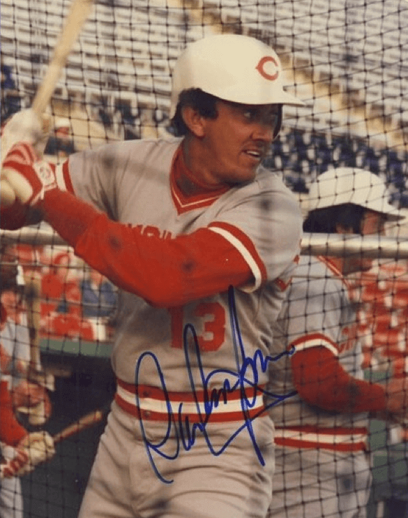
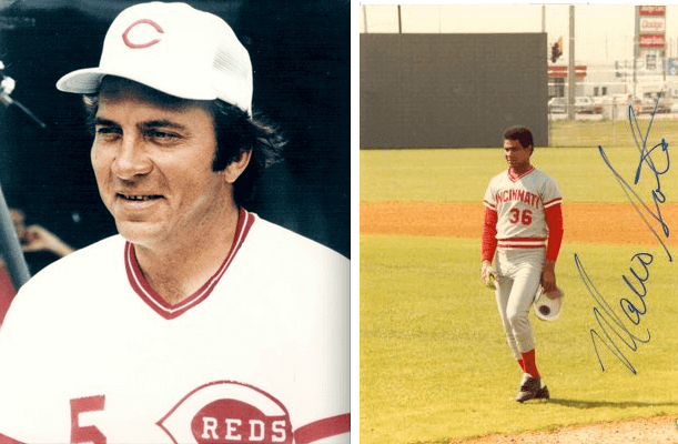
Reader Leo Strawn Jr. recently sent me the photo you see above, which shows Reds greats Davey Concepcion and Johnny Bench wearing white helmets! It was striking to see, but I also had a feeling I’d seen it before — if not this specific photo, then others showing the Reds in white headgear — so I ran the photo by uniform designer/historian Todd Radom, who confirmed that it was a spring training thing in the early 1980s. Todd also came up with this photo of Nick Esasky:
And there are these two shots, which apparently ran on some site called Uni Watch back in 2007:
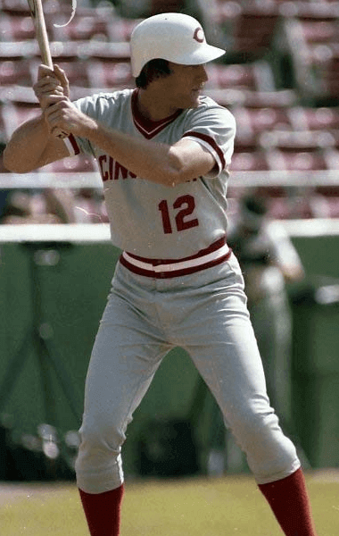
Those two, which were in the Ticker section of this entry, were submitted by a reader named Bob Jonas, who said the white lids were worn in the spring of 1983.
It’s worth noting that the Reds have a long history of spring training headwear experimentation. For example:
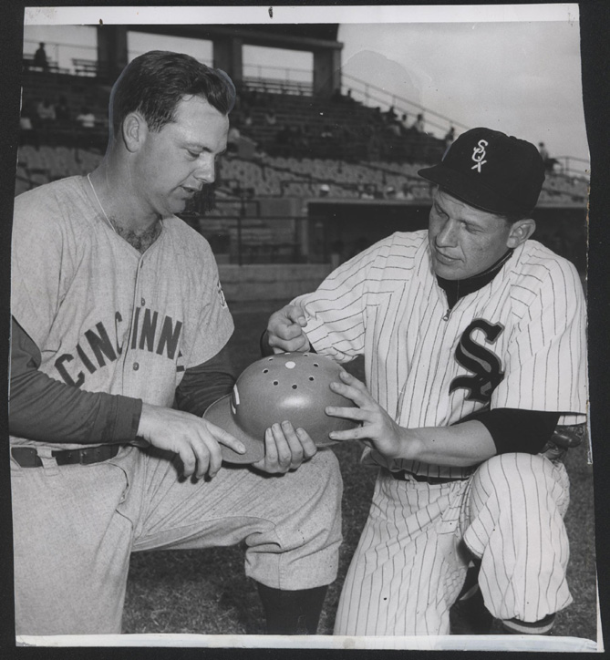
1954: The Reds announced in spring training that all their players would have to wear plastic inserts under their caps (click to enlarge):

1956: The Reds tried drilling holes in their helmets for better ventilation (click to enlarge):
1958: The Reds introduced white-mesh “air-conditioned” caps (click to enlarge):

Alright, now getting back to the white helmets: The Reds did of course wear white helmets in the 1960s, but with red brims. But Leo Strawn Jr. — the reader who triggered this whole entry by sending me the Concepcion/Bench photo — also found this 1960 shot of Billy Martin, who was then with the Reds, wearing what appears to be a solid-white (or solid-grey?) helmet:

White MLB batting helmets, with or without colored brims have been exceedingly rare. In fact, I can’t come up with a single non-Reds example — can you? Other teams have worn white or cream caps, including the Diamondbacks, the Mets, the White Sox, the Senators, and the A’s coaches and managers (and, on at least one occasion, A’s players). But to my knowledge, none of those teams, or any other I can think of, wore white batting helmets. (Of course, lots of additional teams wore white caps back in the day, but there were no batting helmets back then so it’s kinda moot.)
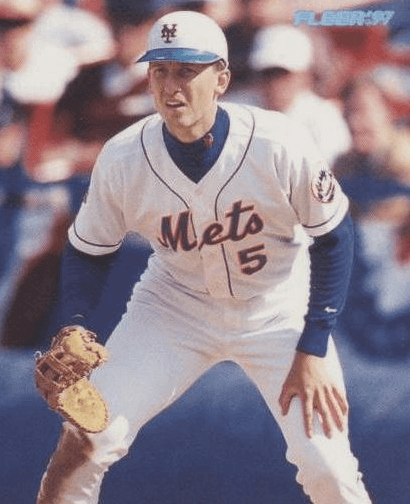
Ah, but there is a case of a player who wore a white helmet — just not a batting helmet. That would be John Olerud, who always wore a helmet while playing the field, including this white-crowned model for a handful of games with the 1997 Mets:
ESPN reminder: In case you missed it yesterday, my latest ESPN column is about teams that have worn LGBT pride uniforms. Check it out here. (And as a follow-up to that piece, reader Michael Haug reports that two Aussie football teams, Sydney and Fremantle, will play a gay pride match this Sunday. No special uniforms, but “the 50m arc, goalpost pads, and goal umpire flags will be decorated in rainbow colors.”)
Phil update: Our own Phil Hecken’s latest uni-centric article for the Sporting News is about the worst-ever uniform for each National League team. Plus his earlier piece on the worst articles for the worst American League teams now has an accompanying video clip.
Uni Watch News Ticker
By Garrett McGrath

Baseball News: Great stuff from Uni Watch friend Todd Radom: Babe Ruth preferred buttons on his uniforms, as opposed to zippers. … From yesterday’s comments: Bud Light in Quebec is offering Expos gear — more than 10 years after the team ceased to exist. … Longtime Uni Watch favorite Josh Outman, now with the Braves, is wearing seriously high-cut stirrups these days (from Mike Nessen). … Here’s rarity: Indians 1B Doc Johnston warming up prior to a game in June 1913 wearing an unusual “Boosters Day” armband (from Graham Clayton). … Here’s a video on the Rangers equipment manager (thanks, Phil). … Here we have 10 Mariners uniforms ranked from best to worst. … The Hanshin Tigers had every player wear No. 10, retired for the late Japanese Hall of Famer Fumio Fujimura, as part of the team’s 80th anniversary festivities (from Yusuke Toyoda). ”¦ Also from Yusuke: The Orix Buffaloes will wear 1995 throwbacks on April 18 and 19 to commemorate the 20th anniversary of the Great Hanshin earthquake. ”¦ Actor Will Ferrell suited up for 10 different teams yesterday. Phil will have a detailed report tomorrow.

NFL News: Nick Foles, newly acquired by the Rams, will wear No. 5 (thanks, Phil). ”¦ Look at this old Bills/Chargers photo form the AFL days. The Bills players are wearing their normal uniforms, but Chargers DL Earl Faison (No. 86) is wearing what appears to be an AFL All-Star Game jersey. Anyone know more? (Good find by Jay Braiman.)

College Football News: College football recruiting letters were much different in 1919, as this Texas A&M note shows (thanks, Mike). ”¦ Tulane is going BFBS next season.

Hockey News: At Islanders practice yesterday, new team member and goalie Michal Neuvirth debuted his new team color pads. New mask is to come (from John Muir). … The Sabres are scrapping their horrendous third jerseys (thanks, Phil). ”¦ Several AHL teams are moving and swapping names.

Soccer News: Supposed leak of Manchester City FC’s home kit for the 2015-16 season (from Conrad Burry). ”¦ Seoul E-Land FC, a new team in the K-League, will play in leopard-print uniforms (from Yusuke Toyoda). … Schalke’s Max Meyer wore Cristiano Ronaldo’s underwear against Ronaldo’s Real Madrid.

Pro and College Basketball News: Wes Matthews underwent surgery to repair his torn Achilles yesterday, and last night he Instagrammed a pic of himself resting after the surgery in his Blazers jersey (thanks, Mike). … A pair of Michael Jordan’s sneakers from his rookie year will be auctioned off next month. Looks like they haven’t aged well (thanks, Mike). ”¦ Oregon is adding “DF” patches to their jerseys in honor of former University President Dave Frohnmayer (again from Phil).

Grab Bag: A gallery of posters from the spring pro cycling races in Europe (from Sean Clancy). … Wondering why sneakers keep getting more expensive? Read this (thanks, Brinke). … In a related item, a guy spent 15 years in prison for robbing a sneaker store, then got out and robbed it again (from Kyle Hanks). ”¦ Nike unveiled a look inside the technology at the heart of their Air Max system. … What would the American flag look like if Congress hadn’t capped the stripes at thirteen, and we’d kept adding a new stripe for each new state? (From Scott Rogers.)
In Jan. 1966 following the 1965 season, The AFL used an All-Star game format where the Bills, as champions of the AFL, played an All-Star team composed of players from the rest of the league. It was the only time they did that, IIRC. This picture is certainly from that game
Great info — thanks!
Also, the Buffalo QB is longtime congressman and former cabinet member Jack Kemp.
Here’s a little story about it:
link
Oh cool, kind-of like the All-Star format in the NHL during the Original Six era, something I personally wouldn’t mind seeing being brought back as opposed to “fantasy” teams.
I don’t think it’d work very well today. Good luck getting the newly crowned Champions to give a shit about the game if it’s played the week after the Superbowl. It’d end up being a joke of a game, just like every other Pro Bowl of the last 50 years. Maybe if they played it now, when there’s really nothing else happening in the football world, and there’s enough time to recover from most injuries before the next season… it might be a decent game.
Thanks for the info.
1. “… College football recruiting letters were much different in 1919, as this Texas A&M note shows (thanks, Mike)…”
What a great document! Just amazing. I’m particularly swept off my feet by the writer’s suggestion that the Aggies’ football motto should be “They Shall Not Pass!” It was 1919, the year after the Allied victory over Germany, and the later-writer is invoking the classic declaration of Petain at Verdun: “Ils Ne Passeront Pas.” Petain was pretty good at snappy dicta: “On Les Aura” (We’ll Get Them) was also his. Too bad about that 1940 business.
2. That photo of Billy Martin. What a jerk! What a stud! Hey, wait a minute, does he belong on I Paesani?
I did enjoy that recruiting letter from 1919.
Is there a better last name for a pitcher than Outman? Sort of th antithesis of Grant Balfour…worst first/last name combination for a pitcher. Sorry, not uni related but I think of it every time I see either of their names.
Dave Riske (pronounced “Risky”) of the White Sox was an inappropriate name for a relief pitcher.
How about Eric Plunk…
Bob Walk.
I learned a new word today trying to find examples: link.
Homer Bailey is a pretty awful name for a pitcher.
All good ones. But in my opinion none top Grant Balfour because it’s his full name…he grants ball four.
You can’t have a “horrible first name and last name combination” conversation without Dick Pole and Rusty Kuntz. Though granted (and I don’t disagree with you), those names are just horrible for all athletes. Not just pitchers.
Go ahead and stare at that picture of Outman’s stirrups for a while.
Keep staring.
This is why we can’t have nice things.
Agreed. Very silly look that detracts from our noble stirrup movement.
Thinking about it, for position players, it might beg the question that if Prince Fielder were such an exceptional defender, why waste him at first base? Pretty ironic for a DH who probably won’t even own a glove anymore in a few years.
Best pitcher name in toto was Early Wynn.
The 2nd picture of the Reds white batting helmet is actually Nick Esasky….not Wayne Krenchickii
I knew it was either one or the other of them (they both wore that number for the Reds in ’83) but wasn’t sure which. If you’re certain that it’s Esasky, I’ll change it.
Yes, it is absolutely Nick Esasky.
Fixed.
RE: Chargers/Bills photo….
I notice that Jack Kemp is not gripping the ball with his fingers on the laces. Google photo search finds MANY photos of him doing the same.
Anyone know why?
I know he had his broken finger set in a curved position so he could grip the ball. Not sure if that has something to do with him not using the laces. ???
Curious.
If I were a fan of an A&M rival, I’m sure that I would have fun with this quote from the recruiting letter article:
“Harrison graduated Texas A&M in 1920 and was among the first Aggies to earn a doctorate of veterinary medicine. He later became the team doctor for Texas A&M football.”
I’m not going to argue with Phil about his choice of worst Pirates uniform (although I fully expected him to pick the Bumblebee-era uniforms). Their alternate logo (which until last year was their primary logo) link so they haven’t divested themselves of red altogether. 1946 was the last year link (navy blue would last another year before adopting black & gold in 1948), there was no reason it not only needed to be back as an accent color, but a prominent one. Sadly, it’s near the bottom of blunders of the Kevin McClatchy era.
“I fully expected him to pick the Bumblebee-era uniforms”
~~~
While it’s true I detested the fat pins in that set, I LOVED the solid gold and black — other than the ChiSox of 76-81 (and to a lesser extent the Caveman Indians), no other team mixed and matched colored tops and bottoms, and They always did it in a way that the stirrups and caps/sleeves weren’t monochrome. This was a unique look — and one they owned (when they weren’t throwing the fat pins in there). Loved that. Wouldn’t want anyone else (ok, maybe one other team) doing it, but for the Buccos it was theirs. Loved that set.
Fun article Phil – but I’m still shocked to see a vintage checked jersey make the list. I love those things!
I hesitate to add the 1978 Padres to this list, because of their contrasting raglan sleeves, but the white pants were often swapped for the gold ones that year. The only combo that was never used was white jersey/gold pants, that year.
The term “home kit” is a misnomer when applied to soccer/football… most clubs don’t use home/away designations.
Says who? They have a kit which they always wear at home and a kit which they’ll only ever wear away. There’s some overlap with regards how teams will (generally speaking) wear their home kit away from home when possible, but the principle still holds. Furthermore, speaking as someone who lives in the British Isles, it has pretty much always been your home kit, your away kit and your third kit (if applicable).
I agree with Padday. While some may call it a first kit, change kit, and third kit, the predominant nomenclature seems to be home, away, and third.
That is certainly how they are marketed:
link
And if you don’t mind me being a little pedantic, “soccer/football” is kinda redundant, since “soccer’ is short for “association football”. Though it comes with the territory when a league website’s URL is MLSsoccer.com.
that caption had me so confused… I forgot Kemp played with the Chargers. Because I was like “he’s a Bill and the guy chasing him is a Charger”!!!
The Baseball Hall of Fame has a Ralph Kiner batting helmet which appears to be white with a blue brim:
link
It appears, and is described as being, worn but I could not find a photo of Kiner wearing it.
Whoa. That minutiae just made my day.
Never worn in a game.
The Dodgers will have an LGBT community night on June 19 where they’ll be giving shirts to those who purchase a special package, but not to every attendee. This is similar to how they do things for other “theme” nights. Images for the shirt aren’t yet available.
link
The batting helmets with the holes drilled, and the mesh hat, imply the team was looking for a cooler option. Was this the case for the white helmets for spring training? Or was it just an aesthetic choice? In either case I think it looks good.
I’ve thoroughly enjoyed your pieces in the Sporting News so far, Phil. Looking forward to seeing more of your work there in the future! A few thoughts on the worst uniforms for each national league teams:
San Diego Padres – No question that anything the Padres wore with brown beats anything they’ve ever worn with blue. But the transition between those two color regimes occurred link, as you state in your article. Looking at them again, I’m not as down on the “sand” roadies as I thought I would be. I don’t consider myself a road grey purist; I have a soft spot in my hear for a few of the powder blue roadies from years gone by. In fact, I could see the sand color working well for the Padres when they bring back brown as their main color next year. (Fingers still crossed on that one!) The sand might even look better with brown as a road color than grey would.
Pittsburgh Pirates – Those 1997-2000 road uniforms are total head-scratchers. I’m not necessarily opposed to pinstripes on road greys, but it makes no sense to wear pinstripes on the road uniforms when you don’t wear them at home. The plain road grey caps actually make the whole uniform look inconsistent. If they were going to go all in on road pinstripes, they should have put them on their caps, too.
Colorado Rockies – My general tolerance of road pinstripes notwithstanding, you ding the Rockies for a uniform set they no longer wear. They ditched the road pinstripes link.
Thanks — With regard to the Padres, I’ll give you the 1991 had ditched the Brown — but with the orange underline, I still equate that to the brown/gold/orange (in my mind). But you’re entirely correct there is no brown there. Still, to me, that at least retained a vestige of the old brown set. But nice call.
Rockies — you are entirely correct. Somehow I had it in my mind they had road pins now. Big fuck up on my part. You’re not the first one to point this out either. I must not have been paying much attention to the Rox since their World Series run. My bad.
“Reader Leo Strawn Jr. recently sent me the photo you see above, which shows Reds Hall of Famers Davey Concepcion and Johnny Bench”
Sorry to be nitpicky, but Concepcion is not in the HOF — this is a sore point with us Venezuelans.
My bad. Thought he was in. Will fix text.
Not just a sore point with Venezuelans, but Reds fans from all walks of life. He should be there, without a doubt.
Not just a sore point with Venezuelans and Reds fans from all walks of life. With baseball fans. He should be there.
Apparently he didn’t do enough back flips while trotting off the field. (sarcasm)
I can’t speak for non-Reds fans, though. ;) Glad you chimed in!
Also glad to see your SN stuff! Good onya, Phil!
Did the Mets not have white alternate batting helmets to match the white alt caps in ’97? I assumed they did when I wrote the link but I may have to go back and edit. I know the two-tone (1998) and black (1999) caps had matching helmets (until 2006 when the matching two-tone helmet was replaced with a non-matching two-tone helmet).
I do not recall them having white helmets.
Confirmed: Mets did *not* wear white helmets with white caps:
link
I was listening to the Big Ten Championship game between the Buckeyes and Gophers yesterday, and at the start of the game, one of the announcers commented that it was the first time he remembers a starting 5 coming on the floor all wearing different shoes.
There was some idle chatter after that (which my 8 year old son ensured I didn’t hear) followed by one of the announcers lamenting “too much individuality for me.”
And by “Big Ten Championship game” you mean “the 2nd round of a five round Big Ten conference tournament”
Interesting that Joe DiMaggio continuted to wear his uniform pants belt off center when he was an A’s coach (see white cap photo) indicating that the style from 1930-40s was for astetics not practical baseball use. Any photos of DiMag in street clothes ? I presume he wore his belts the traditional way away from the diamond.
Hey Paul and all:
I just ran across a photo of one of the 1983 spring training all-white Reds caps. The blogger (post from 2010) says he won an eBay auction and then somehow (either due to postal service or the seller) the cap never arrived, but thankfully he did keep and posted the photo. Scroll down the page a bit:
link
Also wanted to mention that I’m not certain those are white helmets with red bill during the mid-60s. Pretty sure that at least the road helmets (like the one on that link with Frank Robinson) were gray with red bill (to match the road uniform and cap from that era).
Can be seen in this game at Wrigley (Maloney’s 10-inning no-hitter):
link
link
The Reds were intent on shaking up tradition in the early 80s, as evidenced by the white caps and also this strange-looking jacket…
link
Paul mentioned it on this site a few years ago and I found more info here:
link
That blog dates it as 1981, but I’m almost certain those jackets were actually introduced in December of that year for use in 1982. Fortunately, they eventually returned to the traditional arched block letters across the front of the jacket. 1982-84 were strange times for the Reds in more ways than one.