
By Phil Hecken
A few weeks ago, a gentleman with whom I’ve worked on articles for Uni Watch before, Mark Anderson, and who posts on Twitter as @MLBcathedrals, began tweeting a few old ballpark sketches. I thought I might have seen them before (we’ve probably showcased a few of them on UW before), but some of them I’d never seen — you know the type — a drawing of a ballpark with little quips and great annotations and things of that nature. Immediately I said to myself, “we gotta get that on UW.”
A few DM’s later, we were all set. For all the images below, you can click to enlarge. So, I’ve set this up enough already, I’ll now turn the rest of this article over to Mark, who will show you his…
Sketches
By Mark Anderson
Those of you that have been baseball fans the last 20 plus years have seen the biggest ballpark building boom in baseball history, but it wasn’t the first. From 1912 to 1923 every team in baseball would get a new steel reinforced concrete ballpark (a new technology at the time) with the exception of the Cardinals, who moved into Sportsman’s Park with the Browns in 1920, and the Phillies, who would play in the dilapidated Baker Bowl, before finally moving into (and sharing) the Athletic’s Shibe Park in 1938.
From 1946-47 cartoonist Gene Mack of the Boston Globe put together this great set of sketches that depicted every ballpark that existed at the time and their rich history. The drawings were later picked up by The Sporting News (now Sporting News) and published there.
They capture an era that would soon be gone. By the end of the 1950s the Braves, Browns, Athletics, Dodgers, Giants, would be on the move. The 1960s brought expansion and cookie cutter ballparks. By the end of the 1970s only four of these ballparks would still exist (Comiskey Park, Fenway Park, Tiger Stadium, and Wrigley Field).

Yankee Stadium, New York Yankees (1923-1973, 1976-2008)*
The first to be called a stadium and the first to have three decks Yankee Stadium. Until it’s renovation in 1973 fans were allowed to exit the game through the field. When this sketch was drawn Babe Ruth was still alive, two years later there would be an in-play monument in center field in his honor.

Ebbets Field, Brooklyn Dodgers (1913-1957)
Ebbets Field, like most ballparks of the time, was built on the least expensive land available. In this case, Ebbets was built on garbage dump called Pigtown named because of the pigs that were allowed to feast there. Ebbets Field’s right field fence was slanted inward like a “v” allowing for some interesting bounces.

Fenway Park, Boston Red Sox (1912-current)
What’s great about Fenway is that, for the most part, it still looks the same today as it did then. One year after this sketch it would get lights.

Wrigley Field, Chicago Cubs (1916 to current)
If you’ve been paying attention this offseason you know that Wrigley Field is getting a makeover, including two video boards. The Center field bleachers, scoreboard, and ivy you see in this sketch (and see today) was added in 1937.

Comiskey Park, Chicago White Sox (1910-1990)
At a time when ballparks were known for being asymmetrical, Comiskey Park was the outlier. The only thing that is missing from this sketch, that existed when it was torn down after the 1990 season, is the exploding scoreboard.

Tiger Stadium, Detroit Tigers, (1912-1999)
Called Briggs Stadium at the time and Navin Field at the time, Tiger Stadium managed to last until 1999. Only thing missing here are the lights that were added in 1948.

Sportsman’s Park, St. Louis Browns (1909-1952), St. Louis Cardinals (1920-1966)
If you look closely at this sketch you will notice a screen or net over the right field bleachers. It was considered part of the the wall, meaning you had to either hit the roof or clear the stadium for it to be a home run.

Shibe Park, Philadelphia Athletics (1909-1954), Philadelphia Phillies (1938-1970)
Just beyond the right field fence at Shibe Park were a row of houses (that still exist today). Owners built bleachers on top of the roofs of these homes and charged admission (sound familiar?) Connie Mack, in the late 1930s, built a wall (later known as the spite fence) to block them out.

Crosley Field, Cincinnati Reds (1920-1970)
Notice how the left field foul line in this sketch all of a sudden has an angle to it near the fence? That’s because there was a ten foot slope there.

Polo Grounds, New York Giants (1911-1957) -1957, New York Yankees (1913-1922), New York Mets (1962-1963)
Look closely at center field and you will see where it says 482 feet. Now, look closely at the left field fence by the could pole. It says 279 feet. Did I mention the upper deck overhung the field in left by another 21 feet? You’ll also notice in centerfield it says clubhouse. Imagine the walk after a manger had to make after being tossed out for arguing here.

Forbes Field (1909-1970), Pittsburgh Pirates (1909-1970)
Forbes Field’s center field was so far away that they used to just park the batting cage out there, in play.

Griffith Stadium Washington Senators (1911-1960), Washington Senators II (1961)
It was 405 feet down the left field line here at Griffith Stadium. Let me repeat that. It was 405 feet down the left line here at Griffith Stadium, and still, Mickey Mantle managed to hit a building across the street from left here. Also, notice how center field comes in at an angle. That’s because the owners of the homes there refused to sell when Griffith was built. The left field wall, at once time, had an a beer bottle advertisement on it that was considered part of the wall. The cap was 56 feet above the warning track.

League Park, Cleveland Indians (1910-1931, 1934-1946), Cleveland Municipal Stadium Cleveland Indians (1932-1933, 1936-1993)
That’s right, the Indians used two ballparks at the same time for over a decade. League Park never did have lights and Cleveland Municipal never did seat less than 70,000 people, so it was a good fit. Notice the right field wall at League Park. Another wall taller than the Green Monster.

Braves Field, Boston Braves (1915-1952)
If you look at the right field bleachers on this sketch you will see where it says “Jury Box,” that’s because the Braves had a hard time drawing fans in Boston and at typical game you’d most likely find about 12 fans in those seats.
*Note: Years represent the years teams played in the ballpark, not the year they were built or demolished. In some cases a (several) wood version(s) of the ballpark(s) existed at the same location with the same name. Years represent steel and concrete versions only. Teams often changed their nicknames and names of their ballparks. Names given represent most common names used.
Thanks, Mark! Great job — as most of you know, after unis, stadia (particularly those for baseball and which are no more) are probably my favorite thing, so this was a joy to have on UW. As I mentioned above, you can follow Mark on Twitter (and if you don’t you really should), and you can also check out some of the other ballparks-related articles he’s done for the Sporting News.
OK, readers — if stadia are your bag (or even if they aren’t) — how great are these old sketches? Any of these ballparks you wish you’d have visited or were still around? I’d have loved to have visited all of them. Their endearing quirks (like the deep centerfield with the gravestone in the Polo Grounds, or the Crosley Field terrace) make them all the more fascinating.

Uni Tweaks Concepts
We have another new set of tweaks, er…concepts today. After discussion with a number of readers, it’s probably more apropos to call most of the reader submissions “concepts” rather than tweaks. So that’s that.
So if you’ve concept for any sport, or just a tweak or wholesale revision, send them my way.
Please do try to keep your descriptions to ~50 words (give or take) per image — if you have three uniform concepts in one image, then obviously, you can go a little over, but no novels, OK? OK!. You guys have usually been good with keeping the descriptions pretty short, and I thank you for that.
Like the colorizations, I’m going to run these as inline pics — click on each one to enlarge.
And so, lets begin:
First up today is a reader who prefers to remain anonymous, who has a concept for the “Whalicanes”:

Hi Phil:
Here’s a uni concept for you.
Please note I like to post anonymously, so if you decide to run this please refer to me as anonymous, or a reader who prefers to remain nameless, etc. Thanks.
The design:
Since the Carolina Hurricanes are the old Hartford Whalers franchise, I thought it would be fitting to try to use some of the great elements of the Whalers logo in a Hurricanes design. The result is what you see here, a letter “C” with a negative and positive space whale tail. The two tails form the “H,” although like the original logo some people may not notice this at first.
Thanks, and keep up the great work! Like most of the readers I really appreciate you stepping up while Paul’s away.
And we close today with Nick Tringale who has some new looks for the Jags:


Phil
Just doodling the other day and came up with these. Bengals-inspired helmet featuring Jaguar spots, carried through the trim/accents on uniforms. Would keep the current primary logo the same.
Nick Tringale
And that’s it for today. Back with more next time.
EPL Tracker
Each Saturday or Sunday, Alex Gerwitz will be tracking the kit combinations (shirt/shorts/socks) of the teams in the English Premier League from the previous weekend and the current weekend.
Here is the EPL tracker for Week 26, Part I:

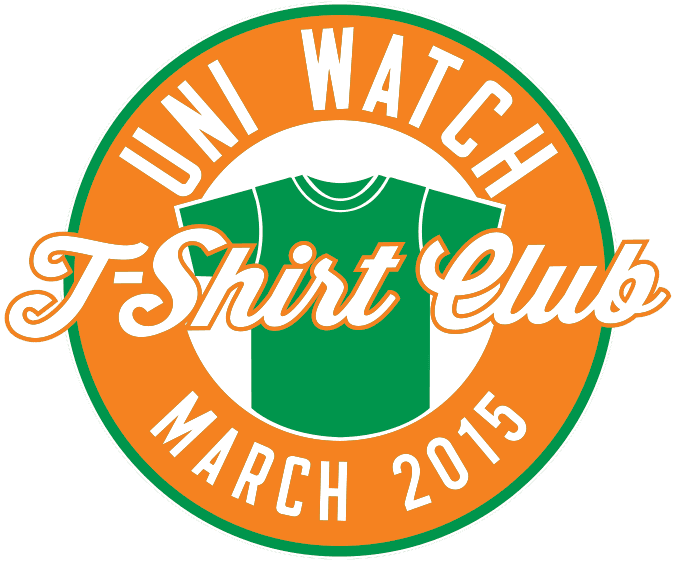
ITEM! T-Shirt Club update: In response to overwhelming (okay, maybe just whelming) demand, we’ve added 4XL and 5XL size options to the Uni Watch T-Shirt Club’s March design. If you had wanted to order one of those sizes, go to the ordering page and choose the new Fruit of the Loom option, which Teespring is now offering.
The March design, inspired by Patrick’s Day, remains available from now through tomorrow night. Full details here, or just go straight to the ordering page.
Uni Watch News Ticker:

Baseball News: A Uni Watch reader-favorite, Josh Outman, was going with solid navy socks on Day 1 of camp (from Mike Nessen). … The Tampa Bay Rays had a pretty impressive Pepsi display at their annual Fan Fest (thanks to Wayne Koehler). … Georgia Southern unveiled a new camo cap, blue jersey and white pants yesterday (h/t Andrew Hartfield). … Interesting design on these socks, for Oklahoma Baseball (pic by Shaun Kernahan). … Friday, in Cathedral City, Calif., many Notre Dame players wore their stirrups backwards against UNLV. Says submitter Jeffrey Seals, “They should’ve listened to Crash Davis’ advice when he told Nuke Laloosh ‘that the rose goes in the front!’ In this case the UA logo should be on the shin & not the calf.” … The Dickinson Red Devils got some pretty sweet new uniforms (thanks to Chris Flinn). … WOW-EEEE – Check out this photo of JR Richard in tequila sunrise stirrups!!! (from Stirrups Now!). … Looks like BYU has new anthracite uniforms (via Ryan Bernal). … Some nick looking stirrups on Lynn University (via Uniform Critic).

NFL News: Here’s a great picture of Steelers K Lou Michaels wearing Bobby Layne’s helmet in the 1962 Playoff Bowl (great spot by Matthew Toy). … The San Diego Union Tribune apparently likes the Chargers concept helmet that has been making the rounds the past week (from Matt Larsen). … As you know (or should know by now) the Browns will be revealing their new logo on Tuesday. This columnist argues the Browns shouldn’t mess with tradition.

College Football News: Tweeter Samuel Stowers asks is this is a Southern Methodist University helmet we may see next season. I’m hoping that’s a negative, and the helmet is just a concept.

NBA News: The Houston Rockets wore their Chinese New Year unis last night. Lots more photos here. … Here’s a teaser image for this season’s Phoenix Suns “ash” Pride alternate uniform (thanks to Conrad Burry). … Here’s a look at the memorial patch the TrailBlazers will wear to honor Jerome Kersey (thanks to Kristina Cruz). … The Pelicans and Heat went color vs. color yesterday.

Hockey News: Last night, in balmy Santa Clara (Levi’s Stadium, or whatever it’s called), the LA Kings (who may have switched socks after warmups, and the San Jose Sharks (h/t Chris Creamer for the last photo) played in the outdoor Stadium Series game. I’m sure Jim Vilk loves those sweater numbers. I thought I’d like the white breezers, but I don’t. Here’s a better look at the two jerseys. And the stadium/rink setup. There was even a shark in the water (h/t Cork Gaines). And here’s Darryl Sutter in the obligatory letterman jacket (via Dave Schwartz), and the Sharks had ’em too. Lots more photos here. … This is pretty cool: check out the Miracle on Icing donuts from the Miracle on Icing donut shop in Lake Placid (h/t GoKingsGo32). … Tyler Vause designed a uniform for the Colorado Eagles “Pot of Gold” fundraiser. Nice! … The Islanders’ Matt Martin had a pretty serious jersey tear yesterday (from Pete Blackburn, but a few of you sent that in). … A Connecticut hockey team has a logo that is very similar to the Blackhawks (from Mike D.). … Reader Matt Larsen asks, “What do you think of the hockey sweater the girl sports in this ad for Scotiabank? If you’re interested here’s the entire ad.” … The Pensacola Ice Flyers wore 1980 USA Olympic jerseys last evening (via Bob Marshall). … Speaking of USA, the 1980 ‘Miracle On Ice’ Team was back together at Herb Brooks Arena for the “Relive the Miracle” Reunion (via USA Hockey). … Boston University did their special jerseys for Autism Speaks last night (h/t Sully). … Here’s a look at the BU rink last night.

Soccer News: It looks as though the new USWNT jersey NOB has writing visible under UV light, apparently (good spot by Holy Calamity. … A bus service in Hull, England uses a logo that flagrantly steals (& amends) the Minnesota Vikings logo (Via Hull City Kits and Paul). … “Arsenal making a relatively rare appearance in mono-yellow (yester)day at Crystal Palace,” writes Laurence Holland. “They usually pair their (awful) yellow change shirts with blue shorts and blue-and-yellow hooped socks, but with Palace wearing blue shorts and socks, they had to make a change to their change.”

College Hoops News: A horrible crime was committed the other evening when thieves stole the unwashed white uniforms from New Mexico State’s men’s team for Thursday’s game and “some very minor equipment” such as tripods, timeout stools and coaches’ dry boards (from Jason Johnson). … Yesterday the North Carolina Tar Heels were wearing 70s-80s throwbacks. First home game since Dean Smith passing (thanks to James Gilbert). … Latest team to go down the neon road: Vanderbilt (via Tres Lawless). … It was black versus gray yesterday for Buffalo and Bowling Green (from Phil Savitt). … Also deciding the dark versus dark look was fine was Northwestern and Penn State (Spinner and Matthew O’Connor, among several who noticed and were disgusted by that). … Interesting Michigan uniform on display in the front window of the M-Den. Here’s a closer look (via Chris Hall). … Syracuse University misspelled the name on the retired jersey given to Roosevelt Bouie. “Unbelievably bad,” says Tony DiRubbo. “Not too mention they give them those horrid jerseys that the team wears now an not the beautiful ones they wore back then.” … Colorado State (breaking out new gray unis) and Air Force went color vs. color yesterday (thanks to Timmy B.). … North Florida and Northern Kentucky also went color vs. color yesterday, if you consider gray a “color” (h/t BLRMKRdave). … Marshall, and probably some other schools, were wearing one black and one white shoe, helping raise awareness of pediatric cancer (via Steve Cotton). Not only did the players wear white/black shoes, the game was color vs. color (h/t Neil Scaggs). … The Northwestern football team showed IN UNIFORM at the men’s basketball game yesterday (from Denver James King). … We have another waistband roller, in another color vs. color game (thanks to bryanwdc). I’m sure Jim Vilk loves those DePaul unis.

Grab Bag: There are a lot of things the Massachusetts Institute of Technology is famous for, but their 1892 Tug of War team is probably not one of those things (h/t Sully).
Wheeeee. And that will do it for today. Big thanks to Mark Anderson for the sketches, Alex for the EPL tracker, the concepters and all who submitted tweets/e-mails for the ticker. Enjoy the Daytona 500 or whatever sporting events you’ll be watching today. You guys have a great week and I’ll catch you next weekend!
Follow me on Twitter @PhilHecken.
Peace.
“The Browns looks is clean and classic. I fear that NIke will make them clown suits like they have done for the Jaguars and Bucs. No one needs more clown suits in the NFL.”
–Lou

I love the anonymous Whalercane uni! I don’t know how much the whale relates to their current Hurricane scheme or if they’d ever want to acknowledge their past, but it is a wonderfully creative homage to their past. Well done, Anon!
I really dig the C with the whale-tail negative space. Great idea and execution. The other tail sticking out of the C, however, just doesn’t work for me at all. Doesn’t make visual sense with the opposing tail shape, and it’s too overt. The Hurricanes could totally have that C with a whale tail inside without disrupting their team identity as the Hurricanes. But the red tail outside the C makes the Whalers reference too overt; it basically says “Not the Hurricanes.”
Still, that criticism amounts to “too much of a good thing.” It’s still one of my favorite concepts seen here recently. Great job, anonymous!
Growing up in the ’80s, I had a book with sketches for every MLB park that existed then and a lot of the ones from the past, with all the cartoony info and trivia, plus a nice detailed write up of each park. I can’t remember the name of it for the life of me though. I doubt I was the only one.
Love the ‘Canes concept. But that Jags concept needs to be out on the field ASAP. That is not only light years better than the junk they wear now but it is exactly what they should be wearing. Also a perfect complement to the Bengals.
The Sporting News published one called “Take Me Out to the Ballpark” that tried to mimic the style of Mack cartoons.
Yup, great job Nick on that Jags concept – looks awesome.
It’s definitely preferable what the Jaguars are currently wearing, make no mistake. But spotted animal prints, when you see them in real-life use, tend to look strange.
link
I’m not sure that it would end up quite right on the field.
I particularly enjoy seeing the different conigurations of infields. Very different basepath treatments, differing first and third base cutouts, and mound-to-plate pitch paths. Fun stuff!
The Jaguars’ concept is spot-on! Especially the gold/white/gold player. In the expansion-year set, the spot pattern was rendered as a group of consistent dots and curves against a gold field. Very Bengals-ish. But the current uniform is a cry for help.
Um…I don’t recall any spots on the original Jaguar uniforms.
Do you mean *on* the cat logo itself?
if you look at the linked image of the Kings walking out to the ice, Drew Doughty is wearing the Kings’ normal away socks while the rest of the team sports the stadium series ones. Looks more like Doughty had a wardrobe error than the Kings switching socks after warm ups.
I’m pretty sure the jersey the girl is wearing in the Scotiabank ad is a New Westminster Minor Hockey Association uniform from BC. The New West Royals used that logo in the old professional WHL and some elementary googling shows that the New Westminster Minor Hockey Association still uses it, also they have a still from the ad in their twitter feed.
Wow, those Jags uniforms are absolutely incredible. Tremendous job!
How do you not cover the stadium series game? It’s one of the only times during the year when the teams wear new uniforms. It’s a big event in uniforms, so how do you not talk about it at all? (and the ticker doesn’t count)
I covered both the SS games that were on weekends last year (Dodger Stadium with the Kings vs. Ducks)and the snowy Soldier Field (Blackhawks/Pens). The former ended very late and it took a while for photos to be available (in fact, I had to use a lot of screen grabs I took). I knew this one would end late, and I’m sorry, but I actually had shit to do yesterday and last evening. I was able to get some pics and links in today.
We’d seen the uniforms well before the game, so there were no surprises, only how they’d look on the ice. Which I posted.
These games are starting to get very played out in my opinion, especially outdoor games in Southern (or northern) California. It was a hard game to watch (the Kings looked awful) and I really didn’t feel like staying up until 2:00 am writing up a game which didn’t need (IMHO) a lede.
If you’d like to write up and get photos for any future 9:50 pm (my time) START Stadium Series games in the future, I’ll be happy to pencil you in. You’d need to have the whole thing written up, photos hosted and coded, and to me by 1:00 am.
Didn’t you or Paul already cover everything about them when they were released? I’m OK with leaving it for Paul to make a mention of tomorrow or leave it to what you covered today. Doesn’t seem like anything major happened during the game to warrant a bigger coverage. Both teams looked like crap, the end.
The outdoor thing is neat for what it should be. 1 game a year in January. Any more than that and it’s just a gimmick that pretty much last night completely jumped the shark. Unless the Coyotees or Panthers are hosting a game I care just as much about the outdoor stuff as I have about the rest of the NHL over the last few years since they messed with the rules and I stopped watching. Keep the dark at home (as god intended). And get rid of the stupid goalie box and shootouts and bring back the ties (also as god intended).
Since “Tar Heels” is two words, the leading apostrophe for Heels is not appropriate.
Fixed. Made it two words instead of just the shortened “Heels”.
Boy, I sure love those old ballparks. Anyone notice the Comiskey Park sketch uses the word “unies” for “uniforms?” I would have never guessed the term was in use some 70 years ago.
And the reference is to the White Sox having worn all-navy road uniforms years earlier, what a great look, as I said yesterday, the ’76 Veeck uniforms minus the shorts and collars were, to my eye, one of the best designs of all time and could look great today.
“…Thanks, Mark! Great job…”
Yessir. Wonderful.
Totally agreed on both counts, Tom. But especially the ChiSox returning to a navy (or midnight) blue, full mono, for the roads (you could make that full-time, or at least a road alt). But you’d need to remove the collars and make the jerseys button front. Similar to what they wore in 1926 (only with the “CHICAGO” font the wore on their all dark unis from 1902 to 1915. That would be awesome.
Nick Tringale’s Jags design is really a huge improvement versus the current uniforms as far as I’m concerned, especially because it so effectively demotes the black and plays up the teal and gold. The huge disappointment for me ever since the Jags came into the league has been that their interesting, distinctive teal-and-gold color scheme has always been so overwhelmed by the ridiculously over-used color of black.
“The Browns looks is clean and classic. I fear that NIke will make them clown suits like they have done for the Jaguars and Bucs. No one needs more clown suits in the NFL.”
—Lou
Well said Lou!
On paper I loved the Kings stadium series set, but on the ice I have to admit it looked terrible.
One detail I thought looked great, however, were the decals on the Kings helmets – both the LA and the numbers were a shiny metallic silver that I thought looked great against the white helmets.
These MLB Cathedrals sketches remind me of that one reader who submitted sketches of his fictional Canadian league. I remember one of his stadia had silos in right field. I can’t find the post that featured his work. Does anyone else remember this, and if so, does anyone have a link?
So who here thinks that “Ash” is just another GFGS jersey?
I think the Kings white breezers would have looked good if the bottom half of the jerseys were black.
So here’s something I have never seen before, Matt Crafton, who is subbing for Kyle Busch after the wreck at Daytona, is wearing Kyle’s firesuit, which had to be hemmed at the last minute, due to Crafton being 4 inches shorter than Busch…no idea why he would be wearing someone else’s firesuit.
Sponsors?
The Kings wore the ugliest thing they have ever worn last night. And given the things the Kings have worn in their history it takes quite a bit of effort to do that. I guess I should congratulate them for that or something but I can’t.
Take a closer look at the lower left hand corner of the Wrigley illustration. It says “Cubs Cutaway” “Forgotten Uniform” and shows what appears to be a some version of the 1940-1942 away uniform, complete with under sleeve stripes.
link
Its interesting that the would call it a “Cutaway.” They also depict it as having a very low neckline, almost like a basketball jersey.
Like the tug of war pic. Always nice to see old pics – especially ones that are outside of our usual sports.
Got me searching a bit for some other tug of war pics. Here’s one from the Toronto Archives – ca. 1915 – 35th Regiment prize winning tug-of-war team.
link
I love old ballparks. I loved (almost all) the cookie cutters, too, but I really love the delightful quirks that had to be built into the old parks.
And no, Phil, I do not love those DePaul jerseys.
I mean, I don’t think Jim Vilk would love those DePaul jerseys. But while we’re at it, I don’t like them either.
@ scott – that’s the book. Thx!