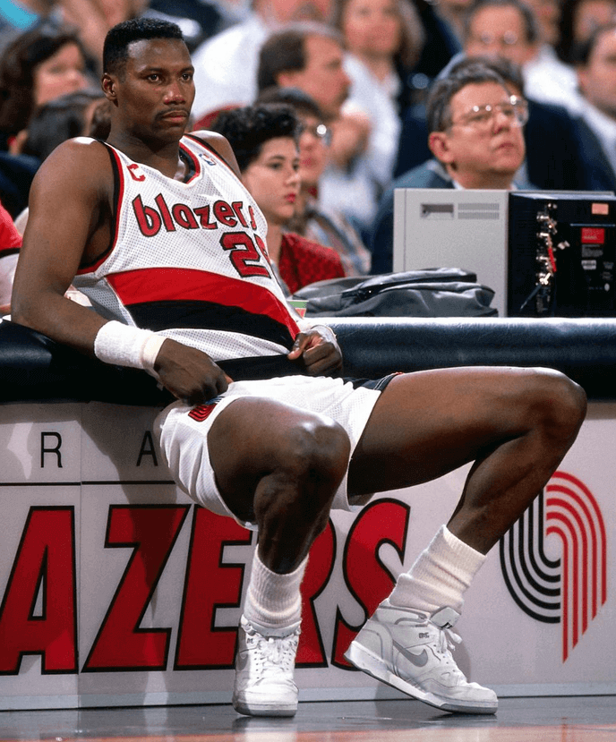
Yesterday I Ticker-linked to this photo of former Trail Blazers forward Jerome Kersey, who passed away on Wednesday, and noted that he was among the relatively few NBA players to wear a captain’s “C.”
That got me thinking: How many other NBAers have worn the “C”? I’ve cited several examples over the years but had never gathered them all in one place. What follows is, I’m sure, a very incomplete rundown of “C”-clad players I managed to come up with yesterday.
In no particular order:
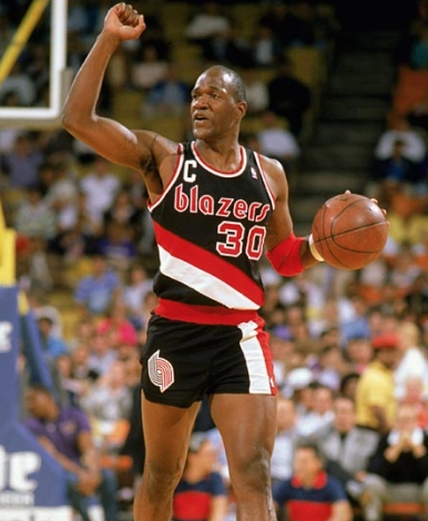
1. Terry Porter. Another Blazer, but his “C” looked clunkier than Kerey’s:
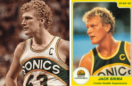
2. Jack Sikma. Sikma played in the era before the NBA logo appeared on jerseys, so his “C” didn’t look as cluttered. He wore at least two different “C” styles — a generic-looking letter and one rendered in the team’s font:
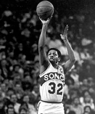
3. Downtown Freddie Brown. Another Sonics player here:
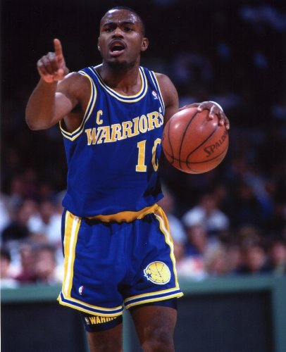
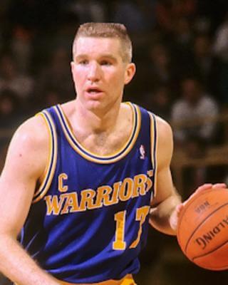
4, 5, and 6. Tim Hardaway, Mitch Richmond, and Chris Mullin. The “Run TMC” trio were co-captains for Golden State. Note that all three of these guys wore their “C” rather low, and that Hardaway’s and Mullin’s were definitely too close to their chest lettering:

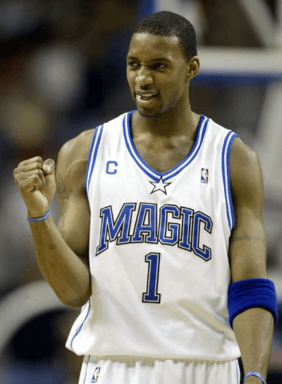
7. Tracy McGrady. He wore a very small “C” when he was with the Magic:
8, 9, and 10. Desmond Mason, Tim Thomas, and Erick Strickland. These three players were co-captains with the Bucks back in 2003-04, all wearing the “C”:

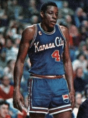
11. Sam Lacey. I’m glad he’s on this list just so we can see the old Kansas City Kings jersey:
12. Antonio McDyess. He wore the “C” during part of his tenure with the Nuggets:
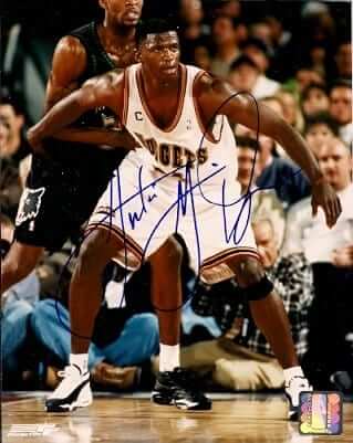
13. Nick Van Exel. Another Denver player who sported the captaincy designation:
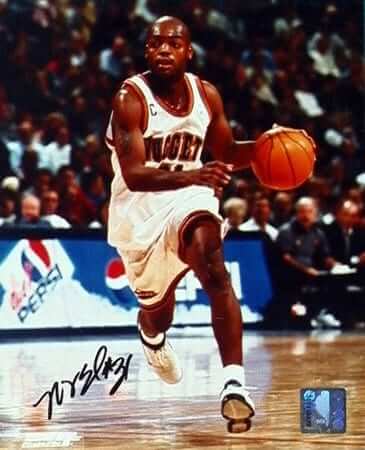
14. Shareef Abdur-Rahim. The man with many letters in his name had an additional letter on the front of his Hawks jersey:
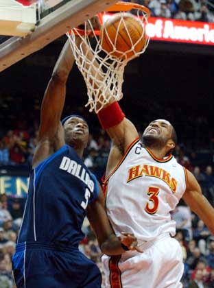
15. Christian Laettner. Hard to believe the Timberwolves’ uniforms were once this generic-looking:

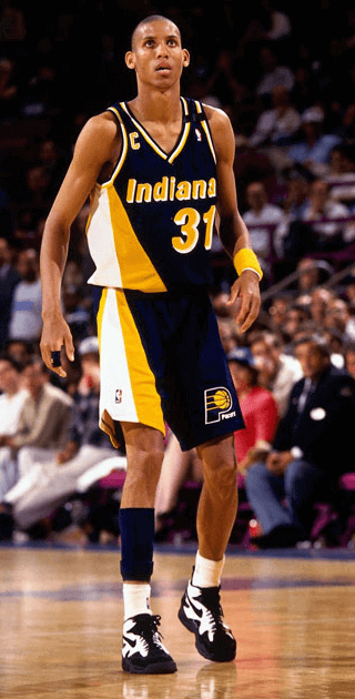
16. Reggie Miller. I believe Miller wore the “C” for only one season — 1993-94, which is when this shot was taken:
———
That’s all I got. Are there more? I’m fairly certain there are. If you know of any, post them in today’s comments. Thanks.
Meanwhile, a few questions to ponder:
• Do you like seeing a “C” on a basketball uni, or is it too much?
• Except for Sikma and Brown — the two Sonics players — all of the players shown above wore the “C” on the right side. Now, granted, in most (but not all) cases that was because the NBA logo was occupying the left side. But now there’s no more NBA logo on the front and, at least for the moment, no ads either. So: Which side is better for the “C”?
• Would a sleeve be a good place for a “C”?
Discuss.
T-Shirt Club reminder: The Uni Watch T-Shirt Club’s March design, inspired by St. Patrick’s Day, remains available from now through next Monday. Full details here, or just go straight to the ordering page.
Raffle reminder: Today’s the last day to enter the raffle for a chance to design your own custom baseball bat. Full details here.

’Skins Watch: A school district not far from Buffalo is considering changing the school’s team name from “Redskins,” but supporters of the name hung a “Save the Redskin Tradition” banner over a downtown intersection this week. A community forum on the matter is scheduled for March 3 (from Phil and Dave Drews). ”¦ Remember that Pennsylvania high school whose student newspaper editor was suspended for refusing to print the word “Redskins”? The editor has now written about that experience.

Baseball News: Several fans have noted that the Indians’ navy Wahoo caps currently being sold are significantly darker than last year’s. The MLB Style Guide shows no change in the team’s caps or in its official shade of blue, so I asked a team spokesman, who confirmed that the Wahoo caps are now darker, to match the shade of the block-C caps. … Not exactly a surprise to learn that the Cubs will be wearing an Ernie Banks memorial patch this season. No visuals yet, but this might be a hint. ”¦ What’s the best accessory to go with tequila sunrise jerseys? Tequila sunrise stirrups! … Stars/stripes pandering jersey this summer for the Lake County Captains. … The Tigers are adding a 50th-anniversary patch for their spring training stadium. … New cream jerseys and Jayhawk logo caps for Kansas. Plus stirrups and a flag patch on the back. … NC State is the latest team going with a really ugly G.I. Joe BP jersey. When I retweeted that post yesterday, Jay Dale responded, “Little League is going crazy with this style now.” If that’s true, it’s really, really sad. ”¦ Pretty bizarro helmet for LSU softball. ”¦ Really like this Staten Island “pride” jersey that the Staten Island Yankees will be wearing later this year.

Pro and College Football News: With the Browns scheduled to unveil a new logo on Tuesday, their Twitter avatar is now a blank outline (thanks, Phil). ”¦ A long-running antitrust case filed by American Needle against the NFL has been settled. … If you’re a Seattle fan and are still depressed about the Supe, this Seahawks-themed Ferrari might cheer you up. When I tweeted that story yestserday, it garnered lots of amusing comments (from Gordon Blau). … Under Armour is launching a new line of cleats at the NFL Combine (from Eric Wright). … Here’s an eBay seller who’s offering football team-themed fighter pilot’s helmets — NFL as well as NCAA (good find by David Firestone). ”¦ Packers coach Mike McCarthy was wearing Acme Packers gear at the NFL Combine. ”¦ Speaking of coaches at the Combine, check out Marvin Lewis’s collar. … Ohio University is asking students and alums to submit logo designs for homecoming week.

Hockey News: Very nice Hall of Fame Weekend jerseys for the Alaska Aces (thanks, Phil). … Here’s a look at throwbacks for each current NHL team (from Phil). … On Saturday the Danbury Whalers will honor the history of hockey in New Haven by wearing New Haven Knights throwbacks (from Dane Drutis). … Cornell is going pink in the rink (from Phil). … Here’s another one of those reports on the story behind the Hartford Whalers logo (from Jonathan Daniel). ”¦ “The Anaheim Ducks have changed their gloves,” says Brian Rowland. “Prior to this season, they had black wrists with orange lettering. Starting this season, they changed to orange wrists with black lettering (horrible, in my opinion). And then on Wednesday night they switched over to black wrists with white lettering.” ”¦ Here’s an article on how the Kings’ equipment staff will prepare for this weekend’s Stadium Series game (from Chris Bisbee).

Pro Basketball News: Blazers PG Steve Blake will stop wearing No. 25 in honor of former Blazer Jerome Kersey, who passed away earlier this week. ”¦ I’m not sure what team this is, but they have ads on their butts. ”¦ Amar’e Stoudemire joins the Mavs and suddenly Rajon Rondo wear goggles on the court. Coincidence?

College and High School Hoops News: Arizona retired Jason Terry’s No. 31 last night. … “As an assistant varsity boys basketball coach at Charlotte Christian School — alma matter of NBA All-Star Stephan Curry — I would be remiss if I didn’t share the sweet new uniforms that Stephan sent our way courtesy of Under Armour and his new signature line SC30,” writes Zach Goodyear. “The kids all got two pairs of game shoes, a pair of travel shoes, and of course the new practice and game unis. We are blessed beyond belief, amazed but not surprised at Stephan’s ascension to the top of the NBA, and absolutely in love with our new gear. The practice jersey is being worn by Trey Phills, a senior guard headed to play at Yale next fall and the son of former NBA player Bobby Phills.” ”¦ More women’s teams wearing pink: Florida State, Kentucky, Texas A&M, Wake Forest, UNC, Florida, Virginia Tech, Boston College, and Georgia Tech. ”¦ Calvin Godfrey of Memphis was missing his conference patch last night. ”¦ There are a lot of things wrong in this photo, but the biggest one is that Minot High in North Dakota wore pink camouflage — yeech (from Jody Michael).

Soccer News: Have Manchester United’s new jerseys been leaked? Maybe (from Phil). … Here’s Canada’s kit for the upcoming Women’s World Cup.

Grab Bag: A Massachusetts man has pleaded guilty to defrauding the U.S. government by creating a phony prison guard uniform company. … The Libertarian Party is holding a logo design contest (from Gregory Koch). … Aussie rules football news from Leo Strawn Jr., who writes: “AFL’s Collingwood Magpies have released their 2015 Anzac Day jumper for the annual rivalry match with Essendon in April. The top of the jumper gets a bit crowded with the extra graphics, but the poppy is a nice addition.” … Russian activists/artists Pussy Riot are wearing Russian riot police uniforms in the video for their first English-language song, “I Can’t Breathe,” which is dedicated to chokehold victim Eric Garner. … Big kerfuffle over pro snooker player Rory McLeod. McLeod, who happens to be Muslim, is sponsored by ISIS Business Solutions, and wears their logo on his apparel. But lots of folks thought he was endorsing, you know, that other ISIS (from George Chilvers). … The Vancouver Women’s Field Hockey Association, after lots of deep thought and serious consideration, has decided that it’s okay for players to wear shorts instead of skirts (thanks, Phil). … Police in Cheektowaga, near Buffalo, are having trouble identifying the logo on the jackets worn by a pair of tablet thieves. ”¦ This shot of astronauts’ and cosmonauts’ suits would make a cool poster (from Brian Dautch). ”¦ All Tennessee women’s teams except for basketball will soon stop being the Lady Vols and just be the Volunteers, a shift that’s caused some controversy (from Chris Weber).


What Paul did last night: The guy sitting next to me in the photo above is Uni Watch reader Noah Hougland, who won the raffle to be my guest at the offices of Skidmore, Owings & Merrill, the architecture firm where I gave a presentation yesterday. Afterward, a bunch of the Skidmore folks took us out to dinner, and a great time was had by one and all.
This type of raffle is always a crapshoot — will the person be fun to hang out with? Will he be really quiet? As it turns out, Noah’s a really interesting guy and fit right in with everyone. Even better, his wife is an architect, so he had plenty to discuss with the Skidmore folks.
The presentation went well, too. Big thanks to Sam, Drew, Emily, Amy, Severin, and everyone else at Skidmore for having me in — it was a great experience.
So I presume the thicker typeface shown at the end of “See the Evolution” is representative of what the brownies will have as part of the final package.
I’m not a big fan of the C on jerseys. It’s just extra clutter.
While it doesn’t bother me aesthetically, when it comes to basketball (and baseball) what really is the point.
According to the rules the “C” and “A” in hockey are the ones that are only allowed in the little semicircle to discuss penalty calls with the ref.
In football you have the pregame coin toss as well as on field stuff like accept/decline penalty (although more often than not the ref just looks to coach first nowadays), ask for a measurement, etc.
For basketball, I recall captains being named and talking with the refs during warmups when I was in high school but aside from that, not really sure what they do for the game.
In baseball I’d question it even more because it’s usually a manager or someone from the coaching staff to take the lineup card out and go over ground rules.
NBA Rulebook, Rule 3, Section III:
“Section III–The Captain
a. A team may have a captain and a co-captain numbering a maximum of two. The designated
captain may be anyone on the active list who is in uniform, except a player-coach.
b. The designated captain is the only player who may ask an official about a rule interpretation
during a regular or 20-second timeout charged to his team. He may not discuss a
judgment decision.
c. If the designated captain continues to sit on the bench, he remains the captain for the
entire game.
d. In the event that the captain is absent from the court and bench, his coach shall
immediately designate a new captain.”
Not only is it extra clutter, but it serves no function (unlike, say, in soccer, where the player wearing the captain’s band is the only one allowed to interact with the referee). It hardly seems coincidental that the TEAMS of most of the players who’ve worn the “C” in recent years have been mediocre (if that).
AFAIC, feeling the need to wear something earmarking your leadership status in a group that size says something about your leadership qualifications.
where the player wearing the captain’s band is the only one allowed to interact with the referee
well, only one allowed *de jure* :p
I had a feeling all of Golden State’s Run TMC were captains together.
Yep. Pulled up a picture, but I can’t get it to post the link on my phone. Add Mitch Richmond to the list.
Thanks, Mike — got it. I’ll add Richmond to today’s lede!
Fighter pilot helmets…..
I think he could have done a little better on the logo placement.
Otherwise, kinda cool.
Mebbe helicopter fighter pilot helmets…
I am sure we have some former chopper (the flying kind, not the renegade biker gang kind) drivers out there that can confirm this… It appears to be a Gentex SPH-5 Helmet as seen here… link
an interesting link to spend some time on here, the History of Flight Helmets
link
My brief USAF helmet redux happened in 1985 when I tarted up my flight helmet with then LA Rams horns, which I thought looked awesome, my instructor to put it succinctly, did not.
However, I did manage to aquire a set of Philly Eagles wings and that changed things… at least for him. Looked good on a helmet.
All this changed when that year the USAF was changing out their helmet line from the plastic-y looking white shells to the then prototype US Air Force HGU-55/P and MBU-20/P Combat Edge system.
link
What’s all the hubbub about Marvin Lewis’ sweater? I must be missing the joke(?).
You and me both.
Yeah, just about every minor league baseball teams will stars and stripes pander this summer. And they’ll also pander to Christmas in July, breast cancer awareness, autism awareness, Star Wars celebrations, etc. It’s what minor league teams do. Most of the MILB teams, like their major league counterparts, will probably have a template for their stars and stripes caps, though most of these teams always take it a step farther by having stars and stripes uniforms, too.
The thing is, when teams wear uniforms that look like R2D2 or Santa hats in July, there’s no implied declaration of nobility or patriotism. There’s no implied “If you love America, you’ll do as we say” message, nor is there a possibility of a serviceman (or woman) being brought back from overseas (and sent back the next day) for the sake of self-congratulatory theater.
There’s commerce and borrowed interest, and then there’s pandering.
Doesn’t seem to keep people away from the parks on those patriotic days.
I can second that the digi-camo is BIG with Little Leagues
KIDS LOVE ‘EM!!!
I can attest this as well.
IMO I dont necessarily like them but I am “okay” with them. But most of it looks don’t right trash.
My son begged to buy a grey/black dig came arm sleeve at a tournament. Reluctantly did and pretty happy that it got lost.
Tennessee’s decision to drop Lady Vols as a nickname comes as the team switches to Nike, huh? As a Syracuse fan, I have a deep feeling of deja vu: link
“For years, Syracuse teams have been identified as the Orangemen and Orangewomen, one of the more distinctive nicknames in all of college sports….All Syracuse teams will change their nicknames to the Orange next year, Director of Athletics Jake Crouthamel announced Tuesday at a press conference. Syracuse will also introduce a new, official school logo, teaming with Nike to redesign its major athletic uniforms.”
I thought I read somewhere there was kind of a feminist movement to remove “Lady” or “-ettes” monikers for woman’s sports teams.
Also, wasn’t the move from Orangemen/women to Orange more a part of the anti-Native American nickname movement than anything Nike “mandated”? I think the name/change and redesign just happened to be at the same time, but not sure if one really had much to do with the other.
If you ask me, I thought with Cuse using that Orange logo all those years they really superseded what people might have taking as an Indian-type name and the change really wasn’t necessary but that’s just me.
No, Syracuse got rid of their American Indian mascot many years before they changed their nickname to “Orange.”
Yeah DJ, it appears of got half facts in my original post.
They ditched the indian mascot but used Orangemen/women for years… and the later change to Orange was based on gender neutrality.
Also, is “Orangeman” really on par with the slur that “Redman” is? I have heard Indians referred to as redskins or redmen, but I can’t ever say “orange man” was something I heard thrown out there.
I’m not sure St. Johns could have changed their mascot to a giant tomato and still been able to get away with “Redmen”.
I thought the “orange”/”orangemen” was an anti-cathloic thing…
I’m not sure there are too many who would conflate link with link. I mean, one is a ridiculous cartoon fruit in a silly hat and the other is Otto the Orange.
Yeah, Phil, I’m completely confused… because there is a history of Indian mascots at Cuse right? But the orange thing had a religous connotation so I am just all over the place here. Sorry!
“I thought the “orange”/”orangemen” was an anti-cathloic thing…”
Phil going all “spelling purist” and “reference to yesterday’s comments” on us…
Rajon Rondo suffered an orbital fracture of his left eye as well as a nasal fracture
Not getting (and a tad chuffed by) the snide tone of the field hockey item in the Grab Bag. A quick Internet search of the Vancouver Women’s Field Hockey Association reveals that 60+ teams likely totaling more than 1,000 players compete in it. Mocking an endeavor of that size for wanting uniform uniform standards hardly seems warranted, and smacks of chauvinism.
Not making fun of the league or its size; making fun of the notion that players were still expected to wear skirts in 2015.
It’s a league solely for women. It’s a league run entirely by women. It’s a sport that in its century-plus of existence is unique in the sense of having only been played in skirts, until very recently and in very small numbers (in the U.S. at least, I can’t speak for Canada). Given that context it’s not unreasonable for women to “expect” other women to follow time-honored tradition; indeed, many of them, including young ones, take pride in that tradition and the fact that it sets them apart from other women’s team sports. To them, wearing a skirt celebrates their femininity as well as their athleticism in a way that wearing a uniform that’s a mirror image of the men’s uniform simply doesn’t. I dunno about you, but to me that’s a laudable thing.
In any event, it’s not as if the league was “standing in the doorway” here. Per the article some competitors in the league flouted the established uniform standards willy-nilly. They were, predictably, threatened with discipline as a result. They then petitioned the organization to change its standards, and following discussion and debate the organization did just that. Again, a laudable thing.
Dog bites man.
Firstly, the tradition for tradition’s sake argument is never one that’s going to have much sway with me. People who expect adherence to a certain set of circumstances based solely on the fact that that’s the way it’s always been, especially in the face of a concerted and thoughtful challenge to that status quo, are indeed deserving of ridicule. Secondly, I know plenty of women who very much resent the idea that their gender needs to be reinforced while playing sports, as if being an athlete is some kind of threat to their femininity which is then magically remedied by an item of clothes. The insinuation, furthermore, that shorts are gender specific athletic wear, rather than simply the most practical athletic wear, is laughable.
If that’s the case, Padday, we can start tearing down the Coliseum in Rome and driving on red lights.
Hell, white at Wimbledon is tradition. The Green Jacket is tradition. Why is it that we, as men, must thrust a false sense of sexism on something the women gladly adhere to based on the sport’s long-standing traditional garb?
If that’s the case, shorts at the US Open, pajama pants for everyone in baseball, and anything else “traditional” can be retired too.
I guess that should have been Colosseum. Wow. I almost knocked it down myself. LOL
Thanks for bolstering my argument with that ridiculous straw man argument. My point was never that tradition in itself is bad, my point was that it’s weak when it is used as an excuse to obstruct progress or otherwise support a retrograde or anachronistic agenda. The Colosseum serves purposes beyond mere tradition – it’s significant historically, as an archeological site, as a visible and prominent educational tool, as a tourist site, etc. And as for red lights, well you’re the first person I have ever heard suggest that they’re purely “tradition”. Frankly I always considered them to be simply an invaluable and extremely successful traffic management tool. JEEZ!
Why is it that we, as men, must thrust a false sense of sexism on something the women gladly adhere to based on the sport’s long-standing traditional garb?
Did you read the article? This was a challenge made by women to simply have the option to wear shorts. Nobody is suggesting that skirts should be banned from the sport and that everybody needs to go out and burn all the skirts they can find. I’m saying that there are clearly women out there who don’t see this tradition as a relevant one, and who perhaps even see it as a harmful one to those personally who don’t feel that their athleticism needs a gendered qualification in the form of a skirt. What I’m saying and what Paul was insinuating in the ticker is that it’s frankly ridiculous in this day and age, regardless of who’s making the decisions, that such considerations are not taken as obvious.
They do wear shorts. It’s just that they wear skirts over top of them.
I’m sorry, “chuffed” is a weird word. Your context seems to make it a synonym of “peeved”. I’d always thought chuffed=flattered.
Well by golly it does, Walter. I always thought it meant the opposite. Thanks for the correction.
How about “chafed”?
How about “chapped”?
Chuffed means to be pleased with something.
‘My grandson was really chuffed with his presents.’
I also dig the Kings from the Kansas City days. I like the city name in script, and wonder how much of it was shared with the one on the Royals/Athletics uniform. For one thing, the flourish on the “C” dots the “i”. One of my favorite pastimes is comparing oft-used team locations (New York, Chicago, Los Angeles, etc.) and picking my favorite rendering. Such as: is the “Minnesota” with the Viking horns better than the script one on the Wild sweater?
One of my favorite uniforms ever.
Actually, there’s a little crown dotting the i.
link
Forgot to include this week’s ’Skins Watch. Now added.
Duly appreciated. Believe it or not, Paul, it’s the feature I most anticipate, every week. As an aside, I hope schools that have used the nickname resist whitewashing their histories. Own up to the fact, and be better for it.
The Neshaminy editor’s editorial was particularly great to see.
Though… that “Rethink” picture… link looks like he’s beginning to morph into the link.
Or maybe it’s just me being extremely nerdy.
Has there really been talk of criminal charges against the editor as he mentioned? Under what grounds?
It’s my understanding that there was a student who submitted an op-ed piece (I’m not sure if it was related to Neshaminy athletic programs or not) to the student newspaper which used the word “Redskin(s)”; the student-editor banned it from publication in violation of school policy (the Board allows the Playwickian’s staff to not use the term “Redskin(s)” from news articles (aka: reporting) if that is the staff member’s preference, but not editorials or opinion columns submitted by the at-large student body.).
While not “criminal”, such action by the student-editor seems to violate the other student’s 1st Amendment rights(?) and a lawsuit may be forthcoming as a result of the student-editor’s action.
A First Amendment claim? That will be a difficult stretch. Both in terms of general First Amendment principles and in terms of specific jurisprudence related to academic settings. And as a practical matter, a First Amendment ruling declaring that a student newspaper editor is not permitted to edit text submitted by another student would destroy student journalism. I mean that literally. A student paper would either have to publish everything without editing or nothing at all, and any school administration that employs an attorney who’s heard the word “libel” will choose nothing.
Here’s a look at throwbacks for each current NHL team.
Or old photos, in most cases. Can you name a scenario where Winnipeg might be possessed to wear Atlanta sweaters?!? Break out the Hedberg/Nilsson uniforms, with the red helmets, if you ask me.
The Indians cap note is a useful reminder of the limits of “official” team identity documents. A team’s colors are what a team actually wears, not what it says in some style guide somewhere that it would prefer to wear.
Agreed. But the odd thing is that the team has also made no announcement of the cap change — they only acknowledged it when I asked them about it. Very strange approach.
They probably didn’t think it qualified as a change that needed mentioning. They just fixed a color matching issue. The 2 caps were likely never intended to be different colors in the first place.
Given the number of caps that are sold, there’s no way they could have thought it wasn’t worth mentioning.
“… … The Libertarian Party is holding a logo design contest (from Gregory Koch). …”
The mind reels with unkind possibilities.
My mind is still reeling with the utter hypocrisy of it, but once that’s done I’m sure I’ll get around to the unkind possibilities.
You should submit one, Rob.
Ya know, for shits & giggles.
The hard part will be stopping at one.
Isn’t it obvious? The logo is a picture of a hand. Except it’s invisible.
Reggie Williams, Bryant Stith, and LaPhonso Ellis all wore the C at certain times with the Denver Nuggets, a simple google image search on all of them with the Nuggets will produce many examples.
Thanks!
And sure enough, Williams:
link
Stith:
link
Ellis:
link
*Terrible* kerning on the “32” on Laettner’s jersey.
Unbelievable. Last night I saw an old photo of Kevin Garnett from ~15 years ago dunking against the Nuggets on twitter. Antonio McDyess is in the background wearing that captain’s “C”. Thought to myself, “You don’t see basketball players wearing the ‘C’ much, I wonder if UniWatch has ever covered this topic?”
BOOM.
Ha!
Wow, never saw those early Whalers concepts with the little whales as part of the design. Great stuff!
Regarding the addition of orange cuffs to the Ducks gloves, I always thought hockey gloves looked better with more colour, especially the ones from the ’60s and ’70s with the alternating coloured rolls. So many teams now use single-coloured ones now.
I think we’re forgetting Chris Paul wearing the “C” when he was on the Hornets.
link
David West as well. Same team. Same time?
link
Those photos aren’t contemporaneous — different collar styles.
Right, but they were co-captains during those years. Also the last to wear a “C” patch to date.
I was actually going to suggest a post covering captains’ patches in the NBA after the Kersey photo yesterday – I guess great minds think alike!
They did in fact both wear the “C” at the same time:
link
Link doesn’t work.
That link doesn’t seem to work, but let’s try link.
#YoureRight
Another picture showing CP3 and David West in their C jerseys in New Orleans:
link
Those tequila sunrise “stirrups” are really Under Armour’s version of two-in-ones.
link
They resemble the real things much more than the ones worn by Rick Ankiel and others in the past.
link
In the ticker link re: the classic NHL throwback uniforms – the Montreal sweater / uni combo is gorgeous. They need to start wearing that pronto!
Chris Paul wore a C briefly during his NO Hornets days: link
Four days a week I live in Buffalo, and have been watching the TV news stories about the Lancaster high school name thing. What struck me is that every news story I saw contained some variation of “supporters of the name say it’s a tradition meant to honor and not to insult.” But not a single mention was made of what opponents of the name said. Did they find no opponents? If there are no opponents, why is there a sign? And who paid for the sign?
I went to school in the WNY area and played hockey against the team from Lancaster. In the same league was a team made up of a few Native Americans from a high school near a reservation. I always wondered how games between those two schools went.
The flag of Staten Island: link
Paul, it strikes me as interesting that jerseys based on or containing elements of the U.S. flag are something which you do not enjoy, while the Staten Island flag-based jersey is pleasing to you. Does the fact that it’s the flag of our country bother you, or was it something more simple, like that you were just unaware of the design of the flag of Staten Island (which is totally understandable)?
The United States flag, whose design I’ve always loved, has an extremely broad range of symbolism. You can say many things about it, but you certainly can’t say it’s underexposed. Putting it on a uniform strikes me as a lazy, kneejerk approach to Band-Aid patriotism.
The Staten Island flag, which I’d never seen before today (or if I had, it hadn’t registered with me), is, I suspect, largely unknown outside of Staten Island (and perhaps even within its confines). Putting it on a uniform strikes me as a useful civics lesson.
Certain flags (USA, Maryland, New Mexico) have a graphic integrity which lend themselves to wide application. I wouldn’t make a uniform out of a Massachusetts or Oklahoma flag unless it were a soccer kit.
State flags: ‘Zona, Sakerlina, Maryland and Alaska flags FTW. Honorable mention to Nuevo Mexico, Texas, Tennessee, Indiana, Alabama.
Not technically states, but the District of Columbia and Puerto Rico belong in any Top Ten list of the best American state flags.
Danny Manning, Ron Harper and Mark Jackson all donned the Captain’s “C” for the Clippers in the early 90s.
Danny Manning:
link
Ron Harper
link
Mark Jackson
link
Good stuff, Ross — thanks!
The NHL Grab Bag column on Grantland today links to a video of the first San Jose Sharks game, and features this uni-related item:
“Defenseman Neil Wilkinson’s no. 5 sweater is missing. He’ll wear uniform no. 45 instead.”
link
The Kansas baseball jersey mirrors this KU basketball jersey link
Also, and I beleibe Phil linked it, it also is the same as a jersey KU baseball wore before. So this is a throwback for Kansas baseball.
Andrew Bogut had a C patch for some of his time with the Bucks. link
My friends and I always joke when we see a plain silver car about how it is painted like the original helmets the Seahawks wore – but that Ferrari is way sweeter!
Michael Redd wore a C patch during his tenure with the Bucks
link