For all of today’s photos, click to enlarge
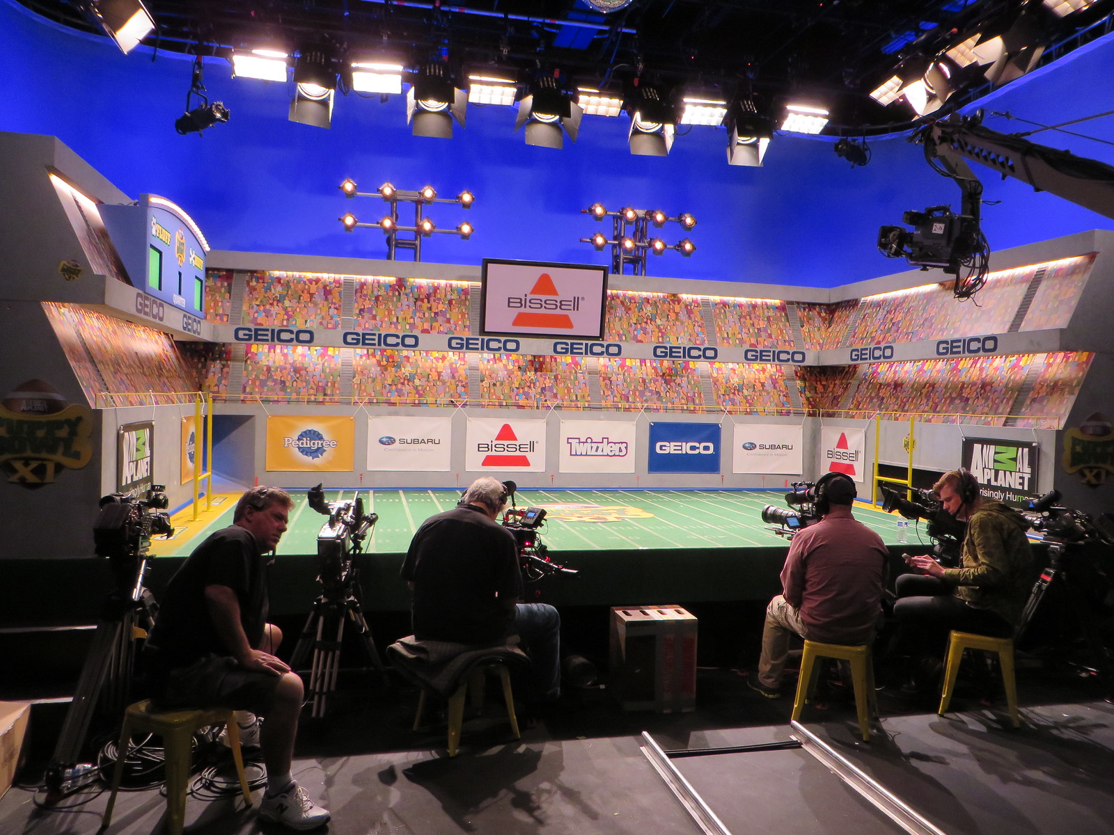
Back in October I got to attend two days’ worth of taping for Puppy Bowl XI, which will air this Sunday. Everything I saw and photographed was embargoed until yesterday, but now I’m finally allowed to share it with you. I had planned on doing a big feature on everything I saw (I took a lot of notes), but I don’t have enough time for that, so instead I’m going to go over a few of the more interesting details.
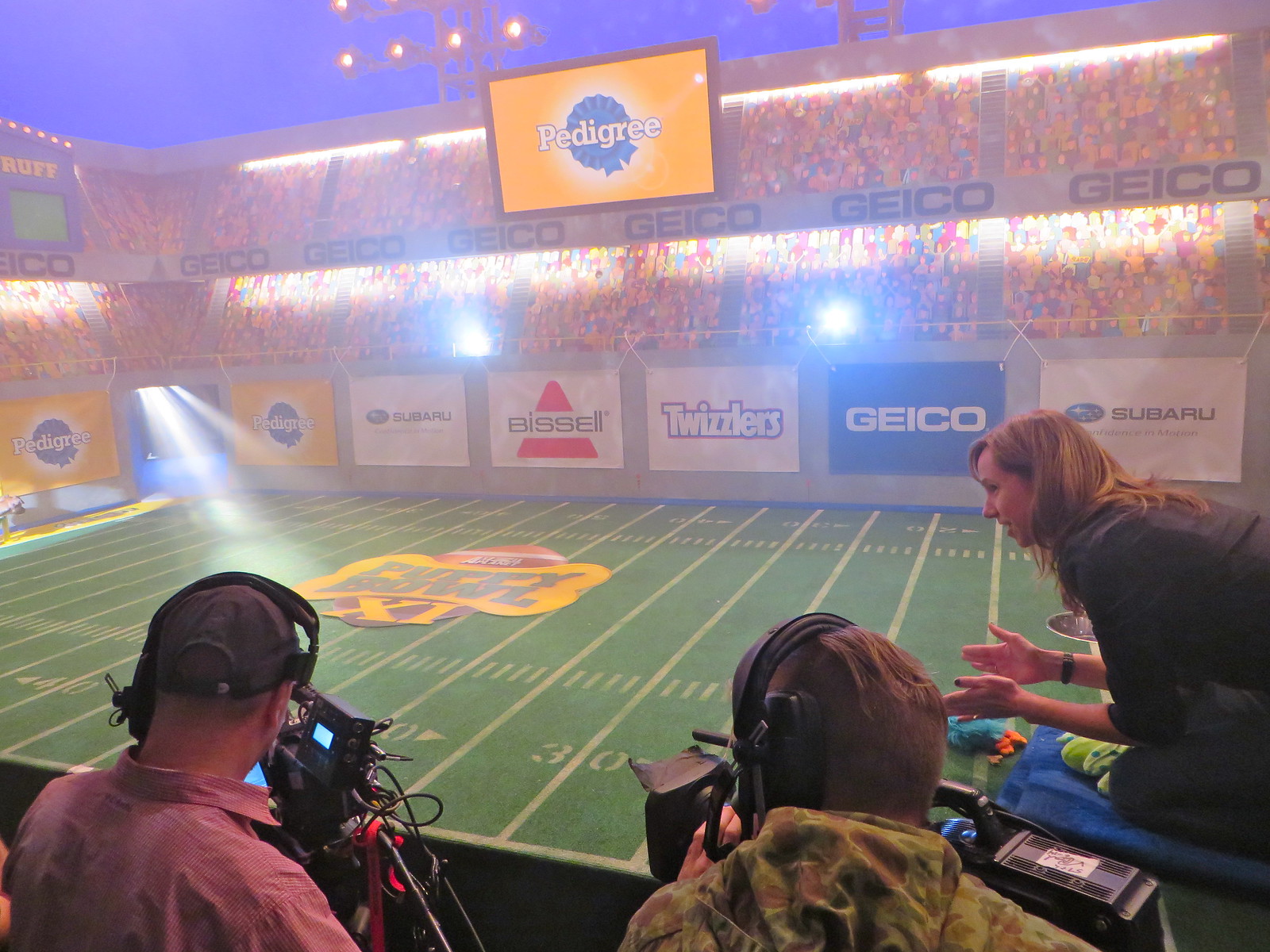
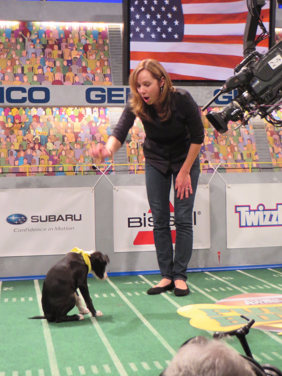
1. The puppy introductions. Each puppy is supposed to come out of a smoke-filled tunnel (just like NFL players do) and trot out onto the field. When the show airs, the intros will be shown in slow motion. Unfortunately, puppies don’t always cooperate — they sit still when they’re supposed to trot, or they trot the wrong way, or whatever. So there was a trainer named Victoria Schade on the opposite side of the set who enticed the puppies with treats, toys, and encouraging chatter. Here’s a photo of Victoria beckoning to a puppy who’s about to emerge from the tunnel, followed by videos of two of the puppies’ entrances:
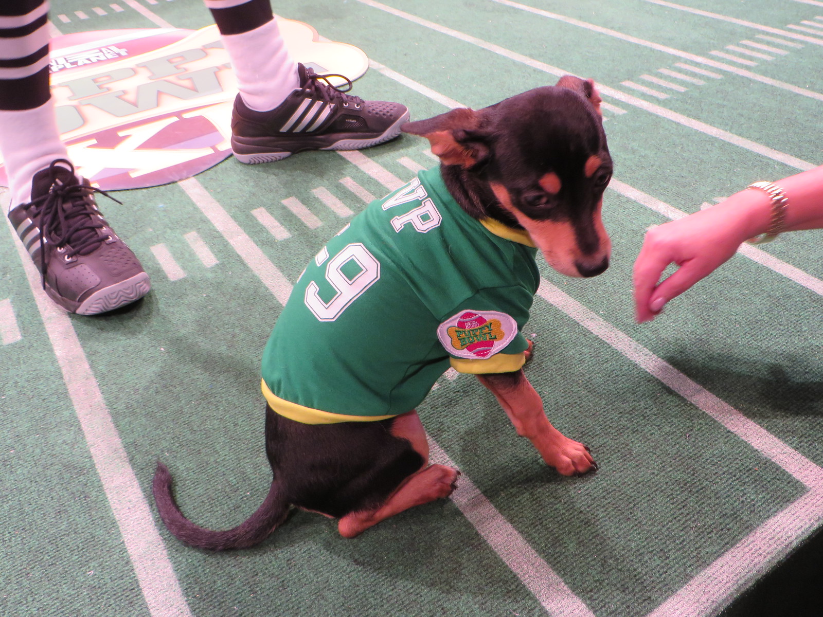
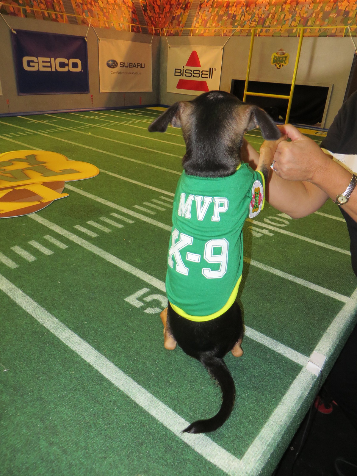
2. The MVP announcement. At the conclusion of the game, the ref — a really nice guy named Dan Schachner (who still wears old-school white knickers, not the black slacks currently seen throughout the football world) — announces the award for the Most Valuable Pup. They shot footage of him making the announcement with several different puppies, I think because they hadn’t yet decided which one was going to win. In these videos, you can hear the director asking Dan to give it a bit more gusto (sorry about the first video clip starting out sideways, but it corrects within a few seconds):
At the end of the second clip, you can hear the director saying, “Let’s switch the shirt, please.” That’s because they had to put the “MVP K-9” jersey onto another dog and do the whole routine over again:
3. The national anthem. There’s a bit at the beginning of the game where they play the national anthem and everyone looks up at an American flag image on the scoreboard:
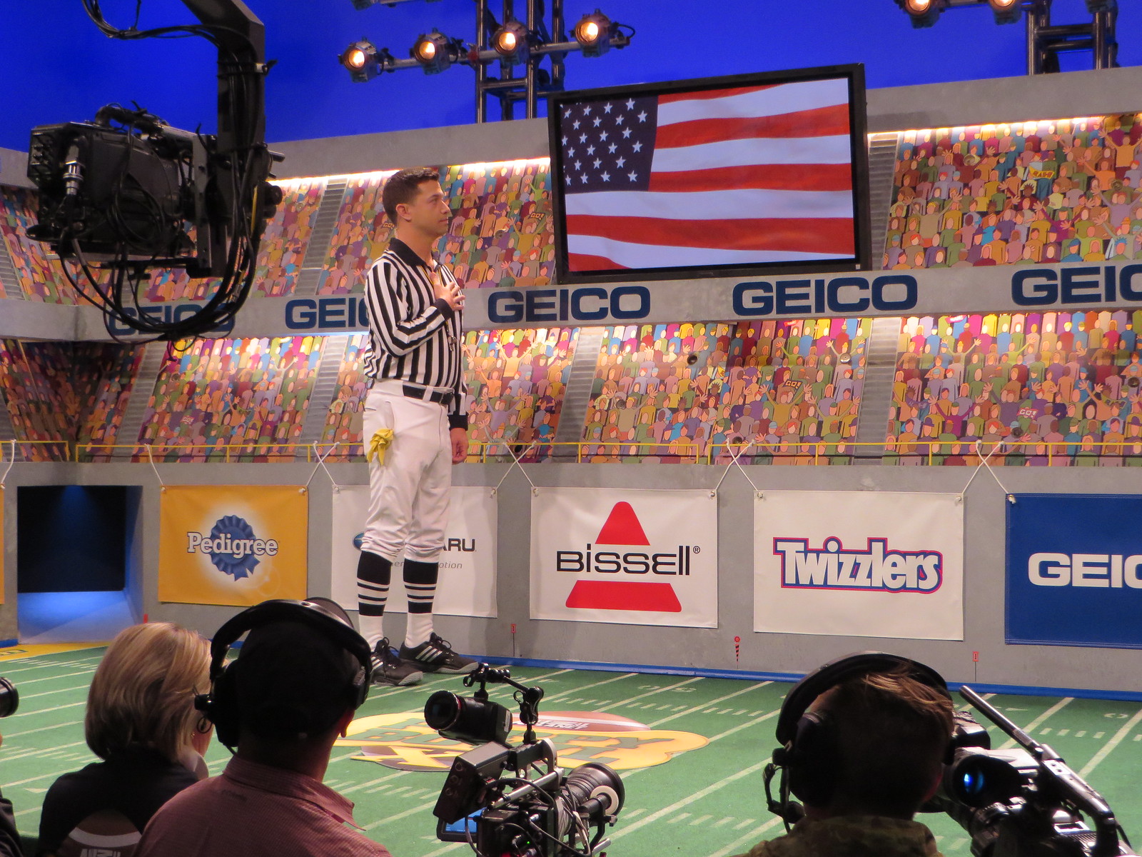
The director wanted to show lots of the puppies’ faces as they looked upward — presumably toward the flag, although you wouldn’t be able to see the flag, just the puppies’ upward-turned faces while the anthem was playing. The thing is, it’s harder than you’d think to get puppies to look up for several seconds at a time. So Victoria, the trainer, was brought onto the set to entice them to gaze skyward. She held some treats up high and made a bunch of supposedly puppy-pleasing (or at least puppy-attention-getting) sounds, but most of the pooches looked everywhere but up. Sorry about the vertical video format, but it was really the only way. They look great in full-screen mode:
As for the actual Puppy Bowl “game action,” I was only around for a little bit of that. It’s fun, but it’s a lot less exciting without the music and play-by-play narration that they overdub later on. Here’s a small sample (you can hear the director noting that they have “a sleeper in the end zone,” which means someone has to go rouse a sleepy puppy):
I also got to see some of the kitten halftime show (which I’ve written about in previous years) and saw the crew try to deal with some remarkably uncooperative hamsters, but that can wait for another day. Anyway, enjoy the Puppy Bowl on Sunday — and the Super Bowl too, although that’s clearly of lesser importance.
Uni Watch on the radio: I discussed the Warriors’ and Rockets’ Chinese New Year uniforms on yesterday’s installment of the public radio program The World. Here’s the audio:
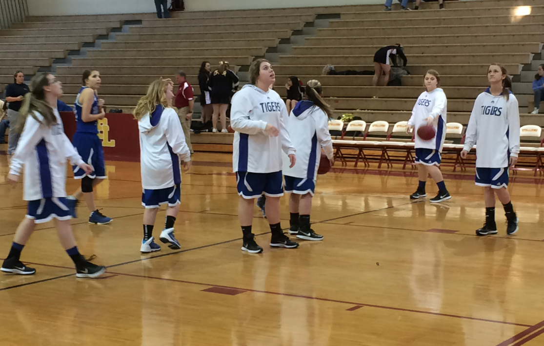
Too good for the Ticker: Dustin Semore was doing radio last night for some high school basketball games in Alabama and was intrigued by the warm-up outfits worn by the Brilliant High School girls’ team. They wear hoodies (click to enlarge):
But that’s nothing compared to the Brilliant High School boys’ team. Check out their warm-ups (click to enlarge):
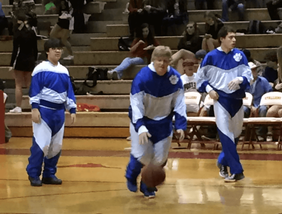
I’ve been told that Brilliant High is a tiny school with a very limited budget, so it’s entirely possible that they’re using old warm-ups from many years ago. But man — those boys’ designs are really something.

’Skins Watch: A new ad argues that changing the ’Skins name won’t harm Washington football (thanks, Phil). ”¦ Really interesting article about how indigenous people in the Pacific Northwest love the Seahawks. ”¦ Protesters at the Super Bowl will attempt to highlight connections between the ’Skins name and domestic violence (thanks, Phil).

Baseball News: Based on these illos from Chris Flinn’s son’s Sesame Street coloring book, Bert is a pajamist but Ernie Gets Itâ„¢ (and Elmo isn’t wearing a cup — or pants, for that matter). … Ichiro Suzuki, now with the Marlins, is going back to wearing FiNOB. He went NNOB with the Yankees, natch. ”¦ Good piece on those old “Say No to Drugs” wristbands. Let’s skip all the obvious Strawberry and Raines jokes, thanks (from John Pritchard). ”¦ Some sort of G.I. Joe nonsense apparently in the works for the Royals. ”¦ New softball uniforms for Mississippi and LIU Post. ”¦ Looks like these horizontally oriented bobbleheads are all the rage now. ”¦ Lots of cool old unis shown in this article about Cal State Fullerton’s baseball program (from Josh Claywell).

NFL News: Here’s a video clip on the official Super Bowl artist. … Here’s a roundup of NFL trademark issues (from Jay Sullivan). … Jerry Kulig was watching some highlights from Super Bowl V and noticed that at one point the scoreboard had “Boys” and at another point had “Cowboys.” … Pretty bad fake Cowboys and Eagles uniforms in this AT&T commercial (from Tim Dunn). ”¦ The Super Bowl field will apparently look like this. Boy does that blank spot in the Pats’ end zone look bad. ”¦ One iron-clad rule of Super Bowl week: There’s always a big bust of counterfeit gear (from Chris Bisbee). ”¦ Check out Bob Hope in his “Hope-mobile” during the halftime show from Super Bowl XXII (great find by Mako Mameli). ”¦ Here’s a video report on the evolution of NFL gloves (from Caleb Borchers).

College Football News: Here’s a rare sight: Florida going mono-orange back in the late 1980s. That’s Emmit Smith, incidentally (nice find by Tyler Cronin).

Hockey News: The NHL is expected to use uniform advertising in next year’s World Cup of Hockey. Whatever — as long as they keep it out of the NHL itself. #NoUniAds (from Jason Hoyt). ”¦ Arizona State has added a memorial helmet decal for an ASU student’s deceased cousin (from Kenn Tomasch). ”¦ Groundhog Day uniforms for the Hershey Bears (thanks, Phil). ”¦ Great story about a Reno Renegades player who was reunited with his game-worn jersey from 19 years ago. “Of course, this raises the question: Do I need to start contacting all of the players who wore all of my Rochester Red Wings game-worn jerseys?” says Paul Bielewicz. ”¦ I think we’ve noted this on previous occasions, but Sabres D Tyler Myers’s jersey was missing the NHL logo yesterday (from Mike McKinnon). ”¦ Adrian Acosta notes that the Rangers’ alternate uni, which features cream accents, used to be paired with cream-trimmed gloves, but these days they’re going with white-trimmed gloves that don’t match the cream in the jerseys. ”¦ “On Feb. 2, 1954, the Red Wings played a game on the grounds of the Marquette Branch Prison against the prisoners there,” says Will Scheibler. “Here’s a video about the game and an article with a good photo of the prison team. According to this article, the prisoners weren’t allow to use sticks to play hockey until the year the Red Wings came.”

NBA News: The Pacers’ 1990s throwbacks, originally slated to debut in last night’s game against the Knicks, will instead debut on Feb. 4 and will then be worn five additional times this season. The full schedule is here (thanks, Phil).

College Hoops News: New uniforms for UNCW. ”¦ Very nice new throwbacks for Kansas, but ugh, the first line of that press release: “A year ago, Adidas and Kansas men’s basketball stepped up their swag game”¦” Uh, right (thanks, Phil). ”¦ Michigan State wore script “State” jerseys last night (thanks, Phil). ”¦ “No picture, but I was watching the Eastern Kentucky/Murray State game and they were explaining why No. 10 for a EKU doesn’t have a name on the back of his jersey,” says Michael Kinney. “They made some joke about how he’s not on scholarship. Then they said the real reason was that his jersey got lost on the team’s recent trip to Miami. That’s completely understandable, but that game was played on Dec. 19. They couldn’t get him a new uniform in six weeks?”

Soccer News: New uniforms for El Tri (thanks, Phil). ”¦ This appears to be the new MLS number font (from Matt Lesser). ”¦ Former Wales player Robbie Savage once wore 72 jerseys at once (from Graham Clayton). ”¦ Mark Gonzalez of Chile went FiNOB in yesterday’s USA/Chile friendly (from Rex Henry).

Grab Bag: Small note buried on this page indicates that USC will be retiring the jerseys of former volleyball players Tom Duke and Bryan Ivie prior to tomorrow’s game against Cal State Northridge. … Really like the coastline-ish swoop and the sedimentary-ish layers of the snow on this car, which I passed on the street the other day. ”¦ In case you somehow weren’t aware of this already, neon/highlighter colors are the hot thing. ”¦ In a related item, here’s what the world’s been waiting for: neon golf balls and golf clubs (from John Okray and Phil, respectively). ”¦ I’m not sure why pro golfer Morgan Hoffman was wearing a giant foam Phx Suns hat at the Phoenix Open yesterday, but it sure looked weird (John Okray again).
Puppies!
I’m too lazy to go back and look to source the tweet, but the Sabres equipment manager ( @hockeyequipmgr ) has said that they remove Tyler Myer’s NHL logo from his collar because the pointy tips of it irritate his long neck.
Here’s the story behind Hoffmans hat..
[i]He received the hat one day earlier after a tough negotiation process.
“On Wednesday, I was on the range and I saw this group of hot chicks and I was like, ‘Where did you get these hats?’” he recalled. “They were like, ‘Oh, we’ll give you one of ours in exchange for balls and gloves.’ So I was like, sure.”
Hoffmann had one of his college roommates carry the hat around all day until he took it from him on 16 and wore it to hit a shot that came up short of the green.
“I thought it was really funny,” he said, “then I whiffed the shot.”
Don’t worry, though, golf fans. We haven’t seen the last of the orange foam cowboy hat.
“I’ll do it again Sunday. I’ll wear orange, too.” [/i]
Taken from: link
one of these days I want to go to the Phx Open and sit on the 16th tee box. That looks like a good time. I like the the golfers get into it.
It’s surprising to see the uniform choices of Bert and Ernie. I can’t imagine Type B Ernie spending much time fretting over his hosiery before the game. Bert, on the other hand, already has a noted fixation on his argyle socks and saddle shoes. I’m not sure who designed that coloring book, but it looks like they put the shoe on the wrong foot.
Well, Ernie’s wearing his ‘rups backwards, so clearly he doesn’t spend that much time fretting over his hosiery…
Bert is wearing a trucker’s hat.
Elmo has no mask. Nobody’s wearing a helmet.
Nice open stance for Ernie though!
And these new Nike neon golf balls are different from neon balls made 20 years ago how???
link
They have a Nike swoosh on them?
They’re not. What’s new is tying the golf neon into the larger Nike marketing campaign across sports. (For the record, neon yellow balls have terrible visibility on grass. White or pink, please. It seems absurd to me to see a professional teeing off with a yellow ball. It’s like imagining an MLB player coming to the plate with a Wiffle bat.)
There’s nothing new about the clubs, either. Last year, I bought off-brand clubs that are ripoffs of circa-2010 Taylormade RBZ irons, and like the originals my knockoffs have neon green highlights on the heads.
“It seems absurd to me to see a professional teeing off with a yellow ball.”
I remember the same thing being said about yellow tennis balls in the late ’60s.
Obviously this is just marketing.
Even if the colour of the ball(yellow, pink, orange, whatever) helps idiots like us find the ball, pros finding lost balls in tournaments isn’t really a big issue.
As much as I dislike Wie, I find it amusing she is just a Nike puppet and playing with neon balls and clubs like an amateur golfer.
This reVOLTing vapor crap is getting out of hand!
I don’t understand using a “Volt” ball on a golf course. I have a hard enough time finding a white ball, let alone a ball that somewhat blends in with the grass.
Do you play on a course near a nuclear power plant?
Manufacturers like to claim that neon yellow balls are “three times more visible at 250 yards” than white, to quote the first bit of packaging mumbo-jumbo I could google. But you see the same claim made for neon orange, or for the recently (briefly) trendy multi-colored balls. In the latter case, one of the golf magazines did a story pretty well debunking the claim. Multicolored balls are obviously terrible for visibility in grass. Like, everything we think we know about human vision would have to be wrong for that claim to be true. All I can say is that personally, yellow balls are for all practical purposes invisible on green grass from any distance, no matter how supposedly “bright” the neon is.
The only thing that beats white for me is neon pink. And I’ve never seen packaging on neon pink balls make any claims whatsoever about better visibility. The box of pink balls I have at hand just says “Brilliant pink for fashionable performance” on its bullet-point list of technical specs. (I’m surprised they didn’t make up a number: “250% more fashionable performance than standard balls.”) Which I regard as evidence that the claims made for yellow and orange are marketing BS. The manufacturers are just saying what they think the customer wants to hear to validate the decision to buy a particular box of balls. You can’t sell yellow balls to middle-aged men by just saying, “It just looks cool.” But if you make up some claim about technical performance with numbers, guys like me will eat that up. Whereas the men who run golf manufacturers seem to believe that women are happy just having their aesthetic preferences validated, so they don’t have to make up technical specs to justify ball-color choice.
What, no love for orange golf balls? According to this article on golf ball visibility, people have won tournaments using them! Very important tournaments. Don’t ask which ones.
…aaaand here’s the link.
Third time’s link?
Jerry Pate won The Players Championship in 1982 with an orange ball. Used to do a TV ad with people making jokes about the orange ball and then Pate picks it up at the end.
I do, actually.
I agree. In the spring & early summer, the grass is a lot lighter in color and you can lose a ball easier than you think
Did you ever try to find a white ball in the snow?
Neon colors do stick out, whether it’s in snow, leaves, or just rough. Don’t laugh, there’s a few ice golf tournaments around the area every year.
I don’t think I would agree to play ice golf unless I could use a dark green ball to completely reverse the usual ground/ball colors.
I’m always victorious when I use the black ball at Putt Putt.
El Tri’s black jerseys (these new ones or the previous incarnation) look stupid and bad. It’s befitting their team that they’ve decided to not even have a green jersey anymore and are just going with black.
And people complain about the USA away kits – you at least know it’s going to be red or blue (or both), and the home kit’s always white.
FWIW, back when Hugo Sanchez managed Mexico in 2007, he proposed dropping the green shirt because it blended with the grass too much.
Stupid go by adidas…
Adidas has been on a streak of stupid the past couple of years – Germany’s all-white and Spain’s all-red home and BFBS away kit (and not picking a light color for the World Cup), Japan’s neon away kit.
“Green is Worn in the Heart” sounds like half-assed self justification, not a rallying cry.
“… Adrian Acosta notes that the Rangers’ alternate uni, which features cream accents, used to be paired with cream-trimmed gloves, but these days they’re going with white-trimmed gloves that don’t match the cream in the jerseys.”
Rangers only did that cream glove thing the first & second season of heritage jerseys. They’ve been using reg gloves with Heritage for a few seasons now. I think someone pointed it out on UW before…
I can’t even remember seeing matching gloves or pants during the second season of their existence. I saw the full matching uniform for maybe 3 games or so.
Equipment managers are usually so meticulous, which makes me wonder why they just decided to let this slide.
I can confirm the MLS number set. DCU season ticket holders have been allowed to upload pictures to be included in the numbers at some point in the season. I would guess all teams will do this.
Looks like the Rangers heritage blue jerseys used to be paired with breezers (or at least shells worn over the regular ones) that had cream accents along the side.
Speaking of the pants, can’t help but notice how much variance between manufacturers in the two color piping on the pants. The piping itself all looks to be the same size, but the spacing between the two lines is all over the place.
About those horizontally-oriented bobbleheads. McFarlane figurines have had these non-traditional poses for some time. Just new to bobbleheads.
I see that Kansas has gotten pretty much the same fauxback that adidas did for Louisville. At least they got closer to the right logo (the 1980 Cardinals didn’t have a “dunking cardinal” on the shorts; the dunking cardinal came either for 1980/81 or maybe not until 1981/82).
LOVE the Cal State Fullerton shout-out. Go Titans.
“Pajamist” is the best word.
Our high school had warmups very similar to the Brilliant Boys high school team…We got them in 1992.
Michigan fab five had similar warmups in 1991-92 season. look up the youtube of the final game vs Duke, they show the intros.
Last night’s Daily Show took on Deflate-Gate and the NFL’s lopsided disciplinary philosophy:
link
Brilliant may be the best name for a high school ever.
My daddy always laughed that it was an oxymoron… Brilliant, Alabama
Man, no response to the Puppy Bowl content? Nobody cares? Dang.
“Puppies!” – Phil Hecken :-)
*ahem* first comment
I care! Quite a bit, actually. Maybe I missed this, but were you serving there in some kind of uniform capacity?
In addition to liking the content for its puppy-ness, I also love anything to do with behind-the-scenes of TV work. I work in TV myself (just a desk job, nothing glamorous), and things like this always fascinate me. I figured the reality of shooting Puppy Bowl would look absolutely nothing like the final product on TV.
Nothing uni-related about it (except the MVP’s jersey). Just interesting/fun/etc.
Cool. I love that you get to do things like that.
It’s good to see that the Puppy Bowl has gotten with the times and added neon trim to the MVP jersey.
Beg to differ, Paul. I was shocked, shocked, to see Bronte come out of the tunnel in the road brown on tan, with the green collar. Nobody had a heads-up on this ahead of time?
First Uni Watch column I shared on Facebook and with my work colleagues by email in maybe a year. So there’s that.
I shared it too – as a great behind the scenes view!
If only you could have snuck a 15th anniversary patch onto the MVP jersey.
Holding out for the kitten content… ;)
Love the puppy bowl content! Now if we can just get them to cover the puppy regular season . . .
I’m excited about the doberman puppy this year. I miss my two, love the breed
re: MLS number font
Guessing the diagonal line mimics the one in the new MLS shield?
Speaking of diagonal lines, looks like link.
I nearly posted the following early this morning. It’s been eating at me all day that I didn’t.
The name above the example of the new MLS font is a homonym for the best description of it.
I may be blind, but what blank spot in the Pats end zone are you referring to?
He wants the Patriots elvis logo to be next to the wordmark like the Seahawks logo is with theirs, instead of below/a part of the wordmark.
Never mind… to the left of the “P” there’s nothing, as compared to the Seahawks’ end zone.
My first red flag about the NFL under Roger Goodell was when they started insisting the league logo be either in the middle of the field or at each 25 yard line. It was at that point that I was like, “Wait a minute — OK, I get the logos on the uniforms, but on the FIELDS at the insistence of the league? For every game? Even fields like Oakland, where practicality should dictate that they use as little paint as possible so it comes off for the A’s? This is branding gone amok.”
It’s been downhill from there, both with the branding pieces and a lot of other parts of Goodell’s leadership. It started, for me, with a misunderstanding of field aesthetics, and it’s seems kind of fitting if the NFL continues said misunderstanding, in what was probably its most-controversial year in its history, with a big, blank, blue space in an end zone Sunday.
As much as I dislike Wie, I find it amusing that she is just a Nike puppet playing with neon balls like an amateur golfer.
But the reVOLTing vapor crap is getting out of hand.
Paul, I always enjoy it when you post links to your radio interviews. You have an excellent voice for audio content – deep baritone, clear enunciation, even pacing – and always provide interesting, thoughtful analysis. If you ever decide to do a podcast, I’d subscribe!
Quick noticed on the Brilliant boys warmups….. the kid on the far left. Either he has a DIFFERENT top, or it’s on backwards. No pawprint, no v-neck, the colors are inverted. I wish I had a shot of the back of a shirt to tell but I’m 99.9% sure the kid has his warmup on backwards.
I think it is just different.
I was hoping on some inside information on who actually won the Puppy Bowl and where the smart betting money would be on the game. Oh well…
Neon green = gree-on
One of those 24-hour-only t-shirt places has a clever Penguins mash-up:
link
About the Reno Renegades goalie story, I owned tony Larissa’ s jersey from 1973 when he was a cub for about 30 years. I decided it was time to get it to him somehow. Being naive, I sold it at a baseball card show, hoping the new owner, from St. Louis, could get it to him. Of course, I was wrong. The guy had it signed and put it up on e-bay. You could probably see it up there now. I can prove I owned it, I have a picture of me wearing it, I made a little money on it, but, I should have put a better effort into finding Mr. Larissa Russa, which is what I really wanted.
LaRussa, not Larissa!!!