Update, 1:30pm: Didn’t realize I was gonna have a new ESPN column today (thought it was being held until tomorrow), but I do, about the latest wrinkles in the annual debate over which cap logos should appear on Baseball Hall of Famers’ plaques. Check it out here.
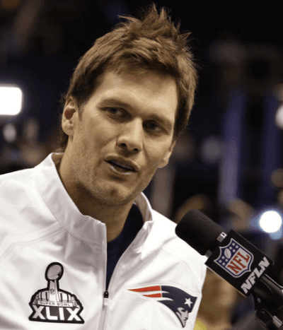
Now then: Yesterday was Super Bowl Media Day (aka the annual Big Fuss Over Nothing). Here’s a look at some of the event’s uni-centric aspects:
• Most players wore those Media Day uniform jackets. But some players, like Pats running back LeGarrette Blount, were in full uniform. Anyone know why?
• Bill Bellichick wore mandals.
• Pats cornerback Brandon Browner wore Nike Hypervenom soccer cleats.
• For reasons that aren’t clear to me, a lot of the players arrived wearing knapsacks. Was this a sponsorship thing (the official knapsack of the NFL, or whatever)?
• Many Pats players wore Flying Elvis caps. But cornerback Darrelle Revis wore this black cap, which looks really odd to me. Like, what Pats wordmark is that?
• Speaking of caps: If you’re wondering about that cap Marshawn Lynch was wearing, look here.
• NBC Sports correspondent Karim Mendiburu Contreras was wearing — uh, you tell me. Bizarre.
• Not sure what the full story is here, but one dude found a new way to wear neon green.
• The event was sponsored by Gatorade, which presumably explains why each player’s chair was accessorized with a Gatorade towel. As you know, sitting and answering questions is really strenuous, so you have to towel off quite a bit. Douchebags.
• Speaking of corporate nonsense, Richard Sherman’s headphones were confiscated.
• Finally, here’s an interesting tidbit: Media members (or at least some of them) were given earpieces that let them choose which players they wanted to hear.
(My thanks to Jason Eich and Phil for their contributions to this section.)
Sneaker Report
By Owen Dillon
[Editor’s Note: As longtime readers are aware, I’m not a sneakerhead. But today we’re going to try something new ”” a sneaker-centric guest column by Owen Dillon. If it’s well-received, it may become a semi-regular feature here on the site. Feedback welcome. ”” PL]
Martin Luther King, Jr. Day is obviously an important holiday from a historical and cultural standpoint, but it’s also become a big day in world of sneaker culture, where it presents an opportunity see the new sneakers being debuted by NBA players. When combined with Black History Month, it makes this an important time of year for new sneaker designs.
This year Nike decided to go with a black and white patterned look, which was present throughout all of its models, including the most recent Jordan silhouette, the Jordan 29. LeBron James also got his LeBron 12 in a Black History Month/MLK Day edition featuring multiple patterns throughout the upper and lower, with a grey sole.
Kobe Bryant is now out for the year, but before that he was given an MLK Day edition of his very popular Kobe 9. This particular shoe comes in the high-top version of the Kobe 9, and is primarily black on the outside, white on the inside, providing a very nice contrast.
Then there’s Kevin Durant. The Durant 7s also received the Black History Month treatment, but I don’t much care for the two-panel multicolored concoction. Personally, this was my least favorite BHM shoe from any brand.
Kyrie Irving also has a signature shoe from Nike, and the Kyrie 1 also got a Black History Month makeover. This is one of the most entertaining shoes from Nike in the BHM line, and is my personal favorite.
Adidas also join in on the Black History Month theme. The John Wall 1 was shown in a variety of browns with a gold lower; Damian Lillard’s first shoe got an MLK treatment; and the Derrick Rose 5 also debuted a new edition for MLK Day. Unlike the Nike models, all the Adidas models featured words and quotes from Kareem Abdul-Jabbar, obviously one of the inspirational athletes of recent memory.
Under Armour has only one signature athlete, and only one relevant non-signature shoe, but that didn’t stop them from taking part in the MLK celebration. The Stephen Curry 1 was featured in grey and black, much like the Nike models.
Finally, my favorite pair of kicks worn during the past few weeks was a special edition of the Nike LeBron 8 Soldier worn by Danny Green of the Spurs. The shoe paid tribute to the late Stuart Scott. In addition to being a very nice gesture, the shoes looked very good with the Spurs’ road jerseys.

Baseball News: New commish Rob Mandred’s signature has been added to the official MLB baseball. ”¦ The A’s are giving away a bobblehead with audio this season. ”¦ Here’s a visual timeline of all the Topps baseball card designs from 1951 through 2015 (from Jonathan Daniel). ”¦ Tequila sunrise jerseys on tap for the Fresno Grizzlies (from Jared Buccola).

NFL News: Odd scene from the 1993 Pro Bowl: Moose Johnston from the Cowboys wearing a Packers helmet. Johnston says it’s because his helmet was stolen the night before the game, so he had to wear Brett Favre’s lid. ”¦ The big neon “R” at the Rainier Brewery in Seattle is changing its colors to blue and green for the Super Bowl (from Markus Kamp). ”¦ EA Sports’ Super Bowl simulation shows Tom Brady with elasticized sleeve cuffs, which is something Brady doesn’t actually wear on the field (thanks, Phil). ”¦ The 1976 Bucs had Maulty Moore and Manfred Moore on the roster, so at least one of them wore FNOB. Look at the spread on that lettering — it practically extends onto the sleeves! “That’s from this site, which has some other cool stuff from the early days of Tampa pro sports,” says Cork Gaines. ”¦ On Thursday the U.S. Commerce Department’s National Institute of Standards (NIST) and Technology will participate in a news conference in Phoenix on health and safety in the NFL. NIST will join the NFL, GE, and Under Armour to announce an open competition to identify innovative materials for protective sports equipment. ”¦ Here’s the annual story on that company that makes the Super Bowl jersey patches (thanks, Phil). ”¦ Here’s a discussion thread on how Super Bowl field designs might have looked if the teams that lost the conference championship games had won. “The one for Super Bowl XIV, with the Oilers versus the Bucs, would cause seizures,” says Eric Dearden. ”¦ Dolphins CEO Tom Garfinkel says the team will be celebrating its 50th season in 2015, which presumably means a patch is in the works (from @JJHarkins). ”¦ Robert Morris University has totally ripped off the Eagles’ logo and wordmark. Yeah, they’ve made slight adjustments to both, but come on (from A.J. Frey). ”¦ A few days ago I showed you the Super Bowl uniform being worn by that statue in downtown Phoenix. That uniform was made by Patsy Elmer of Big Time Jerseys, who’s shown here posing with the statue. “All the tackle twill name and numbers are 25% larger than on a normal-size jersey,” she says. “The statue’s chest measures 65”, which is only 5” bigger than Shaquille O’Neal’s. When Shaq played with the Phoenix Suns, he wore a size 60 jersey, which to my knowledge is the largest size any Suns player has ever worn.”

College Football News: Here’s some 1980 footage of Bear Bryant talking about some very specific aspects of his hats (nice find by Chris LaHaye). ”¦ Here’s a one-minute video of Clemson’s football equipment staff going through all the gear players are issued during the season (from Scott Moody).

Hockey News: Good story about the NHL’s partnership with GoPro helmet-mounted cameras. ”¦ The Powerchair Hockey International Committee is launching a logo design competition. ”¦ The Penguins misspelled Sidney Crosby’s name on their own program. … The Blackhawks are auctioning off a seriously ugly jersey as part of a meet-and-greet with Marian Hossa. “Yikes,” says Ryan Lindemann. ”¦ Always kinda weird when a team uses an anniversary logo as its main jersey crest. That’s the 15th-anniversary uni for the Tri-City Storm (from Jason Johnson). ”¦ Stars C Jason Spezza changed from a jaw guard to a conventional visor at some point during last night’s game against the Habs. “The Canadiens’ announcers suggested that it was because he had trouble inserting his mouthpiece,” says Matt Larsen. ”¦ Here are Miami’s uniforms for the upcoming Hockey City Classic (from Jason Eckerle).

NBA News: The Pacers will wear 1990s throwbacks tomorrow night against the Knicks. ”¦ Charlie Panian recently picked up this 1972-73 Bucks media guide. Among other things, it lists the official team colors for each NBA club. The funny thing about this is that it has “red and white” for the Hawks, even though the accompanying photo shows Pete Maravich wearing the blue/green uni. You can see more of the interior pages here.

College Hoops News: North Carolina Wilmington’s new logo will be revealed prior to tonight’s game against Elon. ”¦ Akron did a purple-out for pancreatic cancer yesterday. The “Peters” NOB is for former assistant coach Dan Peters, who died of the disease about three months ago. ”¦ Pink-trimmed uniforms last night for Georgetown. ”¦ Some sort of bizarro sneaker on tap for Maryland (thanks, Phil). ”¦ Arkansas G Anton Beard normally wears No. 31, but someone puked on his jersey during last night’s game, so he had to switch to an old No. 15 jersey with outdated fonts (from Jason Yellin).

Soccer News: Here are the Women’s World Cup jerseys for Sweden (from Mira Muikku). ”¦ Here are some updates on MLS and international kits (from Trevor Williams). ”¦ Barcelona may end its sponsorship deal with Qatar Airways.

Grab Bag: Did you know there’s a band called Uniform? It’s true! Not really my bag music-wise, but ya have to like the name. Now let’s see a band called Stirrups. ”¦ There are lots of species of “white-crowned” birds — the white-crowned sparrow, the white-crowned pigeon, and so on. But the recent snow has left me with a white-crowned bird feeder. ”¦ Under Armour may design new uniforms for the Baltimore police department (from Adam Marcus). ”¦ The Super Rugby champions NSW Waratahs have extended their sponsorship agreement with CMC Markets. ”¦ Cycling news: Menswear designer Paul Smith has designed the leader’s jerseys for Dubai Tour (from Sean Clancy). ”¦ Here’s a fun slideshow of Syracuse-area high school wrestling singlets (from Tony DiRubbo). ”¦ Another company outfitting an Aussie Open tennis player in neon green: Uniqlo, which sponsors Kei Nishikori (thanks, Phil).
The wordmark on Revis’ cap looks like script from 1980s caps, like link, link, or, more recently, link.
Yup, the old Sports Specialities wordmark. Chuck D and NWA wore the Raiders model of this back in the late 80s/early 90s.
I thought the company was bought out by a bigger name but I can’t find anything to prove that. But I think a few years ago, that script came back on sideline caps Reebok made.
But it was very popular on the sidelines in the 80s, pre-Starter. It was also used on coaches sweaters.
^what he said. It’s just a throwback/fashion script from the 80s and 90s, nothing official.
I have both a fully red Patriots and a fully navy blue Chargers cap with the same script. It seems players and even coaches wrote similar ballcaps in the ’80s and perhaps even early ’90s. Until seeing Revis wearing the cap, I had no idea they were still a thing.
That font really has come back full force since snapbacks got popular again. It’s been on apparel for a few years now, especially with street brands.
The cap is by mitchell & ness. It’s a collaboration with Don C (designer/friend of Kanye West). You can tell by the stars where the eyelets should be and the pin. The brim is also likely red snakeskin.
I really liked those jackets/pullovers they had the players wearing. I especially liked Seattle’s version. Just a real nice and sharp, clean look.
link
Welcome Owen Dillon, here’s to hoping the sneaker report is a regular feature going forward!
Owen Dillon…nice job with the sneaker report!
Typo: new MLB commish’s name is Manfred.
I think those are just flip-flops.
(Zoris, if you will.)
Mandals, flops, w/e.
Still trolling NE with those…
Marshawn crotch photos have since been removed from sale(yesterday).
How many people does it take to make an actual “Band”?
2 seems too few to be called a “band”.
Lots of bands are duos. Still a band.
…and some are quartets:
link
The White Stripes and Black Keys would like a word with you.
When they make some decent music then we’ll talk.
Wasn’t soliciting opinions/taste in music… just naming two acts that consist of a duo but are billed as “a band”
Brooklyn’s own They Might be Giants… 2 guys… 1 name (john)… still a band.
Heck, Eels and the Magnetic Fields are really just one guy each, and they’re still bands.
The Magnetic Fields are very much a real band with steady, longstanding members. While the band is essentially a vehicle for Stephin Merritt’s work, it is still very much a working band in the traditional/conventional sense of the term.
I think you’ll find the answer in the picture here:
link
link
Backpacks are part of black youth culture and fashion. As a white guy from England I’m not the best placed source, but since the backpacks are worn by black players, I’d say it’s more to do with that than anything the NFL/Patriots have mandated. I’d be shocked if the NFL even knew about ‘backpackers’.
I remember during the last NBA lockout, link.
It used to be more specific than just black youth culture (underground hip hop is often referred to as link). And it used to be that only rap nerds/graffiti artists double-strapped, but now everyone double-straps.
…”but since the backpacks are worn by black players”…and white kickers.
link
White people have always been a huge part of the link.
Um…I see no backpacks in that picture, t.h.
more than likely it’s got their laptop/tablet/phone and stuff in there, snacks, etc. Just wearing a backpack to have stuff with them.
The other thing about backpacks is that media is really boring for most players. Many of them just sit in the stands during the entire time.
Here’s a discussion thread on how Super Bowl field designs might have looked if the teams that lost the conference championship games had won.
As a Raiders fan, I find that link very depressing.
Maybe the NFL should start playing those “Third Place” games. They’d be better than the Pro Bowl.
They used to have such a game:
link
In theory I’d like to second that. I didn’t watch the Pro Bowl this year, but I would have definitely watched a Broncos/Packers 3rd place game.
On the other hand, I’m guessing they stopped doing it because the teams involved didn’t really want to play that game. So it might not be any better in reality.
Vince Lombardi dubbed it the Losers Bowl
If I owned a team, I wouldn’t want to be involved in such a game, mainly for fear of player injury in a game with no particular meaning. So if the game were played, I’d expect it to be a Pro Bowl-like glorified scrimmage.
That said, if you could get the teams involved to take the game seriously, who wouldn’t prefer to watch the 3rd and 4th best football teams in the world play one more game, rather than watching two teams battle for the right to call themselves the world’s 33rd-best football team, which is what the college championship amounts to?
Completely different level of competition, Scott. Do you view the NCAA men’s basketball tournament winner as the “31st-best basketball team”…?
By that logic, we shouldn’t even bother with high school state championship playoffs. Surely, those are just bush league.
NCAA football is, in practical reality, the NFL’s minor league. Whatever team wins the NCAA football championship has exactly the level of bragging rights as the baseball team that wins the championship of a triple-A league.
Just because the NCAA is, in fact, a bush league, doesn’t mean it shouldn’t have a championship. The best youth teams in any sport in any city aren’t actually all that good, compared to the standard of play of their nearest collegiate or pro team, and yet there’s still value for the players, the leagues, and their fans in having a season-ending tournament. It’s part of the nature and function of any sports league and of any sports’s season to conclude with a championship tournament.
It’s just that it’s kind of insane to regard the NCAA football champion on any higher plane than, say, the Omaha Storm Chasers of the PCL or the Texas Stars of the AHL. Like them, Ohio State is the best team in a second-best league. The Buckeyes are clearly not the best, or second-best, or tenth-best, or even thirtieth-best football team in America. They are the best football team at their lower level of play. Which is great! But a third-place NFL game would, objectively, be a better game between better teams with better athletes than the first-place NCAA game. If, that is, you could get the two teams in an NFL consolation game to take the game seriously, which probably cannot be done.
As that Wiki article attests, it was a desultory affair all around. The NCAA used to play 3rd-place games too, but has long since ended the practice, for much the same reasons (hell, they used to play third-place games in each of the 4 regionals, even). I mean, could you imagine suffering a career-ending injury in a consolation game.
Major soccer tournaments and the Olympics are among the few bastions where the practice continues.
I’m usually one to stick with tradition, but the Olympics really need to get rid of bronze medals for sports where the competition is head-to-head and elimination-based. There’s just really no point to it.
Or maybe just give half a bronze to everyone eliminated in a semi-final round.
For several Olympic individual combat sports, including boxing, judo, taekwondo, and wrestling (both freestyle and Greco-Roman), both semifinal losers are given bronze medals without having to compete any further. I suppose the rationale behind that is to guard against injury. I don’t see why that logic couldn’t apply to other head-to-head competitions in the Olympics.
The positioning of the “Flying Elvis” logo on the Pats hats sucks, it needs to be moved to the wearer’s right quite a bit, the centering shouldn’t be on the entire logo but just the head and have the tail’s hang off.
The Redskins and Titans have similar issues. I feel the circle should be centered and the feathers/flames fall where they may.
There’s a simple explanation to the Atlanta Hawks’ colors in the Bucks Media Guide. The Hawks’ colors changed to Red & White for 1972-73. That’s the year they changed to the pinstriped-insert uniforms from Russell Athletic. The Bucks simply ran an old photo of Pistol Pete in his Rawlings-made Royal Blue & Lime Green uniform.
Chances are the Hawks’ new uniforms hadn’t even been unveiled yet, just the logo, by the time the guide went to print. Gold (yellow) isn’t included in the listed colors, since that uniform trim color was never incorporated into the logo.
You’re correct. The Gold was used as an outline color on the lettering on the game uniforms and cardigan-style warm-up jackets. The jacket logo was single-color.
Those uniforms were part of Russell’s “Team Specialist Dealer” network of exclusive offerings to certain dealers. We were one of the TSD program at Ruby’s and had access to pro-quality basketball, baseball, football and hockey jerseys from Russell. Russell’s Southeast-area distributor sold the Hawks their uniforms. They also handled the Falcons. Russell, through Watson made a prototype for the Braves before the Sand-Knit “feather” jerseys were selected. They also did playoff sweaters for the Atlanta Flames and made the game sweaters for the Birmingham Bulls.
I guess you can tell that I’m a big Russell fan but that’s understandable. I sold the line for over 25 years, toured their plants in Alexander City, AL and they pulled out some miracles for us. And that was back when “Made in the USA” meant it because it was true. Ah, for the Good Old Days.
“- Speaking of caps: If you’re wondering about that cap Marshawn Lynch was wearing, look here.”
Marshawn Lynch: “The cap does all the talking…”
That’s a darned good fit on that statue!!
The dude in the superhero costume is “Pick Boy”, a character who hosts blocks of shows and hosts things for Nickelodeon. I saw a lot of him on TV when my son was younger.
I was going to add this as well, but I got to thinking…:
At what point does he get to be ‘Pick Man’…?
And how does someone add this job title to their resume’?
I’m a little confused why the corporations are branded douchbags again and again.
Presumably the players like getting paid the obscene amounts of money they get from the league.
One of the ways the league collects revenue to pay the obscene salaries is to offer advertising on things like chairs and towels and headsets and line markers. It’s not like Gatorade or Buffalo Wild Wings or some other company forces themselves on the leagues.
I know it’s all trendy to bash corporations these days. But your blame is misplaced. It’s player/league greed douchbaggery. Not a single one of these things — not a single one — happens without league approval, and the league like the amount of money it takes in.
The companies are trying to raise brand awareness, like you are with the shirts, patches, stickers, ect. They’re just doing it on a larger scale.
The notion that all business practices are self-justifying is, as always, bullshit. Some business practices are reasonable; others are odious.
If Gatorade wants to sell towels (or t-shirts, or stickers, or whatever) on its own website, go for it. But when they put their towels in a forum that (a) does not require towels and (b) is supposedly about the Super Bowl, not about Gatorade, then yes, that’s odious.
Douchebags.
From an aesthetic standpoint, it’s douchebaggery on both sides… the corporations and the league. the leagues for selling the visibility and the companies for buying it.
I think Dave just wants you to hold the leagues to the same standards. They ultimately decide what logo creep they want to sell.
Exactly! The baggery begins and ends with with the league. It’s not like Gatorade ran out there throwing towels on chairs without permission — or paying for the privilege of doing so.
The NFL decided that it is willing to sell the commodity of viability, and valued the cash over the aesthetics or the focus on the game. The players decided they like the obscene salaries.
You’ve rightfully placed the scorn on the NBA for thinking about putting ads on the jerseys, rather than companies who are looking to purchase the ads. The same principle applies here with the NFL.
Paul – i believe the reason Blount (and others) were in full uniform was to film the NBC (I think they have the game?) spots needed during the game. Living here in New England, there are lots of photos from yesterday including Brady in full uniform against a white background for the TV production.
Got it. Thank you!
Great Job Owen. As a fellow sneakerhead, it is nice to see sneakers get some love in relation to uniforms. All Star Weekend will be another great time for a sneaker column, as all the players get a special edition of their signature shoe for the game.
EA Sports’ Madden games only have three types of sleeve options.
1. Loose long sleeve (Manning & Romo)
2. Basic elastic cuff (Like what Brady is wearing)
3. Tucked in sleeve (O-linemen, defensive backs, linebackers)
Players like Rivers and Brady with loose shorter sleeves usually get the elastic cuffs.
Love those Topps cards, especially the 1969 Johnny Bench. Wearing #55, obviously an old spring training shot, because the only number he wore officially was 5. Odd that they’d use that shot for 1969 cards, since he debuted in in the majors in 1967 and played a full season in 1968.
Also funny that the man who was famous for his revolutionary one-hand catching style is portrayed using perfect both-hands form.
Looks like the have completely abandoned the posed photo and go entirely with “Game Action!” shots on the cards now (at least by the examples shown).
Good. Always loved the action shots over the posed shots.
That 1956 Roberto Clemente is a work of art !
RE: Audio Bobblehead
The A’s aren’t the only ones getting in on the action. The St. Louis Cardinals are giving away a talking Harry Carrey bobblehead on Labor Day.
link
As someone who grew up in the eighties, it’s hard not to see Caray as anything but an icon of the Cubs. In fact, until looking his career up just now, if you were to have asked me what teams he worked for before the Cubs, the only one I would’ve been able to come up with was the White Sox.
And, naturally, the promotion is scheduled for when the Cubs are at Busch.
The next time MLB Network or ESPN Classic shows Bob Gibson’s record-setting game in the 68 World Series, listen to the guy announcing with Curt Gowdy. It’s Harry Caray, at the peak of his powers as the most exciting, colorful baseball announcer of all time. For those whose mental image of Harry are of his dotage with the Cubs, it’s an eye-opener.
Is there a limit to the file size when I send a tweak/concept to Uni-Watch?
As long as you can email it, we’ll take it.
Thank You.
As a wrestler myself, it’s been great to see wrestling in the ticker two days in a row! My dad is a wrestling coach, and when his school got new singlets last year, I designed them for him. Uni Watch is the main reason why I knew I had that interest.
So do we get to see the singlets you designed? Please share!
They’re pretty basic/retro, as we were trying to go with a throwback feel, but they have been very well received by the kids on the team. If you really want to see them, I’ll upload a picture. (Warning: Purple was involved. School colors are purple/white)
Paul seems to be disconnected with the snapback/backpack/hip-hop younger generation that is flooding the streets of urban America. Weird coming from a guy that lives in Brooklyn, the birthplace of this culture.
Brooklyn (which is just one of NYC’s five boroughs) is a big and varied place. It has about as many people as Dallas and San Diego combined. The simple fact of living here does not instantly put one’s finger on the pulse of everything that happens here.
And yes, I’m not at all plugged into hip-hop culture. I’m neither proud nor ashamed of this; it’s just a fact.
No offence Paul.
Have a good day from Canada!
Not to get nitpicky, but isn’t Bronx the birthplace of the culture?
(the origin of backpacking from what I understand, is that taggers carried their spray cans in their backpacks wherever they went, and Bronx was the epicenter of graffiti)
The thing that bugged me most about that Uniform band is the acrylic guitar.
The players were shooting their media pictures prior to media day. There were several shots of the Patriots in their gear before media day.
In the college hoops section about the Razorbacks, it says no. 15 is wearing the outdated font, but that’s the new font that was introduced earlier this year and it appears no. 24 is the one wearing the old uniform.
*earlier last year
NBC Contreras’ get-up was from a 1980s SNL/Am Franken skit, I think.
Johnston wasn’t the only one who had his helmet stolen in Honolulu.
The previous year, Michael Irvin was wearing a Falcons helmet in the Pro Bowl, after someone pilfered his own.
link
Irvin didn’t say whose helmet he borrowed, but I’m presuming that it belonged to Norm Johnson, since he was the only Atlanta player who wouldn’t have also been lining up on offense.
Didn’t realize I was gonna have a new ESPN column today (thought it was being held until tomorrow), but here it is, about the latest wrinkles in the annual debate over which cap logos should appear on Baseball Hall of Famers’ plaques:
link
Piazza: Why stop with the backwards helmet? Put him in a full mask on the plaque. It’d make his plaque like the Holy of Holies for every kid in youth ball who fancies himself a catcher.
Bagwell: I hope Biggio goes with either the star-H or the navy shooting-star cap logo, and Bagwell goes with the black-and-brick shooting-star cap logo. An underappreciated design that deserves to be in the Hall, if only once.
Vlad: Expos. Baseball’s last chance to add another Expos logo to Cooperstown, right?
Schilling: Just show the darn sock, no face on the plaque at all.
Mussina: Yankees. Without a doubt.
McGwire: If he were to get in, it’d have to be a Cards cap. For one thing, that’s when people really paid attention to him as a star athlete. For another, the A’s of his era are so tainted by the reputation as being “patient zero” for doping in baseball that an A’s cap would seem a step to far even if the guy gets voted into the Hall. Might as well include an actual syringe on the plaque as put McGwire or any of his Oakland contemporaries in an A’s cap.
Raines could (and should) still go in as an Expo.
True! But Raines won’t get in next year, which is another very crowded ballot. And the new 10-year cutoff applies to Raines, so assuming he’s not elected in 2016, then 2017 will be his last chance.
Not a uni-centric discussion, but is Raines truly worthy of the HOF?
Raines a HOF? Yes. Greatest lead-off man of all time, but for Rickey Henderson. The sliding-headfirst-to-avoid-breaking-the-coke-vial-in-his-pants story kills him in the balloting.
Raines should be a HOFer. I don’t think it’s the cocaine that kills his candidacy, but rather a perception that he hung on forever.
“Piazza: Why stop with the backwards helmet? Put him in a full mask on the plaque. It’d make his plaque like the Holy of Holies for every kid in youth ball who fancies himself a catcher.”
Because Piazza will eventually be inducted for what he did at the plate, not behind it. I love the idea of having a catcher wear his mask on his HOF plaque, but I’d like to see that treatment reserved for a catcher who was particularly well-known for his defense and handling of pitchers. Perhaps that honor should go to Ivan Rodriguez when his name comes up for induction, or maybe Yadier Molina someday.
As to Bigs/Bags – like someone mentioned recently, the blue/gold and black/brick might look pretty similar when rendered in bronze.
Vlad should definitely be in as an Expo.
Something about seeing that Raines is nearly out of HOF eligibility makes me feel really old. I remember watching him as an up-and-coming minor leaguer along with Tim Wallach and Jerry Manuel on the Denver Bears in ’80.
Mussina in a Yankees cap “without a doubt”? The only thing Mussina did in a Yankee uniform that he didn’t do, and do better, in an Oriole uniform was have the only 20-win season of his career. Not to mention that the signature performance of his career – the 1997 post-season – came as an Oriole. It’s one of the most-underappreciated post-season pitching performances in MLB history.
I was at Game 6 of the ALCS that year. Mussina was brilliant. It still boggles my mind that the Orioles lost that game.
It comes as little surprise that Tom Boswell summarized it nicely. Two wins over Randy Johnson and a Seattle lineup featuring Griffey/A-Rod/Edgar Martinez, followed up by two even better performances (albeit each a no-decision) against an Indians lineup featuring Manny/Thome/Justice/ Matt Williams. All at or darn near their primes.
link
re: Piazza
I remember similar debates for Carlton Fisk, who left both Boston and Chicago on acrimonious terms, so the suggestion was to go in with a backwards cap.
Great ESPN column today, Paul. The cap insignia on Hall of Fame plaque issue is a fun one to debate.
As I mentioned in a comment yesterday about Biggio’s cap selection, I suspect factors beyond simply the player’s best years come into play when the cap selection is made. That explains why Blyleven’s plaque features the “M” the Twins wore when they won the World Series in 1987 (arguably the high point in franchise history) rather than the interlocking “TC” he wore while playing in relative obscurity for a Twins team that routinely missed out on the playoffs.
It also serves as a justification for Ripken wearing the ornithologically correct oriole on his HOF cap rather than the cartoon bird. He may have won a World Series wearing the cartoon bird, but when he really became an icon was during the fanfare around his pursuit (and eventual surpassing of) Lou Gehrig’s consecutive games played record. He did that wearing the ornithologically correct bird on his cap.
I loved Paul’s ESPN column today as well as the discussion of it in this comment thread. I would like it even better if my all of my attempts to participate in it weren’t “awaiting moderation.”
I’ve found that a number of the automated comment sites put you in the “waiting moderation” queue for using the contraction for “He Will”.
And then this happened today:
link
Paul, don’t you dare stop writing here for at least a full year after Andrew Sullivan stops blogging! Losing both the Dish and Uni Watch at the same time would be just too much to bear.
I don’t think you linked to what you meant to, arr.
Shoot! Meant to link to this:
link
But if you are running a Linux server, do take heed of the thing I accidentally linked to instead …
slideshow of the Aussie Open hit and miss kits.
link
So no comment on Purple being the accent color for all the Media Day stands, and the apparent main color chosen for this Super Bowl?
Revis’ cap font (or something quite similar) also seems to be making appearances on Reebok caps. I almost took a picture of a gentleman sitting next to me in the car dealership a few minutes ago with a similar cap in all navy.
Read your column today on HOF cap. Only disagreed with the Piazza idea.
Don’t think there is much debate that Mike split his best years between the Dodgers and Mets. BUT he did have more hits, total bases, homers, runs batted in and did actually play more games for the Mets.
In addition Dodgertown did turn on Piazza and created a rift that still exists to this day.
Additionally I like the thought of his eventual plaque having a backwards catchers helmet- but Mike was NOT a gifted catcher. He was known more for his bat than his arm and glove. So I contend that a catcher’s helmet might be a stretch. How about just a regular batting helmet? In any event I believe he goes in as a Met.
Paul, not sure if you noticed (or care for that matter), but you may have a new pet troll. In the comments attached to your ESPN piece today, there’s someone named “Chazz Black Abdolf Hitcolnson” who typed repeatedly, “PAUL IS GAY”. His icon seems to be a mock-up of Abe Lincoln and Hitler, which probably says a lot about this moron. Just figured you’d get a kick out of another potential participant in the All-Troll Douchelympics.
Re the MLB Hall of Fame hat issue, why do they show any logos at all? I know it’s tradition, but why not have the hats blank (or with a HoF logo of some kind) and simply list all their teams in the bio? All would be avoided that way.
Make sense? Oh, what fun is there in making sense?
And when was the last time BBWAA did anything that made sense?
I don’t understand why they can’t handle the situation with a profil shot like Yogi Berra (link) or Charlie Gehringer (link). This was done for two players who essentially played their careers with one team, so hat selection wasn’t even an issue. This is a much better solution than a silly blank cap like Hunter or Maddux have.
Earlier it occurred to me this is the 35th anniversary of the NBA’s 3-point line. I was half-jokingly suggesting the NBA should have had a patch. Too late for them to do it now, but it’s not too late to for a Uni Watch design-a-patch contest, huh?
You got the wrong info about the arkansas jersey mix up. #24 micheal qualls is wearing the old jersey, #15 is wearing the new jersey. You can tell by the word mark and number font.
If i missed it yesterday, my bad, but it looks like Real Madrid’s stadium may be getting corporate sponsorship.
In the college hoops section about the Razorbacks, it says no. 15 is wearing the outdated font, but that’s the new font that was introduced last year and it appears no. 24 is the one wearing the old uniform. Not sure why you haven’t corrected this yet.
I like the new jackets also, very nice clean look, and you still get a uni feel with the numbers and SB logo, but I still like it better when they were in full uniform with the logo.
Also I love the new Fiberlok patches on the jerseys, def beats the old sewn on, and later ironed on patches. They def make the logos pop when you see them. Only wish you could purchase them for your own jerseys.
Pacers decided not to wear throwbacks vs. lowly Knicks.
link