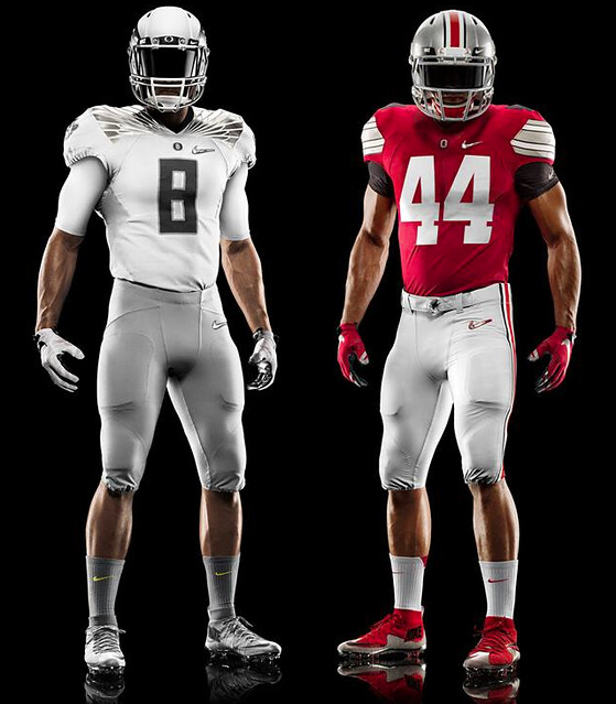
So it’s actually gonna look like a football game.
That was the surprise news yesterday, as word came down that Oregon would be wearing a fairly sedate, normal-looking uniform for next Monday night’s national championship game. (Ohio State will be wearing a conventional design as well, but there had never been any doubt about that.)
I’ll have more to say about these uniforms in an ESPN column later this week, but here are some initial thoughts:
• Everyone wants to know why Oregon, the higher seed, is wearing white. I tried to find out yesterday but couldn’t get an answer. Lots of people claim to have it all figured out — “It’s so Nike can sell more jerseys” or “It’s because they’re playing at the Cowboys’ home stadium, where the home team always wears white,” etc. — but all of those people are talking out of their asses. The fact of the matter is that no reason has yet been given, the end. (The funniest explanation I heard yesterday is that it’s because Nike used up all their green fabric when they finally got around to making the Eagles’ home jerseys.)
• Is it odd for Oregon not to be wearing either of their team colors? Yes. Is it also odd for them to be wearing a lot of grey, which is one of OSU’s colors? Also yes.
• Interestingly, the Oregon design is superficially similar to the one they wore four years ago when they lost the title game to Auburn.
• The OSU uni is basically the same one we saw a month ago, when we all said, “Why is Nike showing them in red? They’re the fourth seed, there’s no way for them to wear red in this tournament!” Shows what we knew.
• It’s a little hard to see, but the Oregon uni has “Fighting Ducks” on both pant legs. That’s really the only place where this design crosses over from uniform to costume. Aside from that, it’s a perfectly nice look (although not a very Oregon-y look).
• If you scroll back up to the top of the page, you’ll see that Nike didn’t use any embossed swooshes or other symbols in the knee or thigh pads. They’re really playing this one pretty straight. Good for them.
• I don’t usually get too excited about footwear, but those Ohio State shoes are really nice.
That’s all for now, except for this: Should be a good-looking game. More on ESPN in a day or two.
T-Shirt Club Is Open for Business: I mentioned several times over the past few weeks that I was working on a new project with the T-shirt site Teespring, and today I’m happy to announce that it’s up and running. Welcome to the Uni Watch T-Shirt Club, which will feature 12 limited-edition uni-themed shirt designs, one for each month of the year. I’ve always wanted to have a project that allowed me to say, “Collect ’em all!,” and now I do.
Each design will be based on a jersey that a team could have in its wardrobe, and we’re kicking things off in January with the design that should be the starting point for any uniform program — the home jersey (click to enlarge):
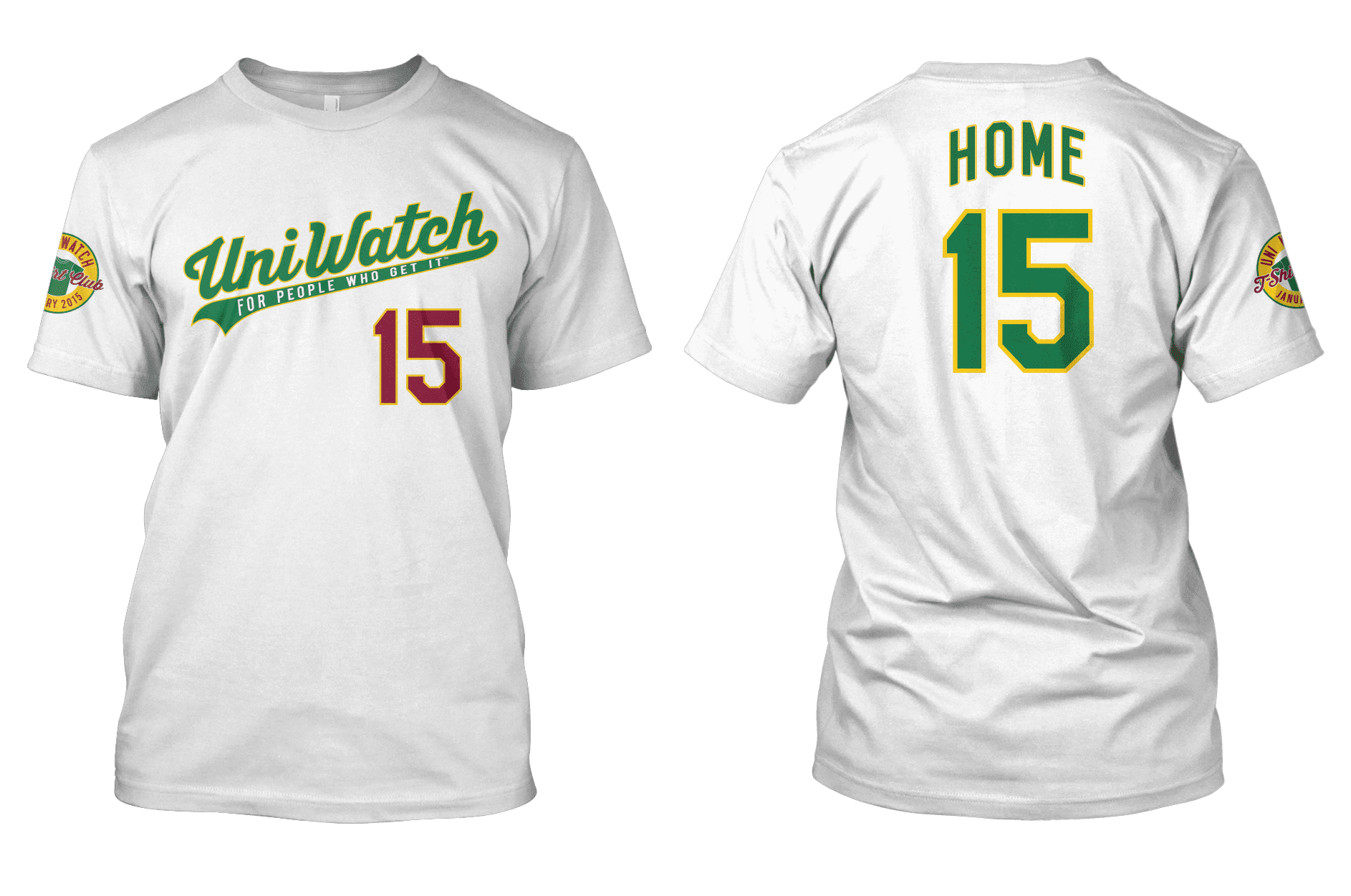
Here’s everything you need to know about purchasing the shirt and how the rest of the program will unfold:
1. You can purchase the shirt on this page. As you’ll see, you’ll have a choice of Hanes ($22) or American Apparel ($24). Their sizes are slightly different, so use the “View Sizing Chart” link to be sure you get the shirt that’s best for you. Domestic shipping is $3.85 for the first shirt, $1 for each additional shirt. Don’t worry about the “Help us reach our goal” notice — that’s a Teespring thing for groups that are doing fundraising, and it won’t affect us. (And no, you can’t customize the NOB or number. The NOB on each shirt will pertain to its design — like “Home” for the home design — and we’ll use 15 as our number for the entire year, because this is 2015.)
2. This shirt will only be available through the end of next Monday, Jan. 12. All shirts ordered by then should be delivered by Jan. 26.
3. There will be 11 more designs — one for each remaining month of the year. Three of those designs are shown here, but those three will not necessarily be the designs that we roll out for February, March, and April. In fact, they almost certainly won’t be. You’ll see the rest of the designs as they become available for sale. You can probably guess what some of them will be, although I think a few of them may surprise you. In each case, we’ll update the “sleeve patch” to reflect the appropriate month.
4. We got a late start with the January shirt. For the remaining 11 designs, each shirt will be made available on the third Tuesday of each month. So the February design will go on sale on Jan. 20 (yes, that’s two weeks from today); the March design will go on sale on Feb. 17; and so on. I’ll reveal each new design at some point during the week before it goes on sale.
5. Each shirt, including the January design that’s now available, will be available for purchase for only one week (that’s how Teespring works — each shirt is a limited edition), from the Tuesday when it goes on sale through the following Monday. Once a shirt’s one-week window closes, it will no longer be available for purchase.
6. Except for the January shirt, which as I mentioned will deliver to customers by Jan. 26, each month’s shirt should deliver within the first 10 days of that month.
7. People who purchase all 12 shirts (collect ’em all!) will be eligible for a bonus prize at the end of the year. I haven’t yet decided what this prize will be, although I have some ideas. It may depend somewhat on how many people stay on board for all 12 shirts, and we won’t have a sense of how many people that might be until the summer, so I’ll likely wait a while before settling on the prize. But I assure you it’ll be something good.
8. I have lots of additional design ideas. So if the response is strong, it’s definitely possible that this project could be extended into 2016.
I think that’s it. Again, the shirt can be purchased here. If you have any questions, give a holler. Thanks for listening.
Click to enlarge
Collector’s Corner
By Brinke Guthrie
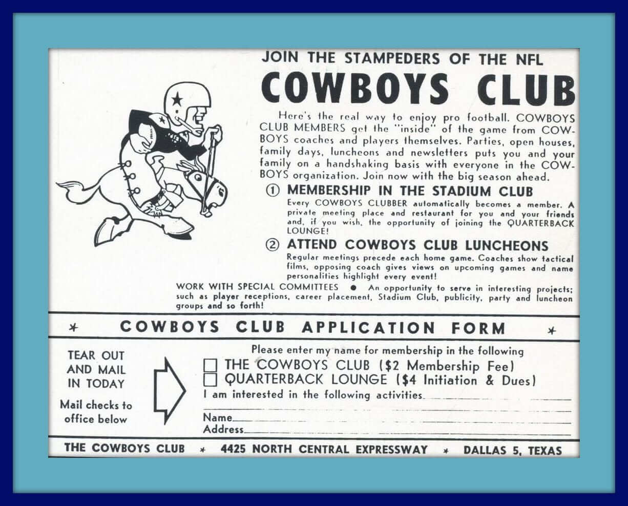
Well now, pardner, you wanna join up with the Cowboys Club? Just a $2 membership fee, or $4 if you want to be a part of the “Quarterback Lounge.” Heck, y’all get to be on a “handshake basis” with every member of the Cowboys organization, attend special luncheons, “and so forth.” How ’bout dem Cowboys!
Ya say yer not a Cowboys type of feller? Okay, then here some other stuff that should strike your fancy:
• Here’s a new one, at least to me: a “Pro Sports Magnetic Note Holder.” This one includes 17 NHL magnets.
• Nice cover artwork on this set of four hockey paperbacks. You get two novels and two non-fiction books — a well-rounded reading diet.
• Look at this 1960s San Francisco Warriors pennant. Think they’ll scrap the “Golden State” moniker and go back to “San Francisco” once the new arena opens in the fall of 2018? I’d say without a doubt.
• Here’s a 1970s Atlanta Braves sticker with a weird-looking facial design. “Braves baseball is more…” More what? [He looks kinda queasy, like he’s about to vomit, no? ”” PL]
• A lot of seven 1970s NFL helmet buggys! You get the Pats, Oilers, Jets, Bengals, Colts, Steelers, and Brownies. Yes, please.
• Remember the big ol’ brass-looking belt buckles from the 1970s? I had a “USA” one myself, but here’s one for the Mets.
• Look at this — a 1970s Denver Broncos helmet that lights up! Ready to hang in your room of choice.
• Now you can prepare dinner the 49ers way with this Niners recipe book. Includes player favorites like “Stouffer’s Frozen Lasagna: 1. Open package and remove cover from lasagna. 2. Prepare as per the directions on the back of the package.”
• Staying with the Niners, check out this nice-looking early-1970s varsity jacket from the maker “Sir Jac.” Looks straight outta Sears to me!
• Here’s a retail display board with a set of 28 NFL helmet pencil sharpeners. Never seen the blue Chargers helmet with yellow facemask before. It would date from at least 1976 due to the Seahawks and Bucs, but that Cowboys helmet was available in the 1960s — no blue outline around the star, as also seen here on this playing card.
Uni Watch News Ticker
By Garrett McGrath

NFL News: “I just ran across this photo of Vince Lombardi as a player, showing off the Lombardi dive,” says Leo Strawn, Jr. “Not sure about when the photo was taken, so it could be from his playing days with the Fordham Rams, or the American Association’s Brooklyn Eagles. Very odd to see him as a player.” … Yesterday, Paul posted how the Cowboys’ blue Nikelace has reached epidemic proportions. Reader Don Schafer sent in a screenshot from Dec. 21 showing how the problem afflicts some jerseys but not others.

College Football News: It had been rumored for a few weeks and now it’s official: Adidas has outbid competitors to become the new outfitter at the University of Miami, ending the school’s pioneering partnership with Nike. ”¦ Amid all of the Oregon Ducks uniform hoopla, Larry Bodnovich sent in this photo from the 1941 university yearbook. [Hey, at least they wore school colors for that shot. ”” PL]

Hockey News: Elvis is in the Building Barn! The Mississippi RiverKings had “Elvis Night” complete with the King’s face on the front of their jerseys. The team is based in Southaven, Mississippi — a suburb of Memphis (from Dustin Semore).

Soccer News: Accrington Stanley, a fourth-tier team in English soccer, is selling tickets to a game that will never happen. Accrington would have played Manchester United in the third round of the FA Cup but they lost the replay of their second-round match, which was played after the draw was announced (from Yusuke Toyoda). … For their FA Cup tie against Arsenal, Hull City wore the kit they wore during their unsuccessful Europa League qualification campaign (plain amber backs instead of stripes, custom shirt numbers instead of the regular Premier League ones, and no Umbro branding on the sleeves). These shirts saw domestic action earlier this season as well, in the Tigers’ League Cup loss to West Brom (from Callum Johnston).

College Hoops News: UNC wore “Stu” patches last night in memory of ESPN broadcaster Stuart Scott, who was a UNC alum. ”¦ Temple debuted new white uniforms on Sunday (from Clifford Blake).

Grab Bag: An infographic of famous logo redesigns of 2014 (thanks, Brinke). … Also from Brinke: LG updated its logo without telling anyone. ”¦ Changing the University of North Dakota’s nickname is costing more than had been expected (thanks, Phil).
Should be a good-looking game.
You say good-looking, I say bland. Gray & red vs white & gray is just boring. At the very least, the Ducks should be wearing green pants.
Agree with you on that last point.
I’m an old alum of “UC Eugene,” as we called it in the early 80s. Generally, I have liked what Uncle Phil has done for my alma mater. However, I think Oregon’s uniforms for the Natty are as bad as the Rose Bowl uniforms were good. The game will look like Ohio State against Ohio State’s scout team.
I was there in the early 1990s, myself.
I agree that these uniforms are good-looking for a generic football team but terrible for the Ducks. Especially disappointing after the nice link. I really thought Oregon was going to start reclaiming its color scheme, but apparently they’re as embarrassed as ever of green and gold.
The saying goes that in the biggest games, you wear your best look. It’s pathetic that we now have to amend it to add that if you can’t wear your best uniform, you ought to at least wear your own colors.
I don’t think it can be called a “good-looking game” if one of the teams is not dressed in anything approaching school colors. A national championship game where a casual fan will have no idea who one of the teams is? That’s an athletic aesthetic failure of the first order. And a perfect example of everything that’s wrong with the Ducks-Nike industrial complex.
Completely agree. UO (abetted by PhilNike) has been trying so hard to “not look like Ducks” for the better part of a decade that it’s not gotten ridiculous. Can’t find a link, but apparently some Eugene folks felt they looked far too “duck-like” (and therefore docile in some way) in their old (link) togs when they got clocked by Penn State in the ’95 Rose Bowl.
And since when is (are?) “Fighting Ducks” their mascot? Does Nike get to adjust that to their aesthetic liking too? How about “Big and Nasty Buckeyes”?
“Fighting Ducks” doesn’t bother me, since it’s link to the pre-Nike era.
“Fighting [Mascot]s” is a common enough collegiate formulation that I don’t mind it in principle. But in practice, plain old ducks are generally majestic creatures. But when ducks get into any kind of fight, and the males do, they’re utterly ridiculous, risible little avian twerps. Nothing intimidating about the idea of a “fighting duck.” Whereas when a goose or better yet a swan sees red, even a human is well advised to steer clear of the flesh-shredding hell-beasts.
Speaking of “Fighting Ducks,” there is one important difference between this silver/white jersey vs. the one worn in the BCS title game a few years ago … there is a duck head on the sleeve and not a TV number.
In essence, this jersey is a virtual bleach job of the semifinal jersey.
First thing the Oregon uniform reminded me of was not Oregon football… but this:
link
It’s little more than a generic “Team Nike” uniform.
Also It looks a lot like the Raiders road unis.
I know it’s probably too late now, but the number on the T-Shirt Club shirts should correspond with the month in which the shirt is released, so you don’t have a whole drawer full of the same number shirts.
Fun idea. But really, who cares if you have “a whole drawer full of the same number shirts”? It’s not like you’re going to wear more than one of them at a time.
On this site, I’d be willing to guess more than a handful people.
He does almost have a point… not so much that it’s a big deal to have a bunch of shirts with the same number… but if we assume that the NOBs are actually names (“Home”, “Road”, and “Alternate” are just as viable as “Who”, “What” and “I Don’t Know”), then each player probably would have a different number.
Doesn’t really matter to me though, I’ll probably only buy the BFBS shirt, if I get any of them.
“I’ll probably only buy the BFBS shirt…”
~~~
Just curious, THE, do you own any shirts that aren’t black tees (not counting anything you may need to wear for ‘work’)?
Speaking as a long-time beta-tester of casual apparel, I think money spent on my white t-shirts is better off thrown in the street. The fabric is too prone to spills and laundering mishaps. History shows color and grey shirts stand up better to the abuse of wear and care; the darker, the better.
Hey now, my wardrobe is only about 95% black. I have a few non-black shirts I wear… yellow Michigan Wolverines, gray anti-RIAA, a couple others. The Raiders replica jersey I own is white.
While we are being obsessive …I think the front number needs to be slightly tweaked. As it stands now it is just a smaller version of the back number, but no actual team does this. All front numbers in use are their own font with their own proportions.
There are 3 basic MLB block styles used that would jive with the current back number – link
That being said, I still really want the Alternate and BFBS shirts!
Nice representation with that Joe. Of those three, however, the only one I like better than what we’re getting is the Dodgers one — no outline, thicker, bolder. I’d be up for that in at least one of the next batch. Didn’t like the As or Os choices.
Yeah, I think the Dodgers treatment for the front number is a great idea!
With regards to use of school colors, each team will stand in contrast to their marching band. The Oregon band is clad (by Nike) in green and yellow, while save for a scarlet and gray plume, Ohio State’s band doesn’t reflect the school’s colors at all.
tOSU shoes look a lot like Nike’s Flyknit, which I wouldn’t think would exactly provide a lot of ankle support. I’ll be very surprised if these are the actual cleats they wear.
They are Flyknits, all four playoff teams had guys wearing them during the semifinal. Johnny Manziel was also wearing them towards the end of the season.
Did this come up yesterday on the titled O?
link
As noted in the update on that page, the whole thing was a based on a mistaken Facebook posting. Big fuss over nothing. (And I should know, because I was heavily involved in the big fuss as it unfolded on Twitter.) Non-story. Let’s move on.
I LOVE the idea of the t-shirt club, with one exception. Using “HOME” or “AWAY” etc. on the nameplate exclusively kinda cheapens it for me – makes it look like a sample product. It would be nice to have a personalization option.
Also, a question about the shirts: Will the letters/numbers be screen printed or iron on? Thanks.
Screened.
A sample product would have “YOUR NAME” on the back.
There is a personalization option…I’m sure some of the DIYers on this site could help you out.
Can I order shirts a few months in a row and have you save them so I can get combined shipping?
No. Sorry.
Don’t worry, Paul. You’re not alone. My wife is in the online apparel business and gets a zillion dumb@$$ questions a day regarding personalization, color changes, sizes (though a size chart is repeatedly provided), shipping “discounts”, etc. too!
$220.00 for what amounts to 7 NFL helmet hot wheels? That guy is one heck of an optimist.
Paul, how about a design the t-shirt contest ala 1981 White Sox uniform design contest for one of the months?
I don’t suppose you will buy any inventory of the shirts for a later sale will you? I will buy 2 or maybe 3, but kinda want to wait to see what all the designs will be, but I get the production, impulse buy and capitalism issues.
The Temple uniforms have a tile pattern of “T” logos. I hope they vetted it for unintentional swastikas before putting it on the court;)
My big dilemma is that I do not know whether to go with the Hanes or the American Apparel. In terms of dimensions, the only real difference in XL is the sleeve length. Is the American Apparel a better fabric?
In my opinion, yes. American Apparel is softer, feels nicer.
Thanks Paul!
I’ve heard that American Apparel tends to run a bit small in any given size. Can anyone comment on how AA sizing compares with more generic t-shirt sizing? Like, at 6’0″ and a 34″ waist, I’m usually a size L in t-shirts, but XL is rarely insanely baggy. Should I stick with L or size up?
AA does run a bit trimmer.
The ordering page has sizing charts with detailed measurements for AA and Hanes.
I know, but the numbers are meaningless unless I go and measure a bunch of shirts in my closet, and that’s a lot of work, so I thought I’d be lazy – er, I mean, modern and crowd-source the question.
It’s actually worth measuring some shirts that fit you well and writing down the measurements for future reference. Do it once and you’ll (a) have a much better sense of how clothing fits you and (b) never have to do it again (well, unless you lose/gain a lot of weight).
I did it years ago for a bunch of tees, sweaters, flannel jerseys, jackets, etc. Extremely useful.
I’ve gotta ask, what is the script font that’s being used for the Uni Watch shirts?
Custom-drawn.
Yeah!
figured, was hoping someone finally found a good baseball style font.
So, Ohio State will look like Ohio State on a color TV while Oregon will look like Ohio State on a black and white TV? Great!
Side note, the color of Oregon’s pants is the color Ohio State’s pants should be.
Totally agree about Oregon’s pants being the color OSU’s should be. I’ve said for years OSU’s pants look more white on TV than grey. They are better now, however. Back when Tressell was coaching, they looked dingy white.
I’m guessing that Nike designed a home and away for both teams, and that they planned on Oregon wearing white if they won whether they played Bama or Ohio St.
“Think they’ll scrap the ‘Golden State’ moniker and go back to “San Francisco” once the new arena opens in the fall of 2018? I’d say without a doubt.”
vomitous
I really liked this idea when it was mentioned briefly last month. I won’t be ‘collecting ’em all’, but hope to get one or two for a long west coast baseball trip in early summer–need a neutral shirt for games where I won’t be rooting for either team. I’m always in the minority in wishing for sizes other than men’s– they just don’t fit short women very well [to get a size wide enough in the hips, the shoulders are way too broad and sleeves come to the elbow]. But I can alter them somewhat, so I can live with it. I just hope a green one comes out before May–white always gets immediate mustard stains, and I just don’t like gray.
re: logo redesigns of 2014
Everyone is going flat and thin, which we saw Google and Apple do with their interface designs too.
I guess we’ll be looking back in 3, 4 years thinking how all the flat, skinny logos look dated.
Did anyone else notice that the “models” wearing the Oregon and Ohio St uniforms are actually a mirror image of the same person? Look at the veins on the arms, especially the “left” arm on the Oregon guy and “right” arm on the Ohio St guy.
Since neither of the uniforms are mirrored, I’m assuming they just photoshop in the uniforms on some model guy. Makes sense in this day and age, I just originally figured they actually put the real uniforms on a real person and took a photograph.
Not sure if this was covered while I was away from the Series of Tubes for a couple of weeks, but NBC has a logo for its soon-to-debut Curling Night in America:
link
A reasonably attractive logo, considering the diverse elements they felt the need to jam together, but it seems to me to understate the sport. The traditional iconography of most curling logos – clubs and bonspiels – is highly abstracted and muted here. Still, it’s better than I’d have expected.
You got my hopes up by saying NBC, but now I see it’s on NBCSN. C’mon, put it on the big network!
They should do a Ski Jumping Night in America as well.
“… Nice cover artwork on this set of four hockey paperbacks…”
Rink Rat is comprehensively wonderful.
The TShirt club is final. Stop asking about changes or improvements.
But future shirts aren’t final, so surely suggestions aren’t like a terrible crime. The proportions of the front-number outline seems an entirely valid, helpful critique to me, since it will be possible to make improvements on future shirts.
And speaking of suggestions and/or ideas for, say, 2016: I’d be all kinds of in on a UW/Geeky Jerseys crossover hockey sweater. May not be viable in terms of production numbers, but if it was, I’d go for it.
“The TShirt club is final.”
~~~
Who said anything is final?
It’s not over until we say it’s over!
“Who said anything is final?”
Wait a darn minute…. You can’t change your permanent record! Everyone knows that! What you speak is heresy!
Should the fourth bullet in the lede read “it’s a perfectly nice look”? That flows better off my tongue, but is quite possibly written as intended.
Fifth bullet point. But yes, thanks — now fixed.
I counted that a few different times to make sure I was pointing out the right one. D’oh!
I have that Broncos helmet light and it’s not “1970’s”. My mom bought it new in the late 80’s. And if it sells for $150, I might have to sell mine.
Dallas has a laundry problem. Most recently, their nikelaces are turning blue, but look at the sleeve stripes on the white tops. Many are cracked and faded, which is a problem they had even on the Reebok shirts. I know some teams send their laundry out, and I assume some teams wash in-house. I have a feeling that whomever does the Cowboy’s wash would blame the manufacturer (and Nike would certainly blame the person doing the wash).
That Lombardi photo comes from his days playing for Fordham. I think it’s 1936, the Seven Blocks of Granite.
It seems pretty likely to me that Oregon selected their championship game uniform design before the semifinal games, with the expectation that Alabama would be their opponent.
Most of Oregon’s (and other schools) uniform designs are planned well in advance of game week, no?
Paul,
Thanks for the Ex Hex rec on Monday. I gave it a listen last night. Very cool.
I was pleasantly surprised by how many people were either familiar with them or gave it a listen and liked it. Welcome aboard!
Paul,
I was mildly surprised that you didn’t comment on the lack of a belt on the Oregon pants – that bothers me more than the grey, which I kind of like (and anything to minimize the feathers on the shoulders is an improvement, in my opinion).
Shit. Now I can’t un-see the lack of a belt! Just the kind of trap Uni Watch always pulls me into!
I don’t think anyone has mentioned this in the comments the past couple days, but it seems likely to me. The playoff is in theory a bracket (without reseeding), so when Ohio State beat Alabama, they took the #1 spot in terms of the bracket. Now, they are treated as the higher seed, ESPN lists them second (read home), and they get to wear red.
Or Nike wants to sell more merch.
I think you’re got it right. While the BCS isn’t the NCAA, that’s exactly how the NCAA does it: whichever team emerges from the side of the bracket that the overall #1 seed started in is the “home” team all the way through. Even where the tournament’s appreciably larger than just 4 teams, and even where the overall #1 seed loses prior to the Final Four.
Just ordered my T Shirt. I am going to try and collect all 12. No matter the prize I think it will be cool to win something, plus I can’t wait to see the madness cooked up for Pink October and GI Joevember
I just hope that GI Joevember doesn’t use the MARPAT that EVERYONE uses. Be different and go with the Air Force or Navy pattern instead. No one uses those.
Better yet, go throwback. For example, link or link, the mother of all American military camouflage.
I hate it when a team as colorful as Oregon eliminates colors from a uniform.
I didn’t mind their 2011 MNC unis because they included that highlighter yellow (also they were still using “Carbon” numbers with that reflective design). But now choosing their 2 drabbest adopted colors and making a uniform out of them?
Perfect opportunity for a color v color matchup, but barring that they should have thrown some actual school colors in. Hopefully they’ll do what they did in 2011 and wear different pants in the actual game, and hopefully those pants will be the Apple Green or whatever they called the green they wore in the semis (no idea if they gave it a different name).
The team on the “Upper” level of the bracket is considered the “home” team.
Round 1:
Alabama and Oregon wear declared the home team because of this and wore the dark colors.
Brackets are made to assume that top seeds make it through, so the Alabama/Ohio State winner slot is the “Upper” level for the championship game. Since Ohio State won, they are in the upper slot and thus the “home” team (even though Oregon is the higher seed remaining).
I’m a ’97 Oregon grad, and have seen the rise of the uniforms and football quality in the last 20 years. I think honestly Oregon’s uniform changes have been crazy for enough years that it is maturing, while all the rest of the teams are in the early stages of copying and not quite there. This mono-silver/grayscale is very reminiscent of the 2010 Civil War vs. OSU, which was a very elegant look. I think this look is much more elegant than the 2010/1 National Champ game which had some really distracting neon. The Rose Bowl mono-apple-green was nice but felt too candy-like. I was hoping for Green-Yellow-Green for this game, but am not as bitter about the silver look as many are. All I care about is Win The Day
Great pic!
Thanks, Larry.
‘Accrington Stanley’… who are they?
link
Glad you saw it Michael