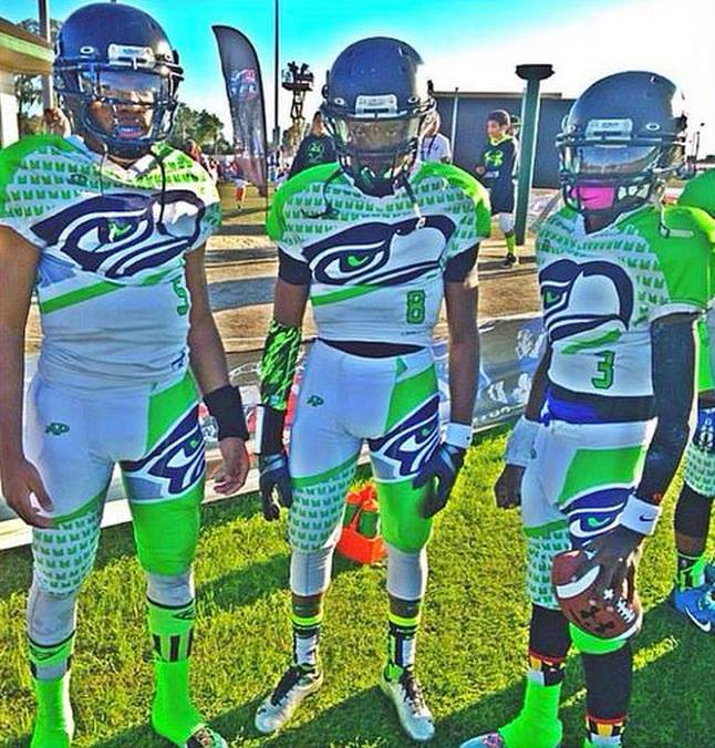
Remember back in 2012, when Atlantic High School in Florida wore those crazy football costumes, designed by Futuristic Woo? That was the first thing I thought of yesterday when this photo of the Maryland Seahawks — a youth league team — began circulating.
Yes, it’s absurd. But it’s also intriguing, because it goes against the longstanding rule that a football jersey has to have a big, prominent chest number. (Yes, I know that rule was briefly waived 20 years ago, but that was a one-time aberration.) Imagine if that rule weren’t in place — it would certainly open up a lot of interesting possibilities for football uniform design. Okay, so most of those possibilities would probably be explored in the most ridiculous, over-the-top ways, but it’s still an interesting thought.
Anyway: Wanna see these uniforms in action? Here you go:
And that’s just the white/road version. Here’s its home counterpart (click to enlarge):
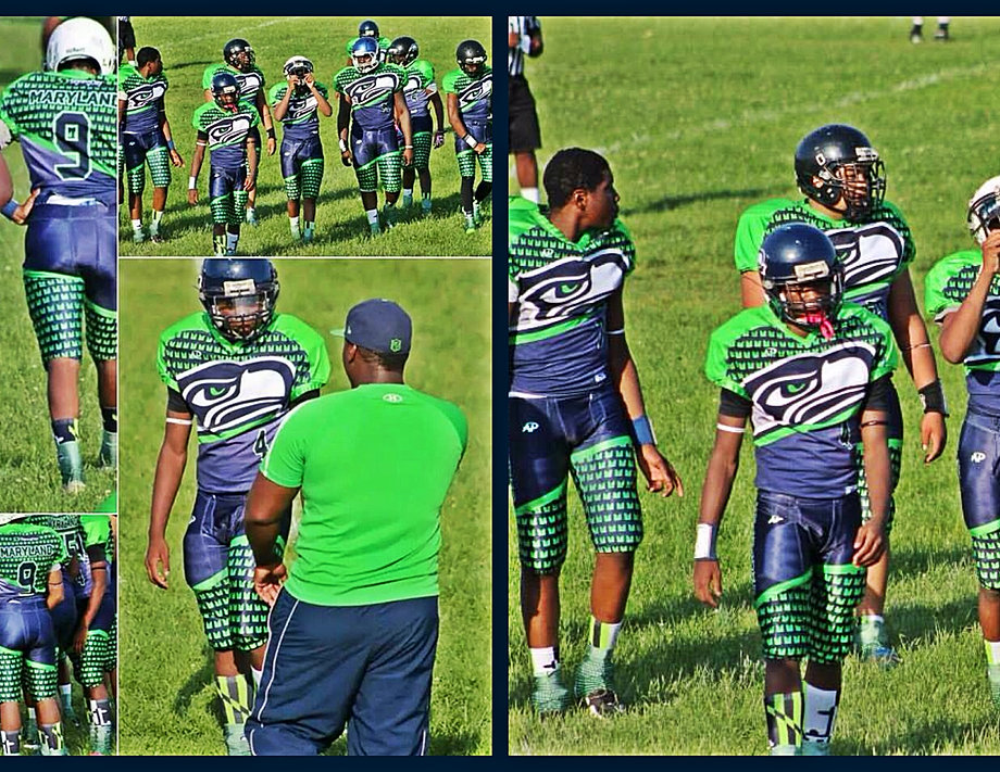
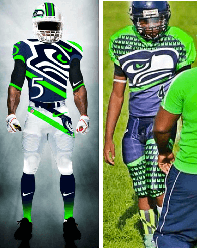
The uniforms were manufactured by All Pro, a Baltimore outfitter whose maker’s mark can be seen on the pants. (It’s also on the jerseys, but it’s harder to make out amidst all the confetti.) But who designed them? Phil immediately recognized them as being similar to a concept he had featured here on Uni Watch two years ago. That concept was by a guy named Dettrick Maddox, who calls himself Mr. Design Junkie. In 2012 he sent Phil a bunch of NFL concepts, including one that looks a lot like the Maryland youth team’s uni:
I sent a note to Mr. Design Junkie, asking if he had anything to do with the Maryland unis, but he didn’t respond. I’ll let you know if/when I hear anything.
Happy uni-versary: Reader Mark Coale informs me that yesterday was the 32nd anniversary of the night that the Flyers and Whalers faced off for the NHL’s first all-Cooperalls game. I did some quick Googling and was happy to discover that this landmark moment in uniform history has been preserved on video:
It looked weird then and it still looks weird now. Personally, though, I’m astonished that hockey has stuck with its short pants for so long. You’d think a more streamlined format would have come around by now, no?
Attention industrial designers: There are certain items that make a very satisfying “Click!” sound when you close them or put the lid back on them. To show what I mean, I shot a short, crappy video featuring three such items — my asthma inhaler, a green pen, and my orange juice container (and also Uni Watch girl mascot Caitlin, although the sound she makes is “Meow!,” not “Click!”):
In each case, there’s a little premolded ridge that offers just enough resistance as you push the lid or cover back on — and then the resistance gives way, yielding the “Click!” When the level of resistance is just right and the “Click!” resonates just so, I find the whole operation to be mildly addictive, and sometimes I’ll keep opening and closing the item obsessive-compulsively. This type of closure appears to be most prevalent with plastics, but I’ve also seen it used with metal.
For those of you who are industrial designers (or anyone else who knows about such things), I have a few questions:
1. What is this type of closure called? When was it invented?
2. Can the ridge — the part that provides the resistance — wear out? Like, if I opened and closed the lid on that juice container, like, a million times, would the ridge (and, with it, the “Click!”) eventually wear away and disappear?
3. What else can you tell me about this type of closure? I want to learn as much about it as I can.
If you can answer these questions, please get in touch. Thanks.

PermaRec update: The latest entry on Permanent Record focuses on a student who was listed as having an IQ of 77 and a “basic age” of seven, but who nonetheless got very solid grades. Get the full scoop here.

’Skins Watch: Arnprior District High School in Canada is scrapping its Native Peoples-inspired logo but will still call its teams the Redmen, at least for now. ”¦ After the Oklahoma City School Board voted to have a high school stop calling its teams the Redskins, students at that school rallied in favor of the name. Further info here (from Matt Larsen and Yusuke Toyoda). ”¦ A Native American group in Arizona wants the Cardinals to ban headdresses and redface when the Chiefs come to town (thanks, Phil).

Baseball News: The Pirates will unveil a new alternate jersey tomorrow afternoon, and Chris Creamer is hinting very strongly that it’ll be a G.I. Joe design, wheee! … The logo on the Cubs’ 1934 alternate jersey was apparently taken from the team’s letterhead (from Jason Mott). … Always fun to see the Twinsfest logo with the winter hats and the frozen river (from Mike Klug). … Yahoo’s Jeff Passan is a really good writer, so I was intrigued when I saw the headline and lede of this story, both of which imply that a camouflage Cubs cap was a key factor in Jon Lester’s decision to sign with the Cubbies. But if you actually read the story, there isn’t much, if anything, to substantiate that claim. Odd (from Roger Smidstra). … The Dodgers are facing criticism for posting a photo of 1B Adrian Gonzalez presenting a jersey to Mexican president Enrique Peña Nieto, who has become a controversial figure for many Mexican-Americans. ”¦ Two good historical finds from Tristan Ridgeway: (1) Was KC A’s pitcher Joe Grzenda wearing a fanny pack, or did he have his windbreaker stuffed into the back of his pants, or what? (2) What was the deal with the tape on Milt May’s helmet? ”¦ There’s a guy in Chicago who makes high-quality bats in his parents’ backyard shed (Brian Crago).

NFL News: Washington WR DeSean Jackson has gotten himself a pair of custom “I Can’t Breathe” cleats, although it’s not clear whether he’ll actually wear them on the field (from Tommy Turner). ”¦ 49ers defensive coordinator Vic Fangio’s old high school is competing for the Pennsylvania state title this weekend, so Fangio showed his support by wearing the school’s cap at a press conference (from Rob Seguin and Phil).

College and High School Football News: Here are the jersey patches for an assortment of bowl games, plus one helmet decal (thanks, Phil). … The U. of New Hampshire team is trying encourage proper tackling technique, and thereby limit concussions, by practicing without helmets. … Doug McConnell looked out his office window and spotted this truck cab painted like a Michigan helmet. … SG Helmets, a new helmet manufacturer that has received some attention this year, says the helmet rating system developed by Virginia Tech’s engineering department, which is widely used throughout the industry, is based on “junk science.”.

Hockey News: Really like the simple, hockey-style design of this vintage sweater. … Ugly Xmas sweater jerseys for the Reading Royals and Indy Fuel. … Here’s an article on the technology that makes it look like the ice is on fire, among other visual effects (thanks, Garrett). ”¦ “The Blackhawks store in Oakbrook (and maybe at the one downtown, although I’m not sure), they’re selling a smallish Ball jar containing chopped up pieces of equipment — sticks, helmets, shoelaces, shorts, gloves, bolts skate blades, helmet decals — all for the low, low price of $75,” says Jennifer Hayden. “They’re not claiming anything’s game-used. Not a penny goes to charity, either.” So it’s sort of like hockey gear potpourri. I’d love to see how they make these. Like, do they have a giant industrial shredder or what? On the plus side, whoever filled out that “Ingredients” tag has very nice handwriting.

NBA News: Since when do NBA players warm up in tank tops? That’s Russell Westbrook prior to last night’s Cavs/Thunder game. Maybe his “I Can’t Breathe” T-shirt didn’t arrive in time or something. ”¦ The Kings wore their black alternates at home last night. ”¦ A Memphis man has been charged with stealing 7,500 pairs of LeBron James sneakers.

College Hoops News: Here’s something I missed from last weekend: Two Oregon players did the “Hands Up” gesture during the national anthem on Sunday. Their coach was not amused. … Utah and BYU went color-on-color two nights ago. ”¦ More color-on-color, this time the Iowa and Iowa State women’s teams, last night (from Barry Brite). ”¦ We can add two UCF players — Brandon Goodwin and Daiquan Walker — to our list of waistband-rollers, but with a twist: They leave the tag hanging out in the back (from Brian Crago). … Some quick research reveals that one of those UCF players, Goodwin, was already rolling his waistband a year ago. Interesting to see that he’s also changed uni numbers since then.

Soccer News: One person who buys a Portland Timbers jersey will get to meet the team’s kit man and help him prepare the team’s jerseys for an upcoming game (from Jeremy Brahm). ”¦ Also from Jeremy: New home kit for Tokyo FC.

Grab Bag: The U.S. Navy has issued revised hairstyle regulations for women. ”¦ Here’s an opportunity for all you folks who tell me you’re looking to break into writing: There’s a job opening for a men’s underwear blogger. … What took them so long: The Swiss pro cycling team IAM has put riders’ first names under the sponsor’s name on the jerseys (from Sean Clancy). … Two U. of Kentucky athletes — basketball player Tony Delk and gymnast Jenny Hansen — will have their jerseys retired in February. … All 16 rugby teams competing in the upcoming NRL Auckland Nines unveiled their new uniforms yesterday. ”¦ Virginia Beach police are adding tourniquets to their uniforms. ”¦ A Duluth brewery has agreed to stop using a logo that was similar to a Vermont brewery’s logo. ”¦ Graham Clayton calls the 1975 Penrith Panthers rugby league uniform “one of the ugliest football uniforms from any code of football in any country of the world,” but I don’t think it’s so bad. Additional photos here.

I’m planning on going to PiratesFest tomorrow. I’ll send a live report on the unveiling.
Let me know if the American eagle cries, if the alt isn’t a camo
Is there a big military installation of some kind near Pittsburgh?
So far as I know, the Padres are the only ones who use that farcical justification.
The Nats certainly have enough local major military installations to use that excuse – Pentagon, Andrews AFB, Fort Belvoir, Quantico Marine Base – but they don’t have a camo alt.
For the Padres, I was a big fan of their original current unis with the khaki roads precisely because their uniforms functioned as tributes to Navy/Marine uniforms without the ugliness and cliche of camo.
Being about three miles from the Pentagon would also give the Nats plenty of cover. Glad they haven’t stooped so low.
Could the Milt May helmet just be taped to hold a crack together? If this was a photo session where a bunch of players used the same helmet, maybe they weren’t expecting to shoot the back. (And maybe Topps said they’d airbrush it to black if they used the photo.)
I was guessing crack as well.
I’m not sure Topps spent a lot of time “primping” the “journeyman” type players–especially in those days. I imagine it as Topps photographers walking around the field (after they had gotten all the “stars”) saying “hey Milt, howabout you in your crouch? *click* Thanks. Hey Bob, howabout you in your batting stance? *click* Thanks. Hey Larry…..”
That also has to be a balled-up windbreaker in Grzenda’s back pocket, fanny packs weren’t even around in the mid-60s.
Looks like you posted he meat slicer video again instead of your click video.
Nevermind, fixed for me now. Sorry.
Even in 1994, NFL teams had to put front numbers on jerseys that threw back to un-numbered jerseys so opponents could identify their assignments.
Yes, I know — that’s why I linked to a photo of just such a jersey.
But the number in that photo is small and off-center, just like the numbers on the youth league jerseys. Hence the connection.
BTW, I’m still unhappy that the “throwbacks” the Colts are wearing in that photo were the same as their regular uniforms.
As I read them, the NFL’s jersey rules require that the numerals be a minimum of 8″ high and 4″ wide, and must “sharp[ly] contrast” with the jersey color (p. 5 of the link below). No requirement that they be centered, and those numerals could well be 8″ x 4″ that’s not all that large.
link
Definitely non-conforming on the “sharp contrast” requirement, however.
Ah, so the link could actually be in full compliance with current regs. Thanks!
Yeah… that rule is why they had to make the circle so large. The original 1929 version was much smaller, but then you already knew that.
I knew that they had to make the numbers (and circle) larger than link, but I didn’t realize that it puts the jersey in full compliance for a regular uniform.
I presumed they were granted a waiver from full-size chest numbers, as they were given to skip the link.
To my knowledge, TV numbers are NOT a required part of the NFL jersey. Quoting the passage from the NFL Rule Book on jerseys:
“Numerals
(c) Numerals on the back and front of jerseys in accordance with Rule 5, Section 1, Article 2. Such
numerals must be a minimum of 8 inches high and 4 inches wide, and their color must be in sharp
contrast with the color of the jersey. Smaller numerals should be worn on the tops of the shoulders or
upper arms of the jersey. Small numerals on the back of the helmet or on the uniform pants are
optional.”
So, it says that teams should – not must – wear “smaller numbers” on the tops of the shoulders or the upper arms of the jersey.
Teams like the Bears, Steelers and Packers who wear throwbacks without the TV numbers aren’t getting waivers necessarily, they are just declining the option of wearing the TV’s.
At least that’s how I interpret the rules.
Outstanding. Thank you!
That article in the Latin Times about the Pena-Nieto jersey is just…awful. I’m not talking about the controversy; I’m talking about the writing. It reads like a middle school newspaper article. And there is no explaining whatsoever as to why Pena-Nieto is under fire, beyond “kids were kidnapped while he happened to be president”. And then some kinda-related drivel about American athletes being outspoken. It’s ruined my day, really.
And it says “some” Dodgers fans aren’t happy about it. I bet I can find “some” fans of almost any team that won’t like something involving political figures. As you said, really bad writing.
I’m with Paul: Those Penrith unis are actually pretty good.
Might Graham be an anti-brownite?
From their admission into the Sydney competition in 1967 until the mid-1980’s, the Panthers were always one of the “also-ran” teams, never making the play-offs. Their poor form plus the brown and white uniforms lead to them being given the unfortunate nickname of the “Chocolate Soldiers”. In my eyes, their on field performances impacted on my view of their uniform.
Interesting article on how Nike has “already won” the College Football Playoff. It picks apart the Nike press release that basically stated all teams would be wearing their normal uniforms, but I enjoyed this tidbit:
“The first thing you will notice is that there are 37 swooshes visible in that photo and just four team logos.”
link
That piece is by longtime Uni Watch reader/contributor Cork Gaines. He Gets Itâ„¢.
Those Maryland Seahawk uniforms remind of Major League Baseball’s turn ahead the clock jerseys of the 1990’s.
Those youth Seahawk uniforms are simply HORRIBLE. Let’s please hope that a costume like that does not filter to college or the NFL. The NFL’s Broncos costume is bad enough!!
Maryland Seahawks uniforms remind me of some of the outfits you might see in motocross. If it didn’t have the small front number it would fit right in.
Could that hint creamer is talking about simply be camp jerseys because it’s the day before Memorial Day?? Just a thought ..
Arnprior District High School in Canada is scrapping its Native Peoples-inspired logo but will still call its teams the Redmen, at least for now.
In spite of the linguistic neutrality of “(color)man” compound words, the mascot is fraught when put into practice. The only colors that are safe are ones that couldn’t conceivably be a skin color. It never seems to come up that the color might refer to the clothing.
“Redmen” could be safe, I guess, only if the school in question has no history of using Native imagery, symbols, etc. Even if they had, perhaps purging such imagery could, in time, remove the association (how many people recall the original logos of the NBA’s Warriors?).
I suspect that the school will eventually adopt an animal-based logo (Red Wolves, Red Hawks, or the like)
The case against St. Johns used a similar argument. Unfortunately, Syracuse dropped their “Orangemen” nomenclature despite a lack of discrimination against the orange man. Technically, orange is an earth tone, and hence a touchy subject.
The Orangemen, though, could very plausibly be taken as a reference to the link, which would be a great way to troll the Catholic institutions in the old Big East.
Redmen v. blackmen??
link
The IAM cycling jerseys use the players last names, not their first names. The photo with “Frank” on it is for Mathias Frank listed further down in the article.
As I’ve always understood it, the basic hockey uniform has always been short pants/long stockings because a hockey player spends so much time falling to the ice and getting back up. Long pants drag and stick to the ice, and with the hockey player having to wear so much protective padding on his lower body, the shorts/stockings combo gives the right combination of protection and mobility. I’m sure some design eggheads have likely fantasized about some sort of unitard/Robocop look, but I can’t imagine any team adopting something like it given hockey’s traditionalist mindset.
From what I have heard it was more a case of the material used in Cooperalls (by whatever name or brand) not dragging and sticking but having the opposite effect and have less friction on the ice – sliding too much so that when a player fell he might slide at a faster speed and more violently into the boards or net.
If the material was changed and the look was improved it’s possible long pants for hockey could come back sometime in the future – but I shouldn’t give Reebok any ideas.
The CFL, during the US expansion of the ’90s, went all-in on off-center jersey graphics. Witness the Birmingham Barracudas:
link
And here’s a link from that period.
The CFL recently went back to that look with their link. Not all the clubs, but the link, Blue Bombers, link (oh, excuse me: link) and link all do.
Of course, that could have something to do with the fact that the CFL sells its jerseys link. These shirts, with their bold chest graphics, look about the same with or without them.
Don’t know how I forgot the link to the link costume.
The CFL’s Memphis Mad Dogs also had that style:
link
Some World League/NFL Europe teams did as well. A quick googling shows the link, the link, link and link. Maybe others?
I recall Barcelona going with that style too.
Maybe the entire league went with that template for one season?
Wait. What? How does Kentucky “retire” a gymnast’s jersey? Don’t they wear leotards? Like, with no numbers or names on them? Nice gesture, but kind of hollow it seems to me.
Gymnasts don’t wear leotards.
Like wrestlers, they wear “the required uniform”.
Isn’t that right, Andrew?:
link
The last item in the “College and High School Football News” section of the Ticker simply duplicates the lede.
Oopsie. Fixed.
I’m not buying that the Pirates new alternate will be camo based on the promo schedule. I’m a huge fan and I know for a fact over the last few seasons they have given out kids replica camo jerseys.
See here for some evidence:
link
link
Yes, the big league club did wear the jerseys for a game or two but they weren’t “alternates” so to speak.
So again I wouldn’t take their promotional schedule with more than a grain of salt when it comes to forecasting what this new jersey will look like.
I know Chris C. well enough to know that he doesn’t drop hints lightly.
If he provides us with enough dots, it’s reasonable to connect them. He doesn’t do this kind of thing frivolously or speculatively.
Shit, maybe it was just wishful thinking by me then. I HATE camouflage with a burning passion.
I’d agree with your reasoning except for the fact that Creamer has in fact seen the alternate, but is embargoed from actually showing it. However, aside from the hint he dropped in his post, he tweeted this…
I know (not personally, but have interacted with him enough to know him) that he wouldn’t put something out there that wasn’t true (or that he knew to be true), and he immediately squashed the rumors that were circulating that the new alternate jersey would be gold (dammit).
Based on those two facts (that he’s seen it and that he tweeted the camo bit), I would bet money it’s going to be camo.
Plus, why not? Camo is the new black (and Bucs already have a black alt)…
Color me confused (in camo, I guess). He’s been embargoed only from “showing” it, but not from “revealing” what it’s going to be? Not a journalist here, but that sure seems back-assward.
He’s not actually revealing anything.
The linked article only reports that people are talking about camo but doesn’t say anything about the validity of such reports.
The tweet linking to that article is much more direct, but even that is just reporting the updated news that they’ll have a camo giveaway.
Creamer isn’t speaking about his own knowledge, only reporting what else is out there.
Again, not a journalist, but sure seems to me that tweeting “well, looks like it’ll be camo” while linking to an article you yourself have authored saying “I’ve known for quite some time based on inside info what the new uniform will look like” is tantamount to revealing.
I think he’s treating the camo-shirt giveaway as a leak from the club, confirming the reports independent of his own knowledge.
Unfortunately for him if that’s the case, Evan above points out that they’ve done camo giveaways in the past.
Again, not a journalist, but sure seems to me that tweeting “well, looks like it’ll be camo” while linking to an article you yourself have authored saying “I’ve known for quite some time based on inside info what the new uniform will look like” is tantamount to revealing.
Maybe — just maybe — Chris C. knows better than you do what he is and isn’t allowed to say, and the terms he agreed to.
Just maybe.
I’ve no doubt he does. But maybe – just maybe – I was commenting not on the terms of what Chris C. can or cannot say, but the notion being posited that in so doing he wasn’t “revealing” something.
Just maybe.
Long time reader, first time commenter.
The camo hat and shirt for Jon Lester isn’t the GI Joe type of camo that we’ve been seeing major league clubs decorate their uniforms with. Lester is a big hunter and was even rumored to be looking at purchasing hunting land near the Wisconsin / Illinois border a day or so before signing with the Cubs. I suspect the camo gifts that he received from the Cubs is more Mossy Oak hunter camo than Military camo.
Wow, Barry. Thanks.
That’s the missing piece. The article mentions and “Epstein and Hoyer, the Cubs’ president and general manager, knew Lester well enough to know how much he’d dig the camo gear.”
We have “Nothing can explain Jon Lester’s decision … quite as well as the cheap swag that greeted him in the mail a few weeks ago. It represented everything that mattered to him, which happened to be the same thing that has buoyed the Cubs through a tenuous rebuilding process: trust.” and “a ball cap and shirt weren’t going to sway Lester one way or another. They simply reminded him that Epstein and Hoyer know him, know what appeals to him, what makes him tick.” but the article never tells us what it is that makes him tick.
It reads like it’s some sort of fashion statement. If the camo hat is important because the Cubs’ executives know Lester well enough to appeal to his love of hunting, that’s a much more interesting story than the one we got.
Always fun to see the Twinsfest logo with the winter hats and the frozen river
And once again, this is why mascot logos rock.
RE: The Virginia Beach tourniquet addition. Perhaps police should have their badge numbers embroidered on their sleeves. They’d be a lot easier to read and a lot less dickish than asking the cop for his badge number …
Why is it “dickish” to ask a police officer for his shield number?
I think he meant that it was dickish to make people have to ask for a shield number.
Love those Maryland Seahawks uniforms. Maybe just needs a number on the front of the helmet like the Steelers. Really bold but I think the colours make it work. For me.
In the video, those Maryland Seahawks unis kind of work for me. (There’s been an explosion of the osprey population around the mid-Atlantic the last couple decades, so it’s an appropriate name.) The still photos, though, seem to have an HDR-simulating filter applied, which turns the garishness up to 11 and makes them look unspeakably ugly. Which, without all the photo manipulation, they’re actually not.
Just a general life lesson: Go easy on the photo filters on your phone. Don’t just apply the “HDR” or “Vivid” or “Clarity” filter to every darn picture you take.
So it’s sort of like hockey gear potpourri. I’d love to see how they make these. Like, do they have a giant industrial shredder or what?
Or that deli slicer from yesterday?
As was at the all Cooperall game, I may even have a stub or program buried in storage someplace.
“Personally, though, I’m astonished that hockey has stuck with its short pants for so long. You’d think a more streamlined format would have come around by now, no?”
I never wore them, but they just look hotter than the traditional short pants/socks. Apparently they never caught on because they were too slick when a player went down, making it more difficult to get up. Plus they looked like sweat pants out there, not a very professional look.
Could goalies wear them?
I did wear them, and they were comfortable enough. For those of you that don’t know the pants part of the protection was a tight fitting padded ‘girdle’ which allowed a lot of free movement. The shell or long pants would simply go over top of that and your shin pads. My team wore them for about a year and then I switched to the short shell with regular socks which in itself was handy as I had different colored ones for my club team and high school teams. I’ll have to try and dig out a picture…
But you are dead on that they were slick. You could easily slide from the blue-line to blue-line if you had enough speed going, if I recall one of my teammates ended up breaking his coccyx from sliding so hard into the end boards…
Why not make the logo more like FAU Football’s helmet logo (link), the bird formed in the center creating the Seahawk instead of just the face slanted?
Was KC A’s pitcher Joe Grzenda wearing a fanny pack, or did he have his windbreaker stuffed into the back of his pants, or what?
Could be “or what?”…based on the shadow, could it be a floppy equipment bag on the ground behind him?
Graham Clayton calls the
1975 Penrith Panthers rugby leagueMaryland Seahawks uniform “one of the ugliest football uniforms from any code of football in any country of the world[.]”Fixed it for you.
For that matter, the sentence also could be fixed simply by replacing “ugliest” with “most glorious”.
+1
The Sharks’ Stadium Series uniform is link.
Disappointingly, the color pattern does not wrap around to the back of the jersey, which is solid teal instead. The collar treatment is pretty ugly as well.
Reflecting upon it, I’m guessing the solid back was done to maximize the long-distance visibility of the numbers. But then, why even bother with the stripe design on the front, then? It just doesn’t look very good at all.
Interesting – they also unveiled link.
Appearing on the shoulder is a new mark that was created to pay tribute to the Sharks devoted fans in Northern California. The mark incorporates the state of California, with a star on San Jose, marking the exact home of the team. Placed at the bottom of the mark is the iconic dorsal shark fin, which has been borrowed from the SJ ligature the team currently uses.
Additionally, the SJ ligature, which appears on the pant, has been simplified to just the lettering making it more legible at distance.
I do like that, and I do like the use of larger numerals on the sleeves.
In fact, with the greater real estate between the shoulder yokes and the elbow panels since the Edge transition, a lot of teams could easily go from 4″ to 5″ on the sleeve numbers with only those of us who nitpick these things even noticing.
Wisconsin and Nebraska played a game in 2012 where both teams wore huge letters on the front with only a very small number on the upper left-hand corner:
link
Ah, yes — thanks for the reminder.
Regarding Oregon coach Dana Altman criticizing his players for their protest, I think link.
In short, link
Bills wearing mono-blue this Sunday:
link
The individual responsible for that Youth Football Team Seahawks uniform should be arrested for disturbing the peace. That is historically putrid!
Woo is coming through…
The outcome is critical
I can’t believe there isn’t a running discussion on clicking.
You have so stumbled on one of my OCD obsessions. I do the same thing, often clicking something multiple times until I get it just right.
Such an obsession. I hope you get some good answers and do an article on it sometime.
As mentioned earlier, it’s clear that “windbreaker in his pants” is a team bag on the ground behind him. A windbreaker in his pants would not make the obvious shadow on the ground under it. A little surprised Paul missed that, but probably a hundred pictures a day come in.
Disagree. If you look at the item (windbreaker or whatever it is), it’s in the same focus as his pants, which indicates that it’s attached to him. If it were on the ground behind him, it would slightly out of focus like the grass, and you certainly wouldn’t be able to make out details like the stitching.
The intricate design of the Maryland Seahawks jersey begs the question, why can’t anyone manufacture UCLA stripes that go full circle?
Was the Hartford Whalers’ ice painted light blue?