For all of today’s images, you can click to enlarge
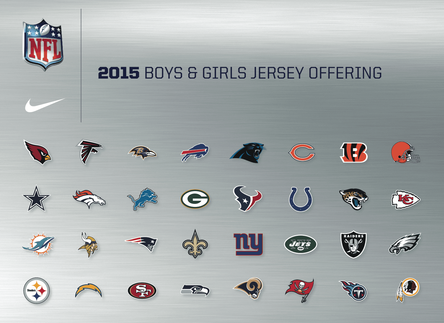
Heard yesterday from a trusted industry source, who shared the new Nike/NFL 2015 youth catalog with me (the cover of which is shown above). This isn’t as good as seeing the adult catalog, natch, but it nonetheless offers some interesting hints regarding what’s in store for next season.
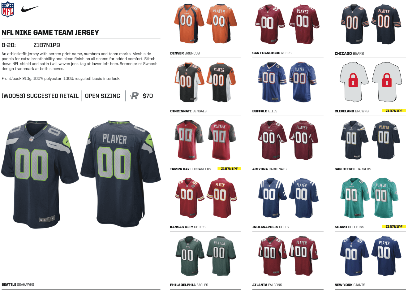
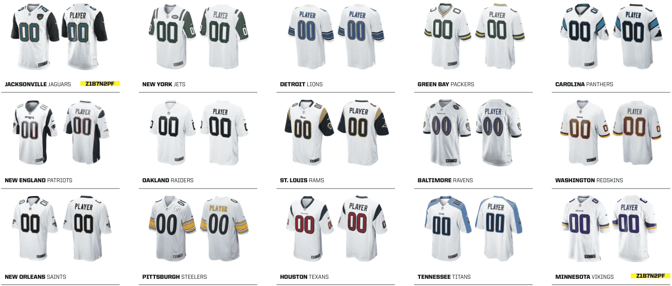
Let’s start with the colored jerseys:
.
.
The most obvious thing here is that there’ll be a new Browns jersey — something we already knew, of course. And no, there’s no way to unlock that image. Even my source doesn’t yet know what the locked designs will look like.
Also, the catalog shows the Eagles wearing midnight green. So if they’re really switching to kelly green, as has been rumored, it’s not happening in 2015, at least if this catalog is to be believed. (Note to Nike: You might wanna stock up on midnight green dye this time.)
The other thing worth noting here is that the Titans’ light-blue jersey is still shown. As was noted two days ago in the Ticker, Titans CEO Tommy Smith recently stated that we’ve probably seen the last of the light-blues, at least for this season, and ESPN’s Titans beat reporter, Paul Kuharsky, says this means they’ll be redesignating the navy jerseys and their primaries. I asked a team spokesperson about that and he confirmed for me yesterday that the team will wear white for the rest of this season’s games but said the team had no other uni-related news to announce at this time. So if they do plan to make navy their primary, then the catalog is wrong (or perhaps simply hasn’t been updated to reflect the team’s current thinking).
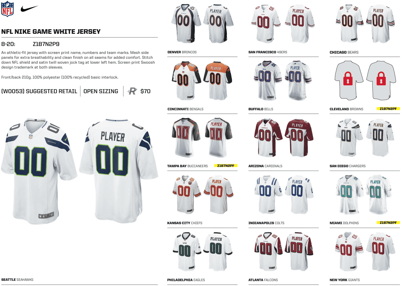
Now let’s look at the white jerseys:
.
.
Nothing remarkable there, except that we once again see mystery design slated for the Browns.
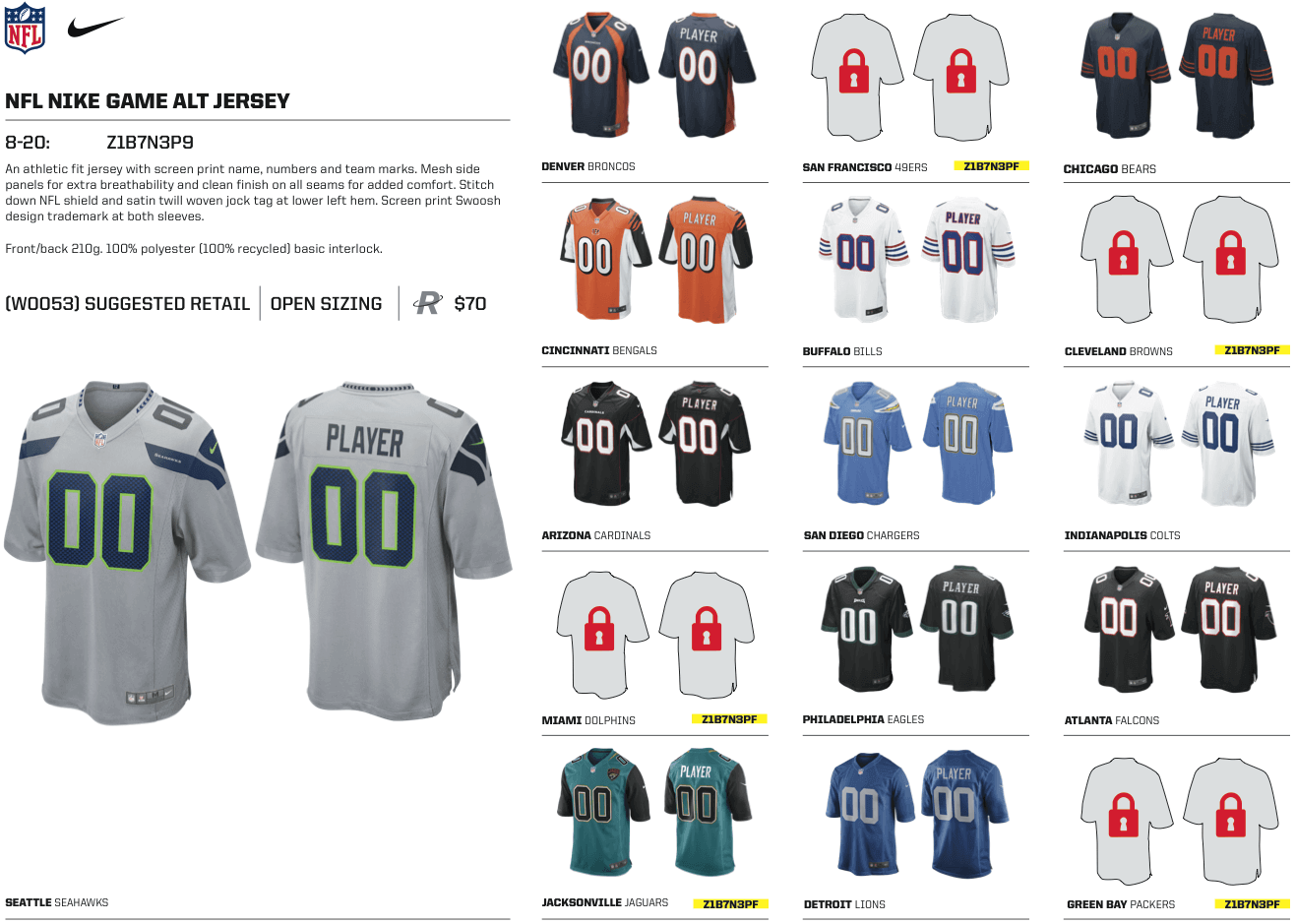
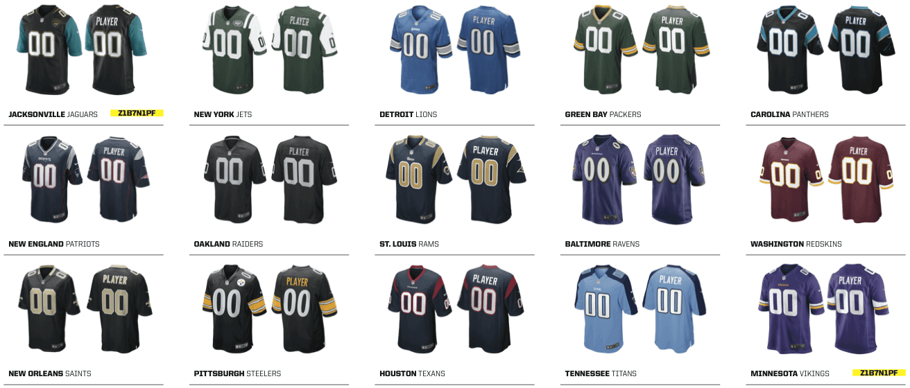
The next set of listings is where things get interesting — the alternate jerseys. Let’s take a look:
.
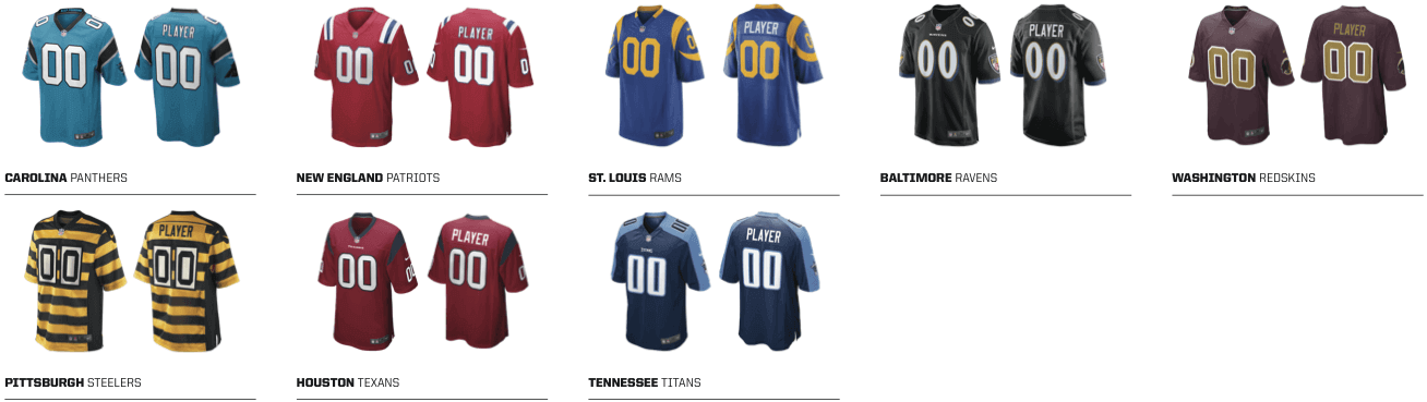
.
Lots of items worth noting here. One thing at a time:
• Looks like there will be new alternate designs for the Browns (duh), Dolphins (orange?), 49ers (beats me), and Packers (what, no more Acme Packers?).
• The Titans’ navy jersey is shown here as an alternate. As noted above, it’s not clear how this plays in with the team’s current thinking.
• As you can see, they’re showing a red Patriots throwback. My initial thought was, “A-ha! If they’re bringing back that throwback, then they must be planning to scrap the one-helmet rule.” But then I double-checked with my source, who said the red throwback youth jersey has been available for sale all along. Ditto for that white Colts throwback. So those don’t necessarily indicate anything regarding on-field jerseys.
So the real news here — aside from the Browns stuff, which we already knew — is that the 49ers, Dolphins, and Packers appear poised to unveil new alternate jerseys that we can’t see yet. Okay, so that’s not completely satisfying, but it’s still fun to look through these catalogs, right?
ESPN reminder: In case you missed it yesterday (and you probably did, because it didn’t post until pretty late in the day), my latest ESPN column is a follow-up to last week’s college hoops season preview.
Membership update: A bunch of new designs have been added to the membership card gallery (including Bobby Hoekstra’s Tim Duncan-era Wake Forest design treatment, shown at right). Some of those new cards have already been printed, laminated, and shipped out; the rest should be in the mail at some point next week. And we have about two dozen additional new enrollees whose card designs should be available for your viewing pleasure soon. My thanks everyone who responded to my “Now or possibly never” call over the past week.
Meanwhile, I’ve made a simple change that I probably should have done ages ago: The membership card gallery now has the newest designs at the top, instead of at the bottom. Much easier to see the most recent designs this way.
As always, you can see how we make the membership cards here and sign up for your own here.
NFL Superhero Project
By Thomas Correia
Did you hear the big news this past weekend? Underoos have officially made a comeback — and they’re now for adults! Although it’s highly unlikely, I’d like to think that our little project here played a small role in the return of this sorely missed element from undergarment history. So let’s strike while the iron is now even hotter and bring you this week’s NFL superheroes, which are based on tonight’s game between the Chiefs and Raiders (click to enlarge):
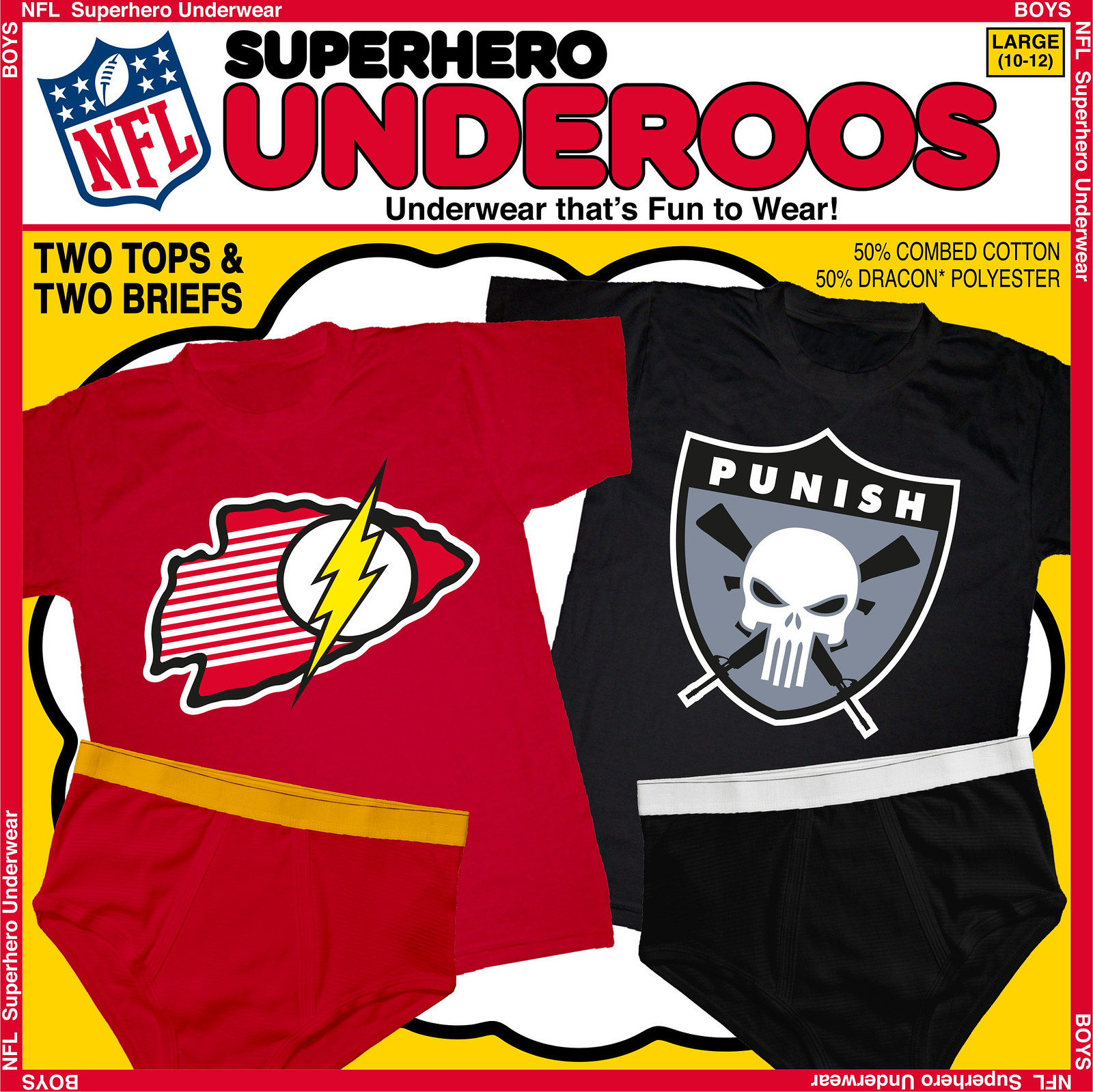
I have to give a shout-out to a commenter from last week named Winter, who guessed that the Chiefs would be represented by Green Arrow’s sidekick, Speedy. He would indeed be a perfect fit, but I opted to use a more famous DC hero who also wears red and gold: the Flash. I incorporated the Flash’s logo and some speed lines into a slightly skewed arrowhead to give it a sense of motion, which is what the Flash is all about.
When I got to the Raiders, one character immediately came to mind: the Punisher. The Raiders of yore and lore were always out to punish teams for entering their stadium. Victory was had by any means necessary. Also, Raiders fans are diehard and menacing, just like the Punisher when he’s dispensing justice to those who break the law.
Next week will be a special holiday edition featuring four of the teams that will be playing on Thanksgiving: the Seahawks, 49ers, Eagles, and Lions. Guess which heroes will represent each team in today’s comments.

Mike’s Question of the Week
By Mike Chamernik
Which failed uniform trend are you most glad went away? Here’s mine: In the mid-2000s several NBA teams wore sleeveless T-shirts instead of the standard tank-top silhouette. I didn’t like the look, but I thought they were the wave of the future. Fortunately, I was wrong, as they’ve mostly disappeared.
We have a ton of options here, from the pullovers in baseball to cut-off jerseys in college football to short shorts in basketball, and everything in between.
Also, which contemporary trend should disappear? [Editor’s Note: If you’re thinking of saying anything other than “baseball pajama pants,” please remain where you are. The reprogramming truck will be arriving momentarily. ”” PL]

PermaRec update: A soldier’s pass to visit Nome, Alaska, in 1945 (shown at right), which was found in an old book, is the subject of the latest entry on Permanent Record.
Uni Watch News Ticker
By Mike Chamernik

Baseball News: Louisville Slugger makes camo bats now (from Jonathan Daniel). … A Nats fan made a nine-foot Jayson Werth gnome out of canned seafood (from Andrew Hoenig). … Ben Fortney found a cool Texas Rangers program cover on Pinterest. … A’s outfielder Josh Reddick will switch to No. 22 as newcomer Billy Butler will take Reddick’s former No. 16 (from Rich Paloma). … We’ve seen this before, but it’s still cool to check out this gallery of 19th-century baseball players in game-action poses (from Chris Flinn). … Semi-related, here are some turn-of-the-century sports photos by photographer George Grantham Bain (from Jonathan Daniel).

Football News: Bowling Green wore all-orange last night (from Phil). … Toledo wore “Glass City” uniforms last night and Tom Konecny wrote a few words about it. … Also, Toledo’s coach wore a multi-branded cap. … Here’s a history on the Penn State paw print logo (from William Yurasko). … Vanderbilt will wear matte helmets against Mississippi State (from Phil). … Borrowed orange unis played a big part in MIT’s football history (from Phil). … Tim Erney took a tour of Levi’s Stadium and saw not only a poster for uniform guidelines but also a display for a game-used Jim Harbaugh outfit.

Hockey News: The Rangers wore white at home last night. … “Arturs Irbe is the Sabres’ goalie coach and was forced into the backup role Tuesday night due to an injury to starter Michal Neuvirth,” says Mike Monaghan. “He wore team’s terrible third jersey, but a nameplate from the regular home blues.” … The Islanders and the Brooklyn Nets swapped jerseys.

Soccer News: The San Jose Earthquakes’ new stadium has a corporate sponsor. … Here are some colorizations of some old soccer photos (from Jack Coyier).

College Hoops News: We discussed college players (specifally those who wear Under Armour unis) rolling up their shorts at the waistband yesterday. Kendrick Nunn from Illinois, a Nike school, also does it (from Ben Zoss). … San Diego State will wear turquoise against Bakersfield tonight (from Phil). … New home, road and alternates for Southeastern Louisiana. Isn’t that where Bobby Boucher played foosball? (From Chris Mycoskie.) … Houston Baptist is wearing a patch to honor 50 years of basketball at the school (from Jeff Sutton).

Grab Bag: Delaware’s student newspaper said it will stop referring to the school’s women’s teams as the Lady Hens. … Josh Lassiter is tracking all of Baylor’s uniforms. … Icelandic RFU is holding a new logo contest. Winner doesn’t get paid; he or she will only get a free shirt (from Eric Bangeman). … Here’s a quiz where you guess which state these colleges are from, based on the logo (from Anthony Nuccio). … Nice library find from Patrick (who prefers that his last name not be used): some bound pages showing illustrations of U.S. Navy uniforms through the years. Good stuff! … Through photo manipulation, an artist covered babies in tattoos of corporate logos to prove a point of some sort (from Jay Sullivan). … Chas Wagner runs a site called Rally, and it sells famous play-inspired T-shirts and coasters, among other nifty items. … David Firestone wrote a few blog posts recently, including one about a driver suit that has both an Oakley and Simpson logo on the back and a breakdown of the best and worst NASCAR paint schemes this year. … Apple released a new typeface (from Brinke). … “A couple of Australian players wearing the uniform for the ‘International Rules’ series against Ireland,” says Graham Clayton. “International Rules is a hybrid of Australian rules football and Gaelic football.”

The Eagles should certainly be the Vulture: same motif and colors.
Niners being red and gold: Iron Man?
The Vulture! Great idea.
For the Niners, first thought that sprung to mind was Captain Marvel…but Iron Man would work well too.
Vulture and Iron Man. Good picks but not correct.
HINTS:
For Philly, there aren’t many well-known “eagle” characters in comics. So instead I was inspired by a hero based on another type of bird.
I’ve already used Iron Man for the Steelers back in Week 2 (see post on Thu, Sept 11). So for the Niners, I used another hero that’s well-known for wearing all red.
No guesses for Seahawks or Lions?
(Lions should be an easy guess)
Quicksilver fits the Lions’ color scheme (kinda). Seahawks is a stumper.
Hawkman is too good for the Eagles!
Sorry Rob, I have already used Quicksilver for the Chargers (see Oct 23 post). I hope you feel better about Hawkman after you see the Eagles logo.
Niners– Daredevil? Also, once again living in SF.
You nailed it Winter! Niners is Daredevil! Good work.
Iron Man came to mind. My son was really into Iron Man for a while and I tried to convince him that Tony Stark was a Niner fan. nIneron Man. I like it.
Vulture is a good one. He could be good for the Seahawks also. The beak is a little more the Seahawks beak.
Eagles: Hawkman?
Lions: Sabretooth?
Seahawks:
HAWKMAN for the Eagles is correct! Good job Berto!
But wrong on Sabretooth for Lions, though.
Iron Man’s been used.
But you knew that already…
(refresh before posting, Vilk!)
Thanks for having my back, Vilk.
Seahawks: the Shield logo would be sweet or Blackhawks (not the NHL team, the comic book)
Nope on both Mickel, but save your SHIELD guess for later in the season.
I’m gonna take a shot on the Lions and guess that they’ll be represented by one Dr. Henry Phillip McCoy, a.k.a. the Beast.
Nicely done!
Lions does indeed equal BEAST! Good job Rob!
Eagles (Hawkman) and Lions (Beast) has been correctly guessed.
That still leaves the Seahawks and the 49ers.
I think the 49ers should be Booster GOLD. Seahawks…Blue Falcon? ;)
How about Dare Devil for SF? Interlocking DD could be the template for the SF.
Also, the red-yellow costumed Colossus could work for the Niners.
Seahawks: Black Condor?
Berto, You got it first. DAREDEVIL for the Niners is correct!
Blue Falcon and Black Condor is not it for the Seahawks.
The Patriots jerseys also have the new-ish arching word-mark finally replacing the script (which is a shame in my opinion).
Ah, good catch — I missed that!
I predicted last year when they announced it that it would end up on the jersey. The new wordmark made it on “jersey shirts”, those cotton t-shirts with the team numbers and NOBs, so I just assumed it would be soon that it would end up on jerseys.
I don’t see anything particularly wrong with the new wordmark. I hated it at first, but it’s grown on me after seeing it in more spots, and I will actually like some uniformity by not having two official wordmarks.
Jim Harbaugh shouldn’t be wearing a whistle during a game!
Definitely thought the Cardinals alt was the Falcons alt at first glance before clicking on the image to expand it.
Anybody else notice that the Cowboys are absent from the catalog?
They always are, they have their own deal with the league, so they handle their own apparel.
“… … Here’s a quiz where you guess which state these colleges are from, based on the logo (from Anthony Nuccio). … ”
Got 43 out of 50,
Some of those east coast ones were difficult.
Yeah! How do you spell Massachusettes??
All depends where you are from. I nailed the East Coast (4 ivies) and got pummeled by the Great Plains.
Me too. I got 32 out of the 34 I was able to answer before the clock ran out, and was mostly stymied by Western schools. I doubt I’d have been able to top 40 even with unlimited time.
Got all fifty in three-and-a-half, but only by using process of elimination.
I got 50/50, but did it ever take me forever to figure out Maine.
50/50. I had to skip New Hampshire the first time it came up because I kept typing “Dartmouth” and couldn’t figure out why I wasn’t getting it right.
I got 48/50 in my first try yesterday. It’s an interesting quiz, but I’d say that it’s not terribly difficult if one understands smaller school logos as much as bigger school logos.
QotW part the first: glad that cooperalls went away.
QotW part the second: (1) too many commemorations of the cause du jour on uniforms, (2) disappearance of sleeves on football jerseys, (3) ridiculous claims about how uniforms give one team a technological edge over an opponent, (4) the disappearance of whimsical mascots and their replacement with fierce ones, (5) teams abandoning their historic colors for the latest dark menacing look, (6) the silly elaborate designs on football gloves (7) the silly poses to show off #6 above, (8) the sales prices for fan jerseys and (9) long pants in baseball.
I’d say Cooperalls were more of a failed experiment than a trend, at least in the NHL, considering only the Flyers and Whalers ever wore them.
I don’t miss ribbon stirrups at all. Two-in-ones were OK, though. I don’t miss the almost-spaghetti-strap look of basketball jerseys that persisited even into the 70s. Barefoot kickers/punters are another thing best left in the past, but that’s more of a lack-of-uniform trend.
As for part two, pretty much what Denver Gregg said, except #9. As long as you can’t step on your own pantleg, I don’t mind long pants. The A’s in particular pull it off quite well. I’ll also add:
* Minimalism (not to be confused with simplicity). Big numbers and proper stripiing are your friends!
* Baggy hoops shorts.
* Baseball jerseys with the same letter on both sides of the placket (I’m looking at you, Philllies and Raays). Just go pullover!
QotW part the second: (1) too many commemorations of the cause du jour on uniforms, (2) disappearance of sleeves on football jerseys, (3) ridiculous claims about how uniforms give one team a technological edge over an opponent, (4) the disappearance of whimsical mascots and their replacement with fierce ones, (5) teams abandoning their historic colors for the latest dark menacing look, (6) the silly elaborate designs on football gloves (7) the silly poses to show off #6 above, (8) the sales prices for fan jerseys and (9) long pants in baseball.
DenverGregg, if you ever ran for office on that platform, I’d manage your campaign.
I know the Browns getting a new uni is old news, but I have to say this saddens me. I kind of look at that uni as a timeless look like the Steelers, Bears, Cowboys or Raiders. Plus, in recent years with bringing back orange pants and the addition of brown pants, they’ve spruced it up enough. I’ll be sad to see the current look go (I supposed in a few years they’ll simply do a throwback but still…)
I’m with ya. I’m not looking forward to any changes for them.
as a browns fan i agree… change isn’t really needed in their case
QOTW: I’m glad that short basketball shorts went away (although that wasn’t so much a trend as it was the rule until about 15 years ago), sorry but those were too short on the eyes.
Current trend? The nonexistent sleeves on football jerseys. I get why they do it, but players are still able to grab onto jerseys anyways. Just let teams like the Steelers have proper striping, please.
Why are the Cowboys missing from at least the Color and White jersey pages?
Good question. Hadn’t noticed!
Does it have something to do with this statement?
“The NFL also shares ticket and merchandise revenues, with the exception of the Cowboys – Dallas keeps revenues generated from merchandise sales and does not receive any from the other 31 teams.”
link
Yes it does, I just commented on this further up. They were also not in any Reebok catalogs as well.
We had pajama day the other day at school. One of my students wore NFL pajamas. Another student pointed out that the Cowboys were missing. Yet another students piped in that the Cowboys are often missing from merch. Not a bad way to start a day in fourth grade. I sure was proud of them.
QotW
I, for one, really like baseball pullovers. I think they give the uniform a cleaner, more solid fee (especially Stanford). Keeping on college baseball, I really wish more teams would adopt grey uniforms. For example, Vandy only wears white pants with gold, black, and blue jerseys, and an all-cream throwback. A few years ago, they did wear a nice looking grey set, but haven’t work them since. Shown here, link
A current trend that’s just as bad as pajama pants is logo creep. Not knowing who manufactured (or, like now, marketed) any given uniform didn’t make watching games any less enjoyable.
Love those Navy uniform drawings. Surprising to see that Napoleonic-era bicorne hats were still part of flag officer dress uniforms as late as 1941. We may not have been ready for war with Japan, but by gosh if a Gilbert & Sullivan production broke out at Pearl Harbor, our admirals were prepared.
QotW: Non-uniform uniforms. The whole thing with teams having a different uniform every week, especially when the variants eschew team colors, drives me nuts. A team should have one main uniform, one secondary uniform, and no more than one alternate for every seventh game. And all uniforms should feature mainly, preferably only, actual team colors. Anything beyond that, and they’re not actually “uniform” any more.
Mainly talking college football here, but I see minor-league hockey teams with so many one-off uniforms in a season that they qualify as well.
I thought the rumor was the Broncos were getting new uniforms next year too? Something sbout one of the biggest redesigns in Nike history?
That’s for ’16, not ’15.
link on those rumors, for anyone who cares.
Fascinating. This is the first I’ve seen of those.
Paul:
Big ups to Brooklyn on this:
link
For the Niners alt I’d like to see something other than the throwback 1994 throwback 1946 jerseys. I loved the 75th anniversary unis back in 1994, not so much when the Niners went with the shaded numbers full time.
I usually like the traditional looks. I like that the current Niner unis are more like their 70s and 80s unis. But for some reason I’m hoping they go with something really different, like gold, for their new alt. I might end up being terrible, but at least it would be fun and truly different. I used to have a lot of fun designing gold jerseys back when Madden still had a uni editor.
If they do go with the 1994 version of 1946 I hope they go to the silver pants they wore their first year. Again, not that it would necessarily look great, but it would fun for a year.
With the NFL’s odd one-helmet rule, silver pants wouldn’t work with the 49ers’ gold helmets.
The 1994 throwback was actually based on the 1955 uniform, as that was the only season the team used the shadowed numbers. As for silver pants, they wore that color from ’48-’52 and again from ’59-’63. And they would look absolutely terrible with the gold helmet.
Thank Jeff. Good stuff.
My comments look like a combo of misremembering 1994, and my reading of Glenn Dickey’s “San Francisco 49ers, The First 50 Years.” He has a story about the team wearing silver pants their first year at the behest of Buck Shaw’s wife (if I’m remembering that right). Then it’s never mentioned again.
GUD has them as white pants the first year. GUD also shows drop shadow in ’56.
I mentioned a while back that if the 49ers came out with a BFBS jersey of the current design, it might not actually look bad. BFBS has appeared to play its course, but how much money do you want to bet that this will be the route the 49ers go?
I think if the new alt isn’t a throwback of some kind, it’ll be gold. I really don’t see them jumping on the black thing this late.
Gold jerseys with gold pants? Awful.
QOTW:
While it’s not a trend that’s completely gone yet, I am glad that the Edge-ification of the NHL has been in retreat in recent years. There are still a few teams that need to be fixed, to be sure, and a few minor tweaks that could be made, but for the most part, the trend back toward more traditional styles has pleased me.
As far as trends I’d like to see gone, I’m going to keep it to three:
1. Lace-up collars. Functionally useless, especially with the Edge unis (considering there’s a big ol’ panel closing up the gap), and I’ve never thought they looked good to begin with.
2. “Vintage white”/”Antique white”/basically any “white” hockey jersey element that’s not actually white. Trying to make your jerseys look like they’re actually 80 years old is ridiculous, considering they’re made with fabrics that didn’t even exist 80 years ago. And it’s an especially egregious thing when a team uses the “vintage” non-white when they’re a product of the 1990s expansion boom (I’m looking at YOU, Columbus!)
3. … baseball pajama pants.
I’ve often wondered if the original “antique” white was also non-white because of copious nicotine exposure/immersion.
Agreed on the hockey points. The Edge jerseys though – although the apron-stripes are gone, the Edge cut still bothers me. The scooped-hems is most obvious point, but the many-paneled jersey is still silly. And it messes with the layout of the Rangers’ jersey-front lettering.
Pretty big deal that Australia will be switching from blue to green for the upcoming international rules series. I had always figured that blue was chosen to contrast better with the green of Ireland, so it begs the question of what in the world the Irish will be wearing.
Ah, it’s just the top part that’s green. In my defense it looked like green on the bottom part too on my tiny phone screen. Regardless, it’s more green than I think it ever needed. Very much a downgrade from previous iterations.
As for the Irish jersey to face it, here it is: link
Consider me a fan. Looks a lot more like an Irish kit than in previous years but without the monotony that has infected the current soccer and rugby showings. Plus, it offers a subtle nod to the quintessentially GAA look of the central contrasting torso band.
Love the “action” photos from the 19th century. I particularly like:
the guy’s bat grip in #11,
The guy tagging a corpse in #13,
and the guy staring straight into a BEANBALL in #16 (I have no idea what that guy is doing!!)!
and the guy staring straight into a BEANBALL in #16 (I have no idea what that guy is doing!!)!
That’s a young Harmon Killebrew, modeling for the MLB logo.
the guy’s bat grip in #11
Apparently a lot of people used to used an “open grip” like that. One of my vintage teames actually had a bat with a 2nd knob to accommodate that kind of grip.
…and link
Hell, that’s how Ty Cobb batted.
link
Anyway I’ll see that bat, and raise you a Heine Groh:
link
He’s not even wearing batting gloves!
30/50 in the logo/state quiz. I’m not much of a college sports guy though.
Paul, the bottom ‘half’ of the Alts section of the catalog isn’t ‘clickable’ to show it full screen like the other ‘sections’ are. (Sorry for the ludite-like description but I’m not sure how else to say it.)
Thanks. Fixed!
I for one hope the Titans ditch the light blue jerseys at least as their primary home uniform. I love the dark navy one it’s a classic look. I also noticed that the Titans haven’t wore the light blue pants since week 2 of last season (I do like those). Are they going to move away from the light blue pants as well or did Nike run out of light blue??
I like the Titans blue jersey and pants but also like the navy jerseys. I wish they would drop the navy pants. They look like a small town high school team. I think the Titans would look a lot better if they I compared their alt logo as the main logo on the helmet.
Qotw: 1. Fairly neutral on this, but waistbands on baseball unis are now thankfully relegated mainly to Pac-12 women’s softball, where they are a helpful accentuation.
2. Oversized-compared to normal logos and striping on college football (also the Tampa Bay Bucs) unis and chrome facemasks.
The Lions could be Lion-O from the Thundercats. With their recent history, Snagglepuss could also work. (I’m a Lions fan)
Bad news: It’s not Lion-O. I kept this project to strictly Marvel or DC superheroes.
Good news: Since your a Lions fan, I think you’ll really like the blue Marvel hero I used for your team.
QotD: I’m glad the trend in college football of guys tying up their jersey went away. Sort of the post-tearaway era thing to do. I seem to remember a lot of ND players doing that.
As for current? One I’m willing to compromise on. I hate the way football jerseys for the most part have become sleeveless… I’d like to see more teams use compression shirts underneath as a uniform element to at least create the effect of sleeves.
The driver suit mentioned doesn’t have both Oakley and Simpson logos. The writer just noted that the Oakley disclaimer tag was much shorter than the one Simpson makes. The Simpson tag was just shown for contrast.
QOTW (SIDENOTE):Score one for the good guys. My nephew got picked up for a pretty big development league baseball team here in WV, and when discussing uniform needs he told the coach “you better not order those stupid pajama pants for me. I need real ones to show my stirrups!”
PROUD.
That’s terrific.
I was very excited when the Packers announced their Acme throwbacks a few years ago. I have a few pieces of blue and gold Acme gear. I know the throwbacks aren’t accepted very well up here in Titletown, so that might be why there will be a change coming. But what era are they going to go to? I mean, there aren’t too many to choose from… especially with the one helmet rule.
I’ll say go with the 60s-90s look with the five stripes on the shoulders and the striped socks.
link
It’s not only a championship team, it’s the first Packers team to win an NFL Championship Game.
Though… GUD alert: it looks like the 1936 Packers had link, not gold/yellow/cheddar as depicted on the GUD. link would seem to back that up (and check out the face protection on #22 during the coin flip! Also, NFL refs looked a lot sharper back then).
link.
I’m guessing that they’d probably just blank the helmet again, or wear it with the regular stripes and no G instead of actually replicating the original striping. After all, they couldn’t be bothered to switch facemask colors with the current throwback.
i like it
I’m still hoping that we get another blue alt, but this time go back to Curly Lambeau’s classic link.
Isn’t that what the 1994 throwback was?
I like the Acme jerseys, but I’m not from there. I’d think it would be neat to have a yellow alt jersey for the Packers.
More: yesterday’s Twitter lede
Has anyone made an account to troll the troll with the name “Lick Paulsass” yet?
QOTW: 1. I was going to say Cooperalls, but Rob S. was correct when he said the fad never took off. Had the league not stepped in, it might have mushroomed, but we’ll never know. I remember how prevalent they were in college hockey. So instead I’ll say the inclination for hockey teams to go with plain breezers. They’re a part of the uniform; they should at least be proprietary.
2. I wish the NBA would discontinue their drab lightweight perforated uniforms and give teams more leeway using shiny fabrics. The enforced uniformity spoils the appearance of the numerals with extra outlines, the matte fabric cheapened the look of the Denver Nuggets at the very least, and the lack of typeface variety for player names cheapens the image of the league. To say nothing of not allowing teams to design their own warm-ups!
You’re right about the perforated uniforms with the extra outlines on the numerals. It really looks terrible, as though its unfinished or a knock off.
Wasn’t a fan of the shiny fabric. And I’m not a fan of the Nuggets’ look (except for the yellow alts). At least they bucked the trend of dark “intimidating” color schemes, but they went to the other extreme with the powder blue and yellow. They make me actually miss the red & blue post-rainbow years…but more importantly I miss the court they played on then.
link
“New home, road and alternates for Southeastern Louisiana. Isn’t that where Bobby Boucher played foosball?”
Bobby Boucher played at SCLSU, or South Central Louisiana State University, which doesn’t exist.
No alts listed for:
Cowboys (as noted above)
What about:
Giants
Jets
Bucs
Raiders
Vikings
Saints
Chiefs
???
None of those teams have alternates anymore (and a few never have), so what’s the question?
Just wondering why they aren’t “bandwagoning” I guess.
Qotd: Fad that I’m glad is gone? The former trend in college BBall where shorts were so baggy and huge the players looked like they were wearing skirts (or baggy capris). They are still pretty baggy, but distinctly remember Arkansas early in the “fad” going way beyond just baggy. What I wish would go away is the football jersey design that all but eliminates the effect of sleeve stripes (see Colts, where their cool UCLA stripes now just look like equal signs on their shoulders). Recently, I saw the Bills play on TV and noticed how much better the full stripe look is when comparing Kyle Orton’s jersey to everyone else’s.
QOTW:
I’m generally okay with current uniforms, but a minor quibble: logos above the NOB on basketball jerseys
The team’s already identified on the front. We don’t need this.
And failed uniform trend? Asymmetrical basketball shorts that were a thing in the mid-90s.
QoTW:
“Which failed uniform trend are you most glad went away?”
Does barefoot kicking qualify?
If not, I’ll go with limiting NFL wide receivers to uniform #s 80-89.
“Which contemporary trend should disappear?”
Overly customized hockey goalie masks.
As an old guy, it’s still odd to my eyes to see WR’s wearing 12, or other #’s in the teens.
But yes, I’m old enough to remember when it was OK before also!
“Which contemporary trend should disappear?”
Overly customized hockey goalie masks.
You’re going to have to define “overly” customized. Better yet, define what you think they should be like.
Easy… Goalie hockey masks should be the same color as the teams helmets.
Lee
OK.
I get that there’s a tradition of such customization, but thesedays there’s a lot of goalies donning masks painted in such a way that it looks like they are wearing a ’77 Dodge Tradesman van on their heads…unique and masterful in artistry, but somewhat lacking in the ‘old school’ charm and appropriateness departments.
I’d prefer to see more 1 color headgear with true-to-form logos and wordmarks that tie the individual to the organization(like the rest of the players)than on-ice reminders that the net-minder likes a particular band, movie franchise, TV show, or other aspect of pop culture.
I get that.
Seems like with Martin Brodeur’s departure, the era of the iconic mask design has given way to new looks every year with all sorts of iconography, but not really standing out.
Gone are the days of Belfour’s Eagle, Joseph’s Cujo, Moog’s Big Bad Bruin, or… whatever the hell that was on Felix Potvin’s mask. But at least you could tell it was Potvin!
Define “overly” customized?
How about from more than 20 feet away you have no clue what is on the helmet, or how about makes the guys that did 70s van art say “that’s a bit too much”
edit. should be mask not helmet.
I think they should allow linebackers to wear 40-49# if the team has 3+ retired numbers/and or Hall of Fame members at that position that wore 50-59. I know 90-99 is an option, but that # always looked more fierce on D-lineman. The Boz had the misfortune of being supplemental-drafted to a recently-birthed franchise.
I think they should allow defensive players to wear any number between 00 and 99. Unlike the offense, they’re all eligible to make a play on the ball, and are allowed to line up anywhere they want, with no rules requiring a certain number of players on the LOS or anything.
Totally agree.
I agree as long as 00 is smaller than 0, because both should be options.
Well, unless on the rarest of occasions you have JJ Watt line up as a wideout, a Deion Sanders-type or a certain Bear who plays for a certain team in Chicago by the certain name of William Perry who lines up in a certain backfield…
(Splitting the fiiiiinest of hairs, I know… and how difficult is it to type in a Chicago accent?)
Well, in those cases the player in question has to report to the refs as eligible, so it’s not really an issue. Also, without number restrictions for the defense, perhaps the Fridge would have been wearing 27 instead of 72.
I concur. And there is something cool about seeing a college DL wearing a single digit number.
QOTW
“Failed Uniform Trend That Went Away”
Two-in-one baseball socks. They were only useful if the player wore their cuffs a calf level which another trend that has mercifully died. Even in that configuration they looked awful.
“Current Trend That Should Disappear”
Grey uniforms in anything other than baseball. Whether is grey, silver, anthracite or whatever fancy name its labelled, it remains boring. Its all the colorlessness of white without that pesky contrast and sharpness. Unless grey has a specific tie to your team just don’t do it.
*Runner up, white out uniforms in college football. Some teams make it work but most don’t.
As an aside I firmly believe that the invention of 2-in-1’s led to the pajama pants look because who would want to show any socks when they looked like that.
I think you’re sort of right, but it’s more complex than that. Baseball socks and stirrups used to be about showing team colors. But as stirrups got longer/thinner and gave way to ribbon stirrups, which in turn gave way to two-in-ones, there was less and less color, and more and more white. At that point, why bother to show anything? May as well wear the pants long.
Trend I’m glad went away: Mesh, tearaway football jerseys. Never made it to the pros, but they were the scourge of college FB in the early 70s. Some players wore them really short, too, so their 6-packs showed. Really awful look. Also, pullover baseball jerseys and beltless pants. And powder blue road jerseys.
Ones I wish would go away, besides the obvious baseball pajama pants: sleeveless football jerseys, long baggy basketball shorts, and colored baseball jerseys that to me scream “softball.” Wearing any color that’s not an official team or school color (black, gray, whatever).
NFL had tearaways in the 70s. Rick Upchurch of the Broncos and Earl Campbell of the Oilers used them extensively, as did link. NFL axed them before they were discontinued by NCAA.
Thanks for the correction. Guess I’d just forgotten the NFL use.
Although now that I’ve looked at your example, I’m not sure we’re talking about the same thing. I’m thinking of see-through mesh, like this (scroll down to “1971”):
link
The most egregious example of softball jersey was the Cubs regular road uniform from 1982 to 1989. In addition to being a softball jersey which was notorious for giving hitters a solid background to see the ball on, it also featured plain white (as opposed to grey) pants and also featured 2-color striping patterns that were related to any element in the home pinstripes-with-solid blue sleeve cups and neck.
At the risk of over-generalizing, all alt college football uniforms can go. Enough. I don’t know who I’m watching on TV anymore. Two weeks ago: Northern Illinois at Ball State. Northern donned all white, helmets included. Ball State went with black helmets, red jersey, and black pants. Impersonations of the OTHER team’s standard uniform. Stupid. Enough. No identity, no brand anymore.
I’ve always disliked the Titans making light blue their primary jersey. It always seemed like a mistake. Hopefully it’s eradicated now.
QOTW:
Blast: I want more vested baseball jerseys. One of the 90s trends I really wish stuck around.
Trash: Sleeved NBA jerseys. They’re way too tight to look anythign but ridiculous with baggy shorts.
QOTW: Unitard college basketball uniforms circa 1990-91. Thankfully they disappeared quickly. So bad, NC State decided to wear regular shorts over them: link
That was going to be my choice. This short video does a great job of showing just how bad they were:
link
Watch it if you dare.
Nice find, brutal.
I. Failed uniform trend I’m most glad went away: MLB link link link link®
II. Contemporary trend that should disappear: minor league link and link-themed uni’s (unless a team commits to that look and rename themselves, Ã la the Saskatoon Chewbaccas).
…and MLB pajama pants.
Just read Paul’s Membership card blurb. Color me disappointed that the new cards go to the top. I always liked that mine was up there among the first ones. Oh well, progress can’t be stopped I suppose. I’m glad the program will continue. I may need to order another one.
QotW Part 1: I’m glad the 90s-early 00s trend of huge Hockey Shoulder/elbow pads. It lead to big bulky flowing jerseys. Shoulder pads have shrunk back down and I grudgingly admit Reebok Edge brought back making players have tight well fitting jersey similar to the look of the 60s/70s/80s.
QotW Part 2: Manufacturers logos on the outside of uniforms. You even see them on youth team uniforms now. It needs to stop, but it will never stop.
Uniform trends I’d like to see disappear:
1) Neon
2) Flat-billed caps on the baseball diamond
3) Camo anything – even if it’s to honor the military
4) Compression arm sleeves
5) More than one alternate per season
Any guesses as to what the Packers Alts will be? I’m assuming we stick in the blue bays era. I’d be interested in a more accurate contrasting yoke jersey (as opposed to the full yoke look worn during ’94 and on a few Thanksgiving’s since). I would love to see a feauback taking the Lombardi Era look but using our original colors (I like that look, but feel the design is too close to our current look to commit to the 60s throwback for 5 years).
Also what if the new design is actually a return of yellow jersey (which was only for retail, but interestingly enough made its way to Madden). Personally I don’t see a need to ditch the the current Acme Packers design (would like to see grey or blue facemasks though).
Anyone notice that the Jags logo in today’s lead image has a dark shadow on the top of it? I zoomed in and compared it to the actual logo and this is definitely something I haven’t seen before.
That is weird. It looks like something more than just a darkened picture too.
Good catch! I enlarge the vector image so we could have a better view:
link
No idea what that’s about, but I’d be willing to bet it’s just a glitch in the graphic, not a harbinger of a logo change.
Maybe it’s a representation of the jaguar “emerging from the shadows.”
Yeah, in that vector image you can see the difference in the spots and the part of the head that *should* be gold.
guessing it would be an ‘over print issue’ for when it went to press. And it was saved with the preview of overprint turned on in the pdf.
Looks like the lighter “gold” was inadvertently rendered transparent with a black background. I’m sure there’s a more technically accurate way to explain it.
Anyway, all it does is remind me of their stupid-ass helmet, and how it disappoints me that they switched away from their beautiful 2009-12 helmet.
QotW:
“Failed Uniform Trend That Went Away”
Great question. Probably the big, cartoony graphics on NBA uniforms and NHL third-jerseys. BFBS has largely gone away, at least in baseball, and I’m also kind of glad that teal is not really a thing anymore.
“Current Trend That Should Disappear”
Oy, so many to choose from; pajama pants, softball tops, color-over-color and irregular striping in the NFL, apron stripes in the NHL… I think my biggest pet peeve is probably “custom” numeral fonts. I don’t know why I like generic block/varsity numerals so much, but what they’re doing with numerals now (especially in football) is ridiculous and it’s always the first thing I notice when a new uni comes out. There are so many “modern” unis out there that would look so much better if they only used standard numerals.
QOTW:
If the link of the 1990s ever make a comeback, I will have to stop watching the sport until the trend passes. Dudes looked like they were wearing link or something.
As for trends that I wish would go a way – teams that wear uniforms in non-team colors – whether it’s BFBS, GFGS, pink, camo, red, white, and blue when those are the team’s colors, or anything else. I don’t care for it much when the team’s colors are incorporated into the special uniforms but take a back seat to the gimmicky color du jour. But I really despise it when the team colors are jettisoned altogether. I also hate it when teams urge their fans to wear those non-team colors to the game.
The billowy look was link.
Despite some flirtations with too-tight jerseys (looking at you, Puma and Kappa), I think soccer jerseys have generally reached an appropriate level of fittedness.
Though I’m not a fan of the semi-recent link look. It’s especially tacky on link
Has NFNS (Neon For Neon Sake) or FFFS (Fluorescent For Fluorescent Sake been said yet?
And when did the Bucs think the Digital Alarm Clock.ttf Number font was a good idea for jerseys? Have they been slapped enough times for being on snooze this season?
QOTD:
Uniform trend I’m glad went away: High top baseball shoes.
Uniform trend I’d like to go away: Hockey-style catcher’s masks.
The lions alt jersey is also new(ish). It’s actually a throwback that they used during the reebok days. Nike hasn’t ever given them an alternate. Surprised they didn’t “lock” it.
Actually, that jersey has been shown in the Nike style guide right from the start of the Nike contract, even though the team hasn’t worn it in recent years.
Ah. Weird.
QOTW:
Uniform trend I’m glad went away: it’s nice to see some of the overly templatey reebok jerseys getting ditched (Minnesota, Jacksonville, Seattle) in favor of still bad but modern unis, and I’m glad that hardly any teams are using the Nike neck roll.
Uniform trend I wish would go away: not really Uni related, but I hate all the extra intimidating beveled logos (looking at you Dallas stars). Stop it.
I’ve been waiting 6 years for the Titans to wake up to no more columbia/powder/baby/titan blue. especially over navy pants. Was discussing this with someone today and he referred to the Navy unis as “throwback” and I cringed. I guess technically they are, but I’ve always considered them alternate since being relegated around 2009.
As for trends I’m glad went away, for certain it included short short basketball shorts, the teal/purple trend circa 1994-2000 across all sports, every team’s facemask being gray (up until the end of the 1970s), waistbands in baseball.
What needs to go away.. oh man where to start…the eligible player number/position rule in all levels of football (give me guards wearing #2 and quarterbacks with #67), anything camo/military oriented at all (just stop), the bastardization of shoulder stripes on football uniforms (or at least mandate undershirts with actual stripes), the over-meshiness (is that a word?) of NBA uniforms, ad patches on jerseys even before they start, the rules against color v. color, the generic captaincy patches for NFL teams (should be team specific, IMO), pajamas pants (as a larger initiative to mandate actual stirrups), flag patches everywhere and especially at the neckline, the ncaa blue patch during the bball tournament, and the overall lack of dark visors allowed in football.
FWIW, the NCAA requires tournament contestants to wear logo patches on their uniforms (i) regardless of what Division they’re competing in, and (ii) even in non-revenue-generating sports. I’ve attended D-III tournament games, attendance in the low triple digits (roughly 98.7% of whom are family members), where the NCAA has measures in place to prevent beverage containers that aren’t Coke products from being brought in.
I’m well aware that some of these heinous uni trends are mandates. A man can still wish for them to go the hell away.
Can someone explain the one helmet rule? Didn’t Washington wear different helmets for throwbacks this year, among others?
Also, I’ve seen other college teams with Nike roll up waistbands, it’s pretty common. My team wears Nike and 3 or 4 guys do it.
Didn’t Washington wear different helmets for throwbacks this year, among others?
No. Same shells, with different (or no) decals.
For further info, start here:
link
Then go here:
link
And for extra credit, then go here:
link
They removed the stripes but link.
QOTW:
I wish there would be less of the “unitard” look in football, like when teams wear black, red, or blue pants over black, red, or blue socks, running around looking like they’re wearing leggings.
Not sure which team that trend started with. Ravens? Saints?
(if it’s white pants over white socks, that’s fine. Other colors just look bad to me)
I concur!
You didn’t use Hawkman for the Seahawks???? I thought that was a gimmie. For the Niners, all red, huh? Liven I’ll guess Daredevil (his original suit did have yellow in it). Any hint for the Seahwks?
I knew not using Hawkman for the Seahawks would be controversial. Trust me when I say that he really does look better for the Eagles (for reasons that I’ll get into next week)…. Daredevil for the Niners is dead on! Others have guessed it correctly as well, but you got it first, Rick! Good work!
This Seahawks hint should put you on “target”: Like Hawkman, “HAWK” is in his name as well.
Hey Paul, just saw you got credited in a ProFootballTalk article that talked about the Titans’ decision to go with their whites for the rest of the season!
1. I hate to see the current Browns uniforms go. I think they are underrated. They look like a football uniform.
2. Hopefully the 49ers stay away from a black alt. I would a create an alternative red jersey, except with gold sleeve stripes (instead of white), white numbers with a gold shadow, and white pants with red, gold, red striping.
QOTW: Baggy baseball pants is a trend I could do without or sleeveless football jerseys
One trend I’d like to see come back is the vest in baseball. Not sleeveless, but the vest uniforms teams like the Reds and Pirates wore in the 1960s.
The catalog still uses the current browns logo. A little bittersweet, at least this means that we can trust Haslam when he said the helmet wouldn’t be changing, however I had this pipe dream that Brownie would make a comeback as a primary mark after seeing him return in mascot form.
But all in all, though I love the current Browns look I’m not terribly concerned. I don’t think we’ll see a crazy Nike bumper-stickered design, it would clash with the classic helmet. Hopefully we’ll just see some modifications that will spice it up a little and make it work better with modern jersey templates.