Today is going to be a very busy day in the uni-verse. In the NBA, the Mavericks are going to reveal have revealed their alternate uniform for 2015-16 (that’s next season, not this coming season), plus another team that I can’t name will be unveiling a new alternate uni. a new Pelicans alternate has leaked. Meanwhile, the Capitals are slated to reveal have revealed their uniform for this season’s NHL Winter Classic.
I might do a bonus post on all of this later in the day, or maybe I’ll just wait until tomorrow. For now, though, we have something completely different: a guest entry from Jack Carlson, who’s going to enlighten us on the very interesting uniform history of an oft-overlooked sport. Enjoy.

An Introduction to Rowing Blazers
By Jack Carlson
Most of us have blazers hanging in our closets, but few people realize that the word “blazer” originates with the “blazing red” flannel jackets worn by a college rowing team, the Lady Margaret Boat Club. In the course of researching my new book, Rowing Blazers (Vendome Press), I actually had the pleasure of seeing the first known written use of the word “blazer” to refer to an article of clothing. It appears, in quotation marks, in an 1852 register of uniforms worn by each Cambridge college rowing club in one of the world’s oldest rowing competitions, the May Bumps.
Today, for better or worse, most blazers aren’t bright red, and the word has lost its strict association with rowing jackets. But the sport of rowing maintains its bright and bizarre blazer tradition, full of its own myths, rituals and anecdotes. I’ve spent the past four years traveling around the world to hear these stories firsthand and to photograph rowers ”“- from college teams to Olympic champions -”“ in their own piped, striped, trimmed and badged blazers.
Rowing blazers began as purely practical items. They were made to be worn in the boat and were among the first uniforms in college sport. Their absurd color combinations and garish stripes were designed to help spectators on distant shores tell which crew was which, and their thick wool flannel material and relaxed fit were designed to maximize warmth, comfort, and ease of motion while rowing on chilly mornings on the Thames or the Cam.
But very early in the history of the sport, rowers, like athletes in other sports and in more recent times, developed a special attachment to their gear. They began wearing their blazers on terra firma, where they served as signs of status and athletic prowess, not unlike varsity jackets and letterman sweaters.
The Henley Royal Regatta — the most prestigious rowing event in the world, currently celebrating its 175th anniversary — has helped the sport maintain its blazer tradition by enforcing a strict blazer-and-tie dress code in its spectator enclosure, thereby providing an annual five-day forum for oarsmen and -women to see and be seen in their club colors.
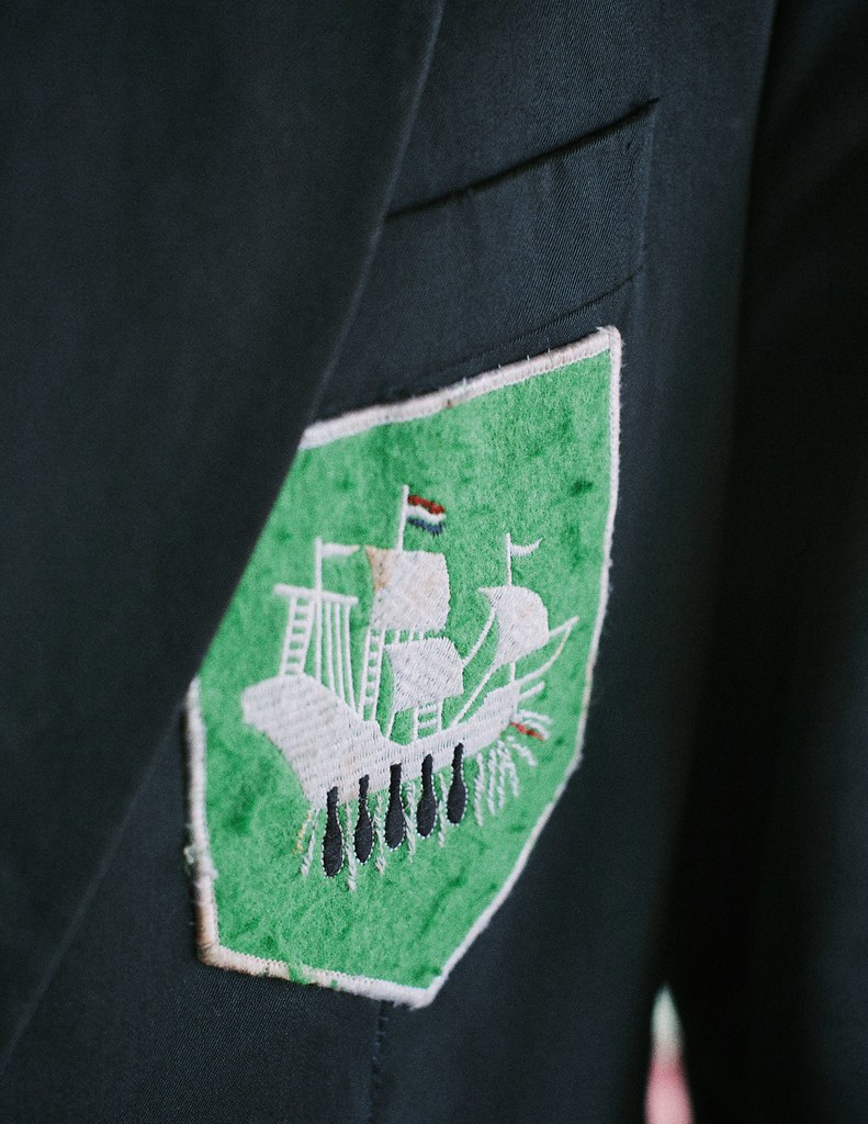
In many clubs, small details of the blazer have great significance among cognoscenti and serve as visual measures for what one has achieved in the sport. The Argo Rowing Club in the Netherlands, for example, uses a green blazer with pocket badge featuring a white ship, and a rower will use a needle and thread to stitch a small white wave beneath the ship each time he wins a race. If he wins a national title, he may embroider a small Dutch flag at the top of the ship’s mast [click to enlarge]:
At other clubs, these signifiers are less subtle. At the Hampton School Boat Club in England, a normal rowing blazer is bright yellow with black stripes. But those who have won “the treble” in the same year (the Schools’ Head of the River; the National Schools Regatta; and the Henley Royal Regatta) wear “Curtains Blazers,” which are literally cut from the burlap curtains that hung in the school’s Great Hall, emblazoned with rampant lions and Saxon crowns.
Rowing jackets range from the understated to the absurd, and it is difficult to say which end of the spectrum is more prestigious. The blazers worn by the top Oxford crew are plain dark blue with matching dark blue grosgrain trim. They have no pocket badge, out of respect for Oxford having the original “blue blazer.” The blazers of an elite rowing society at Cambridge, on the other hand, are striped light blue, magenta, black, red, yellow and indigo. The club’s ties, socks, caps, scarves, and even watchbands feature the same stripes.
A pattern I noticed while doing research for the book that might be especially interesting to Uni Watch readers (and is, undoubtedly, connected to rowing’s history as one of the world’s oldest collegiate sports) is the frequency with which university colors were derived from its rowing team’s colors, rather than vice-versa. Harvard’s crimson, for example, originates with the color of the school’s rowing team, selected in 1858. The dark blue of Oxford University comes from the color worn by the university’s crew in the 1829 Boat Race. Likewise, Cambridge University’s duck-egg light blue was adopted from the color worn by the crew that won the 1836 Boat Race by 20 lengths. Yale’s university color was green until the rowing team, which had been wearing dark blue jackets since the 1850s, prompted the university as a whole to adopt blue in 1894. And Georgetown’s rowing team took blue and gray as its colors in 1876 as a sign that the northern and southern boys in the crew would be “pulling together” (a reference to the Union and Confederate uniform colors during the Civil War). The university followed suit several years later.
All images are from Rowing Blazers by Jack Carlson and are copyright Carlson Media Inc. All rights reserved.
———
Paul here. Big thanks to Jack for this highly educational entry. I’m looking forward to meeting him tonight at his book launch party, where I expect there will be plenty of photo-worthy blazers on hand. Full report to follow later this week.
Collector’s Corner
By Brinke Guthrie
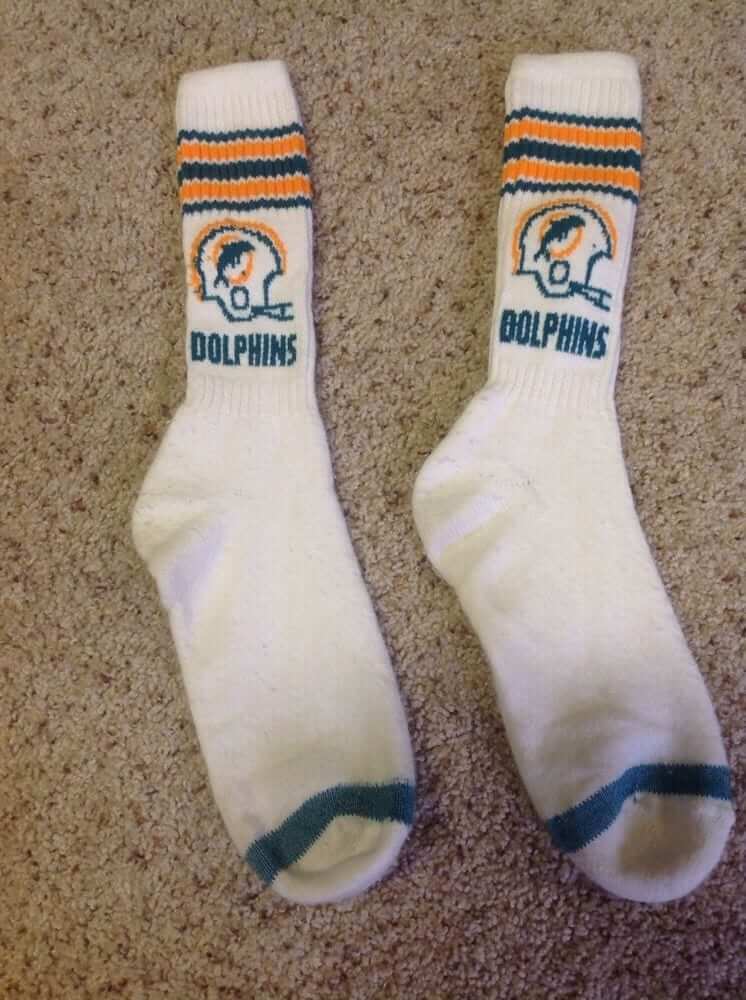
Boy, are these terrific or what? Don’t recall seeing a lot of logo socks back in the day. If I had, a Cowboys and Bengals pair woulda been in my sock drawer. But if you’re a Dolphins fan, these socks should be just the thing.
Here’s the rest of this week’s picks:
• Stay in shape with this 1970s- era NHL Hockey Player’s Conditioning Manual.
• Interesting set of 22 1970s NFL matchbook covers.
• And here’s a lot of six 1966-1967 NFL book covers.
• Here’s a set of four 1965 NFL placemats. The key deal here is, while you’re eating dinner, you can learn all about offensive formations. “Mom, Brown Right Over Flip Zac 73 Chicago F Arrow X Curl — and pass the salt.”
• Technigraph alert! This 1965 49ers plaque would look good on the wall at Uni Watch HQ in Brooklyn. Or at my house, come to think of it. (P.S. Here’s a Falcons helmet still in the 1960s shrinkwrap!)
• Here’s a Wilson promo photo of Packers RB Paul Hornung. No facemask!
• Bucco Bruce is front and center on this 1970s Tampa Bay Buccaneers kids spiral notebook.
• Hmmm, why would a Pirates bobblehead be wearing red and green?
• I like how “CHIEFS” is emblazoned on the chest of this Wilson-branded jersey. Wonder why NFL teams haven’t done this? This ad says 1970s, but the uniform number suggests that it might have been made for Joe Cool’s time with the team (1993-1994).
• Nice 1970s San Diego Chargers poster by Stancraft. This one ends tonight!
(The seller has more here.)
• Seen plenty of these 1960s-1970s NFL helmet banks before- but never a Broncos version.
• This auction is for a pair of 1969 caricature drawings of Cowboys greats Chuck Howley and Bob Lilly. I think the artist missed the mark.
• Staying with the Cowboys, here’s a 1971 promo poster of “Bullet” Bob Hayes. No team markings on this one.

’Skins Watch: As you know, ’Skins Watch now runs only on Fridays, but this can’t wait: The new season of South Park begins tomorrow, and they’re apparently going to address the ’Skins situation. This teaser video reportedly aired during Sunday’s Eagles/’Skins game, but only in the DC market:
E-book reminder: In case you missed it yesterday, our friends at Diversion Books are currently offering Uni Watch readers a special $2.49 price on Mike Shropshire’s excellent book The Ice Bowl. Full details here.
Uni Watch News Ticker
A joint effort by Garrett McGrath and Paul

Baseball News: Giants CEO Larry Baer talked on a podcast about how ads on MLB uniforms could become a reality under new commissioner Rob Manfred (thanks, Phil). … The Washington Post has a great piece about the traveling secretary and clubhouse staff with plenty of uni details (from David Goodfriend). … Back in 1966, an umpiring team’s uniforms were lost, so they had to wear pink Yankee Stadium ushers’ shirts and Yankees caps (great find by Todd Radom).

NFL News: The NFL logo was missing from Jets safety Antonio Allen’s jersey last night (from Matt Harris and Ross Hazlett). ”¦ Someone at Sunday’s Bills game was wearing OJ Simpson “Guilty” NOB jersey (from Brady Phelps). … Teddy Bridgewater switched from white gloves in the first half to black gloves in the second on Sunday (from Wesley Eustis). … The 1964 Dr. Pepper Bottler Meetings program featured a beautiful cover photo of an old Cowboys/Steelers game (thanks, Phil). ”¦ As you know, the Chargers have a yellow stripe on their socks. But Malcolm Floyd has two yellow stripes — one high and one low (from Jared Buccola). ”¦ Bears LB Jonathan Bostic wears No. 57. But is the 7 bigger than the 5? Sure looks that way (from Frank Mercogliano).

College Football News: The University of Louisville unveiled a gray and red uniform that they will be wearing at home against Florida State on Oct. 30 (thanks, Brinke). … Jameis Winston coming out in his full uniform for warm-ups on Saturday was a “miscommunication,” according to Florida State head coach Jimbo Fisher. … “I noticed during last Saturday’s Michigan/Utah game that when Utah QB Travis Wilson went down with an injury in the second quarter, one of the Utah athletic trainers was wearing a fanny pack with the Fiesta Bowl logo,” says Sean Lewis. “Utah has only appeared in the Fiesta Bowl one time (2005). I won’t go as far to suggest that the fanny pack was from that trip, but I can’t possibly think of another reason why a trainer would have something like that.” … Nebraska will be wearing those “Red Rising” unis Saturday night against Illinois. … 1968 throwbacks on tap this weekend for Virginia (thanks, Phil). … With Arizona State slated to do the blackout thing this weekend, here’s a look back at previous ASU blackout games (Phil again). ”¦ Here’s a good look at Navy’s 1963 “Beat Army” helmets, which also had helmet NOBs (from Erkki Corpuz).

Hockey News: Here’s a view of the All-Star Game patch on the Blue Jackets’ jersey. … The Calgary Hitmen wore their Bret Hart-inspired sweaters on Saturday (from Mike Styczen). … Great story from Graham Clayton, who writes: “In 1995 Sweden issued a stamp commemorating the country’s victory over Canada in the Gold Medal game at the 1994 Winter Olympics in Lillehammer, Norway. The stamp shows Peter Forsberg scoring against Canadian goalie Corey Hirsch. While Forsberg gave his permission for his image to feature on the stamp, Hirsch declined. Stamp designer Lars Sjööblom got around this by changing Hirsch’s uniform from red to blue and changing his number from 1 to 11.”

NBA News: A shot from a preseason photo shoot reveals that the Hawks have changed their chest insignia from the team name to the city name. As you can see, they’ve also removed the secondary logo on the right leg of the shorts, added the Pac-Man logo to the left leg, and moved the NBA logo from the left leg the upper-right thigh. (And of course they’ve also moved the NBA logo on the jersey from the front to the back, but that’s a league-wide thing.)

College Hoops News: The North Carolina State Wolfpack unveiled their new men’s basketball uniforms yesterday (thanks, Phil). … The Siena College Saints have new uniforms for the upcoming season as well. Look at those shorts! … Western Kentucky is asking for fan input on an alternate jersey design (thanks, Phil).

Grab Bag: “This past weekend I had the pleasure of being in Wisconsin,” says reader George Nikas. “I saw this sign in a local bar. I love the use of the logos, but the best part of it was that it’s carved in wood (or out of wood).” … A Detroit-area mom and daughter have been charged with putting a huge penis image on a local football field. … Melbourn Squash Club’s new logo tried to capture the essence of the sport without showing a racket. Interesting stuff (from Yusuke Toyoda). … Here’s a gallery of national cycling kits from the recent under-23 world championships (from Sean Clancy).

I think we need to see the full episode before we discuss South Park. It is South Park, after all, and it involves Eric Cartman, who has been shown to be the most evil character that universe on multiple occasions. The episode could be Anti-Redskins, but it could also flip things around, with Cartman losing his fight against Snyder and the name being defended for various reasons. They could also mock both sides and imply that the whole issue is stupid. We really don’t know until it airs.
They could also mock both sides and imply that the whole issue is stupid.
I fully expect this to be the case.
Oddly, South Park is some of the best societal satire we have today. They give a good poke in the eye where it’s deserved.
“The episode could be Anti-Redskins, but it could also flip things around, with Cartman losing his fight against Snyder and the name being defended for various reasons.”
~~~
I cannot imagine Parker & Stone defending (or even having Cartman, by proxy, defending the name. More likely, which both you and Paul have noted, they’ll probably poke fun at both sides. But I highly doubt the episode would be “pro” the R-word.
I can confirm that the South Park spoof did indeed air in the DC market during the Iggles game. And it was fantastic.
Doubtful that MLB would pioneer the use of ads on its uniforms, especially considering how riled up fans got when they tried to put advertisements on the bases several years ago.
That was in 2004. Not quite ancient history, but I think it would be fair to say that many people’s attitudes on many things have changed in a decade’s time.
(Not my attitude on uniform ads, however.)
I think I’d rather see an advertisement on a base than on a uniform, if this must come to pass.
I don’t know. I bet it will happen whether we like it or not.
I remember when major league ballpark outfield walls didn’t look like Triple A ballpark outfield walls.
link ;)
The 70’s and 80’s when outfield walls were adorned with the logos of other teams in the league, not ads. IIRC, the Shea Stadium logos for each NL team were on pennants.
Ads started popping back up on walls in the 90’s, but not sure exactly the year or ballpark where that might have happened.
LOL.
Yeah I know baseball has had a history of ads on field pre-1970’s-ish. But I remember the 90’s (late 80’s?) ads starting popping up on outfield walls again. I remember Yankee Stadium being one of the last ones to submit (I could be wrong). I was actually embarrassed for the Twins in the Dome since I remember them being one of the firsts to do it again.
Look at those beautiful blue fences in 1988 AD-FREE!
link
It was when that stupid GAP sign started appearing on outfield walls’ gaps in the mid-90’s. I think that was the moment when outfield wall ads were accepted again.
Yankee Stadium 2008
link
“Look at those beautiful blue fences in 1988 AD-FREE!”
The fence is about the only thing in that photo that’s ad-free…
True.
I am convinced that the NFL field of play will have a primary ad on the 50 yard line instead of home teams logo as well as secondary ads at the 25 yard lines.
Yeah, link
You can thank the Orioles. When Camden Yards opened it was the first ballpark since the 60s to feature ads on the walls. I remember at the time people were so gushing over the ballpark that every single aspect of it was embraced–including the ads.
Must have been at least before 1957.
link
Brinke, you are *assuming* that piggy bank was a Pirates bank in red and green. It only says Pittsburgh.
It’s actually the assumption of the seller – though, it’s a piggy bank, not a bobblehead.
There is no way (without the names being printed on them) that I could guess those Cowboys caricatures were Howley and Lilly.
(btw, I notice a spellcheck feature here as I comment that I have never had/seen before)
They look like “TV Fred” from the old Captain Kangaroo show: link
YES!!! That’s the face I was thinking of, but could not for the life of me remember who it was or what show it was from!
Ronnie, you are life saver!
“(btw, I notice a spellcheck feature here as I comment that I have never had/seen before)”
That’s a feature built into your browser, not this site.
Crazy! My work must’ve updated to IE6!
‘Baer said placing ads on uniforms could be an alternative to raising ticket prices.’ Really? How dumb does he think fans are. Nothing will stop ticket price increases. Ads on NHL dasher boards? Check. Prices go up. In-game ads during TV broadcasts? Check. Prices go up. In-stadium ads on every non-moving object? Check. Prices go up.
Reminds me of the PA state tax on liquor sales. Part of the overall tax includes an 18% hit for the Johnstown Flood repairs. The flood occurred in 1936, the city was rebuilt by 1942. And 72 years later, the good folks of the Commonwealth are still paying to rebuild Johnstown.
Baer was Olbermann’s “link” yesterday. Key points: Baer couching his words so that he could not be construed as saying definitely that ticket prices would not go up, and the fact that fans are willing to pay the continuously escalating prices.
The PA flood tax reminds me of our own New York State Thruway. When the Thruway opened in 1953 they told us the bonds would be paid off by 1965 and then we could drive it for free. Instead we keep paying, tolls keep rising and there’s no end in sight. Promises, promises.
Same with the Penna Turnpike. I at one time had a 1950 copy of the trade magazine “Highway Builder” dedicated to the Turnpike extension from Carlisle (formerly Middlesex) to Valley Forge. The original Irwin to Middlesex Turnpike was opened in 1940.
In there, I distinct remember reading that the Penna Turnpike would be paid off by c.1986.
Act 44 ensures that the Turnpike will always be a toll road, a very expensive toll road, with annual rate increases.
PA, NY, the Mass Pike as well.
To this day I find it a little hard to believe that this toll road actually DID go away when it fulfilled its statutory mandate:
link
So did the Denver-Boulder Turnpike.
Right. And Coloradans still refer to that stretch of Route 36 it as the Boulder Turnpike, even though it technically hasn’t been a turnpike for almost 50 years.
FWIW, I think it was irresponsible to promise dropping the toll in the first place. Even if you pay off the construction costs, there’s still the maintenance that link.
As great as the Eisenhower Interstate Highway System is, they made a mistake in not making tolls the norm.
You can say that about most “temporary” taxes.
Income tax in Canada was supposed to be a temporary tax to help pay for the war – WWI that is.
link
and an old cartoon
link
It’s all about the First Rule of Acquisition:
“Once you have their money, you never give it back!”
Fun to read the Jack Carlson piece on rowing blazers. Not an oarsman meself, except insofar as you count self-torture on a Concept2 indoor thing.
The Royal Henley Club is completely crazy in its devotion to the rowing past. Awesome old photos all over the walls, plus oars and boater hats and ribbons and medals galore. I had a job a few years ago working with an Englishman ex-rower who loved the whole thing so much that he lived in Henley, a few blocks from the club. I stayed in one of the Club’s guest rooms. Each guest room was decorated to honor one of the Royal Henley rival clubs from overseas. Hence a Vesper Room, a Harvard Room, etc. The walls were painted the color of the rival club, which also carried over to the curtains and towels. Completely nuts. Lots of relevant pennants and photographs and program covers on the wall, etc. The whole shebang was way too Tory for me, but you gotta love uni mania and over-the-top hospitality, right?
On that Swedish stamp, Corey Hirsch was the goaltender for Canada, not the U.S.
Fixed.
Typo-spotting in the hockey section:
“Here’s a very of the All-Star Game patch on the Blue Jackets’ jersey.”
Thanks. Fixed.
I’ll check when I get home, but I’m certain I have a Browns shirt/jersey like that Chiefs shirt/jersey. It’s #19, for Bernie Kosar, so I would also assume it to be early-90’s and not 70’s vintage like they are advertising it to be.
Before Montana in 1993, there hadn’t ever been a Chief to wear the number 19, since it hadn’t been issued since the team moved from Dallas (it was the number of original Texans QB Cotton Davidson, but he was sent to Oakland after the 1962 season). So either that is a 90s replica, or it is older and Wilson used a then-unassigned number.
In the Army-Navy photo, what’s the story for the “Drive for Five” on the back of Staubach’s jersey?
link
Re: “Great story from Graham Clayton… The stamp shows Peter Forsberg scoring against U.S. goalie Corey Hirsch. While Forsberg gave his permission for his image to feature on the stamp, Hirsch declined…”
Not that it’s a happy memory for me, but Corey Hirsch is Canadian and it was Team Canada that lost to Sweden in the ’94 Olympic final, not USA…
Yep. link for the stamp.
You’d think Tommy Salo would’ve gotten his own stamp, though, for link to ice the gold.
“In 1995 Sweden issued a stamp commemorating the country’s victory over the Canada…”
Berlin top flight soccer club Hertha BSC will wear special home shirts during their league game Wednesday night. Shirt Sponsor DB – German Railways shows support for Youth Sports funding “Jugend Trainiert Für Olympia” link
The idea behind that Melbourn Squash Club logo is brilliant (BTW, there’s no “e” in “Melbourn,” the club is in England), but to my eye there’s a disconnect between its “story” and the way the design “tells” it. If, as the narrative suggests, the lines are intended to illustrate the ball’s flight path during a typical rally, thereby conveying a sense of the game’s frenzied, pell-mell nature, then the use of two contiguous lines hardly seems appropriate, as the ball can only have one flight path (not to mention that the first parabolic line seems to reflect a flight path that doesn’t exist in squash, namely a lob TO the front wall). If, on the other hand (and though the narrative suggests otherwise), the pair of contiguous lines are intended to convey that notion by illustrating player movement, the players are running in odd directions relative to one another (not to mention in a curved path that, again, you wouldn’t see done).
tl;dr: Boutique design firms are no less immune from embellishing their design “stories” than their behemoth counterparts.
I came away with similar feelings. I like the thought behind it, I like the way it stands out in the field, but at least to my untrained eyes, I’m not seeing “squash” from the squiggly ‘M’.
Thought this might be interesting. The BBC is creating a film about the life of Stoke City’s kit man.
link
Not knowing anything about the guy, I’d LOVE to watch a movie that focuses on a kit man.
In regards to ads on pro sports uniforms…Here is something that never gets brought up by us, the consumers as a whole, that owners and decision makers absolutely need to hear. I understand there are corporations willing to pay for the exposure of being present on a uniform, HOWEVER, that corporation IS NOT paying me to represent their company. Why would I purchase the right to advertise for a corporation? If sports owners want to place advertisements on uniforms, then anything that corporations logo should be given away to fans for free. Think this is unprecedented? Go to any college football stadium and take a look at the student sections wearing free t-shirts, more thank likely those shirts bear the logo of a corporate sponsor, however nobody is forced to purchase those.
you’d think that, and i do too, but then look at how much nascar stuff gets sold every year. it boggles the mind. people paying $100 to wear an M&Ms jacket.
Actually, if you go to college towns, you’ll see kids wearing fundraising t-shirts emblazoned with various sponsor logos.
And people seem to have no wearing uniforms with Swooshes and Under Armour’s “X”. Sure, makers’ marks aren’t exactly ads, but they still serve the same purpose – signaling a corporation’s association with a sports team.
Here’s a good look at Navy’s 1963 “Beat Army” helmets, which also had helmet NOBs
And my favorite bit – huge “N”s on each shoulder!
Uni Watch must not be getting my e-mail submissions if I keep seeing some of these crap ones, like Jon Bostic’s numbers. Obviously, the 5 is crumpled slightly on his jersey which would give the appearance of the straight 7 being larger.
Coming off of Phil’s twitter question last night regarding the Bears white cleats, when I was a kid white cleats were most frequently worn by teams which played on astroturf. Which makes sense since white shoes would look muddy playing on dirt.
However that association has been flipped. Of the 17 teams which currently play on grass, 9 wear white shoes to 8 which wear black. This includes cold weather teams in Chicago, Pittsburgh, Kansas City, and Denver. The overwhelming majority of teams which play on artificial surfaces wear black, 12 out of 15.
In case anyone is wondering to what what he’s referring.
Interestingly (and I didn’t read them all), the responses seemed to be about 70/30 white vs. black.
I bet a lot of it depends on when we grew up, or even more…if we remember the 1985 team, which of course, sported the white turf shoes (mostly)
70/30 white vs. black? That’s horrifying.
First time submitter long time reader. I was excited and dissappointed a few weeks ago to see the school from my hometown, McNeese State on this site. Unfortunately it was to show off the digital camo unis they were to wear last weekend.
I haven’t seen any updates since the game took place so I grabbed a few shots of the horribleness from the local newspaper’s website:
link
link
link
Their regular uniforms are very classy. I don’t know why they would want to stray:
link
link
Wow! They looked every bit as bad on the field as I suspected they would. Thanks (mostly) for following up.
Louisville’s new uniforms are an adidas template.
The team I announce for, the link, uses the same template.
Go ‘Chokes!
Lee
What a great nickname!! There’s an apocryphal story that a minor league football team (the Hartford Charter Oaks) got the Rev. Spooner treatment from a Connecticut announcer. But I’d be proud to root for Artichokes.
The story goes that when SCC was formed, they had the student body vote for the nickname. There was a group of students that didn’t believe in sports because they wanted a college to focus on academics, so they proposed Artichokes in order to make a mockery of athletics.
The student body got behind the name, and it has been a source of pride ever since.
I love Jack Carlson’s piece on rowing blazers today. I always appreciate it when two of my deepest interests – history and sports uniforms – converge. Dujour.com link on Jack’s new book as well, including link. In particular, I love the photo showing the Hampton Curtains Blazer!
Publishers site
link
I have a mental image of crew members thoughtfully embroidering waves on their blazer patches just before hitting the hay.
I can’t figure out the white/gray blotches on the Louisville uniforms. Are they cardinal droppings?
The Titans might have reason to hold off on giving Rob Bironas a uni memorial:
link
Those of us who have been around long enough to remember it would probably prefer this not to start a Steve McNair-like debate. That was not pretty.
I could almost forget Manfred the ads on the jerseys if he forced the Wilpons to sell.
Almost.
I noticed on the 1965 NFL placemat in Collector’s Corner that there was a Monday night game scheduled for October 4th. Never realized that NFL games were played on Monday night prior to 1970.
Yes, they were. Not often, but, yes.
There were, apparently, 24 NFL and 2 AFL games played on Mondays prior to 1970, starting with a Detroit/Brooklyn game on October 22, 1934.
There was one in 1936, 1937, 1938 and 1946, two in 1947, one in 1948, three in 1949 (two on the same day, and Chris Berman did not call the second one), one each in 1950-1952 and 1955. I THINK CBS televised one or two of the mid-1950s or mid-1960s ones as an experiment. I think.
There were then two in 1964, one each in 1965-1967, two NFL and one AFL in 1968 and again in 1969.
The St. Louis Cardinals actually hosted a Monday night game for four straight years (1965-68).
Here’s the list, for those who care:
10/22/1934…Detroit 28 vs Brooklyn 0
09/28/1936…Detroit 39 vs Chicago Cardinals 0
10/04/1937…Chicago 7 at Pittsburgh Pirates 0
10/03/1938…Pittsburgh Pirates 13 at NY Giants 10
09/30/1946…Chicago Cardinals 34 vs Detroit 14
09/29/1947…Boston Yanks 7 vs NY Giants 7 (tie)
09/29/1947…LA Rams 48 at Pittsburgh 7
10/04/1948…Chicago 28 at Chicago Cardinals 17
09/26/1949…Chicago Cardinals 38 vs Washington 7
10/03/1949…Philadelphia 22 at Detroit 14
10/03/1949…Washington 27 at Pittsburgh 14
10/02/1950…Chicago Cardinals 55 vs Balt Colts 13
10/08/1951…Detroit 37 at NY Yanks 10
09/29/1952…Washington 23 at Chicago Cardinals 7
09/26/1955…Pittsburgh 14 vs Chicago Cardinals 7
09/28/1964…Green Bay 14 at Detroit 10
10/12/1964…Baltimore Colts 47 vs St. Louis Cardinals 27
10/04/1965…St. Louis Cardinals 20 vs Dallas 13
10/31/1966…St. Louis Cardinals 24 vs Chicago 17
10/30/1967…Green Bay 31 at St. Louis Cardinals 23
09/16/1968…LA Rams 24 at St. Louis Cardinals 13
10/28/1968…Green Bay 28 at Dallas 17
09/09/1968…Kansas City 26 at Houston Oilers 21
10/13/1969…Baltimore Colts 24 vs Philadelphia 20
10/27/1969…Dallas 25 vs NY Giants 3
10/20/1969…NY Jets 26 vs Houston Oilers 17
I definitely knew this about Monday night games, that there were plenty before it became a TV show.
On Pro Football Reference, you can filter by day of the week, you’ll find some interesting stuff.
I don’t know how far they went back, but for sure the Monday night games in 1968 and 1969 were held to ‘test’ the Monday Night Football concept, in anticipation of the full merger.
Thanks for pulling up the list of games!
I do wonder what the rationale was at the time for the pre-late ’60s Monday games was.
Lee
Capitals sweaters for 2015 Winter Classic
link
I love how the “W” includes an homage link. Nice subtle way to create a custom mark without going to far and losing the classic block-letter feel.
Thanks! I had a great time developing the mark.
And the same for the two ‘A’s in Capitals… as well as the Alternative Captain’s ‘A’…
Very cool!
Splendid look. It references the Brooklyn Americans, who perhaps were the inspiration for this team, all along.
Whoever decided to shoot those uniforms against a red backdrop is an a-hole! I’m having a hard time processing how they’re supposed to look because the red is overwhelming the blue and (especially) white!
I vote thumbs up for the Capitals Winter Classic, even though it feels a little retro forced, the colours look great, I would have preferred at least one more stripe at the bottom of the sweater. The current striping pattern at the bottom of the sweater looks a little too much like Team Canada, Carolina Hurricanes, etc
Classic example of “less is more”
“I like how “CHIEFS” is emblazoned on the chest of this Wilson-branded jersey. Wonder why NFL teams haven’t done this?”
I’ve always liked that look, which I attribute to the old Sears catalog jerseys that they sold when I was a kid.
(found one on ebay too:
link )
Paul, is that NBA team still coming out with new alt unis (I think I read something from yesterdays post about it)
holy cow. Sorry man. I promise I read the blog! haha
those dallas unis are ugg but A for effort
Somebody mentioned on this very site that a skyline is a bad idea if it has no distinguishing buildings. Poorly played, Dallas. D-
The Mavericks’ new alternate uniforms are the winners of the public design competition the team announced last year. Hey, you get what you pay for.
The Nuggets did it much better decades ago.
Such a shame. It took a public “design contest” to nick the ol’ Denver concept, if not an ol’ Seattle logo concept. That’s what you get… free. And suck royal.
And then the Pelicans? Lol. Wonderful girlie shoulder cut. Refreshingly, boringly bland as you can get. Hurray for bad design in the NBA… both paid and gratis! That’s impressive.
I hate to be a nag, but the Catch of the Day has not changed since before you took August off. Could you please change it sometime soon? I really enjoy the off-the-beaten-path websites you find and post there. Thanks so much.
+1
Lee
I noticed on the sidebar that the link.
[blatant sarcasm]
And Paul, you’re obviously not paying close enough attention to the differences between the Flyers’ jerseys! The home one has white shoulders, while the third has black shoulders!
[/blatant sarcasm]
Yeah, I’m a bit disappointed with the Flyers reusing their WC uniforms, which I didn’t care much for the first time around. The only good element is the keystone captaincy patch, and that could easily be used on a new, more original design. I’m also sick and tired of the contrasting-color nameplates, considering it was gimmicky when it was first used.
Also, “vintage white”. *vomit*
The Pens definitely got theirs right, and I hope and pray they do switch to it permanently.
glad you like the Captaincy patches, some of my favorite work I’ve done.
Are you with Reebok or the league?
Just noticed an odd MLB logo on the Ticketmaster Sportstember site that is aimed at promoting September and sporting events. What is this? link
Probably doesn’t matter to anyone, but on that Dr. Pepper Cowboys/Steelers program cover…
That’s Amos Marsh (31) about to butt heads with Dean Derby (27).
#70 for Steelers is Hall of Famer Ernie Stautner.
link
Re: the AL umps ‘pink’ shirts
This looks fairly ‘normal’ – but one has to realize in the 60’s, AL umps had to wear their full jackets and ties almost ALL the time. Even when they were able to take off the jackets, they still had to wear long sleeved shirts. In B&W, outside of the Yankee caps, this could be a pic from anytime in the mid 70s on…
Joe Cronin was VERY conservative about things like this as AL president.
Not mentioned in the Ticker the last three days: this weekend was the first use of the Titans’ white pants (excluding the 2009 Oilers throwbacks) since Week 1 of 2007, and the first all-white for the Titans since Week 9 of 2006.
As much as the New Orleans font is too small, this new Pelicans font is too big.
Spotted another umpire wearing next years potentially new umpire shirt(all black, no white piping). Chad Fairchild at 1st base Giants/dodgers. Bill miller was wearingnone behind the plate there last night as well as other games since Mid-august.
you are in reality a excellent webmaster. The website loading
speed is amazing. It seems that you’re doing any unique trick.
Furthermore, The contents are masterpiece. you’ve performed a wonderful
task in this subject!
Heya my business is somebody in charge of below. I came across this kind of aboard i to uncover Promoted practical & this solved the problem available very much. I really hope to provide some thing again plus guide some others that you assisted me.