[Editor’s Note: Today we have guest entry from Chad Fette, who’s going to educate us on a sport that’s never been covered before here on Uni Watch. Enjoy. ”” PL]
By Chad Fette
When the classification of the sport you compete in is determined solely by the uniform you wear, it needs to be featured on Uni Watch. Competitive powerlifting is that sport.
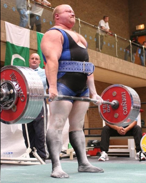
Powerlifting is traditionally a sport focused on three weightlifting movements: the bench press, the deadlift, and the squat. The goal is to lift as much weight as possible one time in each category. That process is much more complicated that you might think, and in large part it is due to the uniform-related issues.
One of the first decisions that must be made when entering into the sport of powerlifting is whether one wants to compete “raw” or “geared/equipped.” This choice is based on which type of uniform you chose to wear while performing your lifts. If you are going to compete raw, it means you perform your lifts with very minimal uniform support. Raw lifters typically compete in an amateur wrestling singlet and are only allowed to wear knee wraps, wrist wraps, and a weightlifting belt to enhance safety. These are all regulated by the competition’s sanctioning body (there are multiple federations and sanctioning bodies, much like in boxing, which can make for murky rules and inconsistent standards).
Geared lifters are more interesting. There is too much nuance of the gear to list in one post, but geared lifters wear a bench shirt, squat suit, and/or briefs. These three primary uniform components can be used singularly or in combination, and with the addition of belts, wraps (both knee and wrist) and shoes, can significantly increase how much weight a person can lift. How much of an increase? Consider this: The raw bench world record is 722 pounds; the corresponding geared record is 1,102 pounds.
All of the geared equipment is designed to store energy in the negative portion of the lift and use that stored energy in the initial phase of the positive portion of the lift. Let’s use a bench presser wearing a bench shirt as an example: As the weight is taken out of the rack and the lifter holds the bar in position with arms locked before descent, the shirt has minimal tension and is doing very little (except being very uncomfortable). As the lifter brings the bar down, the shirt begins to stretch and becomes very taught. Once the bar touches the lifter’s chest, the shirt is stretched to its maximum capacity. The lifter then aggressively begins to push the weight away from his body, capitalizing on the stored stretch at the bottom of the lift, and drives the weight up through lockout and completion of the lift.
The shirt is engineered to create this effect. Some shirts are worn as typical shirts, needing to be pulled on overhead, while others have an open back, similar to putting a blazer on backwards. The shirts are constructed from multiple materials, but popular ones are made of denim or canvas. They are triple- and quadruple-stitched at all seams and can be single- or multi-ply, which refers to the layers of materials in the shirt. The more layers, the more energy the shirt is capable of storing and the more the lifter is able to press.
To many, that sounds great — put on a shirt, bench more weight. But there are caveats. For starters, everything about them hurts. . Just putting them on can take up three people. You need to cover your arms and torso in baby powder, as every follicle on your body that emits sweat becomes a sticking point. Once they’re on, you are locked in that position until you’ve finished your workout. And the shirts can be dangerous — just because the shirt gives you the ability to handle more weight doesn’t necessarily mean you should handle that much weight. Also, people who wear these shirts in competitions can miss lifts because the weight they are attempting is not heavy enough to “break” the shirt. That means the shirt gets so tight toward the bottom of the lift that the bar physically cannot touch the lifter’s chest, which is a missed lift. And then there are the blowouts — among the scariest things in lifting. A blowout occurs when the shirt fails. The weight is too much and a seam gives out. When you have hundreds of pounds over you, the tear happens so quickly that it can literally sound like a gunshot, with the weight free-falling onto the lifter. Spotters at these events are trained to handle this situation, but sometimes it doesn’t matter.
There is also a great debate within the powerlifting community between the raw and geared lifters. Raw lifters think using gear is cheating, and that a geared lifter’s numbers are therefore artificial. Geared lifters think raw lifters are jealous and just not capable of handling those kinds of weights (lifting geared is whole different training regimen and does take special skills). This debate will likely get more heated as technology and skills improve, which will lead to bigger and bigger numbers and a greater gap between the two categories.
ESPN reminder and ASU update: Paul here. In case you missed it yesterday, my latest ESPN column is about the use of religious imagery on uniforms. Check it out here.
Even if you read the column yesterday, you may have missed an update that we added at about 1pm, which is that there’s a new development regarding the cross decal on the Arkansas State helmet. After the Liberty Institute — a religious advocacy group — complained about the school removing the cross, the school has issued a new policy, as follows: Individual players will now be permitted to voluntarily wear the cross if they choose, as long as they pay for the decal themselves and apply it to their own helmets. You can read the university’s full statement on the matter here. (My thanks to Arkansas State journalism instructor Larz G. Roberts for providing that letter.)
Also:
• As I noted yesterday here on the blog and also in that ESPN column, Tennessee wore a black cross in 1965. But it turns out that the Vols also wore a cross on one other occasion: After Tennessee alum Reggie White passed away in December of 2004, Tennessee added a small cross memorial for the 2005 Cotton Bowl. (Kudos to Jared L. for that one.)
• Reader Robert Shears pointed out an additional example of an athlete wearing religious imagery: Canadiens goalie Carey Price has worn a cross on his mask’s backplate.
• Another goalie with a cross on his backplate: Cam Ward. (Courtesy of Mike Engle.)
• Alvaro Muñiz notes that Red Sox slugger David Ortiz wore a Catholic saints bracelet in 2008.
• And Tony David Potter pointed out that Trinity University has had a Sikh basketball player named Darsh Singh who plays while wearing a turban.
Great stuff, people. I’m really fascinated by this topic — my thanks for all the contributions.
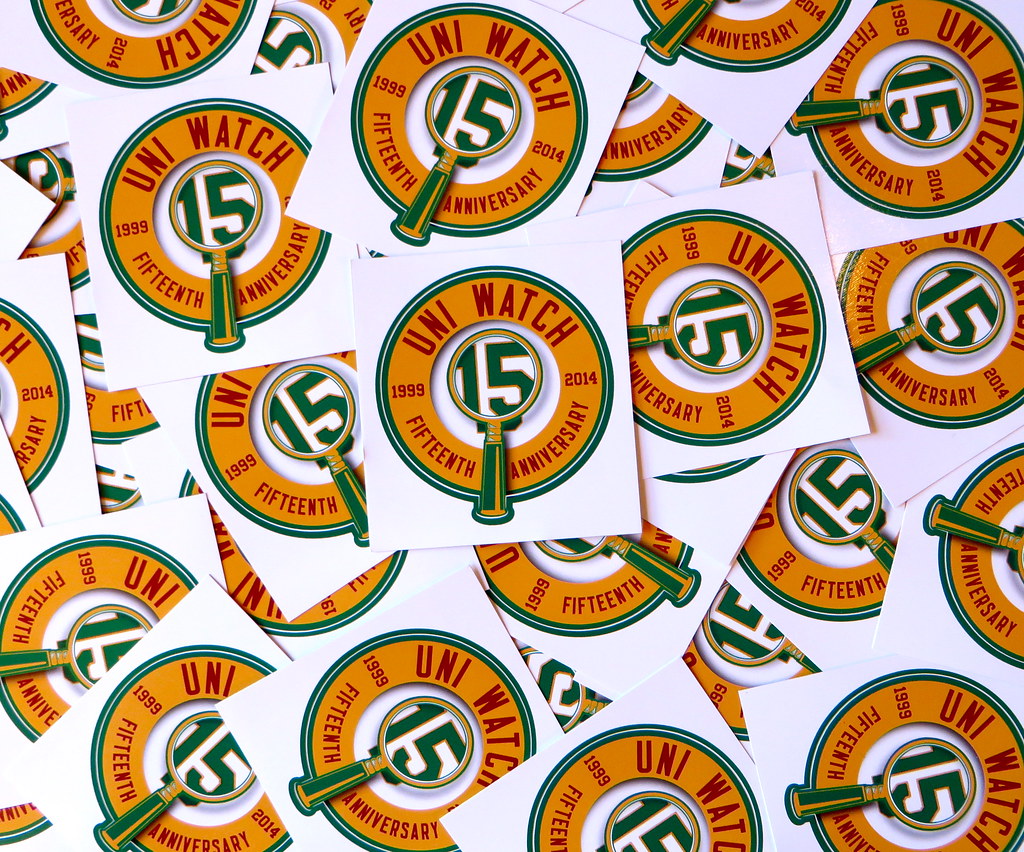
Click to enlarge
By popular demand: You asked, I delivered. The Uni Watch 15th-anniversary logo is now available on a high-quality vinyl sticker, suitable for plastering on your laptop, your file cabinet, your car bumper, your brother’s forehead, or whatever. The circular stickers measure 2.75″ across (or 3″ if you include the little extension for the magnifying glass handle) and are priced like so: $2 for one, and an extra dollar for each additional one.
To order, send a check, money order, or well-concealed cash, along with a self-addressed stamped envelope, to Paul Lukas, 671 DeGraw St., Brooklyn, NY 11217.
Big thanks to Ron Roza and his crew at Sticker You for doing such a nice job with these.

’Skins Watch: Bruce Anderson is in a fairly unique position: He’s a member of the Coquille Tribe and he played for the ’Skins in 1970. He thinks the team name perpetuates negative stereotypes. … The editor of a Pennsylvania high school newspaper and the award-winning journalism teacher who serves as the paper’s faculty advisor were both suspended for refusing to print the name of the school’s teams, which is Redskins.

Baseball News: Buried within this story is the news that the Doubla-A Chattanooga Lookouts “will soon get to work on a uniform makeover” (from Michael Vines). ”¦ Looks like the addition of the MLB postseason sleeve patch will mean the removal of the Orioles’ 60th-anniversary patch (from Wes Reichart). … Several readers noted that the Gatorade ad for Derek Jeter that everyone’s talking about shows Jeter holding a cap with a white sweatband, which isn’t New Era’s current style for 5950s. Must be an old photo. … Interesting piece about Bud Black wearing someone else’s glove on his 1991 Donruss card (from Chris Cruz).

NFL News: Some spectacular illustrations among these early-1960s Dallas Texans program covers. So much FUN in those illos — something sorely lacking in most of today’s sports graphics (big thanks to Bruce Menard). ”¦ A Thursday-morning SportsCenter report on Cardinals RB Jonathan Dwyer featured a photo with the advertising patch on his practice jersey blacked out. Then they went to a different graphic that included the same photo with the ad patch left untouched (good work by Matt Spencer). … McDonald’s Happy Meals now come with NFL figurines. “Looks like the Bengals are the only team to get proper helmet graphics,” says Steve Jacobson. … CNN apparently can’t tell one sport’s Cardinals from another’s (thanks, Phil). … If you liked Ray Rice so much that you bought his overpriced polyester shirt and then came down with a case of buyer’s remorse after you learned that he’s not such a great human being, the Ravens will let you trade it for someone else’s overpriced polyester shirt this weekend.

College Football News: Here’s an interview with a guy who collects Minnesota Gophers jerseys. ”¦ New Mexico has some new jerseys, although I’m told neither of them will be worn this weekend. ”¦ Here are this weekend’s uni combos for UNC, Louisiana Tech, Vanderbilt, Mississippi State, Washington, and West Virginia. … Tennessee might or might not wear gray this season, and definitely won’t wear gray against Florida on Oct. 4 (thanks, Phil). … This is pretty cool: Duke’s throwback game will also feature a throwback scoreboard! ”¦ BYU will retire Jim McMahon’s jersey on Oct. 2 (thanks, Phil). … As promised, Florida State has adjust its helmet shell and facemask colors (Phil again). … It’s not like Boise State really needs another helmet, but I have to admit that their latest one looks pretty good. … LeBron James apparently wanted to dress up in an Akron football uniform. But Akron is outfitted by Adidas, while James has a deal with you-know-who, so you can guess what happened. Douchebags. … Kansas State coach Bill Snyder was apparently using his jacket from last season’s bowl game last night (from Mark Emge). … Oooh, check out the gorgeous sweater worn by Indiana trainer J.D. Ferguson in 1931 (big thanks to Jay Sullivan). … Wisconsin is bringing back the black-striped helmets this weekend (Phil, of course).

Hockey News: New mask design for Devils goalie Cory Schneider. Here’s a video clip where he explains the design (from Kevin Clark). … The Tampa Bay Times, which recently took its name off of the Lightning’s arena, may not even exist three months from now. … “In recent years, Dartmouth teams and athletes have been using the ‘Lone Pine’ logo more often,” says Tris Wykes. “Here it is on goalie James Kruger’s new leg pads.” … New masks for Blues goalies Jake Allen and Brian Elliott (from Ed Bauza). ”¦ The Capitals have been quietly collecting the hats thrown onto the ice for hat tricks for the past six years and have now used them to create a new hat trick display — nice (from Mike McLaughlin).

Soccer News: Montreal Impact midfielder Jérémy Gagnon-Laparé has an unusual abbreviated NOB (from Sean Kautzman). … Tuesday’s match between Liverpool and Ludogorets was red vs. green, creating a nightmare for colorblind fans (from Yusuke Toyoda). … Also from Yusuke: Several Nike-outfitted European teams have some seriously garish new uniforms. … “AC Fiorentina (Florence, Italy) is currently playing without a shirt sponsor,” notes Billy Duss. “I think it makes the front look a little empty.” … “The badge of Mönchengladbach’s Patrick Herrmann faced in the wrong direction during his post-match interview on Thursday,” says Tim Ruschkowski. ”¦ And From that same match: Villarreal normally has an Xtep maker’s mark on the upper-right chest area, but they used yellow tape to cover it up. Why? “Shoe company Brax, a Borussia sponsor, is currently suing Xtep over the similarity between Xtep’s stylized ‘X’ logo and the ‘X’ in the Brax wordmark,” explains Bernd Wilms. “Villarreal avoided wearing the Xtep logo so as not to allow for the lawsuit to move into German jurisdiction.”

Grab Bag: New college hoops unis for Oklahoma (thanks, Phil). ”¦ As sponsors continue to distance themselves from the NFL, Skott Daltonic points out that this might have implications for the larger issue of advertising on uniforms. Basically, companies might think twice about having an ad patch on a team’s jersey if they think one of the players might end up as a criminal. … The Colombian women’s cycling team with the faux-nudie uniforms has decided to keep wearing them (thanks, Phil). … Aussie footballers wear shorts, but a 1980s player named Michael Reeves wore padded pants more like American football pants to prevent bruising on his legs (from Graham Clayton). … Reprinted from yesterday’s comments: Here’s a gallery of high school football helmets from Michigan (from Jason Axel). ”¦ Good article on the Museum of Brands (thanks, Phil). … Longtime reader Gordon Donovan is a professional photographer and has taken some spectacular photos of rusting and decaying ships moored off of Staten Island. Powerful stuff. ”¦ Sheer genius: Beer cans designed like Pantone swatches (big thanks to my pal Friederike Paetzold). … Eric Frein — the guy who recently ambushed a pair of Pennsylvania state troopers, killing one and wounding the other — had served jail time back in 2006 for stealing World War II uniforms from a reenactment event. ”¦ Consistency problems: The famous Stone Pony rock club in Asbury Park, N.J., has three different pony logos on its exterior (from John Calabrese).

Bill Synder…not Bill Schnider.
Snyder, not Synder. Now fixed.
I thought we already covered awhile back that Jeets has his hats customized for some reason with a white sweatband? I’m positive it’s been covered either here or on sportslogos before. And it’s definitely not an older model, since the underbrim is definitely black, not gray.
I also remember this being covered on here.
I wonder what the leaders at Arkansas State are going to say when a Muslim player asks to wear a crescent moon and star symbol sticker on his helmet?
Terrerrerererist!!!!!!
Yes! The stickers!!!
Thank you, Chad Fette. Great lesson on what must be, after all, the latest version of one of history’s oldest competitions. I just assume that there was a betting pool on whether Grook could lift a bigger rock than Agnar.
So when Chad writes…
“There is also a great debate within the powerlifting community between the raw and geared lifters. Raw lifters think using gear is cheating, and that a geared lifter’s numbers are therefore artificial”
… it’s hard for me not to automatically side with the raws. The gear seems like an exteriorized analog of PEDs. Maybe Chad is a gear-guy, and I really don’t want to give offense. I’d be very interested in his analysis of the kind of backgrounds or personalities that seem to accompany one camp or the other. I dunno. Could be a reflexive anti-tech attitude on my part; I’m weird enough that think that the poles in pole vaulting should go back to bamboo.
Connie- thanks for the immediate feedback. I do participate in the sport, but i would consider myself any kind of true authority figure on the actual lifts. I have trained in both formats, and can honestly say that the movements are similar in name only. Once a shirt goes on, it is entirely different lift. Different muscles used, different checkpoints. IMO, i think people fall into one camp or the other based on their skill sets: if one person excels sans gear, they are against it; and the if the other group takes to using gear easily, they favor it. Either way, it takes a special kind of crazy to lay underneath these weights.
just because the shirt gives you the ability to handle more weight doesn’t necessarily mean you should handle that much weight
I”ve come to realize that the less technology is involved in a sport, the more I like it. So count me on the side of raw lifting. The idea of sports is to see how well *you* do vs. your opponent…not how well your equipment does.
This debate will likely get more heated as technology and skills improve, which will lead to bigger and bigger numbers and a greater gap between the two categories.
And it will lead to bigger and more dangerous blowouts. Hope it doesn’t happen, but it’s bound to someday.
Thanks for a very informative article, Chad! It takes a special kind of crazy to write for Uni Watch, too, so consider yourself doubly special.
The Chattanooga Lookouts uniform makeover would likely be changing the color scheme to one more similar to the Twins; as a Dodgers affiliate, the Lookouts emphasized Dodger blue. Would the team change the logo with the eyeballs centered inside a C, which at one time was one of the more popular logos in the minor leagues?
I hope they don’t change the eyeballs. That’s been one of my favorite minor league hat logos link and probably one of the most recognizable logos this side of the Durham Bulls.
Yes, recognizable to those who follow minor league baseball or uniform/logo aficionados but every time I wear my Lookouts cap I get questions as to what the logo refers to. I do get compliments on the cap. Agreed, I don’t think they should consider changing it and I highly doubt they will.
They will not change the logo…they’ll just mimic the Twins’ uniform now instead of the Dodgers’ uniform.
An 8-bit scoreboard is not what I consider “throwback”.
I loved what the Phillies did during their throwback weekend in the summer against the Cubs – they tried to recreate the old Connie Mack Stadium scoreboard on the TV screen. I still can’t believe I didn’t take any photos, I was at the sunday afternoon game…
I like being educated. The powerlifting article was quite educational. Who knew??!!
Like so many things in life that seem simple, clearly powerlifting has a much higher level of nuance than one might ever suspect.
Much like the surge in curling fandom for example, a little education regading the sport/subject can open up one’s eyes and mind to something they may have previously poo-poo’d as simple, boring, and/or uninteresting.
The funny thing is- when i talk to people about powerlifting, the sport that compares most favorably to it is golf. Yes, golf! Looks easy, anyone can do it, some people are naturals, most are not. And to get good- really good, it takes years and years and years of honing technique and mastering your craft.
If you ever get bored and want to see some crazy stuff, try to find a powerlifting meet on youtube, they are intense. The last one i competed in, and 85 year women deadlifted 185 lbs. (raw).
Dumb Guy,
I’ll second that. I think that anyone who is going to watch a sport for the first time should spend some time beforehand reading about the rules, strategies and history of both the sport and the teams/competitors they are going to watch. They then won’t be as confused when they watch, which will increase their enjoyment and the possibility of becoming a regular watcher of that sport in the future.
I had no knowledge of the “geared” style. The only time that weightlifting gets any coverage is during the Olympic Games, which is the “raw” style.
Finally, I want to thank Chad for the informative article. I have submitted an article to Uni Watch for possible use, and I appreciate the amount of work required to not only write a story, but to source images and video clips which help explain the article as well.
I get that black is not an official Wisconsin color, but man… who cares, that red helmet is gorgeous. It might be my favorite in all of college football.
That kind of attitude doesn’t help the argument against BFBS.
A black stripe is hardly BFBS…
And I should say that I’m a staunch opponent to BFBS.
I realize that, and I’m 99% against BFBS. But, I’m also a hypocrite sometimes. I like what I like. Oh well.
I also agree with Scott. An accent color, if done correctly, does not necessarily ruin a good uniform. Black (or gray, or whatever) can be fine if done in small doses. But it’s all subjective, and always will be.
Here’s an example of my hypocrisy.
link
Hate the Iggles BFBS alts, but loved the old black accent around the numbers of their late 80’s/early 90’s set.
Scott, that black trim isn’t completely unprecedented, since the Eagles used black trim on the numbers and pants during the white-helmet years (1970-73 for the numbers, 71-73 for the pants stripes), at least according to the link.
Yeah, I know. I just cited the more recent uni, because I like that style better. Never was a fan of the white helmets.
Grey as a uniform color is the gateway drug to BFBS.
Nothing is wrong with black hats, shirts and britches.
Now if they could only remove the black accents from the Detroit Lions helmet & uniforms…
Paul, FWIW the turbaned basketball player goes to Trinity University (San Antonio, TX), not Trinity College(Hartford, CT).
Trinity U is the one sports fans have heard of, thanks to Lateralpalooza.
Aside from the fact that Trinity College has the longest winning streaks in intercollegiate sports (14 years) and most consecutive NCAA D-I championships (13), I suppose that’s correct.
Unfortunately, squash is not an NCAA-sanctioned sport. But I’m sure the Methodist women’s golf team, with their 13 consecutive NCAA D-III championships, appreciate Trinity’s accomplishments.
link
Ah, thanks — will fix.
“… Some spectacular illustrations among these early-1960s Dallas Texans program covers. So much FUN in those illos – something sorely lacking in most of today’s sports graphics (big thanks to Bruce Menard). …”
Bliss was it in that dawn to be alive,
But to be young was very Heaven!
— Wordsworth, “Prelude of the AFL”
Light-heartedness has been in short supply everywhere since about 1968. Could really use a reset button for that.
Comment of the Day!!!
Vetting ideas before a committee came into vogue around then. Lightness of the heart is usually a result of spontaneity.
Among the gallery of high school football helmets from Michigan; a Seahawk big cat mashup:
link
Paul, do you have any commentary on the MLS rebranding?
No strong feelings either way. Sorry, I realize that sounds like a cop-out, but I don’t follow the sport.
Good to see UNC will be wearing school colors for a change.
Thank you for the Bruce Anderson piece, Paul. I found his commentary compelling, and it reinforced my belief that changing the name is the right thing to do.
link And it’s the classic black jersey with the gold sleeves!
link
I hate the pens more than just about anything, but good on them for getting that right.
Perfect for a third.
Perfect for a first! Athletic gold > Vegas gold, at least as it relates to Pittsburgh sports teams.
(And that includes the Pitt Panthers.)
You can thank me for doing all the research and labor to get the numerals and lettering just right. :-)
Thank you very much. Especially since they changed in the late ’80s, and sometimes those details are ignored.
It’s the uniform from my childhood, and I hate it as much now as I did then.
Why? I loved those jerseys. The only jersey I liked as much since then was their third jersey turned road jersey in 97/8-01/2. (link)
I know Miss State is building a brand with adidas, but I’d love for the Bullies to atleast buy their MSU logo back from Nike. I think that would be awesome, esp for throwback uniforms
RE: McD’s NFL Figurines, Cincy isn’t the only team with the correct helmet graphics. Cleveland’s helmet, technically, has the correct graphics as well.
Too late for Skins Watch, but the link, with a less evil looking mascot and no belly dancers performing on the sideline.
Had that in last week’s ’Skins Watch.
Ah, sorry, it just popped up in my Facebook feed.
About Newcastle United’s third shirt – Is the EPL moving a team to Seattle to compete with the Sounders?
link
They’re probably trying to get away from their loan with a payday lender.
Too right. Bring back Newcastle Brown Ale.
In addition to David OrtÃz, doesn’t Tim Lincecum wear a saints bracelet (in his case, on days when he doesn’t pitch)?
Double-Fail: Notice the backwards “Z” photoshopped on the right side of LeBron’s helmet.
Paul,
I just wanted to say that I really enjoyed that ESPN piece. It’s a topic that really fascinates me too. I’m always interested in national team logos for olympics, soccer, etc. because of some of the amazing religious and other imagery you can find in them. Great read!
Thanks, PJ — appreciated.
Regarding the red/green color-on-color match-up, yes it’s a nightmare for colorblind fans… but what about the possibility of colorblind PLAYERS, COACHES or REFS? Many states high schools mandate the home white rule, and this is why. I’m always surprised this gets through at such a high level as EPL. Surely there have been colorblind players. It’s such a simple fix. Why put your athletes in that situation at all?
Are there really colorblind refs? I’d think that would be a disqualifying handicap.
Doing away with color vs color seems like an overreaction to accommodate people with colorblindness, since red/green and blue/yellow are the major problems, as far as I know.
I think preventing red vs green matchups might be a reasonable solutions, but there’s no need to do away with more common matchups like red vs blue.
FWIW, colorblindness is not considered a disability under ADA.
Severe colorblindness really isn’t that common, either. Plenty of people have a bit of a deficiency, especially with red/green, but it tends to manifest with the more washed out or brownish shades. Very few people are going to have a real problem with the bright red and green used in that game, and those people probably shouldn’t be sports fans in the first place. (Yeah, I said it) The one guy they quoted in that article says he couldn’t tell the uniforms apart from the field, meaning that even if it was red vs white, he’d have still had issues. What, are they supposed to play on black turf so that one guy can see a gray vs white game?
“What, are they supposed to play on black turf so that one guy can see a gray vs white game”
They’d need Boise State’s permission for that first.
As a colorblind person, and former goalie in soccer, that matchup would be very hard to decipher the teams. I used to have pick out one feature on the other team that was different (socks, shorts, long sleeve vs short sleeve, etc.) and focus on that to make sure it was a different team, but with that picture, each team is head to toe the same color.
It reminds me of a Illinois college basketball game a few years back (I believe mentioned on this site) where they were playing Ohio St., Indiana or someone in all red. I had to stop watching because I couldn’t tell the teams apart.
I recently attended my nephew’s soccer game and noticed they were using a red ball. This started a conversation with people around me because I mentioned the ball is very tough to see and blends in with the green grass.
Thanks Tyler (and Walter below too). For what it’s worth, UEFA and most leagues wouldn’t allow an orange vs red matchup like with Illinois and Knicks.
Since referees make the final decisions on color contrasts, a theoretical colorblind ref would not allow a red vs green matchup, I guess.
For better or worse, FIFA competitions avoid the issue by matching up “predominantly dark” vs “predominantly light”.
Color-on-color matchups need to take color value into account as well as hue. As a color-blind person, I can affirm that different hues that nonetheless have the same relative brightness give me trouble. If a yellow (gold) team is opposing a navy blue team, not a problem. But I must admit candy-apple red vs. royal blue tests my endurance. I wouldn’t want to witness an NFL color-on-color match between the Jets and Cardinals.
I’m color blind and wouldn’t mind an occasional red/green game. Although, I know it’s different for each person. Having MORE color would make more games easier. The toughest games for me are the ones that are overly white.
Nebraska/Wisconsin a few years ago was brutal (White Helmet/White Top/Red Numbers/Red pants vs WhiteHelmet/Red Top/White numbers/White Pants)
link
Cardinals/Falcons
(black/red/white/white vs white/(redandwhite)/red/white) In still shots I have to stop and think whose arm is whose let alone movement.
link
There are too many games that have too much white/black and not enough color. White is so common, it doesn’t even distinguish. Sometimes it is basically looking for helmets.
Many times it feels like games are white/white/white/white/white with one element being dark green and the other black/dark blue.
Isn’t it awesome when the way a team used to look becomes the way a team should look, and then becomes the way a team looks? Dear Pittsburgh, raise an Iron City in your honor. Those Penguins jerseys look amazing. I just hope the team orders special helmet decals, gloves, etc., because Vegas accents won’t look good with Steelers gold.
Kudos, Penguins! You knocked it out of the park.
As far as the Jeter white sweatband…that’s a screen shot from the Gatorade/Jeter commercial, not a picture. My guess is it was filmed, and then the filled stands were superimposed from another game.
Has anyone heard if the Double-A New Britain Rock Cats will be changing their uniform/logo because of their change in affiliates from the Twins to Rockies? Saw that the Lookouts will be doing so, but havent heard anything about the Rock Cats
The Rock Cats were a Rockies affiliate many years ago – maybe about 1997-2000 (going off memory here). The Rox minor league affiliates above short-season A in recent years have tended not to copy Rox colors.
No, the Rock Cats haven’t been a Rockies affiliate, though the New Haven Ravens were back in the 1990s. I’d guess the Rock Cats get an overhaul if/ when they move to Hartford.
Sorry bout that. I knew there was someone inexplicably in Connecticut.
Great lede story today. These are my favourite days on Uni-Watch, when its about a sport I know nothing about and I learn something completely new.
I was on youtube earlier and one of the forced ads at the start of the clip i was watching was one of the propoganda ads by the washington football team.
I have also seen their paid tweets show up in my timeline.
Please, it’s not propaganda. It’s a grassroots coalition of concerned alumni, fans and highly-compensated PR professionals.
I blocked them on Twitter so I don’t have to look at their tweets on my feed; I can still look at their feed if I were so inclined, but I’m usually not.
I haven’t seen their stuff on Youtube yet.
There are a lot of people in the Baltimore area with link.
I sure hope they aren’t exchanging for Terrell Suggs jerseys.
Wow! I did competitive powerlifting in high school. I never, and I mean NEVER thought I’d see it featured on Uni Watch! Well done Chad!
During the time I was active, it was sort of a hybrid time when most of the stuff we were doing was raw, but bench shirts were just coming into popularity. I stopped competiting before that really took off, in fact, I never even competed in a singlet! We just wore t-shirts and sweat shorts!
I’ve seen some of these slingshot things guys are using to do benches, I don’t like it.
Love Love Love the Chase programs. He started doing them for Rice in the early 50s. Texas soon picked him up for their programs – and used his illustration through 1969. I have amassed a number of the SWC program images to one day provide a complete record. Surprising that I still don’t have but about link so far…
New college hoops unis for Oklahoma (thanks, Phil)
Thanks, indeed! That gorgeous vertical arching made my day.
Re the Fiorentina kits, they recently signed a deal with Betclic, so the sponsorless jerseys may not last much longer.
link
Great…another betting company. I prefer the blank shirts over this.
I prefer blank shirts over any sponsor.
The photo of the Washington football helmet from the WashPost shows a clear sticker on the front of the helmet (where a lineman’s helmet would get the most contact). It looks similar the invisible shield on some cars (link). I’ve never noticed this before. Is this commonplace?
link
Common during training camp, to keep the helmets from getting too dinged up. And that’s definitely a training camp photo, because it includes the “Heads Up” decal.
Yes, a lot of teams apply them on their helmets during practice and some pre-season games, scrimmage, etc… Here’s a little history on that product.
link
Here’s an offer for some bad unlicensed NFL t-shirts:
link
Nike has an update to the old “Witness” mural, with “CLEVELAND” as the NOB: link
Am I the only one annoyed by the incessant use of “douchebag?” Give it a rest.
Douchebag.
Whether it’s called for or not, using the word makes you look like a douchebag.
I use it in one very specific context — when critiquing corporate branding nonsense.
Is it a harsh, somewhat juvenile term? Yes. It is a gutter term with zero dignity, and I use it because corporations engaging in the type of behavior I’m targeting are already in the gutter and deserve zero dignity. It is an expression of mockery, despair, and outrage, and I intend to keep using it in this very specific context.
The new Pens alts have an element that make me extremely happy. White ear loops and chin straps on a black helmet! I love the contrasting colors. I believe it was around 1997-98 when the cooper helmets were replaced by Bauer branding when all the black helmets went to black straps/loops.
The Red wings were the only dark helmet NHL team to stay with white chin straps throughout. It wasn’t until the 08-09 Oiler retro thirds appeared that another team wore a dark helmet with white loops, and then the Isles Retro thirds shortly after.
The Rangers/Leafs/Habs would looks so much better in white loops since they don’t have any black in their color scheme.
For the record, I swapped out the black loops in my black helmet with white replacements.
Nice ESPN article, thanks. Surprised that the comments were rational (so far). Normally, there would be a lot of “I’m not offended so it must be OK, so you’re wrong” comments.
New awesome kits for 1860 Munich
link
Didn’t watch all of the video for the Devil’s goalie mask: but goalie masks paint jobs are like a jokes in that if you have to explain them they likely aren’t that good.
Bring back some simpler designs similar to the 70’s mask – where the design is easily “legible” from a distance.
Thank you a bunch for sharing this with all people you really know what you’re talking about! Bookmarked. Please additionally discuss with my web site =). We can have a hyperlink trade contract among us