
By Morris Levin
The online resources for those of us who track historic baseball uniforms are abundant in 2014. We have Bill Henderson’s Game Worn Jersey Guide; Chris Creamer’s MLB Uniform Tracker; the Diamond Uniform Database; team specific fan projects, and official team histories; and now a 19th century uniform project.
These data repositories are all phenomena made possible by the power of graphic design programs and the collaborative possibilities of the internet. Before the widespread adoption of the internet in the late 1990s, and availability of access to news and photo archives, much of the uniform specific research resided with those companies producing historically accurate authentic caps, jerseys, and jackets.
Many readers of this site still have their 1980s and 1990s Ebbets Field Flannels and Cooperstown Ball Cap catalogs. Mitchell & Ness would issue two subsequent catalogs in the 1990s, one in 1995 with Rabbit Maranville on the cover, and another in 1998 with Hank Aaron.
The 1990 Mitchell & Ness catalog came out in a wave of early enthusiasm for historic uniforms. It’s fun to remember the context in which it was produced and issued in 1990.
You can see the gallery here of many of the pages of the 1990 Mitchell & Ness catalog. I do not know of any specific places online that make it available for sale.
Mitchell & Ness had been a long time Philadelphia sporting goods company when its owner, Peter Capolino, came into the business of reproducing historic baseball flannels in 1985.
The shiny gleam and infatuation with 1970s multipurpose AstroTurf stadiums, and the double-knit’s first generation pullovers and elastic waistbands, had begun to wear off by the late 1980s. This met the nostalgia of the post WWII generation who had grown up watching Mickey Mantle, Jackie Robinson, and Willie Mays, and who in the 1980s were in their 40s and 50s and 60s.
At this time, the Roman Pro Cap Company began to offer authentic fitted caps in styles which had not been available in decades. One could buy and wear the classic 1955 Brooklyn Dodgers, and 1951 New York Giants cap, and short lived gems like the 1961 Los Angeles Angels with its embroidered silver halo. At age 14 I read Jim Bouton’s Ball Four and bought myself a 1969 Pilots cap.
Chance Michaels has a great post on this site where he traces the historiography of the Brooklyn Dodgers through the licensed apparel made available again in the 1980s.
The shift back to a 1950s and 1960s uniform aesthetic gained serious momentum with the 1987 season as many teams revived classic uniform elements. The Chicago White Sox went button front with athletic script. The Seattle Mariners put S on their caps and went button front in clean blue and yellow. The Oakland Athletics married post-1963 gold and green, button fronts, and the 1955 to 1960 Athletics lettering in one of my favorite contemporary classic uniform sets. The Braves revived and updated the club’s 1946 to 1962 uniforms, with Atlanta on the road. The Twins returned to pinstripes and were so bold as to drop their NOBs.
Mitchell & Ness grew through the late 1980s. A Sports Illustrated article on the company came in 1987, and in 1989, Sports Illustrated’s Baseball preview issue featured Marc Okkonen’s work on the Chicago White Sox which brought more awareness to uniform history as a topic unto itself. Major League Baseball created the Cooperstown Collection in 1988. This licensing label remains today the umbrella label for all licensed MLB historic logos and marks.
In addition to Mitchell & Ness in Philadelphia which produced the authentic reproductions of MLB jerseys, jackets, and pennants, Jerry Cohen at Ebbets Field Flannels in Seattle did the same for Minor League Baseball, Negro League jerseys and jackets. The idiosyncratic Cooperstown Ball Cap made gorgeous hand made MLB, Negro League, Minor League, and well… just about every real and fictional professional and semi-professional baseball club they could track down or imagine.
On the most basic level, the purpose of the 1990 catalog was to sell jerseys and jackets. By virtue of the absence at the time of any other publication illustrating and tracing the specific history of the game’s jerseys, and patches, the catalog served as a sort of reference document, summarizing and publishing for the first time much of the research completed in those first years.
To build Mitchell & Ness as a company, Peter gathered a small crew that included Paul Pogharian who went to libraries and took out microfilm, and combined through old sports magazines. Mitchell & Ness happened to share a physical building with Reedmore Books, a used magazine and periodical shop rub Mr. and Mrs. Bagelman, who also owned the building at 1229 Walnut. Reedmore had complete sets of Sports Illustrated, Sport, and other vintage sports magazines with pages of color photos. (It was how research was done in the olden days before the Library of Congress, Getty, and everyone digitized their photo archives in a gluttony of pleasure for those who get it.)
The catalog was the result of this research. To present the material, Mitchell & Ness had designed a publication that itself was wonderful tactile object, sharp in its presentation even twenty four years later, with its alternating pages of 10 by 10 glossy color, with 7 by 10 two-color inserts.
Rather than give away their catalog as most companies did, Mitchell & Ness sold it for $5 (the equivalent of $9 in 2014 spending power). The jerseys and jackets were premium, and so too was the catalog itself. This also served to contribute to its feeling of being as much a book as a retail marketing tool.
Inside a 10-inch by 10-inch square brown paper envelope, Mitchell & Ness mailed the catalog together with the current price list (printed on cardstock) and a swatch of soft Mitchell & Ness jersey flannel. It put in your hand the feel of the jerseys displayed in the catalog’s pages. The narrative assured you that the company knew its history.
Mitchell & Ness today, and especially prior to its purchase by Adidas and increased focus on fashion apparel, served as a unique kind of for-profit business. It served as a central clearing house, community center, and resource for historic uniform research.
In the spirit of a history book, Mitchell & Ness presented its 1990 catalog chronologically. It opens to How It Began: A History, tracing the Mitchell & Ness company’s roots to Philadelphia’s industrial immigrant past in 1904, and carries the narrative through the 1940s when Mitchell & Ness began to outfit the Philadelphia Phillies and then the Athletics.
The earliest jersey reproduced was the 1890 Brooklyn home. The middle opens to A Brief History of Teams. The chronology closes in 1969 with the MLB 100th Anniversary Patch, expansion era, and Sleeve Patches and Their History, with patches from 1925 to 1969.
By virtue of its license with Major League Baseball, Mitchell & Ness was not able to use player names in any of its marketing copy. The absence of player names meant that a subtext is a vision of team histories transcending any one player.
In addition to Mitchel & Ness’ jerseys and historic memorabilia, we find in the catalog examples of the other companies producing historic items. The pennants in the pictures were (and continue to be at M&N) the work of Roanoke, Virginia manufacturer Collegiate Pacific. The 1925 Phillies cap is Cooperstown Ball Cap and New York Giants an 8-panel Roman Pro cap.
Interest in historic uniforms continued to grow.
Later in the 1990 season, with the White Sox playing their final season at Comiskey Park, the team played the first turn back the clock game. They wore their 1917 uniforms, the year of the team’s last World Series win. The following year, in 1991, the Phillies hosted a turn back the clock game, as did the Baltimore Orioles, and Reds, and the trend grew from there.
Such was the strength of this aesthetic shift back to 1950s and 1960s styling that by the 1993 season, all twenty eights clubs wore button front jerseys; not one team wore powder blue on the road; two clubs had resurrected the jersey vest unseen since the 1970 Pirates; and only three teams had dark color alternate tops. Most games that season were white home versus gray road.
Update on Bill Henderson and the 2015 Game Worn Jersey Guide
Bill Henderson has had a robust response to his call for assistance for the 2015 edition of his Game Worn Jersey Guide. He can still use more volunteers to do web research to find for game photos. He will provide a list of games for which he is looking for photos, and a guide on “how to do it”. He also needs spring training photos of players wearing BPs in 2013 and 2014. Please write Bill at wfhenderson@yahoo.com.
Morris Levin first shopped at Mitchell & Ness in 1989. He worked at the retail shop between 1993 and 1997, and for the wholesale company from 2001 to 2006. He is looking forward to Athletic Base Ball Club of Philadelphia’s 2014 Base Ball Exhibition & Fair at The Philadelphia Navy Yard on September 6 and September 7.

U.W.F.F.L. Spring League
UWFFL Developmental League – Weekday Edition
By Rob Holecko
We have finally reached the Championship Game of the inaugural season of the UWFFL Developmental League. Two South Carolina teams, the Greenville Pointers and the Charleston Navigators, will face off for the title. These two teams both came out of Group B, Greenville running the table with an 8-0 regular season mark and playoff victories over Missouri and St. John’s, enter this game at 10-0.
Charleston went 7-1, their only loss a 9-5 decision to the Pointers on March 29. After winning a play-in game over Staten Island to get into the playoffs as a Wild Card, they’ve had impressive victories over undefeated teams Yellowknife and Little Rock and they enter the Championship with a mark of 10-1. Last week, both teams looked impressive in their semifinal victories:

It should be an exciting Championship rematch for these two teams who are fast becoming rivals as they both will compete in the Metro South Conference this fall.

Speaking of the fall season, the minor leagues are in full swing starting this week, so head on over to www.uwfantasyfootballleague.com to vote on more of this week’s games. If you’d like to design a team for future inclusion in the UWFFL, go to our Prospective 2015 Expansion teams G+ Community and post your ideas and concepts today!

Design Contest Reminder
In case you missed it, I’m hosting a WFL Design Contest. All the rules and instrux are in the link…
…but if you don’t want to click there it’s pretty basic: If the World Football League hadn’t folded in 1975, and the League were still active today, what would the teams’ uniforms look like in 2014? Click the link for more details. Deadline is September 1, and you can send all your submissions to me: Phil.Hecken@gmail.com.
Should be a fun contest, so if you are a concepter or designer, give it a whirl!
OK? OK!
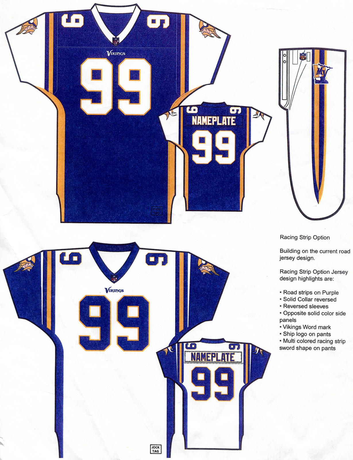
Click to enlarge
And now a few words from Paul: In case you missed it yesterday, my latest ESPN column is about a bunch of previously unseen prototype designs that Reebok prepared for the Vikings about a decade ago (including the one shown above). Check it out here.
And as long as I have you here:
• My annual college football season preview will be up on ESPN next Monday.
• The annual NFL preview will follow two days after that.
• My thanks to the many of you who’ve ordered Uni Watch 15th-anniversary patches. If you want to get in on that action, look here.
And now I’m off to Chicago, where I’ll be attending Comrade Robert Marshall’s wedding tomorrow. Everyone have a great weekend!

‘skins Watch: Reader TommyTheCPA sends in this article from the Washington Post, “My kids are Redskins fans. But I won’t let them wear the sportswear.” … The latest to chime in on the debate is former QB and CBS broadcaster Phil Simms, who “considers not saying ”˜Redskins’ on broadcasts,” (thanks to Chris Flinn). … An advocacy group dropped its threat of a lawsuit against Warroad Public Schools over the district’s use of an American Indian head as its school logo (via Jimmy Lonetti). … Former player and ESPN commentator Mike Ditka on Redskins controversy: ‘It’s all the political correct idiots in America’. Ditka also said the name debate is “so stupid it’s appalling,” (thanks to Patrick O’Neill). … Mike Carey, longtime NFL referee, avoided Washington’s games because of the name. … Kelly Maw writes, “Thought you guys might be interested in this. The redskins could take a lesson on how to honor Native Americans from the Utes.” … Jim Schweitzer writes, “Not sure if you’ve seen this before, or if it’s intentionally “Redskins” free, but I saw these shirts at the Roanoke, VA Target (yesterday) evening. They had NFLPA stamp on them. Unbranded RGIII looks strange. Didn’t notice any other Redskins merch around, mostly because this area is drowned out by Hokie junk.”
Of course, the twittersphere had some thoughts on fans attending Monday night’s Washington/Cleveland Browns game as well:
Most fans just toss on jerseys. Not these two. @Redskins @WTOP @WTOPSports pic.twitter.com/iLo1vukVvE
— Michelle Basch (@mbaschWTOP) August 18, 2014
Must be headdress night… https://t.co/wso75JlOwT pic.twitter.com/ZrJQPm7AiJ
— Dan Steinberg (@dcsportsbog) August 18, 2014
Uni Watch News Ticker:

Baseball News: Check out this 1951 photo of Joe DiMaggio & Mickey Mantle, showing the American League Golden Anniversary patch (h/t @Baseball_Photos). … Most of us know that the Cardinals’ iconic “birds on bat” logo was created in the early 1920s. But, with current events being what they are, did you know they were ‘born’ in Ferguson, MO? (h/t to Chris Creamer). The Brooklyn Eagle declared them “snappy” at the time (thanks to Todd Radom). .. What the hell is this? At least we know where it’s located. … Nice to see an old Red Sox stirrup. Odd to see it depicted like that. … The KC Royals 1974 uniforms (complete with stirrups!) have arrived for “Retro Night,” which is Saturday, August 30th (thanks to Lendsey Thomson). … Korea unveiled their Descente made baseball uniforms for the upcoming Asian Games (thanks to Dan @MyKBO). … Here’s a look at the jerseys the Brooklyn Cyclones will wear for 90s night to benefit the ALS Association, on August 27th (h/t MiLBPromos).

NFL News: The Cleveland Browns have changed the wordmark fonts in their endzones. Here’s the old font and here is the new font (great spot by Jonathan Dies). If you look closely you’ll see the ‘Dog Pound’ eyes. That immediately led Tom Wilson to note that is a ‘ripoff’ of the Bengal cat eyes. And THAT prompted Christopher Smith to note it’s all a ripoff of the Panthers. Sigh. … Reader Matt Larsen shares this piece regarding the St. Louis football Cardinals. Says Matt, “You can see the solid colored socks on the offensive lineman on this page.” … Couple Seahawks items noticed by Alex Allen: This 12th Man soda display at a WalMart in Renton, WA, and these door handles, at their old training facility on the campus of Northwest Univesity in Kirkland, WA.

College Football News: With a week to go before their first game against Miami (OH), here’s the Marshall equipment staff decaling up the helmets (h/t @HerdEquipment). … Eastern Michigan has gray field turf. Yes, gray. That sound you just heard was THE Jeff poking himself in the eye with a sharp stick. More details here. … Utah football will wear Ute tribal seal on helmets for 11/22 game vs. Arizona as part of “Ute Proud” campaign (thanks, Paul). … New uniforms for the SMU Mustangs. Here’s video of the reveal (h/t Patrick Engel). Here’s what all three (red, white & blue) unis look like. … Marshall Football will be giving out jersey towels, 3,000 of which will be passed out at the Ohio Game. Submitter Brice Wallace says, “it’s funny that the ‘jersey towels’ have numerals with green at the bottom, which would apparently violate the gradient-numbers rule calling for contrast between the numerals and jersey color. The new butt-ugly unis have white at the bottom of the numerals.” … New uni for Sam Houston State University. Says submitter Chris Mycoskie “SHSU plays Eastern Washington in the first college football game of the year, Saturday at 3:30, for the Inaugural FCS Kickoff.” … Also bringing the SHSU tease to my attention was Victor Quintana, who had this wonderful quip: “SHSU spent the last 2 years with a uni set from Nike that included an OK jersey and a GOD AWFUL pair of pants dubbed by fans and critics like as the “diaper” pants. Along with this switch in brands is also a minor switch in the helmet. The decal logo on the helmet will remain the same, but the helmets are now a matte orange instead of a glossy finish they were in previous years. An example of both the diaper pants and glossy finish helmet can be seen here for comparison.

Basketball News: Looks like the new basketball shirts this year will still have sublimation. Here’s a look at the back of the new Arizona Wildcats hoops jersey, with sublimated cactus and desert scene (thanks to J.D. Thomas).

Hockey News: The Islanders (a team I grew up watching, going to maybe 10-20 games a season during the late 70s-early 80s), playing their last year at the Coliseum, are saying goodbye to the old dump (h/t @MetsBro). Here it is that logo on a patch and a few pucks (h/t Mike Engle). And here are closeups of the puck and patch (MetsBro again). … The NHL (if you remember back to the outdoor games) has a thing for chrome now. And that will continue with the All Star Game jersey crest. Ugh. … “Check out the new mask by Blues goalie, Brian Elliott,” says Ryan Zwyer. “I would love to see more goalie masks. Maybe even a goalie mask contest.” … “Did the Blues just leak their own new sweaters?” asks Patrick Walsh. “From a game in Slovakia. There’s precedent for a Blues wordmark over the note, but never under. And that wordmark is garbage anyway, hopefully it’s just there for the exhibition abroad. The rest looks good though.” … Lumby Nelson writes, “Came across this cool article on the history of Team Canada’s hockey jerseys. The article is celebrating 100 years of Hockey Canada.”

Soccer News: International soccer is big business. Here’s a good article outlining how each Premier League side fares financially against one another, as well as the deals that top European and international teams have carved (from Michael Richardson). … Bayern Munich get new team bus and do a “reveal” in spectacular fashion (thanks to George Chilvers). Also from George, for English football fans, a “very difficult” quiz (lol) to identify shirt sponsors.

Grab Bag: Nice find from Graham Clayton who writes, “Back in 1973, Glenelg (SANFL) and Richmond (VFL) both had identical primary jerseys (black with diagonal yellow sash) when they played each other in the unofficial end of season “Australian Championship”. A coin toss was used to determine which team would keep their primary jersey. Glenelg lost, and had to play wearing all-yellow jerseys.” … What happens to football players when their careers are over? Well, some of them open art studios (thanks to Jerry Wolper). … SI’s Extra Mustard has compiled a list of the worst bootleg team merchandise available on the Internet (Thanks, Brinke). … This is pretty cool: some really smart people have attempted to come up with anti-shark swimsuits, for those who, you know, like to swim where man eating sharks tend to also swim (from Roger Faso). … The fourth section of this article states that the #48 Lowes Chevy of Jimmie Johnson will be switching from white to blue as a good luck charm after a series of sub-par finishes (thanks to David Firestone).
And that’s going to do it for this fine, penultimate Friday in August. Big thanks (again), to Morris Levin for another great segment of Fridays with Morris. Always a highlight of the summer. Speaking of which…
Where has the summer gone? There’s actually a college football game tomorrow!
I’d like to offer my own best wishes to Comrade Robert Marshall and his lovely bride-to-be Kate — sure would liked to have been there, but alas, someone’s got to mind the UW store, right? Yeah, that’s it. Anyway, Happy Trails Wreck & Pineapple!
Everyone have a great weekend — the blog will be ably handled by our webmaster Johnny Ekdahl, and I’ll be back for one last week (of weekdays) on Monday — don’t forget to check back then because that’s the day Paul releases his eagerly anticipated NCAA Football Preview — always one of the best columns of the year!
Follow me on Twitter @PhilHecken.
Peace
“Next stop on the Europhile express appears to be Columbus. If we’re lucky it’ll just be an “FC” stuck onto the backside of the existing name like a Victorian bustle. If we’re unlucky”¦ Borussia Columbusgladbach?”
— Padday

Is it racists to assume that the Skins fans wearing the costumes are not Native Americans? Serious question.
I think you could consider it inappropriate, but racist?
By definition, racist is the ideal that one race is superior than another. If you take those people in the picture above, I would not believe on the surface that they are racists.
Consider the tomohawk chop the Braves fan did/do? Could you label that as a racist act? Probably not, but maybe mimicking a violent act?
“By definition, racist is the ideal that one race is superior than another.”
That is one definition, one extremely narrow definition. By that definition, things like Jim Crow laws and minstrel shows are not racist. I don’t think I can agree with you on that.
The silliness of that question aside, it ignores the WAAAAAAY more important one: is that guy to the right of the couple really wearing a Kai Forbath Redskins (#2) jersey, or is he instead honoring the myriad Redskin greats who wore it before Kai? Or is he honoring one of the other Redskin greats who wore the number: P Kelly Goodburn, P Ralph Mojsiejenko, or PK Eddie Murray?
Inquiring minds want to know.
I’ll bet it says “Sanders” on the back… Deion used to wear #2 in practices when he played for Washington.
I think rocking the Kelly Goodburn jersey would be less pathetic.
Cindy Brady: cultural appropriator and de facto racist.
link
I love my 1969 Mitchell and Ness Tom Seaver home jersey which is about 10 years old. The Mets script is nearly perfect as are the number fonts. The patches are not the greatest, but do a nice job recreating the look of the originals. I also have a Terry Bradshaw that is pretty spot on. I revere accuracy.
That said, I would hate myself for not bringing to light what many of you know…the current M&N line is so inauthentic, I would never buy most of them. The current Seaver home jersey has a poor script and inaccurate fonts. The Nolan Ryan road version, which used to have the great Mets road font, now has some weird font I have never seen on a baseball jersey. Many Yankee jerseys have inaccuracies from poor number fonts to inaccurate NY logo.
It would almost be understandable if these jerseys were inaccurate from the beginning…but to have jerseys that were pretty accurate a few years back and then make them LESS accurate over time tells me all I need to know.
And the Philadelphia Flyers jerseys are JUNK. The firs-generation Parent, Barber and Clark jerseys (both the white home and the red/orange with white nameplate roads) were pretty accurate representations (notwithstanding the tacky M&N logo and script on the bottom right hemline). However, as probably noted before, the neck label in the road version inaccurately stated it was from 74-75 when in fact that style jersey was worn in 73-74.
The current Hextall and Clarke jerseys are worse than a China knock-off in terms of font and crest presentation.
That’s what I’m screaming about…the Chinese knockoffs are almost better than some of these, LOL!
This is all very interesting to me as I haven’t looked too closely at M&N stuff over the years – as much as I would like to drool over replicas of old jerseys, that stuff is way out of my league pricewise.
-Jet
Very helpful stuff from Morris, adding a narrative coherence to an interesting wide cultural phenomenon. [Of which losers like us constitute a portion.] As an adopted son of Boston, I also dig Morris’s Philly-philia. Love the one you’re with!
“… Later in the 1990 season, with the White Sox playing their final season at Comiskey Park, the team played the first turn back the clock game. They wore their 1917 uniforms, the year of the team’s last World Series win…”
Sublime. And — look! — they’re wearing white socks.
Clearly, Phil got an F in Bullshitting 101.
…sure would liked to have been there, but alas, someone’s got to mind the UW store, right? …
Everyone have a great weekend – the blog will be ably handled by our webmaster Johnny Ekdahl…
It could’ve been worse. He could’ve treated it like a game at PNC Park.
No it wouldn’t. He actually received an invitation to the game at PNC Park.
ouch. i know man, my bad.
the Bootleg Merch story is a bit of a letdown. Those folks are just trying to avoid using actual logos (and not get in trouble).
I MUCH prefer when people TRY to make REAL merch and F it up.
Contrary to earlier reports, the Phialdelphia Eagles do NOT use kiss cut numbers on their white jerseys. A close look at the nameplate letters and the numbers shows that they are still the “traditional” two-layer (letters) and three-layer (numbers) twill. But the twill seems thinner and more flexible (aka NikeEliteTwill).
You are wrong. CONFIRMED! The Eagles’ white jersey DOES use kiss cut customization:
link
link
What the hell does “kiss cut” even mean?
Uniform newbie, huh? Google it.
For your and all other Uni-Rube’s edification:
link
This photo demonstrates three-color twill kiss cut. Whereas in “traditional” (as BirdsFan calls it) twill application, the number would consist of three separate twill layers each sewn (either the foreground and middle layers sewn to each other and then the number sewn to the jersey around the background layer edge OR all three layers each directly sewn to the jersey, the Eagles using the latter method until now), you can see in this photo that the foreground layer is “kissed” by the middle/second layer (which is actually just a thin outline/overlay of twill).
link
Man, PuckBoy. I HATE your elitist attitude.
2 questions
hadn’t the Browns used the dog eyes before..or maybe i just play too much madden
and didn’t they have a checkerboard endzone design at one point.. or at least for one game
Morris, to Steve D’s point, could you provide an overview of what has gone wrong at M&N since the early days? The quality control around what’s touted as authentic is appalling, especially given the roots of the company focused on a level of accuracy and detail that was unparalleled. I’ve been to the store several times in recent years and am able to eyeball inaccuracies with ease. It’s really sad to be honest, especially when we are talking $250-$300 per jersey.
I think many of us would value and appreciate your inside perspective.
link
Browns President Alec Sheiner discussing the Browns unis and mascots on 92.3 The Fan. it’s later in the conversation so fast forward 3/4 of the way in
Both hosts ragging on the Browns white uniforms. I sure hope the new unis are not a mess next year!
The St. Louis Blues jersey referenced in the ticker is actually that of the Blues Alumni team. The wordmark on the jersey is the word “Alumni”. For a better look, here’s a link: link
Thanks for clearing that up, I couldn’t get a good view of the wordmark from the video clip and just assumed it was the Blues mark. Have they used that template (stripes, colors etc.) for the alumni jersey for a while now, or is it recent? Just wondering if it’s possibly a sign of things to come…
Typically their Alumni jerseys are based on the 2000’s era jersey… Just before the Reebok switch.
That Alumni sweater is based on the 67-75 era jerseys, which are GORGEOUS.
Well that’s a relief. It would have been pretty horrific is that was an actual Blues wordmark.
However, I’m still trying to quell the nausea over the various pictures of NHL jerseys with CHROME. Please, make it stop…
-Jet
I concur with the other comments regarding the lack of accuracy for M&N. For years, the 1978 Padres alternate jersey was incorrect (the one with the gold body and brown sleeves). The M&N version had the gold sleeve stripe raised above the bottom of the brown sleeve and featured a gold V-neck, whereas the correct on-field version had a brown V-neck and the gold band was at the bottom of the sleeve. I know that they produced a Gaylord Perry version of this, but finally “retired” or pulled the jersey. When I brought this to M&N’s attention back in 2005 (along with photo documentation), they sent me a free Padres jersey of my choice (very nice customer service back then). Now, I don’t think they care at all, and with the jerseys at $250 and up (generally), that’s a lot to pay for inaccuracy….
Wow, glad I can’t afford this stuff anyway because I would get ticked off if I realized the lack of attention to detail.
-Jet
Sam Houston State, what a relief!
I regard my visit to the M+N showroom on Walnut Street with the same reverence as my trips to the New York World’s Fair: Almost a hallucination.
“This met the nostalgia of the post WWII generation who had grown up watching Mickey Mantle, Jackie Robinson, and Willie Mays, and who in the 1980s were in their 40s and 50s and 60s.”
Huh? The post-WWII generation was not in their 50s or 60s in the 1980s – that would mean they were born in the 1920s and 1930s, pre-WWII.
Point well taken; thank you! I could have articulated that thought with greater clarity and coherence. I would add extend those “who in the 1980s *and 1990s* were in their…” and not included those in their 60s.
I should know this, since I bought a pair from Comrade Marshall (congrats!), but the Sox ‘rups have two white stripes.
What a rough season. Can’t even get the hosiery right in cartoons.
In the words of Casey Stengel – “CAN’T ANYBODY HERE PLAY THIS GAME?!”
-Jet
The Yankee Statue is actually based on a series of bobbleheads Forever collectibles did around 2003. There were a bunch of Yankee ones, but there were also other teams, each one incorporating a unique aspect of the team. The yankee aspect being the pinstripes and the, at that time, 26 WS championships.
My first exposure to Mitchell and Ness was in the Hall of Fame store at New Comiskey in the 90’s.
First time I ever got an immediate sense of uniforms having a history or of teams changing their colors over time.
I bought a 1952 Mickey Mantle road gray from M&N back when. The only problem I have with them is I had to send back several until I got a size that fit. Normally, an XL is plenty roomy for me, but I had to get a 3X, their largest size, and that is even a bit tight on me.
“so stupid it’s appalling,”
What are things people say about Mike Ditka?
If you scroll to the bottom on the Brian Elliot mask article there is a picture of the back plate. On that back plate there is sort of a moose version of Casey Jones wearing a Blues jersey. Although he is wearing the old style with apron strings. So if Elliot wears this with the new style jerseys it will immediately be inaccurate.
I believe that DiMaggio and Mantle picture is at Ebbetts Field. The Dodgers and Yankees didn’t play in the Series that year (Bobby Thomson and Ralph Branca took care of that), so it must have been an exhibition.
Ebbets. My bad.
Was wondering about that, Yanks are in away jerseys but the WOR 9 ad would indicate it was in NY.
Yep. Mantle’s link.
Nice pull, Jimbo.
Shit, I read “Borussia Columbusgladbach” as “Benedict Cumberbatch”.
Also, looking at the Browns bit in the ticker, I find it interesting that they switched to the link for the link.
…should have used comic sans
Benedict Columbusbatch. Might be very popular with the tumblr crowd.
I’m holding out for Red and White Columbus. (Rot und Weiß) or Columbus Kickers.
Where the hell am I going to find a chrome crayon so I can enter the WFL contest? Gradients should be no problem.
Just do your crayon drawing on a mirror and then take a picture of it.
Don’t forget the purple!
link
To chime in re the end of Morris’s post – the Base Ball Exhibition & Fair at The Philadelphia Navy Yard is an absolutely fantastic event. I participated in it a few years back with the Chesapeake & Potomac VBBC and had a blast. The Athletics do an A+ job of hosting.
Unfortunately I won’t be playing with the Capitol Stars club this year, but it’s well worth the trip if you’re anywhere near Philly.
I have told this story before but maybe worth a repeat today. My band was playing in Philadelphia in the late 80’s I believe. I was walking round downtown killing time when I saw a small sporting goods store. I walked in and there were 2 old jerseys for the Pirates and Phillies of fifties vintage. I had never seen anything like that before. The guy who ran the shop asked if I liked them and would I buy one. I told him if he made a Mets one I certainly would. He said he had just bought a load of material that was used to make the MLB uniforms and was thinking about producing old jerseys like the ones I saw. It was Peter Capolina and the company turned into Mitchell & Ness.
Did you ever get that vintage Mets jersey?
Yes I did. Mets road 1969 number 14.
Will CBS give their announcers the option not to say Ray Rice during the game? What about Phil Simms, will he call him # 27?
Why? Is “Ray Rice” a disparaging term for a marginalized ethnic minority group?
Not a marginalized *ethnic* minority group. Just a marginalized *sociological* minority group. You know, that minority of humans that beat their wives/fiancees unconscious.
To the extent that that demographic is marginalized, isn’t it more of a self-marginalization, though?
I don’t have any issues with Phil Simms, I guess my question is will the networks let their announcers make other choices regarding things like domestic violence.
I understand the point you were trying to make, but it’s an apples-and-oranges comparison. And who says the networks don’t already give their announcers some rather wide latitude in how to do their jobs? Or maybe they don’t. Until we have an actual basis to know the answer to that question, any conversation on this topic is hypothetical at best.
Congrats to Marshall. I’ve bought a lot of socks from him and he’s one of the nicest people I’ve ever dealt with.
thanks man.
and to anyone else who had well wish, i really appreciate it.
when those Arizona Hoops Cacti unis are tucked into the shorts, the players may look like they have a tail.
I love Mitchell & Ness. I visited just before the original store closed, and several times after at the new store. I will say that when it comes to visual merchandising & social media, any business can learn something from them. Reading about the details of the catalogue just adds to my opinion.
I have noticed inconsistencies as everyone else has. I’m going to go out on a limb and say that like many businesses, the employees who care about every little detail are driven crazy by the suits/number crunchers. They make the final call; hence the inaccuracies. Some are genuine errors, and some are business decisions.
The number crunchers will move on to other gigs without emotion. The detail-oriented employees will still have a nervous twitch about errors long after they themselves have moved on.
IMO, artistic people have a better long-term business vision than a number cruncher, but they usually don’t make the decisions. A very undervalued personal trait/skill in the business world, that should have more sway in any company.
When I can afford to visit again, I look forward to going!
Just to add to the above: I read the SI bootleg article. The number crunchers drool at the Chinese bootleggers and their profit margin. Remember, the bootlegger has never had an original idea in his life. It costs money to do things right, and to build a brand.
I’m not a math guy, but I’d love for someone to figure out a solution to $300.00 jerseys, just to have a semblance of accuracy. There has to be a formula that works for everyone. I’m optimistic LOL.
The part of bootlegs that makes me cringe is when I see teams retweeting/liking photos of fans wearing them, or even using their images in their own marketing. There are many examples of this (I won’t shame anyone in specific). I do expect you to turn your nose up at their photos if you expect me to pay $300.00.
The link to Brian Elliott’s new mask is from last year. I think it was his best mask, but it was crushed during a trip in January. link The Blues alumni are playing a few games in Pavol Demitra’s hometown. The word under the Bluenote is “Alumni.” They have had that as the norm for Alumni games, and it is in the same font as the wordmark. I would believe it would be a leak if it was an Edge cut, but it’s clearly not. I’m just going to think the Icethetics guy is right, and wait until I see otherwise.
Looks like we’ll have to wait until next year for Mitchell and Ness possibly offering Mariners star trident BP jerseys again.
I’ve said it before and I’ll say it again…while I like Paul Lukas and his work quite a bit his crusade against the Redskins name has nothing to do with respect for the culture and everything to do with white guilt. White liberals don’t like being reminded that the privileges they enjoy now came at the cost of a genocide.
There is nothing disrespectful about using Indian symbolism in sports. It’s all about soothing guilt.
“There is nothing disrespectful about using Indian symbolism in sports.”
“Redskins” isn’t “Indian symbolism.” It’s a racist word from the past that should be retired, unless you think it would be OK to have the Philly Micks, the San Fran Chinks, The San Antonio Wetbacks, or the Jacksonville Jigaboos.
Why do the NFL refs have a black square on the back of their caps with “SS” on it?
The St. Louis Blues jerseys in that video were for a memorial for Pavol Demitra who was a star player with the team in the late 90s early 2000’s and tragically died in that plane crash a few years ago that killed saw a whole hockey team die. I believe they were memorializing the arena in his name and I’d assume they were wearing those jerseys to honor him. The jerseys the Blues will unveil will be their 98-07 look.
Morris, this is a great piece.
I can hardly bring myself to look at the pages from the M&N catalog – I couldn’t afford their products back in the day, and now that I can we’ll never see things like those early Dodgers uniforms again. Not to mention the caps, which remain unequaled.
As a proud Bearkat, its kinda disappointing to see SHSU go from Nike to Under Armor. But that happens when you get a new head football coach. Love the new hats, can’t wait to see the new orange shirts and britches.
as ugly as Eastern Michigan’s new grey field turf may be, at least it’s new turf & no longer the old style that instantly gave you rug burn if you looked at it the wrong way