Click to enlarge
Paul here — I’m minding the store this weekend.
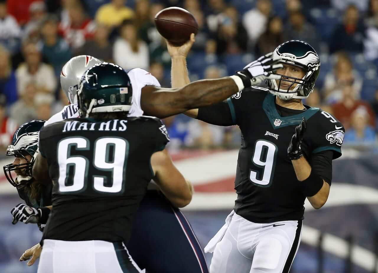
Odd scene at last night’s Eagles/Pats game in Foxboro, as New England opted to wear white at home and the Eagles wore their black alts. But according to a series of tweets from Philadelphia Inquirer reporter Zach Berman, the black alts weren’t just an aesthetic choice — they were worn out of necessity, because Philly’s new green jerseys in Nike’s Elite 51 tailoring template aren’t ready yet. Why are they running late? Berman says it’s because “midnight green is a custom color that apparently needs time to make.” And here’s the kicker: According to Berman, the green jerseys won’t be ready in time for the start of the regular season either, so the Eagles will be wearing a lot of black in the early part of the 2014 schedule.
Let’s go back and add some context to this. When Nike unveiled all 32 teams’ new uniforms in April of 2012, the Eagles were among the handful of teams that stuck with the old Reebok tailoring and fabrication. As I reported at the time, Nike’s own press notes at the event said that the Eagles hadn’t gone with the new Elite 51 template due to “color matching issues.” It wasn’t clear why midnight green would present such a challenge, but whatever — I figured the Eagles would use the old Reebok template and fabrication in 2012 and then change to the Elite 51 template in 2013.
But that didn’t happen. The Eagles stuck with the Reebok template/fabric in 2013. Then it was announced that they’d finally be switching to Elite 51 for 2014 (and sure enough, they wore the white version for their first preseason game last week). But now it turns out that Nike still has production problems with midnight green.
This all seems bizarre. What exactly is so difficult about this color? (Insert obvious “Just go back to kelly green already!” quip here.)
Meanwhile, as you can see in the photo at the top of the page, the black jersey is now saddled with that ridiculously thick contrasting collar, just like the collars worn by the Texans and the Broncos. Woof!
Click to enlarge
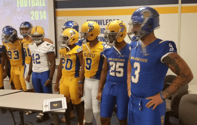
New look for the Spartans: San Jose State unveiled new matte yellow helmets back on Monday and now, as you can see above, they’ve come out with their full 2014 uni set. Unless I’m missing something, the yellow jersey is the same as last year, but the blue and white designs have been updated. (You can see last year’s blue and white jerseys here and here, respectively.)
Click to enlarge
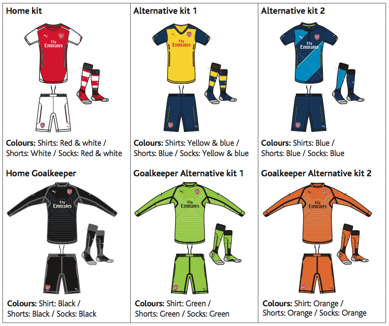
EPL bonanza: The new 2014-15 EPL Handbook is out, and it includes, among other things, mock-ups of every team’s uni set for the new season (like the one for Arsenal, shown above). The handbook also has schedules, official rules, forms, and more. Download it here.
And as long as we’re talking EPL, here’s a good piece on all of the EPL’s jersey-sponsorship deals.
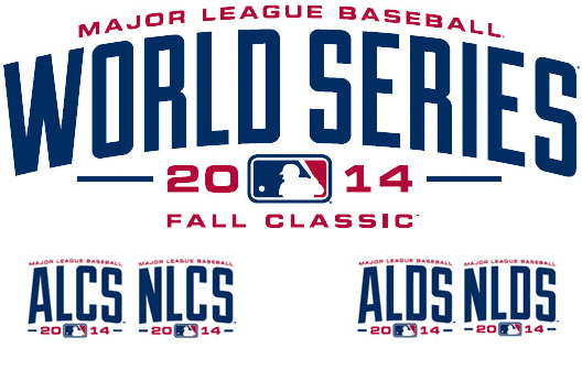
Fall Not-So-Classic: Nobody likes vertically arched lettering more than I do, but the newly released logos for the 2014 World Series and postseason — i.e., the things we’re gonna have to see on everyone’s sleeve and cap throughout the month of October — are seriously underwhelming. This design style will look particularly bad as a sleeve patch, where logos always work better than wordmarks. Further details here.
Click to enlarge
Tasty treat: Oh man, look how much you can do with a two-color design and a photo, assuming you have a decent sense of design. Big thanks to reader Jonathan Daniel for sharing this one.

Click to enlarge
Reading the street: Colored plastic markers like the ones shown above, about the size of a poker chip, appear throughout the streets of New York and Boston. They’re precisely the kind of inconspicuous landscape detail I love, so I’ve written an article about them for a new design website called reForm — check it out here.

Baseball News: The A’s and Braves will wear 1914 throwbacks today. … The Norfolk Tides wore “ugly gnome” jerseys last night. … The University of Northwestern Ohio is going with red infield turf (from Tim Shay). … Jonathan Daniel sent along this photo of the Big Red Machine during a 1970s trip to Japan. What’s that red mark on George Foster’s upper-right pant leg? ”¦ Pirate-themed jerseys yesterday for the Fort Wayne TinCaps (thanks, Phil).

NFL News: Last night’s Saints/Titans game featured ads on the field in the red zone. Let’s hope that’s just a preseason thing. ”¦ The Tampa-area fashion industry has weighed in with some opinions on the Bucs’ new uniforms (from Phil). … The Giants are using “Football Giants” duffle bags. “I’m surprised ‘New York’ is nowhere to be seen,” says Chris Flinn. ”¦ Check out this shot of Walter Payton wearing some very short practice pants (from David Soline). ”¦ Fred Goodwin spotted a uni-numerical inconsistency in this 1989 Cowboys screen shot. “Tom Rafferty’s number font is clearly different from Herschel Walker’s,” he notes.

College Football News: New helmet design for Morehead State. … The folks at Oklahoma State are very happy with their uniforms. … Here’s one observer’s list of the 10 ugliest college football uniforms. … New SpeedFlex helmets for Old Dominion (from Jeremy Walker).

Soccer News: “Manchester United put a twist on the kids walk in their opening match,” says Matt DeLeon. “The players wore jerseys with the names of the kids accompanying them. They took them off before match and gave them to the kids, who were wearing the NOBs of their corresponding players. Nice.”

Grab Bag: Australian rugby news from Graham Clayton, who reports that the South Sydney Rabbitohs wore an indigenous-themed jersey for Thursday night’s game against the Brisbane Broncos. … New logo for the WWE. ”¦ Here’s our first look at the Anaheim Ducks’ new uniforms in action — or at least simulated action — courtesy of a video game screen shot (from Harrison Hamm).

What’s that red mark on George Foster’s upper-right pant leg?
A Rawlings manifacturer’s mark?
We have a winner…and a really good explanation worthy of Uni Watch…amazing what you can find on this Internet thing.
link
Excellent find!
You can see that “red mark” on Pete Rose’s pants also and looking close at Bench’s, you can make out a hint of red on the side.
The NFL still restricts the Alts to 2 games a season, don’t they? So are we going to see a lot of white or are the Eagles going to be exempt from that rule due to this issue?
Good questions. I’ll try to find out.
The Eagles usually wear white at home until after the bye week anyway, so if the midnight green jerseys are not ready yet it doesn’t matter.
Unless, of course, they’re playing a team that also goes white at home, then you have the problem you had yesterday.
but…
looking at their sked, it appears any road games will have the home team in their dark jerseys (pre-bye week).
They may have caught a break.
The more pertinent issue is that the NFL restricts the alts to one game per PRESEASON.
The NFL did allow an exception to the one-alt-per-preseason rule for the Jaguars in 2012, when they wore their alts three times. I can only presume a similar exception will be granted to the Eagles if they chose to wear color at home in either of their two home preseason games.
So Nike can put midnight green trim on a jersey without issue, but not a whole jersey. Uh huh.
Apparently (from those who saw it up close and/or in person), that’s not midnight green, but more like a teal (different from the color the green jersey will have).
So that’s even more of a fuck up — the black jersey won’t even have the same green as the green jersey (at least until Nike can get that fixed).
Not 100% sure this is true, but if true…disgraceful.
Our buddy Hugh McBride said it best yesterday.
So that’s even more of a fuck up – the black jersey won’t even have the same green as the green jersey (at least until Nike can get that fixed).
This would presumably apply to the green trim on the white jersey as well.
Do the Eagles actually have green trim on their new jerseys? I think the collar and sleeve trim is black — would the tackle twill cut numbers and letters also be affected by the dying problem? Or are they a separate manufacturing/dying process (and thus Nike can make them in the proper shade)?
I meant the numbers. But yeah, maybe that’s not as much of a problem with the tackle twill….
I’ll call the Eagles on Monday and try to learn more.
“… (Insert obvious ‘Just go back to kelly green already!’ quip here.)…”
Just go back to Kelly Green already!
Here’s a better look at the new white jersey.
Seems like the numbers are “midnight green” as opposed to the tealish shade on their collar/sleeves on the black jersey.
Don’t think the numbers would be a problem…does Nike even cut the numbers? Certainly whoever does has access to the same tackle-twill that the numbers were made from before. The numbers may also be older stock.
Nike doesn’t cut the numbers. In most scenarios the jerseys are numbered by the team, so the twill wouldn’t be affected by Nike’s Pantone issue, or whatever it is.
I just don’t understand why they don’t switch back to Kelly. Though I’m terrified that if they did they’d let Nike’s Design Interns dress them like the Buccaneers.
The problem is the cordura fabric (the solid portion). That is what it was called on Uni Watch when Nike did the NFL unveiling. Different fabrics react differently (i.e. the collar).
Could they simply be B.S.’ing the public for promotion, or to test opinions on all of the colours, including black?
That’s what I think. The team clearly is conflicted in how to proceed forward, since I am certain sales are down for midnight green.
Sure, a lot of people online say they like midnight green and like the black, but are they paying customers? Do they buy bootleg jerseys? I’m a paying customer (zero bootlegs) and I want KELLY.
So, uh, why can’t the Eagles just wear their old midnight green Reebok template jerseys until the Elite 51 jerseys are ready? Surely they still have extra stock from the last two seasons. Or did Nike gleefully collect all the surplus jerseys and ritually burn them as soon as Philadelphia announced its intentions to switch?
Because they look like shit? Seriously, that Reebok template was terrible. They looked like a highschool team, with all that dazzle fabric and those baggy shoulders. As silly as all the hype is, Nike’s new template looks much better.
You seriously think link looks better than link? You prefer link (not to mention link), link that are twice as thick as the neck they’re surrounding, and link to link?
At least the Reebok template looks like a football jersey. The Elite 51 just looks like faux high-tech Nike link.
And while you criticize the old Reebok template for the dazzle cloth, you conveniently ignore the fact that the Elite 51 still has plenty of “Ooh! Shiny!” on it, too. Look no further than the link and the glossy threads of the
Nikelacelink. Not to mention link special link Nike has incorporated into some of its wearers’ designs.Was the Reebok template perfect? Absolutely not. But I don’t see how Nike’s Elite 51 template is an improvement in any way.
Don’t get me wrong, I agree with you that many of Nike’s “innovations” are just them shoe-horning their brand aesthetics into the design. The “Nikelace” is stupid. The super-thick collar looks bad. The various patterns and “sweatboxes” are unnecessary. I totally agree with you. And we are talking aesthetics here, which are subjective. In my opinion, the Nike template improves on much of where the Reebok design felt dated to the mid-nineties. Yes, I really do think it looks much nicer than that photo of Desean. Mostly in the actual cut of the jersey. It’s like wearing a fitted dress shirt, versus one in your size that’s all poofy and baggy. The Nike jersey fits better, and looks more professional, where the Reebok template was baggy, shiny, and outdated. The Nike design isn’t perfect, no. (And I’m so glad I’m not a Buccaneers fan, a team with two of the more classic uniforms in the history of the league, and Nike’s interns designed that abomination.) But I’m not tied to the past. I’d love to go back to the durene era of uniform design- high-waisted pants, socks with actual stripes, and quarter-length sleeves. I’m a huge fan of the designs of the WFL and even the WLAF. But those designs aren’t relevant in today’s league. And just as I don’t buy into the new design for its “innovation”, I don’t hate it outright, simply because it’s Nike.
And I’m so glad I’m not a Buccaneers fan, a team with two of the more classic uniforms in the history of the league, and Nike’s interns designed that abomination.
By “two of the more classic uniforms in the history of the league” I sincerely hope you mean “creamsicle orange” and “creamsicle white”.
HA. I should have said “arguably”. I was really referring to the creamsicles, though I didn’t hate the pewter and red. I liked the pirate ship logo, and in comparison to the clown suits they have now, those uniforms seem like classics.
And thanks, Paul, for the link to your cool article about the asphalt circles and the heads-up about reForm.
Glad you like, Conn!
I too really enjoyed the A-Tag article… but it seems like these tags wouldn’t last very long as evidenced by the photo of the orange colored one chipping away at the edges. Why not use metal or something else sturdier to last longer than a couple of years?
Love the asphalt marker story, Paul!
It brought to mind a picture I posted a couple of years ago from the sight of the old Kingdome, now a parking lot….
link
ODU just got an upgrade in the uniform department. I know it looks like a mad mash-up of Navy and the not so long ago Arizona Stripes with the pants stripes which could use some work. They’re better than their old horns of the bull uniforms.
I’m waiting for the future ECU/ODU football rivalry to startup.
Oh, and count me a fan of the Arsenal third kit. Puma did a bang up job on the squad.
In that photo of the Reds, it is cool how the three reds wore their stirrups low to show little sani. This was not how most players wore them in the 70s. I didn’t follow the Reds that closely back then, but now that I think about it and google it, it may have been a team-wide style. Anybody know more about this? Certainly when they switched teams, some Reds chose different styles:
link
link
link
Check this out:
link
Yes, that was the Reds’ style at the time, along with the plain black shoes and the facial hair ban.
But the Reds did allow their players to have long sideburns, George Foster’s in particular.
The ads on the field are definitely just a pre-season thing. The NFL still restricts the networks from using on field ads during the regular season, but the pre-season games have different rules because the teams own and run the broadcasts, so they can pretty much do what they want as far as ads go. Not sure if this was ever linked, but Toyota got some heat because of their redzone ad and decided it was better to cancel it than piss off fans. link
That “Slap Ya Mama” ad was even worse last week.
That is awful, I hope that didn’t stay up during the play. The NFL should reconsider their rules for preseason broadcasts. How many more ads do they need, they already have like 50 commercial breaks a game?
The NFL is in the business of generating revenues. Football games are merely the vessel.
Lee
I know it’s for a hot sauce, but, jeez, with all the domestic violence hullabaloo the league is dealing with, you’d think they’d have more tact at the moment.
My thoughts last night as well.
Agreed. Seems tone deaf, at best.
Lee
Doesn’t sound to me like they’ve actually cancelled it. From that ABC article — check out the part I bolded.
“We’re football fans too. We’ve heard fan feedback and it’s not our intention to distract from the joy of the game,” she said. “Toyota will continue to be a strong supporter of the 49ers as part of our multi-year partnership and we’re working to ensure that future brand mentions won’t distract from game play. During the remainder of the 49ers’ pre-season games, fans and viewers should no longer see the Toyota Red Zone once the ball is snapped.”
You’re right. I guess they haven’t noticed that people don’t want to see these things at all. It would actually be less distracting if they just painted the ads on the field.
Agreed.
It’s been getting bad in other sports, too. Local broadcasts in the NHL have added ads superimposed on the glass behind the goals for a couple of years now – for regular-season games, too. Really disappointing that they feel the need to resort to that kind of crap.
Red mark issue on Foster’s pants solved with the longest explanation of all-time to prove it:
link
Fascinating. Great work, Steve!
I recall the BC Lions had a similar issue with the colour of their jerseys around the time of the switch to the current templates. Apparently the orange colour was custom and they had to wait a year before the new designs could be done. At least that’s what I remember. Hopefully more info will come out as I’d like to know more about how the fabrics are dyed.
regarding the football giants bag…….I believe NY is on the side panel.
Yep, I spy a big NY on the end of the bag as well.
With Leicester wearing blue and white kit today, it looked Everton was playing themselves.
What is it with Nike and the color green? They’ve already ruined the Jets’ jerseys because they can’t get the green(s) right. Now they can’t get the Eagles’ green right either? Are the Packers next?
“Are the Packers next?”
~~~
You have to wonder why the Pack haven’t switched to the Elite 51 template (yet). Although I’m not necessarily a fan of that dazzle sheeny shit they currently wear, the color is gorgeous.
In a “lesser of two evils” I’d rather they keep the current shiny jersey if Nike can’t properly match (or recreate) the current green.
That’s the color the Jets’ jerseys should be, and were before 2012. I give Nike credit for getting the sleeve/shoulder treatment right (much better than Reebok ever did), but … well, you’ve heard this rant before. :)
Ehh, the shoulder treatment isn’t quite so right as far as I’m concerned; that link still bugs the crap out of me. It’d be nice if they could extend the stripes down, like link (and do away with the superfluous logo patch in the process).
Alternatively, they could just make the stripe panel a two-color panel, with the jersey body color being a wider stripe, as it was in link link.
I’ll take Nike’s “notch effect” over Reebok’s “vest effect” any day. It’s not perfect, and an easy fix would be to reverse the shoulder inserts (i.e., make the insert on the green jersey green-white-green instead of white-green-white, and vice-versa).
In the 1960s, back when football jerseys actually had sleeves, the TV number panel was actually more of a link than an opposite-colored sleeve. In the ’70s when sleeves got shorter, it became an link and a base-color stripe at the base, similar to what they have now. That was also the basis of the link and link.
The link are still the best version of the current uniform.
The Tom Rafferty thing was a “white whale” of mine for many years, until I found some solid visual evidence on YouTube a couple of years ago. See link at GUDB.
Why is it so difficult to match Midnight Green? It’s not just a shade of green. It’s a shade of metallic green, and metallic colors are the absolute worst to match, and it’s likely that Nike’s new fabrics don’t behave similarly to previous fabrics due to their thinness (which pushes colors lighter and more transparent). Your metallic color candidate is too shiny? Decrease the amount of metallic component. Well, now it’s too dark, but the metallic sheen seems right. Not shiny enough? Add more metallic component. Well, now it looks too light because the metallic components push the color toward white because their hue is close to white (think of grinding up glitter with a green crayon. It would make the crayon more metallic, yes, but also less green.) OK, make the color component darker green, and add more metallic component. Good looks OK as-is. But what about how it looks in direct light? Indirect light? Shadows? Does your new material match the old material in all of those conditions? Probably not. Metallic colors are the worst (metallic greys are the absolute worse, but generally any metallic color is bad news, especially when changing substrates, like Nike’s doing).
Source: I work in an industry with extremely tight color limits, and I oversee color matching. Matching metallic colors while changing substrates is awful.
Of course, Nike is a rich company that seemingly had two years to practice with different matches; I don’t exactly pity them in this case. AND, it is odd that Russell, Starter, Puma, and Reebok managed to achieve acceptable matches in Midnight Green in the late 90s without the resources of Nike behind them. My only guess is that they’re having severe issues getting each of the different “Elite 51” materials to look the same. (remember that one of the least talked about changes Nike made, especially for teams that essentially looked the same after the Nike contract, was moving from metallic colors to matte colors. Think of the Patriots and 49ers, specifically their pants.)
I wrote much more at the link below, but in full disclosure, my comments above fully address the specific topic of today’s post.
link
Thanks for an excellent post. Nike has had problems with metallic colors well before they acquired the NFL contract; look at some of their college deals, such as Georgia, Pittsburgh, Wake Forest…
Dan I read your article and I think you’re close but I ain’t buyin’ Nike’s “it’s too hard” nonsense.
I have 30+ years experience in garment dying (much in the Del valley) and I know what it’s like when design wants to mix fabrics. But this is the color matching for an incredibly high-profile customer. To not make opening day is insanely disastrous. This isn’t shipping at the tail end of the window to retail bad. This is no dress for the bride on the wedding day bad.
If Nike is pushing back that Eagles chose the wrong green I would search the contract for penalties. The supplier pushed the customer into something the supplier can’t supply. Yes green is hard. In NC we had to reformulate greens in winter once the copper from the leaves of fall had leached into the ground water. But these are pros.
I recall reading on UW that there was a move to make colors uniform so manufacturers for mass retail wouldn’t have to stock 20 shades of red. But this isn’t that. There is some failure in Nike’s supply chain. And it’s the elite level not the mass market one. At least I hope so. If they are holding back delivering to the team until they get it all perfect for the mall they are morons.
No Excuses. Just Dye It.
Yeah, Nike might get sued for breach of contract… Hey, we can hope!
I’m not meaning to say that Nike’s stance of the green being difficult is acceptable with respect to their product not being ready for the start of the season, just that it’s not a ridiculous excuse, and there’s a real reason metallic green would be difficult to match. Nike is too rich of a company to not have figured it out over the last two years (plus they started working on NFL efforts before the announcement in April 2012, so it’s considerably longer than those two years.
Also, there’s a chance that the Eagles came to Nike with the decision to change to the new fabrics very, late. My gut feeling is that this is not the case, but in fairness, not knowing the real situation, that’s plausible, too.
Don’t forget to add that this season the Eagles’ numbers and nameplate letters are kiss cut rather than the “tradtional” three-layer tackle twill (numbers) two-layer (letters).
Could you explain the difference between traditional tackle twill and “kiss cut” emblems? And how does it affect today’s discussion of the delay in Nike’s production of the Eagles’ midnight green jerseys?
I may be wrong but I believe it means the numbers are cut from one piece of cloth as opposed to stacking 3 layers on top.
At least that is what I gathered from what was said and the fact that a Kiss Cut sticker is a sticker that is placed on a sheet but when you remove the sticker it is just the part you actually want to see (and oversimplified way of explaining it: Die Cut: pre-cut, Kiss Cut: sticker sheet).
I’m not sure it really applies to the production issues but I think its worth noting, given the discussion is, at least in part, about the changes in the way the Eagles uniforms are constructed.
Thanks for the explanation!
Sasha Fruitticher, Owner, London Philips: “For the last decade Nike has continually evolved college football uniforms for the country’s best teams, and it’s refreshing to see the Tampa Bay Buccaneers embrace and lead the trend for the NFL.”
Wow, does she have a side job working as a Nike publicist?
Every single one of my comments today is awaiting moderation. What the heck?! I’m using the same computers/internet connections I always do, and I would hope people around here are familiar enough with my comments that no one suspects me of being a troll or a spammer.
So of course that comment goes through with no problem…
It seems I’m on moderation now too. Is there a problem with the site?
Too bad Raftery’s teammates didn’t wear jerseys to match his. I always liked the Cowboys’ 1970s-era jerseys better than the current set, which I think they adopted around 1986. The Cowboys actually changed numerals in 1982 and wore those until ’85, so his jersey survived two jersey changes.
The Eagles need to wear the black shirts with the green britches and green hats.
What is baffling about this to me is the shade of green and the mismatching greens are one of the main reasons why the Eagles opted to keep the old style uniforms when the change was made a few years ago.
It’s assumed it was also a contributing factor in the Packers sticking with the old look, but they have cited player preference, and I think collar design (though I may be making that up, obviously there would be an issue with this if they made the switch but I don’t know if they ever confirmed this suspicion of mine).
Nike has had 2 full years to sort this out (even longer if they started work on the new uniforms upon inking the deal) and it appears that they waited until the Eagles decided to make the switch to the Elite 51 to start working on getting matching colors.
There is no excuse for the Jets still having 3 or more shades of green on their uniforms, and no reason for them not to have already had a Midnight Green jersey ready for the Eagles when they made the switch to the Elite 51.
Its not like this color was sprung on them.
However it is worth noting that Marshall’s Kelly Green looks amazing on their most recent uniforms (their numbers are a mess but that Kelly Green is beautiful).
link
Just two things about the Rabbitohs thing.
1: It’s Rugby League, not Rugby. Two completely different sports, much like CFL is different to NFL
2: a lot of teams are doing that this week (and last week and next week) due to it being the ‘close the gap’ round where they wear special jerseys to help promote indigenous causes
Nice, Bros. Bar-B-Q with the on-field ad.
link
Someone needs to introduce Nike to Pantone. Works like a charm! Though they would probably recreate it, make 27 versions of it, and then sell it for twice the price.
Also – I wonder if the EPL handbook is a living document? Paul Faulkner isn’t CEO of Aston Villa anymore.