
By John Ekdahl
From the official release on the adidas corporate website:
The University of Michigan and adidas today unveiled the new “Go Blue” TECHFIT football uniform the Wolverines will wear October 11 versus Penn State.
The first head to toe blue look in school history, this new look draws inspiration from the university’s past uniforms. The jersey and pants feature metallic blue, laser-cut stripes that shine under the lights while ultra-light, no-sew metallic numbers stretch with the jersey, and the compression base layer features the Michigan “M” on the bicep and “GO BLUE” across the chest.
The rest of the release goes into the obligatory “lighter, faster, stronger, more breathable, stretchier, more cup holders, etc.” routine that we’re all familiar with by now. More photos, including closeups on the pants and striped numbers are available over at adidas. Video of the reveal is available here.

Hey listen, it’s the preseason for everyone, not just the players. Amirite? (Thanks to Rydell Commisso for catching that.)

Nike will release the Kobe 9 Elite Low Beethoven next Saturday. Why “Beethoven”?
The Kobe 9 Elite Low brings Bryant’s muses to life. The artistry of music and its ability to move and inspire people has always intrigued the athlete. From classical to pop, he has appreciation for multiple genres. The Kobe 9 Elite Low Beethoven pays tribute to the German composer and pianist, and more specifically the power of his Ninth Symphony from the early 1800s. The grey color of this colorway represents Beethoven’s timeless quality.
So, there’s that. More photos and the ability to customize over at Nike.
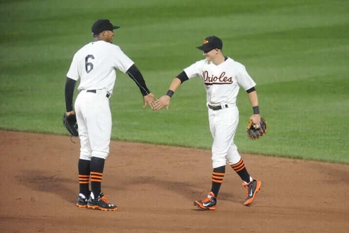
Last night the Orioles wore 1954 throwbacks to celebrate the franchise’s 60th anniversary of arriving in Baltimore. More photos are available over at ESPN.
Y’know who’s not a fan of the Bucs’ reflective uniform numbers? Phil, that’s who.
Just…no RT @SamuelYLam One last Buccaneers reflective numbers tweet. It really illuminates on the close up shots pic.twitter.com/63b3WcEU3f
— Phil Hecken (@PhilHecken) August 9, 2014
If Adidas actually drew “inspiration” from past uniforms for UM, they wouldnt b head to toe metallic blue, they wouldn’t be meant for “under the lights” and they wouldn’t SUCK!!!
Great observations.
Nah, they looked at the old uniforms and they were *ahem* inspired to make something different.
“Y’know who’s not a fan of the Bucs’ reflective uniform numbers? Phil, that’s who.”
That’s because they’re stupid. Look, I’m all for uniform individuality, especially in the US’s biggest sport. But it’s one thing to have a bespoke uniform that sets you apart from everyone else, and another to have a uniform that’s ass-ugly, filled with unnecessary touches, and does not evoke the team name or city in any way, shape, or form.
Meh… the font itself could be better, but I have no problem with the reflective part.
Longtime Bucs fan… the reflective doesn’t bother me, the typeface is the problem and the lack of Buc sherbet orange in the palette. That’s what gripes me.
This era reminds me of baseball’s 70s sansabelt, mono-colored flashy polyester duds. A play toward the trends, but what’s REALLY needed is a system-wide uni-enema that returns to a more traditional, historic and understated design approach.
but what’s REALLY needed is a system-wide uni-enema that returns to a more traditional, historic and understated design approach.
Look what such thinking gave us in baseball though – the most yawntastic era design-wise in Major League history. Seriously, we have the Astros – you know, a team based on a space age glee for all things futuristic – dressed as though they were performers from Main Street U.S.A. at Disney World who have gotten lost (not to mention so many of the newer parks have been built as “ye olde base ball” theme parks). There are few aesthetic ideologies more insidious than nostalgia. “Traditional” is merely a byword for conservative, unimaginative and creatively bereft.
Unfortunately, the creativity in baseball uniforms is to take your primary color and make a dark jersey out of it instead of using your standard white and gray jersey.
Seriously, we have the Astros — you know, a team based on a space age glee for all things futuristic — dressed as though they were performers from Main Street U.S.A. at Disney World who have gotten lost (not to mention so many of the newer parks have been built as “ye olde base ball” theme parks).
YES.
Don’t get me wrong…there is room for nostalgia and tradition. But not every team needs to look as if they played in the 40s and 50s. Not every park needs to have that fauxback look. Give me Tropicana Field and bring back a couple of cookie cutter parks (just not the Vet). Give me a handful of teams in pullovers and sansabelts. And give me a space-age-lookiing Astros!
“we have the Astros — you know, a team based on a space age glee for all things futuristic — dressed as though they were performers from Main Street U.S.A. at Disney World”
~~~
Yes, it’s amazing how different and horribly Disnefied the current Astros unis are from their originals…
I get your point — but just remember these current Astros unis are a harkback to their original 1965 uniforms (which they actually threwback to in 2012), which were perfect — the “shooting star” did reflect the space age-ness of their home and their name — and they should have brought that back on their current unis.
But don’t think the Astros were BORN in tequila sunrise rainbow guts uniforms. They started conservatively (except for that shooting star, which was great) and only got wild when other teams did as well.
I rather like the ‘stros current unis (despite the lack of the shooting star) — they’re a shit-ton better than anything they’ve worn since the jettisoning of the rainbow guts (or sleeve piping) (1994-2012). That period was AWFUL.
I like the current ones too. They’re a big step up from the black and red days with the pinstriped home uniforms. When Padday mentioned Disney, that’s what went through my head.
Once they went space-age, though, they should have stayed that way, or changed the name.
I get your point – but just remember these current Astros unis are a harkback to their original 1965 uniforms (which they actually threwback to in 2012), which were perfect – the “shooting star” did reflect the space age-ness of their home and their name – and they should have brought that back on their current unis.
Yes! One possible tweak would have been to make the streaks of the Shooting Star multicolored (one red, one orange, one gold) to evoke the Tequila Sunrose period. But that isn’t really necessary.
I think you’ve just proved my point – in the Astros’ first season they had a not particularly ambitious design but they did have a shooting star on the front of the jersey, a fairly futuristic style font and of course the Astrodome: link
50 years later how far have we come? Well it’s not exactly the same; dime-a-dozen placket piping has replaced the shooting star, a rather generic serifed font has replaced the whimsical futury font and their preferred method for reaching the stars is now a steam powered, steel rail guided orange freighter. NASA wept.
as replaced the whimsical futury font and their preferred method for reaching the stars is now a steam powered, steel rail guided orange freighter. NASA wept.
You do realize that Minute Maid Park was built using part of the old Union Station building, hence the train motif?
Where my house is built there was once a neolithic settlement, should I feel ashamed that it wasn’t built out of wattle and daub? Should I shun my nice appliances and instead opt for an outdoor fire pit for my cooking?
Besides, your comment assumes that the Astros had to move to minute Maid, that they had to build Minute Maid on top of Union Station, and that once they did build on Union Station they had to make godawful tacky references that the stadium was sitting on top of its corpse. As Vilk said above, if they wanted to go there, then the least they could have done was change the name to reflect that about-face thematic turn.
“50 years later how far have we come?”
~~~
I don’t disagree (and I would prefer a return to the shooting star, if I hadn’t made that clear earlier), but from your original post, it seemed like you were implying the Astros were born in tequila guts, only now returning to blandness. When in fact their original uniforms were conservative (though innovative enough to include the cool shooting star) — but not the loud 1970’s rainbow sunrises.
The Astros went off-track in 1994 when they dumped their last remaining vestiges of multicolor stripage, and had two periods (1994-99) and (2000-12) that sucked. I’d rather have these “Disnefied” uniforms than anything they’d worn in the previous 2 decades. But I’d take any of the 1965 originals, the orange caps/socks that replaced those, the rainbows and even the rainbow stripes over anything they’ve worn since.
If you don’t like the current unis, that’s fine — many don’t — but they are a hell of a lot better than what they replaced.
Still, if they were going to harkback, they needed to include the shooting star, and ditched the piping on the placket. Then everything would have been right in the world.
You do realize that Minute Maid Park was built using part of the old Union Station building, hence the train motif?
That doesn’t actually make it any better.
Where my house is built there was once a neolithic settlement, should I feel ashamed that it wasn’t built out of wattle and daub?
No, I doubt there was a trace of said Neolithic settlement there when your house was built. But when Harris County decided to build the new Astros stadium at Union Station, and to not raze it before building the stadium, it behooved them to incorporate the old building into the new. It’s somewhat analogous to Camden Yards; the architects were scratching their heads on how to work around the red-bricked B&O warehouse until someone suggested “using” it. This led to the parks unique dimensions, it’s red-brick exterior, etc.
Besides, your comment assumes that the Astros had to move to minute Maid, that they had to build Minute Maid on top of Union Station
You’d have to ask Harris County/Houston Sports Authority, who built and operate the stadium. I suppose they could have built it next to the Astrodome, but they wanted it in the downtown business district
You’re misunderstanding my point Phil. I’m not saying that the Astros (or any team) should return to any specific design, style or trend. What I am saying is that baseball as a whole needs to rid itself of this nostalgia trip and return to a mentality which was about encouraging innovation, creativity and newness. While ostensibly this mentality reached its zenith in the 70s and 80s it can be seen in pretty much every decade to some degree for the past century. It is only in the last two or so that design has truly regressed.
While we may, in a hindsight heavily skewed by the relative madness of the 70s and 80s, view the 1965 Astros as “conservative” they were never nostalgic, never deliberately derivative. The new duds could have been a carbon copy of the original, but it still would have been just a reproduction however, contributing nothing new or innovative to the sports world.
Just because I used the words historic and traditional doesn’t mean that it has to be boring or derivative. Believe me, I also abhor the boring baseball duds of this era… everybody’s either blue or red, everybody seems to wear pinstripes, everybody has the softball jersey… nobody wears sansabelt pants, which are OBVIOUSLY more comfortable than wearing pants with a belt. :)
My point was more related to “less is more” in good design. If you’re going to do the reflective numerals… cool, just don’t do a digital clock typeface. And keep some tradition by realizing Orange and Red IS your colorway… that pewter was thrown in in the 90s, cool, that’s the third color, but that doesn’t minimize the importance of sherbet orange in distinguishing this franchise.
Also, I’m a longtime Astro fan BECAUSE of the tequila sunrisers (and JR Richard). There are ways to nod to the past, while designing for the current era. But very rarely does that happen. Uniform design in this era can be very polarizing… too traditional, or too crazy modern. Most of it just follows a trend (The Bucs basically following college football’s trend).
In the end, something like the 70s Buc unis, accented with pewter and maybe dialing back the orange just a tad. But that numeral typeface is just ghastly.
The beauty of the 70s White Sox unis today looking back… is that they were outrageously designed without being outrageously trendy with bad design. Sure, the cut of the pants, or the flared collar… but they didn’t have a stupid typeface, or stripes going every which way, or dumb little triangles of color, or piping in bizarre places. Show some flare, be bold… but don’t be stupid and go overboard. Good designers know THAT line.
So is there innovation in minor league baseball or college baseball? What sort of innovation do we want? The one-off uniforms that populate college football? And please never bring back the beltless pants and pullover jerseys. An ugly period for baseball.
Agreed.
Is “colorway” the most pretentious word in the uni lexicon?
I’m sure I’ll be in the minority with these (as I am most of the time). But I love the idea of the blue pants for Michigan. I’ve wanted to see them wear blue pants forever. But on the road, not these horrible looking things. At least the helmet doesn’t have the numbers (yet). But those numbers on the uniform? Wow. That is awful! But I always have to smile when these costumes are brought out against teams like PSU that are stuck in the 1950’s. Of course being born & raised in Pa anything that embarrasses PSU or makes the PSU fans cringe is something I will automatically LOVE. So for that Michigan gets a 10/10 just for the timing of the costume. On the looks alone it would be a 3/10 at best.
For some reason the Bucs new unis didn’t look as bad as I feared. It was bad along with those numbers but I didn’t hate them as much as I expected to. Maybe because I was too distracted with the logo downgrade & how bad the helmet change is to notice the uniforms. Those were embarrassing.
They don’t look bad… but they also don’t look like Michigan. I’d say give those uniforms to the Toledo Rockets and leave the Wolverines alone. Michigan puts too much emphasis on the “maize” part of their color scheme to wear mono-blue.
Agreed. And it’s funny but this seems to be a pattern for the 3 stripes. I said the same things about the Nebraska ones. In a vacuum they looked OK compared to other special uniforms. But it would be better on Northern Illinois than Nebraska.
Honestly for the Micigan ones my biggest complaints are the stupid numbers, how huge the 3 stripes logos are, and that absolutely horrible background they seem to love using lately. At least they’re getting their money out of it.
I heard Adidas used Beethoven’s name on Bryant’s shoe due to the amazing similarities between their illustrious careers:
“Beethoven suffered what to many composers and pianists is a career ending injury when he tore his Achilles as he finished his Symphony 2 in D-minor. He then made a delayed debut of his “overture to Macbeth” before fracturing his left knee which ended his 1804 campaign. Still, Ludwig was never found contemplating retirement, and continued his vow to return for the upcoming symphony season every year. Bach or Mozart would not even be considered worthy enough to name a jockstrap after, but because he was “The Menschlich Mamba,” Beethoven is still highly regarded throughout inner city basketball courts around the world.”
This crap didn’t happen at Michigan before David Brandon became AD. But the football program’s been a joke pretty much ever since Lloyd Carr decided to retire.
I’m seriously considering defecting to the Michigan State bandwagon.
This crap didn’t happen at Michigan before David Brandon became AD. But the football program’s been a joke pretty much ever since Lloyd Carr was forced to retire.
fixed that for you
Timmy B pointed out to me that the Eagles have gone flywire.
link
Disappointing, but not entirely unexpected.
With the news the Eagles want to bring back Kelly green as a 3rd Jersey, I wonder what other changes are in store for the Eagles? With the One Helmet rule, could we see the return of the white helmet?
link
I really hope not. We have more than enough white helmets already. I am kinda tempted to do some Eagles concepts which use both kelly green and the current midnight green… see if I can find a middle ground where a kelly green alternate jersey would work without too drastic of a change to the current uniform.
Do NFL rules allow for a non-throwback alternate helmet if it’s the same color shell?
The only way I can see the helmet fitting in with the Kelly green is by either going white or going black/gray. I could see the Eagles doing what the rams do and having different decals depending on the uniform.
I prefer darker colors so I’m one of the few that actually like the current scheme. I do wish they would go back to a more block looking number font though. I never did like that font. if they do go back to the Kelley I hope they go with the Cunningham era with the gray/black added in. Those throwbacks are way too plain. They look like a practice uniform for any team that has ever worn the color green.
I may be hungover/stoned from my CVS Severe Cold elixir, bur I’ve just had an epiphany. Most — not all, but most — of the new unis that are being trotted out these days strike me as unattractive. Like Michigan’s today. I also dislike the commercial calculations — gotta buy the new Wolverine jersey! – that prompt much of the newness.
But the good side is that popular culture these days cares about athletic aesthetics more than at any other period in my life. The obsession that leads us to this website is every day shared by more of our neighbors. It’s kind of fun to deplore popular uni trends because more of the vox pop knows what you’re deploring.
And besides, tastes are cyclical. Trads like me can witness the new chic of retro, especially in baseball. And from strictly a uni-lover perspective, that Big 5 business in the NCAA may prompt a return to cool old football unis among some of the excluded. I’m waiting for a revival of unadorned matte-finish tan football pants above boldly-striped socks.
I’m waiting for a revival of unadorned matte-finish tan football pants above boldly-striped socks.
If this happens, I’m blaming you. I don’t mind more sock stripes, but the old tan football pants look absolutely terrible.
The only reason the pants were tan was because they were canvas. As soon as pants were made from other materials — which could be colored in the team’s proper colors (such as white or yellow) — the change was made.
Please tell this to the teams that still wear gray facemasks!!!!
Breaking news: Facemasks can me made in team colors now. It’s not 1972 anymore!!
As a ]V[ichigan alum, those unis are an embarrassment to our tradition. I see people post everywhere about how we should go back to Nike, or whatever, but that wouldn’t be any better. How about if Dave Brandon takes a stance and says “NO!!!” instead???
“How about if Dave Brandon takes a stance and says “NO!!!” instead???”
~~~
HAHAHAHAH! (sorry)
There’s just too much money and pressure on coaches to say “no”. I surprised ‘bama hasn’t caved (yet) — although they did have those slightly tweaked amateur pacifist jobs in 2010…
There is too much available $$$ in introducing an alternate for the schools (especially now that the Big 5 have collectively told the NCAA to fuck off) to turn down. Maybe they’ll be “one shots” or “special game” unis, but all it takes is one.
I hate adidas even more than swooshie, but if Nike had the Michigan contract, I’m sure they’d be pulling similar crap.
And the kids love this stuff.
Agreed, those Adidas unis are an embarrassment. (I’m a U-M grad as well.) Michigan was one of the few schools that had never worn the same color _dark_ jerseys and pants*–I believe Ohio State and Notre Dame, two of U-M’s three traditional rivals, have also never done so (please correct me if I’m wrong); and Adidas is urinating on that tradition.
* I refer to unis like these as “unitards”. White-on-white is OK, but dark-on-dark, I hate. I hope my Detroit Lions never do anything like this.
Really not a fan of how Adidas is justifying screen-printed numbers as “super light” and “stretching with the jersey.”
I don’t think sewn-on numbers were slowing anyone down.
They’re definitely lighter and provide less air resistance, but it’s not a very big difference.
This Wolverines Uni could have been a lot worse.
Just wait till you see Texas A&M’s Diamond themed alternates, solid white uni, with the helmet painted to look diamond studded. I hope they (A&M) opt not to use it. I will say A&M is also getting a pretty neat throwback, but the helmet is using a winged pattern that I think may upset the bigwigs at Michigan. Bad move on adidas’ part, IMO.
On the upside I’ve heard that in 2015 Adidas May change Michigan’s maize to be less neon and more “maizey” so to speak.
The O’s throwbacks looked sweet. Simple. Elegant. Understated.
I like the current uni set better but I liked the throwback hat. Then again I hate that stupid cartoon bird so any time they have a full bodied oriole on the hat it makes me happy.
I absolutely loved them too. What a treat.
Just wondering how you can call them “head to toe blue” when they are wearing yellow (er, maize) shoes.
Probably because most of us consider shoes to be equipment, as opposed to a component of the uniform. (Yes, we’re probably splitting hairs here, and classifications are gonna vary on a subjective basis.)
Today’s rant:
1) Loved the Orioles throwbacks, especially the number of players high-cuffed it and showed the stripes on their socks. They also mauled the contemporary-clad Cardinals 12-2. Coincidence? Some don’t think so.
2) Michigan’s blue-on-blue scheme is butt-ugly, but another departure from the Wolverines’ rich football tradition, like their now-annual loss to Ohio State. The classic home uniform was as much a part of Michigan football as The Big House. So, of course, it had to be “updated.” The worst part is that this newest fashion faux-pas will be worn against Penn State, which has thus far refused to join the Makeover Mob. So what’s next? Michigan dumps its winged helmets for some sort of chrome design with an “updated” logo? Sure, let’s make the Maize look more metallic and call it a “tribute to the state’s auto industry” or some such nonsense.
3) Add to above: Phil’s right about “The kids love it.” One of the tropes I keep hearing about my Ducks’ is the role their uniform closet plays in recruiting.
4) I’ve viewed and reviewed and re-reviewed all of the Astros’ uniforms over their 53 seasons and I can’t say that there is a single ensemble that I really like. The infamous tequila-sunrise jerseys were probably the most attractive, but the team played in the Astrodome then and was trying to look as futuristic as the stadium. I don’t think an ensemble like that would work in a more-traditional park like Minute Maid. The current Astros uniforms fit better than any of the rainbow ensembles would.
5) Ballparks. I have no brief against the “nostalgic base ball park” alluded to above. In fact, I prefer parks built specifically for baseball rather than the old multi-purpose cookie cutters that made Pittsburgh like Cincinnati like St. Louis like Philadelphia. Off the top of my head, I think the Blue Jays and Athletics are the only teams still playing in football stadiums, although one could add the Rays to that list, too. The Oakland Coliseum, or whatever they’re calling it these days, still has vast expanses of foul territory and Mt. Davis looming in center field. The Skydome is an improvement on Exhibition Stadium, but still not really a baseball park. And the dome in Tampa Bay reminds me of the old Kingdome in Seattle. Yeah, you can put an acceptable ball field inside, but it still lacks ambience, not to mention spectators.
The Suncoast Dome, now Tropicana Field was built as a baseball park.
I never understood the comparisons of the Trop to the Kingdome or the Metrodome. Unlike those parks, the Trop has good sightlines for baseball.
I was wrong about the Trop, then.
The Trop’s good sightlines are doubtless aided by the absence of spectators. Makes for shorter concession lines, too.
Never visited the Metrodome, but many trips to the Kingdome, which had all the ambience of a parking garage with carpeting and the Mariners in the early days stinking it up on the field while wearing those double-knit clown suits they were passing off as uniforms back in the day.
Interesting that the Rays’ fauxbacks for tomorrow include sansabelt pants but the 2012 “original” fauxbacks did not.
Is the upside-down 3 in the 30-yard line a joke? 3 is the same upside down as it is right-side up!
No, look closer, you can tell the 3 digit in the 30 is upside-down because it looks top-heavy, when stylized numbers are generally supposed to be bottom-heavy.
I like the Michigan unis. It’s something different.
Browns going with the classic whites tonight, one of the best looks in the NFL IMO. As an old school Browns fan, I dread what changes are coming next year!
Could somebody please do a scientific study to see if all these uniform claims (“faster,” “more breathable,” “stronger,” “more douchy”) are even remotely true, please? I feel like it doesn’t matter how clingy your uniform is if you have tons of Clay Matthewsy hair flowing behind.
I’ve scientifically verified the “more douchy” claim.
The numbers are the only appealing thing on those Michigan unis… Otherwise, pretty underwhelming.
The Saskatchewan Roughriders unveiled their new alternate: link
Best “Orioles” script ever.
Add an outline to the numbers, and those should be their 2015 unis.
Congrats to Michigan for letting another shoe company make them look like clowns.
And I don’t know what the Tampa Bay Buccaneers were thinking. Their 1997-2013 uniforms were good enough.
Both should have taken the advice of the maxim: IF IT AIN’T BROKE, DON’T FIX IT.