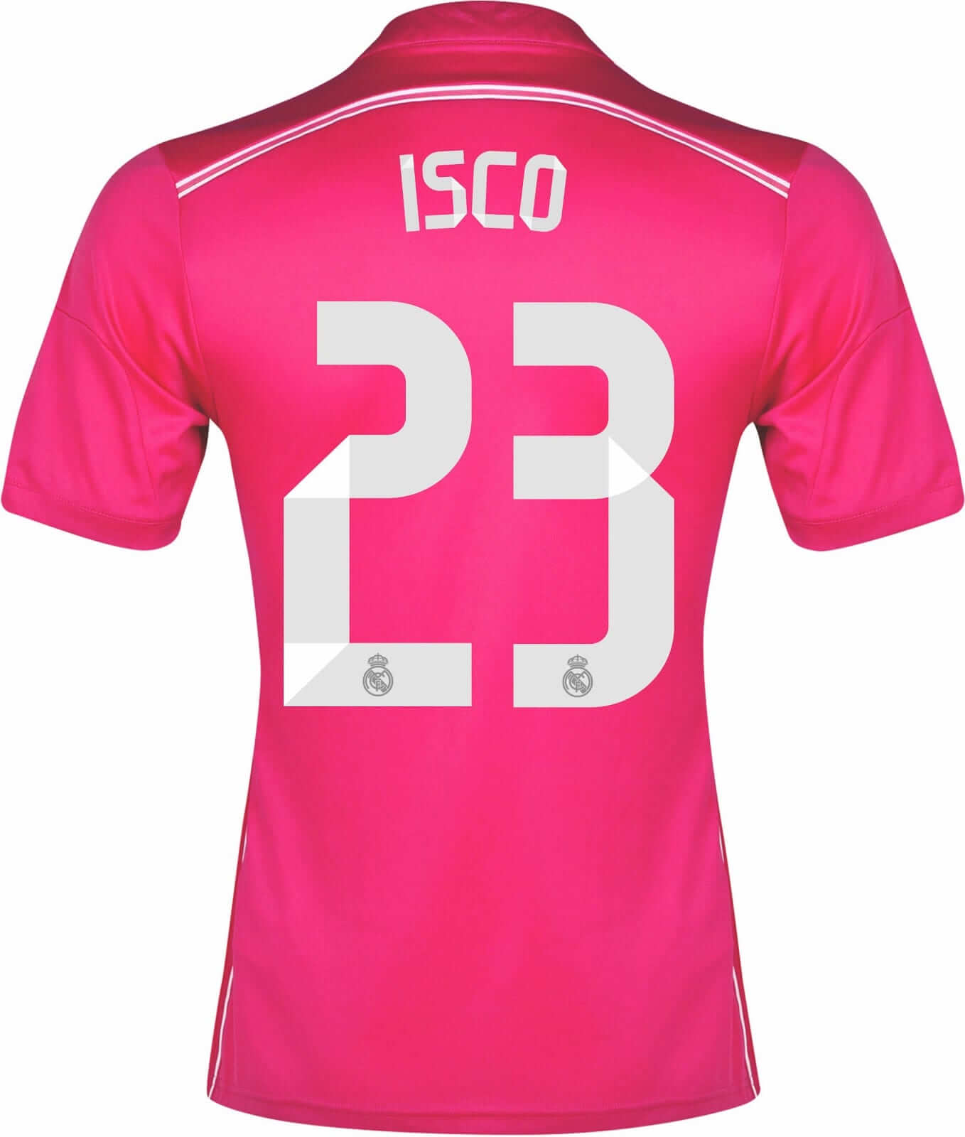
As most of you know, I don’t usually get excited about soccer. But there was a small discussion in yesterday’s comments regarding a topic that I found very intriguing: the uni number font on Real Madrid’s new jerseys:
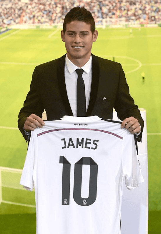
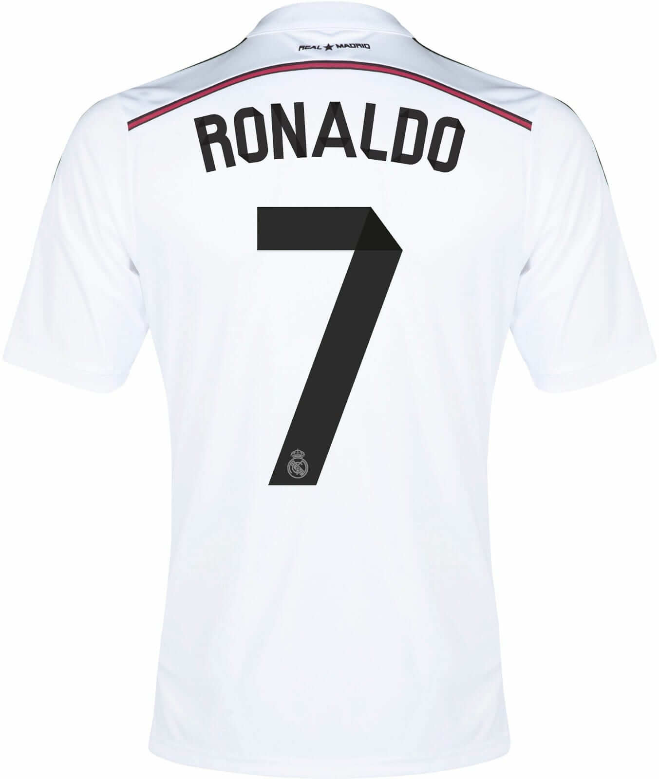
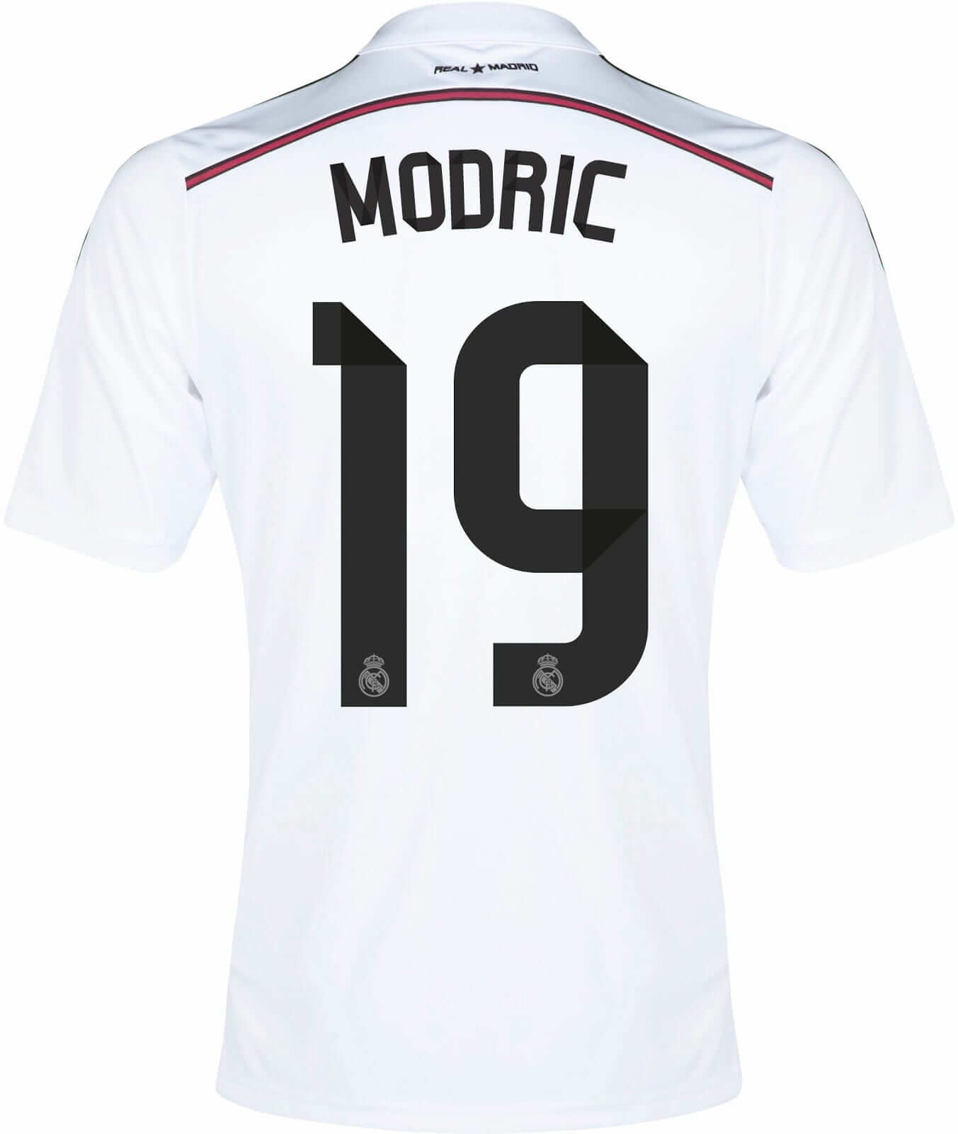
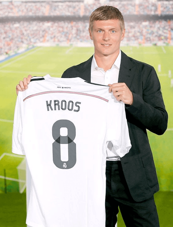
The interesting thing about the font is that the numerals look like folded paper, sort of like origami. Here are some additional examples (click to enlarge):
Some of the other numerals are less origami-like but still attractive. The “8,” for example, doesn’t feel like a single piece of paper that’s been folded — it’s more like a “o” overlaid with a horseshoe shape. I really, really like it:
And the “3” is like a backwards “c” overlaid with a backwards “L” (click to enlarge):
And so on. A few other thoughts on this:
• While I like the numerals a lot, I don’t think the font works well at all for the NOB lettering.
• I usually don’t care for custom number fonts. Why do I like this one so much? Is it strictly on the merits, or is it partially because I don’t follow soccer and therefore have no emotional stake in it? Simple exercise: Would I like this font as much if it were being used by an NFL or MLB team? Hmmm — probably not. So I’ll be interested in hearing whether soccer fans like this font as much as I do.
• If you like the idea of a font based on folded-paper patterns, check out this alphabet from the Danish graphic designer Kasper Pyndt. So cool! (Big thanks to my pal David Wilson for that one.)
NFL Decal-o-rama: The Steelers had said they weren’t going to unveil their Chuck Noll memorial decal until Opening Day, but I can tell you it’s going to look like the design you see at right. I’m sure some folks will say it’s too plain or whatever, but I think the design’s understated dignity fits Noll’s character (or at least his public persona). My only gripe is that the lettering was rendered in the Steelers’ current NOB font, which was never used during Noll’s career.
And as long as we’re talking about NFL helmet decals: Pinktober and G.I. Joe-vember are back for another season, and all teams will once again wear USA Football’s “Heads Up” logo for preseason games, just like last year.
(My thanks to Mako Mameli, without whom this section wouldn’t have been possible.)

Baseball News: The Mets wore brutal orange “Los Mets” jerseys last night. And if you look at that photo, you can see that they didn’t even try to adjust the angle of the “Mets” script to make it flow properly with the “Los” — they just reduced its size and kept it at its normal angle. That’s some lazy-ass shit right there. ”¦ Love this: The Nashville Sounds forgot or lost their road caps on the way to last night’s game, so they had to wear blank caps (from Barry Brite). ”¦ Here’s one of those old-timey “base ball” leagues where the players wear 19th-century uniforms. I especially like this guy’s belt (from David Alexander Hatch). … Even better: An old-timey base ball game staged in an old Gold Rush ghost town (from Matt Sepersky). … Here’s one of the ugliest Star Wars jerseys yet, for the Brooklyn Cyclones (blame Phil). … “I was sitting at the pool yesterday, reading a Pirates game program I had in my bag, and I noticed this strange little quirk in this photo from Neil Walker’s introduction after has was drafted in 2004,” says Rob Ullman. “The zero in the ’04’ on his jersey looks to be an 8 with the middle cut out!” … Can’t recall if we’ve seen this before or not, but just in case: Here’s a breakdown of all the unis in that AT&T U-verse commercial (from Steve Vibert). ”¦ You know how there’s a tech assistant who helps the umps when they’re contacting the MLB office during a replay? Mike Guterman notes that the techie at last night’s Jays/Bosox game was MLB- and Samsung-branded. When did that start? Definitely hasn’t been a universal thing this season. ”¦ The good news is that the Bridgeport Bluefish have decided not to wear that godawful naked-torso “military appreciation” jersey after all. The bad news is that they’ll probably just use the default camouflage option (thanks, Phil). ”¦ The Single-A Charleston RiverDogs used to be called the Charleston Rainbows from 1985 through 1993. They’ll wear Rainbows throwbacks this Saturday to mark the start of the 2014 Charleston Pride Festival (thanks, Phil). ”¦ The Big 12 logo has been added to Baylor’s cap (from Coleman Mullins).

NFL News: Steelers QB Ben Roethlisberger showed support for DE Brett Keisel, whom the team has not yet re-signed, by wearing Keisel’s No. 99 in practice (from Tony Shiffman). ”¦ Looks like the Pats are now using Flying Elvis on their nose bumpers. Remember, the Riddell logo can no longer appear in that spot, so a lot of teams may be experimenting with new nose bumper graphics this season (from Garrett Heller). ”¦ Sports Illustrated ran a Drew Brees cover story that included photos of Brees wearing a TRX T-shirt and also quoted him talking approvingly about TRX but neglected to mention that Brees is a TRX investor. … Buried at the bottom of this Browns article: “[Coach Mike] Pettine ended practice with a drill in which the offense had to gain 20 yards against the defense. In a best-of-five format, the side that prevailed won the right to wear orange jerseys Thursday.” Unfortunately, there’s no explanation of what’s so special about wearing orange jerseys. … The Dolphins have come up with a motivational T-shirt (thanks, Brinke).

College Football News: Jell-O has come out with out with a line of college football logo molds. The Texas A&M one features a double whammy — bevels and a backwards apostrophe on the package (from David Wilson). … New helmet for Tulane (thanks, Phil). … Here’s a cool display of Minnesota helmets (thanks, Phil). … Nebraska will wear an alternate uni for one game this season (thanks, Phil). … Louisiana Tech will be doing a red-out, including this new helmet design, against UTEP on Oct. 4 (Phil again). … Seriously ugly new jerseys for Cincinnati (Phil yet again). … New jersey for Arkansas State.

Pro and College Basketball News: Here’s a slideshow of LeBron James wearing No. 23 at various points in his career (from Jerry Wolper). … ACC logos are being added to Virginia Tech’s court (from Andrew Cosentino). ”¦ As you’ve probably heard by now, UCLA’s court might be a little damp for a bit. Details here. ”¦ Here’s Maryland’s new B1G uniform (from Matt Shevin).

Soccer News: New third kit for Man U. ”¦ New kit for Dynamo Moscow. ”¦ Interesting study on how teams perform when wearing their away kits.

Grab Bag: Here’s a very detailed look at the history of U.S. Navy uniforms (from Jason Nofsker). … An English cricket player has been told to stop wearing “Save Gaza” and “Free Palestine” wristbands on the pitch (thanks, Phil). … Unusual intellectual property case here in NYC, as a popular housewares shop has been told to stop selling a line of dishes featuring the NYC skyline because some of the buildings belong to the Port Authority. … There’s been a mild kerfuffle over Nigerian ahtletes wearing inconsistent jerseys at the Commonwealth Games. ”¦ Want to pay to have a pro golfer wear your logo at the upcoming PGA Championship at the Valhalla Golf Club in Kentucky? Here’s how. ”¦ You’ve got to be fucking kidding me: Reebok-branded bacon (blame Cavan Happel).

What Paul did last night: Last night I went to a free outdoor screening of the 1976 baseball film The Bingo Long Traveling All-Stars and Motor Kings, which is about a barnstorming Negro Leagues team in 1939. I’d always heard good things about it but had never seen it. It’s really more of a old-school black vaudeville movie than a baseball movie, but whatever — it has Richard Pryor, Billy Dee Williams, and James Earl Jones all making fairly pithy observations about segregation in the 1930s (Pryor spends the movie studying a Spanish phrase book so he can reinvent himself as an ersatz Cuban and crack the color barrier that way), so it’s pretty damn enjoyable.
Even if you’ve never seen the film, you might be familiar with its famous Bingo Long uniforms, which look sort of proto-tequila sunrise:
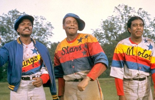
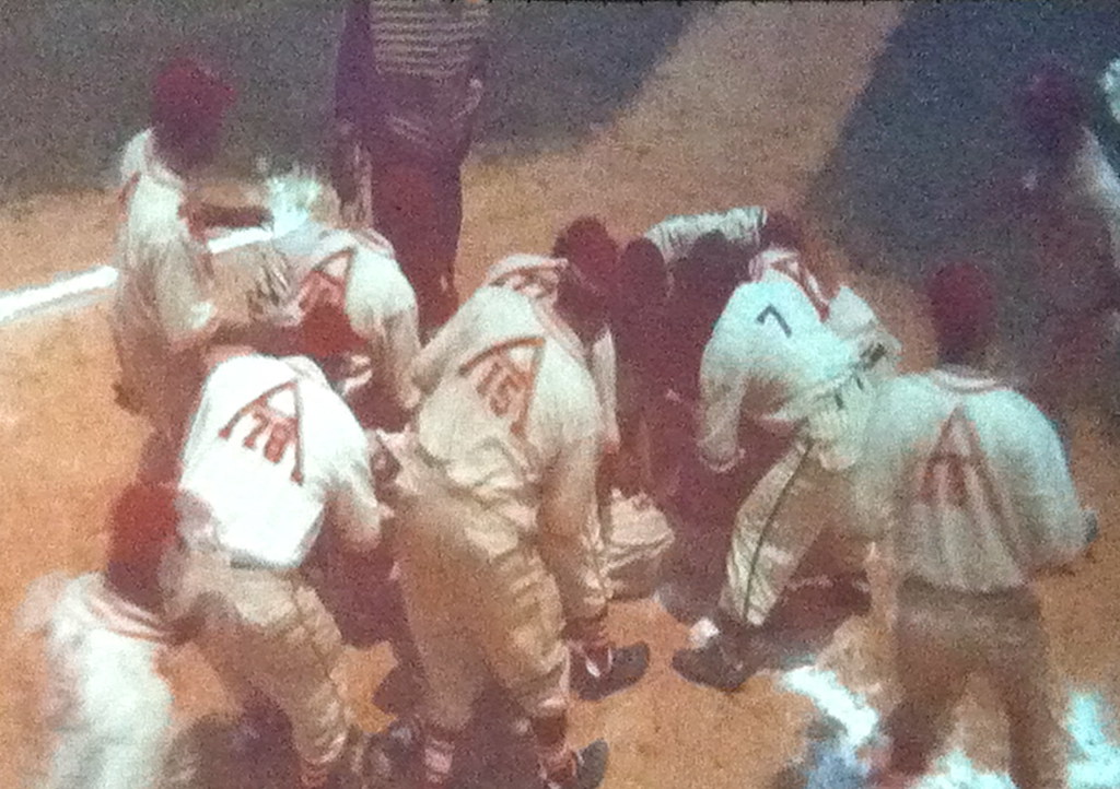
But there are several other Negro Leagues teams whose uniforms are shown in the film, along with a House of David team and more. Unfortunately, the outdoor lighting conditions were poor, but I did manage to get some halfway-decent shots of the St. Louis Ebony Aces and the Baltimore Elite Giants:
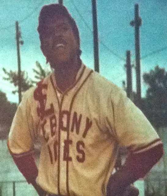
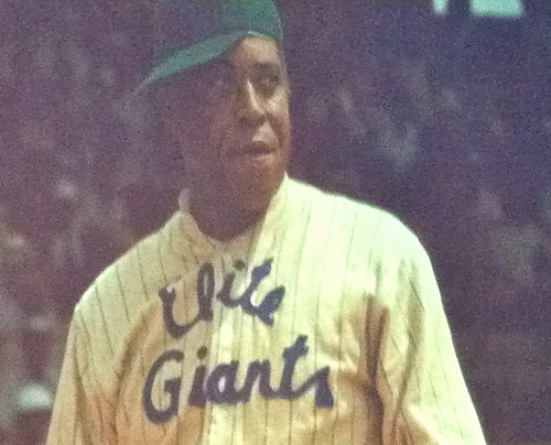
But my favorite uni-related thing in the film was the uni number treatment for the Ebony Aces. Each jersey had a big “A” on the back, with the player’s number inside the letter (click to enlarge):
Really like that design. Anyway: Good movie — worth seeing. Even more worth seeing outdoors for free on a crisp summer night.

If I’m reading this right, the Steelers will be wearing black ovals on black helmets, which seems a bit odd.
It is a memorial decal not the actual helmet logo.
What BurghFan meant, I’m pretty sure, is that a black decal on a black helmet won’t stand out very much.
It could have a white or yellow outline, or they could put it on the stripe.
I think part of the thing that makes custom fonts feel more acceptable for soccer is that teams like Real Madrid generally change their name/number fonts every year, so even if you don’t care for a particular year’s font (and I didn’t care for last year’s at all), there’s no reason to get too upset about it, because it’s not permanent. With NFL/MLB/etc uniforms, you know you’re probably going to be stuck with it for a while (as I was with horrible font the Washington Capitals used from 95-07). And Real Madrid’s kits are also generally very conservative, design-wise, so there’s room for some playfulness with the fonts.
I’ve never understood how the teams in some soccer leagues let the league dictate to them what the number font should look like (and then sometimes make every team in the league wear the same font). It’s like they’re taking a part of the teams’ identities away from them.
I guess since numbers are less prominent on soccer jerseys than basketball or football, they haven’t really been considered an integral part of the identity (which is another reason why custom fonts don’t bother most people). And if nothing else, a league standard font reduces contrast and readability issues.
Plus, most replica jerseys are sold without customization, it’s not something they put a lot of effort into — at the World Cup, Adidas and Puma teams all wore the standard manufacture typefaces, while only Nike teams wore specific number and name fonts.
Let’s not get overly dramatic here. As B W notes, these custom team fonts are really just gimmicks – nice enough as pieces of design but certainly not to be considered integral to a team’s identity especially since they’ll be discarded within a year or two anyway. I’m certain nobody is being dictated to or held up against a wall so that the standard numbers can be forced on their backs. It’s just one of those things where somebody within the league thought it would be a good idea and the teams just said, “yeah sure whatever, what do we care?”.
That’s not to say I don’t have issues with standardized league fonts, it’s just that my problem has more to do with the fact that they almost universally suck, or at least the ones I’m aware of do.
I’m certain nobody is being dictated to or held up against a wall so that the standard numbers can be forced on their backs.
Padday, in the English Premier League isn’t this exactly what happens?
I’m sorry but you’re going to have to convince me that this is something that the clubs have actually spoken out against. Otherwise I’m inclined to believe that they are not only passively compliant but generally happy with the situation. I sincerely doubt, considering the myriad ways the clubs, particularly the top clubs, are able to dick around the league, that they would have any trouble reversing such a practice if they really wanted.
A persecution complex in relation to FIFA may well be warranted, but many of these leagues are well and truly at the mercy of the far more powerful and wealthy clubs that operate (supposedly) under their jurisdiction. In the unlikely event that they have indeed managed to beat them into submission on this point, then if anything I’ll celebrate it as one small win for order in the Hobbesian state of nature that is European club football at present.
I’ve never understood how the teams in some soccer leagues let the league dictate to them what the number font should look like (and then sometimes make every team in the league wear the same font)
That’s one of the things I absolutely love about English soccer. The Premier League has link, and teams have to earn it by gaining promotion to the league. If they are relegated, they wear the numbers link until they can claw their way link. Those Premier League numbers are a badge of honor.
I admit this only works in the presence of a promotion/relegation system, but I love it.
It also doesn’t hurt that I really like link. I loathed link.
Ugh. I hate this aspect of English football. The Premiership number font is indeed rather attractive; but that’s beside the point. The point is that the number font should be part of the team’s aesthetic; so the choice should be left to each team.
This is one of the many reasons that I love the Champions League: Premier League teams can free themselves from the mandated font and use one of their choice. Seeing a Champions League match between teams of varying number fonts only reenforces how bad that aspect of Premier League football looks.
I don’t really mind the league mandated number fonts – EPL for instance. Between the font and the lion logo on the bottom, it allows you to immediately figure out what league you’re watching if you happen to come across a highlight or something like that. The teams still have their own identities but the numbers tie everything together (as do the shoulder patches).
link
New York Elite Giants? I thought they were Baltimore…or was this a fake team for the movie?
You’re right — my bad. Will fix.
Bingo Long was filmed in and around my hometown, Macon GA, around 1975. Many scenes were filmed at Central City Park and Luther Williams Field, one of the oldest minor league stadiums still in existence. That was my high school band that played the national anthem, at Morgan Field where I played Pony League ball.
Loved how each team member’s jersey had a different word on the front, so when they lined up all the jerseys read The Bingo Long Traveling All Stars and Motor Kings!
Entire movie’s available on YouTube: link
Thursday is Cleveland Family Day at training camp
link here’s a link to the jerseys
Throwback number font!
William Green (2002)
link
Perhaps someday Cleveland will return to wearing those white facemasks.
a fan can only hope…
i was at a Lids Locker Room here in Orlando and they had both on display(one over the other) and man the white facemask one just pops compared to the grey masked one
Couple of typos: for the Noll piece, “grip” should be “gripe”; for the Sounds piece, “last” probably should be “lost”.
God, those Los Mets jerseys are horrible.
Also: “An old-timey bsae ball game”…
I wasn’t going to say anything but since it seems to appear regularly in the ticker these days, can we start calling it by it’s proper name?
“Vintage base ball” is what all the teams and leagues call it, some of whom take things like terminology and vocabulary VERY seriously. “Old-timey” makes it sound like some sort of novelty exhibition, when in fact it is an actual sporting activity.
Thanks,
“Gentleman” Ben Fortney
Bridgeport Orators, 2007-2009
Potomac Nine of Washington, 2011-2014
Both fixed. Thank you!
Miami Dolphins stole the Warrior Ethos from the US Army for their motivational T-Shirt
link
That shirt is about the lamest damn thing ever.
Totally agree. We obviously owe thanks to Richie Incognito.
As someone who served in the Army and lived by the Soldier’s Creed and was proud to recite it every morning, I hate this. It is a cheap rip off and is disrespectful to twist the creed of men and women who serve this amazing country of ours, and use it for grown men who make a ton of money to play a game. Disgraceful and distasteful.
No matter what font Real will be using this year that team is stacked.
I love it when teams show their support for the military, but I think those Bridgeport jerseys are awful! For one thing, a growing number of women are in the service — and of course, people of color. The camo is a much better design.
I give Bridgeport points for the intent and trying to think outside the box. But they can keep thinking.
Charlston Rainbows from 1985, not 19885
I don’t know. Bud Selig may disagree with you on that. To him 19885 would be a classic throwback. After all, we did just have the 20014 draft. link
IIRC, The Steelers DID use that font during the Noll era – for their helmet numbers.
True, but the numbers were (and are still) in white.
They used that font for the NOB.
link
Never mind…that was a blockier font back then.
When exactly did the Steelers switch nameplate fonts? You can’t really tell on the GUD because “NAME” doesn’t show enough of the font to make a determination. Did it start in ’97 along with the italic numbers, or did they use it before then?
Yeah, the nameplate font changed when the numbers did, and the road names were black for a year before they went back to gold outlined in black.
In the 1997 preseason and their Week 1 game at home against Dallas, the Steelers black jerseyed NOB was the 1970-1996 style. The font would change the next week when the Steelers hosted Washington.
RE: UCLA “damp” court…..
Just send out the scantilly clad mop girls to take care of it!
Tech assistants for umpires: noticed during the replay review of the Phillies-DBacks game on Sunday, there was a gentlemen wearing a camo uniform (not sure if he was an active member in the service)standing behind the umpires. Wondered what his role was. Now I know. Scroll to 1:53 mark of the embedded video.
link
Surprised to read in that Charleston RiverDogs article that they recently held a sequel to Disco Demolition Night. I had no idea Mike Veeck was even currently in baseball.
As for the Rainbows promo… the name of the person they have scheduled to throw out the first pitch… the pun is too painful!
… and, I also had no idea Veeck owned the St. Paul Saints, either. But then again, it’s not like I actually follow the baseball minors.
If you’re interested in Mike Veeck, this is the book to read
link
Its got Mike Veeck, Bill Murray, minor league baseball, Daryl Strawberry, Jack Morris, and its an amazing read.
I’ve talked to him in his office, and he actually insists on being called “Night Train.” The boy’s a trip.
To clarify: Bill Veeck (Jr.)’s son is Mike Veeck. Mike Veeck’s son is Night Train.
“Simple exercise: Would I like this font as much if it were being used by an NFL or MLB team? Hmmm – probably not.”
I was a bit surprised to hear you say you liked it, as I assumed you would bash it as a gimmick in one of the big four leagues. Interesting to seenyou recognize that. It draws attention to the fact that our design sensibilities are different outside of uniforms.
I think the 3 looks off compared to the other numbers. It might be better if it were based on the “flat-top” 3 glyph.
I’m a soccer fan, and I usually appreciate the innovations in “football kits”. If I was the type to buy my team’s shirt, I would be annoyed because they change every year. There are a couple reasons I love the design element of soccer unis.
1) I got into club soccer in 2002-ish. So, I have no nostalgic attachment to the good old days or anything like that. Yes, I expect to see certain teams with a main look for their home kits (white sleeves for Arsenal, all white for Madrid, etc), but I also love the addition of patterns, odd striping, vibrant colors for change kits, etc. That said, teams should have a recognizable identity (see Arsenal/Madrid). This is something I HATE about MLS And US Soccer. MLS has become more consistent lately, but USMNT needs to get their ish together.
2) I think because a soccer uniform is basically a t-shirt and shorts, it feels like a more acceptable canvas. A baseball uniform should have knickers with belt loops, a belt, a button down shirt, and a cap. A football uniform has all those pads and a helmet. The simplicity of a soccer uni provides an attractive canvas for patterns, new fonts, bright colors, etc. A football/baseball/hockey uniform becomes busy very quickly. That said, I think basketball unis also provide a good canvas, and I wouldn’t mind seeing new looks in the NBA, provided they aren’t boring and generic like the current Christmas shirts.
Of course, there is a line. That team, Napoli I believe, with their recent camo shirts looked terrible.
I don’t get the consistency gripe about US Soccer. They’ve gone with all-white or white/navy/white for every World Cup from 1994 on (the hoops were just worn for the qualifiers). The away kits have changed, but that’s no different from the bigger European national teams.
I think you can forgive MLS for going through a few uni changes. It took a while for top European teams to settle on their looks, but they’re 100+ years old. MLS isn’t old enough to drink yet.
Still good point about busy-ness of football/baseball/hockey uniforms. The thing about basketball jerseys though, is that they don’t provide a lot of real estate to play with.
My opinion is that US Soccer lacks identity. All white works for England, somehow, but it feels lacking for ‘Merica. Adding a sash (as has been done many times) would be great. White top with a red sash, navy shorts, white socks, for example. If they were consistently white/navy/white, that would be one thing (if also boring), but they deviate often.
But the clean(ish) white look is, for better or worse, the team’s identity and in my opinion, fits the USMNT ethos of hard-working, team-first players. It doesn’t lack identity – you just don’t like the identity that’s there.
And you can’t really complain about the consistency. Here’s what the US has worn in the last few World Cups:
1998: white/white/white
2002: white/navy/white
2006: white/navy/white
2010: white/white/white
2014: white/white/white
Not too much variation here.
Compare that to the Netherlands, who’ve switched around from orange/white/orange to orange/black/black to orange/white/blue to all-orange. As far as national teams go, US has maintained a pretty consistent identity.
Agreed. I understand saying “I don’t like their identity,” or “their identity is too close to England/Germany/whomever”, but not that the USMNT doesn’t have a distinct identity.
I think this is merely yet another manifestation of the US soccer inferiority complex: think up some abstract or entirely subjective criteria for being a good soccer culture and then take advantage of the indistinctness and fluidity of the criteria in question to paint the US as distinctly lacking.
Terriblehuman makes a good point. The US’ identity is essentially some kind of white shirt and either blue or white top. This identity, however, is pretty bland when compared to the 1994 designs or the 2014 rocket pop kit. It also looks very much like the typical England home kits used over the last 25 years.
Permanently adding a sash or some kind of thick striping (vertical in 2006; horizontal in 1995; horizontal in 2006 third kit) might give the US more of a clear-cut identity that stands out. I think that might be what Don G and others are pushing for. It’s the jersey that generally stands out. See the Dutch, who – despite changes to shorts and trim – stand out because of the (arguably garish) bright orange tops.
This blog does a good job showing all the various iterations of the US unis:
link
I think the waldo hoops would be an excellent “home” look for us from now until forever. Match our look to our flag. Works great for Croatia and Brazil.
That, or the 2006-08 link. Without a doubt, my favorite US shirt.
I’m with Don G: the barrel hoops are the best. Don, did you infant that “waldo hoops” moniker? Brillant.
I hate spell check. “Infant” above should be “invent.” Although “infant” is an interesting verb.
Connie DC, unfortunately I can’t take credit for that. Many have referred to those unis as “waldos”.
Right on, Don G. Add me to the “Waldo” stripe camp. I actually thought the rocket pop unis looked pretty good this year but it didn’t make me think “America!” You can’t help but think “America!” with the stripes.
As a Notre Dame fan I am glad they left adidas. Holy cow can that adidas logo get any bigger on that awful cincy jersey? It runs into the claws and just looks terrible. yuck.
My only fear is with how Under Armour likes to change everything. I can’t wait for the announcement that Notre Dame will have an “alternate” helmet…
They’ve already worn a couple of those, so…
UA has been *relatively* conservative. Look at how little they’ve done with Auburn.
True. But that’s more a function of Auburn than UA.
If teams (like in the NFL) tell suppliers (Nike, Rbk) to leave their unis alone (and roughly 1/2 of the NFL fits this category), they do. It’s when the schools/teams allow the designers to have more free reign that you get Oregon and Maryland uniforms.
Of course, now the Packers/Steelers/Giants/Bears etc. are considered “boring” by many (as are PSU/’bama/whoever is left in that category). So the designers can sometimes (often?) convince the team that newer “fresher” unis (especially in space age fabrics that allow players to fly and/or become untacklable) are good for morale/recruiting.
But yeah…Auburn hasn’t been ‘swayed’ by UA…yet.
“Of course, now the Packers/Steelers/Giants/Bears etc. are considered “boring” by many (as are PSU/’bama/whoever is left in that category). So the designers can sometimes (often?) convince the team that newer “fresher” unis (especially in space age fabrics that allow players to fly and/or become untacklable) are good for morale/recruiting.”
I’ve always thought that the “it’s good for recruiting” spiel was BS. Many of the most conservatively-dressed college football teams (Auburn, Alabama, and USC among them) have rarely had trouble attracting top talent.
Meanwhile, teams like West Virginia and Maryland are dressed up like Nike and Under Armour’s lab experiments gone wrong, and they’re not attracting the same caliber of talent. Maybe those costumes make the difference between a two- and three-star recruit saying yes to a program, but they don’t seem to be swaying the four- and five-star athletes.
I’ve always thought that the “it’s good for recruiting” spiel was BS. Many of the most conservatively-dressed college football teams (Auburn, Alabama, and USC among them) have rarely had trouble attracting top talent.
Well, I think you’re mixing the chicken with the egg (or the egg with the chicken – which comes first?). Alabama, Auburn and USC don’t have to resort to gimmickry/give up its identity to uniform makers, because they’re established names.
Other teams do need something like uniforms to get the recruits’ attention because they don’t have the luxury of letting their records speak for themselves. And even Notre Dame, as an independent, probably needs help getting attention because they don’t have the national reach of the top SEC schools.
Also, you can think of uniforms as, say, a foosball table or an espresso machine in the break room – it’s a workplace perk. It’s not going to be *the* reason for choosing a school, but it’s something that signals to recruits, “Hey, we’re a fun program that gets cool, cutting edge unis from UA/Adidas/Nike!”
Case in point – link. No one is going to sign at Rutgers because of the mode of transport, but it’s a signal that recruits will notice.
terriblehuman, it seems like you’re kind of making my point for me, although I think you’ve stated it better than I have. What I meant was, essentially, the crazy uniforms may work best as a means of recruiting mid-tier talent, which is the situation that you more or less described.
Maybe the Rutgerses and Marylands of the world need that arrow in their quiver to attract the players that Alabama and Florida pass on. But it just seems like a whole lot of excess (and aesthetic crimes) for modest rewards.
The replay tech for the Cincinnati/Arizona game was decked out in Samsung gear as well.
Re the Los Mets jerseys.
I noticed that the Mets have 2 distinct versions of “Mets” for their jerseys. The standard look where the “M” and “ets” are split.
link
As you can see, this creates an extra long space between the “M” and “e” in “eta”.
And then there is the tightened up version that appears in the older pullover jerseys and the logo.
link
link
However, it looks like Majestic used a newly created variation of the split version to create the “Mets” for the “Los Mets” jerseys.
link
Don’t the “M” and “e” look too far apart?
Sportslogos.net has a mock-up of what it should look like with the proper logo
link
I think you may be right, that they took the extended “Mets” script (with room to separate into two halves for a button-up) and just shrunk it down.
But the Mets are a mess with their wordmarks in any case. Look at the angle of the bottom of the M link and compare it to the nice, level “M” link. Drives me crazy.
And, of course, you’re not the only one who’s driven crazy by link.
I think part of the reason that the jersey in the Chris Young picture doesn’t flow well between the Los and Mets is that he butchered the buttoning of the jersey. He’s at least one button off.
About the Samsung branding for the replay tech- a few weeks ago the official twitter account for MLB replays changed their display name and pictures to Samsung Replay, though @MLBReplays stayed the twitter handle. On July 10th they made the first tweet linking to the video being reviewed for replay including the hashtag #SamsungReplay when previously they would just have the hashtag be the matchup of the game (#NYYvsNYM for example). My guess is they slapped the Samsung branding on sometime this month as well.
Link to the twitter account:
link
Interesting. Thanks for the info, John.
The Real Madrid font works for me because it implies the thinness and light weight of the jersey itself. Soccer jerseys these days feel like nothing. I think if it was on a heavier jersey like a baseball jersey it wouldn’t work as well.
Interesting point. It makes me wonder how the alternating translucent/opque effect – the very thing that gives the numbers their thin and light feel – is achieved. Is the screen printing actually applied in a thicker layer at the “folds”? Are there individual components making up the numerals that are then overlaid on one another to create the effect?
I’m sure this was reported on the site, so forgive me, but what is the reason the Riddell logo can no longer appear on nose bumpers? Loss of an exclusive contract?
I’m excited to see what each team will do in the NFL preview column.
I’m a UVA grad/fan and used to love when they had “HOOS” on their nose bumper. At some point in the early 2000s they switched to “ACC” as I believe every team in the conference did. Not sure if that was/still is a requirement, but they still use “ACC” – save for the occasional throwback game.
what is the reason the Riddell logo can no longer appear on nose bumpers? Loss of an exclusive contract?
Yes. By contract, Riddell was the only helmet manufacturer allowed to put its maker’s mark on an NFL helmet. That contract has now expired, and now *no* maker’s marks will be allowed. So expect to see a lot more team logos in that spot.
Riddell’s contract as the NFL’s official helmet supplier didn’t so much expire as the NFL bought it out. Originally, Riddell’s grant was in perpetuity until the NFL put some leverage on them to renegotiate a termination date at the end of last season. Something to do with the NFL wanting to look like they care about concussions or something…
Todd Radom had a good piece about it last fall:
link
Paul, we’ll have to agree to disagree. I can’t stand that font. Bellotti Bold has met its match…the 8 in particular hurts my eyes and wounds my soul.
By the way, England had an oragami-ish font in the World Cup for their 4s and 7s.
link
I could live with that one if I had to.
I clicked through to the jello molds and was astounded to discover there were none for BYU or Utah. If jello isn’t Mormon soul food, what is?
There’s no market for them in Utah. All true Cougar and Ute fans have already DIY’ed their own Jell-O molds.
OK, since a baseball film is in the post today, I think I can reasonably segue to this question.
Watched A League of Their Own with my daughters last night. Has Uni-Watch done any analysis of the uniforms in the film?
The search function didn’t turn up anything.
No, haven’t done that.
Well then you’d better get on it, before some other uniform site beats you to the punch.
And if another site does, don’t cry about it.
I know this guy that nearly cries every time the credits for that film roll. He says it is a combination of the Madonna song that is playing (“This Used to be My Playground”), and the ladies’ love of playing ball.
.
.
.
.
(ok, that guy is me.)
I’m with you there. It’s a very touching moment. I also kinda get emotional during the montage of the league getting popular. The scene ends with the guy whom took over the league (drawing a blank on his name) walking in packed, wildly cheering stadium. Great moment. Of course I never shed tears because, you know, there’s no crying in baseball.
Puma used a folded paper-like font in soccer during the last two years too, it was called the “gaffer tape” font.
link
FC Porto seems to have changed uniforms during their friendly against St. Etienne. They started in their home kit: link
and switched, I assume at half-time: link
Also from that game, they’re using the Brazuca ball from Brazil (same colors as in Brazil, unlike MLS, who are using the same ball with a different scheme), and it looks like the Brazil World Cup logo is still there…odd.
link
Second half link got hijacked…here it is…the change kit: link
I appreciate the mention of “Bingo Long’s Traveling All Stars and Motor Kings”.
JellO Molds for colleges, if we think this is not a silent nod for the tailgating JelloShot crowd, we’re lying to ourselves.
“Don’t” put Q-Tips in your ear canal;)
I actually saw Real Madrid in person last night against AS Roma. From the stands, the origami effect of the number font was pretty hard to see on the pink jerseys. Had I not known to look for it, I doubt I would have noticed.
Soccer fan here. I love the new Real font in general. The even strokes and uniform angles sell it for me.
Not a fan of that 8, though. Or even the 3. Those aren’t folded-over so much as unrelated shapes combined into familiar patterns. There’s a great font to be made out of overlaid geographic shapes, but I’m not feeling it within this particular design.
I see a magnet picking up an iron doughnut, not an 8.
And if the other numbers were similarly cobbled together, it could look very cool. Just doesn’t fit here.
I wish the bottom of the 8 was a wee bit shorter, but maybe that can’t be helped because of the layered look.
I like it overall though.
Fans of accidentally-upside-down jersey numbers might like this Livan Hernandez Nationals jersey in which the 6 is actually an upside-down 9:
link
Now if 6 turned out to be 9,
I don’t mind, I don’t mind
I have come across Spalding bacon in Canada more than once. link I often wonder if it is made of basketball and football leftovers.
Yeah, I know what you mean. When that picture of Jimmy….Dugan…there at the end…….sorry… lets start over.
When that picture of Jimmy Dugan is shown, I’ve been known to get a tad misty.
I’m surprised link hasn’t bought ads on this site. I’m seeing it on pretty much every sports site I visited today.
I can’t possibly see Paul ever willingly selling ad space to them; if one of their ads were to ever show up here, it’d be because they bought slots from the ad serving company.
Last night I was watching the Phils vs. Mets game and my 77 year old grandfather who has advanced alzheimers and can’t remember my name pointed out how ugly the Los Mets jerseys were and how bad they looked. That’s when you know a jersey is bad.
Not sure if I’m late to this party, but some First Nations have come up with a mock “Caucasians” T-shirt styled a la Chief Wahoo
link
Buying one immediately.
correction to my earlier post: the First Nations ppl in Ontario didn’t come up with it, but it’s become popular among them.
Looks like Ernie Stautner’s number 70 will no longer be the only number officially retired by the Steelers. Fittingly, it will be link
It should be noted that it’s just ceremonial, as 75 has been unofficially retired since Greene retired in 1981.
Was Jack White wearing a Tigers jersey when he threw out the opening pitch last night?
A link.
The man loves him some baseball and he’s link.
When I think of notable Cubs fans under the age of 40, I think of link
link
Evidently it’s a link.
Cleveland Indians going with high socks tonight in honour of traded teammate Justin Masterson.
I’m a soccer fan, and I looooooove the new Real font. Infinitely better than the Comic Sans-esque font they had last year (not the best picture, but you get the gist here: link). I also like it as the name font.
This isn’t necessarily uni-related, but just a simple request from a lifelong Manchester United fan to stop the use of “Man U” when referring to the club. It seems petty and simple, but it’s actually a derogatory term used by opposing fans to mock the Munich Air Disaster of 1958, where a plane carrying the team crashed on take-off and killed half the team and staff. The term started when Leeds fans would sing about the captain, Duncan Edwards: “Duncan Edwards is manure, rotting in his grave. Man you(U) are manure, rotting in your grave.” Something small, but nowadays when names have the ability to offend (re: Redskins, Indians, Braves – not to say this compares with the over-simplification of an entire race and implicit racism, but to prove that names make a difference), it’d be cool for Uni-Watch to use Man United or Manchester United. Thanks, guys.