For all of today’s photos, you can click to enlarge
Paul here. As most of you know, I’ve been away on vacation for the past week. It was a great trip, and I’ll have more to say about it tomorrow. I’m still catching up on stuff, so thanks in advance for bearing with me as I get back up to speed. Meanwhile, please join me in giving a standing O to Mr. L.I. Phil Hecken, who did a great job of keeping the site running in my absence.
Now then: I’ve written many times about my ever-growing collection of old sports uniform catalogs. Occasionally, though, I’ll acquire a vintage catalog for non-sports uniforms, and we’re going to look at one of those today.
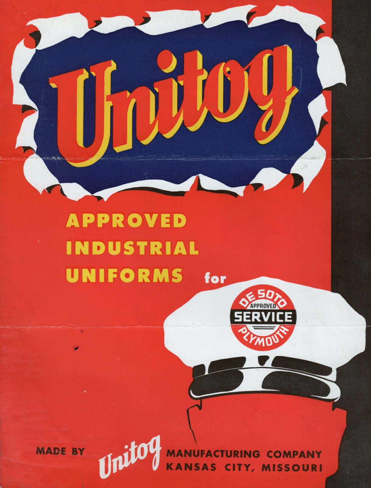
I saw this 1948 Unitog catalog on eBay recently. I was familiar with the company’s name because I have this old Gulf jacket with Unitog tagging, but I’d never seen one of the company’s catalogs before, so I scooped it up for $10. It’s really more of a folder or brochure — one sheet, folded in half. But what a design! You can see the front cover above, and check out the interior spread:
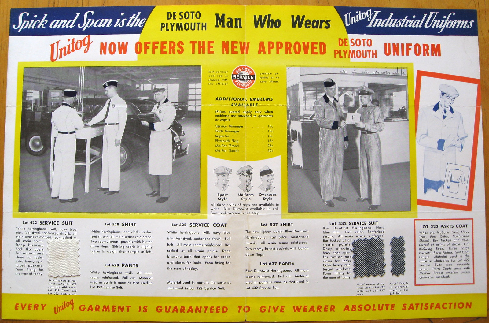
That spread features lots of good details that are worth a closer look, beginning with these two swatches (man, I loooove swatches):
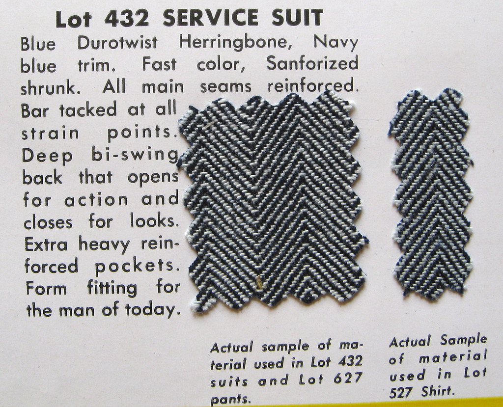
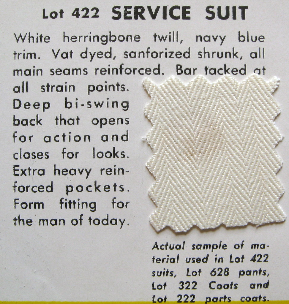
I love how the text accompanying the swatches says that the suit jacket “opens for action and closes for looks,” and that it’s “form fitting for the man of today.”
Interesting to see that Unitog offered three different hat styles:
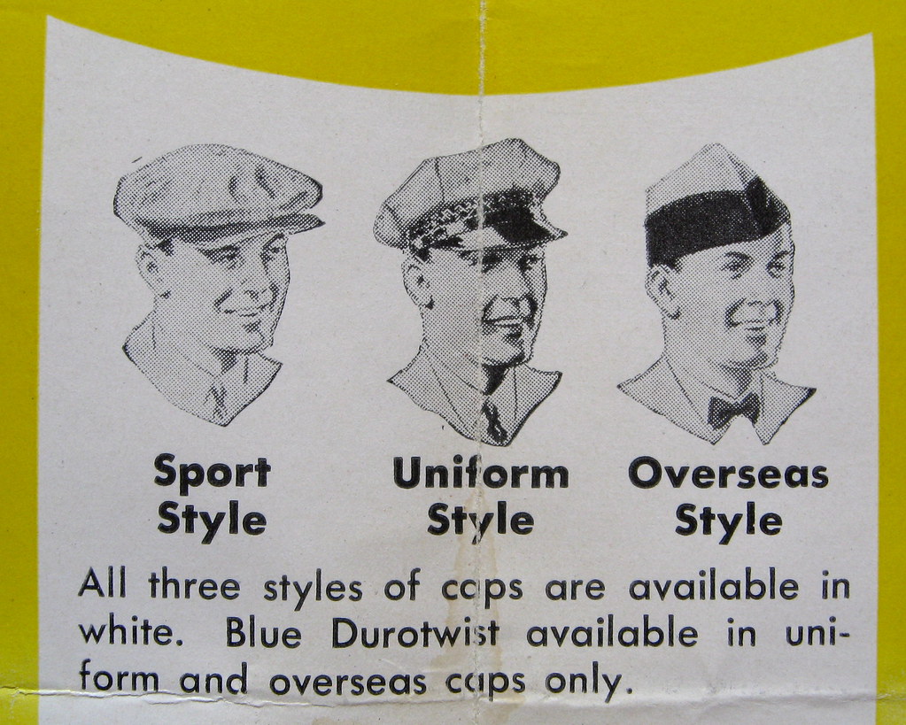
And here’s a closer look at the emblem that appears in the center of spread:

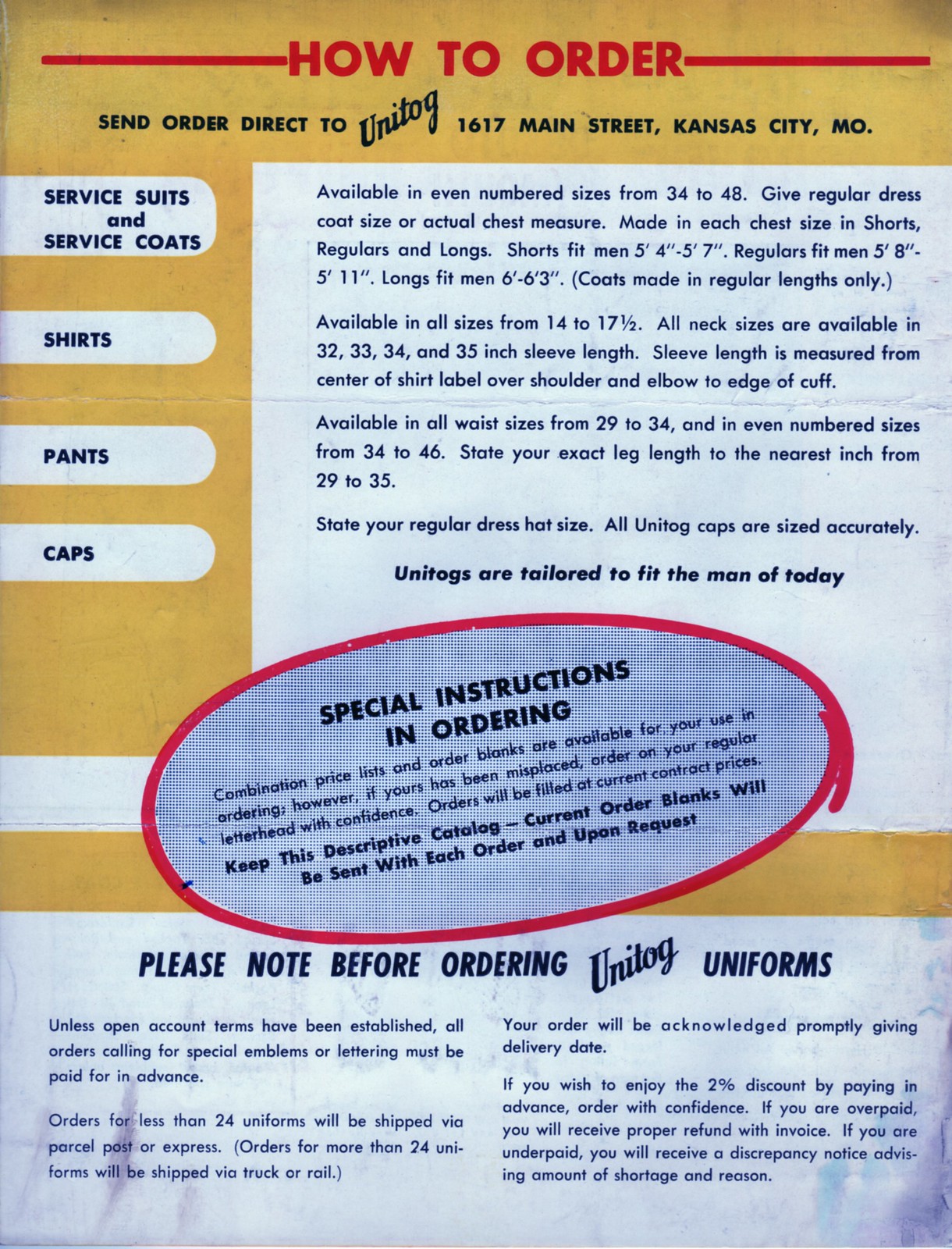
Next up is the back cover. I particularly like that it says to “State your regular dress hat size” when ordering caps, since most men in those days wore fedoras and presumably knew their hat sizes. Actually, the rise of cap merchandising may have created a new generation of cap size-literate consumers, no? Anyway, here’s the back cover:
The catalog came with this letter from Unitog sales rep E.M. Riddle, indicating that it was mailed to De Cola Motors of Newark, Ohio:
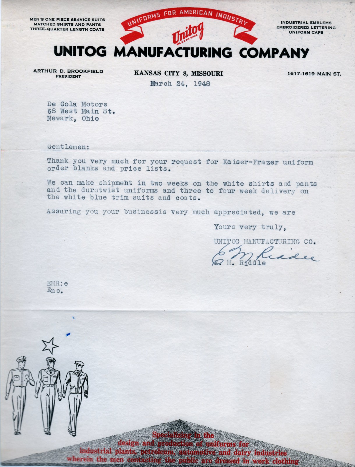
I found a few vintage items on the web relating to De Cola Motors, including this 1950s postcard, but they’re apparently no longer in business.
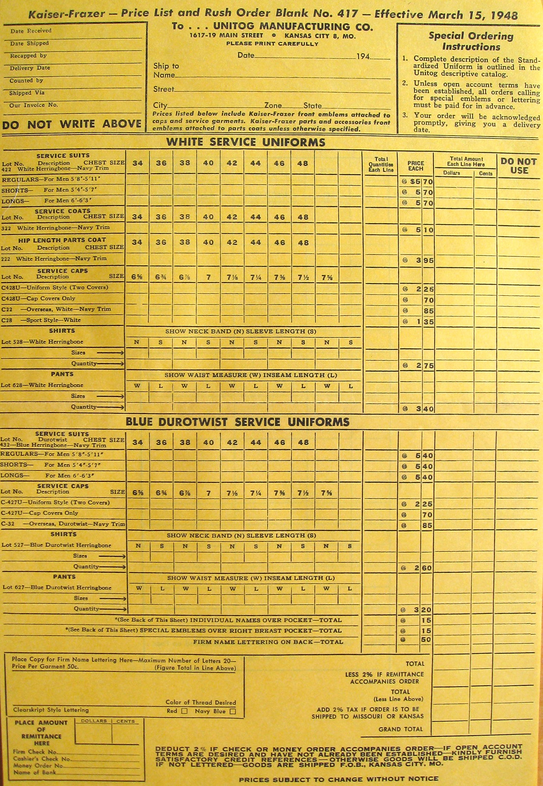
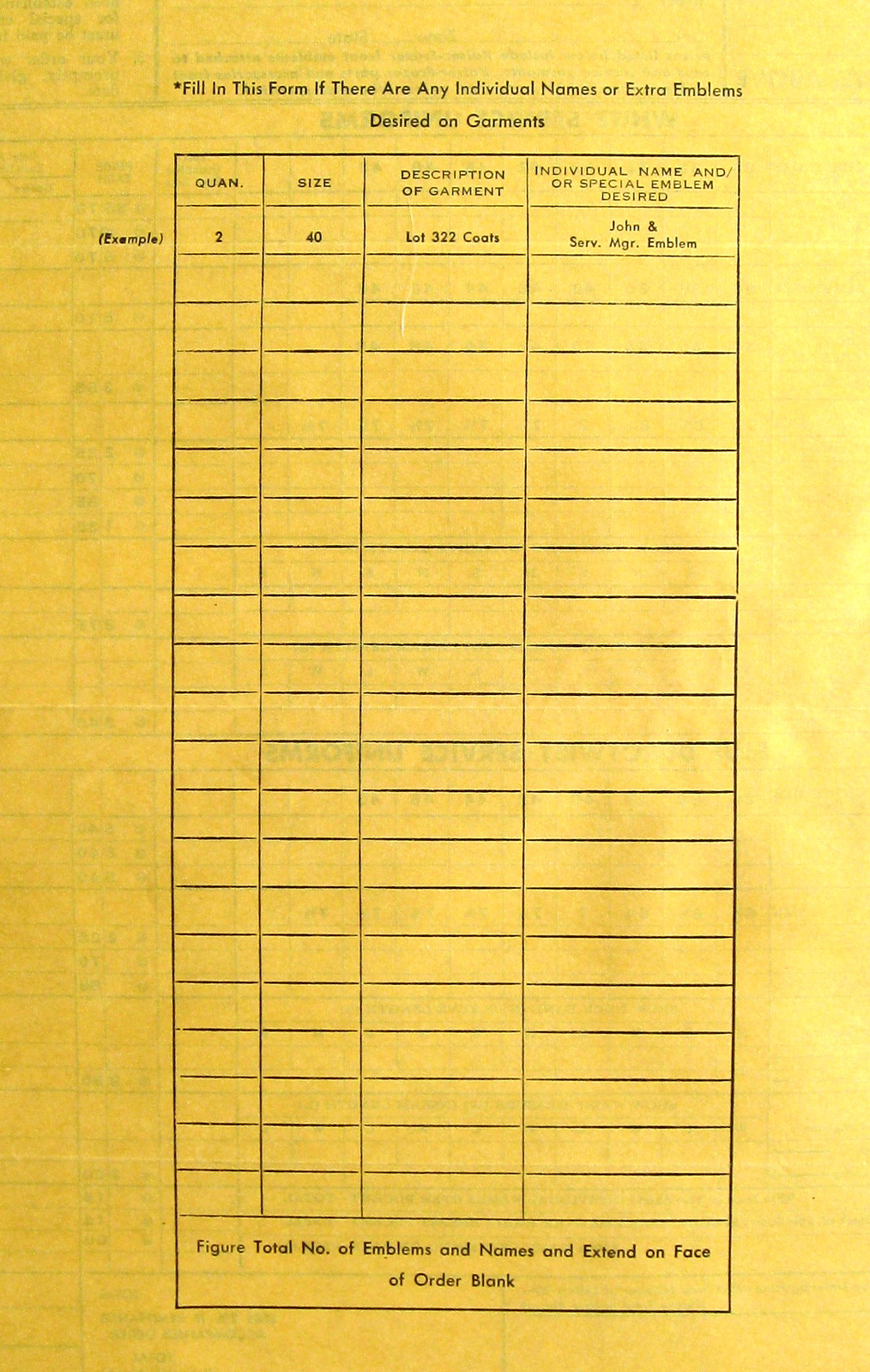
The catalog also included an order blank. Here are the front and back:
Unitog, incidentally, has an interesting history. According to this page, it was founded in 1932 (during the worst of the Great Depression — a tough time to launch a business). I like this passage:
The nucleus of [company founder Arthur] Brookfield’s idea for Unitog was this: Businesses needed to convey a professional image that would establish a company’s identity and quality through well-groomed employees. Unitog would provide one-piece neatly tailored uniforms that would boost employee morale and increase visibility for the company. …
The name Unitog was birthed from Brookfield’s background as a former teacher of Latin. Unitog is a derivative of the Latin word “Unus,” meaning one, and the Greek word “Toga,” a Roman garment.
In the 1950s, Unitog became a key supplier of U.S. Postal Service uniforms. By the 1990s, the company was buying up smaller competitors, but in 1999 Unitog was itself acquired by Cintas. The uniform world: It’s a jungle!

’Skins Watch: The Virginia state legislators who recently formed the Redskins Pride Caucus have issued a series of statements defending the ’Skins name (from Tommy Turner). … Meanwhile, Sen. John McCain says Native Americans in his home state of Arizona have told him that the name is offensive and that he’d therefore change the name if it were up to him.

Baseball News: While looking for something else, I came upon this cool set of MLB jersey pins. … And then a few minutes after that, I spotted this completely amazing vintage jersey for a pharmacy-sponsored team. Look at that chest patch! … And yet another vintage find: Look at the Spalding label at the top of these stirrups. Never seen that before. … And here’s a great 1950s American Legion jersey with a cool Ford dealership patch. ”¦ The Springfield Cardinals wore USA Olympic hockey-inspired jerseys last night. Here’s the rear view (thanks, Phil). ”¦ “Fresh Prince”-themed jerseys last night for the State College Spikes and the Williamsport Crosscutters. ”¦ Back in 1990, the Jamestown Expos wore TNOB. “I have seen this before from time to time in volleyball and soccer, but never with minor league baseball,” says Marc Viquez. ”¦ Yesterday’s Ticker had a photo of a camo-vs.-camo high school game from Ohio, but here’s a much better shot of it (from Gary Rasberry Jr.). ”¦ Good piece on the visual history of the Lake Elsinore Storm. ”¦ When the Yakult Swallows travel in Japan, their charter flight number is 2896 — which is also their mascot’s uniform number (from Jeremy Brahm).

College Football News: Here’s an interesting combination of a FIOB and a nickNOB. That’s Houston Cougars RB Chuck Weatherspoon, most likely from 1990, when they also had Linton Weatherspoon on the roster (nice find by Dennis Jones).

Soccer News: Neymar began Saturday’s Brazil/Chile match wearing gold shoes but then switched to red (from Yusuke Toyoda). ”¦ Also from Yusuke: St. Pauli’s jersey has a cool detail hidden under the collar.

Welcome back. Like that pharmacy’s baseball jersey. Wording on that link could stand a fix.
Those Springfield Cardinals jerseys are identical to USA Hockey’s Olympic jerseys worn in Sochi.
link
D’oh! That’s what I meant. Obviously, I’m still a bit rusty after the trip…
Welcome back. The late Nick Weatherspoon wore a similar NNOB jersey when he played for the Bullets in the mid-’70s:
link
“… Form fitting for the man of today…”
Can you doubt that the man of 1948 had a better form to fit than the man of 2014?
“… Unitog is a derivative of the Latin word ‘Unus,’ meaning one, and the Greek word ‘Toga,’ a Roman garment…”
Erudition!
Great acquisition, Paul. Seriously, I would be so delighted if the denizens of all the think tanks in this town sported Unitogs. The findings of the Brookings Task Force on the Future of Multinational Lending Practices in Southeast Asia would be so much more impactful if delivered by someone looking like a person you would trust with your car engine. My biggest conflict right now is what cap I should wear: Sport Style, Official Style, or Overseas Style. Leaning toward the jaunty Overseas look.
I would pay good money to see you in the “uniform” style cap.
How much is “good?”
More than I can afford.
Though the milkman jokes would write themselves…
Can you doubt that the man of 1948 had a better form to fit than the man of 2014?
Men’s coats from 34 to 48. “All waist sizes from 29 to 34, and even numbered sizes from 34 to 46”. My gods, we’ve gotten both taller and fatter in the past seven decades.
. . and shirts only go up to 17 1/2 neck.
My dad’s favorite joke: Guy goes to the doctor says, “Doc, you gotta help me out. My neck is red and swollen, my eyes are bugging out and I can barely swallow.” Doctor takes a look and replies “Well, this looks serious. As far as I can tell, you’ve only got a month to live.” So the guy quits his job and decides to live it up. First stop is the tailor. The tailor asks for the man’s measurements and he says “Hat is a 7 1/2, Neck is a 16.” The tailor interrupts and says, “If you wear a 16, your neck will be red and swollen, your eyes will bug out and you’ll barely be able to swallow.”
I just like the name “Unitog”.
I propose that all Uni Watch shirts & assorted other wearable paraphernalia be referred to as “Unitogs.”
And when the gang all gets together to get down with Otis Day & the Knights, it would of course be a Unitoga party.
Welcome back, Paul; hope you enjoyed yourself here in Nova Scotia. Another example of TNOB is Team Canada from the 1972 Summitt Series vs. the Soviets.
Another TNOB from minor league baseball is the late-’80s/early-’90s Phillies chain. When recycling jersey sin the minors, they used to take the player’s name off the back of the major league jersey and replace it with a nameplate that simply said “PHILLIES”. Can’t remember if it was vertically arched (like the ML team was) or radial.
While the NBA are thinking about following soccer in terms of ads on jerseys, soccer is following motorsports in terms of the amount of ads on jerseys…it’s a slippery slope.
link
If it’s any consolation, Barça won’t be able to wear a sleeve sponsor in Champions League. It probably speaks to the relative poverty of La Liga that they’re the only top 4 league to allow multiple sponsors and Barcelona’s gradual but planned whoring–they went from not having a single sponsor signage to advertising UNESCO to now maximize every revenue source possible because they’re feeling the squeeze from Real Madrid.
Which is to say, I don’t think this will be a trend outside of Barcelona.
*UNICEF, not UNESCO, though they’re both really the same, seemingly benign, feelgood organizations that are secretly promoting the United Nations’ ultimate goal of eroding the sovereignty of the United States and, oh, I don’t know, promote anti-semitism AND Zionism.
“I don’t think this will be a trend outside of Barcelona” wins the Neville Chamberlain Memorial Cup for Unwarranted Optimism, UniWatch Divison.
Where is it going to happen? I don’t see Champions League allowing additional jersey sponsorship.
And shirt front sponsorship is lucrative enough in the Premier League that I don’t see them allowing additional dilute its value (maybe Serie A will succumb to it).
It will go the way most things go in Europe: there will be rumblings from Iberia (as La Liga goes, so go the Portuguese). Then, strong movement from Germany (how rich are most Bundesliga clubs, after all?). France will capitulate without a fight. Then it hits the British Isles. Oh, they’ll fight for a while, but eventually, they’ll cave.
Remember: shirt sponsorships in England went from abhorred to tolerated to embraced. Pretty soon everyone will look like Swedish hockey players.
The J-League in Japan has had sleeve advertising since (I think) its inception in the early 1990s. In general, there’s an advertisement on the front, on the sleeve, and above the number on the back. The one redeeming thing is that J-League ads are often local companies that strongly identify with the city whose team they’ve got their name on, so this time the word “sponsor” might really be appropriate. Kyoto Purple Sanga, for example, used to have Kyoto Ceramics (Kyocera), Nintendo, and clothing company Wacoal. The first two in particular are huge employers of locals.
(Normally I would not dignify these advertisers my ever mentioning their names, but in this case I don’t mind.)
I read somnething a few years ago that companies in la liga advertise on the smaller teams’ kits just for the exposure they will get from the four (maybe more) games vs madrid and barcelona.
That makes sense – that’s about the only time teams have any sort of TV audience, and their controversial TV deal structure reflects that – Barcelona and Real Madrid get about half the money, and the other 18 teams divide up the rest. It seems unfair, but there’s also the reality that the league’s viability basically depends on the Big 2.
Woah, strange…I was in that building for a neighborhood meeting on Wednesday. Today, the Unitog building has a link on the first floor and an link upstairs.
Also, this isn’t the first time that a vintage uni-related catalog from Kansas City has been featured on the site; KC had a link during the first half of the 20th century.
“… And then a few minutes after that, I spotted this completely amazing vintage jersey for a pharmacy-sponsored team. Look at that chest patch! …”
What a beaut!
I would love to see a future column on gas station unis of the 40s-60s, such as Esso, Flying A, Sinclair, Philips 66, Chevron, Texaco, etc.
That would be cool.
Seconded. Would add Hudson, Husky, Skelly, Terrible Herbst . . .
Thirded. If that’s even a word…
It looks like the Williamsport Crosscutters were acutally wearing their Ugly Christmas Sweater jerseys that they were originally scheduled to wear on Wednesday, 6/25, before the game got rained out and rescheduled for a doubleheader on 7/4. Though since this was a road game, they may have intended to wear them for this one all along.
Welcome back, Paul. Hope you had a good one.
I thought of you this weekend. We took our kids to see link in Williamsburg. Really amzing.
I didn’t see this in your Flickr set, but since you were there three of the “sugar baby” statues have collapsed under their own weight and lie in pieces, slowly dissolving into a pool of molasses. The effect is amazing (and the stench overpowering).
I wasn’t that impressed with the sphinx either. For me, it’s not just that the smaller statues were easier to take in but that they were far more challenging. The sphinx is overly showy and a bit of a cheat (unlike the children, the sphinx isn’t actually made of sugar).
Just wanted to add my recommendation to yours. I think I might even go back before it closes next Sunday to see how the statues continue to deteriorate.
I’m fascinated by this Reds CINCINNATTI thing. A Quick search and Joey Votto has the same problem. Here’s a side-by-side I put together…
link
Has anyone ever calculated the amount of time dedicated to commercials per game time? Has anyone ever stated that for every minute of broadcast time how much is dedicated to ads for the NBA/NHL/NFL/MLB?
Given how much NBA games can drag out at the end, with multiple time outs and commercial breaks, and that it only covers 48 minutes of actual gameplay, I would think basketball would have one of the higher ads/gameplay ratio.
I don’t know about the other sports, but an NFL game with commercials and halftime cut out typically lasts right around 2 hours.
Of which link is actual playing time.
Yeah, but that’s kinda unfair really. Pre-snap formation shifts, motion, defenders showing blitz, etc is still “gameplay” that you probably want to see if you’re trying to follow the game, even if the ball isn’t technically in play.
Those USA hockey jerseys are the freaking bomb
Anyone else notice the “S” on the USA shield?
link. It’s their link.
Random question for the motorcyclists out there: Do you own/wear a helmet that looks like your favorite college/NFL team’s helmet? I know such helmets exist, but I cannot recall ever seeing one on the streets.
link
I’ve seen a Packers version or two, but they seem to be very rare. Bicycle versions of NFL helmets seem to be slightly more common.
FYI–
I’m a longtime frequent visitor of this site for past 8 years. I’ve even contributed to entries on a few occasions. But the increasingly raunchy advertisements that appear on this site will soon prohibit me from viewing it anymore. I often check in during my lunch hour, and I don’t want to come across as a pervert getting my jollies in the office. I would really appreciate more selective, tasteful choices in advertising. ‘
To fend off any rebuttals, these ads are definitely not appearing as a result of my web site viewing history. I do not view anything that could be categorized as “related material.”
Maybe your response will be “fine, get lost, and contact the Moral Majority on your way out.” But I just want to voice my opinion on this. Whatever ads are coming my way are not necessarily appropriate for the workplace, and I don’t appreciate seeing them in general. Hopefully this changes soon. If not, I’ll phase myself out of this uni-verse.
I’m not seeing any raunchy ads.
I’m getting ads for socks from two different sources, the UW magazine store and Open Table (a restaurant reservation service). I’m guessing you’re either getting something else or you’ve got something against socks.
I’m getting Rooms 2 Go and Verizon FIOS on the left, and on the right, UW magazines, American Trench socks and a bunch of sponsored links that are more dumb/golf-y than raunchy.
I have definitely gotten some ads in the “From the Web” section that have caused me to scroll very quickly or switch tabs/windows when reading at the office.
Paul & Ek are the ones to contact on advertising, but what “ads” are you getting that are raunchy? I’m seeing a Honda Odyssey ad, a Verizon ad & a Netflix ad (plus the American trench and UW magazines that are specific to this site). Are you referring to the “From The Web” thing? I’m not sure Paul.Ek has much control over that (but those ads are “What You Need To Know To Do Content Marketing,”
“Are People Really Paying LESS THAN $24 for Brand New Michael Kors Totes?,” “17 Gay Celebs Who Pretend to be Straight” and “Found. The Perfect, On-Trend Friendship Bracelet.”)
I wouldn’t consider any of those “raunchy” but I suppose the third one could offend some sensibilities.
What are you seeing that you consider to be raunchy?
Raunchy or not, the link-bait links in the “From the web” section detract from the experience and, dare I say, the Uni Watch brand. While I understand that advertising is essential to self-publishing on the web, I have to wonder if the revenue from the clicks is worth associating the site with content that seems way, way below UW’s standards.
I’m guessing it’s a package deal with whatever ad network the site’s using, but it’s not a good look.
That is a very fair critique.
Personally, under “sponsored links” I’m seeing a link for “Dutch Porn Star: If Holland Wins World Cup It’s Blowies For Everyone (SportsGrid)”
Previously I’ve seen “Peeing And Sports: A Terrible Marriage Occasionally Caught On Camera (SportsGrid)”
“Remember That Former Bengals Cheerleader That Had Sex With Her 17-Year-Old Student? They’re Engaged! (SportsGrid)”
“Chile’s Secret Weapon: Porn Star Is Offering Marathon Sex Romps For Every Win (SportsGrid)”
“NSFW: Kenny Britt Posts, Then Deletes Instagram Video Of He And Wifey Going At It Doggystyle (SportsGrid)”
Granted, all of these are from whatever “SportsGrid” is (I refuse to support this type of clickbait advertising by following any of these links). Even so, Mr. Mac is not the only one noticing raunchy ads frequently being featured on this site.
Hmmmm. I rarely notice the ads, but now I’m intrigued. Just now, as I type this, I have:
– ‘Steroid Alternative’ Putting Gyms Out of BusinessMen’s World Health
– Warren Buffett Reveals How Anyone With $40 Can Become A MillionaireThe Motley Fool
– The 15 Sexiest Sports Moments From 2012 Will Blow Your MindRant Sports
– You Won’t Believe Who’s Related to Abraham LincolnAncestry.com
Whatever the hell SportsGrid is, it’s probably not worth clicking ever.
Everyone has valid points about the ads. I’m surprised you a) even notice them (maybe I’m strange, I can tolerate any ads to the “sides” of a main page — never notice them. It’s the IN STORY ads that I hate — that and popovers/unders) and b) you don’t just ignore them altogether. Seriously, until it was pointed out today, I NEVER noticed the ads. Again, that could just be me, maybe on UW I just have tunnel vision.
NHL Accent Watch: Daniel Brière just got traded from the Habs. In return, Pierre-Alexandre (P.A.) Parenteau has no accents in his name. With prospect Erik Nyström back in Sweden and prospect Jérémie Grégoire in the minors, it appears as if there won’t be any special characters next year, but you might see Grégoire in the preseason (as you did last year).
I know people have their issues with World Cup unis from Adidas, but the anthem jackets are worse. The hood is completely unnecessary and tacky. The goalie jerseys leave a lot to be desired too.
Meanwhile, France played in the away kit against Nigeria despite being the designated “home” team.
Re Jamestown Expos TNOB, I used to go to NY Penn games back in the 80s when I went to summer camp in the area… there were quite a few teams that used that concept like the Cubs, Astros etc. Maybe it was a league thing back before the affiliates learned how to establish an identity for themselves and make some money in the process.
I recall going to Memphis Chicks (AA – Southern League) in the late 80’s when I lived in Memphis, and they used to play against the Jacksonville Expos – who also wore Expos jerseys with TNOB.
I remember noticing that as a kid and thinking how strange it was.
Apparently the Expos used to do it throughout their system…at least until AAA…the Indianapolis Indians was their AAA affiliate at the time.
I mentioned this earlier with the Phillies, who also did that in the Florida State League, but I think it was les of a team-identity thing and more of a “the hand-me-down jerseys we’re inheriting from the big club have a big blank space above the number and we have to fill it somehow, and cheaply at that” thing.
(Of course, Majestic sees no problem whatsoever in having all that blank space, even on jerseys that were never designed to have names on them, but I digress…)