Click to enlarge
It’s not often that a single photograph is enough to main entry here on the site. The rare exceptions have usually involved photos that present a history mystery, or provide the missing piece to a previously unfinished puzzle, or show a serious jersey typo or other mishap. Occasionally, though, there’s a photo that merits serious examination simply because it makes you say, “That is so fucking amazing!”
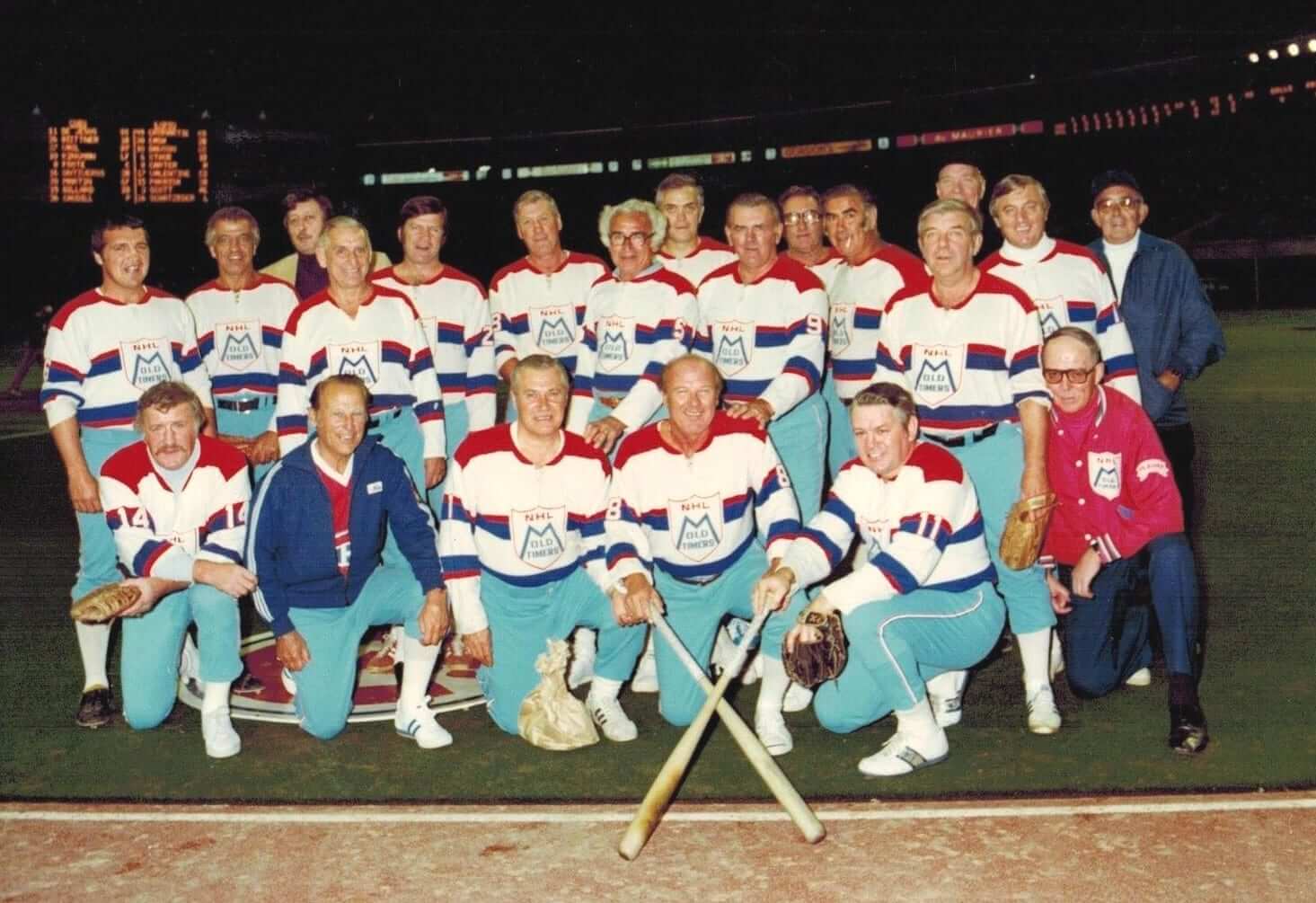
That’s the case with the photo shown above, which I came across the other day while poking around on eBay. It shows a softball team comprised of NHL old-timers. The eBay listing doesn’t mention the location or date, but I’m pretty sure it’s Olympic Stadium in Montreal, circa late 1970s or early ’80s.
How amazing is this photo? Let us count the ways:
1. Although this is a softball team, the guys are wearing hockey-style jerseys, complete with long sleeves, TV numbers, shoulder yokes, belly striping, and — my favorite detail — lace-up collars.
2. The jerseys are tucked in, which sort of makes sense (it’s a softball uniform) and sort of doesn’t (they’re hockey jerseys).
3. Those sky blue pants are the bomb. Looks like some of the guys went high-cuffed (nice blousing on the fella standing in the second row, far right) and some didn’t.
4. Some guys are wearing belts, others aren’t.
5. Lots of white sneakers, especially in the front row. But at least one guy has red sneakers, and another has black spikes.
6. Love that the jersey crest also appears on the jacket of the guy kneeling at far right.
7. The guy in the front row, second from left, is wearing a Canadiens jersey. Too bad they had him cover it up with a generic Adidas track jacket instead of an Old-Timers jacket like the other guy is wearing.
8. The dude in the back row with the cigarette is just too perfect. Like, they should just Photoshop him into every team portrait from now until forever.
So who are the guys in ths photo? The eBay listing for the photo doesn’t say, so I contacted the seller and asked him. He didn’t respond, so I emailed a few of Uni Watch’s more historically minded hockey fans to see if they could identify the players. No dice there either, alas.
There’s a tantalizing clue in the photo’s background, because the player’s names might be listed in those lineups shown on the scoreboard. Unfortunately, I can’t make out any of the names, even after enlarging the image. (Also, it’s possible that those lineups show the players for the “real” baseball game that was going to take place after the old-timers softball promotion.) If you can i.d. any of the players, please speak up.
But wait — it gets better. When I showed the photo to reader Rob Ullman, he noted that the same eBay seller was recently offering this photo of Maurice Richard (click to enlarge):
That’s definitely the same jersey and pants, only now the jersey is untucked. This photo makes it pretty clear that the jersey was meant to be tucked — otherwise the bottom striping would have been positioned lower, like on a traditional hockey jersey. Also, the Rocket is wearing stirrups in this shot (and, shamefully, using striped below-the-calf athletic socks as sannies — a total Little League move). Wish we could get a better look at that cap logo. Is it an Expos pinwheel cap?
Were the two photos taken on the same day, or did the Old-Timers softball team convene more than once? In the second photo, Richard is wearing No. 9 (makes sense, since that was his number with the Habs), which makes it easy for us to find him in the first photo. Unfortunately, we can’t see his shins, so we can’t tell if he was wearing stirrups in that photo.
If you like the first photo, it’s still up for bids, but move fast — the auction closes later today.

Click to enlarge
Too good for the Ticker: Some artists in Brazil think the country shouldn’t have devoted so much money and other resources to the World Cup when so many Brazilians are poor, homeless, hungry, and so on. Whether you’re sympathetic to that point of view or not, it’s hard to deny that the street mural shown above, by an artist named Paolo Ito, is a spectacularly effective piece of work. Lots of additional examples here.
Leaving aside the message being communicated, it’s fascinating (to me, at least) that Ito used the old icosahedron-based ball design, which is apparently still the default concept of what a soccer ball is “supposed” to look like in most people’s minds, even in Brazil.
In case you missed it yesterday, Phil put together a really great Father’s Day post featuring photos of Uni Watch readers’ fathers in various uniforms. Great stuff — don’t miss.
Signal flare: Attention reader “TacoTodd” — I received the payment for your membership enrollment (thank you!) but didn’t get a follow-up email with the details of the design you want for your card. Please shoot me a note — thanks.

’Skins Watch: WWJD: The United Church of Christ’s Central Atlantic Conference is calling on its members to boycott the ’Skins until the team changes its name (from Tommy Turner). ”¦ Here’s a legal article about the ’Skins trademark situation (thanks, Phil). ”¦ Latest people to weigh in on the ’Skins name: Former ’Skin Russ Grimm says keep it, Mike Tyson says change it (from Patrick O’Neill). ”¦ Ohio has more public schools with Native American mascots than any other state, which is an increasing source of controversy (from Jason Hillyer).

Baseball News: Yesterday was Father’s Day, so MLB players wore blue jersey ribbons and lots of blue wristbands. Among the “highlights”: Pirates OF Andrew McCutchen, who usually goes pajama-pantsed, went high-cuffed with blue leg bands; Brewers OF Carlos Gomez had leg bands as well; Cardinals P Joe Kelly turned his wristbands into a sleeve; and the Miller Park mound logo was light blue. ”¦ The Phillies once again wore their 1964 throwbacks yesterday. They had also worn them on Friday night, and Phil had good coverage of the design in Saturday’s post. ”¦ Here’s a really fun article about a Long Island guy who wears a full uniform to pick-up softball games. ”¦ For reasons that aren’t clear, at least to me, A’s OF Criag Gentry pull down his pants in the dugout the other night, revealing some A’s-colored boxers (great work by Allison Ambrous). ”¦ Writer Paul Caputo has been doing a good series of team visual/branding histories for SportsLogos.net. His latest piece is on the Las Vegas 51s. ”¦ Here’s a cool set of Pirates blazer buttons (from Bruce Menard). ”¦ Reds P Homer Bailey, who did not play yesterday, was wearing eye black in the Cincy dugout (from Alex Hider). ”¦ Someone on the Maryland team was wearing a serious rally cap yesterday (from David Firestone). ”¦ Julie Streeter was helping her mom with some cleaning and came across this awesome umpiring cap, which had belonged to her grandfather. “My mom says he umpired adult rec softball leagues in Chicago during the ’40s, ’50s, and maybe early ’60s.”

NFL News: “When I watched an AFL documentary a few nights ago, I noticed that Bills coach Buster Ramsey was wearing this old English ‘B’ hat,” says Allison Ambrous. “Does anyone know anything about this? Was it team-issued?” No idea. Anyone..? ”¦ Nice pair of Houston Oilers cowboy boots (from Bruce Menard). ”¦ The Pittsburgh Power — that’s an arena team — may wear a memorial decal for Chuck Noll (thanks, Phil).

Hockey News: Odd scene during Game 5 of the Stanley Cup finals, as Kings goalie Jonathan Quick got his stick caught in his jersey (from Allison Ambrous). ”¦ An artist on Etsy is selling NHL team logos made from license plates (from William Yurasko).

Soccer News: One observer thinks the American World Cup uniform keeps changing too much (from Anil Adyanthaya). ”¦ “Kobe Bryant is in Brazil and was interviewed about his love for soccer,” says Luke McCarnan. “When asked about who was going to win, he said he loved Messi, that they were close friends, but that he’d have to stick with his Nike family. He’s pulling for Brazil — not even our Nike-outfitted American side.” ”¦ Webmaster John Ekdahl was in a surf shop in Florida and spotted these board shorts patterned after the U.S. national team’s away jersey. ”¦ Speaking of the American team, they may be at a disadvantage because the don’t fake injuries as much as the other teams.

Grab Bag: The No. 79 car in the 24 Hours of Le Mans had a U. of Colorado logo on the hood. “One of the drivers for that car is Cooper MacNeil, who is currently a Colorado student,” explains Dane Drutis. ”¦ “In a day when virtually every PGA tour player has a sponsor on his golf bag, it’s odd that a player of Martin Kaymer’s caliber doesn’t,” says Chris Perrenot. “Kind of refreshing, isn’t it?” ”¦ Interesting piece on school dress codes. ”¦ Okay, so this is weird: Mr. Magoo in a G.E. uniform, at a bowling alley (from Charles Rogers). ”¦ Woodland High School in South Carolina uses the Wu Tang Clan logo on its football jerseys (from BJ Lanier). ”¦ In Victory Lane at the 1985 Daytona 500, Bill Elliot wore eight different sponsor hats (from Joanna Zwiep).

Bill Elliott wearing 8 different hats in Victory Lane is hardly odd… At almost every NASCAR race since as far as I can remember, the winning driver will do the “hat dance” where they wear hats for a plethora of different series sponsors for photos. Here’s a short article I just found on Google giving a quick explanation.
link
Make that 9 hats for Elliott’s 1985 Daytona 500 win(?):
link
Funny how the cigarette company-sponsored race series patch is covering the brewing company-sponsored race team patch.
My wife actually pointed that out to me after yesterdays race, which I’d never seen before. They showed Johnson and company changing hats over and over on TV.
Wonky link for first item in hockey section.
Here’s a question that’s likely never been asked before: is Mr. Magoo wearing nylons with the GE uniform?
Fixed.
“is Mr. Magoo wearing nylons with the GE uniform?”
Is that like “What’s the frequency, Kenneth?”
The black and white contrast makes it almost certain that those are Expos pinwheel caps on both the Rocket and the catcher. Also, the tiny bit of detail visible on Maurice’s cap’s white panel is consistent with an Expos logo. And given the year (and that it’s Montreal), it’s unlikely to be an Expos-style pinwheel cap with a custom logo.
FWIW, my church is a member of the UCC Central Atlantic Conference. On Sunday, our pastor, who was at the annual conference meeting, talked about the Oneida representative who addressed the meeting on the subject. But it’s important to note that the UCC is a congregationalist polity. Which means that each church is governed by its own members; we don’t have bishops or elders or external authorities who can impose any theological doctrine or political stance on any church, pastor, or member. The CAC vote on the Redskins is an expression of the preference of the ordained and lay leaders at the conference, but it’s not binding on anybody as it would be if, say, a bunch of Catholic bishops decided something or or the LDS president issued a decree.
Great info, Scott — thanks for sharing.
The USMNT bomb pop design looks fantastic as a board short.
And not only do US players not flop nearly as much as, well, pretty much every other team from the New World, they are less likely to stay down when they’re actually hurt. It’s an attitude borne, I assume, from a combination of a more general American ethos of athletic performance – the whole “concussion? bah!” attitude in the NFL – and the fact that for decades, FIFA’s officiating corps has consistently turned a blind eye to serious fouls against American players. If the refs are going to let opponents get away with red-card attacks against American players, then why bother trying to draw a foul on lesser tackles?
The “American mentality” argument doesn’t hold as much water as it used to, I think. Flopping’s become prevalent enough in the NBA to have a set fine, while smart NFL teams use fake injuries to stop the clock now.
Honestly, as much as I dislike flopping, the American tendency not to go down easily speaks less to nobility than to lack of professional savvy.
Those stupid Americans. We should encourage flopping as a matter of professional savvy.
Exactly.
There are different levels of flopping. When Rivaldo clutches his face after the ball hits his thigh, I think it’s disgraceful.
But when there’s contact and the referee wouldn’t call the penalty because he’s afraid to make a big call without someone going down (I’m thinking Sturridge against Vidic in this year’s ManU vs Liverpool), then you should absolutely go to ground.
I used to be a Rivaldo fan until he pulled that crap in the World Cup.
You go to the ground when gravity commands it. Otherwise you stay up and play the game. I applaud the NBA trying to do something about flopping. They could do more, while FIFA needs to do MUCH more. If it gets to the point where the US and England feel they have to flop to win, I’m probably done with the sport, at least at this level.
Did you see the end of the Switzerland/Honduras game? There was contact and the Swiss guy fell, but he got right back up and continued the play,, which resulted in a beautiful goal. Had the guy stayed on the ground writhing in imaginary pain, who knows if they get the same result after a free kick? Just play the game and leave the officiating to the officials.
My previous post was sarcastic. Flopping is inherently un-American.
Flopping is also a professional necessity. Which means Americans don’t like winning.
Switzerland/Ecuador game, I meant.
If it’s a “professional necessity,” then the rules need to be changed. Add another ref. Install a running clock you can stop when someone stays on the ground…enough with only the ref knowing how much time is left. Do something.
Oh, and quit letting the players gang up on the ref and get right in his face. One guy should be allowed to talk to the ref and anyone else gets carded. This part of the article was equally depressing as the part about flopping:
Klinsmann, who frequently did a superb Greg Louganis impression of his own when he was playing, has not hesitated to say he would like the United States to be, collectively, a bit more “nasty,” pointing to other teams’ success in confronting the referee and putting him on the spot.
Pffffft.
then the rules need to be changed
I don’t know that we can ever get referees to grow enough balls to call a penalty without a player going to the ground.
I agree on ganging up – refs should be empowered (if they aren’t already) to tell players to back the hell off.
Also, when players wave imaginary cards, which seems to have become a trend in the last couple of years – that should be an automatic yellow card.
They aren’t empowered enough. They should have a second ref out there, for starters. And I agree…if a player waves an imaginary card, show him your real one. Have a penalty box as they do the vastly superior indoor game ;) or in hockey. But do something.
If MLB can improve its umpires’ strike zone calling and force/tag calling, as it has despite the seeming impossibility of the task, then FIFA has no excuse. A few rules changes may help – such as the notion that only the captain may speak to or gesture at the ref, and anyone else gets an automatic yellow – but mainly it’s about expecting more of refs and holding them to those expectations in professional evaluation.
While it’s true that there’s too much flopping in soccer, I think it stems from a larger problem of overly passive, not overly active, refs. When the refs start holding back because of the importance of the game, they lose control of the match. Players will fill any vacuum of officiating rigor, and they’ll fill it both with dirtier play and with flopping and attempts to trick or bully the ref into a call. When the ref calls a tighter first 15-20 minutes, assuming he’s making good calls and not rewarding flops, you generally see a much cleaner, less floppy rest of the match. The matches where the second half bogs down with more pretend injuries than an episode of “House”? Usually they start out with players testing the ref right out of the gate and not getting called for it.
Flopping in the NBA parallels, rather precisely, the introduction of European players into the league in increasing numbers (can you say Vlade Divac?). So yeah, that argument pretty much collapses onto itself.
Yet flopping didn’t really take hold until after Vlade retired. And the whole throw-up-arms-at-minimal-or-even-phantom-contact thing was always there.
Plus, the thing where players pretend to shoot and dive into the defender to draw a shooting foul has nothing to do with the European players, and is just as cynical/calculated as diving/flopping.
I meant to add, flopping only became common after the NBA started cracking down on handchecking and generally making more calls in favor of the offense, which was a reaction to the rougher style of basketball in the early- and mid-90s.
So if you want to blame specific people for NBA’s, you should point your fingers at Pat Reilly and Chuck Daly, not Vlade.
Or point your finger at the guy who played rough AND flopped like a soccer player…Bill Laimbeer.
Attributing the increase in flopping to the NBA cracking down on hand-checking is akin to a criminal lawyer “blaming the victim” as a defense strategy. It may succeed, but that doesn’t make it right. Reducing hand-checking didn’t make NBA players throw themselves to the floor after the slightest (or no) contact; rather, seeing other players getting rewarded for doing that is what caused the increase, and it can hardly be questioned that Vlade was the poster child for that. Laimbeer may have flopped some, but he picked & chose his moments, whereas Vlade turned it into his signature defensive move.
Anyway, the original point made was that the “American mentality” argument in soccer was invalid b/c “hey, NBA players flop.” Which is nonsensical, b/c to this day you rarely see American soccer players dive. Certainly not with the the flair & frequency of their European/South American counterparts.
I positively yearn for the day the USA wins the World Cup b/c of a timely dive in the box. One thing’s for certain – THAT would be the event most likely to precipitate a sweeping and effective crackdown on diving, injury-feigning, harassing the referee, excessive time-wasting and other foolishness that diminishes the pleasure of international football.
If flopping is a professional necessity, then I suggest we simply find other sports. The top-rated comment from the NYT today states it succinctly. Soccer – 80 minutes of pretending you are hurt, Rugby – 90 minutes of pretending you are not.
Strong take. Must have worked out hard in the gym to get a take that strong.
I like curling more and more each day. You don’t see flopping in bowling, either. Put the PBA back on ABC!
I ceased to take rugby seriously as a sport on Saturday, when a coach on a local men’s club approached me on the street and tried to recruit me. I’m pretty much the least rugby-physiqued person alive, or so I would have assumed. To be fair, his team does have awesome uniforms:
link
link
Oh, you’ll get flopping in rugby too: link
The Old-Timers picture was likely taken before this game:
link
The lineups and pitchers appear to check out.
Sounds about right…and maybe I’ve looked at too many photos, but I could easily make out “Cubs” “De Jesus” “Expos” “Cromartie” etc. without even blowing the pic up. In any case, great pic/jerseys!
You’ve got The Rocket, Cigarette Guy and Gump Worsley next to each other. That looks like Henri Richard to Maurice’s right.
The guy standing to the right and slightly behind the Gumper, is Dicky Moore. My first six years of existence, I lived in a very working class neighbourhood of St. Laurent Quebec (suburb of Montreal). Dickie Moore lived on our street, I remember being called into our house, because he scored (I think) in an afternoon Stanley Cup Final play-off game for St. Louis against Montreal. Dickie’s career was coming to an end (hockey wages weren’t what they are now – thus explaining the blue collar hood). He later made a small fortune in an equipment rental business, which may explain why he looks like the happiest bloke of the lot.
#14 I’m pretty sure is Claude Provost. (Far left, first row)
Just a guess, but could #5 (white hair, large glasses, standing next to Maurice Richard) be journalist Red Fisher?
Could be. I think he’s been covering the team since Georges Vezina was in net.
The license plate art is near and all but the artist used Washington (state) license plates for the Washington (DC) Capitals piece. The DC plates have been white for as long as I can remember. And they had “TAXATION WITHOUT REPRESENTATION” written across them at one point (maybe they still do).
Whoops.
Yes, the DC plates have “TAXATION WITHOUT REPRESENTATION” link but drivers can opt for the District’s web address if they prefer.
It was big news last year when the President link.
And here I thought my OCD was for naught…
None of the new soccer ball designs out of Adidas over the last decade have been able to capture the imagination the way the Telstar did over four decades ago. It also doesn’t help that Adidas frequently changes their designs, in an attempt to “improve” the ball’s performance, while most other manufacturers are evidently content with the truncated-icosahedron design and whatever crazy patterns they can stamp on them.
And the black-and-white Telstar pattern is still sold today, usually as an entry-level ball. It’s really no surprise to me that it’s still considered the “default” soccer ball pattern.
American Soccer Inferiority Complex volume 3,486: Another person blames a perceived lack of success for U.S. Soccer at international level on lack of sartorial compliance with the norms* of the rest of the world.
*Norms referred to in article may reflect more so the delusions of author’s blighted psyche than any actual state of affairs.
Woops. Did not mean to post that there. Sorry.
I was gonna say… !!
To be fair, the Tango design has gained some level of currency (though it probably helps that Adidas kept the design for 10 years).
Speaking of World Cup balls, one thing I noticed. When the Brazuca ball spins, it kinda looks like the link. Coincidence? Maybe!
I think the closest we’ve come to something as recognisable as a standard soccer ball is the Tango design which was used – with slight variations – in every World Cup from 1978 to 1998. It did seem like at one stage you would be as likely to see a Tango inspired representation of a ball as a Telstar, yet despite twenty years of design stability it’s been largely eradicated from the visual culture of the sport recently while the truncated-icosahedron lives on.
Jinx!
Great minds etc. etc.
I remember that when I drew pictures of soccer players when I was young I would always draw them with Tango style balls. So I guess for young me at least the Tango held more of a significance than the truncated-icosahedron.
And of course Adidas resurrected the Tango two years ago (with a slight change to the proportions) for Euro 2012. It didn’t seem quite the same though.
I think the problem with Tango 12 was that link, and looked more like an off-brand ball you’d find at Target.
The thing about the Tango, though, is that it’s still the same buckyball-style construction as the Telstar, and most other soccer balls regardless of their graphic elements.
It still seems, though, regardless of other graphic patterns’ popularity, that the Telstar is still the “default”. It does stand out more than a completely plain buckyball.
And yes, I’m going to use the term buckyball for the truncated-icosahedron design. It’s much shorter, and besides, we can all use a little Buckminster Fuller in our lives, no?
I think I have the perfect solution for the soccer ball design dilemma. Just use one of these: link I think they’re also available in blue, yellow, and green so there’s no issue with contrasting against the teams playing.
It would certainly make for more entertaining matches, that’s for sure!
Regarding the Telstar adidas ball…it did NOT debut with World Cup 1970 in Mexico.
The NASL in its 1967 debut season used the Telstar pattern and even going back to 1963, the Telstar was in use in the Bundesliga’s very first season for many games. The BL never had an official game ball until – I think – 2008 when the first adidas Torfabrik made its debut.
Trying to see the scoreboard at the back.
It says Cubs vs Expos, and to confirm this the first name on the left is DeJesus which is Ivan DeJesus link
Then looking at the 1980 Cubs team some of the other names are apparent: link
De Jesus
Biittner
Vail
Kingman ?
Foote (catcher)
Ontiveros
Martin
Dillard
Caudill (pitcher)
Expos link
Not going to go through all of them but 6th name is 17 Valentine, and 8th is 3 Scott, pitcher is Schatzeder
So its definitely Cubs @ Expos
Drew got there first! Yes its that game.
Now we just need to i.d. the hockey/softball players!
Buster Ramsey coached the Bills in the 1960-61 seasons. The Buffalo Bisons baseball team wore navy caps, featuring an Old English “D” during that time period.
My guess is that in those days before branding, someone just gave Buster a Bisons cap.
The Bisons mascot today is called Buster Bison, but that’s beside the point.
Cort-You hit the wrong key. LOL The Bisons wore an Old English “B” on their caps and home jerseys, a carry-over from their days as a Tiger farm team. They wore those Tiger clones through ’62. When they hooked up with the Mets in ’63 they switched to a generic Red, White and Blue set with a no-tail script “Bisons” at home and “Buffalo” on the road. Royal caps with a Red button and the same Red script “B” completed the set. They kept these until ’66 when they became a Reds farm club and switched to Cardinal Red as their ase color. Vertically-arched full-block “BISONS” or “BUFFALO” adorned the shirts. A full-block White “B” was on the solid Cardinal Red cap. I remember seeing a 19-year-old Johnny Bench (We’re the same age) play at Red Wing Stadium in ’66.
Thanks for catching that, Terry. I did indeed mean to hit “B”.
Terry,
Can you confirm that the Bisons ever wore olive and red? I’d never heard of anything but this JCrew hat by Ebbets Field Flannel suggests otherwise. If it were a straight JCrew product I would dismiss it, but Ebbets is typically pretty good with reproductions so I’ve been curious.
link
I think the description itself tells the story:
each historical team logo is carefully researched and authenticated by the experts and aficionados at Ebbets before being applied to the cap in exclusive-to-J.Crew colors.
So no, the Bisons never wore olive.
The gentleman standing in the 2nd row on the far right (directly next to the kneeling man wearing the red jacket) is very clearly Hall of Famer Lorne “Gump” Worsley. The Gumper is one of the all-time characters in hockey, or even all of sports for that matter. Gump is pretty universally accepted as the second-to-last goaltender (Andy Brown was the last) to not wear a mask in NHL play.
Quote of the Day Nomination:
“Gump is pretty universally accepted as the second-to-last goaltender…to not wear a mask in NHL play.”
I remember seeing those jerseys being worn by in a Canadiens old timers hockey game in a magazine when I was a kid. The probably did double duty for ball games.
Please forgive my typo ridden comment. My reading glasses are wearing out.
The picture is from September 11, 1979, after the second game of a double header between the Cubs and Expos.
That’s Gump Worsley standing behind number 11 in the NHL old timers photo.
actually, I guess its probably BETWEEN games of a doubleheader, seeing as both starting pitchers are listed, neither of whom finished the game
The Maryland rally caps were from the previous weekend’s Super Regional at Virginia. UVa advanced and opened play in the College World Series last night.
The Etsy link under NHL also sells MLB and NFL items as well.
link
I’m assuming we’ll be discussing link in tomorrow’s ‘Skins Watch.
I should know by now not to read YouTube comments. The ones on this video nearly gave me an aneurysm.
That Air Miami song plays on constant repeat in my head every time the World Cup comes around…nicely done.
Anyone wanna go halfsies/thirdsies/fourthsies on that set of Pirates buttons with me?
Wow, those NHL Old-Timers pictures are the bomb-diggity! It’s been confirmed by multiple readers already that these photos were, in fact, taken in Montreal, but I noticed that those powder blue pants jive with the Expos’ original flannels, before the racing-stripe uniforms. Highly unlikely that Expos’ pants would get flown out of Montreal to be used. You’d think that the old-timers would use more convenient pants to the home location.
Anyway, I’m surprised to see Rocket Richard batting righty, when he shot lefty in hockey. Most of the time, Canadians swing the same way for consistency.
I’m surprised to see Rocket Richard batting righty, when he shot lefty in hockey.
Now THAT is a spectacular and fascinating observation — good one!!
Based only on my limited observation and my recollection from hockey site articles (hfboards and the like) – the norm for right handed Canadians would be to bat right (for baseball) and shoot left (for hockey). In believe it’s usually shoot left for hockey and everything else right.
Have seen a few internet articles that it’s more common for Americans to be a right handed shooters for hockey than it is for Canadians.
I was (and am) the oddball being a right hander who shot (and shoots) right in hockey. Reason may have been taught to shoot at an early age by my left handed dad who shoots right.
Catch left when playing goal and shoot (poorly) right – probably one of the few adults still using a straight goal stick.
“Most of the time, Canadians swing the same way for consistency.”
That’s an incorrect statement. There’s no correlation whatsoever and many hockey players golf and swing a bat the opposite way.
this might right down Paul’s alley
Star WarsTie Fighter themed argyle socks
link
Never liked argyle myself. I’m a stripes guy, not an argyle guy.
Can we not be both? I’ve always loved stripes and have come to like argyle as well.
I like both. I’m not a polka-dot guy, though.
Oh, totally. It’s not an either/or thing. I was only responding because Tony C. said he thought I’d like the socks.
“… One observer thinks the American World Cup uniform keeps changing too much (from Anil Adyanthaya) …”
Well, duh. Arr Scott and his acolytes have been saying the same thing for a long while now. Get a design and stick with it. We don’t need no fancy-pants RISD professor ’round here.
I’m one of those acolytes, of course. One little problem is that we often disagree about which uni should be the uni we stick with. Me, I’m for those awesome red-and-white hoop shirts with blue shorts and socks (Home) and the all-white Centennial duds for the Away. And dammit, I’m right.
Well, you can’t have both the Centennial and the red/white hoops, since they’re both predominantly light.
Anyway, most of the arguments are about the away kit, and even the supposedly consistent European countries keep changing their away kits. I’m going to co-sign Padday’s inferiority complex rant here.
“… Well, you can’t have both the Centennial and the red/white hoops, since they’re both predominantly light…”
Yes, I can. Red-and-white hoops with blue shorts and socks is predominantly light? OK, maybe in the “reality” universe, they didn’t quite feature the blue part, but this is Uni Watch, goddammit, and delusion self-importance and stoutly-asserted inaccuracy is part of the deal. “Inferiority complex?” What?!
Sputter.
“Predominantly light” is about the color of the shirt (FIFA is going to pair the hoop shirt with white shorts and white socks anyway). Unless you seriously adjust the red/white balance, the hoop shirt is going to be the “white” shirt – the hoop and the centennial were both the home shirts.
Speaking of “sputter”, from that Boston Globe piece:
If our protean uniforms tell us anything, it’s that we tacitly accede to this quadrennial oblivion.
If you consider three knockout stage appearances from six world cups since 1990, including one quarter final appearance, to be “quadrennial oblivian” then I’m not sure what else it could possibly be other than a massive inferiority complex.
That’s the first time Padday has invoked the “inferiority complex” trope that hasn’t left me wondering what he’s talking about. USA soccer is a badly run, often embarrassingly slipshod organization. But on the field? The kids are alright. And that’s my problem with things like the crappy constant uniform changes: Our players (and fans) deserve better from the national federation than than the don’t-give-a-shit leadership they get. The suits act like it’s still 1986, while the players are on the edge of the global elite.
I’ve realised that maybe I’m just missing the point here. So I’m asking, what exactly is it that you think implementing a standard, consistent visual identity will achieve? How will it help advance the cause of US soccer?
I ask because from what I’ve heard on the subject, and especially since you assert that competitiveness of the team itself is just fine, it really just sounds like vain pretense. It seems like it always comes down to this need to be more like the rest of the world, that pretending the US has an identity akin to nations like the Netherlands, Brazil or England (even though its history is actually indoor soccer, faux-denim, fringed jerseys, star spangled balls and a mercurial wardrobe) will equal prestige or respect. And prestige or respect from whom? The international community that has supported Blatter, that produces the injustices against US soccer you yourself have complained about and that is seemingly only getting more and more corrupt? If ever there were a time to double down on the ways in which the US is outside that cabal, right now would be it.
Fair question, Padday.
How would a more consistent visual identity “advance the cause” of US soccer? The same way that uniform consistency helps any team. There’s a reason the Yankees have a national fanbase, and it’s not only because they’ve had a few good seasons in the last 15 years. (If you’re over 35 or so, like me, the Yankees have had more bad seasons than good, and yet they’re still an immensely popular team among people my age.) Wild swings in visual identity make it somewhat harder for fans to develop deep and lasting ties to a team (or consumers to a brand). This is why few successful brands, whether in sports or retail, radically change their visual identity every year. And even those that do make change and novelty a part of their identity tend to have a core visual language that comes through even as surface treatments change.
And why does USA change so radically every two years? Because Nike. Which is to say, the federation basically lets Nike do whatever Nike wants, even if that means using colors that aren’t even traditional American sporting colors. Why? Either because they’re dipshits who don’t know or care about what the team looks like, or, and this is what I actually believe, because the US federation doesn’t have confidence in its own value. So instead of thinking of Nike as serving them, they act as if they’re grateful to have a real company like Nike doing them the favor of clothing Team USA. So instead of asking “WTF?” they respond to anything Nike throws at them with a demure “Thank you sir.”
For me, this isn’t really about on-field issues or FIFA. I just sort of wish the team I like to root for would (A) Look good and (B) Look like itself from tournament to tournament. I mean, look, why don’t we scrap Old Glory and design a new flag every two years after each election? Why don’t the Yankees change their uniforms and colors every year? Why doesn’t Coca-Cola adopt a new logo every summer? (For that matter, why doesn’t Nike adopt a new logo as often as it seems to think the teams it dresses should radically change their looks?) Because it doesn’t make long-term business sense to do so – that’s not how you grow a fan base or build loyalty.
For me it has nothing to do with “trying to be like the rest of the world” – it’s about building our own traditions and identity. It’s about trying to be like America. And contrary to the semantic game of claiming that not having an identity is its own identity – it’s not, actually – the United States has a number of worthwhile traditions. Instead of scrapping all of them every two years to try something radical and new, as if no American had ever competed internationally before, I say, let’s figure out what works and build something. Not for the rest of the world, not to earn “prestige,” but for ourselves. To show a little pride, and to try to grow and deepen the American fan base.
Well the difference between the Yankees or Nike and the US soccer team is that people in the US are hardly going to go on masse to support a rival country. Brand loyalty or brand recognition is redundant when your main selling point is patriotic loyalty. True, the need is to get people to get into soccer in the first place… which, unless I’m mistaken, seems to be happening apace even despite this apparently debilitating lack of brand stability. You see, I don’t think people just getting into the game care all that much about things like tradition. You do, but then you’re already in deep, you care enough to worry about these things and you’re protective of these things as a result.
If anything in fact, I’d imagine that having an identity that’s constantly changing is rather a very good thing for marketing the sport. If every time a new kit is released it’s something drastically new then it’s a lot more likely people will take notice than if you just release a slightly tweaked version of a single formula. I mean, that’s the reason why Nike do it. They want to sell as many jerseys as possible and to do that they have to get as many people interested as possible. We bemoan Nike but if your main concern is getting people interested in soccer then you absolutely have to recognise that Nike and US soccer’s goals are mutual.
But aside from all that, your comment I think highlighted why we’ll never agree on this. Basically, I don’t think you can, nor should you try, to force traditions. All that achieves is that you kill the spontaneity of invention by imposing an artificial order on things. At the very least, we wouldn’t have anything to argue about.
I approach it about like how I approach voting for president: I always wind up in the “anybody but …” camp with regard to one or another of the candidates. Thus with USA soccer uniforms: Anything but the bomb pop. Even the jean-jacket jobs of 1994 would do if must needs be. USA almost always looks good – this year excepted – so just pick a basic format and stick with it. The unis don’t have to be unchanged – look at how teams like Argentina and Holland change significantly from year to year while maintaining a few key consistent markers of identity. Sash, hoops, solid color blocks, mid-chest stripe, crazy stonewashed field of stars, shoulder yoke, whatever. Just pick one and stick with it for a while.
Any incarnation of a diagonal sash and the Centennial jersey crest for the primary and any Nike designed secondary. This gives the Federation aka Nike the leeway to use different colorways for the primary and anything for the secondary but then the US will be known for the sash and crest, instead of constant change and a terrible crest.
You got my vote, Conn. Unfortunately it’s pretty rare for me to be on the more popular side of an issue.
Not a big hockey fan, but the guy standing in the second row, second from left is Boom Boom Geoffrion… I remember him from the Miller Lite Commercials.
link
Completely agree, sure looks like Boom Boom. Well done, Steve.
The gentleman in the back row whose face is directly behind Gump Worsley looks an afwul lot like Hall of Fame NHL Official Red Storey. He appears to be wearing a dark hat and a dark top, as if he were umpiring the game, which would make total sense as a former NHL referee. Also makes sense given that Red was a Montreal resident for many years, and made his home there until the time of his passing in 1991.
Looks like Storey to me, too.
Do you dislike nba? I have barely seen any basketball news and last night was the finals.. Pretty cool tidbits on the selection of championship hats or shirts, lebron’s
custom sneaks? Anything?
I don’t care about championship gear, which is just merch. Didn’t include anything about the NBA *or* NHL in that regard.
I don’t “dislike” the NBA, but it’s always been at the bottom of my Big Four hierarchy.
If I’d been aware of anything uni-notable happening in last night’s game, I would have included it. But I’m not aware of anything uni-notable having taken place. Are you?
All of that said, the Hornets will be unveiling their new uniforms on Thursday, and I’ll be all over that.
Most of the NBA uni stuff happens during the season anyway, usually at Christmas and All-Star Game.
The NBA Playoffs are, for the most part, pretty orthodox.
Aside from the Heat and Pacers having five different uni matchups in six games (red v. yellow; black v. yellow; white v. yellow; white v. blue; black v. white; then back to white v. yellow).
Good for Mr. Tosky, who reveals his uni-bona-fides by wearing the Marlins’ gray jersey, the best look that team currently has (arguably the only decent look that team currently has). That the actual Miami Marlins consciously choose not to wear this is a crime against the uni gods.
I found this photo to be quite fascinating and just spent well over an hour trolling the internet looking for anything I could on this.
First of all, as for who is in the photo:
1- top right, Jacques Plante
1- centre, Gerry McNeil
6- Ralph Backstom? (Maybe)
9- Maurice Richard
Second to the right from him Gump Worsley, presumably wearing #1
14- Claude Provost
There are lots more recognizable faces but I cant figure them all out. Ill leave the rest for all of you!
Here are some more really cool Montreal Canadians Baseball photos with other unis and all!
1980 Habs baseball team. Even though he’s not in the photo, Maurice Richard apparently also played on the team
link
Marcel Bonin (or is is Jacques Plante?), Maurice Richard, and Jean-Guy Talbot (the 2 photos I found list those as the players in the shots)
link
link
Jacques Plante
link
Enjoy!
I dont think that is Jacques Plante.
It is Jacques.
Brian, which guy is Jacques? All pics of him show him to be tall and thin with a long face and lots of broken noses.
I was referring to the solo shot of the guy at bat, not the three guys. Not sure about that one.
RIP Tony Gwynn
Amen. One of my all-time favorite players, both in how he played on the field and how he conducted himself off of it.
Good broadcaster, too. Always thought he had an interesting voice, which I happened to like quite a bit.
Agreed on both counts. Though as a kid I always used to make light of how the….voice didn’t match the face? God I sound so racist….
Definitely.
Also, from a uni perspective, I appreciate that as a one-club man who stayed active with the team, he bridged several eras of Padres baseball, from the 70s brown and yellow to the brown and orange to the blue and orange to the current, unfortunately bland blue and white.
Strictly as a player, wasn’t the last uniform he wore the blue and orange?
link, though they had phased in the solid white jersey with no orange trim as their new home uni.
The current logo set made its debut with the opening of Petco Park in 2004.
Yeah, I was thinking more his involvement with the team post-retirement.
Those license plate art pieces look fantastic. License plates are my #3 niche interest after sports uniforms and cocktails. The license plate map of the USA and Canada are incredible, i would love to have that on my garage wall, but i can’t justify $900.
That team photo also shows a part of the warning track of Olympic Stadium, which still had the lane marker from the Olympics.
link
a few comments after the first weekend of the World Cup:
1. Costa Rica’s uniform looks much better on the field than it did in the pre-tournament photos. I’m not saying it’s the greatest ever but it’s not bad.
2. Ivory Coast’s look remains my favourite after seeing it in action. Beautiful shade of orange and I love the elephant logo.
3. France look great with the buttons, collar, and I do like the rooster logo.
4. Argentina doesn’t look right with white shorts.
5. I seem to like all of the Puma kits – simple but they work for me.
6. I forgot Uruguay had such a great colour scheme – sky blue/black/black looks good.
7. Holland, as expected, looked great in their blues.
Anyone else?
My issue with the Puma shirts is that they seem to be the tightest of the bunch (or they have built-in nipples, not sure), and with the humidity/rain in Brazil, they just look drenched, especially the darker shirts.
Nike has the best presentation jackets (the warmups they wear for the national anthem, then promptly discard), Adidas has the worst (they look thin, and the hoods look cheap and tacky).
I was disappointed in how the Puma shirts looked because of being too tight, thin and susceptible to swamping. This was especially noticable on Italy.
Argentina’s white shorts were a flop, but I liked the socks. Fortunately the fade on the jersey stripes wasn’t as extreme as it looked in earlier pictures.
Uruguay and Costa Rica looked better than I had expected.
At least Argentina’s worn white shorts in FIFA competitions before. The white shorts on Germany and Colombia are a little more jarring, though since we’re in Brazil, I’m kinda okay with teams going with a lighter, more tropics-friendly look (and I feel the same about USA’s bomb pops – bright red with a lighter shade of blue).
Can’t say the same for Spain and Japan going monotone, though.
I liked the white shorts on Colombia. Just didn’t like the pinstripes.
Those awful, cumbersome 4th official boards have been a real downer for me. And while he’s in the spotlight with his hat trick, Thomas Müller needs to pull up his goddam socks.
Gump Worsely -2nd row on right beside guy in red jacket
Maurice Richard – #9 to the left of Gump Worsely
Bernard Geoffrion — back row, 2nd from left, beside the guy in the tan blazer
I actually thought that was Boom Boom too, but I couldn’t be sure so I didn’t want to say anything!
Still dying to know who the dude with the cigarette is.
Maybe you can get one of the hockey blogs (e.g., Puck Daddy) to post the picture and expand the group of people trying to complete the identifications.
Excellent idea, Dane — thanks. I just sent a note to Greg (aka Puck Daddy).
I think the guy on the far right over Gump’s left shoulder is Frank Mahovlich.
Henri Richard looks like Harry Caray.
No, I don’t see either Mahovlich in the photo.
Pete Mahovlich, standing 4th from left next to guy in tan jacket.
no way that is Pete Mahovlich. He was 6’5″ – way taller than any of these guys.
Look for the Padres to have a memorial patch for Tony Gwynn soon.
We all know that deaths lead to memorial patches. So when there’s a death, rushing to be the first to say, “His team will wear a patch soon” isn’t exactly contributing much to the discussion. It’s also a rather tasteless thing to say when the body isn’t even cold yet.
That’s why we have a simple rule around here: We don’t make comments like that in the first 24 hours after someone dies.
Like most rules, this one has some exceptions. When Dr. Frank Jobe died, e.g., it was interesting to ponder whether any team (or multiple teams, or all teams) would honor him with a patch, because he occupied an unusual place in the game. In a situation like that, speculating about the patch protocol is legitimate uni discussion.
Aside from that type of atypical scenario, however, let’s not post comments that emphasize the obvious and simultaneously disrespect the dead. Thanks.
“….when the body isn’t even cold yet.”
Also a bit tasteless IMO.
The whole point of that phrase is for it to hit with a jolt, to reinforce the reality of what death is (i.e., more than an excuse to talk about patches).
“It’s also a rather tasteless thing to say when the body isn’t even cold yet.”
Well, the commenter’s last name IS “Craven.”
Those where actually a pair of A’s shorts made by nike that Criag Gentry was wearing in the dugout
My Uniwatch membership card is 1980s Padres design with #19.
RIP Tony
link
Ah, just the way the Padres should look. Good choice.
Re: the soccer ball in the protest art, it’s not correct. While at first glance it gives the appearance of a classic soccer ball, that may be what was intended, it uses a seven sided polygon instead of strictly hexagons and pentagons.
Ok seriously…what’s even the point of this?
link
link
link
link
Sort of like how nobody noticed that the Yankees celebrated the 15th anniversary of their extraordinary 1998 season last year with throwback unis for every Sunday home game.
Or when George Steinbrenner was asked why the Yankees didn’t wear 2027 jerseys during the “Turn Ahead the Clock event – he said “We did.”
My mind is broken from the sheer ridiculousness of that marketing ploy.
Paul, on the NBA section question, did you notice that during the broadcasts ABC consistently used Miami’s all white logo rather than their full color logo? You or someone may have already brought it up. Do you know why?
No idea — sorry.
Uni-moment in the ongoing Germany vs Portugal game:
link, instead of waiting for the final whistle.
I guess they figured with the game out of reach and Ronaldo not at 100% fitness, he’d be subbed out? But he’s still in the game.
Cristiano’s hair gel turned in a stalwart performance today.
I’m a bit surprised to hear myself say this, but Germany – Portugal was a good-looking game. Portugal’s kits looked better on the pitch than I expected them to. A little more green in the color scheme wouldn’t have hurt, though.
As for Germany, the thin gold stripe at the bottom of the chevron was more noticeable than it looked in the preview images. That helped make it more reminiscent of the colors of the German flag than I was expecting it to be.
One thing that fascinates me about soccer is that the home kit and away can not only be different colors but completely different animals entirely.
Take collar types. The 64 jerseys competing in the 2014 World Cup utilize 23 different collar styles. Out of 32 teams, 15 use a different collar style for primary and away kits.
Compare that with the NHL, which has 60 home and away jerseys which incorporate only 6 collar styles. The Carolina Hurricanes are the only team to use different collars for home and away. The NBA has 9 different collar types and 0 teams which switch style from home to away.
Only in soccer do we see that much different between on kit and another.
Nigeria’s green World Cup kit has come in for a lot of criticism as among the worst in the competition. I hadn’t thought it looked all that bad, but seeing it on the pitch right now, boy was I wrong. It looks dreadful. Even the darker green portions are too washed out and light; reversing the light/dark elements wouldn’t improve it much. It’s so ugly it almost has me rooting for Iran, whose off-center shoulder details are at least interesting.
How awesome are those Iranian socks!
Watching the CWS game between Louisville and Texas I’m not sure who I should be more embarrassed for, the Adidas designers that apparently love the MLB Turn Ahead the Clock promotion or the teams too dumb to refuse to wear that horrible looking stuff. Between this and the basketball it’s no wonder schools would be willing to jump to other companies.
Is there going to be 5 & 1 segment after the group stages in the World Cup?
Yes.
Ah…Carlos Gomez had blue legbands over knee-highs. I was at that game and couldn’t tell from a distance what what going on there. I thought he just had shin-pads on.
My other uni-note from the game: from my seat high above the 1st base dugout, I noticed that three high-sockers (Marco Estrada, Jean Segura, and Khris Davis) all lined up in a perfect row (P, SS, LF) several times during the game.
Bomb Pop jerseys looking pretty good right now, eh?
Long time reader, first time writer – just chiming in to add that the fifth guy from left, back row, is definitely Phil Goyette – a four-time Cup winner with the Habs, a Ranger in the late sixties, and the first head coach of the New York Islanders.