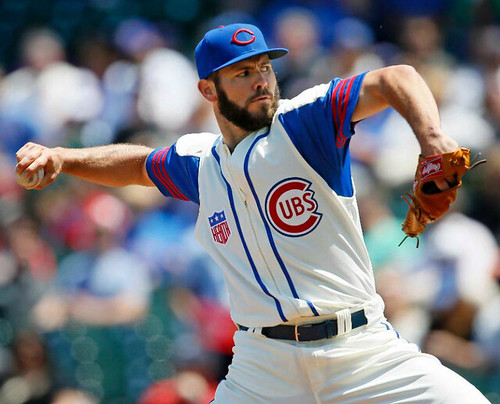
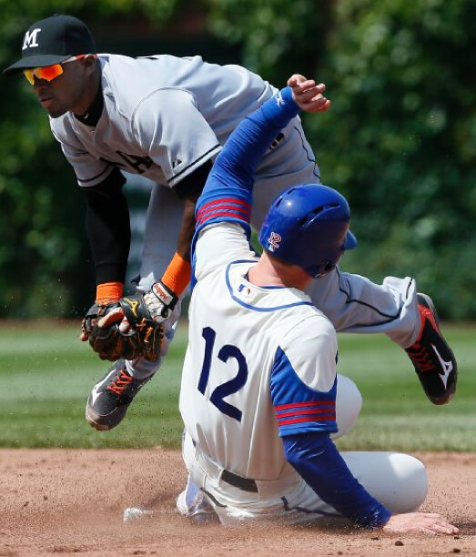
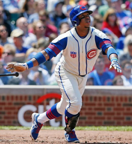
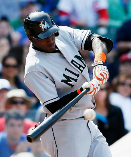
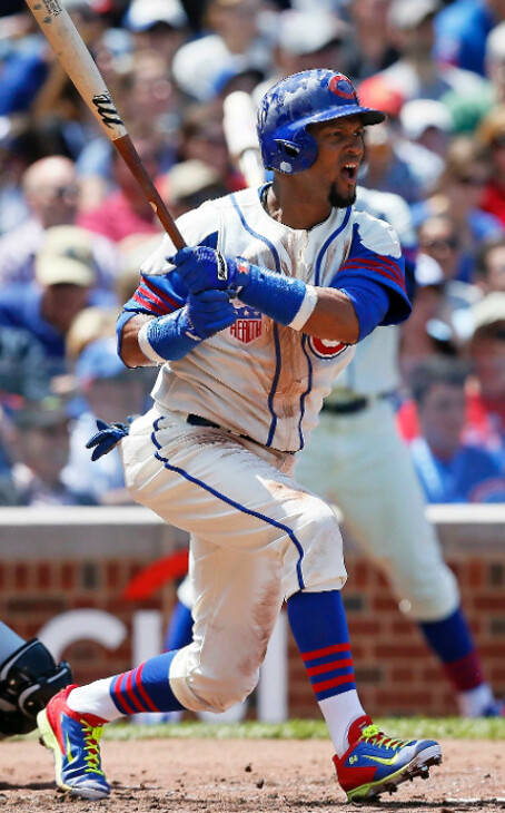
The Cubs held their latest throwback game yesterday — the fourth of the nine slated for this season — and it was the one I’d been waiting for: the 1942 zippered vests, which were worn over a blue undershirt with a white shoulder yoke and red sleeve stripes, complete with the Hale America “Health” patch. The plan, as announced last winter, was for the Cubbies to cheat a bit by wearing the vest over a short-sleeved undershirt, so the stripes would be on the upper arm instead of the forearm. I was curious to see how that would work out.
For the most part, it looked great:
But here’s the weird thing: Some of the Cubbies chose to wear an additional, longer-sleeved undershirt under the striped undershirt:
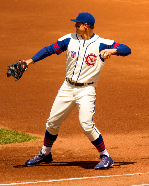
I don’t understand why they couldn’t provide yoked/striped long-sleeve undershirts for the players who wanted them, especially since there’s recent precedent for it. Aside from that, though, the Cubs looked very, very good. Everyone was high-cuffed, and kudos to Majestic for making using the old-style vest tailoring — narrower across the shoulders, with deeper armhole vents — instead of just using their regular jersey template and leaving off the sleeves:
The Marlins, meanwhile, dressed up as the Miami Sun Sox. Their uniforms were plain (which isn’t their fault, of course), only a few of their players went high-cuffed, and they wore their regular batting helmets:
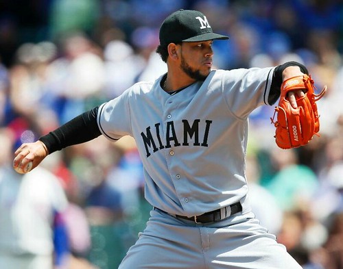
Getting back to the Cubbies, they wore white-bottomed stirrups over white sannies — except for outfielder Nate Schierholtz, who wore blue sannies:
Finally, someone should have told infielder Emilio Bonifacio that Nike’s Day-Glo-trimmed footwear isn’t really appropriate for a throwback game:
The Cubs’ next throwback game will be on June 22, when they’ll be wearing the 1953 home whites.
(My thanks to reader Matt DeLeon, who attended the game and provided one of the photos shown above.)
Rangers history mystery: I wasn’t able to hear the broadcast of Game 2 of the Stanley Cup finals (I was in a bar, where the noise drowned out the announcers), but several readers report that NBC broadcaster Doc Emrick said something about the Rangers’ first logo having been a cowboy holding a hockey stick. Another reader had mentioned the same thing to me a few days earlier, saying that he once read about that early logo in an article by veteran hockey scribe Stan Fischler. This logo is also referenced in the team’s Wikipedia entry, although the source citation appears to be incomplete.
This was all news to me, so yesterday I contacted the Rangers (no response yet, which isn’t surprising given that they were coming home from L.A. and are, you know, kinda busy at the moment) and also got in touch with Fischler, who was nice enough to talk with me for a few minutes. The gist of our conversation is as follows:
• Fischler says he has definitely seen this early logo. The cowboy motif was a reference to the team’s original name, Tex’s Rangers, which was a riff on Madison Square Garden president Tex Rickard’s name.
• He thinks the logo is shown in a book that he has, although he hasn’t yet been able to find the book in question. (He was literally pulling books off the shelf of his library and thumbing through them as we spoke on the phone.)
• While he’s certain that the logo exists, he’s not convinced that it ever appeared on the team’s jerseys. It might have been used on letterhead or for other promotional purposes.
So that’s where we stand at the moment. Personally, I won’t be convinced until I see visual evidence. If anyone knows more, please get in touch. Thanks.
Update: Just heard again from Stan Fischler, who found a reference to the logo in the book When the Rangers Were Young, by Frank Boucher. According to Stan:
Boucher said first team crest was that of horse sketched in blue, carrying a cowboy waving a hockey stick aloft. The horse was rearing , with the word TEX’S in a crescent at the top of the emblem with RANGERS looped below.
Rickard didn’t like the idea and before the season opened the insignia was changed to the present diagonal splash of the word RANGERS.
So now at least we have some confirmation about the logo having existed. Still no visuals, though.

And now a note from Phil: Last year, you guys may remember we had a very special Father’s Day edition of Uni Watch, where I invited readers to send in a photo and brief writeup (50-100 words, give or take) of their Dads in Uniform. It was a great feature, and one I’m going to repeat this year.
The genesis for last year’s post came from Cort McMurray, who wrote me with the following:
Hey, Phil:
I was thinking it would be kind of cool to invite Uni Watchers to share photos of their dads in sports uniforms this Sunday.
The attached image is my dad, circa 1956, running the 880 for the North Tonawanda High Lumberjacks.
Dad died in 1979 ”” I found this photo two years ago, while doing some research at the Historical Society of the Tonawandas.
I think you may have done something like this in the past. Feel free to use this image, if it fits your plans for the weekend.
Cort
I’ll again be running the special Father’s Day edition of Uni Watch this coming Sunday, and I want to include as many photos and thoughts of your dads as possible. So if you’d like to be a part of this, please email me by this Friday with a photo of your dad in uniform (any kind of uniform) and a short writeup (50 to 100 words) and I’ll be pleased to include it. Thanks.
Party update: As most of you know, we’ll be celebrating Uni Watch’s 15th anniversary with a party tomorrow, June 10, 7:30pm, in the back room at Sheep Station.
Now it turns out that a reporter from the Awl will be on hand. He’s writing a story about what makes the uniform subculture tick and wants to talk to us about the Uni Watch community. Should be interesting.

Design contest reminder: I’m currently taking submissions for my latest ESPN design contest, which is to redesign the World Cup soccer ball. Get the full scoop here.

’Skins Watch: The truth-squad operation PolitiFact says the oft-repeated claim that the ’Skins name was historically used as a term of respect is “mostly false” (thanks, Phil).

Baseball News: The Rays began wearing a Don Zimmer memorial patch yesterday. That same patch had appeared on the Brooklyn Dodgers jerseys that the Rays wore for a pregame ceremony on Saturday, but they didn’t wear it on their game jerseys until yesterday. ”¦ This year’s flag-desecration caps for July 4 haven’t been formally announced yet, but here’s what they’ll probably look like. ”¦ Here’s Dirty Harry wearing a Giants cap in the 1976 film The Enforcer (screen shot by Douglas Ford). … In yesterday’s Ticker, Phil linked to this nice shot of Fergie Jenkins at his locker during 1968 spring training, but he didn’t mention two of the photo’s most interesting details: First, we’ve all seen players wearing windbreakers under their jerseys during spring training, but I’m not sure I’ve ever seen torn windbreaker sleeves before. And second, look at the length of the cuff on that undersleeve — that’s crazy! … Love this old Brooklyn Dodgerettes fan club sweater (from Alan Tompas). ”¦ After the Giants beat the Mets on Michael Morse’s walk-off hit on Saturday night, Morse’s teammates ripped his jersey off of him (from Jay Heiple). ”¦ The Worcester Bravehearts, the newest entry in the Futures Collegiate Baseball League, wear road gray pants at home with their white uniform jersey (from Joe Kuras).

NFL News: The Henry Ford Museum in Dearborn, Michigan, will be hosting an exhibit from the Pro Football Hall of Fame this fall (from Mike Princip). … Man, the uni numbers on the Raiders’ early uniforms were huge (from Kenn Tomasch). … This is fascinating: If your city wants to host the Super Bowl, it has to agree to give the NFL a ton of freebies and perks (from Christopher LaHaye). … This was in yesterday’s Ticker, but it’s worth repeating: Check out the NFL as reimagined by comic book artist Jack Kirby. ”¦ Here are some 1997 trading cards showing NASCAR helmets painted to look like NFL helmets (from David Firestone). ”¦ Joanna Zwiep notes that some Falcons players in the mid-1980s were wearing red/white striped belts. It appears to have been an optional accessory, as others wore solid red.

College Football News: “Morgan Spurlock did an episode on paying college athletes and he toured the Ole Miss football facility,” says Chris Flinn. “They had a hallway with all of their players who made it into the NFL, along with the players’ NFL uniforms. Also, Spurlock worked out with the Ole Miss football team. The equipment manager made him change his Under Armour socks and put on Nike socks because ‘we’re a Nike school, everything you wear must be Nike.'” Douchebags.

Soccer News: All of these are from Yusuke Toyoda: On Saturday, Tim Howard made his 100th appearance for the U.S. national team. He was presented with a No. 100 jersey and wore commemorative goalie gloves to mark the occasion. ”¦ Possible leak of Arsenal’s blue away jersey. ”¦ Here’s a gallery of World Cup mascots.

Grab Bag: While watching the Belmont Stakes on Saturday, I noticed that California Chrome jockey Victor Espinoza had three little loops of fabric on his right shoulder but not on his left. Anyone know what those are called, and/or why he’d have them on one shoulder but not on the other? … A court reporter in Utah was barred from entering the courtroom because her blouse let her shoulders exposed. … Reader Greg Maharry has a Uni Watch decal on his canoe. … Oh, for fuck’s sake, G.I. Joe goldfish crackers?! Yup (from Brian Wulff). … Here’s a piece on the visual history of the New England Whalers. Not bad, although you have to wonder about any Whalers article that doesn’t even include the word “Pucky.”

Surprised that the Yanks aren’t wearing their black armbands for Zim as of yet…
Speaking of Zimmer…I was thinking it might be nice to take his idea of changing numbers each season and do that with the Uni Watch logo. Instead of going back and forth with 7 and 15, keep it at 15 until next May, then change it to 16 and so on and so on each year.
“This logo is also referenced in the team’s Wikipedia entry, although the source citation appears to be incomplete.”
I’ve updated the source citation. It’s citing the book “When the Rangers Were Young,” by Frank Boucher, who played with the Rangers from 1926-27 through 1937-38 and a stint in 1943-44. (He also played for the original Ottawa Senators and Vancouver Maroons.)
Do you know if the book *shows* the logo, or merely describes it?
I am not sure. I completed the citation going off what little information was there. However, I bought the book off Amazon, and I will be receiving it somewhere in the next week. I’ll let you know what it says.
Great — thanks.
I just emailed Stan Fischler to see if he has that book. He does. The book doesn’t show the logo; it describes it. Stan says:
“Boucher said first team crest was that of horse sketched in blue, carrying a cowboy waving a hockey stick aloft. The horse was rearing , with the word TEX’S in a crescent at the top of the emblem with RANGERS looped below. Rickard didn’t like the idea and before the season opened the insignia was changed to the present diagonal splash of the word RANGERS.”
Will update the text accordingly now.
I’m dying to see this logo.
I found the logo!
link
Ha!
Interesting, though: there’s that out-of-place “NYR” logo again.
Pretty sure I heard Emrick say the Rangers’ first jersey – not logo – showed the cowboy. The cowboy insignia I thought I had read about before, and likewise presume it was used on team stationery advertising etc, but not on any uniform.
Knowing nothing of horse racing, I’ll guess the loops on the Jockey’s right shoulder are for holding crops?
Looks like the Astros July 4th hat may be a star within a star??
Fergie’s sleeves are not torn off. They have been cut off with pinking shears.
Yes, that was definitely the work of pinking shears. Which begs the question, why are there pinking shears in an MLB clubhouse? Was scrap booking really that popular 45+ years ago?
Pinking shears are used to cut fabric when mending clothes as they reduce the risk of the cut fabric raveling before being sewn into place, which is also why Jenkins would have cut the sleeves that way rather than with a razor or standard scissors. They’d have been very common in clubhouses.
Paul, note how Jenkins is wearing the same getup in his 1969 Topps card, which could have been taken the same day… link
Actually, wearing a windbreaker, sleeves mostly (but not always) torn, was kind of a thing for Jenkins.
link
link
link
link
D’oh!
link
Here, lemme help you out with that
What an honor to talk to the great Stan Fischler!
I can’t wait to hear what comes of this logo search.
It was indeed a treat to talk with Stan. Been reading his stuff since I was a kid.
Fischler is also a noted writer of New York subway history.link..
He was great on last week’s Hang Up and Listen podcast. They talked both about hockey and subways.
Those Cubs uniforms are fun! What a great year for Cubs fans to enjoy.
PS, about the Ole Miss storyline… wonder who makes mannequins these days? There’s sure to be a rise in demand with these kinds of displays at schools everywhere. Lol
re: Timmy Howard’s 100th cap:
* I’m glad his commemorative shirt is a goalie shirt and not a field player jersey
* But why are his kids wearing field player jerseys from 2006? Shouldn’t they be repping their dad?
* I wish US Soccer actually handed out caps for each international appearance. They don’t have to be link like England. Maybe something simpler like baseball caps or trucker caps or ski caps.
This is a highlight for me. I had no idea England actually handed out caps for caps.
I just fear that we’d give the cap contract to Nike and they would design something terrible. However, I suspect that over time (like 100 years) what we would view as terrible would end up being quaint.
Yep, you get link for most matches, but an link for the 100th.
I think issuing actual physical caps is unspeakably cool.
Now excuse me while I sign my dual-citizenhip kids up for another few thousand soccer camps. Come on, England!
why are his kids wearing field player jerseys from 2006? Shouldn’t they be repping their dad?
Because people who wear goalkeeper jerseys at games are utterly terrible people, and that’s just the ones whose job requires it i.e. the goalkeepers. The fans who do it voluntarily, however, so they can sit in the stands in their luminous green (or yellow or whatever) long sleeved shirt, sticking out like a sore thumb against a sea of whatever completely contrasting colour everybody else is clad in (probably thinking up new and crueler ways of beating their spouse once they get home to boot) well there’s a special place in Hell for them. Kudos to Tim’s children for having more sense than that.
To that end, Nike is selling link (though no equivalent product for Timmy).
Anyway, link is the guy to go to when I need fresh ideas on abusing my spouse?
“Anyway, this is the guy to go to when I need fresh ideas on abusing my spouse?”
Somehow, th, I just knew you were going to find a photo of a full keeper kit wanker.
I think there’s a pathological distinction to be made between the “full kit wanker” and the otherwise nondescript goalkeeper jersey wearing fan. The former is defined by being in a generally harmless mental state of arrested development, while the latter is definitely more in the egomaniacal/dangerously unstable sociopath region of the spectrum of soccer based psychological affliction. And that’s the thing, there’s something very innocent, even endearing, about the way that “full kit wankers” go about faithfully emulating their heroes, but those who simply wear goalkeeper jerseys as most others would wear the outfield jersey are clearly exhibiting a deep rooted narcissism, a sense that they are above all others and most likely they are bitter that their self-perceived genius is unappreciated. Hence, they take it out on the world by beating their spouse or burning down a local orphanage or invading Albania (I strongly suspect Mussolini wore a replica of Gianpiero Combi’s jersey under his uniform during the 1934 World Cup).
The NFL-themed NASCAR helmets belong to Bobby Labonte. He drove for Joe Gibbs at the time. The car actually had the NFL as an associate sponsor on the edges of the hood link.
Labonte also wore a UGA-themed helmet in 2011
link
Here’s a shot of that NFL sponsorship of the #18 back when Dale Jarrett drove for Gibbs (he was first to wear the NFL-theme helmets as well):
link
Note the ‘down and to the left’ drop shadow of the numbers on Al Unser Jr.’s Lumina.
Bobby Labonte was driving for Joe Gibbs Racing. No surprise that the coach had an NFL tie-in for his team – in fact, I remember a bit of that from back then, as I was following the Winston Cup regularly at the time.
In fact, link.
Oddly enough, I don’t recall seeing them on Jarrett as much, mainly because I didn’t get in to the Winston Cup until mid-1994 (when I got to attend the inaugural Brickyard 400), and by the time I noticed the NFL helmet gig, Labonte had taken over the ride, after Jarrett took over Ernie Irvan’s seat at Robert Yates Racing for 1995.
And I didn’t read the earlier comment where Gibbs was mentioned. D’oh!
“If they were racing at New Hampshire Motor Speedway in Loudon, the helmet would look like the one used by the New England Patriots. When they raced at Michigan International Speedway in Brooklyn, a Detroit Lions scheme would be used. And, of course, at Richmond (Va.) International Raceway, the Redskins helmet design would be used.”
Los Angeles still had 2 NFL teams in 1994, the track at Fontana wasn’t built yet, and Sonoma is closer to San Francisco…so where did Jarrett wear this?:
link
Perhaps this link is still good:
link
I own a 1:64 diecast #18 Jarrett car from ’92 with the Lions helmet on the hood just like this. I got it at a race at Michigan International Speedway, i was just 7 years old, but i thought it was really cool how they were cross promoting NFL and NASCAR. link
Love the Cubs throwback uni!
Great job…and great to see everyone going high-cuffed.
…and that old Brooklyn Dodgerettes fan club sweater is amazing! It’s reminiscent of the 1952 “Duke Sniderettes” sweater pic that I sent in last year: link
Curse you, O’Malley!
Somebody needs to close an italics tag in the body text.
Nah, let it go… it makes everything look more important.
It’s like how I highlight every line in a book because I don’t want to miss anything important.
Now fixed.
re: Morgan Spurlock at Ole Miss
Remember the NCAA mantra – those kids are students product endorsers first, athletes second.
My only beef with those Kirby NFL drawings is that there aren’t 20 more of ’em! My god they’re amazing!
Those Cub unis are fabulous. Seems a shame to only wear them one time.
Agreed. Hope we see em again this season.
Cubs unis looked great in person. Took a ton of photos to preserve it. Bonifacio’s shoes were wacky–wish they would all wear black versions of their shoes on throwback days. A note on the long sleeves under the striped short sleeve shirts–it was an unusually cold day at the park, low 60s and a 35 mph wind blowing in at the stands. It was miserable out there, and the concession stands cleaned up selling $50 Cubs blankets. They probably planned on the shorts sleeve look untilthey stepped outside.
There’s actually some precedent to the jersey shredding; the Cardinals did it during their 2011 World Series run. This article has a picture of David Freese’s jersey after Game 6 before it went to Cooperstown.
link
Re: Paul Caputo’s article on the Whalers’ logo
Though the classic whale tail logo is the gold standard in serendipitous logo symmetry, I’m also a big fan the #3 mock-up featuring the trident/harpoon design. The negative-space ‘H’ is very pronounced and it’s a clean look all around. The Seattle Mariners were wearing their tridents in ’79, so I wonder if that was a factor in the decision making process.
The whale tail has a lot going for it, including subtlety and distraction from the actual act of whaling. Despite being used for such an aggressive sport, it is the rare logo that could be described as gentle or peaceful.
I hate the Cubs with the burning passion only a Wisconsinite can muster, but I’ll give ’em this: they know how to do a throwback game.
Here’s Dirty Harry link in the 1976 film The Enforcer
Inspector Callahan was one heck of a sports fan; sure knew his way around link.
What’s the deal with those Virginia baseball uniforms worn yesterday (sorry, not good at linking pictures)? They looked like fake granite kitchen counter tops.
Interesting. Looks like Rawlings has come up with a faux-flannel fabric:
link
Does Majestic have one yet? We’re waiting…
Dude looks like he’s sporting the link look.
I like link as well, but it’s not as pleasing to my eye as the finished product. I wonder if it has something to do with the silhouette; jagged above, curved below. And, of course, the negative-space H is so much better when it’s less obvious.
Sorry, that was supposed to be a response to AlMaFi above.
“The Worcester Bravehearts, the newest entry in the Futures Collegiate Baseball League, wear road gray pants at home with their white uniform jersey”
That has to be the smallest jersey script I’ve ever seen!
“Morgan Spurlock did an episode on paying college athletes and he toured the Ole Miss football facility,” says Chris Flinn. “They had a hallway with all of their players who made it into the NFL, link.
Why are all “the players’ NFL uniforms” shown wearing number one? Is it generic, with the names of each player who made it to that team listed below?
Celtic FC in their tartan best!
link
very tempting
World Cup Willie made me feel uncomfortable.
Check out the link link link Snoop Dogg wore for his appearance on Jimmy Kimmel Live Game Night last night. An interesting choice of apparel considering the show aired after Game 2 of the NBA Finals.
Snoop’s 1994 link featured him rocking a minor league team jersey in the Whaler’s dark blue color scheme.
That jersey was from the Springfield Indians, while they were an affiliate of the Whalers in the early 1990s.
Gin and Juice is 20 years old?
I think I have some kids to chase off my lawn.
In those days, everything Snoop wore was blue due to his affiliation with the Crips. When he was on the Arsenio Hall show, I believe he was wearing a Maple Leafs jersey.
The only problem with showing that Jack Kirby ad is that now his money grubbing kids will want a cut of that too.
Paul, do you know about and can you confirm this? From Chris Creamer.
link
That same exact link is in the ticker, so I don’t think Paul knows anything.
Indeed it is. I need food and more coffee.
I like these 4th of July styles better than bastardized team designs. They’ll still look horrible with most team jerseys bet better than link.
What’s the name of the Miami team the Marlins are honoring in the lead story photos? What was the name of the team that wore the block M hats?
Someone didn’t read the lede text very carefully.
Ah, got it. Thanks
I’m interested in seeing what the Astros cap looks like if the leak is legit.
Just to clarify-the leak of the 4th of July cap
I’m more interested in seeing what the Blue Jays cap will look like.
With Canada Day falling on the 1st and the Jays playing at home, expect them to don their red Canada hats for that game. They play in Oakland on the 4th of July, so they’ll probably be forced into the stars-and-stripes cap to help honor America in Oakland.
And don’t you forget it!
I’m against the idea of Memorial Day camo but I was impressed that the Jays/New Era/MLB whomever’s idea it was that enough to outfit the Jays in CADPAT and not a US camo pattern. I really hope they end up with a red maple leaf. A star even in red, has no connection to Canada (setting aside the obvious fact that celebrating independence day on July 4th also has no connection to Canada).
Another interesting detail of the Fergie Jenkins photo is the link on the top shelf of his locker. (I find it interesting, at least.)
Man has to have his tunes, ya know? And since boom boxes are a few years in the future…
I am glad someone else thought that was a turntable. I also love the window for ventilation.
Check out the link on the front of Kennesaw State’s baseball jerseys. That’s from Saturday night’s NCAA Super Regional game against Louisville.
link
Anyone have an idea if Tampa will be wearing a “throwback” against the Cubbies on Aug 10th? Looks like the opposing teams are wearing an alternate against the Cubs on these Sunday series, curious if the Rays will follow suit. Not that they have much to work with, though.
The Cubs have wanted all their opponents for the throwback games to dress in period-appropriate attire. If they were able to come up with something for the Marlins, I’m sure they’ll be able to do likewise for the Rays.
They’ve done minor-league teams from the same city (Milwaukee Brewers, Miami Sun Sox).
The Tampa Smokers were still around in 1953, though I don’t know if they were still wearing link. There was a throwback to that era in 2011, although Majestic didn’t quite link.
August 10 is 80s throwback, so Tarpons (White Sox affiliate, moved to Sarasota in 1988) or Pelicans (senior league since 1989) make the most sense.
Oh, thanks. I misread it – the Cubs’ *next* TBTC game is 1953, not their game against the Rays.
The Rays have worn the link, link and link.
I imagine they’ll either repeat the Pelicans throwbacks or recreate the ’80s Tarpons.
Is that double-knit pullover really supposed to be from 1960?
Did I say 1960? I obviously meant link.
That’s still surprisingly early; the same year the Pirates brought doubleknit pullovers to the majors. Was it a thing in the minors first, or were the Tarpons just early adopters?
The Rays could wear the ’79 throwbacks, right? That look would have suited them well into the next decade.
Maybe Tampa Bay used that set both at home and on the road back then?
Steelers going to wear a patch this season for the 40th anniversary of their first Super Bowl team.
link
That has to be a first, although with them being the only team to win six Super Bowls, that does sound appropriate.
Looks like its only for one game:
– The team will wear a special Super Bowl IX 40th Anniversary patch on their uniform versus the New Orleans Saints on Sunday, November 30.
I hope they lose that game by 40 points.
Why would you say that?
On a related note, I’m guessing no Bumblebee jerseys this year, since they normally wear those for their annual alumni weekend and this will be marked as their alumni weekend.
Maybe a little something having to do with link?
Well if that’s the reason it’s surely an odd one, since the year of the Immaculate Reception doesn’t coincide the year the patch honors. The Immaculate Reception only propelled the Steelers to the AFC Championship Game, which they lost.
But that said, it’s never not a good time to link to pictures of Immaculate Reception protagonist Frenchy Fuqua, although tragically not ones of him wearing his legendary goldfish stacks, which don’t seem to exist anywhere on the interwebs:
link
link
Some people do confuse the Immaculate Reception game with the 1974 Super Bowl winning year, but 1972 was the important breakthrough season which set the tone for the success in the following decades. In 1973, the Steelers lost at Oakland in the playoffs.
I just think wearing a patch for a Super Bowl anniversary is dumb. I thought it was dumb when the Jets did it in 1993 for Super Bowl 3 (although that also started the era of throwback uniforms, so I guess that’s something), and it’s still dumb now. Are they going to wear a different 40 year patch the next season for Super Bowl X too? You didn’t see the Dolphins wear a 40 year patch 2 years ago for their 17-0 season & SB win, and that’s probably more historically significant as Miami hasn’t had anywhere near the success afterwards that the Steelers have.
Well, dammit… the Dolphins did a 30 year patch for it in 2002.
I still think it’s stupid.
The Bulls wore a 20th anniversary patch for their first NBA title.
link
link
This may be old already, but I was looking at some photos and discovered a great piece of trivia about Mets pitcher Jacob de Grom.
link
Is there a uni-related way to discuss death of Rik Mayall? The symbolic choice of attire worn on The Young Ones?
He wore a uniform when he played Captain Flashheart on “Blackadder Goes Forth”
link
“Yeah! Had enough, Nazi? Or d’ya want some more??”
Oh, man. I hadn’t heard.
Love the Cubbies throwback. As a one-off. It’s the very rare example of a quirky old uniform style that I don’t wish some team would wear today.
Kind of agree. I do wish some team(s) would replace their buttons with zippers, though.
Actually, those sleeves are growing on me. Maybe not enough to keep them, but I wouldn’t mind if they made another appearance next year.
link to work on “discussions of team origins, history and traditions, Washington Redskins Charitable Foundation and youth sports, activities of Original Americans’ Foundation,” according to lobbying disclosure papers.
Because if there’s one way to convince the American people of your good intentions, it’s to hire a lobbyist…
Well, anything is a step up from Lanny Davis running your campaign.
McGuireWoods is also the current lobbying home of former Virginia governor and senator, and son of beloved Washington NFL coach, George Allen. Who better to make the case that “redskin,” like “macaca,” is really a term of respect?
“activities of Original Americans’ Foundation”
… OAF. That still cracks me up. Couldn’t have gotten a focus group to take a look at that one more closely, eh, Danny boy?
Also in the political/sports universe…
Did you know there’s a link?
I love this sport.
For your consideration:
In two out of the four Wrigley centennial games to this point the opposing team has been outfitted in uniforms resembling minor league franchises of that particular error.
On one level this makes sense since those two clubs, Miami and Milwaukee, had no major league club at the time.
Had the Brewers played the Cubs for the 1920s game, would it have been more fitting to outfit the Brewers in Milwaukee Bears Negro League uniforms? The Bears were the only team in Milwaukee in the 1920s which participated in the highest level of competition possible at the time. Therefore they were the closest anagram to major league club in Milwaukee at that time.
We usually only see Negro League uniforms played either against each other. To my knowledge (and I am happy to be corrected) we have not seen Negro league and throwback National/American League uniform arrayed against each other.
You’re right – I don’t think that’s ever happened.
But I’m not sure your anagram holds.
I’m waiting for someone to get a walk-off hit, for his teammates to mob him and rip his jersey apart… only for the hit to be reviewed and overturned. Then the guy will have to get a new jersey (hopefully a blank “blood” jersey!) to play out the rest of the game.
This will happen, I’m telling you.
Damn. Now I have to start watching MLB more closely.
Stars and Stripes hats of minor league team for Fourth of July real photo and not the drawings like previously seen.
link
Another great part of the Marlins winning (and actually wearing grey uniforms on the road) was Henderson Alvarez doing a retro windup for the first pitch. I can’t find video of it but here is a gif from a previous time he did it.
link