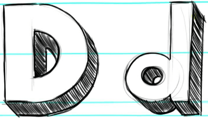
In case you missed it yesterday afternoon, my latest ESPN column is about NOBs with lowercase and small-cap lettering. It’s a fun typographic rabbit hole — enjoy.
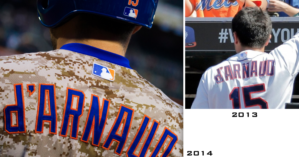
Now, several other media outlets have reported that the Mets used an upside-down “P” for Travis d’Arnaud’s NOB last year but are using a genuine lowercase “d” this year. But I’d looked at a ton of photos over the past two months and had been unable to discern any difference between the upside-down “P” and the genuine “d.” I even called Russ Gompers, the guy who does all the stitching for the Mets’ uniforms, and asked him if there was any difference between the two, and he said, “Not that I can tell.” So when writing yesterday’s column, I included the following line: “You can’t really tell the difference between last year’s ersatz ‘d’ and this year’s real thing on d’Arnaud’s jersey — the two letterforms are essentially identical.” Then I made my point by linking to this comparison (click to enlarge):
But reader Steve Dodell spotted something that I missed. As he posted in yesterday’s comments, “This year’s [version of the ‘d’] has a tiny triangular notch cut in the lower-right corner in the blue layer, to simulate the rounded bottom of the [letter].”
It took me a minute to understand what he meant, but then I saw it:
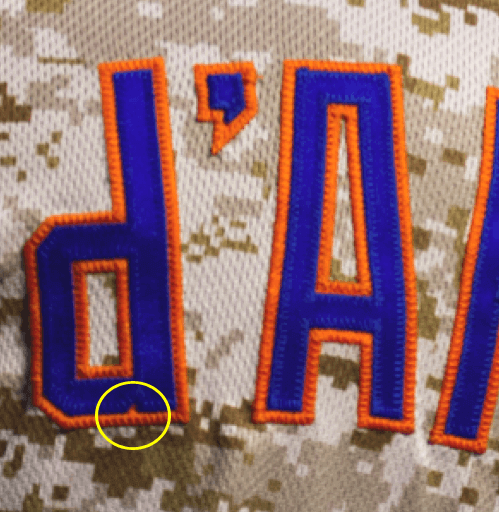
Wow. That is one subtle element! The funny thing is, it basically looks like a random fleck of orange, which feels in keeping with the camouflage background on that jersey. I’d like to say that’s why I didn’t initially spot it, but the reality is that I just wasn’t as attentive as Steve was. Kudos to him for spotting what I missed.
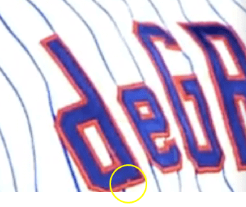
But wait — is the little notch also apparent on Jacob deGrom’s NOB? Sure enough:
It’s worth noting that the font used for the Mets’ NOBs, Block Standard, wasn’t designed to include lowercase letters — just caps and small caps. Majestic created the lowercase “d,” along with the other lowercase letters the Mets are using this season, at the request of Mets equipment manager Kevin Kierst. But there was no precedent for that, so they kinda winged it.
Meanwhile, that ESPN column from yesterday prompted lots of other good responses:
• From Jeff Caveney: I had mentioned that I couldn’t find a good rear-view shot of Tony LaRussa from his time in Oakland, but here’s a good view from the 1989 World Series. Small cap “A” and a space!
• From Ed Westfield Jr.: A few minor league and college hockey teams used lowercase lettering for their NOBs in the 1990s, including the Orlando Solar Bears and Northeastern University.
• From Louis Griffel: NHLer Greg de Vries wore lowercase lettering on his NOB while player for the Predators, Avalanche, and Oilers. But he had small caps with the Thrashers, and the Rangers gave him an odd hybrid — a lowercase “d” and a small-cap “E.” (At first I thought the “d” was an upside down “P,” but that can’t be right, because the block-shadow wouldn’t be properly oriented if that were the case. So why use one lowercase letter and one small cap? Weird!)
• From Jaime González: Puma has been including lowercase letters for its soccer NOBs for several years now.
• From Jericho Ilagan: The Philippines’ soccer team uses all-lowercase NOBs — no initial caps.

WCWS: The Women’s College World Series got underway yesterday, and Brian Rice checked in with some detailed info regarding jersey patches:
I know you’ll probably get some submissions on inconsistent and/or missing patches from the Women’s College World Series. I’ve gone three times with Tennessee and helped in the patching process, so here’s a refresher.
First, the NCAA only patches two sets of jerseys for each team, so they ask you to bring your two “primary” white and color jerseys to the NCAA hotel, where they are patched on-site by a seamstress. If you wear a sleeveless jersey, as Alabama does, the NCAA will patch a set of undershirts instead. A team can still wear another jersey.
Second, the patches are placed on whichever sleeve will face the CF camera when the player bats. So the right sleeve for lefties and left for righties. They do it that way even if the jersey has another patch on that sleeve, and will not cover any other logo or patch that is already there. I’ve never liked that, but they’ve done it that way since at least our first trip in 2005. All about the logo, I suppose.
If you make the Championship series, you must wear your “primary” patched jerseys.
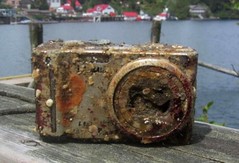
PermaRec update: The camera shown at right was recently found by divers in 40 feet of water — with photos and video content still intact on the memory card! The photos were then used to track down the camera’s owner. Get the full scoop over on Permanent Record.

’Skins Watch: A New Hampshire high school has decided not to change its Native American “Red Raiders” mascot (from Tom Mulgrew). ”¦ ’Skins apologists like to claim that the team was named in honor of coach Lone Star Dietz. A newly unearthed 1933 article clearly refutes that claim. Here’s the article itself. ”¦ The ’Skins asked their fans to tweet #RedskinsPride at Sen. Harry Reid — what could possibly go wrong with that? ”¦ Speaking of Reid, Skins team president Bruce Allen sent him a letter defending the team’s name.

Baseball News: Whoa, look at the logo the Padres almost ended up with thirty years ago. Also, read all the way to the end to see some tantalizing info about prototype uniforms. … First two numbered grafs on this page are about the Indians switching from gray jerseys to navy for Wednesday night’s game in Chicago (thanks, Phil). … Wally Campbell has written a lengthy manifesto on the history of the A’s white shoes. ”¦ The Twins will wear 1984 powder blue road throwbacks at home on June 5. Note that their stirrups will include the “TC” logo! Further info here (thanks, Phil). ”¦ Interesting snakeskin glove for Juan Uribe of the Dodgers (Phil again). ”¦ Here’s the Civil Rights Game patch that the Astros and Orioles will be wearing tonight (Phil again). ”¦ That patch will also appear on both teams’ caps, as seen here and here (from Todd Fisher). ”¦ Major find here: I’ve often been told that Twins pitcher Paul Thormodsgard wore a “Thor” nickNOB, but I’d never seen visual evidence of it — until now. Paydirt! (Huge thanks to Stephen Kraljic. ”¦ I’m not sure why Jose Cardenal was riding a penny-farthing, but it sure looks amusing (Phil yet again). ”¦ The Indians recently used some high-tech glasses to track where fans looked during games. Why? So they can put more advertising where the fans look, of course. Douchebags (from Jarrod Leder).

NFL News: Here’s more info on yesterday’s “concussion summit” at the White House. … The “Manzelf” illustration that recently circulated on Twitter is now being merchandised on T-shirts and stickers (from Joe Coney). ”¦ You know the problem with the Bills’ helmets? Not enough charging buffaloes (from Thomas Migliaccio). ”¦ Here’s more about former Vikings coach Bud Grant’s garage sale, plus a photo gallery and an article on what he didn’t sell. … A dear friend of mine had a bike accident on Monday night and ended up in the hospital with four broken ribs. When he was discharged yesterday, the technician who wheeled him to the exit was wearing a Giants head wrap. ”¦ Two more strength/conditioning T-shirt examples, this time for the Giants and Pats (from David Varley).

College Football News: Penn State equipment manager Brad “Spider” Caldwell is retiring (from William Yurasko). … Several uni-related queries come up in this Q&A with Virginia Tech athletic director Whit Babcock. Just search on the word “uniforms” (from Tommy Turner). … New logo for the ACC. Here’s the new style guide, and here’s how the logo looks on Clemson’s jersey (thanks, Phil).

Hockey News: Odd place to spot the Sabres’ old bison-head logo: on the side of a fire truck in Cincinnati (from Scott Palmer). ”¦ The Wilkes-Barre Scranton Penguins wore 15th-anniversary jerseys for Wednesday night’s playoff game against St. John’s. “I have never seen an anniversary logo used as a primary uniform crest before,” says Steve Cook.

NBA News: Here’s what the Hornets’ new practice court will supposedly look like. … Reprinted from yesterday’s comments: The first five games of the Eastern Conference finals have featured five different uniform match-up. Game 1: Miami (red) @ Indiana (yellow). Game 2: Miami (black) @ Indiana (yellow). Game 3: Indiana (yellow) @ Miami (white). Game 4: Indiana (dark blue) @ Miami (white). Game 5: Miami (black) @ Indiana (white). “Does anyone know if we’ve ever had a series that long with no repeat uni match-ups?” asks Brian Perkins. “Also, interesting that the Pacers have worn yellow both at home and on the road.” Indeed. … The 76ers will reportedly have new uniforms for 2015 (thanks, Phil). ”¦ ESPN ran a segment on spelling bee contestant Gokul Venkatachalam in which he cited LeBron James as his favorite player. Then they showed him wearing KD’s. “Hypocritical genius,” says Chris Perrenot.

Soccer News: The guy who designed Brazil’s iconic uniforms is an Uruguay fan (thanks, Phil). … New training kit for Liverpool (from Nile Smith). ”¦ Valencia CF switched kit suppliers, to Adidas, and released a limited-edition uniform with a retro badge (from Yusuke Toyoda). ”¦ Also from Yusuke: A Korean has activist placed an ad in The New York Times arguing that Japan’s World Cup uniform features the ‘Rising Sun’ flag motif used by imperialist Japan during World War II.”

Grab Bag: Mitchell & Ness is running a big sale (from Scott Davis). … Serena Williams is blaming her early French Open ouster on my favorite color (thanks, Phil). … “In Saturday’s Top 14 (France’s professional rugby union competition) final, Toulon will wear a commemorative jersey for fly-half Jonny Wilkinson’s final game before retiring,” reports Eric Bangeman. “Wilkinson is one of the most storied players in the history of the sport, best known for a drop goal in overtime to win the 2003 Rugby World Cup for England.” ”¦ Lots of debate in Provo, Utah, over what the city’s new flag should look like. “The mayor has been advocating for the aesthetics and standards of proper flag design, while citizens are arguing looks and meaning,” says Josh Sorenson. “It’s very interesting.” ”¦ A lot of the photos and screen shots from this listicle on jersey typos originally ran on Uni Watch.

In some minds, that Padres logo is better than what they ended up with in real life.
Speaking of which, why wasn’t the brown/yellow set ever criticised for being an advertisement for McDonald’s? Everyone calls them the McDonald’s uniforms, but no one considers the possibility it was deliberate on the part of the team.
I’ve often heard them referred to as Taco Bell uniforms, which would be advertising for Ray Kroc’s competition.
It came up a few days ago that it seemed Ray Kroc adjusted the McDonald’s color scheme to better match the baseball team. Hey, beef=brown and cheese=yellow; good for business!
They wore brown/yellow from the start in 1969, and Kroc didn’t buy the team until 1974.
“In some minds”? You mean, “In the minds of all right-thinking loyal Americans.” How is that not everyone’s favorite coulda-been prototype logo? I ask as a child of the 70s, so of course I’m conditioned to like logos in the style of the link. Abstract, thick lines, color blocks, strong negative space, high contrast, printable with spot color, and no bleed: Everything a logo should be.
Love that Padres prototype. But as a child of the 1970s, I suppose I would. It has all the virtues of the link: Abstraction, thick lines, ungradiated color blocks, strong negative space, printable with spot color, and no bleed.
Maybe it’s just me, but I think the old Bicentennial logo would make a better crest for US Soccer than what they currently wear.
The Bicentennial Star is like maple syrup or sloe gin – had too much of it back in seventy-something and it still makes me a bit queasy.
In some minds, that Padres logo is better than what they ended up with in real life.
Mine’s absolutely one of them. I’d gladly take the link over link they chose instead.
But nothing — NOTHING — tops this: link
Nah; the prototype wins. Why? Because the famous Swinging Friar is a righty, and the prototype is a lefty. It is downright criminal how few logos are left-handed.
So… it’s perfectly acceptable to depict a Catholic priest (because that’s what the team’s actually named for, after all) as a stupid looking smiling cartoon character with a deformed head, but it’s totally racist and “wrong” to represent a Native American with a stupid looking smiling cartoon character with a deformed head (Chief Wahoo). Sure.
“I’d gladly take the stylized Friar over the bland corporateness they chose instead.”
I’d gladly choose that logo over link that the Padres currently use. If nothing else, at least link.
“So… it’s perfectly acceptable to depict a Catholic priest (because that’s what the team’s actually named for, after all) as a stupid looking smiling cartoon character with a deformed head, but it’s totally racist and ‘wrong’ to represent a Native American with a stupid looking smiling cartoon character with a deformed head (Chief Wahoo). Sure.”
Weren’t Catholic priests at least partially responsible, historically speaking, for dehumanizing and stereotyping Native Americans into the kinds of caricatures typified by Chief Wahoo in the first place? (Kidding. Mostly.)
Obviously, the above post is a reply to The Jeff and was intended to be placed under his comment. My slightly less snarky response is a follows.
There are many reasons that the Padres’ cartoon logo is in a different category than Chief Wahoo. First off, it is depicting a vocation, not an ethnicity. Secondly, the Padres’ logo isn’t drawn to highlight certain racial or ethnic stereotypes. (Vocational stereotypes, perhaps, but not ethnic ones.)
Finally, considering that Catholics make up nearly a third of the total population of San Diego County and account for link, the Padres logo is much more akin to the Minnesota Vikings or the Boston Celtics than the Cleveland Indians. It’s appealing to something a significant portion of the local population can identify with and claim as their own. The Cleveland Indians, on the other hand, are appropriating the identity and imagery of a group of people they don’t represent.
Pads prototype = WFL Hawaiians
I thought so too.
I wonder if the colorized version of this prototype was made to look like a church’s stained-glass window.
How is Gokul Venkatachalam “– the reigning spelling bee champ –”? … he finished third.
Defending?
I don’t think reigning/defending is the word in question … I think it’s “champ” … though he is champ – of the St. Louis area. I live about 5 miles from him.
But not the big Spelling Bee….. If we are going to call Gokul the “reigning champ” then we all can feel free to call the Denver Broncos the “reigning champ” (of the AFC) without any context.
Ah, I see. Will adjust.
Whilst we’re at it.. it’s Spelling “Bee,” not “Be.” Ironic, no?
I don’t know, calling it “spelling be” makes it kind of existential, no? One of the words was even “Kierkegaardian”
Go, Mike!
. . . .take that leap of faith!
Wonky link for ACC style guide.
I think there’s a rogue > in the Grab Bag, too.
Both now fixed.
My reaction to the news that the Philadelphia 76ers will have a new uniform in 2015 was, they must be one of the most prolific serial uniform changes in North American sports. (not counting the NCAA mess). Got me wondering, who would capture this honour?
Not counting tweaks, Sixers, Cavs, Kings and Hawks have each had 4 new uniforms since 1990.
If you include teams that have moved, then you have the NJ/Bk Nets and Charlotte/New Orleans Hornets/Pelicans with 5 each.
In the NFL, the Jaguars have this honor.
1995: Franchise introduced
1997: New uni set
2002: Black alt introduced
2004: Alteration to road numbers
2009: New uni set
2011: Alteration to the infamous “piping”
2012: New black uni added, designated as “home”
2013: New uni set
That’s 4 uni sets in their history, at least two violations of the five-year rule, one year where the team had two home unis and no alternate, and the weirdest helmet to ever exist. I bet they’ll change again in 2019 for the anniversary.
. . . probably before that when they move elsewhere and completely rebrand.
I think they’ve built up enough cachet that they won’t totally rebrand. I imagine they’ll keep the nickname and colors when they move to London.
“I think they’ve built up enough cachet that they won’t totally rebrand. I imagine they’ll keep the nickname and colors when they move to London.”
But then they’ll be called the “Jag-yoo-uhs,” which will cause all kinds of confusion.
I don’t know, there’s a few other teams who had some… issues figuring out what they wanted to look like. The Houston Oilers wore 6 different helmets in their first 15 years, though the uniforms themselves didn’t change quite as drastically.
Is there an explanation as to why they went to silver?
So the blue softball jerseys didn’t actually help the Indians to win the game against the White Sox? Wow, how surprising.
A few weeks ago The Cleveland Indians sent out a survey to fans and it was asking could you name so many sponsors in the ballpark and which sponsor was located here in the stadium etc. Guess that went hand in hand with the glasses thing they did in the stadium.
That isn’t an outdated Orioles logo. That is still the official primary logo: link
The O’s logo isn’t outdated, that’s the official team logo:
link
Haha, what he said above :)
Will adjust.
Very strange that the Cincinnati fire dept co-opted the old Sabres’ logo. They also rotated it a few degrees counter-clockwise and removed the portion of the logo that juts out from the left of the buffalo’s chin.
Always had an optical illusion effect with this logo in a similar sense of the Atlanta Hawks pacman logo. The old Sabres’ logo has always appeared to be a crazy devil with black eyes sticking out its tongue. Here’s a chop-job I once did to accentuate this effect.
link
Yeah, I did a double-take when I was walking by. (It was at Eden Park, for the locals) I was wondering if it was a city-wide thing or if it was just a personalization for that particular truck.
On the link for the “Hornets’ new court”, the tweet refers to the image as what the PRACTICE court will look like. I have no idea how closely practice courts match up to game courts in the NBA, but I thought you should know.
Thanks. Will adjust.
The O’s logo the Astros used on their board last night isn’t technically outdated, it’s still their “primary logo”, they use it around Camden Yards for certain things, it’s still used on some merchandise, and other official team things like letterheads. The cartoon bird is technically just their “cap” logo.
Dammit, 0-2 on comments this week. Should’ve refreshed the page.
Lots of minor-pro hockey teams have worn anniversary logos as their primary crests. Personally, it makes the team look minor-league.
Isn’t that the way they’re supposed to look? No one’s confusing the St. John’s IceCaps with the Winnipeg Jets.
The Iowa Wild and Minnesota Wild are pretty close to being the same team based on jersey design.
The comment about them looking minor-league is that you don’t celebrate a meaningless anniversary if you’re a professional team. Here’s a brief list…
link celebrate 10 years
link celebrate 70 years
link
link celebrated 10 years
link celebrated 10 years
link celebrated 10 years
link celebrated 25 years
link celebrated 5 years
link celebrated 5 years
link celebrated 10 years
link celebrated 5 years
link celebrated 10 years
link celebrated 10 years
link celebrated five years
link celebrated 50 years
link celebrated 20 years
Maybe that’s enough for now. LOL
Most of the ones I can recall have been from the AHL and many of those have been for 5-year anniversaries…hardly a milestone worth acknowledging on any level, but I can understand why teams celebrate such ‘milestones’ given the frequency of franchise movement/cessation in that league.
I was going to say, I remember quite well when the Lowell Lock Monsters had a 5th anniversary jersey. link
and of course, they only lasted another 3 years before the Devils bought the franchise and renamed them to the Lowell Devils, and then another 3 before the Devils moved the team to Albany.
But the word Nippon means “sun’s origin” – so a rising sun design is quite appropriate. Unless the Korean activist thinks they should change the name of their country also :/
I think it’s the sunburst design with the sun off-center that’s reminding the activist of the rising sun flag. I think it’s a serious overreaction (like, I’m not going to begrudge Ole Miss for using red and blue as school colors), but also an understandable reaction.
I think it’s a bit of an overreaction, particulary because the sun’s rays on the jerseys are not red. There’s only so much you can do with a big red dot,
(Now if a physicist or astronomer could just convince the Japanese that the sun is a yellow star, not a red one. Even at sunset it’s orange. But Japanese kids will draw of mid-day scenes with a red sun high in the sky. Sorry; it’s a class-G2V star, which is yellow.)
The Japanese also think the green light is blue (as in “ao shingo”). Japan is clearly the very model of a colorblind society we aspire for.
“… arguing that Japan’s World Cup uniform features the ‘Rising Sun’ flag motif used by imperialist Japan during World War II…”
One of the difficulties here is that — unlike the Swastika flag — the Rising Sun ensign had a history as a national banner long before the 1930s and the Second World War. It’s featured prominently in illustrations of the Russo-Japanese war. Japan was certainly “imperialist” throughout the first half of the 20th Century — it made no secret of wanting territory beyond the Japanese archipelago, saying that it was just trying to act like a normal Great Power — but before the 1930s most of that colonial cupidity was directed at unlucky Korea. [There’s a Britain / Ireland analogy worth exploring.] And it was in the 1930s, flying its old Rising Sun flag, that Japan embarked on a hugely ambitious projection of military power throughout East Asia, often featuring appalling cruelties. Post-1945, under an explicitly anti-militarist constitution, the Rising Sun emblem was much less frequently seen, but (I believe) was never officially jettisoned. Unlike the Swastika flag, which went from obligatory to illegal in a period of about ten years.
This doesn’t mean that Prime Minister Abe shouldn’t go to Seoul (or Nanjing) and fall on his knees a la Willy Brandt.
Seems like one could make a similar argument against, say, link. Belgium did a lot of not-so nice things in Central Africa.
The Japanese also think the green light is blue (as in “ao shingo”)
That part is OK, because historically ao encompassed the entire range from English “green” well into English “blue”. It only becomes a problem when a Japanese person, speaking English, literally translates ao into “blue” when takling about traffic lights.
(Great piece of trivia: according to linguist Guy Deutscher, Japanese traffic lights have the bluest shade of green legally possible under internatinoal standards, because people are never going to stop calling them ao even though in today’s language, midori has crept in to cover most of what English calls “green”. So rather than start a campaign to change what they call the color of blue/green traffic lights, they just picked the bluest shade they could.)
(Trivia, part II: we Westerners are hardly immune to this. Anciently there were fewer color words than there are now, and “red” covered more ground than it does now. We still call reddish-purple-colored wine “red”, and pale-green wine “white”.)
Perhaps we should aggressively create names for even the most subtle shades of colors before corporations like Nike (“Traditional Story Maize”) start doing it for us.
It is true that Japan has never completely jettisoned the rising sun flag. It remains the Naval Ensign and a modified version serves as the flag of the entire SDF.
Unlike the Swastika, the Rising Sun was never the emblem of a particular political party or political agenda. So even though it remains a militaristic flag it lacks the type of specific associations we see with the Army of Tennessee flag, the Nazi Flag, or the hammer and sickle.
That said, the Koreans are understandably uncomfortable. Its easy to forget just how horrible Japan’s imperial policies were. Korea was just one country of many nations (Philippines, China, Vietnam) which suffered. While not the worst possible motif to have on a jersey, I understand why it causes discomfort to Koreans.
The lowercase D in den Dekker’s name needs more than just a little chip at the bottom; it needs one where the round part meets the bar at the top too.
But I still think small capitals are the only way to do this.
And Paul, I have an absolute doozy of a screenshot of an eBay search from about six months ago that is total Uni Watch material, particularly for this week’s ESPN column. Check the uniwatching inbox!
I agree, small caps work better. It’s outright weird to see “MC GWIRE” or “d’ARNAUD” on the field.
Mark,
I was thinking the same thing about a notch for the top part also.
BTW, this notch is not a totally new technology…certain varsity fonts have had this type of element for awhile…check out the top serifs on the C, G and S on this Varsity font:
link
Is the phrase “an Uruguay fan” (in the Brazil entry) correct? Uruguay is pronounced with a Y sound (YUR-u-guay), it might be better to write “a Uruguay fan” instead.
The American pronunciation is “OUR-u-guay“. You hear “YUR-u-guay” too, but the “OO” is closer to the native pronunciation, “oo-roo-GUAY”, or something thereabout.
I meant to link to the link.
I’ve only ever heard Spanish speakers pronounce it, “OO-roo-gwEYE,” so “an” would be the correct article.
Also: an ukulele.
Also: an ukulele.
But then, I’ve seen UK people write “an hotel”. It’s a YOO-kulele, dammit. You never hear about anyone “Shredding ook”, do you? It’s always “yook” for a reason.
That was an hilarious anecdote.
Or, just
be lazy like meremove all doubt and go with “a fan of Uruguay”…Homer Simpson: “Hee, hee, look at this country! YOU-ARE-GAY.”
American pronunciations vary. Between the extremes of “YOO-ruh-gway” and the tediously correct Spanish pronunciation, one often hears halfway-house pronunciations like “ERR-uh-gwye/gway” and “OO-ruh-gwye/gway.” Depending on how one leans, either “a” or “an” can be correct.
The excuse I always got for the Washington Redskins name was that they did not want to keep the name Braves after moving out of the baseball Braves park. With moving into Fenway, Redskins seemed like a way to pair up with (pardon the pun) the Red Sox and keep their logo. The logo came from the Tammany Hall organization in New York which I believe an owner belonged to.
I never heard that about the football team. I know that the Boston Braves baseball club was indeed named after the Tammany organization.
During the run-up to the World Cup, FIFA has been running profiles on the participating countries. The first two teams profiled were Brazil and Japan. However, two weeks later the Japanese profile was dropped without any explanation. The rumor was that they took it down because Korean fans were complaining that feature used “the rising sun flag”. (I remember seeing it but I didn’t download it).
A week ago, the Japanese team profile made a quiet return. Though it wasn’t the only edit, “the rising sun” was removed and replaced by “sun origin”.
Take note that despite Japan’s and Brazil’s profiles are right next to each other on FIFA website link , there is a time discrepancy between the two in FIFA’s YouTube page.
Brazil (April 1, 2014) link
Japan (May 22, 2014) link
I’m not asking this to be snarky or argumentative, but why does the glasses thing make the Indians douchebags?
Don’t you think there’s enough advertising at the ballpark without actually *tracking where people look* to figure out where to put more? Especially since the real thing you’re supposed to look at is, um, the ballgame?
That seems like a rational thing to do, right? Whether you like it or not, the whole point of advertising is to be seen.
It doesn’t seem any different from Nielsen keeping track of which shows people are watching or a website operator setting advertising rates based on pageviews.
Ah, yes — “it’s just business.” The all-purpose excuse that makes everything OK.
If you don’t think the use of vision-tracking glasses is at least a little bit creepy, that’s your prerogative. But I respectfully disagree.
“All-purpose excuse” implies that tracking consumer behavior is necessarily evil, unless you’re against placing advertising in stadiums in the first place, which is a whole another conversation. It seems like you’re reacting to the technology more than the behavior.
Good or bad, I don’t see the behavior being any worse (or better) than tracking viewership or page views or response rates.
Good or bad, I don’t see the behavior being any worse (or better) than tracking viewership or page views or response rates.
Two things:
1) The examples you’ve cited (TV viewership and web viewership) both involve products/content/etc. that are given away for free. Without ad revenue, those industries could not exist. The Indians, on the other hand, have ticket sales, concessions, parking, TV/radio rights, etc. Do they really need to hook human beings up vision-tracking eyeglasses in order to squeeze a few more pennies out of their ballpark signage?
2) You’re trying to paint this as a matter of black/white absolutes, but there are plenty of shades of gray and issues of degree. At some point certain things cross a certain line. I feel that hooking human beings up to vision-tracking glasses meets that standard; if you disagree, that’s fine, but in that case I’d be interested to hear where *you’d* draw the line.
I agree that there’s a distinction between ads in stadiums to TV commercials/website (though I suspect most viewers/internet users are already paying their cable operators for access). But that’s what I mean when I say it’s a different conversation – if you dislike in-stadium ads, then the glasses are merely an extension of a douchebaggy business practice. If you think in-stadium ads are an acceptable business practice, then the glasses are a minimally invasive way of tracking behavior.
As for the second point, I don’t know where that line is. If it was getting into people’s personal lives or sensitive data, or forcing people to change their behavior, then I’d have an issue. But this is just tracking behavior at a superficial level.
I think we disagree on what qualifies as “minimally invasive.” Let’s leave it at that.
“Rational” and “douchey” are not mutually incompatible. No one’s saying it’s not a clever marketing tactic. However, it widely comes across as invasive & intrusive to men of ordinary habits and sentiments. They’re just doing their jobs. But not every job is worthy of doing, or–even if arguably worth doing–says good things about the men who’d do it.
So well put — thanks.
Last night, Keith Olbermann changed my views completely on the Washington Redskins name controversy. He provided proof that they only reason the original owner changed the team name from the Boston Braves to the Redskins, is because they were playing at Fenway, and wanted to connect with Red Sox fans. So he changed the name to Redskins in order to keep the logo and uniforms so he wouldn’t have to buy more.
This video is worth your time:
link
Already in today’s ’Skins Watch.
The Axis of Ego blog link contesting the notion that the Hartford Courant article of July 6, 1933, proves that Marshall didn’t have Dietz in mind when he renamed the team.
Central to the blog’s argument is a July 18, 1933 article from the Chester Times of Pennsylvania, in which Marshall says, “Besides my coach, Lone Star Deitz, I’ve got half a dozen Indian players signed up, and I’m going to have them wearing Indian war bonnets, and blankets, and everything.” The blogger thus concludes, “What is undeniable is that Marshall was connecting the name change to Dietz and Native American players before the newly-christened ‘Redskins’ ever took the field.”
The blogger’s assumption is incorrect. Marshall’s later statements in the Chester Times article don’t contradict anything he said in the Courant piece about Dietz and Native American team members not serving as the impetus for the name change. If anything, it simply shows that Marshall was willing to use Dietz and the Native American players to promote the team, likely as an afterthought to his decision to rename the team.
Moreover, any attempt that a Redskins apologist might make to use the Chester Times piece to revive the argument that the Marshall was honoring Dietz with the name change doesn’t withstand scrutiny. First, Marshall could just as easily have used Dietz’s and the players’ Native American personas to promote the team regardless of whether it was named the Braves or the Redskins. Secondly, requiring them to dress up in war bonnets and blankets did nothing to honor them; it turned them into a sideshow spectacle for Marshall’s benefit.
But when the Japanese kit was released, Adidas claimed it was not a sunburst, but a symbol of “enjin” (the pre-match huddle; the eleven bars are the players breaking from the huddle)
link
76ers need to put stars on their unis. Maybe rip off the look of the old school New York Net unis
link.
Living up to your moniker today, eh? Why else would you link to a Shawn Bradley rookie jersey?
;)
I’m not a big jersey buyer or wearer, mainly because I refuse to buy the jersey of any current player with how often they switch teams. But that Mitchell & Ness deal sucked me in. I ended up buying 5 jerseys, and could have easily bought 10 more. It was just too good a deal to pass up.
Pretty damn cool productivity killer: an link.
Folks complaining about the blue in the USA Bomb Pop kits should look at how inconsistent other supposedly “classic” kits have been.
I was about to post this same link via The Big Lead. This thing is awesome!
I shared with everbody!! BUT if you want to see every single World Cup GAME’s matchups since 1930, go here: link
and follow the links. Socks are also included.
Wow. Thank you, timmy. Fabulous site. Someone tell me, please: If 1966 was not the acme of sartorial footie, what year was better?
If I could upvote this, I would.
Terrific stuff!
Connie, I have to take 1958 over 1966. Honorable mention to 1930, especially Bolivia’s gimmick.
Didn’t click every kit, but damnit why couldn’t they have kept the red/white hoops?! So visually distinctive and it appears nobody else has used it (in WC competition.)
Nike could’ve given them a visual identity that would “live on,” but instead they opt for garishness. Shame.
correction: garishness and jersey sales.
The all-white, not the Bomb Pops, replaced the hoops.
Not sure how that’s relevant except in a formalistic kind of way. Very recently, the USA had 1) red-and-white-hoops and2) all-whites. Now it has the Bomb Pops and all-whites.
/s/ Loyal member of affiliated Uni Watch lodge that really liked the hoops and really dislikes the Pops.
Pair either the vertical stripes or the hoops with blue shorts and socks and you’ve got a great secondary. The all-whites (ideally with a flag blue baldric stripe or a red-blue-red northwestern-pattern baldric stripe) are the best fit as primary.
Connie, the most recent combo was the hoops and the Santorum vests. The white/navy centennial kit was introduced as a replacement for, not a complement to, the hoops.
We wouldn’t have gone with a white kit and a hoop kit, since both would be “predominantly light” (not that Spain, Netherlands or Mexico seemed particularly bothered about compliance).
Just take a look at link
There are really only 2 visually distinct elements that the team has used over the past 85 years: diagonal sashes and bold red/white stripes. The current kits feature neither of these.
If we want the team to be taken seriously, these decisions need to be taken seriously as well.
Consider me forever a supporter of the hoops. Could’ve (and should’ve) become the signature US look.
If we want the team to be taken seriously, these decisions need to be taken seriously as well
I link.
If we want the team to be taken seriously, these decisions need to be taken seriously as well.
The U.S. soccer inferiority complex rears its ugly head yet again. From the outside, this obsession with trying to achieve some affected notion of international soccer propriety is far more off-putting than any perception of backwardness. You have a tendency to act like the street rat who came upon a load of money and decided to try and fit in with the Rockefellers and such by wearing an ill-fitting tuxedo, a monocle that keeps falling out and speaking with a put-on Martha’s Vineyard drawl. A) Nobody’s fooled. B) You only end up debasing yourselves.
Padday, I honestly have no idea what that sequence of words means. Like, each word is a word in the English language that I could define, and the basic grammar of how nouns, verbs, adjectives, etc are ordered looks like English. But I literally cannot understand what you’re saying.
So as someone you’re probably trying to describe, let me at least try to offer a perspective. I don’t think I suffer from an inferiority complex regarding team USA. Nonetheless, twenty-plus years of watching USA in international competition has revealed some patterns. In general, the rest of the soccer world really and truly does not respect USA as much as its quality of play would otherwise deserve. And, look, fair enough: I’ve lived abroad and I understand that pretty much everyone else, from Toronto to Tashkent, is kind of tired of the United freakin’ States being always up in their business, whether it’s invading them or blowing shit up with drone planes or even just filling their movie theaters with our crappy movies (filled, of course, with explosions: sensing a theme?). Soccer – sorry, football – is like the last cultural refuge where a person can pretend that America isn’t trying to run their world. I get that, and I’m sympathetic to it. Most Americans are – we’ve soured on the whole thing ourselves!
Still, it’s simply an observable fact that the international soccer establishment, from Sepp Blatter at FIFA HQ down to the lowliest backup midfielder on any marginal European or Latin American team to the officiating trainees at wherever they train FIFA officials, holds team USA in open and visible contempt. You see it in competition draws and scheduling. You see it in how other teams play against Americans. You see it in officiating that is consistently biased. I see it in the blank stares from my European friends when I mention Germany’s uncalled handball in the 2002 quarterfinals. Easily the second most blatant uncalled handball in World Cup history, and even Germany fans have no idea what I’m talking about. Second-rate Central American midfielders stick their spikes into the best Americans’ thighs in blatant professional fouls expecting that they won’t be called because the global officiating community doesn’t give a shit about upholding the rules when an American player is the one bleeding. And they’re right! Imagine how the rest of the world would feel if FIFA routinely let USA players get away with literally punching opposing players in the face. Seriously, imagine an American player doing that in an international game and getting away with it. Twice. Now you have an only somewhat exaggerated idea what it’s like to be a fan of USA in world soccer.
Now, I know it sounds like I’m complaining and expressing an inferiority complex here. But I’m really not! Bear with me a moment longer. Ultimately, I can live with USA being disrespected, and our players painted with targets on their backs by FIFA and the global refereeing corps. I’d rather be the underdog anyway, and better to be underestimated. And, let’s be honest, USA may be a consistent top-10 team these days, despite FIFA’s oh-so-convenient ranking system that just happens, by pure accident don’t you know, to demote USA down the standings days ahead of every World Cup draw, but we’re still not in the same league as the truly elite handful of teams like Brazil.
What bugs me isn’t really the rest of the world’s contempt. It’s that in a number of areas under our own control, we live down to the world’s diminished expectations. On the pitch, USA is a serious soccer competitor. Off the pitch, Team USA often acts like the second-string joke that the rest of the world seems to think we are. That’s why the Bomb Pop uniforms bug me. Most teams that deserve respect also have some traditions in their uniforms. Some basic visual language. You know at a glance if you’re looking at Brazil or Argentina or Italy or even, most years, England or Germany or France. Heck, Japan and Mexico have more readily recognizable uni traditions that USA. And to the extent that USA does have any uniform traditions, the Bomb Pop kit violates it completely. Visually, as a design, it is as if Germany showed up wearing yellow shirts and blue shorts. It’s Brazil in black. It’s Italy in red. It’s wrong. It’s a bad joke. USA is already likely enough to be gone in three games like a second-rate team, that’s bad enough, but do we really need to dress the part too?
I’m not demanding that the rest of the world respect us. Someday, we’ll make the quarters again, and we won’t be beaten by blatant German cheating, and then we’ll go on to lose to Brazil in the final like a respectable soccer nation, and that’s when USA will finally get a little international respect. I’m cool with that, even if it may not happen in my lifetime. But I am sick and tired of team USA management acting like the pikers everyone takes us for. We see those off-the-field own goals inflicted in lots of ways, but the disastrous uniform thing is the most visible, and would be the easiest to fix.
So you’re saying it would be like link or link or link or link or the Netherlands not being to pick an away color?
Why are we demanding consistency from the US when the Europeans are arguably worse?
arr: Very long, did read. Well said.
Arr, every single nation in the world has been screwed over on scheduling, or draws or whatever else and every other nation has some story of when their team got screwed over by on field officials. Yet, as your long, rambling paranoia filled comment above very clearly demonstrates, few seem to get as neurotically obsessive over those things as US soccer fans. You wanna know another team that got royally screwed over by officials in 2002? Italy. The beneficiaries? South Korea. Yes, South Korea, that powerhouse of international soccer with their bureaucratic heavies who go around bullying national federations and referees alike with their pushy South Korean ways, went and only dashed the dream of the lowly Italians who were just trying to get a foothold in international soccer but who once again had their humble dreams dashed.
It’s really quite pathetic Arr. You want to know what’s unjust? How easy it is for the U.S. to qualify for the World Cup these days. Every four years, that place is yours to lose. The US have been in every tournament since 1990. In that time France, England, the Netherlands, Portugal and Uruguay have all missed finals. Yup, the odds are well and truly stacked against you. The only way to describe this is the carry on of a spoiled child throwing the toys out of the pram, Arr.
By the way, if my language is too difficult for you Arr, then I am sorry, but just as I feel that American soccer is too good to be playing this feeble game of pretend, sucking up to Europeans and South Americans with pitiful copycat gestures, I also believe that Americans in general are worthy of being spoken to as adults and that not all require, as the stereotype goes, a helping hand in the form of shorter words and full, deliberate e·nun·ci·a·tion. Sorry if you would rather the latter, but I would rather not debase myself and patronize you in the process.
You’re all missing the point…the point being Cameroon’s 94 white kit. This may be the king of the so bad its good category.
*it’s
There are two problems: first, the program is essentially in its infancy (yeah, yeah, they beat England in 1950. And about 15 people paid any attention). The US program did not receive any significant public attention until 1994. There hasn’t been enough time to establish a tradition.
Consider the Yankees. The iconic interlocking “NY” on blue pinstripes took about 30 years to fully develop: there were variations on the logo design, and experiments with red, and pinstripes sans logo, before it all finally came together. And a big part of establishing that iconic look was the team’s success on the field: prolonged success helped to entrench the look. USA Soccer has had neither time nor success enough to establish much of anything.
The other factor is that Nike doesn’t give designs enough time to get any legs. The hoops seem a perfect look for the team, but Nike rolls out a new look every eight months. In fairness, they all do it: when Umbro was handling Team England, it seemed like there was a kit unveiling every couple of weeks. The difference there is that home whites, red change kits are so much a part of English tradition, that radical change never happened. Team USA, with no fimly established sartorial tradition, is at the mercy of marketers and designers.
But the home whites have been a constant for the US for the most part (notable exceptions being the vertical stripes in 1994 and the hoops in 2012). They’ve consistently worn white at home and red or blue as away.
Meanwhile, England’s away kits have changed just as much as the US’s: light blue instead of red in 1990 and 1996, all red in 2010 and black/blue in 2012.
As for the kit rollouts, the hoops and the vests were around for 24 months, briefly interrupted by the centennial kit last year. Umbro used to alternate, releasing the home kit in odd years and away kit in even years, both keeping designs for 2 years at a time.
I think that Padres logo is pretty cool, actually. I’d rather see that than the boring blue nothing they wear now – at least it’d have some personality.
Me too. I wouldn’t replace the SD logo on the hats, but that prototype would look great as a sleeve patch.
There is no logical reason under the sun that I should like those ‘Manzelf’ t-shirts. But I kinda do.
Lee
The Guardian site was error-riddled as to the US (a lot of mis-matched jerseys and shorts — for instance in 1998, the US change kit was a red shirt and navy shorts, not red).
“The 76ers will reportedly have new uniforms for 2015”
As long as they don’t have PHILA across the front. That has to be the dumbest abbreviation ever. Would Milwaukee have MILWAU? Tennessee TENNA?
They might. God help us, they just might.
Well, we used to have a poster on here named MINNA.
I’d like to see a resurrection of their 1977 uniforms. During the Bicentennial, there was a glut of RW+B teams wrapping themselves in flags; now, not too many. The blue Doug Collins design is iconic. The red Moses Malone suit struck me as drab.
The Mitchell and Ness website must be using 1996 software..good luck trying to find something on there now. They have to extend this sale. Can’t remember seeing any merchant with a page this bad in a long time.
These guys so badly screwed up their Black Friday sale a few years back that, at this point, I can’t help but think the website problems are intentional (or at least an example of willful disregard of the inconvenience to customers).
I always thought the story behind the Redskins name was that when they moved from Braves Field to Fenway Park, they picked a name similar to Red Sox that also allowed them to keep their Native American branding… Maybe I’m wrong? (FYI I agree the name should be changed, but that should go without saying…)
The city of Cincinnati and the Buffalo Sabres have a history. Doesn’t surprise me that a hockey fan living in Cincy could be a Sabre fan and work for the FD.
link
Mark Schlereth is the latest former ‘Skins player to come out against the team’s name.
link
And name-defenders immediately take to throwing insults at him.
Went back and forth this morning with a friend who happens to be a fan of the team, and a defender of the name, and he was playing the excessive-PC card. Short of him being personally confronted by offended Natives, I don’t see him changing his mind any time soon.
Jacob deGrom, not Jason.
And speaking of the lowercase D’s on some of the Mets’ NOB’s, what about Matt den Dekker?
He’s only appeared in one game, as a 9th inning defensive replacement. One plate appearance. This is the only image I have:
link
Not big/hi-res enough to see the fine details of the letterforms.
And the camo letters certainly don’t help in that case.
The city of Provo, Utah, wants to change their city flag. The current flag has a rainbow bar underlining the city name. That couldn’t be the reason for wanting to change, could it?
The current flag design looks like an early 1980s home appliance/consumer electronics logo.
I think a more compelling reason to change the flag is that the current one is a ridiculously bad design.
link
This new ACC logo may take some getting used to. Overall it’s completely boring and the grey stripe doesn’t compliment the letters.
Apparently the style guide does not apply to athletic uniforms. The stripe on Clemson’s patch would, of course, be purple.
Looks I have a lot of work to do on my site.
The new ACC logo reminds me of the Big East logo, which makes sense since the ACC itself reminds me of the Big East of the past.
Interesting move by ESPN/NFL on today’s OTL. Adolpho Birch, the NFL’s senior vice president of law and labor policy, was asked “point blank, is the Wasington football name a slur?”
Adolpho said “No, it is not a slur.”.
I can’t help but think what Mr. Adolpho would think if an NFL team wanted to chance their name to the “Blackskins”? Afterall, the majority of the players in the league are black, so wouldn’t the argument about how the name represents the history and pride on the past Afrian Americans. Of course he wouldn’t bee okay with it. He’s just towing the company line. I think this thing is very close to picking up momentum.
While Im not a Browns fan the “Manzelf” idea was pretty bright.Kudos to the dude that created it