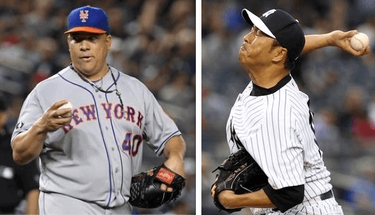
Two middling ballclubs that have been struggling lately played each other last night and decided to “honor” their “rivalry” (which isn’t really that much of a rivalry) by shelving their usual solid-colored caps in favor of contrast-brimmed caps.
That was the scene at last night’s Subway Series game in the Bronx, where the Mets and Yanks were apparently trying to make the occasion look “special” but instead just made it look clown-ish (lots of additional photos here and here). A few thoughts and observations:
• This was the first time the Mets have ever worn their orange-brimmed alternate cap with their road grays. (For the record, I’m okay with the brim but hatehatehate the white outline on the logo.) Or maybe they were wearing their alternate BP cap, which looks just like their alternate game cap except for the fabric. I watched the game and honestly couldn’t tell.
• The Yankees wore their BP caps for a game last August. Last night was the first time they’ve done it since then.
• Not sure if the idea for this stunt originated with the Yankees, the Mets, or the MLB office, but I’m trying to find out. Remember, it was right around this time last season that teams wore BP caps for interleague games because MLB told them to.
• Not sure yet if the teams plan to keep doing this for the three remaining Subway Series games, or if this will become a Subway Series “tradition” for future seasons. Let’s hope not.
• The Subway Series games are fun. But after 17 years of them, they’re certainly not a big deal anymore. This year’s games haven’t even sold out! Combine that with the spread of interleague games throughout every day of the season (instead of just during certain designated periods, like it used to be) and you can see the problem: On the one hand, MLB has essentially normalized interleague and “rivalry” games; on the other hand, they try to pretend that these games are more special by having the teams wear “special” caps. Can’t have it both ways, guys. And remember, when every game is special, no game is special.
Incidentally, speaking of rivalry games, I see that the concept of MLB rivalries now has — of course — a corporate sponsor (or maybe they’ve had that sponsorship for a while and I’d just been blissfully unaware). But if it’s about rivalries, shouldn’t there really be two co-sponsors, like McDonald’s and Burger King, or Playboy and Penthouse, or something like that?
It happens at least once every year: Rangers infielder Rougned Odor fielded a ground ball during last night’s game against the Astros and had it disappear inside his jersey. (If you can’t access the embedded video above, you can see the play by clicking here.) This type of play usually involves the ball somehow sneaking into jersey in between two buttons, which leads to people saying, “That wouldn’t happen if baseball used pullovers instead of button-fronts.” But this time the ball appears to have disappeared down Odor’s collar, which means it still could have happened if he’d been wearing a pullover.
(My thanks to Andre Torres for letting me know about this one.)
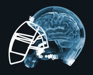
Concussion Discussion: How big have the concerns about football and brain injury become? So big that a school district in Texas — Texas! — has replaced seventh grade tackle football with flag football. Key quote: “Paradoxically, the more that [NFL commissioner Roger] Goodell focuses on the need for stronger safeguards, the more he runs the risk of highlighting the dangers of the sport. With its sky-high television ratings and billions of dollars in revenue, the NFL has the power to transfix fans but also scare them off.”
Collector’s Corner
By Brinke Guthrie
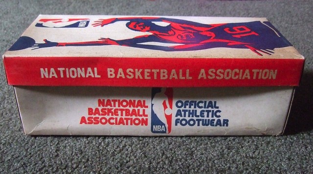
I don’t often feature footwear auctions, but the graphics on this box of NBA sneakers are just too, too good. Totally of the period, people.
Here’s the rest of this week’s eBay haul:
• Here’s a nice-looking 1979 Baltimore Colts poster by Damac– part of a Champion Spark Plugs promotion.
• Totally doubt the authenticity of this retro Padres shirt (check out the collar tag font, not a chance it’s sanctioned), but it’s got a great design!
• This 1970s NHL pin set from Rah! Rah! Pro Sports is still in its original plastic wrap.
• Always loved to collect fridge magnets. We have quite a few on ours now, from places we visit: Vegas, Oregon, Yosemite, etc. Don’t have these NFL helmet magnets anymore, though. Wish I did!
• From the late 1950s: Y.A. Tittle gives you “Fine Points of Playing Quarterback.”
• California Angels chewing gum? We all know Big League Chew, but I’ve never seen this gum before.
• Stillers fans! Nothing beats this 1960s Dave (The Master) Boss Steelers oil painting. Wow.
• Here’s a 1969-1970 San Francisco Warriors magazine called Warriors Quarterly. Especially intriguing (for me) is the inside “Computicket” ad. Wow, tickets from a computer — what a concept!
• I have a few media guides to share with you today, beginning with this 1970 Cowboy/Niners NFC title game media guide from Kezar Stadium — which was pre-Candlestick Park! Helmets look pretty much the same, 44 years later.
• Here’s another media guide: 1969 Bears. Note the helmet evolution on the cover.
• And finally, nice artwork on the 1971-72 media guide for the ABA’s Memphis Pros.
Seen something on eBay or Etsy that you think would make good Collector’s Corner fodder? Send your submissions here.
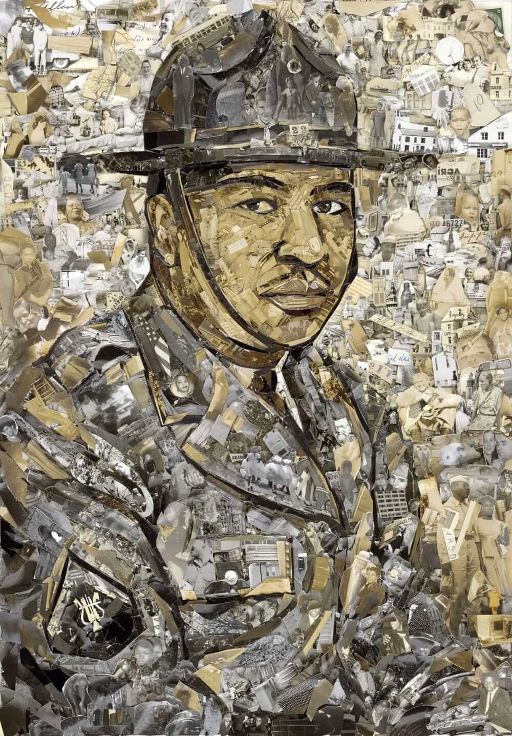
PermaRec update: The portrait shown at right is nice enough. But to see what’s really going on there, click on the photo. Cool, right? The portrait was made by an artist who takes found photographs, cuts them up, and creates collages out of them. Additional images and info on Permanent Record.
Special note for Seattle-area readers: Membership card designer Scott M.X. Turner’s band, RebelMart, is playing this Friday at Slim’s. You know what to do.
Tick-Tock: Today’s Ticker was compiled and written by Garrett McGrath, except for ’Skins Watch, which was handled by Paul.

’Skins Watch: A bunch of idiot students at the U. of North Dakota celebrated some sort of spring drink-a-thon by making and wearing T-shirts showing the school’s now-defunct Native American mascot — only he’s using a beer bong and accompanied by the words “Siouxper Drunk.” Classy!

Baseball News: The Mariners have stirrup fever! Jeff Forsyth says, “Ever since James Jones, a stirrup wearer, got called up, right fielder Stefen Romero has been wearing ’rups as well. When you add shortstop Brad Miller, the M’s have three stirrupped players! Is that a league-leading statistic?” … Speaking of James Jones, he appears to wear ribbed tube socks instead of standard sannies under his stirrups. “They were talking about that on the Mariners’ broadcast last night,” says Peter Chiappinelli. ”¦ Three from Phil: On May 26, the Dodgers are giving away a BBQ apron at their stadium. … Here are some Houston Astrodome cufflinks. … Have you ever wondered how the Mets pick their road uniform for each game? This video explains the process. … Here’s one of the greatest customized jerseys you’ll ever see. “I’m sure that guy didn’t get it at the MLB Shop website,” says Mike.

NFL News: From yesterday’s comments: The top-selling jersey among newly drafted NFL rookies is, unsurprisingly, Johnny Football’s. The No. 2 seller? Michael Sam’s. … A creative mind has come up with Brownie the Manzielf. … One more about Manziel: the NFL store is notifying purchasers of Manziel T-shirts that “the actual product will have the players number once assigned by the NFL League Office” (thanks, Phil) … It looks like the Broncos are going to be offering SpeedFlex helmets to their players this season (from Sam Hill). … The Titans have posted the uniform numbers for their 2014 draft picks (from Jimmy Morris). … The Chiefs did the same (thanks, Phil). … The Ravens also assigned rookie numbers. Of note, C.J. Mosley will wear the number 57 in honor of O.J. Brigance, the senior advisor of player development and a former Raven. … Golden Tate is adding III to his NOB, according to the Lions webstore (from Jeffrey Sak).

Hockey News: A sports television network took blood, sweat, tears, and errant water bottle spraying remainders and turned them into delicious summer treats. Translation: NBC handed out free ice pops made from the actual ice at arenas in Minnesota, Anaheim, Chicago, and Los Angeles to promote the latest round of playoff action. Yum! Or maybe gross! (From Scott Lederer.)

Soccer News: Adidas has released the 2014 FIFA World Cup Battle Pack cleat collection. Every adidas sponsored player will be wearing them on the field next month (thanks, Paul). … In more World Cup news, Ghana will be using red and white jerseys for the finals (thanks, Phil). … “I caught an interesting uni wrinkle during Manchester City’s Premier League championship celebrations: gold COB (‘Champions’ on back) and ’14’ jerseys donned for their trophy ceremony,” says Elliott Bueler. “I don’t think I’ve ever seen this before in the Premier League.” … Check out this infographic on the potential kits in the future of soccer (from Ben Fortney). ”¦ New crest for Orlando City. “Looks like the Lion King!” says Kenn Tomasch.

NBA News: The Trail Blazers wore their Rip City uniforms last night for the first time in the series against the Spurs. … The Blazers are also selling this Dr. Jack t-shirt, with all proceeds going to the Jack Ramsay Scholarship fund (thanks, Phil). ”¦ In celebration of the NBA’s worst regular season record, the Milwaukee Bucks sent out ping-pong balls to 10,000 fans with a note that says: Own the future, win the lottery (thanks, Mike). … The NBA’s Sixth Man of the Year, Jamal Crawford, has become the face of a new sportswear line (from Tommy Turner). … Here’s an interactive map that shows NBA rooting loyalties across the country.

Grab Bag: Here is a look at the bookplates of thirty-one famous men. … While attending the Offshore Technology Conference in Houston, Texas last week, Caldwell Bailey saw this pink drill bit. “Not sure how much awareness a drill bit that will spend most of its life in a dark hole raises.” … From the Australian Football League: Leo Strawn Jr. says, “Carlton Blues are the 5th of 18 AFL clubs to release their indigenous guernsey design, so far. I’m afraid the boomerangs will be overdone, but we’ll see. Fremantle wore boomerangs in place of chevrons on their home jumper and Richmond had them in their sash last season.” … A wearable technology company has developed a workout shirt with specially woven threads that track heart rate and calories burned (from Ben Fortney).

Spring cleaning: I routinely dust, vacuum, and keep things where they belong, but household cleanliness is nonetheless a fairly nuanced concept. A home can be tidy, or it can really be clean. I’ve recently come to the realization that Uni Watch HQ is the former but is no longer the latter, so today I’m doing something I’ve never done before: I’ve hired a service to give the place a “deep cleaning.” Pricey (about $300, after tip), but it seems like money well spent.
The cleaners will be arriving this morning. I’m told their work will take a good five hours or so, so I’ll be getting out of their way and working from a remote location (read: the New Girl’s place). Here’s hoping Tucker and Caitlin don’t freak out too much.
It’s important to note that the removal of the North Dakota mascot was forced upon them by the NCAA and the state, and the students are not happy about it. Why these idiots decided to add a beer bong, on the other hand… it’s because they’re college students and that’s what college students do.
No, it was not “forced” upon them.
The school has chosen to be a member of the NCAA. The NCAA has rules. If the school wants to be an NCAA member, it has to abide by those rules. If it doesn’t like the rules, it’s free to leave the NCAA, or to work within the system to get those rules changed.
Why does my brother always beat me to the comments section?
“Yeah, I’m not forcing you – I’m just going to pull your underwear over your head and steal your lunch money every day until you submit to my will,” said the playground bully. Can’t wait ’til the hypocrisy of the NCAA brings it down.
link
“Yeah, I’m not forcing you — I’m just going to pull your underwear over your head and steal your lunch money every day until you submit to my will,” said the playground bully.
This metaphor you’re trying to invoke could apply to virtually any rule or law. Yes, if you break a rule or law, there will be consequences. That doesn’t mean the rule or law is a form of “bully[ing].”
This isn’t about the NCAA — it’s about being a member of a larger organization and agreeing to abide by its rules. That’s not “forcing” or “bullying”; that’s how a huge percentage of our daily interactions work and how much of our society is organized. You’re just singling out this one particular rule because you don’t like it, but the reality is that UND is free to leave the NCAA anytime it likes, and is also free to work within the NCAA’s system to repeal the current rules and replace them with new ones.
You can always go to a different school if you don’t like bullying, or you could just not go to school anymore. Oh, there are no other school’s close enough? Tough luck, chuck.
The NCAA is the only college athletics association that I know of that sponsors hockey – UND’s most cherished sport. The NCAA is the only game in town.
The hypocrisy here is that the NCAA allows FSU to keep their name and imagery with support from the Seminole tribe, but even with support from a local tribe, the NCAA required support from two tribes for continued use of name and imagery by UND. Those requirements sound very arbitrary.
The hypocrisy is also in the NCAA not pushing to defend any other ethnic or cultural group from the possibility of offense.
I’m not singling out this rule. This is just one of many instances of hypocrisy in the NCAA. The biggest of which is this notion that college athletics is about “amateurism” while every. other. single. part. of big time college athletics is being promoted and sold professionally. Can’t have it both ways – pick one.
In other words, you want all the privileges and benefits that come with the NCAA (status, legitimacy, visibility, money, etc.) but none of the responsibilities or obligations.
This is known as an entitlement mentality.
There’s no inherent right to have an NCAA hockey program (or any other hockey program, for that matter), nor is there any inherent right to ignore the rules of an organization to which one belongs.
It’s that simple. All the rest is noise.
If you want to talk about the T-shirts the kids were wearing, feel free. But the larger UND/NCAA situation is old news. Let’s please move on. Thanks.
….and the government didn’t “force” you to buy healthcare, it’s a law, and if you choose to continue to live in the United States….
See, it works for everything!
The Affordable Care Act is a law duly passed by both houses of Congress and signed by the President, just like every other Federal law. It’s no different than the law that “forces” you not to kidnap someone or the law that “forces” you to pay tax on your income (and, like both of those laws, you’re free to petition your elected representatives to repeal or amend it). You’re only singling it out because it’s a law you happen to dislike.
Duly enacted laws and rules don’t “force” anyone to do anything. They’re the organizing principle of our society. Let’s please move on. Thanks.
That’s not North Dakota’s old logo. I don’t know where they got that native American image from. Interesting.
Google Image Search + Photoshop, literally. I just searched for “native american head” and it’s the 3rd result for me, from some clipart site.
It’s also important to note that while the University of North Dakota cannot wear or produce the logo on merchandise or official game wear, there are still many manufacturers who are producing merch for stores in and around the North Dakota area.
The NCAA can ban the school from using it, but it has no authority over what the fans wear.
Therefore, these shirts can very easily be made by a huge number of places in the North Dakota area.
Oh, no question — they weren’t produced by the school. They were produced by an online T-shirt vendor that ended up issuing an apology after this story broke.
I can’t tell for sure, but could the Mets be wearing this BP hat? I know they wore it most of spring training. Yes, it does look exactly like the alternate and the only difference is the material it is made of.
link
This is their BP cap:
link
Right, however the one I linked to is their alternate bp cap
Oh, right — honestly, I forgot about that one!
In any event: If we can’t tell the difference between the alt cap and the alt BP cap, then it really doesn’t matter which one they wore. Only difference is the fabric.
“Alternate BP cap?” I believe we have a winner for this week’s edition of Signs the Apocalypse is Upon Us.
I agree – I looked a few pictures online and I couldn’t tell.
Just caught a glimpse of the replay from last night’s game and on the close-ups of Terry Collins his cap has the diamond weave so it looks like the Mets went with the Diamond Era 59Fifty AKA alternate batting caps last night.
Manchester City did exactly the same thing in 2012: “CHAMPIONS” as the NOB with “12” beneath it. The players wore them at the trophy presentation, many of them wearing the shirt backwards, to display the triumphant motif.
Yesterday’s discussions of West Ham’s use of their third kit on Sunday rightly pointed out that it was no big deal. What wasn’t mentioned is that earlier in the week, facing Everton, City wore their Champions League kit – white shirt with navy and sky blue vertical stripes down the left side, black shorts. I don’t think they’d worn that set for a Premier League match all season.
I remember the same thing.
link
Has anyone other that City worn similar shirts?
Not that I recall, and nothing comes up during a quick GIS. I like it, it shows a certain arrogance that fits well with this (mostly) successful era of City history. Hopefully we’ll continue the tradition…
I’d like to see us wear a similar strip for the first game of next season, similar to how the Red Sox wore gold-trimmed jerseys to celebrate the WS win.
Chelsea sold similar jerseys after winning Champions League in 2012 and Europa in 2013, but I don’t recall ever seeing the players actually wear them. It was just merchandising/fan gear.
Champions of Europe:
link
Champions of Europa:
link
The World Cup group of USA, Ghana, Germany, and Portugal should be very visually interesting, since the US, Ghana, and Germany all wear white as their primary color. Lots of opportunities to see those fantastic US and Germany change kits! (yes that’s right, believe it or not I like the red, white, and blue US kit)
Good point, Portugal’s primary is red/dark red, but their secondary is white, and one of my favorites. With Germany, US and Ghana wearing white as their primary, Portugal may not have a chance to wear their secondary jersey until after group stage (provided they escape).
Does Germany have a green kit for the world cup?
No their change kit is red & black hoops.
link
It took me until now to realize they’re repping Flamengo with the away kit. Too bad their home kit doesn’t rep Corinthians
“… In more World Cup news, Ghana will be using red and white jerseys for the finals …”
Ghana conceivably could make it to the finals — though quite a long shot — but those jerseys are for the group stage (with USA, Germany & Portugal). I like both of those shirts a lot; Ghana has a fine natty tradition.
I think in this case “finals” means the World Cup Finals, the quadrennial tournament of 32 teams, not the final match of said tournament.
FIFA has informed the individual federations of what the teams will wear for the group matches, and the competition committee will determine the color matchups for knockout stage matches as they come up.
Gotta love Wacky Packs.
Confession: I put that note at the end of today’s entry mainly as an excuse to post a Wacky Pack image.
Thanks for the Wacky Pack post and for their name. I saw that post here, loved it and couldn’t remember the brand name of those things, which were all the rage back in grade school 1 year. Very funny. :-)
There’s a terrific breakfast-and-lunch-only restaurant in Denver called Jelly. The dining room features lot of old cereal boxes – particularly novelty items like Quake – and the restrooms are decorated with Wacky Packs.
My brother and I used to go through a box of Wacky Pack cards/stickers at my grandparents’ house when I was 8 or 9 (so about 20 years ago, wow). Belonged to one of my uncles I think. We thought they were really cool. Found a new run of packs in a 5 Below probably 5 years ago and bought some.
As odd as it may look, offside indicators on shirts could save a lot of confusion.
There were some interesting ideas in there, but I don’t see many/any of them happening on the pro level anytime soon. They can’t even get goal-line sensors implemented…
Goal-line technology will be used at this year’s World Cup and Premier League used Hawk-Eye this season.
Well, I’ll be damned! About stinking time.
Let’s hope they’re not dependent on a “manager’s challenge.” (Silly MLB)
It’s different companies doing it (Premier League used the same company as all the tennis tournaments, the World Cup is different) but the idea is the same – there’s a sensor inside the ball and cameras around the goal. When a goal is scored, a link.
So no challenges or video reviews, just the computer telling the ref whether the ball crossed the line.
As far as I know, there’s no sensor inside the ball. If there is, that article doesn’t mention it.
I’m fairly certain I haven’t seen anything as brilliant as the Manzielf in a long time. Props to whoever had that idea first, and to anyone who gets that onto a T-shirt and stuffed into a package destined for the Pacific Northwest.
Here is a look at the bookplates of thirty-one famous men.
Should I be concerned that one of my favorites was Hitler’s? I thought nearly all the Presidents’ were trite.
Some of the art deco designs are gorgeous.
Like someone in Nazi Germany was going to borrow a book from Hitler and NOT return it?
Paul, nice move going w/ a professional cleaning service. I’ve found that my personal cleaning skill set, and cleaning products/tools, are no match for the pros. You have hard floors, correct? Carpeting really demands the skills of a pro is why I ask. They tend to find the nooks and crannies I/we take for granted. As for the price, you are in NYC so that sounds about right. As for your 2 roommates, cats are great at making themselves scarce when strangers, loud noises are around, although they prob will be freaking a little. The only other option would of been to load them into cat carriers and take them with you, that is if the New Girl and her crib are cat friendly. Cleaning, or reading about cleaning, really scratches my OCD itch so that part of today’s entry was my favorite! Please provide a recap tomorrow of your reactions and results to the cleaning.
You know, the Bucks/Ping-Pong thing would excite me if I was a Bucks fan. But what if they don’t get the first pick? What if they do get the first pick and select a “Greg Oden/Sam Bewie” type player.
Have we discussed the awesomely terrible Bus slogans for the 32 World Cup teams?
link
I don’t think you can beat Australia:
Socceroos: hopping our way into history
but South Korea’s is pretty awful:
Enjoy it, Reds!
They really are awful.
Last World Cup, comedians Mitch Benn came up with a perfect slogan for England: “We’re Gonna Win Onw, Lose One, Draw The Eady One, Scrape Into The Knockout Stage And Then Go Out On Penalties Again!”
But I guess that’s too big for the side of a bus.
I liked this link, especially in light of how it turned out.
I have that exact NBA shoebox, it full of old baseball/football cards.
Weren’t the sneakers themselves were made/sold by Kinney and sported 4 stripes?
It seems, by my casual observation, that the yoke is coming back in MLB. A few years ago only a few teams carried them–Detroit, Atlanta and Seattle are the ones I remember. Now the retro looks for Washington and Houston have it, plus others.
Is this something UniWatchers like on their favorite teams, and why (or why not)?
The yoke?
Not sure what you’re referring to. Can you explain a bit further?
I think he means “headspoon”. You know, the up the middle and around the neck piping.
Headspoon?
I like that word better than yoke and will start using it immediately.
Maybe I’m using the wrong word?
The stripe running one side of the buttons, around the neck, and down the other side.
Ah, the placket piping — or headspoon.
I don’t know that it’s more popular know than in the past — I feel like it’s always maintained a pretty strong presence, no?
Okay, I got ambitious enough to go to the BHOF site and determined this:
2005: Five teams wore eight total (home and road) jerseys with placket piping.
2008: Eight teams wore 13 total (h & r) jerseys with placket piping.
2011: Nine teams wore 14 total (h & r) jerseys with placket piping.
2014: Twelve teams wore 18 total (h & r) jerseys with placket piping.
(Disclaimer: Some of BHOF the drawings are difficult to tell a yoke v. regular plackets on, and I guess I’m lazy enough to not look up photos for those. This also doesn’t cover the plethora of alternates jerseys.)
But the BHOF templates don’t show all the alternate jerseys out there. They only show home and road.
Headspoon looks good on a simple jersey like the Tigers. On a jersey with more substantial ornamentation, it doesn’t. Headspoon plus pinstripes = disaster.
Sounds awful.
I don’t want to search images to see if it’s been done.
(To up the ante: How about with ’80s Expos or Mets racing stripes, or perhaps a sleeveless vest jersey?)
I received a “Big Dogs” novelty jersey with both headspoon and pinstripes as a gift. It was super comfy (extra-heavy t-shirt material and cut just so) so I wore it around the house or for walking the dog.
Headspoon plus racing stripes = too much (IMO), though I thought the Mets’ racing stripe were a good look for them.
I dislike sleeveless jerseys regardless of their other deets.
“Headspoon plus pinstripes = disaster.”
Wow, serious typo on the word link there, Gregg.
Headspoon + pinstripes = disaster.
Except when headspoon + pinstripes = awesome, such as the New York Knights, or at least half of all the early baseball examples, when this arrangement was pretty common.
Much trickier, and thus likely to be a disaster, is headspoon + length-of-sleeve elements, such as contrasting raglan sleeves or racing stripes. I can think of two not-terrible examples of the former and none of the latter in all of baseball history.
However, racing stripes + pinstripes = usually awesome, such as the Mets and Phillies, back in the day.
I’m a fan of the Philadelphia MLB team and as much as I like the headspoon look for many other teams (generally speaking), I’m glad they haven’t resurrected it.
It might have looked OK on the ’70-’92 uniforms instead of the racing stripes, but then those uniforms would look ‘less-modern’ for that time period(?).
I’d like to see them lose the pinstripes and make the home day game alt the standard, but that’s another topic.
Which are the home day game alts, the red on cream? Cos that’s a nice kit.
If the Yanks needed to go with a contrast-brimmed cap last night (an extremely horrible idea in the first place… Ughck!), then why didn’t they go with this?
If the Yanks needed to go with a contrast-brimmed cap last night (an extremely horrible idea in the first place… Ughck!), then why didn’t they go link
In the comments on the bookplate link post #24 is Permanent Recordish. Too bad there’s no photo of the bookplate being referenced.
Next Cubs retro game includes re-painting marquee to original colors
link
“For the record, I’m okay with the brim but hatehatehate the white outline on the logo”
link
Better?
Definitely.
Not as good as the solid-blue cap, natch, but tolerable.
Begs the question, why didn’t they go with the simple one?
Manchester United has gone with gold COB the past few times they’ve won and to honor Sir Alex Ferguson.
link
Granted, I think the Yankees have basically B-minus uniforms that we all regard as Teh Awesumest by dint of long familiarity. But I find myself actually liking the white-brim look. I mean, sure, my visceral response is, “Yargh! No! Make the hurting stop!” But that’s not because of the white brim, it’s because it’s different, and it’s the Yankees. When I try to set aside the basic shock of the novel, it seems to me to be a terrific look. I still don’t like the Yankees using gray, so the road BP cap needs to stay off the field, but if the Yankees were ever going to change up their cap, either this or a pinstriped crown with navy brim are really the only two options.
The Mets cap, though. Ugh. I love the basic idea of an orange-brim chapeau for the Mets, but that outline gets worse every time I see it. At this point, I’d almost rather they just went back to black. (Kidding! Mets, please don’t go back to black.)
“using gray as a team color.” That is, I’ve got no problem with the Yankees wearing gray uniforms on the road. But thing that are made of team colors, like, normally, cap bills, ought not be gray.
Seattle Seahawks rookie numbers: link
A defensive end has #43, which is a little uncommon, though with such large rosters and a few retired numbers in Seattle, they probably ran out of options.
Should he make the roster, it’ll change.
The preseason is always littered with DE/LBs wearing 40s, Receivers with single digits, even the occasional double number.
…and Brian Bosworth cries a little, each pre-season.
Interesting choice by adidas for their “Battle Pack” collection which seem to be current shoes/cleats with the new print.
link
Handful of great photos here of mid-twentieth-century Vancouver’s neon lights:
link
All the more impressive that they’re as vibrant as they are in black and white.
O.J. Brigance, the only player to ever win a Grey Cup and Super Bowl for the same city.
The “rivalries” in interleague play has run it’s course.
The contrived rivalry between the Reds & Indians for the so-called Ohio Cup is an absolute farce. I would be willing to bet that fans in both cities could give a rat’s ass less.
The rival that the Reds should have always had is the Tigers. The Reds and Tigers had a long-standing tradition of playing in-season exhibition games in each city that help support knothole baseball. In Cincinnati, it was The Kid Glove Games. It was a chance to see the American League too. Now, we get to see the Padres (yawn).
Paul,
David Schoenfield is chatting right now and somebody wanted to know about undershirt colors in MLB. transcript below-
tom (Roanoke)
Hello David, What are the MLB rules on unis? Must they be uniform? The Cubs just added Chris Coghlan to their team and he is wearing red sleeves instead of the blue that all the other Cubs are wearing, and have worn as long as I can remember.
David Schoenfield (1:06 PM)
Where’s Paul Lukas when I need him? I thought sleeves did have to be a uniform color. Anyone have the rule handy?
Loved seeing you get a shout out on this. So, what’s the answer?
Schoenfield is a friend (and a former editor!) of mine. Saw him a few weeks ago when I was in Bristol.
All players on the team must wear the same undersleeve color. A few players cheat on this, like David Wright, who gets away with wearing short orange sleeves that barely peek out from under his jersey sleeves. But he wouldn’t get away with wearing LONG orange sleeves.
Not sure how long Coghlan’s sleeves are, but I’ll try to find out.
Also: Lots of players are now wearing those detachable arm sleeves, usually on just one arm. Seems like any team color (or black, or white) is acceptable for those, based on what I’ve seen.
OK, here’s what Coghlan was wearing last night:
link
Looks like a red undershirt with one short sleeve and one long (or maybe a short-sleeved undershirt plus one of those detachable sleeves).
Definitely not what the Cubs usually wear. He’ll likely get away with it unless/until he goes with two long red sleeves.
Shawon Dunston wore (short) red sleeves for a while. Naturally, I can’t find a single decent picture showing this.
Further proof the Texas Rangers should embrace red as their primary color, because in blue they just look like a version of the Cubs.
“Two middling ballclubs that have been struggling lately played each other last night and decided to “honor” their “rivalry” (which isn’t really that much of a rivalry) by shelving their usual solid-colored caps in favor of contrast-brimmed caps.”
Translation: an opportunity for MLB to sell even more crap.
Re: headspoon
Neat word, but I wish the Giants would ditch it- just doesn’t look right.
And how about the black/orange cap for home and all black for the road?
Oh and ditch the road SF alt. who needs 2 road jerseys?
And get offa my lawn.
The editorial board of the University of Iowa’s newspaper has concerns about the pink appointments in the visitors’ locker room at the football stadium:
link