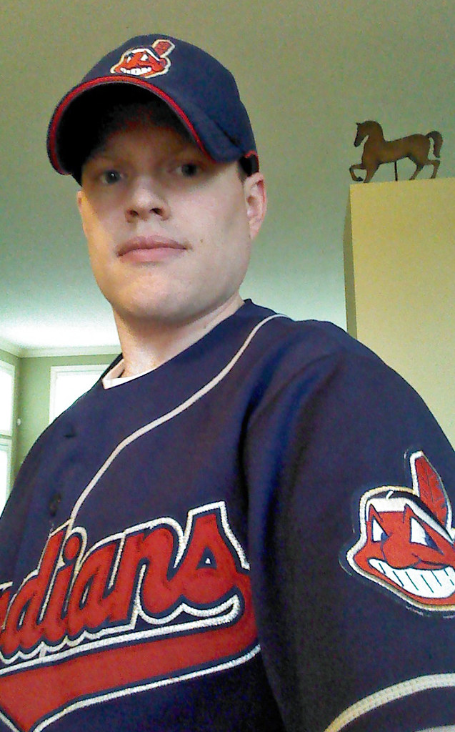
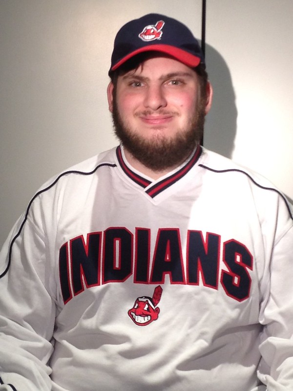
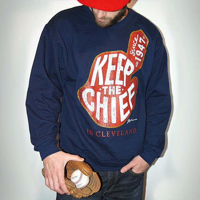
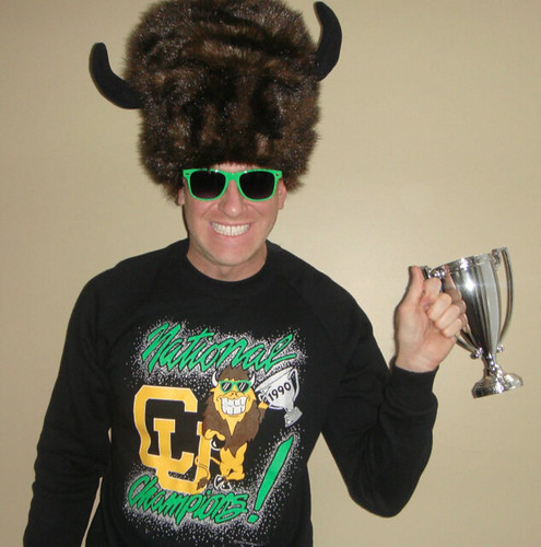
From top: By Alex Connor; by Stanley Meckler; courtesy of GV Art + Design
My ESPN column last week was about Indians fans who are de-Chiefing their jerseys and caps. At the end of that column I invited pro-Wahoo fans to get in touch so they could weigh in on the logo controversy. Several fans responded, and the three shown above — from top to bottom, Alex Connor, Jonathan Meckler, and Greg Vlosich — are featured in a follow-up column that’s up now on ESPN. ”” Paul
Unmasking the Commenters: I recently invited the site’s commenters to tell us a bit more about themselves and give us a peek at what they look like, just because I thought it would be fun to pull back the internet’s curtain of anonymity. I’ll keep showcasing you folks as long as you keep sending in your photos and quick bios.
Today we’re featuring longtime reader Matthew Robins, who sent along this photo:
I’ve been reading Uni Watch since around 2004, when I first discovered it as a part of ESPN.com. Since May of 2006, this blog has been the first thing I read every morning either on my computer or mobile phone. Occasionally, I leave comments on this site, although not as much as I used to.
I went to school at the University of Colorado in Boulder. My obsession with uniforms and logos probably began at a home football game in 1998, as the Buffaloes took the field in gold uniforms and black helmets, which totally blew my mind. It was also in college that I began to collect pocket schedules, which is still a healthy obsession.
Even at 34, I still get excited over the unveiling of a new jersey, logo, cap, or helmet, and Uni Watch has been a big part of it. I’ve also gained an interest is so many other sports-related issues and social issues that I had no idea I was interested in, all thanks to this site. While I don’t always agree with the reviews or opinions of every Uni Watch writer or commenter (I love purple), it’s great that so many people care and contribute. Obviously, a huge tip of the cap goes to Paul, but everyone else — from the interns to the guest bloggers to those sharing tips via email, and of course the commenters, masked and now some unmasked — that’s what makes Uni Watch so strong.
Thanks so much for the kind words, Matthew, and also for your many contributions over the years. You help make Uni Watch a better place!
Do you want to be featured in “Unmasking the Commenters”? If so, send me a photo and a quick paragraph about yourself. You don’t have to reveal your real name, and the photo doesn’t have to show your face, but you must include a photo to be considered. Send everything this-a-way.
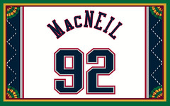
Membership update: We’re once again at one of those points where we’ve almost filled out the current batch of eight membership card designs (including James MacNeil’s 1990s Nets design, shown at right) but still have a couple of slots open. So if you sign up now, you’ll likely get your card very quickly, with very little wait.
As always, you can order your own custom-designed card here, you can see all the cards we’ve already designed here, and you can see how we make the cards here.

Mike’s Question of the Week (aka “I Wanna Know”): Intern Mike Chamernik (that’s him at right) is back with another question for the Uni Watch readership:
My favorite basketball team is the Milwaukee Bucks, and though there are many, many problems with that franchise (I don’t feel like listing all of them), one of the big issues is the team’s look.
Not only is the logo a scared deer (wouldn’t this be much better?), but the uniforms are dreadful. The green-and-red color scheme is a mess and the road and alternate jerseys are seriously homely. The home jerseys are a tad better but they, like the road unis, have stupid ugly beveling, which I hate. Other than that, the team looks great.
So here’s what I wanna know: Do you dislike the uniforms or logos of any team of which you are a fan? And has it affected your fandom at all?
Thanks, Mike. Post your responses in the comments and we can all commiserate together.
Tick-Tock: Today’s Ticker was compiled and written by Mike Chamernik.

Baseball News: Two Northwest Indiana high schools played a tequila sunrise versus camo game the other day (thanks, Zeke Clark). ”¦ Baltimore Ravens CB Ladarius Webb is holding a charity softball game at M&T Bank Stadium (where the Ravens play) on June 1, and here’s how the field will be laid out (from Andrew Cosentino). ”¦ Orioles 2B Jonathan Schoop doesn’t normally go high-cuffed but he did last night (also from Andrew Cosentino, who I’m guessing is from Charm City). ”¦ A team in Coleman Mullins’s nephew’s baseball league wears camo. ”¦ The Vermont Lake Monsters have new road unis (from Phil). ”¦ A fireworks display accidentally set the American flag on fire at the Braves game Tuesday night. ”¦ Nebraska wears some excellent stirrups (from Joe Andersen). ”¦ Pepperdine will wear camo hats on Saturday (from Phil). ”¦ The Giants gave away Hunter Pence motorized scooter bobbleheads last night (from Phil). ”¦ Simmons Field, in Kenosha, Wisconsin, is incorporating a fishing boat into its outfield wall. Very cool (from Matthew Robbins via Phil). ”¦ Orioles OF Adam Jones wants to increase punishment for fans who run onto the field, including this twist: “And they should let us have a shot to kick them with our metal spikes on because it’s stupid,” Jones said.

NFL and College Football News: Jerry Rice has a new “tribute shoe.” It’s in 49ers colors and has Rice’s career highlights printed on the insole (from Brinke). … Mississippi State’s new uniforms, which are due to be unveiled today, will include a patch for Scott Field’s 100th anniversary (from Phil).

Hockey News: “In the spirit of old-tyme baseball re-creators, I tried to do the same using vintage hockey equipment,” says Chris Mizzoni. ”¦ Bruce Bennett recently photographed his 5,000th hockey game, and here are 10 of his best shots. Garrett McGrath likes this Mike Bossy photo in particular. ”¦ The Halifax Mooseheads have an elaborately cool on-ice pregame display.

Grab Bag: NBA commissioner Adam Silver again said that NBA uniform ads are “inevitable.” Of course, he’s been saying that for three years now. If it were truly inevitable, it would have happened already. ”¦ New logos and wordmarks for University of Southern Indiana (from Lee Wilds). ”¦ Wacky hairstyles are a way for people to show their fandom (from Chris LaHaye). ”¦ Dennis Alpert has a nifty Masters autograph collection. “Signatures ranging from Sam Snead, Byron Nelson, Gene Sarazen to Jack Nicklaus, Arnold Palmer, Gary Player to Vijay Singh, Fred Couples and Tiger Woods,” he says. ”¦ A watch for blind people is up for design of the year at London’s Design Museum (from Tom Mulgrew). ”¦ Here’s a book that chronicles vintage corporate design manuals (from Brinke). ”¦ Nascar’s Brian Vickers will have a Florida State paint scheme (from David Firestone). ”¦ Look at this photo of yesterday’s Pennsylvania stabbing suspect being taken into custody: The officers are wearing seven-pointed stars, but their sleeve patches and caps show six-pointed stars! (Great spot by Leo Strawn Jr.)
Question of the week:
As a padres fan, strongly dislike the camo. Give me back the UPS uniforms.
The Orioles item in the baseball section of the ticker needs some kind of attention. I’m guessing it’s missing a “doesn’t.”
Thanks — fixed.
the Jonathan Meckler photo is dead
strike that it looks to been a temporary thing
Speaking of watches for blind people, the watch shown is an interesting spin on the common way to provide this function (i.e., allow the wearer to feel the position of the hour hand). See for example:
link
A somewhat different way to do this is has been made by Tissot, which takes the common vibrating motors from a phone, and puts it into a watch to make a vibrating time piece (including an alarm).
link
ed
As an Atlanta Braves fan, I find the “Screaming Indian” logo quite distasteful. I also don’t care for the weekend creams, but neither has affected how I feel about the team.
The creams I am sort of indifferent about. I think they are pretty unnecessary, considering that I think our whites and grays are two of the best uniforms in baseball. That opinion is, of course, biased.
I hate the road blues. I feel like they are something a high school team would wear. I can’t quite put my finger on why, though. I hate the numbers on back being just a white outline. The front “Atlanta” script logo doesn’t work for me on that jersey. The uniform feels drab, especially paired with that blue on blue hat (another tweak I don’t like – bring back the red bill on all combinations!). Altogether I just despise that uniform.
I was so proud of the Braves for holding out against the alternate-uniform fad for so long. And when they finally weakened, to have made such uninspired choices!
I don’t like our new red jersey with the stars in the script, and I’ve always longed for the “A” on the home cap to be outlined in red. For some reason, it has always looked out of place to me since it is the only white item on the cap.
I agree with both accounts. One colored alternate- the red- is enough. It was a nice color boost, but I hate the new stars and stripes motif. The alternate hat is my favorite though.
RE: Mike’s question
I’m moving to the Hudson Valley in the fall, and my local baseball team would be switching from the single-A Tri-City ValleyCats to another team in the NY-Penn League, the Hudson Valley Renegades.
Out of curiosity, I checked their website wanting to buy a hat for my future “new” team., but holy damn they’re all horrible looking. Just. Not. Good. I don’t know if I can do this.
Try to find an old Renegades cap, then, one with the “HV” rendered in blue and red. Or better yet, try to locate an original cap with the “V” created out of two baseball bats and the unusual maroon and green color scheme.
Yup. Pretty cartoonish/amateurish.
I’m really only a Cowboys fan because I live nearby, but their home uniforms drive me absolutely crazy. The mismatched silver on the pants and helmets is bad enough, but those terrible blue socks are just awful. Shouldn’t the blue on the jersey and socks match the blue on the helmet? It’s an absolute train wreck of a uniform!
Oh, I left out that this does affect my enjoyment of watching them. I simply can’t understand why they look this terrible.
I remember back in the 1980s the Maple Leafs couldn’t seem to find pants that matched the shade of blue of the jerseys and socks. How difficult would that have been? Of course, those were the Ballard years; he probably got them cheap and didn’t give a rat’s ass about the team or the fans, just the gate.
I believe Paul did a story on the Cowboys’ “green” home pants and it goes back to Tex Schramm. Green looked more gray on black and white TVs which most people had when those pants were developed. I am doing all this on deep memory recall and at my age I could be very wrong. I am sure Mr. Lukas will be able to correct or confirm. The Cowboys just never changed them. The blue socks are supposed to match the blue numbers on the jerseys but not sure if they do.
Kenosha Kingfish, really? I’d have expected the Kenosha Cadillacs based on the city’s long history with Nash/AMC. Of course Kenosha may not be as nostalgic about its automotive history as, say, South Bend.
I’m not sure how Cadillac would feel about licensing its name.
I love the Northwoods League, although I’ve never actually been to a game – going to take my kids to a Lakeshore Chinooks game when we’re in Milwaukee this summer. Not to mention my slightly insane brother wants to drive all the way up to Wausau to see a Woodchucks game, too.
Head to Madison, and check out a Mallards game. They are the most successful franchise (at the gate) in the league.
Madison is all about the Duck Blind… but they do a good job of separating that Frat Party from people actually watching the game.
Ah, I’m still bitter that the Hatters left town. Or the Muskies, before them.
Duck blind was a blast ten years ago. Now its way more expensive and so much of the deck is reserved.
A history with AMC – how about the Gremlins for the team name?
Enjoy seeing the few games I see each year for the Border Cats of the Northwoods League. Don’t know how much longer we will keep the team here with the dwindling fan support (2nd last in league last year). Though we could use the support your brother would probably have to be more than slightly insane to make a road trip all the way up here though.
link
how about the Gremlins
I can picture the special uniform event!
Re: Jerseys I hate for teams I like:
I hate the 2014 Mets camo jersey because it looks awful. I mean, I’m all for showing patriotism on a jersey, but a full camo jersey is overkill.
When I rooted for the Denver Nuggets, I could not bring myself to root for their alternate jerseys. I’m referring to the Carmelo-era navy jersey and the recent skyline faux back.
As a semi-Islanders fan, I could never root for the team when they wore the alternate jersey with Islanders spelled on the front. In fact, when I went to a game with my cousins this past November when they played the Detroit Red Wings, they wore those jerseys, almost forcing me to root for Detroit, a team I hate with a passion.
The Isles’ black alternates actually made me nostalgic for the sea sickness-inducing fisherman jerseys! (Though, if they’d used normal numbers and NOBs on those instead of trying to fit them in the wave patterns, they wouldn’t have made me so queasy.)
Mike’s Question of the Week (aka “I Wanna Know”): As a Cub fan, I’ve always liked the home uniform, always accepted the road uniform (with the exception of the Cuba uniforms of 1994-1996 – link), but the one uniform I CANNOT STAND is the blue softball alternate jerseys. Some headspooning or trim work of some kind might help, but in my opinion, a MLB team’s game uniforms should be easily identifiable from their BP tops.
Oh, come on, they’re easy to distinguish — the practice jerseys have those link that ruin an otherwise spiffy jersey.
Now I grew up watching the ’80s Cubs in their blue road jerseys so I have no problem with that shade, and the team’s history includes plenty of other shades (such as the 1940s and ’70s powder blue, and the navy blue of the 1880s-’90s and 1900s-’10s).
I think your “identifiable from the BP tops” gives too much importance to the BP jerseys, which are just for practice. I like blue and detest drab gray, so if these have to be different, I say wear blue on the road all the time and relegate the gray to batting practice!
Also, to answer Mike’s question, while I have no problem with any of the Chicago Cubs’ logos, I absolutely detest how the Ricketts family put names back on the otherwise-perfect home uniforms a few years ago. The Cubs had a timeless look to begin with, and the red borders on the numbers look pretty nice, but if you have to have NOBs somewhere, do that on the road. Really with the proliferation of jumbotron screens at the ballparks and on-screen graphics on television, there’s no need for NOBs at all.
I am pretty sure that the Cubs added NOB to home jerseys before the Ricketts family bought the team. I don’t disagree with your overall point.
They added them in 1993, but then removed them in 2005. It was the Ricketts family that specifically put them on again (and paraded around Wrigley Field all wearing jerseys with RICKETTS and number 1 on the backs).
Mark, your timeline is way off.
The Ricketts family didn’t take ownership of the team until AFTER the 2009 season had ended. The Cubs re-added the NOBs well before that.
Want proof? link was only on the Cubs’ roster in 2007 and 2008.
That being said, NOB or not, the Cubs’ unis suck. Their home set is mediocre at best. Everything else is crap.
that comment goes into moderation? really?
JTH, I guess I’m wrong. I could have sworn that the Ricketts family was involved in that. Maybe, after they took control, fans asked them about going back to number-only and they said no.
I’m a Yankees fan in Georgia and have always considered the Braves to be my NL/second favorite team. I’m also a serious uni traditionalist. Braves have classic whites and grays and the cream is great too. However, the red and blue softball tops have always put me off and I’ll admit have probably kept me from buying in all the way as a fan.
I’m with you on the red tops, but I love the blue. At first, I hated the blue font w/ white outline, but now it’s my favorite part of that uniform (although, I would love to see how a plain white, direct-sewn number would look on them.)
I LOVE the Indiana Hoosiers, but IMO their uniforms across the board are awful. Even the classic basketball uniforms have been ruined by Adidas – they may look the same to some, but there have been subtle differences and inconsistencies throughout the years that drive me crazy!!
And don’t even get me started about “cream & crimson” UGH!
Mike. Question: My favorite team is he New Jersey Devils and I have never had any problem with their look. I have always been lucky though that my tastes that run mostly old school and understated have been a good match for the way Lou Lamoriello runs the organization. It will be interesting to see what happens when he eventually steps down. I do not know if a radical change in the a Devils look would affect my enjoyment of following the team.
I’m curious as to what you think of their original red and green look compared to their current red and black.
For Mike’s Question,
Mets – I like most people, hated the BFBS Mets Uni’s. Now I still always rooted for them no matter what, but those things should have never seen the light of day. Especially when they wore the black Mets jersey as an away jersey for a year.
Jets – Nothing to hate on those uni’s. Maybe the sweatbox on the jersey but other than that they look fine to me.
Hockey – I’m a New York Hockey fan. Love all the teams (expect for the Devils). As much as the Sabres went kinda nuts with the 2 tone jersey this year, and the BFBS Islander jersey I acutally like those.
NCAA Hockey – I’m from Upstate NY (Near Albany) so I’m really into the Frozen Four this year with Union College playing toinght (and hopefully Saturday). A couple of years ago they played in the Frozen Fenway game against Harvard. They had fantastic BFBS (although they were “historically accurate”) unis they wore. I almost wish they kept those around for a couple of years. This year was actually the first in a couple that they did not wear any sort of alternate uni during the season. One exception was when they wore their road garnet at home against RPI during their home at home series. But even then their unis still looked good to me.
Mike’s question:
UNC: I’m a Tar Heel not born, but raised, and I hate, hate, hate the link. Thankfully, *everyone* hates that logo too, so it rarely sees the light of day. The same can’t be said for link, unfortunately.
Liverpool: Good lord, the link, but with the dream season we’re having, I can’t really complain. It only affected my enjoyment when Liverpool dropped a few points (vs Arsenal and Hull) while wearing them. The link has grown on me, though.
Carolina Panthers – No complaints (even the link is tolerable), though I’m afraid it’s due for a refresh, since it’s been largely unchanged since the team’s launch.
Oh, and:
Washington Nationals – Nothing bad, though there’s an oversaturation of the curly W, and the red/white scheme is way too similar to so many other National League teams.
I REALLY liked the DC logo they came out with when they became a team, never understood why they always treated it like an ugly cousin to the W logo. It was fresh, simple, and classic. They could’ve still made it look good even after getting rid of the gold in their color scheme. I get that they want some sort of visual relationship to the old Senators team, but the DC logo was a very-wasted opportunity by them to also establish their own identity as their own franchise. My all-red DC fitted cap is still the one I wear the most to Nats games.
Still surprised they haven’t revived some sort of alt DC cap, but the college summer team that plays in the District has a link
True – they could easily put the interlocking DC inside the link and make that the sleeve patch.
Pretty sweet, Ben. Negro League tributes are always welcome in my book.
Loved it too… But Bring BACK the GOLD
Wow, Ben. Very cool.
Still wish they had chosen “Grays” in 2005. It would have been very cool to have one team honoring and remembering the Negro Leagues every day. We have major league teams named after old American Association, International League & Pacific Coast League clubs, but not the Negro Leagues.
The Royals are really, really close to being a Negro Leagues name.
It could have been close, but it’s really not.
They might not have been comfortable openly making the connection in 1968, and it’s too late to retcon one now.
I’m a Tar Heel born, but not raised, and I hate that logo, too. Especially since UNC has at least three other great logos to choose from–Rameses, Tar Heel, and NC. I also hate their sweatbacks and the “Carolina” on the ass.
My other great sports fandom, the Chicago White Sox, has a great set of unis. But they royally screwed up their road unis a couple years back by removing the sock logo on the sleeve and replacing it with a giant version of the cap logo. Ugh!!! Hate hate hate.
I’m flipped flopped no the LFC kits this year, Love the Home, the Away kit has grown on me but I hate the 3rd kit.
Next Years kits that were released today not a fan.
PSU fan who likes our current football uniforms fine, but still wishes they’d switch back to the logo-less collar and opposite color trim on the collar and sleeves, like from my days as a student.
Orioles fan that wants the orange jersey gone. Or at the very least, get the sleeve stripes fixed so they match the single-stripe look of the black jersey instead of the white and gray jerseys. And have all the chest scripts cut down in size so you can read them all better. I’ve always liked the O’s hat better than the real or cartoon bird hats, but I can live with our current hat lineup ok, I guess.
Sort-of Indians fan that has disagreed with every uniform change they’ve made since 2008, however major or minor the change may be. They were one of the sharpest looking teams in my opinion in 2007 and the few years prior, but now they’re middle-of-the-pack, at best.
Steelers fan that likes our current look fine, but would prefer the block lettering and front logo patch nixed. And those bumblebee uniforms were definitely awful at first, but I’ve sort of warmed up to them. Still terrible, but not AS terrible. Our previous throwback jerseys with the regular helmet and regular pants I always thought would’ve looked awesome, or that throwback’s white pants with the regular helmet and road white jersey.
Penguins fan who wants the old shade of gold back…and have it put on our jerseys just prior to the RBK edge redesign in 2008. The triangles and points on the sides of the jersey and sleeves had much more character than our current jerseys, and were sort-of even city themed. And I liked the pigeon-like logo on the sleeves instead of no logo on the sleeves, too.
I should probably also say sort-of Pirates fan that has no idea why the team needs both a plain P cap and an outlined P cap, especially when they’re otherwise the exact same cap all the way around. Get rid of the outline on both the alternate and BP caps and get rid of the outlines on the alternate black jersey. Problem solved.
Oh also!
The last part of Mike’s question about these affecting fandom.
Growing up, the O’s were always 1A and the Indians were 1B for me. When the Tribe lost to the Red Sox in the 07 ALCS, I took it about as hard as I would have had the Orioles lost in their stead. But the O’s continuing to improve their uniform set and the Tribe continuing to ruin their uniform set has made the gap in interest for me between the O’s and Tribe widen considerably. The O’s were always in front except for specific situations, but now the Tribe is a very distant 2nd for me, and I’m sure it’s at least partly because of all their uniform changes.
Can’t say any of my other fandoms have been affected by their changes in unifoms, I don’t think.
Schoop hit his first homer for the Birds last night, so hopefully he gets superstitious and keeps the high cuffs.
It was his first homer of the year. However he had one last year as a September call-up.
Zoinks. My mistake.
Thanks Paul for letting the other side speak.
Regarding the question: I’m a lifelong Blue Jays and Bills fan who spent most of the last decade-plus either shaking my head in bewilderment (gray caps?!) or full-out suppressing my gag reflex. Thankfully with both mostly fixed, I can now cheer in peace again. (Now, here’s hoping they don’t ruin the Raptors with their promised Drake-led rebranding….)
Question of the Week:
The Capitals don’t have the greatest nickname and the logo isn’t really all that great either. It’s pretty terrible having a word mark for the team logo and having it featured on the front of the hockey sweater/jersey. But hey. It’s our team’s logo and name and uniform, so it doesn’t stop me from pulling hard for the Capitals.
Tennessee Titans fan here. It absolutely pains me when they show up in “Titan Blue” (baby blue powder blue, whatever you want to call it). I was a fan from the moment they switched from the Oilers to Titans in 99. For me, the Titans are supposed to be in Navy blue. The light blue by itself isn’t totally dreadful, but it looks amateurish paired with the navy pants. For the past five or so seasons, that’s the default look. I will always root for them, but I keep hoping one day they’ll come back to their senses and restore their original identity with Navy as the primary. All navy, all white, navy over white and white over navy.
Titans fan here as well. How did you feel about the light blue jerseys/white pants combo they broke out last year? I thought that was a really good look!
But I do agree that they don’t wear the original navy jerseys enough.
I’d say I’m ok with it, not in love with it. I just think Light blue and white together is “too light” on the whole. I think I may just be personally inclined toward darker jerseys in general. It wasn’t ugly or anything. I’d definitely take it over light jersey/navy pants. More so, I’d be ecstatic if they saved the light blues for road games and went color v. color against other teams’ home jerseys. One can dream!
I hate the helmet logo and the goofy stripes the Titans have. The sword with the 3 stars of Tennessee would look better and those stripes are just horrible. The current helmet logo looks like a flaming as-hole.
As a huge Syracuse fan – I hate the football uniforms. They’re a mess, and totally inconsistent year to year. They need to find a style they like and stick to it. And the basketball team loses whenever they wear blue uniforms, including the mismatched disaster (orange jersey/blue shorts) a couple months ago. Ruined the whole season for them.
Whoa, Adam, you and I are both Titans and Orange fans? awesome! I agree the football jerseys need a consistent look. I think the Ernie Davis days of white/orange with helmet numbers was fantastic.
On a related note, I’ve seen a lot of rumblings, especially on TNIAAM, that the football team gets new duds this fall. Here’s hoping is has absolutely zero gray/silver (nike bs), like basketball does. THAT ruins an otherwise awesome basketball uni, IMHO.
Sorry, that’s a different Adam. I’m Titans Adam. Not sure who Syracuse Adam is. Sorry for the confusion. I should probably get a more distinct username.
Fair enough. My fault for assuming as well. The timing of the comments just looked really close.
Mike’s question:
Charleston Southern University: The move from gold to white helmets was much needed, and the all whites look amazing.
NC State University: They usually do uniforms well but their alternates are just terrible. They go BFBS at least once a year in the 3 major sports (Football, Basketball, Baseball). They also started using red helmets a few years ago that at first I didn’t like but are growing on me now.
Atlanta Braves: Pretty sure I’m the only fan that likes the red alternates, but it is by far my favorite uniform. I also wasn’t sure that I liked the sunday cream uniforms that have also grown on me. Road blues are amazing though
San Diego Chargers: The refresh they made a few years ago has really helped them. Can’t really complain except that they don’t use the powder blues enough. I hear it all the time from fans, yet the team doesn’t seem to get it.
RE: Today’s Question
Being from, and still living in, Pittsburgh I am a fan of all the major teams across the board, plus being a Pitt alum, I follow Pitt as well. For the pro sports, for some reason I have love the fact that all the teams are black and gold, or at least some shade of gold. I don’t know if it’s because it makes them feel all that more a part of the city, or juts my OCD being satisfied.
Buccos: I love the pirates unis. The road grays are my favorite. I love the font even though some say it is too much sometimes. The Sunday alts are very nice, especially since they started wearing stirrups with them (though they need to clean up their look a bit, all in good time). I even like the black softball top alt and the alt BP hat. Tough I will confess the black alt had to grow on me a bit. Guilty pleasure: I LOVED the red vests and the red brimmed hats. DON’T JUDGE ME!!!!!!
Steelers: They are the Steelers. The martini of unis. Classic. Satisfying. Never goes out of style. Guilty pleasure…I love the fact when a graphic shows a conference or a set of teams by their helmets, they all have to face right if the Steelers are included.
Pens: Though I prefer the Mario era gold and black unis, I can’t complain too much about the newer look. It feels right with a younger, exciting team like they are. The look suits them. Not the greatest unis, but not the worst either. The blue alts have also been nice, especially the powder blues. I based my Uni Watch card off their 95-97 alt uni (one of my favorite unis of all time) and also their mid 90’s road jersey with “pittsburgh” diagonal down across the uni is also a classic.
Pitt: Hate the new branding and color scheme. Not terrible to look at, just bland and boring. Wish they would go back to the Marino era blue and gold, with the script “Pitt”
Mike, what do you think of the Pirates’ number font? I would like it except that the 7 looks so ridiculous; like someone just cut the bottom line off from a 2. They need to square up the two corners at the top and it would be fine.
Lifelong Pirates fan, and I can’t stand the number font. CAN’T STAND IT. It works for the letters, and that’s it.
That being said, the uniform as a whole is still good. I won’t buy a shirsey with the new number font, but I’ll still watch and enjoy the games.
Mike V., I’m with you on the red-brimmed caps. They’re not my first choice, but when they had them I liked them. Not as good as the mustard or current caps but better than the pillbox caps. The red vest…um…no thanks.
Jim,
No worries. Like I said, dirty uni pleasure. I was in my early 20s when they came out with those so maybe it was my bad judgement then, but always had a like for them.
And similarly, how do you feel about the Steelers’ number font? That’s the one thing that keeps me from agreeing with you on the “martini” bit; too spindly for a hard-nosed team, and italics don’t belong on jerseys.
I actually like the Pirate’s numbers. I’m a traditionalist at heart, but I love how unique they are and it fits their name and look. The seven is hard to look at but you take the good with the bad.
I also prefer the block numbers. With those numbers, that is the true Pittsburgh jersey. Once again, it’s not a deal breaker for me, plus I am 31, so I think I have grown up more with the italic font at this point, so I am not totally loyal to just the block numbers.
My two favourite pro teams are the Edmonton Oilers and Toronto Blue Jays (I’m Canadian). I think they both look pretty great now, but there was a while when they were both ugly: The Jays’ black jerseys (and a few others before them) and basically everything the Oilers wore from the time they got rid of the orange trim to when they brought it back.
It never affected how I felt about the teams, but I sure did complain a lot about how they looked. (I remember seeing in the Jays media guide one year that one of the “highlights” for one of their marketing people was designing the black jerseys and thinking, “Who would want people to know that they were actually responsible for that thing?”)
I am also a Miami Dolphins fan, although not as much as I used to be. I love watching the NFL, but don’t follow the Dolphins as closely as I used to. That waning interest began before they unveiled their new logo and unis, which are awful.
I’m a bordering-on-obsessive Pens fan, but it annoys me that their unis are…well, not bad, but blah at best. I don’t hate the Vegas gold with the intensity that most of the fan base seems to, but I think a return to athletic gold. And it absolutely kills me that they ditched the 01-07 style for the horrible, boring edge template. The previous look was among the best in a pretty solid history and the recurring triangle theme made sense for a Pittsburgh team in so many ways.
The main logo is still SO good, however, that I wouldn’t say it has affected my enjoyment of the team at all. Hell, boring as they are, I own several of the current sweaters, but that probably has more to do with my being insane than any aesthetic judgements.
You’re an artist. You’re not insane, you’re eccentric.
At least, as long as you haven’t committed any violent crimes…
Perhaps it’s shallow, but I picked my favorite team because of their uniforms, and they haven’t changed, so I obviously still like them. I’m not really sure what I’d do if the Raiders made a drastic uniform change that I hated. I guess I’d probably still support them, but they might fall to being my number 2 team. It’s really hard to say though, without it actually happening. The only other team I’ve cheered for that made big uniform change was the Detroit Pistons, and I actually thought the teal & black was an improvement at the time.
I can’t believe I’m agreeing with multiple people today, but I’m 100% with you on both of these. The Raiders have the best look in the game IMO (especially the white/away,) and those teal and black Pistons uniforms still immediate remind me of Grant Hill, regardless of the number. That could be an interesting topic: uniforms synonymous with a player…
Uniforms have always been one of the prime reasons why I choose a favorite team or drop them. Probably the only team I would root for no matter what is the Pirates. Hopefully they won’t test me on that, though…I’ve already forgiven them for the red vests and the clunky number font.
Any other team, look good or else.
I’m a fan of Wisconsin sports, and here are my gripes, past and present:
I’m not quite sure what the Bucks are doing, but it is a tremendous improvement on the purple era uniforms. The problem is that they kept the beveled wordmark with oversized B & S, and those side panels are just ugly. The logo needs to completely redone, and I’d love to see a logo with a full body deer standing proudly rather than something that looks like it just came from the taxidermist. I get mildly upset when people make the “Christmas colors” argument. If you think Christmas has a monopoly on the red & green tandem then you have already admitted defeat to the holiday. The early 70s Bucks uniforms were fantastic, right down to the old deer head logo on the shorts.
When the Brewers abandoned the clean white and blue (with ball & glove logo) look for the green and dark blue look in the nineties, it was not a good moment. The current dark blue and gold is boring, but at least it is fairly neutral–excepting for their terrible dark-top-on-white-pant alts. The team font gets tiresome, but I do like all of their logos.
I do not like the Badgers’ gaudy, italicized, 3-D ‘W’ at all. It looks like a sample font for furniture store sales blowouts in the nineties. A return to the classic, symmetrical block letter would be welcome.
No gripes with the Pack. A great uniform set to please the retro fetishist.
“If you think Christmas has a monopoly on the red & green tandem then you have already admitted defeat to the holiday.”
If that’s not Quote of the Day material, I don’t know what is!
Bucks are moving to Seattle so that doesnt really matter.
Agreed on the Brewers & Packers.
As far as the UW, the motion W is Alvarez’s baby so it’s not going anywhere. He actually hates Bucky (the logo).
Red Sox: Love the uniforms, except for the softball tops.
Pats: Hate everything about the unis. I could live with the Flying Elvis as long as they went back to the classic 70s/80s color scheme.
Bruins: Love em, wish they would bring back the Bruin head alt.
Celtics: Love the classic home/roads. Lose the gold trim.
Alabama: Love the traditional football unis, but the basketball team needs an indentity, even if they haven’t been that good in ten years, i did love the pinstripe throwbacks from a few years ago but the actual cut of the jerseys looked sloppy, like the neck had been stretched out.
Re: Question of the week
As a Raiders and Dodgers fan, clearly the uniforms and logos have not had any negative affect on my level of fanaticism. Both are classic, timeless, and have virtually remained untouched in my 3+ decades of rooting.
Although I love my Lakers and their uniforms, the purple and gold were an acquired taste and one that I appreciate solely for the basketball team. They are colors that I otherwise don’t wear or particularly embrace but I can’t imagine the Lakers in anything else (and hate both the white and black alternates).
Lakers fan here. Totally agree that the purple and gold uniforms are an acquired taste. My weird thing is that I love watching the players in the purple uniforms but think they look ugly when I see people wearing them when walking around on the street (and I don’t have a Lukas-like hatred for the color purple).
I actually love the white uniforms as they have a nice clean look.
The black alternates are horrific. Purple and Gold should not ever be mixed with black. If they want to go BFBS, just go all black. Going all black with white numbers would upgrade the Hollywood Nights unis from horrific to bad.
As for the LA Kings, I loved the Gretzky-era uniforms and hated the updated logos until they went back to a silver and black logo. The new home-plate shaped logo seems like something I should hate but I can’t explain why I love it so much.
Lakers: No issue with the uniforms (the on-court product OTOH…)
L.A. Kings: No real issue with the current set. I just lament the loss of the Gretzky-era unis. It was a great set that would still look good on the ice today.
Angels: Their current set is nice if unremakable. I’m just forever grateful that they won a WS and they won it in their current set instead of what they wore just a season prior. I like to pretend the periwinkle phase never happened. I have a particular disdain for that aesthetic period because they gave up a beautiful uni set to go to those awful unis. Their uni set from 93-96, reminiscent of their original unis, was a thing of beauty. If they had kept it, it would be a modern classic.
QOTW:
For me, it’s the Pittsburgh Penguins unis. They have an ugly template, and their matte “Vegas gold” is inferior to the shiny gold trim they had on their 2000-07 unis. They’ve only had one good uniform in the Edge era, and that was their powder-blue throwback from 2008-11.
YES! You are exactly right! The shiny gold was great, what they have now is sadly more akin to beige. But man, I’d put those powder blues in the all time top five.
I was actually considering a longer post to rip on a couple more teams, but then I scaled it back… only to find a bunch of long, multi-team posts above me! So, here goes…
Detroit Red Wings: Two things bug me about the Edge jerseys.
1. The sleeves. Pushing the sleeve stripe down to the elbow while the yoke became slightly smaller just added a ton more space around the sleeve numbers, and even after 7 years I still think it looks awkward.
2. Special-event patches vs. right-side C/A letters. Why can’t the Wings just use their shoulders for these patches?
Michigan football: I’m tired of the ever-changing and unnecessary yellow trim on the white jerseys. Granted, that crap started when they were still with Nike in the mid-00s, but Adidas hasn’t done any better.
Plymouth Whalers (OHL): Very disappointed that they went with non-matching templates when the CHL adopted the Edge unis. It’s especially annoying when their pre-Edge design (based on the 1992-97 Hartford Whalers) was successfully adapted to Edge by the WHL’s Seattle Thunderbirds!
I’m an Astros fan who originally liked then gradually and intensely began to hate the team’s moves away from navy and orange. When I realized their black-and-red color (I’m not calling it brick) scheme was really a nod to the owner’s trucking company color scheme, it really pissed me off. It would be nice for the current owner to spend a buck or two on the major league roster, but I can tolerate the rest of the rebuilding project much easier now that the Astros are back in their rightful navy and orange colors.
I’m also an LSU grad, and hated the team’s Toonces logo, so much that I would not buy any item with Toonces. I own one jacket with the Toonces head and that was a gift from my dad, which is the only reason I still have it. Thankfully, LSU is phasing out Toonces and going back to a tiger head that is close to one of its historical logos.
Re: Mike’s Question:
Being a Padres fan since 1974, it STILL irks me that they wear navy. I was “okay” with the change from Brown and gold (and orange trim) to brown and orange (sans gold) in 1985, but did not care much for the change to navy and orange in 1991, and YUCK! since 2004 of navy and sand. I’ve submitted a uniform design to the Padres brass last year and am part of the bring back the brown movement as well.
Navy just has never felt like the Padres to me, and I rarely buy any of their navy merchandise. Best look IMO? 1977 home units.
That 74-77 Padres script is so much nicer looking than that overwrought script they’ve been using for the last decade.
The Chamernik QOD
Habs and Yankees, no uniform problems at all! But I wish Majestic could pay a royalty to Under Armour so that textured heritage gray could be an option. Those are the two teams I care about the most.
Football Giants, well I have to admit I was a Jets fan before Tim Tebow, and I swore them off when I discovered the Jets were just a cash cow hype machine attention whore instead of a football team. BUT, too many red accessories for Big Blue.
Knicks: Shit, the NBA has too much uniform white noise. Xmas Day, No Soy Fiesta, sleeves, Aliases…don’t bother me until the Stanley Cup Final is over.
But I wish Majestic could pay a royalty to Under Armour so that textured heritage gray could be an option.
I don’t think Under Armour owns an exclusive patent on it; who made the link last year? I know it wasn’t Majestic, but beyond that I’m not sure.
You know what? I just spent a bit searching through the Uni Watch archives, and couldn’t come up with anything on who made the Marlins’ 1956 unis. Haven’t turned up anything in a broader search yet either…
We’ll need one to come up on the auction market (or maybe somebody here who bought one at the time). They can be internally tagged by the manufacturer, but only Majestic can put its logo on it.
Apples and oranges. The Miami Marlins throwback is a flannel reproduction, IIRC. Gray flannel naturally has texture. Probably Ebbets Field Flannels, if I had to take a guess. Under Armour came up with a textured-looking double knit, and Mizzou baseball used it. Cream (SF Giants et al) is a color scheme just like white, but UA’s “heritage gray” truly is different, compared to every other gray uniform in the MLB.
I am a Bengals fan. It is tough. Embarrassing, really. But every summer they wear these lovely unadorned jerseys in training camp and hope is renewed. Then, the season begins. It’s a vicious cycle.
I saw the Twins win two World Series wearing that dated M cap and the current home uni. Yeah, I was happy but all the joy felt slightly tainted but the hideousness aesthetics.
Mike, as for your Bucks, they got everything right the first time around, uniforms and logo.
Re: Mike’s question
I have been a Tampa (Devil) Rays fan since day one. I have always found our name to be the worst name in all of baseball (they should have been the Tarpons). The Devil Rays also went through a few years of crappy uniforms to match the name, until they released the green based uniforms in 2001. When they removed the Devil from the name in 2008 and they then released the blandest uniform set in all of baseball, that does not have some historical value to it. Every year I hope for a nice reset of the uniform and I get disappointed every year (like Cubs fans).
Now, no matter what uniform they wear on the field I will continue to root for them.
I don’t mind the Rays’ uniforms as much as I used to. They are, as you said, bland but there isn’t much more you can do with their color scheme (unless they started using the yellow more).
(unless they started using the yellow more)
Which is exactly what they should do. Since they dropped the “Devil” part of the name (and failed to replace it with “sting”) and stopped being about the animal, they really ought to embrace the whole “ray of light” aspect of the name. The yellow should be their primary color. Navy blue is ridiculously overused in baseball.
Except it hasn’t “stopped being about the animal”.
The name is still very much link.
They’re trying to have it both ways, which drives me batty.
Chance, The Jeff is correct. Stu on numerous times has said that the ray on the sleeve is about embracing the past and the name now stands for the Rays of sunshine that comes with living in Florida. Even though yellow is my least favorite color, I wish they would use it and the sunburst logo more. I would also like them to put Tampa Bay on their road and alt jerseys.
I know he’s said that, but mouthing corporate-speak doesn’t make the sentence actually true.
They wear the fish on their sleeves. Heck, they re-colored it to make it fit the new scheme. That means the name still refers, at least in part, to the aquatic creature.
And besides, they haven’t yet replaced the link in centerfield with sun lamps. ;)
They’re trying to have it both ways.
No, it actually DOESN’T mean that the name refers to the aquatic creature, any more than the team in Oakland is the Elephants.
There’s a connection, obviously. The team uses the batoidea as an homage to history, to the state and as a unique ballpark fixture.
You are free to draw whatever connection you like, I guess. But if you’re not an actual fan of the team, whatever they do isn’t intended for you and isn’t relevant to those of us who ARE fans.
That should read that what YOU think isn’t relevant to us. Nor should it be. If you are driven “batty” by what a team you’re not a fan of does with its branding, you have some strange priorities.
I was a Tampa Bay Rays fan for one glorious day.
link
Make that your full-time uniform. It fits so well with that awesome dome you have.
You know what day I’m talking about, but in case that picture didn’t show up:
link
Ah, the bold fusion between the 1978 San Diego Padres and Pepsi Light.
If you’ve been a fan since day one, you obviously know they’re the Tampa BAY (Devil) Rays and not the Tampa (Devil) Rays.
Hey KT, sorry for the omission of the BAY in my statement. It was an error in proof reading. I see that feel superior to all of us by using batoidea instead of ray. I believe it is very naive and weak minded to fully support everything you team does, as a TRUE fan I can agree and disagree with everything or anything they do as long as a root for them no matter what.
I was a Bucks fan in the late 80s, the Cummings-Moncrief era with Nelly in a fish tie and John Lucas and Jack Sikma singing backup. Those uniforms with the double green, and the logo, with the smiling reindeer, were classic. Loved ’em. I had a Starter Bucks jacket in those colors, and that was back before the Internet. I used to play pickup games wearing my Sand-Knit Terry Cummings #34 (NNOB) replica.
The current red-and-green look like vomit, the kind you get when your chest-buster didn’t make it through the abdominal wall and cut itself into pieces on your ribs while you bleed out through the path of least resistance.
But you’re cool with the link, right?
Do you know how many shots of Stoly I had to put down to get the Bucks wearing purple out of my memory?
Re: QOTW
My college teams are nicknamed after a color, but the men’s basketball team wears black. Every other team’s road uni is the school color. The BFBS drives me nuts.
Harvard?
How do you feel about the football team’s gold pants? They’ve always fascinated me being the only part of Harvard that uses gold.
The purple Devil Rays jerseys… my son played T-ball in first grade and his team was called “The Devil Rays.” He had the only jersey on the team that said “Devil Rays,” all the others kids’ and the coaches’ shirts said just “Rays.” They wore the purple jerseys but the black hat with the green “TB” logo.
I really want to love the NY Giants, well I do but only because of Eli.
Their helmet logo bothers me so much that I cannot commit to them. I prefer the logo with the giant throwing the ball above stadium.
Also I wish they played on natural grass.
I gotta say that seems like an odd complaint about the Giants. You don’t actually think the Football Player Towering Above the Stadium logo would look good on the helmet, do you?
Beats having a “ny” logo when you play in “nj”…
True enough… I would rather see them with the GIANTS logo instead of the ny.
Nah, the stadium wouldn’t be in NJ save for its close proximity to NY. State lines are fairly meaningless when it comes to suburbs.
I just think the NY logo looks incredibly, badly dated.
I love-love-love the “ny” logo, it’s the main reason I prefer the Giants to more than half the rest of the league even though they’re big antagonists to my two favorite teams, the Eagles and Patriots. That logo really harkens back to the wonderful NFL days of the early 1960s, and that kind of link to the league’s tradition is what keeps me interested in the NFL. (The giant-in-the-stadium logo is also great, wouldn’t mind seeing it get more use.)
Question of the Week:
I hate every black element on the Reds’ current uniform set, especially the bush league, black-billed road cap. It’s not 1996 anymore and this is a major league club, not some single-A outpost. Such a waste with all of the history and tradition involved.
As a U of Cincy alum, I pretty much can’t stand anything that Adidas has done with the football and basketball uniforms. I like the red football pants and the basic black helmet, but that’s about it. Get rid of the cat scratches everywhere.
None of those issues have had an impact on my fandom, but if the Browns go ahead with the proposed Nike bullshit in 2015, I’m going to have a hard time watching anymore games.
I don’t mind the black accents (except for the shadow on the Wishbone “C”) in the Reds unis. It sets them apart from other red-colored teams. Also the black gives them a third color, other than red and white to work with. Finally, black has a historic use as a secondary color by the Reds, and I’m not talking about late ’90s. See, link
To Mike’s Question:
When I was growing up, my brother wouldn’t allow me to be a Celtics fan, so I picked the Bullets. I was a fan of the team since the late 60s, but then things got grumbly and they changed their name to…WIZARDS?? Really? We couldn’t come up with a better name than that? Wasn’t there already a basketball team named the Wizards, the Harlem Wizards? Dumb, “modern” logo, ugly jerseys…I just couldn’t take it anymore. The name change and the fact that NBA games became nothing but noise, noise and more noise (and NO traveling violations) turned me off to “my” team and the league as a whole.
Finally, could you imagine Wes Unseld on the “Wizards”? Ugh.
The 90s were rough, man. I was a Cavs fan, but when they left Richfield and put on those awful black and blue uniforms, I dropped them until they went back to the original wine and gold. So I became a Sonics and Bullets fan, then Seattle succumbed to the 90s and the Bullets disappeared, only to be replaced by the Wizards. Then I became a Spurs fan.
Oh yeah, I also liked the Dr. J-era Sixers, but when he left and they clowned around with the uniforms, I left as well.
i liked the lack, sky blue, and orange… Guess it was just me
Yep, just you…but down below you said you liked Pitt in royal blue so I won’t give you a hard time. ;)
If the Cavs would have started in those colors I might have put up with the 90s-ness of those uniforms. But they started out wine and gold, made a major switch to orange and blue, then blue and orange, then black, sky blue and orange. For a team that was only 30 years old at the time that was way too much frittering around.
Mike’s QOD: How much time you got?
Twins. I’ve been a Twins fan since 1982. Hated their pre-1986 unis, even as an eight-year-old. (Though the red cap with blue brim, that I liked. Still do.) More recently, the pinstriped throwback alternate uniform bugs me. The old Twins script is just dreadful. I mean, even granting that more traditional, handwritten-looking scripts are awesome, and better than computer-aided-looking modern scripts, the old Twins script is a terribly executed piece of work. To call it “amateurish” is an insult to amateurs: Your average schoolchild learning the Palmer Method could do better. If there were such a thing as drunken amateur calligraphy, the old Twins script would be the result. Nostalgia is no excuse for shitty design. A once-a-year throwback? Fine. But as an everyday alt, it’s almost enough to have me rooting for the White Sox.
Capitals. I basically don’t like team-name-scripts on hockey jerseys. I want bold crests and graphics, and if they incorporate text like TORONOTO MAPLE LEAFS or whatever, fine. But no amount of clever type design will get me to like any hockey jersey with a big old team name written across the front. I’ve gotten back in to the NHL in recent years (after Norm Green pretty much turned me off of the pro game entirely for a good long while), and I’m thrilled to have a basically good-looking, good-playing home team with a decent heritage and history. But I root for the Caps despite their uniforms, which do absolutely nothing for me.
Nats: Basically the “Star Wars: The Phantom Menace” of sports uniforms for me. So many excellent ingredients, so nearly achieving greatness, but missing by just enough in execution to be kind of crappy. At this point, it’s mainly about the road uniform and the cap situation; the Nats today look better than they ever had. But they’re a couple of easy fixes from being one of the best-uniformed teams in modern sports, and without those fixes, they’re a solid B-minus team at most. Disappointing.
Do you miss some of the gold? I thought the gold distinguished them…. However, I am not advocating going back to all the shadowing on the nb and letters of the old unis. And what specificially do you not like about the hat situation?
I do miss the gold – I think the Nats missed a real opportunity for distinction by not making red and gold their primary colors, with navy as a minor, accent element. But yeah, they definitely over-beveled. The jersey script was fine, but the beveled numbers were way too much.
As to the hats, they just have too many. Some teams can pull off home-and-road unis with different caps. The Nats, not so much. They’d be better off with just the one all-red cap, or adopting the red-crown, blue-bill alternate as either their only cap or their road cap. But three caps, including a Braves cap with a curly W? To stick with the “Phantom Menace” metaphor, the Nats’ caps are the Jar-Jar Binks of the uniform. If only Jar-Jar had spoken his own language, like Chewbacca, so we never had to understand his words, it would have been just enough less of him to not ruin every scene he was in. “Too many notes!”
ok, I understand… I like the navy hats better… I have all navy hat from when they first got to DC that I always wear… I think it looks the cleanest and goes with most things.
I’m not too big into red… I’m not the huge Rock the red thing that they and the caps promote… I always thought all blue and all red hats with no alternating brim.
And then an alternating brim for the alternate DC hat…
(I do have to admit that the white front training camp hats look mighty nice, bit I won’t buy one b/c I hate the material they are made of)
scott, once again, you are misguided on the classic Twins script. But I do admire your perseverence.
That Twins alt is the most beautiful uniform in baseball.
I love the Caps too, but they’ve gotta do something with the unis. All the piping reminds me of the horrible period of NFL unveilings (Falcons, Cards, etc.). I don’t mind the Caps wordmark so much and the Weagle is pretty cool, but that piping is kind of the turd in the punchbowl to me.
Prefer the navy or lighter blue that they use to have?
I like both, but prefer the blue from the pre 1996 days.
Today’s question strikes a chord with me. As a Seattle native (I live in Arizona now), I grew up watching Univ. of Washington sports. I’m a huge Washington football fan, but they have one uni detail that is a visual equivalent to scratching a chalkboard for me: They have unnecessary single stripes of piping running from their neckline toward their armpits on the fronts and backs of their uniforms. That one little detail makes an otherwise fairly traditional look into a complete eyesore. It seriously makes it more difficult for me to watch their games. I’m holding out hope that coach Peterson will make some tweaks that will improve the look, but seeing as his last stop was Boise State I probably shouldn’t hold my breath.
Example:
link
QTD
I’m a Vikings fan. The last two uniforms have been dreadful. As much as I like the new helmet, I dislike the new number font. I will not purchase any jersey, t-shirt, or other product with the new number font on it. My one hope is that whichever quarterback is drafted wears a two digit number, so he at least looks like the other players.
Totally agree with your comments regarding our Vikings. Their unis were always top notch until the last two. The new ones are better than the last ones but the number font has to go before I’ll come close to liking it.
I’ll always love the Vikes but I hate having to cringe at their uniforms.
As much of a uni-fan I am, I always root for the team in the uniform first. For example, I recently started following hockey. In a league with a ton of great uniforms, I chose to follow the Predators because of family ties and proximity to home. As dreadful as those “drawstrings” are on the home an road jerseys, they certainly own their…unique…look. As for my other favorite teams:
Browns: I am dreading the 2015 redesign. Handcuffed by the team colors, I don’t think you can do much better than their current set. They need to find a simple and bold way to advance their look (something like Northwestern’s current football unis, perhaps?), but I have no faith after seeing Nike’s work over the past few years.
Reds: Their current set in adequate, minus all the drop shadowing. Not just on the cap logo, but all over the jersey. Fans show up to games all the time in bootlegged jerseys without drop shadows, and it looks infinitely better than their current look.
My favorite teams are the Redskins, 49ers, BYU,MD, Orioles, and Nats.
I like the Redskins uniforms, but prefer they go back to the colors of the throwbacks… with the darker burgandy and gold… The yellow pants look better than the whites, but all NFL yellows are the same… Dissapointing…
I have loved all the variation of the 49ers looks, however, I am currently enjoying the throwback red. However, I would not mind seeing the throwback 95 champion with the black shadowdrop on the nbs appear as a throwback on occasion.
Orioles- New unis are excellent. I usually like Orange uniforms… However, their orange alts are not all that great. It would be nice to see them wear black and orange throwback pants/entire uni on occasion.. (Update that look alittle) Just to change it up. Baseball could use more color on occasion. (not as the primary unis though)
Nats- Like their uniforms, but dissapointed that they deemphasized/got rid of the gold. I always liked that touch and distinguished them from the Braves and every other navy blue and red team that their is in MLB. (Too many if you ask me)
Suns- thought the Nash era uniforms were ok(liked the orange alts, but never understood why they didn’t try to implement more purple in it somewhere)… New ones are eh… Loved the barkley era ones… thought they could have updated those to be more modern….
Couldn’t stand the Nash-era Suns uniforms. Really didn’t like the PHX on the jerseys. Doesn’t bother me when the Hawks wear ATL, though…don’t ask me why.
I love the Suns’ new look. Count me as a fan again.
I guess part of my eh feeling toward the new suns uniform is the feeling that the logo on the chest is missing the ball/sun… Like it feels empty
Yeah, they could have made it a little more like the Barkley-era uniforms, but I’m still happy with the look.
Also with the Nats… Bring back the interlocking DC alternate hats
And Caps and Wizards unis are great… Just need to change thw Wizard name to Bullets… Love the DC logo for Wiz
Thing is, the Nats still have an interlocking DC logo among their official set, only the new post-gold-bevel version is even better than the original. It’s like San Diego’s current SD logo, but done well. A real shame it’s not on, say, their road cap. If they’re going to have a road cap.
am I the only one that liked the Gold aspects of the original colors.
I did not like the Gold-bevel stuff… But i thought a little dash of gold really distinguished them from the Braves and Red Sox
Also, BYU needs to go back to their royal blue and ditch that navy.
When BYU-UTAH play color-color with BYU throwbacks (in football or basketball)..it’s a beautiful thing
Sadly, when anyone mentions BYU football to me, the first thing that pops into my head is those link. I don’t normally follow the Cougars, but those uniforms caught my eye – unfortunately – when I happened by one of their televised games that year.
Thankfully the NCAA put an end to that nonsense by banning those unis in 2000.
those were terrible… never speak of them again.
Despite being a lifelong Broncos fan, I’ve never been a big fan of the 1997 redesign. I loved the orange uniforms and the royal blue helmet with the orange “D” and white stallion. Moving to navy blue uniforms was jarring, and it feels like that Nike-led uni redesign was in a way responsible for the ass-tastic uniforms of the present day.
I’m happy they made orange the primary jersey color today, as that’s been the predominant uni color for most of the team’s history, but short of going back to the 1968-1996 unis, I’d welcome a redesign incorporating the royal blue and orange color scheme. I’ll still love the Broncos regardless of what color and logo they’re wearing, however.
As a Broncos die-hard myself, I agree with pretty much everything you say. The uniforms the team wore from 1968-1996 are classics.
The only difference for me is that I’ve grown to appreciate the modern uniforms the team has worn since 1997 perhaps a little more than you have. Seeing the Broncos win two Super Bowls in that look certainly didn’t hurt.
I would be reasonably satisfied with the team’s current look if they would just tone down that link and change the pants striping from the link to the link.
Am I the only one who liked the mid-60s unis with the contrasting sleeves? Though the orange helmets with the cartoony horse can stay in the past.
“Am I the only one who liked the mid-60s unis with the contrasting sleeves?
I like that design. It worked well for their NFL 75th anniversary throwbacks in 1994. You still see lots of those jerseys in the stands at Mile High, so that jersey style still seems to have some caché with the fans. I just like the “Orange Crush”-era jerseys even better.
That’s the best jersey they’ve ever worn.
I love the contrasting sleeves. It’s also their only classic orange jersey that works with modern jersey templates, unless they’re willing to drop sleeve stripes entirely.
nothing was wrong with the ones they had… Nike just needed to mess thing up and have a test case
I mentioned the Caps earlier, but forgot to mention how much I hated the Skins’ red over white look. The addition of the gold pants has almost made the white an afterthought. Now, if they’d fix the striping and go back to red pants on the road, they’d have perhaps the finest look in the NFL, IMO.
Do you like the current colors or wish they go back to the colors that they wore for throwbacks a few years ago?
I’m not really a hockey fan, but I am a Vancouver Canucks fan. Unfortunately, in my opinion, they have never had a logo that I have liked. I especially despise the Orca whale jumping out of the “C”. To me it was a form of advertising as the owners at the time of the logo’s inception were named Orca Bay. I have always thought that the “Johnny Canuck” logo would have been great. I have never owned a Canucks’ jersey, but would definitely get one if Johnny Canuck were on the front.
I agree – I love link.
How about something like this? (2nd last pair of pics with the Johnny Canuck as main crest)
link
Bought a pair off a guy that runs a beer league team somewhere in B.C. (he had a few extras at the time).
Buffalo Sabres, Saskatchewan Roughriders (with Ti-Cats as my 2nd team), Seattle Mariners fan.
Some of the changes I have disliked a lot: Sabres – Buffaslug, Goatshead, numbers on front. Saskatchewan – BFBS third, Reebok changes. These haven’t changed my being a fan of the teams, they however have kept me from spending a cent on any jerseys/items with these changes (though I do have a couple gifts with these logos that I wear/use).
Other teams I had a passing interest in that I would cheer for if I happened to see a game with them in it, (ex. Padres, Astros) I no longer cared about when they dulled down their uniforms (got rid of brown, and got rid of orange). Also was somewhat of a fan of the Nordiques and Expos but that disappeared when they moved to Colorado and Washington – may have continued somewhat if they hadn’t gone to a total departure from their previous incarnation, but probably would have dropped Colorado, even with Nordiques uniforms, while they had Patrick Roy.
I also really hate how the Riders wear their throwback helmets and jerseys with the current white pants. The CFL needs to step in on that one.
If I had the power to change the Riders uniforms, their primary set would be changed to something as close as possible to their 1967-1978 look.
I love the Rider’s throwbacks, and the fact that they’ve gone back to the white facemask on the green helmet. The black never looked right to me. I also wish they’d go back to the wraparound helmet logos, instead of the small version they wear now. Never liked the BFBS unis – they are the “Green & WHITE”, after all! Still getting used to the solid unis (don’t know if I’ll ever get used to the white helmets)! For the most part, I like the current look, though the jerseys seem to be lacking a little something – maybe a little colour on the collars,like some silver/black striping, like the last couple of jerseys had. and the lower back seems like an odd place for a logo!
The New York- Penn League has some horrible Jerseys. But the new Lake Monster one is the worse. The Batting Practice caps and Jerseys link are just bad.
What is a shame is that their previous look was fun yet respectable. There was no need for a rebrand, yet they couldn’t insist.
Great question Mike!
2 Words: Bengals fan.
Ha! I still think the helmets are cool.
The Bengals’ helmets are cool! I hope they never change.
RE: Mike’s question —
While I have lived all over the country and picked up a few teams along my journey, I am a native Nebraskan… thus I will always be a fan of the Cornhuskers.
Generally, the team have been a hallmark of the traditional scarlet and cream; and the simple N on the helmet, to me, is one of college football’s iconic looks.
Sadly, black has been trickling into things of late. I know the kids like them, but I have not even remotely liked the “alternate” uni looks for Nebraska.
That said, I love Nebraska no matter what. The uniform does not change my relationship with my “beloved” — you’re welcome, Paul ;) — team.
Beyond the Huskers, I am also a fan of da Bears and am an Auburn grad. Thankfully, neither team appears to have any plans to shy away from their classic uniforms.
Cardinals: Absolute perfection.
Rockies: Their basic home pinstripes and road grays are excellent, and kudos for basically leaving them alone for their entire 20+ year history. I hate softball tops, but at least the purples are unique. But I really, really, REALLY despised the cursed black vests. Fortunately they seem to have dropped them, haven’t seen them in a couple of years.
Avs: Blah. The alt blue jerseys with maroon shoulders and the diagonal “Colorado” are nice, they should probably wear them as their primary.
Nuggets: Don’t like the sky blue of the last 10 years; it’s fine in and of itself but they had no history with it and it seems arbitrary (although it matches the sky here most of the time). I’d prefer them to go back to the navy, metallic gold and dark red they wore from 93-03. At least the metallic gold trim had something to do with “Nuggets.”
Arsenal: As long as the home unis feature red shirts, white sleeves, and white shorts, as they have since the early 30s, I’m fine. That’s their signature and I love it.
Ohio State: Would prefer true gray helmets (a school color) to the metallic silver. In basketball, I liked “Ohio” above the front number and “State” below, rather than squishing both words above the number. Scarlet and Gray make a great color combo.
None of my dislikes, even the black vests, were enough to drive me away. My level of like/dislike of teams I’m essentially neutral about has a lot to do with how much I like the unis, but not “my” teams, at least so far.
I totally agree on the Buckeyes. With all the stupid trendy GFGS going on, you’d think a team that labels itself “scarlet and gray” would actually freakin wear gray.
QOTW: I know sponsors are hideous, but in soccer having one or more is the norm so my problem is not with having one per se but how they do that.
I root for Pumas UNAM since I was 7 and then was able to pass the admission exam to go to college at UNAM (it’s the largest public school in Mexico so it’s really tough) so you’ll understand what I’m about to say.
The team experimented with several kits until they got one awesome kit in the late 70’s, early 80’s with a huge logo on the front of the jersey. This is uncommon since most teams just have their crest/shield/logo on the right upper side of the chest. It also may have been from where the Turn on the Clocks promo for the MLB idea was taken.
Here’s the uniform: link
Since sponsors at that time were not yet in the map, this had no problems at all. Fast forward to UNAM using Nike jerseys and the brand making a smaller and smaller logo on the front every year until the team, hearing the claims of the fans, decided to end it with Nike in order to hve more control over the design.
Here are 2 Nike samples from that laet 90’s, early 00’s jerseys:
Small logo: link
Smallest logo: link
By this time, we already had the merch machine going on and you know that the fron of a jersey is the most profitable part of it. Well, UNAM managed to put a bigger logo than the Nike era while squeezing our main sponsor on top of it. Didn’t look good, but the logo was big and people didn’t mind.
Here’s one of them: link
However, last season, the team decided to make an ever bigger logo than the one used in the 80’s and, in doing so, they were able to once again keep the sponsor in the front.
link
The problems are 2: The logo is so big that, if you’re not familiar with the team you won’t understand it anymore.
The sponsor is now sitting in the forehead of the logo which, in my perception, looks like they have tatooed my school with some brand that may change in a couple of years. This is my main problem and sadly, people are focusing more on the size of the logo than on what it’s happening.
Sorry for such a big answer, but I felt I needed to explain a little more than “I don’t like sponsors in my team’s jersey”
Omar
Here’s kind of the flip side to Mike’s question. I live in the Boise area, but I’m one of the few locals who isn’t totally in love with BSU sports (especially football). Their look is one of the reasons I don’t like them. I can’t watch a team in blue unis on a blue field. Their other recent combos– gray at home, black helmets, too much orange/white on the road– are similarly bad. Their basketball team did a fair amount of BFBS this year (even at home, yuck!), which also put me off.
This might be a pattern for me, because my other least-favorite university is the Washington Huskies. I’ve never liked purple and gold together, so they are easy to hate.
I love this website, but unfortunately not today. You certainly can do what you wish, but to give attention to an individual who just tried to murder school mates by plastering his picture up is just not necessary. Especially for a discussion of uniforms. Great. I’m suprised you didn’t discuss his choice of jail clothing.
I assume you’re also boycotting every other news organization that covered that story?
Please get over yourself. I was neither glorifying nor condoning the suspect. I was simply pointing out an unusual aspect of the officers’ uniforms.
I’m sorry I didn’t see that one coming, Paul. Wow.
It certainly wasn’t my intent to show anything glorifying about the stabbing by pointing out the sheriff’s stars. My brother is a 15+ year deputy sheriff, so I guess I pay more attention to uniforms of public servants than others.
You have nothing to apologize for, Leo — don’t sweat it.
You do realize that the focus of the picture was the difference between the police badge and police patch, not the suspect, right?
“News Without Bad People” would be a great media commentary project in the vein of link and link.
Thanks for that… I didn’t know G-G was still an active thing. It certainly makes Jon look rather psychotic.
link
Boston Fan who has lived in Cleveland for the past 10 years. Boston teams are my favorites and they all have good unis (even the RS softball tops I can abide once in a while). The Celtics are classic but I hate all of their alternates (though they did have some Bill Russle throwbacks a few years back with “Boston” on the green road uni that looked nice).
Cleveland teams are my second favorites and I can say that the horrendous Cavs unis of the 90s with black and blue turned me off. I like the Browns unis, but I think they need to freshen things up — not sure how. I also think Wahoo has to go. I can understand holding onto tradition (as a Boston sports fan I always love when the Pats wear the throwbacks) but Wahoo is an anachronism whose time is way past gone.
RE: Mike’s Bucks logo change
I don’t think those white areas are supposed to be eyebrows, but just the transition from skin/fur to antlers where they rise from the skull.
That said, I think I’m going to see eyebrows now whenever I look at that logo.
I know they’re not eyebrows, but on a cartoon deer they come across that way. I can’t unsee it, either.
Photo number 2 of the 10 great photos of the hockey photagrapher is seriously confusing me.
Mobile here, so no pictures, but I feel like the Caps came out somewhat favorably in the EDGEification of the NHL. The ones I always despised were the old black road/alts. BFBS aside, that logo was a clipart distaster and by putting the Capitol building front and center, was a total case of mistaken identity. I get these were pretty popular in their time though.
Also, I know the Braves’ red jerseys catch a lot of flack here, but to me, they are head and shoulders above the “all blue everything” alts. The previous version at least. The stars and stripes version is mighty dumb.
I never cared much for that desaturated blue/copper/black look for the Caps (or the Wizards).
Regarding Mike’s question: I’m a Buffalo Sabres fan and the slug era was terrible. The team did well that first year, but I’ll be honest, seeing them win in that uniform made me dread that if they were to hypothetically win the Cup that year that they would stick with it forever. Luckily, that didn’t happen.
Currently, the “sweat stain” gray areas of the underarms are my only pet peeve about the main home and away uniforms. And it’s such an easy and minor fix it drives me nuts that they don’t just fix it and be done with it. But this detail doesn’t really affect my feelings about hte team. However, the third jerseys are a total disaster. And watching them play games in these things, particularly against teams with classic uniforms, definitely affects my enjoyment of the team.
That and the team is terrible, of course.
The Buffalo Bills uniform changes over the years haven’t impacted me very much, even when they had the multicolored messes for a while there in the 2000s. But then, I approach every Bills game like a comedy. And they always seem to deliver.
I’m just sorry the Sabres felt the need to subject the Red Wings to those monstrosities twice this year.
Agreed on the pit stains on the Sabres’ regular jerseys. I wish they’d get rid of the piping as well.
Red Sox: scrap the horrendous alternates and I’d be thrilled. Heck, even swapping the navy numbers on the red alternate for white would look much better. It’d be cool if they incorporated green into their design to have more of a tie to Fenway through their uniforms as well.
Celtics: best home and road sets in the game. We’d just need to dump the BFBS alternates.
Bruins: perfect
Oilers: perfect
Patriots: bring back the Pat Patriot logo and ditch the side panels
Vikings: the new set is horrendous though the logo is timeless. The Tarkenton-era jerseys are fantastic and should be reinstated.
If there’s one team practically begging to be the representative of the under-used green-and-red combo, it’s the Red Sox. Replace all the navy with green and you’d have something really different. Not traditional, of course, and I love the pre-2000 navy sleeves and navy-striped socks, but green sure would be interesting.
As a Diamondbacks fan, I was pretty bummed to see they changed their color scheme. I don’t dislike the Red, but just the fact that they changed was bothersome to me. As the seasons pass I get more and more used to it, but I do still wish it never happened.
I could almost live with the color change, but they lost me when they put “D-backs” on the jerseys. Put the A or D logo on the home and red jerseys and you’re good to go.
I know I’m in the minority, but I LOVE the Diamondbacks uniforms, hats and logos. Love the black and sedona red color scheme, love the fonts and wordmarks. I’d even go as far as to call the D-Backs the most visually pleasing team to me in MLB. But that’s just me.
Mike’s question
Broncos: the bigger one is now moot, but the helmet logo used from 67-97 had the horse charging backwards half of the time; smaller one: the dearth of orange in the road uniforms when the home jersey is orange. Both were/are annoying, but the team’s had worse issues over the decades.
Rockies: detest all the sleeveless jerseys, especially the black ones that were ubiquitous for a few years.
Avalanche and Rapids: the maroon is so tiresome that I watch less hockey and soccer than I otherwise would. It’s even more irritating with the Rapids who have had other color schemes, including link. If the Rapids went back to green and white, I’d be a season-ticket holder. If they went back to bland and blue, I’d probably attend every home weekend game. As it is, we go to two or three per year.
Freudian slip with “bland and blue”. Should be “black and blue” of course, but was typing while a particularly boring colleague stepped through the door to chat.
“Avalanche and Rapids: the maroon is so tiresome that I watch less hockey and soccer than I otherwise would.”
What’s your objection to the burgundy? Are you simply not a fan of it(a la Paul’s disdain for purple), or is it that you think burgundy is overused? Or perhaps it has something to do with an objection to the Avalanche and Rapids having their color schemes standardized by mutual owner Stan Kroenke?
Some of each. Other than an occasional necktie, I don’t care for red clothing in general (love red meat, red sauce and red wine though), maroon/burgundy seems an overused color in sports and I don’t much like the standardization between the Avs and Rapids.
I wish the Rapids would use their burgandy and light blue link – that would instantly make it an underused color in American sports.
I’m also a Rockies, Broncos and Avs fan. I have always really liked the burgundy and blue the Avs wear. I’ve always wished the NHL would adopt a uniform system similar to many international soccer leagues with a clash uniform instead of mandating a white jersey. I would love the Avs to use their burgundy and alternate blues as their 2 primary jerseys.
As for the Rockies, I don’t think they really work. I don’t mind the purple or the black, but their combinations never really worked for me, especially the black vests.
i would have to say that while i don’t always love my teams’ uniform/logo choices, it doesn’t affect how i feel about the team, really…
collingwood magpies: logo needs an update, love our black jumpers, could do without the white jumper, but not much they can do about it, esp. since that’s the traditional look for 3/4 of the club’s existence…
cincinnati bengals: along with the rams, the bengals have their definitive helmet…absolute classic…i would tweak their unis, though (aside from the lids, of course)…
cincinnati reds: not a fan of the black, think the color scheme should return to 70s red/white, a much cleaner look…can’t ever complain about our wishbone “c”, though…
columbus blue jackets: would start from scratch with the name, but if we can’t change that, then start from scratch with the logo…several attempts and all fail so far…hockey sweaters depend upon club logos so much that it’s hard to like their look at all…double blue cannon logo alts aren’t bad, though…
ohio state buckeyes: nike needs to keep their grimy hands off our classic football look! ’nuff said!
I should also point out, I’m an AZ Cardinals fan, and they have nothing good going for them in the Uniform department.
The Suns just made a MAJOR upgrade, although they are not perfect. The Butt stripe is pretty awful, and I’m not the biggest fan of the weird Phoenix logo on the shorts. But other than that, they are great!
And despite ASU Football having a seemingly infinite amount of Uniform combinations, I’m a pretty big fan of most of them. As long as they never wear those silly flame helmets they wore for one game last season. Those were wretched.
The Cardinals do have a great logo going for them. As much as I dislike the rest of it, they’ve a great place to start when the next rebrand comes around.
My tuppence on “Question of the Week”:
I have one team whose uniforms I love and one whose uniforms I hate.
There are the Packers, who continue to have a near-perfect uniform (just move the sleeve stripes-and the proper number of them-to compresson shirts). I’m also glad they’ve started using the link on more merchandise. Because yes, buying Packer merchandise is somehow essential to Packer fandom, as anyone who’s read John Irving’s The Fourth Hand can tell you. I don’t have much of it myself, but it’s a standard gift, especially for my kids.
Then we have the Brewers. I can’t stand their current logos and uniforms. Hate ’em. So I won’t buy anything with the current scheme (heck, I’m still a little mad they ditched link, but I guess what’s done is done). So much of my fandom is based on sensory continuity – instead of sneaking a transistor radio under my covers to listen to Bob Uecker, I now listen to him call games on my phone. But visually? The Brewers are broken. I look at the team, and I don’t see anything I recognize. I don’t have that immediate visceral connection with the club. Well, not link.
I don’t mind the current Brewers set, but it is kind of plain, and it is nowhere near as cool as the ball-glove “mb” logo and unis (or even Barrel Man!).
Mike’s question
For me I became a die hard and boarder line obsessed Seahawks fan when I was 10 and a good chunk of the reasoning was that blue and green, my 2 favorite colors, were theirs and no one else. I find that the blue + green combo to be the most under used color combo in sports. If I had anything bad to say about the uni’s is that I would like more of the green. When I want to buy Seahawks gear if there is no green other than the eye of the logo I move on.
Re Question of the week:
I’m a UCLA alumnus and fan of all UCLA sports. I’ll save my concerns with the UCLA stripes (or lack thereof) for another day, but my general beef with UCLA athletics is the lack of consistency over the use of the color blue. When I was going to school in the mid-to-late nineties, there was seemingly no rhyme or reason to which shade of blue was worn by the various teams. The football team wore a form of powder blue, but other teams wore a darker shade of blue or even a form of navy (a la Cal). When Adidas took over in 2003, they created “True Blue,” a color that was supposed to be uniform throughout the sports. Even aside from the “special” football (stormtroopers, LA Nights) and basketball (March Madness) disasters, the uniforms still aren’t consistent. This makes for not only a lack of uniformity, but for a lack of identity. If you go to USC game everyone wears cardinal. If you go to Clemson everyone wears orange. If you go to a UCLA game there are 50 shades of blue.
Here are some (non-exhaustive) examples from the current school year:
Baseball home: True blue
link
Baseball alt: Darker blue jersey with true blue undersleeves and true blue helmet
link
Baseball pinstripe: Darker blue lettering/undershirt
link
Softball home: Navy lettering with true blue accents
link
Softball away: Navy visor, true blue jersey with navy lettering
link
Men’s basketball home: Darker blue numbers/stripes
link
Men’s basketball away: True blue
link
Women’s basketball home (different than men’s home): True blue numbers/stripes
link
Womens’ basketball away: True blue
link
Men’s golf: Wide variety of blues
link
link
link
Women’s golf (different designs than men): Wide variety of blues
link
link
link
Men’s soccer home: Powder blue with true blue accents
link
Men’s soccer away: True blue
link
Women’s soccer home (same as men): Powder blue with true blue accents
link
Women’s soccer away (same as men): True blue
link
Women’s soccer alt: Gold with true blue. I don’t think I’ve ever seen UCLA wear gold other than the football pants.
link
Men’s water polo: True blue/yellow caps
link
Women’s water polo: Navy/yellow/powder blue caps with navy swimsuits
link
The multiple shades of blue that UCLA uses gets more attention, but a similar problem is the lack of consistency with the shades of yellow/gold. As shown in the links you posted, UCLA uses almost as many different shades of gold and yellow as it does blue.
That’s a really good point. There seem to be multiple shades of both gold and yellow. My recollection of the 1990s is that everyone wore some shade of yellow other than the football team. I think the introduction of different shades of gold is more recent.
How do other schools with gold approach this – Notre Dame, Boston College, UW? Do they have both gold and yellow variations or just gold?
Orioles/Texans/NY Rangers are my pro teams and in general I’ve happy with their unis. I know the Texans take some crap here for their look but I like the colors and the helmet. I can do without the gimmicky all red and all blue looks they break out but it doesn’t affect how I feel about the team. Likewise I wish the Orioles ditched everything other that the whites and grays but since I know that won’t happen I hold my nose (or cover my eyes?) and keep rooting as I have for 55 years.
My college team is the University of Houston and while the unis may not detract from my love of my school I DO consider the awful new Nike outfits to be a first class embarrassment. Contrasting yokes, gray pants stripes that resemble pieces of duct tape, candy apple red helmets, BFBS elements all look awful.
While not nearly as infuriating as UCLA (and this has been covered on UniWatch several years ago), the away forum blue Lakers uniforms were often mismatched.
Just James Worthy mismatched:
link
The whole team mismatched:
link
QOTD:
Mets: Didn’t like the tail under the script they had in 93-4 even worse than the black. Very happy with the current unis.
NY Rangers: Didnt like this at all:link
NY Football Giants: Not a big fan of the gray pants. Love the ny on the helmet just because it pisses off people from nj.
Became a Nets fan when they came to Brooklyn. Their black and white are the only unis I’ve ever known
Mike’s Question:
My favorite teams are the Twins, Timberwolves, Wild and Colts (not Vikings).
Colts are solid. Love the uniform. Zero complaints.
Wild: I give them a big thumbs up for the logo, but I dislike the use of their colors on their home uniforms. I like the circular logo but the red and green always leaves a taste of Christmas in my mouth. Too much of each color (the red one). Love the away and alternate though.
Timberwolves: Love the uniforms except the side panel wavy design. Love their blue roads with black shoes. Very sharp. Good clean home whites too. Thumbs down on the black T-shirt jersey with zebra side panels. Yuck. Good logo in my opinion.
Twins: Love TC logo. Love the new “Baseball Club” primary logo they incorporated in 2010 I believe for Target Field era. Good road uniforms, very clean. I dislike the white home uniforms simply because pinstripes do not work on that template, I don’t think. I would rather they use the Red Sox/Astros template with that cool button piping and clean white fabric. That would be sharp.
I don’t think it affects my fandom with the exception that I wouldn’t buy their stuff, but as far as rooting for them to win, not even an issue.
I’ve been a Phila. Eagles fan since I was 9 years old but I hate the current outfit which they have been wearing since 1996. I’ve always liked the wings on the helmet, but these wings just don’t look right. The first time I saw them I thought it looked like they belong on a motorcycle helmet. The “midnight” green is all wrong. In some light it looks like the color of an army jeep. In others it looks blue. It never looks good. That number font does not belong on a football jersey. I think their best uniform design was the set from the early 90’s Randall Cunningham era.
Good stuff everyone, as usual.
Another thing about the Bucks: the link was great, as were the link. And Paul might not like this, but I enjoyed the link of the 90s and 2000s. That makes their current set even more disappointing.
I don’t mind the unis… Excepts the overkill of bevel-nbs and the unnecessary addition of gray/silver
As a Pitt fan, I like the Pitt script, but I also like the arch PITT. I think they are both equally good. However, I don’t like the shade of gold. I’d rather have a yellowish gold like the Steelers or the old mustard gold from the 70s. Also, the black drop-shadow on the arch Pitt drives me crazy. It’s unnecessary and poorly done. The angles vary from letter to letter. As one example, look at the difference in the bottoms of the 2 T’s.
link
what about the blue? I prefer the royal blue
I hate the St. Louis Blues’s Bettman Apron so much, it’s time to break my silence as a long time Uni-Watch reader/lurker. The stripes to the stripe on the pants that doesn’t line up. Good night.
Thank God the Cards look the way they do.
I don’t like the Blues’ Edge look either. To me, it’s always looked like a funhouse mirror distortion of their 1998-2007 unis; the shoulder panels splaying out wide like that just don’t look good to me at all.
Eagles season ticket holder for 21 years. I’ve really grown tired of the current branding and colors. It feels dated and the midnight green and black is gloomy. I wish they would return to Kelly green and white, with a silver wing on the helmet. The uniforms they wore to celebrate the 50th anniversary in 2010 (sorry no link) were perfect to me, and had a classic feel similar to the Raiders.
That being said, my fandom runs deep with the Eagles and all of the Philadelphia teams. The uniform might annoy me but has zero impact on my rooting interest.
link
Loved those throwbacks. “Gloomy” is the perfect way to describe their current look.
My observation of the comments suggests that a lot of Uni Watch commenters agree with you on the Eagles’ colors, regardless of their feelings for the team itself. I’m definitely in the category of bringing back the Kelly green.
If it were truly inevitable, it would have happened already.
But that’s the thing with predicting something – if you keep saying “eventually”, there’s a chance, even if a remote one, that you’ll be right. It’s like if you were an economist and predicted a meltdown every quarter, you’d be wrong most of the time, but when it does happen, you can say “See, I told you so.”
Right. But in Silver’s case, he’s clearly trying to create a climate of inevitability. He’s hoping that if he says it often enough, people will accept it and it’ll become a self-fulfilling prophecy.
What I’m saying is that he has so far failed in that regard. I’m fairly certain he initially thought it would have happened by now.
I heard someone say that the demise of the universe is inevitable, but I doubt it, because it would have happened already.
Nice. Except when people say the demise of the universe is inevitable, they’re talking about (a) something that’s already predestined because of the laws of physics, so nothing can be done about it, and (b) something very, very far into the future.
Silver wishes the uni advertising thing were as certain as the laws of physics, and he’s trying to make it so by saying, “It’s inevitable!” over and over. But three years ago he said it would happen within two years — so he’s already wrong in terms of the time frame.
It’s true, however, that he could eventually be right. And to paraphrase Edmund Burke, all that’s necessary for that to happen is for good men to do nothing. That’s the real reason Silver keep parroting the inevitability line — he’s trying to get the disarm the anti-ad side by getting us to give up without a fight. Fuck that. #NoUniAds
I’ve been a Toronto Raptors fan since the Vince Carter era. I hate the color purple, but I loved those jerseys. The away jersey with the black back panel and purple front jersey and shorts. The unique number font. I could kind of understand why they changed their colors to red and black (more “Canada’s team” and whatnot), but the team’s identity was kind of in the purple/silver/black/pink-ish thing. I sill love the team, but hate that tier unique jerseys just became a template for a different, less unique color scheme.
The Chief Wahoo-wearing Indians fans look a lot more normal than the ghoulish-looking “dechiefing” fans, just saying.
Let me get this straight — you think this person looks “ghoulish”?
link
And this person?
link
And this person?
link
Yeah, you’re right — they’re total fucking freaks compared to the three guys at the top of today’s page.
Please grow the fuck up already. This issue is contentious enough without making ridiculous assertions about how people look.
I’m a Texas Tech alum, and the aesthetic mess they’ve become in football has completely killed my fandom. I find myself openly rooting against them at this point, especially when they are playing teams with great uni’s like Texas or Oklahoma.
I’m a lukewarm NBA fan at best these days (Mavericks). They look dreadful. Those uni’s aren’t getting any less dated as time goes on, and it’s time to blow them up completely and go back to something more like the green/blue years. If the Mavs had a more classic look, like the Spurs/Lakers/Bulls/Celtics, I’d be more invested.
I’m a lifelong Braves fan, and have loved their look since the 1987 redesign. Their home whites and road grays are among the very best in mlb. I just wish they’d ditch the alts. All of them. Wear only the red brimmed cap, too. The only subtle change I’d like to see is making the tomahawk dark, like the Milwaukee days (while there’s still a tomahawk on the jersey at all).
This may be a dumb question, but if a player who doesn’t normally go high-cuffed decides to mix it up, like Jonathan Schoop did, how do the equipment managers handle that? Do they keep pants in multiple lengths for every player, or do they have to customize them on the day of the game? Is it more difficult being that it was a road game?
The equipment manager will usually have plenty of extra pants in a variety of waist and inseam sizes — not just for players who want to change things up, but also in case someone tears up his pants while sliding, etc….
Got it, thanks. I’ve always thought it might be fun to be on an equipment staff for a pro or college team, but the smallest details they have to be prepared for seems pretty staggering.
Regular length pants can also be worn pulled up around the knee, and secured in various ways. Playing not so professional men’s baseball, Ive used tape to keep panama style pants up around my knee on the odd occasion I feel like showing some hosiery. it doesn’t always have to be shortened pants to get the high cuffed look.
As a Braves fan I’ve always liked the “screaming Indian”, but even as a little kid before the Chief Wahoo issue became news, it still didn’t sit right with me. I’ve always kind of thought it to be in bad taste. I know it sounds like I’m being a hypocrite, but to me I’ve always thought that they were two different issues. The screaming Indian doesn’t look like a caricature, it just looks like a depiction of a Native American. This may be, admittedly, just my Braves fan blinders that makes me see this.
I know I don’t have much to complain about being a Cardinals fan, but it was definitely a mistake to bring back the red hats with the road grays. They just look dopey, which I thought was why they got rid of them back in 1992. Sorry about no links, but the red hat was fine with the blue road unis back in the 70s/early 80s. But when they changed to gray in 1985 the red hats looked awful, and now they do again.
And the Blues desperately need to go back to their early 00s unis and lose the apron strings, the Rams need to bring back the gold pants, and Mizzou needs to bring back the “M” on the helmet. When these things happen, all will be right with the world. :-)
Forgive me. I didn’t read all 190+ replies. But I hope someone mentioned correctly that on the Milwaukee Bucks logo those two lines are NOT eyebrows. Heavens. Haven’t we been over this ground enough? The logo/brand/team/organization/stadium may all suck out loud. But there’s enough reasons for that that are legitimate, such that we shouldn’t need to invent more.
Of course deer don’t have eyebrows. But that’s not a deer, it’s a cartoon of a deer’s face. A face with eyebrow-shaped bits in the place where a face would have eyebrows. If the intended audience of the logo is human beings, then you have to expect that part of the drawing to be read as eyebrows, even if people generally know better. Just the same as if you make an electrical outlet with a single round shape below two symmetrical oblong shapes, you have to assume that any human who sees it will see a face, even though they know it’s just an electrical outlet.
Exactly.
Baltimore Fan here.
If I owned the Orioles I would make the following uniform changes immediately: (1) The “O’s” hat would be replaced with a “B” hat (see 1963). This would mean that the cartoon bird would now wear a “B” hat. (2) The black alternate would be dropped. (3) The orange alternate would be simplified by removing the white outlines and adding black sleeve piping instead of orange on orange with black trim. (4) The socks/stirrups would go back to black over orange.
For the Ravens, I’d drop the faux helmet stripe thing and replace it with a real, normal, purple stripe. Add white/purple/white stripes to the black pants, and add purple socks to be worn with the all black unis.
I think we should take up a collection so you can buy the Orioles.
Please buy the Orioles.
don’t mind the black unis
My teams (Vikings, Boston Bruins, Winnipeg Jets & Blue Bombers, Red Sox, Expos…sigh) are my teams no matter what they wear but they are all easier to watch when they look good.
I commented on the Vikings above. Please go back to any of the pre-2006 unis or at least get rid of the bogus number font on the new ones.
The Bruins look great again after foolishly wearing the jersey with the full arm piping for about a dozen years. I’m not a huge fan of the third jersey, though. I’m a spoked B fan and they should bring back the gold B on the black jersey.
The Jets home uni is fine but the road jersey is overcooked with the horizontal stripes over the full arm piping. Get rid of the piping and either go with a navy shoulder yoke or leave it white.
The Blue Bombers made a great decision in going back to the big white W on the helmet. The regular uni isn’t bad (except when they wear blue leotards) compared to some CFL teams but their throwback third uni is gorgeous.
New England Patriots fan who can’t stand the flying Elvis and lived through the Bledsoe royal blue/slanted numbers horror show. I wish they’d bring back the red/white scheme, love it when they wear the throwbacks. Also, God I hate the flying Elvis.
I agree completely. I’ve been a diehard Pats fan since 1970 and have been hating Flying Elvis and all the blue/silver uniform incarnations since 1993. The Pat Patriot red jersey / combination may be my favorite design in sports uniform history.
I/R/T the question of the day, I have to say it’s who’s inside the jerseys that matters than what’s on the outside of them. Of course, being a fan of Oregon and the Seahawks will do that to you. At least the Mariners’ uniforms are clean and approaching timeless.
Asking that question of someone who was an Oregon fan before, oh, say, 1999 or so is bound to give them a complex. Thanks!
Fan of all the Detroit teams. Don’t mind the mismatched Olde English D’s with the Tigers. The only thing that bothers me are the Lions number font and the shade of blue, wish the would go back to the darker blue from the 90’s.
Rams – need to go back to the unis they wore in the late 70’s / early 80’s.
Chargers – need to go back to unis from the same time period. The unis they wear now are horrible.
Lakers – should NEVER wear white, or any other color besides yellow and purple.
Patriots – Need to wear the Pat Patriot helmet with the Red jerseys more often.
Braves – Should wear the Hank Aaron era unis more often.
Padres – need to go back to brown and yellow like in the late 70’s.
Dolphins – need to get rid of their new unis.
Astros – need to go back to the tequila sunrise.
Eagles – need to go back to Kelly green.
Phillies – while I like their current uniform should pull the powder blues out more often.
Rams — need to go back to the unis they wore in the late 70′s / early 80′s.
… which would be the same uniforms they wore through 1999, save for slight adjustments to the sock patterns.
Chargers — need to go back to unis from the same time period. The unis they wear now are horrible.
The lightning bolts should be over the shoulders, not on the sides. A Reebok mistake that Nike (and the team) has thus far failed to correct.
Braves — Should wear the Hank Aaron era unis more often.
Agreed!
Today’s ESPN column is up:
link
Just an observation comparing the two sides represented: Of the pro-Chief people, all three identified their “level of Indians devotion” with the amount of merch they own while none of the de-Chiefers mentioned merchandise under that specific heading. Obviously it’s far from a representative proportion of either side, but it’s interesting to see that divide nonetheless.
Mmm…maybe anti-Wahoo can’t find much merch without Wahoo, while pro-Wahoo either has no problem finding acceptable merch or is stockpiling Wahoo merch anticipating a change. There is a chance you’re reversing cause and effect.
I don’t I suggested any cause to possibly be reversed with effect. I merely made the observation and, specifically because I couldn’t think of a cause that satisfied me, left it up for discussion.
Nevertheless, I see your point regarding availability. I’d also note that de-Chiefers did still equate a consumer aspect (owning a season ticket in two cases) to devotion to the team.
Check that – Only one de-Chiefer mentioned being a season ticket holder, the another mentioned they go to “three or four games a year” and “usually go to Opening Day.”
I also found it odd that their fanhood was all dependent on the amount of caps and jerseys they owned. The amount of stuff I own that says Cardinals on it has nothing to do with my level of interest in the team.
To clarify: I asked them how much stuff they had, not so much as a barometer of their fandom but as a way of gauging their commitment to Wahoo.
I might have thought that only for the fact that you had it under the same heading as in the other companion piece where it meant something completely different. Hence why I drew the parallel. Might be worth changing to “Level of Wahoo devotion” or something like that instead to avoid further misunderstanding.
Mike’s QOTD:
1. MLB: I am a big Cardinals fan and that uniform is just plain awesome. That being said, I despise the pajama pants. The Cardinals have a terrific stirrup design and I believe ALL MLBers should be wearing stirrups. Should be a league uniform rule against pajama pants.
2. NCAA: Alabama. Football unis are virtually perfect and classic. The baseball uniforms are usually good but the basketball ones usually stink. Not sure why that is.
3. NFL: Cowboys fan. Their uniforms are terrific too except for the damned green looking home “silver” pants. Those things are terrible period. Fix it Cowboys.
4. NBA: Grizzlies. I hate hate hate the powder blue component. Rather see them in a navy and gold arrangement. The powder blue is just awful. The yellow gold should be replaced with Vegas gold too. But then with navy, people would think it was like Notre Dame.
My answer to Mike’s question of the day:
1. Braves: Love the home whites and road grays. I kind of wish we could just stick to those. I’ve never cared for the red alts, and I detest the new red stars and stripes. It reminds me of one of those slow pitch softball team jerseys where the team has more money than other teams in the league so they try to have kick-ass unis, but they go over the top. I’m sort of neutral on the cream alts and the blue alts.
2. South Carolina Gamecocks: I am a fan of all of our baseball unis. I don’t like any of our basketball combos (it would take forever for me to finish that rant). The football uniforms are nice enough. I especially love how coach Spurrier has instituted “Garnet on Gameday” and we wear the all garnet combos. However, I feel like we have one of the worst helmet designs in the NCAA. The white is boring, and the Gamecock is too intricate to be on a football helmet. I would love to bring the garnet helmets back and have some other kind of logo that isn’t so detailed. Maybe a block C, or the interlocking SC logo that the baseball team uses.
QOTD –
MLB. Reds. I don’t mind the re-introduction of black in the road uniforms but I would like to see the club drop the black shadow from the Wishbone “C”. Also a better home and road number font. Current font is too busy.
NFL. Bengals. Keep the helmets. Get rid of the stripes on the jerseys/pants. Make Orange the primary color.
NCAAF. Notre Dame. Quit f*%#ing with tradition. Get rid of the Shamrock Series mess.
Re: Question of the Day
I’ve come to the conclusion that I’m not like most people. As a die-hard New York Mets fan, I liked when they added black to their unis. Especially the black road jersey with “New York” on the front. Of course, I knew it was a total marketing ploy as black was the “hot” color back then.
These days, I’m a big fan of the Mets blue alternate road unis with the silver lettering. I just love the way it looks…very sharp in my opinion. Obviously, none of these have affected my fandom.
For the record, my all-time favorite Mets unis were the 1993/1994 road set. Love the bold cursive “New York” with the tail running underneath. If only they weren’t reminders of the awful teams the Mets had those years…
It looks like that Mississippi State jersey will use their cheer “Hail State.” What are the odds that gets nixed the same way “Sic Em Bears” did by the NCAA?
One of my favorite things about reading everyone’s comments is that probably the majority of people here cheer for a mix of teams not bound by geography. Many of you cheer for pro teams in different cities, like me (Bucks, Brewers, Lions and Florida Panthers, for example).
How people choose their favorite teams is another great topic.
I’m a big believer in rooting for your hometown teams. I grew up a Dodgers/Lakers/Raiders/Kings fan but when the Raiders left town, I switched my allegiance to the Bears because I had cousins from Chicago. My wife is from SF and roots for the 49ers/Giants but now living in San Diego, my plan is to raise my 1 year old as a Padres/Chargers/Lakers fan. Most Lakers games are on TV here so I count that as the local basketball team.
What cracks me up is when people have random favorite teams like my coworker who roots for A’s/Saints/Spurs. It’s like he had a dartboard of a US map when picking teams.
What I hate the most is people who just choose to root for the best teams. For example, LeBron who grew up in Akron in the 90’s and is a fan of the Yankees and Cowboys. I guess it was always in his nature to take the easy route and side with proven winners.
To be fair, it also represents a shift in how we’re exposed to sports. Back in the old days, before the internet and cable TV, people weren’t exposed to teams outside their markets, so naturally, they gravitate to their local teams (and conversely, teams that had wide coverage, like the Cardinals and their strong radio signals, benefited).
Nowadays, the local affiliates and local sports networks still cover the hometown team, it’s just as easy to watch teams outside your region, and with the internet, it’s not that hard to get in-depth coverage of a faraway team.
Also, and I can only speak to this anecdotally, some African-American sports fans have rooted against the home teams because they’ve felt disconnected from the city’s mainstream. And I think parents, more than geography, is a factor in rooting interest.
With all that said, LeBron is from Akron, not Cleveland. He’s not responsible for the fate of the Cavs (or the Browns or the Indians).
Maybe, like me, some of our fellow uniwatchers have moved. I follow the White Sox for baseball, but the Saints for football. (Grew up in Chicago, now live in New Orleans). The Saints are religion down here, its impossible not to root for them!
I don’t follow basketball or hockey much. But I’m a casual fan of the Bulls and Blackhawks.
All in all, I’m rooting for some of the all-time best uniforms (IMHO)
Why am I the only one (seemingly) who reads about white people saying an obvious caricature of a garishly-red-colored cartoon native American with a huge nose and grin means “he’s smiling, he’s happy, it’s a joyous thing” and thinks, “Really?”
Ignoring for a moment the ridiculousness of the idea that if you want to know if something is culturally insensitive, the absolute BEST person to ask is a 20-year-old white guy, how can people not see that there is no difference between Wahoo and a Sambo-like caricature of a black man?
“He’s smiling, he’s happy!”
Oy.
Well, you should have seen the email I got from the 16-year-old who wanted to be quoted…..
And the “How could it be racist when he’s happy?” argument reminds me a little too much of the anti-abolitionists who advanced the idea that slavery was doing black people a favor, and probably more pertinently, the Brazilian military dictatorships of the 60s advanced the stereotype of the happy, Samba-dancing Brazilians to put a gloss over their oppress regimes.
Chief Wahoo’s grin is, if anything, creepy as hell.
In answer to Mike’s Question,
I’m a Dolphins Fan and an Ohio State football fan, and I’m happy with both team’s choice of unis/logos. I’ve always been happy with both.
Nothing wrong with Ohio State, it’s classic. I’m not too much a fan of the Chrome Alt helmets the past two years, but I think chrome looks terrible. I especially love OSU at home.
I actually like the Dolphins revamped unis/logos, I wish there was more Orange on the Uniform and an Aqua facemask, but other than that, I’m quite happy. I’d still be rooting for them even if they had come out with a terrible redesign.
I’m a Syracuse basketball fan as well, and but for those awful blue things they pulled out this year, I’m happy there as well.
It’s funny, I love my teams for many reasons, but none are my favorite uni/logo of their respective sport. I actually like it that way. I’ll always root for my favorite teams, but it’s fun to have other teams to root for and keep an eye on based on uniforms alone. For example, I always root for LSU football because I love their look. I went to school at a small college in Upstate NY and our colors were Purple/Gold, but we had no football team. I live vicariously through LSU.
I’m 65 years old so my loyalties go way back. Yankees, Red Wings and Eagles. Love the Yanks and Wings uniforms. In my mind, they are easily the classiest in their respective sports. The Eagles are a different story. What made me a fan of theirs in the first place when I was just a kid were the silver wings on the kelly green helmets. I also liked all the the changes they made in the 70’s and 80’s, even the white helmet era, but when they went to the midnight green, they didn’t lose me as a fan of the team but they sure lost me as a fan of their uniforms. They’ve used the current color scheme since the mid-90’s, so it’s definitely time for a change. I’m hoping this involves a move back to the kelly green and silver of a bygone era. I wouldn’t mind some Nike touches but, basically, let’s get back to basics.
Referring to the general use of the term ‘Indian’
In Canada, in is not socially acceptable to refer to a First Nations person as an ‘Indian’. It is considered a derogatory term North of the Border, and it consistently blows my mind when I cross the border into Buffalo (I live in Niagara Falls, ON) and hear ‘Indian’ being spoken and no one seems to notice.
In my opinion, ‘Indians’ and ‘Redskins’ seem to go hand in hand as far as team names go, and you would have to assume that once either of them are changed, the other would be very soon to follow.
I really enjoyed both ESPN articles regarding Wahoo.Maybe it’s just me but it seems that those interviewed are pretty casual fans.Nothing wrong with that,but I wonder what the die hard fans with shrines,memorabilia,wardrobes dedicated to the Indians feel about the whole thing.
I’m a Red Sox fan so It’s not my place to comment on a logo not from my city.Hypothetically, If any of the franchises that I follow logos were deemed offensive,I could find myself slow to buck tradition.
I’m a day late, so nobody will probably see this, but well whatever. Who cares.
I’m from Oklahoma, and I’ve been an OU fan since birth. I LOVE their football unis. The only big change in my lifetime has been the shade on the helmets from just the flat crimson to the metallic look. I’m used to it, and it is pretty. I laugh every time OSU changes their uniforms. The white-orange-white had become THEIR uniform, even through the logo change in 2001 or so. Their sleeve stripe bothers the heck out of me. It has a notch that just seems wrong to me. I feel like I’m sort of allowed to say my opinion on it, as I did attend there shortly (lost my mind).
I’m a huge fan of St. Louis sports. Cardinals… I just have no issues at all with them. They are perfect. I like the red caps on the road, but I do wish they could wear navy alt caps on regular occasions. I’m talking both the bird cap and the StL cap. I know I know, too many caps, but it’s my opinion. I’ll also use this to gripe, I HATE 5950s. Oh they piss me off. I don’t want an unstructured cap, those look trashy, but the 5950s are so freaking tall. It’s not Abe Lincoln’s hat, shorten that thing up. I honestly think the best NewEra hat structure is the 3930. It’s still got structure, but it’s not like setting an upside down pot on your head. The way they build the 5950 so tall on the sides, you almost HAVE to leave the bill flat, because if you curve it even a LITTLE, it totally warps the sides and makes it look like a terribly curved little league cap, where the bill is almost a v. I do NOT wear flat bills, which is why I also hate snapbacks.
Blues – I’m just a casual hockey fan at best, but I love the Blues note. It’s just pretty. I wish they’d bring back the red to the color scheme. As good as the Blue/Navy/Yellow are, and they really are nice, the red just left some brightness in there that was a nice bold pop. I also severely miss the old Brett Hull jerseys with the angled stripe/color block that made the numbers angle with it. The back of a white Hull sweater:
link
Gretzky and Hull in the blue sweaters: link
As for the Thunder. I felt at first that the uni was bland and just whatever, but over 6 years, it’s grown on me and now I never want to see it changed. It’s home. Even the two line Oklahoma City on the blue unis, I guess I can handle. I HATE HATE HATE the navy alt. It’s stupid. Tons of people hate it around here. It just doesn’t fit at all. It’s an alt trying to be a fauxback, and there’s just no past to even ACT like you’re going back to. The vertical stripes down the FRONT of the jersey, then vertical stripes down the sides of the shorts, I mean… I guess you can have the stripes on the shorts not matching up to anything, but that jersey stripes just bother me. The number font, all of it. Burn those f’ers. As much as people hate retail jerseys around this site, there’ve been 20 better possibilities out there. Orange. Orange with yellow and Oklahoma blue piping. The OKC secondary logo (not the main logo) across the front maybe. (I guess sort of like this, but just the OKC lettering part link)
I’m a fan of the teams first. I’m lucky none of the uniforms of my favorite teams are just awful. The busiest ones are those of the Blues, but even with all the piping, I can tolerate them. Thank goodness.
I read it for you! I just wish the Blues could’ve beaten Dallas tonite.
A day late, hopefully not a dollar short.
Canucks- I like the Flying V’s. Curiously, I also liked the set they replaced.
NY Rangers- An excellent uniform as-is, though I find myself appreciating the details better of the Fred Shero era.
Suns- The ship appears to have righted itself.
Saints- Subtract the black pants, add the gold-numbered white jersey from the Ditka era, I can live with them being hard to read.
Seahawks- Not drinking the Nike Kool-Aid. I love the Year
One uniforms.
Bengals- Cris Collinsworth uniform.
Mets- Hate to be the turd in the punch bowl, but I liked the black! Current set is solid, though.
Red Sox- Current set is okay, they could stand to lose the patch on the sleeve of the grey uniform, and maybe add a red headspoon to more resemble the home jersey.
The question of yesterday is a good one since I have many problems with my favorite teams’ uniforms.
Miami Dolphins: I can’t stand the new logo and colors! There was not, hing wrong with the old logo yet it was still changed. I didn’t mind the navy blue of the previous era but this new stuff is terrible. Not enough orange either. And no football team should ever wear (all) white at home. Long live the aqua.
Florida Marlins: Firstly, I refuse to call them Miami. Sure that change makes sense for the team but I grew up with this franchise and will always call them Florida. As for the uniforms, there was nothing wrong with the teal/black/silver era of the early 2000s, so changing it to so much orange/blue/yellow/black is a major turnoff for me. Again, I understand why they changed but I won’t embrace it. Plus why must they wear alternate uniforms for every single road game and some home games?? Embrace tradition! And F that tropical M!
Florida Panthers: My favorite hockey team is getting better in the uniform department by switching back to red from blue, but the stupid neck “Ree-box” bothers me. As does the sleeve stripes that don’t go all the way around. Bring back the original jerseys, and I’ll be happier. And make the playoffs too please!
Georgia Southern: I absolutely hate helmet numbers and my alma mater still thinks they look good. It works for Alabama because everyone knows who they are. But for little old GSU, promote the school with the GS logo they have, and maybe more people would like them. Promotion is important for little schools, and mine would rather wear boring plain simple uniforms. ugh.
And one final note, I don’t like it when colleges wear alternate uniforms against rivals. The Buckeyes do it too often but my Gators have done it too. Again, respect tradition; don’t suck up to Nike.
Question of the week:
Being from Indy, I’m a Colts/Pacers fan. The Colts have one of the best, most iconic looks in sports, but the Pacers stuff is down right bland and boring. They have one of the most unimaginative logos in the NBA. As awful as the Hand/Tennis Ball “P” ABA/NBA logo was, it at least was unique. The current logo is just a retred of the “flo-jo” logo of the 90’s save for gray trim and new “Pacers” font. The jerseys are clean, but seem like a generic design you might find at any local high school. To me they are better than the pin-striped era jerseys, but thats not saying much. It is time for a new look, a COMPLETELY NEW logo (not a re-do of the “P”) and I’d be happy if they went back to their original lighter shade of blue and yellow.
Oh, I’m also an Oakland A’s fan and I’m sick of them changing the road cap just for the sake of change!
QUESTION: Do the Reds still have that “clean shaven” rule? Just wondering since their logo has a moustache!
No, Randy, it was stricken around the time the GAP opened:)