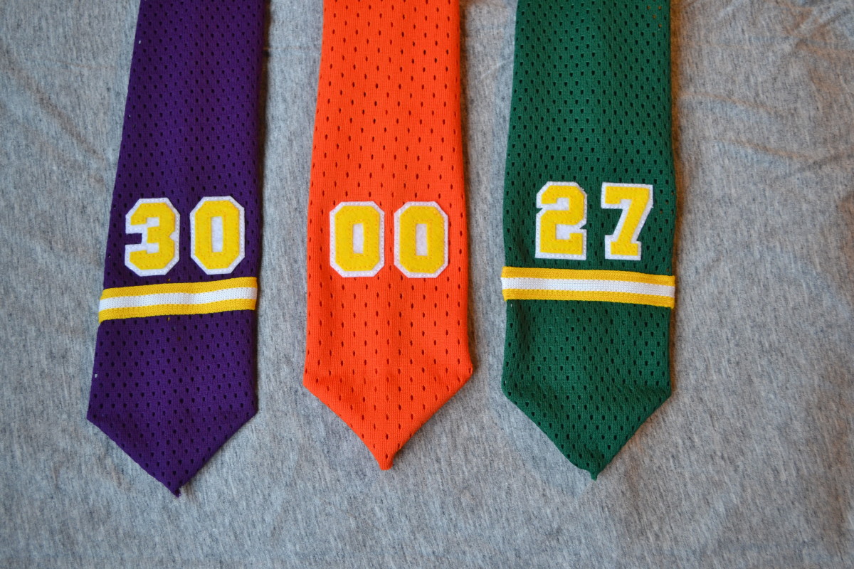
Click to enlarge
[Editor’s Note: Today we have an absolutely spectacular DIY project from a reader who prefers to remain nameless. Enjoy — PL]
By Anonymous
I do a lot of jersey-related projects, and I’m often left with small, narrow scraps of mesh fabric. I hate throwing materials away and prefer to find a way to use them. After looking at these scraps, I decided to create some neckties.
The 1970s were my favorite era for jerseys and I’m an ex-goalie, so I decided the neckties would be based on 1970s NHL goalies (the ones shown above are for, from left to right, Rogie Vachon of the Kings, Bernie Parent of the WHA’s Philadelphia Blazers, and
Gilles Meloche of the Seals). Some get stripes, others stay plain. I wound up loving the orange/yellow color combination, and I’m now thinking this could be one of the more underrated color schemes in sports — it really looks great to me.
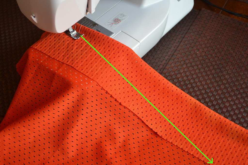
Since I was going to be referencing 1970s jerseys, at first I thought I’d make the ties super-wide, 1970s-style. But I decided to go with a more conservative width, as it’s more appropriate for weddings and job interviews (you have to think of these things).
I begin by sewing a straight but angled line to the width I want [for all these photos, you can click to enlarge]:
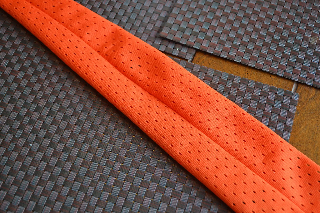
Then I turn the fabric inside-out and position the seam in the middle. This forms the traditional tapered tie shape:
At this point I (very) briefly feel like a bespoke tailor as opposed to some hack with a $59 sewing machine. I just turn up the corners at the bottom and hand-stitch them to create the point at the bottom of the tie. This is not a classic seven-fold tie design, but I figure no one will see the back anyway:

I cut the numbers from stiffened felt and then sew them onto the tie. If it’s a two-layer number, I sew the top layer to a bigger piece of the second color and then cut it out after. Stiffened felt is better than the regular stuff, as you can do sharper edges that hold up under sewing:
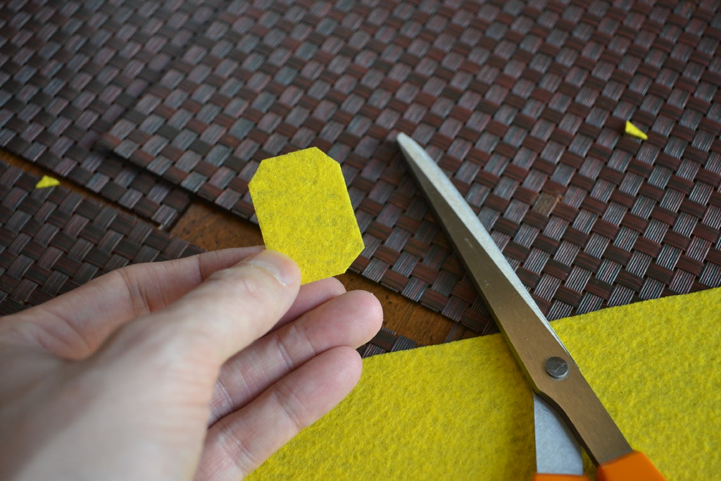
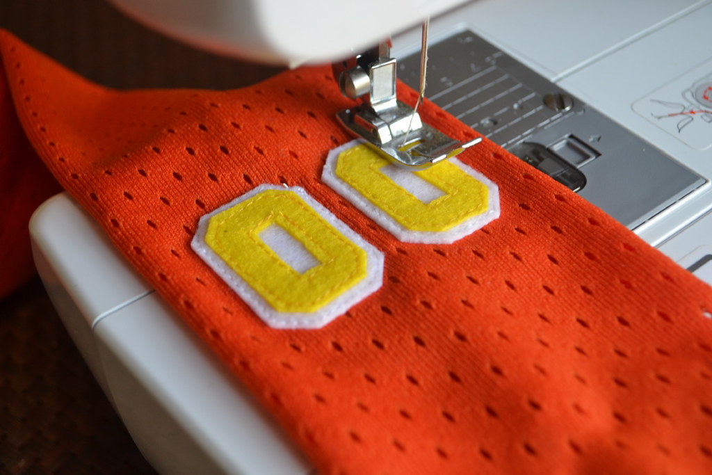
The felt look isn’t really era-appropriate for this project (it’s more appropriate for early wool hockey jerseys or flannel baseball jerseys), but I wind up using it a lot because it’s easy to find, inexpensive, comes in any color you can think of, and is easy to use. I also like the vintage look it provides, even though it may not be era-correct or even sport-correct in some cases.
If I’m adding a stripe, I use the same type of stripe/braid material you’d find on ’70s-era track suits and uniforms. I’ve been able to source it as new old stock at some sewing supply stores.
For some of the ties, I don’t have a long enough piece of mesh, so I add an extra strip of material — in this case, a strip of yellow and white striped fabric. This makes the tie more visually interesting, and nobody else has to know, since that end of the tie won’t be visible when the tie is worn:


And here we have the finished product:

Collector’s Corner
By Brinke Guthrie
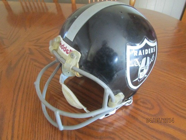
The Rayduhz have held onto their look for ages. It’s fairly obvious they’ll never change it — but what if they updated it a little? That’s the thought that came to mind when I came across this black Raiders helmet on eBay. While it’s sloppily done, it does pose an interesting question: How about an all-black helmet with the silver stripe? Toss a little of that Bucs-style chrome facemask in there and believe me when I say these would go over nicely in the 510.
A lot of this week’s other picks are helmet-related, too. Why? Just sorta happened that way. Let’s take a look:
• Going across the bay, here’s a Niners mini-helmet with the Candlestick final-season logo on one side.
• Can’t the Giants use this as a throwback helmet? Swap the logo and stripe, no repainting needed!
• This vintage L.A. Rams helmet plaque is in great shape.
• Check this out: a six-pack of the definitive 1960s NFL helmet plaque look. Simply gets no cooler or retro than this.
• Here’s a helmet of another kind — a set of 600 MLB ice cream batting helmets!
• Okay, enough helmets. Get a set of seven 1970 Vikings portraits by Nick Volpe right here.
• I remember trading these in my 1970-71 class at Orville J. Stivers Elementary in Louisville: the complete set of Volpe’s Kentucky Colonels Pro Star Portraits. I always wondered who Bobby Croft was. I felt bad for the guys who never played.
• Here’s a terrific-looking 1969 NFL/Chiquita transistor radio! Listing doesn’t say if it works, though!
• Learn all about “Exciting Plays and Formations” with this 1977 NFL Action Teammate Playbook.
• The cartoon cub on this early-1970s Chicago Cubs pennant looks a bit like their recently introduced (and widely disparaged) mascot, does it not?
• And here’s a Jacksonville Jaguars beverage glass with the original/banned logo, priced to move.
Seen something on eBay or Etsy that you think would make good Collector’s Corner fodder? Send your submissions here.
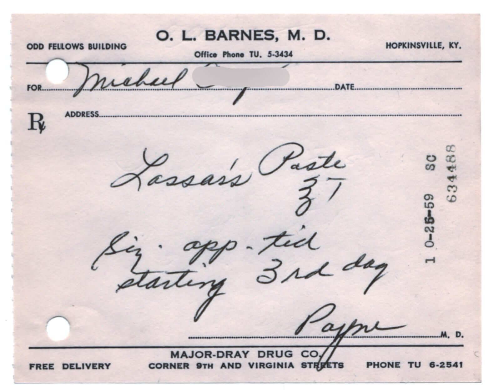
PermaRec update: The latest vintage ephemera that’s caught my eye: old prescriptions (like the one shown at right). Read about them in the latest entry on Permanent Record.
Tick-Tock: Today’s Ticker was compiled and written by Garrett McGrath.

Baseball News: Oh no, Papi! President Obama is considering a ban on selfies with White House guests after David Ortiz’s Samsung stunt last week. “Perhaps maybe this will be the end of all selfies,” White House Senior Adviser Dan Pfiffer said on Face the Nation. One can only hope. … Here’s as great a photo as you’re likely to see these days of two MLB players from opposing teams, both wearing striped stirrups. That’s from Sunday’s Cards/Bucs game (from Rich Strayer). … The Rochester Red Wings (AAA affiliate of the Minnesota Twins) debuted their 2014 white home uniforms on Sunday, replacing the black home jerseys they’ve been using on and off since 1997 (from Paul Bielewicz). … Clemson wore camo jerseys and hats during their game last night (thanks, Phil). … Our Notre Dame expert Warren Junium sent in what the Fighting Irish were suppose to wear at their rained out Saturday game.

Football News: Not confirmed: One Reddit user is claiming to know what the 2015 Cleveland Browns uniform will look like (thanks, Phil and Matt Masuga). ”¦ Miami is hinting at a BFBS move. … “Here is the story behind the picture you showed of Troy Akman’s jersey with the 75th anniversary patch on Sunday,” says John Hoyle. “Troy had the patch lowered because he likes to grab his jersey there and wipe his face. The patch was scratchy so he had it lowered. The league noticed he had moved it and made him return it to its proper place.” … Not to be outdone by teammate RG3, Kirk Cousins told a reporter about his logo. “I can’t say I’m a big Royals fan, but I’ve always kind of stockpiled Kansas City gear, just because it’s my initials and I think it’s a simple logo. It’s fun to wear every now and then, and I’ve got a receding hairline, so I like to hide it.” (from Yusuke Toyoda) … San Diego State University will be test-driving the new SpeedFlex helmets, and Alabama wore SpeedFlex helmets at their spring practice.

Soccer News: The Tampa Bay Rowdies of the NASL unveiled their 2014 kits. … Liverpool will wear a patch for the 25th Anniversary of the Hillsborough tragedy for their final three home matches. … In England’s third tier, Tranmere Rovers were forced to play in Colchester’s away kit after the referee thought Tranmere’s sky blue away shirts clashed with Colchester’s royal blue (both from Yusuke Toyoda). … The rest from Trevor Williams: Sneak peak at the Burkinao Faso 2014 home kit. … Puma also redesigned the 2014 home kit for Gabon. … Chelsea unveiled a new red goalie kit that Petr Cech and/or Thibault Courtois will wear next season. … Atlético Huracán released their alternative kit for 2014.

College Hoops News: Here is a look at championship shirt designs that were created for UConn and Kentucky. Congratulations to UConn (thanks, Mike Chamernik).

Grab Bag: The developer of the Barclays Center in Brooklyn is going to coat the arena’s dome with a green roof. The rendering looks pretty interesting. … NASCAR news: Stewart-Haas cars added a decal honoring the Fort Hood victims (thanks, Phil). … Here’s an article and visuals of the drug tax stamp designs from the 20 states that attempt to collect money on the illicit transactions (from Joseph Andersen). … The killer vehicles of James Bond are on display at London’s Film Museum. … Last two from Brinke: 23 urban hacks made from New York City trash, and photos of NYC storefronts taken 10 years apart really show gentrification at an alarming rate.
Notre Dame bringing it with their baseball uniforms. Love the socks.
It would have been nice seeing them lose in those unis. Sadly FSU had to settle for the double header (and series) sweep on Sunday.
Great uniform, but that top I of the vertical-IRISH kinda gets lost when the jersey folds over. I keep seeing “RISH” when I look at that pic.
Maybe they are all paying tribute to girl named Trish.
I had UConn winning the whole thing, so I think I might have won the brackets. Go UConn!
dang i post that Browns story in the comments yesterday, but Phil and Matt get the credit… :(
Only one of the NYC photos stuck me as even remotely alarming. Shame about the deli. But otherwise, we have two small businesses in sectors that are dying regardless of gentrification, one of which is replaced by another local small business, and two abandoned or vacant storefronts. Even a Subway (ugh) is preferable to a vacant storefront.
Yeah, I almost took that out of the Ticker (Garrett compiled today’s Ticker, but I reviewed it before posting it), but I decided to leave it in because some of the photos are so nice.
The real story is that NYC is always changing — *always.* It reinvents itself much faster than most other cities, because there’s such a rampant real estate speculation scene here (and because every mayor since Koch has changed zoning laws to make things more developer-friendly). Pick your chosen “good old days” era of NYC, and you can bet that that era simply displaced the previous one. If there’s one thing I’ve learned from living here, it’s that you have to enjoy things while you can, because expecting them to stick around is a sucker’s game.
I’m glad you left it in the Ticker – great photos, and a powerful meditation on change and the urban landscape. I just don’t see much by way of a commentary on gentrification in these particular photos is all. That thing that makes a decrepit stocking shop not exist ten years later? That’s not yuppies, it’s time. Even so, and even when change is generally positive, there’s a tragic aspect to it. That store was someone’s livelihood, and at one time there must have been customers who relied on it, and so it was a little anchor for part of its community, and even if its time had passed and its closure inevitable or even virtuous, it still inspires a pang of grief.
A pharmacy or a lingerie shop or a butcher replaced by a cupcake shop or a boutique, whatever. Like Paul says, New York is never not changing, and that’s part of the city’s character.
But when a small, independent business is replaced by a Chase or a Subway, that’s when I get sad. Because part of what made New York special was the specialists, that guy who did stuff that you couldn’t get outside the city, whether it’s a cheese importer or someone who sold 10,000 kinds of buttons, you knew a place that you had to come into the city for. And to see that replaced by a chain that you can find in any suburb is a loss for everyone, I think.
arrScott & terriblehuman, perfectly stated.
What saddens me is the disappeance of that great sinage.
What you’ve said is pretty accurate (contrary to Scott’s point at the top of this thread, a Subway is NOT better than an empty lot), but there are so many additional factors to consider. For example:
– The internet has changed shopping. There are still specialty shops that carry 10,000 buttons, but there are also websites that carry 10,000 buttons. I’m not saying one is better or worse; I’m saying it’s unrealistic to expect the retail (or wholesale) economy of past generations to persist without changes in the internet age.
– There are still plenty of artisan/craft specialists — but now they’re more likely to be college-educated people who are refugees from the creative and/or professional classes (i.e., the guy with the pickle operation or the brewery or whatever), not blue-collar/immigrant artisans of past generations. People like to label this “hipsterism,” but it’s really a migration of work-with-your-hands crafts from the working class to the professional/creative class, which tends to have access to more capital (whether from investors or from their parents) and can therefore better afford today’s high urban overheads (rent, insurance, etc.).
Agreed.
And I love the constantly-changing nature of the city, but I’m still bummed out every time I see a photo of 315 Bowery. I cycle past it every morning, and with the changing storefront have almost forgotten that CGCB was ever there.
The other one that really stings is just up the block, the NW corner of Bowery and Bond. It used to be the link (home of the Cocteau Rep) and is now home to link.
At least those two aren’t Subways today.
People like to label this “hipsterism,” but it’s really a migration of work-with-your-hands crafts from the working class to the professional/creative class, which tends to have access to more capital…
Very well stated.
You’re right, Paul, and my “sad” reaction is exactly that – completely emotional. And I agree about how the artisanal/craft business has changed-I have zero problem with a cupcake shop or a fancy cheese purveyor taking up those storefronts. They’re still providing unique products and services.
It’s the sameness that bugs me the most – the world doesn’t need more Chase branches or combination Pizza Hut/Taco Bells.
I L-O-V-E LOVE “then and now” photos!! Even of places I’ve never been (like NYC).
In one of last week’s posts, there was a link to an Atlanta history website with a great (and slightly depressing) then & now album
The “before” photos come from link where you can enjoy them without the killjoy nature of seeing the current Google Street View next to them.
The NYC photos may be my favorite link I’ve ever clicked in the history of this site. I could study “then and now” photos forever and not get bored.
Do I love Wrigley Field because of this, or am I like this because of Wrigley Field?
I’m with most everyone here… thanks for keeping that link in there! I obviously come here for sports uniform discussion… but those finds you (and the interns) toss into the grab bag make this site extra-special.
Those neckties, wow! They would make an amazing present from a coach to his players. I could even see Joe Maddon issuing them to his Rays players to wear (in powder blue, with those awesome plaid jackets) on road trips. I want one!
Those ties are among my favorite DIY projects here, ever. Awesome stuff. Advice to the nameless necktier: If material is short, try making a bowtie!
As for Maddon, the Rays should have either plaid ties to match the cap, or cotton with stripes to match the Rays stirrups,
These are dynamite! Since the taleneted Mr. Anonymous seems disinclined to make these available, perhaps some enterprising soul with the requisite skills could be persuaded to do some custom work . . .
If Mr. Anonymous (or anyone else for that matter) was willing to do some custom work, I’d buy 2 right off the bat :) – assuming a reasonable price, of course.
Amazing work! I’m lovin’ his choice of 70’s teams/goalies as well! Of course being a Seals fan I’m drooling over that Meloche tie. Might be incentive for me to actually wear a tie!
-Jet
Yeah, the Seals tie is a beaut. I’d like to see a Billy Smith Islanders tie!
Yankee Stadium — following in the footsteps of the Washington Nationals? link
Nah, the Yankees are just taking a link and updating it for the 21st Century. Like New New Yankee Stadium…
Tampa Bay Rowdies are in the NASL.
Thanks. Fixed.
What happened to the Hockey ticker? Did Bristol kill it?
Hasn’t been any hockey news.
Oh, come on Paul. Let the conspiracy theorists have some fun for once.
To borrow a quote Chris Smith at Icethetics: “It’s playoff time and teams aren’t really thinking about jerseys – or next season, for that matter.”
F.C. Porto, one of the top football clubs in Portugal did a little stunt the other day: players under 25 wore jerseys with a different sponsor, to reflect the brand’s younger demographic. The link is in portuguese, but it’s nothing google can’t fix… link
my fave team! it would be nice if the Big three could have different sponsors, though, go back to the days where revigres was on porto’s shirt.
I cannot think of a team more ill fitted to the modern era of logos/apparel/unis than the Cleveland Browns. They team doesn’t have a logo (sorry but a picture of your helmet doesn’t count.) Between that and Wahoo Cleveland has gotten the short end of the uni/logo stick.
Is there a reason they can’t have the brownie or a bulldog or something to represent the team? Maybe start there and then tweak the rest of the unis?
I have had this full-size Cubs pennant since c. 1969. It has virtually the same cub on it. Interesting how it has a trademark indicator by the cub, but NOT by the Cubs logo.
link
Here is a mockup of the Browns uniform based off the description the reddit user gave.
link
this was his feed back
—]trash432a [-1] 6 points 10 hours ago (7|1)
The helmet is almost identical, only thing missing is the barely visible pattern in the stripe.
The jersey is sort of close, but the stripes are much wider and the numbers are completely different.
The pants stripe needs to be lower.
You nailed the shade of orange.
Oranges Poranges!!
link
I think this might be a good time to point out that the Browns uniform is more than a year away from being unveiled.
Whatever state of development it’s in now, it is likely to change at least somewhat by next year’s draft, which is when it’s due to be revealed.
i know but this is a mock up of the design the user claims is the front runner at the moment
Right, but “the front-runner at the moment” doesn’t mean much when the moment in question is still a year out from the unveiling.
“Front-runner at the moment” doesn’t mean much anytime. Still, while almost nothing about this mock-up reflects anything I would do if I ran the Browns, I have to say I’m surprised by how restrained it seems to me, relative to what we know Nike prefers to do when given a freer hand.
Also, the source’s claim about the numbers hints at a highly distinctive custom number font, which rings true. If the 2016 Browns take the field with legible numbers that fans and TV viewers can read, Nike will have failed.
“If the 2016 Browns take the field with legible numbers that fans and TV viewers can read, Nike will have failed.”
~~~
I disagree. The Seahawks numbers are easily readable. Probably from space. The Dolfish numbers are also quite readable.
I don’t think Nike necessarily strives for unreadable numbers…just completely new fonts. Not that everyone needs Varsity Block, but I don’t think there’s a need to reinvent the
wheelnumeral every time a new uni gets introduced.Where they fail is in their attempts to create something that’s so unique (and fits in with whatever idiotic “team” motif they’re going for — like the Viking Sail numerals on the Minnesota team) oftentime fail because the numbers should NOT follow whatever printed font they think works.
I give them credit for trying to invent a new typeface for every team they tackle (pun semi-intended). But they fail miserably when they don’t recognize that in many cases (see: Alarm Clock Bucs), it’s just. plain. stupid.
According to the owner jimmy Haslam, the Browns helmet will not change, so that mock up is faulted.
Reading the original thread, the OP says that the front office is picking the final design this week.
Looking at that, I can only think of Keith Olbermann saying “GUH!”
Personally, I think the Browns have one of the best looking uniforms in all of sports. Simple and classy, plus they use the color brown, which you don’t see much of in sports. It’s a shame they could be ditching all that.
In the reddit thread, someone said NFL teams can’t use brown because of it camouflaging the ball. The Browns are grandfathered in. So any new design changes cannot use brown as a primary color. Any word on the validity of that?
I have never heard that.
Not saying it’s wrong, but it’d be news to me.
The leather that makes up “The Duke” is a much lighter a shade of brown than Cleveland’s “seal brown” anyway, isn’t it?
If there’s an advantage to wearing brown jerseys, Cleveland sure as heck hasn’t figured it out.
If there’s an advantage to wearing brown jerseys, Cleveland sure as heck hasn’t figured it out.
QoTD right there. (For Browns fans like myself, make that QoOL (Quote of Our Lifetimes.)
Obvious solution: Pink balls. Or camo balls, which would stand out against either the green field or a brown jersey, since the surface of neither looks anything like military camo.
Or, considering that it’s the Browns, go totally old-school, by which I mean their AAFC glory days:
link
link
Can’t use pink balls. There is an entire month when both teams are loaded up with pink gear.
They need to work this guy onto the uniform:
link
How about a shoulder patch on each side? :)
Sigh… why can’t every MLB game look like that one great stirruped snapshot from the Cards-Bucs game??
-Jet
I do have a couple of gripes with the photo though. For one thing, Daniel Descalso needs to blouse his cuffs. Having the elastic showing looks really sloppy. Second, between the two of them it actually looks like they’re cuffed too high. Cuffing above the calf and more into the back of the knee makes the profile of the lower leg look kind of strange and crucially it messes with the proportions of the stripes on the stirrups. As you can see there is far too much of the yellow showing on Neil Walker’s right leg.
For comparison, Roberto Clemente demonstrating perfect blousing and cuff height: link
To Pedro: It looks like it was Portugal Telecom stunt. Benfica also had players under 25yo wear ‘Moche’, while everyone else wore ‘meo’.
yeah, as I said above, would be nice if the big 3 could have different sponsors, there’s a weird corporate blandness to have the major teams have the same sponsor
That Raiders helmet is pretty shabby, but that facemask is somewhat hard to find (at least without paying a pretty penny).
There are lots of good concept helmets on eBay at any given time. A lot of them are done so well, that they look mass produced.
Does Pittsburgh still use the pirate head as a secondary logo? Or have they not updated the logo on their bases? Because the pirate head logo is clearly on second base in the lovely photo from Sunday’s game.
It’s been a year, but still. Every day, I check the MLB schedule. My first thought is usually surprise that the Astros are playing an AL opponent. My second thought, after doing a little mental “D’oh!” re the Astros, is surprise that there’s also a single other interleague game going on.
C’mon, MLB, grow a pair! Of teams, I mean, so that we can have two 16-team leagues that play each other much less frequently. Also, two more nicknames, logos, and uniforms!
That is almost a daily gripe of mine too! There has to be at least two markets in N.A. that can support an MLB team, and getting back to an even number of teams in each league would be priceless.
. . . but then would they want to go to four divisions per league? The ostensible reason for the current mess is to have the same number of teams in each division.
Four Divisions (each winner advances) with two wildcard teams who play in a one off (winner plays team with best record in Div. Series) would work.
AL East
– BOS
– NYY
– TOR
– BAL
AL Central
– HOU
– TEX
– KC
– MIN
AL North
– CHI
– DET
– CLE
– MIL
AL West
– SEA
– PDX
– OAK
– LAA
NL East
– NYM
– PHI
– WAS
– PIT
NL Central
– COL
– STL
– CHI
– CIN
NL South
– ATL
– CHA
– MIA
– TB
NL West
– SF
– LAD
– SD
– ARI
Now all we need are two owner, two new stadiums, a couple billion dollars and the consent of the owners! Easy peasy….
Better yet: Two leagues, four divisions per league, no wild card. If you can’t finish ahead of thee other teams, you don’t go to the playoffs. Period. LDS goes to 7 games. Season drops back to 150-something if necessary, though it shouldn’t be.
That, or stay at 30 teams but split into 3 leagues with two five-team divisions each. The playoff math on that is surprisingly easy, and that structure would accommodate interleague play much more sensibly than the current two-league legacy structure. I mean, look, I’m against radical change in principle, but if practice is going to change radically (as it has), then the formalities need to be changed to reflect the reality of practice.
Mike – Milwaukee will NEVER give up the Cub money that flows northward….that’s why they insisted they be in the NL.
So the Yankees don’t ever play within 1000 miles of Florida? FL and TB in the same division? They’re lucky if they get 10,000 per game when they play each other.
Swap out MIL for COL and they can continue to ride the Cubs gravy train! COL in the AL is awkward, but nothing is really sacred anymore.
Yeah, two FL teams are not ideal attendance wise, but the Rays presumably get nice TV numbers. And as for the NYY not being in FLA… Anyone have an idea? :)
Nashville and Portland would be ideal
I could see Nashville, but Portland? Great support for the Timbers there, but it just doesn’t strike me as a baseball town. I’d suggest Indy, Okie, Nawlins or Charlotte ahead of Portland and that’s not even including the several various non-US NAFTA markets that could work. Viva Guadalajara!
I considered Charlotte, too…but if the other team was in Nashville, it could lead to over saturation on the East Coast. Tulsa, Indy or Vegas would be better options IMO
I assumed PDX and Charlotte. A second team in the South would be great. Montreal/Mexico City would be intriguing as well. Oh to dream with other people’s money…
2 new teams would make sense, but I don’t know any cities where you could practically put a team that would be successful. Any ideas?
Regarding the Clemson/NC State game last night – I saw highlights on SportsCenter and there was at least one NC State player wearing some nice stirrups.
link
I agree arrScott, it’s time for MLB to expand to 32 teams. Interleague everyday got old quick and needs to go.
Vancouver, Montreal, Havana…
Los Misiles de Cuba! I will die a happy man if a team named the Cuban Missiles ever joins MLB.
Throwback day between the Cuban Missles & the Houston Colt .45s would be something to see.
And just imagine the coverage Fox New would give to every match-up between the Yankees & the Cubans.
This has uni-gloriousness & PR amazingness written all over it.
Where does the Tennessee picture come into play in relation to the new Browns uniforms? My first instinct is to throw the BS flag on that because Tennessee is an Adidas school and you can clearly see the Adidas logo on the picture. With that said, was the original poster the one that made that link, or was it somebody else?
Jim Haslam, the owner of the Browns, is a big Tennessee booster I believe.
I read the Reddit thread in question, and a lot of folks seem to think Haslam is pushing orange as the main color because of, well, his love for the Vols. I’m a ‘Bama fan, so don’t ask me how somebody could love the color orange that much, but I guess the theory is valid.
I am sure I am not alone when I say I would buy one of those hockey jersey ties today, right now, just let me know where to send the cash.
Pretty disappointing that Nike didn’t come up with separate slogans for UConn or Kentucky based on who won. Basically it becomes a generic slogan for the winner, and it doesn’t matter who wins. Either the photo shouldn’t have been leaked or there should have been separate slogans.
Ditto for NASCAR races that shoot off fireworks to celebrate the winner. Unless there is some specific “thing” about the fireworks show custom created to each winner, it simply becomes a generic fireworks show to celebrate the winner, whoever it is. Yay for you driver, you won! Yay for you basketball team, you won!
If the Browns ditch Brown, I will be extremely disappointed. As a DIE HARD Browns fan, I want them to leave the uniform unchanged, if anything, I’d accept something like this ( which i believe has been on this site before)
link
This is an argument the Browns forfeited the moment they opted for orange helmets. If the team logo is the helmet, and the helmet isn’t brown, then the color brown cannot possibly be claimed to be a core part of the team’s identity. The mock-up linked above has the virtue of being honest about the fact that the Browns are an orange team.
Re: The orange and yellow tie. To the best of my knowledge, never been used as a pure colour combination in the Big 4. Not that it hasn’t been used, but always comes with other colours – in the case of the Houston Astros, many shades of orange red and yellow.
But – I’ve actually seen used on a rec hockey girl’s league team. If you put up with overt garishness, it really stands out.
Bernie Parent – WHA’s Philly Blazers. He wore #00.
somebody didn’t read today’s lede very closely . But I don’t blame you, Endive. It was pretty well buried aaaaaaaaaaaaaaaaalllllllllll the way down there in the second paragraph.
I don’t believe Miami will actually be releasing BFBS uniforms. Many fans have requested the team return back to black cleats/socks, as they wore during many of their later glory years. The two teasers that have been released by the Canes have everything blurred out, except for the black shoes/socks : link
Montreal and San Antonio could be possible future homes to MLB. Mark Cuban wants in as an owner, unfortunately he’s not part of Selig’s club.
Thankfully Selig is on his farewell tour this season. Deuces Bud!
Is there a reason that the Pirates could not have made their stirrups accurate to what was worn in the 70’s? I was talking to my wife that I googled custom stirrups the other day before Sunday’s game about trying to replicate the 70’s look and what they had was about as close as I could get as well. I was excited to see them from the grandstands on Sunday but could tell that they included an extra white stripe. Are the manufacturers not willing to duplicate that template or did the Bucs just not insist upon it?
link.
Were those socks actually stirrups? Somebody on the Creamer board said something about them being all in one socks.
If you’re referring to the Cards/Pirates photo, both players are wearing real stirrups.
Those ties are sweet. There’s a new startup business if I ever saw one.
The Pirates and Cardinals stirrups are awesome. More MLB!!
link
Ignore that. Here is the proper link:
link
link
Re: Tampa Bay Rowdies new kits… Being an old Rowdies fan, while I appreciate the attempt at connecting to the past (striped sleeves; same wordmark logo used as a “crest”) it comes across as just so half-assed. Nothing will ever match the old 1970s early 80s collared jersey with the wordmark logo centered right above the jersey number (as Phil said, the old Rodney Marsh look). Go all in or don’t go in at all.
Inspired by today’s anonymous ascot assembler, I think I’ve finally found my million-dollar idea: Jersey ties. That is, a tie that reproduces as exactly as possible a tie-shaped slice of the center of the front of a team’s jersey. Not a tie that is inspired by or pays tribute to a team’s jersey – like today’s exceedingly excellent DIY – but a tie that, if an athlete wearing his jersey put on the tie, you couldn’t tell the tie was there. To wit:
link
The Habs one looks great. I’d wear that! But some versions for baseball teams (looking at teams with chest logos like the Yankees and Tigers, instead of wordmarks) would be horribly boring.
anyone else have a “Sonobi” add covering the entry title and left side of the lead picture? Seems to be a formatting error. I use chrome.
here’s the url :link
Didn’t even notice that someone else posted on it when I came across it a few minutes ago and made a screencap, which I posted below.
And, incidentally, I’m also on Chrome, but I didn’t experience that issue earlier today (also viewing in Chrome).
It’s creepin’ on my phone
So during the ceremony for the 40th anniversary of Hank Aaron’s 715th homerun, the other 3 professional sports teams and all metro-Atlanta colleges and uga, unveiled uniforms with his #44 and his name on the back.
All the colleges did this with their respective baseball jerseys, but uga used a football jersey…
Here are the teams in order in which they were unveiled.
Atlanta Falcons
Atlanta Hawks
Atlanta Dream
uga
Georgia Tech
Georgia State
Kennesaw State
Emory
Morehouse College (HBC)
Clarke-Atlanta University (HBC)
Braves wearing their 70’s era unis tonight to honor the 40th anniversary of Hank’s 715th home run.
Makes me wish I was able to get in that game; instead, I’ve got the monstrosities that are the Buffalo Sabres’ thirds against my Red Wings.
Paul, I’m starting to get an ad encroaching into the content of the site:
link
Oddly enough, since enabling AdBlock on this site and then re-disabling it, that annoying ad has gone away and been replaced with a correctly-formatted ad.
The neckties……………simply AWESOME!!!!
Hello there, I found your web site by means of Google even as searching for a comparable topic, your site got here up, it looks great. I have added to favourites|added to my bookmarks.