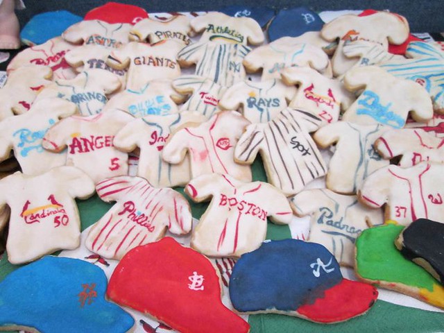
Yesterday was Opening Day — the real Opening Day — which among other things meant that longtime Uni Watch reader/baker Elena Elms upheld her annual tradition of making baseball-themed cookies for her office. I can think of no better harbinger of spring that that!
Here’s a roundup of uni-notable happenings from each one of yesterday’s games:
• Cubs/Pirates: Lots of uni-related interest here, as the Cubs wore their new gray alts and the Pirates wore their black softball tops. Terrible move by the Buccos — that’s no way to open the season in your home park. As for the Cubbies, the front uni numbers on that jersey sure look small, no? Additional photos here.
Also of note: Prior to the game, Pirates outfielder Andrew McCutchen received his MVP and Silver Slugger trophies.
• Phillies/Rangers: The Phillies debuted a “CB” memorial patch for former owner Claire Betz. (This was apparently announced last Thursday, but I missed it — mea culpa.) At first I thought the lettering on the patch was gray, not white, but then I saw this shot, in which the lettering does indeed appear to be white. Interesting that the Phils keep using the over-the-heart placement, which I believe they’ve done for all their memorial patches since the Harry Kalas patch in 2009. They’ve kinda painted themselves into a corner — if they ever wear a memorial patch on the sleeve, instead of on the chest, it’ll be viewed as a lesser honor, a lower status. (Update: Turns out they used a sleeve patch for Robin Roberts in 2010, so I stand corrected on that.)
Meanwhile, the Rangers are another team that doesn’t know how to dress on Opening Day. That shot does provide a good view of their red jersey’s new non-beveled lettering, however. Also, in recent weeks I had reported that longtime double-flapper Shin-Soo Choo had been experimenting with single-flapped helmets, but he was back to his familiar double-flapped style yesterday. (Also note that, as a doube-flapper, Choo is allowed to keep wearing the CoolFlo helmet, while single-flappers are all required to wear the S100 Pro Comp. Choo’s fellow double-flapper Bryan Peña, now with the Reds, was also wearing a CoolFlo yesterday.)
• Royals/Tigers: It was a little chilly in Detroit, so several Royals wore ski caps for pregame warm-ups. Meanwhile, the Tigers unveiled their division championship banner just prior to the game. (As an aside, looks like the Royals have nary a high-cuffer on the roster.)
• Braves/Brewers: Milwaukee wore white but Atlanta wore blue (and what was Carlos Gomez wearing on his wrist in that photo?). This game also provided our first in-game look at Atlanta’s Hank Aaron home run patch. And as I suggested last week, Jason Heyward wore his facemask into a second consecutive season.
• Nats/Mets: Mets reliever Jose Valverde was wearing blue/orange camouflage undersleeves during pregame introductions. I was wondering if he’d try to wear those in the game, and if he’d be allowed to do so (remember, the umps wouldn’t let pitchers wear the old Nike-pox sleeves back in 2006). When he entered the game in the bottom of the 7th, he was bare-armed — hmmm, had he been told to remove the sleeves? A little photo research reveals that he almost always pitches bare-armed, so I suspect the camo sleeves were just a pregame thing.
• Red Sox/Orioles: We finally got to see the Orioles’ memorial patch for former team part-owner Tom Clancy, which had been announced last week but wasn’t shown until yesterday. Wow, they really knocked themselves out on that one, eh? We also got our first in-game look at Boston’s new road uni, which is pretty much the same as what they wore from 1990 through 2008. Looked terrific then, looks terrific now.
• Jays/Rays: Tampa wore white but Toronto wore blue. Also, Rays reliever Heath Bell appeared to have a really oversized cap during pregame introductions.
• Twins/White Sox: Chicago wore white pins but Minnesota wore navy.
• Cardinals/Reds: Now that’s how Opening Day’s supposed to look.
• Rockies/Marlins: Probably the most garish Opening Day in MLB history — here, see for yourself. Hey, if you’re gonna flout tradition, why not go all the way? Such an epic eyesore for the ages that it kinda achieves “so bad it’s good” status, or at least earns a bemused chuckle. Bonus points for Giancarlo Stanton, who added a blue arm sleeve into the mix.
• Mariners/Angels: Nothing unusual here — home team in white, road team in gray. Shocker! (One side note: At one point Albert Pujols pulled up a pant leg and revealed that he uses an EvoShield elbow guard on his shin.)
• Giants/Diamondbacks: Egad, yet another case of the home team in white and the road team in gray. What a concept.
• Indians/A’s: Oakland wore gold and Cleveland wore gray.
So out of yesterday’s 13 home teams, nine of them wore white (and among the four outliers, we’ll give a mulligan to Oakland, since they’ve been existing in their own aesthetic universe for nearly half a century now). Similarly, nine of the 13 road teams wore gray. But because of the way those teams were spread out in the various games, only six of the 13 games were white vs. gray. Not quite how I would’ve drawn it up
But it could’ve been worse. And hey, it’s baseball season! That makes everything better — even baseball.
(My thanks to all contributors, including Brandon Creeger, Andrew Domingo, Derek Furuichi, Jeff Lantz, and of course Phil.)
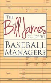
New book deal: Just in time for the start of the MLB season, our friends at Diversion Books have another exclusive offer for Uni Watch readers: The Bill James Guide to Baseball Managers, which is the definitive text on MLB skippers. It’s a great book (I first read it about 10 years ago), and as of right now Uni Watch is the only place you can get it. Even better, Uni Watch readers can now download the e-version for only $2.99 — that’s 50% off the price at which the book will eventually be offered elsewhere.
Meanwhile, the e-version of Mike Shropshire’s hilarious Seasons in Hell is still available for only $1.99. Quite a few of you got in touch to say how much you liked that deal, and I hope you’ll dig this new Bill James offer as well. If sales are good, Diversion will continue to make these discounted downloads available exclusively to Uni Watch readers, so you know what to do.
Collector’s Corner
By Brinke Guthrie
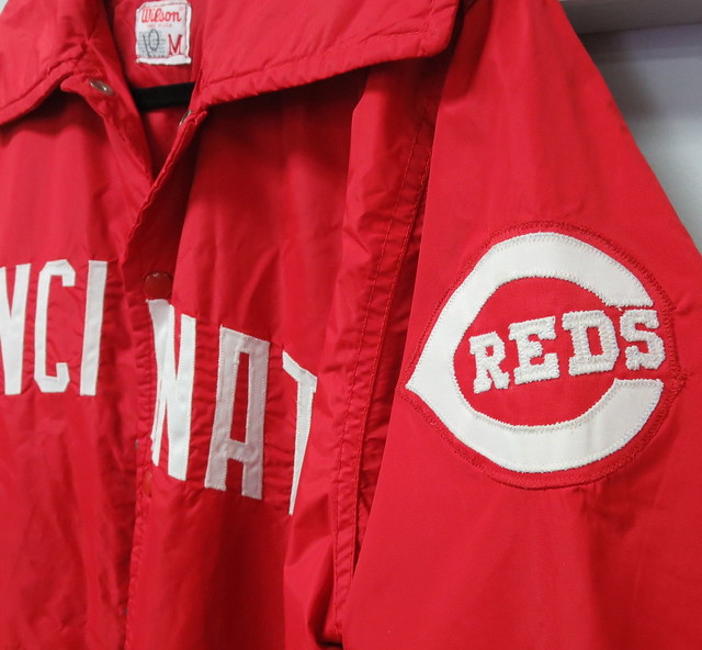
Opening Week in MLB, so we’re loaded with baseball today, beginning with this Reds jacket that, according to the seller was worn by Sparky Anderson. I’ll never forget coming back to my Miami U. dorm in November of 1978 and seeing the news on TV about Dick Wagner firing Spark.
But let’s not belabor such unpleasantness — it’s the start of the baseball season! Here are some items to get you in the mood:
• This 1940s-1950s Red Sox pennant still has some life left in it!
• Here’s a 1970s-1980s KC Royals three-quarter-sleeve henley from Champion. Would you judge the Royals logo to be a classic? It’s never changed, and I’ve always thought it’s a perfectly balanced look.
• These Russell Athletic turtlenecks are outstanding quality. I had a Reds one.
• Let’s check out these great 1971 posters for the Angels, Dodgers, and Giants.
• Mets stuff: a classic-looking bobblehead and a press pass, both from the 1960s.
• Had this Texas Rangers sticker! Always liked how they put the little sheriff’s badge at the bottom of the “R” in Rangers.
• Uni Watch’s recent entry about old Cubs and Cardinals scorecards reminded me of this Cubs cover. I remember going to a Wrigley game that year and buying this Braves helmet, strictly because I liked the look. (I bought a Padres cap for the same reason.) A Reds fan at a Cubs game wearing a Braves helmet!
• Why don’t they make stuff like The Great NFL Fun Book anymore? Because the NFL is all Nike-corporate now, blah-blah-blah, that’s why. Seriously, this book looks like ten tons of fun, with a section devoted to all 28 teams helmets and uniforms, no less. Dirt cheap, too — what are you waiting for?
• A St. Louis (Football) Cardinals Action Puppet — really?
• This 1970s Sears Atlanta Falcons helmet plaque looks to be in excellent condition.
• Gadzooks, this is a great San Francisco 49ers DeLong varsity jacket.
• From reader Bruce Menard, check out this All-Madden Team BBQ set!
Seen something on eBay or Etsy that you think would make good Collector’s Corner fodder? Send your submissions here.
Unmasking the Commenters: I recently invited the site’s commenters to tell us a bit more about themselves and give us a peek at what they look like, just because I thought it would be fun to pull back the internet’s curtain of anonymity. I’ll keep showcasing you folks as long as you keep sending in your photos and quick bios.
Today’s commenter is David G. Firestone, who generally comments under his own name (and has also guest-written some entries):
I live in Evanston, Illinois, where I write The Driver Suit Blog and Vintage Item Spotlight and produce Introduction to Sports Memorabilia. When I am not obsessing over uniforms and auto racing, I can be found playing with my cat, Alejandro, and my dog, Lucy. In addition to sports stuff, I also collect pens used by Presidents to sign bills, Beavis and Butt-head animation cels, and things that interest me.
Thanks, David. I appreciate your contributions to the site. You help make Uni Watch a better place!
Do you want to be featured in “Unmasking the Commenters”? If so, send me a photo and a quick paragraph about yourself. You don’t have to reveal your real name, and the photo doesn’t have to show your face, but you must include a photo to be considered. Send everything this-a-way.
Tick-Tock: Today’s Ticker was compiled and written by Garrett McGrath.

Baseball News: Very cool photo find of the elusive Padres bullpen cart (from Brady Phelps). … Popping the Question: Now you know how much it costs to propose at every MLB stadium. The Mets don’t allow proposals because they are allergic to extra revenue. … Our own Brinke Guthrie has written a piece about the Brewers’ new mascot. … The Atlanta Crackers players in this photo posed at Ponce de Leon Park in Atlanta, Georgia in 1950. They were told by the press that they taking headshots so they didn’t wear pants (from Mark Smith). … Good article and photos about the famous House of David baseball team (from Rick Whittaker). … “The box art for the DVD release of the Highway to Heaven television series has a flopped photo, so the logo on Victor French’s A’s cap is backwards,” notes Chuck Miller. ”¦ … Reprinted from yesterday’s comments: good article about MLB uniform rendering in video games (from Stephen Rains).

Football News: The new grass turf surface is ready to be installed at the new San Francisco 49ers stadium (thanks, Brinke). … Hmmm, is that a new Rams logo? (From Daniel Etna.) … The University of Akron has released a peek at their new helmets (thanks, Phil).

Soccer News: England will be wearing armor-inspired V-neck jerseys at the World Cup (thanks, Phil). The Guardian poked fun at the Nike corporate-speak (and the high prices) of the new kits (from Yusuke Toyoda). … MLS players wore black armbands in tribute to former DC United player Shawn Kuyendall, who passed away two weeks ago (also from Yusuke Toyoda). … The rest of these items are from Trevor Williams: “Arsenal switched from Nike to Puma for more money and as Gunner fans feared, Puma added superfluous streaks and stripes all over the shirt.” … To celebrate the 90-year anniversary of Atlético Paranaense, a limited-edition third Kit was released. … From Brazil, Botafogo had their third kit leaked. … From Argentina, San Lorenzo had their home kit leaked.

Grab Bag: “I was at a local watering hole Saturday night and saw this beautiful letter sweater from Sellersville-Perkasie High School in Pennsylvania, circa 1942,” says Steve Cook. Wow — what a beauty! … Legendary graphic designer Milton Glaser, creator of, among other things, the “I (Heart) NY” logo, critiqued a bunch of craft beer bottle labels (from Yusuke Toyoda). ”¦ “In early 1972 an American speedway motorcycle team toured Australia, competing against local teams,” says Graham Clayton. They sure had great uniforms! … Here’s an article on the symbolism behind the logos of most car companies (from Adam Herbst). … “I’ve seen green-on-green, and blue-on-blue before, but this is the first cricket match I’ve ever seen that is orange-on-orange,” says Richard Hunter. “That’s England vs. The Netherlands at the World Twenty20 Championships on Sunday. England normally wears either a handsome royal blue or an adidas all-red affair, but their kit for this tournament was some sort of fluorescent red that appeared orange.”
I adore the the purple-orange combination on display in the Rockies-Marlins game. The Rockies and Giants played a game like that last year too and I loved it.
I like it too, but Paul is something of a traditionalist (boy, is that an understatement) and thinks that opening day, at the very least, should be home whites and road grays.
I don’t like the idea of being restricted to only white or gray just because it’s Opening Day. I have no problem with the Blue Jays wearing royal blue tops in St. Pete or the Pirates wearing black tops at home in their 2014 debuts. I like the variety of jersey colors across MLB.
Garish, but colorful. Interesting.
What I noticed is the caption that identified each manager as ‘head coach.’ You’d think someone at espn.com would have caught those and corrected them.
Is there a link to purchase the Bill James book?
Argh — yes, now included.
Here it is:
link
Surprised at the CotD repeat.
More surprised at the link that ESPN gave Walt Weiss and Mike Redmond.
Even more surprised that Mr. Lukas doesn’t remember that link from the 70s.
The House of David article is a treat.
You know, I *thought* that was a repeat on the CotD, but I wasn’t sure. I’ll swap in another one.
To be fair, DG, Paul didn’t compile the ticker today.
Mea culpa.
Re: Carlos Gomez – Isn’t that an elbow pad? Normally don’t ballplayers hand all their armor (don’t get me started) over to the 1st base coach when reaching base?
I believe the the Carlos Gomez shot is from when he got a single yesterday, rounding first and returning to the base. Then he would have given the elbow pad (that fell down to his forearm) and his shin pad to 1B coach.
Caption reads (I didn’t read it at first glance either) he was tagged out at third. He is likely looking to left field from between 2nd and 3rd base and the act of running has caused his elbow pad to slip down (as you suggested).
At first glance, it looked like he was looking at home plate after a pitch and returning to first after a lead off.
Good work on that one. Here is what the play-by-play says
“C Gomez singled to left, C Gomez to second on error by left fielder J Upton.C Gomez out at third.”
Another opening day and another disappointment in that pajama pants were everywhere. If players just understood how lame they look that way all would be better.
I am not a fan of orange or purple so the Marlins-Rockies game really hurt my eyes.
I also noticed, as they did last year, the Cardinals wore the navy road caps and batting helmets against the Reds. I suspect the Cardinals will be wearing red road caps and helmets against teams that wear navy home caps as they did last season. In addition, though, Yadier Molina wore his same red catcher’s hockey style mask that I guess he wears every game.
Was very happy that at least 4 Mets went high-cuffed yesterday. Plus they stuck with the link. I hope Granderson’s addition leads to wright going cuffed every game.
I’m happy that the Cards didn’t mothball the navy road caps and helmets. I like seeing them wear those on the road. They did wear red undersleeves, though.
It just struck me…..
If the Cubs’ “Big C…u…b…s” logo reads as “Cubs”, why isn’t the Reds’ logo on the Sparky Anderson jacket read as “Creds”?
Just askin’.
i guess it is supposed to be read as: C. Reds
C(See)-U(You)-B-S(b.s.) is pretty much the M.O. of Cubs management.
Just a heads up: Sellersville-Perkasie High School was in Pennsylvania, not California. Sellersville and Perkasie are small boroughs in northwestern Bucks County, almost due north of Philadelphia. S-P combined with a number of other smaller school districts to form the Pennridge School District; the physical school itself is now a middle school. The Pennridge High School Rams no longer use those colors, but have instead adopted green and black (and, apparently, link on their football helmets).
Thanks — will fix.
A “peak” at the new Akron helmets? Paul, you get 10 lashes with a wet apostrophe (held upside down, of course).
“Tick-Tock: Today’s Ticker was compiled and written by Garrett McGrath.“
Still my responsibility, as I checked/edited Garrett’s copy.
OK, only 5 lashes for each of you then.
I believe that the Phillies wore a 36 Patch for Robin Roberts on the arm after the death of Harry Kalas. Ryan Howard with the 2009 HK patch link ,
and Cole Hamels with the 2010 patch link
Oooh, good one! I stand corrected.
The Rangers looked just fine.
That Rams logo has been around at least a few years. Nike uses it for their vintage collection. Link below is not the best but there are quite a few different things for sale with the retro logo.
link
That’s not a new Rams logo, it’s a throwback from the 70’s.
Jeff, your job today is to say, “What’s wrong with wearing something other than white or gray on Opening Day? That Marlins/Rockies game looked great!” Please get with the program. Thanks.
Sorry about that, I didn’t think I needed to say it every year. My bad.
Didn’t the Rams say they were going to change their throwback uniforms this year? It looks like they’re preparing for Blue and White Fauxbacks.
Happy April Fool’s Day from Chris Creamer:
link
Nice.
Shouldn’t those jerseys read “The FATHERS”?
No more than “LOS BULLS” should be “LOS TOROS”. Sigh.
To quote McBain, “that’s the joke.”
For Cinco de Mayo, they’ll be wearing “Los Fathers” jerseys
I like how they referenced April 1 with the jersey no. ’41’.
That site with the car company logo background kicks off it’s comment section with this:
“Please use the comments to demonstrate your own ignorance, unfamiliarity with empirical data and lack of respect for scientific knowledge. Be sure to create straw men and argue against things I have neither said nor implied. If you could repeat previously discredited memes or steer the conversation into irrelevant, off topic discussions, it would be appreciated. Lastly, kindly forgo all civility in your discourse . . . you are, after all, anonymous.”
That might come in handy here from time to time.
Oh..uni related… Rockies-Marlins game was ugly beyond description.
The new-old Red Sox away jersey was worn through 2008, not 2010.
Right you are. Will fix.
Speaking as a Cub fan, those new road jerseys are even more boring and pointless that I thought they’d be. The front numbers are too small; they’re using the exact same color scheme as they do with their regular-font gray road uniforms; and the new font somehow manages to be the worst of both worlds in looking very generic but not actually being a font used by other teams.
If you’re going to have an alternate, do something different. Blue pinstripes on gray; no NOB; something that sharply distinguishes it, in a good way.
I’d rather see them take the ’78 powder blue uniforms from the upcoming throwback game and just wear them all the time on the road. I can’t wait to see those in action. (Hopefully it’ll be the earlier version, which doesn’t have a NOB.)
Hopefully it’ll be the earlier version, which doesn’t have a NOB.
But then you know they’ll botch the vertical centering of the uni numbers, which is your pet peeve!
You know… these mockups of their link actually get it just right (and with nice multicolored socks too), so I’m feeling confident about it this time. I think they can replicate the link if they try. They got the slightly-different ’30s number font right too, and not too many people would have even noticed if they’d just used today’s font.
Speaking of the powder blue uniforms , my father will be wearing this on Friday because of the home opener: link
Worse than boring, they looked cheap. Seriously. They looked like some cheap knock off you would buy off a street corner. I don’t really understand how those jerseys got through a focus group.
“I’d rather see them take the ’78 powder blue uniforms from the upcoming throwback game and just wear them all the time on the road.”
You and me both.
The duds they wore yesterday were quite poor. Not quite as bad as the 95-96 set, but still startlingly bad.
At least in ’95-96 they used the right font! I don’t mind the word “CUBS” on the road — it’s been a tradition since 1909, so it’s almost as old as the nickname — but the ’90s gray roads had a litte more “oomph” with that big bold nickname.
Having been a kid in the ’80s, I like color jerseys on the road and don’t see the love for gray. But if you’re going to do dull gray, you need to add some character somewhere else. These new alternates might work if they were sleeveless vests, they brought back the two-woned road cap, and all the players went high-cuffed with red-and-blue striped socks.
As it is… these jerseys will be on the clearance racks by the end of this season. The team probably won’t even be able to get much for the game-used versions when they sell those off at the fan convention.
I guess that since the Red Sox changed their road unis this year, there was an opening for “boringest road uniform in MLB” so the Cubs jumped in to fill that void.
Why can’t anyone in the Cubs organization understand that what they need to do is shitcan the red/white numbers and make them blue/red (like on the home unis) and also scrap the white outline on the blue lettering and make it red? Do that and you’ve got yourself a good road uniform.
>>those new road jerseys are even more boring and pointless that I thought they’d be.
Kinda like the Cubs, no?
Nah; having watched the 2012 and 2013 teams, we knew in advance what to expect.
holy crap do I wish Star Wars, Ugly Sweater & other promo jerseys were all in MLB the Show
I was really hoping that the resurgence of stirrups at both the college level and the high school level would work its way up to the majors this year…maybe next year. (Sigh).
so glad the Red Sox went back to the old road grays with red lettering. …and I think I even like them slightly better this time around without the red piping they used to have on the bottom of the sleeves.
also I noticed the CSN screen cap of the A’s-Indians used Wahoo as the Indian logo. Is CSN not with the program? Is the “C” logo not primary now?
I’ve got no links or photos, but if someone wants to do a search for the recent Worcester/Newcastle rugby match they’ll see the pseudo Chuck Taylor hi-top socks that Newcastle were wearing for the UK charity Sport Relief.
Here you are:
link
If I were Dan Snyder, I’d send out an internal office-wide email with the subject line, “Guys, I give up – I’m changing the name”, and see how fast it gets out. It’ll freak out the staff and piss off both opponents and proponents of the name.
He should do it today… then he could gauge response and pull it back as an April Fools joke.
I had that NFL Fun Book. I totally remember the cover, and I cut out the uniform/helmet section (they were arranged 4 to a page and could be cut out like trading cards) and saved those for years, long after the book was gone. I remember being aware even then (I was around 10) that it was odd that some of the teams (the Colts seem vivid in my memory) were pictured in their white jerseys instead of the colored ones.
I did the same thing, but with the 2nd edition of the Fun Book, which came out 3 or 4 years after the first one and had the mascot caricatures on the cover.
There was also an MLB Fun Book, with a similar section on uniforms in the middle. What I remember most about it was the notation for the White Sox which noted that they were changing uniforms for the upcoming season (1982). In lieu of a photo, the book featured a concept drawing of the 1982 Chicago uniforms, on a very jolly-looking stock ballplayer.
The “unmasking the commenters” logo gives me nightmares.
link, pants with the “Marlins Red-Orange” piping and the black cap.
Well, that sure link.
If you read the whole thing…
UPDATE: Opening Night will break the pattern and be a special uniform combination. Which would YOU like to see?
is at the bottom of that page. Noticed it yesterday.
God only knows why I would do it but I actually did read the whole thing. I’m fairly certain that wasn’t there when I did. so that update must have been been made some time after I read it and before you did.
Not sure if it’s been mentioned, but Jason Gay committed the heinous crime of link. NCAA showed mercy by returning the offending mug after the game.
The new US soccer uniform is… link.
If you turn the French flag on its side and put it on a jersey…
“link?”
link.
Three cheers for the Red, White, and, ummm… Powder Blue?
Where is the powder blue?
Point taken.
“Three cheers for the Red, White, and Shade of Blue on the Light Side of the ‘Royal’ Spectrum!”
now you’re talkin’.
Simple enough…BOMB POPS!
And I thought I didn’t care for the all-white uniform from earlier this year.
Are they trying to make the faithful look back with fondness on the 1994 Denim Stars?
I wish they had the balls to do something as comparably wild as the denim stars, but in any case I’m still delighted with what they went for. There’s been nothing particularly wrong with the navy blue + sash motif that has reigned supreme for a number of years now, but they’ve always seemed rather too staid and uptight – as though trying to affect some pretense of proud and lofty tradition. Bullshit! 30 years ago the pinnacle of American soccer was an indoor league.
It’s colour: bold, imposing, shamelessly unadorned and emphatically unpretentious. Embrace it! Embrace your madcap soccer heritage!
I’ve no problem with embracing madcap heritage. (My favorite baseball team was born wearing the sky blue road unis, therefore I’ve completely normalized them.)
I just don’t see why National Flag Blue isn’t part of the scheme. And the color blocking does remind me of Russia or other kits.
Faithfulness to the flag colours is hardly something I would consider too important. The French jersey is a significantly darker blue than the blue on the tricolor and the Algerian green jerseys are significantly lighter than the green on the flag. As for the colour blocking being reminiscent of Russia, well that’s just an unfortunate inevitability considering the obnoxious ubiquity of red, white and blue in national flags. Even so, it doesn’t look like anything Russia are wearing at this year’s World Cup (nor anybody else) and taking just a link look at Russian soccer jerseys over the years it’s difficult to find anything to substantiate your claim really (maybe the sash jersey, but then there’s also a lot of gold in it too).
30 years ago the pinnacle of American soccer was an indoor league.
You say that like it’s a bad thing…
Speaking of the MISL, my first thought was that the US kit reminded me of the ’83-’84 NY Arrows.
link
I like that look slightly better, but I’d wear the US kit, too.
So sad. The “hoops” uniform was unique and instantly said “USA.” Another winning identity goes out the window.
The hoops went away when the centennial kits arrived. This one’s replacing the link.
I liked that one as well. I’m also glad to see I’m not alone in thinking the away strip seems more Russian than French/Dutch (their flags, anyway).
Perhaps it’s because I’m paying a little bit more attention to these developments this year than leading up to prior World Cups, but the designs seem especially bland. You’ve got big teams like Germany, Spain, England, Portugal, Argentina, Colombia, and (to a degree) the Netherlands eschewing their “traditional” looks.
It also seems like there’s more monochromatic strips than in years past. Sure enough, just going by the first and change listings on HFK, in 2010, 11 (of 32, for the uninitiated) teams had shirts and shorts of like colors for both kits; another 6 had one of their kits in a similar fashion. This time around, I count 12 teams with both kits monochromatic, and another 10 teams with one.
So, just factoring in what we know now (and what we knew at this point 4 years ago) and nothing with combining elements from both depending on a particular matchup, that’s 28/64 kits as monochromatic in ’10, versus 34/64. Not a huge leap, but I also seem to recall reading that Nike or adidas (or both) blamed a misinterpretation of a new-ish FIFA rule regarding the colors on a kit. It’s almost as if they knew they were doing something unpopular and just chose FIFA as the easiest scapegoat.
I have the same DeLong varsity jacket ala Redskins. Sadly, here in FL I get to wear it 1 or 2 times a year!!
yeah, i’d love to see all the opening day games be white vs grey, but i’m gonna give the A’s a pass…those gold jerseys are nice.
Very, very dubious that that Arsenal “leaked” kit design is the real deal. Pretty horrible if it is, but I’m hopeful that it’s bogus.
Also, the caption on the Rockies-Marlins photo. Mike Redmond is the “head coach” of the Marlins, and Walt Weiss of the Rockies? Some clueless ESPN intern deserves a stern talking to.
I think the home one is legit. It’s the same as link in the picture Linford Christie leaked.
Sigh. Yeah, you could be right. Didn’t look so bad in the Henry shot, because the red part at the bottom of the sleeve and the thin white stripes down the sides are hidden. Yuck.
Could be worse, though — I was afraid they’d go with Adidas and they’d have 3 red Adidas stripes running down the sleeves. [Shudder]
Adidas stripes would actually look good with link.
I don’t think they are horrible, could have been worse, the side stripes are pretty subtle in the pic at the link below, the part I don’t like are the strips of white and navy on the tops of the shoulders, like raglan sleeves.
I believe they are going to have hooped socks again, so that’s good.
link
So, the Red Sox are visiting the White House today for the annual winners visit. Jonny Gomes is wearing a stars and stripes blazer.
Flag Sacrilege! Flag Sacrilege!
I have no problem with trying to be patriotic (except when teams are trying to capitalize on same patriotism to sell more and more jerseys, caps, jackets & t-shirt).
BUT- what in the name of all that is holy was he thinking????? Wear a little lapel pin like all the other lemmings/crooks in Washington. Don’t where the whole flag!
What, no mention of the Habs’ new color-reversed alternate, blue with a red belly stripe?
What I don’t understand about the CoolFlo double flapped helmets and the S100, is that if MLB went to the S100 for player safety making the CoolFlo not very safe for high speed pitches, how does the addition of a second ear flap make the CoolFlo acceptable or safe to wear? I can’t imagine the double ear flap has any greater resistance to shock absorption than a single ear flap.
I think it’s because the double-flapped S100 is super-bulky.
So yes, they’re making a concession on safety in return for comfort/convenience.
“The University of Akron has released a peek at their new helmets.”
Hmmm… it looks like Adidas is trying to figure out creative ways to unload surplus inventory now that it lost the Notre Dame contract.
Except that adidas doesn’t manufacture helmets….
Did you link? Navy blue Adidas jersey front and center. Tell me that doesn’t look like Notre Dame.
Aaaah. My apologies. I thought you were referring to the golden lids. I see what you were getting at.
No love for the Ralph Kiner memorial patch on the Bucs’ unis? They’ll be wearing a Black circle patch with the number ‘4’ on the sleeve of their uniforms all season long.
The patches I listed today were, for the most part, patches we hadn’t seen before (Phillies, Orioles). The Pirates’ Kiner patch was reported and shown last week. You’ll note that I didn’t mention the Mets’ Kiner patch today either.
It’s true that I mentioned the Braves’ Hank Aaron patch today, even though we’d seen that before. Why? I don’t really have a good answer for that. Just felt like it. But I probably shouldn’t have, for consistency’s sake.
Noticed the 1971 SF Giants poster had Juan Marichal sporting #12 instead of #27.
The numbering on the posters is all over the board.
The Dodgers poster shows #6 (should be Steve Garvey; looks like a random infielder scooping up a grounder), #7 (no one wore #7; looks like a black Koufax), and #31 (should be Hoyt Wilhem; looks sort of like a white Maury Wills).
The Angels poster seems to make the players’ identities/numbers generic on purpose.
The Giants poster shows #11 (no one wore #11) and #12 (no one wore #12; looks like Marichal who wore #27).
I agree the Royals logo is a classic, but it has had some tweaks. Right now, it’s perfect:
link
speaking of patches, is anyone overly disgusted with some of the patches teams are wearing these days? the Angels, for example, DO NOT understand the concept of a patch. They already wear their primary A logo on the cap, the helmet, and it’s on the front of the jersey, but nooooooooooo, they think it’s a fantastic fucking idea to wear it on both sleeves. teams need to cool it with the idea of wearing the primary logo on the sleeve when they’re already wearing elsewhere.
No, you’re absolutely right. One of my first acts as commissioner would be to unpatch every uniform. Let the jersey stand on its own!
It’s official- the new kits for UgoSlaviaA
link
Let’s do it for Tito!
My uncle has an old Los Angeles Rams cowboy style hat that features that Rams logo on it.
Why did The Red Sox gave POTUS a home jersey with NOB? link
give
And here’s the McDonald’s All-American game unis…
link
link
Minor edit: In the Red Sox/Orioles section, the link to the Tom Clancy patch goes to a close-up of the Orioles’ 60th anniversary patch.
You either didn’t look closely enough at that photo or you have a very good sense of humor.
Sorta… see that little thing at the bottom, almost looks like an ink stain? There’s your TC patch. Lame….
They could have done something very cool with a black book-shaped patch, if they didn’t already have a commemorative sleeve patch for the season.
I sent Paul the wedding proposal at MLB link late last night. (I’m guessing that someone else sent it first, since it was mentioned earlier.) Did anyone happen to notice that Chief Wahoo–controversial enough in his own right–appears in blackface in the link? I understand all the logos have muted colors, but they couldn’t of used the block “C” logo for the Indians–or at least a lighter color for Wahoo’s face? Just saying…
As I was saying earlier, the Mickey D’s All-American unis, complete with shiny numbers…
link
link
In regards to the England World Cup jersey once again we see the evil empire at work. Nike purchased Umbro for the sole purpose of getting the England deal and once they did they dumped Umbro like they did Bauer once they got the rights to do all the IIHF uniforms.
Bauer never had the IIHF rights before purchased by Nike.
Reebok outfitted the 1994 Olympic hockey teams. Nike acquired Canstar in late 1994. In 1996 at the World Cup Of Hockey, it was split – Nike had most teams except Canada wore Bauer (where the new Bauer logo was unveiled.)
Really, who writes this crap for Nike? “Armor-inspired”? “Inspired by the armour worn by St. George”? Why? He never won ANYTHING, let alone a soccer match.
I had a tough time keeping a straight face while typing it; how do they say this stuff in front of real people without busting a gut?
“‘Inspired by the armour worn by St. George’? Why? He never won ANYTHING…”
Try telling that to the dragon.
Little known fact: St. George lost to the dragon on penalties.
The dragon was German?
As the English like to say, “Two World Wars and one World Cup… and one dragon”.
Doo dah, doo dah!
The best England World Cup song is by Mitch Benn. The chorus: “We’re gonna win one, lose one, draw the easy one, scrape into the knockout stage, and then go out on penalties again!”
Losing on penalties is a long and proud tradition in Old Blighty…
Did anyone notice on the proposals item that the people in the graphics department of Swimmingly used the old pre-2012 Toronto Blue Jays logo?
Some very interesting opening day 1965 pictures of the new Houston Astros in their new home-The Astrodome:
link
I’ve been at Wrigley, and Fenway, and Dodger Stadium and about a half-dozen other MLB stadiums, and the only time I’ve every had my breath taken away was in 1986, when I first walked into the Dome.
It was a ridiculous, amazing, Space Age Bachelor Pad kind of place. Totally nuts, and totally great. And we’re gonna bulldoze it to make parking space for the boring, ugly, charmless football stadium next door.
By the way, Elena, the cookies look amazing! Outstanding work!
I see how orange works for Miami but purple Colorado really does not make sense.
“…but purple Colorado really does not make sense.”
Have you never heard of “link“? (Written by Katharine Lee Bates. At the summit of Pikes Peak. In the Colorado Rockies.)
Great uni-related April Fool’s Day gag from MLS’s Colorado Rapids, who are promising to revive the uniforms of the old NASL’s Caribou of Colorado. Buckskin fringe ahoy!
Here’s the announcement from the team website
link
And here’s a full gallery of players wearing the throwback kits on their Facebook page. Note head coach Pablo Mastroeni in the (actually pretty good looking) warm-up jacket to boot.
link
That’s pretty spectacular.
I wish this wasn’t an April Fools’ Day joke.
I wish Houston would add more astro color to their boring home white uni’s
Speaking for Bay Area folks, it’s ( a ) inaccurate and ( b ) annoying as all hell when people refer to our teams as “Tampa” on second/subsequent/offhand reference.
National announcers do it. Writers do it. It’s wrong. Our teams are all “Tampa Bay” (except for the Florida State League’s Tampa Yankees). Most of them play IN Tampa.
It’s proper to say “we are here in Tampa” or “in the Tampa Bay Area,” but not to say “Welcome to Tampa Bay” or “Tampa has runners on the corners.”
This has been a public service message from The Committee For Proper Naming Of Things.
Then name the team the St. Petersburg Rays and you avoid the problem.
Or, you know, you could grasp the very simple concept.
And it’s not just the Rays. People do it for all of our teams.
We don’t have to do a thing. You people do.
I understand Paul writes for ESPN as well but ledes like today’s that link to ESPN box scores instead of straight to the picture really bother me. There are so many components on those pages that take to load and I normally look past those articles.
Has nothing to do with me working for ESPN – has to do with those being the best and most readily available photos I’m aware of, and unfortunately ESPN photo pages don’t allow me to link directly to the photo without all the surrounding stuff.
I used to use Daylife photos, but they’re no longer avialble. If you know of a better source, I’m all ears.
You actually can link directly to those photos, but it’s such a colossal pain in the ass to figure out the URLs it’s probably not worth the effort.
Maybe I’m confused but Is the “O” in the Orioles patch a little odd? I’m not a fan of the franchise so I wouldn’t be overly familiar but thought they almost have always used a cursive style “O” with a loop at the top.The one on the patch seems new to me.Does anyone have any info on this?
I don’t know if anyone cares, but the Cubs road alternate follows suit with their normal road grays by including the “Cubs” patch on the pants. It’s clearly seen in the video below.
link