If you can’t see this slideshow, click here
[Editor’s Note: Today’s main entry is from intern Mike Chamernik, who has something very appropriate for the onset of the baseball season.]
By Mike Chamernik
When I turned 14 in 2004, my dad gave me a pretty swell birthday gift. Even back then he knew I enjoyed history, nostalgia, and aesthetically-pleasing sports memorabilia, so he surprised me with a gift bag filled with, among other items, old scorecards. The bag included Cubs scorecards from 1966 to 1978, plus the 1990 and 1995 versions, and Cardinals scorecards from 1966 and 1972. You can see some of the covers and interior pages in the slideshow above.
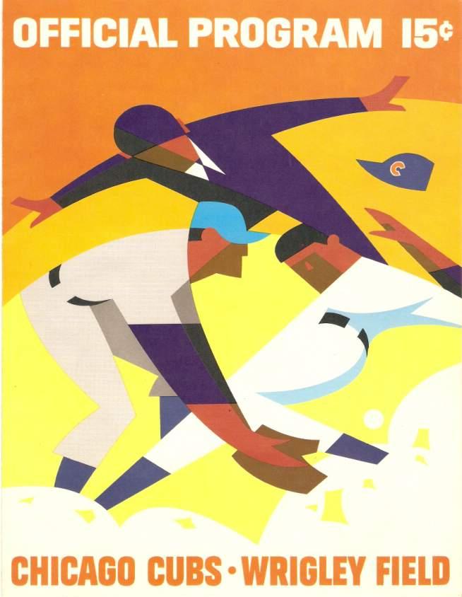
While the Cardinals scorecards (does anyone call them the Cards’ ’cards?) are nice, the Cubs’ programs are the true gems. The 1966 to 1971 editions featured cover artwork from longtime Cubs graphic artist Otis Shepard. As you may recall, Paul recently featured a 1937 article about him. Even though he died in 1969, some of his artwork must have been released posthumously, because the 1970 and 1971 cards have “Shepard” inscribed on the back covers — interesting that he created the template for the back-cover advertisement, in addition to doing the front-cover artwork (for all of these, you can click to enlarge):

Shepard had a distinctive style that was very visually pleasing. The artwork was angular and geometric yet colorful and striking. This cover uses vibrant warm and cool colors along with white and black, and notice how the lines intersect and even up — the top of the fielder’s arm, the back of his neck and back of his cap are all on one curved line:
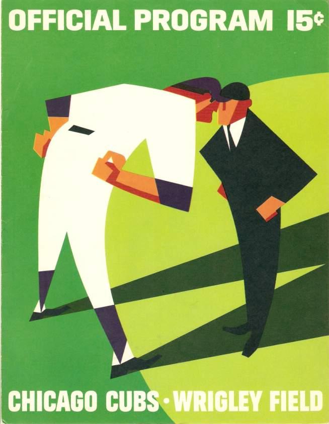
This scorecard uses the minimalist approach. It has very little detail — the only features on the two men are noses and ears on the faces, a tie for the ump, and a belt and triangular stirrups on the manager — but it works very well:
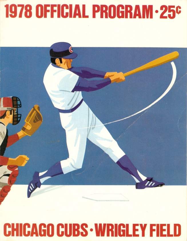
Although Shepard’s artwork was no longer being used by the late 1970s, the two programs in my collection from that period show dustings of his influence, as you can see here:
By the 1990s, the Cubs had switched to using action photos (and ads!) on the scorecard covers — a big shift away from the old illustration-based style:

My favorite scorecard is the 1971 Cubs edition. I’m not sure if all the programs that year had a printing error that made the colors appear out of registration, but the one I have is really trippy. It captures — perhaps inadvertently — the psychedelic era of baseball:
Another cool thing about these cards (and, unfortunately, my scorecards aren’t with me at my current residence so I couldn’t scan them) is that in the Cardinals cards, not only is the score kept throughout the game but the keeper, my great-aunt, wrote brief annotated notes. She jotted down game action descriptions but also noted what the teams were wearing, what the vendors were selling, and even what color the seats were. I remember the Busch Stadium seats were described as salmon-colored. This is extremely fascinating to read 40 or 50 years after the fact; it has a time capsule effect.
Getting the scorecards as a gift inspired me to collect scorecards myself. I even used to keep score of games and write my own notes and stuff. Too bad the more contemporary scorecards aren’t as cool as the old ones.
Chart-toppers: Paul here. Last week I wrote that piece about the role of cultural critics and how critical tastes relate to popular tastes. That piece included the following bit:
[P]eople now have more ways than ever to express their tastes. They can start blogs, post on Twitter, vote on American Idol, and so on. This reminds me of … the advent of the People’s Choice Awards [in the 1970s]. Even though I was just a kid at the time, I remember thinking, “What’s the point? Don’t we already know who the ”˜people’s choice’ winners are, just by looking at sales figures? Who needs an award for that?” The situation nowadays, with all the internet-driven ways people can express themselves, is like a giant, society-wide version of the People’s Choice Awards.

I thought of that passage yesterday when an interesting bit of news came over the wire. But before I get to that news, let me backtrack for a minute: The years I attended college (1982-1986) were right when MTV was starting up and becoming really popular. I was lucky enough to work at and then co-manage an on-campus record store at the time, and we always had copies of Billboard magazine, the trade journal of the music biz, at the store. Billboard, of course, is famous for its music charts, which supposedly measure sales and popularity, and it was around this time, I think in ’84, that they added a chart for music videos. I recall saying to another person at the store, “Wait a minute — this doesn’t make any sense,” because music videos at that time began and ended with MTV airplay. There was no YouTube (duh), and VHS sales of music videos were still in their infancy. So the Billboard music video chart was really just measuring what MTV felt like playing, which wasn’t a measure of popularity — it was just a measure of one company’s content choices (which were presumably influenced by all sorts of corporate graft from the music labels). True, Billboard also ran lots of radio airplay charts, but those were aggregated from hundreds, maybe thousands of stations, so at least they presented a composite snapshot of something fairly broad (even if it was only a snapshot of how payola worked at that time). The video chart was just a snapshot of MTV. Who needed a chart for that?
About 10 years later, in 1993, I found myself working for Billboard, at least peripherally. I never wrote for the magazine but I was the senior editor for its book division, Billboard Books. We did mostly chart-based books like The Billboard Book of Top 40 Hits, The Billboard Book of One-Hit Wonders, and so on — bathroom books, basically (and I mean that in the best sense of the term). It was around this time that Billboard’s sales charts to reflect bar-code sales data from SoundScan, instead of using self-reported sales figures phoned in from record stores (plus whatever bribes and graft were still baked into the system). SoundScan totally rewrote the Billboard charts — country and rap artists had claimed for years that their album sales were seriously underrepresented under the old system (maybe they just didn’t know who to bribe), and it turned out they were right: Once the SoundScan numbers were factored in, country and rap artists suddenly shot to the top of the album charts, often debuting at No. 1. I was uncomfortably aware of the fact that most of the chart-based books I was working on were based on old, pre-SoundScan chart data that was almost certainly bogus.
I left Billboard Books in 1996 but have kept an eye on the goings-on in the Billboard world. The magazine has been bought and sold a few times over the years, and my sense is that it’s been struggling, which I guess is no surprise when you consider that Billboard operates in one beleaguered industry that’s been brought to its knees by the internet (trade journalism) and chronicles the workings of another (recorded music sales).
All of which is very lengthy way of saying I was particularly interested to see the news yesterday that Billboard is adding a new chart for — get this — music-related tweets. Key quote, from Twitter’s “head of music” (who knew Twitter had a “head of music”?), Bob Moczydlowsky: “We want music business decisions to be based on Twitter data.”

Now, Twitter is extremely useful for a great many things. But I’d like to think that everyone reading this is smart and well-informed enough to know that it’s ridiculously easy to manipulate Twitter data. With a little bit of money, for example, you can buy yourself 5,000 new followers, and there are all sorts of automated things you can set up to present a distorted view of reality. Does anyone really expect “music business decisions to be based” on something that malleable? (Maybe they do. After all, the pre-SoundScan Billboard charts offered a distorted sense of reality too.)
But here’s the thing: Even if Twitter data were reliable, what would it tell us aside from what Billboard’s other charts already tell us? “Look, Beyoncé is trending!” — wow, there’s a scoop for ya. It’s like a giant version of the People’s Choice Awards all over again — popular taste reaffirming itself. Nothing new about that, but it’s still pretty fascinating.

’Skins Watch: Stephen Colbert had a humorous take on Daniel Snyder’s latest maneuvering last night. You can see it at the 4:55 mark of this video clip (from Joshua Paster). ”¦ Research by a psychology professor at the University of Washington confirms what previous research has shown, namely that the use of Native American mascots has a harmful psychological effect on Native students (from Jess Lemont). ”¦ Also from Jess: A west coast group plans to stage protests when the Indians play in Oakland next week and in San Francisco next month.

Baseball News: The Red Sox will wear the white “Boston” jerseys on Marathon Monday, which I gather will now become an annual thing. I asked the team about this repeatedly in the days leading up to the publication of my MLB season-preview column, but they played coy. Grrrrrr. They also played coy about whether they’ll be wearing anything special for their ring ceremony (like, say, this cap), and they were coy about that too. Draw your own conclusions. … My ESPN colleague Jim Caple attended the Dodgers/D-backs games in Sydney, Australia, where he noticed that the Perth Heat — that’s an Aussie baseball team — have a mascot who looks suspiciously like Mr. Met. … When a Ticker submission begins with “I was reading this great article in Garden & Gun magazine,” you just know it’s going to be a doozy. So: Scott Moody was reading the aforementioned publication and spotted this article about adult sandlot baseball. “I did some searching on the web,” says Scott, “and man, they do some really cool things that Uni Watch readers would love, including this patch and this flyer. Check out all their photos.” … Tremendous multi-colored striped stirrups for Eastern Guilford High School in North Carolina — or at least for that one guy (from Don Conrad). … Sacramento River Cats will be going THOB on Aug. 13 (from Brady Phelps). … The Reds are adding two exhibits to their team Hall of Fame (thanks, Phil). … I think we can now say with some certainty that the Star Wars thing has officially become the year’s most annoying jersey trope. ”¦ Big slate of promotional dates this season for the Toledo Mud Hens, including a Ghostbusters-themed uni (thanks, Phil). ”¦ Louisville Slugger has made a bunch of Opening Day bats, although I don’t know if they’re going to be used in games (Phil again). ”¦ The Brewers wore their usual BP jerseys for yesterday’s spring training game — except for pitcher Brent Leach, who was wearing an old (or minor league?) BP jersey (from Martin Rivas). ”¦ In an even weirder case of a pitcher wearing the wrong jersey, Phillies reliever Jonathan Papelbon wore teammate Carlos Ruiz’s jersey yesterday (from Harrison Tishler). ”¦ I had previously reported that the Dodgers had custom bat knob decals for the two games Down Under. Here’s how they looked on the bats (from Andrew Cosentino). ”¦ In a related item, the Orioles have been using spring training-themed batting knob decals (Andrew Cosentino again). ”¦ Also from Andrew: Orioles pitcher Kevin Gausman has been wearing some pretty clunky-looking glasses. ”¦ And one more from Andrew: The Orioles wore “MB” wristbands the other day in memory of PR director Monica Barlow, who passed away on Friday. ”¦ The Giants wore BP jerseys with regular game caps for last night’s Bay Bridge Series game against the A’s. “Oakland wore BP jerseys and caps,” says Rich Paloma). ”¦ New gold uniforms for Alabama State. “I love these,” says Phil.

NFL News: Here’s a spec-fucking-TACular photo of Johnny Ramone wearing a Dolphins T-shirt onstage. Yabba-dabba-doo! “Note the lack of security — ah, to go back to more civilized times!” says Sterling Foster.

College Football News: Everyone went ape-shit yesterday over Johnny Football wearing a Nike jersey and G.I. Joe shorts at Pro Day. And look, you can buy some of the same crap he wore, wheee! “That’s pretty absurd, even for Nike,” says Kyle Beaudoin. … Little item about how how Penn State updated its logo 27 years ago. “A friend of a friend has that logo tattooed on his lower leg,” says William Yurasko. … Here are some thoughts about bling-ish college football uniform designs (thanks, Phil). … Reprinted from yesterday’s comments: Here’s a little-noted feature of the new Speed Flex helmet.

Hockey News: Unusual uni match-up last night in Florida, as the Panthers wore white at home and the Hurricanes wore their black alts (thanks, Phil). ”¦ European company has come up a non-circular puck. “It kind of looks like a half-eaten Klondike bar, but the point of the odd shape is to create irregular bounces off the boards,” explains the Hungry Hungry Hipster.

Soccer News: Pretty sure we’d already seen a leak of Portugal’s World Cup away jersey, but now it’s been officially unveiled (thanks, Phil). ”¦ Incidentally, I’ve been working on a big World Cup column for ESPN. But since I don’t know jack about soccer uniforms, longtime reader/contributor Trevor Williams has been assisting me, and he’s being doing a sensational job. I’ve learned about soccer uni history just by reading and editing his copy! Thanks again, Trevor.

NBA News: Jodie Meeks of the Lakers says he likes the sleeved jerseys. Rumors that Adam Silver paid him to say this are almost certainly untrue (thanks, Phil). ”¦ The Trail Blazers are inviting fans to vote on a new court design.

College Hoops News: More crazy brand policing: Wisconsin player Zach Bohannon wasn’t allowed into his team’s closed shoot-around until he removed the label from his water bottle. Douchebags (from Jeff Ash). … Interesting article+chart on how long it takes to play the last minute of a college hoops game (from Ken Singer). ”¦ Holy moly, look at this amazing 1971 UCLA program cover! Psychedelic, man (thanks, Phil).

Grab Bag: Here’s another one of those mock-untucked basketball jerseys. That’s Canton McKinley High from Ohio in 1989 (big thanks to Vince Guardado). … Here’s some box lacrosse video from 1994. “Too much spandex, tons of traditional sticks, and a football facemask in a pro lacrosse game, which terrifies me still,” says Connor Wilson. … Faaaascinating photo gallery of children from around the world in their bedrooms. Wait till you get to the kid from Kentucky (thanks, New Girl). … Here’s a new one: Maryland lacrosse — and maybe some other Terps sports, I’m not sure — has a “Farewell to the ACC” logo (from Anthony Pellegrino). ”¦ By the time we meet again next Monday, it will be baseball season! Isn’t that a nice thought? See you then.
The Louisville Slugger bats are for a giveaway on Twitter I believe.
Nice lede, Mike!
Thanks, Phil!
That pitcher with the Brewers is definitely wearing an old minor league jersey. Worked with the Brewers a few years ago. Funny that they couldn’t find him a big league one.
From Helena, perhaps?
Ummmm,… Did you mean Gabba Gabba Hey?
Ha! Hadn’t thought of that. I often invoke “Yabba-dabba-doo!” as an all-purpose exclamation of “WOW!,” but I hadn’t thought about how close it is to the Ramones’ signature line. Good one!
That’s your story?? ;^)
I always associate them with the 1! 2! 3! 4! they counted before every song in the concert I saw of them.
Dee Dee always did the count for the Ramones.
Yep. From what I’ve heard, the Dee Dee count-in was kind of a hark-back to the band’s earliest days when he sang (and played guitar) and Joey was the drummer.
Paul, nice find on that pic… LOVE it!
I am all those guys in the front row.
Lee
Shirley, that Aalto puck has to be a hose. Right??
Could be delicious though.
link
Kudos to Alabama State for matching the gold jerseys with gold pants.
Eh, Gausman is just maintaining the tradition of O’s pitchers sporting clunky eyewear:
link
link
The most amazing thing about that 1971 UCLA basketball program cover is that it’s for the FRESHMAN team, whose members included Bill Walton & Keith (later Jamaal) Wilkes. Actually, perhaps the MOST amazing thing is that their opponent, Chaffey College, apparently didn’t field a recognized NCAA/NAIA team that year.
link
It’s hard to imagine the beatdown they must’ve received.
Looks like the freshman game is just the prelim for the varsity vs. Washington. And, without doing any research, I’ll guess that design was from a catalog and used by other schools as well.
You’re right, my bad. The UCLA varsity beat a middling .500 Washington Huskies team, whose second leading scorer averaged all of 7.2 PPG, 78-69.
I wonder who won the UCLA varsity-frosh game that year, though.
Not quite a chart freak, but I do happen to have all of the Billboard weekly Top 10 charts (Best Sellers 1940-1958, Hot 100 1958-current) and all of the weekly UK “Official” Top Tens since their start in 1952.
Funny how several covers (I think as many as 6!) of a specific tune would land in the Top 10 charts concurrently in the 1940’s.
It’s cool to parallel what folks were buying and listening to during specific life and sports events in the days of yore.
Of course, the charts are a good indicator of how gullible Yanks (myself included at times) and Brits alike are at making junk music very popular.
Timmy, when you say you “have all” the charts, do you mean you collect tearsheets of the charts from each week’s issue of Billboard?
I did a few books with Joel Whitburn (I’m sure you know who he is). A total nutjob, but in an endearing way.
I’d think Whitburn would be your (our?) kind of nutjob.
Joel Whitburn was my neighbor in the 90s. Really interesting guy. Definitely an endearing nutjob.
Ooooh, did you get to go down into his climate-controlled vault, where he keeps all his records?
I did get to peek into the vault once; it’s a seriously impressive record collection.
Paul,
In answer to your question,
I have the chart info as follows:
1) 1940-1954: “Joel Whitburn’s Billboard Pop Hits Singles and Albums 1940-1954” (hardcover). Which actually also includes the Record Buying Guide unnumbered charts from 1/6/40 – 7/20/40. Whitburn used the Best Sellers in Stores charts as the de facto “official” chart from 7/27/40 forward.
2) 1955-2000: “Joel Whitburn Presents Top 10 Singles Charts” (paperback). It uses the Best Sellers in Stores charts from 1955 through 7/28/58 and the Hot 100 from its debut on 8/4/58 through 2000.
3) 2001-present: 2001 and 2002 charts were obtained from hard copies of weekly issues of Billboard at the Elizabethtown College library and since 2003 I have accessed the weekly charts from billboard.com. These I have on a flash drive.
4) As for the UK charts, there was a forum (I can’t recall the name unfortunately) where a poster known as “King of Skiffle” (a tribute to Lonnie Donegan) posted ALL of the official British pop charts from the first one of 14 November 1952 to what was current (I’m thinking 2003). I have updated moving forward from the site officialcharts.com. All of these charts are on flash drive.
How old is Joel these days? I wrote him a letter many years ago regarding his Record Research. He did give a nice personal letter thanking me, so yeah, I liked that about him!
I guess my only nit-pick is how he/Billboard usually only go back to 1955 as opposed to 1940 in their music chart history books. Why? Because “Rock Around the Clock” came out in ’55? That’s a lame reason! “Shake, Rattle and Roll” first made the Top 10 on 10/2/54!!
According to Wikipedia, Joel is 74:
link
And born in mine own little suburb – who knew?
This just in!!! NFL to change the shape of their footballs to a trapezoidal prism to make extra points harder to kick and fumbles harder to recover.
If the really want to F things up, just make the ball round!!
link
David Stern was a man ahead of his time. That’s why he’s unemployed now.
Nice programs/lede Mike, Otis Shepard’s work is legendary for good reason. Cheers!
They’re superb. Thanks, Mike.
For what it’s worth, that ’71 Cubs program looks like a red/blue stereogram.
That ’71 program is awesome. Finally, we can all see Wrigley through the eyes of Doc Ellis.
*Dock (coffee hasn’t kicked in yet)
I thought that as well, but I can’t find any 3D-glasses.
“…Pretty sure we’d already seen a leak of Portugal’s World Cup away jersey, but now it’s been officially unveiled (thanks, Phil). … Incidentally, I’ve been working on a big World Cup column for ESPN. But since I don’t know jack about soccer uniforms, longtime reader/contributor Trevor Williams has been assisting me, and he’s being doing a sensational job. I’ve learned about soccer uni history just by reading and editing his copy! Thanks again, Trevor…”
1. Portugal should wear neither blue shorts nor blue piping on white shirts. Your colors are green and red, my esteemed Lusitanians, and don’t tell me that the little blue shields on your escutcheon give you license to go crazy. Goddammit.
2. Thank you, Revor.
That should be, Trevor, not Revor.
During the Portuguese monarchy, which lasted about 900 years, their royal colors were — wait for it — white and blue! So with almost a millenium of history behind it, white and blue are perfectly valid options for a Portuguese change kit.
link
That kit will make Portugal the best dressed in Brazil. I love the simple beauty of the collar.
I’m very late to the party, so I commented below and missed yours, but you are absolutely true. Provided a little more context
I’d agree that Lusitanians should wear green and, to the extent it’s absolutely necessary, red. Blue belongs to a few other prominent European teams.
That being said, “shield on your escutcheon” strikes me as a tautology.
Then again, when people speak Portuguese it sounds to me like a drunk Russian trying to speak French.
Hello, Gregg. The national escutcheon of Portugal contains various little shields. Maybe I should have called them mini-escutcheons.
I have a bizarre interest in national coats-of-arms (“escudos” in Spanish, a wonderful language for grandiloquence and pomposity.
But basically, your point is the best point: too many teams already wear blue.
Sorry if this is either pedantic, erroneous or both, good sir, but wouldn’t the blue devices themselves be inescutcheons?
I appreciate the support. I’ve tried to find the real story behind the kits and hopefully didn’t make too many glaring errors.
For example, I haven’t been able to find FIFA themselves mandating monochrome. The idea may have originated from this article: link.
If you watch the video below, you can see that an adidas designer decided to make Spain red-on-red because of their nickname.
link
If someone has a direct FIFA source about monochrome, I’d love to hear about it.
I don’t think there’s a direct FIFA source. I know the technical rule on uniforms at the Finals is unchanged from 2010, where we often saw teams wear light-colored jerseys paired with dark shorts.
I think this monochrome thing is just a fad. Consider Germany. If they really had wanted Adidas to give them black shorts to wear with the white jerseys, they’d have insisted on it. I read somewhere that they’re wearing the white shorts because they feel that black shorts would draw the eye away from the three-tone red chevron on the shirt. Come Euro 2016, the Getman shirt will be it’s usual white, without a large chevron, and they’ll revert back to black shorts.
I’ve always thought the monochrome was Adidas taking its “All in” slogan to practical terms (i.e. “Spain is ‘all in’ red”).
The Mirror article is just Mirror being Mirror, completely misreading the language, which says the jerseys have to be distinctly dark or light, and says nothing about shirts having to match the shorts.
There’s some talk that contrasting colors hog data when the whole world is watching in HD, but I don’t know enough about technology to know whether that’s true. Traditionally, teams have gone monochrome in the World Cup because of black and white TV (and later, B&W monitors in production booths).
BTW, if you like soccer uniforms, you could lose a lot of productive hours at this site: link
Red and Green are the Republican colors. Blue and White are the royalist colors (FC Porto for example, was blue and white as a sign of alignment with the monarchy at the time). So Blue and White are the actual traditional portuguese colors.
Blue and White are the royalist colors (FC Porto for example, was blue and white as a sign of alignment with the monarchy at the time). So Blue and White are the actual traditional portuguese colors.
Well, that’s a lot like saying that traditionally speaking the USA is rightfully represented by all things English monarchy… which I hope is understood to be a ridiculous statement. Portugal rejected it’s monarchy through revolution and hence is no longer traditionally a monarchist country, just as much as it is no longer traditionally a fascist nation since it dispensed with that unfortunate episode back in the 70s.
Politically, yes the monarchy and fascism have been rejected, but Portuguese still embrace traditions and elements of the past. The flag wasn’t completely reinvented, the sphere and shield that was part of the monarchy are part of the republics flag. So it’s not outlandish why blue and white would be the basis for this alternate kit
Did 3D glasses come with the Cubs ’71 program perhaps?
“Wait till you get to the kid from Kentucky”
This being UW I was expecting UK hoops paraphernalia, not a small arsenal.
I was skipping through the pictures and I assumed he was a kid from some war zone.
I didn’t think anything of the Kentuckian. He likes to hunt. So?
That’s a really interesting error card, the 1971 card. I have several examples of ’71 cards in my collection and none of them looks like that. You might have a unique card!
I’m a hockey guy first and foremost, but after this crazy winter, I’m looking forward to baseball as a sign that spring just might stick around for a while. I may or may not be wearing a tie just for that:
link
Nice lede, Mike.
Another issue with “measuring” tweets – beyond the ease of manipulation – is the difficulty in determining the mood of those tweets. Does Billboard really think that everyone who mentions Justin Bieber is endorsing his latest album? Quality is as important as quantity, unless you really think that there’s no such thing as bad publicity.
I’m the Director of Research for a network TV affiliate in a major market. Even Nielsen itself wants us to consider Twitter trends to determine viewer engagement.
Sure, you can tell me that 5,000 people in my market had something to say about American Idol or The Blacklist while that given program was on the air. But WHAT did those 5,000 people say about it?
Stephen Colbert, Mark Sanchez and Taco Bell are trending on Twitter right now, but that sure as hell wouldn’t be proof that everyone loves the Colbert Report, hates the Jets for getting rid of a hero, or can’t wait to recommend the new breakfast menu.
James Mollison’s photographs of children and their bedrooms (or, more apt, for some: places where they sleep) are beautiful and heartbreaking. Stunning.
By Mike Chamernik
When I turned 14 in 2004, my dad gave me a pretty swell birthday gift. Even back then he knew I enjoyed history, nostalgia, and aesthetically-pleasing sports memorabilia, so he surprised me with a gift bag filled with, among other items, old scorecards. The bag included Cubs scorecards from 1966 to 1978, plus the 1990 and 1995 versions, and Cardinals scorecards from 1966 and 1972. You can see some of the covers and interior pages in the slideshow above.
So many factual mistakes in one paragraph. Pointed out Shepard’s artwork six years ago on this fog blog.
What factual mistakes are you referring to?
Are you saying? (Choose all that apply.)
A) Mike didn’t turn 14 in 2004.
B) The elder Mr. Chamernik didn’t know his son enjoyed history, nostalgia, and aesthetically-pleasing sports memorabilia.
C) Mike’s dad did not give him a gift bag full of Cubs & Cardinals scorecards.
D) We can’t see some of the covers and interior pages in the slideshow above.
E) Mike wasn’t surprised by the contents of the gift bag. He’d sneaked a peak the night before.
Ugh, sneaked a *peek*
And one more from Andrew: The Orioles wore “MB” wristbands the other day in memory of PR director Monica Barlow, who passed away on Friday.
I think she passed away about a month ago.
Actually it was February 28. In fact, it was first mentioned in the ticker on March 2.
link
“I think we can now say with some certainty that the Star Wars thing has officially become the year’s most annoying jersey trope”
I’d like to see a “Silence of the Lambs” night instead.
I like that. Everybody wears a skin suit and does the “tuck”.
The walk up music would be either Goodbye Horses, or American Girl.
“[T]he Perth Heat – that’s an Aussie baseball team – have a mascot who looks suspiciously like Mr. Met.”
link looks like a rip-off of link.
Regarding the kid not being allowed into his teams CLOSED shootaround, how much more ridiculous can things get? I know it’s a rhetorical question, because we’ve seen things get worse and worse but this is bugging me a lot. And the Nike crap with Manziel. Disgusting
Just waiting for some large company sponsor to trademark some sort of ‘Black out in a can’ – one type for clothing another for hard surfaces.
Are players coming in with unsanctioned company logos on their possessions? Just spray them at the security door with ‘Black out in a can’. It quickly removes all traces that any corporations exist except yours, and lets your quickly get on with your day.
” Jodie Meets of the Lakers says he likes the sleeved jerseys.”
Should be “Meeks,” not “Meets.”
Thanks — now fixed.
The Colbert Report clip was actually from Wednesday night’s show (March 26). It should be noted that it stirred up a bit of controversy on Twitter, where people started the hashtag #CancelColbert – all because they took the “Ching Chong Ding Dong” bit completely out of context, completely missing the whole point of the bit.
out of context or not, it was a stupid thing to say by a stupid unfunny person. “Ching Chong Ding Dong?”
What the heck did Snyder do to deserve this? He actually has done more for native americans in the past week than colbert, costas, and the far left radical media windbags have done in their entire lives! And he’s being smeared and kicked around for it? Why?
It’s pretty clear that the anti-redskins name crowd is now grasping at straws, desperate, and just flailing mud now that the name isn’t going to change despite their personal attacks.
Intelligent, rational discussion is welcome; tossing around terms like “far left radical media windbags” is not. No more of that — thanks.
“He actually has done more for native americans in the past week than colbert, costas, and the far left radical media windbags have done in their entire lives!”
You got some evidence to back that up? I’ll hang up and listen for my answer.
FYI, Colbert has been doing the “Ching Chong Ding Dong” bit since the first season of the show.
please, again with the “evidence”. Yes I’m going to research everybody that has slandered the Redskins and see how many native organizations they’ve started, how many millions they’ve raised, how many goods they’ve donated and compare them with Mr. Snyder. That’s not a very fair question to ask.
I think it’s a very fair assumption to make that Dan Snyder has done more for Native’s than the people who have come out of the woodwork the past year to smear him and his team without providing a detailed excel spreadsheet about it.
Now provide for me the overwhelming evidence that the vast majority of Americans are for changing the name.
Now provide for me the overwhelming evidence that the vast majority of Americans are for changing the name.
Nobody has ever claimed that a majority of Americans are in favor of changing the name. It’s just a point of view — a minority point of view, at least for now — that some of us are advocating for. You’re free to disagree.
A few other things that are not supported by the majority:
– High-cuffed baseball pants
– The new Connections album
– Giving a shit about uniforms
If it’s OK with you, I’m going to keep advocating for those as well.
“A few other things that are not supported by the majority:
– Giving a shit about uniforms”
~~~
Wait, what?
The whole point of the discussion is the timing of Snyder’s charity. If he’d done this ten years ago, when there wasn’t one-hundredth of the public discussion over the team name going on, he might have been viewed with a lot less skepticism.
However, now? When he’s spent the last couple of years being outright defiant about the name? This completely comes off as self-serving. Yes, taken by itself, he might be doing the right thing, but he comes off as doing it for the wrong reasons – to buy goodwill to defend a name that I, for one, knew was just wrong thirty years ago when I was NINE YEARS OLD!
Well, morty, the early returns for OAF are hardly what I would call “promising:
link
“please, again with the “evidence”. Yes I’m going to research everybody that has slandered the Redskins and see how many native organizations they’ve started, how many millions they’ve raised, how many goods they’ve donated and compare them with Mr. Snyder. That’s not a very fair question to ask.”
Oh, wow. Sorry, Morty. When you said that Snyder has “actually has done more for native americans in the past week than [your examples] have done in their entire lives” I thought you had something factual to base this on. Because only far left radical media windbags would resort to hyperbole to get a point across.
Wow, I sure do look silly now.
The Aalto puck is based on a classic piece of finnish design, the Aalto vase. The form is ubiquitous in Finland, as it is unofficially forbidden to organizations or people over 40 to host any kind of occasions without having these vases as focal points.
Anyhow, while turning the form into a hockey puck is easily the best use of it that I’ve ever seen, the whole thing seems to be an ad for Iittala, the company that holds the rights for Aalto vase.
It really is a brilliant idea, though. Perhaps even the Euro Hockey Tour could have a future, if it was played with pucks that would reflect the host country’s most valued designs – Aalto pucks, dalahäst pucks, Skoda pucks, matryoshka pucks (which would house smaller matryoshka pucks)!
That shape really kills so many techniques that are based on the puck’s ‘puck’ shape (the spin put on the puck during a slapper, a wrist shot or backhand rolling off the stick blade, the spin needed on a saucer pass.) It could see it being fun for pond hockey or a small shinny when you aren’t really firing it hard.
Eric, you’re totally right.
I was aiming to have some good natured fun poked out of two institutions that are just falling a bit behind the times – prestiiiishous cultural icons (in this case the Aalto vase) and an international tournament created mostly so that sponsors can slap their ugliest physical ads onto moving (B/C-team) NT jerseys (Euro Hockey Tour). So shinny w/Aalto puck would be more interesting than that silliness – actually, I would totally watch that!
However, I almost forgot, but this also reminded me of these brilliant things (on the exception that they actually work): link
Square wheels!
Here’s a better picture of a single wheel: link
I’m not much of a collector, but I did keep that 1978 Cubs scorecard from my one and only (so far) visit to Wrigley. Funny, I hadn’t pulled it out in many years but was looking at it just a couple of weeks ago. And yes, the 1970s-era Busch did have salmon-colored seats. Hadn’t thought of that in a long time either, but seeing that mentioned brought it all back!
If Johnny Ramone had been wearing a Reds shirt, I would have it enlarged as much as possible and hung it on my wall. Spectacular, indeed.
I too loved the two page cardboard scorecards and often kept score. Sometime in the ’70s they became unavailable at Cardinal games. Instead, one blank scorecard was included in each expensive Cardinal yearbook. That was the end of scorekeeping for me, and it seems, everyone else.
Perhaps it was the ’80s but it seems to have marked the end of baseball for the common man.
I was at a Cards game in 2012 and they had cheap(ish) scorecards, no yearbook required. And the Rockies sell them for $1.50. Not the 10 cents they used to be, but not too outlandish.
I took the family to the Barclays Center Friday night. First time there (from Boston) and, apart from the spectacular arena, I was very impressed that the Nets’ programs had printed rosters in the program. No blow-in or handout rosters. Who does that anymore? It also had “Nets v. Celtics” on the cover with the date and game number. And, it was free! Very nice experience.
The size was 5.5 x 8.5 inches, reminiscent of a ’70s Phillies program I have.
Some ballparks still sell two-page scorecards for a buck or so, some include them in more expensive programs, and some now include them in free giveaway programs. (The Pirates and Nationals both gave away 5.5 x 8.5 programs with scorecards last year.)
Paul, have you ever had a look at Desmond Morris’ bizarre but entertaining book from 1981 called The Soccer Tribe? Really strange but interesting look at soccer from a sociological point of view. Has a great section on soccer uniforms which gave me a great introduction to the topic and, apparently, the deep psychological reasons behind their colours and designs.
I’ve read two of his books (you can probably guess which ones) but didn’t know about that one. Thanks for the tip!
Great lead article, Mike!
And dude, Garden and Gun is a good magazine. If anything, it suffers from a dearth of actual gardens or guns in its articles. It almost always has a few good foodie and spirits articles.
I don’t know enough about the old St. Louis Browns and their unis to know if this is noteworthy or not, but regardless, link really is a beaut’.
Any picture of Satchel Paige in a big league uniform is noeworthy. Especially a color one, even if the colors aren’t quite true to life.
Anybody recognize those light standards? Where was the photo taken?
If the photo really was taken in September of 1952, the Browns’ road games were in Cleveland, Chicago, and Detroit.
That’s the view towards left centre in Comiskey
link
It’s old Comiskey. You can tell by the “window cutouts” on the back wall of the lower deck outfield bleachers. US Cellular Field kept the shape for the windows on the outer facade.
Love the Sheperd stuff, evokes the ’30s (even though I wasn’t around then). Of course, I have a weakness for poster art in general.
You just nailed it — all his cover illos feel like posters. Yes!
Thanks guys for the compliments. I’m also glad one reader finally learned what a Frosty Malt was. I could go for one right now. Well, I could go for one at any given time ever.
I’ve always been a big fan of Ghostbusters so those Toledo Mud Hens themed jerseys are fantastic! Maybe they could do a reenactment of the whole Stay Pufft Marshmallow Man scene.
“He’s a sailor, he’s in New York…we get this guy laid, we don’t got a problem!”
Big news out or Oregon…New System of Dress for Lacrosse will be on display tomorrow in Central New York:
link
Dodgers wore BP jersey and poly game caps (with opening series side patch) in their game versus Team Australia.
Not really uni-related, but it’s been driving me insane…
Watching the NCAA games tonight, at both venues, it seems nobody’s changing the possession arrow when they should be. As a result, CBS/TBS’s on-screen scoreboard shows the same team possessing the ball for the entire half, since it’s presumably relying on the data from the scorer’s table.
Why would CBS/TBS bother showing the possession, then, if it DOESN’T CHANGE? Seriously, is there NOBODY at the goddamn network or the NCAA that has caught this yet?
Trying to see if I can get some attention to this, but it seems like I’m just shouting at a wall:
link
link
You’re misunderstanding the role of the possession arrow in college basketball. Read the third paragraph here: link
For what it’s worth, I do think it’s dumb to have the possession-arrow graphic constantly on-screen, because (a) it could easily confuse irregular college hoops viewers [like yourself, I presume] and (b) alternating-possession so rarely comes into play that the constant reminder is really unnecessary.
Well, then if that’s the case, then my initial irritation at CBS two weeks ago was right after all!
test
[b]test[/b]