[Editor’s Note: It’s been a very fertile time for DIY projects. Our latest one comes from Mike Cline Jr., who took on a very specific kind of project that I don’t think we’ve seen before. ”” PL]
By Mike Cline Jr.
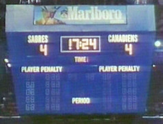
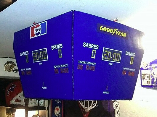
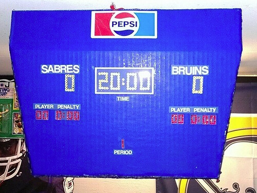
I decided that my air hockey table was missing something, so I decided to build a scoreboard above the playing surface, not unlike what you’d see in a hockey arena. It didn’t take me long to decide that it had to be a replica of the scoreboard in the old Buffalo Memorial Auditorium, known locally as “the Aud,” which was the home of the Sabres, Braves, and countless minor league and college teams.
My first thought was to make a working scoreboard, but then I realized I know nothing about creating circuits and the cost would get out of hand, so I decided that my best bet would be to stick to a visual replica. For reference, I found some good photos of the Aud’s scoreboard and also consulted this scoreboard illustration site.
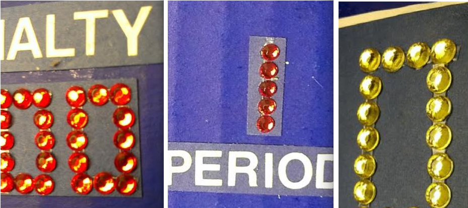
I went to my local AC Moore craft store and wandered the aisles in search of the right supplies for the project. I ended up using a blue folding presentation board, white letter decals of various sizes, and red and gold rhinestones for the scoreboard lights. In all I probably spent about $15 to $20 on the project.
Once I got all the supplies together, I cut the board to size and applied all the decals and rhinestones, which probably took around 10 hours. After that we glued it together with a hot glue gun and hung it up above my air hockey table. I’m pretty happy with the results (for the first photo, you can click to enlarge):

———
Paul here. Unfortunately, Mike didn’t document his step-by-step process, but it’s still a really nice project — well done!
Unmasking the Commenters: I recently invited the site’s commenters to tell us a bit more about themselves and give us a peek at what they look like, just because I thought it would be fun to pull back the internet’s curtain of anonymity. I’ll keep showcasing you folks as long as you keep sending in your photos and quick bios.
Today’s commenter is Terence M.K. Here’s his photo and self-description (click to enlarge — it’s definitely worth it):

My name is Terence M.K. I live here in NYC (the Bronx), very close to Van Cortlandt Park where fellow commenter Jason Bernard thinks The Warriors was filmed. (The film mentioned Van Cortlandt, but those scenes were actually filmed in Riverside Park in Manhattan — sorry, JB.) I was born and raised in the Bronx as a Mets fan, something I inherited that from my Pop, who grew up on Edgecombe Avenue overlooking the Polo Grounds. I comment only occasionally but send in lots of Ticker submissions. I’ve also been know to stalk a particular uniform columnist at Brooklyn Beefsteaks and Mets fan conventions, to consume too many pepperoni rolls and L.I.T.s on the Strip in Pittsburgh, and to collect $200 polyester shirts. P.S. RyBerto wuz here!
Do you want to be featured in “Unmasking the Commenters”? If so, send me a photo and a quick paragraph about yourself. You don’t have to reveal your real name, and the photo doesn’t have to show your face, but you must include a photo to be considered. Send everything
this-a-way.
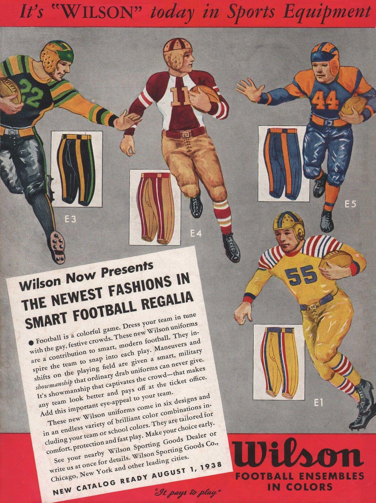
Click to enlarge
Too good for the Ticker: Longtime Uni Watch reader/pal Michael Princip recently scored this 1938 Wilson football uniform ad. Mike thought I’d particularly like the gent on the left, because he’s wearing green and mustard, but I actually love all them equally. What a beauty!
It’s interesting to see how these designs from three-quarters of a century ago have several elements that we now consider radical or controversial: striping on the back of the pants; monochrome; black; vertical sock striping. And yet they all look classic (at least to me), not futurist. Or, perhaps more accurately, they represent a past version of futurism, and maybe that’s what I like so much about them. Also, the full-length sleeves sure do help.
Big thanks to Mike for sharing this super-tasty treat.

’Skins Watch: Up north of the border, there’s now some discussion as to whether the Edmonton Eskimos’ name should be changed (from Stephen Coulter). … In a vaguely related item, a CFL team is going to be using the ’Skins training facility in Richmond, Virginia. It would be a perfect convergance if that team happened to be the Eskimos, but no dice (from Tommy Turner).

Baseball News: No photo, but I noticed that Reed Johnson, now with the Marlins, wearing solid socks the other day. In the past, he’s always worn stirrups. ”¦ In this ad for the new NBC TV series About a Boy, the guy is wearing a San Francisco Seals T-shirt from Ebbets Field Flannels. … Here’s another follow-up to Monday’s round-up of wire service photos: If you look again at this photo of Pepper Martin sampling gloves during spring training, you can see that the lockers in the background are labeled “Black,” which leads Dave Rakowski to wonder, “Given that the photo is from 1950, several years after Jackie Robinson’s breakthrough, it it possible that those lockers were part of a segregated locker room in Vero Beach?” Hmmmm. … The rock band the Black Keys are sponsoring jerseys for their childhood Little League in Ohio (from Robert Sanden). … Good to see hosiery hero Rajai Davis is back in stirrups. He also wears one of those sliding mitts while running the bases — more info on that here (from Jeffrey Sak). … The Wilson Tobs — that’s a collegiate summer team — have a new logo set, including a stadium anniversary logo (from Alan Poff). … It’s bad enough that every minor league hockey team on the planet has jumped on the “ugly Christmas sweater-themed jersey” bandwagon, but now minor league baseball teams are getting in on it. … Mariners pitcher Roenis Elias and minor leaguer Ketel Marte were both wearing No. 81 in yesterday’s Cactus League game against the Angels (screen shot by L.M. Grismer). … The Cubs’ throwback program for this season apparently includes throwback-style T-shirts (thanks, Phil). … Vanderbilt wore nice throwbacks, including striped stirrups, last night (from Jerry Lawless).

NFL News: Check out the guy in the foreground of this photo from Crimea. Is that an Eagles logo? Sure looks like it! (Good spot by Chris Weber.) … In the wake of the rape charges against Darren Sharper, the NFL’s online shop stopped selling his jersey but then reinstated it (thanks, Phil). … Not truly NFL-related, but close enough: I wrote a short ESPN piece on those crazy L.A. Kiss uniforms.

College Football News: According to this article about this season’s Chicken Sandwich kickoff game, which will feature Alabama and West Virginia, “Alabama is the home team, will be in the visitor’s locker room and wear its crimson jerseys. West Virginia will be in the Atlanta Falcons’ home locker room and wear its yellow or blue jersey.” So, as Phil points out, “it’s not only color vs. color — it could be navy vs. crimson.” … Back in the early 1940s, Auburn had two twins who wore name tags during practice so the coach could tell them apart. “Isn’t this why they have numbers?” asks Jonathon Binet, not unreasonably.

Hockey News: With the Coyotes changing their name affiliation from Phoenix to Arizona, new versions of their logos have been sighted (from John Muir). … Here’s a Bernie Parent card — or is it? Lots of problems with it, as Curtis Peddle points out: “The goalie is wearing a 1987 NHL Rendezvous jersey complete with the sleeve patch, while Parent retired in 1979. Also, Bernie Parent never wore the Mike Liut-style mask that is pictured. And he appears to be wearing a No. 66 Mario Lemieux jersey. What’s going on here?” Anyone know more?

Soccer News: Here’s something I never knew before: Topps once repurposed its baseball card design template for UK soccer cards (interesting find by Alain Nana-Sinkam). ”¦ As you know, the NYC FC is letting fans vote on the team’s crest. Chance Michaels says, “Some fans (full disclosure: including me) have worked up a new crest featuring the best parts of each choice.”

NBA News: You’ve probably seen the Celtics’ St. Paddy’s Day jersey by now, but here’s the full uniform. Interesting that they removed the shamrock from the waistband for the Irish holiday (thanks for the photo, Phil).

Grab Bag: This is pretty awesome: Marty Hick displayed his vintage tie collection — or about 70% of it, he says — at the school where he teaches. ”¦ Did you know that the apostrophe placement in the brand name Lands’ End is due to a 1964 printer’s error that the company owner couldn’t afford to fix? It’s true! This and many other eccentricities in brand naming are explained in this super-excellent article (big thanks to my ESPN pal Dave Wilson). ”¦. We all know what Interstate highway route signs look like. But here’s a great article on what they might have looked like, based on some early design submissions (big thanks to William Yurasko). … This is pretty funny: The Louisiana State high school basketball tournament is called Marsh Madness (from Chris LaHaye). … Here’s a map of the United States, as broken down by meat (thanks, Mike). … Speaking of meat, New York Times business reporters recently complained to their union about fumes from a nearby steakhouse. If anyone from the Times and/or the Newspaper Guild is reading this, I’d just like to make it clear that I have no fucking problem working in close proximity to meat cookery. … Reprinted from yesterday’s comments: Oh baby, look at these amazing old photos of Detroit! (From R. Scott Rogers.) … Some great old rugby photos available in this article. … New Zealand will soon be voting on a new national flag design (from Tom Mulgrew). … Mike Simmons and the crew at eCollegeFinder have created a cool-looking, logo-rific map showing the largest university, by enrollment, in each state. Further info here. … Aussie football news from Leo Srawn Jr., who reports that the Columbus Jackaroos are have a fan uniform vote. … Here’s one of those periodic boilerplate business articles about how the Big Four leagues are facing pressure to adopt jersey advertising. Well-written, but it’s the same old crap we’ve heard a million times before (from Ted Arnold). … Happy to report that I just signed a new two-year contract with ESPN, whoop-whoop.
So… if they change the name of the Eskimos, can we then ban that damn Winter Wonderland song?
Last sentence seems to be unfinished.
Love the Wilson ad!
Now fixed. Thanks!
Oops — NOW it’s fixed.
Colubmus…boilerplate articles about how…I think Paul was kidnapped.
IMHO, if “Eskimos” is going to be changed, then names like “Fighting Irish” and “Celtics” should be also. I think this is getting out of hand. I’ve never heard anyone say (although I don’t live in Canada, I have visited NWT) that “Eskimos” is offensive. If it’s slang, there’s a difference; just because something is slang doesn’t necessarily mean it’s derogatory. Not sure if “Eskimos” qualifies technically as slang, but I didn’t hear anyone complain about the word when I was in NWT. I don’t believe “Indians” is offensive either (though it’s easy to see the problem with Chief Wahoo), and I haven’t read much saying that it’s a problem like “Redskins”, which is obvious. I think this p.c. stuff is getting waaaaaaaaaay out of hand. Just my opinion. Cheers.
IMHO, if “Eskimos” is going to be changed, then names like “Fighting Irish” and “Celtics” should be also.
As we’ve covered a few jillion times, that’s a poor analogy. Notre Dame and the Celtics are both examples of Irish-associated institutions celebrating themselves, not being caricatured by outsiders. (And the word “Fighting” is moot, because it applies to literally dozens of college teams and has nothing to do with the Irish per se.)
I’ve never heard anyone say (although I don’t live in Canada, I have visited NWT) that “Eskimos” is offensive.
link
I think this p.c. stuff is getting waaaaaaaaaay out of hand. Just my opinion.
As always, Leo, you’re welcome to make rational arguments on any side of any issue, but you’re not welcome to invoke the term “p.c.,” which is an all-purpose nonsense term with no real meaning except to demean the other side in a debate. Make your case, but please do so without name-calling. Thanks.
although I don’t live in Canada
Well…..
Anyway, I don’t live in Canada but I’ve been aware for basically forever that the preferred term is “inuit”. And even if it’s not meant to be a pejorative, there’s no getting away from the fact that it’s a term that’s racist in origin and the people prefer to be called something else.
p.c. stuff is getting waaaaaaaaaay out of hand
That’s basically a tautological argument. Plus, “p.c.” is generally shorthand for “don’t want someone pointing out that something is kind of dick-ish”, and I don’t think it’s any different here.
Eskimos is no more offensive than Yankees. Plus, there is no derogatory/offensive mascot/logo/imagery etc. team logo is, & has always been a stylized “EE”, & the team mascot is a polar bear. No Chief Wahoo, etc – I’m offended at the suggestion.
Eskimos is no more offensive than Yankees.
Have you asked the Inuits? Point taken about the mascot, but that doesn’t change the fact that they’re using a term that’s outdated and offensive in its etymology.
You guys seem to be missing the fact that “Eskimo” is an American term. Canadian First Nations people of the north have always maintained their traditional name of Inuit. In fact, there are distinct land and cultural differences between the Eskimo people in Alaska and the Inuit people in Canada.
People in Canada’s north don’t get offended by the term because they aren’t Eskimos. They do get offended when they are called Eskimos because they are not. Pretty easy distinction there.
And looks like link about the origin of the term “eskimo”.
Linguists now believe that “Eskimo” is derived from an Ojibwa word meaning “to net snowshoes.” However, the people of Canada and Greenland prefer other names. “Inuit,” meaning “people,” is used in most of Canada, and the language is called “Inuktitut” in eastern Canada although other local designations are used also. The Inuit people of Greenland refer to themselves as “Greenlanders” or “Kalaallit” in their language, which they call “Greenlandic” or “Kalaallisut.”
Most Alaskans continue to accept the name “Eskimo,” particularly because “Inuit” refers only to the Inupiat of northern Alaska, the Inuit of Canada, and the Kalaallit of Greenland, and it is not a word in the Yupik languages of Alaska and Siberia.
I’m be eating crow pie over here.
“I’m be eating crow pie over here.”
As long as it’s not raw crow. That would be offensive.
I would say “Eskimos” is no more offensive than “Indians.” That is to say, it’s a term applied to certain indigenous people by those outside their culture that: (1) the indigenous people did not originally use to describe themselves, and (2) is not particularly accurate in identifying or defining its intended namesake.
The term maintains general acceptance in mainstream society because its long history of use and its continued utility as cultural shorthand to refer to certain groups of people. Some people in the indigenous cultures take offense to the term. Others don’t. Most people agree that those who use the term rarely do so with an intent to offend.
The issue in the case of “Eskimos” isn’t so much whether it’s offensive. Rather, it’s whether using the term as a team mascot is an acceptable appropriation of another group of people’s name, identity, and culture.
I’ll give the Edmonton Eskimos credit. They don’t use a caricature of an Inuit person as their mascot. Their visually imagery doesn’t go over the top with references to Inuit weapons, decorations, or clothing. In this regard, the Edmonton Eskimos are doing fewer things that some consider offensive than their American pro sports counterparts in Cleveland, Atlanta, and Washington.
Nonetheless, using a name like “Eskimos” evokes fairly specific mental and cultural images that have nothing to do with the people who first named the team and little to do with the municipality that cheers for them. This imagery doesn’t belong to the culture that is using the name for its sports team, and that’s the biggest problem.
Paul, shouldn’t you despise the pant stripes design of the uniforms in the ad based on previous commentary? I didn’t think you liked pants with the stripes on the back of the legs like this have or was it just the way stripes are done these days on them? Not trying to start anything here just looking for a clarification because as my old memory serves me you didn’t like the stripes on the back of football pants. Please do correct me if wrong.
I’ve never issued a blanket condemnation of stripes on the back of pant legs. I’m pretty sure I’ve praised them on several occasions.
Wasn’t trying to start anything or being a troll. It was why I was asking and wanted you to correct me if wrong. The jerseys and the socks are what I like most in that Wilson ad. I wish I was Commissioner of Baseball so I could ban pajama pants and bring color back to the game.
Wasn’t trying to start anything or being a troll.
I know! No offense taken, I assure you. I was just explaining that I don’t think I’ve ever taken the position you ascribed to me — that’s all.
“I’m pretty sure I’ve praised them on several occasions.”
~~~
Well, maybe not these pant stripes (or their more insidious cousins)
Is there any practical reason for stripes on the back of pants? I get that the wings/stripes on helmets helps to differentiate, but why specifically would they place them on the back of pants? Seems like they wouldn’t be very visible.
There’s little “practical” reason for any stripe, except to look cool.
“… As you know, the NYC FC is letting fans vote on the team’s crest. Chance Michaels says, “Some fans (full disclosure: including me) have worked up a new crest featuring the best parts of each choice…”
Brilliant. Go, Chance!
I like it, though I still prefer the circle/subway token. It looks too much like the police badge thing people put inside their windshields.
“…is it possible that those lockers were part of a segregated locker room in Vero Beach?”
I hadn’t even noticed that detail when I edited the photo. Literally right in front of my face! Interesting thought…and quite possible as Florida was heavily segregated in those days.
If it was a segregation thing, wouldn’t they have been labeled “colored” rather than “black” in 1950?
Maybe the lockers were just due for a paint job.
Another plausible theory…
The tape with “Black” written on it is most likely pitcher Joe Black’s locker
Can’t be. Joe Black didn’t even sign a minor league contract with the Dodgers until 1951. link
I don’t think that would be my first guess, though. First off, even if you had segregated lockers, you’d need player names. Second, those seem kind of short for lockers… looks more like shelves possibly in the clubhouse attendant’s area?
Just guessing as I have no idea what the Vero lockers looked like.
And why would the Dodgers, the first MLB team to integrate, have segregated locker rooms, 3 years after Jackie Robinson made his debut. Doesn’t seem to make sense. I have to go along with the “about to be painted” theory on this.
School segregation was outlawed by the U.S. Supreme Court in 1954, and soon thereafter a statewide bus boycott led to the legislative repeal of most remaining Florida segregation laws in 1956. So the segregation thing remains a possibility, and it may not have been up to the Dodgers whether to designate white and black facilities in 1950.
“Black” and “Negro” were in practice used interchangeably with “Colored” in public facilities during segregation.
Also, by the end of Jim Crow, it was not uncommon for public accommodations to obey the letter of the law by designating white and black facilities, but then with a wink and a not not enforce the designation.
So a hypothesis: Due to still-on-the-books state law, the Dodgers (or whoever legally owned the facility) were required to designate – to visibly label – segregated facilities, including lockers. So they send some poor clubhouse guy in with a piece of chalk, he writes “black” on the lockers on one side of the room, and the Dodgers go about their business without regard to the supposedly “segregated” facilities.
Excellent theory arrScott, makes a lot of sense!
The ‘Bernie Parent’ card is all over the net from Amazon.com to ebay to a number of player trading card sites. The only difference amongst the cards is the series number. Some have it as 17/299, or 87/299 and even 177/999. If there ever was a buyer beware item, this is it.
The xxx/299 or /999 number at the bottom is to show what # out of however many copies of this particular version of the card were printed.
I’m guessing the 299 and 999 depend on what colour the foil border is. The card companies have been doing this for ages.
As to why they’re using a photo of somebody who isn’t Bernie Parent (or maybe it was from some sort of Alumni game they had at Rendez-Vous?), I have no idea.
Off the cuff, the mask looked like Pelle Lindbergh’s, another Flyers goalie who was killed in a car crash in 1985 – a quick check of legends of hockey says Lindbergh used the Sher-Wood stick, see link.
Still doesn’t explain the picture – Lindbergh died in ’85, and that patch wasn’t worn until 1986.
That is Bernie. After he had his eye injury, Greg Harrison made this mask. You can tell as the eye holes are much smaller than on normal masks of the era. I don’t think he wore it during a game, but it is his mask and was an attempt at a safer design to protect his eye. The equipment, especially the black and orange Cooper blocker, also looks like Bernie’s stuff he was using at the end of his career.
I assume this was some kind of alumni thing.
I don’t think it’s a #66 jersey, it looks like #65 to me. Bernie came into the league in 1965 with the Bruins. I think an alumni appearance would make a lot of sense.
I’m a Celtics fan and I can’t stand that uniform!
A baseball team… wearing a Christmas-themed jersey. Christmas in July? Oh for the love of…
Obviously, the solution is to invent a new holiday tradition of ugly Fourth of July sweaters. Which MLB pretty much already does.
While I like the compromise that was presented for the NYCFC badge, I would like to see the orange be a little more prominently featured. This is why I voted for the Police Badge logo as opposed to the subway token logo. Now if someone did that compromise with an orange NYC and a white border, that I’d like even more.
Maybe dropping the Shamrock on the waistband makes the Celtics uniform .02% lighter?
Ha — excellent!
Don’t forget about making it more aerodynamic as well!
Congrats on the new contract, Paul. Hopefully there’s a clause calling for regular appearances on Olbermann’s show. Brand Synergy, ho!
Congrats, Paul! I was afraid you’d be waived or sent to Sports on Earth for draft picks and a pack of staples.
Hey now — I’m pretty sure I’d bring back two bags of staples in a trade….
I’ve heard talk that Sports on Earth offered to trade Emma Span for Paul, but ESPN is holding out for a three-way deal to get a contributing editor to be named later from Grantland.
It’s a good deal for ESPN. His ‘words per minute’, ‘re-tweets’, and ‘hits per day’ stats are average to above-average. The real eye-popping stat is his ‘readers above replacement’, which leads the organization. The only worry is that old arm/wrist injury a little while back, could hinder him in the future, though no lingering effects have shown yet.
I grew up fervently believing that the Aud was the Greatest Arena in History (even with that terrible overhang that made it impossible to see the scoreboard from most of the Blue seats), so today’s DIY brought back a lot of happy memories. Well done, Mr. Cline!
On the NYCFC logo, is it safe to assume that the light blue represents Man City, orange represents NYC, and the interlocking NY sort of represents the Yankees?
Hopefully the home kit has pinstripes.
Something like link (with Adidas sleeve stripes, obviously)?
Those 1938 unis are terrific. The designs are striking and bold, but, they make sense. There is balance. And proportion. And the bloody numbers dont scream for attention! And there are no patches and wordmarks and makers marks.
And there is yet another argument for sleeves here. Those depicted not only look great, but are virtually skin tight.
Good points. I love the unis from the 30s
Vanderbilt wore nice throwbacks, including striped stirrups, last night
and shoulder stripes too. Bring back the shoulder stripes! Criminally underused in baseball these days.
And their jersey numbers are positioned just right. No complaints here!
The Diamondbacks, the Cardinals, and now the Coyotes–the Suns might yet follow suit. Is there something about the city name “Phoenix” that’s problematic? Or is it the allure of being alphabetically first in the league?
Between Chicago and the Pacific coast, you have large stretches of space with few cities, and even what cities exist tend to have weak urban-core civic identities with highly diffuse suburban, exurban, and peripheral rural populations.
So whereas for a person in, say, Fredericksburg, Virginia, the Washington Redskins may feel like the natural “home” team, for someone in, say, Tempe, Arizona, the Phoenix Coyotes may feel more like a “not Tempe” team, while the Arizona Diamondbacks feel more like a “home” team. As far as what the name communicates. Heck, I know people in Scottsdale who get their dander up when they’re referred to as being in Phoenix, even though Scottsdale:Phoenix::Queens:NYC. So for teams in places like Arizona or Colorado, it probably makes more sense to use the state name than the city name.
As a point of comparison, you go 60 miles south of New York City, you’re in Trenton and starting to enter Philadelphia’s sports territory.
Without having a map handy, I’m pretty sure 60 miles outside of Phoenix is still part of the Phoenix sports territory.
I believe the Florida Panthers purposely used the state name so it would appeal to people in the entire state. Living in Orlando I would say we’re more in tune with the Lightning, I don’t think theres anymore following outside of the Miami area than for any other team of any other state.
However since there is only one team in each league in AZ, calling them AZ or Phoenix probably doesn’t make much difference. However the entire area there is one giant metropolitan area, thats like saying folks in St Pete feel little connection to the Tampa Bay Lightning. (Forget the fact that nobody (or a very small number of people) actually live in Tampa Bay.) I don’t think team area names carry all that much weight versus what general area they’re in.
Well, the Panthers play about an hour north of Miami, in whole another county. Calling it “Florida” instead of “Sunrise” extend its territory into West Pam Beach to the north and Miami to the south.
And the Lightnings example shows the exact opposite of what you’re arguing. It’s precisely how a regional name makes more practical sense than a city name. They could’ve called them “Tampa Lightnings”, but with one little word, they’re also covering St. Petersburg and Clearwater.
But although they don’t play in Miami proper, they are a Miami area team.
I live in between Orlando and Ocala, we generally follow the more local teams no matter what city they’re named after.
We get Lightning games on cable because they’re the more local team. If the Panthers truely were Florida’s team you should be able to get their games all over the state right on up to Pensacola.
“Florida” is just a less awkward way of saying “Not Really Fort Lauderdale, and We Don’t Want to Alienate Non-Broward County People”. “South Florida Panthers” would be less awkward, but only slightly so.
I think it’s more Fort Lauderdale folks wanting to think of themselves as distinct from Miami, so counter-intuitively, they get a team name that’s more catch-all.
It’s also worth noting that the Florida Panthers are named after the link, an endangered subspecies of the cougar endemic to the state. Calling the team the “Miami Panthers” or “Ft. Lauderdale Panthers” kind of kills the effect.
I would guess it is all marketing. Making the remote AZ towns feel a part of the team. Or, it’s just to make Tucson feel better.
I’ve said it before and I’ll say it again … I want to be rich, buy an Arizona-based team, and make the location, identity, and logo one thing: Phoenix
My college roommate, who grew up in Tucson, was forever alienated as a potential Cardinals fan when they moved to Arizona and called themselves the “Phoenix Cardinals.” The later name change did not change his mind.
An insider within the Cardinals baseball organization says this is one of the main reasons that both Cardinals’ home and road uniforms show “Cardinals”. With nearby fans in Missouri, Illinois, Kentucky, Tennessee, Mississippi and Arkansas, the team has consciously marketed itself by team identity, not city location. Yes, the new alternate uniforms show St. Louis, but that was a point strongly debated before those uniforms were finalized.
It’s kind of like they’re the opposite of the Texas Texases.
I believe that was the justification for the Orioles avoiding “Baltimore” on the away uniforms for a coupla decades. They wanted to be “DC’s Team”, as well.
Paul- what happened to the second installment of the new NFL uni concepts? I can’t find them (if they were ever published) or even a link to the 1st installment from a week or so ago…
Thanks
If you’re referring to the concepts posted last Saturday (link) part 2 will probably be this Saturday. Phil (not Paul) likes to split those things up like that.
THE Jeff above pretty much nailed it. The second part will run this weekend.
those celtics shorts are based off of their alternates. which do not have a shamrock on the waistband, rather there is a shamrock on both sides of the shorts in the triangle side panel
Congrats on the two year contract, Paul, it’s well deserved. Maybe soon they’ll give you your own version of Grantland, perhaps?
“New York Times business reporters recently complained to their union about fumes from a nearby steakhouse.”
When I was a kid my school was across the street from an ice cream cone factory, and on warm Spring days with the windows open we could smell those sweet cones. That was torture for us kids, even by Parochial School standards.
My childhood memories are tinged with a somewhat different, and less sweet, odor.
Every so often, when I’m back visiting Milwaukee, I’ll catch a whiff of hops in the air and I’m ten years old again. Doesn’t happen so much anymore, with the Pabst and Schlitz breweries closed down, but it does happen. And it’s amazing.
Chance – as long as were talking Milwaukee smells… nothing beat the Red Star yeast plant right off I-94 or the old Ambrosia plant near where the Bradley Center sits today!
Paul’s going to have to crawl into a grave so he can spin inside it when he sees this:
link
Wow… those are fucking awesome. They’re just so blatantly bad that they’re good.
I would GLADLY accept that logo (face) as the next incarnation of the Cubs jersey bear patch!
Regarding the US meat map, the roast beef thing for Massachusetts seems to me to be a north of Boston thing. I grew up south of Boston and just moved north last summer, and there’s definitely a lot of places that offer roast beef. I don’t recall seeing many, if any, places down south in the state that emphasize their roast beef offerings. Even though I live a few minutes from two Kelly’s roast beefs (and ate at one once), I have yet to try their signature product. I suppose it’s unfair to compare these places to Arby’s, but I rarely ever crave a roast beef sandwich
My only problem was with New York. Shouldn’t it have been either pepperoni pizza or a finer bit of Jewish deli meat?
My gripe was with New Jersey: Should be Taylor ham!
But the whole point of a map like this is that everyone can find a gripe with it. That’s why it’s fun!
I’ve had ’em all except Corned Ham, Hot Wiener, Squirrel and Yak. The Mutton we got stuck with is down there with Squirrel and Tofu as the least appealing item on the list. Jealous of the Dakotas and Old Wyo.
Weird that staples like Venison, Veal, Carpaccio and Steak Tartare were all omitted.
I thought the whole point was celebrating Iowa’s signature loose meat sandwich on a national platform. Man, I wish we had a Maid Rite somewhat closer to DC than the one franchise in North Carolina. (Even though I usually get the pork tenderloin sandwich with mustard and pickles, not the loose meat, when I actually get to Maid Rite in Iowa.)
Or a Culvers. I’d freakin’ kill for a double butterburger with cheese and onion rings that didn’t require a week-long road trip to acquire.
Nailed Wisconsin
DenverGregg, I’m surprised you’ve never had yak. The International Yak Association does a yak meat tasting event at the National Western Stock Show just about every year. You’re too late for this year’s show, but you should totally check it out in January 2015. Nowadays, I pretty much consider my Stock Show experience incomplete until I’ve had a yakburger.
arrScott, is this the wrong time to mention that we have both Maid-Rite and Culver’s here in the Denver area now?
MaidRite is good. Culvers is good too. arrScott in DC where they have half-smokes and those are better.
BvK 1126, do you know if Yakburger might make some extra appearances, say at Dana Cain’s Denver County Fair this summer?
DenverGregg, I doubt that the yakburger will make an appearance at the Denver County Fair. They simply won’t have room for it among link.
In all seriousness, I doubt the yakburgers will be there. The Denver County Fair highlights products made or grown in Denver, while the state’s yak ranchers are all up in the mountains west of Denver.
I was hoping for Beef on Weck or wings. NYC always wins out, though.
The list isn’t bad, as far as these lists go. And hot dogs, from Buffalo’s red hots to Rochester’s white hots, is acceptable as the representative meat of Western New York.
The problem is that Western New York had nothing to do with the deliberative process. Western New York is the home of chicken wings and beef on weck and a dizzying array of Polish sausages, from kielbasa to kiszka (well, kielbasa and kiszka is pretty much it, but that blood sausage, man, eat enough and dizziness will be the least of your troubles). I say, Fair Play for Buffalo! Give the Queen City her due.
I married a Wyoming girl. I can confirm that those people eat elk. I’ve spent a fair amount of time in Idaho and Utah. Opening day of Deer Season is a school holiday in Utah. Gelatin is a cute choice, but that’s venison country, particularly in the more rural areas, where every house boasts a deep freeze locker to store processed deer meat. I have never met anyone from Idaho who’s admitted to partaking of yak.
Wyoming is awesome.
Amaze your wife with this fact: there are only two escalators in the entire state of Wyoming. Both are in banks in Casper.
Lander Wyo, Santa Fe, Sedona or Kenai would be the best places to retire in the US.
You could make the point that the hot dog is also very appropriate for New York STATE as well – especially Central to Western N.Y. The preponderance of superior packing companies across the Erie Canal/Thruway trail is very impressive. Not only do Syracuse, Rochester and Buffalo ‘compete’ for the coveted Golden Snowball, but the arguments up there of who has the better hot dogs up there can be pretty heated. Sahlens, Zweigles and Hofmanns all produce superior dogs.
The state college enrollment map is wrong. Iowa State has sky-rocketed ahead of Iowa this year. And, yes, I really do care.
Marquette’s untucked look from the 70s gets the 30 for 30 short treatment
link
RE: University enrollment map….
Interesting (or maybe not) that 5 do not contain the name of the state in the Univ. name.
I would have guess even fewer.
Thanks for the old photos of Detroit in the Grab Bag. An interesting look at life 50-60 years ago.
link in particular intrigued me. The corner where the Hotel Dixieland was located (the southeast corner of John R and Farmer Streets) is now a small parking lot adjacent to the Broadway Station of the People Mover. The rest of the block is occupied by the downtown YMCA center.
“Smart Football Regalia.”
In case anyone is looking for a name for a new football blog, there you go. Props to the Wilson company and its football ensembles … in colors!
The text, within the ad, is indeed awesome!
I’ve never heard of much of the musicians that Paul talks about but I’m very surprised to hear that he actually owns some KISS albums.
While I like a lot of music that’s somewhat obscure (sometimes willfully, although more often just due to circumstance), I’m not an obscurist per se. Hell, my favorite band is the Rolling Stones.
Favorite KISS songs?
“Beth.”
Kidding!!
I’m a fan of all sorts of music, too… I generally dislike gimmick bands… but KISS puts on a very fun concert.
(Bonus if you can score front-row tickets)
Congrats on the new two-year contract, Paul!!!
Congrats to Paul on signing a new contract with ESPN.
Paul –
Nice espn.com article on the NCAA not permitting Baylor to go with the “SICEMBEARS” unis.
Congrats on the new contract.
Huh. Of all the things Adidas has done, from highlighter colors to non-contrasting numbers to Zubaz stripes, it’s a stupid slogan that gets banned.
Glad to hear you’ll be around ESPN.com for another couple of years, Paul. I’ve always had a fondness for your work there, since it’s how I found this website in the first place.
Marty Hick’s tie collection is awesome.
Great scoreboard. That’s a nice addition to your air hockey table.
Though I would have been really impressed if you’d done the scoreboard for the new arena:
link
That’s the best Unmasking The Commenters entry your gonna get so I’ll just take the trophy now and move on!
P.S.
‘Vaders for life!
My pal Michael Princip, that is a wonderful ad for football uniforms from late 30s. I love seeing those.
I have said may times the best era for football uniforms was from late 20s- early 40s.
I would love to have seen many of those in person.Or wish the old pictures for many could be accurately colorized.
The Wilson ad is right up there with the 1939 Goldsmith ad Paul wrote about a little while back; “An eyeful of color brings an earful of cheer.”
The NCAA just announced that Baylor will not be allowed to wear the SIC EM jerseys in the post season. I was anticipating a lot of teams putting slogans on their jerseys next year. BOOMER SOONER, HOOK EM, ROLL TIDE and so on. Looks like that won’t happen now. I believe that’s the quickest the NCAA has ever ruled on anything.
I had an ESPN piece on this several hours ago:
link
Putin’s guy looks as though he is wearing the shirt of maybe a hockey or a football/soccer club that uses the Philadelphia Eagles logo.
MAC TOURNAMENT – EASTERN MICHIGAN JERSEYS
In the MAC Tournament game against Northern Illinois Wednesday night, EMU’s Mo Hughley wore a jersey with a standard block #3 that was different from the rest of the team’s taped-look #3s. No pictures up on ESPN website yet but I did spot it on the ESPN3 webcast of the game.
That scoreboard was such a great idea for a project!
Apparently (now former) Auburn basketball player didn’t like Under Armour unis/shoes/gear:
link
‘Skins? Chicken Sandwich Bowl? Use the real names please.