Before we get to anything else, I want to thank the many, many readers who approached me and had kind things to say during Saturday’s Queens Baseball Convention. I was blown away by both the quantity and quality of the salutations. Thanks, people — much appreciated.
Now then: Not a much uni-notable action in yesterday’s conference championship games. But with the Super Bowl match-up now set, reader Jay Braiman has crunched some numbers for us, as follows:
The AFC is the home team this year, so the Broncos will likely wear orange in the Super Bowl. The Broncos are 0-3 in orange in Super Bowls, 1-1 in white, and 1-0 in navy blue. The only other team to wear three different colors (i.e., two different colors plus white) in Super Bowl games is the Patriots.
The Broncos are the first team to change the primary color of their home (i.e., colored) jersey after winning the Super Bowl, and then get back to the Super Bowl. They’re the first team to play in the Super Bowl wearing one color, then play in the Super Bowl wearing a different color, then play in the Super Bowl wearing the first color again. They’re also the first team to play in two Super Bowls wearing two different primary jersey colors with a uniform design that is otherwise the same.
Not much uni-notable surrounding the Seahawks. They’re the third team to lose one (and only one) Super Bowl in one uniform set, then go back to the Super Bowl in a different uniform set (the others were the Patriots, who did it twice, and the ’Skins). They’re also the second team to use a single decal (or decals) to create mirror images on either side of the helmet, the other being the Bengals.
This is the 11th Super Bowl in which neither team’s helmet logo contains any letters of the alphabet. The Broncos are the only team to play in different Super Bowls with and without letters in their helmet logos. For the record, teams with letters in their logos are 20-9 in Super Bowls against teams without.
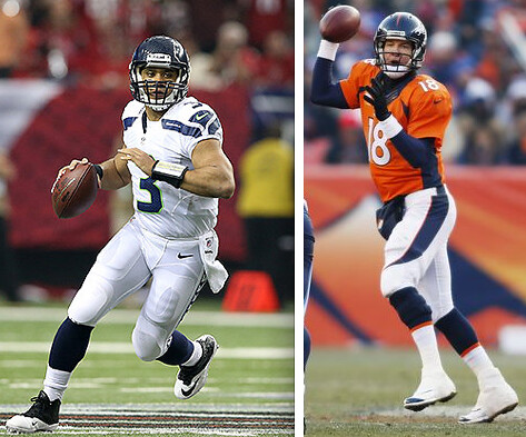
Peyton Manning’s No. 18 and Russell Wilson’s No. 3 represent the largest numerical difference between numbers worn by starting Super Bowl quarterbacks. The previous record was 12, way back in Super Bowl II, in which Green Bay’s Bart Starr wore No. 15 and Oakland’s Daryle Lamonica wore No. 3. Wilson ties Lamonica for the lowest number worn by a starting QB in the Super Bowl. The only other difference of 10 or more was in Super Bowl XXII, which featured Doug Williams wearing No. 17 and John Elway with No. 7.
Peyton Manning is the first quarterback to start in a Super Bowl wearing No. 18. The only starting Super Bowl quarterback wearing a higher number was Johnny Unitas, who wore No. 19 in Super Bowl V.
Quarterbacks wearing double-digit numbers are 12-10 in Super Bowl games against quarterbacks wearing single-digit numbers.
Wow. I think I speak for everyone here when I say Jay needs a new hobby deserves a pair of Super Bowl tickets for his efforts. Thanks, man!
As Jay noted, the AFC is the designated home conference this year, so the Broncos will presumably be wearing orange. That means the Seahawks will be wearing white — but which pants will they wear? They usually go solid white on the road, but they went white-over-navy for two games this past season — Week 10 against the Falcons and Week 15 against the Giants. Personally, I much prefer that look — here’s hoping they go with it. (I guess they could theoretically go with the gray pants, but that seems really unlikely.)
Either way, this is almost certainly going to go down as one of the worst-looking games in Super Bowl history. If you’d like to nominate any other games for that distinction, feel free to do so in the comments.
Raffle results: The winner of the game-used Bengals jersey is Al Rottini. Congrats to him, and my thanks to all who entered.

’Skins Watch: The Houston Independent School District board has voted to ban culturally insensitive mascot names (from Patrick O’Neill). … Also from Patrick: Florida State is attempting to stop a T-shirt company from selling an FSU shirt with a “Scalp ’Em!” slogan. … Steve Shapiro was at his son’s elementary school in Pittsburgh and saw that some 6th graders had done a class project on whether the ’Skins should change their name. … ’Skins CB DeAngelo Hall has clarified his statements about the team’s name (from Tommy Turner). ”¦ Remember that Canadian football team that recently stopped calling itself the Redskins? One of the primary activists who was advocating for the name change has received death threats and other menacing communiqués, all of which has led to a police investigation (from Matt Walthert).

Baseball News: Buried within this story on Saturday’s memorial service for Padres broadcaster Jerry Coleman is the news that the team will wear a memorial patch for Coleman in 2014. It will be based on this design (from Andrew Domingo). ”¦ You know that famous photo of Mike Tyson clowning with Doc Gooden and Darryl Strawberry? Here’s a video of that encounter (from Steve Dodell). … Last week I mentioned that camo was out and stirrups were in at Auburn. Here’s more info on that.

NFL News: The great collage illustrator Stephen Kroninger created illos of the four conference championship quarterbacks (from Sean Kane). … Bill Kellick was watching an old Browns/Bengals game from 1984 and spotted two things that amused him: a random station wagon parked on the sidelines and a mascot who seems to have gotten lost on his way to the Bears game. … Remember the China Bowl, which was proposed but never played? Here’s the football that would have been used for the game (from Ryan Perkins). … See that Dolphins jersey that Kenny Kaplan was wearing back in 1985? “When I bought that jersey, it only had sleeve stripes — no numbers,” he explains. “So I painted the numbers on with acrylic paint, which basically dried into kind of a plastic form and the numbers never wore off. Too bad I didn’t keep the jersey.” ”¦ Marshawn Lynch’s well-documented affection for Skittles is presumably to blame for this guy who attendeded yesterday’s NFL Championship Game (thanks, Phil). ”¦ For reasons that aren’t entirely clear — and that I suspect I’d rather not know — Austrian TV anchors apparently wear camouflage when discussing the NFL (Phil again).

Hockey News: The Maple Leafs revived their Winter Classic uni, only without the WC patch, for Saturday night’s game against the Habs (from David Feigenbaum). … Here’s a good shot of former Red Wings player Gerard Gallant with a football facemask on his helmet (from David Hamen). … Minnesota and Ohio State played an outdoor game on Friday night. Here’s a good photo gallery (from Mike Menner).

Basketball News: “I noticed Nuggets guard Nate Robinson wearing a Raiders hat in Friday night’s postgame interview — a general ‘no-no’ here in Denver,” says Pete Tognetti. “I know he played briefly for Golden State, but I wonder if his team owners, or anyone at Altitude (the Stan Kroenke-owned network that airs most if not all Nuggets and Avalanche games) will say anything.” … This is weird: One year the Hawks’ media guide listed Armond Hill as wearing No. 24 but showed him wearing No. 28. Basketball-reference.com doesn’t show him having worn 28. Hmmmm (from Douglas Ford). ”¦ Nice throwbacks for La Salle on Saturday (from Al Salazar).

Grab Bag: Here’s the Japanese speed skating uni for the Olympics (from Jeremy Brahm). … Kenny Kaplan sent in a photo of himself in his 1977 University of Texas lacrosse uni. “It was a little different than the football uniforms, as it had three sleeve stripes compared to two for football, and a black outline on the numbers and letters,” he says. “I still have that jersey and it’s in mint condition!”
want to see anchorman in boots? not only do we cover the newspeople in boots angle, but Bob Schieffer’s boots have the TCU logo on them!
link
Double your pleasure and get the boot fetish with a sports related twist. Everyone wins!
link
What’s a station wagon? ~ Young Guy
“What’s a station wagon? ~ Young Guy”
It’s like a crossover, but with wood panels on the side.
And isn’t designed so you look like you’re going rhino hunting on your way to the mall.
CLARK W GRIZWOLD HAS ARRIVED AT THREE RIVERS!
“Sorry folks, park’s closed. The bengal outside should have told you.”
link
SB
Love Jay’s Super Bowl analysis. One more: How many Super Bowls have featured the same color helmet, in this case predominately dark blue? Baltimore/NY Jets – how many others?
Going from memory without actually looking it up… I think the Patriots/Panthers is the only other instance.
’87 Giants/Broncos were quite close shades of blue.
Nah, the Giants helmets were freakin navy. Their jerseys weren’t too far off from Broncos helmet blue though. If the Giants/Broncos is close enough to count, then the Bills/Redskins are as well for both being shades of red.
Colts-Jets, for one.
Or does the question mean other than white vs. white?
Boy, talk about brain dead. Colts-Jets right there in your comment, Endive.
Du-uh.
Hmm; not sure the Broncos and Seahawks helmets are the “same color,” mainly because the latter has a metallic paint finish and the former does not, but I’ve argued elsewhere that different shades don’t count as different colors, so using that criterion there have been 5 other examples:
SB III Jets-Colts (white)
SB XXI Giants-Broncos (blue)
SB XXVII Redskins-Bills (red)
SB XXXVII Bucs-Raiders (silver)
SB XXXVIII Patriots-Panthers (silver)
Of course, only III and XXXVIII had both teams wearing precisely the same shade of the same color (or practically the same; not sure if there’s a subtle difference between the Pats’ silver and the Panthers’ silver).
Man, I really seem to be arguing with you a lot today… but I’d consider Tampa Bay’s pewter to be more of a shade of gold, rather than silver.
Still, considering how few colors are actually used for NFL helmets, it is rather amazing how few times we’ve had same-color matchups.
“Gold” to me has always been a metallic color with a yellowish tinge (Saints, 49ers, Notre Dame), whereas “silver” is whitish or grayish (Raiders, Patriots, Ohio State). Hence to me the Bucs’ “pewter” is a darker shade of silver, not gold, as it’s grayish, not yellowish.
By way of comparison, the USFL’s Michigan Panthers “champagne” and Arizona Wranglers’ “copper,” would be shades of gold.
…meaning, 2 of the 3 USFL championship games featured teams wearing the gold helmets (Panthers-Stars, Stars-Wranglers), and the third featured gold-vs.-yellow (Stars-Invaders).
gold? you are link.
and different shades mean different colours zep, that’s what differentiates them. next time i go to the long john silvers and they tell me it’s 2.39 for my hush puppies, i’ll just plop down a quarter and say “money”. money is money, it’s all the same, a quarter is 2.39. is this a dated comment, is there still along john silvers? i mean long john gold, sorry jeff.
I’m a lot of things, rpm. I guess I can be daft today.
Actual metallic pewter figurines and such do look like darker silver. What the Bucs wear, to my eyes at least, has a bit more brown in it, and is therefore closer to gold. Also, when Tampa Bay first unveiled their uniforms, I remember people saying they were ripping off the 49ers, not the Buckeyes.
…and yes, long john silvers still exists, but I have no idea how much the hushpuppies cost
rpm, unrealistic and inapt analogies are neither helpful nor illustrative.
Different shades = different colors for some purposes, but not all purposes. Believe it or not, it is possible to consider royal blue and navy blue to be the same color (i.e., both blue) in some contexts and for some purposes, while also considering them to be different colors in other contexts or for other purposes, without necessarily being dishonest, hypocritical, mentally incompetent or having a serious personality disorder.
However, if you’d like to take a jaunt down to your local LJS and carry out this little passive-aggressive charade you’ve described in order to “prove” me “wrong” and satisfy yourself thereof, by all means do so. Please be sure to YouTube it for us as well.
I’ve always thought what the actual football players wear, the helmet and pants is simply dark metallic grey. However, the coaches in wearing “team colors” would be a lot closer to a gold/beige. Something I’ve never understood.
In terms of most “unique” – I would argue the neon green is the most “unique”. Tampa Bay’s pewter, is really just part of an overall trend of going to darker shades. The Pirates Dijon colour of the early 70’s (or whatever rpm wants to call it), has occasionally made appearances.
Note it’s a clash of 90’s Nike vs. Modern day Nike, with certain similarities. Navy Blue being offset by a very vibrant colour. Ironically, IMO, Seattle uses that vibrant colour better (more restrained)
I’ve never discerned any yellowish, brownish or beigeish tinge in the Buccaneers’ pewter, neither on the helmets nor pants nor trim nor merchandise. To me it has always looked like a dark metallic gray.
wow! i made ’em both angry. well, jeff just likes to tell me to take off, which is cool by me if he does it under his name, i have a jeff love/hate. but the zepo-graph is befuddled…
it is never right proper to consider navy and royal the same colour, that’s why they are navy and royal. earth, saturn, it’s all the same, planets,
i don’t have a local LJS, they don’t exist on pluto. but i am not trying to prove you wrong, i am calling you a blow-hard. i just shot the video brother, here is your link
Oh, dear. Some random anonymous person on the Internet is calling me names. What ever shall I do?
i am neither random or anonymous. i have been here since the dawn, and my name is robert paul marshall. i live in chicago on halsted and 18th. what else would you like to know? i’m a taurus, 6’5″ 210, but i am getting a belly truth be told. i have sandy blond hair with a touch of grey, been known to carry a beard in the winter .i take the 8 to the blue quite often instead of driving because i hate cars. um, i like jazz, especially mingus, but that might be too specific. this is boring, but i assure you i am not anonymous here, i am one of the only ass-clowns who actually says who he is. leeet’s see, what else what else? oh,!i’m an artist who paints pretty blue pictures, but sometimes the blue ochre, but why call the colours by name? who are you zepo-graph?
“most unique”?
The Broncos are the first team to change the primary color of their home (i.e., colored) jersey after winning the Super Bowl, and then get back to the Super Bowl.
No, the first team to do that would be the Rams. Royal blue in ’79 and ’99, navy in ’01.
I thought about that; different shades don’t count. Mainly because shades subtly change over time due to changes in fabric & dyeing processes, so there’d have to be a criterion for whether a different shade of the same color counts as a “different color.” Hence for the purposes of this “statistic,” changing colors is not the same as changing shades of the same color.
I’m sorry, but I can’t accept that. Yeah there’s some minor changes due to technology or whatever, like the Lions “Honolulu blue” fluctuating over the years, but the Rams made a specific choice to switch from royal blue to navy blue. If the Titans had made it instead of Denver, would you ignore their primary jersey switch from navy to powder? What about the Eagles? What they wore in 1980 and what they wear now are both “green” but they’re certainly not the same color.
Ok, the Eagles & Titans didn’t win in their previously colored jerseys, but still, you’re almost getting to the point of tailoring your statistic specifically to fit Denver. They’re also the only team to wear orange jerseys in a Superbowl, and the only team to have a horse on their helmet in a Superbowl, and…
I get what you’re saying, and that’s fine. All I’m saying is that for the purposes of this statistic, the criterion is a change to a different color, not to a different shade of the same color.
Yes, because the statement is that the Broncos are the first team to change colors after winning. The Patriots also changed colors (red to blue) after losing, and incidentally, so did the Broncos (orange to blue).
Ditto; the Eagles also changed shades after losing.
The Giants also changed shades after winning, as did the Cowboys. The 49ers changed shades after winning but changed back by the time they returned.
Dude, why the hostility? Does the idea that changing colors and changing shades are two different things really offend you that much? Or is “tailoring [a] statistic” to demonstrate that something is happening for the first time an unforgivable offense?
I’m really not trying to be hostile. It’s just a nit-picky pet-peeve sorta thing. Don’t take it personally or anything.
Note also that the Rams wore white in all three of their Super Bowl appearances. So the Broncos will still be the first team to actually wear a different-colored colored jersey in the Super Bowl after winning in one.
sorry zep, jeff check and mate. how can someone be so wrong so often? you’re 0-2 man, i better read on to see if you can make a miracle comeback, or i could blow a call or two and say your even, but that wouldn’t be fair to my very good friend columbus jeff. who i truly love dearly.
I’m sorry; I wasn’t aware that you were being forced against your will to read the Uni Watch comment board. How awful that must be for you. I’m sure there are web pages out there where there are no discussions, debates or disagreements, that you might like better; perhaps those who are forcing you to read this page will allow you to read those pages, if you ask them nicely.
there is a reason i stopped the comments years ago and just read the blog every day. but no, nobody forced me to be here. i just find it laughable that you consider yourself some sort of authority on everything. including colour theory, which you obviously failed. i mean for corn’s sake man, navy is royal?! not even on a grey scale is that true.
Did I say navy is royal? No. I said they are both blue. Which is true. They are different shades of the same color.
The Titans, Bills, Giants, Chargers, Patriots, Seahawks, Lions, Bears, Rams and Colts all wear blue. Is that a false statement? No. Does any of those teams not wear blue? No. They all wear blue.
Your language- and mind-reading skills are wanting, I’m afraid.
no, they are different colours man.is purple blue? orange is red? okay, i guess navy and royal are colours. shoot, i guess all colours are colours, why give them names? where does it stop? colubia is pink because they are light shades? blue? the sky and the sea are blue, but do you see them as the same colour? is it that simple? you make me love jeff, at least he has something in the brain pan.
Between royal and navy, which of the two is not blue?
Hate to break this to you, rpm, but it’s not a competition. And I’m not wrong. But if it pleases you to believe so, do go ahead.
it’s clearly a competition because you and columbus jeff comment on eeeeeeverything. neither of you can let any topic go without your 2 deutschmarks, it’s really beyond annoying(see me today until 1pm).
at least jeff is an NFL savant who likes colour on colour, and i can dig the later. what does the zepograph believe? the sky is green? i mean it’s a cool colour and all.
Can the seahawks wear their gray jerseys, or are they considered an ‘alternate’ and therefore not allowable?
It’s an alternate, therefore it can’t be used.
Of course, if the Seahawks equipment guys “accidentally” packed the gray pants & jerseys instead of white (hey, the lights were dim, we thought these were the white ones… whoops), what could the NFL do? It’s not like they’re going to cancel the game.
/stupid rules are stupid
I think the most likely penalty would be Seattle being docked a timeout to start the game.
They’d have a week to fix it, and the league would insist.
Would love to see the Seahawks go with no logo on their helmet though.
Nice picture of Gallant, showing off the Red Wings’ 60th Anniversary logo which was direct-embroidered to the jersey. (Too bad that was a horrible season…)
This Super Bowl will definitely be the worst uni-looking one yet. Let’s hope that Denver wears orange and Seattle wears their white over navy road uniform. At least that would lessen the severity of the horrible uniforms.
Also, am I the only one who likes the Seattle uniform? Maybe its the new HDTV, but the green accents seem to have extra pop in the overcast skies.
If Seattle would just get rid of the solid blue or solid white look, I think their uniforms would be bearable. The monochrome uniforms look like something the local high school would wear.
Has Seattle ever wore the white pants at home with this latest gear? Just wondering if the mono look at home is some sort of tradition.
I has to be a tradition. Since ditched their classic look in 2002, they’ve worn almost exclusively monochrome at home. Only exceptions I can think of are the neon jersey and the blue over navy combination that they used in 2009: link
Looks like they wore blue over white in 2005, but that may have been a road game: link
I look at that thng all the time. The colors are nice but the package makes no sense. Too many elements, too random and the nike advertisment on the shoulders makes it irredeemable.
Which brings me to Stephen Kroninger’s superb qb collages. Those are really great. But…while I respect the attention to detail, it’s unsettleing to see the uniform manufacturer’s logo on the depictions.
You echo my feelings… Some good ideas, and I don’t dislike the color scheme, but not executed very well.
Lee
I agree completely – Seattle is one of my favourite NFL uniforms and I think that the neon green is a perfect accent colour.
I also agree that the monochrome blue “scuba suit” look is not a good look. Pair the blue jerseys with grey pants and its a perfect look.
My wife asked me this morning “Who won?” When I replied “Seattle” she said “Oh, the ones with the pretty outfits.” Sums up everything that is wrong with uniforms today. They’re making ‘Outfits” not “uniforms”. However, I really could get behind the Seahawks “outfits” if they’d wear Blue over Gray and White over Blue. The solid blue just looks brutal.
The blue shirts and blue britches are pure greatness. So is the gray shirts and britches.
I would chalk her calling it an outfit up to her being a woman.
link
They would look awesome if they went with no logo on their helmet.
This is also the first SB where the two teams had been in the same division prior to being SB opponents.
Nope. Raiders/Bucs – Tampa played in the AFC West in 1976.
Forgot about that one, as I was concerned with the pre-merger division alignments.
Badly worded that I didn’t say multi-year series.
I have to drop a post-merger caveat on that. The Steelers shared the old Eastern Conference with the Cowboys and Cardinals from 1960-66, and were in the Century Division with the Cards from 1967-69.
No, but it’s the first Super Bowl to be played between teams that have previously played each other in conference playoffs. The only other teams to play each other in the Super Bowl and conference playoffs at different times in their history are the Jets and Colts.
Manning wore No. 18 with the Colts so if he is the first QB to wear No. 18 in a Super Bowl, he first did it in 2007.
He is the first, and thus far the only. Saying he “was the first” or “is the only” would have been more precise, but it’s still true.
I think the Broncos in all white vs. Falcons in black was the most hideous Super Bowl I can remember.
I think the worst was Steelers-Cardinals. The only other SB where neither team wore varsity/block numerals.
Patriots/Eagles
One notable from Sunday was Peyton Manning taking the time to remove the hologram sticker and other tags from his AFC champions cap (while surrounded by a horde of cameras) before putting it on. Some will see it as Manning being hopelessly square but I thought it was great.
Saw that as well, and thought it was pretty cool that he did that…
I agree – I thought that was great!!! Totally old school.
+1. SAW IT. FORGOT TO MENTION IT HERE.
Saw a Meme the other day that stated…”If everyone who left all the stickers on their caps returned them on the same day, New Era would be screwed.”
I noticed it and thought, could he be more middle aged white guy (square)? He takes off the stickers, curves the brim of the hat, and then takes the tag off the t-shirt. Perfect.
If they wear a flat-brim cap, deduct 10 IQ points. If they leave the stickers on the cap, deduct 10 more points. If they wear the cap with the brim off-center, deduct 10 more points.
The Seahawks jersey isn’t bad yet. It may be dated in 10 years, but for now it’s decent.
The Broncos jersey, aside from being ugly, looks like something a college team would wear in 1998.
“The Broncos jersey, aside from being ugly, looks like something a college team would wear in 1998.”
Nah, it looks like something a college team would have worn in about 2000, seeing as how the Broncos debuted that look in 1997 and it took a couple of years for it to trickle down to college.
First time “neon” green will appear as a uniform color in a championship of any of the 4 major North American sports? Perhaps the most unique color shade to appear since the Dijon mustard 1971 Pittsburgh Pirates.
While very remote, IMO – it would be great to have one end zone painted Broncos orange, the other neon green.
Perhaps the most unique color shade to appear since the Dijon mustard 1971 Pittsburgh Pirates.
I’d say Tampa Bay’s pewter would easily win that distinction.
I’d say that it’s a contest that can have no winner.
No, not because the colors are ugly, but because it’s impossible for something to be the most unique. It’s either unique or it isn’t.
All three of the aforementioned colors fit that description.
Howsabout the ‘Edskins burgundy???
nevermind. harumph
i’d say adding “dijon” to “mustard” makes me want to pull his limo over and ask him if he has any needs a whoopin’, but that’s me. especially when you consider “dijon” was not the mustard shade of the pirates, it was clearly “dusseldorf”. maybe if you squint it’s whole grain on pumpernickel, but dijon? dijon?!
way to stay zen, pewter is probably better to bring up, but you are far more classy then i is.
The Pewter still is one of the most under-used team color that actually works well! That and Green.
Seahawks had neon green in their last uniform set, which they wore in Super Bowl XL against the Steelers, albeit very little of it.
Question: Are the Packers the first team to win the Super Bowl wearing 4 different uniform combinations (3 different uniform Sets)? SB I & II featured the same set but the home and away versions. SB 31 featured a uniform that looked similar to the original set but sans strips on the socks and with a green facemask. And then for SB XLV they were wearing the same uniform set worn in SB 32 but the home version of it. So: Home and Away versions of 60s uniforms, home version of early 90s uniforms, and home version of current uniforms.
Going by GUD the 49ers are the closet ones to come to that mark having won wearing 3 different combos (home and away various times in the 80s and then the 75th anniversary uniforms in 1994). They have worn 4 combos in total (1 less than the Packers), and the Cowboys can claim 3 different combos in wins if you count the changes in their socks (placement of stripes, and 1 year without any stripes).
Certainly they are the first to change their uniforms following a Superbowl and make it back the next year (SB 31 – 5 stripes SB 32 – 3 Stripes), or is there someone I am missing?
Darnit, wrong area. I’ll repost it below.
My $.02, the Packers’ uniform of 1966-67 is not significantly different from their current set; the only changes are to sleeve striping and the positioning of the TV numerals. I would consider what they have now to be essentially the same as what they had then, at least not enough to consider it a uniform change like, e.g., the Patriots or Broncos made.
Same with the Steelers; the current uniform is basically the same except for the numeral font, so I would consider it to be the same uniform.
For completeness’ sake, the Seahawks have combined their white jerseys with grey pants a few times.
link
link
They wore them in WK1, WK4, WK7 of 2012, and Preseason Game 3 of 2013. (via Gridiron Uniform Database)
I think they lost all three of those regular season games. May explain why they stopped wearing them.
This may have been covered before, but I noticed that many of the Seattle players had inserts in their “earholes”, presumably to keep out the noise. Here’s Sherman and another defender at the end of the game:
link
I noticed that the kicker also featured this helmet treatment.
Seahawks white on white is their best combo as it contains the least amount of neon green.
By best, you obviously mean worst. The neon green is the best part of the Seahawks color scheme. The all-white uniforms are terrible because there isn’t enough green.
I really wish the NFL would let this Superbowl be color-vs-color. Denver in orange jerseys vs Seattle in mono-blue would look so much better than what we’ll get with Seattle likely wearing all white.
I also wish the NFL would allow that. I think that making the rule that the uniforms must just contrast would be sufficent. I really would love to see the orange v. blue.
The Seahawks best combo is white jerseys with blue pants. Really feel(hope) this is what they’re going to go with.
as long as the Seahawks continue to wear blue socks with them, there is no possible combo that includes the blue pants that looks anything remotely close to good.
what this tower of a man said, it’s a no brainer slam dunk.
^
What JTH said.
Almost every team that wears dark pants screws it up by wearing dark socks of the same color.
Agreed. The white-over-blue is Seattle’s best look.
we all need a new hobby. that’s a great point, spot on.
Say, who’s up for a trip to SBGUSC this afternoon?
mmmmm, trip. can we video tape it but never show it publicly? never you mind, i trust you.
OK, but the LJS location is your call. Englewood or Lincolnwood?
Not sure if there’s a store in Maywood…
let’s hit the one by the purple hotel in lincolnwood. i mean blue hotel, sorry graplin. i want a fried “fish”. hush puppies, and french fries with loads of tartar sauce slathered on top. just give me brown food .sorry, i mean red food, or is it blue food, i am so confused by colour now, my world is fractured.
can we have a moment of silence for link?
seriously? motherhgrumbles. okay, let’s hit the LJS in cicero instead.
IF the @Seahawks wear their white tops as the visiting team. They are 3-3 w/ white pants in the past 2 years and 2-1 w/ blue pants. 0-3 w/ gray
Love this look; link
That’s what I’m hoping for, but I would like to see a nontraditional blue vs orange match up in the Super Bowl.
I find it interesting that DeAngelo Hall’s “clarification” of his position on the ‘Skins’ name has actually made it incomprehensible.
One line from that piece that really stood out was “on Friday he acknowledged the sensitive nature of the topic”. So using a racial epithet for a national brand and sporting icon is kosher, but even broaching or acknowledging the idea that it might be controversial is so sensitive that a player has to awkwardly walk back his comments in case some harm comes of it?
DeAngelo Hall would probably prefer that any team he is a member of be called the “DeAngelos”. The Atlanta DeAngelos, the Washington DeAngelos, etc.
So I guess The Jeff would prefer the Hawks to go back to their all green jerseys. Agree to disagree.
I don’t understand how the Bengals and Seahawks helmets are different from many teams that I would consider “mirror-image”: Broncos, Bills, Ravens, Cowboys, etc.
Can someone explain?
“I don’t understand how the Bengals and Seahawks helmets are different from many teams that I would consider “mirror-image”: Broncos, Bills, Ravens, Cowboys, etc.
Can someone explain?”
I believe Jay is pointing out how the decal wraps around the helmet. In the Seahawks’ case, it wraps around the back of the helmet. In the Bengals’ case, the decals wrap over the top.
I guess it’s because the decal they use actually overlaps the center of the helmet? I thought it was a rather odd thing to point out as well.
The difference is that other teams use two decals, a “left” and “right” decal, to create mirror images, whereas the Seahawks and Bengals use a single decal (or a set of single decals) to create mirror images.
If the 49ers had won, it would have been relevant to point out that teams with the same decal on each side are a combined 13-5 in Super Bowls against teams whose left and right decals are mirror images of each other. The latter category includes the Ravens and Chiefs, which are not precise mirror images due to the letters, but the statistic excludes games involving the Steelers and Bengals because they don’t really fit into either category.
The Steelers have only one decal, like the 49ers, Jets, Packers and Colts, among others, but only apply it on one side, hence the left and right sides of the helmet are different, but not mirror images (or quasi-mirror images like the Chiefs, Ravens and Dolphins).
The Bengals’ left and right helmet profiles are mirror images of each other, but not because they have two separate left and right decals; each stripe is a single decal centered on the top of the helmet rather than the profile.
Similarly, the Seahawks’ current helmet profiles are mirror images formed by a single decal rather than two separate decals, which they were still using when they played in SB XL.
For the record, the Steelers are 2-2 against teams with the same decal on each side (2 wins over the Cowboys, losses to the Cowboys and Packers) and 4-0 against teams with mirror-image left and right decals (Vikings, Rams, Seahawks, Cardinals).
[The Seahawks are] the third team to lose one (and only one) Super Bowl in one uniform set, then go back to the Super Bowl in a different uniform set (the others were the Patriots, who did it twice, and the ’Skins).
Eagles: 1980 they link and then the Eagles link.
Same color, different shade – see above.
You’re correct; the Seahawks are the 4th. Issue here is overall uniform set, not colors; these are 2 different uniforms.
I recall “random” automobiles being parked behind the corner of the end zone at Three Rivers Stadium and Jack Murphy Stadium during the late 70’s. Never made any sense.
You are definitely correct with Three Rivers Stadium. I can distinctly remember Lynn Swann jumping over a car parked behind the endzone after catching a game winning overtime TD against, I think, the Browns!!!
Correct.
link
Well, correct about the car, not the catch.
The automobiles were a sponsor’s product.
I wondered if maybe some lucky fan was going to win a station wagon at halftime.
This Super Bowl has to be Phil Knight’s ultimate wet dream.
The original avant garde football makeover vs. a uniform Nike remade wholesale once getting the new contract.
Coincidentally, the Pro Bowl happens to be Team Orange vs. Team Neon. The Broncos wear orange, and the Seahawks have neon.
When you put it like that, I almost start to wonder if the game is fixed.
/like in 2001, after 9/11 and everyone was all America, Fuck Yeah! and we had the Patriots & Eagles in the Superbowl, because an obvious fumble was ruled a forward pass for some reason
link
…but that was Patriots-Rams, not Patriots-Eagles, which followed the 2004 season.
Err… yeah. Dammit. Apparently that play pissed me off so badly that I can’t even remember things properly.
I still agree with that conspiracy theory guy, though.
Also, the first Super Bowl where the teams come from cities where marijuana is legal.
THIS is the year Paul McCartney should have done the halftime show.
Let’s be perfectly blunt.
Patriots – Eagles is definitely the ugliest Super Bowl in history. This one will give it a run for it’s money, but I’m not sure it will look worse. If Denver does, as expected, go orange with Seattle in all white, it will be merely the second ugliest SB.
Good call.
I still haven’t thought of my “bash name” for this matchup. Pot Bowl is too obvious, so I won’t use that.
It’s the Smoke-a Bowl.
I think #bowl sums up all the various levels of things worth ridiculing here.
When the Seahawks were running around with the 12th Man flag, it looked so weird cuz it was a white block numeral on blue–as opposed to the grey w/ green trim numeral they currently use on their jerseys. It looked disjounted to me.
I noticed the same thing about the 12th Man flag. It looks like Seattle still uses link that they used on link from 2002 to 2011.
I can’t imagine why the team wouldn’t want to pony up the money to make a flag link. If not the team, then you’d think that Nike would pay for it.
I agree that color vs color would be a good way to go. I always heard that the TV trucks have b&w monitors, therefore one team has to dress in white. I would think by now those trucks have color monitors though.
The only conclusion must be there are still homes with b&w tv’s and color-blinded people, which wouldn’t be fair to them if the game was color vs color.
I read today’s entry quite early this am and I’m still thinking of the station wagon haha hilarious! I bet the back door window rolled down. Those boats on wheels were great for fishtailing.
Although there are vehicles in today’s world that have the fake wood look ->ugly.
My theory on Armond Hill wearing 28 is that this photo must’ve been taken between the 1975-76 and 1976-77 seasons, and number 24 was already taken by Jim Creighton in 1976-77 so Hill chose number 28. Since 1976-77 was Creighton’s only season in the NBA, it’s safe to assume that once he was released, number 24 became available again after that photo shoot and thus Hill didn’t have to wear 28 in any of the actual games.
In a perfect world they would both wear their home unis. No only making it an awesome color on color game, but cementing the “Ugliest Super Bowl Ever” title. Can’t seem anyone topping that unless they added camo-breast cancer pink accessories. Oh god, forget I ever said that, I just gave some idiot in marketing an idea for his team didn’t I?
Heck with pink, why is neither team wearing camo or flag desecration unis? Why does the NFL hate America so much?
Are the Seahawks the first team to wear open-foured numbers?
Depending on how you define “open fours,” the Broncos link in Super Bowls XXXII and XXXIII. While the upper left line of the “4” in the Broncos’ numeral font does slant diagonally to the right, it doesn’t meet the vertical line on the right.
So, seeing how the Broncos still wear that same numeral font, is this the first Super Bowl between teams with “open-foured” numbers?
The order for teams wearing open 4s goes: Broncos – Broncos – Titans – Seahawks/Broncos.
Didn’t the Steelers elect to wear white vs. Seattle in their Super Bowl even though they were the home team? That would’ve at least saved us from seeing those god awful “muddy blue” monochrome monstrosities that Seattle used to wear. There current monochrome is hideous, but miles better than that.
I actually preferred the grayish shade of blue that Seattle wore the last time they were in the Super Bowl. If nothing else, it was a refreshing departure from the royal blues and navy blues that just about every other team with blue in their color scheme seems to wear. I will agree, however, that pairing it with pants of the same color was overkill. I’d remember that uniform ensemble more fondly if they’d worn their white pants with the blue-gray jerseys.
Steelers chose to do that because they were the away team throughout the Playoffs and didn’t want to mess with the mojo. Packers had the opportunity to do the same thing in 2010 but went with Green.
Unless Denver decides that the Orange jerseys are cursed, I doubt we’ll see them wear white in the SB.
would like to see Seattle wear the gray shirts and blue britches also. Hats and britches should be the same color if you gotta wear white shirts.
I agree, but it would be better if the socks weren’t also navy.
In the last 9 Super Bowls, the Packers are the only team to win the Super Bowl in a jersey that wasn’t white.
Steelers-Rams 1980 was a pretty ugly Super Bowl, just based on the way the color schemes blended. All that athletic gold.
Question: Are the Packers the first team to win the Super Bowl wearing 4 different uniform combinations (3 different uniform Sets)? SB I & II featured the same set but the home and away versions. SB 31 featured a uniform that looked similar to the original set but sans strips on the socks and with a green facemask. And then for SB XLV they were wearing the same uniform set worn in SB 32 but the home version of it. So: Home and Away versions of 60s uniforms, home version of early 90s uniforms, and home version of current uniforms.
Going by GUD the 49ers are the closet ones to come to that mark having won wearing 3 different combos (home and away various times in the 80s and then the 75th anniversary uniforms in 1994). They have worn 4 combos in total (1 less than the Packers), and the Cowboys can claim 3 different combos in wins if you count the changes in their socks (placement of stripes, and 1 year without any stripes).
Certainly they are the first to change their uniforms following a Superbowl and make it back the next year (SB 31 — 5 stripes SB 32 — 3 Stripes), or is there someone I am missing?
See my comment above. The difference is so subtle (sleeve striping and location of TV numerals) that I would consider the current uniform to be the same (or essentially the same) as the 1966-67 version. When I talk about changes I typically refer to wholesale changes like, e.g., the Patriots and Broncos made. There are changes and there are tweaks; the Packers, like the Steelers and Cowboys, have only tweaked their uniforms from one Super Bowl (or time period) to the next.
I really hope the seahawks say “Fuck it” and ask if they can also wear their solid navy home uniforms. If it could possibly be the worst looking at least it would be Color v. Color. As a Broncos fan I love the Orange jerseys over the Navy ones Elway won in. But that is simply me. On their own each uniform is not bad but together I can understand not that pleasing as say FSU v. Duke in the ACC Championship.
The only other difference of 10 or more was in Super Bowl XXII, which featured Doug Williams wearing No. 17 and John Elway with No. 7.
In SB XLI, Peyton Manning wore No. 18, and Rex Grossman wore No. 8.
That’s right; I thought Grossman wore #9. Good catch.
I don’t know if anyone’s posted this yet, I did check today’s and yesterday’s ticker and comments, but I may have missed it.
Martellus Bennett wants to tweak the Bears unis….Personally, I don’t agree with what he likes, no one in their right mind likes white over white and blue over blue. I also love the stripes on the socks.
link
The blue shirts and britches would be nice.
Seahawks need to go with no logo on their helmet in the Super Bowl along with white on blue. That would be awesome.
I like blue over grey for home and either white over blue or grey over blue (looks the roughest to me).
Here are all the combos of the seahawk uni:
[ link ]
Is it too late for Nike to introduce a neon green jersey for the Seahawks so we can have a “Colorblind Super Bowl” with the teams wearing neon orange and neon green?
All joking aside, is there any traction for a color on color Super Bowl this year? These are about as contrasting as you get, with orange vs navy.
Surprised that no Dallas fans voted for Super Bowl V as the worst looking Super Bowl simply because the Cowboys had to wear blue. However, I love the Cowboys in blue, so I thought that game looked pretty darn cool.
Worst Super Bowl ever IMHO was Chargers-49ers. Both in quality of game and lack of aesthetic quality. Cannot stand the Chargers’ white/navy combination today. Really hated it in the Ross era.
I agree… I hated it because it was throwback vs. modern… Chargers should have worn powder blues sincde 49ers were wearing throwbacks all year, or else nboth team should have wore modern. Either way, but don’t mix the two…
Good pick. I like the Niners but their “throwback” uniform that year was not a good look, especially since they wore it with their usual gold helmet. And that Chargers’ uniform was nothing special.
The Cowboys vs 49ers NFC Championship Game that season would go down as the worst uniform combo in a Conference Championship Game.
For worst Super Bowl uniform-pairings of all time, I’d suggest these:
1. 49ers vs Chargers (already mentioned)
2. Falcons vs Broncos (already mentioned)
3. Steelers vs Seahawks (only because the Seahawks wore that odd blue-green color and did so in momochrome)
4. Broncos vs Redskins
5. Rams vs Patriots (the Rams had that goofy gold stripe down the side of their jerseys, not to mention the gold replacing the yellow).
Dishonorable Mention: Both Giants vs Patriots games; Pats vs Eagles, mainly because of Pats blue pants and jersey stripe up the side.
Suggestion For Five Best-Looking Combos:
1. Raiders vs Vikings (two classic designs on a sunny day at the Rose Bowl looked great)
2. Redskins vs Dolphins SB VII (again, two classic styles)
3. Rams vs Titans (Rams yellow vs Titans’ blue over white, which the Titans wisely brought back this year)
4. Oakland vs Green Bay (yet another classic with both still wearing essentially the same look today)
5. Pittsburgh vs Dallas (Pittsiburgh had their block-letter numerals and Dallas whites have always looked good)