As you may have heard yesterday, the NBA All-Star Game jerseys were unveiled yesterday. I’ll get to that in a minute, but first I have two other NBA-related exclusives:
1. I recently heard from a credible source who told me that the Nets have developed a new jersey that’s a lot like their classic Dr. J-era look, but rendered in their current black-and-white color scheme and with their current font. The source created a mock-up to show roughly what it looks like:
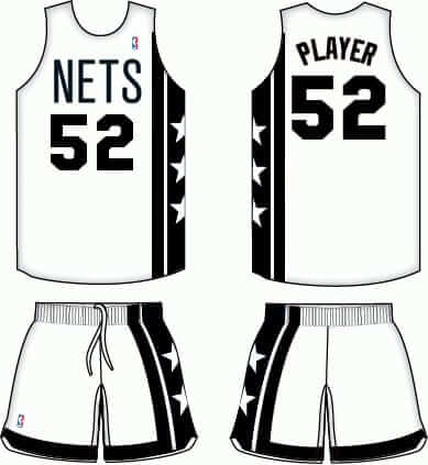
But here’s the thing: Unlike that mock-up, this new jersey has sleeves. That fits perfectly with the ambiguous news we recently heard about the league going with sleeved “heritage jerseys” next season. Neither the NBA nor Adidas has been willing to say what qualifies as a “heritage jersey,” but this new Nets design would appear to fit the bill.
My source isn’t sure whether this new design is final, or just a prototype, or still in development. Time will tell.
2. My source has also seen what appears to be the new Charlotte Hornets uni set. Again, it’s not clear what stage of development these are in — they could be prototypes. My source created a mock-up of the white uniform from memory, so this is not an exact representation, but it should give you a general idea:

As you can see, there are no pinstripes and the number font is very blocky. My source says there’s also a teal version with purple lettering/trim and a purple version with teal lettering/trim, both with “Charlotte” on the chest, following the same general template as the white design.
To reiterate: While I trust my source in terms of what he saw, it’s not clear whether these are final designs, prototypes, or something else.
Okay, now let’s circle back to those All-Star jerseys. I’ve actually known about the All-Star designs since last summer, and I published a written description of them in November, but I wasn’t at liberty to show you the visuals. But then reader Julien Simonin spotted the East design listed for sale on a French website. Once something’s out in the open like that, it’s open season, so I tweeted the design yesterday morning:
EXCLUSIVE! NBA All-Star jersey leaked on French site. I confirm it's the real deal –> https://t.co/ihX7lPzEQu pic.twitter.com/7tuvUvp3E4
— Paul Lukas (@UniWatch) January 16, 2014
The listing on the French site was soon taken down, but by then it was too late. Then, maybe 20 minutes later, Chris Creamer showed me a tweet from someone in Spain who had leaked photos of the East and West designs:
More NBA All-Star leaks, this time showing the West jersey:
pic.twitter.com/rv25isyUkr
— Paul Lukas (@UniWatch) January 16, 2014
The ESPN news desk asked me to write something about the leaks, so I asked the NBA for comment. They didn’t respond, so we went ahead with the story anyway. Soon after that, I heard that the NBA would be officially unveiling the designs that afternoon, in response to the leaks, and here we are.
Speaking of the leaks: It’s not surprising that a retail site would accidentally post the design too soon — that stuff happens (although it’s a little odd that it was a French site). But what about the Spanish guy who tweeted those other photos? How did he have access to the jerseys? A British source provided me with the explanation yesterday afternoon:
Those photos are from Foot Locker’s “Approved Heat” event here in London at the O2 before the NBA’s Nets/Hawks game. A number of media/bloggers/sneakerheads had been flown in from across Europe to preview Foot Locker’s “Approved Heat” collection that launches in stores in February, and it seems as though they displayed the All-Star designs before they were officially released. One of the journalists in attendance who tweeted pictures got a call from Adidas people in his country who weren’t happy, asking how he had seen them.
Hmmmm. When it comes to the NBA’s corporate partners, it appears that the left hand didn’t know what the right hand was doing. Maybe they wouldn’t have so many leaks if they weren’t so busy trying to buy off journalists by treating them to junkets and parading them in front of merch displays.
Finally, reader Scott Moody has come up with an interesting variation on the All-Star designs. I’ll let him explain:
I started thinking about how cool it was when players wore their regular unis during the All-Star Game. But I get the idea of having a special uni. So I started thinking about what if they combined the two ideas? What if the uni was a mashup of sorts, a combination of the player’s team uniform design and the All-Star game’s colors? It might look like this [click to enlarge]:
Not bad, Scott — I like. Thanks for sharing.
Maybe the glare is why he’s wearing that eye patch: Yesterday’s Ticker linked to some photos of an old Raiders helmet. That prompted the following comment from The Jeff:
This bugs me every time I see an old Raiders helmet. Look at the logo on the side — the helmet on the logo is depicted with white glare on it. But if you go to a site like SportsLogos.net, you’ll see the Raiders logo being listed as unchanged since 1964. Why does this version with the glare not seem to show up in any online databases, and when did the team stop using it?
I’d never noticed this myself, so I sent a note to SportsLogos.net honcho Chris Creamer. His response:
Like you, I’d never noticed this before. Doing some quick research, I’m finding photos of the Raiders using this glare logo as their helmet decal until at least 1992, possibly later. Conversely, I’m also finding glare-free logos used on official team pocket schedules and media guides as far back as 1978. In the early ’70s it looks as if all logo use had the glare.
Could be a situation where the helmet logo was slightly different from the primary logo during these years?
Interesting. If anyone out there knows more about this, please fill us in.
ESPN reminder: In case you missed it yesterday afternoon, I wrote a piece about Wes Welker’s new helmet.
Raffle reminder: Today’s the last day to enter the raffle for the game-used Bengals jersey. For details, look here.
QBC reminder: Last call for the Queens Baseball Convention, which takes place tomorrow. Phil and I hope to see lots of you there.

’Skins Watch: Was the demotion of Chief Wahoo forced upon the Indians by MLB higher-ups? At least one writer thinks so. … ’Skins CB DeAngelo Hall thinks the team should change its name (from Tommy Turner).

Baseball News: Whoa, check out the uniforms for the 1908 Reach All-American Stars — tri-colored striping on the stockings and the undersleeves! (Great find by Bruce Menard.) … Keith Olbermann sent in a shot of Kevin Mitchell going NNOB during his first game with the Giants. This wasn’t so uncommon back in the day when a player got traded, especially if their new team was in the middle of a road trip. The traded player often had to wait a game or two for his NOB. The ’89 Giants probably posed a particularly tricky problem, because their NOB lettering was vertically arched. … The Madison Mallards — that’s a wood bat summer league team — are conducting a design contest for their alternate jersey (from Jerry Nitzh). … Reprinted from yesterday’s comments: Look at that belt! I’m told that’s called a “meander” pattern. … New orange alts for Tennessee.

NFL News: Former NFL player Nate Jackson has written a fantastic account of what it’s like to play in cold weather, with lots of uni-related bits. Great illustration, too. ”¦ Look at this: official NFL slacks — from the 1960s! (Great find by Scott M.X. Turner.) … Speaking of slacks, no more pleated khakis for Jim Harbaugh (thanks, Brinke). ”¦ Yesterday we linked to those “hipster” NFL team logos. Here’s a story about the guy who created them (from my pal Meteorologist Michelle).

College Football News: Some players at the East-West Shrine Game, where players routinely swap helmet logos, are apparently mocking Texas by wearing Longhorns logos horns-down (thanks, Phil).

Hockey News: The backplate of USA Olympic women’s hockey goalie Jessie Vetter’s mask had included her surname and the “We the People” line from the Constitution’s preamble, but those are against IOC regulations, so she’s had to change the design. … Key passage from this article about the Lake Placid Olympic Museum: “For years, the staff at the museum [couldn’t] figure out why some of the 1932 United States Ice Hockey players had a white band around their jerseys. After searching the archives for answers and asking Olympic scholars, it wasn’t until just recently we discovered that the purpose of the white bands was to differentiate between defensemen and forwards. For instance, if a forward saw a player with a white band (defensemen) ahead of him, it was a signal for the forward to stay back and temporarily fill in the defense position” (from Will Scheibler). … Check out this awesome photo of the 1936 Japanese Olympic goalie (nice find by Chris Mizzoni). … Here are the top 10 high school hockey jerseys in Fairfield County, Connecticut (from Chris Jowdy). … The ECHL has released the jerseys for Hockey Heritage Weekend (thanks, Phil). … Don Cherry uniforms for the Lloydminster Bobcats.

Soccer News: The logo for Stabaek FC — that’s a Norwegian team — includes what appears to be a fraction. “I asked on Twitter for the story behind that,” says Brad Beatty. “Someone explained that it’s not a fraction — it’s the date and year that the team was founded. I’m familiar with the European custom of writing the date as date/month/year but I’ve never seen it expressed as a fraction like this before. Not sure if that’s Scandanavian-specific or a larger custom, but either way it’s first time I’ve ever seen a fraction on a sports logo.” … Colombia’s second jersey has leaked. “I know most of your readers don’t read Spanish,” says Fernando Cardenas, “so I want to point out the first sentence goes, ‘Adidas’ head of leaking stuff has leaked new pictures…’ I just thought that was genius.” … New kits for Italy and AC Milan (from Trevor Williams). ”¦ Australia will wear white socks at the World Cup (from Yusuke Toyoda). ”¦ Also from Yusuke: Hull City’s owner has threatened to quit if he’s not allowed to change the team’s name to the Hull Tigers. ”¦ And one more from Yusuke: The MLS Superdraft was yesterday, which means there were a lot of people wearing colorful scarves over their suits.

NBA News: Pleasantly surprised to see that the Nets and Hawks just wore their regular uniforms for yesterday’s game in London. No patches, no sleeves, etc. … What’s going on here? Practice photo, perhaps? (From Matt Wade.) … The Kings have become the first pro sports team to accept Bitcoin (thanks, Phil). … How many warm-ups can one guy be wearing over his jersey? This many (from Duncan Wilson). ”¦ The Suns will debut their sleeved orange alts tonight.

Grab Bag: Menswear design Alexander Julian, who designed the original Charlotte Hornets uniforms, has a whole section on his company’s website devoted to his sports-related designs (from Tommy Turner). … New speed skating uniforms for the U.S. Olympic team. Can’t say I really understand that white patch around the crotch. … Navy is switching from Nike to Under Armour for all its athletic gear (from Kevin Whisman). … New logo for Absolut Vodka (thanks, Brinke). … Rafael Nadal is wearing “disguised” shoes at the Aussie Open (from Jerry Jubb). … Here’s a look at Johns Hopkins lacrosse jerseys through the years (from Rob Turning).
Hey, any new convert to the “Change the Redskins name” bandwagon, no matter how mediocre or likely to be looking for a new employer he is will be linked to by Uniwatch. Have we found out what Fred Smoot thinks yet?
Smoot is probably the one guy Paul and co. wouldn’t care about.
Always easier to demean the messenger than to engage with the message, isn’t it….
When the messenger isn’t so fired up with the message that he’s still cashing the checks, I think that’s an indication of the importance of the message to the messenger and worthy of discussion.
Vetter link needs an update
Fixed.
Love that 1908 Reach All-American Stars team photo. One oddity: #8 Bliss is holding a bear or a fox, yet the bat boy is identified as the mascot.
For whatever it’s worth, teddy bears became a fad in 1902, and 1908 was the eponymous Teddy Roosevelt’s final year as president.
I believe that #8 Bliss is actually holding a small dog. Also, in those days it was common to see what we’d think of as a bat boy listed as the team mascot. I have dozens and dozens of pictures that show this.
Cheers!
~Bruce
Small dog makes sense. Thing looks alive, but back then stuffed animals tended to be much more realistic than today, so it’s hard to tell.
Part of the intrigue of that 1908 Cubs photo with the squirrel-beast mascot (link) is that it’s a costumed mascot, instead of a child or a dwarf or an old guy in a bowler hat or whatever.
in those days it was common to see what we’d think of as a bat boy listed as the team mascot.
I wonder when that went out of fashion? I know teams were link (at least in the minors).
Not odd, but perhaps even more fascinating: the guy standing next to Bliss is Bill “Sleepy” Burns, who served as Arnold Rothstein’s go-between with the players in the Black Sox Scandal.
link
This site attracts the best heads. What a great exchange.
Someone call Ebbets Field Flannels! That uniform must be made!
In 1908, the sporting good company Reach organized a tour of Japan, China, Phillipines, Hawaii.
link
I noticed that both of the photos of the Reach All-Stars are identical with different backgrounds. Is this common for photos of this era?
Jessie Vetter entry has bad code.
i have a bad feeling about Harbaugh ditching the pleated WalMart pants. it is not a good idea to make a change like this in the middle of the playoffs. if the 49ers lose, i’ll blame it on the pants.
Good point, Harbaugh is messing with the whole “dance with who brung ya” theory.
Can’t wait for the QBC tomorrow. I’m so pumped for the jersey parade.
Forgot to include the link for the Kevin Mitchell NNOB photo. I just added it to the Ticker, and here it is:
link
Kevin Mitchell was traded from San Diego to San Francisco in the middle of the 1987 season (July 5, which makes sense since the west coast teams usually swung through the CHI-STL-PGH part of the NL East around the All-Star break).
The photo mentions that Mitchell has been with the Giants for 69 games, which begs the question, how long does it take to sew a name on a jersey?
He was with San Diego for those first 69 games; a players stats are counted from the previous team if it was also a team in the same league.
62 games with the Padres, 69 games with the Giants. The stats shown are his Giants stats, so this is probably a screenshot from a season recap highlight video.
The game in question was the July 5 game at Wrigley Field; Mitchell arrived for his first game and hit 2 home runs with the NNOB.
This story suggests that the crotch material in the speedskating uniform is friction-resistant. Makes sense.
link
Yeah, but it didn’t have to be contrast-colored. That’s just branding, a way to call attention to a special feature — same as the Nikelace.
Paul, it’s possible (probable?) that the color-contrast exists for that reason, but not necessarily true- there are some fabrics/fibers that are impossible/next to impossible to dye successfully.
For example the “grid pattern” found on almost all products (ultra-lightweight backpacks, for example) using using Spectra or Dyneema yarns (brand names for ultra-high-molecular-weight polyethylene) appears “white” for this very reason.
As somebody who owns two of these packs I can say that while it does add to the aesthetics of the item and create a certain “wow factor,” both are a by-product of the technology, not a choice made by the manufacturer.
Reminds me of a baboon’s @$$. You don’t want to look at it, but its coloration MAKES you look!
You’re not just expected to LOOK, DG. C’mon, tell the truth, what did you feel?
Connie, I feel that I could not pull off wearing one of those suits.
My associate has bailed on me at the last minute, so I’ll be attending the QBC stag. Hope to run into some Uni Watchers there.
The inner-thigh panels on speed-skating uniforms actually don’t go all the way to the crotch (usually, anyway), but it does seem odd to make those panels stand out so much. Apparently, though, contrasting panels have been in use for some time now, as the Wikipedia entry on link features a picture dated 2007 of a skater with such panels.
I was thinking the same thing, Rob. I can’t fathom why they’d want to highlight the inner-thighs with that much of a contrasting color. Bizarre.
ok the Raiders helmet topic has picked my brain.
When we refer to the ‘glare’ do we mean the man with the eye patch and one eye closed??
as in ‘the glare from the Cal sun is very bright for his exposed eye therefore it cannot handle 100% of ‘glare’ from the sunlight’?
Because in one of the other photos his eye is open, just wondering if I am in the same ballpark as you guys…?
Referring to the white reflection marks on Mr. Eyepatch’s helmet.
Mr. Eyepatch
Does he have a name? Figure he’s been around long enough that the team would have nicknamed him, like Pat Patriot or Bucco Bruce.
The story of “Mr. Eyepatch” that I’ve heard is that he is based on the actor Randolph Scott. I do not know the validity of that story, but here’s a link for you to decide…..
link
LOL the glare is also on this 1963 replica helmet.
link
The Nets and Hornets uniform – not “concepts” but, what, “notions”? – are both nice designs. (Shocking to me that the Nets are black on white, not white on black.) But both designs rely on the jerseys being tank-tops to work. Sleeves in either case would completely break the design and the overall aesthetic of those stripes.
If the NBA wants to go to sleeved jerseys, fine, but if so, teams are going to have to completely rethink many of their design elements. Many things that look good on tank tops will look terrible on a t-shirt. And many things that the NBA doesn’t do because they don’t work on a tank top will work on t-shirts.
I think sleeves are stupid, so I agree completely on that.
Design elements aside, I am happy that Charlotte is smart enough to go back to the teal and purple. I was afraid they would think it’s too 90s and instead use, I don’t know, some shade of blue (since Lord knows pro sports don’t have enough teams wearing blue). Good for them. Whatever your thoughts on teal (or purple), for better or worse that’s who the Hornets are. More color variety is always a good thing.
+1 for the Nets reviving the Dr. J jerseys. Despite the recent rebranding, that’s by far the best visual the franchise has ever had.
True that. There really is no other color combo for Charlotte than Teal ‘n Purple. Brand gets thrown about recklessly by people with no clue what it means… but in this case, that color scheme is ingrained in the culture of pro basketball in Charlotte.
PS, the NBA has jumped the shark with those sleeved All-Star jerseys. Ugly is one thing, and A-S jerseys are known to be a “out there.” But sleeved ugliness is unacceptable. Good grief.
Man, I love Scott Moody’s idea for having the All-Star uniforms match colors like that. And implementing it would even make a ton of money for the teams!
Likewise, Mark! I’m not even a hoops fan but that is such a winning idea!!
-Jet
So does the US Hockey Team get away with the “Land of the Free / Home of the Brave” message because it is not visible on the outside of the jersey?
link
And is this a new rule for 2014, since the 2010 jersey had “Land of the Free, Home of the Brave” on the sleeve?
link
I was a Raiders fan, thoroughly obsessed with the team, its history and iconography, for a dozen years [don’t worry, I’m recovered now] and never noticed the white glare marks on the helmet decals. Granted there was no HDTV then and photos in newspapers, books and magazines were pretty low-res.
Speaking of the Eyepatch guy on the Raiders helmet….
Can someone please do an infinite GIF of him (ala the infinite Dolphin helmet one)? It should be as follows:
As we zoom in on him he turns his head to show the side of his helmet. His helmet also has the Raiders logo on it (naturally). As we zoom into THAT logo eyepatch guy turns his head to show the Raiders logo…..and so on….and so on…..
OK you tech-savvy sports nerds….Get Busy!!
(and remember, you heard this idea from Dumb Guy!! I am staking my claim to it!! LOL!)
Re: Kevin Z
Land of the free, home of the brave is part of a song (which gets played at the Olympics, dontcha know), as oppose to “we, the people” being part of the constitution…pretty sure that’s how they “got away with” it.
Fair point, but in the article it says, “[It] had to be removed because no writings of any kind to promote the country is allowed…A sort of ‘our country is better than your country’ kind of thing that the IOC frowns upon.”
Seems as though ‘Land of the free, home of the brave’ might fit that criteria as well. Just seems to me that this rule is being inconsistently applied.
Actually, I just reread the whole quote and it says, “Our original idea was ‘land of the free, home of the brave,’ and that would have had to have been removed as well.” So they must have changed the rule since 2010 (or just started enforcing it more strictly) and the slogan inside the jersey must be ok.
I thought I posted this earlier, but maybe I forgot to hit submit?
Paul, are you planning a special Olympics section for the Ticker? Not sure why I am curious, but I am. Guess I’m interested to hear how much interest you have in the Olympics, both in general and as a source of uniform discussion material.
Yes, I plan to add an Olympics section shortly. Maybe this Monday.
Also, my next ESPN column will be Olympics-themed.
Is it me, or do other folks think Olympic uniforms by country should at least have some uniformity? For instance why is USA speed skating black? I know there’s a plethora of different uniform types to work the designs across but at least some design consistency would be nice.
I assume each team is free to raise their own funds, so everyone picks whatever manufacturer gives them the best deal.
But yes, visual consistency would be nice.
(Not sure how other countries work.)
I agree – the Olympics look best when countrymen and women look like they’re actually on the same team, regardless of sport.
They do have consistency in the outerwear–every US medal winner will wear the same thing on the podium, for instance. The in-competition uniforms are set by the national governing bodies for each sport, not by the USOC, so there’s always going to be variety there.
Well, not always.
I wasn’t a huge fan of the design, but Stella McCartney’s uniforms had all the Great Britain olympians link in 2012.
special olympics take place 2015
“… Check out this awesome photo of the 1936 Japanese Olympic goalie (nice find by Chris Mizzoni). … Here are the top 10 high school hockey jerseys in Fairfield County, Connecticut (from Chris Jowdy). … The ECHL has released the jerseys for Hockey Heritage Weekend (thanks, Phil). … Don Cherry uniforms for the Lloydminster Bobcats…”
The Hockey ticker and the rollout of World Cup soccer make my day.
Made mine too, although I was disappointed not to see my alma mater among the Fairfield County HS Hockey Unis. Staples HS’s colors are navy and white, so perhaps they could not come up with anything cool enough to make the list.
Can’t say that I’m a big fan of the Hornets uniform. Too minimalist. A purple outline around the team name and number would help. It looks like they’re trying to be the Brooklyn Hornets or Charlotte Nets. As glad as I am to have the Hornet name back in Charlotte, these mock-ups are a huge letdown. I hope they don’t see the court, but seeing the trend in the NBA lately, I’m afraid that’s the uniform that will take the court next season.
Keep in mind that it’s just a rough mock-up.
This Hornets mock up–if that’s all it is–is just…lifeless. I hate this trend in basketball uniforms. I’m a proponent of less is more but, come on, this goes beyond minimalism. This is just…indifference. So sleepy. Nothing pops, nothing catches the eye. It’s as if it’s asking you to gloss over it and look at something more interesting.
My association with that Nets design is so indelibly linked to Dr. J and ABA Championships that seeing it rendered in black and white is insulting. It’s like the blood has been drained from the glory and memory of that time.
Hmm. I can see that. But for me, basketball uniforms are more forgiving than other sports of the kind of minimalism you describe as “indifference.” The players are in such constant motion, and the uniforms tend to be looser and more drapey, that even the simplest-on-paper designs are greatly enlivened in use.
The Hornets mockup is so, so bland. It doesn’t work primarily because the teal isn’t a bold enough color to stand on it’s own. It really would pop with purple outlining. And the striping needs to be on both sides. Otherwise, the whole thing just looks off balance, or unfinished.
Considering the 3 stripes on the side, which look like the stripes on current NBA warm up gear, it looks like practice gear more than a game uniform, and I would’t think the NBA would allow such a blatant “3 stripe” motif, but with Stern leaving, and the new guy being all about advertising on uniforms, it wouldn’t surprise me if that was the new thing, i.e. 3 stripes all over the uniforms.
Killer piece on the 1936 Japanese goalie!
And those top ten high school hockey jerseys (of Connecticut)? Fantastic! If only the NHL looked that good!
-Jet
Seen the top photo on Nitzy’s page of the Japanese goalie in books before, but haven’t seen the bottom one until now.
Nitzy, I’m partially blaming you for getting me started on getting old Olympic hockey cards. Awaiting some from Germany (from Ebay). I had to use Google translate for the Ebay listing, but luckily for me the seller fully understood English when I contacted him.
“I recently heard from a credible source who told me that the Nets have developed a new jersey that’s a lot like their classic Dr. J-era look, but rendered in their current black-and-white color scheme and with their current font.”
I’m still surprised that the NBA marketing wankers allowed them to go with such a clean, minimalist color scheme. Gotta sell ugly crap to 12 year olds, you know…
Stabaek FC were founded on 16 March 1912 – 16/3/1912 to us over here. Simple really.
Tangentially on the subject of the umpteenth Nets uniform since the NBA/ABA merger:
My sports-watching “lifetime” dates to, let’s say, Super Bowl I, conveniently in the modern era with more games shown, and much more color TV ownership.
Why is it that NFL teams don’t seem to drastically rework their colors and/or logos nearly as commonly as MLB, NHL and NBA teams do?
Great question. Some speculative answers:
Stakes are higher. NFL franchises are worth more, so have more to lose with significant changes. Also, they only play 16 games a year, so there’s less space in the schedule to innovate or change without actually altering public perception of the team’s identity. Finally, for whatever reason the modern fan-merchandising thing seems to work differently in the NFL than other sports. Hockey maybe comes closest to the NFL here. But go to an MLB or NBA game, and you’ll see wide variety in fan attire. Of those who wear team-uniform-like merchandise, you see more variety, more wearing of older or alternate or “fashion” jerseys. At NFL games, you see much more uniformity: More folks wear a jersey, and it’s less common to see anything other than the current regular home jersey. So minimizing changes may also play into that fan culture.
Right, and the everyone-wear-your-jerseys-on-Sunday ritual definitely has an effect. I get the sense that the NFL understands the value of fans dressed in the same colors. I mean, when you look around town and see people dressed in the same uniforms, even if they’re not actually attending a game, that’s a sign of pretty strong branding.
Alexander Julian of all people should know how to spell “Tar Heels”.
*Broken Record Alert* For those not convinced that the whole scarf thing in MLS has nothing to do with “tradition” and everything to do with merchandising see: MASSIVE Adidas logos. All except for San Jose Earthquakes, although I’m sure somebody is going to be fired for that.
Couldn’t it be both tradition (or at least borrowed interest) *and* merchandising?
It could be, but in this instance I think the two are mutually exclusive. The problem is that the whole notion of “tradition” and the culture which venerates the scarf is one being driven by Adidas for the express purpose of convincing fans to part with their money. On this side of the Atlantic when you want to buy a scarf you do it from a slightly shifty looking guy for a fiver a couple of blocks from the stadium. Scarf culture in America conveniently ignores this ingrained frugality in favour of typically overpriced “official team” scarves. We see it all the time how these companies use terms like “tradition” and “heritage” the same way that McDonalds will use the term “artisanal”. It’s marketing buzz, it’s aspirational advertising and in the end it renders the reality completely meaningless.
Except “scarves as American soccer item” thing existed way before Adidas realized it could sell MLS merch.
Fair enough, but I don’t see how that makes the current situation any better. Whatever genuine claim to tradition has since been well and truly consumed by the Traditionâ„¢ of Adidas and MLS marketing.
Whatever genuine claim to tradition has since been well and truly consumed by the Traditionâ„¢ of Adidas and MLS marketing.
I’m sorry, but that’s simply not true.
Sure, the teams sell scarves. But most link of supporters create their own (unlicensed) link that are the very link of the tradition. I think you’re link to see those fan versions link as you are the team-approved, Adidas-designed versions.
So “well and truly consumed”? “Driven by (Adidas)”? I call foul on that, sir.
I don’t see how that makes the current situation any better.
The real and deep pre-Adidas roots of American soccer scarves may not make the current situation better, but it does make it’s-all-just-a-new-marketing-ploy arguments such as you first raised false.
Since my dad was in radio, I got a lot of sports promo freebies, and one of the first that I can remember was a Philadelphia Fever scarf. It was kind of confusing – I didn’t know what soccer was, and since we’d just moved from Iowa I had plenty of scarves that I never wore because it hardly gets below freezing in Philly. This was 32 or 33 years ago.
Great observation Padday. In fact the Earthquakes scarf is of a completely different style than the rest (presumably Adidas super-duper official 2014 scarves), which makes sense since they are rebranding or reviving their brand or whatever buzzwords they’re using to promote their logo change at the end of January.
If anyone wants to see what the Arizona Cardinals uniform would look like if it was hockey jersey, see the second to last uni, on the countdown of Fairfield County, Co. Except it’s whole lot nicer looking – well done.
Just looked at the COTD. Weird and random…but very cool.
Does “Meteorologist Michelle” own any boots?
Re: The pic of the Kansas City King player wearing dark shorts with his white home jersey. . .
I remember seeing this game I believe. It was in the mid-70s, when the Kings were known as Kansas City-Omaha. The game in question was televised locally in St. Louis, but I’m not sure who the opponent was. The player had forgotten his home white shorts, had had to wear his navy blue (?) road shorts instead. Hope this helps, and thank you.
I don’t know about that… Mike Barr only played for the Kings for the ’76-77 season, long after they stopped playing in Omaha. And the road uniform looks like the Kings’ road unis, sans NOB – no other team wore that style of shorts during that season, and the back number is higher than most teams of the era (in order to fit the Kings’ subscript NOBS underneath).
I’m leaning towards it being a preseason intra-squad scrimmage.
Makes sense.
A little googling brought up this image
link
PL, out of curiosity, are we penalized if we bring a BFBS jersey or rewarded for wearing stirrups?
Fantastic chart here of American cities and their standings in the most-populous rankings, from the first census under the Constitution to today:
link
The last third of the chart puts a lot of 20th century sports history into nice perspective.
Cubs Unveil 2014 Uniforms and throwbacks. Even for a Philly guy, I have to admit that they are SHARP!
Via Chris Creamer’s
link
Not a Cubs fan, since I follow the White Sox… but that’s very cool!
I could kiss the Chicago Cubs on the mouth right now. Can’t wait to watch the Wrigley throwbacks this season.
The Cubs’ “throwbacks” look pretty bad, except for 1988.
And unless the Cubs wore a batting practice jersey in a game in 1994, which I suppose is possible, that blue jersey is an anachronism, not a throwback.
Pseudo uni-related: look closely to see a non-mustachioed Ben Davidson.
link
I can recall the NBA all-star uniforms (up until around 1979) having a unique format….The uniforms would look like the host city’s team uniform (except with additional red and blue accents). There’s pictures on the internet of the All Star Game at San Francisco’s Cow Palace around the late 60s…..the East would wear blue, the West gold, but the all-star uniforms itself was a modification of “The City” set. I hope they bring this type of format back.
Forced to watch the Suns game last night.
If the idea was to look like an 8th grade rec league team, mission accomplished.