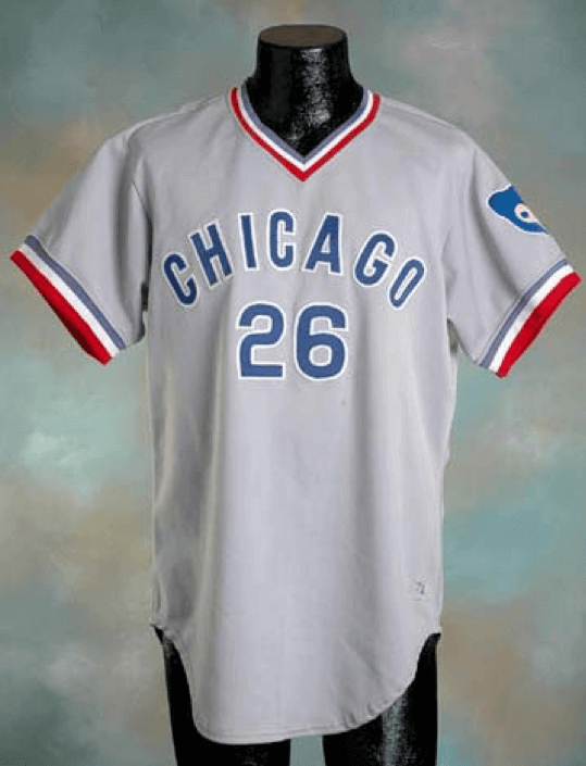
The first MLB season I followed pretty much from beginning to end was 1972, when I was eight years old. The Cubs had an odd road jersey that year — the front uni number was centered, sort of like what you’d expect to see on a basketball jersey. I’m pretty sure it’s the only design of its type in MLB history.
I wish I could say I noticed this during the 1972 season, but I didn’t — my uni-watching skills were still embryonic. Two guys who did notice it, however, were NBC Baseball Game of the Week play-by-play man Jim Simpson and color analyst Tony Kubek, who called attention to the Cubbies’ unusual road grays — and explained how the design came about — during a broadcast on June 10, 1972 (the uni discussion starts at the 25:55 mark):
In case the video ever gets taken down, here’s a transcript of what Simpson and Kubek had to say:
Tony Kubek: The Cubs have got a little something different, a number right in the center. You don’t see any other team with that.
Jim Simpson: Kind of reminds me of a basketball uniform. … Talking to some of the Cubs, Tony, they said that the manufacturer of these nifty-looking double-knits here put the number there, instead of offsetting it as on most uniforms, and when they got it back to the Chicago Cubs front offices, some of the people there looked at it and said, “I like it!” So they kept it there. But they have no number at all on the front of their at-home jersey, only on the away, and it’s in the center. I have not seen that anyplace else.
So according to this account, the centered uni numbers were the result of a manufacturer’s mistake, or at least a misunderstanding. Interesting!
According to Bill Henderson’s jersey guide, the Cubs’ uniform outfitter in 1972 was Wilson. I know from past experience that neither Wilson nor the Cubs have an institutional memory that goes back to the early ’70s, so there’s no way to confirm Simpson’s account, but he specifically said he got the story by “talking to some of the Cubs,” which provides at least a halfway-decent patina of legitimate sourcing.
It’s easy to see why no team ever had a centered number prior to the ’72 Cubs. In the flannel era, all jerseys had either zippers or buttons, and you wouldn’t want a single-digit uni number to be split in two as it crossed the placket. But when pullovers were introduced in 1970, that problem vanished — no more placket to worry about. Still, the Cubs went back to a more traditional number placement in 1973, which lends further credence to the notion that the ’72 design may have been a manufacturer’s glitch.
The Blue Jays’ inaugural design was was somewhat similar, substituting a centered logo for the centered number. And who made those Jays’ uniforms? It would be great if the answer were Wilson, but it’s actually a bit more complicated than that. As you can see, Wilson made the home unis for the first seven years of the team’s existence, while Rawlings made the road grays. (This type of arrangement seems bizarre by today’s standards, but it wasn’t all that uncommon at the time.)
It’s also worth noting that the Cubs’ uni timeline includes a different sort of centered design. Check out their 1957 road uni! So unusual to see the city name and team name both included like that.
The story of the Cubs’ ’72 road grays brings to mind our recent revelation about the Dodgers red numbers. In that case, the story was printed right there for everyone to see in The Sporting News, but for some reason it never gained traction in the historical record and was forgotten until uni designer Todd Radom came upon the old news clipping. In the case of the ’72 Cubs, the story was plainly stated during a nationally televised broadcast that was presumably watched by hundreds of thousands (millions?) of people, possibly including my eight-year-old self, but then it vanished into the ether, just like the Dodgers story.
And speaking of Todd Radom, he just uncovered two more gems, neither as important as the Dodgers or Cubs stories but both plenty interesting:
• If you look at Dressed to the Nines, you’ll see that the A’s are listed has having worn white undersleeves in 1981. It turns out that the white sleeves prompted Brewers manager Buck Rodgers to protest a game. It’s all very reminiscent of the white war of 1967.
• The Rockies were considering wearing black jerseys as their primary home and road look in the run-up to the team’s 1993 on-field debut.
It’s amazing how much history like this has been forgotten or lost and is just waiting to be (re)discovered. It all brings to mind an important maxim: The past is what actually happened; history is how we catalog and retell what happened. It’s worth remembering that the latter is never a perfect mirror of the former.
(Special thanks to Dan Fuller for bringing that Cubs broadcast to my attention.)

Going, going…: This hasn’t been officially announced yet, but I have it on good authority that the Indians are poised to change their logo designations for 2014. The block-C will become the primary and Chief Wahoo will be relegated to secondary status.
There’s no change to the uniforms — Wahoo will still be on the home cap and on the left sleeve of all the team’s jerseys, at least for 2014 — so the logo redesignations are largely symbolic for now. But symbolism matters, especially in a debate about something like Wahoo, which is a symbol to begin with. Moreover, there will be some practical ramifications, because the logo redesignation should mean that media outlets, from SportsCenter to newspapers, will start using the block-C, instead of Wahoo, as their visual shorthand for the team (although if history is any guide, that changeover will likely come slowly and inconsistently). In any case, this would appear to be the latest step in the now well-established path toward Wahoo’s inevitable mothballing.
After I tweeted the logo-redesignation news yesterday, the Indians’ PR department denied it. But I got the information from a source I trust, and later in the day Chris Creamer confirmed it. I stand by it.
ESPN reminder: In case you missed it yesterday, my latest ESPN column is a brief history of nickNOBs, and I don’t mind saying it’s a pretty fun piece.
A few follow-ups to that column:
• At one point I mentioned that I wasn’t aware of any nickNOB examples from the world of college football, but reader Sam Kitchens sent in a good one. In 2009, Texas Tech quarterback Taylor Potts wore “Nick” on his back. Why? Because Tech coach Mike Leach wanted him to play like Nick Reid, a former linebacker at Kansas. So this nickNOB was also a “Nick” NOB!
• I neglected to mention Chad Johnson’s infamous “Ocho Cinco” cover-up nickNOB, which he wore during pregame warm-ups. Of course, he later legally changed his surname to Ochocinco (without the space) and wore that as his standard NOB.
• I also left out Jason Isringhausen’s “Izzy” nickNOB, which was part of the Mets’ 1999 “Mercury Mets” promotion.
Troll reminder: Another thing you might have missed yesterday is that there’s a new entry on My Pet Troll.
Tick-Tock: Today’s Ticker was compiled and written by Mike Chamernik.

Baseball News: The Corpus Christi Hooks will have a logo for their 10th season. They also have a new alternate jersey (from Mike Vamosi). ”¦ Might the White Sox be changing their number fonts? Thomas Juettner found that the Sox’s new BP uniform number font is slightly different than their typical numbers. ”¦ The Nashville Sounds have a new logo for their final season at Greer Stadium (from Lee David Wilds). ”¦ The original concept for Kansas City’s Truman Sports Complex was for a retractable roof to be shared between the Chiefs’ and Royals’ stadiums.

NFL News: As you’ve probably heard, Chargers fans are rallying around Philip Rivers’s bolo tie. Longtime Uni Watch reader/contributor Brady Phelps is quoted in that article, plus he blogged about the bolo and got a Pixar artist to do a great Philip Rivers illustration. … Also from Brady and also regarding the Chargers, free safety Eric Weddle’s beard is now on T-shirts. For the super cheap, if you want to cover up the captaincy patch and Twitter handle, the shirt could be used to honor James Harden too if you happen to be a Rockets fan.

Hockey News: Yesterday we showed former Kings’ goalie Gary Edwards wearing gloves under his gloves for extra padding. Roberto Zanzi notes that former Islanders goalie Kelly Hrudey did the same thing. ”¦ No pictures, but Seth Horowitz says that “on the Rangers-Blachawks game on NBCSN, they just announced that Mike McPherson, the linesman, is wearing 85 tonight. He usually wears 83 but all of his equipment was lost in transit, so he is wearing a borrowed sweater, pants, skates, pads, etc.” ”¦ Here’s a great quick video showing the making of the Red Wings and Maple Leafs sweaters for the Winter Classic (from Bobby Pinkham). ”¦ The Rangers’ pants striping is inconsistent (from Corey Minerva).

Soccer News: A Los Angeles Galaxy blog spoke with Alexi Lalas about the team’s re-branding in 2007 (from Phillip Foose). ”¦ Two items from Yusuke Toyoda: Zamalek of Egypt changed from pink jerseys to white jerseys at halftime of a game Tuesday, and the Palestine Football Club in Chile has replaced the 1s on their jerseys to maps of Israel, which has caused an uproar. ”¦ It seems that USA Soccer has altered its shade of blue in its crest. The Twitter avatar is different than the current logo on SportsLogos.net, and even the home website has undergone some changes in recent days (great spot by Jay Winkler).

NBA News: According to Deadspin, Brooklyn’s Andrei Kirilenko will have his nickNOB jersey in Cyrillic. ”¦ New Cavalier Luol Deng asked rookie teammate Matthew Dellavedova to give up No. 9. Dellavedova will now wear No. 8. Deng wears the number because he’s one of nine brothers and sisters (from Samuel Selker). … The Bulls’ logo is being used by a high school in Indiana (from Kurt Esposito).

College Hoops News: LSU and Tennessee played a color-on-color game Tuesday night (from David Steinle). ”¦ IU Kokomo held Military Appreciation Night last week. The Indiana National Guard donated jerseys for the game, and the players had different words on the fronts of their jerseys (Honor, Respect, Loyalty, Service, Duty, Courage, Integrity), with Indiana National Guard on the back. Full gallery here (from Tyler McClure). ”¦ Hannibal-Lagrange (MO) of the NAIA has some seriously funky shorts striping. Fortunately no one was at the game to see it (from Dustin Semore).

Grab Bag: “It’s been historically cold here in Iowa (and everywhere else) lately,” says Jesse Gavin, “but you still don’t see this very often: high school basketball players from Cedar Rapids Prairie going with long-sleeved undershirts.” ”¦ “It looks like no sport is safe from going pink,” says Matt Busch. “They even used pink wickets. Yikes!” ”¦ Who’s No. 44 in this photo? None other than Bob Einstein, also known as Marty Funkhouser and Super Dave Osbourne! Awesome sleeved jersey, striped socks and block numbers with drop shadows (thanks, Scott Novosel). ”¦ Juan Martin del Potro will only have two rackets for the Australian Open, and if they both break, he’ll ask to borrow one from Roger Federer. How quaint (from Brinke). ”¦ The Melbourne Cricket Ground has a warped concentric squares mow pattern for today’s match between the Melbourne Stars and Adelaide Strikers (from Leo Strawn Jr.).

What Paul did last night will be doing today: Busy day ahead, beginning with a dental appointment in the early afternoon. My dentist’s office is near Bryant Park, so then I’m gonna go ice skating at the Bryant Park rink. Then maybe a movie, and then I’m meeting friends for dinner.
All of which is a lengthy way of saying, “Please go easy on the Ticker submissions today,” because I won’t be near a computer from about noon until at least 10pm. Thanks.
In the inaugural season, the Rockies did wear black jerseys for the first several Sundays. Around the all-star break, after the team had compiled a very bad record in those duds, the black jerseys were relegated for several years.
Thanks, Gregg! That’s some great knowledge of the Rockies uni history. Here’s link with some good illustrations of the 1993 version of the Rockies’ black jersey.
Kirilenko’s jersey will be an actual NOB in Cyrillic not a NickNOB in Cryllic. The Association won’t let him use his actual nickname (AK-47) as a NickNOB because of the children or because it promotes gun violence or something like that.
Great minds…
Promoting gun violence is the Republicans job anyway
Insightful commentary there. Thanks.
Must… buy… an AK47!
Hmmm. It seems to that Kirilenko putting his name in Cyrillic on his jersey doesn’t count as a nickname. I’m willing to call “WAHOO” and “DEACON” NickNOBs, and given that the Braves had “ROD” and “KEN H”, I’m even OK with extending the designation to first names, since last names are the NOB standard. Just changing alphabets isn’t enough, though.
Not only was the rolling roof over Arrowhead and Royals (later Kauffman) Stadia part of the original design, it was brought back in 2006 as a separate ballot measure alongside a massive renovation project for both buildings. The renovation passed, but the rolling roof measure failed. I’m a huge fan of the changes at Kauffman but a little part of me as a sports fan (not so much as a Jackson Co. taxpayer) really wanted to see the rolling roof a reality. Apparently the NFL had promised Lamar Hunt a Super Bowl in KC if the rolling roof measure passed in 2006.
I was about to post this, I was living in Jackson Co at the time and voted against both measures (I’m from Boston, I don’t want to pay for your damn stadia! lol). But I did get to enjoy a few games at renovated Kauffman before I came back east. I was a proponent of a downtown ballpark, the timing was right and it could have been done with all the other urban renewal there, it’s kind of weird to have a park essentially in the middle of nowhere
Any chance they might try to improve the “traffic leaving after the game” situation? I’ve been to Arrowhead on two occasions–both soccer matches–and I don’t even want to know what it’s like trying to get out of there after a Chiefs game
I’m going to try to work “nifty-looking double knits” into a conversation today somehow!!
Totally adding it to my list of proposed band names!
I believe Henrik Lundqvist also wears white gloves under his catcher and blocker. I will search for visual evidence.
First picture I’ve found.
link
John Vanbiesbrouck wore an under-glove: link
Kelly Hrudey, too: link
Tony Esposito: link
It’s pretty common.
It’s VERY common. Batting or golf gloves have been used for decades. I used a golf glove on my catching hand to give me a better grip. After a few seasons, the leather glove stretches. Wearing the additional layer of a golf glove fills the void & takes a little of the sting out of a shot.
Here is a discussion thread on the topic: link
In the photo Hank linked to, Tony Esposito has his fingers taped up, but keeps the knuckles open. He was legendary for adding “stuff” to his equipment. In this photo: link you can see that he has added a partial cage and header piece to his mask, a large pad to his glove-hand wrist and a cover/pad to his left toe. Playing with the equipment from those days, making a save really hurt!
Surprised not to see this is the ticker: Pirates are doing the same as the Indians and swapping their primary and secondary logos. It was announced last season that they would be redesigning the pirate logo, but after focus groups with fans, they decide the P logo was more popular. Some fans don’t like this, however, I highly enjoy the P, even though it annoys Paul because it is missing a serif on top.
link
Will be in tomorrow’s Ticker.
They are also getting new batting practice duds…yellow to black. Shame, I liked the yellow.
link
I too preferred the yellow BPs.
I wonder if this is more of an MLB wide move for teams going to a letter(s) as their primary mark versus any American Indian imagery concerns.
I would imagine that the change in US Soccer logo and website treatment is related to the expiration of the “Centennial Year” that was 2013.
It looks like US Soccer is returning to the color palette it used link. I’ll reserve judgment until I see uniforms, but first impressions are that I prefer the darker shades of red and blue of the log that’s being replaced.
*logo
I’m ready for a redesign contest for US Soccer!
I wish I were good with design and I’d enter. I am just highly critical of our ClipArt design. We need something much better.
2ndededed!!!
NRAOB – Non-Roman Alphabet on Back
I don’t have a problem with Wahoo going away, but I wish they could be a little more creative with a new logo. The block C is so… plain. It might be fine for a college team, but you expect more from a professional franchise. And I’m usually a minimalist/traditionalist. It just doesn’t seem to work for me, for Cleveland. But perhaps I’ll be in the minority on that.
I feel the same way. I’m anti-Wahoo, but the “C” is not a strong mark.
I would say that it is a strong mark, formally. It’s very easy to understand and produce from memory after seeing it just once or twice, but conversely, it’s not unique. If you don’t know baseball or you’re not from Cleveland, it could be anyone’s mark to you. I think it could be better, but at least it’s from the team history, so it is authentic.
I agree as well that the C is too plain-jane. Interesting though, as I stated above, I feel the opposite about the Pirates’ switch-a-roo. I always saw the P as primary anyways. I never liked the current pirate face logo, thought it was too cartoonish/generic feeling. Earlier faces I felt were better. Either way, i always preferred the P on my bucco shirts as a logo rather than the pirate. I guess it’s the way that it is stylized that lets it stand in its own.
It’s not more or less strong, or distinctive, than the Mets’ NY or the Tigers’ D. Simple initial logos become distinctive through use and habituation. These traits are not inherent in the designs.
Formally, it’s an excellent mark for a Cleveland team. Cleveland has a strong history of simplicity in team identities. And the city’s industrial, working-class cultural identity is well represented by the only slightly adorned block C.
As a primary logo for the Indians, however, there I see Paul’s point about weakness. If the C had been the Indians only cap logo for a couple of decades, then the C would work well as a standalone team logo. But it hasn’t, so it doesn’t, at least at this point.
What the Indians really need is to make an illustration of their cap, with the block C, their primary logo. Which would require choosing a cap to wear both home and road.
Or, tl;dr: Cleveland’s block C is the American League equivalent of Washington’s curly W.
If they want to go with the block C (and I am ok with it) Go back to the 1980s cap block C, which at least had a white border. Which is the same complaint I have about the block C caps they currently wear.
Agree 100%. Maybe they left the white outline off because it wouldn’t really show against a white background, thus requiring ANOTHER outline (or, worse, drop shadow).
I’d LOVE LOVE LOVE it if they went back to the cap design from the early 80’s with the red bill, navy crown and block red C outlined in white.
Too expected, and too 70s if you ask me. I prefer the turn of the century look offerend by the plain red against the dark navy.
Yep. Think this C is nicely unique:
link
That’s the era I’d hark back to if I ran the Indians, too. Though I’d look to take it in a direction something like this:
link
That’s better than anything they have right now. Me likey
Too 1970s. I’m having blood clot flashbacks just looking at it!
You say that like it’s a bad thing! Those unis:
link
Were better than 90% of what passes for “alt” uniforms in MLB today.
That would be what I’d prefer. Loved that cap, and font. Glad to see it getting a rebirth in some way but Cleveland-based rapper Stalley, who likes to wear that style cap a lot.
I tend to think a cursive “C”–something like the first letter of the Coca-Cola logo–would be an attractive look. It would also be consistent with the cursive script they’ve used over the last few decades.
And I don’t mind seeing Wahoo get demoted–not because I necessarily object to him, but because the head’s way too big and takes up disproportionate space on the cap front. He belongs on a sleeve, if anywhere.
I’m ok with the pink for the 5th Ashes Test. Glenn McGrath, the guy in the pink blazer, started the tie ins with cricket after his wife passed away from breast cancer. He’s also one of the best bowlers in cricketing history.
Kerfluffle in Chile over map on the jersey of the Palestine club was not because it was “a map of Israel” but because it was a map of pre-1948 Palestine…
I think the real story with Cedar Rapids Prairie isn’t the long sleeves-it’s the Kid’n’Play haircut on the kid.
“I think the real story with Cedar Rapids Prairie isn’t the long sleeves-it’s the Kid’n’Play haircut on the kid.”
That hairstyle just finally made its way to Iowa.
C’mon now…it’s a “high top fade.”
It’s on its way back…as it should be. No need for it to go out of style.
Definitely retro-cool in the hood now. Cedar Rapids has a lot of ex-Chicago GDs and such.
I never really thought of the area from which Prairie draws its students as “the hood.” More like “the farm.” Washington High School is much closer to what passes for the inner city in Cedar Rapids.
I think the reason you see inconsistencies in NHL team pants is because they are treated like equipment, and any player can wear whichever type he wants. You’ll have guys wearing Bauer, CCM, Reebok, etc. and evidently they don’t always manufacture to the same specs when it comes to decoration.
I brought this up post winter classic and a poster was quick to inform me that this was an equipment-endorsement deal so that’s why you see different maker’s marks.
It’s not always been like this though has it? And how long has it been?
Not the point of today’s story, but I’m noticing that the number 6 on the 1972 Cubs jersey in the photo is a little rounder than the 6 that they use today, and has about the same roundedness of the 3.
Close examination of the numbers on the Cubs jerseys will reveal the font’s 1930s hand-drawn origins; a similar computer font, such as Eurostile, has uniform curves for all the “rounded” numbers (0, 3, 6, 8, and 9) but the Cubs’ 3 (and in this one case above, the 6) is rounder.
Compare this link. Am I just seeing things, or is this 9 not just an upside-down 6? The 9 looks much squarer than the 6 does.
I’ve always liked the Cubs’ number font; it looks modern no matter what year it is, but has remained basically unchanged since about 1940 or so, with the sole innovation being the very early addition of serifs to the number 1 (before that it was a straight line like the Bears still use). But there are lots of little quirks that have survived the years. I hope the 3 never gets “fixed”.
For comparison, link
Wahoo is disappearing from the Indians.com website too. He’s buried way down in the footer…
link
Also, check out the logos on the MLB.tv page for the Tribe
link
The MLB.tv thing reflects a change most MLB media properties made in 2012, including the At Bat mobile app, many online platforms, and (to a lesser extent) MLB Network.
For Friday’s Ticker grab bag: Check out the “Lon Asgeles” baseball jacket on this al-Qaeda fighter in Iraq:
link
More pictures, and commentary, here:
link
From the second link: “The jacket seems to speak, however imperfectly, to aspirations to embrace Western culture. Yet he’s fighting with the jihadists. What’s his back story? Was he so ticked off that somebody sold him a defective knockoff that it turned him into a terrorist?”
“Busy day ahead, beginning with a dental appointment in the early afternoon. My dentist’s office is near Bryant Park, so then I’m gonna go ice skating at the Bryant Park rink. Then maybe a movie, and then I’m meeting friends for dinner.”
Sans the dental appointment, this sounds like an aweseom day. I really need to consider a career change. Enjoy!
*awesome, obviously
I love the number treatment on Funkhouser’s–er, Bob Einstein’s–jersey.
So… he has a bit of a history with basketball.
link
Nice piece on the Cubs’ 1972 road uniforms. Great video; even saw Ernie Banks #14 as a first base coach!
Look at this slightly NSFW new York “Vagiants” shirt
link
This was reported a while back, but the Bucs made it official yesterday.
link
Is there a way to change settings to view the mobile site? I can’t seem to change it for viewing on my phone.
Really interesting look at the Royals/Chiefs roof. Wow.
“Really interesting look at the Royals/Chiefs roof. Wow.”
Agreed, Brinke. Arrowhead and Kaufman have always struck me as visionary and ahead of their time, but even more so knowing that they were intended to share a retractable roof.
Looking at the photo at the top of link, I was struck by how much the jerseys look like sleeved basketball jerseys, what with the v-necks and the cuffs and the big bold numbers on the front.
Interesting story. I see your point about Dallas’ uniforms. It provides an interesting reminder that the uniform requirements for many sports really don’t go much beyond a simple t-shirt and pair of shorts.
And looking at the Cubs jersey at article top, looks like in the 70s, you could’ve worn the same uniform for basketball, baseball and soccer (and possibly football too) and not look too out of place.
“…[L]ooks like in the 70s, you could’ve worn the same uniform for basketball, baseball and soccer (and possibly football too) and not look too out of place.”
Totally! I’d say the Chicago White Sox of that era link to play just about any sport at a moment’s notice.
Any NY area peeps want to do me a solid and check at the shops at Barclays if they have the AK47 Cyrillic t-shirt jersey? I went online, only see Garnett, D-will and a few others. Would need an XL and a XXL. Much obliged. If we’re friends on facebook or twitter, PM/DM me. If not, contact me through the email address on my website that’s hyperlinked were it says KEK where I post.
To quote the late gilda radner’s SNL character Emily Litella….. “never mind” hahahahaha it IS on the website
link
Here is a link to the Nets cyrillic tee for Kirilenko.
link
Woo Hoo…I’ll be there tomorrow night, should I make my own nickname tee?
heck yeah… what would it be?
Deadspin list the Brook Lopez nickname jersey as “Brooklyn”. It would have been neat to see someone wear an NBA jersey with the same name on the front and back, but since he is out for the season we will not see it.
Perhaps Deadspin got their info from this t-shirt:
link
His nNOB was widely reported before he went down for the year. You’re right, it’s a shame.
Super Dave played for Chapman which currently has a pretty good lacrosse program, and pretty nifty uniforms:
link
link
link
That ’57 Cubs roadie is not good looking. Reminds me of the Ruth / Gehrig exhibition series of games unis – Larrupin’ Lou’s.
Don’t know if players are going to wear them, but these are the Nike gloves for the Super Bowl… lined with fleece (Per Darren Rovell on Twitter)
link
I don’t know how big a list we’re compiling but Woodbury Junior/Senior High School in New Jersey uses the link logo.
There are huge versions of it painted on both sides of the link.
Serious question: I am really looking to get a hold of a Jay Gruden uniform from when he played in the AFL or even in NFL Europe.
Anyone know of any place where thats possible?
Nice video. One thing that stood out to me was how Cardinal handed over his batting helmet and donned a cap after getting on base around the 20:00 mark (my skipping was inexact). Commonplace then, but it really jumps out now seeing a baserunner in a hat.
Dressed To The Nines has it wrong regarding the 1981 A’s. They only wore the white pullover with gold lettering at home & the gold “Oakland” pullover on the road. The button up home jersey with green lettering was worn only in 1982.
Better make sure that adidas doesn’t see the Cubs jersey, or else the Bulls could be wearing it next year.
New “I’m Calling It Shea” T-shirt just showed up in my inbox!
If you still want one…
link
Just recieved an email notification… I’m Calling It Shea is back!
link
If 50 sell they ship!
The Cubs’ ’72 road jersey looks great, another example of how button-front jerseys are inferior to pullover jerseys.
Didn’t think Notre Dame would actually make the switch, but they are:
link
Re the Australian cricket – Day 3 of the annual Sydney test match has been a pink day since 2009 I think, Jane McGrath day, in honour of Jane McGrath, the wife of Glen Mcgrath, who died in 2008 of breast cancer. Glen McGrath is one of the alltime great Aussie fast bowlers. While majority of accessories, etc. are pink – the wickets are not, the stumps however are.
It was often batting gloves but many goalies went to Neuman football gloves because of the tacky palm.
Neat stuff on the Cubs. They have always been a favorite of mine. For no real reason though, maybe the ivy? the outfield brick wall?
Although there was one thing annoyed me since day one, it was their ballcap logo.
Come on, your team is in Chicago! Hello! An amazing animal! Al Capone smuggling booze across Lake Michigan! ………..yah, let’s put a plain old “c” not capitalized or lower case, just the letter “c”.
We’ll let “them” argue whether it’s a lower case or CAPITALS
As a collector of Cubs jerseys, I really liked the story on the Cubs jerseys today. It actually never struck me as odd that that particular style had the number in the middle until you mentioned it..
I never knew that these jerseys were gray; I always thought they were blue, like the design they went to soon after this one.
For some reason a lot of the baseball cards of that era seem to have a blue tint: link, link.
And — off topic — while googling for those cards I found this beautiful ’73 Willie Stargell card where he’s playing against the Phillies, who are wearing the classic blue road uniforms but before they shrunk the numbers and added NOBs, so thy’ve still got those link. Are those chain-stitched?