If you can’t see the slideshow, click here; to see a larger version of it, click here
At last month’s Uni Watch party, reader Walter Helfer brought along an old sketchbook filled with amazing MLB uniform illustrations that he’d done in the early 1980s — one page for each MLB team. They were beautiful, detailed, and annotated with all sorts of pithy commentary. This was essentially Uni Watch before Uni Watch was Uni Watch.
As soon as I saw Walter’s illustrations, I knew I wanted to feature them here on the site, so I asked him to send me a batch of scans, which you can see above. I also invited him to write a little something about them. Here’s what he submitted:
I was an artistic kid and had trouble wrapping my head around sports. Always threw to the wrong base and couldn’t hang onto the basketball to save my life! But something clicked in eighth grade and I embraced hockey. The colors and iconography appealed to me, plus I knew how to skate. Baseball only started to grab my attention around my senior year in high school ”” there began to be enough teams with garish uniforms that caught my eye. I also realized I enjoyed watching pitchers and being able to tell them apart by watching their windups.
Drawing athletes and uniforms turned out to be a great icebreaker and allowed me to introduce myself to new kids and to network. I welcomed a genre that allowed me to practice copying graphics and typefaces, and hopefully overcome my colorblindness. It now occurs to me that the baseball pictures were my earliest stab at rendering an entire league; when I tried to move on and complete other sports projects, the exercises took on a rote quality and I started to become bored.
I hope nobody takes umbrage at the snarky things I said about certain teams. By the same token, when I tried to praise something, it often came off as over-earnest and corny. Keep in mind that all of these were the work of a 20-year-old.
The more I looked through Walter’s work, the more questions I wanted to ask him, so I conducted an email interview with him. Here’s how it went:
Uni Watch: So these illustrations were done in 1982, when you were 20 years old. Is that accurate?
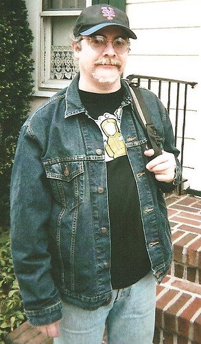
Walter Helfer [that’s him at right]: Yes. I was a sophomore or junior in college. Drawing helped me to unwind between studies.
UW: What kind of art education did you have, if any, prior to doing these?
WH: Figure drawing in my first year of college; before that it was experimenting with paints and watercolors in high school, with some still life and sculpting. I have a vivid memory of a middle school art class where all the boys drew and colored in the football helmets of their favorite teams. That may have been the spark that turned me on to sports.
UW: Did you do all the drawings freehand, or did you employ tracing, projection, etc.?
WH: By this time I was drawing academically, building figures out of cylinders, spheres and cones, so yeah, it was freehand. I like tracing, but I had progressed beyond that point by the time I was seventeen.
UW: Did you use colored markers, colored pencils, paint, crayons, or what?
WH: You name it! Crayons were pretty well in my past. On a recommendation from my dad, I used Magic Markers. It was important to have a medium that dried quickly and wouldn’t come off on other sheets of paper when they rubbed together. You’ll notice t he white pinstripes on the Cubs’ road uniforms were done in white pencil; I hadn’t yet discovered the utility of Dr. Martin’s white ink or ruling pens. I wanted the option to take the pinstripes out if I didn’t like the way they looked! In college I discovered Pantone markers. They laid down a nice, even wash of gray or pastel blue for the road uniforms.
UW: Are all of the illustrations based on photographs? If so, do the illos match the teams of the original photos? In other words, would you sometimes use a photo of Team A to create an illustration depicting Team B (keeping the pose but swapping the uniform)? For example, the Brewers’ home player looks so much like Goose Gossage! Was that really a Brewer, or did you just put a Brewers uni on a depiction of Gossage? Similarly, the Twins home player looks like Steve Bedrosian.
WH: Actually, the Twins pitcher was modeled on Dick Tidrow. [D’oh! Should’ve known that. ”” PL] But I had favorite players, and Rich Gossage was one of them. Everything is modeled on a photograph, taken from a Street & Smith’s magazine or Baseball Digest, or what-have-you. I took pains to swap the uniforms; it was crucial to me to make that creative decision and render a team of my own choosing.
UW: It seems like you usually (but not always) depicted one player wearing fairly traditional stirrups and another player wearing much higher-cut stirrups. Was that intentional?
WH: No, that was the fashion in that era. Some guys had the spaghetti straps, others wore the stirrups in the Uni Watch-approved fashion. Even then I appreciated stripes on the stirrups, and made sure to call attention to them. Only a couple of players stood out, like George Hendrick or Rusty Staub.
UW: It seems like a surprisingly high percentage of your illustrations show players wearing eyeglasses. Coincidence, or was that something intentional on your part?
WH: No, that was by accident. Even though I’ve worn glasses since the second grade, and another of my favorite pitchers was Kent Tekulve, I wasn’t cognizant of it. You should mention this to my sister, the optometrist! She thinks I never draw anyone with eyeglasses!
UW: With a few exceptions, you always depicted white players. Again, coincidence or intentional?
WH: That is a coincidence, I’m afraid. I have a better angel who nudges me to make portraits of diverse groups of people, but that always follows a period of deliberation. When inspiration strikes, it takes the form of “Young white male frowns at a spaceship” or “Young white male boards a trolley car.” When I make an illustration of a woman or a person of color, it’s because I allowed the mental image to percolate for a few hours before committing it to paper. I’m not as color-blind as I would prefer.
UW: A lot of the players seem to have the same (or at least very similar) faces. Were these faces based on real people in
your life?
WH: As luck would have it, my favorite celebrity at that time was Adam Rich, the mop-topped child from Eight Is Enough. Look at my baby-headed Mariners infielder — infielder”>he wore No. 8! My favorite people always seemed to have big heads of hair, and Adam came on the scene at an auspicious time. I was drawn to mop-topped students at school, I liked shaggy cartoon characters, I liked hirsute athletes. Of course now I’m bald, so it’s karma!
UW: In a few instances, NOBs are visible on the backs of your jerseys, but the names shown (Hlubek, D’Benedetto) are names that don’t appear in the MLB player registry. What’s the story behind these names? Like, did you just invent generic NOBs, or do these names mean something to you?
WH: I used invented names, usually as an excuse to experiment with an especially lovely typeface, like the White Sox’s fancy block, or Philadelphia’s vertical arch. I think Dave Hlubek was the guitarist for Molly Hatchett, but I’m fuzzy on that! [True enough. ”” PL]
UW: You have (or at least had) interesting handwriting, especially your “E” and “A.” What’s that about?
WH: You have Rick Griffin to thank for that. Outside the sports realm, I enjoy psychedelic art and inventive lettering. (On a related note, if I ever buy a major league baseball team, Roger Dean is designing our lettering!
UW: Do you have other illustrations from other seasons, and/or for other sports?
WH: Hockey and football were right up there with baseball. Checking my archives, I see that I didn’t save as many of those pictures. Maybe they weren’t up to my high standards. If I colored in the uniform but neglected to outline the drawing with a thin black marker, that was problematic. It suggested I ran out of interest as soon as the uniform was done, and the rest of the drawing didn’t warrant finishing.
UW: Did you end up going into an artistic job/career/etc.?
WH: Yup, I’m a graphic artist in Manhattan. And things are trending upward, because I never have time to check in on Uni Watch when I’m at work!
UW: These drawings are now over 30 years old. Why have you saved them all these years?
WH: The completeness of the project seemed to warrant it. Usually, I’d embark on some sort of profound task, and lose interest a few entries in (typical Aries), but this was one I actually saw through that had some scope to it. If I’d done the Original Six NHL teams, I might have done it too quickly to appreciate it.
UW: Anything to add?
WH: Yeah, I published a comic book in 1989. It was called Oblivion, and I wrote it out of an urge to cash in on a trade that was wildly expanding. This was around the time of the Teenage Mutant Ninja Turtles, and people who saw my sketchbook artwork were always saying, “You should totally do a comic book.” So I did, only I didn’t enjoy the writing. It was fatuous and turgid. Plus, I was a staff of one, and couldn’t follow a schedule. So by the time the second issue came out, my distributors had lost interest. Lessons learned: use someone else’s money next time, and find someone to do the writing.
———
Great stuff. Big thanks to Walter for sharing his artwork and thoughts. To everyone reading this, I strongly recommend spending some serious quality time with Walter’s illos and commentary — it’s totally worth it.
Collector’s Corner
By Brinke Guthrie
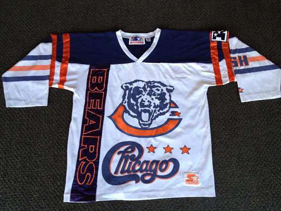
Interesting item here (and shown above). The tag says it’s from Starter, but I’m not sure I believe that. Those are official Chicago Bears logos at the top, for sure — it’s that “other” Chicago logo that caught my eye. Sittin’ cross-legged on the floor, 25 or 6 to 4.
Okay, so what else do we have this week? Let’s take a look:
• Merry Christmas from your 1969 San Francisco 49ers.
• Look at this 1967 NFL electric football game. You didn’t get players with this version. Did these little colored helmet circle things all end up in the corner of the end zone, too?
• Received this via Twitter: Andy Crossley sent in this World Basketball League jersey. Wait, the World Basketball League? Was I asleep for those four years?
• Check the quaint high school-style artwork on the cover of this 1966 Packers program. Can you imagine the NFL using this now?
• Speaking of cover artwork, this 1958 Rams yearbook cover just knocks me out. How clean and retro.
• Back in the day, even when I saw this at the local drugstore in Dallas as an 11-year-old, it bugged me: This Chargers gumball helmet was not even close to accurate.
• And I clearly remember these in Dallas too: a 1971 Springbok Cowboys puzzle. Didn’t get it ’cause puzzles frustrated me no end. They still do, actually. Nice artwork, though.
• And we wrap up this week’s haul with a grab bag of early-1970s NFL merch. What really interests me here is the 1970s NFL merchandise catalog. That could fill up a future Collector’s Corner installment all by itself!
Seen something on eBay or Etsy that you think would make good Collector’s Corner fodder? Send your submissions here.
Tick-Tock: Today’s Ticker was compiled and written by Garrett McGrath, except for ’Skins Watch, which was handled by Paul.

’Skins Watch: Here’s more on the move to restrict Native American team names in Houston schools. Key quote: “The time has come for the Houston Independent School District — the most vibrantly diverse school district in the nation — to acknowledge that some decisions made generations ago need to be reconsidered. Traditions are important. But respect for cultural difference and sensitivities matters more” (thanks, Phil).

Baseball News: The Yankees are adding a plaque in Monument Park for Nelson Mandela. It will be unveiled, fittingly, on Jackie Robinson Day. … Jarrod Saltalamacchia posed with his new Marlins jersey and his record-setting NOB yesterday at the Winter Meetings. … The Diamondbacks are auctioning off the opportunity to photobomb their 2014 team photo. … Boston Magazine is running a picture of Xander Bogaerts hugging the Commissioner’s Trophy on their cover this month–but he is wearing “Postseason” patches on his sleeve and cap (from Alex Spanko).

NFL News: “I don’t recall NFL officials doing this before,” Cork Gaines says. “In the Monday Night game, the ref wore a position-appropriate white head warmer, while the other officials had black head warmers.” … The Bears retired Mike Ditka’s No. 89 last night. And in a very cool move, they also retired his sweater vest. … 49ers coach Jim Harbaugh switched to wearing cleats on the sideline not for style but because he was wearing improper footwear when he tried to break up a sideline tussle on Oct. 20. “No traction,” Harbaugh says, “I don’t want to be in that situation again.” (from Jameson Costello) … The bloodclot Arizona Cardinals are 14-3 overall and have won 8 in a row including the win this past weekend over the Rams (from Michael McLaughlin). … We all know the Cowboys put little Dymo tape NOBs on their helmets — they’ve been doing it for decades. But check this out: Last night the Dymo label on Jason Witten’s helmet had his number and the name Betsy. According to some quick Googling, Betsy isn’t Witten’s nickname or anything like that. Anyone know more..? (Screen shot by Steve Sarran.)

College Football News: “Louis Nix is well known for his strong connection with the Notre Dame student body,” says an ND fan. “On Sunday he tweeted a picture notifying his followers that left a bag of team issue gear in the middle of South Quad on the Notre Dame campus. It did not take long for students to find.” … Clay White and Jeff Alexander noticed the trend of long and loose sleeves on players making a comeback during the Civil War game last month. The trend reminded them of Ken Dorsey.

Basketball News: The New York Knicks can shelve their new alternate orange jerseys, having worn them the league minimum sixth time on Sunday during their 114-73 blowout by the Celtics. They’re 0-6 in the orange jerseys.

Grab Bag: For the Masses: Chris Weber is trying to figure out who manufactured the San Fernando High School Football uniforms, any ideas? … MLS announced that the new World Cup ball will be used for next season. … The 1932 USA Olympic Bobsled Team had some terrifying masks (from Jake Elwell). … New logo in the works for the next generation of New York City cabs. … What would the union jack look like if the Scottish bit were removed? (from Tom Mulgrew) … $400 is a steal for this camo sport coat (from Patrick O’Neill). … “Simpson Race Product has taken the HANS device — a revolution in auto racing uniform safety systems — and made a number of changes to make it even more comfortable for the driver,” says David Firestone.
Witten named his helmet Betsy
Here is a 2010 story about helmet safety in which is stated that Witten calls his helmet Betsy. Further down in the comments is the reason it’s Betsy and not Maggie, or Freda or anything else. (Thanks Chris Taylor)
“…the Pro Bowl tight end ultimately sticks with the helmet that he’s worn since his rookie year, which he has nicknamed “Betsy.”
link
got that on the DVR, I was wondering why that was on the Dymo.
Here is an article mentioning it.
link
“Not everyone wants so many options. McCord has repeatedly offered veteran Jason Witten newer models of helmets to try, but the Pro Bowl tight end ultimately sticks with the helmet that he’s worn since his rookie year, which he has nicknamed “Betsy.”
A glance inside “Betsy” reveals the wear and tear. It even includes old glue stains left from a changeover in padding.
“We’re always saying, ‘You might try something different,’ ” McCord says. “But the guys are so set in their ways. This particular helmet has been with him for a long time, and he just feels more comfortable wearing it. I can’t blame a guy. I’m never going to force a guy into changing.”
There are players such as Witten all over the NFL when it comes to sticking to the headgear that they’ve become accustomed to.”
Excellent — thanks!
Witten’s home town is Elizabethton, Tennessee. The teams, in the news, are commonly referred to as “Betsy”. Probably where the name came from.
Could be…also it is pretty common to name old, reliable, inanimate objects “Betsy”…when I was a kid, we called our car “old Betsy”…probably started with Davy Crockett
link
The NFL really ought to step in and ban these players from trying new models out during the season. Hasn’t the NFL heard that changing helmet shells during a season can be a top-notch safety issue?
Re: HANS device – there are several competitors to the HANS device on the market, of which the linked item is one.
HANS was developed independently by Jim Downing and Robert Hubbard, starting in the 1980s. Their company was purchased by Simpson only in 2012 after trying to compete against them in the marketplace for several years.
Other Head-and-Neck restraints are the R3 and the Hutchens device.
AFAIK, only the HANS device is approved in F1 and Indycar racing.
The San Fran Valley uniforms looks like it has some sort of Oakley logo, I never heard of them doing jerseys before but I wouldn’t be surprised either.
I believe that the logo is Salomon, but I haven’t ever heard of them doing football.
The San Fern. uniforms look as if the graphic and the numbers are sublimated. That is the domain of lacrosse manufacturers, where their goal is to cut down on the weight.
That 1967 NFL game is not electric football, but a board game. You would move the checker-like pieces around and execute plays.
A… what kind of game?
I remember coming across the same article and/or information that Whitten still wears his rookie helmet. I also recall reading somewhere that its called Betsy in honor of his high school in Elizabethton Tennessee.
Check out what I found (excerpt below the link) when I did a Google search on Witten’s helmet…
link
Here’s an odd one, at least to me: The Dymo label on Jason Witten’s helmet reads, “82 Betsy.” At first I thought maybe that was his wife’s name, but it isn’t. Then I googled “Jason Witten Betsy” and came up with this message board thread in which it’s mentioned that Witten “is a Betsy alum” – apparently a reference to his high school. Could someone please enlighten us about this? (Update: First comment of the day, from Tommy Forrester, reads as follows: “Jason Witten went to high school up the road from me in upper east Tennessee at Elizabethton High. That is where ‘Betsy’ comes from.” Fascinating. Still odd that his high school is listed on his Dymo label, though.)
You know I’ve been doing this too long when I don’t remember my own work!
After watching the Monday nighter last night it would be a good idea if the NFL provided winter hats (tuques?) for the refs.
Or Elmer Fudd-style ear muffs?
Richardson makes the HS version of them…I wear them as the Head Linesman for two reasons…
A. to keep warm
B. So I don’t have to hear the coaches
link
I didn’t even remember that Mandela played for the Yankees!
Just like the Pope!
Can anyone shed light on why the Yankees include these non-baseball figures in Monument Park? Not that I have an issue with it… just curious.
Yankee Stadium was one of Mandela’s first stops after release from prison. He also link and declared “I’m a Yankee”, so that’s good enough for me.
Also, there have been several papal masses at Yankee Stadium and that’s always a big deal, especially in the Northeast.
Not actually much of a fan of either one. No matter how notable or worthy, I’m of the opinion that they should limit such tributes to actual members of the organization.
I think that the stadium was actually owned by the knights of columbus the first time the pope spoke there. So I think that it was the KoC that started that tradition…
that’s what I remember to be the case, anyway
Maybe they will now have a Mandela room at Buca di Beppo!!
Love the olde-timey Packers program. The guy with the crutch is a nice touch. ?????
Arguably the biggest pop song of 2013 was inspired by a baseball jersey in a National Geographic photo in 1976 spotted by a 16-year-old girl in New Zealand.
I guess a link would help: link
It *is* a lovely photo.
Come on, people — not a single comment about Walter’s amazing artwork?!
I noticed that he called for black accents on the Reds 70s-80s unis. He was somewhat visionary in that regard. link
Maybe, just maybe, black is decent secondary color for the Reds.
He does mention that he thinks stirrups are useless on the white sox uniform page. but cool drawings.
It is one of the best ledes of the year. He put in writing what all of us were doing in our heads at that age. Fantastic stuff.
Busy morning – I just got here!
Just.
Brilliant.
Work.
Period.
You know you’ve been in law school for way too long already when A’s, in that typography, read “Defendants.” Oops, did I just compose an Oakland joke?
All kidding aside, awesome series. Always super fun to see old art by pre-Uni Watch Uni Watchers.
They are Beautiful! It didn’t take long for the Reds to follow his advice. By the end of the 80’s they were wearing red shoes, eased the low stirrup rule, and had added white outline to the road greys and red and white pants striping to both home and road unis. The black trim also showed up (in a big way) by the late 90’s.
Just got a chance to read it and the first thing that stood out to me was that Walter was wondering about the red numbers on the Dodgers uniforms. Glad we finally have an answer about that.
This is what I did in my youth. But my best stuff on my best day was not nearly as polished as Walter’s work. And none of it survived the 70s.
I’m wondering if we’re related. Family hasn’t been in New York in a couple generations, but it’s a possibility.
Great work on the illustrations. Mine never really looked like people.
Can we please not have articles with the phrase “record setting NOB” in it, on I am I being to english about this? Great article by the way
It’s not the length of the NOB, but the vertical arch that matters.
Am I the only one who’s noticed that for MLB teams with NOB, the radial arching used isn’t very radial?
For most names, they almost appear straight on the back with a very gentle, subtle arch in the middle.
NBA jerseys usually have NOBs with very almost circular radial arches but a lot of MLB jerseys made by Majestic seem to avoid that (the only time there’s any significant arching is if the name is long). I wonder why.
It’s something I have noticed for a few years now ever since Majestic became the official jersey supplier. Jerseys made by Russell seemed to use a little more arching (both radially and vertically).
And the extra-thin font that used to be commonplace (remember the Mets with Darryl Strawberry?) seems to have vanished entirely.
Those San Fernando unis are made by Elite. If you go to any slow pitch softball tournament, you’ll see their main realm. Crazy, wacked out uniforms in every direction. A lot of them created by Elite.
Thanks for the daily read!
link
hwsprague,
Thanks for filling in the gap.
– Chris
(… from a Grant HS ’87 alum)
Given the fact that the United Kingdom didn’t remove the part of their flag that is supposed to be in honor of Ireland (the small diagonal red stripes) after it gained independence, I’m guessing they wouldn’t change it were Scotland to leave either.
The diagonal red stripes are for Northern Ireland (St. Patrick’s Saltire), which is part of the United Kingdom.
That wasn’t the idea originally, it came about when the Kingdom of Ireland became part of the UK in 1801. There was a lot of debate about whether it should be removed after Irish independence.
I love flag stuff even more than uni stuff, so the best item for me today was near the bottom: a link to an amusing article about what might happen to the Union Jack if Scotland votes for independence. Many wonderful, whimsical proposals. Most of the entries tried to cope with the loss of the Cross of St Andrew, aka the Scottish saltire, the white on blue X-shaped design that was the model for the battle flag of the Confederacy. Only a few dealt with the other saltire of the Union Jack: a red-on-white X sometimes called the Cross of St Patrick.
“…There is no official flag of Northern Ireland, so it would be difficult to represent it on an equal footing. The saltire of St Patrick – the diagonal red cross on the union jack – was incorporated into the design in 1801 to represent the whole of Ireland, and not altered with the creation of the Irish Free State in 1922. ‘It’s such a difficult issue that no-one has grasped that nettle,’ says Farrow…”
Among the wonderful elements of all this is that there’s no evidence that St Patrick, or Ireland, was ever symbolized by a red X on a white field. It was kind of “Yes, well, you Irish are an integral part of our archipelagic Kingdom, no doubt about it, really, delighted to have you, actually, so of course we’ll want you in the flag, it goes without saying, really, but one mustn’t make it too too busy, mustn’t one? Lovely. So we thought that you might be rather pleased with this lovely red cross. Fits quite prettily, wouldn’t you say? Rather perfect, actually. So very very good to have you with us.”
Esthetically, I’d say the 1801 designers were right on the money. That red X really helps make the Union Jack as wonderful as it is. Much much better — we’re only talking design here — than the boring tricolor of the Irish Republic. Much better if it were a big yellow harp on a Kelly Green field.
It’d have to be an orange harp, or a return to the pre-sectarian nationalist emblem of a gold harp on blue, but yeah.
Prediction: If Scotland votes independence (it won’t), the UK will do absolutely nothing with the flag. It has long since passed the point where the symbolic elements mean anything, so even though the union flag changed and evolved over the course of a century as Britain came into its present form, nothing short of German conquest will prompt anyone in London to alter the flag.
But link is what Parliament should adopt if Scotland leaves.
Personally, I’ve always been partial to the link, which was in use at the time of the American Revolution. It’s a bit visually imbalanced, yes, but that only gives it a certain frisson of motion in my eyes. It’s the flag of a simpler time, a more personal imperial juggernaut.
The horrible nature of imperialism aside, I have also liked the uniformity of flags of the British colonies. They have a basic template red or blue (sometimes Carolina blue) base, throw the Union Jack in the upper left banner and then lets add a national symbol in part of the remaining space. New Zealand and Australia you get some cool stars and all of the other colonies we’ll design a crest in our British style but incorporate natural and cultural elements unique to you. And done…oh and pick out sporting colors because it would be foolish if we were all wearing red and blue at the Empire Games.
I agree – there’s something about the link.
And they usually look great, although there are link.
Not as widely known: The U.S. flag is a direct descendant of that style of link. Union Jack in the left, locally meaningful design (thirteen stripes) on the field. Then, when Congress declared independence (or, in effect, when Congress dethroned the king), substitute a “new constellation of stars” for the Union Jack, and voila, Old Glory.
But come on, man, Hawaii’s flag is by far the best of the world’s Union Jack-in-the-corner flags. It gets a bonus for the Union Jack being purely a voluntary tribute; Hawaii was never a British colony or part of the empire.
“…Hawaii’s flag is by far the best of the world’s Union Jack-in-the-corner flags.”
Tuvalu gets my vote:
link
The first alternative Union Jack pictured in the Beeb article reminds me of Captain Edmund Blackadder’s retort to Captain Darling’s assertion that he was “as British as Queen Victoria.”
Great work Walter! Even if he didn’t save as much football and hockey drawing, I’d still like to see them. I love the old powder blue unis.
Walter, your work is amazing. I really enjoyed it. I’ve always wished that I could create art like that.
TREMENDOUS JOB Walter!
Just…wow.
Great, great stuff, Walter.
You lambasted the Twins pretty hard.
Do you still harbor the disdain? : )
Absolutely not. Everything looks better in perspective, that’s why throwback uniforms are so popular!
Sorry I can’t give & take as much as I’d like. It’s busy here today!
I cant belive nobody mentioned that the “Los Angeles” from DeAndre Jordan’s jersey completely fell of last night against the Sixers. He had to change into a nee Jersey. Sorry no pics.
Video and photo here: link
In last night’s Cowboys/Bears debacle, Matt Forte and Brandon Marshall were both wearing Nike Huarache 4 Lacrosse cleats:
Forte, Image #7:
link
Marshall, Image #11…Marshall’s were made on Nike ID:
link
I’ve been waiting for this entry since Walter passed his right-to-left sketchbooks around at the meet-up.
Outstanding work, Walter. And FWIW, I’ve always agreed with you about those Brewers unis. Even as a kid at the time.
As with everything else, I’ve mellowed on the Brewers’ uniforms. The ball-n-glove insignia was crafty, perhaps too much so for baseball; it had the quality of a well-done hockey crest. I might have appreciated it better as a shoulder patch. And the fat blue sansabelt really bugged me. Milwaukee really should have used the trim of the solid white uniform that went before.
BTW, I am MUCHO upset that nobody reached out to let me know about the November Sheep Station gathering!
I had a project just waiting to be shown!!!
The Packer program art was done by Bill Juhre, a local artist, and used as the cover for the Bishop’s Charities Game preseason game for several years. (The Bishop’s Charities is run by the Green Bay Catholic Diocese) The people in the stands are supposed to represent those helped by the charity. For many years, the game did its own program, selling its own ads and getting local sportswriters to do articles to add to the fund-raising, along with selling tickets. That went by the boards when the Packers joined the rest of the NFL in including preseason games in the season ticket package, although there are still donations made to the charity.
In regards to the Bears retiring Ditka’s jersey, is it really an honor is 12 other players have worn #89 since him?
link
As wonderful as the drawings are, I think I might actually like Walter’s commentary more.
“The most I can say for the Twins’ uniforms is that they have a functional appeal.”
“I will resist temptation and not turn this into a treatise on how rotten the Cubs are.”
“I like striped socks. Why don’t more teams have them?”
Also love the note about those pre-league-wide contract days. $20 for an Astros jersey at Paragon, but a Padres shirt will set you back $65 at Crosby’s!
But shame, Walter – the Red Sox and Angels in black? ;)
And the White Sox in black as well (they didn’t return to black until the end of the 1990 season).
“Why don’t any teams have red uniforms?” Ha.
Navy blue markers were hard to come by in the day. I seem to recall those Pigma acid-free markers (that’s a plug BTW) only came in black at the time. The Yankees were in black, too:)
That’s what I figured. What I used to do for a navy team was to start with a blue (marker) base, then put a second layer of black on top. Sometimes I’d use a black ball-point or a metal-tipped marker to enable me to make the “navy” shade lighter or darker as I wanted.
As a San Fernando High alum and religious uniwatch reader im stoked to hear my school being discussed about here…….Tiger Pride!!
Very impressed by Walter’s work. In all the uni-related drawings I did back in the day (and ended up never saving), I never did anything so comprehensive.
Posted just this morning: an article by Chris Creamer on unlucky uniforms – link (though he does link to it on his own site).
I have that Chicago Bears shirt pictured at the start of Collectors Corner – Starter tags and all.
I am a big Chicago fan—I’ve never seen there logo anywhere else ON anything else..
except I went into a store in Chicago and there on the shelf was a wood carving of the logo. Bought it and still have it.
Regarding the Mandiba memorial plaque at Yankee Stadium… that makes about as much sense as the Jo(h)n Voight Day promotion that George Costanza suggested.
Or as much sense as the Pope plaque that they already have — right?
Three pope plaques!
“Mandiba.” Interesting conflation of “Mandela” and his clan name “Madiba.”
I don’t remember a rally and concert in honor of Jon Voight’a release from prison, but my memory isn’t perfect.
Walter – I may be a die-hard Philadelphia fan, but I also have a sense of humor.
“The only thing good to come out of Philadelphia is Todd Rundgren”
Excellent stuff! ….for a mets fan. ;)
My friends and I always acknowledged that teams we hated could still have excellent uniforms. It was like a grudging respect between enemies.
40+year Todd fan here. Never expected to see his name show up here.
Gotta love Uni Watch.
According to the CCA manual (the Collegiate Commissioners Association), the referee’s foul-weather must be white. All other officials may wear black. I don’t see this as being any different for the NFL.
San Fernando High School’s jerseys are made by Elite Sportswear, based in Southern California.
At his intro press conference, Curtis Granderson put on a number 3 Mets pinstripe jersey…said it was because he was born in March and he is a small guy so a single digit looked good on him. He also said his parents helped him decide and he “pulled up a couple of images” to see what it would look like.
The jersey he put on has the Mets logo patch back on the left sleeve after having the 50th patch in 2012 and the all-star patch last year. This was predictable, but this may have been the first confirmation? This is the link This is an improvement from other versions, but still has issues…since removing the dropshadow, the METS is now a bit too far left, throwing off the balance of the logo. Of course, the little NY is still missing and the buildings are link
link
A picture of the jersey tweeted by the Mets.
First thing I noticed was the “Mets” script looking better-proportioned in the logo–no more “Wilpon” Mets script!
Wilpon script was gone in 2012…but other problems were introduced, like the fat E and the M being too far from the E. They should restore the original Mets script. You can see the differences here:
link
What do you think Paul? Maybe you could bring this up on the Mets uniform panel.
Gorgeous illustrations. My favorita part is the lettering for each team.
Holy cow, Walter – your illustration project is *fantastic*! The drawings, the lettering, the notes – just pure excellence throughout. Thanks for doing them, thanks for keeping them, and thanks for letting us all have a look at them here.
I should have sent this in yesterday for MMUW, but Packers running back Eddie Lacy link part of his helmet’s Braisher stripes yesterday. A rather Chicago Bears-style uniform malfunction.
I love Walter’s illustrations! Thanks, Walter, for sharing them with us. And thanks, Paul, for using your forum at Uni Watch to bring them to us.
One thing I found particularly interesting are the two different Texas Rangers illustrations. I would guess they were done a year or two apart. The figures in the later illustrations look taller, thinner, a bit more angular. And the black outline around on the figures is slightly bolder and thicker.
Different drawing equipment would account for some of the differences, but it also looks like Walter’s drawing style evolved. It’s fascinating to see how much of a difference a year or two can make in someone’s illustration styles. Walter, if you have any additional drawings from the same era as the second Rangers uniform illustration, it would be fun to compare them to your earlier work.
I really wish I’d saved the pictures I made in 9th grade of the short, fat basketball players. If you could animate the progression of my average athlete, the effect would look like a funhouse mirror.
Those orange Knicks uniforms are atrocious. Kinda glad they are 0-6 in them maybe it will make them stop wearing them.
Agree 100%…I don’t care if they lose every game…when Lin left, my heart was out of it. Not that he is so great, but they played like a tem for those few weeks and I realized how boring they are usually.
Even if they stop wearing that orange uni, they’ll still be wearing this OTHER orange uni on Xmas Day:
link
The NBA puts in so much effort to creating these special looks and photo shoots and gets upset when the unis are leaked but they don’t take the time to get rid of the photographer’s reflection on the stupid chrome ball.
For some reason that shirt doesn’t bother me as much. Maybe because it doesn’t strike me as a Knick jersey in the wrong color, but a decent t-shirt. I reserve the right to change my opinion when it is on the court during a game.
All of the x-mas day unis make me want to vomit. I know its a money grab by the NBA but they could have came up with some more tasteful designs. At least the suns changed their sleeved jerseys up a little bit to make them look better imo
Maybe if we are “lucky” the nfl will just change the ball into a chrome one for play too. and when they make baskets on x-mas snow will fall from the hoop
NBA rather
Saw a company that sells flip flops with balls on them. Kindof a goofy idea, but I thought it might be uniform related. link
The “Erie Wave” were part of the World Basketball League…from what I understand it was run by the guys who owned the Phar-Mor pharmacy chain.