We’ve seen plenty of cases of MLB umpires wearing makeshift uniforms after their luggage was lost. But reader Jerry Wolper has come up with a particularly unusual case in which the four umps working a given game ended up wearing four distinct outfits.
The date was Oct. 1, 1982, and the Mets were in Philadelphia to open a season-concluding series against the Phils. Let’s start at first base, where Harry Wendelstedt (father of current MLB ump Hunter Wendelstedt) wore a Phillies cap, a maroon sweater, and khakis:
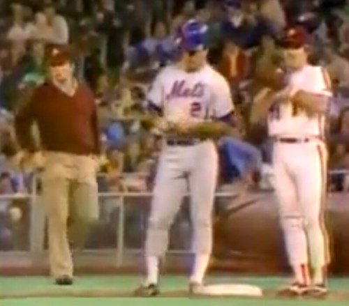
Over at second, Lee Weyer was wearing a Phillies cap, a Phillies windbreaker and black slacks:
Unfortunately, it’s impossible to make out the jacket’s NOB, but I’m pretty sure it wasn’t “Weyer.” Even more unfortunately, this is the only glimpse of Weyer that’s available, so we won’t get a better view of the NOB than this one.
Moving to third base, Randy Marsh was wearing a Phillies cap, a Phillies windbreaker similar to Weyer’s, and what appears to be gray baseball pants:
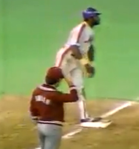
The NOB lettering is a little clearer here, but still not fully legible. I looked through the Phillies’ 1982 roster in search of a name that might match up with the lettering but came up empty. It occurs to me that these might have been a groundskeepers’ jackets.
Meanwhile, the gray pants could be slacks, but the fit seems more like gray baseball pants. That’s interesting, because the Phillies were wearing powder blue on the road in 1982 and hadn’t worn gray in a decade, while the Mets had those racing stripes down the side of their road pants (as you can see above), so who came up with the plain grays for Marsh to wear?
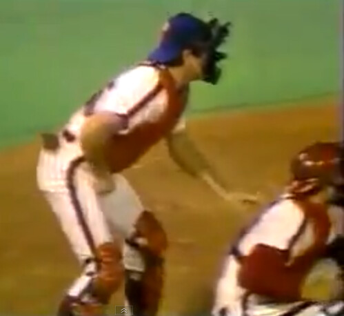
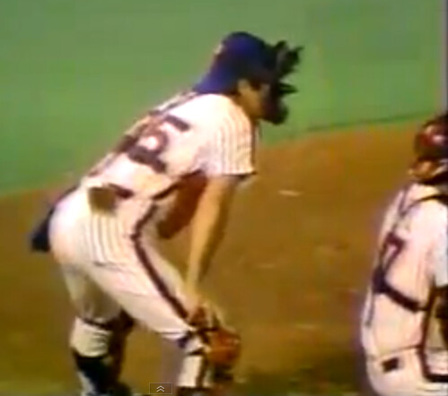
The most interesting outfit was worn by Ed Montague, who was working the plate. Check out his attire:
Lots of oddities here. Let’s go one thing at a time:
• That uniform is pinstriped, which means Montague was wearing a Mets home uni. Why would the Mets have brought a home uni on the road, especially for the final road trip of the season?
• The jersey is NNOB, but the Mets’ 1982 home jerseys had NOBs.
• No. 35 was worn in 1982 by pitcher Randy Jones. He had made his final appearance of the season — which turned out to be the final appearance of his career — on Sept. 7.
As you can see in the crossed-out text above, I initially thought Montague was wearing a Mets home uni. But as several commenters quickly pointed out, it was actually a Phillies home uni with a Mets cap. (The colors on the uni are really washed out, and the cap fooled me into thinking the pinstriping, piping, and numbering were blue, not maroon. The giveaway is the number font, which is clearly the Phis’ font, not the Mets’.) Odd that he got a full uni while the other umps didn’t.
Interesting that Montague’s jersey was NNOB. Jerry Reed wore No. 35 for the Phils in 1982, but he was traded to the Indians on Sept. 12, so maybe they just grabbed one of his old jerseys and removed the NOB.
I love — love — that Montague wore stirrups. Granted, he probably had no choice but to go high-cuffed, because baseball pants in those days had shorter inseams, but he could have just worn white sannies and left it at that. So cool that he went the extra mile and wore stirrups! (Since Randy March appears to have been wearing gray baseball pants over at third base, did he wear stirrups as well? Unfortunately, there’s no full-body shot of him.)
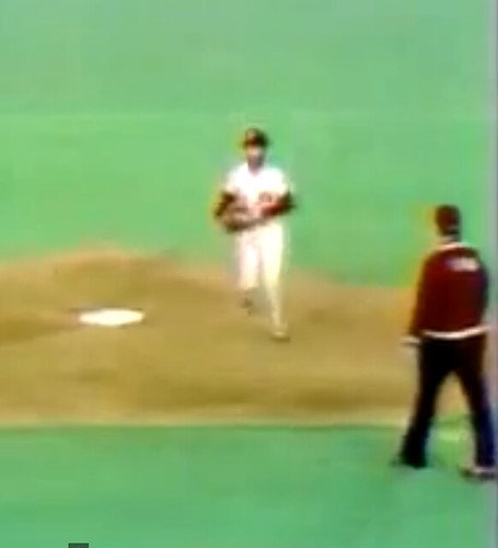
As a bonus, this game went 10 innings (in fact, all the base ump shots are from the top of the 10th), just to prolong the umps’ indignity a little bit.
How awesome would it have been if there had been an argument over a disputed call in this game? Imagine Montague, in full Phillies regalia, arguing with with Phils manager Pat Corrales — that would have been rich! Makes me wonder if the umps and managers have a sort of gentleman’s agreement in this type of situation — “Look, I already look ridiculous out here, so don’t make it worse by coming out to argue.”
If you want to see the video that served as the source of these screen shots, Montague can be seen here (at the 2:36:56 mark), and the base umps are all shown in this sequence (2:41:00).
Let’s all thank Jerry for this awesome find. I can never get enough of stuff like this.
More camouflage bullshit: We had already reported earlier this week that the Reds would be unveiling a new GI Joe uniform tomorrow. Now Reds beat reporter (and longtime Uni Watch reader and contributor) C. Trent Rosecrans has reported that the GI Joe design will be worn for six “Military Appreciation” nights. (For those keeping score, that’s one more game than the Mets’ five planned “Military Mondays.” Why are the Mets 16.7% less supportive of the military than the Reds?)
This is all particularly interesting in light of a radio interview I recorded yesterday with Zoe Stagg of the Armed Forces Network. We were talking about the upcoming Army/Navy game, and we discussed the irony of how the two service academies — the teams that have the greatest authority to wear camouflage, and whose players are the only high-profile athletes in America that will actually serve in the military — will be wearing fairly straightforward camo-free uniforms for their biggest game of the year, instead of doing the look-at-me camo routine like everyone else. Zoe also mentioned that the Army base-layer shirt has olive branches on one sleeve and oak leaves on the other (because both appear on the West Point logo. So while every other team under the sun is trying to evoke intimidation, combat, and militarism, Army isn’t afraid to wear a symbol of peace.
I think the Reds, and a lot of other teams, could learn something from the service academies. Remember, kids, not all soldiers are heroes, and not all heroes are soldiers.
More Notre Dame News: Yesterday I posted some exclusive inside information about Notre Dame’s stadium. Today I have additional info, this time from a different source, who has this to say:
What they are planning on right now is a renovation of the stadium that will commence in about five to six years. They will be digging underneath the stadium to make a subconcourse where all the offices, storage, and kitchens will be moved, as well as a loading dock. There will be jumbotrons added to the stadium, but they’ll be in the corners so that they do not block Touchdown Jesus. They will build a tower opposite of the current press box to provide suites and club settings.
Overall, the expansion as currently planned will add about 8,000 seats into the stadium. There will be a ballroom as well as classroom. Since the initial announcement, there have been drastic changes to the plans — of course because of money. The stadium itself will still not be able to host winter events, as it is not and will not be winterized — only the new parts will be. The renovation will mostly focus on suites and clubs. The wooden bench seating will remain. Most fans will not see too many changes to normal concourses, facilities, and such.
As for field turf, the coach has been pushing for that for some time, and I expect we will see it sooner rather than later.
Update! Big QBC news: On Tuesday I mentioned that I’d be participating in the Queens Baseball Convention, which is the Mets-centric event being put together by Mets Police blogger Shannon Shark. It will take place on Jan. 18 at McFadden’s.
I originally said I’d be conducting a pub quiz-style trivia contest based on Mets uniforms and that Mets uniform timeline curator Mike Cesarano would be doing a presentation on the team’s uniform history. But now our plans have changed: Mike and I have decided to combine our time slots into a longer segment. It will consist of a panel discussion devoted to Mets uniforms, and I don’t mind saying that we’ve assembled an all-star roster of panelists. In addition to Mike and myself, it will consist of the following:
• Russ Gompers, who owns Stitches, the shop that does all the lettering, numbering and tailoring for the Mets’ uniforms. (I did a story on him way back in 2004.)
• Uniform designer Todd Radom, who has done his share of Mets-related work over the years.
• Mets by the Numbers impresario Jon Springer, who’s the world’s foremost authority on Mets uniform numbers.
• Our own Uni Watch weekend editor Phil Hecken, a lifelong Mets fan whose uni-related bona fides speak for themselves.
• We’ve also invited Bill Henderson, whose game-worn jersey guide makes him a serious authority on all things uni-related. Bill isn’t sure he can make it, but he’s hoping to rearrange his schedule so he can join us. Stay tuned.
As I think you’ll all agree, that’s an impressive mix of industry professionals, enthusiasts, and scholars. I think it’ll make for a lively discussion, and I for one can’t wait.
As I mentioned two days ago, the Queens Baseball Convention will also feature lots of non-uni stuff, including autograph sessions with former Mets Ed Kranepool and Ron Darling; presentations by ESPN.com columnist Mark Simon and Faith and Fear in Flushing blogger Greg Prince; a scavenger hunt for kids; and a lot more. You can see the full schedule of events and purchase tickets ($35 for adults, $10 for kids) here.
Blazers contest reminder: In case you missed it last week, I’m soliciting entries for a Blazers redesign contest on ESPN. The deadline is Dec. 9, and the results will be published on ESPN soon after that. I look forward to seeing your designs.
Tick-Tock: Today’s Ticker was compiled and written by Mike Chamernik.

Baseball News: Lawrence Finnell found a photo of Red Ruffing wearing an odd sleeve patch. I asked Paul what it was about and he responded: “That’s the famous and fairly rare ‘ruptured duck patch.’ I wrote about it nearly six years ago. Interestingly, in that entry I mentioned that Red Ruffing wore the patch but that I didn’t have a photo. Now we do!” ”¦ Paul Konerko is returning to the White Sox for a 16th season. Though it seems he’s played for the South Siders his entire career, Andy Chalifour reminds us that Konerko played catcher for the Dodgers and went clean-shaven for the Reds nearly two decades ago. ”¦ David Firestone found two vintage baseball uniforms, one for the Yancey Hotel in Nebraska and the other for Pepsi. ”¦ A 1927 photo found by a Baltimore baseball historian determines the exact location of a bygone Negro Leagues ballpark (from James Ashby). … Forget about customizing your own Jarrod Saltalamacchia jersey (for now, at least): The Marlins’ online shop limits personalized jerseys to 12 NOB letters (from Matt Shevin).

NFL News: The Seahawks repainted their endzones before Monday night’s game against the Saints (good spot by Kyle Hanks). ”¦ These logo redesigns are for the people who love both Disney cartoons and pro football (from Phil). ”¦ Niners WR Michael Crabtree isn’t afraid to mix it up with his footwear on gameday (from Brian Graham). ”¦ Speaking of the 49ers, the team sent an email to fans reminding them when to cheer. “L-A-M-E,” says Dave Rakowski. ”¦ Jimmy Kim found a photo of Len Dawson smoking a cig and drinking a Fresca on the sidelines during Super Bowl I. Better yet, Jimmy found a colorized version of the photo on Reddit. … Seahawks WR Golden Tate was wearing Seattle skyline socks on Monday night (from Andy Heiting-Doane).

College Football News: Cincy will have new helmets for tonight’s game against Louisville. … Here’s a clever way to kick the two-time defending national champions when they’re down (from Phil).

Hockey News: New Jersey’s North Wildwood Recreation and Tourism group has a good interpretation of the Whalers’ logo (from Paul Ricciardi). ”¦ Henrik Lundqvist has a new mask. ”¦ Brett Leonhardt, the Capitals video coach and who occasionally moonlights as an emergency backup goalie, has changed his number from 80 to 35 (from William F. Yurasko). ”¦ “While watching the highlights of Penguins vs. Islanders, I caught Calvin de Haan’s NOB,” writes Maks Skuz. “It’s labeled as ”˜de HAAN.’ Upon research, I’ve found ”˜DE HAAN’ or ”˜[small caps] DE [normal caps] HAAN.’ I wonder how many NOB modifications has he gone through?” … Mikhail Grabovski of the Caps was victimized by an NOB typo during warm-ups the other night, but it was fixed in time for the start of the game (from Vince Serritella).

Soccer News: Volkswagen will no longer sponsor D.C. United’s jerseys (from Phil). ”¦ “It looks like Adidas didn’t waste any time getting their Brazuca soccer ball on the shelves,” says Andrew Cosentino, reporting from a Modell’s in Greenbelt, MD. ”¦ “I routinely get game updates from the English Premier League via the SportsCenter app for the iPhone,” says Chad Hensley. “I got this one a few minutes ago and noticed the spelling error immediately.” ”¦ Come to think of it, the US soccer crest really is outdated (from Brian Bittner).

College Hoops News: Pinktober is over, but Wake Forest hoops wore pink anyway last night. … These ACC/B1G Challenge logos are being digitally superimposed by ESPN on the floor. “Much better and safer than stickers,” says Phil.

Grab Bag: “This is why you never wear team gear to the game,” says Phil. ”¦ If you’re ever in Minneapolis you can go to Familia Skateshop to design your own Nike sneakers with fridge magnets (from Brinke). ”¦ “I hope you enjoy the irony of Wal-Mart selling a print titled ”˜Destroy Capitalism,’” writes Andy Moeschberger. ”¦ Burton unveiled the US Olympic snowboard uniforms. ”¦ “I know, I know, ”˜minimalist’ is a bit overdone lately,” says Yusuke Toyoda, “but a British website named Form & Glory is creating some nice, simple prints for soccer, baseball and a bunch of other sports. ”¦ George H. W. Bush wears socks with his face on them! How charming (from Robert Silverman). ”¦ Union City High School (TN) dyed its 419 Bermuda grass football field purple. “We believe that we are the first to dye a Bermuda field a color other than green,” says Stephen Crockett. ”¦ Yo dawg, I heard you like Chucks. So we put Chucks in your Chucks so you can style while you style (from Gordon Blau). ”¦ Ignore these newfangled high school basketball jerseys and instead focus on how “Village” is misspelled. Also mentioned in the piece, here are Atlantic High School’s football unis from last year. … 2014 is going to be difficult, at least judging by Pantone’s official color for the new year (from Bernie Langer).
HP umpire is wearing a Phillips uniform.
Awesome. Oh and BTW – if I hadn’t checked the site too early this morning, I totally would have called this out first!
Isn’t the plate ump in a Phillies home uniform? The color of the stripe matches the catcher’s, and they are both pinstriped.
I had the same thought… but the uniforms are so similar… and when one is maroon, and the other is blue with orange (which tends to look maroon at low resolution) i don’t know if it’s possible to tell the difference with the low quality images.
Easy. First, the colors really aren’t that close. It’s maroon. But more usefully, look at the pattern on the racing stripe: It’s a single band of color, which is what the Phillies wore. The Mets at the time wore a three-band racing stripe of orange-blue-orange.
Also, man do I miss racing stripes. Mets, Phillies, and Expos each wore them in those days, and each represents the best uniform in team history. Please, someone, anyone, bring back racing stripes!
If not for the number typeface, I might still argue that this was a Mets uni. Really hard to tell with the lo-res video and the colors being so washed out. But the number font makes it clear that it was indeed a Phillies uni (which also makes more sense, since there’s no reason why the Mets would have taken a home uni with them on a road trip). Text has now been corrected. Mea culpa!
“Please, someone, anyone, bring back racing stripes!”
The Aberdeen New York-Penn League ballclub new uniforms for 2014 will have an abbreviated version of them:
link
Yer pal, Walter, on belt tunnel detail: Notice that Pete Rose’s racing stripe is interrupted by the belt tunnels, but Ozzie Virgil’s is continuous. Always better to shell out the extra shekels on details like these.
Also, the ump’s pinstripes show a raglan sleeve is being used…the Mets have always used set-in sleeves.
One of those umps jacket looks like it had Manny Trillo’s name on the back.
Yeah, it looks to me like Montague is wearing a Phillies home uni, not Mets. Phils wore pinstripes as well, and look at the 5 on the back; clearly the Phillies’ modern typeface, not the Mets block style.
Wow — I missed the typeface. Obviously, the colors on old video look washed out, but he’s clearly wearing a blue Mets cap, and the pinstripes, numbers, and side piping look like they could be Phils colors OR Mets colors. The cap made me think all those elements were rendered in Mets colors, but I think you’re all correct — this was a Phillies uni (and Phillies catching gear).
I’ll correct the text now.
Also interesting that the plate ump is wearing a catcher’s chest protector, which is a lot thinner than the regular one they wear. I hope he didnt take a hard one to the chest.
That photo of Len Dawson – was that during the game? It does not seem likely as they would not be using folding chairs on the sidelines. It looks like it was during practice. Also, those do not look like Chief game jerseys but I could be wrong. Alas, this brings back fond memories of Barry Switzer munching on a hot dog during the 2nd half of the Pro Bowl game he coached. It was at that exact moment the Pro Bowl forever lost any appeal (even minimal) it had for me.
Well, I believe it that it IS from the sidelines at Super Bowl I.
The Chief’s 1966 Road jerseys DID look like that, and, Dawson and others are wearing GAME socks – which they would not be wearing for practice.
Lots of smoking in the NFL during the 1960s. Truly astounding by today’s standards ….
This has to be in the locker room during halftime…it was a bright sunny day at the first Super Bowl, and this looks like a concrete floor…no image I’ve seen of the game shows anything like this on the field. Here’s an image of the field… link
Whoops…here’s the link for the image, I hope: link
So sorry, don’t know why the link ain’t working, try this one for the page the photo is on.. link
I’ve seen that photo before. There was a link in here last season to a bunch of pictures from the first Super Bowl, and, if memory recalls, I believe the caption noted that it was in the Chiefs lockerroom at halftime.
Regarding the US Soccer crest, I hate the ball design on it. Classic crests which include a ball use older ball designs, lends some historical weight that the 70’s ball does not.
The most incongruent part, if you think about it, is that the ball used in the logo is the Adidas Telstar, and US Soccer has been a Nike client since 1995.
They obviously need to go back to the link.
The current crest is a joke. Terrible design.
It’s especially frustrating becase, as the article notes, they already have link in their package. The rattlesnake is a New World animal, unique in world soccer and would be a welcome respite from the standard American S&S/eagle branding. Plus it helps us reclaim the symbol from the Tea Baggers.
Love that thing, and I don’t care that an MLS team has link for their own.
I’m with you on the rattlesnake, eagles are overused. Writer mentions buffalo which would be a good one, but probably hard to execute.
Just sub out the shield in the background of the rattlesnake crest with the current centennial crest and I think we have a winner (excuse the quick photoshop job):
link
I believe that design is owned by Nike
That’s my understanding, as well. For all the flak they get on this site (much of it deserved) for various uniform “innovations,” that logo is definitely one thing they’ve gotten right. It’s got a shield; red, white, & blue; and a menacing animal that has historical roots (“don’t tread on me”).
I was going to suggest replacing the “US Soccer” with a simpler “USA” across the top, but I think I like Nick’s rendition better. Could we perhaps convince Nike to just donate whatever elements they own to the USSF?
I’m always amazed by UniWatch, specifically that there’s someone out there watching a 1982 Phillies-Mets game.
I was looking through a 1982 Mets highlight video for possible additions to the link. IIRC, I did find a game I didn’t have, and then stumbled across the umpire situation.
Is the NOB for Bill Giles? I know he was part of the ownership in 1981, therefore, I could believe he had personalized jackets in 1982. I just can’t tell if the number of letters match.
It looks like Montague is wearing #35 for the Phillies (no name) with a Mets cap. I guess to show his impartiality. Jerry Reed wore #35 for the Phils in 1982, pitching in 7 games before being traded on September 12th to the Indians. So I guess the jersey was available at that point. Reed and two others were moved for pitcher John Denny, who won the Cy Young award the following year.
“…for the people who love both Disney cartoons and pro football”
Hey, that’s me!! I like those.
Speaking of which……
Happy Birthday, Walt! ºoº
I’m a little surprised there wasn’t some kind of tie-in between Pocahantas and either the Chiefs or Skins.
Stinky Pete (Toy Story) & the Niners
any plane from Planes & the Jets
Captain Jack Sparrow & the Raiders
adult Nala & the Panthers
So many possibilities!
“More Camouflage Bullshit” is an excellent heading, Paul. For whatever reasons (euphony, maybe), I’ve always preferred horseshit to bullshit, but it’s a very close call, and I respect your decision.
That photo of Lenny Dawson toking on a Marlboro at Super Bowl I is glorious.
Horseshit is the better word in general. But bullshit is a term of art with a very useful precise philosophical definition:
link
… that more exactly applies in this case.
“Bullshit” refers to something verbal, i.e. speech or writing; “horseshit” refers to anything else. Example: “He’s a horseshit manager — the way he explained that decision was all bullshit.”
It’s a thrill to be amongst such a horseshit community of bullshit scholars.
Well, some say “Ph.D” stands for “piled higher and deeper.”
LOVE (yes, all caps) that Pepsi-Cola logo on that uni. Always been one of my faves.
Me, too. Always reminds me of the link in Long Island City.
I even love the simplified version they use for link.
I was just browsing on eBay and found that, and if I had the money, that would be in my personal collection today!
“Why are the Mets 16.7% less supportive of the military than the Reds?”
Well Cincinnati, generally speaking, is a more socially conservative city–definitely more socially conservative than New York–I could see them going out of their way a little bit more.
To be honest, though, MLB teams need to back off the camo unless the communities they serve actually have a high percentage of military personnel. So except for the Padres and MAYBE the Nationals, teams need to back off the camo.
I really don’t buy the relativist argument here. If it is a bad idea for one it is a bad idea for all. Introducing some kind of scale for deciding who gets to be a military city and who doesn’t seems like it’s only making the problem worse with each city deciding it needs to prove its military credentials and usually with superficial jingoism. For example, how much of the popular conception that San Diego is ‘a military city’ is merely the result of how much San Diego goes shouting about it every chance it gets?
Well, San Diego doesn’t have a whole lot going for them these days. The Padres suck. The Chargers are inevitably going to move back to LA, maybe as early as next season. (There’s more Steeler fans in San Diego, anyways.) What else does San Diego have going for it besides the military?
San Diego is definitely a military city without any shouting needed. From Camp Pendleton, MCAS Miramar and many other installations, the Navy and Marines are a huge presence and influence here.
While the Chargers *might* someday move, it is far from inevitable that they’ll move to L.A. The Rams and Raiders may both be more likely. More Steeler fans in SD than Chargers fans? Like hell.
What does San Diego have going for it besides the military? The perfect weather, the beaches, the incredibly beautiful women, the burritos, the best craft brewerys in the country…etc etc.
“What else does San Diego have going for it besides the military?”
~~~
Have you ever been to San Diego? No offense, but it probably has a lot more going for it than Pittsburgh.
Just not in the sports department.
So just like it would be ludicrous for a team in most cities to be named the Steelers, since nearly all of America has never had a steel foundry located nearby, therefore neither should Pittsburgh’s team be named the Steelers?
There are a few places in America where military establishments amount to a dominant local industry. In those places, special military recognition events are no different from, say, a team in a city with a large Latino or Polish community hosting Latino or Polish events. San Diego, San Antonio, and Norfolk/Virginia Beach are pretty much alone, among major cities, in having sufficiently dominant local military presences to justify such a thing.
Pittsburgh being a ‘Steel City’ is the result of a self-perpetuating identity. It has a rich steel industry history, but the football team doesn’t NEED to be called the Steelers. It just is because they have baught into that identity and in turn proliferated it.
Similarly, San Diego having a strong military presence does not necessitate that non-military aspects of the city buy into it. Hence, the Padres playing military dress up is a part of a self mythologising just as much as the Steelers is about Pittsburghian self-mythologsing.
The difference of course is that the steel industry isn’t purely about war, death, famine etc. and as such is a pretty harmless identity myth to perpetuate.
Who said anything about need? Of course nobody needs to do anything of this sort, including naming their team after the city’s once-dominant, now long-dead industry, or hosting ethnic heritage nights, or paying tribute to local employers. The point is that local circumstances really do differ from city to city. Context matters. It does not follow, as you argued, that because it’s bullshitty for the Mets and Reds to wear camo, therefore it’s bullshitty for all teams to wear camo. Your general rule is valid, but only if it admits of reasonable exceptions.
Also, neither is the military “purely about war, death, famine, etc.” Nor is the steel industry “pretty harmless” in comparison. American industrial and labor history is a fascinating story, full of both terrible abuses and heroism. Among the abuses in the steel industry were the murders of numerous worker activists, as well as the needless maiming and killing of workers in preventable “accidents” that companies routinely accepted for decades to maximize output and minimize costs. Read up on the Homestead Strike if you’re under the impression that Pittsburgh’s steel industry was a “harmless” place of fun and giggles.
I don’t think there is even a modicum of comparison between the hardship that war has caused over the millenia and the struggles which have happened in the name of steel. For example, (according to wikipedia at least) the Homestead strike resulted in a total of 12 casualties. If just 12 people died in one day on Earth as a result of military conflict that would be amazing.
Besides, aligning the city’s identity with steel is not automatically an advocation of that kind of violence. Labor violence is a part of that history but it doesn’t define it. The military however, is irrevocably tied to war. It is war. Wars bring death and famine.
It’s bullshitty for Sand Diego to do the military thing because it’s bullshitty for any team to do the military thing. San Diego doesn’t get a pass and that’s because it doesn’t NEED (there’s that word again) to be a military city. Its military presence is the result of geological coincidence (deep harbors and all that) and any time coincidence is conveyed as having deeper meaning, say as a city’s identity, that is mythology. San Diego does not get a pass because it has been mythologised as a military city.
It’s definitely a matter of opinion whether San Diego has more going for it than Pittsburgh. Better weather, but a much higher cost of living. Good luck with that California traffic as well, LOL
Pittsburgh has been named a the most livable city in America, so the old stereotypes just don’t match the reality.
Pittsburgh also has the Marcellus Shale drilling going on right now that has just started to pick up steam the last couple of years. Its expected to provide jobs in at least Eastern Ohio, Western New York, and Western PA for 50 years. (West Virginia is also under Marcellus territory, but is fighting the drilling with environmentalists.) And no, I’ve never been to San Diego but I would like to try fish tacos.
The Whalers rendition is pretty impressive. Good design on that, and it wasn’t gaudy or overstated despite them pilfering an already-beautiful design.
Paul, I spent some time taking pictures at the uniform place in Winnipeg, but it’s just a shell of a building. I called the leasing company, the former management company, and anyone else who has their phone number scribbled on a wall to see what I could find out, but the leasing and management companies knew less than I did other than the bills were paid on time. In short, it appears that the company simply closed shop when business dried up.
I also found that a local community center, and several others, around Winnipeg have freely borrowed current NHL logos for their own use. If I can squeeze it in, I plan on taking some pictures this weekend of some of the offenders.
“…the uniform place in Winnipeg…it’s just a shell of a building.”
Dang. Great that you made the effort, though, Teebz.
Thanks, Seattle.
I was a little shocked and disappointed that the leasing and building management companies had little information, but I guess people only keep records for a certain amount of time.
On a different note, I’m also working on getting an interview scheduled with the guy who has the NHL deal to provide teams and the league, amongst other leagues, with the link. Might be of some interest to UW and/or Paul since he has a deep appreciation for the brannock device. :o)
Those Seattle Skyline socks should be standard issue. Their uniform is a joke anyway, might as well have those awesome socks to balance things out.
the socks belong to a company out of Seattle called Strideline. They have a picture of Marshawn Lynch wearing them earlier this season.
link
It’s Brett Leonhardt, not Brian
I wonder if anybody who got a “LEONHARDT 80” sweater made is making the update.
My fault. Fixed.
Haha, anybody who owns a Brett Leonhardt sweater is either a close relative, or has a little too much money to burn.
Scathing review of App State’s new secondary logo here: link
It’s a little harsh. Sure, the execution of the logo isn’t the greatest, but the idea is fine. And anything is better than the generic Zeus-gone-country nonsense App had before.
The other umps couldnt wear full unis. would be confusing to phils on field. throw ball at one of them
The painted end zones at CenturyLink are something of a post-MLS-season tradition, as can be seen in this Rams-Seahawks game in December 2012.
link
Guess the team/groundskeepers like to express their relief at not having to scrub the field for soccer.
Fixed link: link
Ah, that makes sense. Last year, I assumed they did it because they’d made the playoffs, but weren’t likely to have a home playoff game. (The 49ers have always painted their end zones for playoff games; not sure if any other teams follow that tradition.)
As a West Point staff member, I had a few minor corrections and a quick thought:
-The Oak leaves and spears are found in the Acadamy’s crest, not our logo (semantics, I realize)
-Oak leaves are actually a symbol of strength, not peace
-USMA actually does have a camo centric alternate uniform.
Could it be that USMA and USNA avoid camo against each other to avoid redundancy, despite having camo alternates?
This, from that piece on the US Soccer crest, is excellent advice for starting any brand-design project:
“Gather the Nike design team that made the University of Oregon’s football uniforms. Lock them in a room, don’t let them out. Next, work with the rest of Nike’s staff …”
Yup. I felt my blood starting to boil… then I read the whole sentence.
I’d guess that the Seahawks painting the full end zone probably has to do with the MLS season being over since they won’t have to change over from soccer to football for the rest of the year.
George H.W. Bush is obviously a man of the early 90s, when link.
SO happy Andre Dawson chose not to partake.
I came across a pair of those that Barry Bonds and I swear to god I almost passed out when I saw that they said “Say no to drugs” on them!
The Len Dawson photo looks to be indoors. My guess is that is a locker room pic judging by the floor and the folding chairs in rows.
I am way late…but here goes anyway. Yeah, I’m pretty certain it was in the locker room at halftime. Most seem to be in agreement there.
BUT HERE’S THE THING: That colorized photo shows what seems to be candy apple red and Old Gold as the Chiefs’ colors. Inaccurate, but I love it! So much so that I now wish they had gone that route.
I will theorize that Marsh and Montague are simply wearing Phillies leftover stock. Dickie Noles was with the Phillies through 1981. That looks like a leftover of his issued gameday gear.
That letter to 49ers fans – not only is it lame, but in the section about when to cheer, it says “Know your QUEUES”. I would think that this would be a better heading for a section telling them to stay in their seats during play and head to the bathroom line during commercial breaks.
If the queue is populated predominantly by women, it’s probably not for the men’s room.
The evils of homonyms… especially when they might share a definition or two, but not the one being confused here.
Crazy thing about that game is that its also noted for being the greatest performance in Terry Leach’s career: a 10-inning, complete game, 1-hitter (Luis Aguayo’s fifth inning triple). Seven strikeouts, six walks, game score 91.
“…the teams that have the greatest authority to wear camouflage…”
How come the Army and Navy hate the Army and Navy so much?
I wish Stretch Leonhardt would lend his pads to one of the Caps’ other goalies. Love the red look!
What else does San Diego have going for it besides the military?
Comic-Con ?
Sea World? Lego Land?
The best weather in the USA?
Most consistent weather. Not sure that is the same as the best weather.
Hot Chicks!!
Tijuana.
Zoo.
As far as I’m concerned, they’ll always have the Chicken:
link
Giant Dipper at Mission Beach.
reef breaks.
Fish tacos
The Form & Glory print for The Outcasts looks like it was designed by Left Field Cards.
“Zoe also mentioned that the Army base-layer shirt has olive branches”
How dare they?
I’d actually love to see one team, any team, go with a “peace motif” just once. I’m sure the RW media would go bat-sh!t over it. Philadelphia Quakers, I’m looking in your direction…
I’d settle for a “Peace Corps Appreciation Day.”
I’m not sure the LW media would let it go either…
Funny that the 49ers memo says “The foghorn blast follows any type of 49ers score: Touchdown, Field Goal or Safety”. Extra points are not foghorn worthy?
“Funny that the 49ers memo says “The foghorn blast follows any type of 49ers score: Touchdown, Field Goal or Safety”. Extra points are not foghorn worthy?”
No kidding. And what about two-point conversions? If they blow the foghorn for those, I think they’re short-changing Phil Dawson’s contributions.
RE: Reds 6 Military Appreciation Nights
I wonder if franchises consult with veterans on this at all? I was a member of the Natinal Guard and saw no real action so I always feel a little hesitant to express an opinion in leiu of others in the military who have done much much more (active duty Army, Navy, Marines, Air Force, etc.). But I kind of get the impression that the best way to appreciate the military is by simply playing the game? I mean, isn’t that what they “fought for”, the freedom to, among other more meaningful things, play sports?
Wouldn’t franchises be better served to simply have a few Military Appreciation Nights where, perhaps, servicepeople could go to a game at a drastically reduced rate or even free? By wearing an expensive jersey with rip-off camouflauge that stores will sell for profit doesn’t really scream “military appreciation” to me. It smells like “more money” and then comes off as poor taste.
I can live with some patriotic stuff on July 4 for baseball, but that’s about it, really. It has gone overboard.
Now I feel bad, because I was going to bring up the restaurant that lets veterans eat free on Veterans day. Applebee’s? Chili’s? Now, if you do something, and there is nothing wrong if you don’t I don’t think, but that is how to make a statement.
The PGA Tour does it well. Not so much garbage, besides the flag tenders, but they let the military in for free.
Nice Mets Uni panel you have scheduled. I can say that I have had contact over the years with every single person on that panel and it should be very interesting.
Rest easy everyone! link!
And when he weighs in he really WEIGHS in!!
Oh, another crack about his weight. How original.
If Rob Ford is commenting about that, he must not have a lot on his plate at the moment. Whatever, no sympathy. He won’t be hungry for long. He has plenty to eat at home.
“Oh, another crack about his weight. How original.”
~~~
He’ll be here all week. Try the ribeye, and don’t forget to tip your server.
I found this linked under the story about Rob Ford weighing in on the ‘Skins team name:
link
That was the link to the letter. Here’s the link to the story about the letter:
link
FWIW, Konerko never caught in the big leagues… he spent parts of his first A ball seasons catching, and then moved to 1B. When he came up in ’98, he seemed to split time evenly between 1B, 3B and LF for both the Dodgers and Reds.
The White Sox installed him at 1B in ’99 with only rare appearances at other positions.
On those Brazuca balls, the sporting goods store I was in had 3 legit balls at $160 a piece, and the big display (just like the one pictured in the ticker) had good knock-offs for $30 – cut in the pattern of the real Brazucas – and cheaper knock-offs that were truncated icosahedrons with the Brazuca design just painted on it. Seemed odd to me.
$160 for a soccer ball?
Boy, I haven’t priced balls in awhile.
“the Reds would be unveiling a new GI Joe uniform tomorrow”
Enough already. Are all these military sports uniforms actually popular in the US?
Are there no other ways to thank the military?
To me it screams pro war.
So, the Reds are having 6 Military Appreciation Nights eh? Paul, WHY DON’T YOU ASK THE REAL QUESTION?!
There are five branches of service:
Army, Navy, Air Force, Marines, Coast Guard
Who are the Reds ‘appreciating’ on the sixth night?! Has Obama sold one of the appreciation nights to a foreign military?! How deep does this go?
National Guard, perhaps?
MERCHANT MARINE!!
Is it just me or did the Jags helmets change? I thought the color difference started father back on the helmets.
My first thought was that Marsh’s jacket might have had (Ramon) AVILES on the back, but probably not (he was with them in ’81, but I don’t know why they’d have a jacket around).
Apostrophe Catastrophe alert: the NFL Network’s Football Life for “Houston ’93” uses a left (open) quote. Gotta learn to fight (correct) the auto-format, people.
I actually spoke with Marsh this afternoon and asked him a lot of questions about that game. Unfortunately, he can’t recall what the jacket’s NOB was.
I guess it will remain a mystery. Another name that just came to me that should have been obvious – that of the Phils’ skipper, Pat Corrales.
Sticker Co.: “The helmet stripe you ordered doesnt match your jerseys and pants.”
Louisville equip. Manager: “But is it shiny?”
Every team in NFL should wear mono black. That way every team would have the coolest uniforms.
Umm…ok?
link
I don’t remember this game but I remember that final series against the Phillies. I remembered (and checked Baseball Reference to confirm) the last game of the season on Sunday, October 3rd, ended with then Mets catcher (and current Giants manager) Bruce Bochy playing 1B at the end of the game for his only appearance in 1982 at a position other than catcher. I don’t know why I remembered that since I was only 9 years old at the time but sure enough it was the same series!