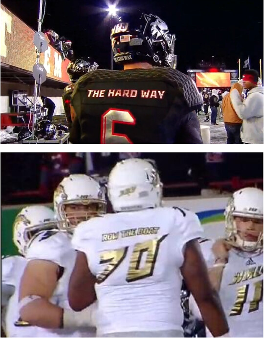
When White Sox owner Bill Veeck pioneered the placement of players’ names on uniforms in 1960, he was probably too busy misspelling Big Klu’s name to wonder how his innovation might play out, oh, half a century later. Veeck was, among other things, an absurdist, so he probably would have enjoyed seeing the slogans Northern Illinois and Western Michigan wore last night, although I — and, I’m guessing, many of you — take a somewhat dimmer view.
A few other notes from that game:
• WMU’s lettering and numbering had this crazy italic slant.
• WMU’s pants and undersleeves had the usual GI Joe bullshit. From a distance, though, the pants just looked like heather gray sweats.
• NIU wore this weird combo of shiny numbers and treadmarks.
• The strangest detail of the night was that WMU coach PJ Fleck wore Cincinnati-branded gloves. Reader Peter Kuzdal thinks he knows why: “The equipment managers advertised this as the Adidas Bowl on Twitter. I guess they weren’t kidding.”
And so it begins: Remember those vaguely metallic-looking team logos for the NHL’s Stadium Series, which were released about two weeks ago? One of them has now landed on a jersey, as the Islanders have unveiled their Stadium Series uniform. My initial reaction is that I’m not in love with it, but I’d like to see some better photos before passing judgment.
Bonus points for Newsday’s coverage of the new uni, which includes one of history’s all-time great photo credits.

Ho-ho-ho: With the December shopping season approaching, here are a few reminders:
• If you want to buy a Uni Watch Membership for someone as a gift but don’t know what that person would want for his or her card design, you can buy a Membership Gift Voucher. For details, look here.
• If you think a certain set of theoretical T-shirt designs might hypothetically find a good home under your tree or in someone’s stocking, let’s discuss.
• I’m putting the finishing touches on my annual Uni Watch holiday gift guide column, which will appear on ESPN next week. If you have suggestions for uni-related items I should include, now’s your last chance. Thanks.
Blazers contest reminder: In case you missed it yesterday, I’m soliciting entries for a Blazers redesign contest on ESPN. The deadline is Dec. 9, and the results will be published on ESPN soon after that. Get crackin’!

Baseball News: Oooh, look at this 1931 fold-out uniform catalog, complete with swatches! Very nice. … Never seen a date of manufacture on a bat knob before (from Brady Phelps). … Also from Brady: Donruss baseball cards are back, but without MLB team logos. ”¦ The Nats are thinking about adding a roof to their stadium. “It’s ugly enough, so why not?” says Andrew Cosentino.

NFL News: Surprising news out of Dallas, where the Cowboys will wear blue on Thanksgiving. Turns out they were forced to do this because they had originally planned to wear their blue throwbacks with the white helmet, but then the NFL put the kibosh on alternate helmet, but Dallas had already committed to wearing a colored jersey, so they switched from the blue throwback to the standard blue. … Meanwhile, the Ravens will wear solid-black for their Thanksgiving game against the Steelers. Festive! … Bears center Kyle Long had a doozy of a jersey tear last Sunday. I like the little uni number on his shoulder pads, too (from Maks Skuz).

College Football News: Good to see that USC and UCLA will once again go color-vs.-color. … Mississippi State will wear their hubris uni and this gold helmet tomorrow. ”¦ Here’s Arizona State’s uni for this Saturday. ”¦ Remember the Virginia Tech helmets with the stripes? They were wearing that design in practice yesterday, so they’ll probably be wearing it on Saturday (from Andrew Cosentino). ”¦ Copper helmets on Saturday for Arizona. … This is pretty interesting: How does Oregon keep track of all that gear? With bar codes (from Jon Springer).

Hockey News: The Adirondack Phantoms are moving to Allentown for next year and will wear these jerseys (from Tom Adjemian). … Here’s an article on the Capitals’ equipment manager, who recently worked his 2000th game (from Tom Mulgrew).

Soccer News: Sporting KC’s third jersey isn’t worn very often but is a big seller at retail. “I see it around town in casualwear much more often than their regular jersey,” says Alan Bloomquist. “They really made a great fashion move in terms of getting people to wear it (i.e., advertise for the team).” … “In yesterday’s Champions League game between Borussia Dortmund and Napoli, Dortmund defender Sven Bender suffered a broken nose on a hard foul at the end of the first half and bled heavily,” reports Bern Wilms. “Rules dictate two backup jerseys for each player, but Dortmund used those up in the first half. This led to the equipment manager being dispatched to the team store, where additional jerseys were procured. However, before the half, a UEFA official informed Dortmund that those jerseys wouldn’t be permitted because they were missing UEFA’s ‘Respect’ sleeve badge. Apparently they got the problem solved at the half, because Bender played the full 90. No word on whether they ended up applying the additional badges at halftime.”

Basketball News: The Suns will wear their new sleeved “Los Suns” jerseys on March 6 (thanks, Phil). ”¦ The Timberwolves will unveil a new alternate uni, featuring the sleeved jersey we already know about, today. Here’s a teaser (thanks Phil). ”¦ Check this out: The 1951 BYU hoops team went on a barnstorming tour of Brazil, where they wore these “Mormons” warm-ups (great find by Benji King).

Grab Bag: A meat scientist has found a new steak lurking in the steer’s carcass (from my old buddy Tim Adams). ”¦ Here’s a good gallery of 1970s Houston sports photos (from Ryan Patrick). … David Firestone recently won this 1929 U. of Maine track and field jersey on eBay. ”¦ Also from David: Maker’s Mark bourbon is getting in on the ugly Xmas sweater thing. ”¦ Subtle logo change for Tumblr (thanks, Brinke).
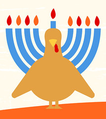
Gobble-gobble: Hanukkah and Thanksgiving combined into one? Sure, sign me up. Hell, kosher turkeys taste better anyway, and there’s really no excuse not to get one this year.
Seriously: To all those who are celebrating the Festival of Lights tonight, my best wishes for a happy holiday. And to everyone who’s traveling today (especially here in the northeast, where the weather is seriously nasty), travel safe.
We’ll have light content tomorrow. See you then.
Newsday also has an editorial correction in today’s paper correcting a story yeterday about the ownership of the NY Rangers from Cablevision to the Madison Square Garden Company.
This is not the first time that they have mis-reported the ownership of the Rangers. Keep in mind however that the MSG CVo is owned by Cablevision, who also owns Newsday!!!
Look at how happy Milbury is:
link
Too bad you didn’t switch the order of the lede photos, then you’d have “row the boat the hard way”. I guess that means holding the blade of the oar.
Meat scientist?
Would you prefer carnologist?
Meateaterologist?
Doctor of cloggedarteryology?
The WaPo is reporting that Mayor Gray has already said no to the Nats offer to let the city spend $300 million putting a roof on their ballpark.
how great would it be if the Nats move to Montreal or Puerto Rico because they wont build them a roof. When are cities going to wise up and treat these business owners like BUSINESS owners?
Not sure what makes Nationals Park any uglier than any other new stadium. What does Cosentino think is a beautiful new balpark? Certainly putting a roof on it WILL make it ugly.
It’s not ‘ugly’ – but it is by far the dullest new stadium built in the last 20 years.
Totally agree with the “dull” assessment. There is really no defining feature in the stadium at all, not that it detracts from the experience of watching a game, but it doesn’t add a thing.
It’s a departure from the faux-retro parks that were all the rage in the last 20 years, but I’m not sure if that’s exactly a bad thing.
I think it’s more that it’s surrounded by a still-developing neighborhood/industrial neighborhood and I hope that changes over the next 10 years. Personally (and perhaps hypocritically, as an opponent of pro sports welfare), I’m looking forward to the DC United stadium going up on Buzzard Point.
Have to disagree with the neighborhood argument. There’s just simply nothing that ‘wows’ me when you’re in the stadium, like Ben said. Seeing two parking garages in the outfield view doesn’t help, either.
Perhaps since I’m a Phillies fan, I’m biased – but I have a feeling some natinals fans probably feel the same way.
Lack of “wow feature” =/= ugly. New Comiskey is ugly. Nats Park is unremarkable.
Basically, take Target Field, subtract the money the Pohlads spent on amenities and upgrades, and you have Nationals Park. It’s a perfectly fine ballpark, with generally good sightlines, but it has few distinctive features or elements and the wide-open outfield and lack of neighboring buildings means that it’s less immersive than many recent parks. And the playing field – what matters – plays almost perfectly neutral. It’s a ballpark for baseball fans, and that counts in its favor.
A roof, though? No way. Rain and cold just aren’t issues in DC. Sure, it gets hot and steamy, but it’s DC. We live with it six to eight months of the year. Doesn’t stop us attending block parties or lawn concerts, and like everyone else at the ballpark on a weeknight, I take off my jacket and loosen my tie and maybe roll up my sleeves and then I sweat a lot. That’s just what summer is like here. If that were a problem, MLB wouldn’t have any teams south of Hoboken.
I think they oversell the view of the Capitol on tv because the are very few spots in the stadium you can actually see that view. Short of that I have no quams with the stadium, I like the monument mimicking materials used to build it rather than brick. It does need something though, maybe an emphasis on cherry blossoms just to add some color. I’ve been wrestling with the roof idea since yesterday and couldn’t think of many rainouts (the article confirms this with only 4 last year) but DC does get damn hot but more humid in the summer. It is uncomfortable to be out watching games sometimes. A roof would make it more confortable especially as DC isn’t a historic baseball town and Nats games are more events than games. Large parts of the crowd are there after work in DC in dress clothes and sitting outside in the summer does suck in that regard. That being said I can’t fathom building a roof on that stadium and especially not for $300 million
How many ‘Scotts’ are here? You’re making it look like I’m debating with myself!
The request is simply outrageous. The District built the stadium to the Nats specifications. It’s the Nats fault that it’s boring. If Lerner wants a roof, he is free to build one. (Assuming that it would even get approved, considering the proxity to the Capitol).
If my tax dollars are going to pay for it, I demand that said roof be retractable/umbrella-like, be made of orange Kevlar and be suspended by cables from a leaning tower.
I need to address the Western Michigan- NIU game. That was a mess. I asked a couple of friends to tune in because I could not believe what I saw. Was there any reason that the teams were wearing special uniforms for a random Tuesday-night MAC game?
NIU’s uniforms were not too bad, but Westerm Michigan was a MESS! They clearly drew the short stick. I wonder if this was an adidas-required uniform. There is no way that the players liked that look.
I disagree with the camoflauge comment. Why? I don’t think it was camoflauge. It was just a design element that happened to look like camoflauge. It looked like the uniforms were part of a Project Runway challenge. Awful.
I don’t think there was a good reason they were wearing special uniforms for a random Tuesday night game. But there is a reason – national television. Specifically, MACtion.
Neither of these schools are on national television much, so they (or more importantly, their uniform suppliers) try to do something to stand out for publicity/recruiting etc. when they know they will have a certain number of eyes on them. Did you see Toledo’s Breast Cancer Awareness Month uniforms last week? They were a month late, because that was a night they’d be on national TV.
Looks like milbury is sporting the regular guy look from “easy money”.
It’s a shame baseball season ends so long before Hanukkah. I’d love to see the Brewers in Hebrew-script jerseys! (Or the Nats with a curly-waw.)
Makers Mark sent those bottle sweaters to its ambassadors as a holiday gift in 2011. They’ve just been featuring them in advertising more this year than previously. Even better, though, is Woot.com’s ugly holiday sweater beer-bottle koozies: link
Saw them at the store, had never seen them before…
Holy crap, thanks for that. Xmas shopping for my brothers = done!
Since it’s the day before turkey day, the question should posed: wet or dry brine for your bird? We tried wet brining last year, thought the bird came out too wet, so we’re going to stick to dry brining.
Gonna be dry brine for us – we got such a large bird that we don’t have a stock pot big enough…and I don’t feel like making a mess of my fridge.
In the past with smaller birds, I’ve had good luck with wet brine, though.
Wet.
Wet.
But I haven’t cooked turkey in years. About a decade ago, we switched to cured Virginia ham for Thanksgiving and haven’t looked back. It’s a much better complement to all the other traditional T-day dishes.
Though it means that Thanskgivukkah will not be celebrated at Chez Moi.
Neat trick to keep your bird extra moist, butter the hell out of it under the skin. Lift the skin away from it enough to get a hand in there and slather that bad boy in buttery goodness.
very cool turkey/menorah graphic
“… With the December shopping season approaching….”
Oh, please, no, not yet, please. Maybe wait until December?
Stores have already been playing X-mas music for the past 3 weeks.
The worst is “Black Friday” sales that start on Thanksgiving. Guh.
Slogan On Back – SOB, obviously – rubs me the wrong way on so many levels. I mean, sure, in rare instances I can live with the basic idea, but only up to a point. I mean, a team all wearing “BOSTON” on the back, fine, but “BOSTON STRONG” goes too far for me.
First, I can’t help but treat it as a joke. Show me a “THE HARD WAY” SOB, and my brain goes straight to listing alternates like “THE EASY ROAD” or “THAT’S WHAT SHE SAID” SOBs. Because I’m a terrible person, sure, but I know I’m not alone in this.
Second and more importantly, when an SOB is self-referential, it bothers me on a philosophical level. It’s of a piece with football players celebrating routine plays. As some wise coach famously said, when you get to the endzone, act like you’ve been there before and you expect to get there again. “THE HARD WAY”? That’s just bragging. If the SOB is about someone else – I don’t know, if the football team celebrated a fellow team’s championship with “MATH TEAM” SOBs – it would seem more appropriate to me. But if you wear “ROW THE BOAT” on your back, you’re kind of a dick, and if you wear it and lose, then you’re a massive asshole.
The thing is, “amateur” sports are supposed to be about building character and forming children into upstanding adults and citizens. SOBs throw that right out the window. “Brag about yourself often,” “Make yourself the center of attention,” “Humility is for chumps,” “Trash talk your opponents” – these are the opposite of the lessons sports are supposed to teach, but they’re exactly the messages most SOBs are sending.
what arrSCOTT said!
SPOT ON!
You know, if it was a I-A school pulling the shenanigans, there should be outrage. I can give a pass though to NI vs WM pulling those slogan on back shenanigans. Other things like camo shouldn’t happen at an level though.
Umm, Northern Illinois and Western Michigan are just as I-A as Illinois and Michigan. And have just as much chance of winning the BCS this year.
Dude, Boise State is totally not a 1-A school either.
Not sure I can follow your argument against “slogan on back” jerseys here. If you believe that sports can be used to teach humility and build character, how is putting a NOB in a team sport any better? Wouldn’t that suggest its more about “me” rather that “we”? Personally, I think the idea of a SOB jersey gives teams a central rally cry and create a sense of comradery amongst the team.
Good point. And I don’t like NOB in amateur sports. But it’s become conventional, so nobody really notices a standard NOB. Its ubiquity makes it invisible, so a NOB these days doesn’t draw attention to the individual player. Whereas SOB, being innovative and uncommon, does so. Context matters.
that HOUSTON pictorial is AWESOME! it is a crying shame the Oilers and those Uniforms dont exist anymore.
I agree, always loved those blue helmets but they remind me of too many Sunday afternoons (particularly in 1972 and 1973) spent hoping for an Oiler victory.
These Houston sports photos make me miss the Astro-Bluebonnet Bowl more than ever…
“The Adirondack Phantoms are moving to Allentown for next year and will wear these jerseys”.
I sure hope that they become a ‘white-at-home’ team…the black jersey with the neck roll collar is too busy. I miss the purple of their Spectrum days, but the electric blue is a decent substitute.
That new white sweater is great – very much a hybrid of their originals, and the Flyers ’82-’07 look. As much as I hated the black look on the Flyers, I can live with it here.
Bring Back Phlex!!
Flap in england over arsenals’ flamini cutting sleeves off his long sleeve kit last night. Arsene wenger not happy about it.
link.
Wenger: “I do not like that and he will not do that again”
Flamini: “I’ve been playing at the top level for 10 years. I like to wear short sleeves, that’s what I like to do.”
It makes no sense to insist that the whole team follows the captain’s decision on sleeves.
I call it England’s peculiar form of football democracy, I used to play with a bunch of English ex-pats, and they ran the club the same way, basically, you elected a captain to be dictator. I was a bit like Flamini, it didn’t always work for me.
Second time in Flamini’s done that now, did it for the ManU game as well, hope they get that worked out, would be a stupid thing to distract from a great season so far.
It makes sense that a Frenchman doesn’t get why the captain is so revered.
If I were Wenger, I’d just name Flamini captain and be done with it. Or teach him the art of rolling up the sleeves.
is there a team that Gordie Howie DIDNT play for?
Actually, Gordie’s career was relatively stable… 25 years with the Red Wings, retiring, coming back for four years with the Aeros, then three years with the Whalers before retiring again.
Then there was the one-shift stint with the IHL’s Detroit Vipers. Sadly, the most memorable thing about being at that game wasn’t the stunt, nor the Turner Cup banner-raising, but the fact that a family got displaced from the seats they’d bought by the house band. Not one of the Palace’s finer moments.
link
Syracuse Crunch?
I must have missed the reference to one of the greatest photo credits of all time. Some help?
Try it now.
I must be in pre-holiday mode. What’s wrong with crediting a photo to “handout”? Am guessing the team took the photo, gave it to the media in a handout or something?
I’ve been a media professional for my entire adult life, and was a media junkie even as a kid, and I have *never* seen that credit used before.
The more typical approach would be to credit it to the Islanders.
Great photo of all 14 NFL quarterbacks of 1961:
link
Can you figure out every team without looking?
link
We’ve seen that before, and in beautiful color. Always a great shot.
Ricko not only could name every team, he could tell you the name of every QB (and probably his college too).
Wow that is beautiful!
Is it just me or do the 49ers pants look almost like their current ones?
In color, it’s a lot easier to name the teams, but I’m pretty darn proud that I could name 9 of the QB considering that picture is from 14 years before I was born.
Revolutionary concept with the sleeves there. Maybe the NBA could pick up on that.
Y.A. Tittle is 35 in that picture.
The back of the uni, as per the video on the Isles website, reveals the shoulder panel doesn’t go all the way around and white nameplates.
OMG It’s awful. (And nothing about it says “Islanders”)
Agreed, it’s a totally unnecessary uniform, but I think they should keep the crest. Much cleaner.
It’s not one I like in particular, but it does look a thousand times better than the black thirds.
The ‘reebox’ on the back of the yoke looks terrible. It looks like an incomplete design. Even worse is how the sleeve stripes stop for no reason. When Reebok sweater stripes stop for no reason, it looks like a WalMart knock off.
You can’t see it too well in the video, but i’m intrigued by the pant striping. It looks like they’re doing something vibrant and interesting.
It took the Isles so long to get back to their original look and colors (one of my favorite post expansion looks). Everything was fine, now they keep trying to screw it up.
Those Western Michigan numerals are so ugly, they couldn’t win a vote in a UWFFL game.
Yeah… that font is terrible.
But the shiny metallic gold is awesome. I’d love to see that color number on a Saints jersey.
Adidas does do a nice job on those screened-on metallic numbers. See also the NIU jerseys in the same game, and Notre Dame’s last two Shamrock Series jerseys.
I feel their pain!
i say it every year, but if The Game was color vs color.. it’d be the best looking game of the year.. Buckeyes in scarlet and TSUN in blue..
Hahvahd are called the Buckeyes?
That School Up by New haven?
Kidding, that would be a great looking game.
I agree, that would be an awesome looking game.
As a card collector myself, I wonder if Panini America went to all the trouble to airbrush all the MLB logos from the Donruss set, could they have not put a bit more of an effort to remove the Majestic (check out the Derek Jeter “Hall Worthy”) & Nike logos (the Miguel Cabrera base card) that are so prominently displayed? They actually seem to stand out more without the team marks.
$10 says they miss at least one, if not more.
Re: NIU & WMU NOBs last night–saw this NOB on high school girls’ volleyball practice t-shirt, “Insert Inspirational Cliche Here”
World Cup stadium being built in brazil collapsed today, three workers passed away.
So the Ravens are wearing sold black (they look better wearing white pants with the black jerseys), and the Cowboys are wearing blue jerseys by choice.
In future news, Raiders crush Cowboys 37-10. In even farther future news, Steelers wear white at home.
the Cowboys are wearing blue jerseys by choice.
Not by choice, as it turns out:
link
But they declared they were going to wear blue throwbacks, right? So it was still their choice of color, just not style.
Every team has to declare white or color for each home game, so the road team knows what to wear.
Cowboys had declared color for Thanksgiving, intending it to be the blue throwback. The fact that they’ve now changed from blue throwback to standard blue doesn’t change the bigger picture: They declared that they’d be wearing color, and that’s what they’ll be doing, so the road team will be wearing white.
That is so ridiculously lame. You can’t seriously tell me that 2 & a half months isn’t enough time for the NFL to have allowed the Cowboys to revert to their standard white jerseys after this stupid one helmet rule came into being.
Here’s hoping the Raiders show up with their black jerseys and “force” the Cowboys into white. (It’s happened before, Denver brought only their white jerseys to a game in San Diego when the Chargers had planned on wearing white, San Diego ended up in blue, and if I recall correctly also wore blue for the game in Denver. I’m not sure if any penalties were assessed in-game or not)
By NFL rules Jeff, the only way the Cowboys could revert back to white at home after declaring their intentions to the league would be to ask the Raiders permission. Not sure if the Cowboys bothered asking (or if they did, the Raiders could’ve said no in a rare instance of instituting the blue jersey jinx on Dallas IN DALLAS), but at this point it doesn’t really matter since Oakland is flying out to Arlington today anyways.
And yes, the Broncos did get fined for intentionally wearing white against San Diego despite being designated with color jerseys. The league also allowed the Chargers to pick the jerseys for their game in Denver later that year. Chargers wore their colored jerseys and the Broncos were forced to wear white at home for the first time since the early 1980’s. Not that it mattered, Denver swept San Diego that year anyways.
It’s happened before, Denver brought only their white jerseys to a game in San Diego when the Chargers had planned on wearing white, San Diego ended up in blue, and if I recall correctly also wore blue for the game in Denver. I’m not sure if any penalties were assessed in-game or not.
Broncos were fined $25,000.
Wow thats interesting/cool/lame/interesting!
Lee
If I am not mistaken, back in 2009 the Patriots were supposed to play a night game in Miami, and wear their white AFL throwbacks. But 12 days before the game, it was flexed to a day game, and the Pats instead wore red throwbacks so Miami could wear white, per usual. I wonder if the Dolphins asked the Pats permission, or the league let them change given the flex.
Miami was home team, so they asked the Pats permission. It’s the only way they could have worn white.
I still don’t see why they can’t wear the throwback unis with the current helmets. Ok, so it doesn’t exactly match– other teams have had throwbacks this year in various states of mismatch with helmets, some better than others.
the silver helmet/white pants combo would just look funky
They should just wear the throwbacks with the current helmets, its not like there is a color issue (like there is with the Buccaneers and Pats), their current blue uniforms are already full of white, and the silver wouldn’t clash at all with the white.
Wonder if they will swap their alternate uniforms with the ’94 “throwbacks” next year so they can keep with the trend of doing something different on thanksgiving.
I really hope the NFL re-thinks this rule at the conclusion of this season, a lot of great looks have been eliminated because of it.
…and also it’s intresting because another Thanksgiving uniform outlier also involved the Raiders, in 1970 the Lions went white at home and Oakland wore their black unis then too. (Along with of course the 1961 game went Lions went White at Home against Green Bay)
Technically, did the new helmet rule prevent them from wearing the throwbacks, or did they just not want to wear the throwbacks with the silver helmet?
Given the lesser of two evils, wearing the hated blue unis at home or wearing mismatched blue & white throwback jersey with the silver helmet, I’m surprised they didn’t choose the latter. Then they could blame the league’s helmet rule for making them look stupid. (rather than their defense, as they’ve been doing most of this season)
As mediocre as the Islanders jersey looks, it highlights the #1 reason I hate exclusive jersey manufacturer contracts for pro sport leagues.
There have now been 4 NHL sweaters with shoulder yokes debut this season (Dallas away, Carolina away, Minnesota away, Islander stadium series).
Every single one of them has had that identical corner-edged yoke that hadn’t been made by reebok on any previous reebok sweater. You’d think a company with deep pockets like Reebok would push for a variety of designs. Instead we get identical design elements over and over. This never happened prior to the Reebok Edge uniform system. Even worse is that it gets passed down to the AHL/OHL/etc. who also have reebok contracts. Those leagues used to be at the forefront of uniform design innovation now we just get a bunch of mix & match template elements.
The Flames third jersey also uses the square-edged shoulder yoke
It does however differ from the template by coming to a bit of a point on the front, mimicking the usual shoulder yoke of a western shirt
link
Even worse is when that one jersey manufacturer is Reebok/Adidas, which consistently puts out a design product that could only charitably be called a “poor man’s Nike.”
And this assessment comes from a guy who isn’t even particularly fond of Nike design.
Paul I hate the bullshit camo trend as much as you but I don’t think Western Michigan was wearing last night, it looks more like the Adidas zubaz pattern they used for last years NCAA bball tourney altered for football. It’s rendered in grey but it looks like the pattern Texas A&M teased that they are wearing this weekend link
link clearly shows a digi-camo pattern. The “Fruit Stripe” basketball patterns were link.
And that A&M tease looks like link to me.
Look for Texas am uniforms to be similar to what northern iinois and western michigan looked like last night. You even could see the similar pattern on the quarterback’s sleeve for niu last night that Texas am is showing.
App. State is bringing their “Throwback” logo into the fold as a permanent secondary mark.
link
“Traditional logos with strong mascots are hot in the market right now and we are excited that Appalachian State has chosen to permanently introduce the Victory Yosef logo to its official logo library.”
A quick comment on the ASU unis for the next game.
“Good god, they look like they are ready for the Debutante ball.”
Yup, I was stuck in a pub last night and, it being Tuesday, all of the TV’s were tuned to the NIU-Western Michigan filler on ESPN.
After washing my eyes out from the intense pain of those uniforms and slogans combining with the snow, I said to my wife “honey, I need to check out a certain uniform blog on the internet tomorrow because they are going to have a field day with this.”
What a hot mess.
Yeah, but what did your wife say in response?
I have all but abandoned watching college football any more due to these uniform shenanigans. It used to be I’d while (waste?) away an entire Saturday watching any and every game, noon til midnight. However, it’s become more of a uniform unveiling every week. Sorry NCAA, I’ll only be watching the Rose Bowl and probably the Sun Bowl this year.
NY Isles jersey? I do like it! I had seen the metallic NY logo beforehand and wondered how it would work out on the special uni.
I’m probably one of the few people who prefer the Cowboys blue uni. I’ll be happy to watch the game! BTW, anyone hear if the Lions/Packers will be throwbacks?
Lions are blue non-throwbacks, which means Packers have no choice but to wear white non-throwbacks.
I haven’t seen any indication that the Lions intend to bring back the plain throwbacks for the foreseeable future.
Regarding the Cincinnati “gloves”…. I believe just by the way the camera shot it, that it looks like gloves. But just like earlier in the year, Fleck wore a UC logo on a wristband for multiple games. WMU also wore a Cincinnati logo on their helmet for a game for the tragedy that occured there. That’s just my take on the logo on his gloves..