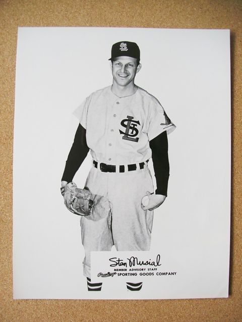
Major historical find today, kids. Here’s the backstory: I’ve written several times about Stan the Man wearing the Cardinals’ 1956 home whites while displaying a new set of road grays at a press conference. That road uni never made it onto the field (here’s what the Cards wore instead in ’56), but a slightly different version of it showed up on the auction block a few years back. The auction-listed version had a zipper front and no sleeve patch, while the one Musial was holding in the wire photo had buttons and a Slugger Bird patch. Obviously, there were several prototypes of this design floating around.
Now, as you can see above, we have a new additional to the historical record: a photo of Musial wearing the button-front version. That’s a Rawlings promotional photo, and I really like the looks of it. Too bad the Cards didn’t go with that design.
That photo was recently sent my way by memorabilia maven Tony Cocchi, to whom I was recently introduced by former Mitchell & Ness impresario and longtime Uni Watch pal Peter Capolino. When Peter was doing the throwback thing with M&N, Tony would often loan him old jerseys from his collection, which Peter would use to help create M&N’s throwbacks.
Anyway: I’ve been getting acquainted with Tony, whose collection apparently includes a huge number of uni-related oddities. For example, Tony also sent me photos of a Washington Senators/Nationals prototype road jersey, circa 1950, from his collection (if the slideshow below doesn’t work for you, click here):
As you probably know, the Sens officially changed their name to the Nationals in 1905, and wore that name on their jerseys for two seasons. (In fact, they were the first MLB team ever to wear their team name on their chest.) After 1906, though, they just wore a “W,” which may explain why many fans ignored the new name and continued to call them the Senators.
So this prototype, had it been worn, would have been the first instance of the Nats calling themselves the Nats in 44 years. It’s a nice-looking script, too — too bad they didn’t wear it. Instead, they wore this.
As for the number on the back, Tony says, “It could have been for the year 1950, or for Manager Bucky Harris, who wore number 50.”
Tony says he has lots of these types of things — so many, in fact, that sometimes he’ll be going through bins of jerseys that he keeps out in his garage and will stumble across something he’d forgotten about. So there’s more where this came from. Stay tuned.
College hoops update: Remember my college basketball season preview column from last week? Today I have a follow-up column, covering 30 more schools — enjoy.
IMPORTANT! Annoying video ads: Some of you have reported that the ad box in between the first and second blog entries on our home page (and/or the box in between the blog entry and the comments) has recently been auto-playing video ads. I encountered this a few times myself yesterday, and I agree that it’s very annoying.
I contacted our ad-serving rep, who told me this shouldn’t be happening. But if it happens again, you can help by doing one of two things: (1) Take a screen shot of the video ad and send it to me. (2) Try the following (I’m copying and pasting the instrux I got from our ad rep):
Hit F12 on your keyboard (or, if you’re using a Mac, right-click on the page and select “Inspect Element”), type ctrl+f and enter “https://vap” in the search field. There will likely be a few results within the code, so as you click through the results hover your mouse over the line of html code until you see img 0px x 0px pop up over the bad ad unit. Once you’ve located that, right-click on the entire line and copy/paste it into a notepad file.
Then send that file to me (assuming you understand all of that).
Sorry for the hassle, and thanks for any help you can offer.
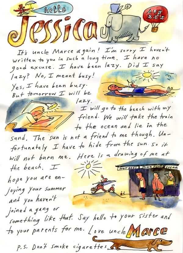
This has nothing to do with uniforms: I’ve been a fan of Marcellus Hall’s work since 1990, when I first saw the punk-blues band he fronted, Railroad Jerk. I immediately became a big Railroad Jerk fan — like, a really big Railroad Jerk fan (for the uninitiated, I strongly recommend starting with this album and then this album) — and later became a fan of his next band, White Hassle.
Along the way, I started seeing Hall’s illustration work in various publications (including the New Yorker, where he’s occasionally gotten to do the cover), and I found I liked his illustration style almost as much as I liked his music. The guy is a dual threat.
Last Saturday I saw Hall and his current band, the Hostages, play a great set at Union Pool. After the show, I ended up chatting with him for a bit. After admiring his work for more than two decades, it was a treat to finally meet him, and I was happy to learn that he appears to be a swell guy.
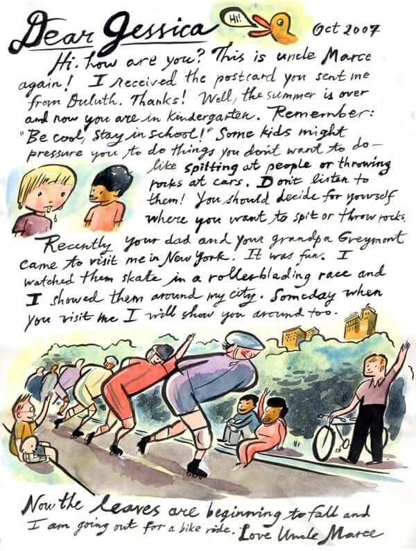
I was telling Kirsten about this afterward, and she poked around on the web and found a really, really special project that’s the reason I’m writing this section to begin with: “Letters from Uncle Marce,” which is a series of letters Hall has written to his young nieces and nephew. They are super-duper-wonderful! Ever since I discovered them, I haven’t been able to stop looking at them, telling people about them, etc. Just clicking through them puts a big, goofy grin on my face. Here are two reasons why (click to enlarge):
.
.
.
.
Pretty awesome, right? I was originally going to link to “Letters From Uncle Marce” as a Catch of the Day, but then I decided it’s too special for that. Seriously, check out the whole batch of letters now — you won’t be sorry. Moreover, you’ll probably starting thinking the same thing I’ve been thinking, which is that someone should compile these letters into a children’s book.
I asked Hall about that, and he said, “All the children’s book publishers love them, but no one can conceive of a way to publish them. They all want me to shoehorn them into some kind of formulaic narrative.”
Arrggh! So short-sighted. If Hall were a famous artist like Maira Kalman, nobody would care about imposing a narrative onto the letters — the work would be allowed to stand on its own. Hall isn’t famous, but his work is strong enough to deserve the same treatment. If any publishing people are out there, please check out “Letters From Uncle Marce” and do what needs to be done. Otherwise, I may have to publish this project myself.
This isn’t about uniforms either: I’ve been a huge fan of the eccentric kitchen-sink band The Scene Is Now ever since I mail-ordered their first LP, 1985’s Burn All Your Records, while I was in college. Over the next decade or so I reviewed their records in various publications, saw them live every chance I got, and at some point in the 1990s became friendly with them. (By this point I was pretty sure I was their biggest fan, but that was before this kid from Iowa moved to NYC and demonstrated such an amazing fluency in their back catalog that he became their new guitarist. But I digress.) Over the years they’ve become some of my favorite people, every bit as warm and interesting as their music.
The Scene will be celebrating their 30th anniversary this Saturday night at the Bowery Electric. I’ve been asked to introduce the band and say a few words prior to the second of their three sets that night, and I couldn’t be more honored. Not sure what I’m going to say, but I’m thinking I may need a few props or visual aids. Maybe see some of you there? Hope so.

’Skins Watch: A group of Native American leaders visited the White House yesterday and thanked President Obama for speaking out on the ’Skins issue, thereby proving yet again that white people are the only ones who want the team’s name changed. … The teams at Neshaminy High School in Pennsylvania are called the Redskins. The student newspaper wants to stop using the team name, but the paper’s staff has been overruled by the school’s administration. … Here’s the best article I’ve seen so far about that California school whose teams are called the Arabs. Good info, doesn’t take sides, solid reporting (thanks, Phil). … There’s pink for Breast Cancer Awareness month, camouflage for Veterans Day Month, and now, right on schedule, there’s turquoise for Native American Heritage Month.

Baseball News: Back in the summer I showed some screen shots of Willie Mays wearing a Reds helmet in the 1965 All-Star Game. Now Bruce Menard has provided us with a much better view. Pure gold! … Oooh, check this out: It’s like striped socks for your bat (from Brady Phelps). … More logo-makeover suggestions from Braves fans (thanks, Phil). … My buddy Rex Doane is a serious minor league cap collector. He just mail-ordered a new set of Rochester Red Wings caps and was surprised to find that the package included a personal note from the team’s mascot, Spikes. “The red feathers that were also included suggest that Spikes is either working feverishly to meet consumer demand for the new logo merch or that he is merely molting for a brighter tomorrow,” says Rex. … As you may recall, back in September I appeared on Keith Olbermann’s show and talked about nickNOBs. As I was leaving the set after my segment, Olbermann handed me a printout of an old article about A’s nickNOBs that his staff had come up with. I folded up the printout, stuck it in my pocket, and forgot about it until the other day, when I discovered it in that same pocket. Then I waited another coupla days until finally scanning it for you. … Speaking of old uni-centric articles, here’s a great 1972 Sporting News piece about the unveiling of the Braves’ “feather” uniforms (killer find by Todd Radom, who also put together a good graphic how much the Braves’ road jersey typography changed in the course of a couple of seasons). … Also from Todd: The 1914 Yankees’ uniforms were sent to Sing Sing Prison, where they were used by inmates (who, according to the article, were encouraged to play baseball as “a commenable means of giving the prisoners something pleasant and interesting to think about”). ”¦ New logo set for the Inland Empire 66ers.

NFL News: Good spot by Steve Monforto, who noticed that a sideline worker at Monday night’s Dolphins/Bucs game was wearing a shirt with an outdated Marlins logo. … The Steelers will wear their bumblebee throwbacks this weekend.

College Football News: How did kickers used to guarantee good distance on a kickoff? By tying the toe of their kicking shoe in an upright position. That’s from the 1975 Air Force/Navy game (thanks, Phil). … Here’s a look at the beautiful Hawaii throwbacks for this weekend. … Nico Bollini notes that USC’s helmet logo appears to be larger this season. … GFGS on tap this weekend for Cal. ”¦ Toledo wore a retro helmet design last night, apparently based on the design in the center of this page (thanks, Phil).

Hockey News: New mask for Panthers goalie Scott Clemmensen (from John Muir). … ” I was watching a video about the NHL lockout and it focused on players heading to the American Hockey League, and especially the Springfield Falcons,” writes Josh Tremblay. “At one point they showed two Falcons players wearing two different team logos during practice — one from the team’s current Columbus Blue Jackets affiliation (left) and one from the former Edmonton Oilers affiliation (right). The Falcons were affiliated with Edmonton three years ago. Is it common for teams, minor league in particular, to hold onto jerseys that old?” … The NHL has released metallic-style logos for the teams participating in the Stadium Series games (from Tore McCarthy). … Here’s a look at the best and worst jerseys in Coyotes history. … New mask for Preds/Admirals goalie Magnus Hellberg (from Daniel Lavender). … A little birdie tells me the Devils will be wearing their red/green throwbacks on March 18.

Soccer News: New away kit for Arsenal? Maybe (from Patrick Runge). … Barcelona has extended its sponsorship deal with UNICEF (from George Chilvers). … According to page 44 of this list of World Cup regulations, FIFA is urging the national federations to submit one “predominately light” kit and one “predominately dark” kit. “So all that corporate marketing talk by Adidas on how Germany’s white shorts are resembling the ‘freshness’ of German soccer is basically corporate marketing bullshit,” says Tim Ruschkowski. “What a surprise.”

NBA News: The Jazz wore flag-desecration socks on Monday. You know, to honor the veterans (thanks, Phil). … The Spurs’ GI Joe uniforms will make their on-court debut tonight. … The Pelicans acquired Lou Amundson and Josh Childress yesterday. Apparently they didn’t’ have time to get Amundson a proper jersey, because he went NNOB when checking into the game during the second quarter (from Andrew Lopez).

College Hoops News: Pitt and Savannah State went white vs. gray the other day. Not a lot of contrast there, eh? Is that really kosher under current NCAA regs? Additional photos here (from Michael Plunkett). … Josh Claywell says the contrasting shoulder straps being worn this season by Louisville, Kansas, and a few other Adidas-outfitted schools remind him of Duke’s uni from the early 1990s.

Grab Bag: Garrett had this in yesterday’s Ticker, but it’s worth listing again: Salon has published the best analysis I’ve seen of the sports world’s “U! S! A!” trope. Highly recommended. … New uniforms for the North Korean airline Air Koryo (from Blair Thompson). … Cory Gibson-Bath has started a discussion thread devoted to archiving press releases and media reports about logo and jersey unveilings. … New Gaelic football uniform for Dublin (from Harrison Thomas). … Unisex uniforms reportedly in the works for the U.S. Navy. … Lots of rugby teams wore Remembrance Day poppies last weekend, including Wales, South Africa, England, and New Zealand (the black armband was a tribute to the former player Peter Fatialofa, who also got the armband treatment from Samoa). France wore a Bleuet de France on their right sleeve instead of a poppy. Notable poppy-free teams included Scotland and Australia (all this from Patrick Fleming). … Portland’s new arena football team will be called the Thunder (from Jay Francis).
Oh, man, that Nationals prototype script is beautiful. Superior to what they’re wearing now. The lowercase N is a much better match to the curly W – just adapt it slightly to match the shapes in the link and bam, the Nats would actually have a decent-looking road uniform.
While arrScott knows, others may not be aware that a “link” for lack of a better term, was used.
Also, the only thing wrong with the current roadies is the two-tone Barves cap.
I’ll make you a deal: let the Braves have the two-tone back for the road, and I’ll let you have the solid navy. I hate that cap.
I’m on board
arrScott- The script used on the Nationals jersey is in Liebes pro script font. Notice the chiseled vertical bar in the “t” and how every background letter has the centers opened, even the “s.” This is a perfect example of the proper way to do script. And it was done 60+ years ago without the benefit of computer graphics and laser cutters. But even with all of the technical advantages at hand today’s manufacturers still screw up simple details. Liebes has always been the best. Period.
The road jersey’s for the nats are fine, though I agree they should go back to a navy cap. It is the home uniform that I would like to see changed to have a Nationals script on them, maybe on the Red weekend jerseys they can keep just the “W”. I would like to get rid of the flag logo’s all together, and just have a blue jersey for weekend road games.
Agreed that the Nationals prototype jersey is spectacular and I’d love to see them use that design, but I also like the curly W.
I love that Nats prototype. It looks a lot like the 1959—60 Senators jersey without the patch. Too bad they didn’t use it as an alternate. I’d prefer a pointy capital “N,” but that’s nitpicking. I like the zipper too. Somebody (but not everybody) should bring those back.
I also like how the number 50 on the back is positioned perfectly.
I love Tony Cocchi and I love that Nationals jersey.
I love Marcellus Hall. No, I wish I were Marcellus Hall. No, maybe I’d rather be his niece Jessica opening those letters.
Great stuff, Paul.
Research question: Can anyone document the Homestead Grays ever actually wearing black, rather than blue, in the 1930s or 1940s? Reproduction caps of the Grays of that era are often black, but in my own research, the only photos of artifacts and period color illustrations (I know, I know) I can find show the Grays using medium to navy blue, not black.
The 66ers’ new logos are actually pretty good, and a huge upgrade over the team’s old look. The addition of a swinging-mascot logo is a victory for America. Couple of problems, though:
1. The hood-ornament logo (top right link) appears not to be their home jersey insignia, which is a shame. How do you design that and then not put it on your jersey?
2. The engine-block logo appears to be a V-6.
Agreed that the swinging wrench guy is fun. However, Brandiose’s stuff is ubiquitous these days. The little icons they create for every team all look the same in their texture and composition. It’s a shame that sports teams keep going to the same place, because they’re certainly getting a lot of same-ness.
The swinging wrench guy is pretty cool. But I was confused because I thought they were another Padres farm team and they aren’t. I wouldn’t have gone with that logo
See that is exactly what I thought too Tank. I figured that the 66ers had to be a Padres affiliate, but alas no. This lead me two two possible conclusions:
1) With the constant shifting of minor league affiliates maybe this is a sign the Padres will be taking over the 66ers. Making their High A team in San Bernardino rather than Lake Elsinore. If the Angels and Padres switched High A clubs it could make some sense as Lake Elsinore was an Angels affiliate up to the Padres taking over in 2001. The thing that probably does not make a lot of sense though because it moves the team further from San Diego and more into Angels territory. I have no idea what the contract situations with the teams are currently.
2) The design firm of the new logo is based in San Diego, so the logo is simply a homage to their hometown team.
Just a couple things to think about.
Just checked. Looks like both Lake Elsinore and Inland Empire are signed with the Padres and Angels respectfully through 2014.
The engine block is absolutely a V6. Poor effort.
“The engine block is absolutely a V6. Poor effort.”
Maybe they’re just trying to stress fuel economy. This is California, after all.
Har Har.
Unless I’m missing a big-ol turbo and that V6 is supposed to depict the Buick V6 from the Grand National – I am dissapoint that they’re calling that a ‘Muscle Car’ engine.
“The 66ers’ new logos are actually pretty good, and a huge upgrade over the team’s old look.”
Agreed. The shape of the shield in link recalled link, but the color scheme evoked link. That was an odd choice, considering the growth of the Interstate system was link.
All I want for Christmas is to see a minor league team come up with a logo that doesn’t feature a fightin’ cartoon character. The Danbury Whalers did it a couple of years back so I know it’s physically possible.
Not a fan of either script. “66ERS” looks like “GGERS” which looks like the last five letters of the N-word (plural).
I didn’t see that, but I see how someone could. Points to what maybe should be a general rule: Team names with numbers and letters (49ers, 66ers, 76ers, 51s, etc.) should be rendered with the numbers larger than the letters. It’s not the 66ERS, it’s the 66ers.
The more cartoony 66ers logo, the “hood ornament” version, does a better job on this score.
Portland Thunder was also the name of the World Football League team in the last year. Already an opportunity for throwback uniforms. Star of the team was a short running back named Rufus Ferguson.
I get that Portland’s arena league team is giving a nod to the city’s famous weather with the “Thunder” name, but isn’t that a bit disingenuous considering the kind of lingering, steady rains the area usually sees? Then again, I guess the “Portland Drizzle” doesn’t inspire much excitement…
“At one point they showed two Falcons players wearing two different team logos during practice – one from the team’s current Columbus Blue Jackets affiliation (left) and one from the former Edmonton Oilers affiliation (right). The Falcons were affiliated with Edmonton three years ago. Is it common for teams, minor league in particular, to hold onto jerseys that old?”
I would imagine it’s like a lot of minor-league teams, in that nobody really cares which logo is on the practice gear, since teams run on their own budget mostly, regardless of their NHL affiliations. The more important thing is the color of the jersey, to denote which line, etc. a player is on.
At the Junior hockey level where players may have been drafted but haven’t signed yet and the teams are not affiliated with parent club, they don’t even wear team-specific practice sweaters. They have the league logo on the front, but again, different colors for different roles and lines.
link
Enjoyed Marce’s work. Yet, I don’t necessarily agree it should be compiled into a children’s book. They’re love letters to his niece. And gifts to her. I realize lots of artists compile their work, inspired by others, into volumes that are sold to the public.
However, it would lose a bit of what makes it truly ‘special’ by monetizing it. (Already kind of does by exhibiting it publicly, rather than keeping it private.) Glad I got to see it, though. ;)
If ya did something like a Kickstarter campaign, raise enough money to publish a small quantity of them for backers and serious fans, maybe a gallery show to go along with it…
Might be tough to do a gallery show if he mailed the originals to his nieces and nephews!
About the FIFA regulations on uniforms: the language about predominantly dark/light hasn’t changed since 2010 (the link). It just means that one kit has to be dark and the one kit has to be light, and doesn’t actually mandate monochromatic kits – i.e. you can’t do what Manchester United does and have a red home kit and a blue away kit.
That said, the FIFA competition committee has been forcing monochromatic uniforms in their competitions for years. For example, Italy more often than not wears all-blue or all-white, rather than the proper blue/white/blue. But the language cited has nothing to do with it.
Whatever the impetus is, it drives me nuts, years of tradition flushed away for nothing.
I think my first comments there were about this issue. F’ing Sepp Blatter.
The thing is, my understanding is that France, England and Brazil will all have contrasting shirts and shorts. Assuming that’s the case, it tells me it’s an Adidas thing, not a FIFA thing (though FWIW, Denmark will designate red/white/red as its priamry kit).
Could be, but I don’t think it is about FIFA insisting that there be “monochromatic” kits, but that no element of opposing teams’ kits be the same color, which is obvious for shirts and socks of course, and has mostly been making teams change shorts, such as Italy as you cited, England wearing all red against Germany in 2010 (when one of the most famous finals ever is “Germany; white-black-white V England; Red-white-red”), I’ve seen Brazil made to wear white shorts with their yellow jersey to avoid shorts clashing, which just shouldn’t matter, happened several times with several teams in the last Confederations Cup.
Players pick out jerseys, contrasting socks can help refs call fouls and possession, but shorts don’t matter, though FIFA seems to think they do in the last few tournaments, and it’s messing with some classic kits for no reason.
“Proving yet again that white people are the only ones who want the team’s name changed.” Sarcasm or typo?
Hmmmmm, such a difficult existential question….
“Halbritter brought with him to the White House a gift for the president: an athletic jersey bearing Obama’s name from a high school in Cooperstown, N.Y.”
link
Everyone knows it’s the white half of Obama that talked about the ‘Skins nickname.
not sure if this has been posted here or not, but here are some NFL teams reimaged as soccer teams
link
Wow, that’s cool stuff. We’ve seen reimaginings here before, but first I’ve seen this. Lots of good concepts, the Revolution should consider this Pats concept, the 90’s distressed flag look needs to go, pronto.
So THAT’S what Obama meant by change…..
One can only hope.
I clicked on the link to see who UCS was. Oops
Oops indeed. Now fixed.
Today’s ESPN column is up:
link
Great to highlight Marcellus Hall. His occasional sketchbook observations on his drawger.com blog are always nice to see, too.
Okay, these are amazing. I think out of all UniWatch posts, the uncovered prototypes of the past are my favorite. The ‘what-if’ part of uni history was, until now, so undocumented. Between this site, and Todd Radom’s blog, I could read these posts all day. Much more fun than having to read about the 5 crappy helmet designs of mid-major college football. And I’m guessing this is the type of stuff Paul would rather cover as well.
In the Steelers bumblebee throwback photo, it’s interesting to see the Nike swooshes and at the same time one of the players is wearing a Reebok cap. That style is a sideline cap from two years ago because I have a Saints cap just like it.
link
Pay wall on the Navy article.
Weird — no pay wall for me.
Well, this is a screencap of what I get: link
Dude, I’m not doubting you — I’m just saying I’m not having that problem.
Assuming you don’t have a Military Times subscription, do you have an account for another Gannett publication? Just wondering if there might be some interconnectivity going on there.
Just scrolled down to type the same thing. I got it too.
Adidas seems to have the same template for every basketball uniform. The shoulder straps. It seems like college football uniforms have more diversity. I know theres not much you can do with a basketball uniform, but it would be cool if not every Adidas school had shoulder staps and not every Nike school had sweatbacks.
“Adidas seems to have the same template for every basketball uniform. The shoulder straps. It seems like college football uniforms have more diversity. I know theres not much you can do with a basketball uniform, but it would be cool if not every Adidas school had shoulder staps and not every Nike school had sweatbacks.”
Agreed. Nike’s sweatbacks were clever and novel at first, if poorly excecuted. Now it’s just an overused uniorm trope – especiall now that it seems that every new Nike jersey has the netback design.
Likewise, adidas’ new shoulder straps would be great if they didn’t roll them for practically every team they outfit. It bothers me to see adidas shove a team like Kansas, who has had a pretty iconic and classic look over they years, into its cookie-cutter approach to uniform design.
Adidas is guilty of relying too much on templates in every sport, but on I’m not sure I’d use the word “shove” here.
Even at the iconic programs, 18-year-olds like shiny new things. And coaches like happy 18-year-olds.
I don’t mean “shove” in a sense of “coerce,” but in more of a “force a square peg into a round hole” context. A team like Kansas just doesn’t look quite right in a uniform template that adidas makes available to a good number of its other teams (if not all of them).
theres so much you can do with basketball uniforms to make them unique.
why dont we have any pinstripes? or diagonal striping? technology is so amazing now that you could make some cool patterns and stuff.
when i saw KU with the shoulder stripping i was like “you have to be kidding me”
Paul’s old catalogs have shown that there are lots of things you can do with a basketball uni. They just don’t do them anymore.
That can not be a possible new Jersey for Arsenal because it is Puma and they are a Nike team.
They’re wearing Puma beginning next season. The home kit link.
Gawd, I hope that isn’t accurate, even worse than the skin tight home leak. Looks like a TATC jersey with the giant oversized cannon. Brutal.
I don’t know, it seems to confirm link that made the rounds on the internets earlier.
The cannon like that on the shirt has been around on the internet since at least May of this year
link
Yeah, I’ve seen a couple comments about that artwork being out there in different iterations, kind of looks like someone saw the gold image, assumed it was real, and decided to get a jump on the knock off market.
The cannon artwork looks good in the yellow (as long as the difference in the yellow tones is kept subtle), but it’s too much in gold.
Marcellus Hall’s letters are definitely stand alone works. That’s their beauty. Each one is a little painting–you pause, take it in, and move on to the next one.
Here’s the auction listing for that 1950’s Nationals jersey: link
I think the only reason Paul likes the Hawaii throwback so well is that they left the purple stripe off the rainbow.
Hey Paul in the new ESPN column, you typed George Washington has a new black uniform, but the picture is of Gardner-Webb’s black jerseys.
Ugh — wrong GW! Will fix.
Man, that new Inland Empire 66ers logo set is awful. Old one was very clean, very fun, evoked the old Route 66 that the name was trying to convey.
This is an ugly color combo with an ugly typeface…wow. Really poorly executed.
Big shock – it’s a Brandiose redesign. And it’s definitely not one of their best efforts. The first thing that comes to my mind when seeing that set isn’t “muscle cars”, it’s “service station mechanics”! They might as well have changed their name to the Inland Empire Mechanics. Then 2/3 of the logo set would at least make sense.
The wordmark is horrendous. The thinning vertical strokes makes the whole thing look uneven, and the attempt to “fit” the characters together has an ugly effect. The different treatments on the consecutive sixes, particularly the massive cut to parallel the lower serif on the E, just makes me want to gouge my eyes out.
The 66ers hood-ornament mark might be okay, if the team was affiliated with the Cardinals! That’s the best they could come up with in a year? A winged human figure – a classic hood ornament motif – would’ve been more approprate, considering their actual parent club in Anaheim (though, yes, it would be trickier to work a 66 into that, but given the lead time, I’m sure they could’ve found a way).
The oily wrench? The mechanic swinging the oily wrench? The not-so-oily wrench behind the IE? The last one might be the best of the bunch just because it doesn’t have the oil part of it. (Besides, when was the last time you saw anybody fling that much oil off a wrench?) The oil streaks instead of speed lines just comes off as flat-out wrong to me.
Which brings me to the engine block. UGH! If you really want a muscle-car motif, why not have an actual image of a muscle car? Just having the engine (and an angry engine, to boot) just doesn’t make much sense to me. And the oil AND flames coming out the back? My dad (a former mechanic and career automotive engineer) must be spinning in his grave right now.
Finally, the colors. The only way powder blue and orange should go together on a muscle car is if the orange is part of a flame pattern. The color scheme, as presented, particuarly with the rather dominant dark steel gray, looks like SHIT.
TL:DR version – The new look is UTTER GARBAGE.
Not a big fan of the old shield, though; how would I fix it? Simple: go black-and-white, make it look more like an authentic vintage US route marker. Interstate colors on a US shield just don’t work for this roadgeek. Color can be introduced as outer trim, and on other logos. Instead of an engine, how about a stylized car reminiscent of an early-60s Corvette, as a nod to the TV show Route 66? For a human figure, how about using Martin Milner as an inspiration?
Great critique. (That I mostly disagree with, but let that bide.) On the colors, I think you’ve hit on something key. I think it’s likely a poor compromise. I assume they were thinking of link and link, it’s one that claims to be all about muscle cars.
Am I the only person here who thinks that the Inland Empire 66ers downgraded their logo? Call me crazy, but I was a big fan of the sign logo. I don’t even get the reference now. This is like a reverse of the Jamestown Jammers, what was once clear now doesn’t make any sense. Ah well, still, gotta like what Rochester did, and I actually find Spikes’ inclusion of feathers and a handwritten note to be funny.
I loved the sign logo, and the old caps, and the red/blue color scheme. But the jersey scripts, and every other elemtn of execution in the team’s old set, was a crime against athletic aesthetics. And the team managed to make its uniforms worse, bit by bit, pretty much every year. It was time for a refresh – just too bad they couldn’t have gone back to basics with the sign logo.
I’m surprised/impressed/etc. that so many people are weighing in on the logos of a single-A minor league team that most of us will never see on the field.
I don’t mean that as a critique — on the contrary, I think it’s awesome. Just didn’t expect so many people to care.
It’s kind of refreshing to see the primary focus of today’s comments be about the pure aesthetics of athletics.
I keep scanning the minor leagues for the best thing ever– not gonna find it in MLB.
Something like this is in my wheelhouse, as the team is named for old US Route 66, and I’m a huge roadgeek.
In fact, I ended up having so much to say about it, my reply to John English above ended up in the moderation queue – probably because it’s so long.
I didn’t mind the old highway sign logo, but as I mentioned in a comment above, the red/blue color scheme seemed a little too Interstatey to me. I think a refresh of the old logo with a different color scheme could have worked.
Yeah, Route 66 is an old white and black “US ##” sign, not an Interstate highway, could have gone with an old school black and white color scheme, hmmm… getting some ideas……
While we’re on the subject, which in your opinion is the best minor league logo? The worst? My personal favorite is the Fort Wayne TinCaps. Sure, the script on the jerseys is ehh, at best, but the apple, I like a lot (it also helps that a family friend has sent my two Tincaps sweaters that I wear a lot)
The worst one in my opinion is the Las Vegas 51s. Really, out of all the things your team could have chosen to represent your club, you chose an alien? What the hell? Aliens weren’t supposedly found in Las Vegas, they were supposedly found in Area 51. How stupid.
Best: Fort Collins Foxes. Or maybe the Burlington Bees.
Worst: San Antonio Missions. Or maybe the Kannapolis Intimidators.
“While we’re on the subject, which in your opinion is the best minor league logo? The worst?”
I’m a sucker for the the Montgomery Biscuits’ logo:
link
The pad of butter as the tongue gets me every time!
My least favorite is probably the Memphis Redbirds:
link
It looks like they found an old-timey baseball player in a clip-art catalog. Weak and boring.
“Best: Fort Collins Foxes.”
Do collegiate summer leagues really count as minor leagues? /nitpick
Railroad/White Hassle are awesome. The White Hassle song Life is Still Sweet is a personal favorite.
What book is the page with the Toledo retro helmet from?
No idea. Someone sent it to me.
“What book is the page with the Toledo retro helmet from?”
Kevin, it’s from the link. The book has a fairly extensive (though not quite comprehensive) section of illustrated historic football helmets, listed by team.
Thanks! I am going to check this out.
SI has regionalized their covers for the basketball preview issue, and all of the players on the covers are wearing dark (road) jerseys. Well, Michigan’s is yellow, but it works either way. What’s interesting to me is that the Duke/UNC cover completely doesn’t work because both are a shade of blue. I can’t imagine ever seeing that on a court. Louisville/Kentucky, however, looks fantastic.
link
I like the discreet and classy poppies on the rugby jerseys, better than the cammo overkill in the nfl this month.
Don’t know when it most recently changed, but CoTD right now is on the short list of things that justify the existence of the Internet.
Those striped bats are fantastic. I really liked the colored bats from Warstic but these are on another level. I might have to get one from each company and use them as wall art. I hope either or both make the cut for your holiday list, they’re some of the cooler uni items I’ve seen all year.
We had a straight ahead kicker on my high school team who had a velcro strap to pull his toe up. Used it on all kicks. Those boots usually have 3 cleats in the front with one way up at the front that is made to be pulled up like this. The strap just hooks that cleat and toe is ready to meet letter.
My last year was in 98, but my wife’s little brother was using one 3 or 4 years ago.
In 1974 we had a kicker who tied up his shoe, David Taylor. He went on to kick the longest field goal in BYU history (since broken). The photo shows an interesting strap that goes around on the back side of the leg. To keep the string from slipping, and to keep the string from wearing a sore in his leg, Taylor slipped a football hand pad over his ankle and up his leg. He then taped the pad into place over his sock.
I was a straight on kicker as well, but didn’t NEED the string.
Every single day I try to learn something new. Today I learned that there is an amazing artist out there named Marcellus Hall. Thank you, Paul.
More on the Braves feather unit: they road jerseys were going to be red, but Hank Aaron didn’t like them. That’s why they changed to royal. While they only wore the royal road jerseys 4 years, the new grey road jerseys also had the feather. Ted Turner had bought the team and initiated the change of the road jerseys to read “Atlanta” instead of “Braves.” Ted was a great owner, but this was the one change I disliked.
I loved that original number font
UMass broke out a gray home uniform in its game against LSU Tuesday morning. Not a good luck, but my understanding is that the kids there think it’s the coolest thing.
Anyone else think that the Panthers mask looks like a John Vanbiesbrouck mask?
link