
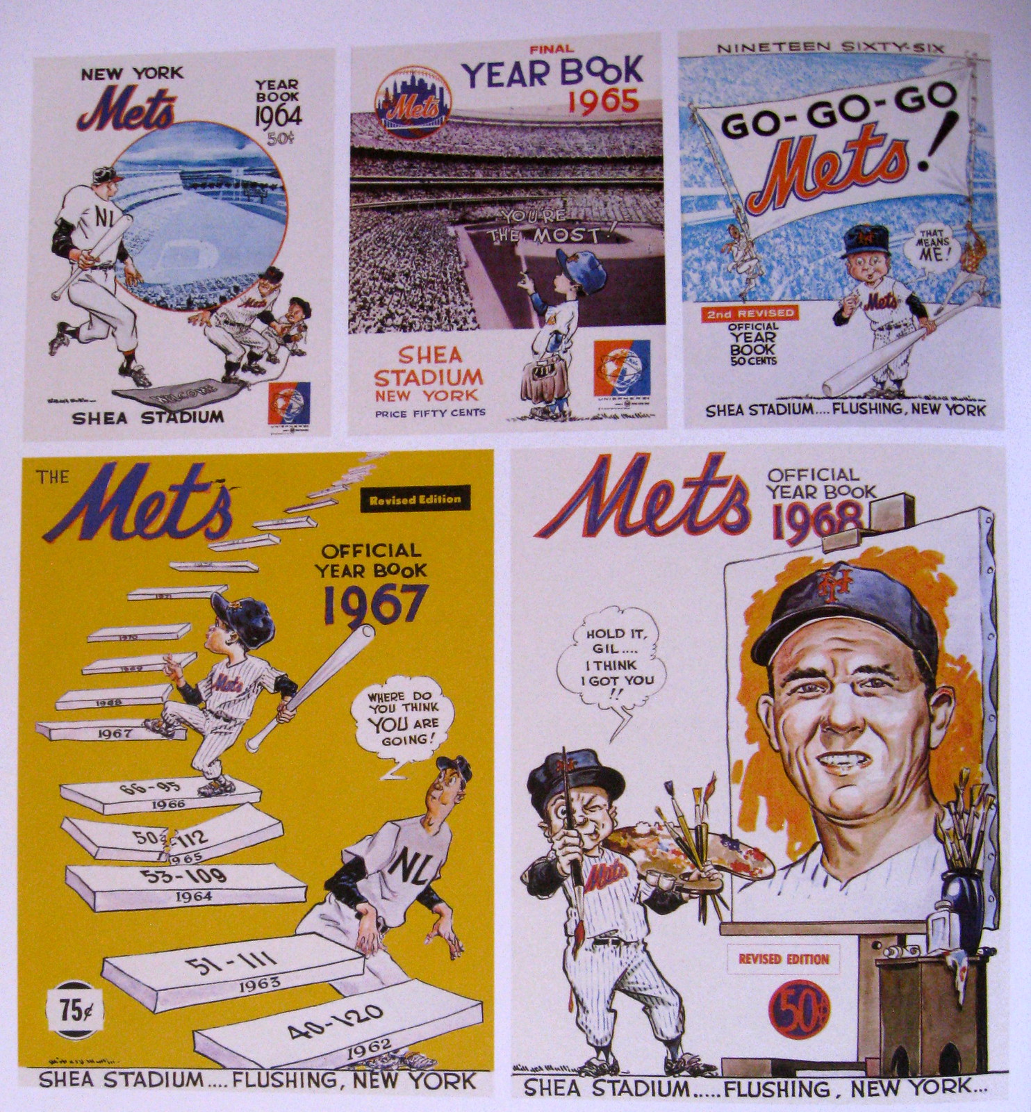
When I was maybe 13 or 14 years old, my much older brother went up to our parents’ attic, poked around in an old box, and came out with a treasure: a copy of the Mets’ 1962 yearbook, which he gave to me on the condition that I never sell it (a condition I’ve always honored).
The yearbook’s cover illustration wasn’t exactly my idea of a baseball image, but I understood the symbolism — the ’62 Mets were a newborn team, a team in its infancy. But what were these diagonal lines near the baby’s foot? “Oh,” said my brother, adopting the very specific tone of voice he used when he was about to impart a life lesson to me, “that’s the artist’s signature. Willard Mullin. You’ll learn about him.”
Thirty-five years later, I have indeed learned a lot about Willard Mullin. Mullin, who was already in the latter stages of his career when he did that Mets yearbook cover, was probably the greatest sports cartoonist who ever lived. And now Fantagraphics, the comics publisher, has put out a gorgeous compendium of his mid-century baseball cartoons. It’s a great book. You should own it.
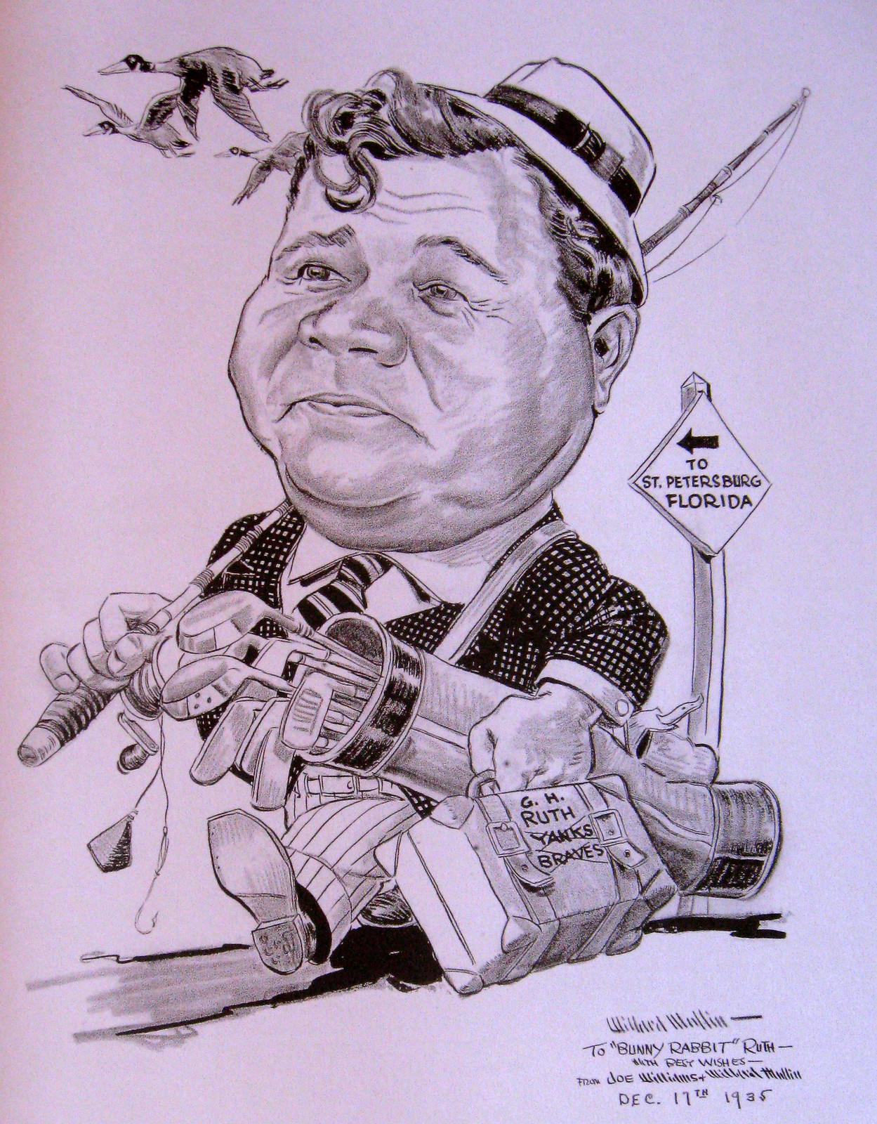
The book is too big to fit on my scanner, but I photographed some of my favorite pieces, beginning with this caricature of Babe Ruth heading down to Florida for the first spring training of his retirement (for all of these, you can click to enlarge):
Mullin was particularly intrigued by contractual negotiations between teams and their players. Here’s a good one about Joe DiMaggio preparing for his latest contractual wrangling with Yankees GM George Weiss:

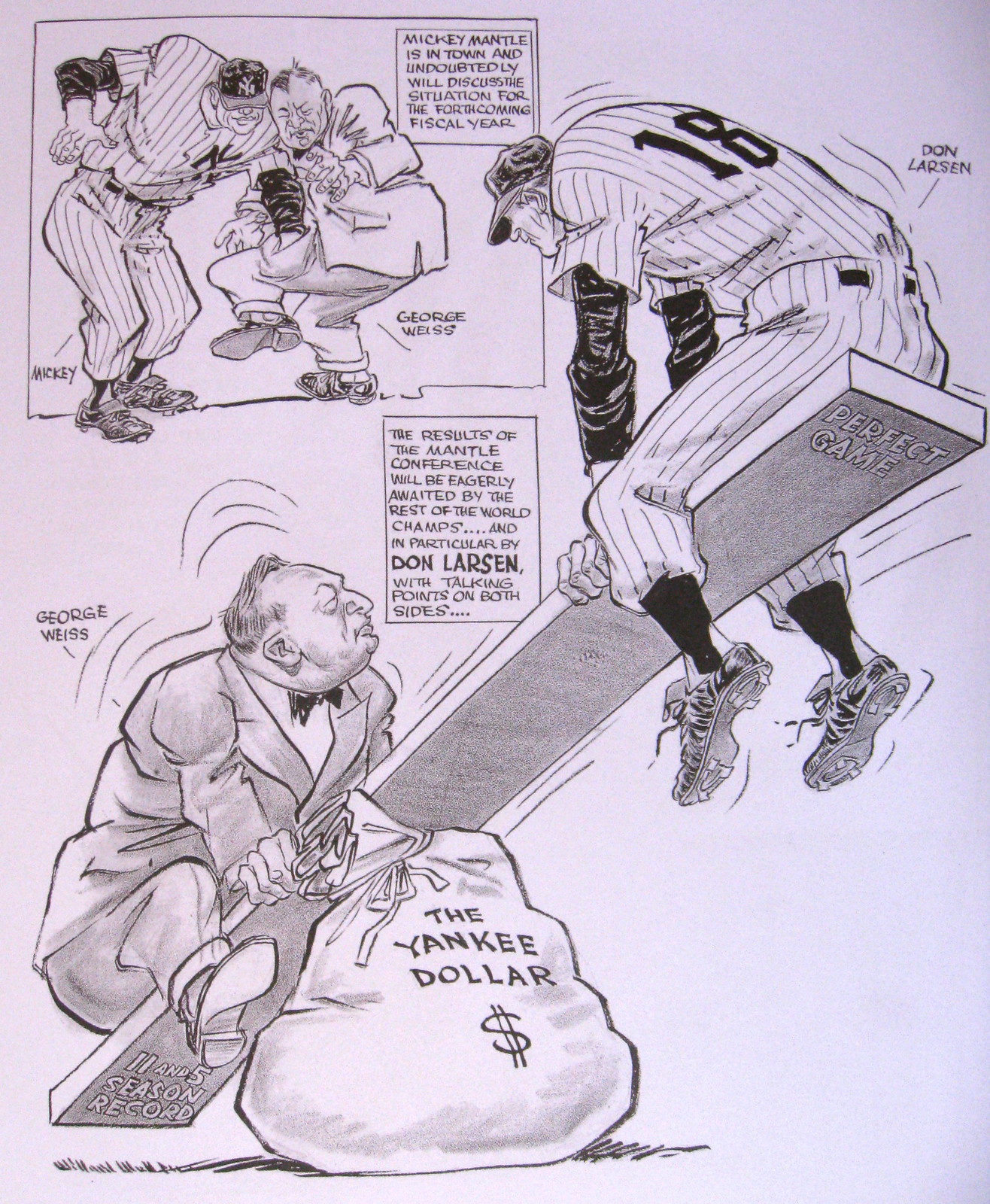
Here’s another contract-based piece, this time showing how Weiss was weighing Don Larsen’s unremarkable 1956 season against Larsen’s perfect game in that year’s World Series:
Mullin’s most famous creation was the Brooklyn Bum, who personified the Brooklyn Dodgers’ downtrodden, “Wait ’Til Next Year” mentality. Here’s the bum expressing his displeasure over Larsen’s perfect game in the ’56 World Series:

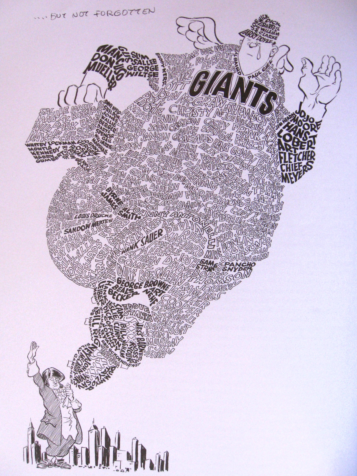
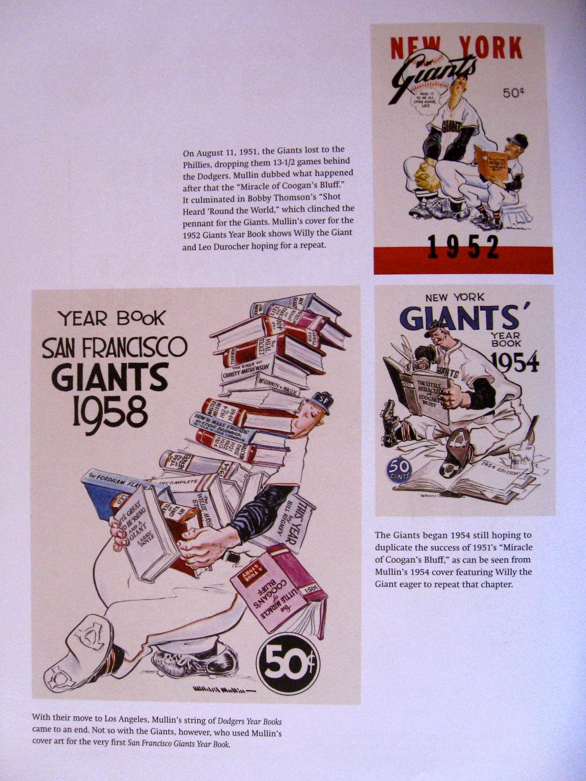
When the Giants left New York for San Francisco, Mullin used the names of assorted Giants players to create this beautiful piece:
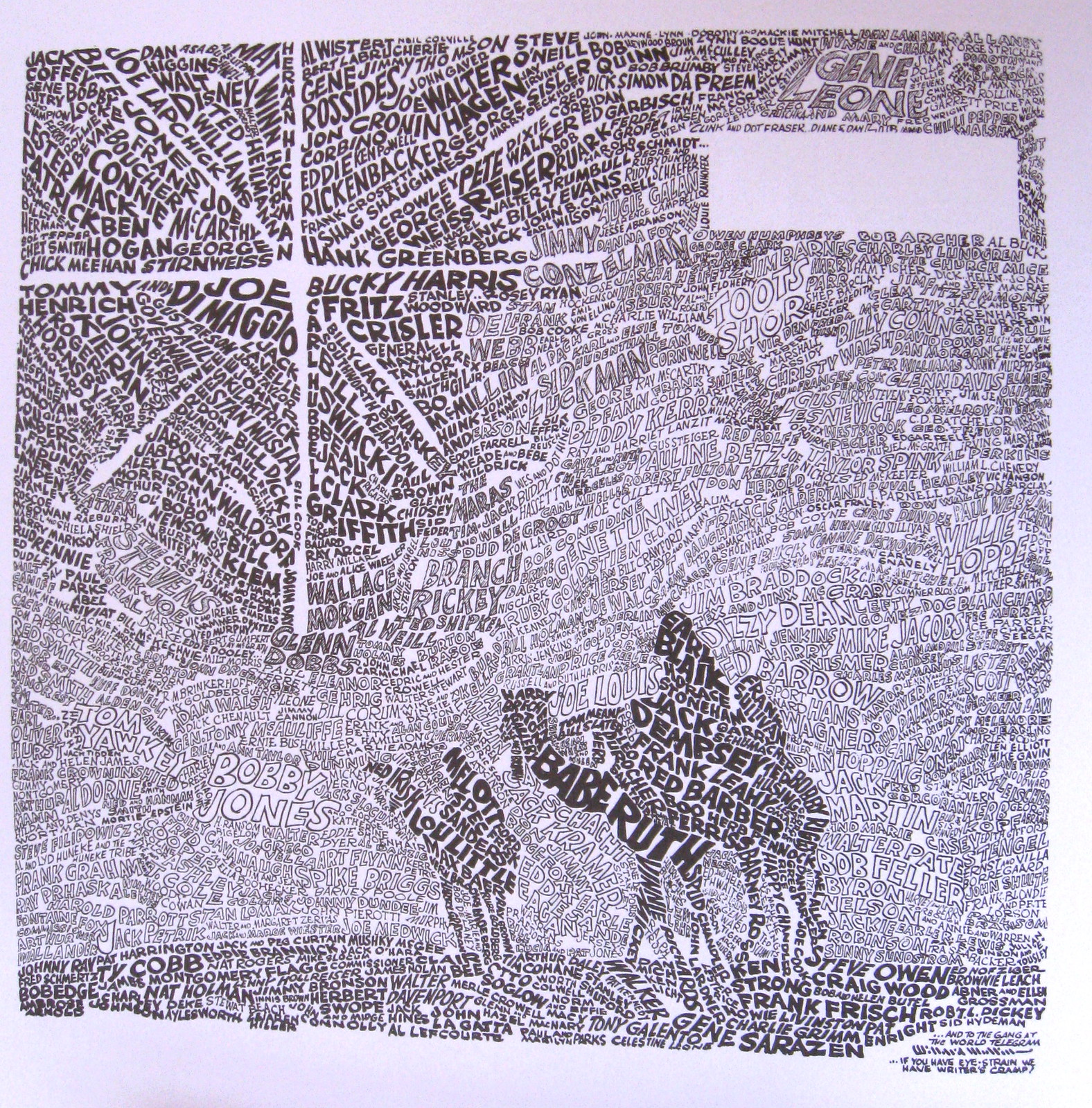
Mullin used that same approach for his annual holiday cards, which incorporated the names of assorted athletes. Imagine receiving something like this every year:

Are you the kind of baseball fan who thinks Opening Day is like Christmas and your birthday and winning the lottery all rolled into one? Mullin understands:

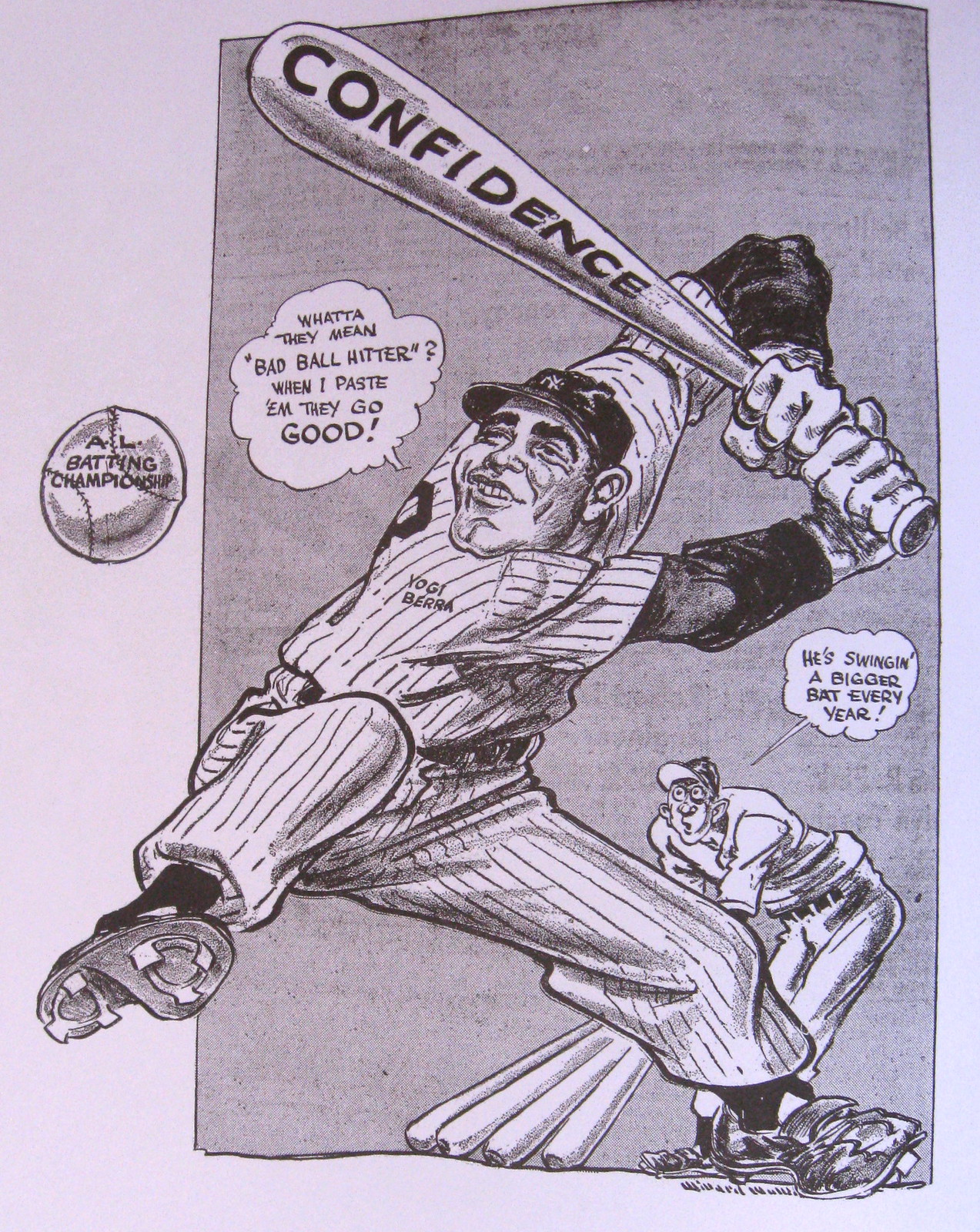
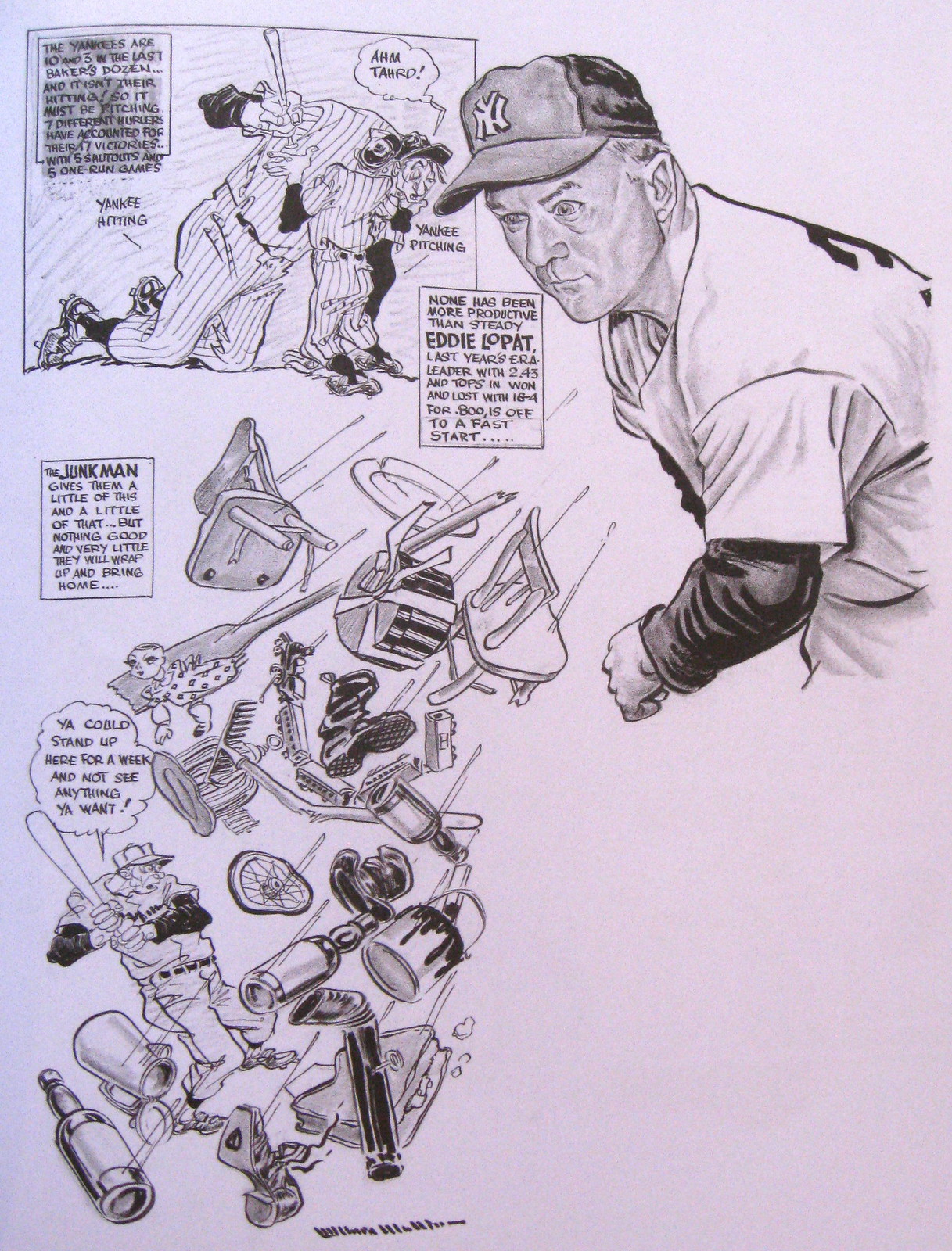
Yogi Berra was famously known as a bad-ball hitter, and Eddie Lopat was known as a junkballer. Mullin played off of those clichés in these two pieces:
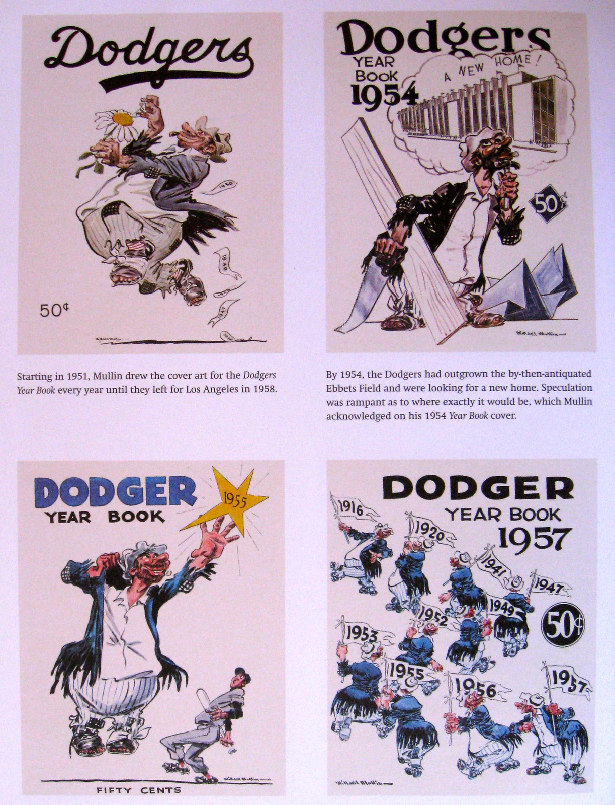
Mullin had already done lots of Dodgers and Giants yearbook covers by the time he did that ’62 Mets yearbook that served as my introduction to his work. Here are some of his Dodgers and Giants covers, along with some of the subsequent work he did for the Mets:

I could go on, but you get the idea. Mullin was a great artist, and this is a great book. Don’t miss.
Click to enlarge
Collector’s Corner
By Brinke Guthrie
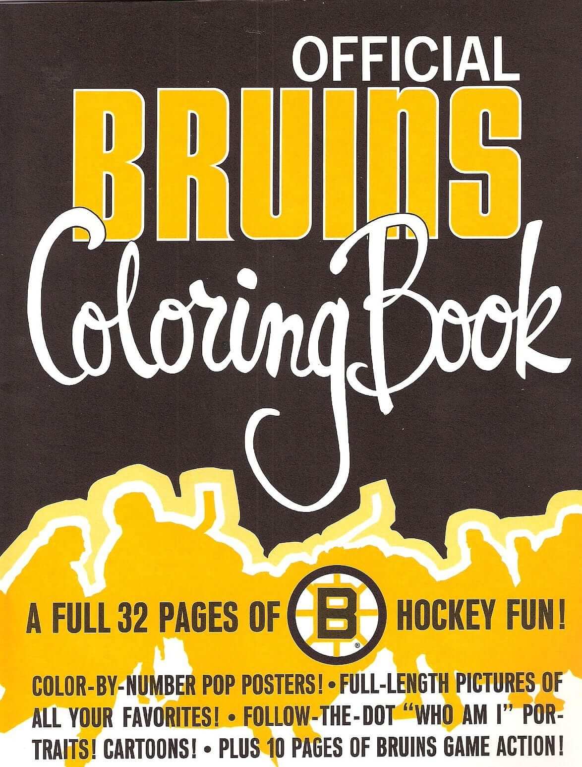
We don’t often lead off with hockey here at CC, but who can resist a full 32 pages of Bruins hockey fun? That’s what you get with this 1970s Bruins coloring book, complete with cartoons! Posters! And more!
As for the rest of this week’s finds:
• DeLong alert! Nothing beats the classic varsity look of this Bears jacket. Here’s another one in maybe better shape. Not a Bears fan? Check out this really nice-looking NY Giants varsity jacket, or this heavyweight Browns pullover shell, and another pullover that’s league-branded.
• Here’s an unopened NY Giants helmet pencil sharpener from the 1970s.
• What sports stuff did you collect growing up? I collected lots of stickers, but I never saw these early-’70s NFL helmet stickers from Chase & Sanborn.
• Classic look to this 1980s Islanders crewneck sweater from Cliff Engle.
• Will Scheibler sent in a couple of items: a 1914 Spalding guide on “How to Run the Bases,” and a Toronto Toros “Ice Cleaning Sweater,” although I’m not sure what that really means. A sweater to wear just to clean ice? Who knew?
• Ah, one of those clothing catch-words from back in the day. A vintage Niners “Naugalite” varsity jacket.
• Great design on this 1970s Patriots poster.
(Quick note: In case you missed it last week, I posted a link for Music From NFL Films. Those audio downloads are available for another week. Don’t miss ’em!)
Seen something on eBay or Etsy that you think would make good Collector’s Corner fodder? Send your submissions here.

’Skins Watch: ESPN ombudsman Robert Lipsyte has written a fascinating piece about the worldwide leader’s use of the ’Skins name. Really interesting stuff, and highly recommended. … Forbes writer Marc Edelman feels the NFL’s backing of the ’Skins name amounts to hypocrisy on the issue of hate speech, and another Forbes writer, Monte Burke, thinks Daniel Snyder should change the team’s name right now (from Phil and Tommy Turner, respectively). … Washington Post sports columnist Tom Boswell, who happens to be a lifelong ’Skins fan, did a Q&A sessionyesterday in which he addressed the ’Skins controversy in very smart, measured terms. Recommended (from David Goodfriend). ”¦ Lots of complicated legal-ese here, but a Wisconsin attorney thinks the state law that led to the state’s schools removing their Native American nicknames is unconstitutional. Of course, he’s a bit biased, since he’s representing a school that’s appealing the law’s provisions (thanks, Phil). ”¦ Also from Phil: “So, someone on Twitter said, ‘Ask Siri who her favorite football team is.’ So I did, and, well, see for yourself.” ”¦ Meanwhile, there’s this, which pretty much speaks for itself:
This kiss between Redskins fans… (Toni L. Sandys – TWP) pic.twitter.com/tflAH2VTpj
— Dan Steinberg (@dcsportsbog) September 10, 2013

Baseball News: I’ve written a few times about Sean Kane and his great hand-painted baseball gloves. A bunch of his gloves will be featured at an art show at the Bergino Baseball Clubhouse in Manhattan’s East Village. Kane will be there for the opening reception on Oct. 4, 6pm. I expect to be there too. … Interesting to see that the 1992 Brewers had NNOB jerseys but NOBs on their dugout ackets (good one from Michael Blake). … Very unusual to see a horizontal chest mark and vertical placket lettering combined on the same jersey. That’s the company team from the T.S. Martin Co. department store of Sioux City, Iowa, circa 1920s. The guy in the center is Mike Johnson’s grandfather. … Ebbets Field Flannels is looking into the purchase of an antique sock-knitting machine, so they can make old-school stirrups (from Rand Martin).

NFL News: Robert Griffin III wasn’t wearing knee pads in his pants last night — but he was wearing them under his socks! I guess that counts as compliance with the new rule. ”¦ Meanwhile, Eagles coach Chip Kelly used these awesome play-calling cards with Philly-centric graphics (from Mario Carr). ”¦ Yesterday I mentioned that Calvin Johnson jerseys with JrOB are available for sale and wondered if he had added “Jr.” to his jersey this season. The answer: nope. Oddly, though, he’s shown wearing JrOB in Madden 25 (from Mako Mameli). … I’ve been saying for years that one of the biggest and most underrated changes in the NFL over the past generation is the rise of super-sticky gloves. What I hadn’t thought about until now was how those gloves can aid defenders who are trying to strip the ball. When Giants RB David Wilson fumbled in the first quarter of Sunday night’s Giants/Cowboys game, a Dallas defender grabbed the ball with both hands and wrenched it out of Wilson’s grasp — standard defensive technique, but I’m sure you can get a lot more leverage with those super-tacky gloves. Hmmmmm. … Hey look, Joe Montana is left-handed! Not only that, but he wears his wedding band on his right hand. Pretty obvious that they flopped the image (good spot by Jason Hilyer). … Julius Peppers’s captaincy patch was either upside-down or falling off on Sunday. “Also, no knee pads!” notes Adam Grad. … Yesterday I mentioned the Packers’ inconsistent pants striping. Longtime reader Jeff Ash, who works for the Green Bay Press Gazette, posted that on the paper’s “Packers News” Facebook page, where some of the reactions were priceless. A good reminder that most sports fans don’t look at this stuff like we do. … Another follow-up from yesterday: Remember how Niners coach Jim Harbaugh wore a Reebok pullover in the first half of Sunday’s game, before switching to Nike in the second half? Brinke is friends with 49ers beat reporter Mark Purdy of the San Jose Mercury News, so Brinke asked Purdy to find out more. Purdy’s report: “[Harbaugh] said at his press conference [Monday] that it was a ‘mistake’ and there was ‘no malice intended.’ He’s so loopy-intense about football on game day, I don’t think he pays attention to minor stuff like that, just reaches in and puts on his outfit, whatever’s hanging there. Didn’t say if he’d been fined. I would bet not, especially since he changed at halftime when he was notified. [On Monday] he was wearing one of his dark tops with the 49ers logo and it had the Super Bowl logo on the sleeve. My colleague Tim Kawakami asked if that meant anything special, what with the Seattle game coming up, and Harbaugh said no, it was just the one of four or five he has in his closet and he pulled it out today. ‘It’s in the rotation,’ Harbaugh explained. So there you go. And you know, despite all this, Harbaugh is a detail guy, so despite his words, there’s a chance none of it is an accident. But he really is football, football, football all the time. One reason he dresses the same all the time, he’s said, is so that he doesn’t spend ‘drag time’ trying to figure out to wear on any given day.” … The Rams’ end zones are about as plain as can be (from Joe Mueller). … Eric Stangel says last night was the first time the Chargers ever wore captaincy patches. Can anyone confirm or refute that? ”¦ “In a couple of the new NFL fantasy football commercials that feature players literally carrying fantasy owners on their shoulders, Trent Richardson and Kyle Rudolph both feature uniform inconsistencies,” says Charles Noerenberg. “Richardson is wearing home brown-topped socks with stripes, which I don’t believe we’ve seen the team wear more than once, a few years ago with a throwback (a shame). Also, his jersey still has the ‘AL’ on the sleeve. In Rudolph’s spot, he’s wearing the Vikings’ new jersey (sort of) with last year’s pants. The jersey is odd because the number font is correct but the sleeve stripe doesn’t feature the ‘Viking ship curve’ toward the back.” ”¦ Buncha other stuff from Charles: (1) Steve McNair used to wear Nike earrings. (2) The Cardinals had some weird lines in their end zones during the preseason. “Maybe it had something to do with their retractable grass field?” speculates Charles. “They were on the road this past weekend, so I’m not sure if they’ve updated or erased the markings.” (3) Also from the preseason: Washington defensive lineman Trent Williams wore solid white socks and white shoes. (4) Two of the worst logo cover-ups ever in this furniture ad. The one on the collar is bad enough, but look at the sleeve — the black tape is extending off of the fabric! Best of all, they forgot to cover up the jock tag, which includes the NFL logo and the swoosh. ”¦ Did you notice that all NFL fields this past weekend had this “Back to Football” logo? I didn’t, until Phil pointed it out. ”¦ Odd that the continuous horizontal line running across the letters in the Chargers’ end zone logo has now been broken up into separate pieces. Downgrade, methinks (from Mike Davis). ”¦ While we’re at it, the Chargers still have outdated logos for the Panthers and Cardinals hanging in their stadium (from Jon Solomonson). ”¦ Don Sauberan doesn’t like the shade of blue that ESPN used for the Chargers’ down/distance graphics last night. “The Chargers weren’t wearing a stitch of the powder blue, and the blue ESPN was using looked more teal-y anyway. It looked like the Jaguars were playing. They should have just went with the Chargers’ navy blue and yellow.”

College Football News: Texas Tech has added a memorial decal for Jess Stiles (thanks, Phil). … Nevada wore a throwback helmet last Saturday in honor of former coach Chris Ault, who retired last year (Brian Catlett). … Interesting to see UNC-Charlotte wearing a Conference USA jersey patch when they won’t actually join the conference until 2015 (from Stanton Foster Smith). … Here’s a doozy: Arkansas State coach Bryan Harsin, whose team was penalized for wearing non-contrasting uniforms on Saturday, later said, “I knew about it. That was my decision. I think it was something for our team and that decision I made and I would not change it.” Wow. Not just bright, but articulate too! (From Dave Wilson.) … Alan Miller says LSU will be wearing its seldom-seen purple jerseys this Saturday against Kent State, and again against Furman in November. … Akron wore a new helmet with a “zipper stripe” (cuz they’re the Zips, get it?) on Saturday (from Peter Parker, and the first person to make a Spider-Man quip gets tossed from the site). … Last graf of this article that UCLA and Nebraska, which play each other on Saturday, will both wear “36” memorials for UCLA receiver Nick Pasquale, who died in a traffic accident over the weekend. UCLA will wear a patch, and Nebraska will wear a helmet decal. ”¦ Boise State will wear solid blue on their blue field on Friday. This is the first time they’ll have done this while in the Mountain West Conference, which initially banned the practice but later relented (thanks, Phil). ”¦ Yesterday I asked if Oklahoma State had ever worn orange-white-orange prior to last weekend. The answer: yes, last year, against Kansas State (from Nicholas Spiva).

Hockey News: The Edmonton Journal isn’t happy about the Oilers’ assessment in the Uni Watch Power Rankings (from Kevin Dorsey). … Interesting piece on the evolution of the Islanders’ marketing now that the Nets have taken over their business ops. “The Isles are now using the Nets’ font on their website and other promo materials,” says Brian Erni.

Soccer News: The concourse at Fratton Park, home of Portsmouth FC, has a cool jersey mural. “I did a little digging and found it’s the work of a local artist, based on photographs from a fan website,” writes Yusuke Toyoda. “You can see the progression of the mural here.” … Oh man, check out this absolutely sensational USA vs. Mexico poster. “Only 39 will be printed up, and I already got mine!” says Matt Busch.

NBA News: “Beloved” watch: Will Leitch, writing about the Cleveland sports scene, referred to Cavs owner Dan Gilbert as the team’s “beloved owner.” Grrrrr (from Mark Faron). … This is interesting: The Nets will retire Jason Kidd’s number at a preseason game. Seems like a very odd choice of timing, no? Any precedent for this?

College Hoops News: Here’s a rare find: video footage of NC State’s infamous unitards (big thanks to Kenn Tomasch). … New uniforms for Kansas. … New court design for Cal State Fullerton (from Leo Thornton).

Grab Bag: Politico published a little explainer about its new headline font (from William Yurasko). … Here’s a good analysis of what’s wrong with the new Yahoo logo (from Yusuke Toyoda). … Meanwhile, Google may be flattening out its logo (thanks, Brinke). ”¦ Last week I mentioned how a Muslim cricket player in Australia had been granted a waiver from wearing his team’s beer sponsorship. “That led to some Australian public figures and pundits making comments www.theguardian.com/sport/2013/sep/10/david-campese-apologises-fawad-ahmed “>that ranged from insensitive to downright racist, for which some of them later apologized,” says John Childers.
Last night I attended a panel discussion and book party about the Cacophony Society, a SanFran-based group of explorers/anarcho-artists who like to stage odd events, conduct elaborate pranks, explore abandoned buildings, and generally make shit happen. They’re directly responsible for Santa Con (which now takes place in many cities) and Burning Man (“We’re sorry,” said one of the Cacophony guys last night), and they’re indirectly responsible for things like the No Pants Subway Ride and loads of other creative urban mischief.
Anyway: One thing that really struck me during last night’s event was the Cacophony Society’s slogan — “You May Already Be a Member.” I really, really like that. It made me think about the slogan I usually use for Uni Watch: For People Who Get Itâ„¢. I like that slogan just fine, but its feel is exclusive, while the Cacophony slogan is inclusive, which seems like a much better approach. Imagine if Uni Watch’s slogan were “You May Already Be a Member” (or even “You May Already Get It”) — it would still retain the secret-handshake element, but it would have more of an inviting feel. Hmmmmm.
That Brewers photo is only from 21 years ago yesterday when The Kid got his 3000th hit off Jose Mesa in Milwaukee
Anyone know if the 1982 Brewers jackets also had NOB? It does seem odd that both their home and road jerseys for many years were NNOB, but their jackets had NOB.
No idea about the Brewers, but I actually liked that style. Number on the jersey, name on the jacket. No need to clutter both of them up with both pieces of info.
Even if that Yount image wasn’t seared onto the brains of every Brewer fan, the script is a dead giveaway – in 1982, the Brewers wore the same link featured on their link. The script was added in 1990 when they switched from pullovers to button-ups.
The home uniforms were NNOB for two years, and then names were link.
The road jerseys from that set were always NOB, link.
As for the jackets, I believe names were added in 1990 with the road uniforms, but am not 100%. I can confirm that names were not used on anything in the 1980s.
Nice pic of the Skins fans. Very cute.
That isn’t cute. Those are white people in Native American costumes, that’s totally racist and evil. Haven’t you been paying attention?
I don’t know, I think folks with white masks and robes are adorable. Cuteness and evil aren’t mutually exclusive.
I think cats already have the cute & evil market covered, though.
link
GEORGE: Didja see the way she was looking at me?
JERRY: She’s a Nazi, George. A Nazi!
GEORGE: I know, I know. Kind of a cute Nazi though.
We all know that if you’re attending a game, you aren’t supposed to dress up in an outfit of what your team name is. And you aren’t supposed to wear a $200 polyester shirt with a player’s name. If you’re a male, you’re supposed to wear a suit, and if you’re a woman, you’re supposed to wear a June Cleaver dress.
…But surely if two people dressed up in a home made German lederhosen or in a Spanish torrero outfit wouldn’t be considered racist.
Manuel, nobody said the two fans are “racist.”
Those Redskins fans may already be members of the Cacophony Society, which would therefore make their attire and actions acceptable in some circles?
Comment of the day!
Put me in the “cute” column. Sometimes a cigar is just a cigar, y’know?
Yup. And sometimes two people dressing up as another race as if race were just a costume that anyone can wear, same as if they were in blackface, are just two people dressing up as another race as if race were just a costume that anyone can wear, same as if they were in blackface.
I mean, yeah, but I highly (and I mean HIGHLY) doubt that they went to the game saying “Hey honey, let’s be racist today!”
Nobody said that was their intent.
More importantly, it doesn’t *matter* whether that was their intent. Sometimes behavior can be inappropriate or hurtful due to thoughtlessness or assumed privilege, not due to specific malicious intent. That doesn’t make the behavior any less inappropriate or hurtful.
Of course it’s perfectly ok for people of any race to wear green and be “Irish” for a day.
The team is not named for any and all Native Americans. The team is named for the Natives of ~200 years ago who did, in fact, self-identify as redskins. They aren’t named for a race, they’re named for a historic culture. Those fans are no different than a black (sorry, I mean African American) Vikings fan wearing a yellow wig and horned helmet.
Those fans are no different than a black (sorry, I mean African American) Vikings fan wearing a yellow wig and horned helmet.
Except the Vikings don’t exist anymore. There are literally no more Vikings! But there are lots of Indians — a living, breathing culture that shouldn’t be caricatured.
Ask yourself a simple question: If you were Native American yourself, would you find that photo to be “cute”?
Right.
Ask yourself a simple question: If you were Native American yourself, would you find that photo to be “cute”?
The Native people of today are not the same culture as the Native people of 200 years ago. Obviously it’s hard to put myself in that position, but I’d like to think that if I was a Native American, I’d ask why the hell you think I still act/dress like my great-great-great-great grandparents.
I wish I’d have asked my former boss about this topic – he was part Native and proud of it, but he was a Raiders fan so the topic never really came up. We just generally agreed that we hated Denver, Al Davis was insane, and that our team sucked.
I still consider myself a viking.
The Native people of today are not the same culture as the Native people of 200 years ago. Obviously it’s hard to put myself in that position, but I’d like to think that if I was a Native American, I’d ask why the hell you think I still act/dress like my great-great-great-great grandparents.
According to this “logic,” it’s OK for white people (or Asians, or whomever) to put on blackface and dress up as slaves, because black people “are not the same culture” as slaves anymore.
The purpose of blackface was to have a white actor play a black character. The racism was in the portrayal of the character, not the makeup. The majority of blackface in the early 1900’s was certainly racist, but that doesn’t make the act itself automatically so. Intent matters. Or at least it should.
OK.
But that doesn’t really refute, or even address, what I said. So I’ll say it again:
According to this “logic,” it’s OK for white people (or Asians, or whomever) to put on blackface and dress up as slaves, because black people “are not the same culture” as slaves anymore.
“The purpose of blackface was to have a white actor play a black character. The racism was in the portrayal of the character, not the makeup.”
Oh, I’m not sure I can agree with that. Blackface makeup itself involved exaggerated racial characteristics.
I agree that the couple showed poor judgement and that their costumes are inappropriate.
In another brilliant decision the guy appears to be holding a real hatchet. Alcohol, hype and weaponry, what could possibly go wrong?
link was cute at some point too. I mean, it’s not a perfect analog, but tastes evolve.
Reminds me of a minor musical dilemma I have. I know almost 3 songs on the ukulele, and I’ve thought about trying to learn one of my favorite Civil War songs, “Marching Through Georgia.” But although it’s a strongly pro-Union, anti-slavery, pro-black-liberation song, it describes freed slaves as “darkies.” Seems clear that the lyricist and those who sang it in the years after the war had only positive intentions for the meaning of the line (“How the darkies shouted when they heard the joyful sound”). But it’s still of a piece with the objectification and infantilization of popular white supremicism at the time. It is, simply, racist language. So probably best avoided. And while “freedmen” is an easy substitute for “darkies” in that line, I’m also not a fan of bowdlerizing artistic works.
So I keep on pushing “Marching Through Georgia” down my list of songs to learn. (Next up, maybe “Northwest Passage,” because, hey, Canada!)
I’ve kind of reached that point with the Redskins, too. I’ve lived here long enough, I’d like to root for the home team. I like their colors and uniforms, I already despise their main rivals for other reasons, and I think highly of RG3. And I’m no absolutist against commercial or sports use of native names or culture. But I’ve personally witnessed “redskin” shouted as a racial epithet, including once by a famous and, sorry Paul, beloved NFL hero. I want to be a Redskins fan, but I can’t jump on the bandwagon until the name changes.
There’s a movie, “Crooked Arrow”, which was produced by the Onondaga Nation. It’s “The Mighty Ducks” with lacrosse and First Nations folk, instead of hockey and a rainbow coalition of adorable poor kids.
Anyway, it ain’t Citizen Kane. But it does touch on some interesting themes about the appropriation of Native cultures into American life. Since the Onondaga bankrolled it, they had a lot of influence over the script; it’s worth watching, if only for that.
It’s not a great movie. But if you are interested at all in how at least some of the Native tribes feel about, say, white folks dressed up as a Brave and Squaw whilst drinking Smirnoff Ice and smooching in a parking lot, it’s worth watching.
It’s not the theme of the movie, but the not-bad 2003 made-for-TV flick “Edge of America” has a couple of evocative scenes that deal with what it’s like for the players on a reservation girl’s high school basketball team to visit mostly white off-reservation schools that use native nicknames, mascots, and fan red-face. Also not “Citizen Kane,” but for a made-for-TV ripoff of “Stand and Deliver,” it’s well worth the watch if you ever see it on the listings. Originally on Showtime, I think, but I’ve only ever encountered it on like Hallmark or equivalent channels.
The argument of cultural appropriation is really a paradox. (If interested I have included the citation for this excerpt below)
“A policy that meant to respect the property rights of tribes in their own names and representations has become ensnared in the popular but flawed logic of cultural property. It gives tribes the right to allow or disallow use of their names, images, or icons. Yet this logic fails to make sense of the fact that many of the offending mascots are white inventions: cultural property without a culture, cultural property that through cultural fusion now belongs to more than one culture, or perhaps belongs properly to the offending culture.”
I would agree with Mezey here that cultural appropriation is not the tack to take for making the argument to ban perceived cultural insensitivities with mascots. This leaves personal tastes — which I think we can all agree — are not subject to logic.
Mezey, N. (2007). The paradoxes of cultural property. Columbia Law Review, 107(8), 2004-2046
That’s a great point, but then, it’s no different from minstrel shows, i.e. presenting black people as imagined through the white lens. I think we could reasonably argue that the culture isn’t any less mis-appropriate just because it’s interpreted through the white gaze.
“Nice pic of the Skins fans. Very cute.”
~~~
Cute? Baby ducks are cute, I HATE cute! I want to be exotic, and mysterious!
Annie Savoy reference! My day is COMPLETE!
Phil always comes through in the clutch.
I see some mandatory “sensitivity training” in their future.
Calvin Johnson had a JrOB in Madden 13 as well. Madden uses JrOB’s and RNOB’s even if players don’t use them. It might have something to do with the way the game reads names for players.
Megatron’s been a JrOB in Madden for years now. It is indeed the way the game stores NOBs.
Madden roster files contain only one NOB variable, that being the number of letters of their first name that appear on their jersey (i.e. 0 is Smith, 1 is J. Smith, 2 is Jo. Smith).
It has no variable for whether the player wears JrOB/RNOB, so all players with a Jr/RN in their name wear JrOB/RNOB in Madden, except for the case of players like Rex Grossman. The RN in Grossman’s name is omitted in the roster file, so he doesn’t wear a RN in Madden.
I love the picture of the Skins fans
Great lede today, beautiful artwork.
Also, are the Chargers so bad that they’ve been relegated to NCAA? (Last link in the NCAA ticker is NFL)
Oops — now fixed.
I’ve always been a big fan of Willard Mullin’s brilliant work, so great lede today Paul!
Cheers!
~B
Additionally, there will be a protest of Washington’s name this weekend when they play the Packers in Green Bay.
link
Not sure if they have anything to do with it, but the Oneida Nation is a sponsor of the Packers.
Why aren’t more clothes made by Uniroyal?
Don’t you mean, Uni, Roy, and Al? :)
Nice! Did you have a *thing* for Uni too?
Haha! I still can’t get past her name being “Uni!”
What are we talking about? I can’t find the reference in today’s entry…
Niners jacket
My wife bought me the Redskins version of the Delong varisty jacket a few years ago. I love it, but here in FL I only get to wear it once or twice a year!
I like how Don Larsen’s 11-5 season somehow counts against him in the negotiations with George Weiss. Was it that he could only get 16 decisions? Or is it that winning more than two-thirds of your games still isn’t good enough for the Yankees?
I think Weiss would only give a meaningful raise to a pitcher who reached or exceeded 20 wins. It was not uncommon for the Yankee front office to instruct the field manager to skip the final start or two of a pitcher that was too close to 20 wins.
This is the same man that offered Mantle a 10% pay cut for the 1958 season because he did not win a second consecutive triple crown in 1957.
Willard Mullin, mentioned in 1964 Peanuts strip…
link
I wonder how people would have looked up who he was back then…
Wow, great reference!
Ah, Lucy. The Dennis Miller of her time.
Thank you, thank you, PL, for a) the heads-up that the Mullin book is ready and b) the tasty appetizer samples from within. Can’t get enough of those Yankees-Giants-Dodgers drawings, but non-Gothamites will also love the way he depicted other MLB teams, plus football, basketball, and boxing. As I mentioned earlier here, on every single weekday evening, I would greet my father by grabbing his copy of the NY World-Telegram and Sun and going right to the Sports page to see if Mullin had a drawing I could add to the collection splattered over wall of me and my brother’s bedroom.
Mullin’s only peer in my kidhood was Hal Foster, the guy who wrote and drew the amazing full-color Prince Valiant strips in the Sunday funnies. They still can pop juvenile eyeballs.
Yup, lede made my morning. Will be revisiting these later today when I have a little more time. One question:
Is that the link bidding the Giants adieu? Just mentioned him over the weekend in a discussion about logos. According to link Mullin created that one too.
Yes!! I actually meant to mention that in my text, but I forgot!
SLOGAN CHANGE: For years, I thought I was the only one who appreciated that my beloved Detroit Tigers wore belt loops, that the Olde English “D” on the home jersey never matched the “D” on their caps or batting helmets…until I happened across this site.
Now I realize I’m a dweeb at noticing uni-centric stuff compared to you and others. I never realized “I was already a member” until I found this site!
watching the eagles and washington football team last night at a buddies house, he commentented on the washignton socks and how every player had the stripes in a different pattern. he asked if any one else saw this, and i noticed it on the kickoff. “i am already a member”
*Position, not pattern. unexplained senoir moment, and im only 25
I sincerely appreciate Paul’s analysis around the use of slogans in the final paragraph of today’s column. It stands in contrast to the comment about the comments re the Packers’ pants striping(“most sports fans don’t look at this stuff like we do”) and in particular contrast to the commentary accompanying the critique of the Yahoo (or is it still “Yahoo!”?) logo design.
Just because there are people who don’t have the same eye for design and detail as the UW faithful (or Glenn Fleishman) doesn’t mean that those people can’t be welcomed into a site and community that can help them learn about design and begin to notice the detail.
I support the “big tent” approach.
I don’t think the slogan really didn’t make me feel welcome here, so I don’t see what necessitates a change. If you’re on this site, you probably Get Itâ„¢.
Understood. I’m not a design expert and only in the last several years did I begin to understand the concept of branding. My own personal eye toward any of this came from a very narrow pursuit: trying to put dates to old photographs of the first Washington AL franchise based on personnel and uniform changes. Even today I’m not sure I “Get Itâ„¢.”
Did the Packers order multiple lots of pants to accommodate different body types? Did the pants vendor just try to pawn off old stock on the Packers – or the Packers try to use up old stock – thinking no one would notice or care? Am I going to make myself crazy thinking about this? In times past, probably not. Knowing what I know now about the importance placed on branding and on putting a visually consistent product in front of a consumer, yeah, I’ll think about it.
Did this site contribute to my thinking more about it? Certainly.
It’s not that they wondered if anyone would notice or care, they probably didn’t care if anyone noticed, or cared.
It was brought to my attention, so I noticed.
What the interesting thing is, I am in a profession where details have to match and we spend an inordinate amount of time making sure they all do. So when things like this happen, I kind of want to know the answer, even as mundane as the answer to this would probably be. Old stock, different cut for different player, etc.
Apparently, link to cover up his knee brace. Honestly, I have never heard that before.
I guess this isn’t really news then…
Eddie Lopat is the junkballer, not Whitey (even though it does look a bit like the great buckle-scuffer). What fantastic artwork!
Ugh — terrible error on my part. Will fix!
Hmm. I hate to give a Terry Bowden-coached team credit for anything (he coached my small-college alma mater a few years ago and we were less than impressed), but damn if that Akron helmet isn’t kinda cool. We’ve seen stripes on helmets that look a lot worse.
It’ll be echoed by several others today, but thanks Paul for introducing me, at least, to Willard Mullin. I consider myself a pretty big baseball fan and had never even heard of the guy. It’s a shame that everything is so sterilized and mass-produced nowadays. If there was the potential for another Willard to be somewhere out there, he or she might not even get the chance to show the ability.
Just tested the Siri question and while the results are not exactly the same, the answer still is
That’s RGIII’s knee brace not his knee pads
You are correct in regard to his right knee. His left knee pad is still in his sock/hose and not his pants. But since the knee portion of his pants is so high I guess the sock is the only thing to keep near his knee.
I think I’ve seen the Chargers use the captaincy patches before. IDK, the Steelers have long been holdouts on that one. Wish the NFL would just simply do away with them now.
I think that thing in the Cardinals end zone is something you see on practice fields for the O-Line to work on. My guess is that the cardinals used their game field for practice during fall camp and had that painted on the grass.
“The current owner, Daniel Snyder, has said: “We’ll never change the name. It’s that simple. NEVER — you can use caps.”
Snyder, you’re an IDIOT. You can use caps.
I have a solution. Keep the name but change the logo to a redskin peanut. The mascot could be the Mr. Peanut. Or Jimmy Carter.
Snyder is an incompetent and a bully. His business career is dotted with instances in which, facing the possibility of a reversal, rather than negotiating for better terms or laying the groundwork for a dignified or profitable exit, he attempts to bluster his way forward. Which always fails.
So when Snyder makes a definitive, defiant statement like his “NEVER – you can use caps” line, we should take that as a sign that he’s licked and he knows it. The only caveat is that this time, he doesn’t face a board or investors who can overrule or fire him, and there’s no chance of a hostile takeover forcing him out, so he probably can push this bluff right up until the moment the NFL commissioner tells him it’s over.
Mullin’s lines and his approach to text sure remind me of Will Eisner. Near contemporaries, both working in and largely illustrating about New York, and both New York sports fans. I assume the older Mullin was an influence on Eisner. Wonder if they ever met – seems like that would have been a great conversation to have overheard.
…But surely if two people dressed up in a home made German lederhosen or in a Spanish torrero outfit wouldn’t be considered racist.
Nobody said it was “racist.”
Especially since nobody today regards “German” as a “race,” whereas “Indian” is generally regarded as a “race” in America. It’s amazing how simple some things are when we actually think about the meaning of the words we use!
The Zamboni drivers at MLG would always wear a team cardigan when they cleaned the ice between periods. Hence the name.
I always loved how the Mets 1969 World Series program, also done my Mullin, indirectly referenced the 1962 yearbook cover:
link
Absolutely. Just fabulous.
Great lede today. Love his artwork.
And oh, for that link!
The furniture ad was especially funny, since they completely forgot about the NFL and Nike logo on the tag at the bottom of the jersey.
D’oh. Completely missed that it was already mentioned in the write-up.
Carry on.
Lipsyte’s article at ESPN is terrific…thanks for the link. I was struck by this quote from Rob King: “I’ve thought about the Generals and the Statesmen as names, even George Washington replacing the Indian on the logo.” I immediately did a Google Image search for the GW head logo…and found nothing. So, here is my very crude attempt at it. As a lifelong DC football fan, I hope this catches on!
My first link for the GW/DC logo didn’t work. Here it is:
link
Imagine if Uni Watch’s slogan were “You May Already Be a Member” (or even “You May Already Get It”) – it would still retain the secret-handshake element, but it would have more of an inviting feel. Hmmmmm.
Motto change, eh? Does that mean I’m gonna need to buy a new t-shirt?
I can’t believe you blabbed about the secret handshake!!
The penalty is I have to spend a week wearing the new Sabres third…
“You may already be a member!” If that’s true I could have saved myself $25.00 by becoming a member. Then of course I wouldn’t have my nifty membership card proving I’m a member.
Not sure what was happening with Brian Orakpo’s jersey, but it looked like his lower back protection flap was either intentionally sticking out of his jersey or it ripped through:
link
It looked intentional, which can’t be legal according to uniform rules.
Also, Jason Peters had some serious jersey issues:
link
Mentioned this a couple of weeks ago, and wanted to mention it again in the wake of today’s wonderful post.
Inspired by Willard Mullin, whose cartoons I saw in The Sporting News when I was growing up in the late ’60s and early ’70s, I adapted his distinctive signature for my own drawings. Mullin used a series of diagonal slashes. So did I, although my name has an “s” that meant I had to use some horizontal slashes, too.
More about Mullin here: link
The picture of the Redskins fans is the place where I find some resonance with the anti-Redskins/Braves/Chiefs/etc folks. Some of the things people use to symbolize their fandom are sacred items. That would be analogous to having a Cardinal with a cartoonish beanie running around Busch Stadium using a big foam sceptre to baptise fans (with Budweiser, of course). With the possible exception of Redskins, I don’t have a problem with the team *names* as such. But I think it’s important to follow the don’t-be-a-jackass rule.
On second thought, if they baptized you with Bud it would cost $12 to get baptized at the game. They would use water. Fountain water.
What would happen if Cardinals fans started dressing in vestments and comically enormous birettas? Would people laugh, or be outraged?
Actually, do any Padres fans show up, dressed as priests? I think they do.
The more I think about it, the stranger the whole redskins thing seems. How did this last as long as it did? The Washingtons are supposedly named in honor of Coach Lone Star Dietz, a self-described Sioux. What if back in the 40’s, the Bears had chosen to honor their greatest player, Sid Luckman, by renaming themselves The Chicago (insert Jewish slur here)?
Setting aside all of the racially charged arguments, “Redskins” is a little like “Raptors”: really dated, and not in a charming, kitschy way.
I’d agree that “Redskins” is more outdated than offensive. It’s like referring to women as “broads” or “coeds”, or “Negro” to refer to black people. It’s not as charged as the n-word that ends with “-er”, but it’s a relic, and not in a good way.
Well, that cross on the pitcher’s mound wasn’t too well received!
The Toronto NBA team nickname which you mention was based on the highly-successful dinosaur film of the early ’90s, correct?
I think it’s noteworthy that back in late ’20s there was a very influential film which could have had an impact on Marshall (who was romantically linked to a few Hollywood starlets of the ‘silent’ era):
link
I love the goofy effectiveness of Chip Kelly’s flash cards, but any chance that he or the team could get in trouble, legal or otherwise, if a trademarked image is used?
What if, for whatever reason, the Adidas logo appears on a flash card? Nobody knows who butters their bread better than the NFL and since the league has no contracts with Adidas (that I’m aware of), could there be consequences?
I imagine, it won’t be unlike how they dealt with Jim Harbaugh’s Reebok jacket – someone will tell the coaching staff to put it away.
Noticed at the end of Sportscenter this morning that Neil Everett said “Washington Football Team.” Was at the gym so I couldn’t record it. Stuart Scott did not follow the same path though when reporting from FedEx Field.
Are we going to start doing an annoying daily update on the word beloved like you do with the stupid Redskins thing? Because we really don’t need that.
Actually, quite a few people seem to like it (the “beloved” thing *and* the “stupid Redskins thing”), because they keep sending me additional examples.
More importantly, *I* like it.
Is the rise of empty testimonial adjectives — beloved, iconic, legendary — a sign of eroding language skills, or the literary equivalent of logo creep, or further evidence of our yearning for permanence in a 6 hour news cycle world, or a little of all three?
We aren’t a terribly well-read people, which limits exposure to new ways of saying things. We hear the same phrases over and over again in the media, so they naturally soak into the way we communicate with one another. Fruit flies last longer than our collective attention span, so it’s little surprise that a quick Google of “iconic baseball players” called up Carl Crawford and Josh Beckett, and “beloved player” led, with no evident irony, to Ryan Fitzpatrick and Chad Ochocinco.
Oddly enough, “iconic” doesn’t bother me, and I haven’t really noticed its overuse. I’m not disputing that it’s overused, mind you — just saying it isn’t on my radar.
And that may be what this is all about — the things that push our individual buttons, as “beloved” has clearly done with me. To my mind, “beloved” is waaaaay worse than “iconic,” but that’s probably just me.
What makes “beloved” worse than “iconic” or “legendary” is that the bar for entry is low. It only takes one lover for something to become beloved. At least “iconic” and “legendary” require some level of accomplishment or longevity.
Basically, “beloved” is a weasel word, in the same league as “many argue” and “it has been said”. It’s a claim to authority that requires no authority.
“Blessed” is at least as bad as “beloved” — in the South, the standard response to almost any comment is “I’m blessed.” As in, “I notice that your hair is on fire.” “Oh, I’m blessed.”
I can’t stand “iconic.” It’s lazy, and dimwitted. And I use it frequently, because I’m a lazy, dimwitted man.
It’s a beloved part of Uni-Watch…
the brewers photo is from 1992, not 1982….
Why won’t Dan Snyder be smart and get permission from as many Native tribes as possible, make a nice donation to local tribes to build schools and roads in exchange for the name and create some type of museum to Natives at the stadium?
The problem is Dan Snyder is stubborn. He could have easily won the PR fight here by turning this into an opportunity for Natives instead of a slight.
He’s a billionaire. Donate 1 mil every year to a new tribe for schools and hospitals under the agreement the Redskins name stays. Win, win.
License the intellectual proprerty? To the extent that’s possible, it’s a good idea. That’s the NCAA’s solution, and it was an inspired one.
Stubborn is an understatement.
Ask his neighbors.
Please please please don’t call it “SanFran” or “San Fran” or “Frisco.” Please call it San Francisco. We Bay Area residents hate the nicknames. Thanks.
KC Chief Eric Berry wore a sock over his left arm on Sunday
link
link
link
Reminds of Joshua Cribbs’s arm warmers similarly made of socks.
link
Old Dominion football also wearing the C-USA logo but will not join until next season.
link
The faded lines in the Cardinals’ end zone are “tracks” that the running backs and quarterbacks use to drill handoffs. They probably held a practice in the stadium in the week or two leading up to the game.
…“and I’ve thought about the Generals and the Statesmen as names, even George Washington replacing the Indian on the logo.”
GREAT IDEA!
I see a new Uniwatch logo/helmet/uniform contest