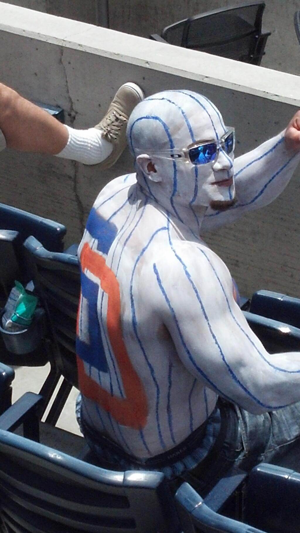
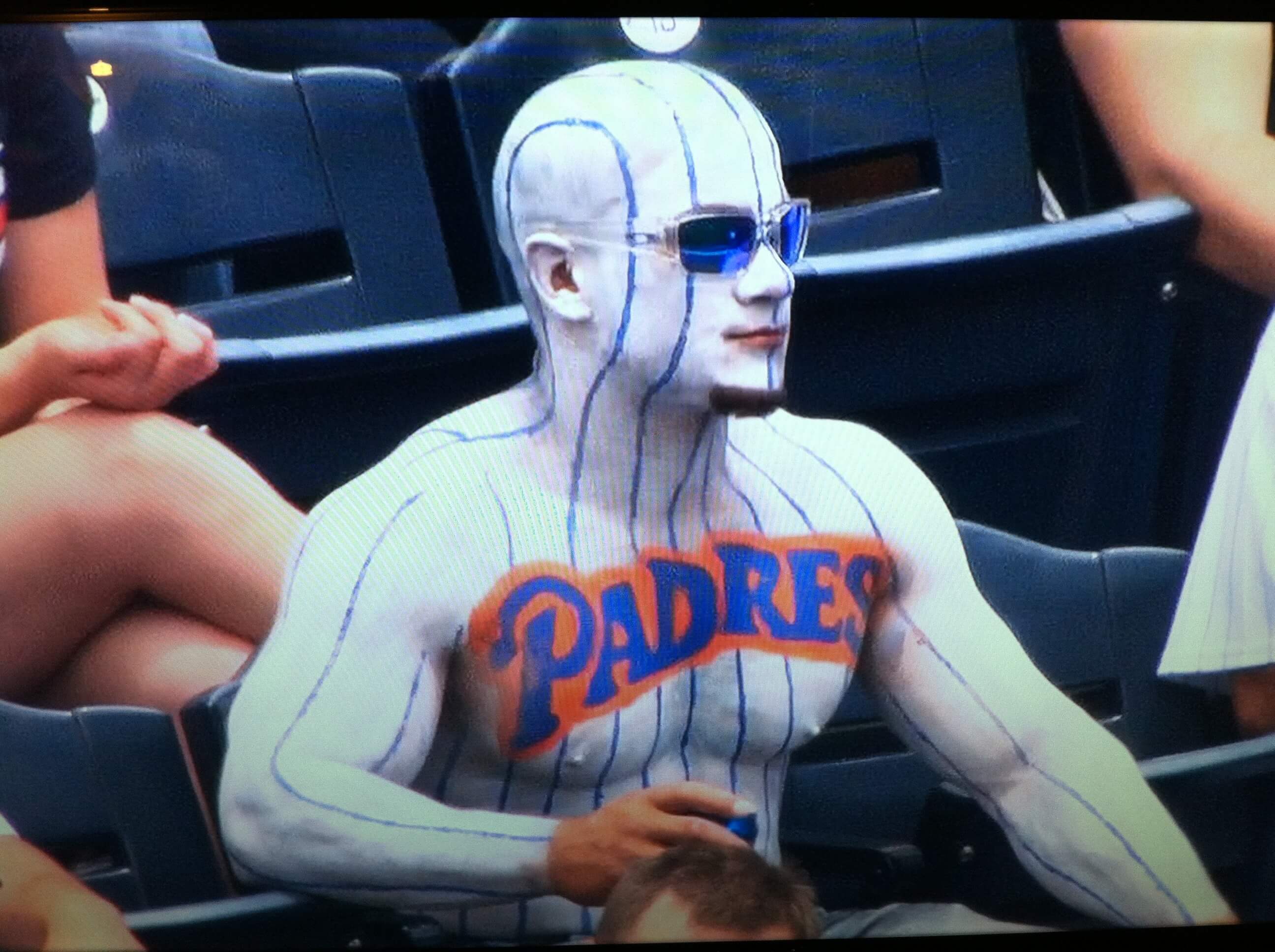
Click photos to enlarge
Credit where it’s due: Reader Brady Phelps first brought this guy to my attention on his blog. Then reader Michael Hersh sent me the frontal view. When I tweeted the photos yesterday afternoon, B. Samuel Wilson had the best comment:
@UniWatch bodypaint jersey looks better than current Padres jersey. Granted, pretty low bar to overcome
— B. Samuel Wilson (@bkwrds) June 24, 2013
Meanwhile: New ESPN column today — the results of the Hornets-redesign contest (finally!). Enjoy.
’Skins Watch: Here’s the latest regarding the ’Skins name and related issues:
• Former Sabres coach Ted Nolan, a First Nation native, thinks the ’Skins should change their name.
• I heard former ’Skins QB Doug Williams interviewed on the New York sports radio station WFAN yesterday afternoon. The show’s co-host Evan Roberts asked Williams what he thinks about the controversy about the team’s name (Roberts didn’t tip his hand as to where he stands on the issue, and I have no idea if he’s voiced an opinion in the past). Williams basically punted: “I stay away from that. It’s a no-win situation. I played for the Washington Redskins, and I’ll leave it at that.”
Collector’s Corner
By Brinke Guthrie
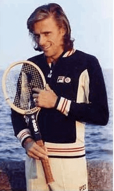
Wimbledon started yesterday, so we’re highlighting some vintage tennis gear this week, starting with Bjorn Borg tracksuit from Fila — as good as it got. They were pricey back in the day, too! I had this one in cobalt/navy, one of five or six color combos. Curiously, Borg wore his Fila line worldwide, except in Scandinavia, where he wore Jockey. (He did the same thing for shoes and rackets. Tretorn shoes and Bancroft rackets in North America, Diadora shoes and Donnay racquets everywhere else.)
In other tennis items:
• There was the other Fila personalized line back in the day. Guillermo Vilas’s warm-up looked like this — and this one is supposedly new with tags.
• Ilie Nastase has had a long relationship with Adidas. He wore their ATP line of clothes, played with an Adidas racquet (rumored to be a Dunlop Maxply with Adidas decals), and wore these shoes. (Here I am in Florida in 1978 wearing the same clothing & sneakers.)
• Jimmy Connors had his own signature Slazenger line in the 1980s. So did Stefan Edberg and Ivan Lendl with Adidas, and Boris Becker with Puma and Fila (though that looks like a reissue). Lendl also used an Adidas racquet at one time — rumored to be a Kniessel paint-job.
• John McEnroe had his own lines, first with Tacchini and then Nike. These shoes were designed for cross-training, but McEnroe saw them on a tour of the Nike campus and grabbed them. His original 1980s Nike clothing line favored a checkerboard motif. (Side note: I saw the late Vitas Gerulatis wear Nike socks at the 1979 US Open. I wrote to Nike, and they responded “we’re not planning on producing clothing at this time.” Really.)
• For a truly bizarre look, you can’t beat the Nike look of Andre Agassi — which he could never wear at Wimbledon.
• A non-tennis item from reader JD Denison: a Devil Rays TATC jersey for the bat boy.
• And from reader Josh Wren, an Alexander Ovechkin jersey from his time with the Moscow team, featuring some funky typography.
Seen something on eBay or Etsy that you think would make good Collector’s Corner fodder? Send your submissions here.
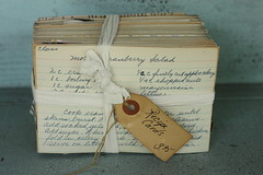
PermaRec-ish update: I recently came across a story that had PermaRec written all over it, but it was also food-related, so I pitched it to Grub Street (New York magazine’s food blog), and they took it. It’s about a woman who bought a bunch of 1930s recipe cards at an antiques shop and was able to connect with the person who originally owned them. Check it out here.
OMFG reminder: In case you missed it yesterday, my latest One-Man Focus Group piece is about ALL-CAPS typography.
Uni Watch News Ticker: Here’s an item I added to yesterday’s Ticker at 10am, so early-morning readers may have missed it: The Brewers wore their Polish-language uniforms on Sunday. By my count, that’s the 11th jersey they’ve worn this season. The other 10: home whites; road grays; home pinstriped throwbacks; home golds; home blues; road blues; these throwbacks; these throwbacks; home whites with camouflage lettering; and home golds with Spanish-language “Cerveceros” lettering. … If you like stretch marks, you’ll love the new UCLA football jerseys (thanks, Phil). … New 15th-anniversary logo for the Predators, and it’s seriously underwhelming. Like, is that supposed to be a twister or what? … The Chargers have officially confirmed two things we already knew: No more neck roll, and they’re changing the colors of their NOB lettering. In addition, there’s news we hadn’t heard about until now: They’re adding a gold stripe to the socks! No visuals yet, grrrrr (from Brady Phelps). … The Suns are reportedly one of the NBA teams that will have sleeved alts next season. No visuals yet. … Yesterday I mentioned that UCF was planning a blacktop-style basketball court, but all I had to show you was a mock-up. Now we have photos of the actual court. Here’s a time-lapse video of it being installed. … Here’s some news from two weeks ago that I completely missed until yesterday: The Dodgers and Diamondbacks will open the 2014 MLB season with a two-game series in Australia. It’ll be interesting to see if these games will feature uniform advertising, as has been the case for all the season-opening series in Japan. ”¦ The Detroit Mechanix — that’s an ultimate Frisbee team — have new uniforms (from Christopher Zervic). ”¦ If you really love your teams, bleed for them. Max Weintraub spotted that guy at Sunday’s Nats game. ”¦ “Caught a Wisconsin Timber Rattlers game over the weekend,” writes Alan Filipczak. “The walls of the stadium bar were decorated with vintage jerseys from the Appleton Foxes era. This one in particular caught my eye — look at the sleeve patch!” ”¦ Many players at the NBA combine claim to be seven feet tall, but most of them only reach that height with the aid of their sneakers. ”¦ One of the Sporting KC coaches had his MLS sleeve patch sewn on upside-down the other day (from Phillip Foose). ”¦ “Blanco Pro Racing becomes Team Belkin at this year’s Tour de France,” says Sean Clancy. “Here is the kit.” … Matt Wade thinks this whole pink thing has gotten out of hand. … The cover of the latest issue of the Penn State alumni mag shows then-and-now versions of the PSU live mascot (from Chris Flinn). … Reprinted from yesterday’s comments: George Mason is inviting fans to vote on the school’s “We’re in the A-10 now!” logo. … Western Kentucky will unveil new football uniforms on July 18 (Phil again). … The Titans’ new offensive coordinator doesn’t want QB Jake Locker to wear a play-call wristband (thanks, Brinke). … Back in 1987, someone sent an amusingly outraged letter to Nike (from Chris LaBella). … Here’s a map showing the most notable corporations headquartered in each U.S. state, designed by a guy named Steve Lovelace (from Ryan Connelly). … If you’ve been dying to see the Blackhawks’ logo made out of Lego, then today’s your lucky day (thanks, Phil). … Dwyane Wade got himself some pretty nifty NBA championship socks (from Robert Silverman). … The Stockton Ports wore tequila sunrise throwbacks last Saturday (from Ethan Kassel). … Game notes for tonight’s Rays game include the following: “NASCAR driver Aric Almirola will throw the ceremonial first pitch. The 29-year-old Tampa native drives the No. 43 Smithfield Foods/United States Air Force/STP Ford for Richard Petty Motorsports and will swap jerseys with fellow Tampa native Matt Joyce.” That leads Cork Gaines to wonder, “Is Almirola going to give Joyce a fire suit?” … Kenny Tobler’s father is a member of the Mormon Tabernacle Choir. “They just finished a summer tour of the Midwestern states,” he says. “And during a stop in Indianapolis, they were presented with a Pacers jersey.” Here’s a front view. … The Fresno Grizzlies wore San Francisco Sea Lions (Negro League) throwbacks earlier this month. “But the re-creation jerseys were not authentic,” says David Taub. “The Sea Lions of 1946 did not have a Sea Lion logo, but a logo of a Cub. That is because the team purchased the jerseys prior to the season from a semi-pro team called the San Francisco Cubs. The most famous player to play for the Sea Lions was Willie Mays Sr.” ”¦ Tennis player Anne Keothavong is wearing tiny ads — get this — on her fingernails to help promote a new high-def Sony TV (from Paul Lee). … Here are excellent close-ups of the new Jags helmet and the new Dolphins helmet (Phil again). ”¦ What would happen if the Miami Heat players dressed up as the New York Rangers? This (Robert Silverman again).
Does that brewers list include the barrelman unis from spring training?
Not included, because they haven’t been worn in a regular-season game.
But your point is well-taken.
That is a sabre-tooth in the Predators logo. That being said…it’s still weak.
I was going to say the same thing, the negative space inside the V is definitely a saber-tooth, not a twister.
Speaking of the Predators, I forgot they were even a team. You NEVER hear about them. I had to look at their Wikipedia page to find out what year they came into existence. I can’t believe they have actually been around for 15 years, today’s Ticker mention is like only the second time I have even seen or heard their name. Also, I might as well mention their logo SUCKS! It looks SO amateurish and just plain FUGLY!!!
15 years is like the ideal time to usher in a new logo and uniforms, especially for a newer team, so for the next Uni-Watch design contest I would like to recommend redesigning the Nashville Predators. That logo is God-awful!!!
15 years is like the ideal time to usher in a new logo and uniforms
Except that the Predators did exactly that last season. Which illustrates, I suppose, your overarching point that “nobody” has heard of the Predators.
thank you for continuing to cover the ongoing story of the dc nfl team’s name. high profile people keep commenting, which you would think would be newsworthy, but every time a wapo columnist reports on it they are accused of going out of their way to make it a story. i think it’s obvious that’s it would be strange (and inappropriate) to ignore the rising voices. i just gave up my season tickets after 8 years, and i haven’t regretted it for a second. i will always be a fan of the team, but the owner only continues to be an embarrassment on this issue (among others).
Honestly, as much as I don’t like the name and I’d prefer if it changed, my life will go on. What bugs me is how belligerent and intellectual dishonest the ownership (as well as many of their apologists are).
There are reasonable arguments to be made for keeping the name. The team and its media partners aren’t doing it.
all of the supporters’ arguments seem to devolve quickly into more and more racist language. honestly, that’s what swayed me the most. i was fairly neutral, as a fan – as a younger kid i guess i bought into the “it’s not about skin color, it’s about war paint!” bs – but the arguments all seem to claim that it’s negatively impacting too small of a minority to matter. that’s not how we should be treating each other. and snyder’s never changing, all caps comment that sounded am awful lot like marshall’s old never integrate quotes… i’d already given up my tickets by then. thank goodness. i will be cheering every sunday, from my couch, and spending my money on the caps and nats.
BTW, the comments for this link is exactly what you’d expect from Yahoo commenters: link
Marshall’s refusal to integrate the Redskins was a discriminatory action.
Snyder’s refusal to abandon the Redskins name is not.
The curly W on DC sports tat sleeve guy looks like it has horseshoe nail holes. Unintentional Nats/Colts mashup?
3M?
I’m guessing they’re supposed to be stars?
…and the ‘Skins tat is horrible!
I think that minnesota’s most notable buisness is not pillsbury, but Target, that being said I understand the contributions of pillsbury to the state’s economy as well as their pivotal role in the founding the “Mill City,” Minneapolis, MN.
My 3M? comment above should have gone here. Sorry.
What about 3M?
“Minnesota’s most notable business?”
Duluth Post-Its! Brainerd Tapers!
Love the tennis-themed collector’s corner. I had an early love affair with tennis, before I moved on to soccer and basketball, and I was a huge Boris Becker fan. I begged my parents for his wristbands, even though I could barely, if ever, keep the ball in play.
That Appleton jersey may actually be older than the Foxes era. Could be from the Appleton Papermakers era.
The sleeve patch is unique. What other locations could pull off a patch like that?
A van with ‘couver’ on it…a rock with ‘Ford’…a ham with ‘ilton’…a wooden boat with ‘ansas’….
does spelling count? A picture of a Road with and Island in the middle?
Nice.
Or a pen with ‘sylvania,’ an oak tree with ‘lahoma’ on it.
How about your ark, but then with a can in the middle that has “Sas” written on it?
Or a Man with the name tag “Chester”?
A Chick with “Ago”? The mind reels…
Howzabout this one…..
link
RE: Appleton Foxes. This was one of the true gems of minor league baseball and probably the biggest reason why I despise just about any uniform design or “edgy” team name that came out of the 1990’s and early 2000’s. I grew up loving going to that old stadium in Appleton in a residential neighborhood and watching the Foxes play. They moved the stadium out to the fringes of town (at that time) and changed the name to something remarkably stupid. What’s wrong with a Timber Rattler you say? Nothing except when compared to the nuance of the Foxes. Appleton is the largest and probably oldest city in what is known as the Fox Cities, which is named after the Fox River Valley where it resides, which is named after the Fox River. The Fox River was the major river trading route for French traders who used it to get from Lake Michigan to the Wisconsin River and the Mississippi River. There was a short portage (at Portage, WI, coincidentally) and it made Wisconsin relevant to Europeans.
Further, there are other minor league baseball teams in Wisconsin (Beloit). So taking away the Appleton name was idiotic.
In summary, the Foxes were classic and awesome. The Timber Rattlers are tangential to Wisconsin at best, and the intent to make the team more appealing to 16 year old males was another example of why we can’t have nice things.
You are a kindred spirit.
Foxes was a great minor league moniker, both at face value and due to the River connection. Where else do we see Foxes used? Marist university Red Foxes is about it.
There are not many actual timber rattlesnakes in Wisconsin, and they’d be most likely seen south of Madison. It’s an example of unnecessary usage of “intimidating” nicknames.
Claiming the whole state with other teams in it is pretty lame. (see Tennessee Smokies, West Virginia Power, California Angels)
A return to the Foxes would be terrific. If the team doesn’t want to limit itself to Appleton, it should go with Fox Valley Foxes (easier to say) or return to the old Fox Cities Foxes. Update the logo and color scheme–maybe maroon and orange?
I agree.
I don’t mind “Timber Rattlers,” as such an animal does exist in Wisconsin (although link), but “Foxes” was just too perfect to let go of. Plus the mascot/logo possibilities are numerous.
My dad drove bus for the Wausau Timbers in the early 1980’s. I believe they were named for the timber/paper mill industry in central Wisconsin.
Re: Corporate map: I would have assigned New Hampshire Velcro over Timberland, but that’s just me. What the hell is AllSup’s?
Allsups is a good chain of convenience stores. Like a southwestern version of WaWa. Sadly they don’t get this far north.
For Kentucky, I would’ve gone with the Louisville-based Yum! Foods or its subsidiary KFC.
I wonder how different the map would look if it was made 20 years ago. I’m guessing Washington would be Boeing, not Starbucks.
What’s “notable” and to whom? There are no airlines and only one company each in energy and mass media.
Why not Microsoft for WA? Is Caterpillar really more notable that McDonalds for IL?
Could anyone help out on the listings for DE and RI?
Delaware is DuPont.
I can confidently say that Delware is DuPont, but Rhode Island is, uh, Curt Schilling’s video game company?
The creator probably went with companies that are kinda sorta associated with each state. So while McDonald’s is HQ’d in Illinois, its first location was in California and I’m not sure if people really think of it as an Illinois firm (ymmv, obviously).
I would’ve gone with Microsoft if it was the late 90s or early 00s. Otherwise, I think Starbucks wins out.
Yeah, “notable” appears pretty subjective. For my home turf (WA state) I’d put Amazon far ahead of Starbucks, M’Soft and/or Boeing. The latter two are basically historical and while I know people think Seattle/coffee, Amazon is pretty ubiquitous and link.
RI is Hasbro
There is one airline: Hawaiian
Also, for Washington State, Boeing is no longer HQ’ed in Seattle. It moved to Chicago. I probably would have gone with Starbucks, too
Mea culpa. Misremembered that as a hotel logo.
Hooters/Florida…I wouldn’t have put that one together. Would have picked Disney (I live outside Orlando so that might be skewed though), NASA, Darden (Olive Garden, etc), Tropicana, Royal Caribbean to name some others.
Linking to just the map, out of context, kind of skews its perception. Apparently, according to link, the map is supposed to identify the most famous brands by state.
Still, even by brand awareness, I’d consider a couple of those choices suspect.
In which case I feel even more strongly about Velcro
Today’s ESPN column is up:
link
I like James MacNeil’s shorts with the honeycomb pattern with the uni numbers, but probably too impractical. Imagine having to change the numbers whenever they have roster moves!
Number 3 (Ethan Dimitroff) is my favorite. It’s good to see someone design a uniform that doesn’t throw in everything but the kitchen sink.
Did you include the 1913 Brewers throwbacks they wore when they played the Cards at Miller Field?
Shit, I thought I had changed that wording. Anyway, yes, now fixed — what I had originally thought were Negro League throwbacks were actually the 1913 minor league throwbacks.
Dolphins hemlet?
Don’t spell like me, Paul.
Ha. Now fixed.
Actually, like Nastase, Borg reputedly fulfilled his Bancroft racket contract by having his Donnays painted over to look like them.
link
I played with Donnay Borg Pros all the way through college, and quite frankly they were suitable only for advanced players, not for the mass marketplace. They were insanely stiff and had perhaps the smallest sweet spot of any tennis racket ever made. When you hit the ball in the sweet spot you’d generate an amazing amount of power, but hit it just outside the sweet spot and the ball (if you were lucky) would flutter over the net with no depth or pace and leave your opponent with a sitter. And Borg strung them at an insane tension (75 lbs. or so), so when he mishit the ball it would fly off at weird angles typically 20 feet or so wide of the doubles alley, as those old enough to have watched him play may recall. By the time I finished college in the early ’80s, most of my teammates and opponents had long since replaced their composites with Prince Pros. Which because they had the big heads were ridiculously forgiving, thus ushering in the modern tennis era.
As for Nastase, it’s likely that the Adidas rackets he switched to from the Dunlop Maxply were not in fact repainted Maxplys, but repainted Wilson Jack Kramer Autograph, or perhaps a Pro Staff (it’s a weird thing – Pro Staffs were by far the most common racket on the junior circuit through the mid-70s, but I never saw any pro except McEnroe use one). A side-by-side comparison of the racket frames shows the Maxply as having a thicker, more rounded throat than either the Adidas or Wilson models.
Adidas: link…8396.8396.0.8696.1.1.0.0.0.0.54.54.1.1.0…0.0…1c.1.17.img.bD_mrLAdqdY&bav=on.2,or.r_qf.&bvm=bv.48293060,d.dmQ&fp=2def95829c55a805&biw=1280&bih=885&facrc=_&imgdii=_&imgrc=oQOQLQiA93zP0M%3A%3BO_yHfDYhlu8dTM%3Bhttp%253A%252F%252Ffarm2.staticflickr.com%252F1335%252F4601593930_112a5e06fc_z.jpg%3Bhttp%253A%252F%252Fwww.flickr.com%252Fphotos%252F37901436%2540N08%252F4601593930%252F%3B640%3B480
Wilson: link
Dunlop: link
Given the Donnays’
oops. Here’s a better link to an image of the Adidas:
link..0j0i24l2.1381.4793.0.4939.19.9.0.10.10.0.52.417.9.9.0…0.0…1ac.1.17.img.4PMi4HPogsY#imgdii=_
Damn, I’m having a hell of a time.
Here’s the Dunlop:
link
And the Adidas:
link
That Nike insult letter was partially plagiarized from the old Monty Python “Argument Clinic” sketch. The “malodorous” bit was originally, if I recall correctly, “toffee-nosed, malodorous perverts.” That was one of many wonderful lines delivered by the late great Graham Chapman.
Don’t give me that, you snotty-faced heap of parrot droppings!!
I’m sorry, this is *abuse*.
At what point do stories on people’s opinions of the Redskins begin to jump the shark? I understand the issue and as a fan of the team I’m totally fine with a name change. My allegience is to the “team” in Washington that competes against the Giants, Cowboys and Eagles. But seriously, Phil Jackson? Who’s next Ja Rule or Ludacris?
Come on, unless you have some sort of credibility (at least the Sabre’s coach is a decendant of Native Americans) why do all these individuals (positive or negative) feel they need to express an opinion that have no association to the franchise or Native Americans I’m excited to hear what Snooki and Pauly D opinions are.
I agree that Phil Jackson’s (or Snooki’s) opinions on this issue are no more valid than anyone else’s. I also think they’re no LESS valid. What exactly do you mean when you demand that someone have “credibility” on this issue? Seems to me that any citizen has credibility when weighing in on something like this.
As for why Jackson and others have given their opinions, has it occurred to you that maybe someone simply asked them?
Saying that significant public debate has “jumped the shark” is akin to saying, “Get over it” — it means you wish the whole thing would just go away.
But it won’t.
Where I was going with the topic is, generationally most people my age aren’t aware of even how Redskins is a version of the “N-word” to Native Americans. I worry when people like Phil just go out there and tweet or throw their 2 cents, it could discredit one side of an argument because people just think the person is looking for attention and picking a controversial topic to do so. I know this is a team name, but I was going for something along the lines of when actors or musicians have made controversial statements about war or terrorism. They know they have a platform and think it gives them the right to be an expert on anything. I love this site because you talk to and value people with experience in the uniform field or team marketing all the way down to the people who sew and repair torn uniforms. I wasn’t looking to offend anyone with my comment. I was mearly wondering at what point when people begin making comments about the topic does it become more of (for example purposes) “Dennis Rodman loves the Redskins name, see what kind of person loves THAT team name” over genuine discussion.
Understood, and well stated. But I think this is one of those topics that more and more people will be weighing in on, one way or the other, because it’s reaching a critical mass of public dialogue. And that’s a good thing — public dialogue is how we, as a society, establish standards, share ideas, etc. I wouldn’t want Phil Jackson to be the only person taking part in that dialogue, but I wouldn’t want to exclude him from it either.
Ted Nolan is not a descendant of Native Americans. He was born on a First Nation community (Garden River Ojibwe First Nation, outside Sault Ste. Marie).
Congrats to Jimbo, Tim E. O’B, and everybody else in Chicagoland. And because I’m a Habs fan, a special “thank you” as well.
Thank you Mike! It was my birthday yesterday, and I received the best birthday present ever last night. Hopefully your Habs can compete for one sometime in the near future as well.
For those of us who are old enough to remember, the Nike/Beatles commercial use thing was a big deal back in 1987. I’ve never really cared one way or the other. Music is open to interpretation. If it moves you to buy sneakers or whatever good for you. If it doesn’t then good for you too. A big deal out of nothing IMHO.
Yeah, it’s sobering to hear “free and freaky” rock fans get their nose out of joint over a song in a commercial. A self-important music snob is an unattractive thing, indeed.
The pattern on the shoulders/yoke of the UCLA jersey is, from what I’ve been told, the new standard pattern for adidas’ TechFit jerseys.
Apparently Tennessee’s will look similar, and the pattern isn’t as noticeable in person as it is in the photo.
Also, not sure if you all had heard, but the rumor is that Tennessee will be unveiling an alt before the season, and all I have heard is that it will not be black. Take it with a grain of salt, because I haven’t seen or heard anything official, but the guy I got it from has been spot on about everything I’ve talked to him about in the past.
Concerning the Tennessee alt, I wouldn’t be surprised at all. I live in TN and admit that Butch Jones is already doing a much better job than his predecessor, and better than I expected. Although I despise them with a passion, I hope they don’t go changing things too much with the uniform. It’s iconic, and has been the least of their problems the last few years.
One thing I have heard mentioned, though not sure how reliable it is… an orange helmet.
Apparently there was actually a black alt for UT like Michigan’s in the works but Dooley crapped on it.
The two guys I’ve talked to that have seen the leading alt proposal for this year have said it is awesome. My conjecture is that it’s a grey fauxback like we’ve seen recently from adidas.
Nebraska will be wearing this on September 14th against UCLA.
link
I am desperately hoping that UCLA’s jersey in the ticker is the one to be worn against Nebraska (Color v. Color!), and not the new default uniform.
That look is awful, and I’m tired of adidas highlighting their “technology” in their uniforms by making it different colors (remember the tentacles?). Yeah others are guilty of it too (Nike and their Flywire shoulders, and I wouldn’t be surprised if the flywire collars could still function as they were intended even if they weren’t visible), but for the most part they don’t mess with the look of the uniform. Adidas is doing it with their baseball unis too (that pit striping serves no purpose, and it makes no sense aesthetically).
Is it just me or does the dolphin helmet appear to have a dolphin decal laid over a sun logo?
Isn’t this a different presentation of the new Dolphins logo than what we’ve seen in the past? I thought the dolphin was more horizontal (swimming). This one looks to be jumping like the old logo. It does look better that way.
I think it’s the same presentation – helmet decals are aligned for how they will look when worn, meaning that link when you place the helmet on a horizontal surface.
Nebraska will wear BFBS uniforms against UCLA on September 14 – “Nebraska and adidas unveil alternate uniform”:
link
Awful. Let teams with no tradition wear costumes, but we should be above this garbage.
If everyone gets to wear black jerseys, it’s not much of an honor to be a blackshirt, is it?
Excellent point!
Better than being a Red Shirt on Star Trek. Those guys tend to have short lives.
When I clicked on the link the headline read “Nebraska and adidas Unveil Alternative Uniform”, which may be even more egregious than an “alternate” uniform. The mind reels at what an “alternative” uniform might look like: link
I’m guessing an alternative uniform would be baggy cargo shorts, open flannel shirt over a tee and some sort of stubble. And Docs.
My thoughts on the new Nebraska alts: link
Does anyone remember the Corpus Christi Hooks wearing a similar jersey to Stockon Ports? I can’t find a photo of it.
Also the Astros should ditch their orange alternate and create their own blue tequila sunrise.
James MacNeil’s Hornets jersey designs are freakin’ AWESOME!
I think that jersey design is the ONLY concept design I’ve EVER seen from a Uni-Watch contest that I would actually WANT a team to wear.
Not counting my own designs of course, lol. ;)
Also, MacNeil’s hexagon/cube logo for the Hornets is pretty awesome too.
What, did Adidas use macrame for UCLA’s new football jersey? It looks like the link in grandmother’s house circa 1979.
That UCF court looks really good.
Gotta love the double standard with the NCAA. They ban hashtags from football fields but from the looks of the UCF court hashtags are perfectly okay for court.
Also, I see the “circle R” included in the UCF logo, but not in the “A American” logo.
That’s because the American Athletic Conference has no such mark.
link
As for the “double standard” the rule prohibits those from being on the field of play. UCF’s hashtags and twitter handles are not in the field of play, they are all out of bounds.
This is illegal now:
link
This is not:
link
New helmets for Oregon? Looks like it! link
interesting take on the Blackhawks logo from Ript
link only available 6/25/13`
Can’t really see it too well in this pick but on the podium for the overall race win at the 24 hours of Le Mans this past weekend, the German flag for the winning team was upside down. The flag for the 3rd place Audi was flying correctly.
link
“your overarching point that “nobody” has heard of the Predators” -> Great definition of ignorance.
Who is this “nobody” you speak of?
The state of the Jax Jaguars’ franchise is in rough shape so whatever works.
The closeup pic of their helmet looks good though.
Whenever I hear of the “Nashville Predators” it makes me think of L&O:SVU type sexual predators. Really pervy types. The legitimate visualization sucks just as much. They’ve got to have some sort of moniker that could work better.