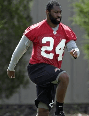
As you may recall, Tuesday morning’s Ticker included the following item: “A well-placed source tells me that the amount Darrelle Revis paid to Mark Barron in order to get Barron to give up No. 24 was ”” get this ”” $50,000. Is that a record? Is it not even close? Has anyone been tracking these uni number transactions over the years?”
Although the dollar amount was a bit of an eyebrow-raiser, I didn’t think the story itself was all that remarkable. Players have been paying each other big sums for uniform numbers for many years now.
Shows what I know. Here’s a selective timeline of how the rest of the day unfolded:
11:30am: Uni Watch reader Cork Gaines picks up the Revis story for Business Insider.
1:41pm: The Revis story is picked up by SB Nation.
1:43pm: The story is picked up by Yahoo Sports.
4:13pm: The story is picked up by the New York Post.
4:42pm: The latest outlet to pick up the story is NFL.com.
7:02pm: Uni Watch reader Brooks Simpson posts the following comment: “FYI: Your report concerning Revis’s number appeared on the crawl for the NFL Network, with the blog credited. Kinda cool.”
7:33pm: CBS Sports gets on board.
10:47pm: Not wanting to be left out, NESN joins the party.
And so on. All of these outlets credited Uni Watch, which is nice, although not a single one of them got in touch to ask about the nature of my anonymous source. This means either (a) I’ve built up a good reputation as a trustworthy reporter whose word is dependable, or (b) source shmource, nobody cares as long as the story sounds juicy and someone else has vouched for it. I’ll let you decide which one applies here.
Anyway: Except for Brooks Simpson’s comment, which I saw, I was completely unaware that the story had gone viral (or at least viral-ish). So I was surprised when one of my ESPN editors contacted me yesterday morning and asked if I could whip up a little somethin’-somethin’ about the Revis situation. Unfortunately, I wasn’t able to oblige (I was busy spending the day with my Mom, who’s been dealing with the aftermath of a nasty fall), but I gave him a bit of background and he said the news desk could take it from there. Then they apparently got Darren Rovell to contribute some reporting as well, and the result was this piece, which was posted yesterday afternoon and quickly racked up over 800 comments.
All this for something that started out as a little Ticker item. Which just goes to show that even after 14-plus years of Uni Watch, sometimes I completely misjudge what people will get excited about.
PermaRec update: A really bizarre story about some old papers found inside a used Bible is at the heart of the latest entry on the Permanent Record Blog.
Uni Watch News Ticker: We already knew several NBA teams would likely have sleeved alternates next season (I reported that myself back in February), but now we have more details, as it turns out that as many as five teams may wear sleeved alts for up to a dozen games each. ”¦ A while back I reported that St. John’s would be moving from Nike to Under Armour. Now we have what appears to be our first look at the school’s new hoops uniforms (from Leon Frager). ”¦ Two really strong pieces pertaining to the Native American issue were published yesterday. One is the transcript of a very interesting subway conversation between an Indian guy and a guy wearing the Braves’ Indian-head cap. The other is an excellent article about why the Blackhawks don’t receive much flak for their Native imagery (you’ll have to register to read that one, but it’s free and worth it). Both pieces are really, really strong and totally worth reading, no matter which side of the debate you’re on. Highly recommended. ”¦ Someone has made a men’s suit out of Bruins rally towels. ”¦ Good for Domino’s Pizza (there are four words I never thought I’d be writing) for upcycling a bunch of merch with outdated logos (thanks, Brinke). ”¦ New corporate name for the Senators’ arena (from Matthew Walthert). … New retro alts for the L.A. Galaxy (thanks, Phil). … This is funny: sports logos as viewed through the prism of cheese (from Kevin Kleinhans). … New football uniforms for Abilene Christian. ”¦ Historic Hinchliffe Stadium, which I wrote about in 2010, may end up being added to Paterson National Park (from Dave Rakowski). ”¦ Odd to see that a display at the Baseball Hall of Fame still refers to the Rays and the Devil Rays (from Christian Eidt). ”¦ Here’s a good interview with uniform designer Todd Radom. ”¦ Japan’s World Cup kits have leaked, and the road version is straight out of the Day-Glo handbook (from Trevor Williams). ”¦ Since when is MLB using stencil fonts? That’s Eric Young Jr., newly acquired by the Mets. ”¦ New logo for the NHL players’ union (from Anthony Nuccio). ”¦ The Rangers wore blue at home last night. “I believe that’s the first time this year,” says Bradley Maybin. ”¦ Odd sight in the College World Series last night, as an Oregon State baserunner and the first base coach were wearing mismatched helmet logos (screen shot by Aaron Stoessel).
You spelled your buddy Darren Rovell’s name wrong.
Thanks. Fixed.
The “Good on Domino’s Pizza” story links to the Bruins rally towel suit guy. Please fix.
Now fixed. Here’s the proper link:
link
“Upcycles”?
It’s like when you “put a bird on it.”
See here:
link
Thank you.
Good story on Domino’s. And what’s with your objection on Domino’s, Paul? I like them better than Pizza Hut–though Pizza Hut has better pasta. (And they serve beer.) Of course, you can’t top Papa John’s among chain places.
At least here in Pittsburgh, anyways, the mom-and-pop pizza places are more than worth trying. Those places are usually hit-or-miss in general–I’ve heard down south you’re better off getting a chain place–but up here, with all the ethnic Italian Americans, their pizza is sometimes better than the chain places.
Paul *is* a Brooklynite, you know.
I can’t speak to the deep South, but here in Virginny, non-chain pizza is almost always better than chain pizza. Easily 80% of the time or more. I’ve found the same to be true in Hawaii, Arizona, Florida, Minnesota, Wisconsin, northern Ohio, both San Antonio and Austin, Chicago, and eastern Iowa. And to whatever extent the deep South is culturally backwards, and despite the deep-fried-Twinkies reputation, I’ve found that Southerners tend to be pretty sophisticated foodies when you scratch the surface. So I’d not assume that non-chain pizza is any less good in the heart of Dixie than up here in the Old Dominion.
As to why object to Domino’s? You do recall that just a few years ago, they based an entire ad campaign on telling us, “Yes, we admit that our pizza sucks.” (link) That pretty much permanently puts the burden of proof on anyone claiming that Domino’s pizza is not terrible.
Northern Ohio (or more specifically, Northeast Ohio) has a large Italian American population, much like New York, Pittsburgh, and Chicago. Not coincidentally, those tend to be places where mom-and-pop pizza does the best business.
I live about an hour outside of Orlando in a small community, kinda in between cities so there’s a few stop lights, etc. But there are two pizza places, one guy is from Italy, the other guy is from Brooklyn and their pizza is good.
I think with the “globalization” of the US, what was once regional food has migrated to most parts of the US, even evidenced by smoked barbeque places slowly making it’s way to the northeast. (I left 13 years ago and don’t remember any smoked barbeque places in NYC, unless I missed them.)
I was going to say I have no idea how places like Dominos and Papa Johns stay in business in NYC, but there’s plenty of tourists and college students and people moving to NYC from other parts of the US that keep them going. If it was up to actual NYer’s I can’t see how there’d ever be a chain pizza place in NYC.
I don’t buy the Italian-American thing. For one thing, it’s a stereotype, and it’s offensive (kidding! just an excuse to link to this: link – RIP, Mr. Gandolfini).
But pizza and the taste for good pie is universal now, so there’s really no reason to expect non-chain pizza to be better in Hungarian/Lebanese Toledo than in Italian North Jersey. Plus, around me, most of the independent shops with Italian names are owned by non-Italian families, often Hispanic or Asian immigrants, have been for a generation or more, and are still terrific. Good pizza really isn’t that hard to make.
I don’t know, the foodie-ness of the consumers range from region to region. The Northeast will continue to have more discerning and demanding consumers of pizza, and conversely, the rest of the country and the suburbs will have a higher tolerance for the more processed, chain-style pizza.
Good pizza isn’t hard to make. *Great* pizza is hard. You’re not going to find Totonno’s-quality pizza anywhere but Brooklyn.
And this isn’t to mention the supposed mythical qualities of the New York City tapwater and its effects on pizza and bagels.
I’m not saying Domino’s is good or bad, but did you actually watch the video you posted? The key to that ad campaign isn’t just “Hey, our product is better!”
Domino’s leveled with the consumer and said “hey, we realize our old product wasn’t up to par. We’re not trying to pull the wool over your eyes.” Sure, it’s still schilling for a corporate monolith, but that corporate monolith at least wants to pretend that the customer’s opinion means something.
Of course, you can’t top Papa John’s among chain places.
This is like saying, “You can’t top firm, solid turds when it comes to shit.”
Again, PL for QOTD!
I always thought that the Blackhawks were less scrutinized than the other major sports teams. I just chalked it up to the NHL being less popular than the NFL or MLB. That and viewing the world as a biased sports fan.
That could very well be. Yet they’ve been in the Stanley Cup Finals twice in the last four years, and not many people at all have seized the opportunity to level criticism. Perhaps that one columnist from Toronto, and if memory serves, he got roundly roasted for his column.
here’s a quick comment on the Redskins issue; blackhawks are mentioned:
link
One is the transcript of a very interesting subway conversation between an Indian guy and a guy wearing the Braves’ Indian-head cap.
Ah yes, another case of referring to the Braves’ cancelled hat logo as a “screaming savage” because god forbid anyone call the logo what it actually freakin is. The character is laughing. Look at it for more than a tenth of a second. It’s really quite obvious. What, we can’t argue that it’s wrong to use the logo without intentionally trying to make it sound extra-racist? I guess “laughing indian” just doesn’t cause the reaction we want, huh? If it’s so inappropriate, then surely you don’t need to resort to lying about it, do you?
I always thought he was yawning.
Just to reiterate…Bill Veeck referred to the logo he designed for the Cleveland Indians as the “Smiling Indian” or the “Laughing Indian.”
Makes sense to me. I suppose living in Ohio (and going to a high school that used Indians as a mascot – and wore purple and gold, so maybe I really am The Anti-Paul) might tint my view a bit, but I really don’t get the whole “racist” aspect of Chief Wahoo either. It’s a cartoon character. He has exaggerated features, sure, but triangular eyes and a giant grinning mouth aren’t exactly stereotypical features of Native Americans, are they? The only thing that really makes him “Indian” is the feather. I don’t see any racist intentions with the logo, I simply see it as an attempt to be a “fun cartoon character”. I suppose he’s a bit dated and really not drawn that well by today’s logo standards, which could be reason enough to change it, but I don’t think it’s racist.
Wellll… don’t forget that hook nose. Which is
I think it’s pretty hard to claim Wahoo isn’t an exaggeration of at least perceived racial characteristics.
The original coloring of the logo was different; the skin color was a golden yellow.
Suppose the current iteration of the Indians logo was colored as follows: feather red with navy trim; hair black (as opposed to navy); skin the same gold color as the Blackhawks logo (as opposed to the red color that makes you think it’s the American Indian version of blackface).
Sorry, that sentence trails off. Add a period – it should be “Which is.”
As in Wahoo’s nose is most definitely found in stereotypical portrayals of Native Americans.
Day after day after day of white man’s guilt Native American BS. We get the picture you object to teams and schools with Native American mascots. These teams have been around for years but now all of a sudden their offensive. Most people offended are middle aged white men. I know a lot of Native Americans and none of them have said they were offended by the Redskins, Braves or Indians. Give it up its getting old.
As I’ve explained many times, I do not feel any “guilt” regarding this issue. Please don’t put words in my mouth or feelings in my brain. Thanks.
The reason this issue keeps coming up in the Ticker is (a) many, many writers are writing about it, and (b) many, many readers send me links to the articles that those writers have written. I don’t go looking for these stories; they come looking for me. And for the vast, vast majority of them, I offer no commentary but simply list the link and move on.
If you don’t care about this particular subject matter, you can skip it and move on to the next thing in the Ticker, just as you probably do when there’s a story about Chinese volleyball. But I’ll keep listing these articles as I become aware of them, because they represent a developing storyline that’s relevant to what this site is about.
As someone who disagrees with Paul regarding the use of Native American imagery, I have to come to his defense. I (probably among others) sent Paul the link to the Tribune story. He linked the article because people are interested in the issue(s). I also know that he has linked articles, and interviewed individuals who do not agree with his point of view. Other than his editorializing (and after all, its his blog) I think he has an even-handed approach to linking articles, both pro and con on the issue.
Paul:
A while back you said:
“Discuss as you see fit, with one proviso: As most of you know by now, the nonsense term “politically correct” is not welcome here, so please refrain from using it. Thanks”.
Fair enough, but it’s not so much political correctness, but to use another buzz-phrase “zero tolerance”. I don’t believe that because some Native imagery is offensive then all Native imagery is offensive. I think the major reason the Blackhawks don’t get as much flak is because it’s not an offensive name or a grotesque caricature. “Redskins” is a deeply offensive slur and should be changed, but “Seminoles” isn’t (especially if the Seminoles are jiggy with it). The difference between the Blackhawks Indian head crest and Chief Wahoo (or the Screaming Savage or whatever he’s doing to look like that) is like the difference between calling a team the Centurions and calling them the Wops. I say lose the offensive names/mascots/logos but don’t lump them all together.
…and what the heck… From the Blackhawks article: The typical logo, she said, “relegates native people to a certain time in history that’s not today, and it’s intended to do so. It’s not something that reflects anything that’s current. It kind of keeps us in the backwater of history.”
Every team named for a group of people is based on a past image. The “cowboy” with the 10-gallon hat and six-shooter on his hip is just as much of a historical caricature as any of the Native American teams. The Patriots are revolutionary war, not modern military. The pirate teams are all classic 17th & 18th century imagery, not freakin Somalians on speedboats with machine guns or nerds downloading music. Hell, that’s one of the reasons that I don’t find the Native teams to be inappropriate – because it IS a reference to the past. Yeah, our history rather horrible, but the cold hard fact is that the culture represented by these teams simply doesn’t exist anymore, regardless of there still being people of Native American descent today.
Exactly. ^
This leads to an interesting question: To what extend are Native Americans a part of mainstream American culture?
There’s a lot of anachronism in sports logos. We had a whole entry yesterday about the Civil War. Cowboys haven’t been around in the stereotypical sense for a really long time. Scandanavian peoples haven’t gone-a-viking since Harald Hardrada was cut down at Stamford Bridge in 1066.
However, as Paul has said on many occasions those usages are people adapting their own culture. The Blue Jackets uses the war legacy of Ohio, the Patriots a nod to the minutemen, and Vikings a link to the ancestors of many Minnesotans.
Paul has contended that its a property issue and he makes a compelling argument. However the issue of who owns what is very very tricky. Are indigenous peoples separate or connected to the rest of the culture? Would they feel differently if their culture, both past and contemporary, was integral to modern American society? There is this sense of “otherness” which pervades much of the discussion of this topic. North and South managed to find, to such a degree as is possible, reconciliation but no such equivalent exists for indigenous peoples.
“the Patriots a nod to the minutemen”
I thought it was a nod to Elvis…
Every team named for a group of people is based on a past image. The “cowboy” with the 10-gallon hat and six-shooter on his hip is just as much of a historical caricature as any of the Native American teams.
There is an important difference between archetype and caricature. When a culture uses historic imagery to celebrate its past or perpetuate certain cultural myths and legends, it is creating archetypes. Groups of people create (or, sometimes, adopt) archetypes as ways to impart collective identity, instill pride, and define shared beliefs and values.
Archetypes have contemporary significance because modern cultures do (and should) have an equitable stake in the imagery associated with their ancestors. The cowboy archetype (ten-gallon hat, six- shooters, etc.) resonates with Dallas Cowboys fans because Texas culture identifies with the resourcefulness, persistence, and ruggedness (in other words, the good qualities) associated with the image. The same is true with fans of the West Virginia Mountaineers, Minnesota Vikings, or the Dutch of Pella High School in Iowa. The common thread is that the archetypes are something a culture or community uses to define itself.
When stereotypical imagery is derived from outside a culture rather than from a culture’s own conception of itself or its past, it is caricature. And caricature, by its nature, mocks and distorts. It is used to identify differences between those who create the caricature and those are caricaturized. Chief Wahoo is a caricature. A student dressed up in face paint and a generic war bonnet at Stanford football games is a caricature.
These caricatures are no less debasing to current cultures because they depict iconography of the past. References to the past do have relevance to cultures today. Contrary to what you suggest, the Native American cultures that are being caricaturized by certain sports teams do still exist – in the heritage and shared identities of their heirs. These caricatures impact the contemporary cultures by equating them with the inaccurate stereotypes of the past, implying they are no different than that now.
The Darrell Revis number story isn’t nearly as good as Jeff Feagles. He wore #10 for the Giants when they drafted Eli Manning. Eli sent Feagles and his family on a Florida vacation for his number. Feagles changed to #17. The next year the Giants sign Plaxico Burress, who wants that number. So he offered to remodel Feagles’ kitchen. But never paid the bill.
“…. So he offered to remodel Feagles’ kitchen. But never paid the bill…”
Oh, man!
the article about the Braves alt hat lost me at
“I’m one of ‘em,” I said. “Well, sort of. I’m also Mexican.”
Because someone has to be 100% something in order to not lose you?
they aren’t the same thing and trying to justify the point by saying “hey.. i am kinda, sorta.. slight somewhat similar” is a stretch
From the author’s bio line at the end of the article:
Simon Moya-Smith, Oglala Lakota, is a Master of Arts graduate from Columbia University School of Journalism in New York City.
I’m pretty sure he’s saying he’s both Indian (from his Lakota heritage)and Mexican, not that his Mexican heritage is “kinda, sorta.. slight somewhat similar” (as you put it) to Indian heritage.
Teaching at a school that is 40% Mexican (80% Hispanic), a few students identify more their indigenous heritage such as Aztec than with their nationality. And roughly 55% of Mexicans have mixed ancestry.
He’s Native American AND Mexican. Sorry that heavy concept “lost” you. Jeez.
I stopped at ““Look, we just left Columbus Circle, right?” I began. “And there’s that massive monument in the middle of the circle to a man who was inarguably guilty of genocide. …”
I was thinking that most current logos that represent a person from the Big 4 sports leagues are not aesthetically pleasing:
Boston Celtics: I’d rather their alternate clover logo
Chicago Blackhawks: Blackhawk division patch makes more sense and from what I can tell Chief Black Hawk does not look like their logo
Cleveland Indians: Politics aside, the logo is possibly the worst of the Big 4 sports leagues
Minnesota Vikings: A Viking ship should be their primary, at least the Viking face isn’t on their helmets
New England Patriots: Most people will disagree, but I liked the original patriot hat logo (what’s it proper name?) the best
Ottawa Senators: The alternate O logo from the original franchise is so much better
Pittsburgh Pirates: They still can’t draw a pirate right after all these years. Pittsburgh should go with a modified Jolly Roger like the Tampa Bay Bucs did.
Washington Redskins: Going back to the 1965-1969 spear logo permanently would be a start
Washington Wizards: Team needs a new nickname
The Oakland Raiders’ logo is the only one out of the lot that looks good and is still timeless after all these years.
The Patriots hat is a tricorne (or tricorn, either spelling is valid).
The classic Patriots helmet logo was Pat Patriot.
I didn’t have to register to read the Blackhawks article. And I definitely didn’t have any existing cookies or settings for the Tribune’s site.
The Mets sell that t-shirt on their web store. It’ll set you back $30 – link
Maybe somebody can help me, but I don’t understand basketball teams using “sleeved” alternates. We’ve watched for years as NFL teams slowly lose their sleeves, and often, the wonderful designs that were on them. Why then, is the basketball world so anxious to add sleeves? I mean, I know the obvious answer is, “OMG fashion~!”. I’m just at a loss as to how people think it’s a good idea.
It’s all about the jersey sales. That’s the only reason. It really is that simple and obvious. There isn’t that much of a difference between playing in a normal basketball jersey and playing in a t-shirt, so the players don’t care – but people in general are more willing to wear a jersey if it has sleeves. Even NFL jerseys, despite being basically sleeveless on the field, are still sold with nearly elbow-length sleeves to the general public.
Not quite fashion, but kinda close – people with money to spend on merchandise are also people who may not look good in tank tops.
The diminishing sleeves on NFL jerseys don’t matter as much, since most people don’t have the shoulder width of NFL players, so the sleeves end up coming lower.
I’d suggest that the diminishing sleeves on NFL jerseys don’t matter much because the jerseys sold at retail are primarily (or entirely) the kicker/punter version.
You’re right about the first part though. As a pasty white guy in his 40s, there’s no way I can get away with wearing an authentic NBA jersey (were I so inclined).
In the photo that says Tampa Bay Devil Rays it also includes a very outdated photo of U.S. Cellular Field. The photo looks to be from when it was Called Comiskey Park. That also being wrong because everyone in Chicago knows there was only one Comiskey Park and that new place did it shame.
It’s also odd because it lists the team’s (former) name, and not the name of the stadium, as it does for the Phils & ChiSox.
It’s just the Hall of Fame not updating one of its displays. For whatever reason, the Hall can’t be bothered.
New Phoenix Suns logos: link
Good news for Paul: less purple!
Bad new for Paul: more black!
This is a bad idea.
The Suns have used purple as their main color since 1968. Over the last 5 years or so it has been slowly replaced as the primary color by orange. It seems now that they are making a step to almost eliminate it completely.
Teams need to stick with their colors. Colors are the identity, the soul of the team.
Look at the Padres, they have no soul, they have no identity. The Astros went back to their orange and navy and look right again.
I just hope the Suns don’t go towards the stupid brick red and black that every other team in Phoenix seems to think looks good.
Paul, going back to yesterday, I wanted to thank you for your OMFG on ticket stubs. A few years ago you linked to ticketstubcollection dot com, which has become one of my favorite sites to browse. I have kept most of my ticket stubs over the past three decades, and I’m almost done scanning them. When I have everything uploaded to flickr and TSC, I will share my little vanity project.
Don’t know if this has ever been on this site or not, but here a link to a good article on the man who played Chief Noc-A-Homa for the Braves. link
And I agree with the comment above, that the “Screaming Savage” name for the old Braves logo is a load of crap. The Chief is clearly laughing/smiling, not screaming.
Thanks for this. Even though I’m on the “don’t like” side of the Indian image debate, it’s nice to get the perspective of those who were involved.
“It lacks dignity,” she said. “There’s dignity in a school being named after a person or a people. There’s dignity in a health clinic or hospital. There’s nothing dignified in something being so named (that is used for) recreation or entertainment or fun.”
Suzan Harjo, you’re overreaching. Frederic McLaughlin’s army unit was nicknamed after the 19th-century leader of a group of Sauk and Fox Indians in Illinois. Does she really believe the army unit was named Blackhawks as a joke? A group of soldiers, fighting for freedom, inspired by someone who fought for freedom?
Does she mean the logo lacks dignity? I don’t see it that way. Nothing about it hints at parody when I look at it.
She doesn’t respect sports. Too bad Suzan, a lot of us do.
I agree with changing the other team logos, but not the Blackhawks. Suzan Harjo’s justification that sports aren’t dignified aren’t enough.
I agree with you, Rad. There are many eloquent spokespeople advocating for rethinking the use of Native American names and imagery in connection with sports teams. At times, Suzan Harjo has been one of them. At other times, I think her passion for the subject matter may override her discernment.
While I support the movement to have the Washington Redskins change their name, it’s not because of Harjo’s reasoning in link from January of this year. Talk about overreaching!
I’m not sure how that article ties into the Blackhawks… It was well written, and in my opinion, explains how the word Redskin is inappropriate…
Going back to the Blackhawks, I just see Frederic McLaughlin’s intentions as honourable, in contrast to George Preston Marshall’s attempt to make fun of his head coach (being a known racist).
For Frederic to be inspired by a freedom fighter of another race as he prepared for World War I is admirable for a period of time when bigotry was “normal”.
To lump the Blackhawks in with the Redskins and others is a disservice to anyone who admires and respects someone from another culture. Even today, if you like something from another culture, you aren’t “white enough” or “black enough” etc. etc. This mentality is toxic and divisive. Hopefully communication with Native Americans and sports teams can grow, so they can be honoured instead of erased from sports.
To be precise, McLaughlin did not give the regiment the nickname.
“I agree with changing the other team logos, but not the Blackhawks.”
Selective outrage in a nutshell.
YMMV.
How is it selective outrage? What is YMMV?
I bothered to explain my position, so if you don’t want to, why bother replying to my post?
Here is a link to a NY Times article from 2005 about amounts or items athletes have paid one another for uniform numbers. Paul is actually quoted in the article too!
forgot the link :) link
This is another reason why the spread of retiring numbers is such a scourge. When every roster had ample decent-looking unused numbers, anybody can find an alternative that still looks OK. Not so when huge swaths of the number spectrum are “permabanned” because they hang in the rafters and on flags, never to be seen on a player’s back again.
We laugh at how much money Jeff Feagles has gotten selling off his numbers, but he never has to worry about looking goofy because there’s always lots of room in the 0-19 QBs/kickers section. If he were a baseball player on a team where there might only be one or two numbers under 50 left open, he’d probably be charging a lot more. I know I would, if selling my digits meant having to wear something like 56 or 59.
I wouldn’t. I’d be trying to make 56 or 59 the number that players are wanting to wear in 25 years because I was just that damn awesome.
But what happens in 100 years, when the current awesome players are wearing 96 and 99? link
I can’t disagree with that. Retired numbers are bullshit and need to be eliminated. How are you supposed to remember a great player if you never see his number ever again? The only sports team that I really care about doesn’t retire numbers, and I personally think it’s rather awesome that multiple great players have worn 16 or 24 or 32 or whatever. Seeing a promising new rookie wearing 75 and being reminded of a player who wore it 20 years ago is a good thing, IMO. I guess I’m just saying that if I was playing, I wouldn’t care if my number was “traditional”, I’d simply try to “own” it.
And if you must, absolutely must raise numbers to the rafters and discontinue using numbers, do what some college basketball teams do and have two tiers, “retired” and “honored” (the latter gets the numbers hung, but not retired).
Otherwise, I’m with you, though I’m happy to make a one-per-club exception. Like, Ajax Amsterdam has Johann Cruyff’s #14 retired because he’s so integral to the club’s identity. The player whose number is retired should be so important the team that it would be unrecognizable without his contributions. By this standard, Babe Ruth should gets his #3 retired, but not Derek Jeter’s #2.
Mostly agree with you, terrible. Think you picked a poor example, though. I would argue that the “modern” Yankees of the last 17 years would absolutely be unrecognizable without the contributions of Derek Jeter. He is the rare player who has defined a franchise over a nearly two decade period. Even more impressive considering the franchise’s history. If you want to make the same argument about Phil Rizzuto or Ron Guidry, I’m with you 100%.
I must say, that article about the “screaming savage” hat is phenomenal. It’s definitely changed how I looked at the use of Native American imagery in sports.
On a somewhat relative note, has anyone else noticed that when the Atlanta Braves wear their cream alternates, the white on the cap doesn’t match? I think it looks really bad. Does this bother anyone else? or is it just me?
It bothers me that they have a cream alternate in the first place. While the uniform itself looks good (sans the hat), it simply isn’t needed. The Braves have FIVE different uniforms they routinely wear. It’s overkill. I’m biased, but they have one of the best white/gray sets in baseball, and those two unis are rarely even worn anymore.
But yeah – if they have to wear the creams, they should at least pair them with a hat that is maybe blue with red “A”.
That’s true. I like the cream as well though, but the other two are overkill. Their whites and grays are great, and they really do wear their other unis way too much. I like the blue hat/red “A” idea, or even the same hat they wear but with a cream “A” instead of normal white. I think that would make the uniform much better
“Since when is MLB using stencil fonts?”
It’s a Nike thing, I started noticing them this year. link
I missed Arr Scott’s comment about ‘The Art of Fielding’ from a couple of days ago, so I’m responding here:
I forgot that the novel was that detailed about the uniform (I remembered navy and ecru, but nothing else), especially the logo. I’d still love to see a faithful recreation of it. Or for that matter, uniform concepts for other literary sports teams.
Yeah, I was surprised to see such a detailed description – it’s the scene where President Affenlight goes to the game hoping to get a glimpse of Owen. The idea of tan uniforms with navy pinstripes, plus the fact that Westish, as a small, low-division school, suggests to me that they probably either have only the one set of uniforms or just the ecru pins plus road grays, and probably just the one cap. So they’d likely be a good-looking college team, lacking all the ridiculous alts with which most college clubs crap themselves up.
I haven’t yet noted any description of the color of the cap logo. It’s a W pierced by a harpoon, but it could be white or ecru or some combination.
I loved actually using “ecru” as a college color. My alma mater, GWU, has navy and ecru as well, but calls it “buff and blue.” And this might not be far off of a Westish-ish look:
link
re: cap logo – I just forgot that it was as specific as the harpoon going through the W. Otherwise, I don’t think it got into any more detail.
And you mean you don’t want to see a “military appreciation” uniform with navy and ecru camouflage?
No, but maybe Hawaiian-print jerseys for Typee Appreciation games, or tribal tattoo patterned jerseys for Queequeeg Day.
Hold on, Scott. Wasn’t it George Washington himself who first wore the blue-and-[NAME FOR A KIND OF A LIGHT TAN] uniform when he assumed command of the Continental Army in 1775? Did he call it “blue-and-buff,” and if not, who did? When I ask Google Translate for a French translation of the color “buff,” I get “chamois.” What is the provenance of ecru, anyway?
This pretty upsetting. I am a Battle of Yorktown buff (noun), and just five minutes ago I was walking across the street from the White House and gazed for the zillionth time at that awesome monument to Rochambeau. You know, the great Jean-Baptiste Donatien, Comte de Rochambeau, best general on either side of the Revolutionary War. The statue very kindly takes about 30 pounds off Monsieur le Marechal, and he looks just fabulous pointing toward the doomed British redoubts.
Wait a minute, how did I get here? Oh, yeah, goddam ecru.
“…even after 14-plus years of Uni Watch, sometimes I completely misjudge what people will get excited about.”
Paul-I think that about sums up the good and bad of the world in which we live today.
The funny thing about the Revis story is I had already heard about it before I read it in Tuesday’s ticker. I watch a lot of NFL Network so I’m pretty sure I heard about it on one of their shows, or I could’ve heard about it on SportsCenter, I don’t know. It’s a fuzzy memory but I know for certain it happened. I remember they treated it as a non-story just briefly mentioned the $50,000 amount and then started talking about something else.
So it is quite possible that this mildly-viral story didn’t originate from a ticker item since the news was already out there before it was mentioned in the ticker.
HOWEVER, since Uni-Watch is updated around 7 am every day, the show I was watching could have seen the story originally on Uni-Watch, and then they mentioned it on air, and then I saw it in in the ticker later around 11 am, so I assumed the tv show was first to report it since that is who I heard it from first. But this is all assuming that I heard the story on tv on Tuesday, the same day that the news broke on Uni-Watch. Unfortunately my memory is waaaay too fuzzy though. Someone should invent a DVR for the brain LOL!
It’s too bad the tv show that mentioned the story didn’t credit Uni-Watch as being the source because that would’ve saved me from a lot of typing today hahaha. Basically what I’m saying is there’s a chance that the ticker isn’t the single source of this story going slightly viral. Your anonymous source could have informed others in addition to you, so the ticker mention *in addition to other mentions on TV* all helped contribute to what happened.
Either that, or I have a really shitty memory.
Also, a question for anyone who might know more about collegiate apparel contracts:
Why do these apparel contracts/relationships seem so flimsy and fleeting?
When Nike unveiled their latest SoD or whatever, they included St. John’s as an inaugural school despite their diminished athletic success over the last decade. It seemed like Nike was doing the Johnnies a solid. Yet here they are 2 & 1/2 years later switching it up.
When Nike lost Kansas to Adidas (~8 years ago I think), I was shocked. How could the leading American sports supplier lose a blue-blood basketball school to a German soccer shoe provider? Who knows.
What I do know is that at the University of Kentucky where I work and am a fan, Nike has reps that work within the athletic department so it would seem that the relationship is too strong to just throw away at the drop of a hat when a competitor comes bidding. If Nike ever lost UK, I would be shocked and sad. Adidas is crap. UA is crap.
Nike has reps that work within the [Kentucky] athletic department…
And judging from this last comment, it appears that one of them posts here on Uni Watch.
You do realize that Adidas and Under Armour have on-campus reps for their major schools?
It’s perfectly fine to prefer Nike’s styles to other companies’; that’s the essence of personal preference. But if you think that only Nike would provide the level of customer service you deem appropriate, you’re fooling yourself.
There is a very good commentary in last week’s Time magazine about the Ohio State President and the trend (which he had a hand in) to run state universities “as businesses” and treat the president as a CEO.
The constant rotation of suppliers by schools is just another example of that.
It’s weird to see Adidas dismissed as a “German soccer shoe provider” when it was doing college basketball long before Bill Bowerman started selling running shoes.
I kept running into technical difficulties yesterday whenever I tried to post links to t-shirts highlighting the deep animosity still prevalent in the Kansas/Missouri rivalry. For anyone who had trouble with those links yesterday and still wants to see the images, here they are again:
link
link
Hopefully, the URL I’m using for the Missouri t-shirt will allow image hyperlinking, unlike the one I tried yesterday. That original web page does have link that provides context for the sentiments expressed on the shirts. It’s worth a quick read.
I realize this is a bit stale since it relates to yesterday’s blog entry. But the obsessive, detail-oriented aspect of my personality couldn’t let it go until I got it right. I’m sure no one on this message board can relate to that.
Thanks!
DATELINE BRAZIL…. Inside the soccer stadiums picketed by those pesky demonstrators worried about bus fares and social justice or whatever, one of the most attractive tournaments ever has been hitting its stride.
The games themselves have been great fun to watch. I sat through the Brazil-Mexico / Italy-Japan doubleheader yesterday, and I don’t know when I’ve enjoyed a match as much as I enjoyed that crazy Italy-Japan twilight. Too many goals for the connoisseurs, maybe, but riveting. The opening match wasn’t nearly so taut, but it was wonderful to see Neymar in full flight.
And the unis were very fine. Brazil wore their customary greatest of all color combinations and Mexico wisely returned to white shorts under green jerseys (though I was disappointed to miss the red socks that really spell El Tri). Italy blue-with-white and Japan white-with-red looked terriic.
The weird thing about BRA vs MEX was the socks – Brazil’s preferred combo is yellow/blue/white, while Mexico usually wears red socks. Yet both teams went with their primary shirts/shorts but with change socks.
Also, I believe this is the first time red has been used prominently in the Japanese unis (they’ve traditionally looked like Italy, though they’ve been all-blue or all-white recently).
The Japanese women broke out a red shirt for the Olympic final last year.
That might have been because the team was considered part of the Japanese Olympic Team, as opposed to the Japanese Football Association. Japanese Olynpic squads tend to wear red and white; the traditional color of the Japanese soccer teams that compete in FIFA events is, as we know, blue.
Mexico is similar in this respect; their soccer uniforms tend to be all green, and manufactured by whoever has the contract to outfit the Mexican Olympic Team (as opposed to Adidas, who outfits the FMF).
The opposite is true for the US; because Nike outfits US Soccer, they wear Nike in the Olympics as well, even in years such as 2004, when Adidas had the Olympic team contract.
Great news about Hinchliffe Stadium. Makes pefect sense.
Samsung Lions’ Lee Seung-yeop broke the KBO all-time home run record with his 352nd home run in the KBO.
For the post-game interview, he wore a special gold jersey that had a patch on the sleeve commemorating this record. (Samsung’s uniforms are made by Descente)
link
The font used in the Mets shirt is used for all MLB teams this year on the workout shirts.
link
The Rangers have been wearing blue at home, at least occasionally for a while now. I noticed a game last week where they wore blue caps with white shirts.
Referring to (legendary) athletes who cannot change the number on their uniform is alright with me.
Paying kickers or reserves hundreds of thousands of dollars??? not so alright.
But if you are a great athlete (Derek Jeter Wayne Gretzky Michael Jordan) who have stapled your legacy in that sport, it’s news!
Revis?..dime a dozen.
…btw I first learned of the former Jet doing this on the NFL Network ticker, pretty cool :)
I agree that nicknames like Redskins should be changed.
But, after that, can we stop calling Native Americans Indians?
signed,
an Indian from India
This is a day late, but Wednesday night in Toronto, Rockies reliever Josh Outman (he of the perfect stirrups) was going with a solid black sock, no stirrup. I almost didn’t recognize it was him out there with that look.
Visiting Canada right now watching NBA Finals on regular cable television channel ABC. Another channel on Canadian cable which is called TSN is showing exact same feed from ABC, but with Canadian commercials.
NBA in Canada “barely exists” according to my Canadian bros who were not even aware which teams were in the finals nor did they know it was game 7.
Why would TSN waste midweek primetime for the NBA in a country where the sport isn’t cared for?
Beats me.
Cardinals’ Matt Holliday hit a HR against the Cubs on Thursday night with his fly open.
link
Oh crap. You know how superstitious baseball players are, you can bet we’ll start seeing barn doors left open left and right.
I think we all bring different experiences and have received various returns from our degree. While I may not share in Ankita’s experience, I appreciate her piece because she shares a personal narrative: one that may differ from my own, but does not come at the expense of others. Had Morrison’s piece embarked on a similar personal narrative, rather than serve as an attack on others who raise important questions, I may have appreciated it.
This piece, however, is one of the most disrespectful and arrogant pieces of “journalism” that I have ever read. With thorough research, Morrison would learn that many instructors accept both “lede” and “lead”. What strikes me as interesting is this was the same woman who made fun of our teaching assistant during a very informative presentation in my History of Journalism class. I can see that some people just lack respect–even after they graduate with prestigious degrees. Perhaps there can be a 1-credit skills course for that.