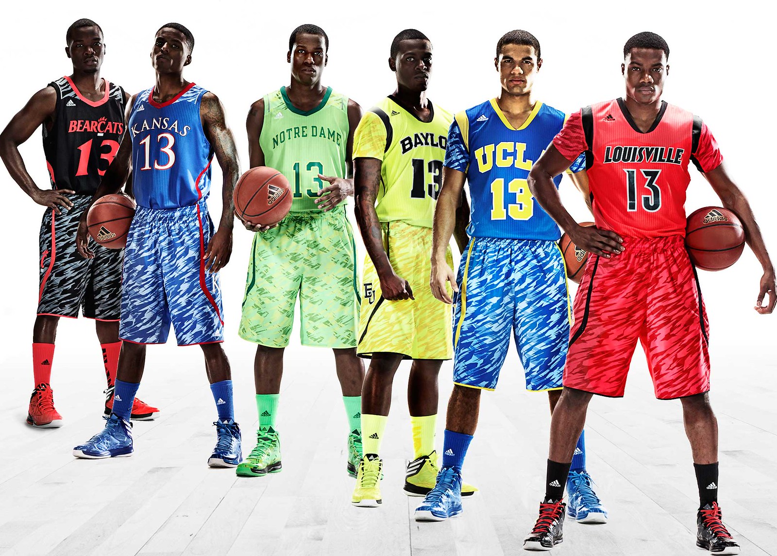
Click to enlarge
When I wrote about the Warriors’ new sleeved jerseys a few weeks ago, I mentioned that Adidas would also be bringing sleeves to the college level this season. They made good on that promise (or threat) yesterday, as three Adidas-outfitted schools unveiled sleeved jerseys for postseason play, and three more unveiled new uniforms with a traditional tank top format.
As you can see above, all six designs feature truly foul-looking striped shorts paired with solid-colored jerseys. This follows the precedent set with the Warriors’ sleeved uni, which has a solid top paired with pinstriped shorts. Can’t say I understand this approach — even if you like striping (which I don’t), the mismatched jersey/shorts format is a total train wreck and feels like little more than a provocation. Seriously, does anyone like these? Anyone at all? I mean, sometimes I can see why certain people might like something that isn’t my bag, but I honestly can’t imagine a single fan digging these. The fact that all six designs are essentially part of a “Team Adidas” template just makes it worse, since no school can claim this design concept as its own (not that any school would want to, but still).
Most observers yesterday, myself included, immediately decreed that the striped shorts reminded them of Zubaz. But then my ESPN buddy Dave Wilson showed me a tweet from Pee Wee Herman, of all people, who compared the design to Fruit Stripe gum. Sure enough — genius! From now on I’ll be referring to these as the Fruit Stripe uniforms.
Kansas has already announced that they’ll wear the new uni for the Big 12 tourney, but not for the NCAA tournament. That hasn’t stopped a bunch of Kansas fans from starting a White House petition to ban the new KU design altogether.
Speaking of Kansas, coach Bill Self had an interesting quote at his press conference yesterday: “Sometimes, you have to be a team player. Adidas has helped KU quite a bit, so KU will do this [i.e., wear the new uni] to help the company.” That almost sounds reasonable, until you remember that it’s Adidas’s job to help Kansas — that’s what vendors do for clients! Clients aren’t supposed to turn around and further the vendor’s marketing agenda. And people wonder why I rail against the corporate influence in sports. What a disgrace.
At least Self was honest about it. When these designs inevitably show up in “Worst Uniforms Ever” slideshows on Bleacher Report several years from now, let’s hope someone includes the quote about how he was just “helping” Adidas.
The worst thing about this, as I’ve repeatedly said about the Warriors’ design, is that the sleeves are an interesting uniform element worth discussing, but now they’ll be forever associated with these mismatched uni designs. For all you Adidas employees reading this: It would be nice if you could just once produce a sleeved jersey that doesn’t look like it’s part of some freakshow pajama costume. That way we could evaluate the sleeves on their own merits, instead of treating them as just one more gimmick in a larger gimmicky design.
You can see individual shots of the three sleeved designs here:
ESPN reminder: In case you missed it yesterday, my latest ESPN column is the full story about my trip to the Daytona 500. Enjoy.
Uni Watch News Ticker: It ain’t broke, but they might fix it anyway: The Cubs are exploring the possibility of new uniforms and a new logo (from Benjamin Gordon). … Speaking of the Cubs, MLB The Show has this alternate jersey. A hint of things to come? It’d be news to me, but who knows (from Jake Watterson). ”¦ Meanwhile, in a Facebook post from yesterday that has now been deleted, Ebbets Field Flannels claimed to be consulting on some new uniforms for the Mariners. EFF said the team would probably switch from white to cream at home in 2014, and that they (EFF) were trying to convince the team to de-emphasize teal (from Keith Kreindler). … The A’s have some awesome-sounding throwback Thursday promotions planned for this season (from Tom Lupoff). ”¦ “Augusta State has become (worst school name ever) Georgia Regents University Augusta, or GRU, as the school was merged with the Medical College of Georgia a few months ago,” says Preston Feiler. “Now GRU is putting together their ‘View Book’ for the new school year and has erased history. They’ve altered photos of the back-to-back National Champion golf team and the Final Four-appearing basketball team by eliminating ‘Augusta State’ from jerseys and the ‘A’ logo from hats and shirts, and other sports. They even went as far as changing the colors to the new blue they are using for GRU. Details here.” ”¦ Nice piece about Sheffield Wednesday’s old-school scoreboard (from Patrick Barnett). ”¦ Infielder Bill Hall of the Angels has been wearing No. 0. “Let’s hope he makes the team,” says Andy Chalifour. ”¦ New Star Wars-themed goalie mask for Ilya Bryzgalov (from Bob Ziegler). ”¦ The final installment of Mark Willis’s MLB/soccer mash-up series is for the N.L. East. ”¦ Boise State hoops will go BFBS on March 21 (from Aaron Bernstein). … This has got to be the weirdest rip-off of the Padres’ logo I’ve ever seen (from Brady Phelps). … BFBS: It’s not just for uniforms anymore. … Rick Nash, who’s always worn a Bauer 4500 helmet, was wearing a Warrior helmet in a recent practice. “It probably has something to do with the fact that he was recently hit hard into the boards by Milan Lucic of the Bruins and sidelined for a number of day,” says Luke Rosnick. “The Bauer 4500 is one of the most popular helmets in the league because it hasn’t changed in years, and guys like it for style and nostalgia reasons, but the new Warrior helmets have a lot more technology and science behind them.” … Surprised we haven’t seen this happen sooner: Elvis Andrus of the Rangers was scratched from a game tue to lingering soreness from a new tattoo. Yo, get that shit done during the winter. … This is pretty cool: Jen McGovern made a bunch of sports logos out of Lego. … Man U’s latest jersey has leaked (from Mark Emge). … The Adirondack Phantoms recently wore throwbacks and mascot-themed jerseys (from Anthony Nuccio). …
At least we know who runs college sports. As if we didn’t already know it was all about making money that never seems to help lower tuition costs or provide a quality education for “student athletes.”
Those uniforms are really awful. I’d rather see the Angels do that pinstripe Disney thing again than have to look at these.
Also, the Bruins have it the worst out of all of those teams.
Yeah, I’m usually down with the out-there, normally considered ugly, bold uniforms (Oregon, even Maryland’s I liked because they were unique). But these are horrible. Just horrible.
Didn’t Adidas hear enough negative feedback last year from the similar uniforms created for Baylor, Louisville and Cincinnati? You would think they would’ve retired that look and came out with something new. They are ugly enough, the sleeves seem lame, but it is insult to injury that they and just re-warming a lame look from last year.
I think Baylor actually liked them, if I remember correctly. They don’t have a traditional uniform history, so I don’t think their neon green uniforms were really that big of a deal.
I have to disagree about the “worst” – the Irish highlighter-green unis are far worse. I can at least recognize UCLA’s colors even if you took the big letters off the front; I wouldn’t be able to guess in a million years that that was a Notre Dame uniform.
They look like a shamrock shake.
A bar of Irish Spring soap.
The home versions of these uniforms are less offensive. White, with “IRISH” in green. The camo pattern on the shorts is gray.
This.
I thought the Irish uniforms were harkening back to the lime green jersey they wore decades ago.
All the other jerseys seem to be able to at least position the front number correctly except the Irish.
Normally, that huge gap between the team name and number would be horribly embarrassing on its own. Instead it’s like the 10th-worst thing on the Notre Dame uniform.
When I saw the Pittsburgh subregionals in 2002, I had a couple of moments watching UCLA where it sunk in that I was watching the same basic uni that dominated the tournament for many years. It’s a shame to see Adidas, or anyone else, screw with it.
Spot on, Paul. The inmates are running the asylum.
“The kids think it’s cool, so we’ll do it.”
“Adidas wants us to help them market their new line, so we’ll do it.”
Meanwhile, all brand standards for these institutions of higher learning have been thrown out the window.
I can (barely) see it for the likes of Cincinnati and Baylor, etc., who’ve always seemed to have “questionable” ethics and standards when it comes to the academic-athletic marriage. But not esteemed institutions like UCLA, Kansas, or even Notre Dame.
Do the university presidents approve of this? Frankly, the most high profile student-athletes at their institutions look like a$$-clowns. Doesn’t ANYONE care about the overall brand equity of the institution?
Or, I suppose the single argument could be: since “young adults” are the target public of these schools … whatever they like … goes?
Poppycock. Inmates (and the corporate behemoths) are running the asylum.
I like the Fruit Stripe shorts. It’s the solid jerseys that, uh, gum it up. Had they been able to do more Fruit Stripe on the jerseys, it might have been a more coherent look.
Reminds me of the old Kentucky shorts from the 90s.
Bottom of:
link
As a Cubs fan, I can handle a uniform/logo change is long as it’s only the road uniform. It’s seemingly changed every 3-4 years anyway.
I don’t think the Cubs have made any significant changes to the road uniform since ditching the script wordmark after 1996.
link
Looks like they dropped the headspon (sp?) stitching somewhere around 2001 as well.
There’s never been a headspoon; what looks like stitching is just a quirk of the illustration.
And as a traditionalist Cub fan, the very first change I want them to make is to make sure at least one uniform (no, the practice jerseys don’t fully count) is number-only on the back. After many decades of single-color blue number-only backs, they went to two-color NOB jerseys for a while before (in 2005-06) hitting the sweet spot: blue numbers with red trim and NNOB. Then the Ricketts family put names back on and ruined it.
I’d love to see them dump the gray entirely on the road. Blue is a great road color; it doesn’t stand out too much, but it’s still colorful enough to be superior to dull gray. I’d be happy if they wore the blue walking-bear jersey on the road all the time, and never at home.
I’d like to see the Cubs use a grey equivalent of their “walking bear” solid-blue alt for the road jersey.
Moreover: the Cubs would be grossly unwise to change their cap logo. But if they were absolutely DETERMINED to, I’d propose a blackletter (often misnamed “Old English”) capital C … in red with white borders, natch. I’d probably also use it on the jersey, rendering them a blue/red pinstriped version of the Tigers.
Strongly agree. The current road jersey was a big downgrade from this link. I think the idea was to mimic link, but on double-knit, it just looks like a poorly designed plain jersey with impact font. The appeal of the old jersey was the flannel, not the wordmark. I don’t really like the walking-bear blue jersey either.
Re Cubs…they’re making it pretty clear that what they’re thinking of changing is only the road unis, which I dont think anyone would have a problem with. Regarding the logo, I wouldn’t mind if they went back to some earlier incarnation of it, with only a thin blue outline or none at all.
Yes, Bob…..I’ve been railing (to my friends’ dismay)about this for years. That circular logo is fugly.
It kind of amazes me that a team with link would ever wear anything else. Hey, Cubbies, just switch to that and call it a day!
As for me, I would propose a return to the 1969 Cubs’ road uniform. Simple and elegant. Unfortunately, I suspect that what will be proposed will be “cutting-edge,” “something that the kids will like,” and therefore crap!
I’ve always liked the Cubs 1978-81 Road jerseys – the blue with pinstripes. I don’t think I’d want them to bring it back, though, but I think it’s an underrated set and would love to see a throwback to it.
I’m a huge fan of those as well. Maybe they could make the blue much lighter; so powdery that the pinstripes are barely visible.
Leave it as is Cubbies, if you change, you’ll inevitably revert back at some point in time (Ask Blue Jays, Mets, 49ers, etc) You’re a relatively storied franchise.
Just noting that the Man U. link goes to Paul’s NASCAR story.
KU petitions to already have been taken down as it violated the terms.
KU *petition seems to
Damn phone.
I used to rail about the gray set and the black set K-State, a Nike school, wears (when white and purple look perfectly fine). Now I think I’ll just shut up.
Meanwhile, dressing individual teams in corporate outfits is an example of the tail wagging the dog. Adidas and its stupid three-strip motif as been an offender. Perhaps, we should start naming the teams accordingly, as in Kansas/Adidas is in second place in the Big XII behind K-State/Nike.
Lego. Logo. Logo. Lego. Uma. Oprah. Oprah. Uma.
The Cubbies better leave any logo change choice up to the fans. Holy cow!
Yoda’s lightsaber is the wrong color on Bryzgalov’s mask – it should be green
Yeah, Puck Daddy’s Greg Wyshinski pointed it out in a blog post, too
There was a tweet from the Flyers that his mask will be corrected by next week. Apparently the designer isn’t a Star Wars follower.
The designer not being a follower shouldn’t matter because those images are not original. He couldn’t follow the reference image and get the saber correct?
As a designer, you have creative control over your artwork. If he thought the lightsaber should be a color other than green, that’s his choice.
As a designer, you have creative control over your artwork. If he thought the lightsaber should be a color other than green, he’s wrong that’s his choice. FTFY
Would you fix the Mona Lisa if you knew it was a self-portrait of Leonardo Da Vinci?
Maybe that’s a hint of a plotline for the next movie. That’d be a major plot twist
At first I thought it was a Mirror Universe Yoda, but then I noticed a couple of things:
1. No goatee.
2. Wrong franchise.
Man U leak linked to your NASCAR article (also good but…)
Thanks. Now fixed.
The Man U jersey leak link is just re-linking to your awesome NASCAR story
Mariners link is dead
Weird. It was a Facebook post (now apparently deleted) in which Ebbets Field Flannels said they were consulting with the M’s on their 2014 uniforms. They said the team would probably switch from white to cream at home, and that they (EFF) were trying to convince them to use less teal.
Teal has been a passe color for years. I’d love to see the Mariners move away from it.
Not sure I agree. Sure, teal was once the flavor of the month–but it’s not an inherently unattractive color, and it wouldn’t be bad for some team out there to “own” it. If Seattle hangs tough sartorially, they might eventually find that the look has stopped screaming “’90s bandwagon,” and instead screams “Mariners.”
I agree with Le Cracquere. The Mariners have a very classy-looking set, and the teal actually works in nicely.
If they consider changing teal though, I’d be interested to see what they change it to, as the teal actually fits in more with Seattle sports (look at the Sounders’ use of neon yellow and Seahawks’ use of neon green). Seattle as a sports town is bold with color.
May the trident M make a return.
There was a rather funny exchange on the Steve Czaban show regarding these unis this morning. Czabe used Paul’s costume moniker (probably showing he loves and frequents the site!) but also used another one: he said they’re not uniforms they’re “multi-forms”. I like that label for teams that go Oregon style apeshit.
Then producer Steve Solomon, who notably hates uniforms and uni talk in general chimed in with “all day I dream about stupid uniforms”
“… truly foul-looking striped shorts …”
Yep.
Re: Ugly Alternate Uni-verse. We all understand that the big clothing manufacturers goal is not to destroy our sense of style and tradition. It really isn’t, a by product of it mebbe, but not intentional style crushing. It is to make a profit. Nothing more.
When you are pushing the envelope of design and marketing… perceived good taste is the first casualty. If that means using our youth-centric society, and sport as nothing more than an expanded catwalk for their “must have” designs, no matter how stomach turning they are then so be it.
I am not a fan of this method, but I do know that it is founded in good ole’ American values. Sorta. More on public relations/propaganda manual written by the Ed Barnays hisself and a forward by some plebe named Chomsky.
Danger Will Robinson! – it is thick reading for primative screwheads, you may have to have your wife, girlfriend or a 10 year old read it to you. Spoiler alert – just jump to chapter this many IIII and read about the psychology of public relations.
(imported via Vienna – link)
This is spot on. I don’t like it either, and it’s especially tough to swallow since I work in the industry. Sadly, it’s reality right now, and I don’t think it’s changing anytime soon.
I agree 100 percent with you brother…
Maybe. But that reminds me of the eternal battlecry of mediocre publicists: “there’s no such thing as bad publicity!” Lots of discerning clients eventually realize that’s not 100% true.
But hey, if Adidas WANTS to self-identify as hacks, who are we to stop them?
Good analysis this morning, Paul.
Who cares about Baylor, but how can anyone even touch the iconic UCLA uniforms, which have been disfigured in both football and baskeball lately. And Notre Dame tried and failed that lime-green look 20-plus years ago. They are a great school and have a great uniform history and they do this? It’s just sad. College sports are about tradition, and that is slowly being lost.
The constant uniform shenanigans are one reason some of us are being turned off by sports. Don’t forget the absurd news here yesterday that Carolina football is going to wear black. Predictable and nonsensical.
Sigh.
tradition is great but when schools are losing out on recruits simply because of uniforms, they might feel they have to do something. I don’t agree with this but you just know they are feeling pressure to “attract” the high recruits, and some schools see this is the way to do it.
Absolutely true, unfortunately. It’s a vicious cycle. School feels like they have to “wow” the recruits with uniforms, so they go to the manufacturer for help. The manufacturer then knows they have the schools by the balls, so they force whatever crap they can on them. And on and on it goes.
Unless a school truly has enough tradition for the uniform to transcend all the nonsense, I’m pretty sure this will continue to happen. At least until the recruits figure out something even more stupid to base such a life-altering decision on.
And what schools, except for Oregon (which was already on the rise in football anyway), are suddenly winning games because they are attracting recruits with sugary sweet abominations of uniforms?
Who played in the football national championship game this year? And where was Maryland pride again? Case closed.
You and I know that, because we are logical thinkers. Sadly, 18 year olds aren’t known for that.
Just once I want to hear a recruit say, “Well, I was considering _______, but, man, their new uniforms are fucking ugly.”
It’s sad that 150-year-old, tradition-rich universities and colleges must cater to the whims of 18-year-olds who may bolt the school after a year. You don’t get to pick a team with cool uniforms on the next level. You get who drafted you, at least for a few years.
What’s also sad is that the above monstosities are eye candy to kids. Hey, I liked a little flash at that age too. But there’s a happy medium.
Everyone must remember that the current Cubs uniform with pinstripes has basically only been around since the late ’50s, and they’ve obviously not had any great success while wearing it.
They’re not like the Yankees, Red Sox and Tigers who have had the same uniform forever. The colors, number font and the “UBS” inside the “C” must stay, but everything else is on the table as far as I’m concerned…
I agree; the Cubs have worn pinstripes at home for many decades, and were one of the first pinstripe teams back in 1907-08, but the powerhouse teams of the ’30s had vests and placket piping. That’s a style I’d love to see them go back to.
ugg.
The 80’s called they want their awful multi colored bright patterned pants back. They also want to know how Will Smith is still culturally relavent.
I just spoke with the 80s and they said adidas can keep those things, they don’t want them back.
On that Augusta State/Georgia Regents piece… pretty disappointing that the only defense they have for the whitewashing of the Augusta logos is that it was a marketing decision.
My question is, whose bright idea was it to come up with a new school name that shares its abbreviation with the military intelligence organization of the Soviet Union/Russian Federation?
Yet all the more fitting that they engage in extensive edits of old photos to obscure that which they would erase from memory.
If the school is now referred to as GRU, will its students (and student-athletes) be called Minions?
Rob, I was thinking the same thing about the GRU! We need to see another offshoot called Georgia Proprietors University and also a University of Kansas campus in England called Kansas-Great Britain. Now those are some letters for graduates to put on their resumes!
Don’t forget Northern Kentucky Veterinary & Dental.
Wow – UCLA & Kansas, 2 of the most storied basketball schools in history, resorting to this?? Adidas designs have always been bad, but these are just…..I’m not sure what to say?
At least my Hooisers have not sold out their tradition to Adidas (I sure hope I am not jinxing them)
And on a side note, I have always thought Adidas’ number fonts have looked weird, almost like mis-proportioned.
Such a good observation. It’s fucking KANSAS JAYHAWKS BASKETBALL! They could sign a contract tomorrow with any uniform manufacturer in the world. Do they really need Adidas’ “help” badly enough to dress up like clowns? It’s an absolute disgrace.
Kansas basketball doesn’t need the help….but the other sports at KU do.
That’s why adidas won the deal a few years ago. Nike didn’t bring nearly as much money to the table, and they weren’t willing to include the non-revenue sports in the deal.
Kansas’ deal with adidas is up this summer. I suspect agreeing to wear these disasters is a sign that it’s going to be renewed.
First thing I thought of was Fruit Stripe gum too! Glad to see that PeeWee and I think alike – or should I be scared?
Probably about 50/50…
I actually like the new Kansas jersey, but not the shorts. The minimal use of the camo stripping looks good. The one thing that made me love the jerseys is the “Beware of the Phog” on the back, pure awesome. I could do without the shorts though.
But they even got that wrong. It only says “Beware the Phog” in the collar.
I’m too lazy to look this up: do bigtime schools pay manufacturers for uniforms or do adidas and nike give their unis away as marketing, or is it a little of both (free for the big time sports, schools purchase other stuff for different sports)?
As a KU fan, I’m of course disappointed. I guess it is high time for awful early 90’s fashions to come back, isn’t 20 years the trend for fashion comebacks?
I can’t speak for all schools, but at North Carolina, Nike pays the athletic department to provide free gear (including, but not limited to uniforms, training gear, game shoes, running shoes) to all varsity sports. I can’t imagine there’s a Division 1 varsity team that’s paying for licensed gear.
And yeah, it’s definitely a callback to early 90’s. I blame this guy: link
“He has denied accusations of homophobia, stating, “I’m not homophobic. I just say faggot and use gay as an adjective to describe stupid shit,””
Seems like a nice, well-adjusted young fella.
The big schools sign contracts where the shoe companies pay them an annual fee and supply free gear, from game uniforms to practice gear, to shoes, to outerwear, depending on the sport. An outdoor-sports athlete, such as a soccer player, will get a winter jacket to wear; an indoor-sport athlete, such as a volleyball player won’t.
Smaller schools get smaller fees, and either free or reduced-price gear.
It’s advertising for the company. Most everybody here hates the Fruit Stripe uniforms, but we’re all talking about them. Mission accomplished.
“…but we’re all talking about them. Mission accomplished.”
Uni-watch and its readers kinda enable this stuff, don’t they?
Anyway, taste aside, the kids who wear these uniforms seem to like them (I remember a video of football players going apeshit upon seeing an all-black uniform), and it is a recruiting advantage for schools like Oregon and Maryland.
but we’re all talking about them. Mission accomplished.
That’s bullshit. A popular cliché notwithstanding, there IS such a thing as bad publicity, and these uniforms are getting a lot of it. The fallacy that anything that gets attention is somehow self-justifying or de facto successful is just that — a fallacy.
I like this viewpoint. I wish the rest of the world agreed with it.
But in this case, I think this is attention for the sake of attention. Sure, there is such a thing as bad publicity, except neither adidas nor the six schools will suffer from it.
People will still buy licensed gear. Alumni will still show up and spend money at the campus store and pump money into the school and booster clubs. Except they can now sell these ugly ass jerseys as well as the more traditional looking gear.
And for all the talk about ruining tradition, the Kansas and UCLA brands can still reference their heritage while appealing to the Affliction wearing crowd.
In this case, “bad” publicity ends up being a net positive for the non-disinterested parties.
I agree it’s bullshit. But some entities prefer bad publicity, or notoriety, to no publicity at all.
Usually people do, not businesses. When’s the last time you’ve heard a business that’s wanted bad publicity? In the meantime, whenever a uni maker announces a new set of unis for different teams, it always catches attention; they don’t need to have fruit stripe unis to garner said attention.
This is precisely why Paul’s view isn’t working:
“That almost sounds reasonable, until you remember that it’s Adidas’s fucking job to help Kansas – that’s what vendors do for clients! Clients aren’t supposed to turn around and further the vendor’s marketing agenda.”
Of course, personally, I agree with Paul, but the “client” in this case isn’t paying for the equipment like they did in the good ol’ days. The “vendor” in this case isn’t collecting money in exchange for product like vendors have always done in the traditional sense. The model has been flipped to where the vendor is paying the client for the right to provide product to the client with the hopes of capitalizing on the equity of said client’s brand, either through merchandise sales or extra exposure gained through stunts like this. Whether or not the client is obligated to throw the vendor a bone and do whatever the vendor asks of it (given all the resources the vendor is providing the client) is up for debate, but the structure of the relationship is what it is.
What you’re saying, Paul, makes perfect sense, but only if you’re talking about a traditional client/vendor relationship. The industry of collegiate and professional sporting goods no longer is.
This is a really interesting point.
One more factor for KU…Adidas is also outfitting every other sport at the university. The basketball team has to take one for the team here in order to keep the free gear for the rowing/tennis/soccer teams.
“… even if you like striping (which I don’t) …”
Everything I know to be true has just been obliterated.
Yeah, I never thought I’d hear him say that. I know what he means by it, but it’s still weird to hear.
I’m kinda hoping the Cubs bring back the blue v-neck top from the 80’s. Why do baseball jerseys need to be button-downs?
They don’t NEED to be without a midriff window, either. As a society, we’ve simply decided that some sartorial choices are off the table for right-thinking human beings.
Crazy talk.
All right, I might have to grant you that.
New Star Wars-themed goalie mask for Ilya Bryzgalov (from Bob Ziegler).
Notice how Yoda’s lightsaber is red instead of green. Too bad I didn’t noticed it right away, read it in Yahoo I think.
Yoda himself doesn’t even look green – he looks bathed in orange light.
Yoda as a Sith? How dare he even put on that mask.
I hope that isn’t foreshadowing anything in Episode VII.
Yoda isn’t holding a red lightsaber its orange. If you look carefully at the mask the colors are black, orange, and white for the flyers.
I had no idea that the Padres logo features homeplate and waves. I didn’t even know they had a logo. That franchise has been identity-less since they got rid of brown and the swinging friar.
It doesn’t anymore. This has been the Padres’ logo since last season:
link
Of course, that’s even worse. The previous logo was dumb for “Padres” but at least it still had a little bit of a “San Diego” vibe to it. The current one is the absolute pinnacle of generic.
Not only did they rip off the Padres with that logo, it should also be mentioned that they use FC similarly to the TC on the Twins’ cap.
I’ve always considered the PHL/ADK Phantoms jerseys to be mascot-themed, although they retired their original mascot Phlex a few years back.
link
That’ll be the last birthday their current mascot will be celebrating(?) since the Phantoms are supposed to be moving out of Glen Falls and setting up shop in Allentown PA next season.
Season after next. The arena in Allentown hit a bunch of red tape last fall, IIRC.
City council should have awarded construction contracts to the Shirk Brothers; the Phantoms woulda had a new home in “2 weeks”!
It was their primary logo from link (and again in 2011, but without the “San Diego” text).
Whoops, that was supposed to be in reply to the other Rob up above (9:37 am post).
Wow, send Pee Wee Herman an honorary membership card! He absolutely Gets It ™!
In other news, looks like sleeves and striped shorts are the new pullovers and sansabelts. By that, I mean that one feature is objectively different but not bad, while the other is objectively stupid looking, and furthermore, the two are so closely considered a package deal, even though they do not have to be.
Why are Man U’s new uni’s blue and black? I thought their colors were red and white. Can some please explain why soccer teams change their colors?
These are supposed to be new away kits. The idea being to have colors different from your home kit, so that when they’re on the road against a team in red like, say, Liverpool or Southampton, you have clear distinction, and not red-on-red.
Blue’s also a pretty traditional away color for United. Holds a lot of regard, as they won the 1968 European Cup (now the Champions League) in an all-blue away kit. They also wore a solid blue shirt as a third kit in 2008, when they won their third Champions League.
It’s their “change” kit.
Their primary usually goes with their “team” colors of red and white. The change kit varies. The goal is to get something different.
Cynically, it’s just another revenue stream. Some of the upmarket clubs will have a home kit, an “change” kit, a tournament kit, and on and on. They make a lot of money selling those shirts.
Less cynically, it’s a pretty smart way of preserving tradition. Home kits change fairly little. Liverpool will always wear red at home. Arsenal will always have some variation of red shirt with white sleeves. Man U is red shirt, white shorts, black socks. Man City is sky blue.
People crave variety. The change kit is an opportunity to experiment with crazy alternate colors, and weird designs, and all sorts of other oddness. In the late 80’s, City’s change kit was chartreuse and black stripes, with sky blue piping. The players looked like road hazard signs, but they won a thrilling playoff match in that outfit, so it’s become a beloved part of team lore.
United does wear a lot of blue away from Old Trafford. The change kit, as Shane notes, is a pretty traditional look for them.
And also, Bill Self and/or Kansas has given lip service to Adidas costumes before. Self either dislikes or is superstitiously biased against red for Kansas, but Adidas makes KU a red alternate uniform anyway. As a result, Self humors Adidas by wearing red once or twice a year just to make them happy. (I remember one instance being a Yuletide color-on-color, against Ohio University.)
Kind of reminds me of posing with your ugly sweater on Christmas morning. Yes, you could tell your great-aunt “This thing is completely hideous, and I hate that I even opened the box when I wouldn’t want to touch this sweater with a ten foot pole,” but that could do more harm than good. I guess Self prefers to pose with the ugly sweater (“Just wanted I always wanted!”) and be done with it.
Related pro tip: Donate your ugly Christmas sweater to a Goodwill ten towns away so your great-aunt doesn’t see it (the one she gave you and you posed with) for sale. Or just keep it for an Ugly Sweater Party, which is apparently a thing in some circles.
The anti-red bias for KU basketball comes from the last time they were worn in a big game, the 1986 National Semifinal against Duke.
Those refs can still kiss my ass, btw.
Rick Nash wore the Bauer 4500 in last night’s game, not the new Warrior. He must have made a game-time decision to wear what he was familiar with.
Wow, so Augusta State has become GRU…
Are they now called the Minions? Is Steve Carell their mascot?
link
Did anyone at this institution watch Despicable Me before coming up with this acronym? This is almost as good as when First Union got naming rights to the arena in Philly where the Sixers and Flyers play. About 5 minutes after it became the First Union Center, everyone in town began calling it the eff-you.
I saw two Angels infielders on the field at the same time (1st and 2nd basemen, I think) wearing number 79 against the Giants Wednesday night. The announcers even made note of it.
It could be worse, they both could have been wearing 69…
Do the A’s plan to wear the uniforms of the indicated periods on these Throwback Thursdays? I hope so!
By the way, note that Joe D. is in the graphic at the top of the page, at the far left side! Joe was a coach in Oakland in 1968 and 1969.
link
Joe D. with Reggie:
link
That’s a nice passing of the torch generation to generation kinda thing, but it’s kinda sad to see an old Joe DiMaggio in the mod colors of the 1969 A’s.
Read the article on Kliff Kingsbury in this week’s Sports Illustrated. There are a couple of paragraphs devoted to his efforts to make Texas Tech the sartorial equivalent of Oregon: he recruited some deep pocketed alumni, to finance a complete makeover of the team uniforms, changes which he pronounces “clean” and “sick.” The prototype helmets — one of which features the Red Raider mascot — are under lock and eye in a team storage room. Coach Kingsbury says the team needs to appeal to potential recruits by snazzing things up, which is a sentiment frequently expressed by the guys who snazz up uniforms.
All well and good, but how do you explain those basketball uniforms? Do the Blue Chip Recruits of Today really want to look like pieces of Fruit Stripe gum? Or dancers in a 1991 MC Hammer video?
Do they even make Fruit Stripe gum anymore?
It’s interesting that Man United, a team known to its most bitter rivals as “The Rags”, has chosen to dress its team in what appears to be hi-tech dish towels.
Rags, indeed.
Quite honestly, as long as I’ve been a United supporter, I have NEVER heard “the rags” before. Elaborate?
As much as I hate to quote from urban dictionary…
rag
A derogatory term for fans of the Manchester United Football Club used only by fans of Manchester City. The term originated in WWII, when Old Trafford suffered damage as a result of German bombing, and United were temporarily forced to play at Manchester City’s grounds, which had suffered no damage on account of being such a shambles that German bomber pilots assumed that they’d already gotten it, and refers to homeless people, as in “homeless rags”.
It is assumed that most Manchester City fans are too stupid and/or too insensitive to realize the disgraceful implied mockery of the tens of thousands of Britons forced out of their homes as a result of the bombing campaigns.
Manchester City fans still use this term despite the fact that Old Trafford was repaired decades ago, and is currently the largest club stadium in England, whereas they have trouble filling the seats in their much smaller, publicly-funded stadium at Eastlands
Clearly. written by a United supporter.
According to Manchester: The Greatest City, by Gary James, the “Rags” nickname dates to the 1930s, when United was on the verge of bankruptcy and the team couldn’t afford to replace worn uniforms. It was coined by United fans as a term of affection for their struggling club, and later adopted by City fans, who used it more derisively.
There is a story related to the bombing of Old Trafford. In the mid-80’s, one of City’s star players was a German, Uwe Rossler. A popular chant among the denizens of Maine Road (City’s shambles of a home stadium) was “Uwe’s Granddad Bombed Old Trafford!”
You left out a definition or two.
I just clicked the White House petition on banning the KU Fruit Stripe uniforms, and it seems that the White House has no soul, and removed the petition due to “violation of our Terms of Participation”.
I already knew the first part, but c’mon…
Adam Ottivino will be switching from 37 to 0 once the season starts, and he will be making the team.
Of the Rockies
Beat me to it…
link
I haven’t read through all the comments yet, so if this is a repeat, my apologies!
1. Nice article on Daytona. I was there for the summer race and my favorite driver crashed on a caution lap. A CAUTION LAP.
2. Go to Bristol. Go to Dover. Go to a short track. That experience is great. The big superspeedways end up having races like the one you just encountered. Mid-sized tracks (Kansas, Chicago(read: Joliet)) are cookie cutter and are pretty boring as well…..
1. John Wooden is rolling over in his grave.
2. The ND jersey font/number location has a CYO feel to it.
I was thinking the same thing al.
Please forgive me but I am actually glad that John Wooden is no longer alive to see what they have done.
Second (on CYO), but I doubt The Wizard would have cared. He was all about playing the game right and probably would have rolled the Bruins out in neon orange if it helped them win.
But as a UCLA alum I’m beyond appalled. If there’s any silver lining in this *maybe* it’ll get a few more folks to re-examine how schools and sportswear companies do business today.
Had a discussion with a friend last night about baseball managers wearing uniforms whereas no other sports head coaches did — I remember Connie Mack wore a suit — and I remember hearing somewhere about some rule about who can come onto the field of play in terms of uniforms…
So what is the real situation? Are baseball managers currently mandated to wear some version of the uniform?
And all of this sprung from our discussion of player-coaches/player-managers because of the announcement about Ching’s status with the Houston Dynamo yesterday. The last major player-manager I remember was Pete Rose. Has there been a player-coach in another major league since Rose?
Hockey had a number of them. For example, Bobby Hull was player-coach for the WHA’s Winnipeg Jets. Lots of minor-pro hockey teams will still do this, but make the player-coach an “associate coach” so that he can still play rather than worrying about line changes.
MLB rule 3.15: No person shall be allowed on the playing field during a game except players and coaches in uniform, managers, news photographers authorized by the home team, umpires, officers of the law in uniform and watchmen or other employees of the home club.
A strict reading of this rule would inidicate that the manager doesn’t have to be in uniform; just the coaches do. However it’s a de facto tradition and I’m pretty sure MLB enforces uniform requirements on the manager.
As for player-coach/managers, Pete Rose was the last in the “Big 4”. In MLS, Walter Zenga was player-coach (head coach) of the New England Revolution in 1999, and Roy Wegerle was an interim head coach of the Colorado Rapids for one game in 1996 while still a player. Pat Onstad was briefly a player-assistant for DC United in 2011 before retiring as a player midseason.
Well there was the fuss a couple years ago about Joe Maddon and Terry Francona wearing hoodies and not wearing the uni underneath.
I can take or leave those uniforms. I don’t watch much college basketball these days. I still want to see those Red Raider hats from the other day.
Worst thing about these basketball uniforms for me is that people are calling the shorts pattern “camouflage” or “camo.” They’re not camouflaged! They’re striped. Ugly stripes, but “camouflage” doesn’t mean “stripes.” It means, Designed to conceal the wearer. The only conceivable concealment these shorts could provide is if the person wearing them were attempting to hide next to a giant pile of the very same shorts.
I beg of the entire world, do not dignify this nonsense by repeating the manufacturer’s and the schools’ implicit claims to connection with the military. These shorts ain’t camo. They’re striped. “Tabby cat striped” if we really want to call it like it is.
Yeah, I specifically avoided referring to them as camo, because they’re not.
The pattern is called “Impact Camo.” To me, it’s always looked like a more angular interpretation of a classic tiger stripe camo:
link
They can call it whatever they want, but it’s not camo. It’s kitty-cat stripes.
It’s marketing bullshit, is what it is.
If I were the Cubs, I would make the road uniform have a navy version of the cap, with a simple CHICAGO across the chest for the jersey.
Navy for Navy’s sake gets a pass from me in this instance. It would “rejuvenate” the light blue classic cap also, by having a contrast for the road.
I’m not too familiar with Cubs tradition, so if this is offensive, none intended.
I find the whole idea of the Cubs using navy blue to be something close to flag-burning offensive.
But you know, this idea might actually work. Royal at home, darker blue on the road. It would make for a more subdued road uni, and in baseball that’s just fine.
How long have the Cubs been flailing around now? Chances are, if there were a perfect uniform, they would have worn it.
Arr, I had to put the disclaimer. As an Eagles fan, if someone told me to change Kelly Green to Midnight, it would be desecration talk :D
At UCLA we have a saying ‘What Would Wooden Do’. Well he wouldn’t have worn blue (another absurd Adidas otfit) at home against USC (we lost, of course). And he sure as hell would not have sent his team out in these atrocities. Hopefully these will be limited to the Pac-12 tourney (early round) and not seen in the NCAAs.
These uniforms have no place in the Pyramid of Success.
link
Discovered on Twitter, thanks to @HarrisonMooney. Rear view afforded of the Vancouver Canucks’ Millionaires throwbacks, to be worn on March 17th. My thoughts (Teebz, you’re welcome to lift anything you read here for your blog, if you like anything I’ve written here):
Looks like a more traditional font, instead of the regular Canucks font as currently used.
Last names on back–surprised that they are there, because NOB’s were absent from the 1970 throwbacks in honor of the 40th anniversary. You’d think that the Canucks would be consistent on that front.
No sleeve numbers–that will probably be annoying because most fans are used to having them.
Ryan Kesler was the model for these jerseys, and now, in an ironic twist, he probably won’t get to wear his in the game, due to injury. Not too often that an athlete models a jersey without wearing it in the game.
I was reading Mooney’s article. I’ll keep your comments high on the list. :o)
Not a big fan of those chunky numbers.
Those fruit stripe gum shorts are so hideous….they remind me of the pajama-looking sweatpants you would expect to see on guys like…Michael Anthony (formerly of Van Halen) or Randy Macho Man Savage. Gah!!!
Re: Chicago Cubs road uni’s:
link
link
link
link
Did I mention: link
What he said. Nothing wrong with those road greys, esp. with the red-trimmed graphics.
New look for Arizona State University’s Sparky mascot:
link
At least they didn’t go BFBS.
As soon as I saw these uniforms, the first two things that came to mind were fruit stripe gum and the year 1990.
I usually like Addidas shoes and most of the football Unis that they make but my goodness these might be the worst uniforms I have ever seen. Not one part of them is appealing or very interesting. I honestly don’t think I would have even noticed they had sleeves if it didn’t say that they did because of the terrible shorts. Addidas keep it simple and just throw 3 stripes on everything.
Look, let’s be honest about the Cubs, here: the Ricketts family paid a ton for the team and stadium and have since realized it’s really expensive to own and operate both.
As a result, everything they’ve done has been about squeezing as much revenue as possible out of the deal, especially as attendance has not quite lived up to their expectations.
I’m sure the Cubs sell a ton of merchandise already. I also have no doubt they believe a new look would result in even more revenue from merchandise sales.
As a former Cub fan who’s been in recovery for five years, I have no doubt at some point you’re all going to look at TribCo as “the benevolent owners” one day.
Those shorts remind me of an Arena team set from far too many years ago, either Detroit or Tampa. There’s a reason that look was given up.
And if we’re battling among the posted photos, I’d say Notre Dame one leads. I’m a redhead who wears green. But never more than one shade of green at a time.
I really hope these wild designs don’t become the norm. The neon colors are growing on me, but the neon shoes craze is something else. I don’t fault the companies for creating the designs (they have to try new things, that’s their job), but who is signing off on these? The Marlins redesign looks pretty tame next to jerseys like these.
As an alum, my one defense of Maryland’s ridiculous looking “Pride” family of Under Armour uniforms is that at least they are specific to Maryland. As much as it is boosting UA, the central theme of the logos is the Maryland state flag.
These Uniforms are ridiculous, and specific to Addidas. Not the schools at all…
The crazy thing about that Mountain brook uniform is that picture was taken at the state semifinal game. They wear this as their normal uniform (At least I believe so they wore them when they played my school)