[Editor’s Note: Today we have a guest-written column from David Firestone, who’s going to take a close look at a auto racing suits. Enjoy. ”” PL]
By David Firestone
The 2013 NASCAR season is upon us, as the 55th running of the Daytona 500, the Sprint Cup Series’ premier event, will take place this Sunday. That makes this a good time to look at something that’s rarely if ever gotten any attention here at Uni Watch: auto racing driver attire.
A racing uniform usually consists of the following: a double- or triple-layer fire suit; a helmet and HANS device (that stands for head and neck support); racing gloves; racing shoes; and fire-retardant undergarments, which include socks, long johns, an undershirt, and — depending on the driver’s preference — a balaclava. These uniform items, like most professional sports uniforms, are custom-designed to the driver’s preference.
The most commonly used material in racing suits and equipment is Nomex, the fire-retardant material created and marketed by DuPont, first used in racing in the 1960s. Prior to Nomex, the way drivers used cotton coveralls that had been soaked in flame-retardant chemicals. After Glenn “Fireball” Roberts died at the 1964 World 600, and Eddie Sachs and Dave MacDonald died at the 1964 Indianapolis 500 — all due to burns suffered from accident-driven fires — these coveralls were phased out.
Fire suits are typically two or three layers of Nomex material, which can provide up to 30 seconds of fire protection. That might not seem like much, but it’s enough for the driver to stop, drop, and roll, or for safety crews to attend to the situation. Older Nomex suits had one layer of protection, but redundancy in safety has saved lives, and now some drivers even wear four layers of Nomex.
The differences in racing fuels and their flammability factors are also critical to suit design. NHRA and IndyCar suits are much more fire-retardant, due to the use of nitromethane, methanol, and ethanol fuels, which have a higher flash point than gasoline but they have the detrimental trait of burning with an invisible flame. These alcohol-based fuels are actually much safer than F1 and NASCAR, which use gasoline blends instead of alcohol blends. Gasoline burns with a lower flash point, but the flames, unlike alcohol-based fuels, are very visible.
Racing suits have become big business over the years. Looking at the NASCAR, IndyCar, and F1 drivers, you see suits made by many different companies, ranging from auto-racing safety companies like Alpine Stars, Sparco, Momo, Simpson, Stand 21, Deist, Pyrotect, and Impact, to athletic apparel companies like Puma, Oakley, and Nike.
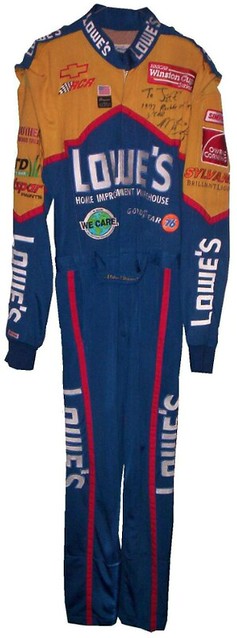
To understand driver suit design, we need to look at some suits up close. Let’s look at the suits worn by Kasey Kahne in 2005; Mike Skinner in 1997; Randy Lajoie in 2000; Alex Barron in 1998, Christian Fittipaldi in 2003; and Terry Labonte in 2009. Let’s look at every aspect of the suit from a design perspective.
• The collar usually has the primary sponsor logos on either side, near the shoulders. If there’s a Velcro strap that closes the collar, the sponsor logo often will be present there as well.
• The Shoulders: Shoulder yokes are a frequent appearance on fire suits, though the design has changed a lot over the years. Up through the ’90’s, shoulder yokes were frequently just strips of Nomex with the sponsor name embroidered into them. IndyCar and F1 suits were known to have shoulder yokes that had text facing the front and the rear, to take advantage of the exposure provided by in-car cameras. In recent years, foreign suit companies such as Momo and Sparco have been more prevalent in NASCAR, which has led to changes in shoulder yoke design. In recent years, a T-shaped design has been used, with logo creep from the suit’s manufacturer.
Located under this section are the arm gussets, which are designed to increase driver mobility without decreasing protection. They’re seen on almost every fire suit in racing.
• The Upper Torso: It looks like a clusterfuck, but there’s method to the madness. The series patch is located on the upper-right chest for IndyCar, the upper-left chest for NASCAR and NHRA. F1, on the other hand, does not have a series patch on driver suits. Also usually present in the upper torso are car manufacturer logo, tire manufacturer logo, team logo, and associate sponsors. The primary sponsor is usually not present here, as it is visible on the shoulders and collar. TV interviews with drivers are usually filmed with the area just above the large primary logo on the lower torso visible, to just below the top of the driver’s head. In these interviews, all logos, including suit manufacturer logos on the shoulder yokes, are visible.
• The Lower Torso: This section of the suit houses two critical elements — the primary sponsor logo, and the belt. The primary sponsor mark is the biggest logo on the front of the suit, and can measure between 4 and 20 inches in height. All the color schemes used on the suit are dictated by the colors of the primary sponsor of the suit.
The belt has a more interesting history. For many years, the driver’s name was embroidered into the upper-torso area, but in the mid-1990s this was moved to the belt to create more room for sponsorship patches. While this is still a common practice, many driver suits have sponsorship logos on the belt, instead of the driver’s name. For a number of suits, the safety certification is located on the belt’s underside.
• The Legs: The logos on the legs are specifically designed with in-car cameras in mind. The leg logos appear to be sideways when the driver is standing up, but they’re properly oriented when the driver is sitting in the car. I refer to these as “television logos,” as this aspect of suit design became the standard when the camera inside NASCAR race cars was moved from behind the driver to the passenger seat. In recent years IndyCar has added a similar camera setup.
The pant cuffs are interesting. They have fireproof inner cuffs — a cuff within a cuff! — and actually have a little bit more protection than the rest of the suit. This makes sense, since the driver’s feet are usually what’s closest to any fire that might occur.
• The Sleeves: Just below the arm gussets are a number of logos. The top logos include the primary sponsor, many associate sponsors, and often have a series logo. The area below the elbow houses another set of television logos, which appear properly oriented when the driver is driving (although these logos can often be obscured by driver’s gloves).
• The Back of the Neck: This is a unique area for customization. Designs appearing here can include the car number, the team logo(95), a sponsor logo, or an, ahem, unique personalization. In a number of suits, the “liability tag” is located on the inside just below this area.
• The Back Torso: This area usually has a large primary sponsor logo. On occasion, stripes or other graphics from the front extend to the back. Other than that, there’s nothing particularly remarkable here.
• The Safety Certification: This small, often overlooked patch is mostly unseen by the general public, but it serves a vital function. The patch indicates that the suit has been examined either by SFI or by FIA and has been certified as meeting the standards of the driver’s sanctioning body. SFI is usually used by most North America-based equipment manufacturers, FIA by more international equipment manufacturers. SFI patches are frequently seen on the inside of sleeves for domestic suits, and on the inside of belts, or on the back of the neck for international suits.
• The Liability Tag: Every piece of racing equipment has some form of liability tag, which basically states that anything that happens to the wearer of the item is the wearer’s problem and not the manufacturer’s problem.
———
Great stuff — thanks, David. And for anyone who wants more, check out David’s new racing suit blog.
Collector’s Corner
By Brinke Guthrie
Interesting story about this postcard of the old Riverfront Stadium in Cincinnati, which shows a hot air balloon right over the field. What’s interesting (to me, anyway) is that I did this very thing. My radio station decided to fly our hot air balloon on the night of the 1988 All Star Game. So up we went, and we ended up drifting over the stadium. That was a no-no — it was restricted airspace due to the Vice President being at the game. Oops. We were just waiting for the F-16s. Then I hear this “whirring” noise and look down, and see nothing but white — it was the Fuji Blimp, which was like maybe 20 feet below us! Guess the airspace wasn’t restricted for them. (For more of my station’s hijinks, here’s a blog I created. Yes, it was really like WKRP.)
Here’s the rest of this week’s eBay finds:
• No new 1970s NHL posters this week, but we do have a big poster showing the evolution of the NFL uniform. And speaking of NFL posters, you’ll never do better than this Vikings poster. I had this one! Finally, this eBay seller has several NFL posters for sale, like this great one for the Oilers. [Hmmm, that “S” looks upside-down, no? — PL]
• Take a look at this Babe Ruth wristwatch from the 1950s! (It’s the sports watch of champions!)
• How many of us grew up watching sports on TV with one of these huge CBS Sports banners in the background?
• Nice lot of 1970 Chase & Sanborn Coffee NFL stickers. Never saw these when they were out. (More of a Chiquita NFL sticker kid back then.)
• Here’s a 1971 Steelers travel clock.
• Staying with 1971, we’ve got a New York Football Giants puzzle from Springbok.
• Nice detailing on this 1940s Detroit Tigers bank.
• From reader Dave Kuruc, here’s a 1965 CFL Coke bottle cap display. “I’ve never seen those versions of the Saskatchewan and Edmonton logos before,” he says.
• And finally, we’ve got a nice varsity look to this 1960s Boston Bruins sweatah.
Seen something on eBay or Etsy that you think would make good Collector’s Corner fodder? Send your submissions here.
Cold case: For reasons not worth explaining, I have an extra iPhone 4 case, made by Speck. Black with gray accents. Lightly used for about four days by a certain uniform columnist but pretty much like new. Retails for $30. Yours for $15, plus a buck or two for shipping. If interested, get in touch. Thanks. Now sold.
OMFG: My latest “One-Man Focus Group” column is about stripes (including a brief mention of stripes on uniforms).
Uni Watch News Ticker: Although the University of Utah has the Ute Tribe’s permission to use Native iconography, some in the tribe are now questioning that arrangement (from JaceSon P. Barrus). … Follow-up from yesterday: Since Jim Bouton was one of the players shown in that amazing photo of MLBers suiting up as a basketball team, I sent him a note and asked if he had any recollections. Here’s what he wrote back: “We were undefeated against high school faculties. We would double-team the gym teacher and let the biology teacher go free. In the fourth quarter I would run around in a gorilla mask. Did you know that you could kiss a nun while wearing a gorilla mask?” … “In HBO’s undercard fight on Saturday night, Sakio Bika and Nikola Sjekloca both wore black trunks with white trim,” writes Jason Mott. “On their gloves, they had red and blue tape wrapped around the regular white tape, in order to tell them apart.” ”¦ Mike Raymer went to a recent Preds game and spotted someone wearing this “Smashville” jersey. “It seems many people (probably all hockey fans) in Nashville have taken to calling their city Smashville,” he says. “The jersey struck me as odd. I guess it would be like a Rangers fan getting ‘The Big Apple’ on a jersey, or a Blackhawks fan getting ‘The Windy City.'” ”¦ Wow, the Ft. Wayne Komets sure have a lot of ads on their ice. Is every ECHL ice surface so logo-strewn? (From Terry Mark.) … Michigan hoops wore throwbacks over the weekend. Here’s how the design originally looked on Rudy T back in the day (from Matt Riegler). … NickNOB alert! That’s Skip Wise of Clemson in 1975 (from Garrett Sumner). … Wisconsin’s goalie wore a hat over his mask for the Hockey City Classic (from Michael Bailey). … Lots of good Negro Leagues photos in this slideshow. “Some I recognize, while others are new to me,” says James Ashby. … With all the Jerry Buss stuff circulating yesterday, my ESPN editor Dave Wilson looked up Buss’s MISL team, the L.A. Lazers, and couldn’t believe how bad their logo was. … Scroll down on this page to see a very entertaining 1968 Globetrotters program (from Mark Coale). … Here’s something you don’t often see: Roberto Clemente wearing No. 19. Plus the striping pattern on his sleeve is reversed from the way it should be. Plus-plus what’s the deal with the multi-colored glove? Anyone know more? (From Jeff Flynn, Jr..) … New gold Friday jerseys for UC Santa Barbara baseball (from Casey Harms). … Ever wonder what a Lamborghini would look like with LSU tiger stripes? Me neither, but here it is anyway (thanks, Brinke). … New shoes for Ichiro (from Jeremy Brahm). … “At the end of overtime, with the game still tied in today’s Devils/Senators game, cameras caught coach Pete DeBoer filling out his shootout paperwork, identifying his three shooters,” writes Neil Vendetti. “He filled out the names, then went to add their uni numbers. When he got to Kovalchuk, he turned around and asked someone (I’m lip-reading here) ‘What’s Kovy?’ It doesn’t seem possible that he wouldn’t know his best player’s uniform number.” … No photos, but an interesting story from Patrick Fleming: “In Monday’s Manchester Utd. vs. Reading FA Cup match, Noel Hunt got hit on the head and started bleeding. After receiving treatment for the wound, he got a new jersey with no name or number on it to replace the blood-stained one. About ten minutes later he started bleeding again and was ordered off to have it treated. Again he was given a replacement jersey, but this one had his name and number on the back. Did they actually have a spare Noel HuntNno.10 jersey that they didn’t know about the first time they went looking for a replacement jersey, or did they go and wash his blood-stained one?” … Chris Perrenot notes that the nets used in the NBA’s slam dunk contest had a few little white panels. I feel like we’ve seen these before, but I can’t remember what they’re for. Anyone..? … Here’s Chuck Cooper, the first black players on the Celtics, with numerically mismatched shorts and jersey (from Zack Kurland). ”¦ Fun infographic on the evolution of NFL team logos (from Chris Taylor). ”¦ Like I always say, start ’em young. That’s Marty Hick, telling a uni-centric bedtime story to his daughter Clara Jane. ”¦ Lots of good finds by Michael Clary: (1) A Seattle University basketball jersey with sleeves and a crotch panel. (2) An excellent look at those early-1940s Cubs uniforms that I love and everyone else hates. (3) A big batch of old Red Sox pants and stirrups. (4) An old baseball card showing the notoriously anti-Semitic Ty Cobb in a Star of David-esque design. ”¦ “I was playing NBA 2K13, and for the first time I heard a little dialogue about the potential for ads on NBA jerseys in the near future,” says Andrew DeFrank. “Didn’t record it, and couldn’t find it on YouTube, but basically the three announcers chatted back and forth about the proposed addition, potential fan backlash, and so forth, making it ‘like European soccer.’ The verdict was that they expected a small patch that fans would quickly accept in the near future.” ”¦ Went ice skating in Manhattan yesterday afternoon and was struck by how many people were wearing baseball merch: a Phillies cap, a Red Sox jacket, etc. The one hockey sighting was a guy wearing a Jagr Rangers jersey. ”¦ You’ll never believe what I’m doing this weekend. Frankly, I can’t believe what I’m doing this weekend. Details soon.
Re: Fort Wayne Komets ice surface, it’s akin to tatoos, you can live with 1 to 2, then it becomes a complete mess, only thing worse is some of the European ice surfaces and uniforms.
Good grief, that was hideous. I think if I walked into that arena and saw that, I’d turn around and walk out.
-jet
Probably not if you lived in Fort Wayne. Your life is already a mess, so you wouldn’t be fazed by this.
I keed, I keed.
It’s funny when you look at old NHL games on NHL Network and see NOTHING on the ice or the boards back in the early 1980s.
But the reality is that
( a ) The Komets CAN sell these things, and the people giving them money apparently don’t feel they’re getting lost in the clutter (I would).
( b ) The Komets obviously feel that to survive and thrive, they need to maximize revenue. Aesthetically, obviously, this is a nightmare. But the aesthetics vs. money ship sailed a while back.
Minor league hockey is such a crapshoot anyway, with teams (and leagues) popping up and disappearing. The Komets have been in Fort Wayne forever, and have long been one of the most successful franchises in minor-league hockey. Maybe there’s a correlation, I don’t know. I figure they believe they need this revenue, and maybe they do.
But, yeah, it looks terrible. And were it not Bob Chase doing their radio, I could imagine the announcer saying “Kovalev skates across the xfinity line, passes to Smith on the Glenbrook logo on left wing, shot SAVED and deflected out to the Kroger logo!”
The puck is already hard enough to see!
I’m surprised Paul didn’t have an aneursym after seeing that…
I can take a few strategicially placed/sized ads, even on jerseys. But that ice surface and the boards is awful. Hopefully after a few minutes the ice is scuffed up enough where they seemingly disappear. Or if you’re sitting down low enough they should disappear. That’s what not to do.
The only area that isn’t branded are the red and blue lines… and now that I’ve said it, I’m sure they will be shortly.
The Steelers travel clock link is code broken. It’s showing the HTML.
As is the Giants one underneath it!
Thanks. Both now fixed.
So..how necessary was the red/blue tape in telling those two boxers apart? I mean, the difference is black and white.
Good point. Maybe there is some boxing expert out there who is more familiar with the uni rules. I don’t think I’ve ever seen two boxers wear the same color trunks before. even their gloves are both black with white.
I’m willing to bet that there is something there to help the person running the compu-box punch scoring thing to tally the punches. But if two boxers wear different trunks in the pros, they don’t make them wear red/blue tape like that. You only see the red/blue thing in the amateurs.
I only watch boxing on occasion when I catch it on HBO. I had never seen this before.
red/blue tape is to signify which corner they are fighting out of. the red or blue corner. helps the judges
Also, I guess I shouldn’t have said “to tell them apart,” but rather said, “to designate their corners.” But still. We should probably be able to tell which boxer is coming from which corner. Again, they wouldn’t do that if one wore green trunks and the other wore orange trunks.
I think it’s for the judges and the punch hit/miss count. When the fighters get too close to each other, some of those short punches could be a bit hard to distinguish between landing or being blocked if all 4 gloves are the same color.
Whenever I hear about things in the air over Cincinnati, I can only think of one thing…..
“As God as my witness I thought turkeys could fly.”
who wouldn’t?
“It’s almost as if they were…organized!”
I’m not into NASCAR, but I really enjoyed the look at their suits.
Lot’s of great links today too. Really enjoyed the Negro League photos, I haven’t seen all of those before.
Nice story on the NASCAR driving suits. Somehow all of the ads don’t look as out-of-place there as they do on Euro hockey uniforms. Guess it’s because the drivers are individuals more than part of a real “team.”
Quick story about Fireball Roberts. He regularly drove wearing just a short-sleeve button-front shirt. Cars were just as hot inside back then. This type of garb was the norm in those days.
Fireball’s number was 22. He started out driving for Ford but when FoMoCo pulled out of NASCAR after 1957 because of the AMA ban on factory involvement (the ban was a scam cooked up by GM who continued to fund their teams through the back door)in racing. Fireball then drove Pontiacs for Smokey Yunick from 1958-62 with his number 22 on the side.
When Lee Iacocca took over at Ford after Saigon Bob McNamara left the company to go screw up Vietnam for JFK and LBJ Lee said basically, “Screw the ban! It’s a sham. We’re going racing!” Holmam-Moody who built all of Ford’s NASCARS at the time lured Fireball back into the new Galaxie fastback with his famous number 22 on it. In his day the driver kept his number, not the car owner like today. And BTW-those 1963 Ford fastbacks finished 1-2-3-4-5 at Daytona that year. Screw GM and the Bowtie they choke on!
Cool story. PL probably would have hated that car:
link
To clarify car number ownership:
NASCAR owns the numbers and issues/leases them to the car owners. Teams can submit requests for certain car numbers and depending on availability, car owners are issued a 12 month license to use it(not sure of the cost involved). With NASCAR approval, one team can allow another team to use a number it holds a lease for. Generally, if a team has used a number in the previous season, that number is re-issued to the same team. If a team relinquishes it, the number reverts back to NASCAR for re-issue.
That 1963 Ford Galaxie fastback was painted in “Passino Purple” named after Jacques Passino, director of racing for FoMoCo. Fireball is wearing his typical “driving uniform” as mentioned above.
NASCAR wasn’t as hardass about the numbers back in the day. They even allowed numbers like 7A on cars in the early 1960s.
Another interesting thing about the ’63 Daytona 500…
Tiny Lund won the race as a fill-in driver; his name was affixed to the #21 using duct tape and a black marker:
link
Trevor Bayne’s car will ‘harken-back’ to that scheme on Sunday, but will have a decal nameplate on his Ford.
So much for historical accuracy!
And every car that has worn the Wood Brothers legendary number 21 has been a Ford product. Ford, Lincoln or Mercury. They’ve run exclusively Ford products in NASCAR’s top division since 1953. They’re currently the oldest continually-operating team in NASCAR as they enter their 61st season. The Blue Oval, the Wood Brothers and the Number 21 together forever!
One last comment before I go! Here are few pics of other ECHL rinks
Reading: link
Cedar Rapids: link
Wheeling: link
Cincinnati: link
(There are a couple more ads this year, but not many)
That Lazers logo is still not as horrible as the one for the link, late of the ECHL.
Both look like winners from an elementary school logo contest.
Winners?
Man, I miss the old MISL from the ’80s! I had the computer game. It had all of the logos on the back. I’m sure that that box is still in my mom’s house somewhere.
Baltimore Blast was the best! Maybe I should go to a game some time.
Since the one and only hockey game I’ve ever attended was a Toledo Storm game, I’ll step in and defend them, sorta. It’s not their fault it was bad. Every team that’s ever been called the Storm has had a bad logo. It’s physically impossible for anyone to draw a *good* logo for a team called the Storm. It simply cannot be done. Toledo’s only mistake was not realizing this before they chose the name.
I always like the WFL Portland Storm. Logo had storm swirls forming the letter S in the shape of a football.
link
Love that one! I think you just proved TJ wrong!
Not saying this looks great, Jeff, just a point of comparison: Guelph Storm of the OHL.
Despite the links,you can’t call these home and roads since they switch at the Christmas break in the OHL: White at home before the break; color at home after.
Guelph solid color: link
Guelph whites: link
And, perhaps proving The Jeff’s position is this old logo for the same Guelph Storm.
link
The reason we Nashville Predators fans call it Smashville is that it represents the type of Smash-mouth hockey that we’ve always played, since that’s what Coach Barry Trotz loves. It’s akin to our “big brothers” in Detroit calling it Hockeytown. (And to be honest, that’s probably where the idea came from. Imitation is the sincerest form of flattery, no?)
Mike Raymer, I hope you enjoyed your visit to Smashville and the crazy hockey love we have here in the Mid-South.
Rather like Portland using the “Rip City” nickname for the Trail Blazers.
I have to say, as a Detroit native and Red Wings fan, I’m impressed with the success of the Predators. I dare say it was one of the better moves on the NHL’s part under Bettman to put a team down there.
Rob S, thank you for the recognition. The original 6 cities usually tend to look down on the smaller southern market teams. I think a good rivalry has developed between the Wings and Preds, which I will get to go see tonight!
(And I will boo Tootoo, since he is a traitor after all… :) )
It’s not just fans in the Original Six (which were either not original or not six, depending) who look down on any Sun Belt team. Seems like anybody north of the 40th Parallel.
We’re here, we’re playing hockey, get over yourselves.
Enjoyed the game very much. I went to a Preds game about ten years ago and the fans were a bit uncertain about hockey I think. Not anymore. Great fans in Nashville.
“…or a Blackhawks fan getting ‘The Windy City.’…”
not the same, IMO. it would be more like a blackhawks fan getting “madhouse” on the back of their jersey.
Or a Clippers fan getting “LOB CITY.”
“… Black with gray accepts…”
What kinds of things do they accept?
[Face-palm] Thanks. Typo now fixed.
WoW! I really like the Michigan throwbacks. They are way better than the cookie cutter design that almost all Adidas schools are wearing. I hope they keep wearing them.
about the Noel Hunt uni-number situation: Since all premier league clubs use the same font for names and numbers (and therefore probably similar equipmentto print them), Reading may have just printed Hunt’s name and number onto the secondary jersey while he was wearing the number-less one
That should be “Ladies and Gentlemen, start your engines”
Or as the late, great Jim Murray said, “Gentlemen, start your coffins.”
Depends on the number of Ladies driving I suppose.
Could be “Lady and Gentlemen”…..as it was at least once in the past.
If Danica is racing, the command is “drivers, start your engines,” otherwise the command is “gentlemen start your engines”
She took the pole, right?
@Phil…Awkward?
When Lyn St. James was racing at Indy and I was covering races there, the command was “Lady and gentlemen, start your engines.” That was back in like 1992.
I am not a NASCAR fan per se, but having lived in NC for a time, I was nursemaided into it by the locals-once I got over the language barrier (Yo hablo goober!). My fav story was this one.
There was a NASCAR race back in the late 90’s, at the old North Wilksboro Speedway where the Grand Marshals were local radio hosts John Boy and Billy. They announced to a sold out crowd “Gentlemen, and Jimmy Spencer, Start your engines”.
Gil Martin repeated the backhanded gesture at a Nationwide race in 2010, as he said “Ladies, Gentlemen, and Kevin Harvick start your engines”.
BTW good luck on your trip deep down south Paul. You’ll find some most knowledgeable uni-watchers down there.
This morning’s OMFG is good, y’all. Paul riffs on stripes, and refers to roll-out of American Airlines new tail design (thumbs up) and 7-Eleven Sweden’s new fast-food design (ditto).
Paul also (lightly) wonders why AA settled on 11 tail stripes instead of 13. Which leads to my heretical view that the US national flag would be better, in my warped, unpopular opinion, if it were just the stripes or just the stars. The US Navy sometimes flies an all-stars flag (for some reason, in some circumstances, as I’m sure we’ll soon find out from our UW expertise bank), and it looks boss. And some of the stripes-only Revolutionary Era drapeaux are very good.
The all-stars flag is the naval jack for the United States Coast Guard and NOAA, and the inactive jack for the US Navy. Since 2002, the Navy has used the “First Navy Jack”, the striped “Don’t Tred On Me” flag, as their active jack for the duration of the “War on Terror”; previously, the First Jack was only flown on the oldest active ship in the Navy (the original U.S.S. Constitution, except for brief periods of deactivation for restoration purposes).
Evidently, the Coast Guard Wikipedia entry seems to contradict the portion of the Navy entry regarding the 50-star jack, as the USCG has its own vertically-striped ensign.
Teaches me to trust Wikipedia… *shrug*
OMFG … Never connected it until now …
The paint job on that LSU Lambo looks like the kind of deco you’d find in the mid-90s Transformers: Generation 2 line.
Someone’s glad that Lambo owner isn’t a Vikings fan.
The Cubs picture makes me wonder … when was the last time a MLB player wore a genuine long-sleeved jersey?
Those are not long-sleeved jerseys. They’re vests worn over long-sleeved, white-yoked undershirts.
True … Cubs there are a bad example, but there definitely were some long-sleeved jerseys back in the day:
link
And has UW commented on the sleeve stripes before? I remember the discussion about the sleeve stripes worn by the Portland Beavers some time ago.
And has UW commented on the sleeve stripes before?
Yes indeed.
To the question about those net panels during the Slam Dunk contest… based on what looks like a logo on one of those panels in the Terrence Ross pic, I’d say it’s a sad case of more ad creep.
Here’s Chuck Cooper, the first black players on the Celtics
Either there’s a slight typo, or Chuck was somehow able to pull a Bugs Bunny (which, if such a thing were possible, could possibly explain the number mismatch).
Chase & Sanborn decals went on the top of the plastic lids for one-pound cans of coffee (back when they were one pound).
The problem was, kids stole the plastic coffee lids. I remember looking for these in the stores and the Chase & Sanborn didn’t have lids. (The old Bells store in Buffalo always kept a stockboy working in that aisle) They finally put up a sign saying when you bought that coffee, you got the lid at the checkout line.
Great idea on paper…
Maybe I missed this, but are the Angels wearing patches on their hats this year? I was watching a video on MLB Network’s website and saw these head shots of Hamilton and Trout: link
Sorry for the lo-res screenshots, they’re the best I could come up with.
That would be news to me. I’ll see what I can find out.
Or perhaps MLB Network photoshopped an old photo of Hamilton into a 2011 Angels hat.
link
Broken link. This should work.
link
The NFL Infographic (albeit in a small size) not only shows the evolution of team logos, but the de-evolution of some teams. The Eagles are one that comes to mind.
Agreed.
Also, I’ve always LOVED the racing stripe Lions logo.
I HATE the ’82 ‘Skins curved feather (never made any sense to me)
Not a NASCAR fan, but today’s lede post was interesting. Thanks for sharing. The last item was an absolute hoot. (I should attach a liability P.S. to everything I write, post and tweet.)
I’m a NASCAR fan but never paid much attention to the components and details of driver wear…except for the NFL-themed helmets of Joe Gibbs Racing, Dave Marcis’ wingtips, and Junior’s X-Ray gloves.
Good Stuff!
As to the Noel Hunt situation, most often the trainer has one or two “blood shirts” is his bag for these occasions and that’s usually the end of things. In Hunt’s case it’s possible that in between his treatments somebody returned to the locker room to get another named and numbered jersey. Most clubs travel with spares so that a player can change at halftime, switch from LS to SS or the reverse, etc., but it’s just impractical for the trainer to carry these in his bag or to keep them on the sideline where he’d or somebody else would have to fish through them all looking for the right one when the priority is simply to get the player back onto the field ASAP.
I worked at the Smithsonian and an interesting note is they use Nomex to create custom covers for large collection objects to protect them. We had to sew together yards of nomex for items like canoes, totem poles and furniture. Couldn’t imagine wearing it because the raw material leaves a waxy feeling on your hands when handling. No logos though.
Question….when searching for ‘rups on Ebay, what do you guys and gals type in the search box? I typed baseball stirrups and got tons of the faux-rup socks, typed in just stirrups and got lots of options for Zumba socks, but that was about all. My softball team starts soon and our colors are black, white, and gray (blah) so I’m looking for something with some stripes in those colors. Comrade’s page was all colours or I’d pick up some more from him. Thanks Uni-Watchers!
Some really cool designs here for MLS people (RBNY is uninspired if you ask me).
link
“We would double-team the gym teacher and let the biology teacher go free.” Jim Bouton still has it.
“Did you know you could kiss a nun while wearing a gorilla mask?” Classic.
I wonder if they tried the mask on Torre at first, and found out no one noticed?
While googling for another purpose, I came across this thing ‘o beauty:
link
Here, Jim, let me help you out.
and…
“While googling for another purpose” — sure you were, Jim. Sure you were.
I’d rather my wife find porn on my google history than anything related to the White Sox.
Let me guess Paul – heading to Daytona?
Winner, winner, chicken dinner!
I’ll totally be a fish out of water there, but that’s sort of the point. Should be an interesting experience.
Hey – rednecks are fun people to hang out with on a race weekend. All they want to do is watch the race and drink – not necessarily in that order :P
You like beer? You like BBQ? You’ll fit in just fine.
NASCAR fans are pretty friendly, you’ll find.
Well, “BBQ” in the south is slow smoked food, a “cook out” is food grilled on a barbecue. They’ll be plenty of the latter there but you’ll have to get there pretty early to slow smoke your BBQ.
Yeah, I know the difference between BBQing and grilling. I’m totally guilty of calling grilling “BBQ”. I know it frustrates the purists. Just a bad habit I grew up with.
If you do proper preparation you can whip up barbecue at a tailgate, we do it at least once a year in our tailgate at Tech.
If you are a BBQ restaurant then its a completely different story (they have giant smokers, and they have a much longer process that they follow because its how they always do it).
Expect there to be plenty of BBQ.
If there is a car without a major sponsor on the hood, will that be the car you pull for?
Paul, if you just take it for what it is – a giant, tailgate party with a race thrown in the middle, you’ll love it. Should be a lot of fun and the atmosphere’s electric. Everyone around knows that it’s the biggest day for the sport.
The only thing that bums me out (and it’s just me) is the plethora of country music shtick…..I’m not a fan.
I’ve been to Daytona too many times to count, it’s always a good time and the only fish out of water experience really is fact one may not totally be brushed up on who’s who. Otherwise like mentioned above, it’s a giant tailgate party with a race thrown in. Weather looks like it’s going to be in the 80’s this weekend, I’ll be there Saturday for the Nationwide Race.
But Paul, if you’ve never been, there’s no experience like seeing 43 cars with 600 HP unmuffled engines going by at 200mph. I was sold on my first lap of my first race. Enjoy!
“(T)here’s no experience like seeing 43 cars with 600 HP unmuffled engines going by at 200mph.”
~~~
That’s a good thing, right?
The only thing better is cars crashing at 200 MPH 50 feet away from you. We always sit near turn 4, very rarely do those seats disappoint.
A little late, but the lead from yesterday would look sweet colorized. Anyone out there willing to take it on?
Browsed those Negro League photos, and link really stands out. It’s Ty Cobb and the owner of the Detroit Stars.
First off, notorious racist Ty Cobb hanging out at a Negro League game?!? 2nd, the old English D is on pinstripes for the Stars, and Cobb’s sweater has a regular block D.
That one caught my eye too. I wondered the same thing. Also, the caption says “Ty Cobb, right” but looking at the picture, that’s clearly Cobb on the left, correct?
“Yes, it was really like WKRP.”
the funniest episode of any show in the history of television:
“As God is my witness, I thought turkeys could fly!”
link
DeBoer TOTALLY knows the number of his best player . . . It’s 30.
A note on the Wisconsin goalie wearing a hat over his mask at the Winter Classic: Miami’s goalie did it as well.
Yup. Someone else just sent me a photo of that:
link
re: the nets during the Slam Dunk Contest
link
I’ll certainly cop to being sympathetic to Indians who find it alienating and grotesque to be used as sport mascots. But I think indigenous Americans are on shakier footing when they contend that use of sacred symbols should be restricted. This is a personal impression created by years of researching Native American art. Indian artifacts like arrowheads, peace pipes, eagle feathers and tomahawks are dynamic and multi-purposed. The very word symbol connotes more than one meaning. The thunderbird, a favorite of mine, anthropomorphizes the power and mystery of violent weather. By dint of disseminating this information through years of lore and education, it becomes a human perception, not just an Indian one. An effort to “claim” the thunderbird would be equivalent to Christians trying to “claim” the cross; the intellectual argument would be undercut by the pervasiveness of cross images in all aspects of life. As I said, this isn’t an argument I can prove with facts, it’s more of a gut feeling that some use is beyond our control. Thoughts?
While I will not be able to be as eloquent in my thouhgts, I love what you said here.
The issue should be about the imagery degrading a people, not a symbol. I would think that the use of a symbol would be encouraged.
I, too, have researched Indian Art (Jerome Tiger being my favorite), and while I know the use of symbols is almost a religious exhibition for Native Americans, I still think of symbols along the lines of public use.
Great thoughts.
Fun quiz over at Sporcle today: Know your sports logo by silhouette.
link
I missed 5 (all NBA–which I don’t watch).
The same for me.
got all of them in 1:35
Didn’t miss a one! It’s in my DNA.
got them all in 1:48
Got ’em all with 29 seconds to spare.
Missed one, the circle and flames (don’t want to give it away).
2013 University of Houston helmets:
link
have they confirmed those are the ones that will be used, or is that just a better look at the ones they have been showing recruits (pics with these same helmets popped up a few weeks ago, all of them were not confirmed to be used but rather ones up for consideration at the time).
Ridiculous ice in Fort Wayne. Had that same Vikings poster Brinke. Gary Cuozzo at QB I think, which is a little strange since Kapp or Tarkenton was QB at that time. And hey Paul, on that Seattle U. jersey, I’ll admit I have no idea what a crotch panel is. Sort of looks like a onesie.
I actually kinda like it…
I think there’s a case to be made for the LA Lazers logo. As a matter of fact I think it very well might be brilliant. If you go look at all the other MISL logos they’re basically your run of the mill generic cartoonish typography. There are a few exceptions – NY Cosmos,KC Comets, Philly Fever, and a very Paul McCartney-ish Wichita Wings – the most interesting of the bunch. As a bit of an aside when I was a kid I was fascinated with the California Golden Seals logo because it seemed so abstract I didn’t know what to make of it. So, maybe have an Achilles heel for the odd…But, back to the Lazers. The logo actually has a 3 dimensional quality to it with the lasers spreading from one point to support the soccer ball from four different angles. None of the other logos have this quality. The lettering and the name it’s self is clearly dated, but I like to see something like this as being a fantastic representative of the artistic qualities of that era. It’s 1983, personal computers are starting to show-up, it’s on the heels of Star Wars, War Games just came out, everyone knows that we are entering the computer age and here this logo is also representing the budding capability of computer rendering.
I guess I’d put it like this. As a native Angeleno the tallest skyscraper we have out here is the US Bank Tower (formerly the Library Tower). When you walk past it you see lots of frosted glass, cubed glass, etc. There’s no way you can look at that building and not think 1986. Now, 27 years later we may see those things that scream 1986 as being out hopelessly outdated, but the building is a pure representation of the artistic age from where it came. So, in that sense, despite that i don’t care for art from 1986 generally, it’s perfect.
When I clicked on the Lazers link I was expecting to see something dull and unimaginative. I don’t think that’s what I am seeing here. I think the Lazers logo is a diamond in the rough.
Thank you. I wanted to say just this, but didn’t have the words to make it make so much sense!
On the Raptors television broadcast tonight, Matt Devlin is complaining how hard it is to read the Wizards numbers. For some reason, they’re not sitting courtside – they’ve been stuck in a box.
If the Raptors – changed their names to the Huskies, a historic basketball name here, and changed their colours to blue and white, and adopted a very traditional looking uniform,(think Brooklyn – but blue and white) would it be a significant improvement?
Not a picture, but BYU is back wearing their original home whites, not those alts
I noticed a few nights ago that this year, most sponsor logos on the NASCAR fire suits seem to be screen printed rather than embroidered as it has always been.
How are those Red Sox Pants and stirrups? The Sox had the blue & white stripes back then.