Although the sports world is now firmly in Stupor Bowl countdown mode, the past few days have been an unusually fertile period for new college football uniform leaks. Some of this is no doubt because lots of new designs and prototypes are being dangled in front of high school recruits, who take photos of the new gear and post them to Twitter or Instagram before the coach has even gotten back in his car driven away. That was apparently the case with those two new Nevada alternate helmets that were linked in yesterday’s Ticker, for example.
Several more new designs — or at least potential new designs, since some of them aren’t yet confirmed and might just be prototypes — began circulating yesterday:
• Texas Tech may have a new white helmet.
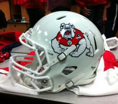
• New alternate helmet and possible new uniform for Fresno State.
• And maybe new uniforms — but with just a small tweak — for Florida.
Also, I neglected to mention in yesterday’s Ticker that Western Michigan has a new helmet (and that one’s definitely legit). No, I don’t think it looks even a little bit like Boise State’s design, do you?
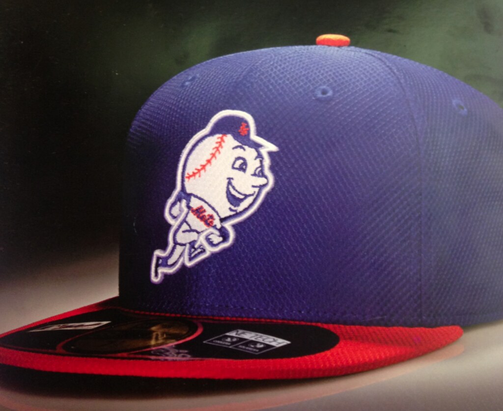
Click to enlarge
MLB BP cap update: What you see above the Mets’ new BP cap, as shown in the new New Era catalog. You can see side views of the other teams’ caps (better than the head-on mock-ups we’ve previously seen) here. As you can see, the Braves’ whooping Indian cap is still very much part of the collection, despite MLB’s recent protestations that it “wasn’t finalized yet.”
(Special thanks to Eddy Ayala for these photos.)
Collector’s Corner
By Brinke Guthrie
Lot of terrific user submissions this week, so let’s get right to them! Given that it’s Super Week, we’ll start with this 49ers mini-helmet complete with the ill-fated one-day logo, sent in by Mike Clary. Glad they’re not wearing this one on Sunday!
Here’s the rest of this week’s haul:
• Terrific 1979 Mariners/All-Star Game duffle bag, from Jess Heltley.
• Jess also sent in this, ahem, roll of 1990s Seattle SuperSonics toilet paper and also a Sonics shooting shirt, which may come in handy once again given the Kings move.
• Ack! Had these! The auction calls them 1970s Converse Dr. J tube socks, but I wore these and an all-white pair for tennis, along with Nike tennis shoes — just like Jimbo did.
• Got cash? Andrew McNeel tipped us off to this 1946 UNC hoops jersey. Buy it now for 10K!
• I believe that’s Giants tight end Bob Tucker depicted on these 1970s NFL bedsheets.
• Chiquita NFL sticker alert! Buy it now for $500!
• With the (final?) Pro Bowl having just taken place here’s a game-used jersey from the 1973 Pro Bowl, submitted by reader Josh Wren.
• Finally, this is a good one. One seller on eBay has a dynamite 1970s Colts poster, and some more of those great 1970s NHL posters like last week, but this time for the North Stars and Islanders.
Seen something on eBay or Etsy that you think would make good Collector’s Corner fodder? Send your submissions here.
T-shirt reminder: In case you misseed it on Friday, a bunch of new (but sort of old) Uni Watch T-shirts, including the one shown at right, are now available. For details, look here.
OMFG: My new weekly column for The New Republic, “One-Man Focus Group,” has made its debut. Oddly enough, the first installment is sports-related, although that won’t usually be the case. Yes, the logo design is dreadful — I’ve been assured that it will be changed.
Uni Watch News Ticker: Two odd glitches from the Pro Bowl: Ndamukong Suh had an outdated Lions logo on his jersey, and players from the ’Skins had their logos facing the wrong way, or at least not the way you’d expect (from Nick Thompson). … Here’s something you won’t often see: Walter Payton wearing No. 21. That’s an early Bears publicity shot (from Bob Gassel). … Some amazing photos of UK soccer fans here (big thanks to Nicole Haase). … Good story on a guy with a serious collection of 49ers memorabilia (thanks, Brinke). … X marks the spot for Xavier hockey (from Jay Sullivan). … And Z marks the spot for Akron hoops. Those jerseys were originally going to have THOB, but the NCAA put the kibosh on that. … Interesting look at a Justin Tuck-esque lacrosse facemask. “It will probably never be worn in a serious lacrosse game, but still,” says Connor Wilson. … A guy selling gear that caters to Knicks fans in Brooklyn is facing legal action from the NBA (from Seth Horowitz). ”¦ Tampa Bay Lightning captain Vincent Lecavalier got a really weird-looking cake for playing in his 1000th game (from John Muir). ”¦ Interesting uniforms worn by Toledo the other day (from Michael Kanady). ”¦ This link will lead you to a PDF of an article about the NFL’s old white football for night games (from Don Montgomery). … New striped stirrups for Florida Southern College. Tasty! (From Wayne Koehler.) … Pink jerseys on tap for the Idaho Stampede (from Brad Iverson-Long). … Good story on the 49ers’ equipment manager, who’s donating some old Niners gear to schools in his home region of northern New York state (from Jude Seymour). ”¦ Yesterday I asked what the deal was regarding that photo of former Auburn star Pat Sullivan wearing No. 7S. The answer can be found by scrolling down to the photo and caption on this page (from Douglas Ford). ”¦ The Heat visited the White House yesterday and gave President Obama a jersey (thanks, Brinke). ”¦ Priceless NFL stuff from the 1980 Sears catalog in this slideshow. That sound you just heard was Brinke Guthrie drooling. ”¦ Neglected to mention that Virginia Tech hoops wore maroon at home last Thursday (from Andrew Cosentino). ”¦ Attention Seattle-ites: Your last chance until March to see Scott Turner’s band, RebelMart, is this Thursday at the Skylark. You know what to do.
The best thing about the NFL sheets is the square-toed kicking shoe!
Love the Colts poster! Love Johnny Fauxnitas!!
Speaking of Johnny Fauxnitas, you’ll find him and a public domain rendering of Juan Marichal on those Uni-Watch t’s?
Not sure who the hockey player resembles; I can’t make out the logo in his sweater either.
Bobby Orr, if memory serves.
That black Texas Tech helmet is new too. There wasn’t a red stripe until this year, and it looks like the glittery shit is gone as well.
I have been waiting for years for the stripes to come back! Now if we can just get rid of the bevel double T…
Right on, Susan! Rodney Blackshear agrees…
link
Ah, the 1000 Games cake. Why no snark about the misspelling?
CONRATUATIONS!!!!!!!!!!!!!!!
The Florida Southern photo has been Photoshopped! Those shoes have all been dodged white, and the stirrup stripes don’t look right either.
I don’t know if this has come up before on here or not: players for the Palm Springs Angels in the late 1980s and early 1990s wore “Palm Springs” in place of their names on the backs of the jerseys.
the Akron hoops link is dead or pointing to the wrong direction
Thanks. Now fixed.
I had FORGOTTEN about the White Football! Saw some pictures LONG ago of the Graham/Speedie/Lavelli Cleveland Browns using it.
Mac Speedie.
Easily top 10 greatest football name ever.
WINNER:
Bronko Nagurski
In that Toledo basketball link, the GFGS uniforms worn by Bowling Green are new, too.
“… OMFG: My new weekly column for The New Republic, ‘One-Man Focus Group,’ has made its debut. Oddly enough, the first installment is sports-related, although that won’t usually be the case. Yes, the logo design is dreadful – I’ve been assured that it will be changed…”
Congrats, Paul. Nice item, too. And yeah, the design blows.
See you next week here in The District, once shaped like an old-fashioned baseball diamond, then truncated by the evil rendition to Virginia of that part of the original district that occupied the south bank of the Potomac. I would join a revanchist movement for a return of the stolen homelands — good for new tax revenues — but I have a busy day ahead.
Design sucks, but the use of OMFG as something other than the expected is pretty sweet
Return Arlington Cemetery to the Lee family, and we’ll talk.
As Tommy Lee Jones once remarked: “I shall make treason odious.” Not only does the Great Republic keep the cemetery and the Custis mansion and all that, I personally am going to blow up the Confederate Memorial and paint over all the signs of the Lee-Jackson Highway and the Jeff Davis whatever. And don’t give me any of that Louisiana Tiger braggadocio, neither. Matter of fact, let’s give Reconstruction another try.
Lincoln’s most assiduously ignored directive was “with malice toward none”.
And a Southerner murdered him, costing the South their strongest voice for a kinder Reconstruction.
I like your spirit, Connie! If I ever get my dream job (Commandant, New Andersonville), I’ll see that you’re slipped an extra bowl of gruel on Saturdays.
Regarding the skins logo on the jerseys. if you look at a lot of the NFL merch out there from Reebok the feathers always seemed to be on the inside of a collar or polo shirt. I own 1 that is set up that way. I am not a fan of it, its clearly backwards but it is something you will see often with Skins gear.
Also because of the ‘Skins asymetric logo there is a lot of gear out there with HORRIFIC logo placement.
some examples:
link
link
I know that some teams logos are reversed to keep the logo from looking like it’s sniffing the armpit. I kid you not.
Wow. I forgot about that rule. Seems they made this one look more like it’s sniffing the ‘pit.
Sweetness wearing 21. Good find. Like seeing OJ with 36 or Mean Joe wearing 72.
That NBA action against the “Knicklyn” fan is ridiculous. The word “Knickerbocker” is far, far older than the NBA, and it belongs to all New Yorkers.
And with the logo, it isn’t Mr. Sorisi’s fault that so many of the league’s team logos contain a basketball. Even the colors aren’t the NBA’s — orange is the color of a basketball, and orange (along with blue) are the traditional NYC colors, as seen on the city flag.
The NBA is totally correct with their stance on this.
True. While it is clearly a parody and should, technically, be protected by the first amendment as such, the credibility and cleverness of this dude’s items are rooted in their similarity and relation to NBA trademarks. Without those trademarks, these caps and stickers wouldn’t be anything special or desirable. Furthermore, the NBA is legally obligated to at least try to fight this guy in order to protect its own trademarks.
absolutely, 110% agree!
he’s ripping off the Knicks/NBA, plain & simple…
The word “Knickerbocker” surely is, but “Knick” isn’t. Especially when paired with a basketball.
Still, he’s got a better claim on the name than he does on the logo, with is a simple steal-and-modify. You can’t “borrow” somebody else’s logo, make minor changes, and then claim it for yourself. Not in a commercial enterprise, anyway.
He would have been much better off either creating his own entirely new logo evocative of the teams, as link a few months ago. Or just refrained from trying to make any money.
The logo is just a basketball with a blue circle around it. You can’t get much more generic than that.
In the same positioning as the Brooklyn ball with the same sans serif letter over the top of it.
Intellectual property should be protected regardless of how big/rich/small/poor the person/company that owns it is.
If he had done the logo before Brooklyn you know everyone would be crying foul over that, how is it different just because the NBA is bigger or more well off?
It’s not.
Look at the ball’s seams – he obviously got ahold of a vector copy of Brooklyn’s logo (or traced his own) and changed a couple details.
It’s a very simple case of IP theft, and the NBA is entirely correct in stepping in to protect its property.
I fou a better copy of “his” logo, and it’s very clear what he did – he ran the Brooklyn Nets logo through a vector trace program, and then re-colored the result.
Compare link with the link. Take a look at the seams. On Sorisi’s logo, the basketball’s seams are uneven and clunky. The trace program was trying to recreate the component shapes without recognizing the seam lines for what they are.
Plus, he didn’t bother to re-work the ball at all. It still has negative space where the “B” should be, that the “K” doesn’t fill.
He’s sunk.
Xavier’s link is pretty excellent.
If Xavier u had this jersey in the late 80s and early 90s they could have funded themselves into BCS conferencedom on inner city sales alone.
Looking at the shoulder logo, that looks like a jersey for St. Francis Xavier University in Antigonish, Nova Scotia…unless Xavier University also rocks the “ring”.
Yes, it is a St. Francis Xavier jersey. From the great town of Antigonish!
Correct – that’s the St. F.X. X-Men jersey.
Here’s another view
link
Love the pictures of the football supporters. Especially like the aerial shot of the Clock End. What strikes me, aside from the massive amount of people, is the ONE entrance. Standing is possible at top flight matches, Germany has shown that, but you have to be smart about it. Don’t oversell tickets, have enough entrances/exits, etc.
I just finished reading Fever Pitch a couple of weeks ago, so it’s pretty cool to get a visualization of Hornby’s description of the sheer masses of humanity crammed into the Clock End @ Highbury, or on the Kop. Pretty easy to see how accidents like the Hillsborough disaster could transpire.
Why is that Western Michigan Broncos helmet logo reversed? The darkest parts of the logo shown (not on the helmet) are the helmet color while the lightest parts are darker than the helmet color.
I hate it when teams do this. That Northwestern helmet last year was awful.
That Western Michigan helmet reminds me more of the old USFL Michigan Panthers than Boise State.
link
The white ball article made me think of something I just found out a few weeks ago. From Ohio States online newspaper this interesting article.
link
They made a rule sometime in the late 1920s that teams could not longer wear brown or tan helmets because of the color of the ball.
That article also had some fun info on the Hoosiers and light wool and heavy wool jerseys for hot or cold weather games.
Good read I thought. And good read about the white football. Gives more background on it then I had seen before.
That has to be the single most detailed equiment story I’ve ever seen! WOW !!!
Nick I got some other cool finds from the Lantern Archives about uniforms from that era.
I used to wonder why Ohio State wore red some games and white others. Home or away was not the reason. They had a lighter material for warm weather and heavier for others.
But yes that one was in great detail.
I certainly hope those are still ‘prototype’ views of the batting practice hats. Why would you outline a logo in white when it appears on white?
Because you’re New Era, so instead of creating a whole new embroidery pattern missing the redundant outline element, you just make the outline thread the same color as the underlying fabric and pretend you’ve solved the problem. New Era does this on fashion caps all the time. They’re just giving MLB the same high quality of effort they give their fashion caps.
And those batting practice caps all look like fashion caps to me, the kind you bypass when you’re looking for an on-field version. I expect they’ll bomb with the masses.
Look at that “outdated” Lions logo. Why do teams do away with what cannot be improved?
link
Meanwhile, here’s a minimal designed executed pretty well….
link
Here’s minimal taken to ridiculous, Hefty trash bag, extremes….
link
Also, those soccer fan photos are riveting!
…er, design, not designed…
link
Why, you ask?
“Moichandising! Moichandising!” – Yogurt
So much “moichandise” in that film. Damn George Lucas, like Spaceballs would have cut into his precious toy sales. That’s one of my favorite scenes in Spaceballs, the shop. That, and Rick Moranis playing with his dolls!
the Birmingham Barons minor league baseball is building a new down town stadium. they unveiled their logo for the stadium last week. no sure why a stadium needs a logo but
link
I’m guessing it’s not so much a logo for the stadium as it is a scheme for the future stadium signage.
Doesn’t link have a link link? Seems like it’s been link for at least a decade.
Torrey Smith got a pretty sweet b-day cake – Complete with a SB patch and “Art” memorial patch.
link
I hopped on one of those 70s Boston Bruins posters when they were put up on the Collectors Corner last week. Not only did I receive mine in a matter of days, but they truly are in mint condition and look even better in person. The eBayer even threw me a little something extra (which is my favorite part about eBay, that happens often), so if you’re hesitant about buying one, don’t be. Well worth the money. I’m getting mine framed next week.
I’m still waiting for a Lightning one.
That’s a tall order. I bet there were but sixteen teams in the NHL when that series was painted.
I think the Knicklyn fan Mr. Sorisi has a legit case. Anyone not named Stevie Wonder would never get this logo confused with the Knicks or Nets.NBA lawyers must be bored…On an unrelated note the new Yo La Tengo record is fantastic
really? you put the new Nets logo next to “his” logo and you don’t see the similarities?
Some people are of the belief that if you take somebody else’s logo, and change it x percent, then you magically own the new verion. It’s not true, but the belief persists.
One might not be confused with the other, but that doesn’t change the fact that he’s making money off the NBA’s trademarks.
Oh man that’s St Francais Xavier University Xmen of Nova Scotia! It’s a solid look that all of St FX sport wears. Note the world famous “X-ring” patch on the shoulders. . . I’m still partial to UNB’s script look and the St Thomas block T unis myself but I’m biased.
I looked and they don’t sell the jersey on their website. They should, judging by the reaction to it.
I posted a photo above of my son in an X-Men jersey. It was purchased on-campus.
Love the cell phone TNR story. Those pink phones will be incredibly obnoxious. And you’re right, it’s a a merchandising arrangement designed to fix something that wasn’t broken.
Under the category of “Good Luck With That…”
link
Oh, not to worry, Texas people. When the SEC expands to 20 someday, I’m sure UT may end up being a part and the rivalry can be renewed.
/s
And FWIW, yes I know that Texas has “looked down” on the SEC in the past and would probably never join. I’m just fed up with the talk of more conference expansions.
Looking closely at the Florida Gators jerseys, it appears that, assuming these are new jerseys for next year, will not only be tweaked in their design and size of the TV numbers, but the font appears slightly different as well. Check out the 5 in the 55 jersey (2013) compared to the 5 in the 15 jersey (2012).
Why is a New Era cap featured in a Majestic catalog?
D’oh! I meant the new New Era catalog! Now fixed.
Noticed that New Era is going away from the 39/30 model for the BP caps. I always liked that they previously had a lower profile and were moderately stretch fitted (S-M, M-L, and L-XL) rather than sized.
If New Era would make the new BP caps in the rare 5950 LOW CROWN style, I’d probably overlook the fact that they are made out of that disgusting mesh.
Low crown! Low crown!
Ichiro wears the low crown 5950. It’s evident on his NYY profile photo, as compared to his teammates.
I wear a low crown too! 5950 Low Crowns are the best caps in the world. But New Era essentially hides that they even exist and rarely stocks them. I buy mine from minorleagues.com, but still, New Era shouldn’t make them so hard to find. AND they should make these nasty mesh 5950 BP caps in the low crown style!
I’d love a low crown. Instead, I guess I’ll just have to rip out the backing of that one, as I have all the others.
But I’m very glad that they’re going to proper sizing. The so-called “L/XL” couldn’t fit on my 7 5/8 melon.
Really? I’m a 7 3/4 and my L/XL Giants BP cap fits fine.
I wear an 8 and those BP caps don’t come close to fitting.
the 39/30 bp cap was preferred by Willie, and I’m sure he would have worn it everyday if it was available in his era. Personally, I love it. The last version’s L-XL was too tight for my big head, but I love the others going back to the first 39/30 in 2002. I also wear 7 5/8.
39Thirty is by far my favorite fit. Always hated the 59fifty hats because you cannot find the low pro ones unless you order them, and for some reason most 59fifty caps all fit me a bit differently, cap to cap. If I can’t try it on, ordering ticks me off because I don’t want to play back and forth trying to get one to fit, plus, I don’t want to look like Abe Lincoln with a freaking tall pipe hat. I have the old Cards bp cap and it’s my favorite cap, even though I absolutely HATE the piping on the side and back. It just feels lighter and more comfortable, and in that, it LOOKS more relaxed without being those stupid faded, broken down, unstructured Franchise caps that look like garbage. As for other styles, I don’t wear snapbacks. Growing up in the late 80’s/90’s (I’m 30), the pros wore fitted caps and the snapbacks were crappy replicas sold at Anthony’s. You wore snapbacks because you couldn’t afford the real thing. And that’s not a shot at people who couldn’t afford. Everybody’s finances are THEIR finances, it’s a matter of the first impression I grew to having of “you get what you pay for.” You buy a cheap cap and it falls apart, get a better cap. So I got a better cap. No snapbacks for me. I don’t care if they ARE better quality these days.
I’ve been an everyday reader for 4 years and that was the greatest thing ever said on here.
The reason VT wore Maroon was because they didn’t want UVA wearing their Orange away jerseys and making it difficult to recognize what team was which.
I may be wrong, but I follow UVA Basketball and I haven’t seen them wear orange since at least 2009-2010. They changed their uniform template for the 2010-2011 season (which is still the current design) and I don’t think they’ve worn orange since.
It’s not their everyday away, but an alternate away. Knowing the magnitude of the rivalry, I can see them pulling that out to piss off the “Cassell Guard”.
The Greeneville Astros updated their link to keep in step with the parent club.
Nice I always thought it was weird when the Devil Rays became the Rays, but one of the minor league teams kept the Devil Ray colors & logos — I think they’ve changed to their own identity since.
A friend of mine, who is a Wisconsin alumnus sent me this today.
link
Anyone know if it’s legit?
Looks perfectly legitimate to me….
[Goes back to reading Gullible’s Travels.]
OMFG (not Paul’s OMFG)…that shit is totally sick!
And totally legit too.
Here’s the real gem of that 1980 Sears catalog:
link
Stripes socks. I want each & every one of them. I don’t care how many chores I have to do, I want them all.
Seconded.
Thanks for the picture of the sweeeeet Braves BP cap!
I know the University in Miami is in line to get some new uniforms for the upcoming year. Have you heard anything about that Paul?
OK, I don’t mean to be a dick, but I get a LOT of these “Have you heard anything?” queries. Let’s imagine the chain of events, shall we?
1) Yes, I’ve heard something about [whatever you’re asking about].
2) But I haven’t written anything about it. Just, you know, keeping it to myself.
3) I’m dying to talk about it in the comments (or by email), however, if only someone would ask me. And now that you’ve done so, I have lots of great info to share with you — info that I was keeping to myself until now.
Yup, that’s exactly how it works.
Anyone have an idea when those spring training hats will be available? I can’t find info on it anywhere online.
I really hope in some instances, they may include these caps during the season itself. Would be great to see the Rays sunburst on Sundays.
“Anyone have an idea when those spring training hats will be available?”
~~~
Never would be too soon.
Interesting that the White Sox cap is listed as “Game.” Here’s hoping that perhaps they add one to match the 1983 alternate lid they will be wearing on Sundays.
And I am so glad that the Dodgers grey lid is only for the road. When the initial story came out that didn’t show a blue or white hat, I could only imagine how bad a grey one would look paired with the home uniform.
On your picture of the two Harbaugh brothers as demon seed Bruins pee wee players: the next threshold BEYOND STIRRUPS is of course NFL hockey socks/leggings. Those particular ones are easily identifiable as the Bruins’ early Sixties vintage, with bumble bee alternating black and gold alternating stripes at the top, with while interspersed in the pattern below. The ‘good’ in this field: VERTICAL stripe Olympic stripes a few years ago. The bad: Canadiens barber shop RWB socks corresponding to their 1905 throwback jerseys– the ugly (and unmentionable) when Flyers used jogging pants one year in early ’80s.
Reply to self: nHL not NFL, dummy!