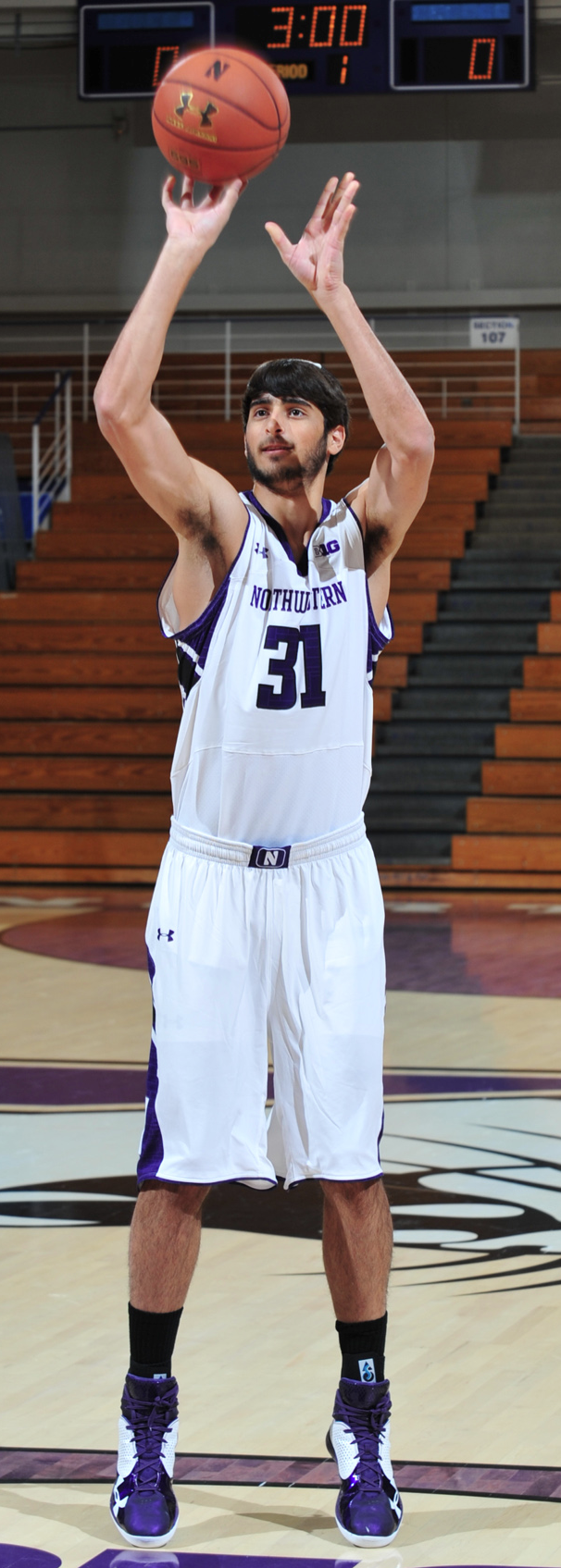
Courtesy of Northwestern Athletic Communications
This is Aaron Liberman, the Northwestern freshman and Orthodox Jew who wears his yarmulke on the bench and plans to wear it on the court when he finally makes his college basketball debut (he hasn’t played yet because of a case of shin splints). My ESPN column today is about him, and about the larger topic of yarmulkes in sports — perfect timing, with Hanukkah just a few days away. I’m really happy with the way this one came out, and I think you’ll find it interesting. Here’s the link.
Me, me, it’s all about me: Last week I was interviewed by a reporter from Gothamist, who I thought was going to write a little article/profile about me. Instead, he transcribed our entire hour-plus interview, resulting in a huge-ass feature that was posted yesterday afternoon. I haven’t read the whole thing yet (the only thing I hate more than listening to an interview with myself is reading a transcription of myself), so I’m hoping I didn’t say anything too stupid. We talked about a lot of stuff — mostly uniforms, but also Permanent Record, Show & Tell, etc.
Meanwhile, one last reminder that I’ll be doing a lecture/slideshow presentation about the Permanent Record report cards tonight, 7pm, at the Housing Works Bookstore Café in Manhattan. Admission is free, and there’ll be several other presentations besides mine (one of which will be sports-related). Details here.
Also, there’s a new entry on the PermaRec Blog — the latest installment of Charlene Dodds’s postcard-rephotography project.
Uni Watch News Ticker: NC State wore Jimmy V tribute jerseys for the Jimmy V Classic last night. ”¦ Looks like the Hornets are going to become the Pelicans. When I ran a “rename/redesign the Hornets” contest earlier this year, there were three Pelicans entries — look here, here, and here. ”¦ Following up on an item from Monday, Chris Willis of Athletic Decals Inc. confirms that the Rams did indeed change the shade of their throwback yellow this season. “They asked for a change to their throwback helmet horns to match the Nike yellow that they were going to use on the unis, so we got a fabric swatch from them and matched it,” he says. … Alex Graber had a layover at the Denver airport and spotted a Rockies sweatshirt listing the team as being in the American League. … Back on Nov. 10, Abilene Christian’s football team wore red ankle bands in support of a local child with cancer, who has now died. Further details here (from Matthiew Mitchell). ”¦ How much do Auburn fans hate Alabama? So much that this T-shirt design has been floating around the Auburn campus (from Brig Slaughter). ”¦ Look at these fantastic Shell Gasoline/Patriots illustrations. “Back when these first came out (early ’80s), I would to ride my bike down to the local Shell station every week to grab the newest print,” says Michael Kearney. “I’d then spend all week drawing and redrawing them until the next print came out.” ”¦ Here’s the jersey patch for the Cotton Bowl. ”¦ Ugh, some upstate New York indoor lacrosse center is using purple turf (blame Connor Wilson). ”¦ Good story about two members of the Cavs who wear masks (rare non-Pittsburgh contribution from Jerry Wolper). ”¦ The Martinsville High basketball team in Virginia lists all of their state championships on their shooting shirts (from Adam Hainsfurther). ”¦ Stop the presses for this absolutely incredible Howell, Michigan, football jersey with killer tagging, circa late 1940s (that sound you just heard was me stealing this jersey from Dan Hutchseon). ”¦ “I was reading about the Republic of Ireland football team on Wiki and ran across this picture of Richard Dunne from September of 2011,” says Stanislaw Olechowski. “It seems like his number was written in marker. It’s not some one-off kit because you can see names of both of the countries playing written on the shirt on the left side. So was it a blood shirt or what?” ”¦ Was that a homemade Cardinals hat that Darnell Dockett was wearing on the sidelines the other day, or does the NFL actually sell that item? (From James Samsel.) ”¦ Pro football is coming to India. You can see uniforms and other gear in this slideshow. ”¦ Check out the second photo accompanying this old gumball helmet kit and you’ll see that the decal sheet includes the Browns’ old phantom “CB” logo (from Leo Strawn, Jr.). ”¦ As of early this morning, this was the lead photo on NFL.com. “That’s John Harbaugh’s head Photoshopped onto the body of a fisherman on the left, with his hat logo removed but with the headset sponsor still intact,” notes Matt Lesser. In addition, there’s Mike Tomlin with his hat logo removed. This is just plain odd.” Indeed. ”¦ Yesterday I wrote about the relatively uncommon phenomenon of contrast-colored NOBs, which prompted Rob Holecko to suggest a much rarer sight: contrast-colored TV numbers. One example that comes immediately to mind is the 1993 Patriots (plus the white jersey was also worn in ’94 and in the ’95 preseason). Any others..? ”¦ Two more weeks until the cast finally comes off.
Check out the second photo accompanying this old gumball helmet kit and you’ll see that the decal sheet includes the Browns’ old phantom “CB” logo
The real oddity there isn’t the CB logo, which was everywhere at the time, it’s the fact that the Browns helmet striping is reversed – white-brown-white instead of the normal brown-white-brown.
Good point!
in the 4th photo you can see the logo printed on the box…i have also seen some other gumball helmets with that logo (used to have one when i was young), but i don’t think i’ve seen more than one ad (or anything) with the cb logo in print…
link
yeah, i noticed that about the stripes too…phantom striping for a phantom logo…
I grew up in CT, between Foxboro and NYC, so our gas stations carried both the Giants and Pats prints, years later when the glasses came out, some would have Jets as well. I think I know which box my copies might be in…
I remember that as well in NJ- for most of my teens I had the Richard Todd and Phil Simms prints hanging in my bedroom. The Giants had another QB, Scott Brunner, and my brother tore up that print when Brunner was named starter over Simms, because he hated Brunner. Weird the things you remember.
I remember picking up the Cleveland Browns set during a family trip through Ohio…Brian Sipe, Reggie Rucker, et al. They were so awesome I put them on my bedroom wall even though I’m a Bills fan.
Paul:
Tuesday nights at 10pm is a great show on the Travel Channel about the Cleveland Browns. It is kind of like Hard Knocks in that it is behind the scenes but it is not behind the players. It goes through the lives of the equiptment guys, the stadium opperator, the national anthem singer. Last night they showed the browns kicker who brings ten shoes to each game. Great behind the scenes stuff there.
So it’s not about the players, but last night it was about the kicker.
Latest example of how kickers don’t get any respect, eh?
TruTV had the same type of show back in 2009.
When I say it is not about the players, I mean it is not following their lives or really the outcomes of the games. They went through his shoe routine but not his life, as in hard knocks.
Re: Darnell Dockett’s hat….
I am assuming the NFL sells the hat since I have seen a number of people around here with that type of hat but with NHL team logos on it.
“DO NOT BOIL”
love it
Sounds like good advice for any garment.
The New Orleans Pelicans. Sounds like a triple-A baseball team.
Agreed.
I think there’s a reason for that
Well there’e the Myrtle Beach Pelicans. They’re a minor league baseball team
He’s being ironical (in the traditional secondary sense). The New Orleans Pelicans were a famous minor-league baseball team, a mainstay of the Southern Association for nearly sixty years.
I actually had no idea there was already a minor league team with the same name. ‘New Orleans Pelicans’ just has that minor league ring to it, like Toledo Mud Hens or Camden Riversharks.
I hear ya.
I like the Hornets name change to Pelicans, even though the Pelicans name has already been used by the minor league baseball team that played in N’Orlins. I wonder though, how they’ll incorporate BLACK into the color pallete?
I wonder though, how they’ll incorporate BLACK into the color pallete?
Shouldn’t be that hard:
link
Wish more teams/cities would go the Pittsburgh route and have a semi-standard color combo for the city’s sports teams. I don’t believe anyone in the NBA has black and gold like the Saints do.
I agree; I actually think that the Saints’ color palette would translate well to a basketball uniform.
I agree; I actually think that the Saints’ color palette would translate well to a basketball uniform.
Yeah… this jersey looks ok: link ,shame about the mismatched shorts that ruin the whole thing.
I’d welcome a black+gold NBA team… or for that matter, a black+yellow one… but it seems the first option a New Orleans team pursues is always the Mardi Gras palette: Purple, green and yellow. If anything, I think of that as the standard color combo.
So walter, if we’re standardizing color palattes, then the Saints in Mardi Gras colors?
So walter, if we’re standardizing color palattes, then the Saints in Mardi Gras colors?
Yucko. But I’ll bet lots of people have suggested it.
If that set of photographs doesn’t give one pause to consider green energy alternatives….
Naming a team the Pelicans is the least we can do.
I completely agree.
I believe their owner was quoted in a recent article as wanting to use blue (navy?), red, and gold in the redesign. ZZZZZZZ. They could almost keep their current colors if they made their unis a basketball version of the link.
I hope Charlotte takes back the Hornets name and switches to link uniform next year.
Dallas used to have a common theme in that all four sports teams logos had a star in it at some point. The Rangers have gone away from the star based logo, but there is one at the bottom of the Mavs primary logo and of course the Cowboys and Stars have stars.
Yeah, but that’s just Texas being uncreative, since teams from Houston (Astros, Texans) and San Antonio (Riders – WLAF, Texans – CFL) have also used stars in their logos.
So do you think it’s a considered choice that the other Houston team with space related imagery (the Rockets) don’t use a star?
Also, the Houston Aeros have used a star in a way — they used stars reminiscent of WWII aircraft insignia.
link
I don’t know if the Rockets consciously thought about not using a star, but I’ll give them a point for it. I just think that the whole Texas = Lone Star State = Let’s put a star in our logo thing is really overused.
Granted, but as a former Texan, I can testify that the state flag is everywhere. State I live in now, I don’t think I’ve ever seen the state flag flying.
The Hornets changing their name to the Pelicans sounds like a story right out of The Onion. Why not go with Brass? When I think N.O. I think jazz before pelican.
I think they should have struck a deal with the AFL and reused the Voodoo nickname.
If they went Brass, I hope they’d use musical instruments in their logo instead of…well…basketballs.
The Brass are a former ECHL team from New Orleans. Former mayor Ray Nagin owned the team. I had a big write-up on the Brass’ history in 2010.
Super-belated thank you, Teebz! Awesome. I was a HUGE Brass fan as a kid. Did you know that our long-time GM, Dan Belisle, is the stick boy in Slap Shot? “He’s not injured, he’s suspended!”
Minority Opinion: I like Pelicans. The pelican is local, of course, even historical: a pelican is often used to represent the Gulf of Mexico littoral, and an image of a pelican appears on the Louisiana state seal. It’s also the name of an animal, which I like, and the name of a bird, which I really really like. Another plus is that pelicans aren’t seen as ferocious (unless you’re a grouper, I guess) and hence can’t easily be made to look angry. I suppose there are those who would say that a pelican is kinda goofy-looking (as if that’s a bad thing), but I like the whole Darwinian package.
Now about that state seal. Since I don’t believe in using Wiki before shooting off my mouth, I’ll just remember, without citation, that the Louisiana seal reprises a longstanding Roman Catholic image: the mother pelican piercing her breast so that streams of her blood succor her brood of wee chicks. Last time I looked Louisiana was still one of the most Catholic states in the union, right up there with Rhode Island and Massachusetts. But now that I think of it, that momma pelican symbol was probably pre-Christian in origin and then absorbed by market-savvy missionaries. You know, like Halloween and Christmas.
Since when are pelicans not vicious?!? Have you ever seen one stalking a fisherman?
I LOVE “Pelican” — Brown pelicans and white pelicans are easily the most common birds on the Gulf coast, and beyond the Lousiana state seal, there are dozens and dozens of towns, counties, parishes, and community groups in the Texas, Louisiana, and Mississippi that incorporate pelican images in their logos and seals.
You’re right, Connie — St. Augustine uses the pelican as a symbol for Christ, but the imagery surely predates Christianity.
As I said last night, I liked the “Krewe” option.
Instead, why not make Utah choose a new nickname (“Stormin’ Mormons?”), then reclaim the Jazz nickname, thereby freeing up the Hornets nickname to return to Charlotte?
Actually… since Utah is the “beehive state”, Utah should become the Hornets. New Orleans gets the Jazz name back, and Charlotte can be whatever they want to be.
No. Utah gives up the Jazz name to New Orleans. New Orleans gives up the Hornets name to Charlotte. Then Utah gets the Grizzlies name from Memphis, which can take the name “Blues.”
And Minnesota can get “Lakers” back and LA can be the “Stars”, once removed from Minnesota via the Dallas NHLers.
The Jeff, bees aren’t hornets.
Well, Utah could certainly find something else. Stormin’ Mormons or Saints probably wouldn’t be used because I am sure that those would alienate a significant portion of the fan base.
Maybe Uni-Watch can do a Name-The-Utah-Basketball poll/contest idea.
Some ideas off the top of my head…
Blizzard (keeps Utah’s double-Z!)
Golden Spikes
Granite (I wish the soccer team has used this)
Elk (state animal… and would be cool to pair against the Bucks)
Pioneers (has Mormon links, but is not necessarily religious name… but sounds like a high school or community college name)
Gulls (state bird… non-ferocious bird that would pair with Pelicans)
I like “Blizzard”, mostly for the fun of saying the names when the Bliz play the Griz(zlies).
It could maybe lead to an interesting color scheme, as well. Seems like they’d have to go predominantly white. Perhaps their fans could have sports’ most appropriately-named “white out”.
I rather like the “New Orleans Crescents.”
Love that first Pelicans design in the ticker, hate the choice of Pelicans as a name.
As for the hat Darnell Dockett is wearing, it’s definitely something the NFL produces. I saw a Redskins one in a store yesterday, and a fan in the stands wearing it while I was watching the Monday night game.
I sure am glad someone else is taking their rivals (or perceived rivals) championship appearances too seriously! First it was Cleveland fans who took up for the Mavaliers in 2011 and then the ThunderCavs (think ThunderCats) in 2012. Now it is the Auburn Fightin’ Tigers? Cool logo though!
“…I would say I’m more of a classicist more than a purist…”
Perfectly precise!
All in all, I thought the Gothamist interview was excellent, Paul, and flattering, too. Not a bad interviewer.
Funny, the same day Paul’s Gothamist interview hits – can a MacArthur fellowship be far behind? – the blogger Andrew Sullivan posts as a “quote of the day” something that I bet Paul has actually said himself:
“If you are not paying for it, you’re not the customer; you’re the product being sold.”
link
And for MLB contrasting front number. A few come to mind right off the bat
Dodgers
link
90’s O’s
link
2000’s Astros
link
I’m sure there are some I’m forgetting
I was going to add the already-discussed post-1990 Cubs gray road jersey, but actually the red number is on both the front and the back. So though it contrasts with the word CHICAGO and with their primary uniform color, it doesn’t really qualify… does it?
Today’s ESPN column is up:
link
Love it.
Thanks, Conn — I was actually thinking that you’d particularly enjoy this one.
I don’t mind saying I think this is the best Uni Watch column in a while.
“Well, it’s Sunday.”
~~~
mex owes me a new keyboard
Great column. Doing what Uni Watch does best.
Great article Paul.
But as a basketball official, I have a different perspective on it. According to IAABO rules, the hairclips to hold the yarmulke in place are illegal. Players (both male and female) are only allowed elastic or rubberized hair fasteners.
Before many a girls’ game, I have to go to each coach and bench and instruct the players to remove all barrettes, clips, and bobby pins. Half of the kids wouldn’t be able to pass through a metal detector with the accessories in their hair!
The reasoning is that the potential for injury exists if contact is made with one of these metal or plastic clips, when play gets a big more physical in the paint. Or, they can become displaced from the wearer and fall on the floor, causing potential for slippage.
I know it sounds a bit silly, but these are the rules set in place. I suppose it’s also why sweatbands and wristbands are solid fabric, and why jewelry isn’t allowed (except for medical tags). Even the endless array of Livestrong/etc bands and string aren’t allowed on court.
College seems to be a different story…players wear a rainbow assortment of bands on their arms, and clips aplenty in their hair. But from high school down, the players are supposed to be free of that stuff.
I’ve worked many games before where players wore religious garments. I’ve seen turbans and hooded head coverings. I’ve even seen a yarmulke or two, and from what I remember, those were held on with double-sided tape, because of the IAABO rules.
Unfortunately, the rule book is not online. I found mine, and here is the rule in question…
Rule 3-5, Article 4 D
“Rubber, cloth or elastic bands may be used to control hair. Hard items, including, but not limited to, beads, barrettes and bobby pins, are prohibited.
Exception: a state association may allow a religious head covering or wrap which is not abrasive, hard or dangerous to any other player and which is attached in such a way it is highly unlikely it will come off during play.”
I like the net treatment on the back of the N.C. State jerseys. Not as a permanent thing, but as a one-off it worked well with the “Never give up.”
Re: the purple lacrosse turf, it’s also available in deep blue at this dual-use field hockey/lacrosse facility:
link
“Here’s the jersey patch for the Cotton Bowl.”
Look on the shelf behind the guy with the sticker – there’s a helmet with Michigan style striping and very unusual number placement. Has anyone seen that before or can anyone place it?
It’s a demo of a throwback helmet using A&M’s helmet design from the 1939 season. Apparently, there are several mock-ups lying around the equipment room.
And, it’s not just a guy with a sticker — that’s none other than Johnny Football himself…
/AggieSpendingTooMuchTimeFollowingHeismanSites
Looks like perhaps they were experimenting with a throwback helmet. Texas A&M wore a winged/numbered leather helmet from 1936-1943: link
Following on from yesterday’s CNOB talk:
Are the Steelers the only team that has more layers in a NOB than in the number? Their white jerseys have numbers in one layer of black, but have 2-layer names.
I can’t think of any other teams that do this… are there any?
that richard dunne hand-drawn number thing: that was a euro 2012 qualifier against russia (IIRC) where dunne had to change shirts for some reason, can’t remember if it was blood or his original shirt was torn.
either way, the ref wouldn’t let him come back on the field without a number, and since blood-replacement shirts don’t have numbers on them, the kitman had to draw the number on with a marker. i have no idea if that’s an actual law of the game or if the ref was just being a tight-ass.
It was indeed blood (he hit his face off the edge of the running track). Also it was goalkeeping coach, Alan Kelly, who drew on the number, not the kit man.
Pretty sure the ref was going by the book (FIFA tend to be stricter on these things than others) but what was most interesting for me was that he was required to have the number drawn on both the front and back of the jersey like everyone else.
Great Gothamist interview. I had no idea what a beer frame actually was until now.
Actually, the bit about carrying your ball around with you in your car struck me as odd at first – in five pin bowling (Canada) you aren’t even allowed to use your own ball.
“in five pin bowling (Canada) you aren’t even allowed to use your own ball.”
~~~
why have one then?
Practice?
The only people I’ve ever known to own five pin balls have them as mementoes or keepsakes. Its like owning your own curling rocks.
Not color-contrasting TV numbers, but names/numbers addition:
As ugly as they were… the ’02-’10 Bills away jersey
link
Such a nice Jewish Boy . . .
There even appears to be an Aleph on his basketball!!!
. . . which prompted Rob Holecko to suggest a much rarer sight: contrast-colored TV numbers.
The Philadelphia Flyers have been doing that for decades.
Since hockey teams have had a meme of using contrasting colors on the yoke and shoulders for generations, the contrasting numerals aren’t such a rarity in shinny. And for the sake of all which does not suck, can we dismiss the white jerseys of the Cincinnati Bengals and the Arizona Cardinals? My contribution to this topic was a sketch I saw on Uni Watch of a prototype NY Giants’ road jersey (circa 1979?) which had red TV numbers outlined in blue, and the scheme was reversed on the chest number.
The link, considering they could keep the number white and it would work fine, since they link.
Other examples:
-Â Ohio State:
link
-Â The Jets (although that’s sort of cheating, since they have contrasting sleeves and therefore have no choice but to have contrasting TV numbers):
link
link
Also the Raiders fir part of 1963: link
One of my favorite things about the Jets uni is the contrasting sleeve/TV numbers.
This is at least somewhat on topic: Does anyone have a picture of the Steelers’ white jersey where the TV numbers were in big gold (yellow) diamonds?
Also don’t forget the Cowboys’ Thanksgiving throwback has opposite colored TV numbers, as well.
Any one know if the Auburn/ND “War Irish” shirts are being sold online? Got a link?
I’d totally get one.
The down-side of the New Orleans Basketball Team changing their name away from Hornets is… the loss of the Fleur-de-Bee alternate logo.
Aw man that is true. That’s one of the best logos in all of sports, regular or alternate.
Maybe “fleur-de-pel”?
it’s new orleans…. pelican will prob have his own flur-de-lur logo
The Michael Vick era Virginia Tech football uniforms had orange tv numbers with either maroon or white (depending on away or home, inverting the jersey body) main front and back numbers.
Um, yes — that’s why I linked to a photo of that when raising this issue in the Ticker.
You mean we’re supposed to actually read the blog before we make comments? Aww man…
Read it on a cell phone at that time…I am much less likely to click all of the links on my phone. Oopsie.
Marquette will wear this patch the remainder of the season in tribute to Rick Majerus:
link
It’s a black ribbon with the initials “RM” on top, all trimmed in gold.
I’ll throw this out there…
Back in the 70s there were three NHL teams that wore red jerseys (Black Hawks, Canadiens, Capitals) that did NOT wear red numerals on their white jerseys. I thought that was odd.
Oh, good, so I wasn’t the only one. It made me think at the time there was some kind of NHL rule against red numbers.
Hawks and Habs still do it that way. In a way its odd because the home and away kits have completely different primary colors (Hawks: Red=home, black=away; Habs: red=home, blue=away)
I’m a Blackhawks fan and I never made that connection before. I have always found the white jerseys a little jarring though. Obviously pretty much every team in sports has a white jersey, so I don’t know the ‘Hawks are any different, but their whites never look quite right. Maybe it’s just because their red is such a bright, vibrant color that looks great on the ice.
In Auburn’s defense, at least the Fightin’ Aubies logo looks sharp. Tiger fans had to look at this monstrosity 2 years ago.
link
Oww my eyes!!!
Here are some interesting soccer posters:
link
It appears Ferenc Puskas would have been interesting to watch play.
Love that guy.
Northwestern Wildcats currently have contrasting numbers on their away jerseys:
link
This seems like it would be a worthy field trip for UniWatch next year
link
Talking about contrasting color TV-numbers and one immediately came to mind… Camp Kilpatrick Mustangs from the movie Gridiron Gang
I don’t recall seeing anybody post this yet, but it looks like David Wright will wear the new Mets hat at his press conference today regarding his extension. Preliminary thought: not a fan. Just stick with the classic Blue and Orange, no alternates required.
link
UPDATE: Wright is in-fact wearing the new hat and uni at the press conference going on right now
Hmm… orange brim, white outline… apparently I actually can see the future. I made this image months ago… link
I can live with the orange brim, but the white outline is what kills it for me. The logo is perfect as is. Outline feels like too much, makes the logo look too big.
Sleek:
link
VS.
Unnecessary:
link
Also, props for forecasting correctly.
Exactly.
Forgot to include this travesty as well…
link
Ugh — the white outline totally ruins it.
Speedy update:
link
Better view of cap in action:
link
Agreed. The orange bill make it look like Not The Mets to me, but it’s still an attractive cap. But the white outline makes it look Bad. Like, back when the Dodgers or Tigers fiddled with adding outlines to their cap logos. Ugh indeed.
Ugh, seconded.
At least there’s no black. Its a fine design in itself, it just doesn’t look like the Mets. Its more a face palm moment. “I thought you clowns learned your lesson??”
link
Ugh, I really don’t like it. It looks like a cheap replica. So unnecessary.
I wonder if they’ll wear it with the road blues as well?
I would guess yes, but I certainly hope it stops there. The SF Giants have a similar alternate, but theirs works.
Regular cap:
link
Alt cap:
link
They don’t have a white outline around the logo, thus preserving the continuity of the logo. Also, theirs works well enough with any of their 4 jerseys. This new Mets cap barely works with the new blue alts.
When the softball-inspired jerseys are first worn and looked over, the owners probably say the hats now look underwhelming and lost. In a way, the hat always needs to be more colorful than the uniform, even for the Yankees.
I am undecided on the new hat right now.
The white outline on the hat does match the outline on the letters and numbers on the jersey, so maybe that is what they were going for – uniformity!
Take the shitty white outline off the jersey as well then.
Ugh; dislike. Unnecessary and ugly. But then again, it’s the Mets….
Contrasting TV numbers? New Northwestern Road jerseys: link
Purple on the shoulders, black on the torso.
On the Home and alt-black jerseys all the numbers are white…
Already posted. My bad.
Still looks outstanding. Worth noting twice.
I love the Pelicans name, honestly. There’s always something to be said for teams who don’t just pick a random scary animal, but a name that has to do with where they’re located.
Agreed. Raises the question, though: Will they be the Pels, the Pellies, or the Cans?
I could really dig “Pels.” Plus, there’s some Christian group who gathers donations for those in need that has a pelican mascot named “Pelly.” I forget the name of the group, but I remember it from my Sunday School years ago.
I was one of the ones who emailed you about the Warthen story when it first happened (your use of my name sent my blog numbers through the roof) and there’s always been something about it that rang false to me. He claims he forgot he had it on but if you saw it happen live, he’s clearly showing it off – like a magician tipping his hat to reveal a rabbit on his head or something. He was being silly – maybe he thought it was somehow inappropriate and changed his story after the fact.
What’s strange to me is, the Patriots were never an APEX team. Yet Bledsoe had the patch clearly added on.
I think Jim Kelly did this too. The Bills were never an Apex team.
Actually, the Pats *were* an Apex team in ’93 and ’94.
You’re right about the Bills, though.
Stupid NBA. They have the SWAMP DRAGONS that they trademarked and own the rights to sitting in some files out in Secaucus and could light that up easily instead of the “Pelicans”?
link
That is a horrble logo.
The Nets applied to change names to the Swamp Dragons, but then became the only NBA team to vote against the change. Sounds very fitting for the Nets at the time.
link
i found the War Irish shirts
link
Hearing New Orleans went with Pelicans is satisfying IMO. NFL’s Carolina became the Panthers, the NHL had Panthers already. NHL’s Carolina became Hurricanes which is tied to the U Miami.
I like Pelicans just because it better than using a nickname that is already being used ie. hurricanes panthers. I still do wish MLB’s Washington went with Senators (already used in NHL)
Si has apologized in the new issue for miscoloring the Baylor jersey
They already appologized, the real question is how/why it happened and I doubt we’ll ever find out and they don’t seem to care to find out or explain what happened…
This link: link had an interesting comment by Jim Colton, the former photography editor at SI. In case the link doesn’t go through, here is a summary of his comment about the color change:
“The photo in question is at least a stop under exposed. I am guessing that one of the good people in the imaging department, who take great pride in making the pictures look as good as possible on the printed page, opened it up in Photoshop and hit a white point for color balance on one of the Kansas State player’s uniform. (For those of you at home, I encourage you to copy the original image off the blog and attempt this yourself.) The result will show green on parts of the Baylor jerseys. This is one of the vagaries of Photoshop….it will show you what the program believes are the true colors. And when you brighten the image overall to compensate for one stop under exposure, it only exacerbates the problem. Using this data, they corrected as they thought the image should read”
Basically, Photoshop overcompensated and changed the color. Hardly intentional, but the drastic change should have been caught.
As a Baltimore fan, I’ve got 1 NFL Ravens note & 1 question:
1) Ray Lewis returned to practice today wearing a new face mask, the one made famous by Justin Tuck: link
I thought Justin Tuck was very protective of *his* facemask design according to the article UW posted a while ago? link
Previously, Lewis wore a more open mask style.link
2) In the past 3 televised games, Paul Kruger has been shown making sacks with the back of his jersey pulled up & exposing his lower back pad. In the last game, the jersey was pulled up by the first defensive series and it appears he never bothers to pull his jersey down for the rest of the game. Is this illegal or only frowned upon in the uni rulebooks?
3 wks ago, 2nd half sack: link
1 wk ago immediately following the 1st quarter sack (image 9 of 12 in slideshow): link
I was flipping through the Indian football team pics, and I noticed that the Gladiators logo bears a striking resemblance to MF Doom.
link
link