
Click to enlarge
Notice anything amiss in this photo from last Friday’s game between Virginia Tech and Appalachian State? The Mountaineer at lower-right, Jay Canty, has a uni typo — his jersey reads “Appalachain.” Tsk-tsk. (Kudos to reader Damian Salas for spotting this one.)
New ESPN column today — the annual holiday gift guide. Enjoy.
Lids for Yids: A few days ago I mentioned that Northwestern freshman hoops player Aaron Liberman is wearing a yarmulke on the bench (and plans to wear it on the court, although he hasn’t yet appeared in a game). I asked if any other college basketball players had gone yarmulke-clad on the court, and several readers immediately suggested Tamir Goodman of Towson, who was briefly known as “the Jewish Jordan” about a dozen years ago.
That got me wondering if any other athletes have worn yarmulkes during a game. The closest thing I could come up with was Mets pitching coach Dan Warthen, who wore a yarmulke under his cap for a game in 2010. I feel like there must be other examples, but I’m drawing a blank. Anyone..?
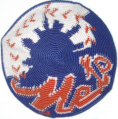
Uni Watch News Ticker: The Rockets have added a green/purple band for Kevin McHale’s daughter (from Mark Coale). … New logo for Boise State. … Nick Wilwert poses a good question: Will Notre Dame add NOBs for the BCS championship game? “They’ve done it in bowls recently, but this is more than a bowl game,” he says. Personally, I suspect the answer will be yes. ”¦ Check this out: Don Shula playing softball (good find by Jesse Agler). … Pitt’s old script logo has its own Twitter feed. Lots of good photos linked from there (from Doug Keklak). … Lazio responded to recent fan violence and racist chants by wearing a “No Racism” kit yesterday (Mark Coale again). … Here’s an article on the changing dress codes for female TV news anchors. … Last Saturday’s Houston football game was the last one ever at Robertson Stadium, and they gave out little stadium replicas. “To my surprise, they included the ‘iconic’ corner palm trees,” says Bob Andrews. “Such a cool detail.” … Love this label design. It comes from this jersey. … You think you’re a big fan? Maybe so, but I’m betting you don’t have a team-branded prosthetic leg (from Mark Kaplowitz)…. Spectacular slideshow of high-quality 100-year-old college football photos here (big thanks to Matt Moore). … Stanford will wear black this weekend (from Ethan Kassel). … Holy moly, this has gotta be one of the all-time great NOBs. It looks like they just threw down some random letters! (Nice find by Jeff Flynn Jr.) … Lots to love in this spectacular 1928 photo of the Bruins’ team doctor. If only team trainers wore sweaters like that today, eh? Lots of additional old-timey Bruins shots here (big thanks to Paul Richard Cook). ”¦ New Sasquatch-ish logo set for the Eugene Emeralds (from Steve Mandich). ”¦ RIP, Marvin — you changed everything.
Doug Gwodsz was sometimes referred to as “Eyechart”.
And, not too shockingly, I misspelled Gwosdz.
Actually, the word “Gwóżdż” means “nail” in Polish. I suspect that someone in his family changed the the first “z” to an “s”. Great name.
I was just about to comment on changing the “z” to a “s”.
And just to confuse everyone even more, I have a friend with the same last name and she pronounces it “gah-voosh”.
I’m pretty sure he played for the Padres in 1983, so his name was vertically-arched on those uniforms.
link
Actually, I think his nickname was “The Human Eyechart.”
If you look under the Bruins’ team doctor’s chest logo, you can see the words “World’s Champions – 1928-29”. It’s a neat little detail.
Those Bruins photos are spectacular! I’ll have to write-up a big article on HBIC about them.
The World’s Champions addition to Green’s sweater is awesome.
Wonderful photos.
Very cool
These photos are better:
link
I am friends with the Flyers equipment manager, Derek.
Confirmed!
As messed up as the US can be regarding race relations, racist Europeans are definitely a unique breed. I know there are chants in many countries there, but far right Italians seem to be the most notorious (or at least I’ve seen the most about them). So I doubt a nice jersey slogan will help change hearts and minds of the more extreme elements of fans.
Sort of getting tired of Brandiose’s “work” on minor league baseball teams. Everything comes out of the same template and represents the McDonald’s- and Wal-Mart-ization of minor league teams. Really wish these clubs would hire local design companies if they really feel the need to overhaul their appearances.
Sort of getting tired of Brandiose’s “work” on minor league baseball teams. Everything comes out of the same template and represents the McDonald’s- and Wal-Mart-ization of sports logo design.
/fixed
OK, that’s a good correction.
not that it makes right, but it’s really the natural evolution of design. Had there been computer-aided graphic design capability back in the oughts, teens, twenties (and onward) we’d have seen these kind of logos long ago.
It’s kind of like the people that don’t want to know the gender of their child after an ultrasound because “they want to be surprised”. Bullshit. If ultrasounds had been around 150 years earlier there would not have been any romanticization of “being surprised” by the gender of your child at birth.
Agreed, but that’s beside the point here. The issue is not that Brandiose’s work all looks like it was done on computer rather than with a freehand pencil on paper. All design work today is ultimately rendered digitally. The issue is that Brandiose’s work increasingly looks like itself from project to project. The Ems have a clever idea here, but it’s poorly executed because rather than looking like work done for Eugene, it looks like work done by Brandiose that just happens to have been purchased by Eugene. Wacky mascot plus unusual colors plus a cartoon style that’s as varied and distinctive as Bugs Bunny and Daffy Duck plus mid-2000s lettering. This isn’t design, it’s a Choose Your Own Adventure book adapted to sports branding.
Yeah- prolly two different arguments here. One is the “McDonald’s and Wal-Mart” logo argument and the other is the Brandiose “template” argument. With the former, it’s progress, for better or worse. For the latter, your point is well-taken. Still, and I don’t mean to imply you feel differently, the vitriol needs to be directed at these teams that are comfortable with this kind of logo design. Alas, the same reason that so many companies fail is the same reason so many poor logos and uniforms come into being: inept decision-making from leadership. It’s a sad state of affairs.
I hear you, but I don’t think my criticism is “vitriol.” It’s criticism. And it’s properly addressed to Brandiose, not the clients. Why? Because Brandiose has become bigger than its clients. We’ve seen time and again with Nike, with UA, and with a few others, that when the “design” company becomes bigger than its clients, it stops doing “design” and starts engaging in self-branding projects at the expense of its clients. (Same thing in architecture, too: Frank Gehry does not design buildings for his clients, and hasn’t since at least 1989. He designs Frank Gehry buildings, and woe to the client who hires his firm expecting to have an architect give one damn about the client’s needs.)
Brandiose has clearly crossed the line past which the “design” firm has more power in the relationship. Yes, surely most MiLB teams come to Brandiose specifically saying, “We want you do to for us what you did for the Threshers.” But delivering self-copycat design work to a client who makes that request is a failure of design. It’s not the client’s fault if the “designer” delivers cookie-cutter work when the client is a local small business with a tiny budget and no internal brand-management expertise to speak of (which is to say, every MiLB team in the nation) and the “designer” is an industry-dominant national branding powerhouse.
If the failures of design in Brandiose projects were wildly different from project to project in the last year or so, we could fairly say that Brandiose was doing its best with incompetent clients. But instead, we see Brandiose delivering products with the same flaws again and again and again. That’s on them, not their clients.
I don’t mean to hate on Brandiose here. I like the company, and I think they’ve done some of the best work in baseball design of the last decade. Of late, though, their work with minor-league teams has been a consistent discredit to the company’s past work. Six years ago, if I owned a team at any level, I’d have wanted either Radom or Brandiose (nee Plan B) to handle my redesign. Today, with my local minor league team about to rebrand, my single greatest hope is that someone – anyone! – other than Brandiose gets the contract.
“Eyechart”
ahahaha. love it.
NYG Football Jerseys – Twill or Heat Pressed Numerals for the 1990 Super Bowl?
I have a friend that did alot of purchasing of NYG items from MeiGray Sports Memorabilia in the early 2000’s. Lots of LT/Simms era jerseys and pants, I believe that MeiGray may have been the exclusive carrier of NYG gamers at that time. My friend told me that when the Giants began to again use tackle twill numerals on jerseys in the mid-1990’s, that many of the receivers complained of the new tackle twill numerals making the fronts of their jerseys slippery and that the NYG Equipment people allowed certain players to have heat-pressed numerals on the chests of their jerseys, twill numerals on the balance of the jerseys.
Maybe somebody with a NYG connection can confirm or debunk this.
The year before I got to college at SLU -1978 – the football team obtained new game jerseys with thick heat-pressed two color numerals. Many of the RB’s complained that these jerseys were slippery, and caused fumbles. Fans were treated to the early-season spectacle of the entire team wearing the new jerseys, with yellow striping and numerals, while the coaching staff allowed some of the RB’s to wear the older, plain Green with plain White numeral wide hole mesh jerseys. Truly a mismatch, but, the fumbling problems suddenly ended.
The next year, the problem and discussion was not even allowed. Everybody had to wear the newer jerseys, and that was that ….
Has any school turned its ENTIRE branding program over to Nike? I’ve seen athletic departments, but not whole institutions.
The Boston Public Library’s photo collection also has some great football photos. Look at the friction strips on this jersey: link
If you want friction strips and lots of sleeve stripes: link
This is one of the most medieval looking helmets I’ve ever seen: link
BPL is also a fabulous source — maybe the most fabulous of sources — of vintage baseball photos. Classy building, too.
“RIP, Marvin – you changed everything.”
Absolutely. And the bastards won’t even vote him into the HoF. We get Cooperstown plaques for management pygmies like Morgan Bulkeley, but nothing for Marvin.
I miss players spending their entire careers on one team.
Great posting! Thanks!
Gotta love the Friction Strip jerseys. Absolutely BOSS! It baffles me that not a single sports/jock merchandiser or even a copycat outfit won’t put out any frction strip jerseys. I really believe they would sell. Dollar for Dollar, the single two most rare and expensive jerseys you wil find on Ebaty, when you can find them, are the 1994 Steelers and Bears Friction Strip throwback jersys.
The closestI have ever seen was last year, Ralph Lauren’s “Rugby” line out out Rugby jerseys – with the White collars – with one of the 100 jerseys offered having a friction strip component. Sorry, no screen grab, plus I believe that the particular jersey has rotated off of the site.
It would be nice if somebody offered them up, though ….
I colourised that picture of JFR’s son in the medieval helmet a few weeks ago on here
I was team manager for a Division III basketball team. We were in a conference with Yeshiva University, and the majority of the Maccabees wore their yarmulkes during the game. The referees would have to stop the game each time one of the yarmulkes fell off.
As you can see from their website, it looks like this is still a common practice.
link
Love that one of the alternate marks for the Eugene Emeralds is an homage to the Swingin’ Friar.
I definitely like the gnome logo better than all the rest and the nod to the Swingin’ Padre definitely factors into that.
Does that mean that Doug Keklak is a script Pitt fan? Say it ain’t so!
I’m all for simple, “clean” logos, but that Boise State logo is just… not enough. Are they dropping “State” from their name? How do you otherwise justify a single “B” as your logo. I’m guessing this is just a university logo and not for the athletic teams, but it’s still dumb.
On a similar note: is anybody else tired of most major college teams using an “alpha logo”? It’s gotten to the point where it seems 75% are using some variation of a letter as their main athletic logo. My school is included in this, so I’m not just hating on teams I don’t like. I would just love to see some variety again.
Well, most of the other “state universities” abbreviate their names as ()SU. How long would it take the students to drop the “U” and just call it “BS”? They might already.
Washington State (WSU) students aren’t even supposed to call the school by it’s popular “Wazzu” moniker because it is too close to a euphemism for butt.
It looks a lot like the recently abandoned Buffalo Bisons cap insignia, minus the beveling.
It’s an improvement over the ridiculous horse head logo they’ve used for years, but using the “COLLEGE” sweatshirt John Belushi wore in Animal House would have been an improvement over the horse head.
I think someone sent that B logo here from 2001.
That new Boise font looks exactly like the custom typeface Mizzou developed and unveiled last spring for its athletics programs (see here: link). Tell me that’s not the same.
I see the Appalachian mis-spelling, but what I find more attention getting in the photo is the Virginia Tech uniform.
That is perhaps the blandest uniform in history.
It may be bland, but so are most home basketball unis.
I think I will give the manufacturer a pass on the misspelling of Appalachian. I’ve lived in close proximity to them my entire life, and I’m still not sure how to even say the word.
As an App grad, I can tell you its Appa-latch-an. Not Appa-lay-chian or heaven forbid, Appy State.
I probably should have clarified that I meant the actual mountains, but I’m assuming Appalachian State uses whatever “official” pronunciation there is?
And I realize there can be more than one “official” or “accepted” pronunciation. I think I’ve always said “App-uh-lay-shun”. I can totally accept being wrong, though.
But you can call it App State…
Did you ever think that the sewing machine operator probably worked at Majestic before joining the Swooshies? LOL
The Virginia Tech player is also wearing the Nike arm sleeves as knee pads
Where is UofH playing next season? Reliant or the Bank?
I’m pretty sure they’re playing at Reliant, because TSU plays at the other stadium.
UH usually gets around 25,000 fans. Reliant will look pretty empty.
Nothing is set yet but all indications are that most if not all games will be in Reliant. Coming off this year’s dismal showing the crowd will have p-l-e-n-t-y of room to spread out,
Paul-You ran the pages from a 19601-62 Marshall Gamemaster catalog a few years ago I don’t think you showed the softball pages though. If you’ve still got it you could look up how much the uniform originally cost.
There was this story a few months back about a University of Kentucky fan who lost is team-branded prosthetic leg in the Gulf of Mexico, only to have it returned by a shrimper who found it:
link
Here’s a direct link: link
Today’s ESPN column is up:
link
I really like the Rockets’ bands for Kevin McHale’s daughter. Nice touch that they used her favorite color and another relevant color as opposed to the standard black. Much more personal.
Love the “Swingin’ Sasquatch” … and the tie-in to the “Swingin’ Padre”! Hoping for a “Swingin’ Johnny Appleseed” for Ft Wayne … and a “Swingin’ Jim Bowie” for San Antonio :-)
Oops, meant to say “Swinging Friar” …
link
As a (trust me) very happy SF Giants fan, I’m getting bombarded by MLB ads to buy stuff, much of it at discounts. I see in the fine print that the offers “do not include the 2013 Cardinals and Mets jerseys”. I’ve been away from the web for 10 days, but I have not seen anything on those. Are they BP or alt jerseys? Any photos?
Kind of a random question, but does anyone know where Nike manufactures the jerseys for NFL players?
Powers, in Iowa.
Thanks!
Never mind…Love the St. Louis cream model. The Astros jerseys look good, but I’m willing to bet the shooting star will show up in a few years.
here is a little uni news, The Baltimore Ravens have announced that they will be wearing their black jerseys this Sunday against the Steelers
Random late-night question, based on this late-60s Leafs/Seals photo:
link
Did uni numbers on skates used to be a common thing?