
Click to enlarge
Uni Watch reader Douglas Ford is a home brewer. This means, among other things, that he gets to design his own bottle caps — including the caps you see above, which he mailed to me. I don’t think he did this just to make my broken arm feel better, but it sure had that effect. Thanks, Douglas.
Speaking of my arm, since some of you have asked, it’s getting there. The first few days after the surgery were pretty rough, but now I’m sleeping okay, I’ve been able to cut back on the painkillers, and I can type for a pretty long stretch before my hand gets tired. Still can’t lift anything heavier than a carrot, and having only one fully functional arm is still really awkward and frustrating, but I’m adapting. Last night I even did the dishes (not so easy with one arm!). Little victories.
Meanwhile, I had been assured by various authorities, including a few of you readers, that chicks dig broken arms. Great, I thought — all those cast/sling fetishists out there, bring ’em on. Hasn’t really worked out that way, though. The one mild exception was this gal at the gym who nodded approvingly at my cast and said, “Wow, that takes dedication.” Unfortunately — and I’m not making this up — she was wearing a bright purple top. Sigh.
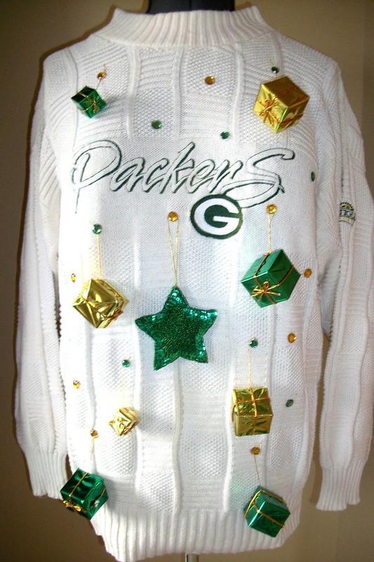
“I purchased this ugly Packers Christmas sweater for a party coming up in a few weeks,” says reader Adam Heili. “Maybe you should put out the call for other ugly holiday/sports sweaters.” I have a feeling Adam suggested this because he knows his sweater will be hard to beat, but what the hell: If you have examples of similarly horrific sweaters, let’s see ’em.
Speaking of the holidays, I’ll soon start working on my annual Uni Watch Holiday Gift Guide column, which should run on ESPN during the week after Thanksgiving. If you know of some good uni-related stocking stuffers that you’d like me to consider, do tell.
Uni Watch News Ticker: The Bills will be wearing blue pants tomorrow night. … No photo, but Steve Cramer checks in with this: “I was at the University of Memphis vs. North Florida basketball game on Monday night, and both teams repeatedly put out squads consisting of the numbers 1, 2, 3, 4, and 5 (although I don’t think they ever played directly against each other). I can’t recall ever seeing this before.” … Eric Reyes spotted a fan in full Browns attire last Sunday. “The jersey looks like an authentic 1980s model, because of the NOB font,” he says. … “Was watching the DC United vs. the New York Red Bulls eastern semifinal, and my wife noticed NBC had punctuated ‘DC’ but not ‘NY,’” says John Muir. “What’s the protocol here? Does ‘New York’ get different treatment than ‘District of Columbia’?” Speaking only from a copyediting standpoint, two-letter abbreviations with no periods should only be used for postal addresses. I suspect NBC has its own style guide for this kind of thing, but I agree that the “NY” and “D.C.” look inconsistent. … The team formerly known as the Scranton/Wilkes-Barre Yankees will officially get its new name today. ”¦ I’m still calling it Mercer County Waterfront Park. “This one really bothers me,” says Dan Cichalski, “because Trenton has been a supremely successful minor league franchise since its inception in 1994, all without stadium naming rights. And it’s a lame name to boot.” … UNC football will once again wear the chrome helmets tomorrow night (from Chris Taylor). … Two on-field changes for Mississippi State’s next game: They’re using an alternate midfield logo, and they’re memorializing former player Nick Bell, who died of cancer two years ago, in the end zone. “First person to be recognized via their own end zone?” asks Dustin Semore. Good question. Anyone..? ”¦ Johnny Bruno has been tracking the uniforms for the Ohio football team. ”¦ Virginia Tech is retiring two of its logos (from Kyle Lamers). ”¦ New alternate rugby jerseys for Scotland. Caleb Borchers says the flag-based design “is sort of like ‘Scotland, fuck yeah!'” ”¦ Also from Caleb: New rugby design for France. Interestingly, they put the flag of the opposing team — Australia — at the base of the collar. ”¦ Andrew Yudis recently received this jersey as a gift. As you can see, it has NFL tagging but doesn’t fit with any NFL team. Chinese bootleg? Mis-tagged jersey? Something else? ”¦ Speaking of odd jersey tagging, Clint Richardson recently found a Titans jersey with a Reebok label and sleeve logo but a Nike hang tag. ”¦ Also from Clint: “Auburn WR Trovon Reed now wears ‘T. Reed,’ even though he is the only Reed on the team. It apparently refers to his nickname, ‘T-Reed Uno.'” ”¦ The NBA, not wanting to be left behind in the flag-desecration/pandering sweepstakes, has come out with stars and stripes headbands (from Robert Silverman). ”¦ Color-on-color alert! That’s Franklin College and Hanover College from last weekend. “Hanover was the visiting team, so I asked their sports information director what he know about the uni choice,” says Derek Linn. “He told me that Franklin’s head coach contacted Hanover and told them they could wear their home reds if they would like. No reason was given, but it’s plausible to think he knew how good a color-on-color game looks.” ”¦ I’ll be off the grid starting at about noon today. Hope to see some of you tonight at Show & Tell, and I’ll see the rest of you tomorrow.
1 and 2 have been illegal numbers to wear in college basketball for quite some time… when did this change?
Quite some time ago. At least since 2003.
If you watch this – link , the guy who hits the shot is #2 and there’s another player on IU wearing #1 on the court.
Georgia Tech had BJ Elder and Ismail Muhammed wearing #1 and #2 their entire career (2001-2002 to 2004-2005).
Franlin College’s SID had always been great. FC is consistently a top ranked D-III football school. I went to a fellow HCAC school, and they let us wear our orange jerseys when visiting them.
What is Trenton getting anything out of the naming rights? Often minor league teams will throw sponsor names on ballparks to pay for improvements to the stadiums, but that’s not mentioned in the story. Is this just extra cash for the owners to pocket?
I didnt think 1 and 2 were illegal. I just know that numbers that can be signaled with each hand by referees were legal.
The following numbers are legal: 0, 1, 2, 3, 4, 5, 00, 10, 11, 12, 13, 14, 15, 20, 21, 22, 23, 24, 25, 30, 31, 32, 33, 34, 35, 40, 41, 42, 43, 44, 45, 42, 50, 51, 52, 53, 54, and 55. Team rosters can include 0 or 00, but not both.
The single digits “1” and “2” have been legal for high school and college basketball for about ten years now. Prior to that the lowest digit was the “3.” Zero and double-zero have been used for years. Are you sure about not having both?
The last paragraph of Rich A.’s comment is verbatim from NCAA rule 3-5(b)(2).
I’ve never understood why one would WANT to wear 00, but maybe that’s just me…
Basketball uniform number rules: link (Scroll halfway down.)
I think for international rules, 1 and 2 are reserved for indicating a 1 or 2 shot foul; 2 and 3 for indicating a 2 or 3 point shot.
The customization on that French rugby jersey is unusual. Usually they include both teams’ flags, and the date of the match. Perhaps the latter wasn’t visible in the photo.
On the French rugby jersey, would guess there will be an Argentina flag on this weeks jersey when they play on Saturday. In most test matches, the jerseys will have the team names and date stitched on the jersey – am guessing the flag is a unique way of doing that.
All in all a nice-looking uni, no? French rugby teams have been looking good for the past few years with that blue-dominant tricolor scheme. And, of course, le coq gaulois (the rendering of which in French is used here to avoid the vulgar overtones of Gallic Cock) is one terrific rooster.
Speaking of vulgar…
“New alternate rugby jerseys for Scotland. Caleb Borchers says the flag-based design is sort of like ‘Scotland, fuck yeah!’”
Also sort of like ‘A once-proud rugby power distracts attention from its recent performances by sporting a trendoid, eye-smarting disaster of a new uniform.’
This just came out randomly, but when is the next Question Time? PL, as soon as you get out of your cast, you should do it. I’m just itching to ask a couple questions.
Good idea — I’ll put out the call in the next day or two.
I am looking into writing a guest entry about the history of BFBS. From what I can tell, the Los Angeles Kings’ switch in 1988, which was before the Gretzky trade, and their subsequent merchandising sales success because of the colors and the trade, started the trend. Based on ESPN’s 30 for 30 documentary, I also believe the band NWA and their association with the Raiders also contributed. What are your thoughts?
Would the grunge/post-grunge culture have attributed? Cuz I figure at that time black would have been popular with the Meh Generation.
I associate flannel more with Grunge than black. Black was more Metal & Rap in 1988.
There’s also Jerry Glanville to blame. Although the Falcons had used a black jersey before, he introduced the black helmet.
I remember the Minnesota North Stars adding black trim to an otherwise green and gold uniform way back in ’81 or so.
Yes, that’s when it started. Black not as an accent color, but as a team color. From totally out of nowhere. The strangest thing.
You’ll probably want to look up WHY they changed. It wasn’t before Gretzky arrived, it happened during his arrival. In order to sell Gretzky on the Kings – a team he manhandled as a member of the Oilers – Bruce McNall wanted to change the image of the Kings. Luc Robitaille, a former Hull Olympique of the QMJHL, suggested that McNall change the colors to silver and black in the same fashion as Les Olympiques.
Who was a part-owner of the Olympiques? None other than Mr. Wayne Gretzky. The trade happened, the team introduced the new uniform with Gretzky’s name and number on it, and the black phase of the NHL was underway wholeheartedly.
That odd orange jesrey with the purple trim looks like a knockoff Clemson home jersey (complete with not quite authentic paw prints). Strange.
Hey Trevor, interesting idea about BFBS. I think that the whole “Raiders” thing in the early 90’s (when they were still in LA) was definitely a part of it. I always thought that the LA Kings change was to match the Raiders, even though the previous color scheme matched the Lakers.
In the early 80’s, the Pittsburgh Penguins changed from the light blue and yellow color scheme to black and yellow, to match the other two Pittsburgh temas (Pirates, Steelers). Maybe that’s the first instance of BFBS, or BFCSS (Black for City Symmetry’s Sake)?
That jersey looks like a mashup. The side panels and collar treatment match a 1990s Denver Bronco replica. The numbers nearly match it too, but for lacking the contrast trim. Maybe this could be an upgrade prototype for the Bengals? /jk
It has the Reebok tags with the hologram. At first though a Clemson Jersey when I got it, until I noticed the NFL logo. The numbers are Sewn on, but there is no name on the back of the Jersey. The colors seem to match the Broncos Jersey from last year, but the paw prints really threw me off.
It could be some sort of knock-off? I’m confused about what the hell I have here.
What’s with the odd stitching near the numbers????
That’s the number on the back showing threw because of the flash.
When the Penguins changed in 1980, it was from dark blue, light blue, and white. (While the triangle in the logo was always gold, it wasn’t an official team color.) And, as you mention, it was about associating the team with what was the “City of Champions” at the time, not about how merchandisable the color was – there wasn’t much Penguin merchandising back then.
Mets “unveiled” the new Blue Alts for next year… I like ’em… link
Apparently Santana just so happens to have been wearing it helping with Sandy relief in Coney Island. Great jersey but an asinine way to show it off. Would have been better to do a press conference to show it off along with any other alts they plan on having next year.
so you’d rather them debut the new jersey during a sponsored press conference, as opposed to getting out and actually helping people while wearing it?
you didn’t happen to drink your coffee out of a gatorade cup this morning did you?
In a way, yeah that would be better. Instead of helping out because its the right thing to do. The Mets are trying to turn this into a publicity stunt to sell their apparel. I guess what I’m trying to say is that there was absolutely a better way they could have shown off their new gear for next year.
Maybe they had this planned already, and the Sandy Relief happened to be on the same day? Why do we have to think the worst of people every time?
It has the Reebok tags with the hologram. At first though a Clemson Jersey when I got it, until I noticed the NFL logo. The numbers are Sewn on, but there is no name on the back of the Jersey. The colors seem to match the Broncos Jersey from last year, but the paw prints really threw me off.
It could be some sort of knock-off? I’m confused about what the hell I have here.
That’s how you do it. I’m chuffed by how many teams in the past few seasons are getting their orange on.
The black jersey just won’t die, will it? Silver is a Mets color?
Silver is a Mets color?
Sure, why not? They’ll be wearing the jersey with gray pants. Silver is just shiny gray, so the jersey will match better and the gray pants won’t look stupid like they do with nearly every other softball jersey that you hate.
As art, I tend to think this is right. As design, though, it’s all kinds of wrong. Gray, whether matte or shiny, is not a team color, it’s a background fabric color. In baseball’s visual idiom, the shirt can be gray but the script needs to be a team color. A team-color jersey with gray lettering is precisely 180 degrees the opposite of good.
It’s like putting stripes on a colored sanitary sock and then having the players wear plain white stirrups over it.
Then again, the supposedly sacrosanct Yankees have been treating gray like a team color, instead of a uni color, for some time now, so the Mets are in good company.
As with the regular jerseys, I like the road version a lot better.
My only problem with these is that they might feel the need to wear them a little too often, viz., more than once a week, relegating the gorgeous road greys to secondary status. We’ll see.
And I’m not happy about the black jersey being retained, Mike Piazza Day or no Mike Piazza Day.
Also not crazy about the ASG patch. It’s nice and all, but that’s 2 years in a row the primary logo has been supplanted. Why not shrink it about 40% and put it on the right sleeve?
I thought Darren Rovell reported that the UNC helmets were sold after the game. Are these new ones or was he wrong?
They were all sold, but it was decided that UNC wasn’t going to be delivering until after the season is over in case they wanted to wear them one more time.
Cool. Thank you Jason.
My only guess with the “D.C. / NY” thing is that one team is actually “D.C. United” and not “District of Columbia,” but because the other is “New York Red Bulls,” the “NY” is akin to when we see other teams’ cities abbreviated on the scoreboard: SFO, STL, CHI, etc.
It’s an interesting point John & his wife raise, though. Just looking on the preeminent research website, Wikipedia, Chivas USA punctuate the “C.D.” (Club Deportivo) before their full name, while FC Dallas do not. Same for Seattle Sounders & Vancouver Whitecaps. Both tack an unpunctuated “FC” on at the end of their respective team names.
This was also my initial gut reaction to the inconsistency. However it is still a styling inconsistency that should have been avoided. Here, the solution would have been to use a three-letter abbreviation, such as DCU – without periods – for D.C. United. I think it is safe to say that the strict application of any formal style guide protocol is overkill for an on-screen score box, but instead consistency of style should be the order of the day.
I don’t know how it’s controlled or who controls things like that for TV, but for merchandise, each team has its own quirks and rules. On merchandise, it’s always D.C. United with the periods, while it’s always Sounders FC with no periods for example. New York Red Bulls can never be displayed in a generic typeface; it must be the trademark Red Bull lettering found in their wordmark.
No MLS team uses periods with their “FC” though. Whether Dallas or Toronto, who use it as a main identifier, or Seattle and Vancouver, who use FC as part of their longer names.
C.D. Chivas USA takes their periods from parent club Guadalajara. It’s interesting, because few (if any) Mexcian teams with the “Club Deportivo” prefix even take the “Deportivo” into account, much less add periods. For instance, Club Deportivo Oro, also based out of Guadlajara, goes by CD Oro, with no periods. The same with CD Malaga and CD Guadalajara in Spain. It’s a confusing world, and as much as I love international soccer, a little consistency would be nice.
At mlssoccer.com, the crest for NY has no periods, but the crest for D.C. does. Team-by-team decision I guess.
Check out the guy on the right in the Browns photo. He has the C crossed out on his Tim Couch jersey to read OUCH. Appropriate. But what does he have scrawled under it? Besides an F-bomb?
lol, I saw that, too. !! It appears to say “F— You (from” but the rest is cut off. Fun Times! Stay classy, Cleveland.
Actually I thought “why can’t I get striped socks like that at the store anymore?”
I wonder if the people at the stadium (if that is where he is going) would let let him wear that in the stands. Many places frown upon that sort of thing.
I saw the exact same thing. “Tim Ouch.” That sums up Cleveland football since the return of the Browns.
I also enjoy how the guy on the right is wearing brown warmup pants with orange and white striping. Bet you can only buy those in Cleveland.
who the hell else would want/wear them?
Who else would want them??? Only dudes rockin’ sweet bandanas and back-of-the-neck tattoos world wide!!!
Uni Watch beer cap refrigerator magnets, I’d buy a 6 pack.
Heck ya. Some neodymium magnets and hot glue and it’s a done deal. I’ll take a 6 pack as well!
That Clay Matthews jersey looks early 90s. I don’t know about Cleveland, but in Pittsburgh stores sold authentic Steelers jerseys by the early 90s. I remember seeing them at a place called ‘Honus Wagners’ in downtown. It closed recently.
Also, the socks on that guy with the Matthews jersey belonged with the rarely-worn Brown jersey. The sock that went with the all-white was a much thinner orange-brown-orange on white. Didnt Clay Sr. end up with the Falcons in the early 1990s?
The Trenton naming rights cash is probably going to the Mercer County who owns the stadium. Arm and Hammer is kind of cheesy, but it beats the alternatives:
“Trenton Makes, The World Takes” Park
“What the World Refuses, Trenton Uses” Stadium
“Wipers On, Lights On” Field
following up, per this newspaper article, the money is going straight to the owner. no money to the county
link
At least nowadays they name stadiums things like “Arm and Hammer Stadium” instead of something stupid like “Veterans Memorial Stadium” which just contributes to the jingoistic rubber stamp rah-rah machine which we all know is the REAL problem.
Majestic have just unveiled the Mets 2013 blue alternate jersey on there Facebook page, looks awesome !
Link for new Mets alt!
link
On a related note, those RotY shirts they have posted look pretty goofy. “Alright, so we got a picture of Trout on the front… what else can we do, people?” “How ’bout his batting stats, so it’s kind of like a baseball card?” “Beautiful! Let’s make it!”
Ummmm, just checking on another project and the Mets have introduced a ton of new changes including bringing black back into a series of alternates along with the new blue alternates? The Ditch the Black campaign lasted for a whole year? Love it. The black alts look terrific. Good for the Mets for not listening to the lunatic fringe Uniboards.
Soccer Dummy has a question.
Why are there no soccer pitches with a team logo at center pitch like in the NFL? I figure in the US this is due to mixed use stadiums and soccer clubs usually being the little brother. But that does not explain elsewhere. Any insights? I think that because the unis are corporate centric I would want the team logo displayed somewhere on the field. Is it a rule thing?
My first feeling would be because it would make the ball difficult to see. Not as big of a deal for sports where the ball isn’t supposed to touch the ground, but for soccer it’s kind of the idea.
FIFA rules that there are NO markings on the soccer pitch.
Yup. FIFA rules require all commercial advertising to be at least 1m from the field boundaries. Obviously doesn’t apply to uniforms. :-) I guess they consider team logos to be advertising.
I have once or twice seen virtual, computer-generated team logos superimposed on the field on TV broadcasts. IIRC they were Spanish broadcast feeds of Barcelona games and it was only for a few minutes.
This famously came to a head when MLS launched in 1996, because they wanted to put the MLS logo at in the halfway circle since the first match was being broadcast on ESPN. FIFA made MLS burn the logo off, but you can still see the shadow of the logo on that broadcast
You can see it here: link
The NASL used to put logos and soccer balls at midfield quite a bit.
You will see field markings in college soccer, which FIFA doesn’t take the time to mess with.
Thanks Y’all, should have suspected FIFA.
@KT – college soccer has its own rules body, and isn’t governed by FIFA.
If you go to the NCAA ranks, I believe BYU’s women have a Y with the soccer ball behind it at midfield.
Here’s a follow-up to last week’s ESPN college hoops column:
link
Wow… that makes six, count ’em six uniforms for the Metropolitans? Holy moly…that’s a lot of work for the Mets / New York trainer to manage. Interesting… interesting… interesting.
It’s a gift shop grab is what it is; as if the patch wasn’t enough. They probably want to move a ton of merchandise during the All Star fest.
Whoa… new Mets cap??? It’s a visual jailbreak of colors and changes in Flushing Queens!!!!
New cap? Where?
Motherlode of MLB visual content as always.
I’m sorry, but some of us are not fully keyed in, what site exactly?
So Brewmaster Ford sent you the bottle caps, but not the beer? Boo!
Kidding, but serious question: What would be the ideal UniWatch brew? Red ale? Brown for brown’s sake ale? Wet hopped for added texture?
Not sure how you could brew striped beer.
If you could make the stout in a black-and-tan green, and float it on a nice yellow ale, that might just be the ideal uni brew.
Okay, now I’m thirsty.
Another serious question… Where the hell did he get his custom bottle caps printed up? I rarely bottle these days (as kegging is was easeir, and I’m a lazy, lazy man) but for me designing labels is half the fun of homebrewing (including the occasional link-themed label) and custom bottlecaps would be pretty sweet.
Oh, and personally (though this will reflect my bias) I would vote for a Munich Helles as the official uni-watch beer. It’s simple and classic, link, and folks who think the only good craft beer is a 10% ABV barrel-aged hop bomb “don’t get it.” Plus as a very drinkable beer it goes great with watching sports, bowling, barbecuing, etc.
They sell kits. Not much different from making buttons.
Oh hell, just get Hofbrau or Weihenstephaner to sponsor Uni Watch. (For those who are unaware, Weihenstephaner is the self proclaimed Oldest Brewery in the World, tucked somewhere in the Bavarian Alps. They claim to trace their origins back pretty close to 1000 – yes one thousand YEARS. Their Original Premium alone is as fine a lager as you will find anywhere on the planet.)
HHhhhmmmm… Uni Watch beer? My initial preference being a beer snob would be like something imported or at least not tasting like the crappy big name domestics. And it better come in an old fashioned beer barrel.
But as long as it’s beer flavored beer it usually works for me.
Well, obviously if we have to choose an existing, commercially available beer, Budweiser would be the official brew. No, not that Budweiser, link.
But I think we can all agree that the ideal Uni Watch beer would be homebrewed by a reader like Hr. Ford.
Always wanted to do the homebrew thing. Don’t have the room though. My brother got a kit a few years back and has never used it and I keep being tempted to “borrow it”. Someday…
Looks like the Mets are Oregoning next year.
Oregoning: noun-verb: Oh-rè-göh-nïng: the crime of having too many alternate jerseys, named after the infamous university in Eugene:
Yes, if the Mets simply add one more uniform set, they could literally wear a unique jersey tied to everyday of the week:
Such as…
Pinstripe Monday?
Grey Alts Wednesday?
And of course the always popular…
Mets Black Friday?
I seem to recall a discussion last week about how too many alternates may no longer be referred to as uniforms but as costumes.
Yep…and now we have to have another ridiculous “uni-schedule.”
Grab Bag is just fine by me.
I’ve long thought that the best way for Mississippi State to honor Nick Bell is rename the cowbells that State fans ring at games to Nick Bells or Nickbells. They could put the number 36 on the side of the bells must like the logo below:
link
I can see why Virginia Tech wants the vintage logo merchandise discontinued. The “T inside a V” logo looks too much like the Tennessee logo. Blacksburg is too close to Knoxville to get away with that.
I’ve never cared much for Virginia Tech athletics, but I’ve always liked the “TV” logo since my first visit to see a friend in Blacksburg. If I was pressed to buy Virginia Tech gear, I’d want that logo on it.
It only looks like the UT logo if you leave out the V, which is an integral part of the logo that would never be left off.
I don’t think there is a need to retire vintage logos, removing off the uniforms sure (when they first went to the UCLA stripes they were throwbacks with the TV logo on the collar) but as long as you keep them as vintage there should be no issue. You shouldn’t sell them on the same designs you use your primary logo on, but if you limit them to vintage style clothing there should be no issue with brand identity.
For instance Georgia Tech has started using their T logo that predated the GT (I could be wrong but I believe it pre-dates Tennessee’s T logo too), but it is limited to vintage designs, whereas the GT and modern Buzz is used everywhere.
The last few days there has been posts in the Ticker with NFL fans in full uniform. Where do they get the pants and socks from? Is there a place online to buy them?
former usc kicker mario danelo has been memorialized on the goalpost padding in the end zones at the coliseum since he died after the ’06 season.
Maybe Paul’s off the grid by now, but his tales of trying to get by in his current condition made me think of a certain former major leaguer:
link
I can say as a soccer beat writer, that D.C. requires those periods as part ot the style guide and they’re the only team that does.
link
But Washington, D.C. is commonly abbreviated with periods
link.
Nice find, Jocelyn!
YIKES!
link
New Mets hat.
link
nope. just a fashion hat
Of course it’s not the new hat…it’s pur pur purple people!
I always wondered if Paul would have been a Mets fan if their original colors were say, purple and white.
That’s got to be a fashion hat. They’ll never wear that on the field.
New Era logo on the side implies it’s not an on the field hat.
That is not the cap that the Mets are going to be wearing as an alternate.
I’ve been trying to dig around to see if I can find any clues to what the new name will be once the S/WB Yankees unveil it tonight but it seems they’re doing a bit better job at it than Reading did. I’m not finding much. I’m still hoping it’ll be Trolley Frogs to tie in with out rail/trolley history but Porcupines and Fireflies (should be Lightning Bugs) have sort of grown on me and if done right could be interesting.
But with this area it wouldn’t shock me if it was Blast, RailRiders, or Black Diamond Bears. Just imagine having to see Scranton/Wilkes Barre Black Diamond Bears on scoreboards and score cards. UGH!!!
link
The Barnum & Bailey 3rd Rail Riders.
Can’t believe no one asked if the boxes on the Packers sweater are functional and, if so, what is packed in them.
The G stands for Gifts.
Kansas briefly had a 1,2,3,4,5 lineup on the court against Southeast Missouri last Friday night. It even made sense, with a point guard, two wings and two big men. I doubt that’s likely for most teams.
Maryland’s Black Ops unis for Saturday…
link
Going to be a BLACK lOPSided loss.
And at least according to those pictures they still didn’t fix the way the flag should look. Perfect. Just perfect.
No, not “black ops” (which is yet another lame attempt to equate football with military combat) — just black.
Yes, “White Ops” was a road jersey marketing strategy for a game @WVU, these jersey at home v.FSU are simply part of the “BLACKOUT” campaign, something Maryland has done for many many years now.
link
Joel McHale, of Community, played tight end for Washington for 2 years. This is his rose bowl picture. Besides the purple, his number was 84, but the number on his shorts says 86. odd.
The Brewers are running a contest where fans can design a Brewers uniform and cap that the Brewers will wear during a 2013 Spring Training game.
link
Some good photos and commentary writings about UConn women’s soccer wearing pink things for breast cancer earlier this year
link
(the kiddies playing at halftime wore pink socks)
Found a crapton of brand new TC sanitaries today at a local thrift store! I paid 99 cents, got 4 pairs! They also had some boring ribbon ‘rups so I bought green and gold ones, just for fun. I was really excited when I went to check out, and the old guy was excited too! He said he used to wear stirrups when he was a “little shaver”.
Thanks for the news about the Trenton ballpark; I agree, I’m still calling it Waterfront Park. One of my favorites.
Btw, as I’m sure you’ve heard Paul, Maryland BFBS uni’s are out. Cannot wait for your reaction/disgust.
Technically not BFBS, as black is an official color for Maryland.
The SWB Yankees are now the f’n RailRiders. Before the announcement the crowd was yelling for Trolley Frogs. Once they saw the RailRiders name the crowd went into an “aw shit” type of silence. Fail again Yaknees, fail again…
The logo from what I saw on TV is the RailRiders wordmark under train tracks with a porcupine conductor. That’s how they described it at least. It was very hard to see because they were broadcasting from the back of the room over everybody’s heads. I couldn’t tell if the colors were black, blue, and gray or black, purple, and gray with the horrid lighting.
OK I was a bit off but the lighting and TV angles were both horrid at best. The new logo is in the upper left here:
link
Excuse me while I go empty my stomach….
Shame they didn’t just go with Hobos instead of fancying it up as Rail Riders. Or if they want to have a cuddly hat-wearing porcupine logo, just be the Porcupines. Where team identities are concerned, less is always more.
Actually I joked the other day if it’s the RailRiders they better have a hobo carrying his possessions on a stick as a secondary logo. I’m guessing the porcupine came as a compromise to the people that wanted Porcupines as the name since it was one of the 6 finalists.
The local TV station showed the reveal live. The crowd was all excited when they said it was time to announce the name. They were cheering and yelling for Trolley Frogs. Then they saw the logo and heard SWB RailRiders. The life went out of the room instantly. It was amazing. Yet another horrible failure in NEPa by the Yankees organization.
A better look at the logo.
link
They “showed” the home uniform and hat on the broadcast as well but again the lighting and people standing in front of the camera made it very hard to see. Once I can find the full uniform & logo sets I’ll post them as well.
I love the porcupine imagery… the image and the name just doesn’t seem to go together right now. I believe the Porcupine is an underutilized mascot and Trolley Frogs is unique and seems fun. Rail Riders? hrmmmm…
So does this negative reaction mean the team will continue to struggle at the box office, even with a renovated stadium opening next year?
The name is a bit of tongue twister or am the only one who thinks that?
I think they may get a bump initially from the stadium renovations. Similar to the 1st few years when the Yankees came to town then it’ll tail off again. Being a Pirates fan I was at a game against Indy in 2010 & I think there were more vendors and security people there than people. If there was more than 35-40 people in actual attendance at that game I’d be shocked.
But it’s tough to tell. I’ve been bouncing around the web checking out the reactions and I’d say 80-90% of the reaction so far has been negative but it could just be the ones that hate it spoke out and the ones that like it are too busy waiting in line to be the 1st ones to buy the new hats.
Not the best pics but if these links will work here’s a look at the uniforms:
link
And the logos:
link
If they dropped the railroad tracks from the logos and changed the name to Porcupines I’d be able to say I really like the overall look of the logos and uniforms. But man that RailRiders name is still taking one mother of a bashing by the fans.
HA!
‘failriders’
FailRiders was great. I loved that one. Just about sums up the fans thoughts. Hahaha…
Unless it’s some sort of bad ass Terminator porcupine Wouldn’t a porcupine on rail road tracks get run over by the train?
Bills, who didn’t wear white at home from 1986 to last year, will wear white at home tomorrow and December 9 (throwback jersey)
It is proper in the Chicago Style Manual to refer to the District of Columbia with periods. L.A. should also get this designation, as “LA” is the postal code for Louisiana.
Northern Illinois are just a couple of good stripes and a maybe revising or getting rid of the side panels and expulsion of the piping from a nice uniform. SOOOOOOO close!
So I am watching “Life After Top Chef” (don’t judge). One of the bits done on the show has former contestant Spike attending a Washington Capitals game. He, of course, gets a personalized “Chef Spike” jersey. The show taped over the Reebok word mark over the name plate on the jersey.
That M-State alt logo looks great at midfield! They should promote that to full-time status.
It’s one thing to wear a football jersey to a game, it’s just plain ridiculous to wear a complete uni. Are you hoping to catch the coaches eye when one of the players goes down with a hammy?
Brandiose does some strange identities. WTF?
link
More like third raid riders to me.
Minor League Baseball identities today are more befitting to Barnum & Bailey.
Clown Shoes.
why SWB have to go and candy up the work clothes?
Here are the Tulsa Oilers “Gotham City” jerseys for an upcoming promotion link
To anyone associated with the Bills: Please do not where the blue-topped socks with the blue pants. Just say no to the leotard look. Please.