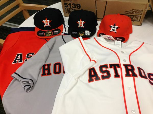
All the chatter about the Astros supposedly reviving the shooting star design turned out to be bunk, as the team unveiled an extremely conservative uni set yesterday. (Further details here, and here’s the new primary logo.)
The most intriguing aspect of the set is the new BP jersey, which has tequila sunrise side panels (I like that) and will serve as the game jersey on Sundays (I’m not so nuts about that).
Overall, I’m very surprised by how generic-seeeming this set is. Disappointed, too — feels too plain, too characterless. Obviously, there’s no extraneous nonsense, which is nice, but where’s the juice? I do like the caps. But the rest? Snoozers. ”” Paul
In case you missed it: Some big news here at Uni Watch HQ. Full details here.

50 Years Ago…This Weekend
Last year, Rick Pearson took us “back in time” to bring us his look at the featured television college football match-up from 50 years ago. (If you’re not familiar with it, this was the inaugural post of “50 Years Ago” from last year — after that, it became a recurring feature on UW for the remainder of the season). Last year, Rick looked at the 1961 season, and fortunately for us, he “uni tracked” the games from 1962 as well, documenting the game via his “kid cards”. Each week this fall, he’ll do the same, again.

Whew. 50 years ago, the Cuban Missile Crisis was over. … Six days before this game, Nikita Khrushchev had agreed to remove Soviet missiles from Cuba. … So intense were moments of that super power face-off that at one point Secretary of Defense Robert McNamara pulled Secretary of State Dean Rusk aside to look out the window. … “The sun is setting,” McNamara said. “It will be the last one we ever see.” … To put it mildly, it was simply a joy to sit back and watch the Game of the Week. … The Irish were in their ornate UCLA-striped jerseys and striped stirrups under their crew socks (home stirrups were solid navy). … And again, yes, the helmet shamrock should be green. … Also Navy’s gold pants and numbers should be more Old Gold. … Ron Blye was chosen because not many players other than interior linemen continued to wear high tops. … You gotta love old style PR photos; this one including Roger Staubach, Dick Earnest, Navy’s mono Old Gold unis and Bill the goat. … Blye played briefly for the Giants and Eagles. … Earnest’s future was in the Navy, not pro football. … Staubach, of course, did okay in the NFL after his tour of duty.

“Benchies” first appeared at U-W in 2008, and has been a Saturday & Sunday feature here for the past two years.
“Do You Hear What I Hear?…”

Click to enlarge
(yawn) Go Astrozzzzzzzzz……..
The new Astros set looks like an adult league’s attempt at creativity.
Wait…there’s NO creativity.
Yep, I was thinking Little League, but maybe it is Adult League, wow, after all that anticipation, after last year’s big wins, Blue Jays/Mets, the Astros seemed so ripe to go the same route, and then this, it’s a buzz kill.
I absolutely agree. I like the nod to tradition with the caps and logo, and the away unis aren’t THAT bad. But yeah, no zing. The Jays went back to the past last season, and came up with a winner.
Colors are good but they look like H.S. uniforms ordered out of a catalog. Generic.
Some people seem to think that because the Astros took leave of their senses in the mid-1970s that they are expected to be semi-outlandish with their designs. If anything, they’ve had many more years of great, good or boring designs. I don’t know if they were expecting something like link but that was truly garbage & Tequila Sunrise was basically retro-junk pop culture.
You’re never going to please everyone with a design anyway. As boring as the uniform & logo is, it could had been much, much worse.
As a lifelong Astros fan, I like them if for no other reason than the true colors are back. If you want generic, I submit the uniforms they just dumped — that logo screamed clip art and computer-generated script. Considering we had colors for 13 years that were the product of the owner’s trucking company, I’ll take the new set, thanks. The blue-orange cap rocks.
Now if only we could have our true league designation to match our real colors. Thanks Drayton McLane, Jim Crane and, of course, Bud Selig, the real villain in all of that saga and in all things in baseball that truly suck.
They traded generic 2000 uni’s for generic 1960’s unis…
At least they look like the Astros again. This just never made sense for the Astros: link
#AstrosNLforever
I don’t love them or hate them. I hate retro and fauxbacks so I can’t say I like it. But anything was better than the pinstripes. That just never looked right.
Many is the time that I’ve played the “What if Selig could’ve bought the Braves and kept them in Milwaukee?” game in my mind. I suspect we’d have a better MLB product with fewer expansion teams and no league swaps for the existing teams.
I guess this is the first set of Astros uniforms that can be described as generic. They’d look so much better with the shooting star. Too bad.
Orange-brimmed hat is good, tequila side panels are good. The rest… meh, whatever.
I like those features too. That’s about it though.
The orange is a good look, but it’s totally out of place with the blue headspoon of the gray jersey. Likewise, the all-blue cap looks bad with the orange trim on the white jersey.
If they insist on having three caps, here’s how they should be used.
orange cap: worn with white jersey only
blue cap: worn with gray jersey only
blue/orange cap: worn with everything but the gray jersey
But, of course, it doesn’t appear that they plan to do that.
Eh… The Red Sox on the white homes have red placket trim with a solid navy cap, and I think that looks fine.
Maybe they should have paired the orange cap with the white homes & the solid navy cap with the gray roads, but the Cardinals & Nationals already do something just like that.
That orange cap really has grown on me over the years, and I wouldn’t have mind if it was the sole cap. I’m actually relieved the additions to the H on the cap are extremely subtle from a short distance. Is the navy star on the orange cap beveled too? It doesn’t look like it & adds inconsistency to the package.
Overall, it does have a very 1962-70 road-Astros feel to it, which isn’t terrible or completely unprecedented. I would have vertically arched the wordmarks & NOB, a more colorful sleeve trim & minus the placket piping & used the 1962-70 number font. A cleaned up Texas patch would have helped things, too. They got the colors right which was the most important thing, the caps look great & I vastly prefer navy wordmarks in color trim (over the more popular red wordmarks in color trim) so I really like the homes & roads in that aspect.
If these were a food, they would be a hamburger. Plain but still good.
“Eh… The Red Sox on the white homes have red placket trim with a solid navy cap, and I think that looks fine.”
The Red Sox have their own color issues so they’re far from perfect, but to even mention their well above-average looking (home) uniforms as being comparable to this ensemble is ludicrous.
The cap does not need to match the placket piping; that’s ridiculous. If anything, the orange piping gives it a nice shot of color.
I never said they NEED TO match.
I said they look out of place they way they’re planning to wear them (except for the link) and would look better with my suggested changes.
I don’t always drink the “right” wine for my entree, either. But I do appreciate the proper pairing.
I love the new unis! I feel it is a great blend of the old into a new without taking a turn down gaudy street. I do agree they seem a little lacking. I do believe that they may surprise us with an additional patch for the right sleeve.
Odd they did not have anyone wearing the orange cap.
That orange cap may end up being almost nonexistent a la the Marlins orange lid.
My thought as well. Notice in that pic of the players, what’s missing? Yep, no orange cap.
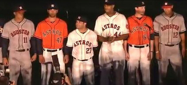
The Orange uni is for Fridays, the orange hat is saturdays, and the blue jersey is sundays. Grey is road and white with blue hat is M-Th. They showed that in the intro.
Having so many options that it requires “uni-scheduling” is ridiculous, in my opinion. They should just mix and match randomly. “Let’s wear the orange cap today, because we feel like it.”
BFBS, College Hockey Department:
RPI played Union in their annual Black Friday game yesterday. Union played in their home whites. Their official colors are Garnet and White. (Garnet is roughly what Harvard calls ‘crimson’.) But their trim color is black, so their uniforms were pretty much black and white. So the game was black and (cherry) red vs white and black.
link
Unreferenced pronoun: “Their official colors…” should be “Union’s official colors…”. RPI’s official colors are Cherry and White.
BTW Paul, sorry to hear about the surgery. I hope it goes smoothly and that you have a speedy recovery.
Agreed. Sending good vibes, buddy.
I’m not a fan of the jersey piping. I think the jerseys would look cleaner without it. I was also hoping they would have incorporated the one thing I did like from the previous uniform set: The Texas state patch. The best thing: NO pinstripes. Only the Yankees and Cubs should be allowed to have pinstripes.
Morris,
I am sick of the piping as well…much prefer sleeve and neck soutache link
I’m not a Phillies fan but I’m sure there are many of them who’d object to your pinstripes decree.
I was gonna say, the Pirates have always looked good with pinstripes, especially during the bumblebee era when they had the gold pinstripes with the black outline. Their current uni set is fine, but whenever they’ve had pinstripes it hasn’t bothered me.
Disagree. The Pirates have never been a pinstripe team, and they always look odd. At least ’77-79 versions were heavier and more colorful, but they’re still odd on the Bucs.
Yeah, I don’t see why the Cubs should be the NL “owners” of pinstripes. Sure, they might have been the first to wear them, but they probably have less overall history with pinstripes than the Phillies do.
Well, they’ve worn them an awful lot, including continuously for the past 55 years, and their circa-1910 pinstripe home uniforms are a classic design that’s only a few tweaks away from what they wear now.
That being said, I’d like to see the Cubs try something different at home, such as a white vest with dark blue sleeves like they had in the ’30s and ’40s. They had some great teams in the ’30s but don’t seem to have ever looked back to that era for uniform inspiration.
I like the Astros’ set, but the orange softball top sort of seems really unneeded. Like they just went “welp, if we HAVE to have one..”
The jersey font over the piping looks Triple-A.
The Braves have their font over the braid. Does that look Triple-A as well?
Good point. I do think the tomahawk helps the Atlanta design.
Some of the Astros’ jerseys look better than others. The gray looks the worst. The piping looks thick. Furthermore, my issue might be with how the “S” is framed within the braid, and then there are three letters on each side.
In other words, my eye is drawn directly at the “S” contained within the braid. That’s what motivated my Triple-A comment.
I like the Astros’ set, although I wanted the star back as well.
But that alt cap with the orange bill – a navy squatchee? What were they thinking?
Very old school which is fine by me. The road grays with the blue cap/red bill is very reminiscent of the Houston Buff uniform that graced the city for so many years.
Perhaps the Astros want to portray a conservative look in the AL, in keeping with the likes of NY, Boston, Detroit, Chicago. I agree they are way too generic…could have made these on a uniform builder website. What a wasted opportunity.
Nice set, although I will say this much: judging by having two-colored hats, it looks like the Astros might try to mimmick their in-state rivals in the “what color are we?” department. Are they a blue team, or an orange team? Just like the Rangers: are they a blue team, or a red team?
Too bad if I want to see these uniforms up front, I’ll have to drive to Cleveland now. Although, the ‘Stros are scheduled to be at PNC Park in May. But still, it won’t happen every year now. (Truthfully, I’m not upset about Houston going to the AL except that we don’t have as many cupcake games on the schedule now.) Interestingly enough, except for a three-game series against the Rangers in Arlington in September, the Bucs are done with Interleague play by the end of July under the new format.
No screenshot, but Robin van Persie just traded jerseys with someone at halftime. Never seen that before.
I’ve heard of it happening more and more these days. With world-class players like VP there are so many guys wanting to trade jerseys they’ll do it twice a game, wear one the first half, trade with a guy, wear a new one the second half and trade with someone else.
Sorry if this was posted earlier this wek but this amused me:
link
link
It could be wishful thinking, but do I see a slightly vertically arched A and S on that orange alternate photo on the top? The top and bottom of the letters look like they might have a little bit of an uphill slant to them. It’s also possible that my mind is playing tricks on me and inventing an element that isn’t there in these uniforms.
Get well soon Paul, very sorry to hear about needing surgery now.
Looking at other pictures it’s clearly my mind forcing something that isn’t there. Oh well.
I like the Astros new unis. Feels traditional. A
I would’t normally think about purchasing a jersey or shirt that wasn’t from my favorite team, but the Houston BP jersey with the sunrise side panels is awesome:
link
Astros now officially listed as an American League team on the MLB website: link
This one is a slam-dunk – Paul’s assessment is totally on the money. Hats are good, jerseys are a whiff.
With the Marlins and Astros, I’m starting to wonder if Orange will be to the 10’s what purple was to the 90’s and red to the 00’s (ie a “fresh” color that is overused). What I’m saying is that we should expect an orange Diamondbacks set any minute now.
Orange might be the new power color — but it was one of Houston’s original colors, so the fact they are going back to blue and orange doesn’t make them trend-lemmings like Miami.
I agree, it would be funny to see the Diamondbacks in orange, though — especially since they essentially copied Houston in the black-and-brick color scheme fiasco.
Back in June, Uni-Watch had that Astros uni design contest and the Astros would have done well to pay attention to what we, the Uni-Watch community, had to say. Similar to what others have said, the unis they came out with last night are almost as generic as the ones the Seattle Mariners came out with in the mid-’80s. And I was hoping the leak would be a big “April Fool” thing.
I put up a poll last night asking you to compare that bland, missed opportunity of a jersey unveiling against the five finalists from that contest. I’ve received some responses already. If you haven’t already participated, you can do so by clicking on the link below:
link
Honestly, all 5 of them are a bit gaudy but it’s for a design contest so it is what it is. I’m not a fan of mixing and matching elements from different eras & the Astros got it right with navy & orange. I know Tequila Sunrise is beloved by some but it’s a 1970s gimmick that is very difficult to pull off in a modern context & even the 1980-93 shoulder version looks very dated. Generally it’s not good for a uni to have more than 2 non-white colors.
The new Astros BP jersey is fine for BP, but that’s where it should stay along with softball tops.
I agree that bringing back the “tequila sunrise” jerseys would have been a bad idea, and I also agree that shoulder and chest stripes are also not options (otherwise I would have considered shoulder stripes in my design, instead of the piping that I went with). Thing with navy and orange is… my Tigers already use that combo (albeit with a lot less orange on the road, and no orange at home), and the Mets do as well. It’s not really unique, whereas navy, bronze and gold would have been, easily.
If I had to pick between orange & bronze, I would go with orange. Same with Athletic Gold over Vegas Gold. Metallic colors are trendy and overdone & look very dull and lifeless. Some people like the 1994-99 Astros set but I do not.
I’m not going to fret over two teams having navy & orange because it’s still pretty rare. While the Tigers did incorporate orange first, they’ve had a casual on-and-off relationship with it, and when the Houston ballclub came about in 1962, they fully invested into navy & orange. As you know the Tigers brought it back for good on the roads in 1972. Navy at home & navy/orange on the road is still very unique and I think that enhances rather than detracts their brand.
Hmmm… I shouldn’t fret about it too much myself, but I’ll just copy-and-paste what I said on my blog regarding why I took bronze and “Vegas gold” over orange and “Athletic gold”: “Metals are tough, and yellow is a color you often find on bruises.”
From someone who considers himself pretty much a traditionalist (at least as far as uniforms go), the Tequila Sunrise unis are a guilty pleasure for me. Maybe it’s because they represent the tradition of the Astros to me. Like them or hate them, It’s the one thing that set them apart from all other uniforms. While they may be difficult “to pull off in a modern context,” somebody thought it was at least worth the effort — at least to a limited effect. See the batting practice jersey, for example.
I think the navy BP jersey was more pandering to a certain group than anything. It just doesn’t fit anywhere else in the set & certainly not on the field. While I’m not a fan of softball tops at all, adding hideous Tequila Sunrise side panels looks like a total cash grab. “Yeah our new uniform set is straight-up for traditionalists but here’s something for the hipsters.”
Winter Classic (Officially) Cancelled
Following rumors, the NHL announced that the Winter Classic would be cancelled:
link
UniContent: the teams in past games have worn some really nice throwbacks
Oh what could have been… link link
I have problems with the conservative and generic approach that appears to have been applied in designing this uniform set. First and foremost, if there is a major league team that can take some creative liberties in using futuristic design elements in a uniform, it is Houston. From the “shooting star” of the sixties, and the “tequila sunrise” of the seventies and eighties, I think most baseball fans are okay, if not comfortable, with the Astros pushing the envelope.
My specific objections about this set are: 1) use of the head spoon, 2) block font, and 3) radial arching. Less would be so much more if they eliminated the head spoon, and used a vertically arched version of the font from the shooting star jersey. Adding the shooting star would be nice, and the subtle application of the tequila sunrise someplace in the uniform would be gravy.
Overall, I give this set a B minus.
If you can’t win the World Series, copy the team that does.
Paul, was late to hear of your injury. Best wishes for a speedy recovery. And yes, I have gotten over my temporary obsession with that Marlin guy.
In other news, Texas A&M goes BFBS at Mississippi State, and Marlyand State Flag desecration V 2.0 in black at home against Georgia Tech, complete with matching shoes. Quoth Mr. McMahon, “THIS IS THE EX-EFF-ELLLLLLLLLLLLLLLLLLLL!!!”
I can see why A&M would wear black, since it’s one of their primary col… OH WAIT NO IT’S NOT.
Miss State wearing their Snow Bowl gear, along with Motto-on-Back (MOB)
The home whites and alt-oranges unveiled yesterday feel very off-centered: AST-R-OS (the “R” in the middle of the piping). It doesn’t look right. However, on the Astros website the ad to buy the new jerseys shows a much more symmetrical jersey: AST-ROS (the piping going under the “T” and the “R”) which to me looks way better.
Wonder which version will take the field in 2013?
If I had to guess, the MLB.com versions look very Photoshopped & the navy blue is particularly light.
Looks like the Astros went with bigboy uniforms this time. Uniforms shouldn’t be the highlight of the game. What’s in the uniforms should be.
Guys we’re not paying attention to what’s important here. They brought Orbit back!!!!!!
(ps. I love the road greys)
The shooting star was ugly and cheesy-looking.
There, I said it.
link
This looks GORGEOUS. You people are nuts.
It’s great to have that cap back–the bevels are ridiculous, but fortunately not too noticable. And those colors, too, are so much more appealing than what they replace.
I just wish there was some reference on the uniform (other than the star on the cap) to Houston’s role in the space program, the Apollo missions, space travel, science, outer space, etc. It’s the Astros, you know? Mission control.
These new uniforms are reminiscnet of the original roads, which I felt at the time contradicted those amazing homes in their conservative stylings.
Rockies have announced their 20th Anniversary patch today:
link (from the Rockies Twitter feed)
Having not watched much college football in years, I see Texas A&M in all black playing Mississippi State in all white, both wearing alternate helmets, the Bulldogs all wearing “Hail State” on their nameplates and Twitter hashtags in the endzones. It feels like I’m in an alternate reality that not even Rollerball could have predicted.
The numbers on MSU are very hard to read, which could be helpful to some of their players when the coaches go over film. aTm is playing great, but their attire is exceptionally bad. The only apparel from this game that should be seen again is that MSU helmet.
(link)
I posted this on Facebook:
In this A&M-Mississippi State game, neither team is wearing a uniform that instantly distinguishes them from any other team. A&M is in solid black. Mississippi State is in solid white. Good versus evil I guess, although nothing distinguishes one as good and one as evil. Somehow we’ve arrived at a moment where specialty uniforms are being developed on a weekly basis that communicate absolutely nothing. Or, do they communicate everything?
Hey Paul,
I didn’t see uni watch yesterday, so I first read of your bike accident today. Best wishes on a quick recovery!
I just saw as well. Ouch! On the bright side you made it through the storm OK and this won’t cut too much into the grilling. Here’s to a quick recovery!!
This might be a little late but it’s still amusing
link
This Astros design looks like it took five minutes. This is the best they can do?
Their on-field prowess merged over to their design sensibility.
Paul —
1) my best wishes for a speedy recovery
2) a gentle head smack for your disappointment in those very nice and classic-looking Astros uniforms. Seriously, what’s wrong with them? (rhetorical – no need to answer that)
I agree that there’s nothing wrong with them. In fact, the initial picture made me think they looked really good.
The picture with the players, though, made me think that those all look like they should be some other team’s uniforms:
White – Giants
Gray – Braves
Orange – Orioles
Maybe it’s just because the colors are off a little in that photo.
There’s little “wrong” with them, but there’s even less right with them. A complete nothing of a design. Almost a NON-design.
Today’s GT/Maryland is one of the strongest “& 1” contenders ever.
WVU in Gray/Gold/Gray. I don’t want to live on this planet anymore.
Also wearing gray digital camo undershirts… *facepalm*
Here, here… Three decent sets and a classic helmet weren’t good enough ?!?!
I liked Mountaineer today. Sooner will go to Morgantown and kill them now.
Pittsburgh Panthers in their proper blue pants on the road and the names have been returned to the jerseys. Tis a glorious day (well for now).
Normally I would talk smack about Pitt right now, but WVU isn’t giving me any ground to stand on, soooooo, yeah. Go Notre Dame!
Haha!! Well all my friends that are Irish fans had ND winning by at least 50 and I told them it’ll be a lot closer than they think. One 4th quarter phantom pass interference call away from an upset. I’m never happy with a loss but I’m hoping this will be the game that costs ND any way of claiming they have a shot at a championship.
texas a & m helmets from hgi…
link
texas a & m helmet from hgi…
link
You know what’s really boring and uninspired? Using “Houston, We Have A Problem” in the headline of every, single, article written by someone outside of Houston. It was old in 1995.
You can say that again. I sometimes wonder if the Astros shy away from their cool NASA imagery just because of that one line, made famous by the movie.
i can’t leave a comment…?
not sure what happened…let’s try this way…
TEXAS A and M new HGI helmets:
link
These designs coming out (Astros, Brooklyn Nets, etc) represent a uni “tabula rasa”: A return to the simple and the mininal, and some might argue, to what’s natural. Perhaps in reaction to the link link of the link, these uniforms–albeit generic–could provide their and other franchises with a fresh start and new ideas.
Feel better, Paul!
Sometimes “going back to basics” works (Tigers going back to the Old English D after 1927, 1929-32 and 1960 designs prove to be fails; Oakland going to their “classic” design in ’87); sometimes it doesn’t (Mariners, 1987-93). I’m concerned that it won’t work with Houston, and they’ll have both Alex Rocklein and me on speed-dial.
Hey Paul.
Is there any flak for bloomberg waiting so long to cancel the marathon?
The Texas Tech unis aren’t too bad. The shoulder yoke shold be bigger, the Texas state logo on the right side of the helmet should be filled, the Tech logo should be in the star on the left side of the helmet, put TV numbers in the stars on the shoulders. #91 had long black sleeves and it helped the look.
The Astros will likely introduce a better Alt jersey after everyone buys these. Even though they’re plain they’re miles ahead better than the red and sand. Hopefully, they’ll be smart and have both the shooting star and tequilla sunrise as options.
Le’veon Bell of Michigan State is (apparently) using socks on his forearms. Looking for pics now.
Here’s a pic
link
Sorry, that pic wasn’t from today. Just did a GIS and found that one.
Syracuse might have the nicest uniforms in college soccer if not for the side piping interrupting the stripes:
link
Braxton Miller went “Am Pac” undershirt again today, I like this look. Get well soon, Paul, hope the surgery goes extremely well
link
My Hoosiers still have their BCS bowl destiny in their own hands.
Seriously, how sad is the Big Ten this year? Right now, the Hoosiers actually have a LEGITIMATE shot at playing in the title game.
Oops. Jim Vilk does not approve that post.
Really, there isn’t anything “sad” about it.
PSU and OSU are suspended because of a lack of institutional and program control. It’s their own fault (and OSU will be the best team in the B1G for the next decade at least, can’t someone else have a day in the sun for one season?).
I don’t feel sad that the best teams in one division are out, I feel glad the corrupt are paying for their sins and I’m glad there’s a hilarious feel good story out there for a BCS bid and I’m especially glad it’s my Hoosiers.
HOO HOO HOO
You’re totally right. The Big Ten is fucking fantastic this year.
I didn’t say that. I said there’s nothing sad about the B1G. They’ll have a top 15 team this year and Mich and MSU were overrated to begin with, at least that’s what I thought in August.
Is this UCLA “LA Nights” uniform a nod to their football history (1949 and earlier)? Here’s Jackie Robinson from a post back in 2007 link
link
From a bit of research I can see they have worn Yale blue way back when.
oops… sorry about that. I’ll repost at the end
My least favorite look for the season by far on Oregon tonight. I guess I don’t have to say why…
But they’re so gorgeous. School color stuff aside, that look is incredible.
Iowa State and Oklahoma – battle of the double striped pants today! link
not a bad looking football game
So THAT’S what USC/IU would look like…
;)
\m/ hahahaha \m/
I like the new Houston Astros uniforms. Are they a little boring? Yes. But look at the classic uniforms (Dodgers, Cardinals, Yankees, Tigers, Bears, Packers, Raiders, Blackhawks, Maple Leafs, Penn St., Oklahoma, USC). They are minimalist but they look good because those uniforms do not cause sensory overload. Orange and navy blue (their true colors) usually look good together. I’m just glad MLB’s divisions are finally even and that I’ll never mistake the Astros for the Diamondbacks again.
About half the teams you listed are actually pretty far from minimalist. I mean, have you ever seen what the Blackhawks wear? There are 8 colors on the crest alone.
I stand by my assertion about the minimalist nature of the uniforms I previously mentioned (you can add the Colts, Notre Dame, Angels, and Red Wings to the list).
The Blackhawks’ logo does have a lot of colors in it. However, the colors in the Blackhawks’ logo hardly affects the overall look of their uniforms (just like the red and blue in the Steelers’ logo has no bearing on their look).
For the record, I would have liked a return to the “shooting star” for the Astros. That design would have eliminated 90% of the negative/ho hum comments about their new look.
No screenshot, but LaMichael James was just shown on the Oregon sideline with “Storm LA” on the back of his shirt.
Coincidence that Oregon is in all white ala Storm Trooper look?
No coincidence at all.
They’ve been planning this whiteout for weeks and sold those “Storm LA” shirts at UO’s official store for at least a week. They even had a hype video released this week using the Imperial March from Star Wars at the end when they implied the uniforms were white. UO and Nike have this all well thought out…
No screenshot, but the Astros’ prospects in the Arizona Fall League are still wearing the old jerseys (with the 50th-anniversary patch, to boot).
Wow Aggie, if you make this your regular uni, I might like you again, even in the Big Southern Dummy conference!!!!
Is this UCLA “LA Nights” uniform a nod to their football history (1949 and earlier)? Here’s Jackie Robinson from a post back in 2007 link…
link….
From a bit of research I can see they have worn Yale blue way back when.
link hahahahahahahahahahahahahahaha
(Look at that pic until you see it/him)
Night owls:
A lot of folks have been complaining that the Astro’s new uniforms look “generic.” Well, baseball uses essentially four or five templates for nearly all the jersey styles, so I thought I’d make a chart listing them by basic style. I separated jerseys with script lettering from ones with underlined script letters. Obviously, script lettering is the most popular style so this breaks it up a little.
Teams with similar or the same style for both home and away jerseys are combined. Grey background for road jerseys, white or pinstriped for home. I didn’t bother with alt’s, third jerseys, etc., just to keep it simple. I did however, use the Phillies alt with the underlined script as their home. I lumped a number of similar styles together under the “Tuscan lettering” column.
I found all I needed for the artwork at Chris Creamer’s Sports Logos site, so thanks to him.
link
That’s a cool chart, Michael. It’s interesting seeing all the similar styles together, especially the underline script. And I hadn’t noticed how heavy the drop-shadow was on Cincinnati’s road jersey until now.
I’m pretty sure the orange jerseys are for Sundays & holidays, not the blue batting practice jerseys.
While another feature would have been good (I like the idea of a shuttle patch for one of the sleeves), I don’t have a problem with these. I’m glad they have the all-orange jersey alt.
I know there are a lot of people who will disagree with me, but I loved the brick-sand-black color combination. They looked great together. However, I have fond memories of orange and navy, so it is good to see them come back. It’s a shame, though, because they are in the AL, and I don’t watch games with DHs.
Lo
ts of cool Track and Field programs here link
I’ve been seeing this return to bland and boring for a while in pro sports, and again another example of “less is less”… I get the H hats… fine. The uniforms might be better with the “Chico’s Bail Bonds” on the back. Ouch. Too far back swings the pendulum.