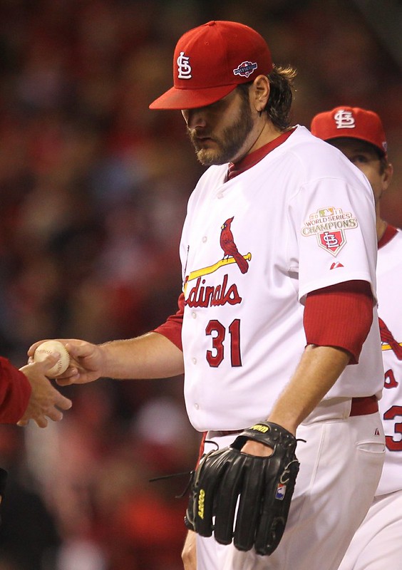
I didn’t have a strong rooting interest in the National League Championship Series. I’m generally fond of the Cardinals and Giants, they both have very nice uniforms, and I knew I’d be happy to root for either of them against the Tigers (I’m a National League fan). But there was one little thing, sort of a mental and emotional tiebreaker, that had me rooting for the Cardinals: their “2011 World Series Champions” sleeve patch. They wore it all season long, even into the postseason. What would have happened if they’d won on Monday night — would they have kept the championship patch and added this year’s World Series patch on the other sleeve? That would have been a pretty unique situation!
I suspect they would’ve swapped out the old patch for the new. But we’ll never know. And that’s gonna bug me for a while.
New ESPN column today, about the Tigers and Giants — look here. And my annual NBA season-preview column will run tomorrow.
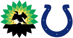
Strange bedfellows: Got a note last night from a reader who prefers to remain anonymous, informing me of an very interesting logo kerfuffle, as follows:
The company I work for has been working on a big game-day promotion involving a certain Big Petroleum company and certain midwestern pro football team with a horse mascot and simple blue-and-white uniforms. A whole bunch of fans coming to the game on Nov. 4 are going to get a special discount card for a one-time gas purchase. The card will be attached to a cardboard carrier with a little glob of glue (the technical term for this is boogered, which I love having an opportunity to say professionally). This project has been bouncing around for months and finally came together at the last possible minute (cannot stress those three words enough).
So the special Big Petroleum discount cards were printed and encoded, the cardboard carriers were printed, the whole thing was boogered together, and then BOOM — somebody at the football team’s front office says, “You can’t use our logo/helmet/colors like that.” Apparently nobody ran the carrier art past the team’s marketing people. Last word we had was that they’re going to cut off the top of the card carrier (where the offending logo appeared) and hand out the butchered logo-free piece.
Faaaaascinating — especially since the football team in question plays in a stadium named after a different petroleum company. Yes, I realize that the Big Petroleum company mostly sells gasoline, while the stadium-affiliated company mostly sells motor oil, so they’re not direct competitors, but it’s still interesting.
Of course, it’s also interesting that anyone would want to partner with the Big Petroleum company on anything, what with them being environmental criminals and all. Maybe that’s why the football folks didn’t want their logo on the carrier.
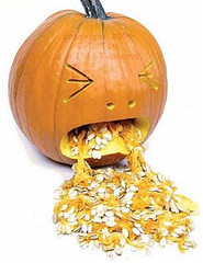
Fun with pumpkins, continued: From now through Halloween, I’ll happily post photos of any uni-related pumpkin carvings you folks come up with. Here’s today’s haul:
• Shawn Cyr and his fiancé, Cassie, have created this Patriots jack-o-lantern.
• “My nephew cut out this Florida Gators pumpkin this week,” says Randy Williams. “He goes to another university now, but Once a Gator, Always a Gator.”
• It’s not Nick Black’s fault that Rutgers has such a straightforward logo, but it sure makes for a simple carving job.
• “We live in New Hampshire, but we lived in Maryland when our kids were born,” writes David Harville. “Our son, age 10, is beginning to identify with his Baltimore roots. In his honor, I decided an O’s logo would be a good idea for this year’s Pumpkin Festival. Considering that I have zero arts and crafts or handyman skills, I’m pretty happy with the outcome (no power tools used!).” The real question, of course, is whether David included the accursed upside-down apostrophe on the bird’s cap. Can’t tell from the photos.
• Ryan Jelsma created a Vikings jack-o-lantern. “The viking’s head is a little shaky,” he says. “I had to piece together a couple of parts with some toothpicks.”
• Andrew Bortman made this Tigers logo pumpkin. Interesting that he chose the cap logo, not the jersey logo.
• Speaking of the Tigers, Kevin Dugal created a Jim Leyland pumpkin.
• Here’s another Rutgers rendition, this time by Jon McCue.
• And John Okray and Nicole Haase pointed out that the Brewers have provided these templates for fans to use.
PermaRec update: Remember that amazing pharmacy ledger I recently wrote about? The latest entry on the Permanent Record Blog has a bunch of follow-ups on that, as told through a series of newspaper clippings and one football card (shown at right). For details, look here.
Uni Watch News Ticker: Who’s that without the logo creep? It’s Lance Briggs, from Monday night’s Bears/Lions game. Here’s another view. “He was missing them on both sides,” says Alex Sampson. I’m assuming several dozen Nike and Bears employees have been fired over this one. ”¦ You’ve Got to Be Fucking Kidding Me Dept.: Instead of buying a gimmicky accessory, you can now buy a gimmicky T-shirt with an image of the gimmicky accessories (from Sam Belk). … Apple’s new maps app is still calling it Shea (from Kenny Jacobson). … New logo for the University of Wisconsin-Platteville (from Olin Skattum). … Sorry for the lousy cropping job, but I’d completely forgotten that the Spurs wore these “heart-shaped ass” shorts in the late 1970s. Stumbled across that while looking for something else. … I don’t know which thing I like better about this 1944 photo — the graphic on the back of the jersey or the fact that the guy’s name was Scrappy Moore (big thanks to Tom Shieber). ”¦ Houston’s colors do not include gray, but the football team will nonetheless wear a gray jersey on Nov. 10. Key quote, from defensive end Zike Riser: “It’s really cool to have a change because we’ve always been red and white.” Yeah, it really sucks when you’re forced to wear your team’s colors (from Paul Kennedy). ”¦ A’s equipment manager Steve Vucinich will be featured this Friday in a TV special about the early-’70s A’s (from Camryn Brown). ”¦ Love love love this curling sweater label. It comes from this very nice (if overpriced) sweater. ”¦ A new company is selling posters of diagrams of iconic football plays (from Yancy Yeater). ”¦ Although eBay recently got a new logo, Bubba Watson was still wearing the old logo yesterday at the PGA’s Grand Slam of Golf (from Adam Heili). ”¦ Kenny Kaplan found some video highlights from a 1973 Dolphins/Lions game in Miami. The Dolphins wore aqua for that game, even though they usually wore white at home in those days. “I remember hearing that the Lions screwed up and brought white uniforms, forcing the Dolphins to wear the dark jerseys,” says Kenny. “In fact, the Lions were fined by the NFL.” ”¦ Articles about the negative space in the FedEx logo aren’t exactly a new phenomenon, but this article is still pretty good (from Kurt Esposito). ”¦ About a year ago I wrote an ESPN column about Jacob Barrette, the Ottawa Senators fan whose third jersey concept ended up being adopted by the team. Now he’s created a proposed branding program for Ottawa’s new CFL team (from Mike McAllister). ”¦ Here’s more info on those new Georgetown basketball uniforms, which I first mentioned last week (from Lucas Ehrbar).
I have the winning pumpkin link. (Apologies to Buffalo fans.)
Nice to see that Apple is calling it Shea.
Re-Strange Bedfellows:
“This project has been bouncing around for months and finally came together at the last possible minute…”
“bouncing around for months”=since late August?
link
Firefox on a Mac: The whole column is farther right than Scott Norwood. Somebody check the coding?
Kindly disregard. It got fixed!
link
Reds have these available on their website as well for fans. They also posted a link on their twitter for these too.
New rule for pumpkin submissions: they must be DIY’d, not from a kit.
Agreed. DIY or GTFO.
Same directions on Brewers and Reds sites, including
“Have you parents help you cut along the dotted lines you have made with the pin, nail or toothpick.”
What if your parents are nowhere near the pumpkin when the carving occurs?
Just found the “official” version of the O’s logo template: link
Glad I didn’t use their template/instructions. The result of their instructions loses the three-color look of the logo.
Lots of teams have templates. Apparently this is been going on for years: link
I’m always amazed at carved Jack ‘O Lanterns art. They used to show them on “Roseanne” Halloween episodes.
My suggestion for yesterday’s Christopher Falvey White Sox pumpkin: give that pumpkin a quarter or half turn & download this link & try again. If I had a pumpkin I’d put the old Sox-batter logo on mine. Toothpicks to hold up the letters & empty spaces is a great idea.
Just sent this link to Paul:
link
ASG looks great, but Mr. Met’s a lock for my gourd.
Prinstant Replays: Very Cool!!
But the Immaculate Reception one is wrong.
It should depict Gold 12 (Terry Bradshaw), to Silver 31(Jack Tatum) (not Gold 33 – Frenchie Fuqua), to Gold 32 (Franco Harris).
By rule in those days, if the ball had bounced off Gold 33 (Fuqua) it would have been ruled illegal touching by Harris and the play/game would have been over.
Yep, illegal play was illegal.
Not a Cal fan, but “The Play” T-shirt is gold, just gold.
What?
No “65 Toss Power Trap”?
Then again, perhaps the most memorable play in Chiefs history must be heard to be truly appreciated (it’s well worth watching everyting prior to 2:30):
link
As a Redskins fan it pains me to say this, but the Marcus Allen run in SuperBowl 18 might make for a good one.
Maybe Riggo’s 4th and 2 in SB 17?
Darrell Green chasing down Tony Dorsett from behind in 1983?
(told you I’m a ‘Skins fan)
John Riggins’ run is a great, game deciding play, one worthy of a great runner peaking as his team peaked, and carrying them all to a Championship, and he to all-time recognition for his and their success.
Marcus Allen’s change-of-direction, hyperspeed, TD scoring run by shaking away and then outrunning an entire team is a timeless, glorious work of art – one of the all-time plays in the history of professional football.
One run is great. One run is unbelievable.
Love these things, wish I’d come up with the idea…
Also wish they had the defense on the Eli/Tyree catch. Small quibble though.
I had seen these plays before.
link
Oooh, even prettier. I may have to make some wall space for Mays’ Catch.
Would Eagles fans agree that “Walk Off Return” trumps “4th and 26”?
Tommie. Frazier.
Taking it above the Colts/Lucas level, I’m wondering if there’s a conflict with the NFL marketing people in re: using the Colts trademarks and logos. I remember reading that the Texans’ deal/interaction with Halliburton has its limits in that regard.
Is there an “official petroleum sponsor” of the NFL?
Love the way the Orioles-O-Lantern looks kinda crappy (no offense) when unlit, but looks wicked-cool once illuminated!
None taken.
Exactly what I was thinking. That’s just about a perfect image of the logo when lit. That’s impressive, because there’s no way to see it while carving, unless the work was done in the dark.
Randy, this makes 7 pumpkin festivals for us, and I’ve probab ly carved about 50 pumpkins over those years. Most of them are freehand eyes, nose, mouth, but I do at least one a year that’s more work. Overall, the O’s logo wasn’t really hard to imagine as a carving: cut out the white parts, peel/shave/whatever the gray parts, don’t touch the black parts. I wasn’t sure I was even going to try the “O’s” on the cap, but in the end I’m very happy I went for it.
link
Interesting that the BP/Colts thing came up… as my buddy, father, and I were leaving the Colts/Browns game on Sunday, we were handed a card for 25 cents off per gallon. It was on a backer, but I honestly don’t remember what it looked like. I just eagerly pulled it off and put the card in my wallet. My guess is that they just handed out as many of the offending cards as they could last week, and they’ll reprint more for the game on the 4th.
The Dolphins wore aqua in the Super Bowl after the 1973 season. If they wore white at home that year wouldn’t have chosen to wear white in the SB?
At the time, the Superbowl uniforms were league mandated. The “home” team wore a dark jersey – it’s the same reason the 1970 Cowboys were in blue.
I’m not sure what year that changed, though.
After checking the GUD, the first break in the pattern is the 1978 (Jan ’79, SBXIII) Cowboys wearing white, having also worn white in the previous year.
So, the rule change was sometime between ’74 and ’78.
The 1978 season, SBXIII in Jan. 1979 is when the change in the jersey mandate took place.
Enjoyed the highlight clip but was bothered by a couple of things:
1) Tom Brookshire’s hideous red socks.
2) The artificial turf at the Orange Bowl. I realize it rains frequently in Miami; however, back in the day, the artificial turf always looked like it was wet in several places. Anyone know why?
Big Petroleum also manufactures and sells motor oil and lubricants. Big Petroleum owns Castrol Oil, so there is the sponsor conflict. Oddly enough, Castrol signed a marketing deal with the NFL in 2011. link
The Blockhams, a must read online cartoon series for Michigan fans, featured a column about this past weekends Michigan-MSU game. Interesting Uni-moment is makers marks on the two jerseys. The swoosh for the Woodson one and the (blurry, but recognizable) three strips on the Denard one.
link
(under game winning kick)
Re Scrappy Moore photo: I’ve always known Joe Engel’s SA team as the Lookouts, and the Choo-Choos was the Negro League team in town. Did the Lookouts adopt the Choo-Choos nickname for a time and, if so, when did they revert back to Lookouts?
I live in Chattanooga, and have never even heard of the Choo-Choos. I’m wondering if it was a clever writer trying to pin his own nickname to the team?
On top of that, I never knew Scrappy Moore managed the baseball team. He was, of course, head coach of the UT-Chattanooga Mocs (formerly Moccasins) for several, several years. The team’s current practice field is named after him, as well as the mascot.
If memory serves, those Spurs shorts with the heart-ass were from their second year in the NBA (feel free to fact-check). I’m guessing they were trying to copy the yoke from a pair of blue jeans. The road shorts still had the silver pentagon a la the Chicago Bulls.
Yeah, they started wearing them in 1977 (they used silver home unis their first year in the NBA), and finally removed the arse-piping after the 80-81 season.
That pocket stitching pattern is actually a Levis trademark, called “Arcuate.” Apparently oldest apparel trademark in the US and was link because it was deemed “decorative” and thread was being rationed.
Regarding the accursed upside-down apostrophe:
Yes.
link
Today’s ESPN column is up:
link
Correction on ESPN article: Last orange vs. orange matchup was in 1984 World Series with the Tigers facing the Padres, whose colors at the time were brown, orange and yellow.
Fuck — I was thinking of the wrong Padres era. Will fix!
Will that count against the Workplace Safety Tracker? “46 days SINCE OUR LAST EDITING ACCIDENT”
Yes. Yes it does.
Since Pepsi is the official soft drink of the World Series, are the Giants going to have to cover up the logo on the giant Coca-Cola bottle in left field?
I noticed it was not covered during either of the first two rounds, so I imagine not. Besides, who could mistake that bottle shape?
I don’t know if the Giants will cover up the Coke bottle, but when the Giants play at Chase Field (a Pepsi sponsored venue) Their headshots on the scoreboard feature a background of AT&T Park, and the Diamondbacks video staff blurs out the “COKE” logo on the bottle in the background before adding the headshot. As if you wouldn’t know it’s a Coke bottle without reading the word Coke…
Uh………….no.
Just as I suspected before clicking on the link, Flying Elvis looks even worse on a link. What a shit logo.
Paul’s pulling a “SEC” fan.. rooting for the conference when their team isn’t relevant in the championship picture. i just don’t understand that line of thinking.
I beg your pardon?
I’m a National League fan. Always have been. Was literally raised that way, in fact. My favorite team plays in that league; I prefer the non-DH rule (not trying to start a debate on that point, so let’s not have one, just explaining part of why I root for the N.L.); etc.
How is that not “relevant”?
what i mean is that it doesn’t improve the way the Mets are viewed if the Cards or any NL team wins the WS. thats what i mean by “rooting for the conference when their team isn’t relevant in the championship picture”. a good portion of SEC fans like to make believe that if a big time school(say Bama) from the SEC wins the Nation Title that it makes their school look better. How would Bama wining the Title make UF look any better? I don’t get how someone can root for a team to win a championship that is a bitter rival.
Maybe it’s not about making any one team look better. (Because guess what: Winning the freakin’ World Series doesn’t even make any team “look better” to the vast majority of people who aren’t already a fan of any given team.) I think Paul explained it quite clearly, but I’ll add that I’ve also evolved into a National League fan. The NL plays a different style of ball, and I just prefer that style of play. I think it’s better. More fun to watch, and more beautiful as performance. Now, I like some AL teams as teams more than I like the NL as a league, so I often root for the AL team in the World Series. But unless one of the few AL teams I like is involved, and unless one of the few NL teams I dislike is involved, then I tend to root for the National League in the World Series. All-Star Game too. (Rooted for Texas the last two years. Detroit fans will be happy to know that I’m rooting for the Giants this year.)
It’s probably a bit more meaningful for a fan in a market with both leagues than it is for those of us in one-league towns.
^^^THAT!^^^
This “SEC fan” couldn’t care less about any of the other 13 schools. I hope they all lose every game they play. No conference loyalty here. That is, of course, unless them winning a game means positioning my school better in the BCS standings or whatever. So, often I find myself silently rooting for School A to win even though I really don’t want them to. That’s part of college football.
Baseball… eh. I prefer the National League game over the American League, but I can’t say the Tigers winning the Series would break my heart. In neutral games, I usually pick the team who has the most likable characters.
You are probably in the small minority of SEC fans. Or, a less vocal one anyway.
There has never been a criteria for picking between two teams other than gut instinct and first impressions.
I’ve said it before (and I’ll probably say it continuously during the season) but I can’t get over the fact that Georgetown is willing to wear the Michael Jordan Jumpman logo on their basketball uniforms. I know it was 30 years ago, but why wear an image of the man who sank the national championship game-winning shot against you?
To motivate them to play better?
*shrug*
Because that stuff happened long before any of the current players were born? They just see Jordan as an icon, not someone who hurt “their” school.
I definitely get what you’re saying, and personally would feel the same way if it happened to my school; but I see why the players and even folks in the AD probably just shrug and get over it because it’s Michael freakin’ Jordan, man.
Or, maybe a more devious answer: Nike told them to shut up and wear it.
Pathetic that they couldn’t even get “Ewing 33” on the image they’re using.
Islanders apparently moving to Brooklyn: link
I hope they keep the name, colours & logo. Now the Whalers are defunct the Isles have my favourite hockey logo, it’d be a shame to see it go (again).
Better than Kansas City…
Keep the name and colors, logo could use an update. No fishsticks though. “Coney Islanders” maybe?
Logo ain’t broken.
I see no reason why they’d change the name, although would there be any kind of consideration give to them contractually for changing to the Brooklyn Islanders? That makes as much sense as “New York Islanders,” really as it’s Long Island, not New York Island.
i’m jusp hoping they change their color scheme to black and white! /s
Rebrand the Isles the Brooklyn Americans!
Wouldn’t a red, white, and blue color scheme clash marketing wise with the Rangers?
They would have to change the logo espically since the Island on the logo doesn’t include Queens or Brooklyn. (would give more details but in a computer class and have to pay attention)
Okay, I just think it’s weird the logo doesn’t include Brooklyn or Queens. They’re on the island. Maybe not culturally, but geographically.
Looking at the current logo … doesn’t it have Queens and Brooklyn already in there?
No it cuts it off at the Nassau/Queens border believe it or not. I checked it out for myself a few months ago.
Could the Islanders be the only team wearing a geographic notation that they don’t play in?
Nope. 2 peninsulas in the upper right are Kings Point/Great Neck and Sands Point/Port Washington.
Err… **upper left**
Looking at the current logo … doesn’t it have Queens and Brooklyn already in there?
link
That one little detail fixed, and they’re good to go. Love their current logo.
“Any chance the name will change to the Brooklyn Islanders?”
Charles Wang: “No. Our name is the New York Islanders.”
Need a new link?
An even better third jersey
link
The press release included this sentence:
“In support of the illustrious history of the team, the New York Islanders name and logo will remain unchanged.”
REALLY hope they ADD Brooklyn and Queens to the map and otherwise leave the logo unchanged.
name and logo are staying intact. so they say.
Would I be surprised at a “New York Islanders of Brooklyn” name? Nope. See Angels, Los Angeles/Anaheim
I wouldn’t care if the Long Island in the Islanders’ logo gets tweaked to include Brooklyn and Queens or not. Nobody asked the Boston Celtics to tweak their pipe-smoking leprechaun logo so that the basketball is “with the times.”
Detroit probably figured that heat from the mid-afternoon sun would not be as “hot” by week 14, and the Dolphins would not need the white uniforms. Usually, the Dolphins were a white for home day games and aqua for late season 4:00pm and/or MNF games.
I remember a couple of years ago when the NFL was still allowing non-divisional games in Week 17, the Steelers were playing the Dolphins in Miami and the Dolphins still had their white jerseys out. Granted, Mike Tomlin was the coach by that point, but I remember Bill Cowher saying that every time they were to go to Florida (which for a while were to Jacksonville when the Steelers and Jaguars were in the AFC Central together) they would bring their black jerseys, because they knew 99% of the time, the home team would be wearing white. That was in response to when Denver intentionally wore their white jerseys in San Diego when they knew they were supposed to wear blue.
Hey I know we already covered this, but for the jabroni who thought the Steelers were going to wear the bumblebee prison throwbacks against the Chiefs and not the Potomac Drainage Basin Indigenous Persons, well…
link
That is from Brett Keisel’s official Facebook page.
Those Nike glove t-shirts were in college form last year for the Pro Combat apparel. It seems like this is the 2nd shirt design (the other being the hand holding the team helmet) that Nike has chosen to use for the NFL after taking it from college shirts
Love Jacob Barrette’s H/football mark for the Ottawa CFL team. Instantly brought to mind link. Once had a hat that had the cartoon oiler and the HO logo on the side. Loved that cap, think I tossed it years ago when moving. Shame.
Glad to see that it doesn’t take a softball top to make the World Series. Go Tigers!
The Bears are wearing their Monsters of the Midway 1940s throwbacks again this Sunday after a season (or two?) off. But this year, the helmets appear as though they’ll have the normal wishbone C on them but gray facemasks, an odd choice considering this is the leather helmet era and the first logo the Bears wore on helmets was a plain white wishbone C.
Image: link
The Pittsburgh Bumblebees will make their debut this Sunday as well.
link
Major fail by nike – if you go to nflshop to custom order a $300.00 bumblebee jersey, you can’t get a Roethlisberger. 9 character limit…
Just like the players wear they say… Actually, the quote on the website states:
“Designed with the exact specifications of the garments worn on the field…”
False advertising class action lawsuit? Yes!
You will lose that suit and I’ll then laugh in your face.
Go to an official team store or call their store’s hotline number, I’m sure either one or both of those options will alleviate the tragic problem your having.
FYI..it’s a 12 character limit..
Two of the best home uniforms in baseball in the World Series, but for me both of these teams have mediocre to sub-mediocre road uniforms. The Giants used to be much better, but these new single-line headspoon road grays have not grown on me. Basic elements shouldn’t clash like the sleeve piping and the headspoon do, and there’s no good reason for this team to have such wildly different home and road styles. Detroit’s road just doesn’t seem to belong to a team with that home uni. I don’t mind the orange showing up only on the road – I actually think that’s the one virtue of the Tigers grays. It’s just so uninspired, and the double outline is too busy. And why wear Dodgers script? Why not an Olde English road script, or even an orange-trimmed D on the chest that mirrors the home? Almost anything would be an improvement here.
Both teams are solid A unis at home, but neither team’s road grays rate above a C-minus for me. Best look will be the games in San Fran.
There is no rule that home & road unis have to match. The road Tigers cursive script predates the Dodgers script (1930 to 1938) so there is some precedence there. I’d say the Tigers just need to lose the white trim on the roads & they would be even better. I don’t know if a navy Olde English D (either plain navy or with an orange outline) would look very good on a modern gray jersey; maybe if it was faux flannel.
The only thing that irks me about the Giants roads is that gold dropshadow. Seems like a lot of extra tackle twill for such a minimal effect plus it barely shows up at all. Actually that & they moved up the sleeve piping. The placket piping doesn’t bother me so much because there was a lot of empty space since there is no uni number. But despite these quirks (probably for the sake of being different & to sell new jerseys) I think both of the Giants gray roads are solid.
Of course there’s no rule that home and road must match. But it’s my strong opinion that home and road should match, in terms of general design, unless a team has a strong design reason not to do so. Actually the Tigers do have just such a reason: They only wear orange on the road. That’s a core part of their visual identity, and as such I approve wholeheartedly of the Tigers wearing very different home and road uniforms. I just think the road unis could be much, much better. And the point isn’t who wore that script first. If you ask a hundred fans outside of Detroit what that style of script looks like, 90 or more of them will say the Dodgers. Which would be OK if the Tigers didn’t already have their own distinctive lettering form in the Olde English D. Really no difference in my book between wearing an Olde English D on the cap and a scripty Detroit on the chest than, say, the old Nats wearing a curly W on the cap and a block Washington on the chest.
As for the Giants, the empty space on the jersey works for them. Their home uni still has it, and it looks great. You know with the tiniest glance that a player in a Giants home uniform plays for the Giants. Very few teams are so instantly recognizable. And the reason I generally favor carrying design elements from home to road is that it tends to make teams more instantly recognizable. As the Giants used to be on the road just as at home. Now, the Giants on the road are much less instantly recognizable; half the teams in their own division, plus the Tigers, have very similar road jerseys.
Of course, this is just, like, my opinion man. Not saying I’m right and you’re wrong, just explaining my thinking.
The Tigers wore a script “Detroit” in blue on the road, in a very similar font to what they currently wear, dating back to 1930 (even wearing the same script AT HOME for a number of years, pre-dating the version of the English D uni they wear now!). The script became surrounded by orange in 1952. They switched to a plain block “Detroit” in 1960. So, the script “Detroit” has plenty of historical precedent and seems to work well. Would love it if they took out the white though. link
For the sake link, list of teams with basically polar opposites of home & jerseys:
White Sox
Indians
Tigers
Twins
Yankees
Cubs
Reds
Mets
Padres
Giants
Nats (kinda)
Personally I am in the camp where homes & roads do not have to match, nor do cap logos & jersey logos re: Tigers & Yankees. One size does not fit all and if anything, those little quirks are interesting. But subtle block/dropshadows & multiple outlines? Not so much. Then you have half the uni-verse screaming that the Cardinals need to put “St. Louis” on their roads.
Then you have the Red Sox, for some reason in 2000 decided to move the home sleeve piping to the roads (like it’s in short supply or something) then in 2009 decided to get rid of that too.
Or I could just keep posting links that don’t work…
link
I’m inclined to agree with Scott here – both the Giants and Tigers have beautiful home uni’s (for my money, they are 1 and 2 in all of baseball)and lackluster roads. I like the orange on the Detroit grays. A lot. But, like concealed said, that white outline needs to go (it looks cheap, and is completely unnecessary). I’d like to see them lose the script and go Olde English, either just the D or the entire word DETROIT. It would also be really cool to see them bring back the sleeve numbers.
I’d like to see the Giants just mirror their home uni with the road gray. I’m usually all for the city name on the road uni, but in the case of San Francisco that just doesn’t work (it’s just too clunky and awkward). The SF chest logo is ok, but I really think the GIANTS wordmark is so strong it deserves to be on both home and road.
San Francisco’s headspoon on the roads doesn’t bother me that much. The design doesn’t seem cluttered on the field. I know spelling out “San Francisco” annoys people, but I think it’s fine. I’d much rather see twelve letters and a space than “Giants” simply repeated on the road jerseys.
A small point: the 2012 road jerseys have “corrected” the three color sleeve piping. By that, I mean the piping has been moved up from the end of the sleeve. The home jerseys still place the three stipes at the edge of the sleeve, and that’s just “not right!”
I get a kick out of the 29 Tigers uni’s: both feature “D’s” and even then they didn’t match!
all detoilet needs to do is link and then they have the best set in the majors…obviously it can’t be flannel, so they just need to get that beautiful faux-flannel stuff UA is using
done and done
as far as the giants?
link…not a thing
That old Tigers road, Phil, is just so strong. So confident. Almost defiant. Love it.
al kaline approves of this comment
RE: Double D’s in Detroit – Did you know the Tigers used to have a THIRD non-matching D on their batting helmets? In recent years they changed it to match the D on their caps. Odd! Check it out here: link
They also wore something similar to this style D after dropping the tiger-through-the-D orange billed helmets and caps. It looked horribly cheap in the early 2000s iteration… fitting for the product on the field at the time. Never knew/noticed this style D in the mid-80s.
“The Tigers don’t have a solid-colored alternate jersey in their wardrobe, and we won’t be seeing the Giants’ orange alternate jersey (it’s worn only on Fridays, and there are no Friday games scheduled for this World Series).”
I’m pretty sure that San Francisco only wears their orange alts for home Friday games. They’ve only played one Friday game in the playoffs (10/19). That was in St. Louis and they wore their “primary” road grays. But regardless, you’re correct–no orange jersey for the Series.
They do however, continue to wear their alternate Sunday caps (orange bill) on Sundays during the playoffs, regardless of being home or on the road.
That’s correct. Orange is Friday home only.
Rummaging thru my sister’s Season Ticket holder box of goodies, I discovered link
You can see it comes with the cool shoulder patch. I left the package unopened.
Check it out! link
Not only was there an article about uniforms in the Wall Street Journal, but Uni Watch got a shout out. I have to admit I thought Gay had made a cop-out when he stated “As many uniform watchers have observed, the D on the jersey and the D on the hat do not totally match,” because my immediate thought was “by ‘many uniform watchers’, you mean Uni Watch, right?” but he gave credit in the following sentence.
Obviously there are a lot of points to quibble about in the article (Honus Wagner may have worn a baggy uniform, but he still didn’t look like he was wearing pajamas) and I’ve never particularly enjoyed Gay’s writing style, but you gotta love the fact that one of the biggest papers in the US just published an article praising the aesthetic aspect of sport!
Two questions for Paul:
1. How do you feel about being compared to Karl Lagerfield?
2. If Gay were to argue with you, would you hunt him down and force him to wear a Houston Astros throwback, or do you have a more appropriate form of punishment in mind?
I know Jason — he was my editor for several GQ pieces five or six years back.
The Lagerfield comparison feels lazy, and I’m surprised Jason’s editor let it go. It’s a poor analogy, because Lagerfield is a designer, not a critic. But referring to me (or anyone) as “the Karl Lagerfield of [whatever]” sounds snazzy, so he went with it, even though it doesn’t make sense. Disappointing.
The Houston Cougars football team has eliminated a lot of the blue accent they have used for years. It seems that it has been replaced with grey (which is now in the helmet logo). I definitely prefer this one off grey uni to an all blue one.
And………why didn’t they think of this before?
link
Pink Penalty Flags!!
Not really uni centric, but this article may appeal to a few who love the legal side to an argument. It’s about cycling’s ban of Armstrong and the potential for paying back some of his winnings. And there’s a funny part I enjoyed about tiger blood in there too. It’s a longer read, but it sure sounds like he’s in a bigger mess, than I thought. link
Just when you thought there couldn’t be anymore pink in the NFL… link
The first link didn’t work..try this one.
link
Link not working. Just so ya know.
I was afraid of that. It’s a link to a story about NFL officials planning to use pink penalty flags in this week’s Jets-Dolphins game. Apparently an 11 year old boy sent a letter to Roger Goodell with the idea and Goodell went for it.
Take it easy Tim E. O’B, it was light humour.
I hope the rest of your day goes better and you calm down. I’m glad someone is happy with nike’s retail authentics because a lot of people aren’t.
I wish I could AFFORD one of the Nike Niners jerseys. But only if they can put all three stripes on the sleeves.
I agree about the sleeves stripes; no excuse for the 49ers. They move the t.v. numbers for the Bears up to the shoulders, then leave the pant leg-like sleeves blank on the retail version between the swoosh and the stripes…not even close to what is on the field.
Most people today can’t justify $300.00, so if you splurge on yourself, you want to feel like you’re getting your money’s worth. I’m pretty much done collecting after Reebok, now Nike making awful products.
In the immortal words of one Paul Lukas, “while looking for something else, I came across these”:
link
Tigers media guides from 1961-1982. Of course, now I’ve forgotten what what it was I was actually looking for in the first place!
Chicago Bears cornerback Tim Jennings wears – at least – link during games. Maybe he studied link at Georgia.
Those look like placebo bracelets to me.
kung-fuckin-fu!
Angel Pagan has a HUGE sticker on his underbrim. No clue what it’s all about.
Re: Play diagrams.
How about:
Harvard Beats Yale 29-29
The Fumble
70 Chip
James Harrison’s return in the Super Bowl
The Ice Bowl