Click to enlarge
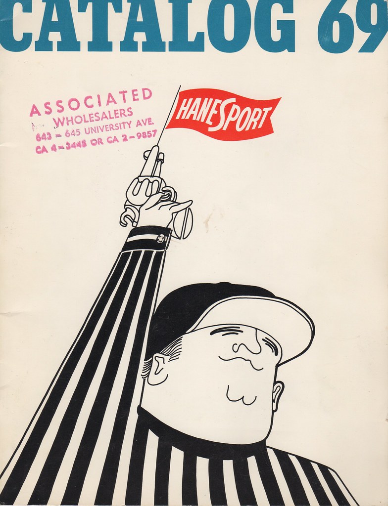
I recently scored this 1969 HaneSport catalog on eBay. I’ll get to some of the interior pages in a sec, but first I want to talk about the cover illustration. I think it’s interesting that they chose to put a zebra on the cover, instead of a player. (The catalog doesn’t even include any officiating uniforms.) Second, look at the sleeve cuff — that’s a French cuff, with a cufflink! I know refs used to wear buttoned barrel cuffs on their sleeves, but French cuffs?! Were those ever worn on the field, or was this just a bit of artistic license?
Now then, let’s take a look inside, beginning with this page of T-shirts (for all of these, you can click to enlarge):
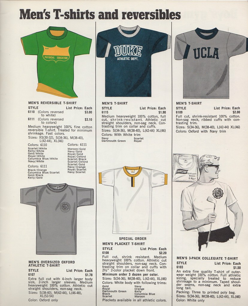
The main thing I like there is the two-tone placket on the center shirt in the bottom row. Unusual!
Here’s a page of football jersey options:
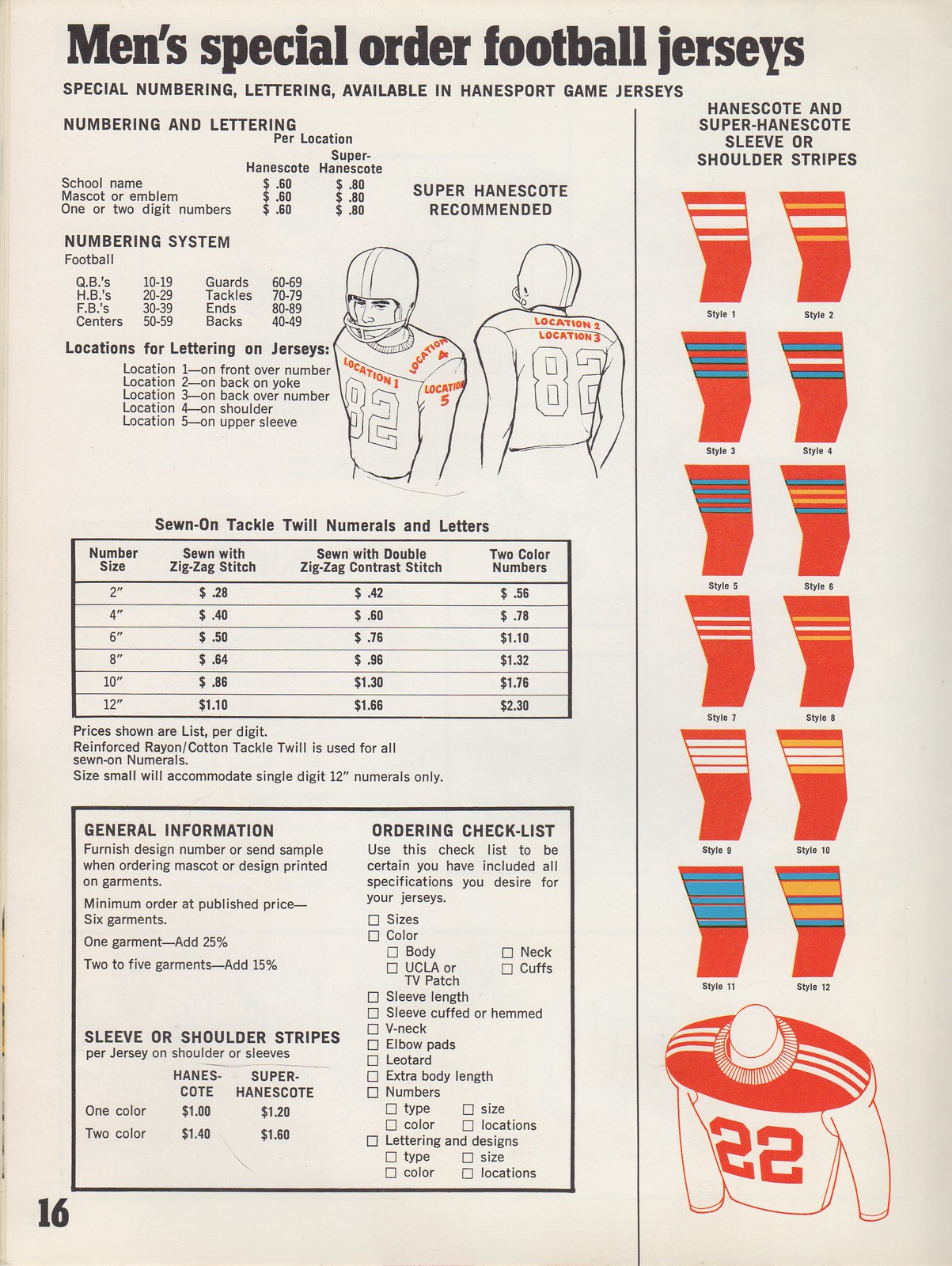
Interesting to see the two different positioning options for the NOB. (NOBs were still a relatively new phenomenon in 1969, so it’s not surprising that a standardized format hadn’t yet emerged.) Also, of course I love all the sleeve striping options on the right, the striped yoke at lower-right. Also-also: In the “Ordering Check-List,” note the box for “UCLA or TV patch.” What, pray tell, is a TV patch? The answer can be found on this next page:

As you can see, a TV patch is a contrasting panel for the TV numbers. I love the reinforced elbow patches, too. Also, note that Durene is listed with a circle-R trademark symbol — you don’t often see that.
A wider range of football jersey options can be seen on this two-page spread:
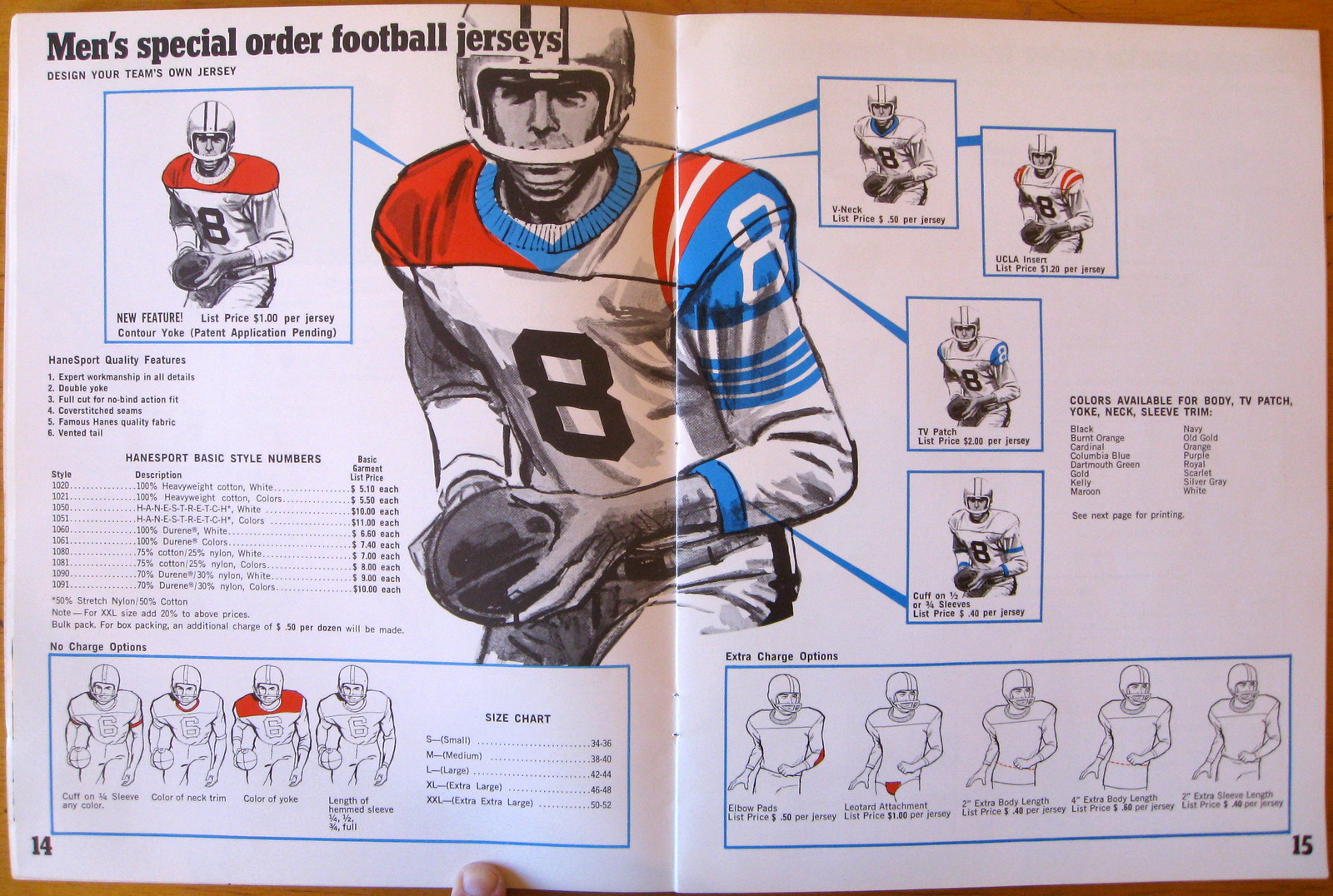
Note that the crotch extension (or what Giants equipment director Joe Skiba calls the “diaper”) is referred to here as a “leotard attachment.” Don’t think I’ve seen that term used in a catalog before.
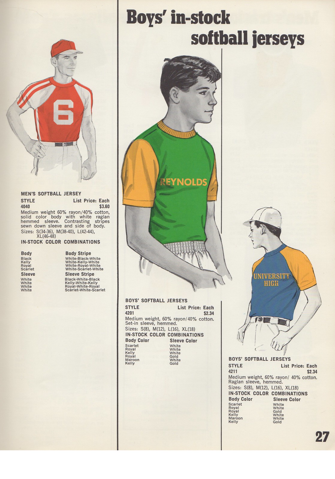
Here’s another two-page spread, this time showing softball jersey options:
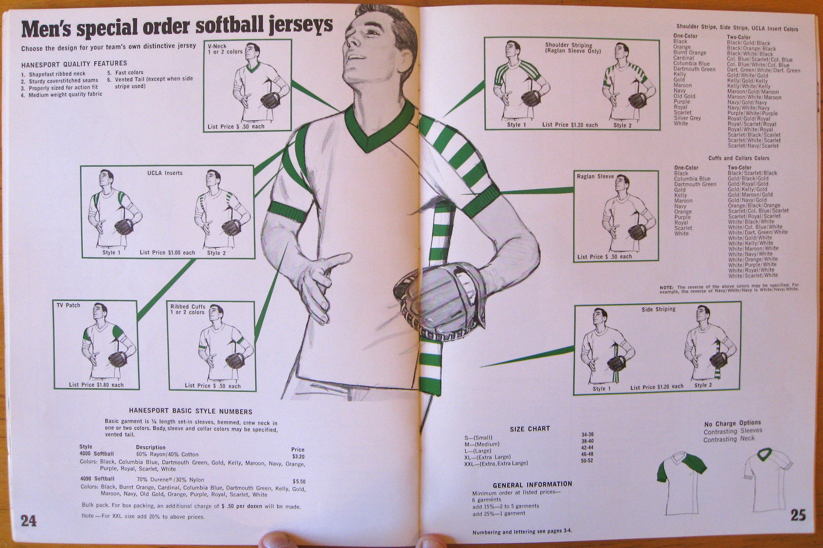
Imagine if they made a sample of the mix-and-match jersey in the illo — I’d love to own that!
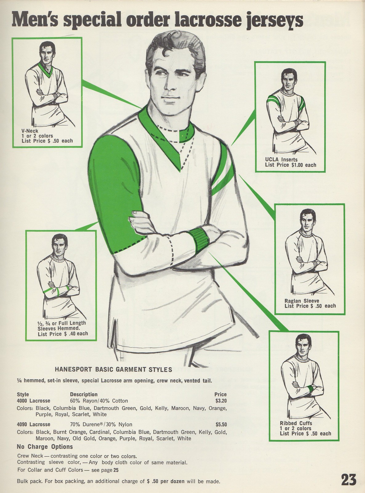
Next is a page of lacrosse jersey options, again with a mix/match illustration. Nothing particularly remarkable, but nice to look at:
On this next page, take a look at the collar, cuffs, and waistband of the jacket on the left:

See how the striping on the collar, cuffs, and waistband matches? Okay, so that’s not exactly a news flash. But I remember having a jacket like that when I was eight or nine, and I specifically recall the “a-ha!” moment when I realized that the stripe patterns matched up. It all made sense, it all felt Right. It was one of my earliest experiences of recognizing and appreciating design. A formative Uni Watch moment.
I bet you can guess what I like on this next page:
Mmmm, that pullover at lower-left — put me down for a dozen, please.
How many different options can there by for a T-shirt and a pair of short? Quite a few, apparently:

These last two pages aren’t especially noteworthy, but I’m including them for reasons I’ll explain in a sec:
Look the models on those two pages, and on all the other pages. Then think about what America was like in 1969, when this catalog was published: war protests, race riots, kids with long hair, drugs, free love, psychedelic music, and on and on. Meanwhile, the HaneSport catalog still acts like Eisenhower is in the White House. Very different from the up-to-the-moment combination of youth appeal and pop culture found in today’s Nike and Under Armour catalogs, eh? I’m not saying one approach is better or worse than the other. Just pointing out the difference.
Finally, as long as we’re talking old catalogs, reader Mike Princip just scored a 1939 Goldsmith fold-out catalog that’s such a beauty, it makes my HaneSport catalog look like garbage by comparison. Check this out:
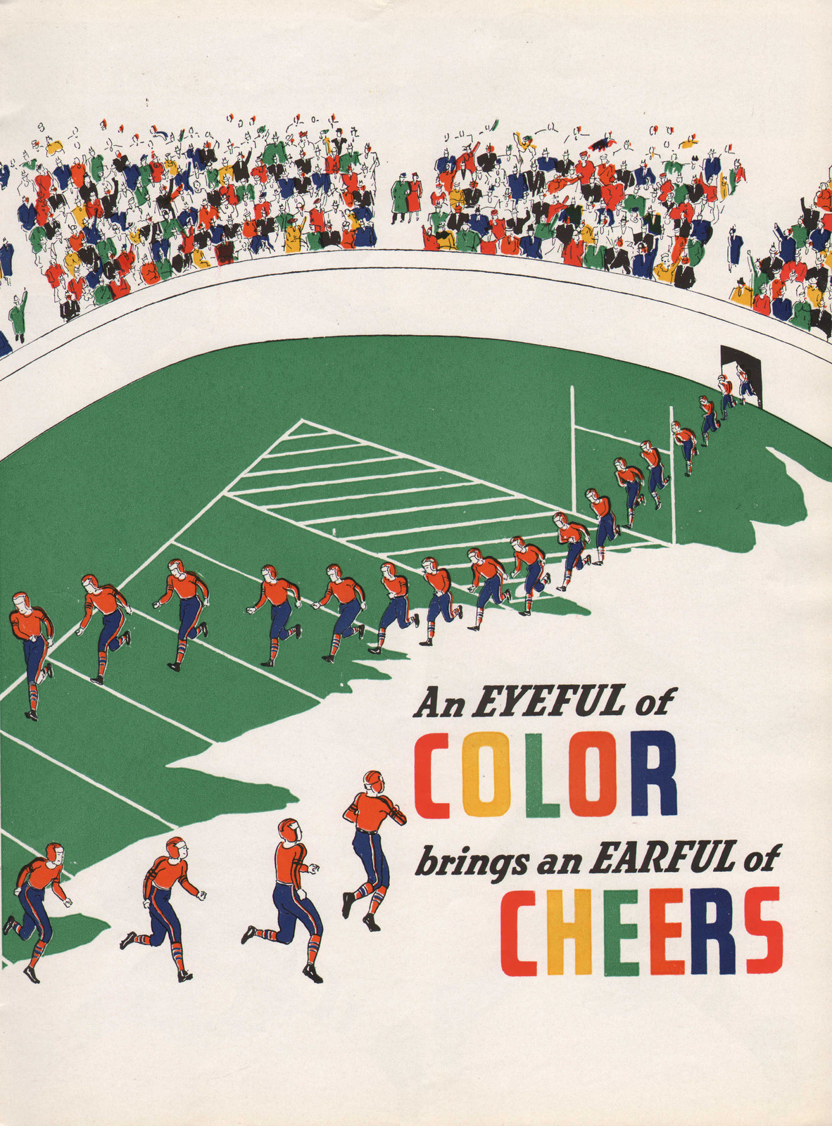
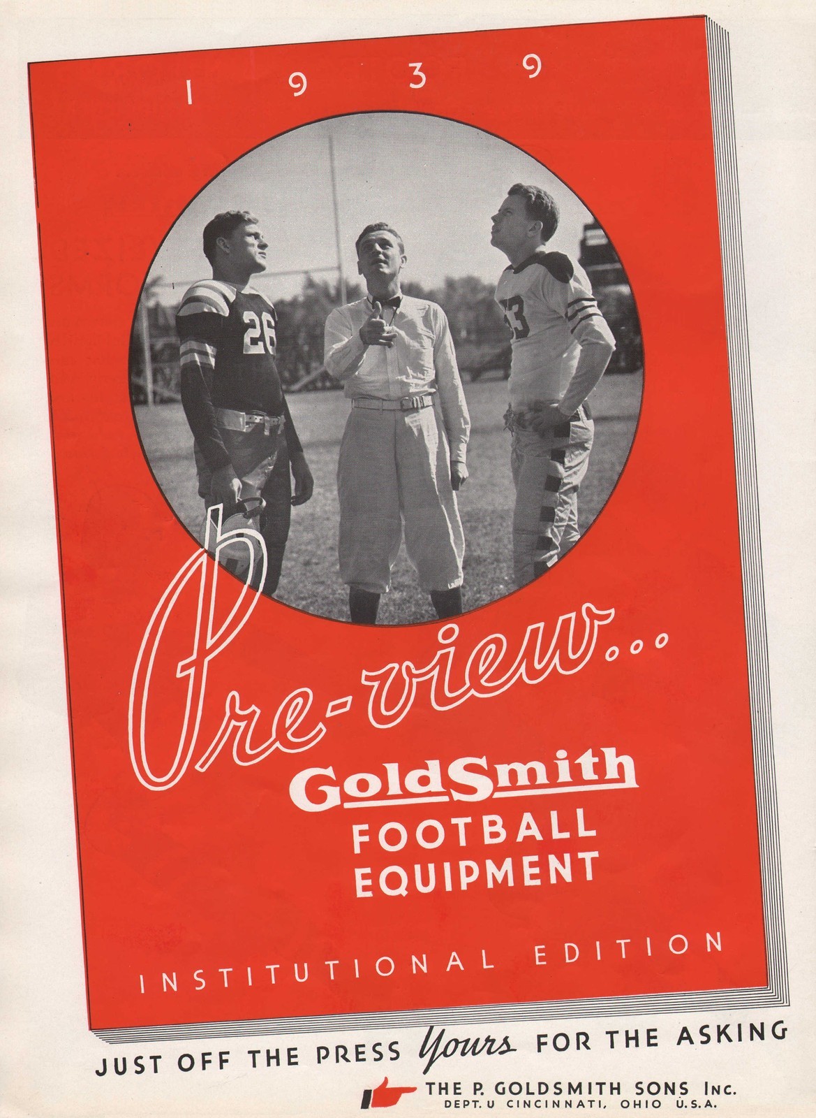
Gorgeous, right? And here’s the kicker: The total price, including shipping, was $12.50. Princip, you bastard!
Cupspiracy update: In the six-plus years of this site’s existence, I have never, ever written about the Little League World Series, and I’ve asked Phil not to cover it either. Sometimes a reader will ask me why, and my answer is always the same: I think the Little League World Series is bad for kids, at least the way it’s currently operated. All the TV coverage, the radar guns, the logo creep — that’s not what Little League should be about.
But I didn’t realize just how bad the Little League World Series has become until I got this note yesterday from reader Joey Orr:
I was at the Little League World Series this summer in Williamsport, Pennsylvania, and got a tour of one of the stadiums. As part of the tour, my group checked out the dugouts, which featured signs informing the players/coaches to only use Gatorade-branded cups while in the dugout. Kind of ridiculous that it goes so far down as to 11 and 12 year-olds.
“Ridiculous” isn’t quite the word I’d use. What kind of kids’ organization strikes a corporate branding deal like this? Imagine some flak telling a 12-year-old, “Sorry, son, you’ll have to pour that apple juice [or whatever] into this Gatorade cup.” What a disgrace. Everyone involved — on the LLWS side and the Gatorade side — should be ashamed of themselves.
Compared to that, our latest round of beverage branding shenanigans seems pretty tame. But here we go, beginning with an account posted in yesterday’s comments by reader Jeff Scott, who does the excellent Birdbats blog:
Back in 2009, when the All-Star Game was in St. Louis, my son and I had the opportunity to be stand-ins for the players during rehearsals for the pregame ceremonies. This was the day before the game and again the day of the game. The Cardinals are sponsored by Ice Mountain water, which is what they gave us to drink during our long waits. But, the MLB and sponsor for the game was Aquafina, so we were asked to remove the water bottle labels ”” even though we were nobodies in an essentially empty stadium.
Also from yesterday’s comments, there’s this story from Matt Beahan:
It’s not just the sports world that suffers from drinks-based douchebaggery. Some years back, I worked a summer at an amusement park where the soft drinks were supplied exclusively by Pepsi. We could drink whatever we wanted in the staff room, but we were only permitted to drink either Pepsi products or water from a clear, label-free bottle while we were on duty or in public areas. I was actually given a verbal warning one day for using an empty Coke bottle for my water — even with the label removed — because the distinctive shape gave it away.
Next up is reader Bryan Stevens:
I was in the marching/pep bands in college from 2001-2004 at the University of Wyoming. My freshman year we made the NCAA basketball tournament, and I found out first-hand about all of the ridiculous cup regulations. Everything we drank had to be poured into an Aquafina cup. If not, we would be brought a cup to pour it into. The guys that were old enough to drink went up and got beers at halftime, bringing them back in the 16 oz. clear plastic cups. The NCAA rep then proceeded to bring them each two 8 oz. Aquafina cups for the sole purpose of “the cameras need to see the logo.” It was possibly the most bizarre thing I’ve ever been involved with.
Next is reader Eduardo J.:
This discussion has raised a question regarding a sport I follow a lot: F1. You see Sebastian Vettel with a Red Bull bottle before each Grand Prix. Does he really have Red Bull in it? It sure looks like the liquid is clear.
And speaking of the world of international sports, Caleb Borchers sent along this photo of Australian Rugby National Coach Robbie Deans. “I doubt he was really that thirsty,” says Caleb.
Same discussion rules as yesterday. If you didn’t see those rules, or if you need a refresher course, look here.
Meanwhile, here’s the Bloomberg TV spot where I talk about all of this.
Uni Watch News Ticker: The National Museum of the American Indian in Washington, D.C., is hosting a symposium on Nov. 1 about racist imagery and cultural appropriation in American sports. The day-long event is free, and the proceedings will be viewable via a live webcast at this page (big thanks to Michael Kochczynski). ”¦ In a related item, hail to the Pigskins! “Seems like a solid compromise,” says William Yurasko. … More Maryland football designs are apparently in the works (from Jeremy Schneider). ”¦ The NBA is cracking down on pregame handshake rituals. ”¦ Nice video segment on the tailor who does alterations on the Eagles’ uniforms, who we’ve featured here on the site before (from Fred Emanon). … My bad for not mentioning the Sacramento Kings’ new arena-sponsorship deal, which was announced on Monday. As you’ve probably heard by now, it’s arguably the worst name ever for a sports facility. … A few weeks ago there were stories about the new Nike/NFL uniforms not being popular with linemen. But now the AP has found a bunch of linemen who do like the new uniforms. … Lots of Big Ten hoops uniforms on display here (from Martha Hermes). … Good article about how varsity jackets have changed over the years (from Paul Hirsch). … Bauer plans to bid on the NHL uni contract, which is set to turn over in 2016 — assuming they’ve settled the lockout by then (from Jay Sullivan). … One guy’s absolutely incredible sports memorabilia collection is showcased in this video clip (from Timothy Tryjankowski). ”¦ Illinois State basketball players wore an interesting mix of outfits for their Hoopfest event this week (from Joel Hackler). ”¦ During last night’s glorious decapitation of the Yankees Tigers/Yanks game, John Muir noticed two MLB-related ads behind home plate — one with a red-white-blue MLB logo and one with blue-white-red. Odd. ”¦ Some women’s fashion site I’ve never heard of (but that’s apparently fairly popular) has some opinions about the state of college football design. ”¦ When Nike unveiled the new NFL uniforms back in April, there was a lot of fuss over their new padded socks. Not sure if I’ve seen anyone wearing them, however, until now. That’s the Seahawks’ long snapper, from last night’s game against the Niners (screen shot by Andres Torres). ”¦ Meanwhile, it looks like the Niners are still using the old Seahawks logo on their play-calling sheet (good spot by Brian Eagle). ”¦ Speaking of the Niners/Seahawks game, here’s an interesting subtext: Not a shred of pink. Amazing! ”¦ Love the handwritten “StL” logo on the Cardinals’ weighted bat sleeve (from Scott B). ”¦ Due to a mix-up, two Arizona eight-man high school football teams went color-on-color. That’s Rock Point in maroon and Mogollon in red (from Raymie Humbert).
some of the colorful fottball unis in the 60s cataog have the same LED effect the new Maryland unis now have …
I think you mean the GoldSmith catalog (which would be the 1939 one), right?
I always enjoy seeing the catalogs. Both today were sweet.
How about the football uniforms from 1939. The late 20’s to early 40s were the best for college football uniforms.
Paul, I was busy early this morning. If you look at the haircuts on the men in the Hanes catalog most of them have the “JFK look.” Neatly coiffed with the part on the right. Definitely early ’60s. In the old days it was not uncommon for companies to use their same photos/illustrations for years and just do a ’60s version of photoshop or air brushing to make changes. Hey, you saved a buck wherever you could.
Speaking of airbrushing…
I read this today about the party photo in The Shining. Pretty cool.
link
second to last sentence “two** Arizona eight-man”
Thanks — now fixed.
Only pink from last night was from Kyle Williams. I think Ted Ginn maybe also
link
Regarding Cupspiracy item about Sebastien Vettel and his Red Bull bottle, that case may be a little different as Red Bull actually owns the team.
Plus, the actual Red Bull drink isn’t heavily colored, so extruded through a thick, somewhat translucent straw, it’s really hard to tell. In fact, it’s hard to tell if he’s even taking a sip at that particular instant that picture was snapped.
I’m not ruling out a beverage swap here, I’m just saying that this particular case is far from clear-cut.
According to Wikipedia (the entry on ABC logos, which I happened to walk into late last night while surfing), today marks the 50th anniversary of the debut of the Paul Rand-designed ABC circle logo. The logo is still in use today (though glossed up to look like a shiny button, it’s still the same basic design, with the same typeface for the lower-case “abc”).
I got to see Rand speak at a design conference in 1991 — he was like a god. Around that same time I edited a book that included a decent-sized interview with him. Asked if he had any regrets, he said it was a mistake to have drawn the little bow on the UPS logo freehand. “I should have used a compass,” he said.
And the CBS eye recently turned 61. Enduring logos. I had read many moons ago that insiders referred to the abc logo as the “meatball.” So, happy birthday, meatball.
Really wish NBC would bring back the “snake” logo of 1959-1975 vintage.
Bradley’s old basketball floor finds new life at a Peoria marketing firm.
link
Bauer produced the Nashville Predators’ inaugural uniforms for the 1998-99 season. As they were owned by Nike at the time, the Nike-branded uniforms for Anaheim, Chicago, Detroit, Philadelphia, San Jose, and Toronto were more than likely actually made by Bauer as well. Bauer also supplied uniforms for International Hockey League teams at the time.
Bauer was sold off by Nike in 2008, so it’ll be interesting to see how they’ll do without a
corporate douchebag overlordglobal juggernaut backing them. Personally, I’m sick of Reebok, and I continue to lament that they bought out CCM.The two tone placket t-shirt, or “tab tee” as we like to call them here, look great as vintage pieces but don’t look so good when they’re new. We do them all the time.
As far as pink goes… I was watching my D2 alma mater play a rare game on TV last night, and sure enough, at least 25% of the players were wearing pink. Combined with our colors of purple and gold, it was not a good look. I called them out on Twitter about it, the official University football account retweeted it, and I got some flak from various fans asking why I don’t support breast cancer research. Sigh.
When will the madness stop? Or better yet, when will we just swap out regular unis for a different color each week, so we can promote research for all different kinds of cancer? I don’t get sports’ singular obsession with breast cancer. Other than, you know, boobs.
I don’t get sports’ singular obsession with breast cancer.
Think: What’s the largest market segment that isn’t already fairly committed to sports?
Willie Sutton would approve.
That’s a fair point, Paul. But are they (NFL/college at least) really sleazy enough to think they can rope in female viewers by promoting breast cancer research…?
Oh, forget it. I probably don’t want to know the answer to that.
I don’t think it’s necessarily sleazy (esp. when compared to, say, making a grown man pour his water into a Gatorade cup — that’s sleazy). But when the NFL thought about a charity to promote, I’m sure they thought something along the lines of, “Well, we could promote prostate cancer awareness — but where’s the percentage in that?”
My sister was an NFL fan long, long before this stuff started, and she’s been long tired of the pink-out. Granted, she’s never cared for wearing pink to begin with…
Of course, women like my sister (who’ve been fans all along, without the fru-fru add-on crap) are perceived by the leagues to be a minority, a fringe group.
Right – it certainly isn’t in the same universe as Gatorade, but I do have a problem with the NFL selling merchandise based on teams wearing pink IF the proceeds aren’t 100% going to cancer research. Otherwise, it is indeed sleazy, in my eyes. I swear your calling bullshit on these matters is wearing off on me, Paul. But I don’t think it’s right to make a single dime of profit off a gimmick that is supposed to promote cancer awareness.
For D2 schools like my alma mater wearing the stuff, my gripe is purely aesthetic. We can reasonably say that there is no tangible benefit from them wearing pink garb. They don’t have Nike to make pink alternate jerseys for them to sell. They could stick a bucket at the entrance gate to the stadium and ask for donations and it would do the job just fine.
Yesterday I tried to play a little devil’s advocate with Paul just for the hell of it. In the end though, I agree with him. Common sense will do that to a man. This whole policing of cups and labels and bottles is stupid and dishonest in certain cases. To put that much importance on a logo and product is actually so sad it’s laughable. This practice at the little league world series is criminal and dirty feeling. When this happens at a professional and collegiate level, it’s annoying at best.
It also seems like these stories are all coming from non-regular season games (i.e. playoffs, ASGs, special events, etc.). As a manager or player, this seems like something you would hate to have to deal with in a playoff scenario. Imagine you’re a manager, your team just lost a game 7. You are heading to the podium to talk about losing the game and all the things you did wrong as a team and manager (the last thing you want to do at that time). You grab a bottle of something on your way and as you are collecting your thoughts, some intern or volunteer comes up to you and tells you to use a certain cup and that you are violating some bullshit contract. This whole practice is obtrusive to say the least. As for all the bottles they have stacked in front of the mics, yes they are annoying and distracting, but at least they are labeled Gatorade bottles with actual Gatorade in them.
I like to think the people that insist on the enforcement of these rules feel some sort of shame, but they don’t. They probably feel proud of their intrusiveness of brand graffiti.
I like to think the people that insist on the enforcement of these rules feel some sort of shame, but they don’t. They probably feel proud of their intrusiveness of brand graffiti.
That touches upon a point that someone raised with me yesterday via email: This isn’t just a problem with corporations, or business culture — it’s a problem with people. Someone willingly (enthusiastically?) drew up the rule that says you have to pour your water in a Gatorade cup; someone else willingly took the job to enforce that rule; someone else is that person’s boss; and so on.
How do these people look in the mirror? How do they sleep?
One reason I’m so gung-ho about this stuff is that I feel the actions of these people demean all of us. They create (and legitimize) a culture and a set of behaviors that, as Mike V. just said, don’t pass the test of common sense. They rob us — ALL of us — of our dignity, our basic sense of right and wrong.
We’re better than this. Or at least we should be.
Paul is using an antiquated notion of “product”.
“Gatorade” is not an electrolyte-based sports drink. “Gatorade” is a brand. Their goal is to get that brand in front of potential consumers as frequently as they can. They don’t care about the drink. They only care that you buy the brand. The more people see that logo, the more they think, “We need some Gatorade in our house.”
In one of his books, Ken Dryden laments that “being the best” used to mean being the best person you could be. Today, it means being the best “at something,” be it sports or bottle cap collecting or tiddlywinks. This Gatorade thing is the corporate variation. Nike is past master at it: no one cares about whether people actually like their products or use their products; they care that people buy their products. And if you don’t plaster that brand everywhere, no one buys it.
So while I sympathize with Paul’s general sentiments that this is obnoxious and wrong, I can’t call it deceptive.
“Gatorade” is not an electrolyte-based sports drink. “Gatorade” is a brand.
Meaningless point. By this standard, NOTHING is a product, because EVERYTHING is a brand.
EXACTLY.
Go back and read the comments from the guy who works for the distillery. He describes a management team that was obsessed, not with product quality or consumer satisfaction, but with brand placement. That’s every corporation in America. It’s every corporation in the world.
Everything is a brand.
That’s why we wear running shoes that are made by child labor and cause plantar fasciitis. And spend billions of dollars on sports stadiums we don’t really need. And drink crappy sports drink that taste like sugary badger urine.
Steve Wozniak said that the best products don’t succeed in our world; the best-marketed ones do. The fight isn’t about whether there’s Gatorade in the cup. The fight is about the cup being there at all.
Cort, you’re describing the current state of affairs. You’re not wrong, but it doesn’t move the ball.
I’m trying to change the current state of affairs.
I call it fraudulent. If you see a Little League player drinking from a Gatorade cup the implication is that he likes Gatorade. What if he doesn’t. What if he likes water and hates the taste of Gatorade. But someone has told this player that he must drink out of a Gatorade cup. That person may be committing fraud.
I have tried really hard to come up with a counterpoint on this cup issue, for one because I’m usually a bit more pro-corporate than Paul, but also because I think there’s always good arguments on both sides of an issue. However, in this case, after two days of thinking about it, I can’t come up with a way to justify this stuff. And you wonder if it really affects people the way the companies intend. It’s like when you’re watching a sitcom or American Idol, and there’s a Coke can on the table which happens to have the label perfectly facing the camera. It makes the “hey we drink Coke because we like it” vibe they’re trying to portray way less believable.
I don’t understand why they can’t just provide their beverages for free, encourage (but not demand) its use (and subsequent display), and leave it at that.
Happy Stirrup Friday! link
Nice, JamesP!
Cards have a shot at going back to the WS tonight. Since my Yankees are out and I live here in the StL, I figured I would break these stirrups out. Haven’t work them since early in the season.
Sudden Sam McDowell and the Indians.
(cuz, y’know, we’ve had the discussion here many time about the two inner white stripes on Cardinals’ stirrups being wider than the others).
I know, but it depends on the year for that variation. I believe the strip size has become normalized now. I will say the two middle white-stripes being a little wider would give the Cardinal’s stirrups a little more character.
Sup with all the pop-under ads?
They suck, but we all just have to deal with it/change our browser/employ anti-popup software, etc.
Not seeing the pop-unders is almost worth the cost of an iPad, where the pop-unders don’t appear.
Firefox + NoScript.
Seriously, it’s 2012. If you’re seeing pop-anything ads, you’re either stuck at work with outdated systems you can’t control, or you fail at the internet.
I open the site, get the pop up but then close and reopen the site and I do not get any pop ups.
heh heh….thanks Paul, I learned from the best.
BTW, check it, one of those badass 1930s link.
Regarding those two MLB ads shown during Yankee Demolition Day (fka Yankee Elmination Day), I believe one of those is “real” (in park), and the other one is a creation of the ad wizards at TBS. When they go to a replay or a camera that shows home plate from a camera other than CF, you see the green screen there on the right hand ad panel.
What just strikes me as odd overall is that with the playoff logo package going back to red, white, and blue this year (the colors of the MLB logo), they decided to flip the colors on the logo itself in these packages (red on the left side of the bat, instead of the regular blue). I can see it when they’re mixing in other oddball colors (red and green, blue and orange, etc.), but this year’s look just looks flat-out wrong.
And I just realized as I submitted that, that I mixed singular and plural (package/packages).
link
The normal colorway (ha!) of the MLB batterman logo reads blue-white-red from left to right. For some reason, their Postseason logo is reversed, red-white-blue. According to Creamer’s site, there have been different colored logos for the World Series off and on since 1995 (black and gold?!). The 2005 WS logo was also r-w-b.
The 2005 version also had gold, while the 1995 version was a one-off variant (I think of it more as a bronzing effect), since they went to a tweaked version of the 1992-94 scheme in 1996.
It’s interesting to see how things have changed; after a two-year scheme in 1978-79, they had the stacked-and-offset text logos from 1980-86, the diamond/script logo from 1987-91, the script/diamond/globe logo from 1992-97, and the pseudo-3D globe from 1998-99, before changing the logo to something different every dang year. There are still common elements, though, since some form of globe was used from 1992 through 2007, while starting in 2008, we’ve had leaves to hammer home the “Fall Classic (TM)” aspect.
Something I just noticed about Creamer’s site – in the reorganization, the link got lost, and he’s showing the regular version of the 1989 Series logo in both the primary and alternate sections.
The Washington Pigskins idea has grown on me hugely. It would join an elite corps of teams named after equipment used to play their sports. I’ve got the Nets, Red Sox, and White Sox. Any other pro teams named after equipment? Is this a thing in any other countries?
Also, while in principle I’d prefer that Washington’s gridiron franchise join the rest of the city’s teams in going red, white, and blue, the NFL already has too many RWB teams. And burgundy and gold seems like a good color combo for a hog-themed team for some reason.
Let me know when the Washington Post signs on.
just sitting here hoping Buffalo never skates out brandishing sabres… unless of couse they play the Flyers…
well… Zednik may have a thing or two to say about that comment!
Would a Muslim player be forbidden from playing for the Pigskins? I know it’s not *actually* a pigskin, but…
I read a book last year called The Year of Living Biblically. The author spent a year, strictly adhering to all the laws in the Bible (it was a good read.)
Anyways, he wouldn’t play cards, because playing cards are made out of gelatin, which is made out of pigs and according to the laws, you’re not even supposed to touch the carcass of a pig.
link
I always heard that the Tigers were named after their socks, which were black and yellow striped. Not sure if that’s true, though.
Yes, and also true of the Cardinals and the Reds. But they and the Tigers are named after their uniform colors, not the actual uniform pieces.
I agree, I love the Pigskins name. It’s a bit minor-league sounding but it’s unique and fits well with the team’s current identity (fans can still call them the ‘Skins or Hogs). Much better than “Washington Warriors” which sounds like a high school team.
Paul, when I was in equipment staff at LA Tech, we called the crotch extender a “diaper” too. They were not in use by the time I joined the staff in ’97, but the stories told about the “diaper jerseys” were they were loved and hated by the players. They loved that the jersey stayed tucked in with them, and hated them when they needed to have a movement at halftime or take the jersey off after the game. What was odd was seeing the old stock of jerseys and seeing a diaper on an old tear-away jersey. Oh to have had a camera back then to have pictures of the odd equipment, etc we had in the equipment room…
nice! i’m sure you’ve meet a Robertson or two in your time there
That’s a safe bet.
Don’t recall if they had duck calls with them or not…
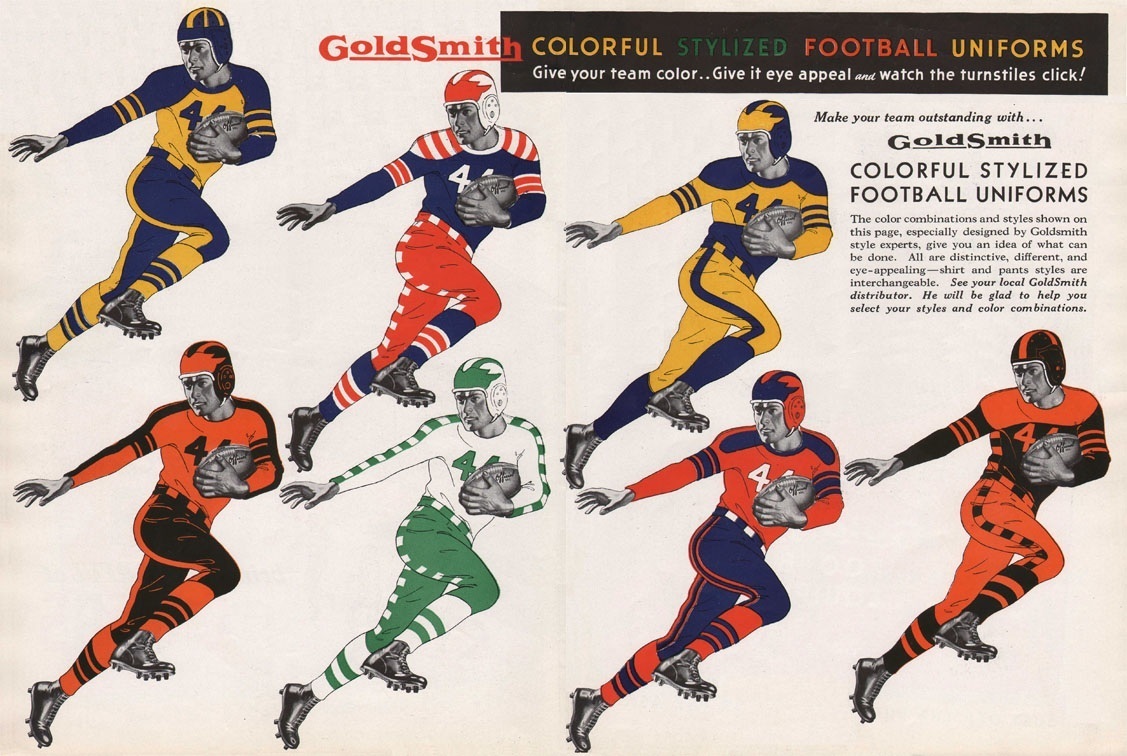
GoldSmith Colorful Stylized Football Uniforms
Give your team color… give it eye appeal and watch the turnstiles click!
Using flashy uniforms to sell tickets/make money? In 1939? For shame…
LOVE the striping selections on link page. I especially love the yoke on number 22 at the bottom.
“Using flashy uniforms to sell tickets/make money? In 1939? For shame…”
I love the action 1939 football player template.
No question, that’s excellent.
Great find, Mike!
Part of the fun (?) of corporate naming of sports facilities is the inappropriateness of the product. Do yourself a favor and look up the most scatalogically-named company, or if you like, tweely-named to appeal to seven-year old girls, and imagine it splattered across the hockey arena in your neighborhood. But I agree with the sentiment expressed yesterday: A company with management that thinks it a good idea to squander capital on larks like this should probably be sold off.
It is worse than just sports. My wife used to work for a nonprofit that is working to rid the world of a specific disease. One of their big event sponsors was a water company (can’t remember which), so they had to remove any competing labels from their water bottles _while in the office_. Just on the off chance the sponsor came through.
My wife works for a major financial-services firm, and for a long time Pepsi was one of their top accounts. In vending machines, conference rooms, event catering, and the like, only Pepsi products were permitted, and while staff were not forbidden from bringing and consuming Coke products, it was softly discouraged. For the same reason: What if a Pepsi staffer happened to be in the office? But this policy was enforced nationwide, not just the office closest to Purchase, NY.
“What if a Pepsi staffer happened to be in the office?”
That’s pretty much the exact reason I was given at my park job. The Pepsi rep would visit every couple of weeks and would have kicked off upon seeing a Coke bottle in my ride hut.
On a similar note, one of our coasters was sponsored by Wall’s Ice Cream and themed around a popular ice lolly, and when we gave the safety announcements we had to always refer to the ride as the “Wall’s Twister”, never just “Twister”. Just horrible…
Have I mentioned lately how much I like working at home?
“More Maryland football designs are apparently in the works”
Hmmm, those look like they might be for lacrosse. Since those jerseys actually have sleeves.
link
And the photo on the right looks to be the MD lacrosse ‘Pride’ jersey from last season.
link
The first one is the Black Ops uni in response to the White Ops uni they wore against WVU. And there was speculation there would be a black Pride uniform.
The one star on the unis near the tag signifies the one national championship the program has. The lax team has two championships.
“Ops”? What the fuck is “Ops”?
(Aside from a bullshit branding scheme, I mean.)
Yeah, more equating football with military crap
It’s supposed to be referred to as the (color) OPS uniform – Official Pride Shit uniform. They did call the initial football uniform a “pride” uniform – and it looks like shit. So, there ya go.
““Ops”? What the fuck is “Ops”?”
~~~
typo
should read “oops”
A ha – thanks Jeremy
Course, Kevin.
And yeah, Paul, it’s supposed to be ops as in operatives. Because, you know, football players are basically soldiers.
Still, these unis are better than the sets they churned out last year. Those gradient numbers were not fun from the press box.
Does anyone think anything can be done about aggressive branding like this cup fiasco? I am not trying to be cynical, but this really feels like one of those things that is here to stay. These corporations obviously feel that his kind of placement helps their brand and their bottom line and so long as they are willing to pay for such exposure someone will be willing to take their cash. We can be sick about it all we want, the fact is that most people probably just don’t care. Will it ever get to a point where an oversaturation of advertising begins to measurably hurt either the game it is “sponsoring” or corporation being promoted? Or will it happen so gradually that no one will notice until pro athletes essentially become like the soda-pop company polar bears or that woman from the insurance ads or some other corporate mascot that exists only to sell a brand?
We can help create and maintain a climate of shame and disgust so that companies think twice about engaging in such policies. Even if we don’t get them to retreat, we can keep them from advancing.
I get your point, though — it’s hard. There’s a lot of nonsense in the world, and it can all seem overwhelming. We all pick and choose our battles. I’ve chosen this one, but there are plenty of others where I just sigh, suck it up, and accept it as “This is the way things are.”
This corporate nonsense is like the Matrix: It’s an integrated fabric of unreality that creates the illusion of a world, but it’s not the real world. Sometimes we choose the blue pill and just accept the illusion; at other times, we swallow the red pill and choose to fight the illusion. In this case, I’ve chosen the red pill.
I think a key to winning this type of battle is to get some smart person to do a study which tries to equate brand visibility to sales. I have a feeling drink sponsors like to think that constant visibility is helping sales, but I’m not so sure I would buy into that premise. And maybe someone could try and see whether a team getting official drink rights to a team stadium, for example, results in increased sales outside of the ballpark. I’m sure there’s a way to create the association, but that’s kind of outside my own realm of expertise
I think a key to winning this type of battle is to get some smart person to do a study which tries to equate brand visibility to sales.
I disagree. The moment you commission that study, you’re buying into the notion that the carpet-bombing/saturation approach to branding could be acceptable, if the study bears it out.
The truth is that the effectiveness of the approach is not relevant to the discussion (at least not as I’m trying to frame it). This stuff is unacceptable, period, because it’s too much, it crosses the line, it flies in the face of common sense, it doesn’t pass the smell test, and all the rest.
That’s a good point, just because it’s proven to work doesn’t mean it’s a good thing to do.
But I do think they overestimate the impact of their oversaturation. I can only speak from my perspective, but I’ve never felt like I wanted a gatorade or any stupid brand of water just because I see people on TV drinking out of those cups.
Then again, I drink Dunkin everyday so maybe I the fact that they’re the original coffee of the Patriots played a role in that…
Ugh typos, last sentence should be
Then again, I drink Dunkin everyday so maybe the fact that they’re the official coffee of the Patriots played a role in that…
Phil i think it’s because you can’t go 10 feet in certain cities without passing a Dunkin.. plus their coffee is 1ox better than Starbucks
The “climate of shame” approach can work and I have seen it happen. I am a Pens season ticket holder. When they opened the new Consol Energy Center a few years ago, they had a great new shiny building that they plastered ads with on almost every square inch. Even parts of the games were sponsored. Power plays. Intermissions. Over times. Shoot outs. The problem was when they had a sponsor for penalty kills. They had a little intro they would play trying to get people excited for the penalty kill. pens fans and even the media was taken back by the celebrating of a bad thing (penalty kills put your team at a major disadvantage and means your team did something bad…why try to get excited for them?) After major back lash from fans and media alike, that sponsor was gone and penalty kills are no longer sponsored. It was a obvious move on the Pens to get more revenue that they were called on and they backed-off when their hands were caught in the cookie jar.
Maybe it will take Congress getting involved. With MLB, they can always dangle that Anti-Trust exemption. It is an issue that would be high-profile yet (for the most part) an utter waste of the Federal Government’s time and resources. In other words, perfect for the US Congress.
I grew up in South Williamsport, Pennsylvania. The Little League World Series has sadly changed from what used to be a fun weekend of baseball for the locals and the teams’ families into a national, corporate barf inducing marathon. I think it takes over a week, not including the regionals. When I was a kid it was basically a Mom and Pop type operation. Local organizations were granted access to the grounds to run the concession stands as fund raisers. I remember the Lions Club specifically was very involved and local fire departments, churches, and even local little leagues sold Cokes, hot dogs, hamburgers, and other stuff for little to nothing. Local ice cream men were allowed to park near the facility and people were allowed to bring in outside foods. Those days are long over. I don’t know what the food situation is now, but I can only imagine that it is highly commercialized. You are no longer allowed to carry in outside food. This really takes a bite out of the pockets of the small businesses in the area that used to make their year during Little League week. LLBB has also scarfed up most of the surrounding property and have made it very difficult for private property owners to sell parking spaces in their yards, etc. It really has become sad and disgusting.
Yesterday, someone expressed gratitude for Coke, which sponsored his high school’s football scoreboard, and helped underwrite the cost of the program. And we probably all have similar memories, of a grocery store or a soda bottler or some other business displaying their logo at the local ball fields. It was less advertising than community service, even with big companies like Coke or Pepsi, which handled those sponsorships through regional bottling plants.
It is a completely different story today. Nike, ESPN, and their imitators have turned everything into a product. And when the cancer surviving cyclist or the pre-teen ballplayers or the college football star is no longer marketable, you just cut ’em loose. It’s pretty horrible.
I’m doing some KHL coverage for a hockey blog today, and it comes to my attention that Lev Praha has two players (a defenceman and a center), unrelated, but both named “Juraj Mikus”.
I can’t wait to see how the NOBs for this work.
I know the other team (CSKA) has a set of brothers, but with that it’s “Radulov” and “I. Radulov”. These dudes have the same first and last name. Sort of makes the FiNOB a little tough.
Considering the defenceman Juraj Mikus wears #66 and the forward Juraj Mikus wears #71, I think there’s a clear way to tell them apart. Alos, the forward Mikus spells his name with an added accent over the “U” – Mikúš – compared to the defenceman Mikus – MikuÅ¡. Not knowing Slovakian, I’m not sure how this changes the pronunciation of the names, but it might be the difference.
One of them wears “J. MIKUS”, no accents. I didn’t catch the other one from the back during the game.
In “David O. McKay and the Rise of Modern Mormonism”, a scholarly history of the Mormon Church under the leadership of David O. McKay, there’s a story about McKay attending the opening of a theater or sports venue in Utah in the early 1960’s. He requested an orange soda. The manager of the establishment explained that this was a Coca-Cola building: he could have his orange soda, but it would come in a cup marked with the Coke logo. “We are contractually bound,” the manager explained. “All beverages have to be served in Coke cups.”
At this time, there were many Mormons who considered cola drinks a violation of Church health laws, and the thought of seeing the head of the Mormon Church with a Coke cup in his hand was somewhat scandalous. McKay laughed and told the manager, “I don’t care what it says on the outside, so long as it’s orange soda on the inside.”
So the Cup Wars have been going on for at least five decades.
[quote]Speaking of the Niners/Seahawks game, here’s an interesting subtext: Not a shred of pink. Amazing![/quote]
Buzz!! Wrong!!
Ted Ginn Jr. had pink wrap above his shoes
link
Also, part of Joe Staley’s shoes were pink, and the Candlestick Security guards were wearking pink jackets (no pics of either.
I dont recall if this has come up before, but on a recent episode of chris hardwicks podcast, tom hanks was talking about making either apollo 13 or the hbo series and touring nasa, where the explained thw two different nasa logos and the nicknames for each.
That podcast was one of the better ones! Didn’t Tom say he liked the “meatball” logo? I’ll be interested to see if the Nerdist group really does follow through on making their insignias/patches.
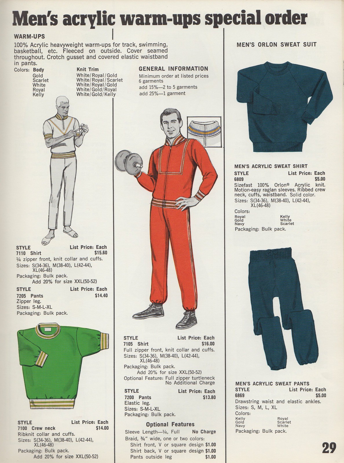
The more I look at the guy in the left column on page 29 of the HaneSport catalog, the more I think he looks like Captain Murphy of Sealab 2021.
I notice that in the ’60s catalog, they think htat QBs can only wear numbers 10-19, and they don’t list any position wearing single digits, but then they say that if you order a small jersey with 12″ numbers, it can only have a single digit (presumably because two would be too wide).
That is a bit odd, especially for 1969. Did college or high school football actually have that strict of a number system at the time? Obviously, the AFL & NFL allowed players to wear 1-9, so where did that supposed restriction come from?
NFL numbering system was instituted in 1974. AFL didn’t have a numbering system either. Not sure about college/HS but I believe there were no restrictions there either in ’69.
Just in time for the Gatorade discussion, here’s my Bloomberg TV spot:
link
Nice job, Paul. Too bad the site designers haven’t programmed the site to run videos on Chrome…! No worries, I was more than willing to go out of my way to open IE!
Again, nice job.
Thanks, Jen. Major props go to the editor/producer, who spliced about 10 minutes’ worth of my rambling statements into a coherent 90-second piece. Nice graphics, too!
I use chrome and it worked fine for me
Nice spot Paul. One question….was that your new suit? Looked sharp and tailored.
Yes! But it was just the jacket. I was wearing jeans.
The one thing that confuses me about cupgate is, why does this work? If I was in the band or a player on a team and a dude told me what cup i had to use he would be picking up his teeth. end of story. And the more I think about someone approaching my 12 tr old son and telling him you cant drink out of that the more I think I would be heading to jail for a long stay. If your not getting paid, why would agree to let somneone tell you what to drink from??? or better yet, tell you ANYTHING? I think some of the blame has to placed on the sheeple who just do what they are told.
If your not getting paid, why would agree to let somneone tell you what to drink from???
This is the Dirk Nowitzki model: “Gatorade doesn’t pay me!”
But of course Gatorade does pay him on some level. The money from the sponsorship goes into the financial pool that eventually comes out as player salaries.
Same goes for Raúl Ibañez and Davey Johnson — they get money from Gatorade too. The question is whether that money is being generated ethically, honorably, and respectably. There’s nothing wrong with sponsorship per se, but there’s a lot wrong with the way Gatorade and MLB are going about it.
Of course, when it comes to Little Leaguers, all of this stuff should be out of bounds. That should go without saying, and it’s an outrage that it doesn’t.
If I was in the band or a player on a team and a dude told me what cup i had to use he would be picking up his teeth. end of story.
Bullshit. Unless you’ve got some mental issues, you’re not going to assault someone and go to jail over being told to use a specific cup. The reality is that you’d probably think it’s sorta stupid, maybe you’d even ask why – then you’d pour your bottle of water into the Gatorade cup, because it’s just not that much of an inconvenience – and *that* is why it works. Sure, it’s unethical – it’s wrong – it shouldn’t happen. But, at the end of the day, it’s just not enough of a problem that anyone is going to really bother to fight it with anything more than a sarcastic comment, especially when they’re already being paid millions.
While I agree with you that allowing only Gatorade in the dugout at Little League games is ridiculous, I wonder if any of the money that Little League gets from Gatorade goes to help kids who wouldn’t normally be able to afford to play. I know for a fact, that in my kids’ area there is at least one Little League that gets some financial help.
Ah, so the ends justify the means, eh?
How about this: If Gatorade wants to help out Little Leaguers, they can do it honorably and ethically, not by turning 12-year-olds into corporate shills.
I’ve written a follow-up to last week’s wishbone-C column:
link
I probably posted this too late last night but about the New Era hats: I thought the 3930 WAS the low crown hat?
3930 is the flexfit. They do make low crown 5950s, as well.
What exactly is the difference? They both seem low crowned and form fitting.
3930 has an elasticized headband, sort of a one size fits all thing. I think they come in S/M and L/XL. 5950s are size specific (7 1/4, 7 3/8ths, etc).
Those placket design t-shirts are very nice. I want to try to find out if anyone still sells them. Thanks for sharing the catalog.
Can some photo shop geek help bring to life Cort’s description of the flavor profile of Gatorade? Sugary Badger Urine just has a ring to it. And not too far from the truth either. Well done Cort.
I’m not sure if you want a can of Bud Light with a motion W on it, or a cartoon badger screaming OH YEAH! while bursting through a brick wall…
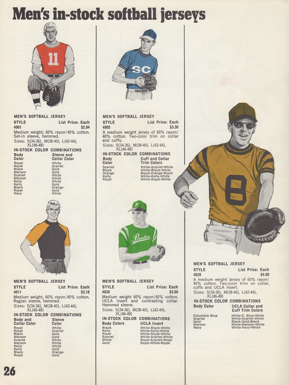
Here’s an interesting piece of (super) minutia to go along with that awesome catalog report: notice that the only non-generic name appearing on the catalog (other than Duke and UCLA on the first page) is “Reynolds” in the boys’ softball tops page. Hanes was founded and is still headquartered in Winston-Salem, NC, and the shirt is almost certainly a tribute to either RJ Reynolds tobacco company, or (more likely in my opinion) RJ Reynolds High School, which since the day it was built has been considered one of the best public high schools in the city (as well as the high school of Sen Richard Burr, Ben Folds, and Stuart Scott).
Great stuff — thanks!
Wasn’t it Deanna Favre who started the whole pink craze in football? After being diagnosed with breast cancer she teamed with the Packers Pro Shop to sell a pink hat with the proceeds going to charity(American Cancer Society?). It was a huge hit and had good intentions. Then the NFL had to start the pink trend and run it into the ground. The problem with the pink now is that it has become so trendy that high schools and colleges just want to feel cool by copying the NFL. It’s to the point where the fad of wearing pink on the field now overshadows the purpose of doing so.
i think the whole teams wearing pink really took off when one of the Carolina Panthers RB’s*(think it was Deangelo Williams) mom had breast cancer and he petitioned the NFL to let him and the team wear pink. i could be wrong, but that’s what i heard
faaaaaaabulous day all around paul, if i was in NYC i would plant a wet one on ya.
So, the question is: how does Gatorade and other companies involved in carpet-bomb branding sleep at night? What possible justification do they have for doing what they do? Everyone who has attempted to justify their behavior in the comments section thus far has been found lacking. So, can we find a columnist for a national sports magazine who can get journalistic access to the people making the decisions themselves? Or if not a Gatorade exec, someone has been in the position to initiate a similar campaign themself? Lots of people have written about the small company or athletic department they worked for who did this and that. Who was their boss? I’m sure the AD at Southwest Pennsyltucky State would be available for a brief interview. Most commenters on this blog are in no position to know how these decisions get made, and what justified them. Let’s ask someone who is.
I never thought there would be a corporate sponsor venue with a name worse than Jiffy Lube Live. Take a bow, Sleep Train Arena.
Speaking of Gatorade cups, here’s some levity on the situation, as Geno Smith is unable to drink whatever’s actually in that cup:
link
Helmets, they’ll get ya every time.
and that’s why the trainers have water bottles…
Not sure if this has already been noted, but the Ocala, FL, PD is going from blue-and-white to black-and-white for their patrol cars, and they’re holding a contest to pick the design. There’s a press release here: link
Thus far, irritatingly enough, I’ve been unable to find pictures.
I find it funny that Mets fans are obsessed with the Yankees and Yankee fans don’t give two shits about the Mets,, Ever
Is the blame for all this on Gatorade themselves or should it more properly be on the sponsor-ee? If the offer is “We’ll give you an extra million to ensure that no other brand’s cup are visible in the location” and the league, team or other entity said, “I’m sorry that exclusivity is not for sale” then they wouldn’t have it there. Ob
I’m not saying I agree with Gatorade (or whichever sponsoring company it is), but obviously those rights are for sale, and I don’t fault the sponsoring company as much as I do the entity that sold those rights.
(Sure, I’m just pointing out the current state of affairs and not really “moving the ball”. Sorry.)
You’re absolutely right. This is as much about MLB as it is about Gatorade.
But since Gatorade paid for all the exposure, they’re getting it — good and bad.
I’m not letting them off the hook, either, I just feel the “distaste” about this issue should be directed squarely towards the teams, leagues and sports selling this ad space because it is the sports that we love as fans that are becoming “corporatized”; Gatorade (or Red Bull or Coca-Cola) are just corporations being corporations. I don’t “root” for them and I don’t have an emotional interest as a fan in seeing them not be “ethically shady” or whatever we’re calling it.
If Davey Johnson has to drink his post-game water out of a Gatorade cup, it’s his bosses with the Nationals or MLB or their partners or whoever that sold those rights.
And I’m not disagreeing with you, except to the small extent that I think MLB/Nationals are more to blame than a company that’s just trying to be profitable, and in fact probably has a fiduciary duty to it’s shareholders to be as profitable as possible. Which doesn’t excuse it, as much as simply attributing it to the whole corporate/capitalist ecosystem that it belongs to.
Which I guess is the whole point — enough bad publicity over this practice and maybe Gatorade would stop doing it. Still I fault MLB more.
…and in fact probably has a fiduciary duty to it’s shareholders to be as profitable as possible
Hold it right there. That rationale has been used for generations to excuse all sorts of corporate misbehavior, and it’s nonsense. If a corporation behaves ethically, honorably, and responsibly, and in the process earns a bit less money, is it violating its “fiduciary duty”? Of course not.
There’s a difference between business and greed; there’s a difference between profit and profiteering; there’s a difference between advertising and deception.
(Also: MLB is a business trying to make money too. So the blame seems pretty equal to me.)
Hold it right there. That rationale has been used for generations to excuse all sorts of corporate misbehavior, and it’s nonsense. If a corporation behaves ethically, honorably, and responsibly, and in the process earns a bit less money, is it violating its “fiduciary duty”? Of course not.
Well, I would like to debate that point a little — isn’t it the inherent greed of a capitalist system that makes it the goal of companies to be as profitable as possible? I’m not saying it has to be, or that they can’t try to be socially responsible if they want to, just that if there is a choice to be made on a particular issue and choice A is more ethical and makes less money and choice B is less ethical but makes them money, the “profit motive” or “greed” or whatever generally leads to them choosing choice A. Sure it’s not always cut-and-dry A or B, and I’m sure if the profitability of two choices is relatively similar that a company may just as well choose the more ethical or responsible choice. And are generally motivated not to “do good for the sake of doing good” but because of the good press they can get for trumpeting the fact they are doing good.
Shareholder invest in companies because they want to make money, and while there may be certain investors who go out of their way to invest in companies that are socially responsible, and don’t mind making less money because they feel they are supporting companies they want to support or whatever, I’m sure there are more than enough investors to make up for them who simply want to get the best return on their investment.
Not saying I agree or disagree with it, just that there is an economic motivation to be profitable, and given the choice of being socially or morally responsible or choosing profitability, companies seem to choose profitability. Not saying that they can’t choose the other path, just that it seems likely that they choose the most profitable course of action.
(Also: MLB is a business trying to make money too. So the blame seems pretty equal to me.)
But Gatorade is just a “business trying to make money”, while MLB is “business trying to make money” but is also a national pastime that we (the fans who enjoy it) are entertained by and have emotions for. MLB needs us (the collective public) to feel a rooting interest, an emotional attachment to their sport, to feel good about them. Gatorade just needs us to buy their product, and there is less to lose if they are “corporately douchey” Some watch baseball because their Grandpa rooted for Mickey Mantle, nobody (I assume) drinks Gatorade because their Grandpa drank Gatorade.
I like having good debates like this. It’s made me think about the issue more.
obviously I meant:
the “profit motive” or “greed” or whatever generally leads to them choosing choice B.
isn’t it the inherent greed of a capitalist system that makes it the goal of companies to be as profitable as possible?
I don’t think capitalism has to run on greed. Like I said before, there’s a difference between business (or, if you prefer, capitalism) and greed, and there’s a difference between profit and profiteering.
Your argument is really just another way of saying, “It’s just business,” which is a reductive and offensive way to look at the world. It implies that we’re all looking to screw the other guy as much as possible (or as much as we can get away with), and that there are no morals or ethics — only profit motive and competition.
That’s not the world I live in (and it’s sure not the world I want to live in).
Remember, you started this dialogue by stating that Gatorade had a “duty” — in other words, profit by any means necessary. That’s a handy excuse for corporate misbehavior, because it implies an imperative. “We had no choice in the matter — it was our duty!”
Fuck that. Everyone has a choice to be ethical, honorable, and responsible. And those who choose not to be deserve to be called out for it. Which is exactly what we’re doing here.
As I’ve said many times (but not lately), there’s a big difference between a market economy and a market society. Don’t be suckered into falling for the latter.
I don’t really disagree with your assessment of my argument. All I guess I would reply is that, yes, everyone does have the choice to be ethical, honorable, and responsible, but in our system it’s not always easy to make the “right choice”, and it seems that few do. I don’t mean to say that I condone that everyone is intentionally looking to screw the other guy as much as possible, nor do I think that everyone is, but rather that the system rewards it, and rewards those that do.
I agree it sucks. Keep calling them out for this and other things like this. But I am more pessimistic than you in that I’m afraid that more and more this is the world we live in, whether we want to be or not.
Fair enough.
Like I said earlier today (scroll up), there’s a lot of nonsense out there — so much of it that most of us inevitably end up going along with at least some of it. We all choose our battles. I’ve chosen this one. But I’m fully aware that it’s just a battle, not the war.
Glad to learn about your stance on the Little League World Series, Paul, I feel the same way.
Gatorade should take it a step further and only have their product on display for the winning team/player and have water set in front of the losing team. See kids Gatorade is for winners!
I found this in a totally unrelated search. I think Paul & many others will love a few of the early looks.
link
this whole gatorade thing has reminded me of something Kobe did early in his career. He used to have a deal with powerade and so he had a special gatorade bottle with a thick purple wristband around the bottle, covering the gatorade logo. For years I had no idea why he had his own special bottle, but eventually realized it was to coverup the logo of his sponsor’s competitor. Quick Google and couldn’t find any old photos of it, sorry
I knew the Bucs would be wearing the creamsicle throwbacks this weekend, but I just realized that this is the first time they’ll be wearing them during Pink-tober. Uh-oh.
After it was announced that the Vikings would play at TCF Bank Stadium, there was an article in the Star Tribune about the conflict between the NFL’s contract with Pepsico owned Gatorade and the U’s contract with Coke. Did anyone notice how that was handled during the 2010 game between the Bears and Vikings?
All I know about Gatorade is, once they took out the Cyclmates, it didn’t taste as good.
Well, that and the NFL bottle caps.
Just noticed the part in the 1939 football uni ad.
Give your team color,Give it eye appeal and watch the turnstiles click.
How great is that?
Really? High schools are having jersey retirements now?
link
Don’t all high schools do that? I went to Pinellas Park High School in Largo, FL (school opened in 1976), where honored in the gymnasium was our most famous alum, Browning Nagel, who went on to play QB for Louisville and the N.Y Jets. Oh and I also once delivered a pizza to former FSU & Minnesota Vikings WR Hassan Jones, who I believe was similarly honored by Clearwater H.S.
I bet most players that are good enough to simply make it to the big leagues in whatever sport (unless they went to a large high school that’s had a lot of stars over the years) get honored & have their number retired.
Like logos, retiring numbers is another thing that high schools copy from the big leagues too.
During last night’s glorious decapitation of the Yankees Tigers/Yanks game, John Muir noticed two MLB-related ads behind home plate – one with a red-white-blue MLB logo and one with blue-white-red. Odd.
Thanks. Now that was ALL I could see during tonight’s Cards-Giants game. the most interesting thing I noticed is that the “wrong” MLB logo was on the Postseason banner ad, while the “correct” (normal blue-white-red sequence) logo was on a Budweiser ad. My wife even noticed it. Drove me bonkers.
If Maryland is dead set on doing that half and half state flag thing, they may as well go full-hog and make it BFBS as well. I mean, why not at this point?
Is it BFBS if black is one of your colors?
French cuffs worn by English football refs???:
link