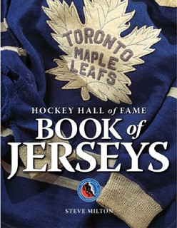
I recently got my hands on a review copy of The Hockey Hall of Fame Book of Jerseys, and I don’t mind saying it’s one of the best, most wonderfully produced uni-centric books I’ve seen in years. It’s so good that I had a hard time narrowing down the images to share with you, because it was tempting to share just about every photo in the book. Obviously, that isn’t feasible, so here’s a sampling to give you an idea of what this book has to offer:
• I love how old hockey jerseys used to have contrasting sweater-style cuffs.
• Interesting to see a Maple Leafs jersey with red lettering. That’s Ted Kennedy, circa late-1940s.
• Here’s a really nice trio of Bruins jerseys. The one at top right is the team’s 25th-anniversary jersey, worn in 1948-49.
• Lots to like in this New York Americans jersey.
• Look at the amazing stripes on this amazing Brynäs IF Gävle jersey, which was worn by Börje Salming in the early 1970s. re those red stripes made of leather? Vinyl?
• Marty Barry wore this All-Star jersey in the 1942 “Victory All-Star Game,” in which a team of retired NHLers played the Bruins to raise funds for U.S. Army Relief.
• Here’s as good a view as you’ll ever see of the New York Golden Blades’ jersey design.
• I love seeing old NHL officiating jerseys. The off-white sweater was worn by Bill Chadwick in the 1940s, and the red one was worn by Frank Udvari in the 1950s. Here’s another off-white sweater, this one from the 1930s.
• Always a treat to see the Seattle Metropolitans’ classic jersey design. But what’s with that ribbon-tie thingie in the collar? I asked Teebz, who said, “It appears to be an early style tie-up collar, much like NHL players have today. The rinks back then were literally freezers. By keeping the ‘ribbon’ pulled tight, players could conserve body heat to stay warm.”
• Imagine how awesome this Epinal Squirrels jersey would be if not all the stupid-ass advertising.
• Holy moly, look at all the loop-de-loop chain-stitching on this Italian jersey.
• If you like the looks of this Cambridge University Ice Hockey Club jersey, take a closer look at the crest — tasty!
• Gotta love the pooch on this 1930 Windsor Bulldogs jersey.
• If corporate sponsorship is unavoidable, you could do a lot worse than this Wrigley’s Gum-themed jersey.
• I’m intrigued by the sleeve patch on the red jersey. According the book, the team was the Pittsburgh Hornets, circa 1950s. Anyone know what the patch is about?
• Man, the 1949 NHL All-Star Game must have been a gorgeous sight to behold.
• Speaking of All-Star Games, here’s a beauty from the famous 1934 Ace Bailey Benefit Game. Interesting that they used a six-pointed star.
• The Ace Bailey game was the inspriration for the 1937 Howie Morenz Memorial Game, in which a Canadiens/Maroons split squad played against an All-star team, raising $20,000 for the Morenz family. Here’s a clever photo showing the two jerseys from that game.
• Still more All-Star goodness, this time from the AHL in 1942.
• Oh. My. God. The Edmonton Mercurys wore that design while winning the gold medal in the 1952 Olympics.
• The Ottawa Senators of the early 1920s weren’t exactly humble.
• Have I mentioned lately how much I love texture? That’s a St. Looey Eagles jersey from 1934.
• Sometimes a really simple design totally works. That’s a Victoria Cougars jersey from 1924.
• What’s better than a skating roadrunner? Not a whole lot.
• Most of the photos in the book are full-page images, but there are also a few pages that have smaller pics — almost all of them of spectacular jerseys. Check them out here, here, and here.
I could go on, but you get the idea — it’s a near-bottomless supply of hockey goodness. There’s also plenty of good text, but the photos are really the thing. Not to be missed.

Culinary Corner: In the last installment of Question Time, someone asked why my food photos always look so good, and I said, “I don’t usually post photos of my failed experiments or things that don’t turn out so well, so the photos I do post may paint a somewhat artificially rosy portrait of my skills.” That prompted several readers to ask me to post photos of a less-than-perfect cooking project.
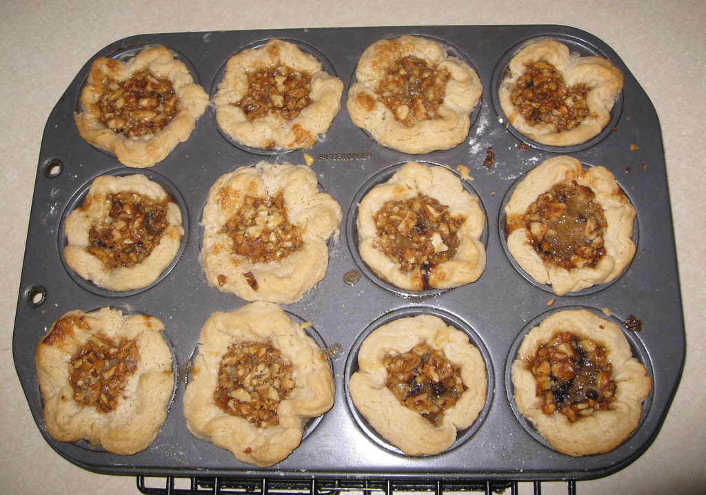
So: I really like butter tarts, which are these really nice little confections that are extremely popular in Canada (although some sources say they originated in Scotland). The other day it occurred to me that I hadn’t made them in years, so I decided to whip up a batch of them. When made properly, they should look something like this (although I like to add a scattering of chopped walnuts on top).
My recipe for butter tarts goes like so:
1. To make the dough, start by mixing together 5-1/2 cups of flour and 2 teaspoons of salt in a large bowl. Cut in 1 pound of Crisco or other shortening with two knives or a pastry blender, until the mixture resembles coarse meal or peas:
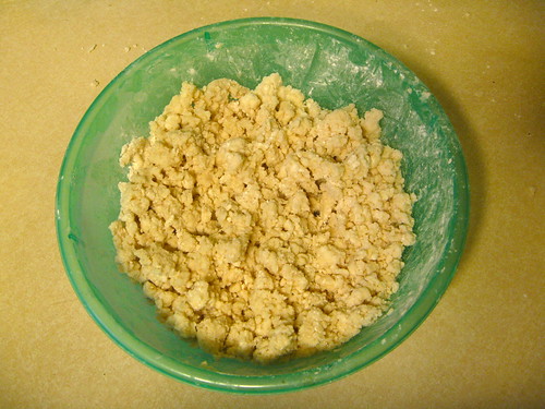
2. In a 1 cup measure, combine 1 tablespoon vinegar and 1 lightly beaten egg. Add enough water to fill the 1 cup measure. Gradually stir the liquid into the flour mixture, adding only enough liquid to make dough cling together (you may have some liquid left over). Use your pastry blender or knives to mix the liquid in well. Gather this into a ball, wrap in plastic, and chill for at least one hour.
3. Meanwhile, make the filling: In a large bowl, blend together half a stick of butter and half a cup of firmly packed dark brown sugar. Stir in 2 lightly beaten eggs, 1 cup of corn syrup, and 1 teaspoon of vanilla. You can also add half a cup of currants if you like (sometimes I do, sometimes I don’t).
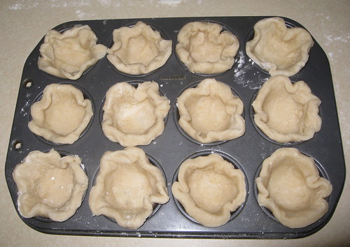
4. Preheat oven to 375 º. Roll out the chilled dough on a lightly floured surface. Then use a 4″ biscuit cutter (or an invert metal can that’s 4″ across) to cut a dozen 4″ rounds of dough and position the rounds in a muffin tin to form little “cups” of dough:
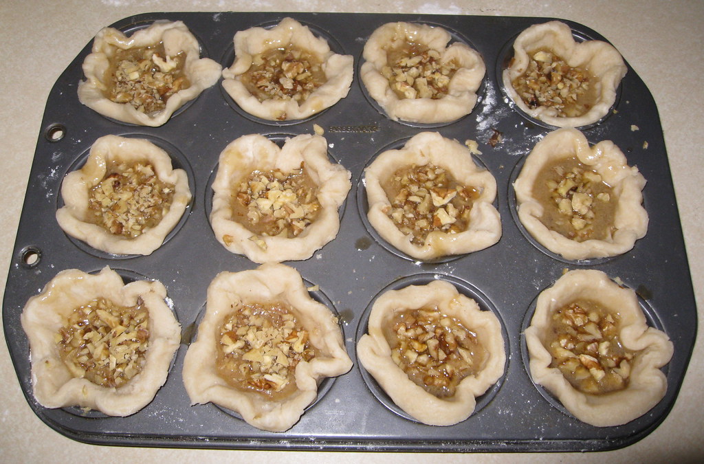
5. Use a ladle to fill each cup about two-thirds full. Sprinkle with chopped walnuts:
If you click on that last photo, you’ll see a larger version, which reveals that my dough cups varied wildly in terms of their thickness. That’s because I did a shitty job of rolling out the dough. I was aware of this but went ahead anyway and popped the muffin tray into the oven for about 20 minutes. Here’s how they turned out (you can click to enlarge this photo too):
As you can see, the thicker dough cups expanded so much that they left only a tiny cavity for the filling. Not a disaster, but not ideal.
After letting the tarts cool for about 20 minutes, I used a spoon to remove them from the muffin tin. But this dough turned out a lot flakier than the batches I’ve made in the past, so the shells got damaged as I removed them. Here’s the finished product:
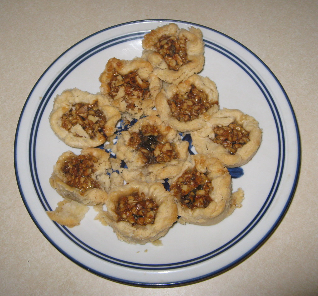
Not awful, but not the best presentation. The good news is that they still tasted really, really good. And I still have a few left over, which I expect to eat later today.
Uni Watch News Ticker: Those annoying postseason caps are going to be worn throughout the wild card, divisional, and LCS rounds. Every team, every player. Sigh. ”¦ Not only that, but the same superfluous logo will apparently be used on batting helmets (photo courtesy of Avi M.). … Omar Vizquel wore No. 17 this year with the Blue Jays. For for the last game of the season — and of Vizquel’s career — Brett Lawrie gave up his No. 13 so Vizquel could wear it on last time. Classy move (from Roch Smith). … Japanese umps recently wore pillbox caps for a throwback promotion (from Jeremy Brahm). … New sweatbacks for Alabama (from Chris Holder). … If you’re a pissed-off Pirates fan, here’s the T-shirt for you (from Kevin Eckhoff). … New hockey uniforms for Bowling Green. “I’m told by people who have seen them in person that the blue-ish patch on the shoulder is a CCHA patch (the hockey conference the Falcons play in),” says Eric Weide. ”¦ Here’s a rare sight: Willie Mays wearing a cap that isn’t a Giants BP cap (thanks, Brinke). ”¦ New visual identity program for the athletics dept. at Ursinus College. You can see the full style guide here (from Greg Weight). ”¦ Here’s TCU’s purple chrome helmet, which they’ll be wearing tomorrow (from Alex Horn). ”¦ Really fascinating article on the design of airline baggage tags (big thanks to Jordan Cutler). ”¦ Schwinn has launched a new bike helmet promotional program called Helmets on Heads. … Remember the two Mike Smiths from yesterday’s wire photo compendium? “In 1989, both of them played for the Rochester Red Wings, the Orioles’ AAA affiliate at the time,” says Paul Bielewicz. “The monikers ‘Texas’ and ‘Mississippi’ were definitely used for them at the time. I remember the PA announcements, etc. for ‘Mississippi Mike Smith’ and ‘Texas Mike Smith’ for that whole season.” … We’ve seen all sorts of early, proto-batting helmet concepts over the years, but until now I’d never seen Frank Chance’s temple guard. “It looks awkward, but I love the jaunty angle of his Yankee cap,” says Chance Michaels. … “I recently took this photo of workers washing the field turf behind Under Armour’s base of operations in Baltimore,” says Andrew Greenwood. “It’s a partial football field with some of the Maryland flag coat of arms in the end zone.” … Toledo football will be wearing gray tomorrow. “I was told they’ll be wearing the matte navy helmet with it,” says Jacob Kubuske. … Boise State’s equipment truck hit a cow while on the road to Southern Miss. “Truck full of blue uniforms: 1. Cow: 0,” says Chester Baker. … “During a Soccer Europa League game on Thursday, the partisan Belgrad fans displayed a banner that for some reason included the Denver Broncos’ logo,” reports a puzzled Jeremy Crampon. … Next week’s installment of NFL Films Presents, which will air one week from today, will feature a segment about a guy who collects NFL socks, hot-cha-cha (thanks to Chris Rocco for the tip). … With the Notre Dame’s Shamrock Series game taking place this weekend, it’s worth noting that the team wore an upside-down-seeming shamrock in 1959 (from Jeff Flynn, Jr.). ”¦ Major uni-related event on tap for me tonight, as I’ll be seeing the awesome Los Straitjackets at the Bell House (and if you’re in the NYC area and have at least half a clue, you’ll be there too). If you’re somehow unfamiliar with their Mexican wrestling-masked charms, here’s a good primer:
The 49ers hat that Willie Mays is wearing is a New Era 3930. Its the same style that the MLB BP caps are. Basically its the same hat but with the different logo.
The Quakers link currently shows the Hornets jersey.
Speaking of which, that sleeve patch is a hornet head. It’s related to the logo on link.
If there were no lockout, I’d already have ordered that book.
How does the lockout prevent you from ordering a book? It’s not like the money from book sales is going to the owners or the players.
The only leverage I have, such as it is, is to not put money in anyone’s hands. That even includes related entities like the Hall of Fame. YMMV.
The Hockey Hall of Fame is not an NHL Hall of Fame. It houses all sorts of international hockey history, AHL, CHL, and various other hockey history as well (as seen above).
I get not funding the NHL, but why deny yourself the pleasure of other leagues? Honestly, go check out a CHL or USHL game. Hit your local rink and see some hockey. Visit a CIS or NCAA campus and watch a game. There’s still tons of excellent hockey being played!
And some terrible hockey too. Right, link?
The cuffs on early hockey sweaters were there because the garment was a sweater. The practice of using the separate cuffs pretty much stopped in the mid-1950s as teams began switching from Wool Blend to Nylon/Durene Cotton fabrics. The first White Nylon/Durene sweaters we ordered for the Amerks in 1959 had solid White sleeve ends. They stained very badly from perspiration and the glove leather. The next set of White sweaters was ordered in 1961. The bottom portion of the sleeves was made Royal Blue.
The Maple Leafs never wore the Red-lettered crest in a game. According to a book on the Leafs it was worn “for portraits only prior to the 1947-48 season.”
The helmet the little Hornet head is wearing was supposed to replicate a steelworkers’ helmet of the 1940s era.
Through my research for the Amerks Booster Club website it has been discovered that in the 1967-68 first-year expansion year the former General Athletic Manufacturing Co. of Greenville, Ohio made 15 of the 20 American and National Hockey Leagues’ teams.
General Athletic-AHL: Baltimore, Buffalo, Cleveland, Hershey, Providence, Quebec and Rochester.
NHL: Chicago, Detroit, Rangers, Toronto, Oakland/California, Minnesota, Philadelphia and Pittsburgh.
W.A. Goodman & Sons of LA made the Kings and their AHL farm club Springfield.
Wilson made the Bruins.
Tease Knitting Company of Montreal made the Habs’ final set of Wool/Blend sweaters.
Hometown Rawlings made the St. Louis Blues initial uniforms.
General Athletic made arguably the finest hockey sweater of the day. They private-branded them for Gerry Cosby, Pearson’s of Phila., Gunzo’s, Olympia Sports, Ruby’s Sporting Goods,Dick Fischer Sports and Cleveland Sport Goods. And teams chose them because they were great quality. They paid full boat too. No freebies in those days. General Athletic bought the farm in the 1980s. RIP General, you did good.
I ordered my copy of the book on Monday.
Definitely looks like a book to order. I always liked the Phoenix Roadrunner jerseys…one of the better WHA jersy.
Agreed. I always thought Phoenix did itself a disservice not naming their NHL club Roadrunners and using that logo.
That particular jersey was worn when Phoenix was in the IHL. The club played in six different leagues: WHL, WHA, CHL, PHL, IHL and ECHL. Their WHA jersey was a dark blue and gold. It had the classic roadrunner, but as I recall it also had the state of Arizona in the background. Cheers.
The Roadrunner sweater shown was made by a company called “HiLi” out of what they called “Ice Sheen” material. From what is known about the fabric is that it had no stretch, was quite sheer and you couldn’t print on it. Graphics and numbers had to be sewn on. It also snagged very badly on the boards. The ECHL used them as the league supplier for a short time in the early-1990s. The company went pfft.
The photo of the skating road runner jersey was very nice. In fact, those colors (royal?, white, gray-silver?) worked beautifully together. Would love to see that scheme on another pro sports team. I suppose the Lions colors are close, but this particular blue really pops on that sweater.
£19.49 post free from Amazon UK. It’s my birthday next month – so that solves the usual problem of what my family can get me :)
Got a Chapters gift card for my birthday and have ordered the “Hockey Hall of Fame Book of Jerseys”.
Will be a welcome addition to the collector’s edition magazine put out by The Hockey News in 2010 “Greatest Jerseys of all time”
I’m afraid the Epinal Squirrels’ logo might actually be part of the supid-ass advertising as it’s a dead ringer for the one of the link (a french bank which may have been a sponsor of the team at the time).
Well, that’s disappointing.
The Japanese pillbox caps link isn’t working for me.
Thanks. Now fixed.
Heh, I like Ursines’s style guide. Never knew they actually did sports…and I live 5 minutes away from it.
They’re not hockey jerseys. They’re sweaters.
Let’s be honest… now that they’re EDGE, they’re jerseys. They haven’t been sweaters in about 30 years. The pictures in this book are of sweaters, but we are talking about a book made by the hall of fame for a league that has had two lockouts in eight years, so there really isn’t much that anybody related to the league has done right in recent memory. You shouldn’t be surprised they got this wrong too.
Boxcar, do you have any sweaters made of coarse polyester? Or are they wool?
The change in fabrics changed how we refer to them.
I like to think “sweater” is just part of hockey nomenclature, the same way “kit” refers to futbol, even if they are all jerseys now made of 21st fabrics.
This is correct.
Sorry folks, they’re jerseys. It’s 2012, not 1912.
I tend to notice that American hockey fans are more apt to call them “jerseys” while “sweaters” is more likely to be bandied about in Canada.
Thanks for indulging us hockey fans today, Paul! I presume Phil just scrolled over that non-sport (in his opinion) lede (Just a good-natured jab, Phil).
3 things…
i get it, you funny ;)
i probably post more puck stuff (per capita) than paul
it’s not a non-sport, it’s not a major sport
big difference
Admittedly, it’s not any kind of sport when the powers that be decide to shut it down.
wow, those Edmonton Mercurys sweaters are the best I’ve ever seen!!!!! How could you not win the gold in those!
They are stunning! And I wonder if that color scheme/design was the inspiration for the WHA Edmonton (Alberta) Oilers’ first-year sweater? link
-Jet
I read that the Oilers’ colors were chosen to emulate Gulf Oil.
Absolutely awesome. If you handed me that sweater right now, I’d put it on. I bet it wears as good as it looks.
I know…I know. I once met a guy wearing a Canadiens jersey (?) in our local mall. I told him I liked his “jersey” but without even a smile, he said “it’s not a jersey, it’s a ‘sweater.'” And it was a polyester replica! What ev’s…
wow..a ‘reply fail.’ I meant to reply to Teebz above.
LOL… all good, sir.
Fans can call them whatever they like – my mom asks still asks if I have clean “hockey shirts” – but the change in fabric is noticeable. Sweaters is the proper term for those gorgeous wool examples above. Jersey would be suitable for anything that has sublimation. :o)
All synonyms are good. Don’t take that “fan’s” high-hatting to heart. It helps to remember sweater, for me, because I don’t like the awkward construct of “New Jersey
‘s jersey”.
Re: Broncos logo on soccer banner.
They’ve added it to the badge of Russian club CSKA Moscow.
In the Soviet era the club was run by the military (and Spartak Moscow were the ‘team of the workers’, Lokomotiv Moscow run by the railway operator, Dynamo Kiev by the secret police) and fans often called them ‘Horses’ presumable because military = cavalry in their minds.
So I guess there’s some connection.
Normal CSKA badge: link
Beat me to it. Good call, Ben! Interestingly, Spartak was also associated with the meat packers trade association at one point, and to this day is referred to by opposing fans as “Meat.” Also, the police were associated with the entire Dynamo athletic organization, so Dynamo Moscow was associated with them as well.
Geez…how fast was that Boise State truck going? They really must have been moooooo-ving!
The only thing more troublesome than a cow on the road is a moose on the interstate:
link
Or a black horse sitting on a dark over pass at midnight
Took a quick look at that Partisan Belgrade flag. The crest on the left side of the flag is a modification of that of CSKA Moscow, the famous Central Sports Club of the Army. The team is nicknamed the horses because their first stadium was an old royal stable. Based on that, the appearance of the Broncos’ logo makes some sense for fan art, even if it’s not an official logo of the team (to my knowledge).
Never thought I’d see Los Straightjackets on UW! Awesome!
Every time I run cool music-related content, someone always says, “I never thought I’d see [cool band] on Uni Watch!” People, I’m a music guy! I was a music writer long before I was a uniform writer.
I haven’t seen them live, but I just bought the new album, Jet Set. And Daddy-O-Grande is back! (At least on the album, he is)
Love me some Straitjackets!
-Jet
He’s back and I can’t wait them to play near me! Daddy-O!
I won’t be satisfied until GWAR shows up. (If somebody makes them a set of chainmail stirrups, you know they’d wear them.)
One of my fave GWAR songs is “Meat Sandwich” which might be UW applicable.
Sing Sing Sing! Love it!
Hate to be that guy, but unless you have a horns SECTION – not just *a* horn – you shouldn’t play Sing Sing Sing!
It’s like playing playing acoustic AC/DC – It *can* be done, but it shouldn’t.
So correct sir. I have “Sing Sing Sing” cued up right now from the BBC Big Band Orchestra. They’re playing it the “right” way.
link
I love the straitjackets and I listen to WFAN and sometimes when they do the annoying ad reads they play straightjackets in the background and I wonder if anyone out there gets it…
Everytime I see that band, I think, “Why not call yourselves The Cruiserweights?” Maybe “Cruisers” for short.
Here’s a better shot of the Hornets logo (B&W):
link
A visual cornucopia today.
Your walnut tarts remind me very much of pecan tassies, which are popular in the South Carolina Lowcountry where I grew up (and where pecans are abundant).
Epinal Squirrels jersey – is it not just an old Hartford Whalers jersey?
Brynas IF Gavle jersey (sorry for leaving out characters) – curious as to why two different numbers on the sleeves (11 and 17, or are they both European 11s)?
On those Bowling Green jerseys, I believe that is the CCHA logo commemorating the league’s final season. Realignment in college hockey has basically scattered all of the CCHA to various conferences (Bowling Green is moving to the WCHA), and the CCHA will cease to exist after this season.
A good view of the logo is at this link:
link
As modern insignias go, the Bowling Green Falcon is one of my favorites. I’m not sure of the vintage, but I appreciate the calligraphic lines and degree of abstraction. Also, having brown as a uniform color sure doesn’t hurt.
As a former BGSU attendee (curse you, unfinished masters), i will miss the CCHA.
To shed a little more light on the CSKA Moscow crest:
The club designed a horse head alternate logo in 2011 to incorporate the “horses” nickname into the official club branding scheme. The alternate logo has appeared on the club website, but I’ve yet to see it anywhere on a jersey. This website has a good visual background on the concept and design of the alternate logo.
link
For some reason that link got cut off. Here it is:
link
link(Moscow)-Official-symbol/2453715
link
Happy Stirrup Friday! link
So we have stupid logos on caps for the playoffs, and stupid logos on helmets for the playoffs, I have to wonder if teams will be wearing patches tonight too. They haven’t made patches for non World Series play since Division Series play in 1996.
Logo creep on a truck? Even the Boise State equipment trailer has the swoosh.
Today’s entry officially qualifies as Uni-porn. Clicking on each link was like opening presents on Christmas morning as a kid. You couldn’t wait to get to the next one and see what was waiting inside. And as the pile (# of links) got smaller, you got sadder because it would soon be over. Great entry Paul!
And just for the record, I would club a baby seal for a chance to have the following sweaters: Pittsburgh Hornets, Moose Jaw Canucks, St. Louis Eagles, and Windsor Bulldogs.
And to answer your question Paul. What is better than a skating roadrunner? I would say a skating chubby penguin…with a scarf.
link
YES.
And for the record, the Amazing David Frost whipped up these jerseys for a fella who posts on another message board I frequent. Bet he’d do something similar for you.
link
Uni-Porn…love it! Definitely adding the “Hockey HOF Book of Jerseys” to my Christmas list. Absolutely gorgeous stuff.
Also, any band that wears luchador masks is a band for me regardless of what they sound like. Awesome.
Me too. Trouble is, I don’t know if I can hold off that long. I may have to ask Santa for an early delivery since I’ve been a REALLY good boy (fingers crossed).
Paul,
Did the guy who sent the picture of the Boise truck say if he noticed how the marbling looked on that cow? Ahhh, meat humor.
In related news, the University of Texas Equipment guys said they promissed Bevo they would watch out for cows on the road and make sure they did not hit any with their truck.
Paraphrasing an honest to goodness tweet from the UT EQ account….
“It appears to be an early style tie-up collar, much like NHL players have today.”
Yeah, except that the laces on today’s collars are entirely cosmetic, and thus functionally pointless. (Especially since, with the NHL logo insert panel, they’re functionally identical to the regular Edge V-neck.)
The laces are one piece of “tradition” that should’ve stayed in the past.
Laces should have stayed in the past: Agreed.
The Roadrunner sweater is from their 1st season in the IHL(I believe that’s Bruce Boudreau’s sweater) awful dazzle cloth.
Brynas’ sweater has red pleather in the shoulder, but also a full shirt collar(though this is hard to pick up in the photo.) Never seen another sweater like that.
Yeah, I was about to say that looked like the IHL version of the Roadrunners, since the WHA team used blue and gold prominently (even having similar shoulder stripes to the St. Louis Blues for two seasons).
Can I just say… man, I love hockey history. :o)
Paul, if you’re ever looking to part ways with that book, I’m offering to pay for it… until I obtain a copy of my own. LOL
Like you can’t just call the HHOF switchboard and say “Hey it’s Teebz. I’ll take two.”
It’s funny you say that, Rob. I get lots of books sent my way, but some publishers refuse to deal with “common” bloggers. My blogger trading card is not worth a damned thing! LOL
Not sure if this was mentioned before or not but check out the Captain’s patch the Silvertips use
link
Makes me think the old Redwings diamond patch and the Cleveland Barons’ Ohio shoulder patch had a child.
Outstanding lede today. Incredible images. It’s impossible to pick a favorite, so I won’t bother. Instead, I’m going to go waste time/money on eBay looking for vintage hockey sweaters.
I’m sure I can’t really add to what’s already been said, but yeah – today’s post is a winner. Man, so many awesome looking sweaters. It’s almost enough to make me want to move from Tennessee to somewhere that has colder weather, just so I can add some hockey sweaters to my closet. Simply awesome.
As I told Paul in my email, I’m not a big fan of those ‘Bama basketball uniforms. The sweatback thing is overplayed already. I wish they would take some pointers from football and leave well enough alone (and tell Nike to stick it when it comes to uniform changes).
Don’t think I saw this in the ticker in the last week, but Andrew Greenstein, creator of the link, has updated the link to match.
Oddly enough, I seem to recall that he originally launched WHAUniforms.com around the time of the last lockout…
The one thing I would’ve liked to see is an integration of the WHA team histories alongside the NHL ones, so that you could view the entire histories of the four teams that came over. It certainly would’ve worked under the site’s old name, the Hockey Uniform Database – which existed because he once had plans for selling a mobile app, but couldn’t get past legal and technical hurdles, which is why he reverted the name to include NHL again, but with the “unofficial” disclaimer. I am glad, though, to see the WHA uni images brought up to the current site’s standards.
Seconded. Indispensable.
Speaking of All-Star Games, here’s a beauty from the famous 1934 Ace Bailey Benefit Game. Interesting that they used a six-pointed star.
I’m guessing they used a six pointed star because link. Teebz….what do you think?
is there an explanation as to why the sleeve numbers on the Brynas jersey are different?
Entirely plausible, Shaftman. Bailey wasn’t Jewish as far as I know, so the six points for #6 – and the All-Star Game in his honour – actually makes total sense. :o)
Crap, that was supposed be above!
-*- BAND NERD THOUGHT OF THE DAY -*-
It’s ironic to me that Los Straitjackets’ drummer plays traditional grip but had no idea how to actually hold the sticks and play using traditional grip… I mean, clearly he overcame his poor technique, but the fulcrum is in the wrong place, his wrists are completely askew and he’s playing with all forearm (because of the other two problems, he has too).
This is why – unless you’re taught by a professional – you just shouldn’t use traditional grip, which is antiquated anyway, thanks to modern drum harnesses.
-*- THIS HAS BEEN THE BAND NERD THOUGHT OF THE DAY -*-
And Keith Moon’s technique is all wrong. I don’t know how he did what he’s famous for!
Drinking and carousing?
It wasn’t the drumming that killed him…
I noticed the drummer’s technique as well. Drove me a little nuts.
Is his Ride a Zildjian K Custom Left Side Ride?
Also, it looks like he got his snare head from Memphis Drum Shop.
my head is spinning… these sweaters/jerseys are amazing!
paul, any word on a potential cow memorial decal for the Boise State helmet this weekend?
:-)
Some of the jerseys have blood stains (or worse), does that count?
It’s jersey night. The first 10,000 receive a free cow. Cue rimshot.
Such beauty on display today!
I think the wonderful Moose Jaw Canucks is my favorite…
link
…but, I’ve gotta say, the logo-less (by the looks of it) Queen’s University is a stunner…
link
The Queen’s Golden Gaels played for the Stanley Cup at least twice when it was a challenge series, losing each time.
The original tricolour jerseys were awesome – there aren’t too many of them around.
link
The one in the link is also amazing – when I was there in the 1980s that style of jersey was a popular fashion jersey for students.
(I used to live about two blocks from the International Hockey Hall of Fame in Kingston and regret that I only got in a few times. Well worth a trip if you’re in eastern Ontario)
ENJOY Los Straitjackets!!! I was just listening to them this morning. They have only played the Norfolk/Virginia Beach area once, in 1999, as an opener for Tom Petty. They have played in Richmond once or twice. I usually have to go to the DC area to get my Los Straitjackets fix. Give Daddy-O Grande a big welcome back to the road too!
I know I don’t care for all the pink in the NFL, and this is just more proof of it being overkill: the Rams mascot will have link for the month of October.
Just as long as the horn on the helmet isn’t pink. (Uh oh, I shouldn’t give them any ideas, I guess.)
Shhh… let’s not let that one leave the blog.
For those readers in the St Louis area, tomorrow there will be vintage baseball played under the St Louis Arch: link
Fantastic, yet for some reason the Nat’l Park Service won’t let vintage be played on the Mall in Washington.
Caught part of the Rams/Cardinals game last night, and I was less annoyed by the pink than by the Rams’ insistence on going monochrome. I miss the gold pants.
I agree. Whoever made the decision to drop the gold pants should be fired.
He was. He is now ruining the Saints defense.
Paul….your diversity continues to amaze me….well done on the butter tarts! My Canadian grandmother would make them for me around the winter holidays. “Something sweet to go with your tea” she always told me. I still have her well-worn tart pan, and try to make a batch or two every year.
Maybe I’m late on this, but I want to say how disappointed I am that the site now gives pop-up ads. (Yes, I have them blocked, but a few still sneak through.)
I understand and agree with Paul’s statement that this is a business and is different than civic space, but I find pop-ups to be one of the most annoying advertising methods around.
Add me to the disappointed list. I understand the necessity to advertise, but pop-ups are the lowest form.
You should NOT be seeing pop-ups. Pop-UNDERS, maybe, but not pop-ups.
If you’re seeing true pop-ups, please let me know (a) who the advertiser is, and (b) which browser and operating system you’re using.
Thanks (and sorry for the hassle).
They are “pop-unders.” I did not realize that there was a different term (although it makes complete sense).
I’d suggest switching to Firefox and the NoScript add-on. For today’s entry, I have one actual ad image on the page and one flash ad that will only load if I bother to click on it. There’s no pop-up/unders of any kind.
My browser’s pop-up filter was catching them, so I was getting the alert message. First time that’s happened though.
I use Internet Explorer, and it blocked one pop up, but one got through from c5.zedo.com.
Creamer’s tracked down a bit of the new Astros home uni, it seems.
link
Orange and the H+Star cap. Huzzah!
No orange cap(and therefore no orange helmet)? Fie!
Cap has a Navy crown and an Orange bill, so the batting helmet might be two-tone…
Speaking of the Star-H, it looks to be a larger H on the Star which covers much of the star.
Looking at the cap again, I was reminded of some recent Astros “throwback” caps that New Era/American Needle created:
link
link
I’m glad the orange is back, but I hope there’s a version of the cap without an orange bill. I’m also somewhat displeased at the apparent size of the logo on the cap. It’s like they’re trying to compete with the Marlins. Should have just used the same size logo as it was the first time around.
I know I may be in the minority, but I’m underwhelmed. I was hoping for a tweak to the color scheme, instead of the traditional navy and orange. I thought maybe a deep, dark purple (sorry Paul) would have worked well when paired with the orange. There is a lot of blue in the majors already. Of course, there is probably more red, so this is already an addition by subtraction.
Creamer seems to have crashed.
No all-orange hat? Who’s going to break the news to the Vilkster?
Who’s to say there won’t be a full orange cap?
The Golden Blades jersey, is that a really small jersey or does that person have a really huge thumb?
Based on the blue like peaking through in the upper right corner of that shot, I would say its a hand holding a picture of the jersey.
Make that blue *line*.
Exciting news everybody. I just saw the Northwestern University equipment truck. oh boy oh boy.
I live a mile from Pa line and near Interstate 80. The truck had just stopped for fuel and was getting back on I 80 heading to Penn State.
Here is what it looked like.
link
I’m sensing some sarcasm…
Yeah, NU’s equipment truck has looked pretty much (if not exactly) the same since the mid ’90s.
I did see it. Not sure if it was the exact one in the pic. It did have Wildcats in big letter and the N on.
Just saw it as it was entering I 80 east a few miles from Pa.
The touch of sarcasm was because I was seriously excited and thought it was cool.
But not the kind of thing others here would be excited about. Me seeing the trailer that is.
It was the kind of thing I felt like sharing.
old hockey sweaters AND culinary corner…sometimes life is suh-weet.
I wonder how far away we are from having Nike make a jersey that is nothing but Swooshes? That way, when they cut it into little squares to put onto trading cards, everyone will get some Swooshes on their particular swatches.
Looks like the moths had a healthy meal feasting on those old hockey er, um, things with full-length sleeves.
Hey, how much vinegar for that tart recipe? You say add egg, vinegar and water to fill a one cup measure but don’t say how much vinegar to be adding. I’d like to try making those this weekend.
Good catch. I also didn’t specify how much egg in that same step. Now fixed.
Since Vizquel wore #13 in his last game, what number did Lawrie end up wearing, and any photos of him?
They swapped. Lawrie wore 17.
I do love seeing old hockey jerseys/sweaters. I prefer to call them jerseys.
There should be a rule that no softball tops or alts be allowed in the MLB postseason.
^^^ this
i like the “softball top” look. any time a baseball can inject more color into the game the better.
then they should have worn the orange top…black softball tops, even if black is a team color, isn’t exactly injecting “more color” into the game
(yes, im aware the orange is a *home* softball top, but the point still stands…and you DON’T NEED TWO softball tops either, ferchrissakes)
rangers look sweet, and the cards/braves was gorgeous (except for the fact that the cards are wearing the wrong color caps)
o’s look like they’re just happy to be there…even if they’re like 6 outs away from moving on
well when the choices are normally white or grey.. even wearing black is a injection of a color.
The importance of the postseason calls for important threads. Softball tops should be put away until next spring.
so the most important time of the year should be commemorated with the most bland looks in the world
yes.
you call them “bland” — i call them classic and beautiful
if you want “color” then you should be fighting for stirrups and sleeves which bring out the color quite nicely, thank you very much
look at how good kinsler looks…plenty of color there!
i do have one complaint about the modern grays — they’re too light — they should be a darker gray (and preferably mimicing the old time flannel … because this shit is gorgeous
Softball tops and alts also dilute the brand during this most heavily viewed time of the season.
I think we need a new t-shirt
“I’m Still Calling It the INFIELD Fly Rule”
I saw Los straitjackets here in Chicago last Friday, opening band was big sandy and his fly-rite boys; two really great bands!!!