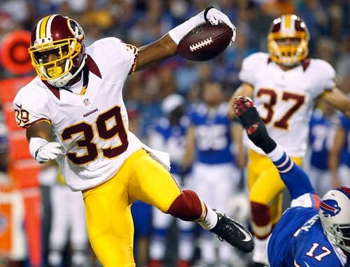
By John Ekdahl
In case you missed it, Paul weighed in on the new Nike two-toned collars yesterday over at ESPN. Here are some collars in action from the last couple nights:
Open Saturday thread.

And he’s gonna sing really LOUD, too…

Click to enlarge
Tired of seeing annoying ads (like this one!) on Uni Watch? There’s a simple solution: Join Uni Watch Plus. You’ll get an ad-free site experience, plus exclusive access to our UW+ discussion forums, push notifications whenever a new blog post has been published, a special UW+ badge accompanying all your comments on the blog, and a 20% discount on our Teespring merchandise.
Already a member? Sign in here.
By John Ekdahl
In case you missed it, Paul weighed in on the new Nike two-toned collars yesterday over at ESPN. Here are some collars in action from the last couple nights:
Open Saturday thread.
And he’s gonna sing really LOUD, too…
Click to enlarge
After looking at photos from the preseason NFL games, I think that the Nike collars look stupid!
Not just stupid, it’s beyond stupid. Have these team’s ownership lost their minds?
To be honest, they work on the broncos and vikings sets, but both of those unis could use a makeover imo.
I thought the same thing when they first came out. Looks natural for teams with modern sets like the Broncos, Chargers, and Vikes. But the jagged collar is downright painful on the ‘Skins, Bills, and Saints, to name a few. Fortunately it’s not a league-wide thing.
Respectively disagree with it looking good on the Chargers. Their uni elements (the colored area around the bolts) end in flat, cornered strokes, not points like the Broncos and Vikes, and therefore, IMO, clash with an element just inches from the collar.
Notice how the points on the ends of the asinine Nike collars resemble the end points of the Nike “swoosh”.
The collars are totally unneccessary and useless. I believe that they were placed for one reason only – Nike Swoosh Doochebaggery.
Let’s hope they get rid of them next year. They suck.
While we are at it, I am a Saints fan. I hate the new, somewhat narrower numeral font. I like all of the Gold elements finally matching, but I HATE the shade of Gold used by Nike. It is paler and less dark or metallic than the previous sucky Vegas Gold. All of the polo shirts, hats, numeral trim and other elements all include this new, disgusting, pasty shade of Nike Saints’ Gold.
I never thought there would come a day when I would long for the era of the Finks/Holtz/Navy/Georgia Tech/Reebok weak Cat Piss sjde of Vegas Gold.
Yuk !!!!
And While we’re at it, let’s pray that those Va. Tech helmets are an internet spoof, and not real team helmets. They truly suck.
Benches is terrible.
Too close to home?
Especially if you root for Team Chickenhawks.
Nike changes for 2013? Adding a bow tie!
New Virginia Tech helmets. ugh.
link
What in the hell are those things?
turkey footprints
No, they’re hokie footprints, which are different than turkey footprints because hokies are imaginary.
Those are…. Hilarious.
Ugh, no thank you. I’d take stupid back of shorts butt ads before you rename the Theatre Of Dreams.
link
What’s a trafford and why is it so old?
[you don’t have to answer that…]
Do they really believe that anyone – and I mean ANYONE – will stop calling it Old Trafford? If so, they are living in Lalaland.
I could point out, though, a little know fact.
“Etihad” in Arabic means “unity” or “united”.
So – Manchester City actually play in the Etihad Stadium at the “United Stadium”.
hehehe… don’t tell them :)
That’s brilliant, that is.
I didn’t think it was little known, since everyone made that joke last year. :>
I assume if they rename Old Trafford, it will be one of those hybrid old/new names, like “corporate name at St. James’ Park” in Newcastle.
I think I like the neck roll on the colored jerseys. The colored neck roll on white looks like the old preppy shirt under a sweater look. All in all, it’s not a bad change. Beats the holy hell out of the armpit stains and superfluous piping we’ve seen in recent years. And no one looked cooler in an NFL uniform than Eric Dickerson. So mimicking his style is not a bad way to go.
Quit wasting valuable web space with “Benchies” please. Thee has not been a funny one yet.
A lot of people like Benchies quite a bit where as you’re the only person I’ve ever seen asking for it to be removed.
Democracy’d.
God dammit Tim, how many times do we have to tell you not to feed the trolls?
Sorry, THE, democracy just started flowing through me. Couldn’t help myself.
(come on, I made a joke, it’s not like I came back with, “fuck you jerk!”)
I really like Benchies. I look forward to it.
And while I’m surprised that someone dislikes it enough to post two complaints, I’m more surprised that the complainer appears to be Amish.
Thee has been a bit hypercritical, Friend.
New collars remind me the old “neck-roll”, a la Eric Dickerson and Steve Grogan. An absolutely awful look on most jerseys. How some of this stuff gets off the drawing board without someone saying, “Oh, by the way, that looks like absolute crap, we probably shouldn’t make that for the most popular sports league in the world”, is absolutely beyond me. Nike is not the only offender, but perhaps the most egregious.
link
The collar doesn’t look so bad on the Vikings jersey, as it matches the rest of the striping, but on the others, looks like 70’s golf collar, horrible.
I am so glad the Chiefs did not adopt the new collars… At least on their home jerseys.
Ditto for my Bears. Glad they stuck with the no contrast collar, this way they get the nikelace benfit (and I actually believe this is the one area where nike combated a legitimate problem on the Elite 51 jerseys, no more collar riding into your neck link ) without looking like clowns.
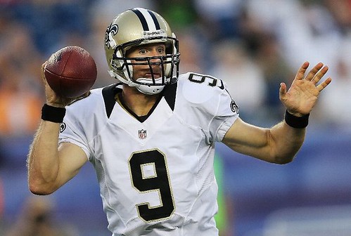
I’m okay with the new Nike collars, though I wouldn’t be sad if they go away. Only thing that annoys me is if they get too big and the NFL shield is too low (see the Drew Brees pic).
I’m just happy the new Nike uniforms look a lot better than the Reebok ones. They fit a lot better, and I’m glad they went back to just the NFL shield on the collar instead of the “NFL Equipment” guitar pick.
My problem with all of this superfluous shit on modern football jerseys – the “medium” size wordmarks, the NFL shields, the patches the long collar fronts, the conference patches, the unit patches, the event-tragedy-memorial-anniverary (OK, you can keep those on the jersey) – all of it – is that it pushes the front jersey numerals far too low on the player’s body. It looks like shit.
Perhaps the very worse offender is NCAA’s UCF. The bottom of the front numerals barely fit into the players’ pants.
I know when I am watching an NFL game, and I know the two teams that are playing. 99.9% of humans and most pets do. I do not need nine team logos on five parts of a uniform. Less would be more here.
Please.
Collars look terrible and are very visually distracting.
Pennsylvania: Keystone State, home of Marcellus Shale, the Liberty bell, and the only state whose football teams don’t look retarded with the neck-roll collar.
“and the only state whose football teams don’t look retarded with the neck-roll collar.”
Illinois, Indiana and Wisconsin would disagree, just off the top of my head. And the Bears and Colts both got nikelace collars – the only legitimately useful piece of tech on the new Nike unis.
Buuuuut the Nikelace does seem to force the two-tone, I’ve been noticing.
Add Arizona, Georgia, Michigan, North Carolina, Tennessee, Texas, Washington (the state) to that list.
New Jersey as well (Would be New York if Buffalo didn’t opt for it, but the other 2 actually play in NJ so I think it should count), and if it wasn’t for the Chargers California would be on the list.
I’m reminded both of the neck roll, and the old White Sox collars from the 70s with this Nike-roll thing.
link
I give up.
30 bucks, what a bargain.
so Gerard Butler’s in a link where he plays an ex-Celtic player. There’s a cgi/archive mess in the middle
First bit shows link in the 1999-2001 home strip, with ntl sponsor, whereas the shot of link shows him in the ’89-91 CR Smith sponsored effort. Also, his shorts aren’t numbered. Surprising that he didn’t insist on correcting the shorts thing, what with it being the team he loves (and has played for in a charity match or two.)
Very minor, understandable, but *odd* considering how easy it’d be to knock up an accurate old strip. I can forgive the mismatched archivery though, rights issues and pragmatism and all that. Still quite odd to see though
Celtic v Real Madrid on live terrestrial TV over here. Not very clear distinction from a viewers’ viewpoint. :)
Can only tell that Celtic have dark socks.
Holy crap, I almost forgot!
ITV4 if you’re over here – half-time at the moment
Nope, in the US–ESPN3 for me. You weren’t kidding about not being able to tell a difference from the main camera perspective. Both teams must have left their change kits in Europe.
It was on ESPN2…
No cable, only high-speed internet for me. My provider is on the list of those able to use ESPN3.com, so I’m good there.
It looks bad on some teams for sure, but I could see a few tweaks next year to fix it.
On unies like the Bills and skins, just have it go all the way around, clean classic simple uniforms need it fixed.
That said you could do some cool thinks like take the strings on the collar and make them a 2nd color.
Agreed.
The contrasting colors on the Nike “Flywire” collars are terrible. The Houston Texans’ are all red and look even worse than the “fang” versions.
I disagree about the Texans, but I my opinion would change from team to team.
Bottom line: Nike needs to figure a way around this, it looks bulky on the ones who go the full route, and too new/modern for most other teams (i.e. the Saints should not have the fangs but the bulky look doesn’t cut it either).
They figured things out for the Titans (not having the neck roll part be one color) they should be able to apply that to all teams. Heck that seems like that is something they could apply to the flywire part. I mean in theory they could produce a normal (smaller) collar pattern and still have the flywire technology.
Totally agree. I wouldn’t mind the collar not wrapping all the way around so much, if it was thinner – maybe keep the flywire as is but make the fang in two parts, one closer to the neck in contrasting color and the other part matching the jersey. Last year I would have thought Tennessee’s jersey would look stupid with the yoke cutting right through the collar but right now it’s actually one of the better looks.
Tonight, Detroit @ Texas to feature throw
upback uniforms from 1976. We’ll see if the Tigers have the Detroit Bicentennial patch made famous bylink.
Hmm, that link didn’t seem to work for me but thanks for the heads-up on the game.
OK, let’s try this again:
link
Yup, Detroit wearing the Bicentennial patch tonight as well. Here’s a good photo of the patch courtesy ebay:
link
It’s a representation of the Noguchi Fountain in downtown Detroit.
link
Almost all of the modern looking unis look good good with the new collar the more traditional ones not so much. The one team where I think it is a perfect fit though is the Cincinnati Bengals.
link
Man. What an ugly, ugly uniform.
Agreed but the ugly collars work on an ugly uniform.
Wow the red collar on the Texan’s jerseys looks like total shite. The Nike Neckroll would be an upgrade.
I like how the Nike jerseys are cut, but those flywire collars look horrible on most teams. The saints have a nice clean uni, but those collars don’t work with it.
The Saints are the best example of how they look out of place. Its too modern for such a basic/classic jersey, it looks so out of place.
The Saints should have a gold collar but no matter what route the go with the current collar system it won’t look good.
Rangers are wearing throwbacks to the Powder Blues from 1976 (I believe that’s the year). Tigers also wearing some tonight supposedly.
Tigers wearing road grays from 1976 and Rangers wearing powder blue roads (at home!). Derek Holland on the mound for Texas wearing full stirrups.
So many players wearing the pajamas. WTF? Talk about stick in the muds!
David Murphy for the Rangers gets an A+!! Mid calf pants and perfect period appropriate ‘rrups!
And what the hell is Ian Kinsler wearing, sock-wise? Looks like elongated ribbon stirrups that go all the way to his knees, damnnear!
Looks like David Murphy also in stirrups.
Forget the collars, the new “sweat zone” jerseys are disgusting.
link
link
Going through each team’s new sideline gear in the nfl shop and there are definitely some interesting cues as to who may be wearing throwbacks this year. Firstly I’d like to congratulate Nike and New Era for making way better looking sideline gear than Reebok ever did. Secondly here are some of the interesting tidbits via the new era “on field” caps.
Black Caps(Teams that don’t have black unis):
Jets: link
Niners: link
I only mention these because both Rex Ryan and Jim Harbaugh like wearing the black caps so it appears that they are catering to them.
Throwback Caps
Falcons: link
Bills: link
Bears: link
Lions: link
Packers: link
Colts: link
Patriots: link
Steelers: link
Rams: link
Bucs: link
Alternate Caps
Cards: link
Dolphins: link
Raiders: link
Eagles: link
And a whole separate category for the Dallas Cowboys who have a ton of options and I’m sure one of them will be paired with a throwback.
Cowboys: link
The collars look awful! Nike should’ve just kept the jerseys as is…
Teams had their choice as to what they wanted to do with the collars. So any blame/praise towards the collars ultimately falls on the teams, because they have the final say.
Watching Seattle/Tennessee. Looking at the Seahawks:
-The numbers on the back are HUGE!!!
-The pant stripe really pops. I like.
-Mono-navy looks dumb, but with the slime green combined with players wearing enough white in their socks, I can *somewhat* tolerate it.
-The semi-matte helmets don’t jump out at me all that much (if at all).
link… Just junk the collarbone shit (and preferably the navy pants, as well), and that’ll bump it to being a pretty good uniform.
As for the Titans…
-The light blue pants have been upgraded by leaps and bounds with the matte fabric and the thinner pant stripe.
That’s really all I have that jumps out at me. I’m sure others will see differences in the collars and cuffs, but overall, a pretty good uniform (when they don’t wear navy dancer tights) got a slight upgrade.
Yeah they need to wear the silver pants with the blue jerseys (and the away jerseys for that matter).
I think it needs to be pointed out that the Titans have a different colored collar that doesn’t have that stupid fang effect. Clearly Nike could cut those off so they look more like the ones you see on the “game” jerseys they sell (still has that modern look on the collars but its not nearly as gaudy).
And in theory Nike could dye part of the flywire portion and recreate the traditional (smaller) collar look.
Well, the sleeve treatment on the Seahawks’ jerseys certainly isn’t designed to lead the eye right to the swoosh or anything.
Just saw some video of the Seahawks, and saw their unis for the first time other than the unveiling…I like ’em.
In fact, I love ’em.
Yeah that little panel, it shows off the swoosh, doesn’t it?
The Saints gold outline on the numbers looks silver. The matte metallic finish doesn’t work for teams that actually have metallic colors in their schemes.
Am I the only one who is bothered by how little this weekend guy is doing for Uni-Watch while Paul is away? Practically every Saturday and Sunday is like two lines about one subject and then “Open forum.” Phil does more on any given weekday than he does over the whole weekend.
You’re the only one.
Why didn’t you volunteer to help out then?
Maybe a few words of wisdom…?
everyone thinks its dumb but i think it brings back the eric dickerson cowboy collar look. vintage
God that is awful, these things are atrocious. It makes even the classical jerseys look retarded… god damn
It’s a MAJOR DISTRACTION! Nike should be fired!!