By John Ekdahl
The Toledo Mud Hens took wore the uniforms of the 1883 Blue Stockings last night during their 6-0 loss to the Rochester Red Wings. The team provided a little history for their promotional night:
The 1883 Toledos were the first professional baseball team in Toledo baseball history. They played their home games at League Park on Monroe Street, between 13th & 15th Street. The Toledos won the 1883 Northwestern League Championship, and joined the Major League American Association the following year.
The team is famous for being the first Major League American Association team with African American players on the roster, most notably Moses Fleetwood Walker.
Jimmy Haslam III, the new owner of the Cleveland Browns, met with the media Friday. While he assured Browns fans the team would stay in Cleveland, he may have hinted at some uniform changes.
He said he is eager to bring “winning back to Cleveland” and offered up a “zero chance” the team moves out of town. And the famous orange helmets with no logo could be on its way out.
“Will we change uniforms? I don’t know,” Haslam said. “But it is a marketing world.”
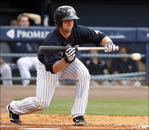
In case you missed it, the Mets and Padres wore throwbacks on Friday night.

“You gotta play this game with fear and arrogance.” “Right. Fear and ignorance.”…

Click to enlarge
If Jimmy Haslam III messes with the logo-less Orange Helmets, Cleveland will riot!
Just bring back the Orange pants and Brown top. But NEVER touch that beautiful helmet.
Note to Mr. Haslam. The Browns’ uniform as God intended consists of logo-less Orange helmet, White jerseys, pants and striped hose or Brown jerseys, White pants and Brown striped hose. Period. End of subject. Marketing, schmarketing!
And, as I asked the other day, if the point is to say, “We are those old Browns,” then WTF was with all the whining about leaving the heraldry, et al, behind when Art Modell shuffled off to Baltimore?
AREN’T those old Browns.
Yeah. I would really like our logo to be something other than the helmet, but don’t put that logo on the helmet.
More importantly, its branding.
Changing the Brown’s uniforms in any way, shape or form is akin to changing the Coca-Cola script font to Comic Sans.
I’d be happy if the Browns wore at least one brown main element (helmet, shirt, pants) every game. Assuming the orange helmet stays, that means brown shirt, orange pants at home and white shirt, brown pants on the road. Orange numbers on both jerseys.
The Toledo Mud Hens took wore the uniforms of the 1883 Blue Stockings
Uh… “took wore”?
…and I really hope that the Browns new owner can see the light and adds a freakin helmet logo. Yes, Cleveland, you are unique with your blank helmet – but it’s uniqueness was created by stubbornness, not creativity, and you have not been what most would call a successful franchise since 1965. It’s time to stop clinging to ancient history and put something on the helmet. At the very least, switch to a blank BROWN helmet. At least that would make sense. Yes, I know, you’re named after a person – but that person went on to found another team that is now one of your main rivals. Perhaps it’s time to forge a new identity. You are not Paul Brown’s team anymore.
Stubbornness, really?
Granted, they didn’t “design” something for the helmet, but isn’t it just as likely they looked around and realized, “Everyone else DID design something, and we can be unique simply by NOT being unique like everyone else”?
“Creativity” isn’t strictly an arts term, isn’t limited to producing something. Sometimes it just means a way of thinking, of recognizing advantages in a situation and the course of action taken. Or, in this case, not taken.
So while the “design” of the Browns helmet may not be seen to be very “creative,” the decision to continue leaving it blank actually is quite creative.
I mean, the H&R Block green square wouldn’t look very “creative” on a helmet, but it easily is one of the more instantly recognizable visual corporate trademarks produced in the past few decades.
link
I understand your point, but I just have a really hard time believing that the Cleveland Browns of 1965 actually thought it about it like that. I mean, we know that the NFL designed a logo for them – and they refused to wear it. Maybe I’m just horribly jaded, but that seems like more of an “eff you, we’ll do what we want” reaction than any sort of creative thinking to me.
Besides that, I think the blank helmet looks cheap and unprofessional. It’s what you’d expect to see on a low budget high school team, not a team playing in the most elite American Football league on the planet.
Let’s define look at “one of a kind” and how it relates to uniqueness.
In the context of pro football, you can’t get more “one of a kind” than the Browns helmet.
As to “low budget”, I feel the same way about dark pants. Looks like they can’t after the cost of keep light-colored pants clean. And that’s based on history because that notion was extremely common for high school programs not all that long ago. Well, not all that long ago for me, anyway.
“Besides that, I think the blank helmet looks cheap and unprofessional.”
Really, the Jeff?…..
link
link
link
link
link
Alright, that’s enough out of you, Jeff.
Browns: Keep your blank orange helmet with white & brown stripes. Keep the pants white on both home & road sets. Gray face mask looks a lot better than orange, brown or white on the orange helmet.
The Browns have a clean & classic look. Don’t screw it up by turning them into some modern generic over-designed pile of crud that has no distinction over 31 other NFL teams.
And for the last time: a uniform overhaul will not automatically make your team better. It’s the players, not the uniform.
Keep the clean and classic look Browns, we dont need no stinking “flash and awe” unis!
I totally agree with concealed78.
The Browns have a GREAT uniform. Leave it alone, except for adding the striped hose to each game. And allow the Brown thug-wannabbe “Let’s Be The U” leotards to be part of the Brady Quinn bygone era. They look like crap.
Brown helmet. Hell NO! That looks like crap too. And exactly what type of logo would improve the Browns’ helmet? I can not think of any.
If you must wear an Orange alternate jersey, wear the one-and-done Orange jersey introduced by Paul Brown many years ago, with regular striping, Brown numerals with White drop-shadowing. That is a pretty cool jersey. At the very least – sell those in a store, and just stick with Brown jerseys and White jerseys.
The Browns have an awesome uniform. Leave Great Enough alone.
If you must mess with an Ohio team – how about starting over on the Bengals’ tragic-comic ensembles ….
Meh, the only problem with the Bengals is that silly white side panel on their dark jerseys. Get rid of that and they’re fine.
The Browns helmet should never change. It is not like the boring Penn State helmet. The orange helmet looks good with the white and brown mid stripe.
Now if it was the original plain white helmet ok. But the helmet is classic and looks good.
Not totally unique when you include the 1976 Seahawks.
I assume he will put a logo on one side of the helmet, so he can both placate the Browns fans who continue to live in the 1950s, and also honor his beloved Steelers.
I agree totally about the brown helmet. Too much orange for a team named the Browns. The brown pants need to stay as well.
How about this: the Browns switch to a brown helmet and add a helmet logo … a picture of an orange helmet.
Why does it have to be so literal? Just stick with the orange helmet.
Why shouldn’t it be literal? We (meaning the Uni Watch majority) threw a fit over the Blue Jays or Reds wearing black, why are we not throwing a fit over the Browns wearing orange? I know I’m generally that one crazy guy that no one likes, but this seems like something you people should actually agree with me about.
But that’s different, the Blue Jays and Reds have always had blue and red as the traditional foundation of their color schemes, respectively. Adding black was an abomination, just as changing the Browns helmets to brown would be.
Apparently, the helmet color determines (or should be) the color most associated with the team or the nickname? That the contention?
By that logic, the Cardinals shouldn’t be wearing a white helmet. Same for Stanford. Or Army should wear black headgear.
Some would argue it’s the color of a team’s dark jersey that is where the predominant color is used. Fair amount of validity to that, seeing as a whole helluva lot of jerseys are sold compared to the number of helmets.
One word: tradition.
A word Jeff doesn’t seem to understand.
Unlike 97.4% of the commenters here, I don’t believe that tradition trumps logic.
The Reds should wear red, the Blue Jays should wear blue. The Red Sox should wear red socks instead of navy, the White Sox should wear white socks instead of black, and the Browns should wear brown, not orange & white with a bit of brown trim.
Some would argue it’s the color of a team’s dark jersey that is where the predominant color is used.
Yeah, sure, except that the Browns insisted on wearing white for ALL SIXTEEN GAMES last season.
That’s funny, I guess we all missed the brown helmet stripes, brown jersey, brown pant stripes, brown socks & the brown numbers & NOB on the white jersey.
I don’t see any rule that the helmet has to be the same color as a team’s color jersey. Far from it.
So the Browns once again try to be unique?
How dare they.
And I was talking in general. The first item MOST people expect to see a football team’s lead color displayed may not be the helmet. It quite likely is the dark jersey. For most people, the color of the helmet is incidental…in that sense.
(Okay, now commence ripping through the exceptions like the Cowboys that will, of course, mean I’m wrong).
btw, the Browns continuing to wear the orange helmet only reinforces the history of their nickname, that it is NOT about the color. A brown helmet with their white-at-home policy would only serve to make it appear they WERE named after the color, now wouldn’t it.
…because being named for a guy who was later fired and then founded another team is really something to be proud of, isn’t it?
The Browns being named for their coach was stupid as hell in 1946 (and if I recall correctly, Paul Brown was actually against it) and it’s not any better now that the Brown family owns the Bengals.
I’m done with this today. The Cleveland Browns shouldn’t even exist anyway. That franchise is playing in Baltimore.
Ricko, since when are “Stanford” and “Army” the names of colors?
I’m with Jeff on the basic premise that if a team’s name is a color, or if the team itself is named after a color, then the team should predominantly wear that color. And while I agree with Ricko that generally speaking, helmet color is not necessarily a team’s main element – which is why white helmets, though almost always stupid, are not generally wrong – we are in this specific instance talking about a team whose logo consists entirely of a picture of its helmet. So no, the Cardinals wearing a white helmet when their logo is a red cardinal head is not actually anything at all like the Browns wearing a not-brown helmet.
I get the specific history of the Browns not being about the color, but if the Browns really want to defend orange on that basis, then they should wear no brown at all. If your name is the Browns, then you either wear brown as your primary color, or you steer clear of brown.
Never mind. I was talking about what is perceived as the lead article of clothing or gear most people think of.
As to Browns, it makes perfect sense to wear brown, sort of out common sense, but then to also think, “We’ll emphasize a second brighter color so as not to be uniformed entirely around the color brown.”
In fact, that might explain the white-at-home to begin with back in AAFC days. In that instance, any color is actually trim…and those unis gave relatively equal emphasis to both colors. Even had a substantial orange drop shadow on the brown numbers for time, we’ll recall.
Anticipating discussion of the decision to go from white helmets to orange helmet…same thing. Didn’t want to over-emphasize the brown. Plus, we need to think in early ’50s time frame. The only people who saw those uni in color were at the games. Orange helmets sure as hell brightened that experience compared to what brown would have (not to mention in that era would have been thought to look like old leatherheads).
Stanford is, of course, the Cardinal.
And Army is the Black Knights.
So much for being done today…
I’m pretty sure that the Browns’ switch to orange helmets came about at least partially due to the NFL’s rules at the time, which banned light colored helmets for night games. The Browns’ switch to orange happened during the same era in which we saw the Lions in blue helmets and the Cardinals in red ones.
Again, I don’t think they thought about it as much as you think they did.
What’s the big deal with brown and orange?
Brown is actually derived from the orange part (orange + grey) of the color spectrum. This can be ascertained from the fact that its h code (hue code) in its hsv code is 30 degrees, signifying a shade of orange. The color “brown” can be described as being equivalent to medium dark orange.
link
I think your predisposition to think that no one back then–especially the Browns, apparently–ever thought about such things colors your judgement.
If they DIDN’T think about such things, they why the edict prohibiting white helmets?
And it also helps validates my observation about the decision-making process. Orange was brighter and more colorful, and therefore better, than brown would have been.
If they DIDN’T think about such things, they why the edict prohibiting white helmets?
…because the football was white. Duh…
Ah, so they DID think about how things looked.
That was my POINT.
A white football?
Gee, I never heard about that. (eyeroll)
One more thing; idiosyncrasies such as the Browns’ blank orange helmet, the Dolphins’ helmeted dolphin logo, and the Steelers’ hypocycloid logo on one side of the helmet give the league character. These are good things that are at risk of being endangered by a certain mindset.
Hey. That guy Wheels is right.
Brown helmet & pants? I don’t think so, Scott.
Army did wear a Black helmet in the Lou Saban era – maybe one or two years (1980? 1981?). Looked pretty cool. However, I believe thatgiven the 70-plus years of Gold headwear, and 1-2 years of Black, you’re likely gonna see Gold helmets on Army for the future.
Then again, with the alt-uni craze, you may get an alt helmet in Black.
Doesn’t the Browns’ inclusion of Orange in their uniforms actually have some type of connection or rooting to the Paul Brown or regional history with Massillon high school, or early Massillon professional football teams?
And doesn’t the fact that the Browns are named after an owner – and not a color – make the whole clor requirment somewhat moot?
And doesn’t the fact that the Browns are named after an owner — and not a color — make the whole clor requirment somewhat moot?
Sure… in the same way that it means the St Louis Blues should be wearing red & yellow uniforms, since they’re named for the music. Yeah, there’s no rule that they *must* wear that color, but it sure makes a lot of sense to do it anyway, doesn’t it?
I wanna see the return of the brown pants, with socks that actually go with the pants. Maybe orange pants, or maybe just a simple brown jersey.
I like the Browns blank helmet, but they could always go with numbers on them, which no other team does in the NFL, and that could allow the removal of the TV numbers on the jersey and open up an awesomely plain brown and white jerseys.
Just saying, I think going the PSU-style of uniform design, with a few additions (pants stripes, numbered helmets) would be awesome for the Browns.
A true part of the punishment of Penn State would be to make them be required to wear the Browns’ discarded (hopefully) Brown leotard, thug-wannabbee, “Let’s try to look like the worst of the “u” Miami assinine teams”, Jacckass-Junior College, East Mississippi Panhandle Consolidated State Janitorial Engineering College pants,
That would punish anyone even thinking about watching or supporting PSU football.
However, there would be considerable collateral damage, as the opponents’ fans would have to ,look at such crap, punishing the innocent needlessly ….
That orange helmet is as iconic to a true football fan as the Green Bay “G” or the Steelers one sided logo or the Colts horseshoe or the Vikings horns. To change it would be to bury a part of NFL heritage. And, what kind of logo would they have anyway? A dog would be dumb as would be “CB” or even just “B.” And the blank helmet is perfect for a blue-collar town like Cleveland.
You do realize that the Vikings’ horns of today are different than the horns of 1961, right?
Iconic is in the eye of the beholder, really. Is the Browns’ blank helmet iconic, or generic? A blank helmet is just that – blank – nothing. Let’s take the Cowboys’ star – you can put a red double outlined star on a gold helmet, and people are going to see it as a Cowboys ripoff. A 5 pointed star is a pretty generic geometric shape, but if you stick a double outline around it – boom, Cowboys. But a blank helmet – well, it’s just a blank helmet. No one is going to see a yellow helmet with a red-white-red stripe as a Browns ripoff.
OMG, a blank space, better fill it with something.
Pretty much the way car dealers approach their newspaper advertising (trust me, it is).
The absence of crap is a design decision.
Unfortunately, so is, “Must have crap because everyone else has crap.” Just not always a good one.
In over 60 years of professional football, the Browns have had a plain orange helmet for all but a handfull of seasons. That is a lot of history to toss aside just to market a new logo. Has it been a glorious history? Not quite. But Browns fans LOVE that helmet. And are we not the target audience here? It’s one thing to say you don’t like the helmet and you feel a logo would look better. It’s quite another thing to say the team NEEDS a logo on the helmet. No one who cares about the team wants it. There is no need for a change to the helmet. The team name is the Browns. The colors are brown and orange. On the white road unis both colors are equally represented. The helmet is orange and the numbers and names are brown. Stripes are both. the home brown unis do have more emphasis on the brown. Why the need for MORE brown? It’s not like the Browns’ colors are gold and blue. I don’t see the need for a brown helmet. The Browns wear the pumpkins on their heads and that is fine with us. Stubborn? Maybe. But if they ever get to the promised land, I want it to be in these uniforms. Wouldn’t feel the same any other way.
link of the comic The Argyle Sweater is bound to strike a chord with UWers, but probably even more so with those who frequent the Cramer board.
Swing & a miss.
The Argyle Sweater is a bad The Far Side wannabe.
Maybe so, but today’s is pretty funny. The Hartford Whaler has a cane:)
I have never heard of said comic strip, but I like this installment.
Looks like a pretty weak effort by the Mud Hens to actually replicate the 1883 jerseys. They could have at least put collars on the jerseys and perhaps worn pants more reflective of the era. The former Pittsfield Colonials team did a much better job of wearing jerseys that looked like they were from the 19th century during their two years in the Can-Am League.
They did a good job of EVERYTHING, aside from drawing fans.
I wish they’d keep a team in Wahconah for more than two years at a time, it’s a wonderful park. Haven’t had a chance to get down and see the new team this year (in the FCBL), don’t know how attendance is for them.
Pittsfield is a small city… the Colonials drew perfectly fine for the size of the community and having no metro area to speak of. If owners were expecting 2,000 to 3,000 a game, then that was unrealistic. I’m sure summer college crowds were comparable, though since they don’t have to pay the players, overhead was lower.
What the Mud Hens wore is actually par for the course for MiLB special jerseys, including throwbacks. I know some teams do a better job, but in a business with such thin profit margins, we can’t really expect better for this kind of event.
Not so much a throwback uniform as a tribute uniform.
On the Mets’ throwbacks: while I don’t like either the racing stripe or the pullover jersey from the 1989 set, the Met players did a great job wearing the stirrups!
link
link
link
link
*This* is how a ballplayer wears his pants and socks.
The stirrups (not just socks; but stirrups) really make a baseball uniform. Despite the unattractive elements in the Mets’ uniformes (the pullover jersey, and the gaudy racing stripe), the Mets looked beautiful. Indeed, even a uniform worn in a baggy fashion looks alright if it’s paired with stirrups.
Major League Baseball needs a rule on this — and also NFL-style enforcement.
By NFL-style enforcement, I assume you mean petty fines that represent such a small fraction of the players’ salaries as to be completely meaningless?
Agreed, Ferdinand. Not much of a Mets racing stripe fan either but the proper use of stirrups is a breath of fresh air.
And I wish the Padres would end this navy charade and go back to brown permanently. I loved all of their brown uni versions (well maybe not the all-mustard) and they simply ceased to be the Padres in my eyes when they dropped their traditional color scheme.
-Jet
Oh, man, do not dis the racing stripes. Only three teams have ever pulled that off well, and the Mets are #2 on the list. Classic look. And the racing stripes make action photos of batters look a thousand percent awesomer. It’s a great look when done well that at least one team ought to wear today, and since the Expos don’t exist and the Phillies seem intent on not returning to burgundy, that someone should be the Mets.
Note that the Mets never had issues with BFBS while wearing the blue and orange racing stripe. This is not a coincidence; it’s simply not possible to add black to a uniform with blue and orange racing stripes. Can’t be done. As long as the Mets don’t have the racing stripes, black’s return will remain one owner’s brain-fart away.
Well, actually you could just put thin black stripes between the blue and orange ones…
;)
Yeah, I’m with you. Those stripes are way cool. Those of us who were the right age when they won the series in ’86 are definitely biased towards that uni, but that was the best team the club ever had, so I agree that they should bring them back.
The Mets get an A for effort…I prefer not so much blue showing on top of the stirrups.
link
gah…
rups and sanis not worn properly…racing stripes NEVER looked good on the mets
jonee’s point is precisely why mets fans love the worst uni (sans the BFBS shit) ever…they won something in it
the mets now are wearing what is about as close as they can come to the perfect uniform (other than # on front and NOB) — 1969 was pretty damn fine too
but 1986, 1988, 1999, 2000 and 2006?
good years, shitty unis
Any reason why the links open in the same window rather than a separate window today?
-Jet
It happened the other day, too….
The Jeff – While the fines are meaningless, the result of the enforcement is that NFL players wear their uniforms according to the league’s guidelines.
Similarly, in soccer, a player is simply not allowed on the field if he is not wearing his uniform according to the guidelines. (Note that this does not prevent some level of individuality: players may wear long or short sleeves, and may wear the their shirts tucked or untucked. The analogy in baseball would be that players could wear their uniforms tight or baggy, as long as they adhered to the stirrup guideline.)
Jet – You are right about the brown for the Padres! That’s their colour; it is absurd that they threw away that signature part of their visual identity, dating back to the PCL days. (Ted Williams wore brown with the San Diego Padres!) Also, the brown matches their nickname, as that is the colour of monks’ robes.
The Jeff — While the fines are meaningless, the result of the enforcement is that NFL players wear their uniforms according to the league’s guidelines.
Uh… not really. There’s a ton of players with varying amounts of white or colored sock and biker shorts and all sorts of individual player customization. Yeah, the 3rd string lineman making league minimum probably wears his uniform properly, but that Megastar WR does whatever the hell he wants to. Heck, we even had a freakin 49ers player wearing black socks last year while the rest of the team had the proper red ones. Although the NFL did nearly suspend that Bears player for the orange shoes (which looked perfectly fine)… so I guess there’s *some* enforcement…
I generally agree that the MLB players should have high cuffs, but easiest the way to do that is to simply tailor the pants to fit that way, rather than extra rules and pointless fines that star players can easily ignore.
One more time it should be noted that NFL uni-cop fines are donated to charity in the player’s name.
So it’s a tax deduction.
For those making huge money, tax deductions are a good thing…so there’s nothing wrong with getting one for wearing the uni the way you feel comfortable in it.
Not defending anything, just corroborating another aspect of the “fines are (essentially–RP) meaningless” position.
“For those making huge money, tax deductions are a good thing.”
Tax deductions are good for anyone, of course.
Should have said, “five-figure tax deductions”
link
As posted on the Chris Creamer Twitter. Figured that if any group of people would laugh at this, it would be ourselves.
That guy needs to get a scanner instead of taking a crappy picture… but that’s awesome.
Um, teenchy beat ya to this comic at 9:55… Lol, check it out above!
(Tongue firmly in cheek)
Clearly his fault for posting so early on a Sunday morning. That’s the epitome of the tree falling in the forest, but with nobody there to hear the sound!
//There’s your more proper scan instead of a crappy picture, THE.
And, pray tell, exactly why can’t the Padres dress like that all the time?
NEBRASKA ALTERNATE UNIS
I happen to be visiting Omaha, Nebraska this week. Huge Univ. of Nebraska presence, particularly football. The Huskers had their Media/Picture Day this week – and huge TV Sports coverage of the Media Day on all Omaha TV stations.
All Husker football team members wore their jerseys and signed autographs – which had massive attendance in 98 degree heat – and many star players wore their alternative jerseys, including RB Rex Burkhead, QB Martinez, and others. the team had a manequin display set up wearing the alt uni also.
Local media coverage was extensive regarding the alt uni, and coverage was 100% positive for the alternative uniforms, and I made a point to ask many that I met about their thoughts. The Husker fandom that I spoke to were 100% approving of the Husker alt unis.
For what it’s worth ….
Many seem to agree the Padres should be back in brown…but what should be their secondary color? The orange they wore the other night, link or link
Light blue. However dark their brown is, they should wear blue of a proportionally inverse lightness. Tan and navy would work – did work fantastically for a few years there – or dark brown and sky blue, or medium brown and royal. It’s a great color scheme, and just works better for all kinds of merchandising purposes better than either gold or orange would.
yeah, um … NO
brown and gold are perfect
orange sucked (and i like orange) but not with brown & gold, and light blue should NEVER EVER EVER be worn with brown…tan maybe, but not brown…not now, not ever
Somebody have the Tufts University Board of Trustees send Mr. Hecken a gift basket…
//If the Padres were an expansion team today, brown and light blue would be cool. Tie into the Chargers a bit. But enough is enough already. Brown with gold or orange trim. Not both. And no co-dominance. Brown in front. ‘Tis all.
Hmmm…thinking of a brown/gold/orange/light blue tweak as we speak…
Brown, gold & orange yes; light blue no. You got 3 colors on the warm side of the spectrum, and one cold color. Doesn’t really go together. White, gray, tan, cream or some variation of these would work.
NFL TYPO ALERT
link
Kuechly. Pronounced “Keek-ley”… I think.
Watching the Hall of Fame preseason game. The Saints uniforms look horrible! The half collars look like a mistake and the swoosh is just squeezed onto the sleeve like an afterthought.
yeah, the swoosh is way too close to the numbers. And it might be my imagination, but I feel like the outlines on the numbers are really faint.
Yeah the collars look ridiculously bad…
I did not know the late 70’s White Sox started playing football. The big collar is a bit much. But the question is, when will they wear shorts. Ooops, they already do.
Watching the HoF game. First look at the Nike
Pro CombatElite 51 uniforms in action. Observations so far:-Still a fair number of players customizing their hosiery, but there is a decent increase in consistency compared to previous years.
-A ton of players on both sides are wearing cleats that are about 90-93% black. Me Gusta.
-The Cardinals’ shade of cardinal red looks slightly more scarlet (on my TV, at least)… until the sweat sets in, then they look normal.
-The Saints’ neck-fauxlls (neck roll+faux) doesn’t jump out as much as I thought they would. Maybe when they wear their black tops, it’ll show up more.
-Spiffy HoF 50 Years logo at midfield.
-a lot of the swooshes on the Saints’ jersey tops land on the seam connecting the shoulder and “sleeve”. They kinda blend in with the sleeve logos and TV numbers.
The Cards sweat boxes are REALLY noticeable…
If I recall correctly, the Browns are brown & orange to honor nearby Bowling Green, since Columbus has claims on Ohio State and the navy & gold used at Kent State & Akron were already being used by too many teams. (Cleveland State wasn’t around at the time.) Come to think of it, no NFL team does have Scarlet & Gray, huh?