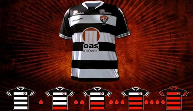
Paul here, pinch-hitting for Phil this weekend. I’ve mentioned many times that I donate blood every two months. That may not seem like a uni-related topic, but it is now, thanks to Vitória, a second-division Brazilian soccer team. Their jersey normally features black and red stripes, but their new kit — shown above — has black and white striping. The missing red stripes will be restored, one by one, as the team’s fan base achieves a series of blood-donation benchmarks set by the team. It’s a great concept, and a great way to promote real, tangible good deeds instead of just “awareness” or fundraising. Further details here. Kudos to all involved (and to the many readers who told me about this yesterday).

“You want me to play WHERE?”…

Click to enlarge
I posted a new entry yesterday on the Permanent Record Blog.
Uni Watch News Ticker: Damian lillard will wear 0 for the Trail Blazers this fall. Here’s why (from Taylor Stallings). … FIFA has lifted the ban on hijabs for female Muslim soccer players (from Ed Westfield Jr.). … The Penguins recently signed minor leaguer Philippe Dupuis. “Their roster already includes Pascal Dupuis (no relation), so iut will be interesting to see what they do with the NOBs if Philippe plays in the NHL,” says Nolan Petote. … Eagles owner Jeffrey Lurie and his wife Christina are divorcing, which could have some uniform implications, because Christina was supposedly behind the team’s move from kelly green (which she hated) to midnight green (which she preferred). Details in the third-to-last graf of this story (from Erik Autenrieth). … I’ve mentioned several times that I wish MLB umpires would wear retro attire for throwback games. That prompted the following note from Jay Sandora: “Spoke to a friend of mine who’s a current MLB umpire about the throwback games. He says they’ve never even been asked by MLB to participate in the proceedings, though many of them think it would be great to be included. A quote from his email: ‘We are not part of the club to most of baseball. It’s sad, really.’ Yes, it is. He also mentioned that when teams started wearing 42 in honor of Jackie Robinson, he asked the VP of operations if the umps could do that as well [which they now do]. The guy was shocked that the umpires would have any interest in participating.” … Here’s something you don’t normally get to see: color footage of the 1953 Tour De France (from George Chilvers). … Field hockey at the Olympics will be played on a blue field (from A.J. Frey). … This is pretty cool: Bryce Harper changed the Mercedes logo on the back of his car to the Nats’ curly W (from Nile Smith). … Cleveland.com is running a poll about whether the Browns should wear white at home. … New away kits for Leeds. “The shorts remind me of either a Roman armor skirt or women’s skorts,” says Jonathon Binet. … The Mets were Los Mets last night. … Speaking of the Mets, remember how they’re wearing raised squatchees on their batting helmets this season? One of those peel-and-stick squatchees ended up in an odd spot on Scott Hairston’s helmet last night (from Anthony Scandiffio). … Why has CD Motagua, a Honduran soccer team, sucked so bad lately? The nation’s top sports commentator blames it on their new jersey colors (from Bart Dodson). ”¦ Josh Hamilton is trying to cut down on thrown bats by using an adhesive commonly found at auto parts stores (from Clint Wrede). ”¦ More zero-ness: U.L. Washington wore 0 for part of the 1986 season with the Pirates, at least according to baseball-reference.com. Haven’t seen him show up on any other lists, so I’d kinda like to see a photo before treating this one as confirmed (from Randy Allemann). … Shout-out to Phil from Pittsburgh, who recognized me and said hello at last night’s Redd Kross show. Good meeting you, buddy!
Attention Cleveland Browns: Bring back something resembling this: link and stop screwing around with this all-white crap.
Love that look.
The brown top and orange bottom look is nice (Greg Pruitt, Brian Sipe, etc.) but it is second best (IMO) to the all whites and the era of championships as mentioned in the article. They need to embrace the era as it is the era of championships for Cleveland.
It’s been almost 50 years since the Browns won a championship. Perhaps it’s about time to stop dwelling on the past and start looking towards the future.
BTW, of the Browns 8 Football Championships (4 AAFC, 4 NFL), only one of them actually featured the current helmet design. The rest were won with either a plain white helmet or an orange helmet with a single white stripe and no brown.
No qualms with me with going back to the plain white or the orange with just a white stripe on their helmets. Being that is was over 50 years ago is precisely why they need to remember the glorious past because all the other looks have resulted in zero chips.
I’m confused. You only have tradition if you win?
In a practical sense, Ricko, yes.
A losing tradition is not one to cling to, is it? Sure, you can call the Cubs and their 100+ years of mediocrity a tradition, but should you?
…and it’s not like the Browns uniforms haven’t been through a few changes. Yes, they’re currently wearing a uniform that is similar to what they wore for their 1964 title, but they’ve also worn orange pants, brown pants, white facemasks and orange jerseys in the time since. They aren’t the freakin Yankees with an almost-untouched-except-for-material-and-fit uniform.
Dodgers haven’t won much lately, either.
Could name plenty more.
Just sayin’, sometimes its about wearing essentially the same uni Jackie Robinson wore. Or Jim Brown.
I’ve always felt tradition is built upon team success, regardless of when that team was founded, and in the context of what the rest of the teams in that particular league have done. The team absolutely has to remain in the same city as well. In addition, it helps to have a large number of fans still alive to recall the ultimate successes. A World Title does help the tradition, and both the great Jackie Robinson and Jim Brown did win it all during their respective careers.
And while the LA Dodgers haven’t won a Fall Classic since 1988, they’ve already won five in LA, so that puts them tied for fourth all-time for this category won in the same city.
The tradition killer and worst streak in pro sports has to be never winning the big one. Numerous teams fit the bill on this one.
Is it really tradition if the actual team is playing in Baltimore now? I hate all this self-proclaimed tradition and history.
If some new guy in New York opens up a bar and calls it CBGB’s, he wouldn’t be able to just assume all the history of the old establishment by proclaiming that some of the best bands ever had played in his bar. So why do we allow sports teams into duping us like that?
Skott, it still goes back to where the history occurred, so the tradition of the Browns in Cleveland is still intact. Obviously, Browns 2 has struggled since reentering the NFL, but that may change down the road. Browns 1 ended as soon as they moved to Baltimore, especially with the change in nickname.
The older Baltimore fans should enjoy the nostalgia of the Colts, because they witnessed some pretty impressive history. But the memories end in 1984, when the team departed to Indianapolis. When the Ravens started, everything was brand new to Baltimore, since they had been without the NFL for more than a decade. As soon as the Ravens began playing, that was the start of a new tradition in a new city. At that point, with the exception of the few original Browns fans in Baltimore, no one in Baltimore cared where the Ravens
came from.
the browns franchise plays in baltimore now
period
they never should have been stripped of their name and colors upon the move
worst precedent the NFL (or any pro league) could ever setup
look at the shit that goes on in warshington…
the day that franchise ever throws back to the beautiful expos (first year) uniforms will be a cold day in hell, but they can keep trotting out the minnesota franchise’s throwbacks any day they feel like it — i just wish they’d acknowledge where they came from…and i hope they have the twinks blessings to do so
Phil, while I generally agree with you on the Expos argument, I would like to point out that the Nats did establish a ring of honor at the ballpark to honor past great to have plaed for the Senators, Homestead Grays, and Expos. That having ben said, there are those of us in the D.C. that would prefer that they honor the numbers the Expos retired. And, yes, wear an Expos throwback for some fun. The Nats have worn throwbacks for the Sens and Grays, why not an Expos night (encourage fans to wear 70’s or 80’s garb to boot). It would be consistent with the ring of honor. At least they didn’t bring Youppi down. Not that Screech is anything worth bragging about either, but still.
OK, Phil. Find a Baltimore fan who remembers the 1964 Championship Game and tell him that it turns out his team actually won. He’s going to disagree with you.
Period.
jerry…
i won’t argue with you but that’s apples and oranges…
maybe it’s different when you live in a city that (for example) has two teams in each of the major sports…and in baseball, two that moved away
i guess, by that logic, a “new york fan” could claim like 30 plus MLB championships, but not a yankees fan (27), not a dodgers fan (1), not a giants fan (5, i think, doing this from memory) and not a mets fan (2)…
if you’re talking about a COLTS fan, then no, the baltimore colts lost 27-0 to the cleveland browns in 1964 — but that wasn’t “his” team then…but it’s his franchise now, for all intents and purposes
i’m going to do a big-ass post on this sort of thing this summer…so we’ll explore it further…but ask a mets fan how many series his team has won and the answer will always be two…guys like my pop, who was born and bread a dodgers fan (although he did eventually switch allegiances to the mets), know his team won one championship in NY (’55) and 5 in LA…but the dodgers have won 6 in toto
the team may have changed cities, but still won six world series as a franchise…nothing about the location of the team can change that
i guess it’s different if you only have one team in a given sport, and i’ll readily acknowledge that it’s much different being a fan in most other cities
but the point remains…franchises move…their titles move with them
cities DON’T win anything, although we may feel that way
like i said, i’ll explore this in much greater detail later this year
I can never wrap my head around the Browns having orange pants. It just doesn’t look right to me. I did like the idea of brown pants, but somebody thought it would be great to just put brown pants on and not change the socks. Or to not put pants striping on.
I like white over white & brown over white. Brown over orange, white over orange & white over brown, not so much.
Agreed, wholeheartedly! If not the orange pants, at least let us see them in brown jerseys more often.
Also, I wish they would put numbers on the helmets like they did for a couple games a few years ago.
I’d like to see them wear the brown jerseys more often, but the orange pants have never done much for me. As long as we never see A) Orange Jerseys or B) Brown Pants ever again, I’ll be happy.
i’d like to see that ever now and then, but not as their default uni.
that article appears to be about CD Motagua, a club in Honduras, rather than about the Honduran national team itself, which really isn’t doing too badly, having qualified for the world cup in 2010 and the semi-finals of the 2011 gold cup…
Thanks — now fixed.
The Scott Hairston squatchee link is bleeding into the next link, causing excess linkage.
Fixed.
There is a history to the Mets wearing blue and not using orange as the lettering color. Their road alts in 1983-4 used gray lettering with an orange outline, and they also used gray lettering on their road BPs from 1983-1992. Here is the Kid in the link.
Last night they used white letters with an orange outline…I did not like the way it looked, mainly because the orange outline was so thin on the front, it could barely be seen. Stick with orange lettering at home.
Could some one make a concept of what the Mets blue jersey would look like if they went with Orange “Mets” and white numbers. Keith, Ron and Gary said they were trying out some diffrent things for next years alt. jersey.
Someone could
link
I don’t think the white numbers work…some might think they do. Notice I got rid of the headspoon, which I find tired…and went with thin braid (soutache) trim.
Could that someone also make a concept New York Knicks home (and away) jersey that replaces black with blue and reads “Knicks” instead of “New York” on the front? ;-)
This someone wouldn’t…it would be like changing the Mona Lisa…link should be the Knicks jersey for all time.
Including the greatest link ever.
If anything hopefully we’ll get more than one game in kelly green per year here in Philly as a result of the divorce. Midnight green has grown on me but a full return to the kelly is needed.
I agree they need more of the kelly green which represents the same thing for Philly fans as it does for Cleveland fans, THE era of championships. Although I am not sure the Eagles had wings when they won theirs, they did have kelly green and silver.
Didn’t have the wings in 1948 and 1949, but the Birds did have silver wings on the 1960 Championship helmets.
Speaking of possible color changes, the O’Malley group just bought the Padres for $800M. Hopefully this could bring a change back to Padre brown & get off this “Let’s have boring navy like everybody else” bandwagon. The Padres have one of the worst sets in baseball.
HALLELUJAH!!!
-Jet
Or it could mean a change to royal blue. Remember who the O’Malleys used to own?
And for crying out loud, can everyone just make up their minds on whether brown is hip or hideous? It seems like every article about the Padres’ uniform history comments on how bad they were when they wore brown…yet you guys want to bring it back? Great. Now they’ll suck AND they’ll look horrible.
Or it could mean a change to royal blue. Remember who the O’Malleys used to own?
Dodger blue is ultimately despised by the Padre faithful; this I know very much. It would never happen.
The Padres had some link, but some link good link, link.
Problem is, a bunch of baseball amateurs like to dwell on the crap & make enough people believe that brown so frickin’ horrible that it should never be done ever again. The Padres have proven it can be done tastefully. Baseball doesn’t need another navy blue team – ESPECIALLY the Padres.
In fact here’s my entry:
link link link
Don’t give me this “they’ll look horrible” crap. The Yankees have had plenty of shitty teams in their unis; likewise for everyone else.
Hey now…the Taco Bell Padres were awesome.
Whatever design they use, they need to bring back the brown!
Hey now…the Taco Bell Padres were awesome.
Let’s get the Padres in brown first before we get all crazy & tacky with their uni’s, Jim. This is a huge battle & we have to start small & modest.
Their first set was damn near perfect.
“Their first set was damn near perfect”
~~~
agreed
the next best set was their 1973 roads — which they need to combine with the 1969 (original) homes (the ones with the 3 gold stripes on brown rups)…
two tweaks to that — wear the 1973 “bell” cap with the 1969 homes, and put gold sanis on the 1973 roads…
none of this orange shit with the gold/brown
I still like the idea of a tan road. Maybe the Athletic Gold gets lost in it. That 1973-79 cap is my all-time favorite. Maybe that chevron cap could be the home & the solid brown for road.
What else was I going to originally say… oh ya..
“Elvis had to come first to get to the Beatles”.
Concealed 78, you rule like Thor. I want to see the Pads in brown, but I have iconoclastic taste and would tart the uniforms up full taco. Your Padres’ designs are right in the wheelhouse.
Thanks walter. The Padres have long been one of my pet projects.
Speaking of the Luries, I’m always reminded of this. Must be a harbinger.
link
There are about 60,000 Midnight green seats at Lincoln Financial Field. I hope that doesn’t make the Rekellification a non-starter.
link
Seat color is so arbitrary. Doesn’t matter at all when they’re filled. Besides that’s a popular color for stadium seats in general.
How fitting that you went to a Redd Kross show last night.
I should really give blood.
Redd Kross?! That’s a band name I’ve not heard in many years! Maybe it’s time to give a spin to my copy of “Hell Comes to Your House.”
“Monolith” and “You Lied Again” are two of my national anthems!!
DGM is right: the article doesn’t refer to the Honduras national team.
Bryce Harper and his curly W are splendid.
Yesterday in comments, Jim pointed out the ASG BP jersey photos had numbers with different fonts…someone said that that was not necessarily the actual jersey.
This is probably the actual jersey…font is now correct…all Block Standard…can barely make out the sublimated graphic on the numbers.
link
Sure seems like the girl today’smBenchies was based on Mark Kotsay’s wife:
link
Busted!
Busted? You really think artists don’t use reference images?
Shoot, a single photo in a magazine, in my files or online often will give me an idea for a strip or an entire week’s worth of strips. Sometimes I just google image “softball” and look for images that suggest situations, or remind me of things in the past. Referenced Bret Favre playing softball a while back, and Mick’s body position today is from an old photo of Jim Rice.
I do it on purpose. Want them to look more realistic and less cartoon-ish on the field…because in their minds that’s how they think they look. Deep, huh.
If anyone wants to play “ID the reference art”, please do. Can be part of the fun.
I’ll go one step further, Rick, and give you this tidbit of info. While at the Milwaukee Art Museum on my recent roadtrip, I visited the Art of Animation exhibit there. Cool exhibit and a “must-see” for people interested in the art featured in cartoons.
However, the exhibit showed how Disney doesn’t actually use the real castles as inspiration for the castles in their cartoons. Instead, they base their castles off someone else’s artwork of that castle. They showed this in a number of different ways.
Most notable was a very dark and gloomy painting of the Cathedral de Notre Dame that Disney based their Cathedral on. As you may know, the Cathedral is never really dark and gloomy during the day, but Disney wanted it to have a “dark” feel so that the bright colors of the heroes – Quasimodo and Esmerelda – would stand out against the gloomy background to give hope and have those characters pop off the screen in an otherwise dark environment.
If Disney can do it, Rick, you’re certainly entitled to do it as well. ;o)
Ricko- my intent was to be appreciative rather than accusatory. It doesn’t matter to me who or what you use as reference materials. I apologize if the comment came off as anything else.
Hey, Mike, I thought it was fun that you spotted it, and I assumed you thought I made a good choice.
I was addressing the comment that I was somehow “busted”.
Apparently Mike had taken a good long look at that photo in the past in order to make that connection ;)
-Jet
Holy crap, sorry about the grammar up there. Damn these gorilla hands..
Nice Benchies today! I love the stirrups on the girl, but it’s a shame the guy looks so foolish in his pajama pants. He clearly would have no shot with her wearing pants like that during a game!
Actually I think those are two-in-one softball link.
They sure are. Still very common for girls softball.
First version she was wearing shortie pom pom socks, but I opted for a little “uni-reality”.
“girls” softball?
Yeah, girls. Was making reference to high school sports.
Love the striped sleeves. I’d wear that jersey!
The Bryce Harper “W” is great, other than it’s alongside “BAM34″…that’s a clown nickname bro.
B. A… H, as in Bryce Aron (Max) Harper… that’s a clown comment bro :-)
Probably short for “Bam-Bam” which is Desmond’s nickname for Harper.
link
If Jeffrey didn’t prefer the kelly green look , well not to be insensitive or anything like that, but lets hope for one nasty divorce, to the point where he changes it back (to it’s rightful colour) just to spite his ex-.
Question: Will the Brooklyn Nets manage to “thread the needle” and some how disect these three influences:
1. Boston Celtics
2. New York Yankees
3. Urban Rap.
“awat kit” for Leeds.
I’m okay with the typo though, it anagrams as “twat”, and um, we ARE talking about Leeds United.
awat anagrams to twat????
-Jet
“If you rearrange the letters in Peru, you can spell Europe.”
I try to rearrange the letters in Peru, and I still come up a o and e short of Europe.
Or is that like the Aretha Franklin song? I’ve never understood the R-E-S-P-E-C-T, take out T, C, P. What’s that supposed to mean?
Sock it to me, sock it to me.
Sock it to me.
If you try hard enough.
Jaromir = Mario Jr.
The Birmingham Barons outfit the umpires in period-appropriate gear when they play the annual Rickwood Classic. If a minor league team can do it, then it shouldn’t be hard for an MLB team to do likewise.
Pascal Dupuis will probably just have DUPUIS and Phillipe will have P. DUPUIS. When the old Jets had both Shannon brothers (Darrin and Darryl) Darrin was already with the Jets for a year or so so he kept SHANNON and Darryl went with D. SHANNON
Or…not. The Habs don’t use first initials: Andrei and Sergei Kostitsyn just had the same last name on the back. It was up to the fans to keep Andrei 46 and Sergei 74 straight.
Not sure that it’s possible to speculate on this one! We’ll just have to wait and see.
Phillippe will be wearing a Wilkes-Barre uniform, so it shouldn’t be any sort of issue.
Vitória’s idea for getting people to donate blood is a great idea. I would have donated blood myself already, but I can’t.
If there are people out there that can donate blood but haven’t yet–just do it. If not for the fact you are helping people, do it for the free gimmicks and the fact that you can rub it in my face that I can’t.
The 86 Pirates were the first team I paid close attention to and I don’t remember UL Washington wearing 0. That doesn’t mean it didn’t happen. Just seems like something I would’ve remembered. I remember Bonds wearing 7 for a month or so.
Washington played with a toothpick as I recall, which could have been dangerous.
Very cool Catch of the Day!
That Tour de France color footage is fascinating.
French club Lille is moving into a new stadium and, of course, they updated their logo.
link
I really like the split shield with the fire on the left. And an unbelievable video. Love the dogs charging on net.
I was going to submit this a few years ago. On their website, they explained the different parts of the design.
The coat of arms “To our victories” New logo, new form and still our colors! The new momentum, the new dynamics that we wish to instill Lorient is characterized by this shield, V-shaped, symbolizing our victories and our ambition.
Lorient Date “To our history” 84 years of history! FC Lorient is steeped in football. We wish to emphasize that longevity and continue to grow.
The Hake “To our roots” This represents hake our origins: the fishing port. In addition, the city of Lorient is famous for its port and trade is known as the city with five ports. The presence of hake on the new logo is essential. Lorient fishermen and our supporters are very attached.
The Breton flag “For Values” The Breton flag, “Gwen-ha-du”, appears for the first time on our logo. It represents, par excellence, our region whose work values ​​and discipline have greatly inspired FC Lorient.
FC Lorient “For our club,” Here is the new logo of FC Lorient, a logo that we wanted dynamic, ambitious, modern and attractive. Hope it will be tomorrow the symbol of great victories and numerous titles
link
As an Eagles fan, I could not hope they bring back the old Kelly green uniforms with silver pants fast enough.
re: 1953 Tour de France footage: Holy crap! There’s a lot of advertisers’ vehicles preceding the bicycles.
Does anyone know if it’s better or (I suspect) worse nowadays?
Red Stripe, Hooray Blood!
So little brown in pro sports. Wear the brown, Browns. You can do white for half your games.
In this day of wearing as many combos as you can sell, it’s kind of….heartening?….that a team would virtually exclude such an obvious option as brown jerseys. I was pretty sure money ruled the world.
I want to see the Browns in brown monochrome someday, bringing back the 2009 brown pants.
oh god no…
” Christina was supposedly behind the team’s move from kelly green (which she hated) to midnight green (which she preferred).”
She hates kelly green! Reason enough to divorce her if you ask me.
By the way Paul, hello from another Phil from Pittsburgh!
Red Sox are wearing their red alternate jerseys today. I believe this is the first time they’ve worn the current reds (no piping) on a game that was not on a Friday night.
this is the second dip of a DH right?
/bobby v’s last stand?
Watching the Mrts game today, Keith Hernandez and Gary Cohen had a little chat about uniforms. It started with Hernandez criticizing the blue softball tops the Cubbies had on today, saying they looked really awful.
Cohen then chastised him with the reminder that Keith said he liked the “Los Mets” blue jerseys the Mets wore Friday night.
Keith responded with something like “Yes, that’s true, because those looked good!”, to which Gary replied that they resembled the alternate jerseys the Mets will be wearing next year.
Keith them asked if the Mets had ever used a uni that had the word “Metropolitans” spelled out, to which Gary replied they never had, since that wasn’t the official name of the team.
That broadcast team is always interesting. I really enjoy them.
wait…this keith?
who liked this…
didn’t like this?
~~~
gary is great but mex is an idiot
That Cubs jersey may not be the best, but the NL patch is a sweet touch.
you know…for like 112 years, i’ve always wondered which league the cubs played in — now that you pointed out that patch, i FINALLY know!
thanks jimmer!!!!
But if you’ve always wondered which team it is that’s always been in the National League all those years, without ever dropping out, being banned, or changing cities… look to the team that wears that patch. The Cubs have a right to display it that no other team has.
We Cub fans have disliked Hernandez for years. Years. We also don’t find that specific Seinfeld episode humorous either….
Team USA in men’s basketball announced:
4 — Tyson Chandler
5 — Kevin Durant
6 — LeBron James
7 — Russell Westbrook
8 — Deron Williams
9 — André Iguodala
10 — Kobe Bryant
11 — Kevin Love
12 — James Hardin
13 — Chris Paul
14 — Blake Griffin
15 — Carmelo Anthony
Twins-Rangers in 1994 throwbacks tonight. Who doesn’t fondly recall the strike-shortened-World-Series-cancelled season? Rangers wearing red with “Rangers” on front, Twins in their gray pinstripes and nameplate on back. The Twins went the extra mile by wearing an MLB 125th anniversary patch.
WHY would anyone throw back to 1994? Maybe the Yanks and Nats could throw back to the never-was Yanks/Expos World Series…no…even that’s not a good idea.
The Twins and Rangers should have thrown back to a Senators/Senators matchup instead.
Ugh. 1994 killed baseball in Montreal & ruined what was potentially a link link. The strike was completely & totally avoidable & accomplished nothing. It also knocked MLB out of the top spot as the nation’s pastime & allowed Selig to use any excuse to wreak havoc on the sport that made it unique & great. All he cares about is attendance numbers, money & marketing gimmicks at the expense of the sport. He exploited pitching & the strike zone for home runs just to lure in fans for a cheap thrill & buck.
Don’t forget being a part of the institution that turned a blind eye to steroids and all other performance enhancing drugs. I like that 125th patch, but I wouldn’t celebrate it.
Thought I heard it mentioned that it was the first season in The Ballpark.
Since they didn’t finish the season, they should have thrown back to 1995. Better yet, that’s one celebration they should just quietly acknowledge then move on.
gotta say this for the rangers — they’ve gotten every team they’ve played in these throwback games to dress the part — they even went out of order to get the astros in their rainbow sleeve kits;
…which they’d been planning to wear at the astr…enro…minute maid park anyway…
they picked the angels for their first one, and the angels obliged by wearing last season’s 1972 throwbacks…
and who’s up for their 1976-80 throwbacks? why, it’s the detroit tigers, who it just so happens, can probably re-wear the rays game retreads
interesting…would this be the first time a team on the road wearing their road unis played TWO teams wearing road unis (lets just assume the fake rays unis would have been their roadies)…because the rangers will be wearing their blue roadies…makes sense for the rangers to wear those same throwbacks again, no?
hasn’t it been mentioned here before that when there’s a throw back game, the home team pays for the visitors’ uniforms?
Speaking of number zeros, Orlando Woolridge passed away recently. Don’t know if anyone mentioned him on the boards here. I know he’s been with Chicago, but I associate him the most with the Lakers. Rest in peace Orlando.
My first memory of him is always as a Bull. Then a Net. Then a Laker.
RIP, O.
Nike v Adidas for all the marbles tomorrow @ The Big W: 5am start here. And I will be up for it.