Click to enlarge
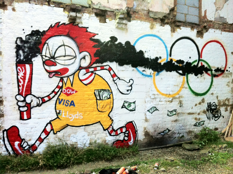
Two brilliant murals in two days! This one’s by the street artist Mau Mau. He’s been using that character, called Evil Mac, on and off for nearly a decade now (here’s a typical example), but never as effectively as in the devastating composition shown above. Big thanks to reader Chad Todd for tipping me wise to it.
New ESPN column today — enjoy.
Uni Watch News Ticker: Yesterday’s MLB pandering caps looked predictably awful, but here’s something interesting: Oakland’s Grat Balfour appeared to have a regular A’s cap with ersatz camourflage drawn in with a Sharpie. I’ve asked A’s equipment manager Steve Vucinich for comment — will advise (from Sam Lam). ”¦ Cardinals trainers wore flag-themed shirts (from Caleb Yorks). ”¦ Earlier this week I mentioned that George Scott had apparently worn No. 0 with the Royals, but I didn’t have a photo. Now I do, thanks to Bob Thomason. Scott’s nickname was the Boomer, so it would’ve been even better if he’d worn 00 — would’ve rhymed with his nickname! … In a related item, it looks like Thomas Robinson will be wearing 0 with the Kings (from Taylor Hollowell. ”¦ Extremely disappointing news out of DC, where logo creep has shown up on Washington’s and Jefferson’s socks (from Claude Jacques). … In a related item, here’s a really fun article on minor league mascot races (from Rocky Lum). ”¦ A Cairo shoe store called El Morshedy is using the Twins logo (from Eric Trager). … Some recent contestants on So You Think You Can Dance wore baseball uniforms during their routine. “The show’s judges were wearing conspicuously placed 2012 All-Star Game caps, so I wouldn’t be surprised if Fox nudged these guys into doing a baseball routine just so they could just promote the ASG,” says Andrew Levitt. … Americans aren’t the only ones willing to sell out their civic assets to corporate interests. European countries are now getting corporate sponsors for their historic buildings and other sites (from David Cline). ”¦ Here’s a good photo showing how they stencil the maker’s mark onto a tennis racket (thanks, Brinke). … New logo for UW-Stevens Point (from proud Stevens Point native John Okray). … If you’re a Nebraska football fan, you’ll love this Memorial Stadium-themed wedding cake (from John Muir). … The Fresno Grizzlies will wear Batman-themed uniforms on Friday (from Chris Kutz). ”¦ The Pirates wore their alternate caps on Tuesday night — the ones with the white-outlined logo — except for Garrett Jones, who wore the regular cap (from Brian Skokowski). ”¦ Independence Day silliness from the Spokane Indians, Arkansas Travelers, and Cedar Rapids Kernels (from Larry Luk, Blake Parker, and Mike McLaughlin, respectively). ”¦ Tim Lincecum’s shitty season hasn’t kept Red Bull from putting him on their can design (thanks, Phil). ”¦ New kits for Athletic Bilbao (from Ryan Maquiñana). ”¦ Why the hell are the Mets using a BFBS logo patch on their All-Star BP jerseys? … “Travesty in the rugby world,” writes a distraught Caleb Borchers. “Rumors are swirling that the All Blacks will sell the front of their jerseys for sponsorship, tarring the clean, pristine Black jersey. Weeping and gnashing of teeth will follow if this is true.” ”¦ The corporate sponsor of the new arena in my neighborhood continues to be a beacon of civic pride. Maybe we can get Halliburton or Blackwater to sponsor the next arena to go up. ”¦ Liverpool’s new third kit is not popular (from George Chilvers).
Somehow the link for the Spokane Chiefs is just a comma.
Spokane Indians… for some reason, my mind transposed “Chiefs” when typing that out.
Spokane Chiefs is the name of their WHL team, I believe.
Thanks — now fixed.
Paul,
Where are this pics of all your grilling from yesterday???
Tomorrow.
Those Arkansas Travelers jerseys look like they were supposed to have NOB’s on the back, but someone didn’t get the memo.
Braves’ trainers also wore flag-themed polos, though not exactly the same.. will try to supply photo.
I like how the player/model for the Batman jerseys has his face hidden. I don’t think I’d want to be recognized in those either.
Appropo of nothing, a few comments:
I believe that HOW particular teams choose to wear certain colors or designs are as interesting, if not more interesting, than what they actually wear. The decision making process, and WHO ultimately decides, could offer us some very good stories.
Some schools/pros let coaches chose team uniforms, some deny coachs’ whims or desires. The Univ of Colorado mandated that the Buffaloes ditch Black jerseys for a few years, putting them in Sky Blue, they then later relented. How this was came about, and was later un-done is interesting to me.
Do AD’s, coaches, or Boards decide if their NCAA teams wear Pro-Combat unis. Who decides. Who decides how each different school decides? This is murky and interesting.
We know that the NY Jets adopted Green and White because Sonny Werblin was born on St. Patrick’s Day, and wanted his rebranded Titans to wear his lucky, favorite color. But why did the Tampa Bay Buccaneers ditch their original, announced Green/White colors favored by Hugh Culverhouse and instead chose to go with Creamcicle Orange and Red? Who convonced him to change his mind?
How did the Saints, and many other teams, chose their colors and uni templates? These could be mundane – or interesting – stories ….
Why did the Vikings ditch Northwestern Stripes on their White jerseys ONLY, and essentially (coincidentally?) copy LSU for decades – until the Nike douchebaggery caught up to their current design? Why the early 1960s change to begin with? Why only the White jerseys? Who decided?
Who decides which shade(s)of Blue the Chargers will wear THIS YEAR?
Why in Heaven’s Name did the NJ Devils ditch their unique Ketchup & Pickle ( Red & Green) uniforms for the current Red & Black? (Oh, sorry – BFBS{?})
Did the Russian Zillionaire or someone else decide the Brooklyn Nets new uniforms and logo? Who did. Why were they/them chosen to do it?
After Robert Kraft allowed his kid to have input into the first post-Pat Patriot unis, who then decided to change them again?
Why is there not a single team in MLB that wears a Yellow, Athletic Gold, or Gold cap? Why did Pittsburg ever ditch their’s when no one else had one?
On and on it goes. I could go on for days. Some of these stories could be pretty good ones.
I’d love to know where we could learn about some of these stories ….
Some interesting thoughts/questions… but don’t blame “Nike Douchebaggery” for the Vikings’ current uniforms which were created when Reebok was still the league’s uniform supplier.
I thought the NY Jets adopted green and white because Leon Hess’ gas stations and trucks were those colors. That may have been the last say he had in team operations before he bought out Werblin and the others and became sole owner. Many of his decisions thereafter were much worse.
The story goes that the Boston Bruins originally wore brown and gold because they were the colours of owner Charles Adams’s First National grocery chain.
“Did the Russian Zillionaire or someone else decide the Brooklyn Nets new uniforms and logo? Who did. Why were they/them chosen to do it?”
here’s the Nets rebrand launch video, FYI:
link
Why is there not a single team in MLB that wears a Yellow, Athletic Gold, or Gold cap?
Bad News Bears.
Why did Pittsburg ever ditch their’s when no one else had one?
“Let’s look like other teams”.
Bazinga! Teams are slavishly conformist. Now and then one will try something to be different, but the novelty factor eventually wears off and your favorite team comes back in quest of a bigger slice of the merchandising pie. Fundamentally, its the same reason all cable TV networks wind up showing pro wrestling.
Please don’t say bazinga. That show is freakin horrible.
But, yeah, sports uniform history is filled with copycats.
Please dont say bazinga
link
Because some of us still have unhappy memories of growing up in the ’70s, when adults dressed like clowns and insisted on dressing you up like a clown as well. It’s enough to turn someone who was there off of loud colors and bold designs for the rest of eternity.
Having lived through the eye-scarring heyday of the rainbow Astros and the Stargell/Tekulve Pirates, I would be quite happy if no MLB team ever again wore anything but various combinations of black, navy, and white/grey–and that includes the Reds and A’s.
Speak for yourself, Eeyore. ;)
My memories of growing up in the ’70s were quite happy, so I applaud the Rays’ “throwback” day and I would love to see the Astros and Pirates get their uniform freak on again.
I loved the 1970s unis; they had their time and place. I prefer the more conservative looks in baseball now. Football, on the other hand, may have looked better in the 1970s than it does with some of the clownish unis today (major exceptions nothwithstanding).
People still dress like clowns, or slobs as the case may be. Have you been on an airplane lately? Men in their 50s and 60s still dressing like little boys. It’s one thing to do it at a backyard barbecue, quite another to look that way in a public place.
I hear you, Geeman. Sartorially, at least, I’d return us to the 1940s if I could. Or maybe even the 1790s (go go, knee breeches!).
My favorite hat is, and has been, the mustard/black Pirates hat of the early 70’s, one of the best hats OF ALL TIME!!!
link
+1
Why is there not a single team in MLB that wears a Yellow, Athletic Gold, or Gold cap?
In the late ’90s the Astros had a cap with a metallic gold brim. Sorry haters, but I love that hat and still have mine.
No hate from me. I liked that color combination, and would prefer it over the blue and orange if that’s what they intend to go back to. With them moving away from the Brewers in the NL Central they could certainly go back to that scheme – though I know they probably won’t.
Please, Pirates…wear this!
link
As you know, they never did – the pillbox preceded the gold jerseys. (Probably too hard to airbrush the different style of cap.)
Yeah, but that would be a good look without having to go back to the mustard gold. Wouldn’t bother me a bit if they did, though!
I didn’t like the hat with the gold bill, but i did like the regular game hat from that era with the Astros. I thought it was a real downgrade, hat-wise, when they changed with the move out of the Astrodome.
Agree 100%. I also think the 94-99 Astros uniforms were the best in their history.
“Why in Heaven’s Name did the NJ Devils ditch their unique…( Red & Green) uniforms for the current Red & Black?”
Originally, the Devils franchise kept the KC Scouts colors when they moved to Denver to become the Rockies…why’d they ditch them when they moved to NJ?
Jeff Lurie’s decision to kill off Kelly green for the Eagles is a greater offense IMO.
Part of me wants to ask green has to do with Devils… but then there’s this: link …so I guess it works
/red and black still make more sense to me as “devil” colors
It made sense for the Colorado Rockies to retain the KC Scouts’ colours, since they are all components in the link.
Not sure why the Devils went with red, white and green.
Not necessarily. If any team in Mountain region goes with that theme, then it should most likely be purple. Still could have gone with purple even after ripping off their flag.
Because teams hate bright colors & everybody wants dark colors (I’ll even admit I want my baseball team in navy blue & red again). Dark colors sell & “look tough”.
People would rather wear caps that are either black, navy, royal, red, crimson or forest than Athletic Gold, Kelly, Green, teal, turquoise, Light Blue, purple, gray, white, tan or brown.
Part of the problem is there’s too many teams. Way too many teams. Another problem is so few like the color green, which is inexplicable. There should be as many green teams as there are red, blue or black. You’re rarely going to see colors like kelly or orange being #1 on favorite color lists. I would say team color awareness really only started being seriously noticed in the past 25 years or so & too much reaching in fashion & merchandising has taken importance instead of really being unique.
Nick,
That would be a fascinating and ambitious research project to take on. If you decide to chip away at it, let us know what you find out.
My guess about the Pirates: As you know, they had both gold and black caps during the multicolored era. They ended up only wearing the gold caps with the black jerseys, so when they went to white and gray jerseys in ’85, they stuck with the black caps.
Not a bad little dance routine, but mediocre unis and they discarded the bats way too early. Props like that force dancers and choreographers to be better and more creative. Anyway, reminds me of an idea I had some years ago: Baseborodo. Tai Chi-style slow movement exercise based on baseball mechanics instead of martial arts.
The original owners of the Saints made their fortune in the “black gold” industry. At least that’s what I’ve always read.
The Fresno Grizzlies will wear Batman-themed uniforms…
Horrible.
Another piece of Minor League Independence Day silliness – Rochester Red Wings
link
why is their a difference of “makers mark” and “logo creep” in your eyes?
You could easily say that any athletic company’s clothes could also have a “makers mark” … just seems like one is your positive connotation and the other negative.
I have never meant anything positive when using the term “maker’s mark.” It’s neutrally descriptive, not positive. All logo creep involves makers’ marks, but not all makers’ marks are logo creep.
Logo creep, as the term “creep” suggests, involves the slow, steady incursion of makers’ marks and other logos into apaces where they hadn’t previously been. But maker’s marks have appeared on tennis racket strings for a loooong time (since, what, the ’70s?), so I wouldn’t call that logo creep.
Also, logo creep usually involves the manufacturer’s brand superceding or at least conflicting with some other brand (usually a team logo). In the case of a Wilson tennis racket, Wilson is, you know, the brand that matters, so it’s not inappropriate for them to put their logo on the racket. That’s very different from Nike plastering swooshes all over a team’s uniform, since the team brand is what’s supposed to be important, not Nike.
Maker’s Mark has tremendously positive connotations for me. Just sayin.
(insert picture of Philip J. Fry)
“Not sure if religious or just playing Dragon Age: Origins”
If you look at a player wearing a uniform and see the same logo in five different places (shirt, pants, gloves, socks, shoes, etc)… That’s logo creep.
The Rawlings on a glove is a Makers Mark.
I think part of it is what did the company actually make? Nike started out with shoes. Fine, they can put their logo on the shoes. But now that they do shirts, headbands, golf balls and everything else, Nike is logo creep. Basically, it’s mostly the shoe and apparel companies that are most guilty of logo creep (Nike, Reebok, Under Armour), because they put their logo everywhere, including water bottles.
Where does Red Bull’s teams appear on this? You know, the New York Red Bulls (soccer) and Red Bull Racing (F1) among others are owned by Red Bull GmBh, not by an individual owner like manyt professional teams.
Having said that, the team name is equal to the sponsor, but is it logo creep because it’s also the name of the owner?
It is different from other racing teams like Ferrari or Mercedes Benz which are part of the same business (cars), but we have an energy drink owning teams in different sports. What’s your take Paul?
I don’t think it’s logo creep at all, but what would happen if Nike decides to buy a soccer team in Oregon and call the the Oregon Swooshes with a big Nike logo on the center of it.
I’d say that they’re sorta unique. It’s not really logo creep if the “evil corporation” owns the team, but it still seems sorta wrong in a way.
I can’t think of any other team in a similar situation.
Another one is the Arena League’s Miami Hooters team from 1987-2008.
link
Racing is somewhat (or fully?) exempt from logo creep. If it weren’t for all those sponsors, there would be no racing.
NASCAR would still be a hobby a bunch of guys partake in around North Carolina.
“… New logo for UW-Stevens Point (from proud Stevens Point native John Okray). … ”
Really pretty good. Like the colors and love the Pointers nickname and mascot. [Non-bulldog canines are way underutilized, imo.] Also happy to see that the pointer is not angry or menacing, though he is a very SERIOUS pooch indeed. Glad the dog mascot is goofy and smiling.
All in all, thumbs up from this member of the UWatch fraternity of Non-Cheeseheads Who Love Wisconsin, P Lukas, President-for-Life.
Speaking of Pointers, always thought this jersey was fun…
link
Wow! That is one handsome shirt.
There are an amazing number of state universities in Wisconsin, aren’t there? I’m accustomed to seeing a mind-boggling amount of interstate basketball games scroll by on the sports ticker.
I was in Menomonie a few weeks ago (home of the best children’s playground in the history of playgrounds at River Heights Elementary) and was shocked to discover that it’s where UW-Stout is. I’d just always assumed there was a town somewhere in Wisconsin named Stout, which would have made it one of the most Wisconsiniest of all Wisconsin town names. Alas.
A couple of years ago, someone suggested a new state motto: “Wisconsin – Land of Beefy Blondes.”
Well, as I understand it, it IS the “most overweight state.”
There sure is:
Four Year schools:
UW-Eau Claire – Blugolds
UW-Green Bay – Phoenix
UW-La Crosse – Eagles
UW-Madison – Badgers
UW-Milwaukee – Panthers
UW-Oshkosh – Titans
UW-Parkside – Rangers
UW-Platteville – Pioneers
UW-River Falls – Falcons
UW-Stevens Point – Pointers
UW-Stout – Blue Devils
UW-Superior – Yellowjackets
UW-Whitewater – Warhawks
“Non-bulldog canines are way underutilized, imo.”
I’d say we’ve got more than enough Huskies as well.
Good point.
Touching upon one of my pet peeves – and not to get all Bob BArker on y’all – teams with the nickname “Huskies” that do not use a Husky to represent the name.
This is a Husky: link
THIS is a Malamute: link
Despite what the University of Washington may think.
I will get off my soapbox now – back to your regularly scheduled program.
Despite what the University of Washington may think.
Well…
They link.
Mostly Maui Waui, but it’s got some Labrador in it.
I like it a lot too. It’s a clean logo that I think would look great on their hockey jerseys.
You could make the argument that the AAA Louisville Bats are always wearing a Batman uni. Evokes Batman better than whatever crap the Fresno Grizzlies are wearing.
I think that Andrew is right about Fox and the producers encouraging some team to do a baseball routine. Those jerseys have “SYTYCD” on them. If it was their own idea, I am sure that they would have come in with jerseys of their favorite teams.
Agreed. Even if they didn’t do jerseys for their favorite teams, they’d probably have their own NOBs, had it been their idea. Such is the nature of “reality” TV. We see what the network wants us to see.
Indianapolis Indians did the 4th thing as well…a bit more tastefully than the others:
link
They also wore Royal Blue hats with red brims and the “I” logo filled with stars and stripes.
link
The New Zealand All Blacks have worn a sponsor logo before.
Back in mid 90’s Steinlager was on the shirt as well as the manufacture logo.
link
I’m guessing that sponsor logo was a lot smaller than the one currently being proposed.
/they both suck though
My theory about why the black patch is used on the mets all star jersey:
Technically, the mets only have two patches this season: the black skyline and the 50th anniversary. There is no blue skyline patch this season, it’s been replaced for the season.
The All star jersey wouldn’t use an anniversary patch as a team patch, so they chose the alt. patch.
This is my theory.
Don’t know why they couldn’t use the 50th logo patch…but maybe MLB has some guideline against anniversary patches on the ASG BP. The blue skyline patch still exists…it will no doubt return and replace the 50th logo next year, so why not use it on the All Star jersey? I’d love to know who made this decision and why. Probably some designer at Majestic saying, “we got all these black patches lying around…kind of looks good with the other colors…let’s use them.” Maybe the Mets agreed, maybe they were not consulted. Perhaps this is a one off retail jersey and Wright and Dickey wear a blue patch at the game…time will tell on that one.
I assume anniversary patches are not allowed on all star jerseys…have they ever been worn during an all star game? I know the mets all star cap has the 50th patch removed.
I can take the camouflage pandering on military holidays like Memorial Day. I absolutely loathe it on Independence Day.
One of the unique and fantastic things about the United States is that the day that we have chosen to celebrate our independence does not memorialize a military victory. We didn’t win our independence on July 4th – we declared it. Fifty-six men made the stunning decision to take on a superpower with little else but principle. At the end of the Declaration of Independence, they “…mutually pledge to each other our Lives, our Fortunes and our sacred Honor.” They signed their names to what could have turned out to be proof of treason, and in so doing founded a country in an unprecedented and novel way.
Our past, present and future members of the military are certainly brave and worthy of our respect and recognition. But I wish we could just celebrate the bravery in word and deed of those 56 men on July 4th instead of pandering to the “patriotism equals military appreciation” set.
Nicely stated.
Absolutely.
I agree. But the reason we pander like that has a lot to do with the fact that so few of us serve in the military now, so we feel a need to over-thank the few that serve and perhaps also to make a connection with them.
Every non-religious holiday has morphed into Military Appreciation Day, even Thanksgiving. And Christmas is teetering.
The level of Military Worship in this country is getting dangerously high.
Agreed, Thanksgiving is annoying because NFL games always make it a point to genuflect before the military. For a professional that gets paid, health care for life, free tuition, plus other benefits bestowed through discounts and stuff, they sure do need a ton of appreciation.
I’m obviously aware that certain generations of folks did serve and sacrifice a ton, and not always by choice (ie WW II, Vietnam), but the modern military is voluntary and as far as I’m concerned, hasn’t really done much to protect my freedoms, as is popularly expressed.
Maybe I’m misguided, but that’s the way I see it. Lots of people serve the public without the same level of respect that the public bestows on the military
Whoa, whoa, whoa there buddy. You are sadly and grossly misinformed. Just because you hear on tv that us military guys get “health care for life” and “free tuition” you might want to check your facts before you continue to hate on us for not earning it.
I’m a disabled veteran myself. I have practically NO healthcare to speak of, and I’m sorry to burst your bubble, but the VA healthcare I AM provided certainly doesn’t compare to any private provider.
Free tuition? Wrong again. Yes, there’s the Montgomery GI Bill, and more recently the Post 9-11 GI Bill, but neither of them cover anything close to making it “free tuition”. Check into what changes have come just this year with the post 9-11 and get back to me on that comment.
Sorry to rant, but you are sadly misinformed. I don’t ask for thanks, or for one bit of preferrential treatment for my service, but I also don’t wanna hear someone spew misinformed nonsense about the “undeserved” perks we receive.
/rant
Like I said, I don’t claim to have all the facts, I was under the impression that the GI bill could cover entire education at a state college, maybe at a different point in time but maybe not, and I know the VA isn’t perfect, but a few vets I know speak highly of it, despite its flaws.
I stand by my original line of thought, that military duty is no more special a call to public duty as any other profession, from blue to white collar. But I don’t see other public sector people receiving near amount the attention, when I think they do just as much for the country. People who serve in the military are practically sainted and are seen as “deserving”, but public employees in places in Wisconsin get villified (although I personally feel unions are a bit out of hand).
I don’t want to paint you, Coleman, as undeserving, rather I wanted to make the point that others are equally deserving.
Maybe I’m misguided
Acknowledging the problem is the first step to a solution.
Coleman, you may not be asking for thanks, but you’re getting it from me. Thanks.
I agree most holidays don’t need to have a military tie-in, but we’re nowhere near reaching a point of military worship. Most people seem to have a proper appreciation of what our soldiers do, and those who don’t/didn’t have to serve (myself included) should especially appreciate that. Just wish we could appreciate it with better looking uniforms…
I agree wholeheartedly with Devin. Independence Day should not be “Military Appreciation Day.” It should be about the brave men who put it all on the line on July 4, 1776 for something they believed in.
That said, I wholeheartedly disagree with Phil P.’s characterization that the military “as far as I’m concerned, hasn’t really done much to protect my freedoms, as is popularly expressed.” I hate to tell you, but you wouldn’t have any freedoms if it wasn’t for the military might that this country is able to project around the globe. Too many brave men and women have died over the course of this country’s history for your freedoms. In its current configuration as an all volunteer force since Vietnam, thousands of brave men and women have died for your freedoms and the freedoms of people throughout the world. They died not on our own shores, but far from home so we don’t have to know the horror of war personally.
We may have disagreements about the policies that put our men and women in harm’s way, but the fact that they are their putting it all on the line changes nothing. They are there for you and for me and they will lay it all down without question. I’ve known some of them. I have known some who have come home with medals, some who have come home on crutches or in wheel chairs and I’ve know some who have come home in a box. Sir, they are all better than you or I will ever be.
link
Toytally understood Phil P. I didn’t mean to come off as a jerk, my reply was hastily posted and I shouldve mentioned that I was not taking it personally, because I’m not. I just know for a fact that lots of the benefits civilians hear about are not all they’re cracked up to be.
I agree, the 4th of July really has nothing to do with our current military, other than maybe that we ensure the freedom continues. That’s about it though.
And thank you Mr. Vilk, I still appreciate hearing it.
You can’t state it any better than Devin did. I don’t have a problem with honoring/paying tribute/paying respect to the people who have served this country. To volunteer to go half way around the world to get shot at shows more cojones than I have.
It has also been stated in this thread that other domestic occupations deserve tributes as well. I won’t deny that. I think I have been to minor league baseball games where they do such for policemen, firemen, etc.. There are others who face physical dangers in the jobs that they do. Mercifully, most of those dangers are less than what the men and women in the military face (Thank God, we aren’t dealing with IEDs and RPGs on a regular basis in our own country).
I would also argue that honoring the individuals that served isn’t necessarily “military worship”. You can disagree with our government’s foreign policies and still respect those that carry out those policies (regardless of how they personally feel about those policies). Part of me wonders if the level of respect we show our veterans are influenced by how Vietnam Vaterans were treated when they came home. There may be some overcompansation in that regard, but, overall, they should be treated better by the general population than they were after that contentious war.
James A,
I was wondering the same thing about the possible “overcompensation” as a reaction to the vilification of servicemen that took place from ’68 to ’72. For those of us old enough to remember, many of the young people of the U.S. in the late 1960s lumped together all authority figures and particularly all military and branded them all “baby killers” and the like. Military men (boys, really) returning home from Vietnam were yelled at, sometimes spit upon (though not as often as the history books would have you believe), and ostracized for serving. The peace and love generation thought that their brothers should have fled to Canada when they got drafted, and they overtly and sometimes viciously attacked those who enrolled voluntarily.
Since the first yellow ribbons showed up during Desert Storm, I’ve believed that the overglorification of the military of the past 20 years comes from Baby Boomer guilt. It was the baby boomers that vilified servicemen in 1969, and it’s the baby boomers who started the big push on “supporting the troops” now. (It’s also the same baby boomers who created and widened the generation gap in the ’60s that created the “helicopter parent” parent phenomenon. Same baby boomer guilt? I think so.)
I’m not a sociologist. But I play one on TV.
Excellently expressed, Devin.
I was thinking the same thing. I’m a veteran and I thought it was too much. What happened to the American flag ones?
Today’s ESPN column is up:
link
Really nice article, Paul, but that doesn’t look like “Dave Kingman of the Mets”. It looks like a Padres player.
Or rather, a Pirates player wearing a Padres batting helmet.
Yeah, wrong link. Just got my editor to fix it.
My idea for Independence Day: ditch the stupid camouflage (did camouflage even exist back in the 1770s?), and make one small addition to the uniforms: every team wears the Phillies-style Liberty Bell on their socks.
Make pajama pants unpatriotic…..I LIKE IT.
1776 camo mostly was, “Don’t wear red coats and white pants and march in a straight line through the woods.”
Actually, camouflage was in use by the War of Independence, though it was generally limited to special irregular or ranger forces who modeled themselves on ranger (and to some extent, Indian) forces in the French and Indian War. But camouflage basically amounted to “wear green coats, or other earth tones, and perhaps smear mud on your face.”
But for most soldiers, infantry tactics of the time were such that any attempt at camouflage was pointless. It was much more important to be able to identify your comrades at a distance than to be unseen by your enemy. In fact, the irregularity of homespun dress of many patriot regiments (A) made for pretty good camouflage and (B) cost the Continental Army defeat in at least one major battle. Camo, in other words, was a Bad Thing for infantry at the time. Getting the Continental Army into some semblance of a standard, highly visible uniform was a key part of turning it into a fighting force that could stand up to the British Army.
That’s pretty much what I meant.
“It was much more important to be able to identify your comrades at a distance than to be unseen by your enemy.”
Also to know who’s who in the powdersmoke.
Right on, Scott. To what degree do you think the distinction between uniforms and mufti follow the distinction between musketeers and rifleman? There weren’t many of the latter, comparatively, Daniel Morgan notwithstanding. The guys with muskets really couldn’t aim at anything more than forty feet away, and concentrating and massing were key. As you say.
Can we also put in a plug (again) for the French? It was their money and/or cloth that made the Continentals of Yorktown actually look like an army. And despite the halo we place around Von Steuben, the French officers were probably the most important influences on American discipline and tactics.
As mentioned, I’m kind of demented these days on the general subject of Chesaepeake / Potomac military history. Yesterday I tromped through Rock Creek Park to look at what’s left of Fort DeRussy, one of the chain of heavy artillery positions defending Washington during the Civil War. And — I know you’re all just dying to hear this — we just signed a lease for a house bordering on the park that encompasses the site of Fort Reno, highest elevation in the mighty District of Columbia! As a neighbor said, “You could really catch the cooling breezes up here if there were any.”
Ricko, apologies: My “actually” is a bad rhetorical habit, and so the implicit sense of “in contradiction to what you say” was unintentional. I meant to expand on, not contest, what you wrote!
No offense taken. None.
Camo pretty much WAS “wear what u normally wear” for patriot forest fighters. “Come as u are” gave them a decided advantage for their guerilla tactics.
On typical battlefield, yes, the implementation of the blue coats and the related proper training were HUGE in turning the rebels into a legit army.
Connie, will that high elevation in D.C. create problems during the next derecho?
Well, JA, it’s a rental, so I wouldn’t endanger my property and I’d get top entertainment value. Speaking selfishly, of course.
I’d like to see the re-use of this patch:
link
Love that patch!
Clearwater Threshers also did the 4th jerseys but on the 3rd. They are uglier than the rest except for the Kernals. I have photos but not posted yet. Basic description- flags on the back with the uni number over the flag and side panels that did not blend in any form.
Wow, something actually can look crappier than the yearly abortion MLB puts out on the 4th. Sharpy camouflage.
I went to the Lehigh Valley IronPigs (Phillies AAA) game last night vs the SWB Yankees. Apparently the ‘Pigs couldn’t decide which way they wanted to go this Independence Day, so they decided to do the worst possible thing they could – combine a new Stars & Stripes cap with a desert camo jersey…
link
Honestly, for Independence Day, I have no problem with the Stars & Stripes caps. For a lot of teams out there, I kind of like them. The IronPigs colors are red with blue, so they don’t look bad with their regular uniforms. But with the desert camo – not a good idea, and even worse execution. I agree with the above – I’m all for honoring our military on Memorial Day and Veterans Day, but July 4th shouldn’t be about the military.
Here’s this years Stars & Stripes cap
link
And here is last years…
link
I’m with you Gary on the Stars and Stripes hats. I don’t hate them as much as others on this site. Particularly when the team’s colors are already red, white, and blue, and when the city played (or plays) a big part in our country’s history (Philadelphia and Washington fit both bills on the MLB levels). The camo hats have gone too far for me style-wise (Including still calling it a “Stars and Stripes” hat).
I get it being a bit unsightly for teams like Oakland, Pittsburgh or Colorado… it doesn’t match their color scheme at all. But its not like they’re wearing them every day. And I realize its all mostly a marketing scheme, but if I didn’t like the cap, I wouldn’t buy one… So that’s on me.
As for the Phillies, I love their Stars & Stripes caps, this year notwithstanding. I wish they’d go off the deep end next year and have a S & S cap with the Liberty Bell logo on the front, but I’m not holding my breath…lol.
Not a bad idea at all. I was talking with a friend last year when we were discussing the Stars and Stripes hats. We went through all the possible red, white, and blue options they could possibly do without going too far off the normal hat designs. We realized that they didn’t have many options left. I think they would have been better off sticking with each design for two or three years to stretch things out and make sure MLB would get every sale they could from, say, the all red hats, all blue, etc.
This white border on the P…
link
…is, of course, not necessary and hideous.
Why can’t these clubs leave perfection alone? If it is to try and drum up additional sales, then sell them in the gift shop.
Even during the pillbox bumblebee era, they left the P alone.
Respect the P…
link
Some guys just badly need to take a P…and make it fancy. Urine good company here, though. I don’t like how they raise the seat of the logos today. The P should be flush.
Tinkle will ever happen? I think having their own identity is Number One. I wizz happy with their pillbox hats.
Stream of consciousness going there, guys?
The rationale behind the white borders on the Pirates hat logo was the decision to use the P as the alternate jersey a few years ago. Having the white borders on the P was almost necessary in order for the much larger logo to stand out properly on the black jersey. As a comparison, the 70’s A’s also used a white border on their logo with the green jersey.
You’ll also notice, the Bucs use a black P with a white border on their batting practice jerseys. In terms of the Pirate hat, yes, I would leave that alone.
The Pirates really do have the most underrated uni’s in MLB. The home whites and road grays are things of beauty, and the cap is perfection. Adding the white outline makes the P clunky and minor leagu-ish. So yeah, keep those things in the gift shop for fans with poor taste.
Now that the trend of sleeveless jerseys has fizzled out, the Pirates need to reclaim it. They own the vests. No one looked better in them. No one but the Reds have as solid an historical claim on them; the Cubs being hopelessly wed to their present uni until the Rapture.
Too bad they didn’t sell. “Let’s look like other teams” wins again.
Amen to that. I admit that the sleeveless-jersey fad was overdone, but the Pirates came by it honestly if any team ever did, and they should have kept it.
On the bright side, maybe they can reintroduce the sleeveless tops at a future time coinciding with a long-overdue run of success, and solidify the precedent.
Are you suggesting that all Wilson (or all tennis) racket logos are administered by hand? It seems outlandishly naive when a machine would do it much more quickly and cheaply than someone with a magic marker and a towel. I’m confident someone at Wilson, Rawlings, etc. has figured that out, too.
*ahem* “Job Creators”
Let’s hope that they DO have an actual person spraying logos on the rackets, that’s probably better for the economy than a robot.
Somebody has to fix and make the robot…
…unless it’s another robot!!
OH GOD, WHAT HAVE WE DONE?! NOOOOOOOOOOOO!
(and, scene.)
Competitive tennis racquets are sold WITHOUT strings, so yes, they are put on by hand, usually by the person who strung it.
It’s not Blackwater anymore, it’s Xe (seriously, Google it).
Maybe Grant Balfour wanted his camouflage pattern to be more of an Australian pattern.
Or something.
(That’s where he’s from, right?)
Yeah, he’s from Australia.
Yeah I see the dingo influence on it.
Oh, and link?
Does that mean it was designed by someone else? (Nike, perhaps?)
Well, seeing as Nike owns Umbro, that stands to reason. Nike just bought a premium brand name to get themselves more into the soccer scene. Ya know, the same way Zalinsky bought Callahan for the brand name and was going to close down all the factory in Tommy Boy.
Paul – I just received an email from New Era advertising the on-field All Star Game caps. Lo and behold, the caps had the infamous stars on the back of them. I forwarded you a copy of the email with a picture of the cap/stars. Looks like they are out of the mothballs! No word on whether or not the on-field jerseys will have the stars too…
The extra stars used to be an extra “Look at me, I’ll be in the ASG next week” addition to the jerseys and caps. Now, not so much.
Good riddance, but now they’re even more redundant, because all the all-stars have cap patches on the side and sleeve patches anyway!
It says Grat Balfour should be Grant Balfour.
Although I despise the GI Joe dressup hats both symbolically and aesthetically, I do think it deserves to be pointed out that according to the official MLB online store, 100% of proceeds from their sale goes to the Welcome Back Veterans fund. Better than previous instances in which they’d say something vague and exploitative like “part of” the proceeds.
Or, you know, MLB could just leave the baseball caps alone, make a lump-sum donation and call it a day. Instead, they have to make ugly “special edition” caps and hope that enough suckers decide to spend three extra dollars on a camo logo. And based on my experience, very few suckers go for the pandering caps.
But with the proceeds from the sales it’s the fans money going toward the fund, not MLB’s.
So MLB cares enough for the veterans’ cause to make the ballplayers look less than stellar, to whore their lids for charity, and to scream “LOOK AT US!” but not enough to actually cut a check?
Damn!
Who’s to say that the MLB doesn’t already give money to the fund, and in addition to that money they give the proceeds from these hats?
I know Paul’s influenced plenty of folks here to hate the camo and stars and stripes and pandering caps but do we really know the whole story?
Whats better:
MLB gives nothing to Vets.
MLB gives $50k to Vets
MLB gives $50k to Vets + another $50k from hat sales and for one day fans are treated to/forced to deal with an incredibly minor change to the game?
Which leads us to the inevitable, why do some of the folks here hate veterans so much?
Don’t mess with the uniforms or caps. Leave them alone.
I agree, I would prefer they not do it all, but if they’re going to, it’s at least better for them not to be profiting off of it as they did previously.
Anyone else seen this picture of Steve Nash in a Lakers jersey with Kobe?
link
The jersey was obviously an inversion of Kobe’s jersey, with the NBA logo moved to the correct side and the “Lakers” put back the correct way. But doesn’t it seem a little lazy that they just photoshopped the 13 from his Suns uniform, blatantly contrasting the font of Kobe’s number?
Nope. More impressive than lazy. Besides, Nash can’t have his normal #13 anyway, for 20,000 reasons.
//I’m predicting he’ll take his collegiate #11.
Then they should have just taken the Logo and number from this shot.
link
I like what you did there…
Can anyone explain this for me? I don’t ‘get’ it and it’s bugging me! How would it rhyme?
“Scott’s nickname was the Boomer, so it would’ve been even better if he’d worn 00 – would’ve rhymed with his nickname”
If 00 = the “oo” in Boomer, then that would be an allusion, not a rhyme…
//That’s all I’ve got.
Would that be an allusion, or more of an alliteration?
Nope, because the “B” is standing in the way, and alliteration is usually for initial sounds. Besides, “oo” is a vowel sound, which would make it an assonance, if anything.
Maybe he thought Boomer’s other nickname was “Bubble Hero”?
link
Now here are some nuggets about the baseball that will be used for the night’s first pitch, which will be tossed by Walter Johnson’s grandson, Hank Thomas. The first pitch “will be thrown from behind the Nationals dugout, similar to how it was traditionally performed,” according to the Nats.
The ball is an actual game-used ball from the 1924 World Series, on loan from Phil Wood.
Other features from the night, via press release:
* “Both teams will wear 1924 replica jerseys, while the grounds crew will be dressed in full 1920’s attire and gameday staff will don newsie caps and skimmer hats.”
* The first 10,000 fans who enter through the center field gate will receive a commemorative replica of a 1924 World Series scorecard, seen here.
* A 1920s-themed jazz orchestra will perform on the Miller Lite Scoreboard Walk from 5:30 to 7:00.
* The Racing Presidents and Screech will wear 1924 Senators jerseys
* The big screen’s Nats HD graphics “will reflect how the scoreboard would have appeared in 1924.”
* “Video tributes of the 1924 Senators will be highlighted throughout the game.”
* “Traditional organ music will be played between innings.”
—–
Not sure how video tributes and “scoreboard as if it were 1924” go together, but whatever. The replica jerseys being sold have NOB, it isn’t clear if the jerseys the players will yet.
Yeah, I used to love those racing Presidents at Expos home games.
Remind us again how often the Twins throwback to the Senators, and also remind us on which side of the 1965 AL Pennant flag does Target Field fly the 1924, 1925, and 1935 pennants
Oh, that’s right, the Twins don’t throwback to the Senators, and they don’t acknowledge or claim the Senators AL and World Series pennants.
Seeing as how the Twins don’t object to the Nats doing Senators I celebrations,, or really make much acknowledgement of their pre-1961 history (more than the Orioles, say, but less than many teams like the Dodgers), objecting to the Nats making hay with pre-2005 Washington baseball history is like trying to be more Catholic than the Pope. Can’t be done.
And after a few first-season missteps, the Nats have been very good about distinguishing between their various celebrations of franchise and civic history. Nobody at Nationals Field tonight will come away erroneously believing that the Nationals played in the 1924 Series, any more than anyone in Minneapolis last weekend was fooled into believing that the Twins used to be called the Millers.
I am looking forward to the Twins first visit to Washington in interleague play (they’re the only AL team not to have played a series in DC). Great opportunity for mutual throwbacks, such as 1960 Senators vs 1961 Expansion Senators, or 1961 Twins vs Nats, or 1924 Nats vs 1987 Twins, or somesuch.
PS: Lots of implied smiley-face emoticons in the above.
I’m willing to bet that a good many people came away thinking the Twins were once the Millers. And more will think the Nationals played in the 1924 World Series. That’s why this shit needs to stop.
Twins have wore Senators throwbacks…
link
(Unfortunately, images are tough to find on the Internet. There’s another I’ve seen of Eddie Guardado, but couldn’t locate it quickly).
But, as you say, so long as the Nats are good about distinguishing their NL history from the history of their AL predecessors, where’s the harm, truly.
As to Twins and Millers, nothing wrong with remembering a defunct historical franchise. It’s just that when the franchise is still around things can get kinda murky…especially without clear distinctions being made.
Personally, I’d like to the Twins wear St. Paul Saints unis one of days, too.
I respectfully disagree.
Begin rant…
For me, it not about claiming (stealing?) an abandoned history, it’s about denying the one you possess whether you like it or not. If they don’t feel comfortable paying tribute(as difficult as that may be)to the decades they spent in Montreal, then fine, don’t throw back to it. But don’t pretend to be that which you never were.
So what if the Twins (a franchise that was nearly contracted a while back, remember? That could have influenced raising objections about anything MLB approves of, could it not?)don’t object? It’s still improper. Since the Nats conveniently overlook and don’t celebrate their roots, should any team be permitted to dress as the Expos if they are so inclined (i.e.: if they lack a ‘proper’ history?)? When the Rays created a fauxhistory to throwback to, that was less offensive that claiming somebody else’s for their own, even though they borrowed heavily from the styles of the Padres & Brewers (and others?).
“Nobody at Nationals Field tonight will come away erroneously believing that the Nationals played in the 1924 Series”. You have much more faith in the general public’s knowledge of history (baseball or otherwise)than I thesedays.
End rant.
Should any team be permitted to dress as the Expos if they are so inclined …
“Permitted”? Yes, absolutely. I honestly don’t understand the premises of this rhetorical question. First, “permitted”? By whom? Did we like abolish the Constitution and name somebody emperor of the world with plenary power to tell professional sports teams how to conduct their marketing campaigns when I wasn’t looking? Because if not, the notion of “permitting” or not permitting this sort of thing is nonsensical.
That’s the general issue. On the specific case in question, the Expos comparison is itself nonsensical. The Nats are celebrating a prior team in the same city that is beloved among local fans. There is no comparable professional team in Montreal that is in a position to celebrate Expos history. If there was one, no one would object to that club celebrating Expos history, or Montreal Royals history, or whatever.
It’s local history. It really is. I know that some folks would like to pretend that Marty McFly goes back in time and erases everyone’s memories every time a sports team moves, but that doesn’t actually happen. The history that happened in a place, happened in a place. Until sports leagues decide to pay to relocate all of a team’s fans when they relocate a franchise, the team’s history both follows the franchise and stays with its departed city. Memory is not a zero-sum scarce resource; the Twins can honor their franchise’s history in another city (even though they mostly don’t) even as the Nats honor baseball’s history in Washington before they arrived, and nobody is the poorer for it.
As to the Twins photo Ricko shares, pretty much proves my point: If you want to see the Twins voluntarily throwbacking to the Senators, you’ve gotta go back to the Tom Kelly era. So the Twins are as likely to stake a claim to the Senators history as they are to wear TATC jerseys.
Let’s just ask this question, to see how it holds up….
Should the St. Louis Cardinals wear St. Louis Browns throwbacks?
Different league. The franchise that left town still exists, but with a different nickname.
Wouldn’t that sorta be the same thing? Not quite, but close.
It doesn’t hold up because the Browns were a contemporaneous local competitor to the Cardinals.
Same reason the Warriors didn’t throw back to the Oakland Oaks when other teams did ABA throwbacks last year. None threw back to former direct local competitors.
I have no photos but I believe in May of 1994 the Twins and Rangers both threw back to the Senators in a match-up with each other. I have seen the Twins from that game but not sure what the Rangers wore. I know the time period because my friend who has the jersey was only up and played against the Rangers in that series.
If the Twins can’t be bothered to honor the Senators’ history, then screw ’em–someone else damned well ought to, and it might as well be the Nats. The Minnesota club doesn’t get to squat grumpily on its half-century of baseball in the capital and forbid others to pick up the loose ball and memorialize it*. I don’t care whether the Nationals were ever the Senators: I care that the fans in Washington once had the Senators, and if the Nationals are the only ones willing to run with that history, more power to ’em.
* Still less can they stop me from mixing metaphors however I please.
I was at the Nats ballpark yesterday and I noticed that the tributes to historical teams and players are very unique and maybe even a little bit odd.
The Nationals are the former Montreal Expos, which were a 1969 expansion team. So, I would expect that the Nats would honor their franchise history, i.e. that of the Expos. The Nationals have no connection whatsoever to the Washington Senators (1901-1960), who are now the Twins. Nor do they have any connection to the Washington Senators (1961-1971) who are now the Texas Rangers. Yet, when the Nats do throw-backs and tributes, they do them for Senators history. Very strange. This would be like the Mets doing throwbacks in Yankee uniforms. Or maybe more accurately, the Royals doing KC Athletics celebrations.
The Nats have created a Ring of Honor up on the facade behind home plate. On the Ring of Honor, they have the names Carter and Dawson with the Expos logo next to them. Yet they do not pay tribute to Staub or Raines, both of whose numbers were retired by the Expos. (By the way, the Nationals un-retired all four retired numbers from the Expos.)
After the two Expos names, there are six names of players from the legendary Homestead Grays of the Negro Leagues. Obviously, the Nats have nothing to do with the Grays, but it would appear to be a great tribute to Washington baseball to have them memorialized there. Or so you would think… Turns out the Grays were never a Washington team! They were a Pittsburgh team who drew well in D.C. and therefore scheduled many — eventually up to 2/3 — of their home games in Washington.
After the Grays’ names on the Ring, come a number of names from the 1901-1960 Senators, with little “W” logos next to them. The Senators had had no numbers retired, and the Twins don’t make mention of the 1924 and 1925 Pennant winners or 1924 World’s Champions. The Senators names on the Ring of Honor are the Hall of Famers.
There are no names for the 2nd incarnation of the Senators, although Washington fans have clamored to have Frank Howard’s name put up there, and there has been discussion of putting Ted Williams up there for his stint as manager.
So, we have a team that sort of half-celebrates its actual heritage (Expos) and they celebrate a team/franchise to which they have no ties whatsoever (the Grays) and that wasn’t even a Washington team. And they celebrate one team (the 1901-1960 Senators) with throwbacks while seemingly ignoring the other (1961-1971 Senators — although I suppose one of the “W” cap logos is a nod to Senators II).
Altogether very interesting to compare how relocated franchises differ in how they memorialize their pasts.
“Traditional organ music will be played between innings.”
Has the ballpark organ gone the way of the stirrup? Are there any left? If so, how much are they used?
New Comiskey Park uses a blend of organ playing (which has its own little room on the main concourse) & a separate DJ mixer (blech).
Wrigley still has it I believe albeit a horrible PA system & increasingly commercial music.
PNC Park plays recordings of the late Vince Lascheid, former organist for the Pirates and Penguins, along with canned modern music. I love the tribute to Vince, and hope they continue it for a long time.
How much say does a visiting team have in participating in a Turn Back the Clock promotion? I know the home team ponies up for the uniforms but does the visitor have a say in the specs of the final product? What if the home team wants to throwback to an era the visitor isn’t incredibly proud of, or in a past city?
In 1924, Prohibition was the law of the land.
…and TR had only been dead 5 years. Too soon, don’t you think?
Speaking of the Pirates alt cap logo, check out the beautiful Bucs uni on the Catch of the Day. Even if you could see his cap, there’d be no white outline. Hint hint, to those who haven’t yet clicked on the CotD today.
Actually that COTD has been up there for a few weeks now and it really deserves it’s own button or something for it’s awesomeness. It by far outweighs any previous COTD.
I’ve made it my home page.
For the second year in a row, I went to the Blue Jays game on July 1 (Canada Day) was was dissapointed with what I saw. The Jays were wearing the camo caps, being it a naitonal holiday, but the visitng Angels did not. Now, come July 4, the Jays are at home against the Royals and BOTH teams wear camo caps.
Now I don’t want to get into a Canada vs. US discussion, but just want to wonder: A) Why didn’t the Angels wear their camo caps being in Canada on Canada Day?; B) Why did the Jays wear their camo caps celebrating Independence Day despite the game taking place in Canada? (The Royals wearing theirs is understandable)
Reds and Majestic are link the “official” t shirt of the team.
In a move that is being touted as the first of its kind, Majestic Athletic (the official uniform of the Reds), the Cincinnati Reds and MLB.com are teaming up to introduce MLB’s first fan designed tee shirt contest.
Says 3 more teams are going to do the same contest.
Just saw a thing on Twitter, the Giants are one of them.
And it’s only open to residents of California, oh hey thanks. Not like you have fans anywhere else in the country or anything.
Vancouver Whitecaps’ Joe Cannon did some self-tailoring last night…link
The real question people should ask is why there are All-Star uniforms at all? You know, since they aren’t worn during the All-Star game and they generally just look dumb.
Retail money grab!
//Duh.
Rule of thumb, if the answer to a question like this isn’t patently obvious, the answer is $$$$$$.
Bud Selig loves money, and he doesn’t care how or where it comes from, as long as it’s money and it’s in his pocket.
The same question can be asked of all sports. The NBA All-Stars don’t NEED to wear ASG uniforms, but they do. Just a money grab for David Stern.
A video with the Under Armour designers showing some of their inspiration into the Northwestern redesign.
link
Habs number news via link.
The pertinent bits translated from French:
Francis Boullion wore #51 for all of his career, including two previous stints with Montreal. But “tough luck,” says David Desharnais. Frankie Bee will take #55 instead.
Colby Armstrong wore #20 with Pittsburgh and Atlanta, and with that number being free, it’s his.
Similar story for Brandon Prust, who gets to keep a red-white-and blue #8.
Finally, René Bourque will revert to his more familiar #17, from his Calgary (where he should have stayed, dammit) days. Last year, he had to pass the time wearing #27 because Chris Campoli had “his” number.
Love how pride in one’s country is pandering only when it comes to the U.S. flag. Canada Day jerseys on the other hand… Just sayin’. Also, wonder if advertising on your website also makes you a douchebag. Where’s the Paul Lukas mural making out with “Overstock.com?”
Ah, yes, another tired and unoriginal apples & oranges comment about ads on this website…or any website.
(sigh) Movie studios still buy ads in magazines whose critics have ripped their films. Or has that escaped your keen media eye?
Ok… Fail to see how that has any relevance. The thing is, a system is getting ripped apart by people who engage in said system. “Do as I say. Not as I do.” The point: you have bills to pay. They have bills to pay. Very expensive bills. (Also, love how you said these issues were “apples & oranges” with no supporting argument. So let it be written, so let it be done…? Gah! Purina ONE has “creeped” unto my screen!)
You are so far off-base, you’re not even in the stadium.
1) I did indeed address the issue of Canada Day uniforms being pandering. It’s right here:
link
2) I have never, not once, said I’m opposed to advertising. I have always said I’m opposed to advertising where it doesn’t belong. The concept of media being supported by advertising — especially media THAT GIVES AWAY ITS CONTENT FOR FREE — is a basic model that is literally centuries old. But if you prefer, you can pay me for the content you read on Uni Watch each day — that way I can get rid of the ads. What do you say?
Right, I thought so.
I realize it’s easier to play gotcha than to actually think about the issues at hand, so keep it up. Meanwhile, be sure to let me know when you come up with one of these “Do as I say, not as I do” examples — we’ll all be eager to hear the details. And as for the mural you inquired about: By all means, please paint it yourself! I think I speak for everyone here when I say we’ll be looking forward to seeing it.
Perhaps Solyndra or GM could sponsor this sight from now on.
Good one. Because only link would have anything to do with either one of them.
I found the article on ads and historic sites in Europe an interesting read. When reading how some of the ads were restricted to just the scaffolding of te building being preserved, I didn’t think it sounded too bad. Then, I thought to when the Washington Monument was entirely encased in scaffolding. How would I feel if there were ads on that scaffolding as I approached DC? I would have hated it.
It’s reassuring to see that Europeans seem to dislike the advertising and sponsorship as much as some of us on Uni-Watch. It also made me wonder about something. While we generally disdain ads on jerseys in this community, I wonder how European sports fans view North American sports jerseys and the lack of ads? Do they think it is a better look (NHL vs. any pro European league, for example) or that our jerseys look too plain?
This is liberal nonsense at its finest. Only a liberal would find an absurd mural (aka graffiti) makes a compelling statement about corporations and the Olympics on a blog devoted to the obsessive observance of minor uniform changes on capitalist sporting teams. Paul, don’t you see the absurdity and contradiction here? You’re forever whining about corporate interests and yet you’re obsessed with corporate sporting events.