[Editor’s note: One of our annual rituals here at Uni Watch is that bench coach emeritus Bryan Redemske, who lives in Omaha, always provides a rundown of the College World Series uniforms. Here’s his report for this year’s CWS. ”” PL]
By Bryan Redemske
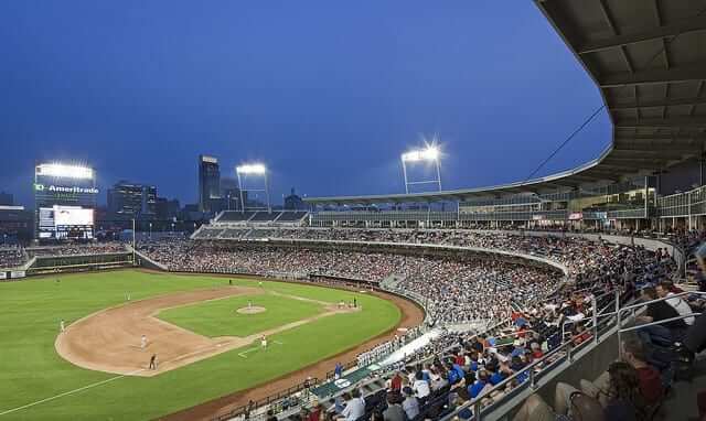
It’s mid-June again, which in Omaha means it’s time for oppressive heat, random thunderstorms, and the College World Series. This is the second year the Series will be played in its custom-built, $130 million downtown stadium. When the stadium opened last year, there was significant moaning about the “loss of tradition” in the shiny new ballpark.
But tradition is what you make of it, and people stopped whining when they realized the food was better, the parking was better, and there was a distinct lack of that stale-beer-and-pee smell that came with the old Rosenblatt Stadium experience. Mmmm … progress.
The College World Series starts tonight, and below you’ll get a good look at what the teams are wearing. Please note that this isn’t an exhaustive, comprehensive review ”” it’s merely a pretty solid guide for what you’re likely to see. For a sport that ends its season with a week-long pageant on ESPN, college baseball is horribly covered for the four months prior to the Series. Finding every uni and hat combination borders on impossible. So with that caveat, here we go.
Stony Brook
Hey, who’s the new kid? That would be Stony Brook, which is making its first College World Series appearance. Welcome to Omaha, Seawolves. (Zesto is overrated. Go to Ted and Wally’s if you want some good ice cream.) Oh, and visit the zoo. It’s nice.
Stony Brook is a Nike team, which is both good and bad. Good because it has a unified look, bad because of the Nike pits found on the team’s white uniforms. The Nike pits serve two purposes, as far as I can tell: to let everybody know you’re in a Nike jersey, and to compress any type that dares use that space. As you can see, it worked.
On the red jersey, which is what Stony Brook has been wearing most often lately, the Seawolves script is red and outlined in navy and white. It’s heavy and hard to read from a distance. At first glance, I thought it said “Seminoles.” And navy numbers on a red jersey, with no white outline? Come on now.
Stony Brook also has a white alternate cap, along with a gray cap and pants.
UCLA
At first glance UCLA is so close to winning this uni-derby outright. Look at all of this. Cuffed pants, stirrups ”” a pretty clean look. Even the alternates are fine. I generally don’t mind alternate jerseys, provided they fit with the rest of the design template.
But look at some of those close-up photos in the UCLA baseball homepage slideshow ”” the piping. Armpits, backs of sleeves, collars. What the hell is that? It’s clearly on a seam of some sort, but putting piping there serves no purpose other than to call out that there’s a seam there. If MLB teams put piping on the seams of their Majestic Cool Base jerseys, it would look like that: dumb.
The result of that, other than bad piping, is a compressed script on the front of the jersey. Any reason for that piping (or that panel) to go so far to the front? Nope. So close, UCLA.
Arkansas
The baseball Razorbacks are a Nike team, which means the pits. There’s a gray version, which I think looks better than the white one ”” mostly because “Arkansas” is a little bit shorter than “Razorbacks,” which graces the white jersey. Either way, that text treatment is pretty heavy. And having more text in the tail coming off of the “S” doesn’t help.
Arkansas would be better off using the A that’s on its cap as an upper-left chest logo on a jersey. And speaking of that A, it matches pretty much nothing on the rest of the uniform. You can see it pretty clearly in this view of the Razorbacks’ red jersey. (The matte helmets look cool, though.)
There’s one more little idiosyncrasy, here, too ”” the white jersey doesn’t have piping, but the gray and red jerseys do. Like they say with umpires: Be good or be bad, but at least be consistent.
Arizona
Another Nike team, another case of the … wait, no pits! So that’s something. The confounding thing with Arizona, though, is the pinstripe uniform. Pinstripes are cool ”” I have no problems with them. But the Wildcats have another set of white pants with no pinstripes, and they’re worn with either the blue or red jerseys.
Ultimately, there’s nothing here to write home about. I guess that’s remarkable in itself ”” a marquee Nike team keeping its head down.
Florida State
I remember writing a few years ago about the 13 or 14 different uni combinations (possibly an exaggeration) available to the Seminoles ”” multiple whites, grays and alternates, comprising a couple of years’ worth of uni sets, not really matching anything. It’s only slightly better in 2012. Here we go: All-yellow, three different whites, two different grays, and a red jersey. And several different caps in there, too.
There’s a definite reason to have an extra jersey in college baseball ”” it cuts down on laundry during long road trips, which are fairly common. There’s no good reason whatsoever to have seven different jerseys. But I guess they all last longer if you wash them less frequently. Maybe that’s it? (Probably not.)
Kent State
If we’re choosing a winner for “single best uniform,” this cream-colored uni from Kent State wins. It’s gorgeous. And this road throwback-style uniform isn’t too shabby, either.
But there’s also the modern-day unis, which aren’t terribly impressive. Bright yellow is always bright yellow. Armpit panels are always armpit panels. And there’s a gray version of that whole setup, along with a navy version, too. Photos seem to be in short supply, but it really doesn’t matter. The only thing you need to look at is that cream uniform. Damn.
South Carolina
South Carolina is another of those multiple-personality teams, though it’s supplied by Under Armor instead of Nike. How multiple? Three different whites, two grays, plus black and red alternates.
These are your two-time defending champions, people. Ugh.
For my money, the white/black, gray/black setups are the best. The script Carolina doesn’t do it for me at all. Plus, it seems like the UA logo is taking up way too much space in the upper left. That is partly the point, of course. Still, let’s stick with one uni theme at a time, huh? You don’t see football teams collecting uniforms for a couple of years to give them more options, do you?
Florida
Not to be outdone by any multi-jersey fun, here comes Florida. But there’s one reason I really don’t mind with the Gators ”” the look is consistent. I’ve said this before, since Florida seems to hang out around these parts a lot. But as long as your look is consistent, go nuts. Well, not too nuts, but you get the picture. Florida has a basic home and road setup, with alternate blue and orange jerseys. None of them are terribly exciting or remarkable ”” they’re solid.
The star of the show, however, is the throwback uniform, complete with striped stirrups and ORANGE sanitary socks.
Yes, please. Sign me up for that.
ESPN reminder: Paul here. In case you missed it yesterday, my latest ESPN column has the results of the “Redesign the Astros” contest and some follow-ups on last week’s “MLB Quirks and Oddities” column. You can read it here.
Uni Watch News Ticker: The Brewers wore their navy “Milwaukee” jerseys last night, except for Martin Maldanado, who pinch-hit in the 9th wearing a navy “Brewers” jersey (screen shot by Dan Ullsperger). ”¦ For years the standard photo of the Phillies’ one-day solid-maroon uni has been this shot of Larry Christenson. But that may change now that Bruce Menard has come up with this awesome shot of Mike Schmidt. A major find. ”¦ Prescott High in Wisconsin has some seriously awesome baseball uniforms. Also, check out the girls in the front row — looks like they’re wearing T-shirts based on the uniform’s vertical-type placket! Love it (big thanks to Jesse Bowen). … Urban Meyer recently threw out the first pitch at a Reds game and wore shorts and a tucked-in jersey (or hiked up to make it seem tucked in) — not a good look (from Jason Hillyer). … Sponsorship decals can no longer appear on NCAA basketball courts. Key quote, from Michigan State coach Tom Izzo: “They gotta get those things off [the court], man. They’re just not safe. Let us wear the sponsor logos [instead]” (from Adam Jackson). … Man, talk about two players spanning the generations! That’s a young Catfish Hunter perched on Satchell Paige’s knee (nice find by Matt Mitchell). … Reprinted from yesterday’s comments: This black Illinois helmet will supposedly be worn for a game or two this season (from William Jeffers). … Tim Newcomb, who wrote our recent entry about brown uniforms, should be happy now that the Vancouver Whitecaps (MLS) have unveiled a new brown third kit. ”¦ Speaking of Tim, you soccer fans will be glad to know he’s working on an MLS-themed entry, which I’ll be running on the site soon, probably next week. ”¦ Here are the Olympic track and field uniforms for the USA and Germany (from Jim McDannald and Leo Thornton). ”¦ Robert Danneker found this KC Chiefs bowling pin at an antiques shop in Minnesota. ”¦ Rex Ryan is “rewarding” Jets players with BFBS practice jerseys. Gross (from Robert Silverman). … New sweatbacks for Oklahoma State (from Arin Mitchell). … Remember that photo I recently ran of MC Hammer as an A’s batboy? Brady Phelps started with that photo and went on a long investigation filled with tons of great uniform shots — recommended. ”¦ A reader who prefers to remain anonymous was at the Nike offices yesterday and saw this new Villanova uniform. Hmmmm. ”¦ The U.S. Postal Service is about to release a set of MLB stamps — nice (from David Teigland). ”¦ Jeff Saturday, who was with the Colts for so many years, is now with the Packers, where some of his new teammates have had some NOB-based fun with thim (from Nicole Haase and Chris Howell). ”¦ More tales of douche-y Olympics brand policing (from MJ Kurs-Lasky). ”¦ I noted two days ago that Brian Roberts is now wearing a double-earflap helmet. But I didn’t mention that the helmet is a Cool-Flo, which makes it unique on the Orioles, who haven’t used Cool-Flos this season (good spot by Domenico Delgado). ”¦ Here’s a really good article about Mick Hoban, who was Nike’s first-ever soccer employee and has lots of good stories about the company’s early attempts to break into the soccer market. ”¦ Lots of info about the American Olympic team’s medal stand footwear and apparel here. ”¦ Funny note from Trevor Williams, who writes: “Wearing a Uni-Watch T-shirt in the Jacksonville airport, I was on a moving walkway when a person going the opposite way pointed at me and said ‘I know what that means!'” ”¦ This is odd: 49ers receivers Vernon Davis and Michael Crabtree both wearing No. 85 in practice. Davis wears that number for real (from John Follett).
That Illinois helmet isn’t black. It’s matte navy.
So, now that matte helmets have become THE trend… I think I’d like to see a team use a glossy helmet with a matte logo.
Or the other way around. A glossy decal on a matte helmet would work for, say, the Vikings or the Chargers.
Thought that immediately when I saw the pic, but you beat me to the comment punch, well done good sir…
It’s also hugely racist isn’t it, Paul?
Happy Stirrup Friday! I’m making up for missing last week with these beauties: link
Ahhhhh, the “once in a Blue Moon Odum” look.
The stirrups are from the 40s/50s, but there was no way I wasn’t going to wear them with out yellow sanis . :)
Fersure. The wide ribbing’s a dead giveaway.
But the general look is Blue Moonish, no doubt.
I just can’t get over how vibrant the green is for a 60+ yr old stirrup!
Ah shoot, why do I always forget Stirrup Friday?
-Jet
Jet, easy way to remember…If it is Baseball Season, and it’s Friday, it is Stirrup Friday! :) Join the Revolution!
I’m finally on board for Stirrup Friday! Hurray! I’m wearing these beauts to Target Field to watch ‘my’ Brewers take on the Twins tonight. :)
link
Welcome aboard, comrade! Are those solid navy stirrups, or are they stripped?
Thanks JamesP! They are solid Navy to match my Brewers jersey. Speaking of stripes, I’m kind of in love with those Rays striped stirrups. When I have some cash flow in a few months, I will be joining the revolution proper and buying a pair of those. :)
Awesome.
The green ‘rups are, that is.
Not only did Stony Brook beat my Tigers,but they love baggy pants.
I am actually ok with tucking a jersey like Urban Meyer did. I am not ok with things like a polo, or a dress shirt being worn underneath like he did.
I am actually ok with tucking a jersey like Urban Meyer did.
Even with shorts??
Urban Meyer is a tool, he dressed appropriately. And I sure hope that Villanova uni is a practice uni, so the only few people can see it…ugh.
Okay, so it looked pretty dorky… but as big as that jersey seems to be, it would look really slovenly untucked. I’d rather see a nerdy look than a Manny-Ramirez-style hobo look.
Mike’s right, though. The polo underneath is pretty terrible.
Even with jeans, the jersey tuck-in is a terrible look.
Combine that with the underpolo and it’s link.
The Reds retired #1. Retired should be retired.
Love the Prescott High baseball unis. I looked in the crowd as instructed and saw the t-shirts in the front row, I also noticed the guy on the left side of the second row having a good scratch!
Wish you hadn’t pointed that out. I was enjoying the picture of not only the studly uni’s, but the over-the-top, 12-6 curveball headed toward the plate.
I’m a fan of the Prescott High now! I’ve designed some fantasy baseball unis with that placard down the front using Tim E O’Brien’s template and I love that style from the early 20th Century. I’m so happy a team today is using that style!
I’ll take Rosenblatt Stadium over a shiny new stadium any day.
Speaking of stadiums, one of the more unique ones appears headed toward private ownership.
link
Bowman Gray Stadium in Winston Salem NC, which is the home of the WSSU Rams football team and which has been hosting 1/4 mile NASCAR sactioned racing events since 1949, might just be bought by racing icon Richard Childress now that plans for the school to buy the stadium have been nixed by the NC legislature.
Yah, the new joint does have certain, I dunno, sterility to it.
“Loveability” sometimes takes time. A decade of so of memorable moments hopefully will give it its own personality.
I realize that baseball parks by and large have more ‘personality’ than do indoor arenas. That said, while the Wells Fargo Center/CoreStates Center/First Union Center/Wachovia Center is vastly a superior venue than the Spectrum was and has hosted its’ share of memorable/unforgettable moments since it opened in 1996, I still hate the place for its’ generic, shopping mall atmosphere and phony air of sophistication. Maybe I’d like it if I had never experienced hoops and hockey at the Spectrum or if the Lakers and the Blackhawks had not won championships there, but I digress.
But tradition is what you make of it, and people stopped whining when they realized the food was better, the parking was better, and there was a distinct lack of that stale-beer-and-pee smell
The people in question mustn’t have been UW readers…
Counting Crows reference…nice. That’s a throwback.
great job bry!
#shocktheworld
Word. Uniforms notwithstanding, Uni Watch is putting all its weight behind Stony Brook, which happens to be about two miles from where my Mom lives. Go Seawolves!
I was in an airport bar a last week watching one of the games, LSU verus “S BROOK”. I couldn’t for the life of me figure out what S BROOK or the SeaWolves was until I saw it on ESPN a few days later. I grew up 10 miles from there, amazed to see them in the CWS. Good luck Stony Brook!
Long Island represent! I read that they’re the first team from the northeast to make the WS since 1986!
indeed — i think maine was the last “northeast” school to make the CWS…last NYC area team to make the CWS was the johnnies in 1980…featuring sweet music & john franco
here’s 10 interesting facts on the seawolves
Seemed like Maine was in it frequently a little while ago, but now that I think about it, I guess that was 26+ years ago. Getting old sucks, until you consider the alternative . . .
I disagree with Redemske regarding Carolina’s uniforms. They are by far the best looking, as befits the back-to-back national champions. (And to the Asperger’s Syndrome contingent in the commentariat, South Carolina = Carolina. Not that school up north.) Garnet and black are great understated colors, and there is enough diversity among the uniform choices to please everyone. My favorite unis are the New York Yankees-style road grays.
Go, Bryan. Fine piece. I love the Kent State throwbacks.
Your argument would hold a little more weight if SC’s away uniforms actually had garnet on them instead of black, white and grey.
My bad, I was assuming they had 1 away jersey, and I’ve only ever seen them wearing the black, white and grey version (over the course of at least 2 seasons and I’m pretty sure over the past 3 seasons). Turns out they have 2 uniforms that are devoid of garnet (that one home uni).
Look, I understand having a large number of uniforms (Tech does, though they should trim some of the crazier designs), but they all have to have the school’s colors.
not sure why you brought up one particular disability :/
Yeah, that was unnecessary.
I should have clarified that a bit. I don’t mind any of SC’s looks, individually – but put together, it makes for a really inconsistent identity. Are you garnet? Are you black/white? Just choose one and stick with it.
You, sir, are mistaken. North Carolina = Carolina. Southern California = SC. South Carolina = Gamecocks.
Wrong. The wine-and-cheese school up north is UNC.
Anybody know who makes Prescott’s unis?
IDK, who made the jerseys, but whoever did gave them Good Karma, becuase they won the state championship yesterday.
Pete Rose working the all-maroon link
In early Mizunos.
And the Phillies wore burgundy. :)
More like the Redskins.
Maroon is darker.
Like Texas A&M or Mississippi State.
You got it, Rick.
PS And crimson is closer to red than either burgundy or maroon.
It’s a shame, with all the red prevalent in the majors – heck, in the Phillies’ OWN DIVISION – that they don’t switch back to the burgundy. It was a great look, IMO.
Likewise for the Angels going back to navy hat crowns and navy sleeves.
Also a reason the Cardinals’ navy road hats work. Keeps their games in Cincy and Philly and sometimes Washington, for example, from looking a little (or a lot?) like intrasquad games.
Also a reason the Cardinals’ navy road hats work. Keeps their games in Cincy and Philly and sometimes Washington, for example, from looking a little (or a lot?) like intrasquad games.
(Insert comment about colored tops and/or non-white-or-gray pants here)
Bringing back the burgundy would bring back this look, too link
Hey, I grew up in the StL area…and I love the navy road hats. Gives them a Stan Musial feel of tradition, rather than a George Hendrick powder blue pullover feel.
link
Ricko-
You like early Mizuno? While looking for something else(pics of the ’79 MLB All Star tour of Japan…on which Mike Schmidt and others(?) were said to have worn the Saturday Night Specials) I found this:
link
Velcro closures?
And there’s another clean shot of Rose’s(?):
link
There’s a shot of Ted
Jarring to see Sandy Koufax wearing Nikes.
To this day, when I think of the Phillies I see them in burgundy.
On this day, when I think of the Phillies I see them in last place!
Blanton looked good yesterday…and pitched well enough too:
link
Yeah, why did they have to switch over to the bright red in ’93? Keep the burgundy. There is too much red already.
I was stunned when the Phillies ditched the burgundy and the stylized “P” logo in the early ’90s. For one thing, at that time, their only World Series victory came with the burgundy and that stylized “P” and there they were, ditching them in favor of a style of uniform that looked like they came straight out of 1964 (the year they choked away the NL pennant). It just never made sense, and never will.
You’d think that maybe there would be more pictures of the Phils in those uniforms since 5/19/79 was Camera Day at the Vet(?):
link
Wow, that was just 2 days after the 23-22 game at Wrigley?
The Illinois helmets aren’t black. They’re navy blue.
We know.
FSU also wears a white pinstripe with SEMINOLES across the chest and a Grey armpit with SEMINOLES across the chest.
link
1. Gotta love the belt loops on FSU’s pants.
2. Picture 15/67. Can you spot the logo creep? Took me a while to find it…
Lots of info about the American Olympic team’s medal stand footwear and apparel here.
You ought to look a lot happier if you’ve just won a medal for The U-nike-d States Of America!
I’m not crazy about the medal-stand outfits, but the big disappointment is with the track and field unis. They’re simple, which is good, but they’re all-red, which is not good.
Why? One reason is precedent. In the past, US track unis have been either white (think Jesse Owens) or predominantly blue (think Carl Lewis). I tend to like uni design continuity. But many of you youngsters might think that a little fusty and stale, and I can’t argue with you. But the big reason why all-red is wince-worthy is that so many other countries have red as a dominant color. Lots and lots of reds out there. Come back, blue!
Unrelated but cool: Soccer fans know that Ireland got pasted by Spain yesterday in the Euro tourney. 4-0, outcome never in doubt. But as time was running out, the multitude of Irish fans started to sing. Not soccer chants, not “You’ll Never Walk Alone,” but old-fashioned Irish ballads. They made big noise. The less-numerous Spanish fans applauded, and then even joined in on some of the choruses. Way to go, debt-crippled states on the western European periphery!
Thanks to his long Olympic career, Carl Lewis wore four separate designs. In 84, it was a traditional red singlet and shorts (Kappa). 88 was a red and white design. Nike took over in 92, and had a mostly white top with royal blue shorts. In 96 it was all navy.
I’ve always thought USATAF should go with an homage to perhaps the greatest team of all time, the 1968 team (dark navy top, red “U. S. A. ” block letters trimmed in white, white shorts with red and blue trim).
Those ’68 uniforms were spectacular!
Regrettably, when a lot of folks think of those Games, instead of recalling this:
link
…and this:
link
…they remember this:
link
Damn it, DJ, you know too much.
Should have said “(think Al Oerter).”
Was it necessary to make the shoes neon green with the white uniform? I mean, you got over 9,000 swooshes on it, so I don’t think you need to highlight the freaking shoes to make sure that everyone knows Nike made the medal stand apparel.
I don’t wanna live on this planet anymore.
I thought we had one Olympic team, not three. I guess Nike wants to push 3x the product.
Gotta say, I am not as excited about those Kent State cream colored unis as Bryan is. I think they look kinda boring. Sure, I prefer them over the Nike pits and all, but I feel they could use some piping or something. The Florida State throw-backs are a B. E. A. Utiful. I must also confess that I like those bright yellow tops, consider it a uni-guilty pleasure. I think the best uni out of the bunch is the Arizona pinstripes.
Big tip-o-the-cap to Bryan for the great entry.
So let me get this straight…as a reward for busting my ass in the summer heat, I get to wear a black jersey to bust my ass more in the summer heat?
It builds endurance, or something.
Do the Jets normally practice in green or white? Because, their green isn’t exactly that much lighter than black – the difference would be negligible.
Not necessarily, but I’m not gonna get into again.
What’s odd is that traditionally offense wears white practice jerseys and defense wears colored (a concept I greatly appreciated during August two-a-days while playing tight end in Texas). Do they wear the black for 7-on-7 drills? That could get very confusing, especially for the QB. Even more specially since he’s Mark Sanchez (or Tim Tebow).
surprised no teams have gone with really shiny silver jerseys for late summer home games in the NFL. I mean if the colour has *THAT* much of an effect on temperature, istr that a shiny silver top would be the best
Well, NCAA rules require the home team to wear a dark jersey, unless the road team gives them permission not to. In the NFL, plenty of teams have worn white at home for warm weather games, and the league does have its limits on alternate jerseys. The wearing of non-team colors is a relatively new phenomenon, and it really hasn’t hit the NFL anywhere near as badly as the NCAA. As for the teams that actually use silver as a team color, the only ones that would typically be affected by heat in the early season are Carolina (who usually wear white at home during that stretch and have a blue jersey for an alternate) and Oakland (and the whole “Raider Image” pretty much requires them to wear black at every opportunity). The rest of the silver teams don’t really have that problem – Dallas & Detroit have a roof over their heads, and New England is far enough to the north to not typically get those kinds of temperatures.
I wish that Florida would wear an appropriate hat with their great throwback uniform, (like Kent St. does with their throwback greys) instead of their standard one with the italicized “F.” That would make it flawless.
.
From Ebbets Field Flannels…
Coming Soon – Vintage Satin!
In the 1940s, several MLB teams, led by the Brooklyn Dodgers and Boston Braves, experimented with satin uniforms. Nighttime baseball was still relatively new, and it was thought that satin suits looked especially dazzling under the lights.
This satin fabric bore no relation to the nylon fake satin of Starter jackets and the like from recent years. It was a heavy duty rayon fabric with a cotton backing made especially for athletic use. It was already common to see athletic jackets in this material so the idea of baseball uniforms was a natural extension.
Ebbets Field Flannels has been working on developing this very same authentic satin fabric and will soon be introducing new products inspired by the satin era. Stay tuned!
Keep doing what you’re doing, EFF!
Bring back the satin uniforms for football too. For teams to wear that is.
Yesterday was a busy one at work, so I couldn’t comment on the terrific Astros’ designs by readers. Kudos all around! I promise I will plagiarize Christopher Pirrone’s detailed rainbow belt tunnels on plenty of my future concepts. If that’s not admiration, I don’t know what is.
Embarrassing typo, Paul. It’s not “the Germany.” It’s “die Germany.”
The, Bart, the. Duh!
IF that is, in fact, a new Villanova basketball uniform, then we might be on to something.
The number font is ugly and too big–and should be off to the side–and there should be SOME kind of trim on the shoulders and shorts, BUT….
I absolutely love that big V in the center of the jersey. That is the kind of bold design move that gets me interested.
I agree. The problem is that it’s probably part of a template that will end up being applied to lots of teams — big letter or logo on top, number underneath.
On its own, I like it. If it becomes just another Team Nike template, fuck that.
I’m pretty sure Miami already has a jersey with a giant U on it.
Oh no. Please, dear God, no.
Been there, done that. Joe Forte UNC and Jamal Crawford Michigan. Sometimes, old is new again, and it’s worth rejoicing; other times, what was old should have been killed with fire before it laid eggs.
I agree in re: NC and Michigan, but I would love a return to this
link
*shrug*
I kinda liked those North Carolina and Michigan unis. And I kinda like this look for Nova.
Not as good as the Massimino-era unis, but I’d definitely wear that.
What? No Stony Brook unis?
it’s a beautiful red softball top in which they will #shocktheworld
it’s a beautiful red softball top
Who are you and what the hell did you do with Phil?
damn sarcasm tags are broken again, i see
That seems to happen a lot here. You really should look into that.
I think the link for Florida’s orange alternate takes you to the picture of the blue alternate.
Those Orioles helmets are funky. And especially Roberts’, the way the color paneling cuts straight down across vents. Yes, I know, they’re trying to make the helmets look just like the caps, but I think I’d rather the curvy white panel. It would still look close enough to keep the brand identity, but it would just look better.
Re: that Brewers player wearing a different jersey than the rest of the team – isn’t there a rule prohibiting that? Could a team just throw out a motley collection of players, each wearing a different version of their unis – home, road, alt, batting practice, different colored pants, etc.??
-Jet
Didn’t this happen a few times last year too? I think it’s about time the Brewers ditched the multiple navy jerseys. The Brewers should have 4 jerseys – white, gold, navy, and the MB/glove throwback you people love so much. That’s it. Having 2 different navy jerseys is just wrong.
And not having one pair of navy pants.
You people!? What do you mean “you people”…
Shouldn’t that be 5 (grey away), or are you suggesting they use a gold uniform as opposed to a grey uniform?
You people?! Everyone loves the MB glove logo.
EVERYONE.
The mb glove logo that the Brewers introduced in 1978 was easily the best one they’ve ever had. Certainly beats the logos they’ve had since 1994 (“Motre Bame” 1994-99, and the current one looks WAY too much like the logo for the TV sitcom “Cheers”). The fact that the only time the Brewers made it to the World Series was in the days of the mb glove logo (the “Harvey’s Wallbangers” days) is one more reason their fans love that logo so much.
If the umpire had noticed it, could he have made him change? Or would he be called out? Did anyone — the announcers — notice it at the time? I guess it’s not like warming up in the bullpen in the wrong color jersey like the guy for Texas a couple weeks ago. People tend to notice that.
A) I didn’t realize those were sponsorship stickers on the court. Naive me, I thought they’d actually spent the money to paint them.
B) I like the brown/light blue color combo on those Whitecaps uniforms.
C) For some reason, I’m okay with Oklahoma State wearing gray. Actually, I kind of wish charcoal/gray had been the base color for the Thunder, instead of that blue they ripped from the state flag. Are we supposed to think “Out of a clear blue sky…”? Nah. I much prefer the color of ominous storm clouds. Maybe a stampeding bison motif. I will give them credit for the highly detailed Rumble the Bison origin story.
Too bad those link aren’t ringer Ts. That really would complete the look.
2 things:
1. As noted by others the Illinois helmet appears to be matte Navy not black.
2. “Jeff Saturday, who was with the Colts for so many years, is now with the Packers, where some of his new teammates have had some NOB-based fun with thim ”
should be: fun with him, not fun with thim
Seems like Brian Roberts of the O’s is wearing the S100 model of the Cool Flo helmet. 13 months missed for concussions… Don’t blame him. Can anyone confirm this?
No, that’s not the S100. It’s a standard Cool-Flo, only double-flapped.
I saw an earlier pic of Roberts with the S100. It appears he switched it after his first game back.
No — here’s a shot from Tuesday night (his first game back):
link
That’s a Cool-Flo, not an S100.
I guess I was mistaken. My bad
I thought Stony Brook was wearing Wilson jerseys during the Super Regional in Baton Rouge? Not Nike
Granted I didn’t look at too many photos but I didn’t detect the mark of the beast anywhere.
Looks like the gray pants/red jerseys are made by Wilson but the link.
Do they even have gray jerseys?
Bad link. Try link instead.
…or not.
link.
Something odd about the CWS teams I’ve noticed – the Nike teams all have different headwear providers. I don’t watch a lot of college baseball, but as an Arizona alum I have paid more attention this year.
Florida: Nike unis, New Era caps, Easton helmets.
Arkansas: Nike unis, The Game caps, Easton helmets.
Arizona and FSU: Nike unis, Nike caps, All Star helmets.
I know that Nike makes helmets, and that some teams such as Miami wear them. It’s odd to me to see that teams have different providers for different pieces of the uniform.
Most programs have different hat suppliers. I know Georgia Tech has always been Russell, but they’ve worn New Era, TPX, Worth, and The Game. I don’t know when they stopped wearing New Era just that they wore them during the 80s, and that they wore The Game before going with TPX, and are back to wearing The Game.
Clemson is Russell with New Era
Kennesaw State is Russell with The Game.
I have no idea why its done like that. I understand why someone with Russell would opt for a different hat provider (Russell is one of the better suppliers for baseball but they don’t make many hats for apparel so I doubt they have high quality caps). But that doesn’t really explain why so many baseball programs with uniform suppliers who make high quality hats opt for a different hat supplier.
Part of it may have to do with previous contracts, I know Arizona State had to wait until the end of the season in baseball to update their logos because of their contract with New Era. I imagine there are other programs out there who probably signed contracts with their hat suppliers that outlasted the uniform contract. So maybe Arkansas signed a contract with The Game while with Adidas was their sponsor and so when they went with Nike they still have to wear The Game. Or it could just be that the player preferred The Game caps enough that they elected to keep them following the transition.
I’m more in the “neutral if done right” camp when it comes to the solid colored (softball) jerseys, but throw in some pinstriped pants and high cuffs and that look starts to look really good.
Kudos to UCLA, (once again) I wish Tampa Bay had gone in that direction instead of their boring navy blue.
I agree. MLB has a serious lack of originality with its team color schemes. And going orange (i.e. Giants/Marlins/Orioles) is NOT original either. I think most southern teams (i.e. D-backs, Astros, Rays, Marlins) should be bright and/or pastel-y, within reason, no?
I wouldn’t mind the yellow from the Ray sunburst used in the trim a little more.
Exactly. Hope their faux-back gets a little crazy.
Great pic of Hunter and Satch. Nothing makes my day quite like those green/gold KC Athletics ensembles!!!
-Jet
Unless they have changed the rule, a CWS team can only wear three different jerseys in Omaha. So although teams like FSU have multiple jerseys in the closet, we will only see three in tournament. Once again, great piece by Bryan.
I don’t believe there is a specific rule against wearing more than three jerseys but the NCAA will pay to put the CWS patch on three sets of jerseys. Any set after that must be paid for by the team.
There’s something a little strange to me in the photo of the Villanova hoops uniform. It looks like it’s a mural of Nova fans, but one guy’s wearing a Yankee cap. Villanova and a Yankee cap? Aren’t they in Philly? The big “V” is in the mural as well. And the clothing the USA is going to wear at the medal ceremonies is pure garbage.
Nova ’09 here. Villanova student body is an equal mix of Philly, North Jersey, NY suburbs, and Boston suburbs. At least that’s what it looked like from someone west of the Mississippi.
link
No wonder why the baby is crying in that 1st Illinois helmet trio of pics. There is a head inside the 1st helmet.
I did not notice that yesterday. The last 2 pics the baby is fine.
The helmet is ok looking I guess.
That just an optical illusion. It’s just the pads on the inside of the helmet.
smh
Ya I think it is like one of those illusions. What do you see a witch or a pretty lady.
I see what you’re talking about, ha.
The O’s switched to Cool-Flo when it was first introduced (link) but then switched away from them when they got rid of the black hat, therefore switching to an orange-brimmed helmet (link).
The orioles base coaches have been using Cool-flo all year though (link) and I think they were using them for awhile last year too, though I don’t have a photo to confirm that.
Actually it’s only DeMarlo Hale, the third base coach, that wears the cool-flo. Wayne Kirby, the first base coach, doesn’t: link
As an Arizona alum, I love our baseball uniforms. I don’t mind having two sets of home pants, since wearing pinstripe pants with a non-pinstriped jersey would look weird anyway, but there’s one combination of ours that I absolutely hate.
I can’t stand the cardinal jersey/gray pants combo. I hope we never see that in any CWS games because it just doesn’t look good. That was the uniform we wore when we were the designated road team in our regional and super regional and it looked terrible. I know we were playing in our own ballpark, but I don’t understand why we couldn’t wear our all-grays.
The Padres used to do that. When they were wearing the blue pinstriped home unis as their primary set, they introduced a link.
A season or so later, they rolled out another alternate top — link, with a cap to math.
I’ve always wondered why the hosting team had to play as the away team at least once (and if you make it to the 2nd Championship game twice). I can kind of understand it in the Super Regionals (especially when the 8 and 9 seeds play each other), but why should the Hosting team have to pretend they are the away team and lose one of the perks of being one of the top 16 teams?
Anyways, why didn’t Zona just wear their Cardinal jerseys with white pants? I know in the winner’s bracket game in the UF regional Georgia Tech got to be the home team we wore our normal whites (sadly the normal whites have random navy piping, and we rarely wear the cleaned up and better looking versions), while UF wore their Blue tops with White pants. And I know Tech always plays at least one game of every 3 game road series wearing a colored jersey and white pants. There clearly isn’t a rule requiring you wear grey pants with a colored jersey when playing as the away team.
I don’t think we (Arizona) have gray jerseys anymore. I’ve only seen pics of red or navy jerseys in road games the last couple of years.
No, Arizona does have gray jerseys. I know they wore them last year: link
I’m trying to find pictures of our road games this year to see if they were worn.
Also, Arizona has worn the pinstripe pants with the colored jerseys: link
Unfortunately, my search for pictures of the road grays is turning up nothing so far since the photo galleries on Arizona’s website are home games only.
The only road game pics I could find were on the Arizona Republic’s Scum Devil slideshows when we played them on the road. No gray jerseys.
Konner Wade wearing the road grays: link
Since he’s a sophomore, that’s either from this year or last year.
Ok, I found one. Here’s Arizona at Rice this season, wearing the road grays. link
I like those. They should wear them more often.
Yeah, as I said, we should have worn them when we were the designated road team for the regionals and super regionals, but I guess the team won’t wear them when they’re at home, regardless if we’re the designated road team. I really don’t like the red/gray combo.
And just like that, Arizona is wearing their road grays tonight.
Just not into the brown on a sports uniform, sorry.
England going BFBS in Euro2012.
No, it’s navy.
Normally, England’s change kit is red with white shorts. The reason for this color scheme is that navy and light blue are the colors of the actual England cap, awarded to a player when he plays in an international match.
metallic flecks in helmets is one on the coolest design touches in professional sports. matte helmets look like dog shit, like someone forget to lacquer them… a bad idea perpetuated by more fucking copy cat sheep mentality so called designers.
Yup, matte helmets suck.
yeah…um, no
Save the matte for the skate and snowboarding helmets, it has no place on the football field.
Matte helmets are ugly. Especially in baseball.
Yep, matte helmets are a dumb fad that needs to end ASAP.
Watching the U.S. Open — too bad Uni Watch (and the internet) wasn’t around twenty years ago — it’d be nice to see a webpage track all the NFL team outfits that Payne Stewart wore. I remember he usually wore teams closest to where they were playing, ending with the closest team on Sunday.
I think it was the ’91 Open that was at Hazeltine, MN, he wore Vikings on Sunday, and I think in the first three rounds he wore Packers, Bears and Chiefs, maybe… Then the tournament went to a Monday playoff and he wore a non-team USA flag design.
I think Ben Curtis (’03 British Open Champ) wore the NFL team outfits (but without the knickers) after Stewart’s death, but I don’t think anyone has worn them for awhile.
Is there any supposed etiquette about whether to wear swag from schools? Only schools you or your kids went to? Place you work? Or is the guy wearing a Yale sweartshirt who never went there a poser?
I’m going to wear what I want to wear, but I’m just wondering..
“I’m going to wear what I want to wear”
That is the proper etiquette.
That’s what I thought. Just wanted to know whether to expect crap from people.
i think if you strut around with a harvard shirt and you’re neither an alum nor a student, you might expect to take some crap (unless, of course, you’re at the game or something)
i wouldn’t quite call someone who wears a yale shirt but never went there a poseur, but i’d be rather mystified as to why someone would do that, unless it were to make people think he/she went there
but you shouldn’t really worry about what other people think anyway, hence the “i’m going to wear what i want to wear” dictum is fine
Wear what you want. For me, if it’s college gear, I’d limit it to the school I attended, or root for. Pro gear only for the team I consider my favorite. For what it’s worth, I don’t own any team gear. And golf gear (not that anyone cares) is a whole different story. I’m not a brand name snob, but since I like to wear a cap, it has to be tied to a golf brand for some unknown reason to me. No pro sports caps in other words. And no plain hats either. And it has to be a brand related to either a club in my bag, or the brand of ball I play. No “outside” brands allowed. That means you Nike. I never liked that a shoe manufacturer was trying to get me to buy golf clubs from them (Adidas bought TaylorMade long after they were an established club maker). My iron set is a different brand then my woods, wedges, and putter, so it’s pretty easy to have a little variety on my head. Sort of uni-related, but not much. I suppose I am weird.
OMG. I just realized I may be a “poseur”.
What about if you work there?
“What about if you work there?”
~~~
again, if you don’t care what people think, then go for it…but if you do, and you work there, is this for some work-related or cheering function? in other words, are you going to some bar-b-que or something? or are you attending a CWS game?
i think if you’re an *employee* then it’s totally fine to wear the gear of your employer…if that’s your gig
if i worked at harvard, i’d make damn sure i owned and wore some harvard duds, but that’s just me…
In my opinion, if you’re not a student/alum of the school, it’s bad form to wear gear from that school unless someone gave it to you. For example, my brother and I each gave each other hooded sweatshirts from our respective schools a while back. It would be incredibly douchebaggy of me to refuse to wear it based on the fact that I didn’t go there when the weather calls for a hooded sweatshirt.
In my opinion, if you’re not a student/alum of the school, it’s bad form to wear gear from that school unless someone gave it to you
I’m sure the folks at the Villanova and La Salle bookstores, who sold me my cap and t-shirts, would disagree. And I disagree along with them.
(linkin the background whilst I continue)
I don’t know about the rest of you, but this morning I woke up in a free country. A country where, as long as you’re not hurting anyone else, you can pretty much do as you please. One of the things that pleases me is wearing shirts and caps from teams and schools that I like, even if I didn’t go there. I have my reasons for liking them, and if I choose to root for them over my alma mater (not saying I do – ‘Nova’s probably tied at the top of my list), then who am I hurting?
Plus, our wonderful system of free enterprise wouldn’t be so free if we could only buy gear from our almae matres. Find me a student bookstore proprietor who would say, “You didn’t go this school? I’m sorry – your money is not welcome here.” You’d have an easier time convincing Paul or Phil to wear a Yankees cap.
Of course, proper decorum shouldn’t entirely be thrown out the window. If one is working for a university, one should be expected to wear said university’s clothing in public. Other than that, wear the gear of your choice, stand tall and proud, then look to the heavens and be grateful you live in this wonderful land of liberty.
“You’d have an easier time convincing Paul or Phil to wear a Yankees cap.”
~~~
i was wearing a *virtual* yankees cap tonight…thanks to interplague, they were able to put a hurtin’ on the gnats as the mets fell to the reds…
See? I was right. Virtually speaking, at least.
I only root against the Nats when they play the Pirates. If they play to Orioles, though, then I have to hope for a Bud-Selig-imposed tie.
FYI, during tomorrow’s Cubs/Red Sox game there should be a Samardzija vs. Saltalamacchia match-up.
Seeing the German track team outfitted by Nike is just jarring, but how Adidas let that slip away from them is beyond me.
Priorities, I guess. I think they’d spare no expense to keep the soccer team. German track isn’t quite as strong as it once was.
How many times today will people confuse navy with black?
Whatever number we are at now.
Tonight the Braves will wear their Red vs. the O’s black, this provides another opportunity, if someone has never seen the Red alts and gets a weird enough look at them they may think that the tomahawks are black… I don’t see that happening because they will have the Black jerseys to compare them to but its a possibility.
either way there were way too many mix ups between navy and black today, even though I only counted two times both made absolutely no sense. I mean England’s kits looked Navy even in the 90th minute after they had been soaked in sweat and rain for roughly an hour and a half.
Funny thing is, the tomahawk used to be black in the olden days! (I’m talking when Ricko was my age, or maybe a little older.)
so…when they played in boston?
Any particular reason the German uniforms say “Germany”, the English word, instead of “Deutschland”?
adidas owns the patent?
Love that story about MC Hammer, Hank Aaron, Reggie Jackson, etc. On a related note, I was watching a classic car auction a few weeks ago with Reggie Jackson in attendance. His paddle number was of course #44.
I remember him wearing #9 for the A’s. I’m almost positive. Saw him hit a homer at a Pilots game.
He didn’t merely wear #9 for the A’s…it’s a retired number in his honor!
#9 for the Orioles, too.
Wasn’t #44 til he joined the Yankees.
link
Yes I know! Dave Duncan gave Reggie #9, but Graig Nettles wouldn’t.
Love that there were LSU fans in Omaha supporting Stony Brook. We do love our baseball in Louisiana.
I have been ashamed of the Arkansas baseball unis for quite sometime now. They just can’t get it right. A few years ago they would wear an awesome cream colored set at home on Sundays. It had red piping and the script ‘A’ on the left chest. It was gorgeous but for whatever reason they scrapped it. They kept the vests around for way too long then went to their current horrid sets. I wish I could help redo them!
You missed an FSU white (pinstriped, says “Seminoles” across the front) and a grey (says “Seminoles,” contains Nike pit action). Generally, the only ones that travel to Omaha are the two interlocking FS jerseys, the Sunday golds, and the garnet jerseys.