[Editor’s Note: Today we have a guest entry by Tim Newcomb, who has written an ode to what he feels is an underappreciated color. ”” PL]
By Tim Newcomb
Brown has never been the “new black” in uniforms. Never has been and, quite likely, never will be. Even teams that have brown in their name (the Cleveland Browns, Rhode Island’s Brown University) often relegate their eponymous color to benchwarmer status.
Having worn lots of brown and yellow while growing up as a Padres fan, I understand why that combination is often viewed as dated. But brown is more than the old San Diego color that Steve Garvey famously called a taco look. It has personality. If given a chance, it could develop a future.
Alas, brown is so unloved that it’s never even had a heyday. If we look at the NFL, NBA, NHL, and MLB, only three teams have featured brown: the St. Louis Browns (they didn’t have a lot of options, now did they?), who played for over 50 years in brown and orange before moving to Baltimore and switching the brown to black; the San Diego Padres, who wore brown from the team’s inception in 1969 until 1991; and that aforementioned team from Cleveland, who didn’t wear their brown jerseys even once last season (although that’s apparently going to change this year).
As for the NCAA, Wyoming wears brown well. And Lehigh. The list isn’t much longer than that. Brown University uses silver and red as its primary uniform colors, saving brown for a few highlights. Two other schools that claim brown in their color palette, Western Michigan and Bowling Green, put it on the back burner in favor of gold and orange, respectively.
Todd Radom, a graphic designer who has created everything from minor league baseball uniform designs to Super Bowl logos, says brown’s first issue, if you don’t count the “inevitable bathroom comparisons,” stems from its lack of versatility. “Orange and brown go really well together, and that’s about it,” he says. “Maybe beige or tan, some golds and yellows, or some reds. Combining cool colors with brown doesn’t really work most of the time, and brown as a dominant color has to be pretty dark in value to carry the day.”
Radom says brown’s most prevalent use was in the 19th century, before the advent of modern marketing, focus groups, and broadcast television (where brown often looks like black). So it’s not surprising that the few remaining brown bastions can trace their brown roots back to the 1800s. Lehigh, for example, has worn brown since 1865. And Wyoming’s brown/gold color scheme was inspired by an alumni banquet in 1895, when decorators chose brown-eyed Susans to garnish the room.
Wyoming football went for a mix-and-match redesign in 2011, and brown stayed in play. In fact, the Cowboys even emphasized the brown angle, adding a brown helmet for the first time since 1976 and changing all the facemasks to brown. Timothy Harkins, an athletic department spokesperson, says brown merchandise now sells on par with gold.
Harkins says that folks in Wyoming love the brown and “take great pride” in the color. The school has tweaked and toyed with the golden hue over the last century-plus, but never touched the brown.
While Wyoming and Lehigh love their brown, the Padres banished brown from their color scheme in 1991 and have never revisited it. Although a certain vocal faction of the public has called for the team to bring back the brown, other fans have been just as vocal in their cries to keep the color locked away. The debate may be moot, because Anne Occi, MLB’s vice president in charge of design, says brown was never considered as an option during the team’s most recent redesign. “It was not even brought up.”
That’s a shame. As franchises look to carve out a marketing niche, brown could project a classic look ”” or a funky one, if paired with the right “cool” hue ”” that others can’t provide. We’ve all seen so much blue and red that those colors run together, and we certainly know that teams can add a black jersey for no good reason. If teams would just be willing to take a bit of a chromatic risk, they’d find that brown — if executed with a modern flair — can push a more daring agenda than it’s generally given credit for.
Tim Newcomb is a contributor for Time, Sports Illustrated, Popular Mechanics, and other publications. You can follow him on Twitter at @tdnewcomb.
French Open Round-up
By Brinke Guthrie
The fans are flocking to Roland Garros once again for the French Open, and as usual the players on court are exhibiting a wide variety of styles. Men’s top-ranked Novak Djokovic has debuted his new line from Japanese maker Uniqlo. Turns out that Uniqlo isn’t a core sports outfitter, but more of a Japanese mass-marketer selling “basic and affordable clothing,” according to the New York Times.
Caroline Wozniacki’s tour nickname is “sunshine,” and that matches this orange/yellow Adidas by Stella McCartney look. Ana Ivanovic’s look, along with other Adidas-sponsored players, is shown here.
Nike’s well represented at the Open, as you might expect. Their players include women’s defending champ Li Na; Roger Federer; Rafael Nadal; and Maria Sharapova.
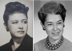
PermaRec Update: Paul here. The two women shown at right had a lot of things in common, not the least of which is that both of their Manhattan Trade School report cards ended up in my possession. They both went on to big things, in remarkably similar ways. It was a total privilege for me to tell their stories in the latest full-length installment of Permanent Record on Slate. I’m really happy with the way this one turned out — give it a shot.
Uni Watch News Ticker: I owe an apology to Vinnie Dinolfo. It turns out that former Browns defensive end Joe “Turkey” Jones really did wear a nickNOB, just as Vinnie claimed. That screen shot comes from the opening seconds of the highlight video on this page. ”¦ Neglected to mention the Pirates’ G.I. Joe pandering uniforms from last Sunday (blame Bob Brashear for reminding me). … The Twins wore their “M” caps at home last night. “This is the first time since the three games over the 1991 World Series 20th Anniversary Reunion Weekend in 2011 (Aug. 5-7) that they have worn the ‘M’ cap at home,” says Jeff Barak. “They did not wear the M a single time in 2010, and prior to that the M logo was only worn on the road since 2002.” ”¦ Marlins pitcher Anibal Sanchez was wearing a standard MLB undershirt with a swoosh on the collar last night. But the shirt also appears to have had an Under Armour logo on the chest. Weird (good spot by Chad Jorgenson). ”¦ We all know that “The City” jerseys used to have those great cable car uni numbers. But I didn’t know they also had a very cool light rail design — with a Giants-style “SF” logo — on the back of their warm-ups (great find by Matt Beahan). … Remember Will Johnson, whose baseball paintings were featured here on the site last summer? He has a bunch of new paintings. … New logo for the Denver Cutthroats (from Kelly Hellman) … Here are before/after pics of the new Mizzou gridiron (from Dwight Ternes). … Padres strength and conditioning coach Jim Malone wears a T-shirt that shows a dumbbell-themed version of the team’s logo (from Brian Crago). … Gary Chanko has made our first MLB Cubees, featuring David Wright and Cole Hamels. Look, he even included the little Liberty Bell on the Phillies’ stirrups! If you want to make your own, here are the templates for Hamels and Wright. Very cool, although those squatchees look a kinda big, no? … Nats reliever Drew Storen has his Twitter handle on his glove (from David Grindem). ”¦ Jeepers, here’s a very nice set of Twins stirrups complete with the “TC” logo (big thanks to Ben Gorbaty). ”¦ The Sugar Land Skeeters — a minor league team in the independent Atlantic League — has been using an old-school bullpen cart (from Matthew Robins). ”¦ This is truly awesome: a Chunichi Dragons uni-history coffee mug (gold star to Eric Stangel). ”¦ “On Tuesday night’s Rays broadcast, the TV guys pointed out that Hideki Matsui’s pants were an odd length,” writes Dan Wunderlich. “They had the elastic removed and came just to the shoetop without any breaking or bunching. They joked that he was wearing slacks.” ”¦ “In the Premiership final this weekend, the Leicester Tigers wore their old-school uni letters, rather than numbers, on their warm-up shirts. Then they wore numbers for the game.” ”¦ According to this La Liga season recap, “Villarreal decided that they were going to mark Mother’s Day by playing with the names of the mothers who gave birth to them on the back of their shirts -”“ an idea so good the fans were reminding them of it for the rest of the season” (from Mark Coale). ”¦ Interesting query from Michael McCormick, who writes: “I’m looking for a unique way to display baseball bats vertically on a wall, not in a case. And I’d prefer to not have to drill into the bats. I like my guests to be able to touch and pick them up to look at them. Any suggestions? Ive seen some acrylic hooks; any other DIY ideas?” ”¦ Brewers catcher Jonathan Lucroy, who wears No. 20, is out for several weeks with a broken hand, but Martin Maldonado was wearing Lucroy’s chest protector last night (good spot by Taylor Meiklejohn). ”¦ The Adelaide Crows are asking fans to vote on their clash jumper for next season (from Leo Strawn).
Alas, brown is so unloved that it’s never even had a heyday. If we look at the NFL, NBA, NHL, and MLB, only three teams have featured brown: the St. Louis Browns (they didn’t have a lot of options, now did they?), who played for over 50 years in brown and orange before moving to Baltimore and switching the brown to black; the San Diego Padres, who wore brown from the team’s inception in 1969 until 1991; and that aforementioned team from Cleveland, who didn’t wear their brown jerseys even once last season (although that’s apparently going to change this year).
…and the Denver Broncos in 1960-61, but that was the AFL so that doesn’t count I suppose.
let’s not forget the Bruins…
or the invaders
or the Burritos
Yeah, them too.
Virginia Squires in the ABA – wore brown road jerseys with orange & yellow trim for a season:
link
Damn that’s 70slicious.
Coventry City. link away strip.
Also, a certain one day cricket side called “enzed” link
Hey, if we’re going to bring cricket into it, there’s always link and their link.
St. Lawrence University wears Brown and Red. Not sure if anyone else uses those colors…
What about St. Bonaventure? They’ve stuck with brown in their color scheme for years and years. It doesn’t help that they’ve been one of the doormats of the A-10, though.
More, they could’ve gone to a different color as they ditched the “Brown Indians” name, but the Bonnies stuck with the brown.
And no love for my alma mater, Valparaiso University? Granted, it probably doesn’t help that the most visible aspect of our school, the basketball team, ditched brown for black some years ago (and our NCAA-tournament-bound baseball team recently did the same) but brown and gold are still our official colors. After all, nothing makes a link look hotter than brown and gold.
That seems unusual to me that the school would essentially have two different color schemes within its athletic department. I can think of examples where a particular school may not have standardized shades of the same color across the board, thanks to different uniform suppliers for different teams, but changing one color entirely seems a bit shameful.
The Bonnies made the tournament this year, and they made my all-tourney Top Five list:
link
With the heavy New York flavor of this blog, how did link get missed as a brown school?
I’m sure there’s good color science behind the brown-and-orange thing, but I’ve never liked that combo. (Could just be the discomfort of wearing dark brown Padres shirts with orange trim two summers running in youth ball; those shirts got literally hot to the touch in the sun.) Sure, you have to darken the brown to work well with, say, red or light blue, and in some conditions the dark brown may look black. But since when is a very dark color looking black on TV a terrible thing? [cough cough Yankees cough cough] And basically any brown goes with basically any green.
There must be something about our aversion to brown, though: it’s probably the least common color in national, state, provincial, and city flags worldwide. Pretty much only appears when a tree is part of a seal on a flag, and as the pelt color on the beautiful Abenaki tribal flag:
link
Which is to say, brown is used representationally, not symbolically, on flags. It’d be as if the Bears, Cubs and Bucs were the only teams using brown, and then only for the color of the animals in their logos.
I do believe the “least used on flags” distinction is borne by Purple which, despite the quadrant for the Kingdom of Leon in some, more accurate, interpretaions of the Flag of Spain, I can think of no flag that uses it.
Paul must be happy to here this
Baby blue + brown looks great. Wish a team would try that.
One of the top entries in my “redesign the Hornets” contest featured that color scheme:
link
Love that color scheme, however, the brown is still relegated to the role of bench player. Would take quite a leap for someone to go with brown as a primary color (no pun intended).
I am happy the Browns will be going brown at home for at least half their home games. Everyone wears white jerseys for their road games. No one else has a brown jersey. Own it!
I think brown probably works with any color that burgundy or maroon work with. They aren’t *that* far apart on the color wheel. So at the very least, you’ve got orange, yellow, gold, light blue or silver. There’s probably a few shades of green that’d work well enough too.
Even better than powdery baby blue is a brighter, more saturated light blue. Sea blue or turquoise, for example. Perfect for the Padres: brown for the friars, sunny blue for the sea and sky.
I’m drinking coffee right now from a dark brown mug with bright red highlights, and it’s a beautiful scheme.
Was going to post the same thing. That combo has been a ‘retro’ favorite of fabric/interior designers for the better part of a decade now.
Also, brown goes with silver (or gray). A lighter brown/dark sand color could go with a gunmetal gray or a black. It most certainly goes with yellow and orange in a fun Taco Bell kind of way.
The possibilities are there. It’s time for a change AWAY from all the reds and navy blues.
Padres missed the boat, and they missed the boat in a BIG WAY. The fact that they said “it never came up” means that they weren’t interested in listening.
I’m reluctant to post sentiments I’ve already stated in this forum, but this one seems apt: My push for brown, orange and yellow Padres’ colors is that they’re fall colors, and that’s when I expect to see my team playing!
That was going to be my comment. I love that color combination. Brown and blue look great. Also, I think brown and pink look good together – though I understand that the likelihood of THAT ever seeing a sports uniform not in the WNBA is about 0.00001%.
Amen to all of this. One has to consider that giant corporations chasing consumer dollars are going to be cravenly conformist. To them, a risk involves chasing a proven fad (such as BFBS). Don’t expect to see much niche-marketing. My advice is to take those turn-back-the-clock uniforms and love ’em as much as you can.
While I can’t imagine it would work for sports uniforms, brown works with pink much in the same way it works with baby blue. I have a daughter who’s almost six and when she was younger we generally tried to avoid dressing her in pink, but we couldn’t resist the occasional link outfit.
And in my hurry to comment I completely missed that Chris Holder said pretty much the same thing two hours before I did. Does that mean I need more coffee (for missing it) or less (for being in such a hurry to comment)?
There’s never not a time when “more coffee” is a bad idea.
In addition, we’ll just chalk it up to great minds, and all of that.
The Grizzlies used a turqoise-blue and brown (although they called it “Bear Bronze”) during their time in Vancouver and first couple of years in Memphis. I think that’s about as close as any team’s got to baby blue & brown during as far as I can remember.
When the Utah Jazz had the purple mountain on the front of their uniform, there was a smidgen of fawn/bronze/ecru in their color scheme. And they wore a black & gold alternate. It’s all coming back to me, now!
I thought that, too, whilst reading. Perhaps the light blue isn’t manly enough? But as a soccer fan, I could picture Manchester City’s shade of blue looking quite nice alongside some brown, albeit as trim.
Agreed re: brown and blue – certainly the best brown combination in my opinion, and it’s not even close. First time I saw it in use was with one of the fantasy teams in Madden 99 – Bruins, I believe. Brown and blue with white helmets – a GREAT look for a football team.
With teams, especially in baseball, all seeming to share the same four or five colors these days, I fully support brown and other underused colors. Color variety is what makes sports pleasing to the eye. I wish the Padres would go back to it instead of being one of like 47 teams in MLB wearing navy blue.
God yes.
Know what color brown goes well with? White. I’d like to see 2-color Padres, myself.
Good point, BGD. I loved the Pads and their brown color scheme from day one and dug just about every iteration of their brown-themed unis (well, maybe not the all-mustard).
It’s no coincidence that my interest in the Padres waned when they dropped the brown. It’s interesting how a team’s color scheme can have a psychological effect like that. I didn’t care about the team anymore when they became just another club wearing some variation of dark blue…
-Jet
The other nice way to use brown is with a nice light blue. See Tufts University.
My high school in NJ was brown and orange. I actually loved the colors together. We found some sweet 1980’s warmup jackets in my tennis coaches old sports locker that we wore for a season. We had fun with it.
We also had a brown and orange version of the Broncos logo going for us, which actually looked pretty good.
link
A suggestion for Michael McCormick, if you haven’t considered it. Guitar hooks would work well with a bat. The cushioned prong hooks come in different sizes and you would have the option of hanging your bat either knob or barrel side up. Or you could have two of them and lay your bat horizontally on them. Some of the hooks are attached to a decorative block of wood which is attached to the wall.
A more DIY way would be to fashion your own hooks from wood. Just just a jigsaw to cut out a U shape to hold the bat. Use small L brackets to attach it to the wall. The wood can be stained to match or compliment the bats.
If you do an google image search for “how to display baseball bats,” you will find some good ideas.
I’m trying to remember how they display the MLB used bats at the Louisville Slugger Museum. I think it’s something like this:
link
My Dad uses these for his bat collection…
link
Also look at your local hardware store. You should be able to find hooks for hanging lawn tools like rakes and shovels. Those may fit a bat but I’m not 100%.
More or less, just run through the garage organization area at your local Lowes, Home Depot, etc. and you should find a few different options. (Not sure if a local hardware store would have those items but they might!)
Another thing is walk through the hardware section of a big box store. There should be all kinds of hooks and you can try a few different ones to see what works. Again a local place may have those, and heck asking the person behind the counter at a local place might give you some ideas. They know about all kinds of cool stuff that we may not.
Sorry but just thought of this: The racks they use in dugouts for little league or softball. You should be able to find those pretty easily online and maybe at a Play it Again or other sports store. Heck Dicks might carry it.
link
Like this perhaps?
Exactly! You can find them without the top part too so its just the bat rack.
Another suggestion, repurpose pool cue racks:
link
These are kinda cool, and could be made at home:
link
For a cheap, quick hanging of bats, these little spring clips work well, if not decorative.
link
I have 2 bats hung vertically in my garage and I use self drilling hooks from Lowes. They are minimal and CHEAP. Stay way from the “offical wall mount for baseball bat” items. In my opinion they are over-priced.
Great idea, Craig… I was going to post the same thing!! =)
Don’t forget the brown and green of Opentoe College, an Upper Midestern Small Colleges Athletic Conference door mat … Chad Harbach’s fictional baseball team from “The Art of Fielding.”
The Boston Bruins color scheme was brown and yellow for the first ten years of their existence. Also, do independent baseball teams count? there is a team from Massachusetts called the Brockton Rox. Before changing the colors to Red, White & Blue – their colors were Brown and an odd shade of Green.
Brockton Rox
link
I was told that the Twins wore the “M” cap last year during their 20th anniversary celebration of the World Series. I could be wrong
Which is exactly what it says in the Ticker.
I read that but somehow it didn’t register in my mind. Too early in the morning for me. I better get back to bed.
I like those hats fine. Mind you, I like the interlocking TC better, but the M with the swash is a good emblem.
I like the M hat with the white “modern” pinstripes, the TC hat with the cream throwback pinstripes, and I guess either one could work with the grays. As for that “thing” with the red brims, there is no good reason that that exists on the field. Keep it in the gift shop *if you must*, but those are expendable.
True that with the red brims. There’s a name for American League Central teams that wear navy caps with red brims, and that name is “Cleveland Indians.”
But the M cap, much as it’s my favorite Twins cap of all time, should never, ever be worn with their current road grays. The M matches, indeed complements, the home Twins script, but it clashes badly with the road Minnesota script. Mainly, this is the fault of the road script being a terrible, awful, very bad script that doesn’t belong anywhere near a Minnesota Twins jersey. But once you make the decision to go with that particular script, you really can’t wear the M cap with it. A shame that the Twins didn’t go with an updated road script in a style that matches the M cap.
Regarding brown as a uniform color, while the story does reference the “bathroom comparisons”, it very much misses that this is the obvious reason that brown is seldom used. It’s the color of fecal matter, and thus people naturally associate it as such.
Or to be even more straightforward, nobody wants to use brown on a uniform because it’s ugly.
It’s the color of fecal matter, and thus people naturally associate it as such.
If it were that simple, I’m fairly certain chocolate wouldn’t be so popular.
Considering the shape of link link link… yeah.
cue spalding & carl
While I’m not suggesting it’s to blame for the lack of brown overall, I can definitely tell as an alum of a school whose colors were brown and yellow that it was pretty common to refer to the combo as “poo and pee.” (I guess we loved our school enough to refrain from using more vulgar terms to describe the color, but not enough to refrain from making fun of the colors in the first place.)
It’s the color of fecal matter, and thus people naturally associate it as such.
If it were that simple, I’m fairly certain chocolate wouldn’t be so popular.
—post of the year so far
When I was in college at Rowan University (Glassboro, NJ) we wore brown and yellow. During the fall baseball intersquad scrimmages, we referred to the brown and yellow teams as simply “shit” and “piss”.
What team are you on today? The shit team.
No shit.
Paul sez:
“If it were that simple, I’m fairly certain chocolate wouldn’t be so popular.”
Chocolate is not popular because people think it’s pretty to look at…
I’m sure there’s something to this, but brown is also the color of beer (yellow beer is a pretty recent invention), most animals humans eat, and much of the cooked food premodern humans ate. Some pretty fundamental survival associations there. Whereas very little of value to premodern humans was yellow; if the waste association were so strongly determinative, then yellow would be even rarer than brown.
Though Berlin and Kay hold that “brown” tends to be one of the last color definitions to arise in any language. (In their theory, color terms tend to develop in the sequence light/dark, red, green or yellow, yellow or green, blue, brown, then purple, pink, orange, gray.) Possibly more than any association with fecal matter, brown simply isn’t a very well grounded color in human consciousness.
being color deficient (i try no to admit that TOO much. lol), brown is one of the toughest colors for me to pick up
Funny, people by the gazillions are hooked on drinking brown “fecal” water every day.
And I’d argue that shades of brown play out in more house color paints and clothing lines (both women and especially men) than any color, and that includes black.
Next theory?
I had bowel movement with a greenish tint to it the other day. So does that mean I’m to associate the Jets, A’s, Eagles and Celtics with poo now? Well, I already do with the last two teams, but you know what I mean…
Yeah, sure, I once thought brown and yellow were bathroom colors. And then I turned four. Folks who confine that fine combo to the toilet need to grow up a little.
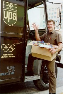
The UPS reference is what I use when defending brown as a classy color. The Padres should take notice, because until they bring brown or sand back to their color scheme, they’re not welcome in my list of favorite teams. They’re in the limbo where the non-blue Blue Jays were for so many years.
I had bowel movement with a greenish tint to it the other day.
In the words of a wise Mr. H. Philip Hecken,
TMFI
he also shared that with me in a email, prior to posting it on the board
i told him he should
tmfi? meh…
It’s rather disturbing to know that the MoVi discusses his digestive functions with you, Phil. I sincerely hope he doesn’t share about any of his other biological functions…
And when I blow my nose, I’ve never seen anything that resembles Seattle’s so-called “neon snot green”…
aight…now that is tmfi
I played lacrosse at Brown. Our helmets were white, then red, then silver (but we wore brown away uniforms).
We lobbied our coach for brown helmets but he said he didn’t want us called the “shitheads.”
After I graduated, they moved to white with brown brims, and once a new coach came on, full brown helmets. Looked pretty good.
link
As a baseball fan, I think of brown as the color of the infield dirt first and foremost, and ahve always thought that brown and green have always been rare colors just because they make the player wearing them blend into the field rather than pop into view.
BTW, Paul, the Padres have not abandoned brown since 1991; until just a year ago they were wearing khaki (a very pale shade of brown) as the color of their road uniforms. In an age where dull grey polyester has a stranglehold on road uniforms, I loved seeing this.
Y’know, I liked those, too. Every conformist mouthpiece slagged ’em, saying they looked like urine or spilled beer. In the meantime, I hear nothing but praise for the new Braves’ alts, which are definitely on the yellow side of cream.
Never understood the idjits who complained of the Padres khaki roads looking like urine. Mainly because they looked nothing like urine. An important public service announcement: If your pee looks anything like the old Padres road unis, you need to seek medical attention immediately.
(That, or your TV color settings are badly in need of calibration, in which case stop blaming the Padres for your own laziness and failure to learn how to operate the most basic devices of modern civilization. It’s like blaming the bakery because your toast always comes out burned. Learn how to operate a freakin’ toaster, or stop eating bread.)
Delran (NJ) HS’ athletic teams all wear brown and gold:
link
As a result, their opposition often refers to Delran as ‘Toilet Town’.
And my sisters all went to St. Huberts HS for Girls (The Bambies) in Philly, another brown and gold school (though when they attended their jumpers were blue, even though the school colors were brown and gold):
link
I think using donuts would be a cool way to display the bats. Glue the donuts to a board and then screw it into the wall and slide the bats in.
oooh i like this one
I think maybe even screwing the donuts (if you can get the leverage) would work best. Take a good, thick board (a 4×4, perhaps) and drill through the donut and into the board.
Just don’t use glazed ones, they’ll get the bats all sticky.
Love this idea! I really want something unique that you dont see everywhere. Ive down the simple (and frequently used) bat racks…just tried of the same thing everywhere. Thanks for all the ideas!
Did the Twins wear the M hats for that whole weekend last year? I thought they only wore it for one game.
That is what I remember too. Just one game. It was even more odd because they were wearing the “M” with the 1961 style uniform. The first and only time that has ever happened, I believe.
Yes, they wore the M caps on Friday, Saturday and Sunday for the reunion weekend.
Kudos to the article being written. I’m a huge fan of brown myself, and I’ve never understood why people immediately associate it to poop. I’ve always seen a color for what it is, a color. I’m also a huge fan of brown and orange. Brown and pink can work as well (not in sports but for decorations) and lilac purple is a good complementary color as well. Neon colors are great with brown too.
I own a brown bathing suit with a orange/burnt yellow trim and outline and I love it. I actually like how brown is used in sports today though. Not exactly an abundance but just enough to spice up the sporting world.
Great points about neon pairings. In tiki culture, you see a lot of brown used with highly saturated bright colors like oranges, yellows, and reds, even blues and greens, and it makes for a much richer, more inviting color scheme than the same colors paired with black.
Brown makes medium and light blue pop. Italy used it on their national kits a few years back.
IIRC, Italy used brown as a substitute for black. The uniforms were throwbacks to the 1934-1938 teams, but black was deemed to still have the fascist connotation.
My last place, I had three walls of my bedroom painted light blue, with a deep brown fourth wall.
You’re right about the pop. Then again, I got the inspiration from a pair of Vans I had at the time.
While not major league, the Hershey Bears migrated to burgandy/maroon in 2002. It’s sad when the chocolate capital of the world abandons brown…
I saw a Food Network show on candy and the representative of Hershey’s was basically ticked off that people thought their packaging color was brown; he insisted that it was burgundy.
I always thought it was brown myself. Then again, i didn’t realize the “brown” jersey of modern times was actually burgandy, equally saddened by the fact I own a post 2002 jersey.
Burgandy? I guess link.
But when Googling it, I found this link.
Ok..The Hershey Bears use burgandy as a Jersey color. So do the Redskins.. then why does the color of my Bears Jersey from the last Calder Cup look different then my Skins Jersey from 2 years ago ~ same mfg and same level of quality (not top of line nor bottom)?
Maybe Descartes was right.
Or maybe that’s why Pantones were invented.
Another “brown” team is link in Chicago, one of the most high school athletic programs in Illinois, if not the country. Another Chicago area school, link in Mundelein, IL, also sports the brown (and in this case, gold).
As far as the shots of the new turf at Faurot Field at the University of Missouri, it still looks like a Big 12 school rather than SEC, nevermind the logos. It just doesn’t have that big look at schools like Florida and Alabama have.
So what is Joliet Catholic’s color – brick red, maroon, medium brown? Very weird and unique shade they use. Note that MC, Carmel-Mundelein, and JCA had to do the brown because all 3 are run by the Carmelite Order.
Missouri need only to start scheduling the deep south SEC teams later in the football season to develop a cold-weather advantage. Due to its place near the Great Plains, Columbia has a much more colder and snow-prone average late autumn day then equal-latitude cities such as Lexington and Louisville.
Joliet Catholic Academy wears brown. IIRC, the girls’ teams use light blue as an accent color.
Greensburg-Salem in Westmoreland County (PA) used to use brown helmets. Our coaches would refer to them as “shitheads”. Shame they switched to the yellow shells a few seasons later!
Truth be told they always used the deep brown/yellow scheme very nicely in all sports.
Often you can look to nature to find color schemes that work well. Brown and orange is probably inspired by autumn foliage, and it looks great. Likewise brown and bright red. Brown and yellow or gold? Chili and cheese? Various types of flowers? To me it always looked like the places out west where the plains meet the mountains, and the same can be said of brown and blue, which is of course, the sky meeting the mountains. Green and brown also works well if you ask me; it’s the earth and the forest. Brown and silver, brown and pink, brown and purple; if the color has sufficient contrast with brown, it will likely make a good color scheme. What is brown but a warm black?
Brown and green would be a good combo for a team called the Lumberjacks or the Timbers or something else tree-related.
Some teams go with a double-blue look…why not a double-brown? Adding tan or khaki to a dark brown would look great.
Apparently I just had to scroll a tiny bit to see Oakville and Jason already said that…
and a certain one day cricket side made it famous in the early 80s
As a big supporter of Brown – thank you for today’s column.
I actually think a certain shade of Brown with a forest green could work – on a team with an outdoorsy name.
I honestly think that the MLS’s Portland Timbers should be green and brown.
My alma mater, the excellently named link use brown and baby blue as their colors.
I would totally wear the crap out of one of those Tufts U. baseball team caps!
I’m mainly a Saints fan,but I love the Browns as well. It’s all about their uniforms. Although I would like them to bring back helmet numbers.
I’m not recommending monkeying around with the Saints’ uniforms, but brown would fit in with their color scheme really well.
A big “brown” component was phased out of hockey in the 1980’s due to technology — the classic brown leather goalie pads. A few goalies have brought it back as a “vintage” look, but it’s usually reserved for when they where heritage/throwback jerseys:
Wyoming’s football uniforms have undergone some unfortunate redesigns since, but link has always been one of my favorite college unis.
The Fresno Bombers of the short-lived National Bowling League (’61-’62) wore brown and cheddar.
I see you’re making good use of that book!
So much in that thing I don’t know where to start.
I remember thinking, as a kid, how odd it was that the Twins put their logo on the stirrups.
But what was especially jolting was that the logo was inaccurate, like it was applied by some guy in the clubhouse with electric tape and scissors. However, one came to expect short cuts with the cheapskate Calvin Griffith running the show.
Now–naturally–I look back on those funny logos with fondness and admiration.
Jim, you should totally buy those stirrups! (Although I dunno, now that you’ve changed your screen name, maybe they should go to a “real” Twins fan…. Kidding, of course.)
The first one was off, yes.
Later incarnations got it right.
A story about the originals…
link
That’s great, Ricko. Thanks! Of course no mention of the half-hearted rendering. ;)
You’re right, Paul, maybe I should buy those. They would go well with the stocking cap I got when I was 12 or so from a small town department store in central Minnesota. The patch sewn in front depicted a football helmet with BENGELS written on it. Shoulda kept that, dang.
I attended a brown and orange high school: Alan B Shepard in Palos Heights, IL:
link
Puma made an African Unity change kit for all their supplied teams at the 2010 World Cup – colours represnting sun, sky and earth
The Brockton Rox did a nice job using brown and light blue in their color scheme for several years:
link
Does anyone remember the WFL Hawaiians? An economically-named team with brown uniforms. NTITOI, the NFL World League San Antonio Riders were brown, too.
The Riders made brown look really good.
This has absolutely nothing to do with today…. but yesterday a few of us had a small conversation about the Eagles and switching of uniforms and whatnot, and I posted this really late so no one saw it… so I’m gonna post it again.
What a late 70’s Eagles uniform would look like with today’s lack of real sleeves: link
Thumbs up!!!
Man… that looks so much better than their current unis, it ain’t even funny. If I were an Eagles fan, I’d be beating down the doors of the front office until they look at that picture and give me a good explanation as to why they keep the atrocious set they currently wear over THAT.
Good work, The.
What I’ve always heard was the owner hates Kelly Green, it’s even difficult to get them to do retro Kelly Green t-shirt designs.
That mock up is real nice and I’d argue that the numbers/wings on helmet could just be solid silver and that would be a perfect look for the Eagles.
That uni would be perfect!
I feel about brown the way Paul feels about purple. It should never be worn with maybe one exception.
link
link can link a link just fine. It’s not for everyone, though.
Speaking of link …
Agreed…brown is an awful color IMO, however, some teams such as the Padres just seem to belong in brown…it’s part of how I still identify them.
Sadly brown is as unloved in Europe as it is in the US.
One former Bundesliga (top German league) team wears brown as its primary colour, St Pauli from Hamburg – link
Also, one former English Premier League team has worn brown alternative jerseys in the past, Coventry City – link
In rugby, the best I can come up with is a quarter of the always bizarre Harlequins jersey – link
It seems that Cleveland is flying the flag for lovers of brown all over the world
Brown University uses silver and red as its primary uniform colors, saving brown for a few highlights
Examples, please. While I’ve seen them use red, silver, or white as a trim or second color, all of Brown’s teams wear plenty of brown.
On the back of the Warriors’ tops, that not a “light rail” design. Those are cable cars! San Francisco… cable cars.
In regards to that DIY baseball bat display, he could do something like a wall-mounted pool rack. And he could probably do it with just two pieces of wood. (I’m not an expert handy-man.)
At the bottom, have the bottom board hold the bats. And probably put the rounded indent-like spaces (that’s a technical term) for the bats to sit in, like a pool cue. Then have an upper board with the open holder parts. In fact, he could probably just mount the acrylic hooks on the top board.
St Lawrence University- brown and red.
did anyone mention the bgsu falcons yet…?
link
oh, wait, i need coffee…the article mentions them…
Here is an interesting blog post displaying team colors by sport. Confirming a lot of what most of you said; red, blue, navy…
link
The Lehigh Valley Iron Pigs, the Phillies AAA team, were almost called the Lehigh Valley Gobblers. The name came in second to Iron Pigs. Had they been called Gobblers, the teams primary colors would have been brown, black & orange. They ran a promotion night last year called “What Could Have Been Night”, and they wore the uniforms of the LV Gobblers, including this hat, which you can still buy on there website.
link
Not related, but they plan on doing that night once a year, showcasing the other choices that could have been, including the Woodchucks, Phillies, Keystones, Crushers, Phanatics and Vulcans… Pretty neat idea, and a great way to get me to buy baseball caps.
Some other minor league team did something like that. The team was set to be called the New Hampshire Primaries, but then the owners balked. I forget what that team is called, but they did a one-off to showcase the prototypes.
//Alternate universes FTW
That was the New Hampshire Fisher Cats.
In 2007, they link “what would have been” uniforms based on the rejected 2003 name and design. They still sell link with the gorgeous Uncle Sam called-shot logo.
That logo is fantastic. I’m absolutely going to order the red fitted cap with that on it.
I was at the first Primaries game…gorgeous evening
oh, and being the resident afl aficionado, i should mention the hawthorn hawks…
link
Love the Brown and Gold of the Hawthorn Hawks. American expat living in Melbourne and six year Hawks member.
In the What Can Brown Do for You post, you failed to mention another team with a longstanding (until about two years ago) brown uni – Valparaiso University. They typically wore brown with some various shade of gold (from dark yellow, to a darker maize (80s-’08) to your typical gold like the 49ers (early 90s) and now they have a matte gold with shiny brown or black combo (brown/black not used at the same time).
You can go to link to check out the lovely brown/gold website.
Re-reading Paul’s article about his take on camouflage uniforms, I see the U.S. Military All Stars are selling brown jerseys with camouflage striping.
link
This brings to mind the “Starbucks” themed entry from the Redesign the Seahawks contest. That one was easily my favorite, and it made excellent use of brown.
Derby County has had brown in their history:
link
I’m also an alumni of a school that uses brown and gold – Manitoba Bisons
link
link
Atta boy, Mike. ;o)
Western Michigan didn’t replace brown with an emphasis on the gold. They completely replaced it with black quite a few years ago (starting in 1998). The original Brown and Gold (yellow) colors came from the Brown-eyed Susans that grew on Prospect Hill in Kalamazoo, where the original campus was located.
I’ve seen Western wear brown recently (trim and face masks on football helmets, hockey). The athletic website still uses brown. My guess is that they wear black in a number of sports because it’s easier to obtain black uniforms than it is brown.
Black is the main color replacing dark brown. A medium brown was kept in the color scheme for trim. In fact, the official color scheme was black, gold, medium brown, gray, and white. The stated main reason for changing to black as the main color in ’98 was that brown clothing wasn’t selling well and that black might do better. This was at the beginning of the BFBS trend. Us old alums were never happy with the change.
“Brown University uses silver and red as its primary uniform colors, saving brown for a few highlights.”
If you look at their website, that doesn’t seem to be the case. Besides the website having a definite brown motif, my quick clicks show that at least the home football jerseys and away basketball jerseys are brown.
Sorry, website here: link
Hey Paul, the Buccos wore camo on Sautrday, too.
As for those adding which other teams also wore brown, give the guy a break. He wrote a pretty interesting article. Even pink is used more than brown in a sports color scheme.
Even pink is used more than brown in a sports color scheme.
As a regular team color and not just for cancer? Really?
As for that other part of your comment… this is a site full of people that are obsessive over minor details. If some guy writes an article about how rare something is, and we can think of 427 examples he missed… we’re gonna freakin list them. Deal with it.
I don’t think anyone is saying the writer messed up.
Rather that there ARE precious few teams using brown that come quickly to mind. And that was his point.
Our calling up the largely obscure or at least low profile uses of brown are validating his contention, not contradicting it.
I mean, seriously, how mainstream are recollections of the WFL Hawaiians. Or the Fresno Bombers.
Precisely my point. I made the mistake link by saying that we needed an ombudsman for an article by a guest editor that had some errors. I’m not making the same mistake this time around. I’m just saying that yinz need to give the guy a break.
Our calling up the largely obscure or at least low profile uses of brown are validating his contention, not contradicting it
That’s as maybe, but when the author points out one of the few brown-using athletic teams (Brown) and gets it badly wrong as to their use of brown, he certainly shouldn’t expect this site to cut him slack.
In first year of World Team Tennis (’74)…
Houston EZ Riders wore brown and orange.
Minnesota Buckskins wore cheddar and brown.
Loved that Buckskins logo. Were you associated with them, Ricko? Or was it the WHA’s Saints.
Maybe the San Diego Friars were a brown clad team as well?
Here’s a Flickr.com set of some Brown University unis: link
Regarding the Marlins player with two different logos… he could have been wearing two undershirts for the game.
My old high school wears brown and gold, and even uses brown caps and gowns for graduation.
Remember too that Long Beach State used to be brown and gold, and I believe it was football coach George Allen that pushed for the black and gold when he was named head of the program. I also sort of remember that he died before the new colors were fully implemented.
I can’t wait until we have this discussion about teams with pink in their color scheme!
Much to my delight, brown has recently been reintroduced as a car color for the first time since the early 80’s. I’ve seen new brown Subarus, Fords, even that Fiat. Thanks in part to the Brown Car Appreciation Society.
link
That is simply not true about Brown University’s team uniforms being mostly silver and/or red. Many of their teams have solid brown jerseys: football, hockey, lacrosse, basketball, etc., for usually for both men’s and women’s teams. Baseball is one team that has red jerseys mostly. Road uniforms are often white with brown trim only for many of the sports, too.
Brown Univ., ’83
(Second image down on the page) I LOVED these uniforms.
link
Enjoyed reading about Eva and Bee. When I lived in the NYC area back in the day, I had quite a few friends who went to FIT, so it was nice to get some history about the school there.
Speaking of the color Brown and the fashion world, I really think brown and blue make a nice combo. Who was that fashion designer who made that color combo popular a few years back? Was it Paul Frank?
Thanks, Mike. I just posted a follow-up on the PermaRec blog:
link
link. A deal today allows the chief administrative officer “to approve sponsorship deals that allow unspecified commercial transactions on sidewalks, skywalks, streets and other public spaces”.
Our mayor, Sam Katz (pronounced Cates), feels that there is no risk of billboarding, “claiming the sponsorship program has been successful and has not provoked complaints about overcommercialization”. I call BS. Having driven through cities with no billboards plastered on any civic property, it’s an absolute dream.
Looks like I’m voting for whomever runs against this in the next mayoral election.
teebz for mayor!!!!
Also worth pointing out – Winnipeg Goldeyes owner Sam Katz
link
My city would be far better off today if its’ citizens had elected Sam Katz (pronounced Cats)one of the 3 times he ran for mayor.
Does anyone else think this juxtaposition is really, really stupid?
link
Yes.
further reinforcing paul’s point that marketers are treating sports (and athletes) like superaction heroes (and villains)
and for the most part, people are eating that shit up
Great article, Tim.
I love brown as a sporting color, especially when paired with gold. This is link ever worn on a diamond.
Binghamton Broome Dusters (NY), a defunct minor league hockey team, had brown and gold as their primary colors, as well as a caveman from the comic strip BC as their mascot. I believe the Binghamton Senators have used the Dusters jersey as a throw-back. The Marlins undershirt doesn’t appear to have the thin grey line around the top of the collar that the nike shirts have. the swoosh was probably screened/ironed on to an under armour shirt. Maybe it’s his lucky shirt. Very strange.
Brown seems to be a popular color at the high school level, though…at least in the Cincinnati area. Why does it always have to be matched with yellow (or gold) though? Makes it too easy for the ol “yellow and brown, flush it down” cheers. Here are a few from the Cincy area (3 of which are all part of the same athletic leagues):
Archbishop Alter Knights link
McAuley Mohawks (all girl school) link
Roger Bacon Spartans link
Taylor Yellow Jackets link
Also, the Western Brown Broncos link
I love that dumbbell Padres shirt! Anyone know if they make them for other teams and can be bought?
I was hoping for the Swinging Friar lifting weights instead of swinging a bat…
No one mentioned the Caribous of Colorado?
Two-tone brown on their away shirt (dark brown top, then that FRINGE, then light brown the rest of the way.
This just came through on my Twitter feed. I thought it must have been written by Paul since it’s called “Uni-Watch”, but it’s something else. I think Paul might want to sent them a note about using that title.
link
On it.
7:40 pm and it’s still there
The Boston Bruins wore brown in their early years of existence.
NFLshop.com misspells NOB of Aaron Rodgers
link
The Texas Longhorns came out with new practice uniforms for the football team. They use black as the third color along with the traditional burnt orange and white. It looks like a Halloween outfit!
I feel that they could replace the black with maybe a “Steer Leather” brown, have a better looking uni and it might be “saleable” to the traditional longhorn diehards in Austin.
Pretty old news. link
You know who else wore brown?
link
link
(this is the internet, so I assumed it had to be done, as a rule)
Spy Smasher, a comic book hero from Fawcett (which also created Captain Marvel) began his existence wearing a brown costume…
link
But it was subsequently changed to green owing to the Nazi “brownshirts”…
link
Hawthorn, Australian Rules football. Lots of brown.
link
Two things. The *slacks* Matsui was wearing are horrible. Ridiculous. And the photo showing the three Wyoming helmets was strange (to me). The middle one and the helmet on the right appear to have the cowboy/horsey decal migrating toward the back. Strange looking in fact, when compared to the helmet on the far left. Maybe the sticker placement equipment dude was in a hurry for the photo op. I’m frankly surprised that this group hasn’t pointed it out, this late in the day, but I may have missed it. Most had shit and piss on the brain, or what color the former was yesterday/last week. I love this place.
“And Wyoming’s brown/gold color scheme was inspired by an alumni banquet in 1895, when decorators chose brown-eyed Susans to garnish the room.”
Sure, sure.
I say someone rolled around in horse poop and some Wyoming cowboy said, take this over there and let that ole’ mare pee on it” and after seeing it said, “That’ll make a good color scheme for our football uniforms”.
Just heard on MLB Network that Jamie Moyer was designated for assignment by the Rockies — probably the end of the road for him unless another team wants to take a shot on a 49-year old left hander out of the bullpen. Sad news for the stirrup quest guy.
I can’t believe I (or anybody else) failed to mention this until now! LA Kings captain Dustin Brown has the ear pieces in his helmet. This is an inexplicably rare thing in the NHL.
link
I wrote a tome about this for Teebz’s blog here:
link
It’s really not that rare, especially for the younger guys: link
I thought it was just Crosby and Malkin, aside from Brown. Pretty cool that Kane is in the club too. I did not know that! Add that to the file!
In John Irving’s book Hotel New Hampshire, the protagonist goes to a private school’s whose football team wears brown and grey, he refers to the colors as “shit and death”. Personally I like that colour combo for a gritty, industrial city to adopt (it would off course have to be a gritty, industrial city that embraces that image…..Buffalo?)
I do not understand in the slightest, why the Boston Celtics would cheapen their brand identity, by wearing a green and black uni. I have to believe the few extra unis they sell is more than offset by the negative impact to the brand. Their uni should be treated in the same way the New York Yankees and the Montreal Canadiens treat there’s
USA soccer change to more visible numbers tonight against Brazil. Navy, probably with a white dot pattern inside, but a good look.
Considering how overwhelmed the US were in the first half-hour, they might have wanted to keep the pervious numbers, so no one could recognize who they were. But they got an end-of-half goal to keep the match within reach.
Looks like they changed back at half.
They didn’t change back at the half, I have no idea what the commentator was thinking when he said that but they were clearly the same color, and nowhere near as unreadable as the silver numbers.
Love the coverage of brown uniforms. A team that has always worn brown well is SE Racing in the BMX world. Early to mid 80’s with Scott Breithaupt, Perry Kramer, Toby Henderson…baby blue, brown, tan, camo.: link
Why is Sandro on Brazil wearing a swimming cap?
link
I guess this is why: link
Looks like the cap is holding a bandage in place, cause he definitely wasn’t wearing it at the beginning of the game: link
Tufts University uses Brown and Cumbia blue for the athletic teams, a nice looking combo
Check out this link showing the Penrith Panthers from Australia’s NRL back in the 1980’s link From 1967-1990 the Panthers were known as the “Chocolate Soldiers” for their Brown Uniforms. In 1991 they changed to this link . No more Brown, thank god for Hawthorn in the AFL link still giving Australian sport it Brown.
As for the DIY vertical bat holder, you could mount an old style baseball glove to the wall and hang the bat in the webbing. I think that would make for a really nice looking baseball display
German counter culture Football Club FC Saint Pauli rocks brown harder than anybody else.
link
*Sankt Pauli
link
Here is a cycling team in France that uses brown successfully, AG2R Mondiale. One of my favorite cyclists, Matteo Montaguti is on this team (obvious reason why a fave)